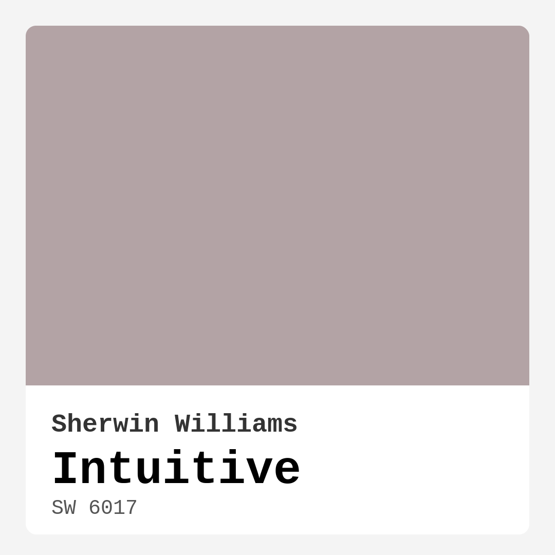
Color Preview & Key Details
| HEX Code | #B3A3A5 |
| RGB | 179, 163, 165 |
| LRV | 30% |
| Undertone | Red |
| Finish Options | Eggshell, Matte, Satin |
Imagine walking into a room that feels like a warm embrace. You’re surrounded by soft hues that make your heart sigh with contentment, and every detail feels just right. This is the transformative power of color in your home, and today, I want to introduce you to a shade that embodies this essence beautifully: Sherwin Williams’ Intuitive (SW 6017).
Intuitive is a soft, muted hue that strikes a perfect balance between warmth and coolness. It’s not just a color; it’s an experience waiting to unfold in your living space. The subtle complexity of Intuitive makes it a versatile choice, whether you’re looking to create a serene backdrop in your living room, a restful retreat in your bedroom, or an inspiring workspace in your home office.
What draws you to this color? Perhaps it’s the way it reflects light. With a Light Reflectance Value (LRV) of 30%, Intuitive sits in the Medium Dark category, meaning it absorbs more light than it reflects. This characteristic contributes to its cozy ambiance, making it ideal for spaces where you want to cultivate comfort and intimacy. Picture it in a dining room, where soft candlelight would dance on the walls, encouraging laughter and conversation.
When choosing paint, understanding undertones is crucial, and Intuitive has a red undertone that adds depth and warmth. This subtlety allows it to interact beautifully with your existing decor. If you have furniture or accents in cooler shades, it can soften the space, creating a harmonious balance. But if your style leans toward warmer tones, Intuitive adapts, complementing your palette effortlessly.
You might wonder how this paint will hold up in different rooms. The good news? Intuitive shines in various spaces. It’s equally at home in a modern minimalist living room as it is in a cozy transitional bedroom. For a home office, this color can inspire creativity and focus without overwhelming your senses. Whether you’re diving into a project or relaxing with a book, Intuitive provides a calming backdrop that encourages productivity and peace.
Have a small room? You’re in luck! Intuitive works wonders in tighter spaces, creating an illusion of openness and airiness. Pair it with lighter decor elements to maximize that spacious feel, and watch how it transforms your cozy corners into inviting retreats.
Let’s talk finishes. Intuitive is available in matte, eggshell, and satin. Each finish has its unique charm, so consider the mood you want to create. A matte finish offers a sophisticated, understated look, while eggshell and satin add a slight sheen that can enhance the color’s depth. Think about how the finish will work with your lighting and furnishings. A little sheen can elevate the overall aesthetic, making the space feel more polished.
Now, paint application can be a daunting task for many, but with Intuitive, you’re in good hands. It’s beginner-friendly and roller-ready, ensuring a smooth application. Whether you choose to brush or roll it on, you’ll appreciate how evenly it dries, giving you a flawless finish with minimal fuss. It’s also easy to touch up, which is a bonus for any DIY enthusiast.
In terms of maintenance, Intuitive scores high. Its washable and wipeable nature means that you can keep your walls looking fresh without breaking a sweat. And if you’re concerned about air quality, you’ll be pleased to know it has a low VOC level, making it a healthier choice for your home.
You might be wondering about its compatibility with other colors. Intuitive plays nicely with a variety of shades. For a chic look, consider pairing it with whites like White Dove, which can brighten and elevate its soft hues. If you want to add warmth, brass fixtures will complement Intuitive beautifully, enhancing its inviting nature.
But what if you’re someone who loves bold colors? While Intuitive may not be the vibrant choice for those seeking a striking statement, it excels in creating a peaceful environment that invites relaxation. If you’re after a color that feels both contemporary and timeless, this muted purple could be your perfect match.
As you contemplate this hue, don’t forget to test it in your space. Paint samples are your best friend! Observe how Intuitive interacts with natural and artificial light throughout the day. You’ll notice how it appears lighter and airier in the daylight, while at night, it retains its soft depth, creating a cozy, inviting atmosphere.
When it comes to decorating with Intuitive, think of it as a blank canvas. You can layer textures and patterns without feeling overwhelmed. Think soft textiles, natural woods, and metallic accents, all coming together to create a harmonious space. Whether your style is modern, Scandinavian, or transitional, Intuitive accommodates it all, offering versatility without overshadowing your design vision.
If you’re considering adding Intuitive to your home, remember that testing it against your existing furnishings is key. Observe how the undertones interact with your decor, as these subtle nuances will reveal themselves in different lighting conditions. It’s about finding that perfect harmony that makes your space uniquely yours.
In summary, Intuitive (SW 6017) from Sherwin Williams is more than just a color; it’s an invitation to create a sanctuary in your home. Its balanced, muted tone can adapt to various styles and spaces, making it an ideal choice for anyone looking to refresh their interiors.
Whether you’re painting an accent wall, transforming a room entirely, or simply looking for inspiration, Intuitive offers a soft and inviting backdrop that encourages relaxation and creativity.
So, what do you think? Are you ready to embrace the warmth and serenity of Intuitive in your home? Give it a try, and let its calming presence transform your space into a haven of tranquility and comfort.
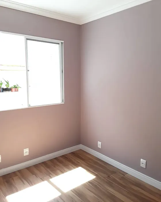
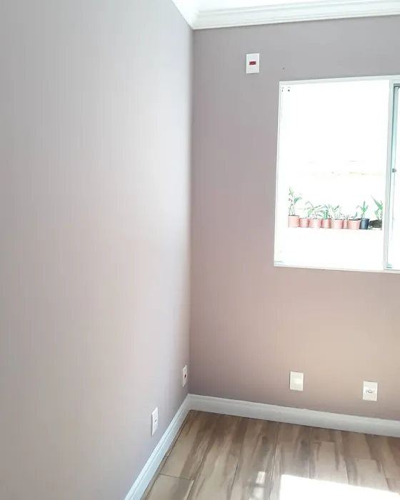
Real Room Photo of Intuitive SW 6017
Undertones of Intuitive ?
The undertones of Intuitive are a key aspect of its character, leaning towards Red. These subtle underlying hues are what give the color its depth and complexity. For example, a gray with a blue undertone will feel cooler and more modern, while one with a brown undertone will feel warmer and more traditional. It’s essential to test this paint in your home and observe it next to your existing furniture, flooring, and decor to see how these undertones interact and reveal themselves throughout the day.
HEX value: #B3A3A5
RGB code: 179, 163, 165
Is Intuitive Cool or Warm?
This color strikes a perfect balance between warm and cool tones. It doesn’t lean too far in either direction, allowing it to complement a wide range of furnishings and decor styles. If you’re unsure whether to go warm or cool, Intuitive is that happy medium that just works, no matter your existing palette.
Understanding Color Properties and Interior Design Tips
Hue refers to a specific position on the color wheel, measured in degrees from 0 to 360. Each degree represents a different pure color:
- 0° represents red
- 120° represents green
- 240° represents blue
Saturation describes the intensity or purity of a color and is expressed as a percentage:
- At 0%, the color appears completely desaturated—essentially a shade of gray
- At 100%, the color is at its most vivid and vibrant
Lightness indicates how light or dark a color is, also expressed as a percentage:
- 0% lightness results in black
- 100% lightness results in white
Using Warm Colors in Interior Design
Warm hues—such as reds, oranges, yellows, warm beiges, and greiges—are excellent choices for creating inviting and energetic spaces. These colors are particularly well-suited for:
- Kitchens, living rooms, and bathrooms, where warmth enhances comfort and sociability
- Large rooms, where warm tones can help reduce the sense of emptiness and make the space feel more intimate
For example:
- Warm beige shades provide a cozy, inviting atmosphere, ideal for living rooms, bedrooms, and hallways.
- Warm greige (a mix of beige and gray) offers the warmth of beige with the modern appeal of gray, making it a versatile backdrop for dining areas, bedrooms, and living spaces.
However, be mindful when using warm light tones in rooms with limited natural light. These shades may appear muted or even take on an unpleasant yellowish tint. To avoid a dull or flat appearance:
- Add depth by incorporating richer tones like deep greens, charcoal, or chocolate brown
- Use textured elements such as curtains, rugs, or cushions to bring dimension to the space
Pro Tip: Achieving Harmony with Warm and Cool Color Balance
To create a well-balanced and visually interesting interior, mix warm and cool tones strategically. This contrast adds depth and harmony to your design.
- If your walls feature warm hues, introduce cool-colored accents such as blue or green furniture, artwork, or accessories to create contrast.
- For a polished look, consider using a complementary color scheme, which pairs colors opposite each other on the color wheel (e.g., red with green, orange with blue).
This thoughtful mix not only enhances visual appeal but also creates a space that feels both dynamic and cohesive.
Light Temperature Affects on Intuitive
Natural Light
Natural daylight changes in color temperature as the sun moves across the sky. At sunrise and sunset, the light tends to have a warm, golden tone with a color temperature around 2000 Kelvin (K). As the day progresses and the sun rises higher, the light becomes cooler and more neutral. Around midday, especially when the sky is clear, natural light typically reaches its peak brightness and shifts to a cooler tone, ranging from 5500 to 6500 Kelvin. This midday light is close to what we perceive as pure white or daylight-balanced light.
These shifts in natural light can significantly influence how colors appear in a space, which is why designers often consider both the time of day and the orientation of windows when planning interior color schemes.
Artificial Light
When choosing artificial lighting, pay close attention to the color temperature, measured in Kelvin (K). This determines how warm or cool the light will appear. Lower temperatures, around 2700K, give off a warm, yellow glow often used in living rooms or bedrooms. Higher temperatures, above 5000K, create a cool, bluish light similar to daylight, commonly used in kitchens, offices, or task areas.
Use the slider to see how lighting temperature can affect the appearance of a surface or color throughout a space.


4800K
LRV of Intuitive
The Light Reflectance Value (LRV) of Intuitive is 30%, which places it in the Medium Dark category. This means it reflects very little light. Understanding a paint’s LRV is crucial for predicting how it will look in your space. A higher LRV indicates a lighter color that reflects more light, making rooms feel larger and brighter. A lower LRV signifies a darker color that absorbs more light, creating a cozier, more intimate atmosphere. Always consider the natural and artificial lighting in your room when selecting a paint color based on its LRV.
Detailed Review of Intuitive
Additional Paint Characteristics
Ideal Rooms
Bedroom, Dining Room, Home Office, Living Room, Nursery
Decor Styles
Minimalist, Modern, Scandinavian, Transitional
Coverage
Good (1–2 Coats)
Ease of Application
Beginner Friendly, Brush Smooth, Roller-Ready
Washability
Washable, Wipeable
VOC Level
Low VOC, Ultra Low VOC
Best Use
Accent Wall, Furniture, Interior Walls
Room Suitability
Bedroom, Dining Room, Home Office, Living Room
Tone Tag
Balanced, Muted, Warm
Finish Type
Eggshell, Matte, Satin
Paint Performance
Easy Touch-Up, Low Odor, Quick Drying
Use Cases
Best for Rentals, Best for Small Spaces, Designer Favorite
Mood
Calm, Inviting, Restful
Trim Pairing
Complements Brass Fixtures, Pairs with White Dove
Intuitive is a paint color that truly lives up to its name. It has a unique ability to adapt to different lighting conditions, making it versatile for various spaces. Whether it’s a cozy living room or a tranquil bedroom, this paint maintains an inviting atmosphere. The finish options of matte and eggshell provide a subtle sheen that elevates the look without being too glossy. The application is smooth, and the color dries evenly, which is a nice bonus for DIY enthusiasts. Overall, Intuitive is a color that encourages relaxation and creativity, making it a perfect choice for any modern home. It’s a great option if you’re looking to refresh your space with a color that feels both contemporary and timeless.
Pros & Cons of SW 6017 Intuitive
Pros
Cons
Colors that go with Sherwin Williams Intuitive
FAQ on SW 6017 Intuitive
Can I use Intuitive in a small room?
Absolutely! Intuitive is a fantastic choice for small spaces. Its soft hue creates an illusion of openness and airiness, making the room feel larger. When paired with good lighting, it can brighten up even the coziest corners. Just remember to complement it with lighter decor elements to maximize that spacious feel.
What finishes are available for Intuitive?
Intuitive is available in several finishes, including matte, eggshell, and satin. Each finish offers a different aesthetic and level of sheen. Matte is great for a more understated look, while eggshell and satin add a slight sheen that can enhance the color’s depth. Choose the finish that best suits your desired style and the room’s function.
Comparisons Intuitive with other colors
Intuitive SW 6017 vs Dusty Heather SW 9073
| Attribute | Intuitive SW 6017 | Dusty Heather SW 9073 |
|---|---|---|
| Color Name | Intuitive SW 6017 | Dusty Heather SW 9073 |
| Color | ||
| Hue | Purple | Purple |
| Brightness | Medium | Medium |
| RGB | 179, 163, 165 | 137, 144, 163 |
| LRV | 30% | 30% |
| Finish Type | Eggshell, Matte, Satin | Eggshell, Matte, Satin |
| Finish Options | Eggshell, Matte, Satin | Eggshell, Matte, Satin |
| Ideal Rooms | Bedroom, Dining Room, Home Office, Living Room, Nursery | Bedroom, Home Office, Living Room, Nursery |
| Decor Styles | Minimalist, Modern, Scandinavian, Transitional | Modern, Rustic, Scandinavian, Transitional |
| Coverage | Good (1–2 Coats) | Good (1–2 Coats), Touch-Up Friendly |
| Ease of Application | Beginner Friendly, Brush Smooth, Roller-Ready | Beginner Friendly, Brush Smooth, Roller-Ready |
| Washability | Washable, Wipeable | Washable, Wipeable |
| Room Suitability | Bedroom, Dining Room, Home Office, Living Room | Bedroom, Home Office, Living Room, Nursery |
| Tone | Balanced, Muted, Warm | Cool, Dusty, Muted |
| Paint Performance | Easy Touch-Up, Low Odor, Quick Drying | Easy Touch-Up, High Coverage, Low Odor |
Intuitive SW 6017 vs Chaise Mauve SW 6016
| Attribute | Intuitive SW 6017 | Chaise Mauve SW 6016 |
|---|---|---|
| Color Name | Intuitive SW 6017 | Chaise Mauve SW 6016 |
| Color | ||
| Hue | Purple | Purple |
| Brightness | Medium | Medium |
| RGB | 179, 163, 165 | 193, 178, 179 |
| LRV | 30% | 24% |
| Finish Type | Eggshell, Matte, Satin | Eggshell, Matte, Satin |
| Finish Options | Eggshell, Matte, Satin | Eggshell, Matte, Satin |
| Ideal Rooms | Bedroom, Dining Room, Home Office, Living Room, Nursery | Bedroom, Dining Room, Home Office, Living Room, Nursery |
| Decor Styles | Minimalist, Modern, Scandinavian, Transitional | Eclectic, Minimalist, Modern, Transitional, Vintage |
| Coverage | Good (1–2 Coats) | Good (1–2 Coats) |
| Ease of Application | Beginner Friendly, Brush Smooth, Roller-Ready | Beginner Friendly, Brush Smooth, Fast-Drying, Roller-Ready |
| Washability | Washable, Wipeable | Highly Washable, Washable, Wipeable |
| Room Suitability | Bedroom, Dining Room, Home Office, Living Room | Bedroom, Dining Room, Home Office, Living Room, Nursery |
| Tone | Balanced, Muted, Warm | Balanced, Dusty, Muted, Warm |
| Paint Performance | Easy Touch-Up, Low Odor, Quick Drying | Easy Touch-Up, Fade Resistant, Low Odor, Quick Drying |
Intuitive SW 6017 vs Vesper Violet SW 6542
| Attribute | Intuitive SW 6017 | Vesper Violet SW 6542 |
|---|---|---|
| Color Name | Intuitive SW 6017 | Vesper Violet SW 6542 |
| Color | ||
| Hue | Purple | Purple |
| Brightness | Medium | Medium |
| RGB | 179, 163, 165 | 153, 160, 178 |
| LRV | 30% | 24% |
| Finish Type | Eggshell, Matte, Satin | Eggshell, Satin |
| Finish Options | Eggshell, Matte, Satin | Eggshell, Flat, Satin |
| Ideal Rooms | Bedroom, Dining Room, Home Office, Living Room, Nursery | Bedroom, Home Office, Living Room, Nursery |
| Decor Styles | Minimalist, Modern, Scandinavian, Transitional | Bohemian, Modern, Scandinavian, Transitional |
| Coverage | Good (1–2 Coats) | Good (1–2 Coats), Touch-Up Friendly |
| Ease of Application | Beginner Friendly, Brush Smooth, Roller-Ready | Beginner Friendly, Brush Smooth, Roller-Ready |
| Washability | Washable, Wipeable | Stain Resistant, Washable |
| Room Suitability | Bedroom, Dining Room, Home Office, Living Room | Bedroom, Home Office, Living Room, Nursery |
| Tone | Balanced, Muted, Warm | Cool, Dusty, Muted |
| Paint Performance | Easy Touch-Up, Low Odor, Quick Drying | Easy Touch-Up, Fade Resistant, Low Odor |
Intuitive SW 6017 vs Moonlit Orchid SW 9153
| Attribute | Intuitive SW 6017 | Moonlit Orchid SW 9153 |
|---|---|---|
| Color Name | Intuitive SW 6017 | Moonlit Orchid SW 9153 |
| Color | ||
| Hue | Purple | Purple |
| Brightness | Medium | Medium |
| RGB | 179, 163, 165 | 148, 145, 148 |
| LRV | 30% | 15% |
| Finish Type | Eggshell, Matte, Satin | Eggshell, Matte |
| Finish Options | Eggshell, Matte, Satin | Eggshell, Matte, Satin |
| Ideal Rooms | Bedroom, Dining Room, Home Office, Living Room, Nursery | Bedroom, Home Office, Living Room, Nursery |
| Decor Styles | Minimalist, Modern, Scandinavian, Transitional | Bohemian, Minimalist, Modern, Transitional |
| Coverage | Good (1–2 Coats) | Good (1–2 Coats), Touch-Up Friendly |
| Ease of Application | Beginner Friendly, Brush Smooth, Roller-Ready | Beginner Friendly, Brush Smooth, Roller-Ready |
| Washability | Washable, Wipeable | Spot Clean Only, Washable |
| Room Suitability | Bedroom, Dining Room, Home Office, Living Room | Bedroom, Home Office, Living Room, Nursery |
| Tone | Balanced, Muted, Warm | Balanced, Cool, Muted |
| Paint Performance | Easy Touch-Up, Low Odor, Quick Drying | Easy Touch-Up, High Coverage, Low Odor |
Intuitive SW 6017 vs Thistle SW 6283
| Attribute | Intuitive SW 6017 | Thistle SW 6283 |
|---|---|---|
| Color Name | Intuitive SW 6017 | Thistle SW 6283 |
| Color | ||
| Hue | Purple | Purple |
| Brightness | Medium | Medium |
| RGB | 179, 163, 165 | 170, 142, 154 |
| LRV | 30% | 66% |
| Finish Type | Eggshell, Matte, Satin | Eggshell, Matte, Satin |
| Finish Options | Eggshell, Matte, Satin | Eggshell, Matte, Satin |
| Ideal Rooms | Bedroom, Dining Room, Home Office, Living Room, Nursery | Bedroom, Dining Room, Home Office, Living Room, Nursery |
| Decor Styles | Minimalist, Modern, Scandinavian, Transitional | Bohemian, Modern, Scandinavian, Vintage |
| Coverage | Good (1–2 Coats) | Good (1–2 Coats), Touch-Up Friendly |
| Ease of Application | Beginner Friendly, Brush Smooth, Roller-Ready | Beginner Friendly, Brush Smooth, Fast-Drying, Roller-Ready |
| Washability | Washable, Wipeable | Spot Clean Only, Washable, Wipeable |
| Room Suitability | Bedroom, Dining Room, Home Office, Living Room | Bedroom, Home Office, Living Room, Nursery |
| Tone | Balanced, Muted, Warm | Dusty, Muted, Warm |
| Paint Performance | Easy Touch-Up, Low Odor, Quick Drying | Easy Touch-Up, Fade Resistant, Long Lasting, Low Odor |
Intuitive SW 6017 vs Grape Mist SW 6548
| Attribute | Intuitive SW 6017 | Grape Mist SW 6548 |
|---|---|---|
| Color Name | Intuitive SW 6017 | Grape Mist SW 6548 |
| Color | ||
| Hue | Purple | Purple |
| Brightness | Medium | Medium |
| RGB | 179, 163, 165 | 197, 192, 201 |
| LRV | 30% | 24% |
| Finish Type | Eggshell, Matte, Satin | Eggshell, Matte |
| Finish Options | Eggshell, Matte, Satin | Eggshell, Matte, Satin |
| Ideal Rooms | Bedroom, Dining Room, Home Office, Living Room, Nursery | Bedroom, Home Office, Living Room, Nursery |
| Decor Styles | Minimalist, Modern, Scandinavian, Transitional | Modern, Rustic, Scandinavian, Transitional |
| Coverage | Good (1–2 Coats) | Good (1–2 Coats), Touch-Up Friendly |
| Ease of Application | Beginner Friendly, Brush Smooth, Roller-Ready | Beginner Friendly, Brush Smooth, Roller-Ready |
| Washability | Washable, Wipeable | Washable, Wipeable |
| Room Suitability | Bedroom, Dining Room, Home Office, Living Room | Bedroom, Home Office, Living Room, Nursery |
| Tone | Balanced, Muted, Warm | Cool, Muted, Pastel |
| Paint Performance | Easy Touch-Up, Low Odor, Quick Drying | Easy Touch-Up, Fade Resistant, Low Odor |
Intuitive SW 6017 vs Agapanthus SW 9066
| Attribute | Intuitive SW 6017 | Agapanthus SW 9066 |
|---|---|---|
| Color Name | Intuitive SW 6017 | Agapanthus SW 9066 |
| Color | ||
| Hue | Purple | Purple |
| Brightness | Medium | Medium |
| RGB | 179, 163, 165 | 187, 197, 222 |
| LRV | 30% | 15% |
| Finish Type | Eggshell, Matte, Satin | Eggshell, Matte, Satin |
| Finish Options | Eggshell, Matte, Satin | Eggshell, Matte, Satin |
| Ideal Rooms | Bedroom, Dining Room, Home Office, Living Room, Nursery | Bedroom, Hallway, Home Office, Living Room, Nursery |
| Decor Styles | Minimalist, Modern, Scandinavian, Transitional | Coastal, Minimalist, Modern, Scandinavian |
| Coverage | Good (1–2 Coats) | Good (1–2 Coats), Touch-Up Friendly |
| Ease of Application | Beginner Friendly, Brush Smooth, Roller-Ready | Beginner Friendly, Brush Smooth, Roller-Ready |
| Washability | Washable, Wipeable | Washable, Wipeable |
| Room Suitability | Bedroom, Dining Room, Home Office, Living Room | Bedroom, Home Office, Living Room, Nursery |
| Tone | Balanced, Muted, Warm | Airy, Cool, Muted |
| Paint Performance | Easy Touch-Up, Low Odor, Quick Drying | Easy Touch-Up, Fade Resistant, Low Odor, Quick Drying |
Intuitive SW 6017 vs Veiled Violet SW 6268
| Attribute | Intuitive SW 6017 | Veiled Violet SW 6268 |
|---|---|---|
| Color Name | Intuitive SW 6017 | Veiled Violet SW 6268 |
| Color | ||
| Hue | Purple | Purple |
| Brightness | Medium | Medium |
| RGB | 179, 163, 165 | 189, 181, 185 |
| LRV | 30% | 24% |
| Finish Type | Eggshell, Matte, Satin | Eggshell, Matte, Satin |
| Finish Options | Eggshell, Matte, Satin | Eggshell, Matte, Satin |
| Ideal Rooms | Bedroom, Dining Room, Home Office, Living Room, Nursery | Bedroom, Home Office, Living Room, Nursery |
| Decor Styles | Minimalist, Modern, Scandinavian, Transitional | Bohemian, Minimalist, Modern, Transitional |
| Coverage | Good (1–2 Coats) | Good (1–2 Coats), Touch-Up Friendly |
| Ease of Application | Beginner Friendly, Brush Smooth, Roller-Ready | Beginner Friendly, Brush Smooth, Fast-Drying, Roller-Ready |
| Washability | Washable, Wipeable | Highly Washable, Washable |
| Room Suitability | Bedroom, Dining Room, Home Office, Living Room | Bedroom, Home Office, Living Room, Nursery |
| Tone | Balanced, Muted, Warm | Airy, Cool, Dusty, Muted |
| Paint Performance | Easy Touch-Up, Low Odor, Quick Drying | Easy Touch-Up, Fade Resistant, Low Odor, Quick Drying |
Intuitive SW 6017 vs Gris Morado SW 9156
| Attribute | Intuitive SW 6017 | Gris Morado SW 9156 |
|---|---|---|
| Color Name | Intuitive SW 6017 | Gris Morado SW 9156 |
| Color | ||
| Hue | Purple | Purple |
| Brightness | Medium | Medium |
| RGB | 179, 163, 165 | 143, 138, 145 |
| LRV | 30% | 20% |
| Finish Type | Eggshell, Matte, Satin | Eggshell, Matte, Satin |
| Finish Options | Eggshell, Matte, Satin | Eggshell, Matte, Satin |
| Ideal Rooms | Bedroom, Dining Room, Home Office, Living Room, Nursery | Bedroom, Dining Room, Home Office, Living Room |
| Decor Styles | Minimalist, Modern, Scandinavian, Transitional | Contemporary, Minimalist, Modern, Scandinavian |
| Coverage | Good (1–2 Coats) | Good (1–2 Coats), Touch-Up Friendly |
| Ease of Application | Beginner Friendly, Brush Smooth, Roller-Ready | Beginner Friendly, Brush Smooth, Fast-Drying, Roller-Ready |
| Washability | Washable, Wipeable | Washable, Wipeable |
| Room Suitability | Bedroom, Dining Room, Home Office, Living Room | Bedroom, Dining Room, Home Office, Living Room |
| Tone | Balanced, Muted, Warm | Cool, Muted, Sophisticated |
| Paint Performance | Easy Touch-Up, Low Odor, Quick Drying | Easy Touch-Up, Fade Resistant, Low Odor |
Intuitive SW 6017 vs Mysterious Mauve SW 6262
| Attribute | Intuitive SW 6017 | Mysterious Mauve SW 6262 |
|---|---|---|
| Color Name | Intuitive SW 6017 | Mysterious Mauve SW 6262 |
| Color | ||
| Hue | Purple | Purple |
| Brightness | Medium | Medium |
| RGB | 179, 163, 165 | 166, 163, 169 |
| LRV | 30% | 15% |
| Finish Type | Eggshell, Matte, Satin | Eggshell, Matte, Satin |
| Finish Options | Eggshell, Matte, Satin | Eggshell, Matte, Satin |
| Ideal Rooms | Bedroom, Dining Room, Home Office, Living Room, Nursery | Bedroom, Dining Room, Home Office, Living Room |
| Decor Styles | Minimalist, Modern, Scandinavian, Transitional | Bohemian, Eclectic, Modern, Transitional |
| Coverage | Good (1–2 Coats) | Good (1–2 Coats), Touch-Up Friendly |
| Ease of Application | Beginner Friendly, Brush Smooth, Roller-Ready | Beginner Friendly, Brush Smooth, Roller-Ready |
| Washability | Washable, Wipeable | Highly Washable, Washable |
| Room Suitability | Bedroom, Dining Room, Home Office, Living Room | Bedroom, Dining Room, Home Office, Living Room |
| Tone | Balanced, Muted, Warm | Dusty, Muted, Warm |
| Paint Performance | Easy Touch-Up, Low Odor, Quick Drying | Easy Touch-Up, Fade Resistant, Low Odor, Scuff Resistant |
Official Page of Sherwin Williams Intuitive SW 6017