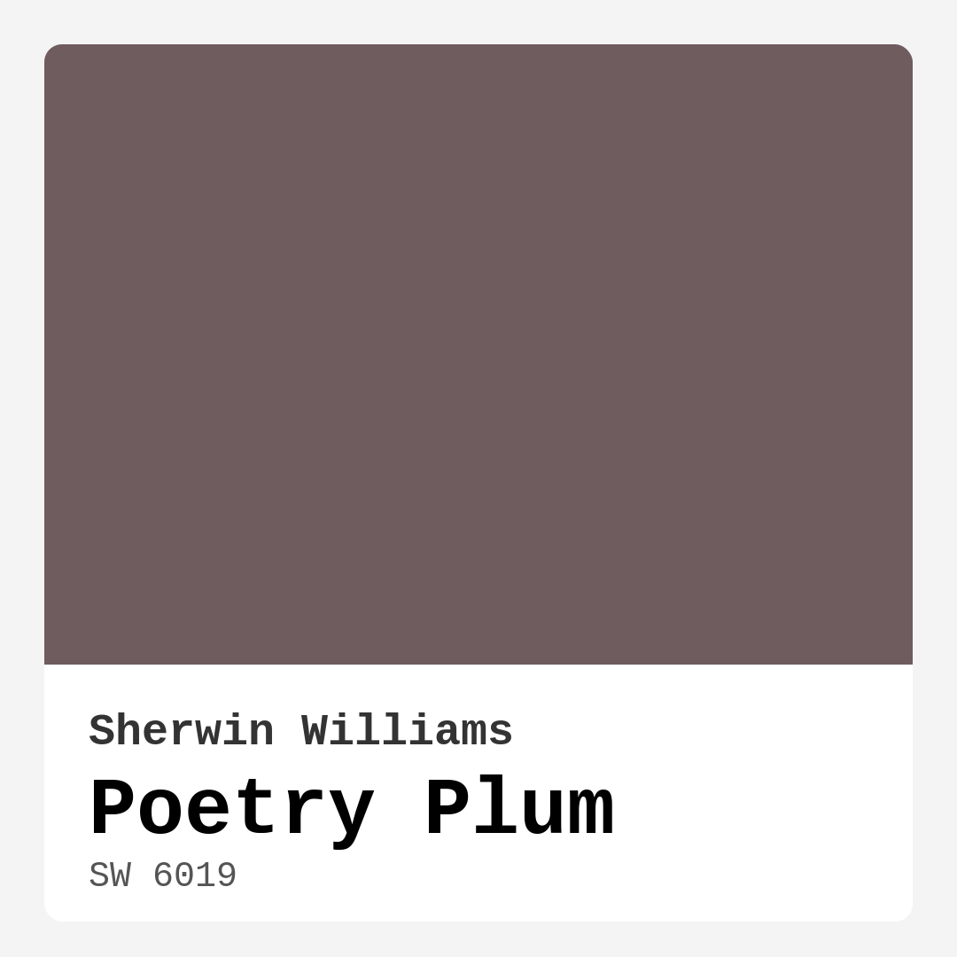
Color Preview & Key Details
| HEX Code | #6F5C5F |
| RGB | 111, 92, 95 |
| LRV | 10% |
| Undertone | Red |
| Finish Options | Eggshell, Matte, Satin |
Imagine walking into a room that instantly wraps you in warmth and elegance. You’re greeted by a rich, muted plum hue that feels both inviting and sophisticated. That’s the magic of Poetry Plum by Sherwin Williams. This color isn’t just a shade on the wall; it’s an experience, a mood, and a beautiful backdrop for your life.
Poetry Plum (SW 6019) is a deep, warm paint color with undertones of red that brings a unique charm to any space. Its hex code #6F5C5F suggests a blend of richness and warmth that can create a cozy atmosphere while maintaining an air of sophistication. With a Light Reflectance Value (LRV) of just 10%, it falls into the darker category of colors, which means it absorbs light rather than reflecting it. This characteristic makes it perfect for creating intimate spaces, especially in rooms where you want to unwind or entertain.
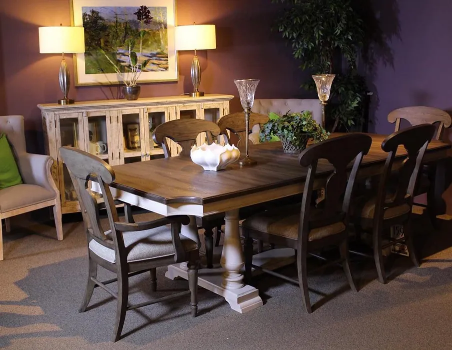
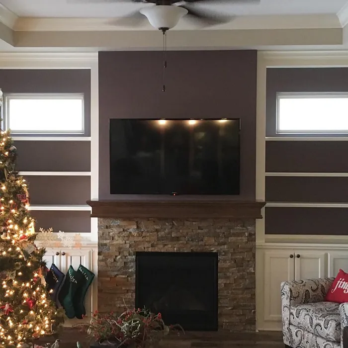
One of the standout features of Poetry Plum is its versatility. Whether you’re designing a modern living room, a rustic dining area, or a bohemian bedroom, this shade adapts beautifully. It harmonizes with a variety of furnishings and decor styles. Picture it as the backdrop for a sleek, contemporary sofa or a vintage dining table—either way, it enhances the beauty of your space.
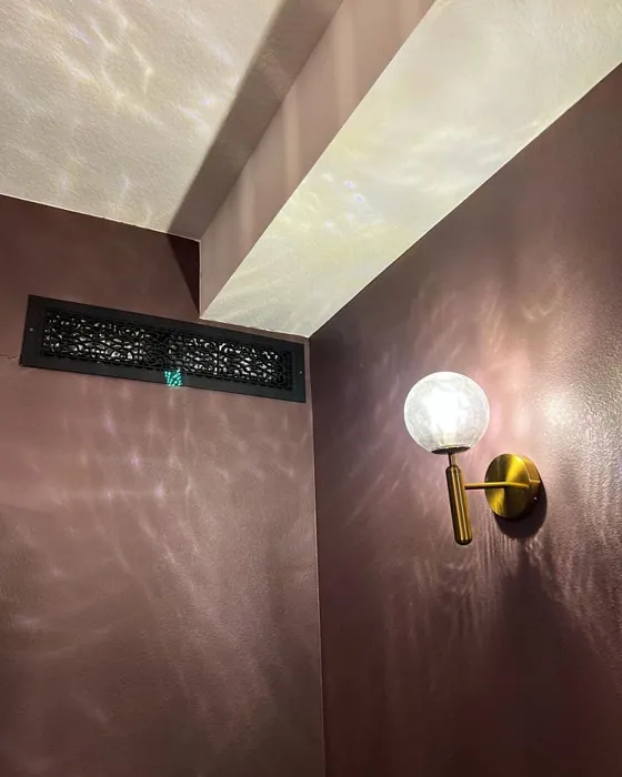
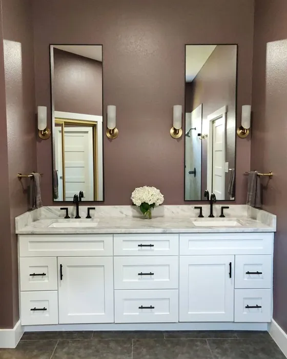
For those who might be hesitant about using a darker color, let me assure you that Poetry Plum can work wonders, even in smaller areas. It’s all about balance. Pair it with good lighting and lighter decor elements, and you’ll find that this rich hue doesn’t overwhelm but rather invites and comforts. An accent wall painted in Poetry Plum can be a stunning focal point, especially when complemented with soft white trim or brass fixtures that add a touch of elegance.
When it comes to finishes, you have options. Poetry Plum looks gorgeous in matte for a velvety feel, or you could opt for eggshell or satin if you need something more durable, especially in high-traffic areas. These finishes enhance the color’s beauty while adding practicality, making it easy to clean and maintain. Plus, with its low VOC formulation, you can feel good about your choice for the environment and your indoor air quality.
Let’s talk about mood. The warm, deep nature of Poetry Plum creates a cozy, sophisticated vibe that’s perfect for living rooms and bedrooms. It invites conversation, relaxation, and connection. Imagine hosting friends in a space that feels both lively and intimate, or curling up with a good book in a reading nook enveloped in this beautiful hue. The warmth of Poetry Plum makes it an ideal choice for social spaces like dining rooms, where you want to create an inviting atmosphere.
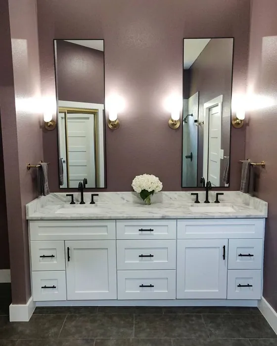
But what happens when the light dims? The beauty of Poetry Plum is its ability to shift with the light throughout the day. In natural light, it reveals a more vibrant plum tone, showcasing its rich depth. In the evening or in dimmer lighting, it takes on a moody quality that can make any room feel more intimate. This dynamic makes it a favorite among homeowners and designers alike, as it can cater to different needs and moods throughout the day.
Now, if you’re wondering how to pair Poetry Plum with other colors, you’re in luck. This color works well with a variety of complementary shades. Consider using it alongside lighter tones like White Dove or softer greens for a balanced palette. You could also incorporate darker shades from the Sherwin Williams palette, such as SW 6224 or SW 9137, to create a layered look. The key is to play with contrast and harmony, ensuring that the overall scheme feels cohesive and inviting.
When it comes to application, Poetry Plum is beginner-friendly. It’s roller-ready and brush smooth, making it easy for anyone to tackle a painting project. Whether you’re a seasoned DIYer or a first-time painter, you’ll find that it covers well with just one or two coats and is incredibly touch-up friendly. This ease of application means you can transform your space without the hassle, making it a perfect choice for busy homeowners.
Of course, it’s essential to consider the lighting in your space when choosing Poetry Plum. In rooms with limited natural light, this color can feel even darker, so be mindful of how it interacts with your existing decor and furnishings. If you’re concerned about it making a small space feel enclosed, consider using it strategically—perhaps as an accent wall or on furniture pieces rather than all four walls.
If you’re intrigued by Poetry Plum but not quite ready to commit, why not try it in small doses? Use it on a piece of furniture or as an accent color with decor elements like pillows or art. This way, you can test how it feels in your space before fully embracing it as a wall color.
In conclusion, Poetry Plum is more than just a paint color; it’s a statement. It brings warmth, sophistication, and versatility to your home, making it suitable for various spaces and styles. Whether you want to create a cozy reading nook, an elegant dining room, or a serene bedroom, this rich plum shade will enhance the beauty of your interiors. Don’t hesitate to explore the possibilities this captivating color offers; embrace the warmth and elegance of Poetry Plum and watch your space transform into something truly special.
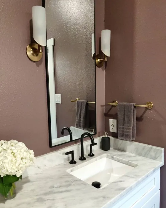
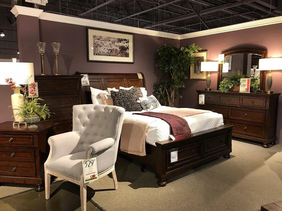
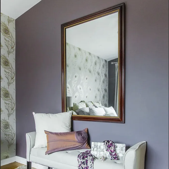
Real Room Photo of Poetry Plum SW 6019
Undertones of Poetry Plum ?
The undertones of Poetry Plum are a key aspect of its character, leaning towards Red. These subtle underlying hues are what give the color its depth and complexity. For example, a gray with a blue undertone will feel cooler and more modern, while one with a brown undertone will feel warmer and more traditional. It’s essential to test this paint in your home and observe it next to your existing furniture, flooring, and decor to see how these undertones interact and reveal themselves throughout the day.
HEX value: #6F5C5F
RGB code: 111, 92, 95
Is Poetry Plum Cool or Warm?
Poetry Plum is considered a warm paint color. This characteristic plays a huge role in the overall feel of a room. Warm colors, like this one, tend to create a cozy, inviting, and energetic atmosphere, making them great for social spaces like living rooms and dining rooms. In contrast, cool colors often evoke a sense of calm and serenity, which is why they are popular in bedrooms and bathrooms. The warmth of Poetry Plum means it will pair beautifully with corresponding decor elements.
Understanding Color Properties and Interior Design Tips
Hue refers to a specific position on the color wheel, measured in degrees from 0 to 360. Each degree represents a different pure color:
- 0° represents red
- 120° represents green
- 240° represents blue
Saturation describes the intensity or purity of a color and is expressed as a percentage:
- At 0%, the color appears completely desaturated—essentially a shade of gray
- At 100%, the color is at its most vivid and vibrant
Lightness indicates how light or dark a color is, also expressed as a percentage:
- 0% lightness results in black
- 100% lightness results in white
Using Warm Colors in Interior Design
Warm hues—such as reds, oranges, yellows, warm beiges, and greiges—are excellent choices for creating inviting and energetic spaces. These colors are particularly well-suited for:
- Kitchens, living rooms, and bathrooms, where warmth enhances comfort and sociability
- Large rooms, where warm tones can help reduce the sense of emptiness and make the space feel more intimate
For example:
- Warm beige shades provide a cozy, inviting atmosphere, ideal for living rooms, bedrooms, and hallways.
- Warm greige (a mix of beige and gray) offers the warmth of beige with the modern appeal of gray, making it a versatile backdrop for dining areas, bedrooms, and living spaces.
However, be mindful when using warm light tones in rooms with limited natural light. These shades may appear muted or even take on an unpleasant yellowish tint. To avoid a dull or flat appearance:
- Add depth by incorporating richer tones like deep greens, charcoal, or chocolate brown
- Use textured elements such as curtains, rugs, or cushions to bring dimension to the space
Pro Tip: Achieving Harmony with Warm and Cool Color Balance
To create a well-balanced and visually interesting interior, mix warm and cool tones strategically. This contrast adds depth and harmony to your design.
- If your walls feature warm hues, introduce cool-colored accents such as blue or green furniture, artwork, or accessories to create contrast.
- For a polished look, consider using a complementary color scheme, which pairs colors opposite each other on the color wheel (e.g., red with green, orange with blue).
This thoughtful mix not only enhances visual appeal but also creates a space that feels both dynamic and cohesive.
Light Temperature Affects on Poetry Plum
Natural Light
Natural daylight changes in color temperature as the sun moves across the sky. At sunrise and sunset, the light tends to have a warm, golden tone with a color temperature around 2000 Kelvin (K). As the day progresses and the sun rises higher, the light becomes cooler and more neutral. Around midday, especially when the sky is clear, natural light typically reaches its peak brightness and shifts to a cooler tone, ranging from 5500 to 6500 Kelvin. This midday light is close to what we perceive as pure white or daylight-balanced light.
These shifts in natural light can significantly influence how colors appear in a space, which is why designers often consider both the time of day and the orientation of windows when planning interior color schemes.
Artificial Light
When choosing artificial lighting, pay close attention to the color temperature, measured in Kelvin (K). This determines how warm or cool the light will appear. Lower temperatures, around 2700K, give off a warm, yellow glow often used in living rooms or bedrooms. Higher temperatures, above 5000K, create a cool, bluish light similar to daylight, commonly used in kitchens, offices, or task areas.
Use the slider to see how lighting temperature can affect the appearance of a surface or color throughout a space.


4800K
LRV of Poetry Plum
The Light Reflectance Value (LRV) of Poetry Plum is 10%, which places it in the Dark colors category. This means it does not reflect light. Understanding a paint’s LRV is crucial for predicting how it will look in your space. A higher LRV indicates a lighter color that reflects more light, making rooms feel larger and brighter. A lower LRV signifies a darker color that absorbs more light, creating a cozier, more intimate atmosphere. Always consider the natural and artificial lighting in your room when selecting a paint color based on its LRV.
Detailed Review of Poetry Plum
Additional Paint Characteristics
Ideal Rooms
Bedroom, Dining Room, Home Office, Living Room
Decor Styles
Bohemian, Modern, Rustic, Transitional
Coverage
Good (1–2 Coats), Touch-Up Friendly
Ease of Application
Beginner Friendly, Brush Smooth, Roller-Ready
Washability
Highly Washable, Washable
VOC Level
Low VOC
Best Use
Accent Wall, Furniture, Interior Walls
Room Suitability
Bedroom, Dining Room, Home Office, Living Room
Tone Tag
Deep, Muted, Warm
Finish Type
Eggshell, Matte, Satin
Paint Performance
Easy Touch-Up, High Coverage, Low Odor
Use Cases
Best for Low Light Rooms, Best for Small Spaces, Designer Favorite
Mood
Cozy, Inviting, Sophisticated
Trim Pairing
Complements Brass Fixtures, Pairs with White Dove, Works with Warm Trim
Poetry Plum is a captivating shade that brings a sense of elegance to any room. The muted quality of this color allows it to harmonize beautifully with both light and dark furnishings. Whether you’re looking to create a cozy reading nook or a vibrant accent wall, this color adapts seamlessly to various decor styles. One of its standout features is its ability to enhance natural light in a room, making spaces feel warm and inviting without overwhelming the senses. Its versatility allows it to work well in both modern and traditional settings, making it a favorite among homeowners and designers alike.
Pros & Cons of SW 6019 Poetry Plum
Pros
Cons
Colors that go with Sherwin Williams Poetry Plum
FAQ on SW 6019 Poetry Plum
Can Poetry Plum be used in smaller spaces?
Absolutely! While Poetry Plum is a darker shade, it can be used in smaller spaces if balanced with adequate lighting and lighter decor elements. Consider using it on an accent wall or in combination with lighter furnishings to prevent the space from feeling too enclosed.
What finishes are recommended for Poetry Plum?
Poetry Plum works well in a variety of finishes, including matte for a soft, velvety look or satin for a subtle sheen. If you’re using it in high-traffic areas, a satin or eggshell finish can provide durability while still showcasing the beauty of the color.
Comparisons Poetry Plum with other colors
Poetry Plum SW 6019 vs Exclusive Plum SW 6263
| Attribute | Poetry Plum SW 6019 | Exclusive Plum SW 6263 |
|---|---|---|
| Color Name | Poetry Plum SW 6019 | Exclusive Plum SW 6263 |
| Color | ||
| Hue | Purple | Purple |
| Brightness | Dark | Dark |
| RGB | 111, 92, 95 | 115, 111, 120 |
| LRV | 10% | 15% |
| Finish Type | Eggshell, Matte, Satin | Eggshell, Matte, Satin |
| Finish Options | Eggshell, Matte, Satin | Eggshell, Matte, Satin |
| Ideal Rooms | Bedroom, Dining Room, Home Office, Living Room | Bedroom, Dining Room, Home Office, Living Room |
| Decor Styles | Bohemian, Modern, Rustic, Transitional | Contemporary, Eclectic, Modern, Traditional |
| Coverage | Good (1–2 Coats), Touch-Up Friendly | Good (1–2 Coats), Touch-Up Friendly |
| Ease of Application | Beginner Friendly, Brush Smooth, Roller-Ready | Beginner Friendly, Brush Smooth, Fast-Drying, Roller-Ready |
| Washability | Highly Washable, Washable | Washable, Wipeable |
| Room Suitability | Bedroom, Dining Room, Home Office, Living Room | Bedroom, Dining Room, Home Office, Living Room |
| Tone | Deep, Muted, Warm | Deep, Dusty, Warm |
| Paint Performance | Easy Touch-Up, High Coverage, Low Odor | Easy Touch-Up, High Coverage, Low Odor |
Poetry Plum SW 6019 vs Blackberry SW 7577
| Attribute | Poetry Plum SW 6019 | Blackberry SW 7577 |
|---|---|---|
| Color Name | Poetry Plum SW 6019 | Blackberry SW 7577 |
| Color | ||
| Hue | Purple | Purple |
| Brightness | Dark | Dark |
| RGB | 111, 92, 95 | 83, 54, 64 |
| LRV | 10% | 5% |
| Finish Type | Eggshell, Matte, Satin | Eggshell, Matte |
| Finish Options | Eggshell, Matte, Satin | Eggshell, Matte, Satin |
| Ideal Rooms | Bedroom, Dining Room, Home Office, Living Room | Bedroom, Dining Room, Home Office, Living Room |
| Decor Styles | Bohemian, Modern, Rustic, Transitional | Bohemian, Contemporary, Modern, Rustic |
| Coverage | Good (1–2 Coats), Touch-Up Friendly | Good (1–2 Coats), Touch-Up Friendly |
| Ease of Application | Beginner Friendly, Brush Smooth, Roller-Ready | Beginner Friendly, Brush Smooth, Roller-Ready |
| Washability | Highly Washable, Washable | Washable, Wipeable |
| Room Suitability | Bedroom, Dining Room, Home Office, Living Room | Bedroom, Dining Room, Home Office, Living Room |
| Tone | Deep, Muted, Warm | Deep, Moody, Warm |
| Paint Performance | Easy Touch-Up, High Coverage, Low Odor | Easy Touch-Up, High Coverage, Low Odor |
Poetry Plum SW 6019 vs Expressive Plum SW 6271
| Attribute | Poetry Plum SW 6019 | Expressive Plum SW 6271 |
|---|---|---|
| Color Name | Poetry Plum SW 6019 | Expressive Plum SW 6271 |
| Color | ||
| Hue | Purple | Purple |
| Brightness | Dark | Dark |
| RGB | 111, 92, 95 | 105, 92, 98 |
| LRV | 10% | 15% |
| Finish Type | Eggshell, Matte, Satin | Eggshell, Matte, Satin |
| Finish Options | Eggshell, Matte, Satin | Eggshell, Matte, Satin |
| Ideal Rooms | Bedroom, Dining Room, Home Office, Living Room | Bedroom, Dining Room, Home Office, Living Room |
| Decor Styles | Bohemian, Modern, Rustic, Transitional | Eclectic, Modern, Traditional, Transitional |
| Coverage | Good (1–2 Coats), Touch-Up Friendly | Good (1–2 Coats) |
| Ease of Application | Beginner Friendly, Brush Smooth, Roller-Ready | Beginner Friendly, Brush Smooth, Roller-Ready |
| Washability | Highly Washable, Washable | Washable, Wipeable |
| Room Suitability | Bedroom, Dining Room, Home Office, Living Room | Bedroom, Dining Room, Home Office, Living Room |
| Tone | Deep, Muted, Warm | Deep, Muted, Warm |
| Paint Performance | Easy Touch-Up, High Coverage, Low Odor | Easy Touch-Up, High Coverage, Low Odor |
Poetry Plum SW 6019 vs Plum Brown SW 6272
| Attribute | Poetry Plum SW 6019 | Plum Brown SW 6272 |
|---|---|---|
| Color Name | Poetry Plum SW 6019 | Plum Brown SW 6272 |
| Color | ||
| Hue | Purple | Purple |
| Brightness | Dark | Dark |
| RGB | 111, 92, 95 | 78, 66, 71 |
| LRV | 10% | 6% |
| Finish Type | Eggshell, Matte, Satin | Eggshell, Matte, Satin |
| Finish Options | Eggshell, Matte, Satin | Eggshell, Matte, Satin |
| Ideal Rooms | Bedroom, Dining Room, Home Office, Living Room | Bedroom, Dining Room, Home Office, Living Room |
| Decor Styles | Bohemian, Modern, Rustic, Transitional | Eclectic, Modern, Rustic, Traditional |
| Coverage | Good (1–2 Coats), Touch-Up Friendly | Good (1–2 Coats), Touch-Up Friendly |
| Ease of Application | Beginner Friendly, Brush Smooth, Roller-Ready | Beginner Friendly, Brush Smooth, Roller-Ready |
| Washability | Highly Washable, Washable | Washable, Wipeable |
| Room Suitability | Bedroom, Dining Room, Home Office, Living Room | Bedroom, Dining Room, Home Office, Living Room |
| Tone | Deep, Muted, Warm | Deep, Earthy, Warm |
| Paint Performance | Easy Touch-Up, High Coverage, Low Odor | Easy Touch-Up, High Coverage, Low Odor |
Poetry Plum SW 6019 vs Soulmate SW 6270
| Attribute | Poetry Plum SW 6019 | Soulmate SW 6270 |
|---|---|---|
| Color Name | Poetry Plum SW 6019 | Soulmate SW 6270 |
| Color | ||
| Hue | Purple | Purple |
| Brightness | Dark | Dark |
| RGB | 111, 92, 95 | 133, 119, 123 |
| LRV | 10% | 24% |
| Finish Type | Eggshell, Matte, Satin | Eggshell, Matte, Satin |
| Finish Options | Eggshell, Matte, Satin | Eggshell, Matte, Satin |
| Ideal Rooms | Bedroom, Dining Room, Home Office, Living Room | Bedroom, Hallway, Home Office, Living Room |
| Decor Styles | Bohemian, Modern, Rustic, Transitional | Bohemian, Modern, Rustic, Transitional |
| Coverage | Good (1–2 Coats), Touch-Up Friendly | Good (1–2 Coats), Touch-Up Friendly |
| Ease of Application | Beginner Friendly, Brush Smooth, Roller-Ready | Beginner Friendly, Brush Smooth, Roller-Ready |
| Washability | Highly Washable, Washable | Washable, Wipeable |
| Room Suitability | Bedroom, Dining Room, Home Office, Living Room | Bedroom, Hallway, Home Office, Living Room |
| Tone | Deep, Muted, Warm | Earthy, Muted, Warm |
| Paint Performance | Easy Touch-Up, High Coverage, Low Odor | Easy Touch-Up, Low Odor, Quick Drying |
Poetry Plum SW 6019 vs Quixotic Plum SW 6265
| Attribute | Poetry Plum SW 6019 | Quixotic Plum SW 6265 |
|---|---|---|
| Color Name | Poetry Plum SW 6019 | Quixotic Plum SW 6265 |
| Color | ||
| Hue | Purple | Purple |
| Brightness | Dark | Dark |
| RGB | 111, 92, 95 | 74, 70, 83 |
| LRV | 10% | 12% |
| Finish Type | Eggshell, Matte, Satin | Eggshell, Matte, Satin |
| Finish Options | Eggshell, Matte, Satin | Eggshell, Matte, Satin |
| Ideal Rooms | Bedroom, Dining Room, Home Office, Living Room | Bedroom, Dining Room, Home Office, Living Room |
| Decor Styles | Bohemian, Modern, Rustic, Transitional | Bohemian, Contemporary, Eclectic, Modern, Traditional |
| Coverage | Good (1–2 Coats), Touch-Up Friendly | Good (1–2 Coats), Touch-Up Friendly |
| Ease of Application | Beginner Friendly, Brush Smooth, Roller-Ready | Brush Smooth, Fast-Drying, Roller-Ready |
| Washability | Highly Washable, Washable | Highly Washable, Washable |
| Room Suitability | Bedroom, Dining Room, Home Office, Living Room | Bedroom, Dining Room, Home Office, Living Room |
| Tone | Deep, Muted, Warm | Deep, Moody, Warm |
| Paint Performance | Easy Touch-Up, High Coverage, Low Odor | High Coverage, Low Odor, Scuff Resistant |
Poetry Plum SW 6019 vs Midnight SW 6264
| Attribute | Poetry Plum SW 6019 | Midnight SW 6264 |
|---|---|---|
| Color Name | Poetry Plum SW 6019 | Midnight SW 6264 |
| Color | ||
| Hue | Purple | Purple |
| Brightness | Dark | Dark |
| RGB | 111, 92, 95 | 93, 89, 98 |
| LRV | 10% | 6% |
| Finish Type | Eggshell, Matte, Satin | Eggshell, Matte, Satin |
| Finish Options | Eggshell, Matte, Satin | Eggshell, Matte, Satin |
| Ideal Rooms | Bedroom, Dining Room, Home Office, Living Room | Bedroom, Dining Room, Hallway, Home Office, Living Room |
| Decor Styles | Bohemian, Modern, Rustic, Transitional | Bohemian, Contemporary, Industrial, Modern |
| Coverage | Good (1–2 Coats), Touch-Up Friendly | Good (1–2 Coats), High Hide, Touch-Up Friendly |
| Ease of Application | Beginner Friendly, Brush Smooth, Roller-Ready | Beginner Friendly, Brush Smooth, Roller-Ready |
| Washability | Highly Washable, Washable | Scrubbable, Stain Resistant, Washable |
| Room Suitability | Bedroom, Dining Room, Home Office, Living Room | Bedroom, Dining Room, Home Office, Living Room |
| Tone | Deep, Muted, Warm | Balanced, Deep, Moody |
| Paint Performance | Easy Touch-Up, High Coverage, Low Odor | Easy Touch-Up, Long Lasting, Low Odor, Scuff Resistant |
Poetry Plum SW 6019 vs Framboise SW 6566
| Attribute | Poetry Plum SW 6019 | Framboise SW 6566 |
|---|---|---|
| Color Name | Poetry Plum SW 6019 | Framboise SW 6566 |
| Color | ||
| Hue | Purple | Purple |
| Brightness | Dark | Dark |
| RGB | 111, 92, 95 | 124, 54, 85 |
| LRV | 10% | 6% |
| Finish Type | Eggshell, Matte, Satin | Matte, Satin, Semi-Gloss |
| Finish Options | Eggshell, Matte, Satin | Matte, Satin, Semi-Gloss |
| Ideal Rooms | Bedroom, Dining Room, Home Office, Living Room | Bedroom, Dining Room, Home Office, Living Room |
| Decor Styles | Bohemian, Modern, Rustic, Transitional | Bohemian, Contemporary, Eclectic, Modern |
| Coverage | Good (1–2 Coats), Touch-Up Friendly | Good (1–2 Coats), Touch-Up Friendly |
| Ease of Application | Beginner Friendly, Brush Smooth, Roller-Ready | Beginner Friendly, Brush Smooth, Fast-Drying, Roller-Ready |
| Washability | Highly Washable, Washable | Highly Washable, Washable |
| Room Suitability | Bedroom, Dining Room, Home Office, Living Room | Bedroom, Dining Room, Home Office, Living Room |
| Tone | Deep, Muted, Warm | Bold, Deep, Warm |
| Paint Performance | Easy Touch-Up, High Coverage, Low Odor | Easy Touch-Up, High Coverage, Low Odor, Quick Drying |
Poetry Plum SW 6019 vs Mature Grape SW 6286
| Attribute | Poetry Plum SW 6019 | Mature Grape SW 6286 |
|---|---|---|
| Color Name | Poetry Plum SW 6019 | Mature Grape SW 6286 |
| Color | ||
| Hue | Purple | Purple |
| Brightness | Dark | Dark |
| RGB | 111, 92, 95 | 95, 63, 84 |
| LRV | 10% | 15% |
| Finish Type | Eggshell, Matte, Satin | Eggshell, Matte, Satin |
| Finish Options | Eggshell, Matte, Satin | Eggshell, Matte, Satin |
| Ideal Rooms | Bedroom, Dining Room, Home Office, Living Room | Bedroom, Dining Room, Home Office, Living Room |
| Decor Styles | Bohemian, Modern, Rustic, Transitional | Art Deco, Bohemian, Modern, Rustic |
| Coverage | Good (1–2 Coats), Touch-Up Friendly | Good (1–2 Coats), Touch-Up Friendly |
| Ease of Application | Beginner Friendly, Brush Smooth, Roller-Ready | Brush Smooth, Fast-Drying, Roller-Ready |
| Washability | Highly Washable, Washable | Stain Resistant, Washable, Wipeable |
| Room Suitability | Bedroom, Dining Room, Home Office, Living Room | Bedroom, Dining Room, Home Office, Living Room |
| Tone | Deep, Muted, Warm | Deep, Earthy, Warm |
| Paint Performance | Easy Touch-Up, High Coverage, Low Odor | Easy Touch-Up, Low Odor, Stain Resistant |
Poetry Plum SW 6019 vs Patchwork Plum SW 0022
| Attribute | Poetry Plum SW 6019 | Patchwork Plum SW 0022 |
|---|---|---|
| Color Name | Poetry Plum SW 6019 | Patchwork Plum SW 0022 |
| Color | ||
| Hue | Purple | Purple |
| Brightness | Dark | Dark |
| RGB | 111, 92, 95 | 126, 105, 106 |
| LRV | 10% | 10% |
| Finish Type | Eggshell, Matte, Satin | Eggshell, Matte, Satin |
| Finish Options | Eggshell, Matte, Satin | Eggshell, Matte, Satin |
| Ideal Rooms | Bedroom, Dining Room, Home Office, Living Room | Bedroom, Dining Room, Home Office, Living Room |
| Decor Styles | Bohemian, Modern, Rustic, Transitional | Eclectic, Modern Farmhouse, Rustic, Transitional |
| Coverage | Good (1–2 Coats), Touch-Up Friendly | Good (1–2 Coats), Touch-Up Friendly |
| Ease of Application | Beginner Friendly, Brush Smooth, Roller-Ready | Beginner Friendly, Brush Smooth, Roll-Ready |
| Washability | Highly Washable, Washable | Washable, Wipeable |
| Room Suitability | Bedroom, Dining Room, Home Office, Living Room | Bedroom, Dining Room, Home Office, Living Room |
| Tone | Deep, Muted, Warm | Earthy, Muted, Warm |
| Paint Performance | Easy Touch-Up, High Coverage, Low Odor | Easy Touch-Up, Fade Resistant, Low Odor |
Official Page of Sherwin Williams Poetry Plum SW 6019