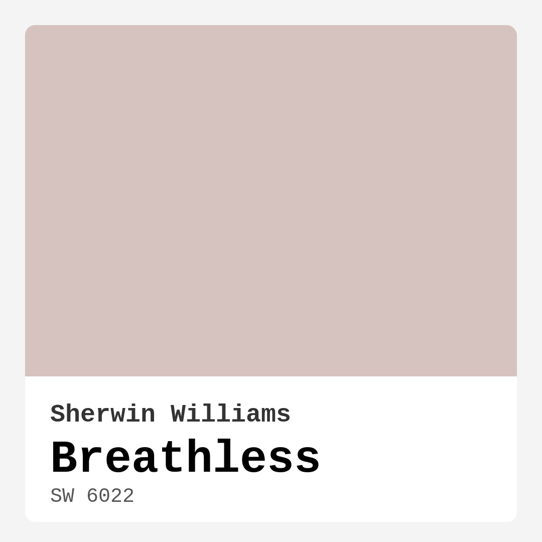
Color Preview & Key Details
| HEX Code | #D6C2BE |
| RGB | 214, 194, 190 |
| LRV | 48% |
| Undertone | Red |
| Finish Options | Eggshell, Matte, Satin |
Imagine walking into a space that instantly makes you feel calm and relaxed, where the colors gently wrap around you like a warm hug. That’s the magic of Breathless, a stunning paint color from Sherwin Williams that’s perfect for creating those cozy retreats in your home. With a lovely soft pink hue, Breathless (SW 6022) brings tranquility and sophistication to any room, making it an ideal choice for your next decorating project.
When you think about Breathless, envision a warm, muted color that embodies the essence of soft sands and delicate blush. It’s that gentle tone that somehow manages to elevate any space while remaining understated. This characteristic makes it a versatile option for various decor styles, whether you’re leaning towards modern, rustic, Scandinavian, or bohemian aesthetics.
One of the first things to consider is how Breathless interacts with light in your home. With a Light Reflectance Value (LRV) of 48%, it sits comfortably in the medium range, reflecting a moderate amount of light. In bright, natural light, the color reveals its soft, airy qualities, making your rooms feel open and inviting. Under artificial lighting, it maintains a warm glow that creates a soothing atmosphere, perfect for unwinding after a long day.
The undertones of Breathless are particularly notable, leaning towards a soft red that adds depth and warmth to the color. These subtle hues are key to its character and can significantly affect how the color looks in your space. For instance, if you have existing furniture or flooring, it’s essential to test Breathless next to those elements. You’ll want to see how the undertones interact throughout the day as the natural light shifts.
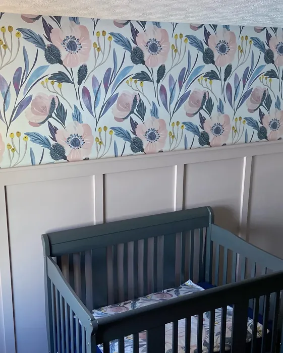
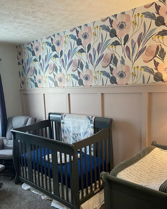
Now, let’s talk about where you could use Breathless effectively. It’s a fantastic choice for living rooms, bedrooms, home offices, and even nurseries. Imagine a serene bedroom painted in Breathless, where the gentle color promotes relaxation and tranquility, or a cozy living room that invites family gatherings with its warm ambiance. The versatility of this paint means it can serve as a lovely backdrop for your decor, allowing your furniture and accessories to shine.
Breathless also pairs beautifully with a range of complementary shades. Consider combining it with whites like White Dove or Pure White for trim, which can enhance its elegance while providing a clean contrast. If you want to add a little more color to the mix, you could consider earthy greens or deeper pinks to create a harmonious palette. This versatility makes it easy to create a cohesive look that feels curated and stylish.
Application is another area where Breathless shines. It’s beginner-friendly, meaning even if you’re not a seasoned DIYer, you can achieve a beautiful finish. The smooth application process, whether you’re using a roller or brush, ensures that you won’t be left with unsightly streaks or patches. Most surfaces will require just one to two coats for complete coverage, although you might find yourself needing an additional coat if you’re painting over a darker color. Just be sure to prepare your surfaces well, as that will make a significant difference in the final outcome.
Another great feature of Breathless is its washability. This low-VOC paint is not only eco-certified but also easy to clean, making it a practical choice for spaces that might experience wear and tear, like family rooms or kids’ play areas. That means spills and smudges don’t have to be a worry; just grab a damp cloth and wipe away without losing the beauty of your color.
However, keep in mind that while Breathless is stunning, its lighter shades can show wear over time, especially in high-traffic areas. If you’re considering it for a space that sees a lot of activity, you might want to think about applying a protective finish or selecting a more durable color.
Breathless is also a wonderful option for rentals. If you’re looking to personalize your space without going overboard, this classic hue can easily transform your environment without feeling like a permanent commitment. It’s a color that suits many tastes and styles, so you’ll likely find it blends seamlessly with your existing decor, making it feel like home.
Mood plays a significant role in your home’s atmosphere, and Breathless has a cozy, calm, and inviting vibe. It naturally encourages relaxation, making it perfect for rooms where you want to unwind, such as bedrooms and reading nooks. The soft pink undertones provide warmth without being overpowering, making it a comforting choice.
When planning your project, think about the finishes you want to use with Breathless. It’s available in matte, eggshell, and satin finishes, allowing you to choose the level of sheen that best suits your space. A matte finish can give you a soft, velvety look, while eggshell or satin can provide a bit more sheen, enhancing the color’s warmth and inviting glow.
Let’s not overlook the practical side of things. Breathless is touch-up friendly and scuff-resistant, which is a relief for those of us who might not have the steadiest hands or the most careful kids. It’s a paint that’s designed to hold up and maintain its beauty over time, so you can enjoy your lovely new space without constant upkeep.
As you ponder whether Breathless is the right color for your project, remember that it’s all about how you feel in the space. This color offers a perfect balance of warmth and elegance, creating an inviting atmosphere that feels like a personal retreat. Testing it in your home, observing how the light dances across its surface throughout the day, will help you determine if it’s the perfect match for your vision.
Finally, if you’re looking for an equivalent color, consider Benjamin Moore’s ‘Misty Rose’ or Sherwin-Williams’ ‘Serenity’ for alternative options that carry a similar soft, muted charm.
So, are you ready to breathe new life into your space with Breathless? This soft, muted hue is more than just a paint color; it’s an opportunity to create a serene, stylish environment that reflects your personal taste and brings joy to your everyday life. Whether you go all out or simply use it as an accent, Breathless is sure to leave you feeling inspired.
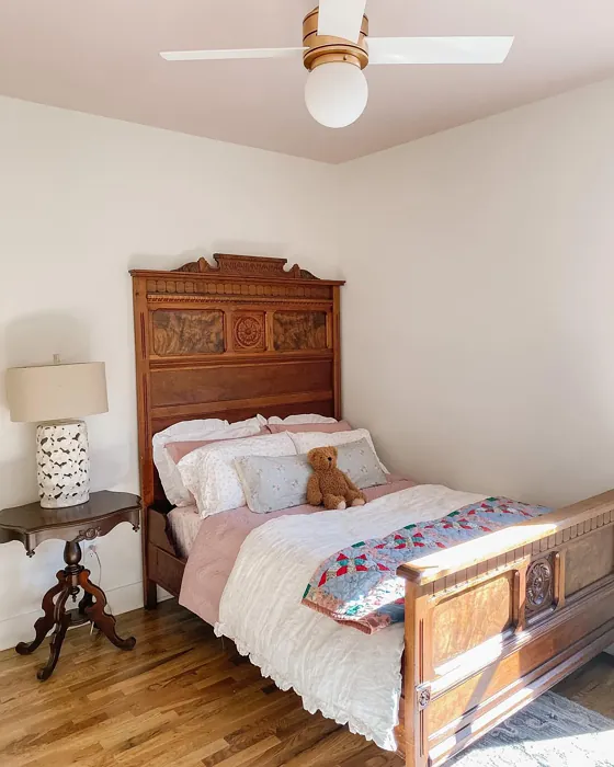
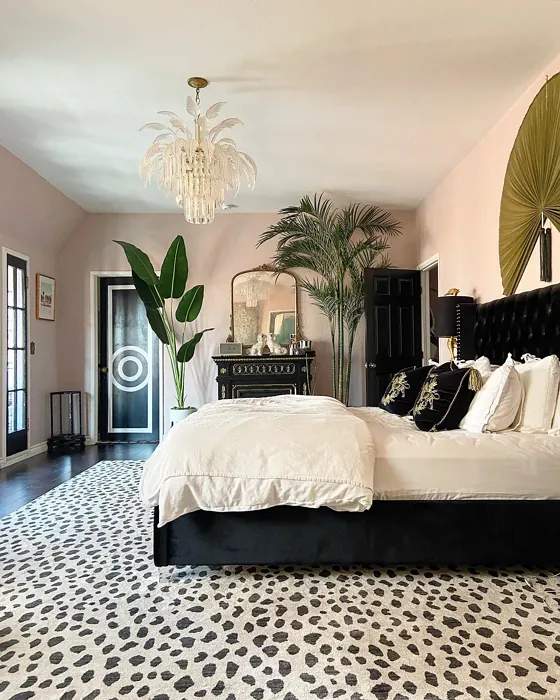
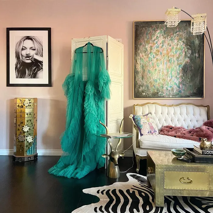
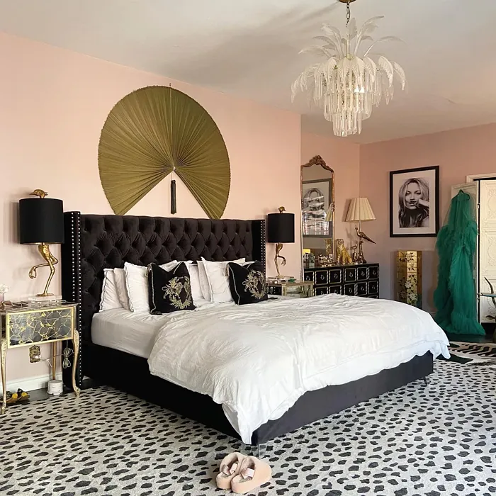
Real Room Photo of Breathless SW 6022


Undertones of Breathless ?
The undertones of Breathless are a key aspect of its character, leaning towards Red. These subtle underlying hues are what give the color its depth and complexity. For example, a gray with a blue undertone will feel cooler and more modern, while one with a brown undertone will feel warmer and more traditional. It’s essential to test this paint in your home and observe it next to your existing furniture, flooring, and decor to see how these undertones interact and reveal themselves throughout the day.
HEX value: #D6C2BE
RGB code: 214, 194, 190
Is Breathless Cool or Warm?
Breathless is primarily warm, with its soft pink undertones giving it a cozy feel. This warmth makes it ideal for enhancing the comfort of spaces like bedrooms and living rooms, where a touch of warmth can create a welcoming environment.
Understanding Color Properties and Interior Design Tips
Hue refers to a specific position on the color wheel, measured in degrees from 0 to 360. Each degree represents a different pure color:
- 0° represents red
- 120° represents green
- 240° represents blue
Saturation describes the intensity or purity of a color and is expressed as a percentage:
- At 0%, the color appears completely desaturated—essentially a shade of gray
- At 100%, the color is at its most vivid and vibrant
Lightness indicates how light or dark a color is, also expressed as a percentage:
- 0% lightness results in black
- 100% lightness results in white
Using Warm Colors in Interior Design
Warm hues—such as reds, oranges, yellows, warm beiges, and greiges—are excellent choices for creating inviting and energetic spaces. These colors are particularly well-suited for:
- Kitchens, living rooms, and bathrooms, where warmth enhances comfort and sociability
- Large rooms, where warm tones can help reduce the sense of emptiness and make the space feel more intimate
For example:
- Warm beige shades provide a cozy, inviting atmosphere, ideal for living rooms, bedrooms, and hallways.
- Warm greige (a mix of beige and gray) offers the warmth of beige with the modern appeal of gray, making it a versatile backdrop for dining areas, bedrooms, and living spaces.
However, be mindful when using warm light tones in rooms with limited natural light. These shades may appear muted or even take on an unpleasant yellowish tint. To avoid a dull or flat appearance:
- Add depth by incorporating richer tones like deep greens, charcoal, or chocolate brown
- Use textured elements such as curtains, rugs, or cushions to bring dimension to the space
Pro Tip: Achieving Harmony with Warm and Cool Color Balance
To create a well-balanced and visually interesting interior, mix warm and cool tones strategically. This contrast adds depth and harmony to your design.
- If your walls feature warm hues, introduce cool-colored accents such as blue or green furniture, artwork, or accessories to create contrast.
- For a polished look, consider using a complementary color scheme, which pairs colors opposite each other on the color wheel (e.g., red with green, orange with blue).
This thoughtful mix not only enhances visual appeal but also creates a space that feels both dynamic and cohesive.
Light Temperature Affects on Breathless
Natural Light
Natural daylight changes in color temperature as the sun moves across the sky. At sunrise and sunset, the light tends to have a warm, golden tone with a color temperature around 2000 Kelvin (K). As the day progresses and the sun rises higher, the light becomes cooler and more neutral. Around midday, especially when the sky is clear, natural light typically reaches its peak brightness and shifts to a cooler tone, ranging from 5500 to 6500 Kelvin. This midday light is close to what we perceive as pure white or daylight-balanced light.
These shifts in natural light can significantly influence how colors appear in a space, which is why designers often consider both the time of day and the orientation of windows when planning interior color schemes.
Artificial Light
When choosing artificial lighting, pay close attention to the color temperature, measured in Kelvin (K). This determines how warm or cool the light will appear. Lower temperatures, around 2700K, give off a warm, yellow glow often used in living rooms or bedrooms. Higher temperatures, above 5000K, create a cool, bluish light similar to daylight, commonly used in kitchens, offices, or task areas.
Use the slider to see how lighting temperature can affect the appearance of a surface or color throughout a space.


4800K
LRV of Breathless
The Light Reflectance Value (LRV) of Breathless is 48%, which places it in the Medium category. This means it Reflects a moderate amount of light. Understanding a paint’s LRV is crucial for predicting how it will look in your space. A higher LRV indicates a lighter color that reflects more light, making rooms feel larger and brighter. A lower LRV signifies a darker color that absorbs more light, creating a cozier, more intimate atmosphere. Always consider the natural and artificial lighting in your room when selecting a paint color based on its LRV.
Detailed Review of Breathless
Additional Paint Characteristics
Ideal Rooms
Bedroom, Dining Room, Home Office, Living Room, Nursery
Decor Styles
Bohemian, Modern, Rustic, Scandinavian
Coverage
Good (1–2 Coats), Touch-Up Friendly
Ease of Application
Beginner Friendly, Brush Smooth, Roller-Ready
Washability
Washable, Wipeable
VOC Level
Eco-Certified, Low VOC
Best Use
Accent Wall, Furniture, Interior Walls
Room Suitability
Bedroom, Home Office, Living Room, Nursery
Tone Tag
Earthy, Muted, Warm
Finish Type
Eggshell, Matte, Satin
Paint Performance
Easy Touch-Up, Low Odor, Scuff Resistant
Use Cases
Best for Low Light Rooms, Best for Rentals, Classic Favorite
Mood
Calm, Cozy, Inviting
Trim Pairing
Complements Cool Trim, Matches Pure White, Pairs with White Dove
Breathless is a paint that truly lives up to its name. The soft, dusty pink undertones create an inviting atmosphere that’s perfect for both relaxation and creativity. Whether you’re painting a nursery or a cozy reading nook, this color complements a range of decor styles, from modern to rustic. Its versatility means it pairs beautifully with both light and dark furnishings, making it a great choice for accent walls or entire rooms. The application process is smooth, resulting in a finish that feels luxurious without being overpowering. Overall, Breathless offers a perfect balance of warmth and elegance, making it a lovely addition to any home.
Pros & Cons of SW 6022 Breathless
Pros
Cons
Colors that go with Sherwin Williams Breathless
FAQ on SW 6022 Breathless
How many coats of Breathless do I need to apply?
For most surfaces, you can expect to use 1 to 2 coats of Breathless for complete coverage. If you’re painting over a darker color, you might need an additional coat to fully achieve the soft look of Breathless. Always remember that proper surface preparation can make a significant difference in the final outcome.
Is Breathless suitable for outdoor use?
Breathless is primarily formulated for indoor use, as it provides a soft, elegant finish that enhances interior spaces. If you’re looking for an exterior paint, consider a more durable, weather-resistant option. However, if you’re set on using Breathless outdoors, ensure it’s on a sheltered area to maintain its beauty longer.
Comparisons Breathless with other colors
Breathless SW 6022 vs Realist Beige SW 6078
| Attribute | Breathless SW 6022 | Realist Beige SW 6078 |
|---|---|---|
| Color Name | Breathless SW 6022 | Realist Beige SW 6078 |
| Color | ||
| Hue | Pink | Pink |
| Brightness | Medium | Medium |
| RGB | 214, 194, 190 | 211, 200, 189 |
| LRV | 48% | 34% |
| Finish Type | Eggshell, Matte, Satin | Eggshell, Matte, Satin |
| Finish Options | Eggshell, Matte, Satin | Eggshell, Matte, Satin |
| Ideal Rooms | Bedroom, Dining Room, Home Office, Living Room, Nursery | Bedroom, Dining Room, Entryway, Home Office, Kitchen, Living Room |
| Decor Styles | Bohemian, Modern, Rustic, Scandinavian | Contemporary, Minimalist, Modern Farmhouse, Rustic, Traditional |
| Coverage | Good (1–2 Coats), Touch-Up Friendly | Good (1–2 Coats), Touch-Up Friendly |
| Ease of Application | Beginner Friendly, Brush Smooth, Roller-Ready | Beginner Friendly, Brush Smooth, Fast-Drying, Roller-Ready |
| Washability | Washable, Wipeable | Washable, Wipeable |
| Room Suitability | Bedroom, Home Office, Living Room, Nursery | Bedroom, Dining Room, Home Office, Kitchen, Living Room |
| Tone | Earthy, Muted, Warm | Earthy, Neutral, Warm |
| Paint Performance | Easy Touch-Up, Low Odor, Scuff Resistant | High Coverage, Low Odor, Quick Drying |
Breathless SW 6022 vs Rosaline Pearl SW 9077
| Attribute | Breathless SW 6022 | Rosaline Pearl SW 9077 |
|---|---|---|
| Color Name | Breathless SW 6022 | Rosaline Pearl SW 9077 |
| Color | ||
| Hue | Pink | Pink |
| Brightness | Medium | Medium |
| RGB | 214, 194, 190 | 163, 136, 135 |
| LRV | 48% | 69% |
| Finish Type | Eggshell, Matte, Satin | Eggshell, Matte |
| Finish Options | Eggshell, Matte, Satin | Eggshell, Matte, Satin |
| Ideal Rooms | Bedroom, Dining Room, Home Office, Living Room, Nursery | Bedroom, Dining Room, Home Office, Living Room |
| Decor Styles | Bohemian, Modern, Rustic, Scandinavian | Bohemian, Contemporary, Modern, Transitional |
| Coverage | Good (1–2 Coats), Touch-Up Friendly | Good (1–2 Coats) |
| Ease of Application | Beginner Friendly, Brush Smooth, Roller-Ready | Beginner Friendly, Brush Smooth, Fast-Drying, Roller-Ready |
| Washability | Washable, Wipeable | Washable, Wipeable |
| Room Suitability | Bedroom, Home Office, Living Room, Nursery | Bedroom, Dining Room, Home Office, Living Room |
| Tone | Earthy, Muted, Warm | Dusty, Muted, Warm |
| Paint Performance | Easy Touch-Up, Low Odor, Scuff Resistant | Easy Touch-Up, Fade Resistant, Low Odor |
Breathless SW 6022 vs Cabbage Rose SW 0003
| Attribute | Breathless SW 6022 | Cabbage Rose SW 0003 |
|---|---|---|
| Color Name | Breathless SW 6022 | Cabbage Rose SW 0003 |
| Color | ||
| Hue | Pink | Pink |
| Brightness | Medium | Medium |
| RGB | 214, 194, 190 | 197, 159, 145 |
| LRV | 48% | 15% |
| Finish Type | Eggshell, Matte, Satin | Eggshell, Matte, Satin |
| Finish Options | Eggshell, Matte, Satin | Eggshell, Matte, Satin |
| Ideal Rooms | Bedroom, Dining Room, Home Office, Living Room, Nursery | Bedroom, Dining Room, Hallway, Living Room, Nursery |
| Decor Styles | Bohemian, Modern, Rustic, Scandinavian | Cottage, Modern Farmhouse, Romantic, Shabby Chic, Vintage |
| Coverage | Good (1–2 Coats), Touch-Up Friendly | Good (1–2 Coats), Touch-Up Friendly |
| Ease of Application | Beginner Friendly, Brush Smooth, Roller-Ready | Beginner Friendly, Brush Smooth, Roller-Ready |
| Washability | Washable, Wipeable | Washable, Wipeable |
| Room Suitability | Bedroom, Home Office, Living Room, Nursery | Bedroom, Dining Room, Hallway, Living Room, Nursery |
| Tone | Earthy, Muted, Warm | Earthy, Muted, Warm |
| Paint Performance | Easy Touch-Up, Low Odor, Scuff Resistant | Easy Touch-Up, Low Odor |
Breathless SW 6022 vs Sashay Sand SW 6051
| Attribute | Breathless SW 6022 | Sashay Sand SW 6051 |
|---|---|---|
| Color Name | Breathless SW 6022 | Sashay Sand SW 6051 |
| Color | ||
| Hue | Pink | Pink |
| Brightness | Medium | Medium |
| RGB | 214, 194, 190 | 207, 180, 168 |
| LRV | 48% | 64% |
| Finish Type | Eggshell, Matte, Satin | Eggshell, Matte, Satin |
| Finish Options | Eggshell, Matte, Satin | Eggshell, Matte, Satin |
| Ideal Rooms | Bedroom, Dining Room, Home Office, Living Room, Nursery | Bedroom, Dining Room, Home Office, Kitchen, Living Room |
| Decor Styles | Bohemian, Modern, Rustic, Scandinavian | Bohemian, Contemporary, Modern Farmhouse, Scandinavian, Transitional |
| Coverage | Good (1–2 Coats), Touch-Up Friendly | Good (1–2 Coats), Touch-Up Friendly |
| Ease of Application | Beginner Friendly, Brush Smooth, Roller-Ready | Beginner Friendly, Fast-Drying, Roller-Ready |
| Washability | Washable, Wipeable | Highly Washable, Washable |
| Room Suitability | Bedroom, Home Office, Living Room, Nursery | Bedroom, Dining Room, Home Office, Kitchen, Living Room |
| Tone | Earthy, Muted, Warm | Earthy, Muted, Warm |
| Paint Performance | Easy Touch-Up, Low Odor, Scuff Resistant | Easy Touch-Up, Low Odor, Quick Drying, Scuff Resistant |
Breathless SW 6022 vs Touch of Sand SW 9085
| Attribute | Breathless SW 6022 | Touch of Sand SW 9085 |
|---|---|---|
| Color Name | Breathless SW 6022 | Touch of Sand SW 9085 |
| Color | ||
| Hue | Pink | Pink |
| Brightness | Medium | Medium |
| RGB | 214, 194, 190 | 213, 199, 186 |
| LRV | 48% | 66% |
| Finish Type | Eggshell, Matte, Satin | Eggshell, Matte, Satin |
| Finish Options | Eggshell, Matte, Satin | Eggshell, Matte, Satin |
| Ideal Rooms | Bedroom, Dining Room, Home Office, Living Room, Nursery | Bathroom, Bedroom, Dining Room, Home Office, Kitchen, Living Room |
| Decor Styles | Bohemian, Modern, Rustic, Scandinavian | Bohemian, Coastal, Contemporary, Modern Farmhouse, Rustic |
| Coverage | Good (1–2 Coats), Touch-Up Friendly | Good (1–2 Coats), Touch-Up Friendly |
| Ease of Application | Beginner Friendly, Brush Smooth, Roller-Ready | Beginner Friendly, Brush Smooth, Fast-Drying, Roller-Ready |
| Washability | Washable, Wipeable | Washable, Wipeable |
| Room Suitability | Bedroom, Home Office, Living Room, Nursery | Bathroom, Bedroom, Dining Room, Home Office, Kitchen, Living Room |
| Tone | Earthy, Muted, Warm | Earthy, Muted, Neutral, Warm |
| Paint Performance | Easy Touch-Up, Low Odor, Scuff Resistant | Easy Touch-Up, Low Odor, Quick Drying, Scuff Resistant |
Breathless SW 6022 vs Pink Shadow SW 0070
| Attribute | Breathless SW 6022 | Pink Shadow SW 0070 |
|---|---|---|
| Color Name | Breathless SW 6022 | Pink Shadow SW 0070 |
| Color | ||
| Hue | Pink | Pink |
| Brightness | Medium | Medium |
| RGB | 214, 194, 190 | 222, 195, 185 |
| LRV | 48% | 45% |
| Finish Type | Eggshell, Matte, Satin | Eggshell, Matte, Satin |
| Finish Options | Eggshell, Matte, Satin | Eggshell, Matte, Satin |
| Ideal Rooms | Bedroom, Dining Room, Home Office, Living Room, Nursery | Bedroom, Dining Room, Home Office, Living Room, Nursery |
| Decor Styles | Bohemian, Modern, Rustic, Scandinavian | Bohemian, Minimalist, Modern Farmhouse, Scandinavian, Traditional |
| Coverage | Good (1–2 Coats), Touch-Up Friendly | Good (1–2 Coats) |
| Ease of Application | Beginner Friendly, Brush Smooth, Roller-Ready | Beginner Friendly, Brush Smooth, Fast-Drying, Roller-Ready |
| Washability | Washable, Wipeable | Washable, Wipeable |
| Room Suitability | Bedroom, Home Office, Living Room, Nursery | Bedroom, Dining Room, Living Room, Nursery |
| Tone | Earthy, Muted, Warm | Muted, Pastel, Warm |
| Paint Performance | Easy Touch-Up, Low Odor, Scuff Resistant | Easy Touch-Up, High Coverage, Low Odor |
Breathless SW 6022 vs Hushed Auburn SW 9080
| Attribute | Breathless SW 6022 | Hushed Auburn SW 9080 |
|---|---|---|
| Color Name | Breathless SW 6022 | Hushed Auburn SW 9080 |
| Color | ||
| Hue | Pink | Pink |
| Brightness | Medium | Medium |
| RGB | 214, 194, 190 | 168, 133, 122 |
| LRV | 48% | 12% |
| Finish Type | Eggshell, Matte, Satin | Eggshell, Matte, Satin |
| Finish Options | Eggshell, Matte, Satin | Eggshell, Matte, Satin |
| Ideal Rooms | Bedroom, Dining Room, Home Office, Living Room, Nursery | Bedroom, Dining Room, Home Office, Living Room |
| Decor Styles | Bohemian, Modern, Rustic, Scandinavian | Contemporary, Modern Farmhouse, Rustic, Transitional |
| Coverage | Good (1–2 Coats), Touch-Up Friendly | Good (1–2 Coats), Touch-Up Friendly |
| Ease of Application | Beginner Friendly, Brush Smooth, Roller-Ready | Beginner Friendly, Brush Smooth, Fast-Drying, Roller-Ready |
| Washability | Washable, Wipeable | Washable, Wipeable |
| Room Suitability | Bedroom, Home Office, Living Room, Nursery | Bedroom, Dining Room, Home Office, Living Room |
| Tone | Earthy, Muted, Warm | Earthy, Muted, Warm |
| Paint Performance | Easy Touch-Up, Low Odor, Scuff Resistant | Easy Touch-Up, High Coverage, Low Odor |
Breathless SW 6022 vs Likeable Sand SW 6058
| Attribute | Breathless SW 6022 | Likeable Sand SW 6058 |
|---|---|---|
| Color Name | Breathless SW 6022 | Likeable Sand SW 6058 |
| Color | ||
| Hue | Pink | Pink |
| Brightness | Medium | Medium |
| RGB | 214, 194, 190 | 209, 183, 168 |
| LRV | 48% | 61% |
| Finish Type | Eggshell, Matte, Satin | Eggshell, Matte, Satin |
| Finish Options | Eggshell, Matte, Satin | Eggshell, Matte, Satin |
| Ideal Rooms | Bedroom, Dining Room, Home Office, Living Room, Nursery | Bedroom, Dining Room, Home Office, Kitchen, Living Room |
| Decor Styles | Bohemian, Modern, Rustic, Scandinavian | Bohemian, Coastal, Contemporary, Modern Farmhouse, Rustic |
| Coverage | Good (1–2 Coats), Touch-Up Friendly | Good (1–2 Coats), Touch-Up Friendly |
| Ease of Application | Beginner Friendly, Brush Smooth, Roller-Ready | Beginner Friendly, Brush Smooth, Fast-Drying, Roller-Ready |
| Washability | Washable, Wipeable | Washable, Wipeable |
| Room Suitability | Bedroom, Home Office, Living Room, Nursery | Bedroom, Dining Room, Home Office, Kitchen, Living Room |
| Tone | Earthy, Muted, Warm | Earthy, Muted, Warm |
| Paint Performance | Easy Touch-Up, Low Odor, Scuff Resistant | Easy Touch-Up, Low Odor, Quick Drying |
Breathless SW 6022 vs Glamour SW 6031
| Attribute | Breathless SW 6022 | Glamour SW 6031 |
|---|---|---|
| Color Name | Breathless SW 6022 | Glamour SW 6031 |
| Color | ||
| Hue | Pink | Pink |
| Brightness | Medium | Medium |
| RGB | 214, 194, 190 | 182, 160, 154 |
| LRV | 48% | 30% |
| Finish Type | Eggshell, Matte, Satin | Eggshell, Matte, Satin |
| Finish Options | Eggshell, Matte, Satin | Eggshell, Matte, Satin |
| Ideal Rooms | Bedroom, Dining Room, Home Office, Living Room, Nursery | Bedroom, Dining Room, Home Office, Living Room |
| Decor Styles | Bohemian, Modern, Rustic, Scandinavian | Bohemian, Classic, Modern, Transitional |
| Coverage | Good (1–2 Coats), Touch-Up Friendly | Good (1–2 Coats) |
| Ease of Application | Beginner Friendly, Brush Smooth, Roller-Ready | Beginner Friendly, Brush Smooth, Fast-Drying, Roller-Ready |
| Washability | Washable, Wipeable | Scrubbable, Washable |
| Room Suitability | Bedroom, Home Office, Living Room, Nursery | Bedroom, Dining Room, Home Office, Living Room |
| Tone | Earthy, Muted, Warm | Balanced, Neutral, Warm |
| Paint Performance | Easy Touch-Up, Low Odor, Scuff Resistant | Easy Touch-Up, Low Odor, Quick Drying |
Breathless SW 6022 vs Temperate Taupe SW 6037
| Attribute | Breathless SW 6022 | Temperate Taupe SW 6037 |
|---|---|---|
| Color Name | Breathless SW 6022 | Temperate Taupe SW 6037 |
| Color | ||
| Hue | Pink | Pink |
| Brightness | Medium | Medium |
| RGB | 214, 194, 190 | 191, 177, 170 |
| LRV | 48% | 34% |
| Finish Type | Eggshell, Matte, Satin | Eggshell, Matte, Satin |
| Finish Options | Eggshell, Matte, Satin | Eggshell, Matte, Satin |
| Ideal Rooms | Bedroom, Dining Room, Home Office, Living Room, Nursery | Bedroom, Dining Room, Home Office, Kitchen, Living Room |
| Decor Styles | Bohemian, Modern, Rustic, Scandinavian | Bohemian, Modern Farmhouse, Rustic, Transitional |
| Coverage | Good (1–2 Coats), Touch-Up Friendly | Good (1–2 Coats), Touch-Up Friendly |
| Ease of Application | Beginner Friendly, Brush Smooth, Roller-Ready | Beginner Friendly, Brush Smooth, Fast-Drying, Roller-Ready |
| Washability | Washable, Wipeable | Highly Washable, Washable |
| Room Suitability | Bedroom, Home Office, Living Room, Nursery | Bedroom, Dining Room, Home Office, Living Room |
| Tone | Earthy, Muted, Warm | Earthy, Neutral, Warm |
| Paint Performance | Easy Touch-Up, Low Odor, Scuff Resistant | Long Lasting, Low Odor, Quick Drying, Scuff Resistant |
Official Page of Sherwin Williams Breathless SW 6022