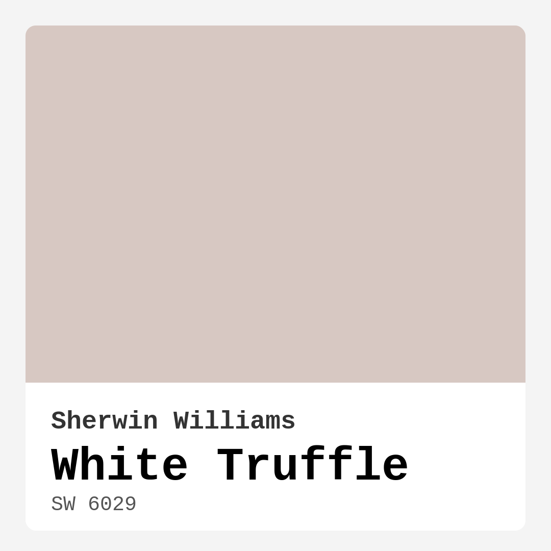
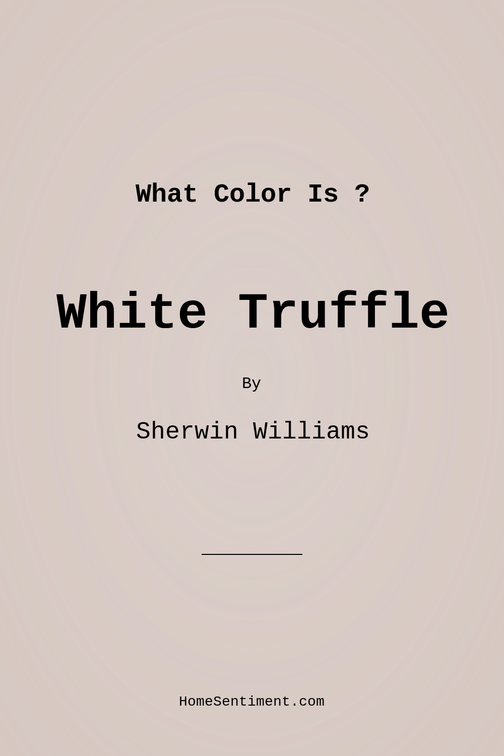
Color Preview & Key Details
| HEX Code | #D7C8C2 |
| RGB | 215, 200, 194 |
| LRV | 48% |
| Undertone | Red |
| Finish Options | Eggshell, Flat, Matte, Satin |
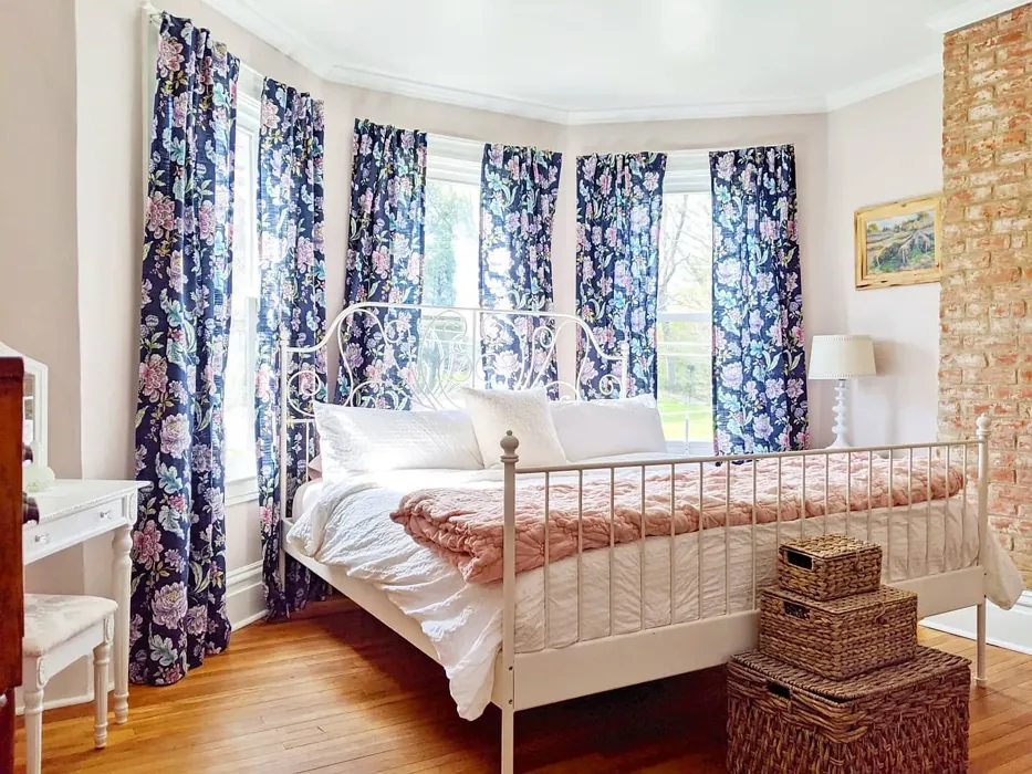
Have you ever walked into a room and felt instantly at home? The right paint color can evoke that warm, inviting feeling, and if you’re on the hunt for something that embodies both elegance and comfort, let me introduce you to White Truffle by Sherwin Williams. This sophisticated hue is more than just a paint color; it’s an invitation to create a cozy, stylish space that feels uniquely yours.
White Truffle is a soft beige, but it’s not just any beige. With a subtle hint of red undertones, this color breathes warmth and depth, making it perfect for various styles, from modern to traditional. Imagine walking into a living room bathed in this gentle hue, where the light reflects off the walls, creating a calm and inviting atmosphere. It’s a color that wraps around you like a soft blanket, urging you to sit back and relax.
One of the standout features of White Truffle is its versatility. Whether you’re painting a living room, bedroom, dining room, or hallway, this color elegantly adapts to its surroundings. It works beautifully in open-concept spaces, helping to define areas while maintaining a cohesive flow. You can easily pair it with different trim colors, and it complements both warm and neutral palettes flawlessly. For a classic touch, consider pairing it with crisp White Dove trim or even brass fixtures for a bit of sparkle.
When applying White Truffle, you’ll appreciate its excellent coverage. Most spaces will require just one or two coats, making it a beginner-friendly option for DIY projects. Plus, if you make a mistake, don’t worry—this paint is touch-up friendly! It’s smooth to apply, whether you’re using a brush or a roller, so you can achieve that professional finish without feeling overwhelmed.
Light plays a significant role in how White Truffle reveals itself. With an LRV (Light Reflectance Value) of 48%, it sits comfortably in the medium category. This means it reflects a moderate amount of light, making rooms feel airy yet cozy. In bright light, you’ll notice the delicate beige tones shining through, while softer lighting brings out its richer, deeper qualities. It’s essential to observe how this color interacts with the natural and artificial light in your home. Test it on your walls and see how it transforms the space throughout the day.
For those of you living in smaller spaces, you’ll be pleased to know that White Truffle works wonders. Its warm undertones help create an inviting environment without feeling cramped. When combined with lighter furnishings, it can make a small room feel more open and airy. This quality makes it a favorite for rentals as well—an effortless way to refresh a space without committing to a bold, darker color that might overwhelm.
Another bonus? White Truffle is incredibly practical for high-traffic areas. Its washable nature means you can easily wipe away dirt and scuffs, keeping your space looking fresh and inviting. It’s not the most durable option on the market, but with regular maintenance and timely touch-ups, it holds up well under everyday wear and tear.
While White Truffle is a dream to work with, it does have a few considerations to keep in mind. In low light, it can appear darker than expected, so be sure to test it in your specific lighting conditions and alongside your existing furnishings. You’ll want to ensure that it harmonizes with your decor rather than clashing with it. Pay close attention to how the red undertones interact with other colors in your space—this will help you achieve the perfect balance.
If you’re looking to create a more layered look, consider complementing White Truffle with richer hues. Lighter shades like SW 6021 and SW 6043 can be used to add depth, while darker shades like SW 6044 and SW 6036 can create contrast and drama. For a more eclectic feel, try pairing it with complimentary colors like SW 9137 or SW 9633—these shades can add a unique flair to your decor and enhance the inviting nature of White Truffle.
Now, let’s talk about mood. The warm, earthy tones of White Truffle evoke feelings of calm and relaxation, making it an ideal choice for spaces where you unwind after a long day. Imagine curling up with a book in a White Truffle-painted bedroom or hosting a cozy dinner party in a dining room draped in this soothing hue. It’s a color that encourages connection, making it perfect for shared spaces where you gather with friends and family.
And while we’re on the topic of connection, don’t forget the power of texture and decor. White Truffle pairs beautifully with natural materials—think wooden furniture, soft textiles, and even greenery. Incorporating these elements can enhance the warmth of the hue and bring your space to life. Whether you opt for a farmhouse aesthetic with rustic charm or a more modern approach with clean lines, White Truffle can adapt, ensuring your home feels cohesive and thoughtfully designed.
In conclusion, White Truffle is more than just paint; it’s a tool to create an inviting and stylish home. Its warm beige tones and delightful undertones make it suitable for a wide range of decor styles, and its practical application makes it a go-to choice for any homeowner. So, whether you’re embarking on a full room transformation or simply looking to freshen up a hallway, give White Truffle a chance. You might just find it’s the perfect color to make your house feel like a true home. Grab a sample, test it out, and watch as your space transforms into a warm, welcoming oasis. Happy decorating!
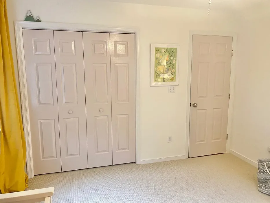
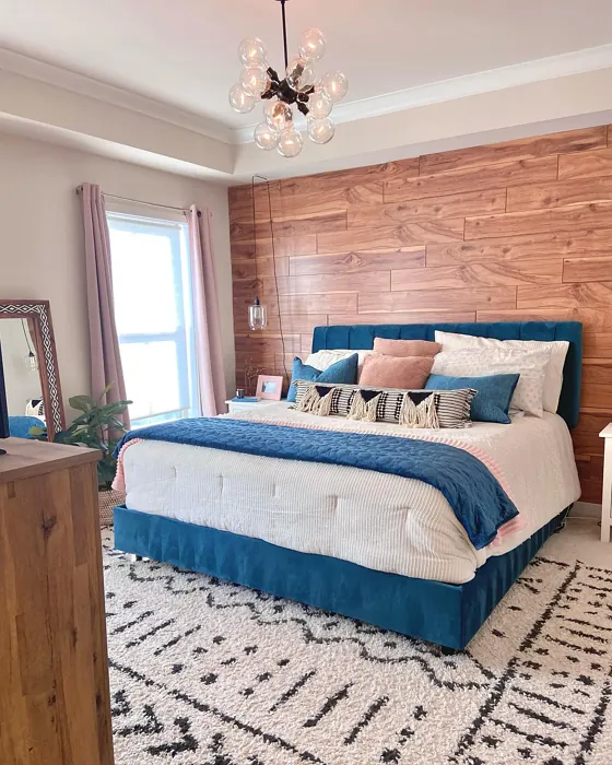
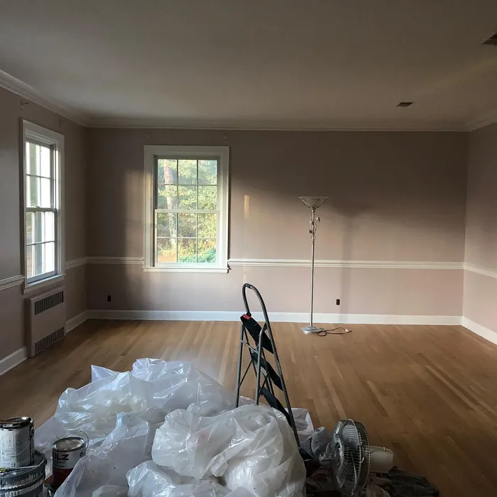
Real Room Photo of White Truffle SW 6029

Undertones of White Truffle ?
The undertones of White Truffle are a key aspect of its character, leaning towards Red. These subtle underlying hues are what give the color its depth and complexity. For example, a gray with a blue undertone will feel cooler and more modern, while one with a brown undertone will feel warmer and more traditional. It’s essential to test this paint in your home and observe it next to your existing furniture, flooring, and decor to see how these undertones interact and reveal themselves throughout the day.
HEX value: #D7C8C2
RGB code: 215, 200, 194
Is White Truffle Cool or Warm?
This color is decidedly warm, making it perfect for creating inviting environments. It harmonizes beautifully with both warm and neutral palettes, lending a cozy touch to your interiors.
Understanding Color Properties and Interior Design Tips
Hue refers to a specific position on the color wheel, measured in degrees from 0 to 360. Each degree represents a different pure color:
- 0° represents red
- 120° represents green
- 240° represents blue
Saturation describes the intensity or purity of a color and is expressed as a percentage:
- At 0%, the color appears completely desaturated—essentially a shade of gray
- At 100%, the color is at its most vivid and vibrant
Lightness indicates how light or dark a color is, also expressed as a percentage:
- 0% lightness results in black
- 100% lightness results in white
Using Warm Colors in Interior Design
Warm hues—such as reds, oranges, yellows, warm beiges, and greiges—are excellent choices for creating inviting and energetic spaces. These colors are particularly well-suited for:
- Kitchens, living rooms, and bathrooms, where warmth enhances comfort and sociability
- Large rooms, where warm tones can help reduce the sense of emptiness and make the space feel more intimate
For example:
- Warm beige shades provide a cozy, inviting atmosphere, ideal for living rooms, bedrooms, and hallways.
- Warm greige (a mix of beige and gray) offers the warmth of beige with the modern appeal of gray, making it a versatile backdrop for dining areas, bedrooms, and living spaces.
However, be mindful when using warm light tones in rooms with limited natural light. These shades may appear muted or even take on an unpleasant yellowish tint. To avoid a dull or flat appearance:
- Add depth by incorporating richer tones like deep greens, charcoal, or chocolate brown
- Use textured elements such as curtains, rugs, or cushions to bring dimension to the space
Pro Tip: Achieving Harmony with Warm and Cool Color Balance
To create a well-balanced and visually interesting interior, mix warm and cool tones strategically. This contrast adds depth and harmony to your design.
- If your walls feature warm hues, introduce cool-colored accents such as blue or green furniture, artwork, or accessories to create contrast.
- For a polished look, consider using a complementary color scheme, which pairs colors opposite each other on the color wheel (e.g., red with green, orange with blue).
This thoughtful mix not only enhances visual appeal but also creates a space that feels both dynamic and cohesive.
Light Temperature Affects on White Truffle
Natural Light
Natural daylight changes in color temperature as the sun moves across the sky. At sunrise and sunset, the light tends to have a warm, golden tone with a color temperature around 2000 Kelvin (K). As the day progresses and the sun rises higher, the light becomes cooler and more neutral. Around midday, especially when the sky is clear, natural light typically reaches its peak brightness and shifts to a cooler tone, ranging from 5500 to 6500 Kelvin. This midday light is close to what we perceive as pure white or daylight-balanced light.
These shifts in natural light can significantly influence how colors appear in a space, which is why designers often consider both the time of day and the orientation of windows when planning interior color schemes.
Artificial Light
When choosing artificial lighting, pay close attention to the color temperature, measured in Kelvin (K). This determines how warm or cool the light will appear. Lower temperatures, around 2700K, give off a warm, yellow glow often used in living rooms or bedrooms. Higher temperatures, above 5000K, create a cool, bluish light similar to daylight, commonly used in kitchens, offices, or task areas.
Use the slider to see how lighting temperature can affect the appearance of a surface or color throughout a space.


4800K
LRV of White Truffle
The Light Reflectance Value (LRV) of White Truffle is 48%, which places it in the Medium category. This means it Reflects a moderate amount of light. Understanding a paint’s LRV is crucial for predicting how it will look in your space. A higher LRV indicates a lighter color that reflects more light, making rooms feel larger and brighter. A lower LRV signifies a darker color that absorbs more light, creating a cozier, more intimate atmosphere. Always consider the natural and artificial lighting in your room when selecting a paint color based on its LRV.
Detailed Review of White Truffle
Additional Paint Characteristics
Ideal Rooms
Bedroom, Dining Room, Hallway, Kitchen, Living Room
Decor Styles
Eclectic, Farmhouse, Modern, Traditional
Coverage
Good (1–2 Coats), Touch-Up Friendly
Ease of Application
Beginner Friendly, Brush Smooth, Roller-Ready
Washability
Washable, Wipeable
VOC Level
Low VOC
Best Use
Accent Wall, Interior Walls, Small Spaces
Room Suitability
Bedroom, Dining Room, Hallway, Living Room
Tone Tag
Earthy, Neutral, Warm
Finish Type
Eggshell, Satin
Paint Performance
Easy Touch-Up, Low Odor, Scuff Resistant
Use Cases
Best for Open Concept, Best for Rentals, Classic Favorite
Mood
Calm, Cozy, Inviting
Trim Pairing
Complements Brass Fixtures, Pairs with White Dove
When it comes to versatile colors, White Truffle stands out as a quintessential choice for those looking to create a warm and inviting space. The soft beige tone gracefully adapts to various lighting conditions, presenting a calming ambiance during the day and a cozy feel at night. Whether you’re painting an entire room or just an accent wall, it offers excellent coverage with just one or two coats. Plus, it pairs well with a range of trim colors, enhancing its adaptability across different decor styles. This paint is particularly appealing for open concept spaces, as it helps define areas while maintaining a cohesive look. Overall, White Truffle is a reliable choice for any home improvement project, delivering both beauty and functionality.
Pros & Cons of SW 6029 White Truffle
Pros
Cons
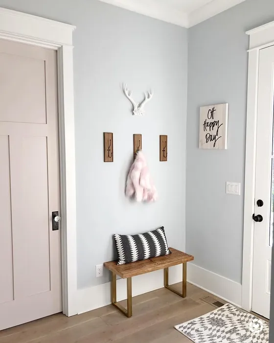
Colors that go with Sherwin Williams White Truffle
FAQ on SW 6029 White Truffle
Can White Truffle be used in small spaces?
Absolutely! White Truffle is a fantastic choice for small spaces. Its warm undertones help to create an inviting atmosphere without feeling cramped. When applied, it can make a small room feel more open and airy, especially when paired with lighter furnishings or decor.
How does White Truffle perform in high-traffic areas?
White Truffle is a solid option for high-traffic areas, as its washability makes it easy to clean. Although it’s not the most durable option available, it holds up well with regular maintenance. Just make sure to touch up any scuffs as needed to keep your space looking fresh.
Comparisons White Truffle with other colors
White Truffle SW 6029 vs Malted Milk SW 6057
| Attribute | White Truffle SW 6029 | Malted Milk SW 6057 |
|---|---|---|
| Color Name | White Truffle SW 6029 | Malted Milk SW 6057 |
| Color | ||
| Hue | Pink | Pink |
| Brightness | Light | Light |
| RGB | 215, 200, 194 | 222, 202, 189 |
| LRV | 48% | 74% |
| Finish Type | Eggshell, Satin | Eggshell, Satin |
| Finish Options | Eggshell, Flat, Matte, Satin | Eggshell, Matte, Satin |
| Ideal Rooms | Bedroom, Dining Room, Hallway, Kitchen, Living Room | Bedroom, Dining Room, Kitchen, Living Room, Nursery |
| Decor Styles | Eclectic, Farmhouse, Modern, Traditional | Coastal, Farmhouse, Modern, Scandinavian, Transitional |
| Coverage | Good (1–2 Coats), Touch-Up Friendly | Good (1–2 Coats), Touch-Up Friendly |
| Ease of Application | Beginner Friendly, Brush Smooth, Roller-Ready | Beginner Friendly, Brush Smooth, Fast-Drying, Roller-Ready |
| Washability | Washable, Wipeable | Washable, Wipeable |
| Room Suitability | Bedroom, Dining Room, Hallway, Living Room | Bedroom, Dining Room, Kitchen, Living Room, Nursery |
| Tone | Earthy, Neutral, Warm | Creamy, Neutral, Warm |
| Paint Performance | Easy Touch-Up, Low Odor, Scuff Resistant | High Coverage, Low Odor, Quick Drying |
White Truffle SW 6029 vs Intimate White SW 6322
| Attribute | White Truffle SW 6029 | Intimate White SW 6322 |
|---|---|---|
| Color Name | White Truffle SW 6029 | Intimate White SW 6322 |
| Color | ||
| Hue | Pink | Pink |
| Brightness | Light | Light |
| RGB | 215, 200, 194 | 240, 225, 216 |
| LRV | 48% | 75% |
| Finish Type | Eggshell, Satin | Eggshell, Matte, Satin |
| Finish Options | Eggshell, Flat, Matte, Satin | Eggshell, Matte, Satin |
| Ideal Rooms | Bedroom, Dining Room, Hallway, Kitchen, Living Room | Bedroom, Hallway, Home Office, Living Room, Nursery |
| Decor Styles | Eclectic, Farmhouse, Modern, Traditional | Farmhouse, Minimalist, Modern, Traditional |
| Coverage | Good (1–2 Coats), Touch-Up Friendly | Good (1–2 Coats) |
| Ease of Application | Beginner Friendly, Brush Smooth, Roller-Ready | Beginner Friendly, Brush Smooth, Roller-Ready |
| Washability | Washable, Wipeable | Highly Washable, Washable |
| Room Suitability | Bedroom, Dining Room, Hallway, Living Room | Bedroom, Hallway, Living Room, Nursery |
| Tone | Earthy, Neutral, Warm | Creamy, Muted, Warm |
| Paint Performance | Easy Touch-Up, Low Odor, Scuff Resistant | Easy Touch-Up, Fade Resistant, Low Odor |
White Truffle SW 6029 vs Abalone Shell SW 6050
| Attribute | White Truffle SW 6029 | Abalone Shell SW 6050 |
|---|---|---|
| Color Name | White Truffle SW 6029 | Abalone Shell SW 6050 |
| Color | ||
| Hue | Pink | Pink |
| Brightness | Light | Light |
| RGB | 215, 200, 194 | 219, 199, 189 |
| LRV | 48% | 30% |
| Finish Type | Eggshell, Satin | Eggshell, Matte, Satin |
| Finish Options | Eggshell, Flat, Matte, Satin | Eggshell, Matte, Satin |
| Ideal Rooms | Bedroom, Dining Room, Hallway, Kitchen, Living Room | Bedroom, Dining Room, Home Office, Living Room |
| Decor Styles | Eclectic, Farmhouse, Modern, Traditional | Coastal, Farmhouse, Minimalist, Modern, Traditional |
| Coverage | Good (1–2 Coats), Touch-Up Friendly | Good (1–2 Coats), Touch-Up Friendly |
| Ease of Application | Beginner Friendly, Brush Smooth, Roller-Ready | Beginner Friendly, Brush Smooth, Fast-Drying, Roller-Ready |
| Washability | Washable, Wipeable | Washable, Wipeable |
| Room Suitability | Bedroom, Dining Room, Hallway, Living Room | Bedroom, Dining Room, Home Office, Living Room |
| Tone | Earthy, Neutral, Warm | Balanced, Muted, Warm |
| Paint Performance | Easy Touch-Up, Low Odor, Scuff Resistant | Easy Touch-Up, Fade Resistant, Low Odor, Quick Drying |
White Truffle SW 6029 vs Faint Coral SW 6329
| Attribute | White Truffle SW 6029 | Faint Coral SW 6329 |
|---|---|---|
| Color Name | White Truffle SW 6029 | Faint Coral SW 6329 |
| Color | ||
| Hue | Pink | Pink |
| Brightness | Light | Light |
| RGB | 215, 200, 194 | 238, 222, 213 |
| LRV | 48% | 66% |
| Finish Type | Eggshell, Satin | Eggshell, Matte, Satin |
| Finish Options | Eggshell, Flat, Matte, Satin | Eggshell, Matte, Satin |
| Ideal Rooms | Bedroom, Dining Room, Hallway, Kitchen, Living Room | Bedroom, Dining Room, Hallway, Living Room, Nursery |
| Decor Styles | Eclectic, Farmhouse, Modern, Traditional | Bohemian, Coastal, Modern Farmhouse, Scandinavian, Vintage |
| Coverage | Good (1–2 Coats), Touch-Up Friendly | Good (1–2 Coats), Touch-Up Friendly |
| Ease of Application | Beginner Friendly, Brush Smooth, Roller-Ready | Beginner Friendly, Brush Smooth, Fast-Drying, Roller-Ready |
| Washability | Washable, Wipeable | Washable, Wipeable |
| Room Suitability | Bedroom, Dining Room, Hallway, Living Room | Bedroom, Dining Room, Hallway, Living Room, Nursery |
| Tone | Earthy, Neutral, Warm | Airy, Muted, Pastel, Warm |
| Paint Performance | Easy Touch-Up, Low Odor, Scuff Resistant | Easy Touch-Up, Low Odor, Quick Drying |
White Truffle SW 6029 vs Romance SW 6323
| Attribute | White Truffle SW 6029 | Romance SW 6323 |
|---|---|---|
| Color Name | White Truffle SW 6029 | Romance SW 6323 |
| Color | ||
| Hue | Pink | Pink |
| Brightness | Light | Light |
| RGB | 215, 200, 194 | 235, 207, 195 |
| LRV | 48% | 69% |
| Finish Type | Eggshell, Satin | Eggshell, Matte |
| Finish Options | Eggshell, Flat, Matte, Satin | Eggshell, Flat, Matte, Satin |
| Ideal Rooms | Bedroom, Dining Room, Hallway, Kitchen, Living Room | Bedroom, Dining Room, Living Room, Nursery |
| Decor Styles | Eclectic, Farmhouse, Modern, Traditional | Bohemian, Modern, Shabby Chic, Vintage |
| Coverage | Good (1–2 Coats), Touch-Up Friendly | Good (1–2 Coats), Touch-Up Friendly |
| Ease of Application | Beginner Friendly, Brush Smooth, Roller-Ready | Beginner Friendly, Brush Smooth, Fast-Drying, Roller-Ready |
| Washability | Washable, Wipeable | Washable, Wipeable |
| Room Suitability | Bedroom, Dining Room, Hallway, Living Room | Bedroom, Dining Room, Living Room, Nursery |
| Tone | Earthy, Neutral, Warm | Pastel, Soft, Warm |
| Paint Performance | Easy Touch-Up, Low Odor, Scuff Resistant | Easy Touch-Up, Low Odor, Quick Drying |
White Truffle SW 6029 vs Innocence SW 6302
| Attribute | White Truffle SW 6029 | Innocence SW 6302 |
|---|---|---|
| Color Name | White Truffle SW 6029 | Innocence SW 6302 |
| Color | ||
| Hue | Pink | Pink |
| Brightness | Light | Light |
| RGB | 215, 200, 194 | 235, 209, 207 |
| LRV | 48% | 75% |
| Finish Type | Eggshell, Satin | Eggshell, Matte |
| Finish Options | Eggshell, Flat, Matte, Satin | Eggshell, Matte, Satin |
| Ideal Rooms | Bedroom, Dining Room, Hallway, Kitchen, Living Room | Bedroom, Dining Room, Living Room, Nursery |
| Decor Styles | Eclectic, Farmhouse, Modern, Traditional | Bohemian, Modern Farmhouse, Scandinavian, Shabby Chic |
| Coverage | Good (1–2 Coats), Touch-Up Friendly | Good (1–2 Coats), Touch-Up Friendly |
| Ease of Application | Beginner Friendly, Brush Smooth, Roller-Ready | Beginner Friendly, Brush Smooth, Roller-Ready |
| Washability | Washable, Wipeable | Washable, Wipeable |
| Room Suitability | Bedroom, Dining Room, Hallway, Living Room | Bedroom, Dining Room, Living Room, Nursery |
| Tone | Earthy, Neutral, Warm | Pastel, Soft, Warm |
| Paint Performance | Easy Touch-Up, Low Odor, Scuff Resistant | Easy Touch-Up, Fade Resistant, Low Odor |
White Truffle SW 6029 vs Angelic SW 6602
| Attribute | White Truffle SW 6029 | Angelic SW 6602 |
|---|---|---|
| Color Name | White Truffle SW 6029 | Angelic SW 6602 |
| Color | ||
| Hue | Pink | Pink |
| Brightness | Light | Light |
| RGB | 215, 200, 194 | 242, 220, 215 |
| LRV | 48% | 75% |
| Finish Type | Eggshell, Satin | Eggshell, Satin |
| Finish Options | Eggshell, Flat, Matte, Satin | Eggshell, Flat, Matte, Satin |
| Ideal Rooms | Bedroom, Dining Room, Hallway, Kitchen, Living Room | Bedroom, Dining Room, Home Office, Living Room, Nursery |
| Decor Styles | Eclectic, Farmhouse, Modern, Traditional | Bohemian, Farmhouse, Modern, Transitional |
| Coverage | Good (1–2 Coats), Touch-Up Friendly | Good (1–2 Coats), Touch-Up Friendly |
| Ease of Application | Beginner Friendly, Brush Smooth, Roller-Ready | Beginner Friendly, Brush Smooth, Roller-Ready |
| Washability | Washable, Wipeable | Washable, Wipeable |
| Room Suitability | Bedroom, Dining Room, Hallway, Living Room | Bedroom, Home Office, Living Room, Nursery |
| Tone | Earthy, Neutral, Warm | Airy, Pastel, Warm |
| Paint Performance | Easy Touch-Up, Low Odor, Scuff Resistant | Easy Touch-Up, Fade Resistant, Low Odor |
White Truffle SW 6029 vs Rosy Outlook SW 6316
| Attribute | White Truffle SW 6029 | Rosy Outlook SW 6316 |
|---|---|---|
| Color Name | White Truffle SW 6029 | Rosy Outlook SW 6316 |
| Color | ||
| Hue | Pink | Pink |
| Brightness | Light | Light |
| RGB | 215, 200, 194 | 235, 206, 203 |
| LRV | 48% | 45% |
| Finish Type | Eggshell, Satin | Eggshell, Matte, Satin |
| Finish Options | Eggshell, Flat, Matte, Satin | Eggshell, Matte, Satin |
| Ideal Rooms | Bedroom, Dining Room, Hallway, Kitchen, Living Room | Bedroom, Home Office, Living Room, Nursery |
| Decor Styles | Eclectic, Farmhouse, Modern, Traditional | Bohemian, Cottage, Modern, Traditional |
| Coverage | Good (1–2 Coats), Touch-Up Friendly | Good (1–2 Coats), Touch-Up Friendly |
| Ease of Application | Beginner Friendly, Brush Smooth, Roller-Ready | Beginner Friendly, Brush Smooth, Roller-Ready |
| Washability | Washable, Wipeable | Scuff Resistant, Washable, Wipeable |
| Room Suitability | Bedroom, Dining Room, Hallway, Living Room | Bedroom, Home Office, Living Room, Nursery |
| Tone | Earthy, Neutral, Warm | Muted, Pastel, Warm |
| Paint Performance | Easy Touch-Up, Low Odor, Scuff Resistant | High Coverage, Low Odor, Quick Drying |
White Truffle SW 6029 vs Demure SW 6295
| Attribute | White Truffle SW 6029 | Demure SW 6295 |
|---|---|---|
| Color Name | White Truffle SW 6029 | Demure SW 6295 |
| Color | ||
| Hue | Pink | Pink |
| Brightness | Light | Light |
| RGB | 215, 200, 194 | 232, 212, 213 |
| LRV | 48% | 50% |
| Finish Type | Eggshell, Satin | Eggshell, Matte |
| Finish Options | Eggshell, Flat, Matte, Satin | Eggshell, Matte, Satin |
| Ideal Rooms | Bedroom, Dining Room, Hallway, Kitchen, Living Room | Bedroom, Home Office, Living Room, Nursery |
| Decor Styles | Eclectic, Farmhouse, Modern, Traditional | Minimalist, Modern, Shabby Chic, Transitional |
| Coverage | Good (1–2 Coats), Touch-Up Friendly | Good (1–2 Coats), Touch-Up Friendly |
| Ease of Application | Beginner Friendly, Brush Smooth, Roller-Ready | Beginner Friendly, Brush Smooth, Roller-Ready |
| Washability | Washable, Wipeable | Washable, Wipeable |
| Room Suitability | Bedroom, Dining Room, Hallway, Living Room | Bedroom, Home Office, Living Room, Nursery |
| Tone | Earthy, Neutral, Warm | Muted, Pastel, Warm |
| Paint Performance | Easy Touch-Up, Low Odor, Scuff Resistant | Easy Touch-Up, Low Odor, Quick Drying |
White Truffle SW 6029 vs Charming Pink SW 6309
| Attribute | White Truffle SW 6029 | Charming Pink SW 6309 |
|---|---|---|
| Color Name | White Truffle SW 6029 | Charming Pink SW 6309 |
| Color | ||
| Hue | Pink | Pink |
| Brightness | Light | Light |
| RGB | 215, 200, 194 | 237, 211, 210 |
| LRV | 48% | 69% |
| Finish Type | Eggshell, Satin | Eggshell, Matte |
| Finish Options | Eggshell, Flat, Matte, Satin | Eggshell, Matte, Satin |
| Ideal Rooms | Bedroom, Dining Room, Hallway, Kitchen, Living Room | Bedroom, Dining Room, Living Room, Nursery |
| Decor Styles | Eclectic, Farmhouse, Modern, Traditional | Bohemian, Contemporary, Modern Farmhouse, Shabby Chic, Vintage |
| Coverage | Good (1–2 Coats), Touch-Up Friendly | Good (1–2 Coats), Touch-Up Friendly |
| Ease of Application | Beginner Friendly, Brush Smooth, Roller-Ready | Beginner Friendly, Brush Smooth, Fast-Drying, Roller-Ready |
| Washability | Washable, Wipeable | Washable, Wipeable |
| Room Suitability | Bedroom, Dining Room, Hallway, Living Room | Bedroom, Dining Room, Living Room, Nursery |
| Tone | Earthy, Neutral, Warm | Muted, Pastel, Warm |
| Paint Performance | Easy Touch-Up, Low Odor, Scuff Resistant | Easy Touch-Up, Low Odor, Quick Drying |
Official Page of Sherwin Williams White Truffle SW 6029