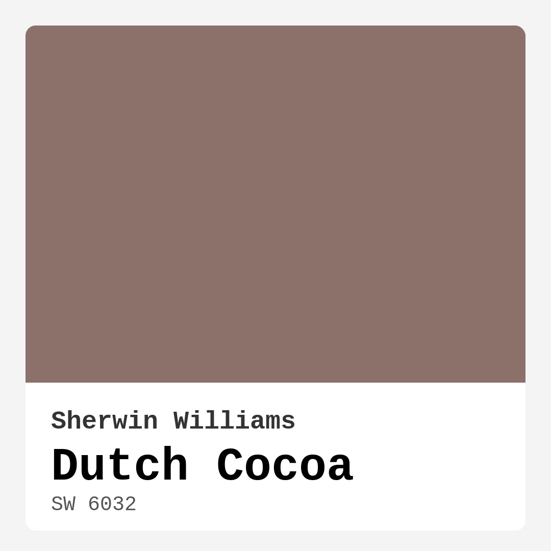
Color Preview & Key Details
| HEX Code | #8C706A |
| RGB | 140, 112, 106 |
| LRV | 12% |
| Undertone | Red |
| Finish Options | Eggshell, Matte, Satin |
Imagine stepping into a room that feels like a warm embrace, where the walls seem to hug you with their rich, inviting hues. That’s the magic of Dutch Cocoa, a stunning paint color from Sherwin Williams that can transform your space into a cozy haven. This warm, earthy brown is more than just paint; it’s an experience and a mood setter.
Dutch Cocoa, with its color code SW 6032, offers a delightful balance of sophistication and comfort. The deep, muted brown is reminiscent of luscious cocoa, perfect for creating intimate spaces that invite relaxation and conversation. Its warm undertones lean toward red, adding a layer of depth that can make even the simplest decor feel elegant and thoughtfully curated.
Choosing a paint color can be daunting, but let’s break down why Dutch Cocoa might just be the perfect choice for your next project. With its Light Reflectance Value (LRV) of 12%, this color falls into the dark category, which means it doesn’t reflect much light. While this might sound concerning at first, it actually allows the color to create a grounded atmosphere, making rooms feel more intimate and cozy.
Imagine Dutch Cocoa in your living room, wrapping your family and friends in warmth as they gather for movie nights or dinner parties. It’s perfect for creating a welcoming environment where everyone feels at home. It also shines in bedrooms, where its rich hue can promote a serene space conducive to rest. Picture waking up in a room that feels both soothing and sophisticated, a true retreat from the busy world outside.
But Dutch Cocoa doesn’t stop there. This versatile color is equally suitable for dining rooms and home offices, bringing a touch of refinement to your workspace while maintaining a casual comfort. You’ll find it beautifully complements various decor styles—whether you’re going for a modern farmhouse vibe or something more traditional, Dutch Cocoa can adapt seamlessly.
When considering this color, think about its application. With options for matte, eggshell, or satin finishes, you can tailor the look to your preference. A matte finish can give off a more organic feel, while eggshell or satin can add a touch of sheen, enhancing the warmth of the color. Dutch Cocoa is also beginner-friendly, allowing for a smooth and easy application. It covers well with just one or two coats, making it a practical choice for DIY projects.
Now, let’s talk about pairing. Dutch Cocoa plays well with a variety of colors, which is key to achieving a harmonious space. For a classic look, consider soft creams or whites like White Dove or Simply White. These colors can highlight the richness of Dutch Cocoa without overwhelming the space, creating a balanced palette that feels effortlessly chic. If you’re feeling bolder, deep greens or navy can create a striking contrast that adds a contemporary edge.
Another consideration is that while Dutch Cocoa is stunning, it’s essential to test it in your actual space. The color can appear different depending on the lighting conditions and surrounding decor. In natural light, it might reveal a range of warm tones, while in the evening, it deepens to accentuate the coziness of your home. This shifting quality is part of what makes Dutch Cocoa so special.
However, keep in mind that darker colors like Dutch Cocoa can sometimes make smaller spaces feel even smaller. If you’re working with a compact room, consider using it as an accent wall rather than the primary color. This way, you can enjoy the warmth and richness without compromising the sense of space.
Touch-ups are a breeze, too. Dutch Cocoa is known for being touch-up friendly, which is a huge plus for anyone who loves a clean, polished look without the fuss. And if you’re worried about maintenance, rest easy knowing that this paint is highly washable, making it suitable for homes with children or pets.
If you’re considering using Dutch Cocoa on furniture, go for it! It can revamp your pieces, giving them a modern yet cozy vibe. Just remember to choose a durable finish like eggshell or satin for surfaces that need to withstand wear and tear.
As you plan your project, remember that the beauty of Dutch Cocoa lies in its versatility. It pairs beautifully with both warm and cool trim colors, enhancing the overall aesthetic of your room. For a fresh take, consider contrasting it with a bright white trim, which can really make the richness of Dutch Cocoa pop.
Before diving into a full paint job, I always recommend testing patches of color on your walls. Look at it at different times of day to see how the light affects its appearance. You might be surprised by how the color transforms from morning light to the warm glow of evening.
In summary, Dutch Cocoa offers a warm, inviting hue that blends sophistication with a sense of comfort. Whether used in a living room, bedroom, or home office, it creates an atmosphere that’s cozy and stylish. Its versatility allows it to complement various decor styles, making it a fantastic choice for those looking to elevate their spaces.
As you consider your options, keep in mind the rich undertones of Dutch Cocoa and how they interact with your existing decor. Test it out, play with finishes, and don’t hesitate to pair it with complementary colors that enhance its warmth. With Dutch Cocoa on your walls, you’re not just choosing a paint color; you’re crafting a space that feels like home. So roll up those sleeves and get ready to embrace the cozy elegance that only Dutch Cocoa can provide. You won’t regret it!
Real Room Photo of Dutch Cocoa SW 6032


Undertones of Dutch Cocoa ?
The undertones of Dutch Cocoa are a key aspect of its character, leaning towards Red. These subtle underlying hues are what give the color its depth and complexity. For example, a gray with a blue undertone will feel cooler and more modern, while one with a brown undertone will feel warmer and more traditional. It’s essential to test this paint in your home and observe it next to your existing furniture, flooring, and decor to see how these undertones interact and reveal themselves throughout the day.
HEX value: #8C706A
RGB code: 140, 112, 106
Is Dutch Cocoa Cool or Warm?
Dutch Cocoa is considered a warm paint color. This characteristic plays a huge role in the overall feel of a room. Warm colors, like this one, tend to create a cozy, inviting, and energetic atmosphere, making them great for social spaces like living rooms and dining rooms. In contrast, cool colors often evoke a sense of calm and serenity, which is why they are popular in bedrooms and bathrooms. The warmth of Dutch Cocoa means it will pair beautifully with corresponding decor elements.
Understanding Color Properties and Interior Design Tips
Hue refers to a specific position on the color wheel, measured in degrees from 0 to 360. Each degree represents a different pure color:
- 0° represents red
- 120° represents green
- 240° represents blue
Saturation describes the intensity or purity of a color and is expressed as a percentage:
- At 0%, the color appears completely desaturated—essentially a shade of gray
- At 100%, the color is at its most vivid and vibrant
Lightness indicates how light or dark a color is, also expressed as a percentage:
- 0% lightness results in black
- 100% lightness results in white
Using Warm Colors in Interior Design
Warm hues—such as reds, oranges, yellows, warm beiges, and greiges—are excellent choices for creating inviting and energetic spaces. These colors are particularly well-suited for:
- Kitchens, living rooms, and bathrooms, where warmth enhances comfort and sociability
- Large rooms, where warm tones can help reduce the sense of emptiness and make the space feel more intimate
For example:
- Warm beige shades provide a cozy, inviting atmosphere, ideal for living rooms, bedrooms, and hallways.
- Warm greige (a mix of beige and gray) offers the warmth of beige with the modern appeal of gray, making it a versatile backdrop for dining areas, bedrooms, and living spaces.
However, be mindful when using warm light tones in rooms with limited natural light. These shades may appear muted or even take on an unpleasant yellowish tint. To avoid a dull or flat appearance:
- Add depth by incorporating richer tones like deep greens, charcoal, or chocolate brown
- Use textured elements such as curtains, rugs, or cushions to bring dimension to the space
Pro Tip: Achieving Harmony with Warm and Cool Color Balance
To create a well-balanced and visually interesting interior, mix warm and cool tones strategically. This contrast adds depth and harmony to your design.
- If your walls feature warm hues, introduce cool-colored accents such as blue or green furniture, artwork, or accessories to create contrast.
- For a polished look, consider using a complementary color scheme, which pairs colors opposite each other on the color wheel (e.g., red with green, orange with blue).
This thoughtful mix not only enhances visual appeal but also creates a space that feels both dynamic and cohesive.

Light Temperature Affects on Dutch Cocoa
Natural Light
Natural daylight changes in color temperature as the sun moves across the sky. At sunrise and sunset, the light tends to have a warm, golden tone with a color temperature around 2000 Kelvin (K). As the day progresses and the sun rises higher, the light becomes cooler and more neutral. Around midday, especially when the sky is clear, natural light typically reaches its peak brightness and shifts to a cooler tone, ranging from 5500 to 6500 Kelvin. This midday light is close to what we perceive as pure white or daylight-balanced light.
These shifts in natural light can significantly influence how colors appear in a space, which is why designers often consider both the time of day and the orientation of windows when planning interior color schemes.
Artificial Light
When choosing artificial lighting, pay close attention to the color temperature, measured in Kelvin (K). This determines how warm or cool the light will appear. Lower temperatures, around 2700K, give off a warm, yellow glow often used in living rooms or bedrooms. Higher temperatures, above 5000K, create a cool, bluish light similar to daylight, commonly used in kitchens, offices, or task areas.
Use the slider to see how lighting temperature can affect the appearance of a surface or color throughout a space.


4800K
LRV of Dutch Cocoa
The Light Reflectance Value (LRV) of Dutch Cocoa is 12%, which places it in the Dark colors category. This means it does not reflect light. Understanding a paint’s LRV is crucial for predicting how it will look in your space. A higher LRV indicates a lighter color that reflects more light, making rooms feel larger and brighter. A lower LRV signifies a darker color that absorbs more light, creating a cozier, more intimate atmosphere. Always consider the natural and artificial lighting in your room when selecting a paint color based on its LRV.
Detailed Review of Dutch Cocoa
Additional Paint Characteristics
Ideal Rooms
Bedroom, Dining Room, Home Office, Living Room, Nursery
Decor Styles
Contemporary, Modern Farmhouse, Rustic, Traditional
Coverage
Good (1–2 Coats), Touch-Up Friendly
Ease of Application
Beginner Friendly, Brush Smooth, Roller-Ready
Washability
Highly Washable, Washable
VOC Level
Low VOC
Best Use
Accent Wall, Furniture, Interior Walls
Room Suitability
Bedroom, Dining Room, Home Office, Living Room
Tone Tag
Earthy, Muted, Warm
Finish Type
Eggshell, Matte, Satin
Paint Performance
Easy Touch-Up, High Coverage, Low Odor
Use Cases
Best for Modern Farmhouse, Best for Rentals, Classic Favorite
Mood
Cozy, Grounding, Inviting
Trim Pairing
Complements Cool Trim, Good with Wood Trim, Pairs with White Dove
Using Dutch Cocoa in your home is like wrapping your space in a warm, inviting blanket. The depth of this color can transform a room, making it feel both cozy and sophisticated. It works wonderfully in living rooms and bedrooms, where a sense of comfort is key. The rich undertones mean it pairs well with both natural wood and sleek contemporary furnishings. When applied, the paint offers a smooth finish that enhances its warmth further, creating a welcoming atmosphere. Whether you choose to use it on an accent wall or throughout a larger space, Dutch Cocoa is sure to impress with its versatility and understated elegance. Just ensure to prep your walls well for the best results!
Pros & Cons of SW 6032 Dutch Cocoa
Pros
Cons
Colors that go with Sherwin Williams Dutch Cocoa
FAQ on SW 6032 Dutch Cocoa
Can I use Dutch Cocoa on furniture?
Absolutely! Dutch Cocoa works wonderfully on furniture, adding a touch of warmth and elegance. Just make sure to use the right finish—eggshell or satin would work best for a durable surface that’s also easy to clean. It can revamp your furniture, giving it a modern yet cozy vibe, perfect for any room.
What colors pair well with Dutch Cocoa?
Dutch Cocoa is versatile and pairs well with a variety of colors. For a classic look, consider soft creams or whites like White Dove or Simply White. For a bolder contrast, deep greens or navy can create a striking effect. Additionally, warm neutrals or muted golds can enhance its richness, making your space feel harmonized and inviting.
Comparisons Dutch Cocoa with other colors
Dutch Cocoa SW 6032 vs Griffin SW 7026
| Attribute | Dutch Cocoa SW 6032 | Griffin SW 7026 |
|---|---|---|
| Color Name | Dutch Cocoa SW 6032 | Griffin SW 7026 |
| Color | ||
| Hue | Beige | Beige |
| Brightness | Dark | Dark |
| RGB | 140, 112, 106 | 111, 100, 89 |
| LRV | 12% | 24% |
| Finish Type | Eggshell, Matte, Satin | Eggshell, Matte |
| Finish Options | Eggshell, Matte, Satin | Eggshell, Matte, Satin |
| Ideal Rooms | Bedroom, Dining Room, Home Office, Living Room, Nursery | Bathroom, Bedroom, Dining Room, Home Office, Living Room |
| Decor Styles | Contemporary, Modern Farmhouse, Rustic, Traditional | Contemporary, Modern, Rustic, Transitional |
| Coverage | Good (1–2 Coats), Touch-Up Friendly | Good (1–2 Coats), Touch-Up Friendly |
| Ease of Application | Beginner Friendly, Brush Smooth, Roller-Ready | Beginner Friendly, Brush Smooth, Roller-Ready |
| Washability | Highly Washable, Washable | Washable, Wipeable |
| Room Suitability | Bedroom, Dining Room, Home Office, Living Room | Bedroom, Dining Room, Home Office, Living Room |
| Tone | Earthy, Muted, Warm | Earthy, Muted, Warm |
| Paint Performance | Easy Touch-Up, High Coverage, Low Odor | Easy Touch-Up, Fade Resistant, Low Odor |
Dutch Cocoa SW 6032 vs Warm Stone SW 7032
| Attribute | Dutch Cocoa SW 6032 | Warm Stone SW 7032 |
|---|---|---|
| Color Name | Dutch Cocoa SW 6032 | Warm Stone SW 7032 |
| Color | ||
| Hue | Beige | Beige |
| Brightness | Dark | Dark |
| RGB | 140, 112, 106 | 136, 123, 108 |
| LRV | 12% | 58% |
| Finish Type | Eggshell, Matte, Satin | Eggshell, Matte, Satin |
| Finish Options | Eggshell, Matte, Satin | Eggshell, Matte, Satin |
| Ideal Rooms | Bedroom, Dining Room, Home Office, Living Room, Nursery | Bedroom, Dining Room, Home Office, Kitchen, Living Room |
| Decor Styles | Contemporary, Modern Farmhouse, Rustic, Traditional | Contemporary, Modern Farmhouse, Rustic, Transitional |
| Coverage | Good (1–2 Coats), Touch-Up Friendly | Good (1–2 Coats), Touch-Up Friendly |
| Ease of Application | Beginner Friendly, Brush Smooth, Roller-Ready | Beginner Friendly, Brush Smooth, Roller-Ready |
| Washability | Highly Washable, Washable | Washable, Wipeable |
| Room Suitability | Bedroom, Dining Room, Home Office, Living Room | Bedroom, Dining Room, Home Office, Living Room |
| Tone | Earthy, Muted, Warm | Earthy, Muted, Warm |
| Paint Performance | Easy Touch-Up, High Coverage, Low Odor | Easy Touch-Up, High Coverage, Low Odor, Quick Drying, Scuff Resistant |
Dutch Cocoa SW 6032 vs Black Fox SW 7020
| Attribute | Dutch Cocoa SW 6032 | Black Fox SW 7020 |
|---|---|---|
| Color Name | Dutch Cocoa SW 6032 | Black Fox SW 7020 |
| Color | ||
| Hue | Beige | Beige |
| Brightness | Dark | Dark |
| RGB | 140, 112, 106 | 79, 72, 66 |
| LRV | 12% | 5% |
| Finish Type | Eggshell, Matte, Satin | Eggshell, Matte, Satin |
| Finish Options | Eggshell, Matte, Satin | Eggshell, Matte, Satin |
| Ideal Rooms | Bedroom, Dining Room, Home Office, Living Room, Nursery | Bedroom, Dining Room, Hallway, Home Office, Living Room |
| Decor Styles | Contemporary, Modern Farmhouse, Rustic, Traditional | Bohemian, Industrial, Modern, Rustic, Transitional |
| Coverage | Good (1–2 Coats), Touch-Up Friendly | Good (1–2 Coats), Touch-Up Friendly |
| Ease of Application | Beginner Friendly, Brush Smooth, Roller-Ready | Brush Smooth, Fast-Drying, Roller-Ready |
| Washability | Highly Washable, Washable | Washable, Wipeable |
| Room Suitability | Bedroom, Dining Room, Home Office, Living Room | Bedroom, Dining Room, Hallway, Home Office, Living Room |
| Tone | Earthy, Muted, Warm | Deep, Earthy, Warm |
| Paint Performance | Easy Touch-Up, High Coverage, Low Odor | Easy Touch-Up, High Coverage, Low Odor |
Dutch Cocoa SW 6032 vs Anonymous SW 7046
| Attribute | Dutch Cocoa SW 6032 | Anonymous SW 7046 |
|---|---|---|
| Color Name | Dutch Cocoa SW 6032 | Anonymous SW 7046 |
| Color | ||
| Hue | Beige | Beige |
| Brightness | Dark | Dark |
| RGB | 140, 112, 106 | 129, 122, 110 |
| LRV | 12% | 22% |
| Finish Type | Eggshell, Matte, Satin | Eggshell, Matte, Satin |
| Finish Options | Eggshell, Matte, Satin | Eggshell, Matte, Satin |
| Ideal Rooms | Bedroom, Dining Room, Home Office, Living Room, Nursery | Bathroom, Bedroom, Dining Room, Home Office, Living Room |
| Decor Styles | Contemporary, Modern Farmhouse, Rustic, Traditional | Industrial, Modern, Rustic, Transitional |
| Coverage | Good (1–2 Coats), Touch-Up Friendly | Good (1–2 Coats), Touch-Up Friendly |
| Ease of Application | Beginner Friendly, Brush Smooth, Roller-Ready | Beginner Friendly, Brush Smooth, Roller-Ready |
| Washability | Highly Washable, Washable | Highly Washable, Washable |
| Room Suitability | Bedroom, Dining Room, Home Office, Living Room | Bedroom, Dining Room, Home Office, Living Room |
| Tone | Earthy, Muted, Warm | Balanced, Earthy, Muted |
| Paint Performance | Easy Touch-Up, High Coverage, Low Odor | Easy Touch-Up, Low Odor, Quick Drying |
Dutch Cocoa SW 6032 vs Porpoise SW 7047
| Attribute | Dutch Cocoa SW 6032 | Porpoise SW 7047 |
|---|---|---|
| Color Name | Dutch Cocoa SW 6032 | Porpoise SW 7047 |
| Color | ||
| Hue | Beige | Beige |
| Brightness | Dark | Dark |
| RGB | 140, 112, 106 | 107, 100, 91 |
| LRV | 12% | 30% |
| Finish Type | Eggshell, Matte, Satin | Eggshell, Satin |
| Finish Options | Eggshell, Matte, Satin | Eggshell, Satin, Semi-Gloss |
| Ideal Rooms | Bedroom, Dining Room, Home Office, Living Room, Nursery | Bedroom, Dining Room, Hallway, Home Office, Living Room |
| Decor Styles | Contemporary, Modern Farmhouse, Rustic, Traditional | Industrial, Modern, Scandinavian, Transitional |
| Coverage | Good (1–2 Coats), Touch-Up Friendly | Good (1–2 Coats) |
| Ease of Application | Beginner Friendly, Brush Smooth, Roller-Ready | Beginner Friendly, Brush Smooth, Fast-Drying, Roller-Ready |
| Washability | Highly Washable, Washable | Highly Washable, Washable |
| Room Suitability | Bedroom, Dining Room, Home Office, Living Room | Bedroom, Dining Room, Home Office, Living Room |
| Tone | Earthy, Muted, Warm | Earthy, Muted, Warm |
| Paint Performance | Easy Touch-Up, High Coverage, Low Odor | Easy Touch-Up, Fade Resistant, High Coverage, Low Odor |
Dutch Cocoa SW 6032 vs Virtual Taupe SW 7039
| Attribute | Dutch Cocoa SW 6032 | Virtual Taupe SW 7039 |
|---|---|---|
| Color Name | Dutch Cocoa SW 6032 | Virtual Taupe SW 7039 |
| Color | ||
| Hue | Beige | Beige |
| Brightness | Dark | Dark |
| RGB | 140, 112, 106 | 138, 122, 106 |
| LRV | 12% | 24% |
| Finish Type | Eggshell, Matte, Satin | Eggshell, Satin |
| Finish Options | Eggshell, Matte, Satin | Eggshell, Flat, Matte, Satin, Semi-Gloss |
| Ideal Rooms | Bedroom, Dining Room, Home Office, Living Room, Nursery | Bedroom, Dining Room, Home Office, Living Room |
| Decor Styles | Contemporary, Modern Farmhouse, Rustic, Traditional | Contemporary, Modern Farmhouse, Scandinavian, Transitional |
| Coverage | Good (1–2 Coats), Touch-Up Friendly | Good (1–2 Coats), Touch-Up Friendly |
| Ease of Application | Beginner Friendly, Brush Smooth, Roller-Ready | Brush Smooth, Fast-Drying, Roller-Ready |
| Washability | Highly Washable, Washable | Scrubbable, Washable |
| Room Suitability | Bedroom, Dining Room, Home Office, Living Room | Bedroom, Dining Room, Home Office, Living Room |
| Tone | Earthy, Muted, Warm | Earthy, Muted, Warm |
| Paint Performance | Easy Touch-Up, High Coverage, Low Odor | Easy Touch-Up, High Coverage, Low Odor |
Dutch Cocoa SW 6032 vs Polished Mahogany SW 2838
| Attribute | Dutch Cocoa SW 6032 | Polished Mahogany SW 2838 |
|---|---|---|
| Color Name | Dutch Cocoa SW 6032 | Polished Mahogany SW 2838 |
| Color | ||
| Hue | Beige | Beige |
| Brightness | Dark | Dark |
| RGB | 140, 112, 106 | 67, 39, 34 |
| LRV | 12% | 6% |
| Finish Type | Eggshell, Matte, Satin | Matte, Satin |
| Finish Options | Eggshell, Matte, Satin | Eggshell, Matte, Satin |
| Ideal Rooms | Bedroom, Dining Room, Home Office, Living Room, Nursery | Bedroom, Dining Room, Home Office, Living Room |
| Decor Styles | Contemporary, Modern Farmhouse, Rustic, Traditional | Bohemian, Contemporary, Industrial, Rustic, Traditional |
| Coverage | Good (1–2 Coats), Touch-Up Friendly | Good (1–2 Coats) |
| Ease of Application | Beginner Friendly, Brush Smooth, Roller-Ready | Beginner Friendly, Brush Smooth, Fast-Drying, Roller-Ready |
| Washability | Highly Washable, Washable | Washable, Wipeable |
| Room Suitability | Bedroom, Dining Room, Home Office, Living Room | Bedroom, Dining Room, Hallway, Home Office, Living Room |
| Tone | Earthy, Muted, Warm | Deep, Earthy, Warm |
| Paint Performance | Easy Touch-Up, High Coverage, Low Odor | High Coverage, Low Odor, Stain Resistant |
Dutch Cocoa SW 6032 vs Sealskin SW 7675
| Attribute | Dutch Cocoa SW 6032 | Sealskin SW 7675 |
|---|---|---|
| Color Name | Dutch Cocoa SW 6032 | Sealskin SW 7675 |
| Color | ||
| Hue | Beige | Beige |
| Brightness | Dark | Dark |
| RGB | 140, 112, 106 | 72, 66, 60 |
| LRV | 12% | 4% |
| Finish Type | Eggshell, Matte, Satin | Eggshell, Matte, Satin |
| Finish Options | Eggshell, Matte, Satin | Eggshell, Matte, Satin |
| Ideal Rooms | Bedroom, Dining Room, Home Office, Living Room, Nursery | Bedroom, Dining Room, Home Office, Living Room |
| Decor Styles | Contemporary, Modern Farmhouse, Rustic, Traditional | Bohemian, Contemporary, Industrial, Modern, Rustic |
| Coverage | Good (1–2 Coats), Touch-Up Friendly | Good (1–2 Coats), Touch-Up Friendly |
| Ease of Application | Beginner Friendly, Brush Smooth, Roller-Ready | Beginner Friendly, Brush Smooth, Roller-Ready |
| Washability | Highly Washable, Washable | Washable, Wipeable |
| Room Suitability | Bedroom, Dining Room, Home Office, Living Room | Bedroom, Dining Room, Home Office, Living Room |
| Tone | Earthy, Muted, Warm | Deep, Earthy, Warm |
| Paint Performance | Easy Touch-Up, High Coverage, Low Odor | Easy Touch-Up, Fade Resistant, High Coverage, Low Odor |
Dutch Cocoa SW 6032 vs Muddled Basil SW 7745
| Attribute | Dutch Cocoa SW 6032 | Muddled Basil SW 7745 |
|---|---|---|
| Color Name | Dutch Cocoa SW 6032 | Muddled Basil SW 7745 |
| Color | ||
| Hue | Beige | Beige |
| Brightness | Dark | Dark |
| RGB | 140, 112, 106 | 90, 82, 67 |
| LRV | 12% | 12% |
| Finish Type | Eggshell, Matte, Satin | Eggshell, Matte |
| Finish Options | Eggshell, Matte, Satin | Eggshell, Matte, Satin |
| Ideal Rooms | Bedroom, Dining Room, Home Office, Living Room, Nursery | Bedroom, Dining Room, Home Office, Living Room |
| Decor Styles | Contemporary, Modern Farmhouse, Rustic, Traditional | Bohemian, Contemporary, Industrial, Modern Farmhouse, Rustic |
| Coverage | Good (1–2 Coats), Touch-Up Friendly | Good (1–2 Coats) |
| Ease of Application | Beginner Friendly, Brush Smooth, Roller-Ready | Beginner Friendly, Brush Smooth, Fast-Drying, Roller-Ready |
| Washability | Highly Washable, Washable | Washable, Wipeable |
| Room Suitability | Bedroom, Dining Room, Home Office, Living Room | Bedroom, Dining Room, Home Office, Living Room |
| Tone | Earthy, Muted, Warm | Earthy, Muted, Warm |
| Paint Performance | Easy Touch-Up, High Coverage, Low Odor | High Coverage, Low Odor, Quick Drying, Scuff Resistant |
Dutch Cocoa SW 6032 vs Backdrop SW 7025
| Attribute | Dutch Cocoa SW 6032 | Backdrop SW 7025 |
|---|---|---|
| Color Name | Dutch Cocoa SW 6032 | Backdrop SW 7025 |
| Color | ||
| Hue | Beige | Beige |
| Brightness | Dark | Dark |
| RGB | 140, 112, 106 | 134, 122, 111 |
| LRV | 12% | 48% |
| Finish Type | Eggshell, Matte, Satin | Eggshell, Matte, Satin |
| Finish Options | Eggshell, Matte, Satin | Eggshell, Matte, Satin |
| Ideal Rooms | Bedroom, Dining Room, Home Office, Living Room, Nursery | Bedroom, Dining Room, Home Office, Living Room |
| Decor Styles | Contemporary, Modern Farmhouse, Rustic, Traditional | Bohemian, Modern Farmhouse, Scandinavian, Transitional |
| Coverage | Good (1–2 Coats), Touch-Up Friendly | Good (1–2 Coats), Touch-Up Friendly |
| Ease of Application | Beginner Friendly, Brush Smooth, Roller-Ready | Beginner Friendly, Brush Smooth, Fast-Drying, Roller-Ready |
| Washability | Highly Washable, Washable | Scrubbable, Washable |
| Room Suitability | Bedroom, Dining Room, Home Office, Living Room | Bedroom, Dining Room, Home Office, Living Room |
| Tone | Earthy, Muted, Warm | Earthy, Muted, Warm |
| Paint Performance | Easy Touch-Up, High Coverage, Low Odor | Easy Touch-Up, High Coverage, Low Odor, Stain Resistant |
Official Page of Sherwin Williams Dutch Cocoa SW 6032