Color Preview & Key Details
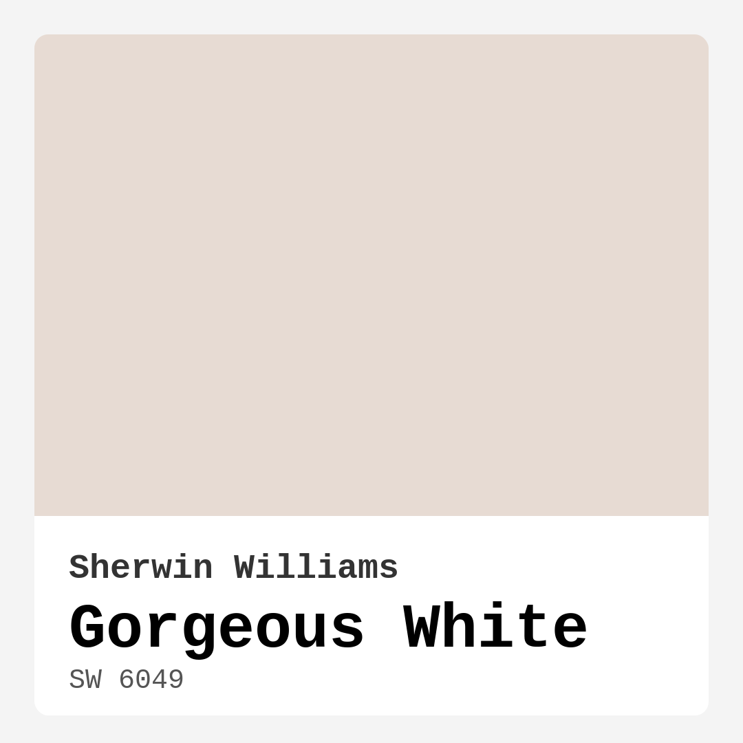
| HEX Code | #E7DBD3 |
| RGB | 231, 219, 211 |
| LRV | 83% |
| Undertone | Red |
| Finish Options | Eggshell, Satin, Semi-Gloss |
Imagine walking into a room that instantly wraps you in warmth and comfort. You know that feeling? That’s what Gorgeous White brings to your space. This soft, off-white hue from Sherwin Williams, with its delicate beige undertones, creates an inviting atmosphere that feels both elegant and relaxed.
Gorgeous White (SW 6049) is your go-to color when you’re looking to achieve a serene backdrop without sacrificing personality. It reflects a high amount of light thanks to its impressive Light Reflectance Value (LRV) of 83%. This means it not only brightens up a room but also gives it an airy, open feel. Picture it in your living room, where natural light dances off the walls, enhancing the space and making it feel larger.
One of the standout features of Gorgeous White is its subtle warmth. Unlike stark whites that can sometimes feel cold and unwelcoming, this color brings a cozy vibe, perfect for spaces where you want to unwind or host friends and family. Whether you’re going for a modern, traditional, or even a farmhouse aesthetic, Gorgeous White adapts effortlessly. Its versatility is a significant asset, allowing it to blend beautifully with various decor styles.
When applying Gorgeous White, you’ll find that its coverage is impressive. With just one or two coats, you can achieve a smooth, even finish. This paint is beginner-friendly, so even if you’re not a professional, you’ll have no trouble rolling it on or brushing it out. Plus, it’s touch-up friendly, making it easy to maintain that pristine look over time.
Considering the finish options—eggshell, satin, and semi-gloss—you’ll want to choose what best suits your room’s function. Eggshell is perfect for a soft, velvety look in living areas or bedrooms, while satin offers a bit more sheen, making it ideal for kitchens or bathrooms where you may need enhanced durability.
Let’s talk about the undertones, because they’re key to how Gorgeous White interacts with your space. Leaning towards red, the undertones of this color add depth and warmth. This is crucial when pairing with other colors or decor items. For instance, if you have wood accents or warm-colored furnishings, Gorgeous White will harmonize beautifully, enhancing the overall aesthetic without clashing.
However, it’s worth noting that Gorgeous White has its quirks. In high-traffic areas, it may show dirt more readily than darker shades. If you’re using it in a space like a hallway or kitchen, be prepared for more frequent touch-ups. Additionally, while its warmth is generally a plus, you’ll want to be cautious in very dimly lit rooms, as it could sometimes lean towards looking yellow if not illuminated properly.
So, how does Gorgeous White stack up against pure whites? The answer lies in its personality. Pure whites can be striking but may come off as too clinical or stark. Gorgeous White, however, has a softness that makes it inviting and versatile, lending itself well to various light conditions and decor styles.
Choosing a color for your project isn’t just about aesthetics; it’s about mood and functionality too. Gorgeous White fits effortlessly into any room you can think of. In a living room, it creates a calm, inviting atmosphere, perfect for cozy evenings. In a bedroom, it cultivates a serene retreat where you can relax and recharge. Consider it for kitchens and bathrooms too, where its warm undertones can brighten up the space and make it feel more welcoming.
And let’s not forget about its practical side. With a low VOC level, Gorgeous White is an excellent choice for those conscious of indoor air quality. It has a low odor and dries quickly, making it perfect for any home, even if you’re working on a tight timeline.
When it comes to pairing Gorgeous White with other colors, you’ve got plenty of options. You might consider using it alongside deeper shades like SW 6805 or SW 9634 for a dramatic contrast that still feels cohesive. For trim or cabinetry, a classic white like White Dove can enhance the overall feel, adding crispness without overwhelming the warmth of Gorgeous White.
And if you’re looking for complementary colors, think about accents in greens or earthy tones. These hues will create a lovely balance, allowing Gorgeous White to shine while also bringing depth to your decor.
In terms of application, it’s refreshing to know that Gorgeous White can be used in a myriad of settings, including rentals. Its classic appeal means it’s a timeless choice that won’t go out of style, making it a safe bet if you’re planning to refresh your space before moving out.
You might wonder about using Gorgeous White in smaller spaces. Absolutely! It can make those areas feel larger and more open, as long as you ensure adequate lighting. Positioning mirrors strategically can amplify the light reflection, enhancing the overall spaciousness.
Ultimately, Gorgeous White is more than just a pretty paint color; it’s a versatile tool in your home decor arsenal. It invites calmness and warmth into your space while offering the flexibility to adapt to your evolving style. So, as you contemplate your next project, consider how this stunning hue could transform your home into a sanctuary of comfort and elegance.
Whether you’re painting an entire room or just refreshing your trim, Gorgeous White is a fantastic choice that promises to deliver beauty and functionality. It’s time to embrace the warmth and subtle charm of this color—your home deserves it!

Real Room Photo of Gorgeous White SW 6049


Undertones of Gorgeous White ?
The undertones of Gorgeous White are a key aspect of its character, leaning towards Red. These subtle underlying hues are what give the color its depth and complexity. For example, a gray with a blue undertone will feel cooler and more modern, while one with a brown undertone will feel warmer and more traditional. It’s essential to test this paint in your home and observe it next to your existing furniture, flooring, and decor to see how these undertones interact and reveal themselves throughout the day.
HEX value: #E7DBD3
RGB code: 231, 219, 211
Is Gorgeous White Cool or Warm?
Gorgeous White is predominantly warm, which helps create a cozy and welcoming environment. Its warmth makes it a great choice for spaces where you want to feel relaxed and at ease.
Understanding Color Properties and Interior Design Tips
Hue refers to a specific position on the color wheel, measured in degrees from 0 to 360. Each degree represents a different pure color:
- 0° represents red
- 120° represents green
- 240° represents blue
Saturation describes the intensity or purity of a color and is expressed as a percentage:
- At 0%, the color appears completely desaturated—essentially a shade of gray
- At 100%, the color is at its most vivid and vibrant
Lightness indicates how light or dark a color is, also expressed as a percentage:
- 0% lightness results in black
- 100% lightness results in white
Using Warm Colors in Interior Design
Warm hues—such as reds, oranges, yellows, warm beiges, and greiges—are excellent choices for creating inviting and energetic spaces. These colors are particularly well-suited for:
- Kitchens, living rooms, and bathrooms, where warmth enhances comfort and sociability
- Large rooms, where warm tones can help reduce the sense of emptiness and make the space feel more intimate
For example:
- Warm beige shades provide a cozy, inviting atmosphere, ideal for living rooms, bedrooms, and hallways.
- Warm greige (a mix of beige and gray) offers the warmth of beige with the modern appeal of gray, making it a versatile backdrop for dining areas, bedrooms, and living spaces.
However, be mindful when using warm light tones in rooms with limited natural light. These shades may appear muted or even take on an unpleasant yellowish tint. To avoid a dull or flat appearance:
- Add depth by incorporating richer tones like deep greens, charcoal, or chocolate brown
- Use textured elements such as curtains, rugs, or cushions to bring dimension to the space
Pro Tip: Achieving Harmony with Warm and Cool Color Balance
To create a well-balanced and visually interesting interior, mix warm and cool tones strategically. This contrast adds depth and harmony to your design.
- If your walls feature warm hues, introduce cool-colored accents such as blue or green furniture, artwork, or accessories to create contrast.
- For a polished look, consider using a complementary color scheme, which pairs colors opposite each other on the color wheel (e.g., red with green, orange with blue).
This thoughtful mix not only enhances visual appeal but also creates a space that feels both dynamic and cohesive.

Light Temperature Affects on Gorgeous White
Natural Light
Natural daylight changes in color temperature as the sun moves across the sky. At sunrise and sunset, the light tends to have a warm, golden tone with a color temperature around 2000 Kelvin (K). As the day progresses and the sun rises higher, the light becomes cooler and more neutral. Around midday, especially when the sky is clear, natural light typically reaches its peak brightness and shifts to a cooler tone, ranging from 5500 to 6500 Kelvin. This midday light is close to what we perceive as pure white or daylight-balanced light.
These shifts in natural light can significantly influence how colors appear in a space, which is why designers often consider both the time of day and the orientation of windows when planning interior color schemes.
Artificial Light
When choosing artificial lighting, pay close attention to the color temperature, measured in Kelvin (K). This determines how warm or cool the light will appear. Lower temperatures, around 2700K, give off a warm, yellow glow often used in living rooms or bedrooms. Higher temperatures, above 5000K, create a cool, bluish light similar to daylight, commonly used in kitchens, offices, or task areas.
Use the slider to see how lighting temperature can affect the appearance of a surface or color throughout a space.


4800K
LRV of Gorgeous White
The Light Reflectance Value (LRV) of Gorgeous White is 83%, which places it in the Light category. This means it Reflects a high amount of light. Understanding a paint’s LRV is crucial for predicting how it will look in your space. A higher LRV indicates a lighter color that reflects more light, making rooms feel larger and brighter. A lower LRV signifies a darker color that absorbs more light, creating a cozier, more intimate atmosphere. Always consider the natural and artificial lighting in your room when selecting a paint color based on its LRV.
Detailed Review of Gorgeous White
Additional Paint Characteristics
Ideal Rooms
Bathroom, Bedroom, Dining Room, Home Office, Kitchen, Living Room
Decor Styles
Farmhouse, Minimalist, Modern, Traditional
Coverage
Good (1–2 Coats), High Hide, Touch-Up Friendly
Ease of Application
Beginner Friendly, Brush Smooth, Roller-Ready
Washability
Highly Washable, Washable
VOC Level
Low VOC
Best Use
Cabinets, Ceiling, Interior Walls, Trim
Room Suitability
Bathroom, Bedroom, Dining Room, Kitchen, Living Room
Tone Tag
Airy, Neutral, Warm
Finish Type
Eggshell, Satin
Paint Performance
High Coverage, Low Odor, Quick Drying
Use Cases
Best for Modern Farmhouse, Best for Open Concept, Best for Rentals, Classic Favorite
Mood
Calm, Cozy, Inviting
Trim Pairing
Complements Brass Fixtures, Good with Wood Trim, Pairs with White Dove
Gorgeous White is truly a versatile paint choice that adapts effortlessly to various settings. Its soft, warm undertones create a welcoming atmosphere, making it ideal for spaces where you want to unwind or entertain. It’s particularly effective in larger areas, where it can reflect light beautifully and make a space feel airy and open. The application is smooth, and with a good quality brush or roller, you’ll find it spreads evenly, requiring just one or two coats for full coverage. It works well in both bright and dim lighting, maintaining its charm without appearing stark or harsh. Overall, Gorgeous White proves to be an excellent choice for anyone looking to achieve a fresh yet sophisticated look in their home.
Pros & Cons of SW 6049 Gorgeous White
Pros
Cons
Colors that go with Sherwin Williams Gorgeous White
FAQ on SW 6049 Gorgeous White
Can Gorgeous White be used in smaller spaces?
Absolutely! Gorgeous White can make smaller spaces feel larger and more open due to its high light reflectance. However, you may want to ensure it is paired with adequate lighting to fully capture its warmth and charm.
How does Gorgeous White compare to pure white paints?
Gorgeous White has a warmer tone compared to pure whites, which often can appear stark or cold. This makes it more adaptable for various styles and lighting conditions, providing a softer aesthetic that feels more inviting.
Comparisons Gorgeous White with other colors
Gorgeous White SW 6049 vs Natural Linen SW 9109
| Attribute | Gorgeous White SW 6049 | Natural Linen SW 9109 |
|---|---|---|
| Color Name | Gorgeous White SW 6049 | Natural Linen SW 9109 |
| Color | ||
| Hue | Beige | Beige |
| Brightness | Light | Light |
| RGB | 231, 219, 211 | 223, 211, 195 |
| LRV | 83% | 74% |
| Finish Type | Eggshell, Satin | Eggshell, Matte, Satin |
| Finish Options | Eggshell, Satin, Semi-Gloss | Eggshell, Matte, Satin |
| Ideal Rooms | Bathroom, Bedroom, Dining Room, Home Office, Kitchen, Living Room | Bedroom, Dining Room, Hallway, Home Office, Kitchen, Living Room |
| Decor Styles | Farmhouse, Minimalist, Modern, Traditional | Bohemian, Modern Farmhouse, Scandinavian, Transitional |
| Coverage | Good (1–2 Coats), High Hide, Touch-Up Friendly | Good (1–2 Coats), Touch-Up Friendly |
| Ease of Application | Beginner Friendly, Brush Smooth, Roller-Ready | Beginner Friendly, Brush Smooth, Fast-Drying, Roller-Ready |
| Washability | Highly Washable, Washable | Highly Washable, Washable, Wipeable |
| Room Suitability | Bathroom, Bedroom, Dining Room, Kitchen, Living Room | Bedroom, Dining Room, Home Office, Kitchen, Living Room |
| Tone | Airy, Neutral, Warm | Earthy, Neutral, Warm |
| Paint Performance | High Coverage, Low Odor, Quick Drying | Easy Touch-Up, Low Odor, Quick Drying, Scuff Resistant |
Gorgeous White SW 6049 vs Alabaster SW 7008
| Attribute | Gorgeous White SW 6049 | Alabaster SW 7008 |
|---|---|---|
| Color Name | Gorgeous White SW 6049 | Alabaster SW 7008 |
| Color | ||
| Hue | Beige | Beige |
| Brightness | Light | Light |
| RGB | 231, 219, 211 | 237, 234, 224 |
| LRV | 83% | 82% |
| Finish Type | Eggshell, Satin | Eggshell, Matte, Satin |
| Finish Options | Eggshell, Satin, Semi-Gloss | Eggshell, Matte, Satin |
| Ideal Rooms | Bathroom, Bedroom, Dining Room, Home Office, Kitchen, Living Room | Bathroom, Bedroom, Dining Room, Entryway, Home Office, Kitchen, Living Room, Nursery |
| Decor Styles | Farmhouse, Minimalist, Modern, Traditional | Coastal, Contemporary, Minimalist, Modern Farmhouse, Traditional, Transitional |
| Coverage | Good (1–2 Coats), High Hide, Touch-Up Friendly | Good (1–2 Coats), Touch-Up Friendly |
| Ease of Application | Beginner Friendly, Brush Smooth, Roller-Ready | Beginner Friendly, Brush Smooth, Fast-Drying, Low Splatter, Roller-Ready |
| Washability | Highly Washable, Washable | Washable, Wipeable |
| Room Suitability | Bathroom, Bedroom, Dining Room, Kitchen, Living Room | Bathroom, Bedroom, Dining Room, Hallway, Home Office, Kitchen, Living Room, Nursery |
| Tone | Airy, Neutral, Warm | Creamy, Neutral, Warm |
| Paint Performance | High Coverage, Low Odor, Quick Drying | Easy Touch-Up, High Coverage, Low Odor, Quick Drying |
Gorgeous White SW 6049 vs White Duck SW 7010
| Attribute | Gorgeous White SW 6049 | White Duck SW 7010 |
|---|---|---|
| Color Name | Gorgeous White SW 6049 | White Duck SW 7010 |
| Color | ||
| Hue | Beige | Beige |
| Brightness | Light | Light |
| RGB | 231, 219, 211 | 229, 223, 210 |
| LRV | 83% | 75% |
| Finish Type | Eggshell, Satin | Eggshell, Matte, Satin |
| Finish Options | Eggshell, Satin, Semi-Gloss | Eggshell, Matte, Satin |
| Ideal Rooms | Bathroom, Bedroom, Dining Room, Home Office, Kitchen, Living Room | Bedroom, Dining Room, Home Office, Kitchen, Living Room, Nursery |
| Decor Styles | Farmhouse, Minimalist, Modern, Traditional | Farmhouse, Modern, Scandinavian, Traditional, Transitional |
| Coverage | Good (1–2 Coats), High Hide, Touch-Up Friendly | Good (1–2 Coats), Touch-Up Friendly |
| Ease of Application | Beginner Friendly, Brush Smooth, Roller-Ready | Beginner Friendly, Brush Smooth, Fast-Drying, Roller-Ready |
| Washability | Highly Washable, Washable | Highly Washable, Washable |
| Room Suitability | Bathroom, Bedroom, Dining Room, Kitchen, Living Room | Bedroom, Dining Room, Home Office, Kitchen, Living Room |
| Tone | Airy, Neutral, Warm | Creamy, Neutral, Warm |
| Paint Performance | High Coverage, Low Odor, Quick Drying | Easy Touch-Up, Fade Resistant, Low Odor, Quick Drying |
Gorgeous White SW 6049 vs Greek Villa SW 7551
| Attribute | Gorgeous White SW 6049 | Greek Villa SW 7551 |
|---|---|---|
| Color Name | Gorgeous White SW 6049 | Greek Villa SW 7551 |
| Color | ||
| Hue | Beige | Beige |
| Brightness | Light | Light |
| RGB | 231, 219, 211 | 240, 236, 226 |
| LRV | 83% | 82% |
| Finish Type | Eggshell, Satin | Eggshell, Satin |
| Finish Options | Eggshell, Satin, Semi-Gloss | Eggshell, Flat, Satin |
| Ideal Rooms | Bathroom, Bedroom, Dining Room, Home Office, Kitchen, Living Room | Bedroom, Dining Room, Hallway, Home Office, Kitchen, Living Room |
| Decor Styles | Farmhouse, Minimalist, Modern, Traditional | Coastal, Minimalist, Modern Farmhouse, Traditional, Transitional |
| Coverage | Good (1–2 Coats), High Hide, Touch-Up Friendly | Good (1–2 Coats), Touch-Up Friendly |
| Ease of Application | Beginner Friendly, Brush Smooth, Roller-Ready | Beginner Friendly, Brush Smooth, Roller-Ready |
| Washability | Highly Washable, Washable | Washable, Wipeable |
| Room Suitability | Bathroom, Bedroom, Dining Room, Kitchen, Living Room | Bedroom, Dining Room, Hallway, Kitchen, Living Room |
| Tone | Airy, Neutral, Warm | Creamy, Neutral, Warm |
| Paint Performance | High Coverage, Low Odor, Quick Drying | Easy Touch-Up, High Coverage, Low Odor, Quick Drying |
Gorgeous White SW 6049 vs City Loft SW 7631
| Attribute | Gorgeous White SW 6049 | City Loft SW 7631 |
|---|---|---|
| Color Name | Gorgeous White SW 6049 | City Loft SW 7631 |
| Color | ||
| Hue | Beige | Beige |
| Brightness | Light | Light |
| RGB | 231, 219, 211 | 223, 218, 209 |
| LRV | 83% | 66% |
| Finish Type | Eggshell, Satin | Eggshell, Matte, Satin |
| Finish Options | Eggshell, Satin, Semi-Gloss | Eggshell, Matte, Satin |
| Ideal Rooms | Bathroom, Bedroom, Dining Room, Home Office, Kitchen, Living Room | Bedroom, Hallway, Home Office, Kitchen, Living Room |
| Decor Styles | Farmhouse, Minimalist, Modern, Traditional | Minimalist, Modern, Scandinavian, Transitional |
| Coverage | Good (1–2 Coats), High Hide, Touch-Up Friendly | Good (1–2 Coats), Touch-Up Friendly |
| Ease of Application | Beginner Friendly, Brush Smooth, Roller-Ready | Beginner Friendly, Brush Smooth, Fast-Drying, Low Splatter, Roller-Ready |
| Washability | Highly Washable, Washable | Highly Washable, Washable |
| Room Suitability | Bathroom, Bedroom, Dining Room, Kitchen, Living Room | Bedroom, Hallway, Home Office, Living Room |
| Tone | Airy, Neutral, Warm | Balanced, Muted, Neutral, Warm |
| Paint Performance | High Coverage, Low Odor, Quick Drying | Easy Touch-Up, High Coverage, Low Odor, Quick Drying, Scuff Resistant |
Gorgeous White SW 6049 vs Shoji White SW 7042
| Attribute | Gorgeous White SW 6049 | Shoji White SW 7042 |
|---|---|---|
| Color Name | Gorgeous White SW 6049 | Shoji White SW 7042 |
| Color | ||
| Hue | Beige | Beige |
| Brightness | Light | Light |
| RGB | 231, 219, 211 | 230, 223, 211 |
| LRV | 83% | 74% |
| Finish Type | Eggshell, Satin | Eggshell, Matte, Satin |
| Finish Options | Eggshell, Satin, Semi-Gloss | Eggshell, Matte, Satin |
| Ideal Rooms | Bathroom, Bedroom, Dining Room, Home Office, Kitchen, Living Room | Bedroom, Dining Room, Home Office, Living Room, Nursery |
| Decor Styles | Farmhouse, Minimalist, Modern, Traditional | Farmhouse, Japanese, Minimalist, Modern, Transitional |
| Coverage | Good (1–2 Coats), High Hide, Touch-Up Friendly | Good (1–2 Coats), Touch-Up Friendly |
| Ease of Application | Beginner Friendly, Brush Smooth, Roller-Ready | Beginner Friendly, Brush Smooth, Roller-Ready |
| Washability | Highly Washable, Washable | Washable, Wipeable |
| Room Suitability | Bathroom, Bedroom, Dining Room, Kitchen, Living Room | Bedroom, Dining Room, Home Office, Living Room, Nursery |
| Tone | Airy, Neutral, Warm | Creamy, Neutral, Warm |
| Paint Performance | High Coverage, Low Odor, Quick Drying | Easy Touch-Up, High Coverage, Low Odor |
Gorgeous White SW 6049 vs Neutral Ground SW 7568
| Attribute | Gorgeous White SW 6049 | Neutral Ground SW 7568 |
|---|---|---|
| Color Name | Gorgeous White SW 6049 | Neutral Ground SW 7568 |
| Color | ||
| Hue | Beige | Beige |
| Brightness | Light | Light |
| RGB | 231, 219, 211 | 226, 218, 202 |
| LRV | 83% | 40% |
| Finish Type | Eggshell, Satin | Eggshell, Matte, Satin |
| Finish Options | Eggshell, Satin, Semi-Gloss | Eggshell, Matte, Satin |
| Ideal Rooms | Bathroom, Bedroom, Dining Room, Home Office, Kitchen, Living Room | Bedroom, Dining Room, Hallway, Home Office, Kitchen, Living Room |
| Decor Styles | Farmhouse, Minimalist, Modern, Traditional | Farmhouse, Modern, Scandinavian, Traditional, Transitional |
| Coverage | Good (1–2 Coats), High Hide, Touch-Up Friendly | Good (1–2 Coats) |
| Ease of Application | Beginner Friendly, Brush Smooth, Roller-Ready | Beginner Friendly, Brush Smooth, Roller-Ready |
| Washability | Highly Washable, Washable | Highly Washable, Washable |
| Room Suitability | Bathroom, Bedroom, Dining Room, Kitchen, Living Room | Bedroom, Dining Room, Home Office, Kitchen, Living Room |
| Tone | Airy, Neutral, Warm | Earthy, Neutral, Warm |
| Paint Performance | High Coverage, Low Odor, Quick Drying | Easy Touch-Up, Low Odor, Quick Drying, Scuff Resistant |
Gorgeous White SW 6049 vs Limewash SW 9589
| Attribute | Gorgeous White SW 6049 | Limewash SW 9589 |
|---|---|---|
| Color Name | Gorgeous White SW 6049 | Limewash SW 9589 |
| Color | ||
| Hue | Beige | Beige |
| Brightness | Light | Light |
| RGB | 231, 219, 211 | 219, 213, 203 |
| LRV | 83% | 75% |
| Finish Type | Eggshell, Satin | Flat, Matte |
| Finish Options | Eggshell, Satin, Semi-Gloss | Flat, Matte |
| Ideal Rooms | Bathroom, Bedroom, Dining Room, Home Office, Kitchen, Living Room | Bedroom, Dining Room, Hallway, Kitchen, Living Room |
| Decor Styles | Farmhouse, Minimalist, Modern, Traditional | Bohemian, Contemporary, Modern Farmhouse, Rustic |
| Coverage | Good (1–2 Coats), High Hide, Touch-Up Friendly | Good (1–2 Coats), Touch-Up Friendly |
| Ease of Application | Beginner Friendly, Brush Smooth, Roller-Ready | Beginner Friendly, Brush Smooth, Roller-Ready, Thin Formula |
| Washability | Highly Washable, Washable | Washable, Wipeable |
| Room Suitability | Bathroom, Bedroom, Dining Room, Kitchen, Living Room | Bathroom, Bedroom, Dining Room, Kitchen, Living Room |
| Tone | Airy, Neutral, Warm | Earthy, Muted, Warm |
| Paint Performance | High Coverage, Low Odor, Quick Drying | Easy Touch-Up, Long Lasting, Low Odor |
Gorgeous White SW 6049 vs Creamy SW 7012
| Attribute | Gorgeous White SW 6049 | Creamy SW 7012 |
|---|---|---|
| Color Name | Gorgeous White SW 6049 | Creamy SW 7012 |
| Color | ||
| Hue | Beige | Beige |
| Brightness | Light | Light |
| RGB | 231, 219, 211 | 239, 232, 219 |
| LRV | 83% | 75% |
| Finish Type | Eggshell, Satin | Eggshell, Satin |
| Finish Options | Eggshell, Satin, Semi-Gloss | Eggshell, Flat, Satin |
| Ideal Rooms | Bathroom, Bedroom, Dining Room, Home Office, Kitchen, Living Room | Bedroom, Dining Room, Hallway, Home Office, Kitchen, Living Room |
| Decor Styles | Farmhouse, Minimalist, Modern, Traditional | Contemporary, Minimalist, Modern Farmhouse, Rustic, Traditional |
| Coverage | Good (1–2 Coats), High Hide, Touch-Up Friendly | Good (1–2 Coats), Touch-Up Friendly |
| Ease of Application | Beginner Friendly, Brush Smooth, Roller-Ready | Beginner Friendly, Fast-Drying, Low Splatter |
| Washability | Highly Washable, Washable | Washable, Wipeable |
| Room Suitability | Bathroom, Bedroom, Dining Room, Kitchen, Living Room | Bedroom, Dining Room, Hallway, Kitchen, Living Room |
| Tone | Airy, Neutral, Warm | Creamy, Neutral, Warm |
| Paint Performance | High Coverage, Low Odor, Quick Drying | High Coverage, Low Odor, Quick Drying |
Gorgeous White SW 6049 vs White Sesame SW 9586
| Attribute | Gorgeous White SW 6049 | White Sesame SW 9586 |
|---|---|---|
| Color Name | Gorgeous White SW 6049 | White Sesame SW 9586 |
| Color | ||
| Hue | Beige | Beige |
| Brightness | Light | Light |
| RGB | 231, 219, 211 | 227, 219, 205 |
| LRV | 83% | 75% |
| Finish Type | Eggshell, Satin | Eggshell, Matte, Satin |
| Finish Options | Eggshell, Satin, Semi-Gloss | Eggshell, Matte, Satin |
| Ideal Rooms | Bathroom, Bedroom, Dining Room, Home Office, Kitchen, Living Room | Bedroom, Home Office, Kitchen, Living Room, Nursery |
| Decor Styles | Farmhouse, Minimalist, Modern, Traditional | Minimalist, Modern Farmhouse, Rustic, Scandinavian, Transitional |
| Coverage | Good (1–2 Coats), High Hide, Touch-Up Friendly | Good (1–2 Coats), Touch-Up Friendly |
| Ease of Application | Beginner Friendly, Brush Smooth, Roller-Ready | Beginner Friendly, Brush Smooth, Roller-Ready |
| Washability | Highly Washable, Washable | Highly Washable, Washable |
| Room Suitability | Bathroom, Bedroom, Dining Room, Kitchen, Living Room | Bedroom, Dining Room, Home Office, Living Room, Nursery |
| Tone | Airy, Neutral, Warm | Creamy, Earthy, Neutral, Warm |
| Paint Performance | High Coverage, Low Odor, Quick Drying | Easy Touch-Up, High Coverage, Low Odor, Quick Drying |
Official Page of Sherwin Williams Gorgeous White SW 6049