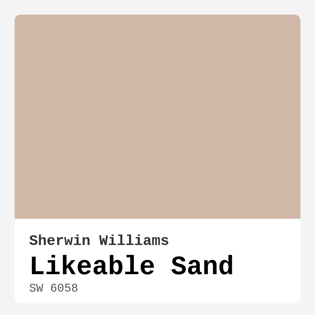
Color Preview & Key Details
| HEX Code | #D1B7A8 |
| RGB | 209, 183, 168 |
| LRV | 61% |
| Undertone | Red |
| Finish Options | Eggshell, Matte, Satin |
Imagine walking into a space that feels instantly welcoming, like a warm hug after a long day. That’s what Likeable Sand brings to the table. This Sherwin Williams color, with the code SW 6058, is more than just a pretty shade; it’s an invitation to relax, unwind, and feel at home. With its soft, sandy tones and inviting warmth, this color can transform your interiors into a cozy haven.
Likeable Sand is a warm pink hue, subtly leaning towards earthy tones. Its medium brightness and low VOC level make it an eco-friendly choice that doesn’t compromise on style. If you’re considering a paint project, this versatile color is a fantastic option that effortlessly complements various decor styles, from modern farmhouse to bohemian chic.
As an experienced home designer, I can tell you that color has a profound impact on mood and space. Likeable Sand excels at creating that sense of comfort we all crave in our homes. It’s especially effective in living rooms, bedrooms, kitchens, and dining rooms—areas where you want to foster connection and comfort. Its soft undertones work wonders in making large spaces feel more intimate and inviting.
One of the standout features of Likeable Sand is its ability to adapt to different lighting scenarios. In natural light, it radiates a soft glow, enhancing its warm undertones. This quality can breathe life into dimly lit rooms, making them feel brighter and more inviting. Conversely, under artificial lighting, the color may take on a more subdued character, yet it retains its warm essence. This adaptability means you can trust Likeable Sand to perform beautifully in various settings throughout the day.
You might be wondering how this shade compares to other neutrals. Unlike many grays or beiges that can feel cold and uninviting, Likeable Sand has a unique warmth that draws you in. Its subtle peach undertone adds a layer of charm and depth, setting it apart from the typical neutral palette. When paired with the right decor, it can create a relaxed and stylish atmosphere, making your home feel both modern and timeless.
When it comes to choosing a finish for Likeable Sand, you have options that can enhance its beauty. An eggshell finish is perfect for areas where you want an elegant, soft look, such as living rooms and bedrooms. If you need something more durable and easy to clean, satin is a wise choice for high-traffic areas like kitchens or bathrooms. On the other hand, a matte finish can impart a cozy feel in low-traffic spaces or ceilings, allowing the warm tones of Likeable Sand to shine through beautifully.
Now, let’s talk about how to integrate Likeable Sand into your existing decor. This color pairs wonderfully with whites and creams, particularly tones like White Dove, which can help create a fresh and airy look. If you’re a fan of metallic accents, brass fixtures will pop against Likeable Sand, adding a touch of sophistication. Wood trim also works beautifully, grounding the warmth of the paint while adding texture and charm.
When you’re painting, remember that Likeable Sand is beginner-friendly. Its smooth application makes it ideal for DIY enthusiasts. You’ll find it rolls on effortlessly and dries quickly, which is a blessing for anyone looking to refresh their space without spending an eternity on a paint job. Touch-ups are a breeze, making it a practical choice for homes with kids or pets.
However, there are a couple of things to keep in mind. Likeable Sand may require multiple coats for full coverage, especially if you’re transitioning from a darker color. Also, lighter shades like this one can show scuffs more easily, so consider this if you anticipate high traffic in the painted area. Yet, the warmth and inviting nature of Likeable Sand often outweigh these considerations, making it a favorite for many homeowners.
Let’s not forget about the versatility of this color. It works harmoniously across various decor styles. Whether you’re leaning towards a coastal vibe with light linens and natural textures, a rustic aesthetic with reclaimed wood and earthy accents, or a contemporary look with sleek lines and bold accessories, Likeable Sand can adapt. This makes it a smart choice for anyone looking to create a cohesive look throughout their home.
In terms of maintenance, Likeable Sand is designed to be washable and wipeable, which is especially handy in busy households. You won’t have to stress about every little mark; simply wipe it down with a damp cloth to keep your walls looking fresh. This practical aspect, combined with its aesthetic appeal, solidifies Likeable Sand as a go-to paint for many interior projects.
If you’re still on the fence, consider testing Likeable Sand in your space. Paint a small section of the wall and observe it at different times of the day. This will help you see how the light interacts with the color and how it feels in your home. You might be surprised at how quickly it can transform your space into something that feels warm and inviting.
In conclusion, Likeable Sand is a beautifully warm and earthy hue that creates a cozy atmosphere in any room. Its versatility, ease of application, and ability to adapt to various lighting conditions make it a fantastic choice for homeowners looking to refresh their interiors. Whether you want to create a serene bedroom, a welcoming living room, or a charming dining space, Likeable Sand can help you achieve that vision. Embrace the warmth, and let this lovely color enhance your home. You might just fall in love with the inviting ambiance it brings.
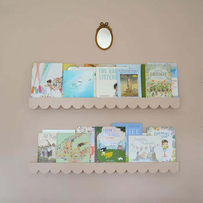
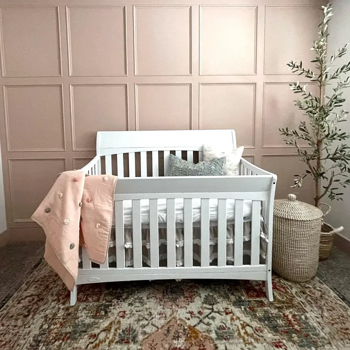
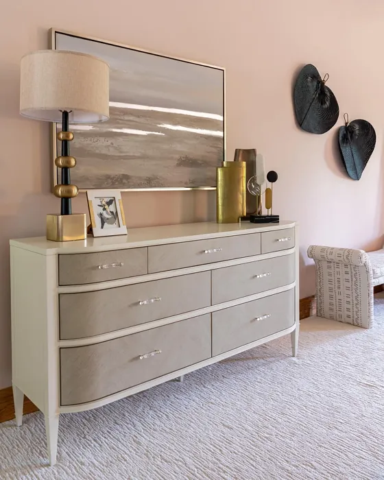
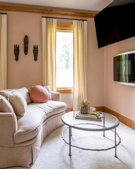
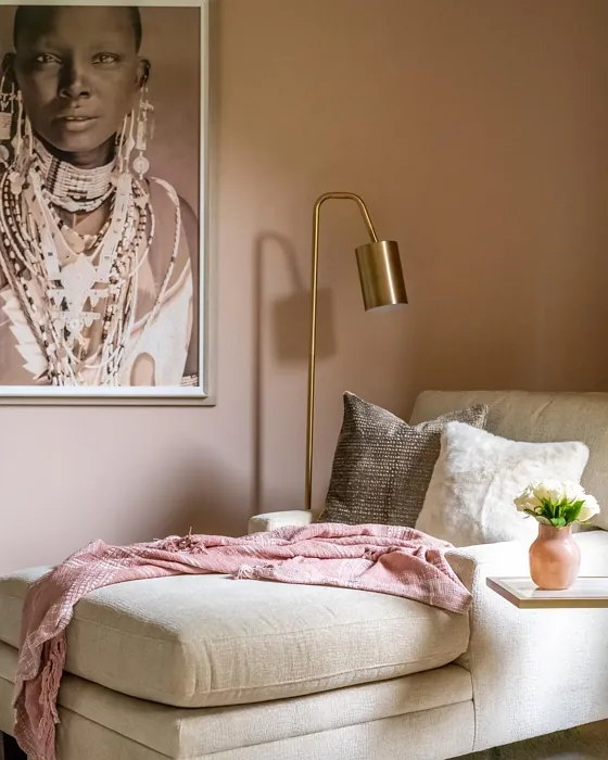
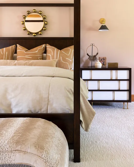
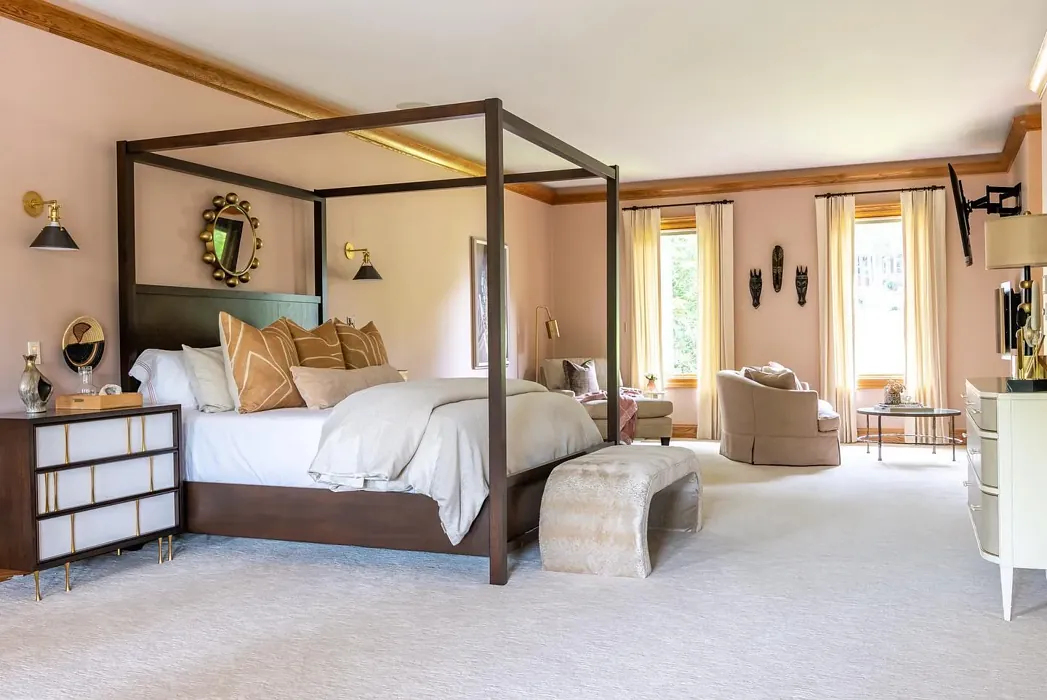
Real Room Photo of Likeable Sand SW 6058


Undertones of Likeable Sand ?
The undertones of Likeable Sand are a key aspect of its character, leaning towards Red. These subtle underlying hues are what give the color its depth and complexity. For example, a gray with a blue undertone will feel cooler and more modern, while one with a brown undertone will feel warmer and more traditional. It’s essential to test this paint in your home and observe it next to your existing furniture, flooring, and decor to see how these undertones interact and reveal themselves throughout the day.
HEX value: #D1B7A8
RGB code: 209, 183, 168
Is Likeable Sand Cool or Warm?
This color sits firmly in the warm category, making it a great choice for spaces that benefit from a touch of coziness. The warmth invites a sense of comfort and can help make larger spaces feel more intimate.
Understanding Color Properties and Interior Design Tips
Hue refers to a specific position on the color wheel, measured in degrees from 0 to 360. Each degree represents a different pure color:
- 0° represents red
- 120° represents green
- 240° represents blue
Saturation describes the intensity or purity of a color and is expressed as a percentage:
- At 0%, the color appears completely desaturated—essentially a shade of gray
- At 100%, the color is at its most vivid and vibrant
Lightness indicates how light or dark a color is, also expressed as a percentage:
- 0% lightness results in black
- 100% lightness results in white
Using Warm Colors in Interior Design
Warm hues—such as reds, oranges, yellows, warm beiges, and greiges—are excellent choices for creating inviting and energetic spaces. These colors are particularly well-suited for:
- Kitchens, living rooms, and bathrooms, where warmth enhances comfort and sociability
- Large rooms, where warm tones can help reduce the sense of emptiness and make the space feel more intimate
For example:
- Warm beige shades provide a cozy, inviting atmosphere, ideal for living rooms, bedrooms, and hallways.
- Warm greige (a mix of beige and gray) offers the warmth of beige with the modern appeal of gray, making it a versatile backdrop for dining areas, bedrooms, and living spaces.
However, be mindful when using warm light tones in rooms with limited natural light. These shades may appear muted or even take on an unpleasant yellowish tint. To avoid a dull or flat appearance:
- Add depth by incorporating richer tones like deep greens, charcoal, or chocolate brown
- Use textured elements such as curtains, rugs, or cushions to bring dimension to the space
Pro Tip: Achieving Harmony with Warm and Cool Color Balance
To create a well-balanced and visually interesting interior, mix warm and cool tones strategically. This contrast adds depth and harmony to your design.
- If your walls feature warm hues, introduce cool-colored accents such as blue or green furniture, artwork, or accessories to create contrast.
- For a polished look, consider using a complementary color scheme, which pairs colors opposite each other on the color wheel (e.g., red with green, orange with blue).
This thoughtful mix not only enhances visual appeal but also creates a space that feels both dynamic and cohesive.

Light Temperature Affects on Likeable Sand
Natural Light
Natural daylight changes in color temperature as the sun moves across the sky. At sunrise and sunset, the light tends to have a warm, golden tone with a color temperature around 2000 Kelvin (K). As the day progresses and the sun rises higher, the light becomes cooler and more neutral. Around midday, especially when the sky is clear, natural light typically reaches its peak brightness and shifts to a cooler tone, ranging from 5500 to 6500 Kelvin. This midday light is close to what we perceive as pure white or daylight-balanced light.
These shifts in natural light can significantly influence how colors appear in a space, which is why designers often consider both the time of day and the orientation of windows when planning interior color schemes.
Artificial Light
When choosing artificial lighting, pay close attention to the color temperature, measured in Kelvin (K). This determines how warm or cool the light will appear. Lower temperatures, around 2700K, give off a warm, yellow glow often used in living rooms or bedrooms. Higher temperatures, above 5000K, create a cool, bluish light similar to daylight, commonly used in kitchens, offices, or task areas.
Use the slider to see how lighting temperature can affect the appearance of a surface or color throughout a space.


4800K
LRV of Likeable Sand
The Light Reflectance Value (LRV) of Likeable Sand is 61%, which places it in the Medium category. This means it Reflects a moderate amount of light. Understanding a paint’s LRV is crucial for predicting how it will look in your space. A higher LRV indicates a lighter color that reflects more light, making rooms feel larger and brighter. A lower LRV signifies a darker color that absorbs more light, creating a cozier, more intimate atmosphere. Always consider the natural and artificial lighting in your room when selecting a paint color based on its LRV.
Detailed Review of Likeable Sand
Additional Paint Characteristics
Ideal Rooms
Bedroom, Dining Room, Home Office, Kitchen, Living Room
Decor Styles
Bohemian, Coastal, Contemporary, Modern Farmhouse, Rustic
Coverage
Good (1–2 Coats), Touch-Up Friendly
Ease of Application
Beginner Friendly, Brush Smooth, Fast-Drying, Roller-Ready
Washability
Washable, Wipeable
VOC Level
Low VOC
Best Use
Accent Wall, Bedroom, Dining Room, Interior Walls, Living Room
Room Suitability
Bedroom, Dining Room, Home Office, Kitchen, Living Room
Tone Tag
Earthy, Muted, Warm
Finish Type
Eggshell, Matte, Satin
Paint Performance
Easy Touch-Up, Low Odor, Quick Drying
Use Cases
Best for Low Light Rooms, Best for Modern Farmhouse, Best for Rentals, Classic Favorite
Mood
Cozy, Inviting, Restful
Trim Pairing
Complements Brass Fixtures, Good with Wood Trim, Pairs with White Dove
Likeable Sand is an exceptional choice for anyone looking to enhance their interiors with a warm and inviting tone. The color’s soft sandy hue creates a calming backdrop that works beautifully in both bright and dim lighting. Whether you’re redesigning a living room or sprucing up a bedroom, this shade provides the versatility needed to adapt to various decor styles, from modern farmhouse to bohemian. It’s particularly effective in rooms that aim to exude a sense of comfort and coziness, making it a top pick for spaces where relaxation is key. When applied, you’ll appreciate its smooth finish and how it reflects light, adding depth to your walls without overpowering the space. Overall, Likeable Sand is a smart choice for those who want a neutral yet warm foundation for their home.
Pros & Cons of SW 6058 Likeable Sand
Pros
Cons
Colors that go with Sherwin Williams Likeable Sand
FAQ on SW 6058 Likeable Sand
What type of finish should I choose for Likeable Sand?
Choosing the right finish depends on the room and the effect you want to achieve. For a soft, elegant look, an eggshell finish works wonderfully in living rooms and bedrooms. If you’re looking for something more durable and easy to clean, consider satin for kitchens or bathrooms. Matte finishes are great for ceilings or low-traffic areas where you want a cozy feel. No matter what, Likeable Sand’s warm tone shines through beautifully in any finish you select.
How does Likeable Sand compare to other neutral colors?
Unlike many grays or beiges, Likeable Sand carries a unique warmth that can make spaces feel inviting rather than cold. It stands out from typical neutrals by incorporating a soft peach undertone, which adds personality and charm. When compared to cooler tones, it creates a more grounded atmosphere, perfect for those who want their home to feel cozy and welcoming, while still being modern and stylish. This makes it a fantastic choice for interior design.
Comparisons Likeable Sand with other colors
Likeable Sand SW 6058 vs Realist Beige SW 6078
| Attribute | Likeable Sand SW 6058 | Realist Beige SW 6078 |
|---|---|---|
| Color Name | Likeable Sand SW 6058 | Realist Beige SW 6078 |
| Color | ||
| Hue | Pink | Pink |
| Brightness | Medium | Medium |
| RGB | 209, 183, 168 | 211, 200, 189 |
| LRV | 61% | 34% |
| Finish Type | Eggshell, Matte, Satin | Eggshell, Matte, Satin |
| Finish Options | Eggshell, Matte, Satin | Eggshell, Matte, Satin |
| Ideal Rooms | Bedroom, Dining Room, Home Office, Kitchen, Living Room | Bedroom, Dining Room, Entryway, Home Office, Kitchen, Living Room |
| Decor Styles | Bohemian, Coastal, Contemporary, Modern Farmhouse, Rustic | Contemporary, Minimalist, Modern Farmhouse, Rustic, Traditional |
| Coverage | Good (1–2 Coats), Touch-Up Friendly | Good (1–2 Coats), Touch-Up Friendly |
| Ease of Application | Beginner Friendly, Brush Smooth, Fast-Drying, Roller-Ready | Beginner Friendly, Brush Smooth, Fast-Drying, Roller-Ready |
| Washability | Washable, Wipeable | Washable, Wipeable |
| Room Suitability | Bedroom, Dining Room, Home Office, Kitchen, Living Room | Bedroom, Dining Room, Home Office, Kitchen, Living Room |
| Tone | Earthy, Muted, Warm | Earthy, Neutral, Warm |
| Paint Performance | Easy Touch-Up, Low Odor, Quick Drying | High Coverage, Low Odor, Quick Drying |
Likeable Sand SW 6058 vs Rosaline Pearl SW 9077
| Attribute | Likeable Sand SW 6058 | Rosaline Pearl SW 9077 |
|---|---|---|
| Color Name | Likeable Sand SW 6058 | Rosaline Pearl SW 9077 |
| Color | ||
| Hue | Pink | Pink |
| Brightness | Medium | Medium |
| RGB | 209, 183, 168 | 163, 136, 135 |
| LRV | 61% | 69% |
| Finish Type | Eggshell, Matte, Satin | Eggshell, Matte |
| Finish Options | Eggshell, Matte, Satin | Eggshell, Matte, Satin |
| Ideal Rooms | Bedroom, Dining Room, Home Office, Kitchen, Living Room | Bedroom, Dining Room, Home Office, Living Room |
| Decor Styles | Bohemian, Coastal, Contemporary, Modern Farmhouse, Rustic | Bohemian, Contemporary, Modern, Transitional |
| Coverage | Good (1–2 Coats), Touch-Up Friendly | Good (1–2 Coats) |
| Ease of Application | Beginner Friendly, Brush Smooth, Fast-Drying, Roller-Ready | Beginner Friendly, Brush Smooth, Fast-Drying, Roller-Ready |
| Washability | Washable, Wipeable | Washable, Wipeable |
| Room Suitability | Bedroom, Dining Room, Home Office, Kitchen, Living Room | Bedroom, Dining Room, Home Office, Living Room |
| Tone | Earthy, Muted, Warm | Dusty, Muted, Warm |
| Paint Performance | Easy Touch-Up, Low Odor, Quick Drying | Easy Touch-Up, Fade Resistant, Low Odor |
Likeable Sand SW 6058 vs Cabbage Rose SW 0003
| Attribute | Likeable Sand SW 6058 | Cabbage Rose SW 0003 |
|---|---|---|
| Color Name | Likeable Sand SW 6058 | Cabbage Rose SW 0003 |
| Color | ||
| Hue | Pink | Pink |
| Brightness | Medium | Medium |
| RGB | 209, 183, 168 | 197, 159, 145 |
| LRV | 61% | 15% |
| Finish Type | Eggshell, Matte, Satin | Eggshell, Matte, Satin |
| Finish Options | Eggshell, Matte, Satin | Eggshell, Matte, Satin |
| Ideal Rooms | Bedroom, Dining Room, Home Office, Kitchen, Living Room | Bedroom, Dining Room, Hallway, Living Room, Nursery |
| Decor Styles | Bohemian, Coastal, Contemporary, Modern Farmhouse, Rustic | Cottage, Modern Farmhouse, Romantic, Shabby Chic, Vintage |
| Coverage | Good (1–2 Coats), Touch-Up Friendly | Good (1–2 Coats), Touch-Up Friendly |
| Ease of Application | Beginner Friendly, Brush Smooth, Fast-Drying, Roller-Ready | Beginner Friendly, Brush Smooth, Roller-Ready |
| Washability | Washable, Wipeable | Washable, Wipeable |
| Room Suitability | Bedroom, Dining Room, Home Office, Kitchen, Living Room | Bedroom, Dining Room, Hallway, Living Room, Nursery |
| Tone | Earthy, Muted, Warm | Earthy, Muted, Warm |
| Paint Performance | Easy Touch-Up, Low Odor, Quick Drying | Easy Touch-Up, Low Odor |
Likeable Sand SW 6058 vs Sashay Sand SW 6051
| Attribute | Likeable Sand SW 6058 | Sashay Sand SW 6051 |
|---|---|---|
| Color Name | Likeable Sand SW 6058 | Sashay Sand SW 6051 |
| Color | ||
| Hue | Pink | Pink |
| Brightness | Medium | Medium |
| RGB | 209, 183, 168 | 207, 180, 168 |
| LRV | 61% | 64% |
| Finish Type | Eggshell, Matte, Satin | Eggshell, Matte, Satin |
| Finish Options | Eggshell, Matte, Satin | Eggshell, Matte, Satin |
| Ideal Rooms | Bedroom, Dining Room, Home Office, Kitchen, Living Room | Bedroom, Dining Room, Home Office, Kitchen, Living Room |
| Decor Styles | Bohemian, Coastal, Contemporary, Modern Farmhouse, Rustic | Bohemian, Contemporary, Modern Farmhouse, Scandinavian, Transitional |
| Coverage | Good (1–2 Coats), Touch-Up Friendly | Good (1–2 Coats), Touch-Up Friendly |
| Ease of Application | Beginner Friendly, Brush Smooth, Fast-Drying, Roller-Ready | Beginner Friendly, Fast-Drying, Roller-Ready |
| Washability | Washable, Wipeable | Highly Washable, Washable |
| Room Suitability | Bedroom, Dining Room, Home Office, Kitchen, Living Room | Bedroom, Dining Room, Home Office, Kitchen, Living Room |
| Tone | Earthy, Muted, Warm | Earthy, Muted, Warm |
| Paint Performance | Easy Touch-Up, Low Odor, Quick Drying | Easy Touch-Up, Low Odor, Quick Drying, Scuff Resistant |
Likeable Sand SW 6058 vs Touch of Sand SW 9085
| Attribute | Likeable Sand SW 6058 | Touch of Sand SW 9085 |
|---|---|---|
| Color Name | Likeable Sand SW 6058 | Touch of Sand SW 9085 |
| Color | ||
| Hue | Pink | Pink |
| Brightness | Medium | Medium |
| RGB | 209, 183, 168 | 213, 199, 186 |
| LRV | 61% | 66% |
| Finish Type | Eggshell, Matte, Satin | Eggshell, Matte, Satin |
| Finish Options | Eggshell, Matte, Satin | Eggshell, Matte, Satin |
| Ideal Rooms | Bedroom, Dining Room, Home Office, Kitchen, Living Room | Bathroom, Bedroom, Dining Room, Home Office, Kitchen, Living Room |
| Decor Styles | Bohemian, Coastal, Contemporary, Modern Farmhouse, Rustic | Bohemian, Coastal, Contemporary, Modern Farmhouse, Rustic |
| Coverage | Good (1–2 Coats), Touch-Up Friendly | Good (1–2 Coats), Touch-Up Friendly |
| Ease of Application | Beginner Friendly, Brush Smooth, Fast-Drying, Roller-Ready | Beginner Friendly, Brush Smooth, Fast-Drying, Roller-Ready |
| Washability | Washable, Wipeable | Washable, Wipeable |
| Room Suitability | Bedroom, Dining Room, Home Office, Kitchen, Living Room | Bathroom, Bedroom, Dining Room, Home Office, Kitchen, Living Room |
| Tone | Earthy, Muted, Warm | Earthy, Muted, Neutral, Warm |
| Paint Performance | Easy Touch-Up, Low Odor, Quick Drying | Easy Touch-Up, Low Odor, Quick Drying, Scuff Resistant |
Likeable Sand SW 6058 vs Pink Shadow SW 0070
| Attribute | Likeable Sand SW 6058 | Pink Shadow SW 0070 |
|---|---|---|
| Color Name | Likeable Sand SW 6058 | Pink Shadow SW 0070 |
| Color | ||
| Hue | Pink | Pink |
| Brightness | Medium | Medium |
| RGB | 209, 183, 168 | 222, 195, 185 |
| LRV | 61% | 45% |
| Finish Type | Eggshell, Matte, Satin | Eggshell, Matte, Satin |
| Finish Options | Eggshell, Matte, Satin | Eggshell, Matte, Satin |
| Ideal Rooms | Bedroom, Dining Room, Home Office, Kitchen, Living Room | Bedroom, Dining Room, Home Office, Living Room, Nursery |
| Decor Styles | Bohemian, Coastal, Contemporary, Modern Farmhouse, Rustic | Bohemian, Minimalist, Modern Farmhouse, Scandinavian, Traditional |
| Coverage | Good (1–2 Coats), Touch-Up Friendly | Good (1–2 Coats) |
| Ease of Application | Beginner Friendly, Brush Smooth, Fast-Drying, Roller-Ready | Beginner Friendly, Brush Smooth, Fast-Drying, Roller-Ready |
| Washability | Washable, Wipeable | Washable, Wipeable |
| Room Suitability | Bedroom, Dining Room, Home Office, Kitchen, Living Room | Bedroom, Dining Room, Living Room, Nursery |
| Tone | Earthy, Muted, Warm | Muted, Pastel, Warm |
| Paint Performance | Easy Touch-Up, Low Odor, Quick Drying | Easy Touch-Up, High Coverage, Low Odor |
Likeable Sand SW 6058 vs Hushed Auburn SW 9080
| Attribute | Likeable Sand SW 6058 | Hushed Auburn SW 9080 |
|---|---|---|
| Color Name | Likeable Sand SW 6058 | Hushed Auburn SW 9080 |
| Color | ||
| Hue | Pink | Pink |
| Brightness | Medium | Medium |
| RGB | 209, 183, 168 | 168, 133, 122 |
| LRV | 61% | 12% |
| Finish Type | Eggshell, Matte, Satin | Eggshell, Matte, Satin |
| Finish Options | Eggshell, Matte, Satin | Eggshell, Matte, Satin |
| Ideal Rooms | Bedroom, Dining Room, Home Office, Kitchen, Living Room | Bedroom, Dining Room, Home Office, Living Room |
| Decor Styles | Bohemian, Coastal, Contemporary, Modern Farmhouse, Rustic | Contemporary, Modern Farmhouse, Rustic, Transitional |
| Coverage | Good (1–2 Coats), Touch-Up Friendly | Good (1–2 Coats), Touch-Up Friendly |
| Ease of Application | Beginner Friendly, Brush Smooth, Fast-Drying, Roller-Ready | Beginner Friendly, Brush Smooth, Fast-Drying, Roller-Ready |
| Washability | Washable, Wipeable | Washable, Wipeable |
| Room Suitability | Bedroom, Dining Room, Home Office, Kitchen, Living Room | Bedroom, Dining Room, Home Office, Living Room |
| Tone | Earthy, Muted, Warm | Earthy, Muted, Warm |
| Paint Performance | Easy Touch-Up, Low Odor, Quick Drying | Easy Touch-Up, High Coverage, Low Odor |
Likeable Sand SW 6058 vs Glamour SW 6031
| Attribute | Likeable Sand SW 6058 | Glamour SW 6031 |
|---|---|---|
| Color Name | Likeable Sand SW 6058 | Glamour SW 6031 |
| Color | ||
| Hue | Pink | Pink |
| Brightness | Medium | Medium |
| RGB | 209, 183, 168 | 182, 160, 154 |
| LRV | 61% | 30% |
| Finish Type | Eggshell, Matte, Satin | Eggshell, Matte, Satin |
| Finish Options | Eggshell, Matte, Satin | Eggshell, Matte, Satin |
| Ideal Rooms | Bedroom, Dining Room, Home Office, Kitchen, Living Room | Bedroom, Dining Room, Home Office, Living Room |
| Decor Styles | Bohemian, Coastal, Contemporary, Modern Farmhouse, Rustic | Bohemian, Classic, Modern, Transitional |
| Coverage | Good (1–2 Coats), Touch-Up Friendly | Good (1–2 Coats) |
| Ease of Application | Beginner Friendly, Brush Smooth, Fast-Drying, Roller-Ready | Beginner Friendly, Brush Smooth, Fast-Drying, Roller-Ready |
| Washability | Washable, Wipeable | Scrubbable, Washable |
| Room Suitability | Bedroom, Dining Room, Home Office, Kitchen, Living Room | Bedroom, Dining Room, Home Office, Living Room |
| Tone | Earthy, Muted, Warm | Balanced, Neutral, Warm |
| Paint Performance | Easy Touch-Up, Low Odor, Quick Drying | Easy Touch-Up, Low Odor, Quick Drying |
Likeable Sand SW 6058 vs Temperate Taupe SW 6037
| Attribute | Likeable Sand SW 6058 | Temperate Taupe SW 6037 |
|---|---|---|
| Color Name | Likeable Sand SW 6058 | Temperate Taupe SW 6037 |
| Color | ||
| Hue | Pink | Pink |
| Brightness | Medium | Medium |
| RGB | 209, 183, 168 | 191, 177, 170 |
| LRV | 61% | 34% |
| Finish Type | Eggshell, Matte, Satin | Eggshell, Matte, Satin |
| Finish Options | Eggshell, Matte, Satin | Eggshell, Matte, Satin |
| Ideal Rooms | Bedroom, Dining Room, Home Office, Kitchen, Living Room | Bedroom, Dining Room, Home Office, Kitchen, Living Room |
| Decor Styles | Bohemian, Coastal, Contemporary, Modern Farmhouse, Rustic | Bohemian, Modern Farmhouse, Rustic, Transitional |
| Coverage | Good (1–2 Coats), Touch-Up Friendly | Good (1–2 Coats), Touch-Up Friendly |
| Ease of Application | Beginner Friendly, Brush Smooth, Fast-Drying, Roller-Ready | Beginner Friendly, Brush Smooth, Fast-Drying, Roller-Ready |
| Washability | Washable, Wipeable | Highly Washable, Washable |
| Room Suitability | Bedroom, Dining Room, Home Office, Kitchen, Living Room | Bedroom, Dining Room, Home Office, Living Room |
| Tone | Earthy, Muted, Warm | Earthy, Neutral, Warm |
| Paint Performance | Easy Touch-Up, Low Odor, Quick Drying | Long Lasting, Low Odor, Quick Drying, Scuff Resistant |
Likeable Sand SW 6058 vs Redend Point SW 9081
| Attribute | Likeable Sand SW 6058 | Redend Point SW 9081 |
|---|---|---|
| Color Name | Likeable Sand SW 6058 | Redend Point SW 9081 |
| Color | ||
| Hue | Pink | Pink |
| Brightness | Medium | Medium |
| RGB | 209, 183, 168 | 174, 142, 126 |
| LRV | 61% | 22% |
| Finish Type | Eggshell, Matte, Satin | Eggshell, Matte, Satin |
| Finish Options | Eggshell, Matte, Satin | Eggshell, Matte, Satin |
| Ideal Rooms | Bedroom, Dining Room, Home Office, Kitchen, Living Room | Bedroom, Dining Room, Home Office, Living Room, Nursery |
| Decor Styles | Bohemian, Coastal, Contemporary, Modern Farmhouse, Rustic | Bohemian, Contemporary, Modern Farmhouse, Rustic, Transitional |
| Coverage | Good (1–2 Coats), Touch-Up Friendly | Good (1–2 Coats), Touch-Up Friendly |
| Ease of Application | Beginner Friendly, Brush Smooth, Fast-Drying, Roller-Ready | Beginner Friendly, Brush Smooth, Roller-Ready |
| Washability | Washable, Wipeable | Washable, Wipeable |
| Room Suitability | Bedroom, Dining Room, Home Office, Kitchen, Living Room | Bedroom, Dining Room, Home Office, Living Room, Nursery |
| Tone | Earthy, Muted, Warm | Earthy, Muted, Warm |
| Paint Performance | Easy Touch-Up, Low Odor, Quick Drying | High Coverage, Low Odor, Quick Drying |
Official Page of Sherwin Williams Likeable Sand SW 6058