
Color Preview & Key Details
| HEX Code | #E5E1D8 |
| RGB | 229, 225, 216 |
| LRV | 30% |
| Undertone | Red |
| Finish Options | Eggshell, Matte, Satin |
Picture this: you walk into a room after a long day, and instead of feeling overwhelmed, you’re greeted by a serene, inviting atmosphere. The walls aren’t shouting for attention; instead, they wrap around you in a gentle embrace. This is the magic of Heron Plume by Sherwin Williams. It’s more than just a color; it’s an invitation to breathe, unwind, and feel at home.
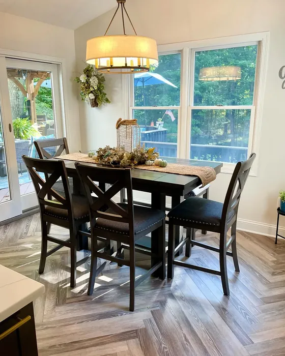
Heron Plume, with its color code SW 6070, falls into the greige category—an exquisite blend of gray and beige that brings a soft, muted elegance to any space. Its hex code #E5E1D8 reflects a light, airy quality, making it a versatile choice for various decor styles, from modern and transitional to Scandinavian and coastal. Whether you’re reimagining your living room, bedroom, dining room, or home office, Heron Plume offers a neutral backdrop that feels both sophisticated and warm.
What truly sets Heron Plume apart is its balanced undertone leaning slightly towards red. This subtle hint is what gives the color depth and complexity, allowing it to adapt beautifully to different lighting conditions. In natural light, it comes alive, showcasing gentle nuances that create a soft glow, while under artificial lighting, it maintains an elegant sophistication, perfect for cozy evenings.
With a Light Reflectance Value (LRV) of 30%, Heron Plume is considered medium dark, absorbing more light and creating an intimate, cozy atmosphere. This is especially beneficial in larger spaces or rooms with high ceilings, where it can help ground the area and make it feel more inviting. However, it’s essential to consider how the color will look in your specific space. The way light interacts with paint can change dramatically throughout the day, so always test a swatch on your walls before committing.
Applying Heron Plume is a breeze, whether you’re a seasoned DIYer or a first-timer. Its good coverage typically requires one to two coats for a flawless finish, and it’s beginner-friendly, smooth to apply with both rollers and brushes. The finish options—matte, eggshell, and satin—allow you to choose how much sheen you want, depending on the room’s vibe and your personal preference.
One of the standout features of Heron Plume is its washability. Life happens, and walls can get scuffed or marked. This paint is wipeable and washable, making upkeep easy, which is particularly beneficial in high-traffic areas or homes with kids and pets. Plus, with low VOC levels, it’s a smart choice for those looking to maintain a healthier indoor environment.
Now, let’s talk about the magic of pairing. When you decide to use Heron Plume, think about the complementary colors that can enhance its beauty. Dusty blues and gentle greens work harmoniously with this shade, creating a tranquil palette that feels cohesive and calming. If you’re craving a bolder contrast, consider deeper shades like charcoal or navy. For trim, crisp whites or warm woods can elevate the elegance of Heron Plume, making it stand out without overwhelming the space.
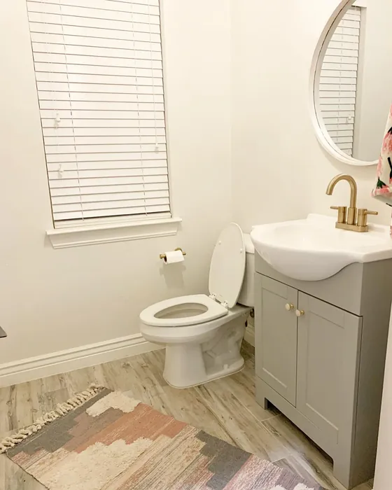
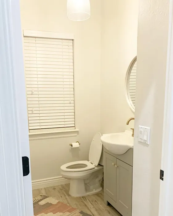
Wondering if it works in small areas? Absolutely! Heron Plume can make a small space feel larger and more inviting. Its light and airy nature helps open up the room, reflecting light beautifully. This makes it an excellent choice for hallways, bathrooms, or cozy nooks where you want to create a sense of openness.
While the pros of Heron Plume are numerous, it’s good to be aware of its potential cons. Achieving full coverage might take a couple of coats, especially if you’re transitioning from a darker color. And remember, it can appear different in various light settings, so testing is key.
For those seeking inspiration, think about how this beautiful hue can be used creatively. It’s perfect for accent walls, bringing sophistication without overpowering the room. Imagine a stunning Heron Plume wall behind a lush green plant or an elegant piece of art; it draws the eye while maintaining a peaceful, inviting atmosphere.
The versatility of Heron Plume makes it a designer favorite, especially for rentals or small spaces, where you want to create an immediate sense of style without the commitment of a more permanent change. The calm, inviting mood it creates is ideal for any space where relaxation and comfort are paramount.
If you’re considering a complete redesign, don’t shy away from incorporating Heron Plume into your furniture choices as well. A piece upholstered in this soft, neutral shade can become a timeless centerpiece, harmonizing beautifully with your decor. Pair it with lighter or darker shades from the Sherwin Williams palette for a curated, sophisticated look.
In summary, Heron Plume is not just a paint color; it’s a transformative element that can elevate your home. Its warm yet refreshing tone strikes a perfect balance, allowing it to work seamlessly with both warm and cool decor elements, making it a timeless choice for any room.
So, if you’re ready to create that inviting, tranquil space you’ve been dreaming of, why not give Heron Plume a try? Whether you’re painting an entire room or just an accent wall, this color promises to deliver a serene ambiance that feels both personal and beautiful. You’ll find yourself drawn to your space again and again, wrapped in the gentle embrace of Heron Plume’s understated elegance.

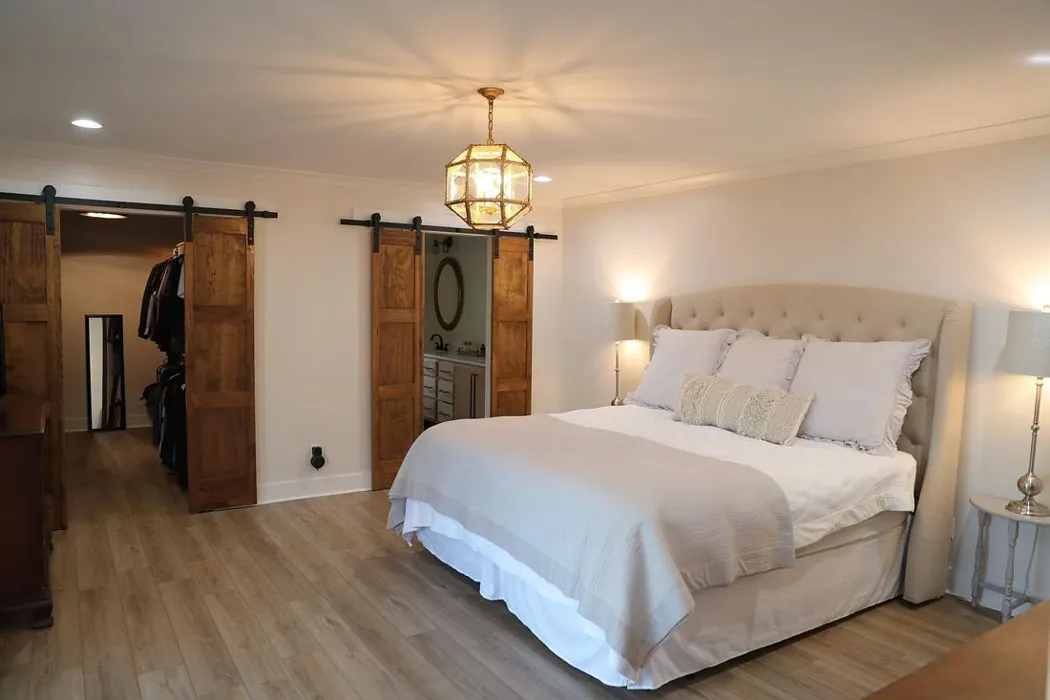
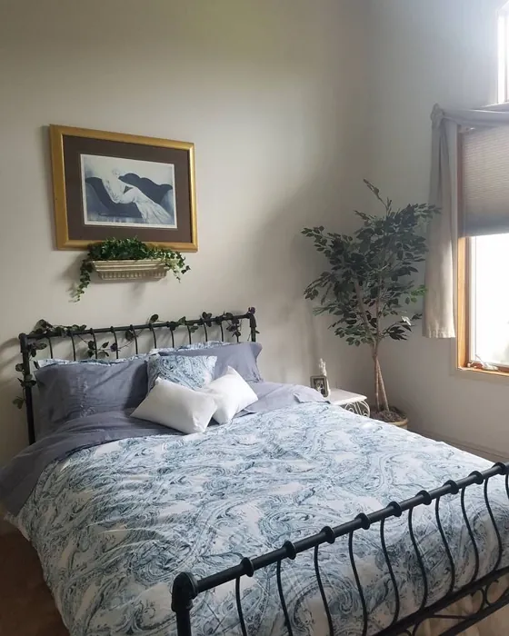
Real Room Photo of Heron Plume SW 6070


Undertones of Heron Plume ?
The undertones of Heron Plume are a key aspect of its character, leaning towards Red. These subtle underlying hues are what give the color its depth and complexity. For example, a gray with a blue undertone will feel cooler and more modern, while one with a brown undertone will feel warmer and more traditional. It’s essential to test this paint in your home and observe it next to your existing furniture, flooring, and decor to see how these undertones interact and reveal themselves throughout the day.
HEX value: #E5E1D8
RGB code: 229, 225, 216
Is Heron Plume Cool or Warm?
This color strikes a perfect balance, making it feel warm yet refreshing. It’s versatile enough to complement both warm and cool decor elements, ensuring it remains a timeless choice for any room.
Understanding Color Properties and Interior Design Tips
Hue refers to a specific position on the color wheel, measured in degrees from 0 to 360. Each degree represents a different pure color:
- 0° represents red
- 120° represents green
- 240° represents blue
Saturation describes the intensity or purity of a color and is expressed as a percentage:
- At 0%, the color appears completely desaturated—essentially a shade of gray
- At 100%, the color is at its most vivid and vibrant
Lightness indicates how light or dark a color is, also expressed as a percentage:
- 0% lightness results in black
- 100% lightness results in white
Using Warm Colors in Interior Design
Warm hues—such as reds, oranges, yellows, warm beiges, and greiges—are excellent choices for creating inviting and energetic spaces. These colors are particularly well-suited for:
- Kitchens, living rooms, and bathrooms, where warmth enhances comfort and sociability
- Large rooms, where warm tones can help reduce the sense of emptiness and make the space feel more intimate
For example:
- Warm beige shades provide a cozy, inviting atmosphere, ideal for living rooms, bedrooms, and hallways.
- Warm greige (a mix of beige and gray) offers the warmth of beige with the modern appeal of gray, making it a versatile backdrop for dining areas, bedrooms, and living spaces.
However, be mindful when using warm light tones in rooms with limited natural light. These shades may appear muted or even take on an unpleasant yellowish tint. To avoid a dull or flat appearance:
- Add depth by incorporating richer tones like deep greens, charcoal, or chocolate brown
- Use textured elements such as curtains, rugs, or cushions to bring dimension to the space
Pro Tip: Achieving Harmony with Warm and Cool Color Balance
To create a well-balanced and visually interesting interior, mix warm and cool tones strategically. This contrast adds depth and harmony to your design.
- If your walls feature warm hues, introduce cool-colored accents such as blue or green furniture, artwork, or accessories to create contrast.
- For a polished look, consider using a complementary color scheme, which pairs colors opposite each other on the color wheel (e.g., red with green, orange with blue).
This thoughtful mix not only enhances visual appeal but also creates a space that feels both dynamic and cohesive.
Light Temperature Affects on Heron Plume
Natural Light
Natural daylight changes in color temperature as the sun moves across the sky. At sunrise and sunset, the light tends to have a warm, golden tone with a color temperature around 2000 Kelvin (K). As the day progresses and the sun rises higher, the light becomes cooler and more neutral. Around midday, especially when the sky is clear, natural light typically reaches its peak brightness and shifts to a cooler tone, ranging from 5500 to 6500 Kelvin. This midday light is close to what we perceive as pure white or daylight-balanced light.
These shifts in natural light can significantly influence how colors appear in a space, which is why designers often consider both the time of day and the orientation of windows when planning interior color schemes.
Artificial Light
When choosing artificial lighting, pay close attention to the color temperature, measured in Kelvin (K). This determines how warm or cool the light will appear. Lower temperatures, around 2700K, give off a warm, yellow glow often used in living rooms or bedrooms. Higher temperatures, above 5000K, create a cool, bluish light similar to daylight, commonly used in kitchens, offices, or task areas.
Use the slider to see how lighting temperature can affect the appearance of a surface or color throughout a space.


4800K
LRV of Heron Plume
The Light Reflectance Value (LRV) of Heron Plume is 30%, which places it in the Medium Dark category. This means it reflects very little light. Understanding a paint’s LRV is crucial for predicting how it will look in your space. A higher LRV indicates a lighter color that reflects more light, making rooms feel larger and brighter. A lower LRV signifies a darker color that absorbs more light, creating a cozier, more intimate atmosphere. Always consider the natural and artificial lighting in your room when selecting a paint color based on its LRV.
Detailed Review of Heron Plume
Additional Paint Characteristics
Ideal Rooms
Bedroom, Dining Room, Home Office, Living Room
Decor Styles
Coastal, Modern, Scandinavian, Transitional
Coverage
Good (1–2 Coats)
Ease of Application
Beginner Friendly, Brush Smooth, Fast-Drying, Roller-Ready
Washability
Washable, Wipeable
VOC Level
Low VOC
Best Use
Accent Wall, Furniture, Interior Walls
Room Suitability
Bedroom, Dining Room, Home Office, Living Room
Tone Tag
Balanced, Muted, Neutral, Warm
Finish Type
Eggshell, Matte, Satin
Paint Performance
Easy Touch-Up, Low Odor, Quick Drying
Use Cases
Best for Rentals, Best for Small Spaces, Designer Favorite
Mood
Calm, Inviting, Restful
Trim Pairing
Complements Wood Trim, Matches Pure White, Pairs with White Dove
Heron Plume delivers a delightful balance of warmth and coolness, making it a fantastic option for those looking to create an inviting atmosphere. It beautifully harmonizes with natural light, softening the edges of any room while providing a calming influence. Whether you’re painting a spacious living area or a cozy bedroom, this color adapts seamlessly, amplifying the sense of space without overpowering it. You’ll find that it pairs wonderfully with a variety of accent colors, especially soft blues and muted greens, enhancing its overall appeal. Plus, its easy application makes it suitable for DIY projects, ensuring a smooth finish that you’ll love for years to come.
Pros & Cons of SW 6070 Heron Plume
Pros
Cons
Colors that go with Sherwin Williams Heron Plume
FAQ on SW 6070 Heron Plume
Can Heron Plume be used in small spaces?
Absolutely! Heron Plume is an excellent choice for small spaces. Its light and airy nature helps to open up the area, making it feel larger and more inviting. When used in a small room, it reflects light beautifully, enhancing the overall ambiance without feeling overwhelming.
What colors pair well with Heron Plume?
Heron Plume pairs wonderfully with soft, muted tones like dusty blues and gentle greens. You can also complement it with deeper shades like charcoal or navy for a bolder contrast. For trim, crisp whites or warm woods work beautifully, enhancing the elegance of this versatile hue.
Comparisons Heron Plume with other colors
Heron Plume SW 6070 vs Gossamer Veil SW 9165
| Attribute | Heron Plume SW 6070 | Gossamer Veil SW 9165 |
|---|---|---|
| Color Name | Heron Plume SW 6070 | Gossamer Veil SW 9165 |
| Color | ||
| Hue | Greige | Greige |
| Brightness | Light | Light |
| RGB | 229, 225, 216 | 211, 206, 196 |
| LRV | 30% | 75% |
| Finish Type | Eggshell, Matte, Satin | Eggshell, Matte |
| Finish Options | Eggshell, Matte, Satin | Eggshell, Matte, Satin |
| Ideal Rooms | Bedroom, Dining Room, Home Office, Living Room | Bedroom, Dining Room, Entryway, Home Office, Kitchen, Living Room |
| Decor Styles | Coastal, Modern, Scandinavian, Transitional | Coastal, Farmhouse, Modern, Scandinavian, Transitional |
| Coverage | Good (1–2 Coats) | Good (1–2 Coats), Touch-Up Friendly |
| Ease of Application | Beginner Friendly, Brush Smooth, Fast-Drying, Roller-Ready | Beginner Friendly, Brush Smooth, Fast-Drying, Roller-Ready |
| Washability | Washable, Wipeable | Washable, Wipeable |
| Room Suitability | Bedroom, Dining Room, Home Office, Living Room | Bathroom, Bedroom, Dining Room, Home Office, Living Room |
| Tone | Balanced, Muted, Neutral, Warm | Airy, Balanced, Muted, Warm |
| Paint Performance | Easy Touch-Up, Low Odor, Quick Drying | Easy Touch-Up, High Coverage, Low Odor, Quick Drying |
Heron Plume SW 6070 vs Toque White SW 7003
| Attribute | Heron Plume SW 6070 | Toque White SW 7003 |
|---|---|---|
| Color Name | Heron Plume SW 6070 | Toque White SW 7003 |
| Color | ||
| Hue | Greige | Greige |
| Brightness | Light | Light |
| RGB | 229, 225, 216 | 231, 226, 218 |
| LRV | 30% | 75% |
| Finish Type | Eggshell, Matte, Satin | Eggshell, Matte, Satin |
| Finish Options | Eggshell, Matte, Satin | Eggshell, Matte, Satin |
| Ideal Rooms | Bedroom, Dining Room, Home Office, Living Room | Bathroom, Bedroom, Dining Room, Home Office, Kitchen, Living Room |
| Decor Styles | Coastal, Modern, Scandinavian, Transitional | Coastal, Minimalist, Modern Farmhouse, Transitional |
| Coverage | Good (1–2 Coats) | Good (1–2 Coats), Touch-Up Friendly |
| Ease of Application | Beginner Friendly, Brush Smooth, Fast-Drying, Roller-Ready | Beginner Friendly, Brush Smooth, Roller-Ready |
| Washability | Washable, Wipeable | Washable, Wipeable |
| Room Suitability | Bedroom, Dining Room, Home Office, Living Room | Bathroom, Bedroom, Dining Room, Kitchen, Living Room |
| Tone | Balanced, Muted, Neutral, Warm | Neutral, Soft, Warm |
| Paint Performance | Easy Touch-Up, Low Odor, Quick Drying | Easy Touch-Up, High Coverage, Low Odor, Quick Drying |
Heron Plume SW 6070 vs Sedate Gray SW 6169
| Attribute | Heron Plume SW 6070 | Sedate Gray SW 6169 |
|---|---|---|
| Color Name | Heron Plume SW 6070 | Sedate Gray SW 6169 |
| Color | ||
| Hue | Greige | Greige |
| Brightness | Light | Light |
| RGB | 229, 225, 216 | 209, 205, 191 |
| LRV | 30% | 24% |
| Finish Type | Eggshell, Matte, Satin | Eggshell, Matte, Satin |
| Finish Options | Eggshell, Matte, Satin | Eggshell, Flat, Matte, Satin |
| Ideal Rooms | Bedroom, Dining Room, Home Office, Living Room | Bedroom, Dining Room, Home Office, Living Room |
| Decor Styles | Coastal, Modern, Scandinavian, Transitional | Farmhouse, Minimalist, Modern, Scandinavian |
| Coverage | Good (1–2 Coats) | Good (1–2 Coats) |
| Ease of Application | Beginner Friendly, Brush Smooth, Fast-Drying, Roller-Ready | Beginner Friendly, Brush Smooth, Roller-Ready |
| Washability | Washable, Wipeable | Scrubbable, Washable |
| Room Suitability | Bedroom, Dining Room, Home Office, Living Room | Bedroom, Entryway, Home Office, Living Room |
| Tone | Balanced, Muted, Neutral, Warm | Balanced, Muted, Neutral |
| Paint Performance | Easy Touch-Up, Low Odor, Quick Drying | Easy Touch-Up, High Coverage, Low Odor |
Heron Plume SW 6070 vs Pale Oak OC-20
| Attribute | Heron Plume SW 6070 | Pale Oak OC-20 |
|---|---|---|
| Color Name | Heron Plume SW 6070 | Pale Oak OC-20 |
| Color | ||
| Hue | Greige | Greige |
| Brightness | Light | Light |
| RGB | 229, 225, 216 | 223, 218, 206 |
| LRV | 30% | 68.64% |
| Finish Type | Eggshell, Matte, Satin | Eggshell, Matte, Satin |
| Finish Options | Eggshell, Matte, Satin | Eggshell, Matte, Satin |
| Ideal Rooms | Bedroom, Dining Room, Home Office, Living Room | Bedroom, Dining Room, Home Office, Living Room, Nursery |
| Decor Styles | Coastal, Modern, Scandinavian, Transitional | Coastal, Modern Farmhouse, Scandinavian, Traditional, Transitional |
| Coverage | Good (1–2 Coats) | Good (1–2 Coats), Touch-Up Friendly |
| Ease of Application | Beginner Friendly, Brush Smooth, Fast-Drying, Roller-Ready | Beginner Friendly, Brush Smooth, Roller-Ready |
| Washability | Washable, Wipeable | Scrubbable, Washable |
| Room Suitability | Bedroom, Dining Room, Home Office, Living Room | Bedroom, Dining Room, Home Office, Living Room, Nursery |
| Tone | Balanced, Muted, Neutral, Warm | Creamy, Muted, Neutral, Warm |
| Paint Performance | Easy Touch-Up, Low Odor, Quick Drying | High Coverage, Low Odor, Quick Drying |
Heron Plume SW 6070 vs Natural Cream OC-14
| Attribute | Heron Plume SW 6070 | Natural Cream OC-14 |
|---|---|---|
| Color Name | Heron Plume SW 6070 | Natural Cream OC-14 |
| Color | ||
| Hue | Greige | Greige |
| Brightness | Light | Light |
| RGB | 229, 225, 216 | 218, 213, 198 |
| LRV | 30% | 64.78% |
| Finish Type | Eggshell, Matte, Satin | Eggshell, Matte, Satin |
| Finish Options | Eggshell, Matte, Satin | Eggshell, Matte, Satin |
| Ideal Rooms | Bedroom, Dining Room, Home Office, Living Room | Bathroom, Bedroom, Hallway, Home Office, Kitchen, Living Room |
| Decor Styles | Coastal, Modern, Scandinavian, Transitional | Minimalist, Modern Farmhouse, Rustic, Scandinavian, Transitional |
| Coverage | Good (1–2 Coats) | Good (1–2 Coats), Touch-Up Friendly |
| Ease of Application | Beginner Friendly, Brush Smooth, Fast-Drying, Roller-Ready | Beginner Friendly, Brush Smooth, Fast-Drying, Roller-Ready |
| Washability | Washable, Wipeable | Highly Washable, Washable |
| Room Suitability | Bedroom, Dining Room, Home Office, Living Room | Bedroom, Entryway, Home Office, Kitchen, Living Room |
| Tone | Balanced, Muted, Neutral, Warm | Creamy, Earthy, Warm |
| Paint Performance | Easy Touch-Up, Low Odor, Quick Drying | Easy Touch-Up, Low Odor, Quick Drying |
Heron Plume SW 6070 vs Ballet White OC-9
| Attribute | Heron Plume SW 6070 | Ballet White OC-9 |
|---|---|---|
| Color Name | Heron Plume SW 6070 | Ballet White OC-9 |
| Color | ||
| Hue | Greige | Greige |
| Brightness | Light | Light |
| RGB | 229, 225, 216 | 229, 224, 208 |
| LRV | 30% | 71.97% |
| Finish Type | Eggshell, Matte, Satin | Eggshell, Matte |
| Finish Options | Eggshell, Matte, Satin | Eggshell, Matte, Satin |
| Ideal Rooms | Bedroom, Dining Room, Home Office, Living Room | Bedroom, Dining Room, Home Office, Kitchen, Living Room |
| Decor Styles | Coastal, Modern, Scandinavian, Transitional | Farmhouse, Minimalist, Modern, Scandinavian, Traditional |
| Coverage | Good (1–2 Coats) | Good (1–2 Coats), Touch-Up Friendly |
| Ease of Application | Beginner Friendly, Brush Smooth, Fast-Drying, Roller-Ready | Beginner Friendly, Brush Smooth, Fast-Drying, Roller-Ready |
| Washability | Washable, Wipeable | Washable, Wipeable |
| Room Suitability | Bedroom, Dining Room, Home Office, Living Room | Bedroom, Dining Room, Home Office, Kitchen, Living Room |
| Tone | Balanced, Muted, Neutral, Warm | Creamy, Muted, Warm |
| Paint Performance | Easy Touch-Up, Low Odor, Quick Drying | Easy Touch-Up, Low Odor, Quick Drying |
Heron Plume SW 6070 vs Elmira White HC-84
| Attribute | Heron Plume SW 6070 | Elmira White HC-84 |
|---|---|---|
| Color Name | Heron Plume SW 6070 | Elmira White HC-84 |
| Color | ||
| Hue | Greige | Greige |
| Brightness | Light | Light |
| RGB | 229, 225, 216 | 219, 211, 195 |
| LRV | 30% | 64.67% |
| Finish Type | Eggshell, Matte, Satin | Eggshell, Matte, Satin |
| Finish Options | Eggshell, Matte, Satin | Eggshell, Matte, Satin |
| Ideal Rooms | Bedroom, Dining Room, Home Office, Living Room | Bathroom, Bedroom, Dining Room, Home Office, Kitchen, Living Room |
| Decor Styles | Coastal, Modern, Scandinavian, Transitional | Coastal, Modern Farmhouse, Scandinavian, Traditional, Transitional |
| Coverage | Good (1–2 Coats) | Good (1–2 Coats) |
| Ease of Application | Beginner Friendly, Brush Smooth, Fast-Drying, Roller-Ready | Beginner Friendly, Brush Smooth, Fast-Drying, Roller-Ready |
| Washability | Washable, Wipeable | Highly Washable, Washable |
| Room Suitability | Bedroom, Dining Room, Home Office, Living Room | Bathroom, Bedroom, Dining Room, Kitchen, Living Room |
| Tone | Balanced, Muted, Neutral, Warm | Creamy, Neutral, Warm |
| Paint Performance | Easy Touch-Up, Low Odor, Quick Drying | High Coverage, Low Odor, Quick Drying |
Heron Plume SW 6070 vs Feather Down OC-6
| Attribute | Heron Plume SW 6070 | Feather Down OC-6 |
|---|---|---|
| Color Name | Heron Plume SW 6070 | Feather Down OC-6 |
| Color | ||
| Hue | Greige | Greige |
| Brightness | Light | Light |
| RGB | 229, 225, 216 | 230, 224, 207 |
| LRV | 30% | 73.16% |
| Finish Type | Eggshell, Matte, Satin | Eggshell, Matte, Satin |
| Finish Options | Eggshell, Matte, Satin | Eggshell, Matte, Satin |
| Ideal Rooms | Bedroom, Dining Room, Home Office, Living Room | Bedroom, Dining Room, Home Office, Living Room, Nursery |
| Decor Styles | Coastal, Modern, Scandinavian, Transitional | Contemporary, Farmhouse, Scandinavian, Traditional |
| Coverage | Good (1–2 Coats) | Good (1–2 Coats) |
| Ease of Application | Beginner Friendly, Brush Smooth, Fast-Drying, Roller-Ready | Beginner Friendly, Brush Smooth, Roller-Ready |
| Washability | Washable, Wipeable | Washable, Wipeable |
| Room Suitability | Bedroom, Dining Room, Home Office, Living Room | Bedroom, Dining Room, Living Room, Nursery |
| Tone | Balanced, Muted, Neutral, Warm | Creamy, Neutral, Warm |
| Paint Performance | Easy Touch-Up, Low Odor, Quick Drying | Easy Touch-Up, High Coverage, Low Odor |
Heron Plume SW 6070 vs Natural Linen 966
| Attribute | Heron Plume SW 6070 | Natural Linen 966 |
|---|---|---|
| Color Name | Heron Plume SW 6070 | Natural Linen 966 |
| Color | ||
| Hue | Greige | Greige |
| Brightness | Light | Light |
| RGB | 229, 225, 216 | 215, 205, 183 |
| LRV | 30% | 59.84% |
| Finish Type | Eggshell, Matte, Satin | Eggshell, Matte, Satin |
| Finish Options | Eggshell, Matte, Satin | Eggshell, Matte, Satin |
| Ideal Rooms | Bedroom, Dining Room, Home Office, Living Room | Bedroom, Dining Room, Home Office, Kitchen, Living Room |
| Decor Styles | Coastal, Modern, Scandinavian, Transitional | Coastal, Minimalist, Modern Farmhouse, Rustic, Traditional |
| Coverage | Good (1–2 Coats) | Good (1–2 Coats), Touch-Up Friendly |
| Ease of Application | Beginner Friendly, Brush Smooth, Fast-Drying, Roller-Ready | Beginner Friendly, Brush Smooth, Fast-Drying, Roller-Ready |
| Washability | Washable, Wipeable | Highly Washable, Washable, Wipeable |
| Room Suitability | Bedroom, Dining Room, Home Office, Living Room | Bedroom, Dining Room, Home Office, Living Room, Nursery |
| Tone | Balanced, Muted, Neutral, Warm | Earthy, Neutral, Warm |
| Paint Performance | Easy Touch-Up, Low Odor, Quick Drying | Easy Touch-Up, High Coverage, Low Odor, Quick Drying |
Heron Plume SW 6070 vs Jute AF-80
| Attribute | Heron Plume SW 6070 | Jute AF-80 |
|---|---|---|
| Color Name | Heron Plume SW 6070 | Jute AF-80 |
| Color | ||
| Hue | Greige | Greige |
| Brightness | Light | Light |
| RGB | 229, 225, 216 | 217, 210, 190 |
| LRV | 30% | 63.30% |
| Finish Type | Eggshell, Matte, Satin | Eggshell, Matte, Satin |
| Finish Options | Eggshell, Matte, Satin | Eggshell, Matte, Satin |
| Ideal Rooms | Bedroom, Dining Room, Home Office, Living Room | Bedroom, Dining Room, Home Office, Living Room, Nursery |
| Decor Styles | Coastal, Modern, Scandinavian, Transitional | Bohemian, Eclectic, Modern Farmhouse, Scandinavian, Traditional |
| Coverage | Good (1–2 Coats) | Good (1–2 Coats), Touch-Up Friendly |
| Ease of Application | Beginner Friendly, Brush Smooth, Fast-Drying, Roller-Ready | Beginner Friendly, Brush Smooth, Fast-Drying, Roller-Ready |
| Washability | Washable, Wipeable | Washable, Wipeable |
| Room Suitability | Bedroom, Dining Room, Home Office, Living Room | Bedroom, Dining Room, Home Office, Living Room, Nursery |
| Tone | Balanced, Muted, Neutral, Warm | Earthy, Neutral, Warm |
| Paint Performance | Easy Touch-Up, Low Odor, Quick Drying | Easy Touch-Up, Low Odor, Quick Drying |
Official Page of Sherwin Williams Heron Plume SW 6070