Color Preview & Key Details
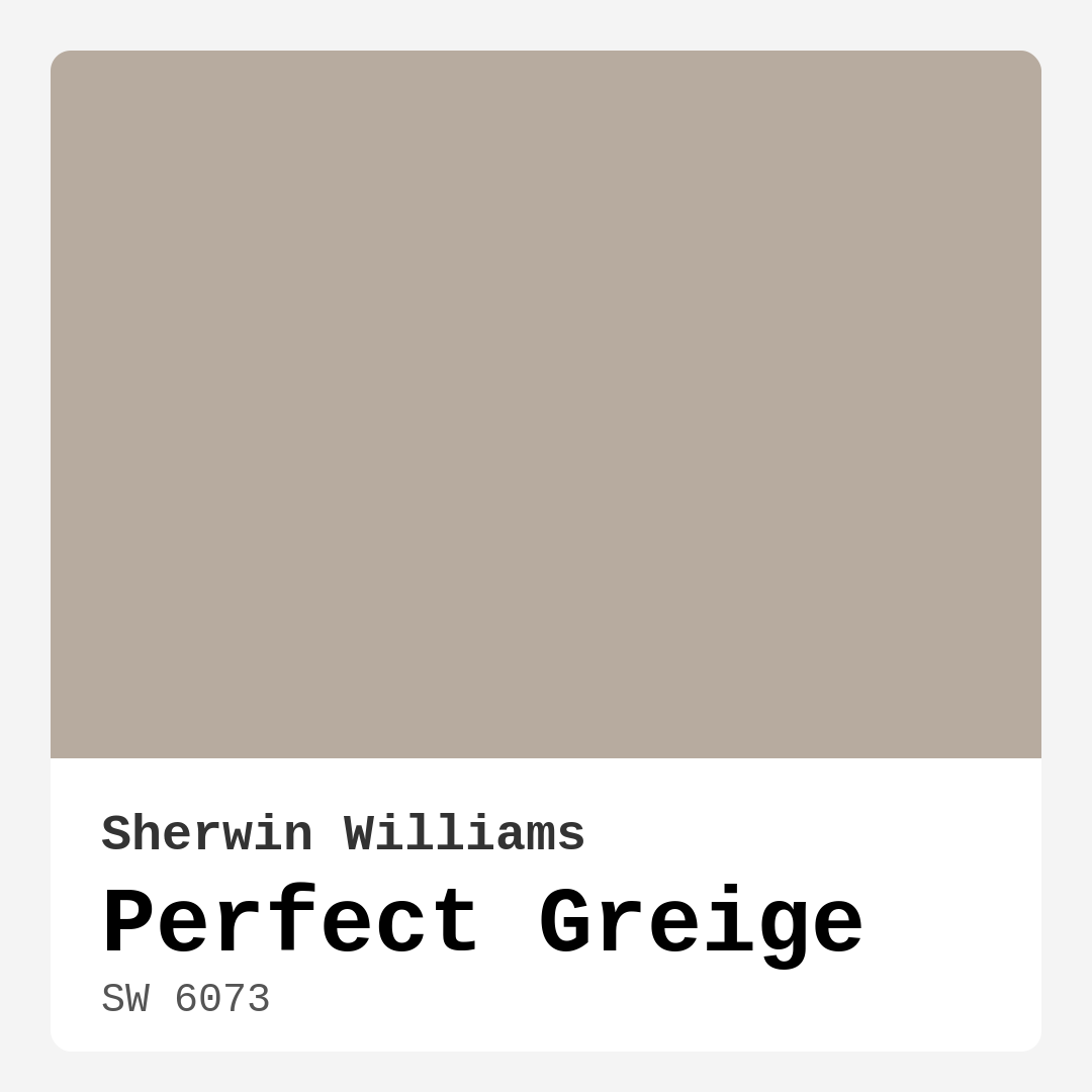
| HEX Code | #B7AB9F |
| RGB | 183, 171, 159 |
| LRV | 38% |
| Undertone | Red |
| Finish Options | Eggshell, Matte, Satin |
Imagine stepping into a room that feels effortlessly chic, warm, and inviting—a space that wraps around you like a comforting embrace. That’s the magic of Perfect Greige by Sherwin Williams. This color isn’t just a paint; it’s an experience. With its perfect blend of gray and beige, Perfect Greige creates an atmosphere that is both sophisticated and approachable. If you’re considering a new paint color for your home, let’s dive into why this hue might just be the perfect choice for your next project.
Perfect Greige, color code SW 6073, offers a unique quality that makes it incredibly versatile. It sits comfortably in the greige family, a popular choice among homeowners and designers alike. This hue is tagged as medium brightness, with a Light Reflectance Value (LRV) of 38%, which means it reflects a moderate amount of light. That makes it ideal for various rooms in your house, whether you’re thinking of refreshing your living room, bedroom, or even your kitchen.
One of the standout features of Perfect Greige is its warm undertone, leaning slightly toward red. This subtle complexity is what gives it depth, allowing it to adapt beautifully to the lighting conditions in your home. In natural light, you’ll notice that it exudes soft warmth, creating a cozy atmosphere. When the sun goes down and artificial lighting takes over, it can shift to a cooler tone. This dynamic quality makes it suitable for any space, from bright, airy areas to more intimate settings.
You might be wondering how this color fits in with your existing decor. The great thing about Perfect Greige is its ability to complement a wide array of design styles. Whether your home is modern, farmhouse, traditional, or contemporary, this color acts as a chic backdrop that enhances your decor without overshadowing it. It pairs beautifully with white trims, particularly shades like White Dove, and can even complement brass fixtures for a touch of elegance.
Perfect Greige is more than just visually appealing; it’s also practical. The paint is beginner-friendly and easy to apply, whether you’re using a roller or a brush. Coverage is good, typically requiring only one to two coats, which is a significant plus if you’re tackling a DIY project. It’s also washable and highly resistant to scuffs, making it perfect for homes with kids or pets. You’ll appreciate that it has a low VOC level, ensuring that your space remains healthy and breathable during and after the painting process.
Now, let’s touch on some practical tips for using Perfect Greige. One common question I get is whether this color works in small spaces. Absolutely! Perfect Greige can make smaller areas feel inviting without overwhelming them. If you’re painting a cozy nook or a chic office corner, pair it with brighter accents or lighter furnishings to keep the atmosphere light and airy.
If you’re considering using this hue outdoors, it’s essential to note that while it’s primarily designed for interiors, it can be used in protected areas like covered porches or accent walls. Just be sure to choose a high-quality exterior paint formulation to withstand the elements. Perfect Greige can lend a stylish, understated look to your home’s exterior as well.
Speaking of versatility, think about how easily Perfect Greige can be paired with other colors. If you want to create a stunning palette, consider lighter shades like SW 6072 or SW 7022, or go for darker shades like SW 7508 for a more dramatic look. The complementary shades, such as SW 7625 and SW 9139, can introduce more depth to your color scheme, allowing you to play around with accents and accessories.
When it comes to mood, Perfect Greige excels in creating a cozy and grounding environment. It’s an inviting hue that can transform a space into a sanctuary. Imagine curling up with a good book in a Perfect Greige living room or enjoying family dinners in a dining room painted this warm shade. The color invites conversation and connection, making it a perfect choice for gathering spaces.
However, as with any color choice, there are some considerations. In low light, Perfect Greige can appear darker than it does in bright spaces. It’s crucial to test the color in your home, observing how it interacts with your existing furniture and decor throughout the day. This is where its undertones come into play; they reveal themselves differently depending on the surrounding light. If you prefer bolder colors, you might find this hue to be a bit too neutral, but remember, sometimes less is more, and a sophisticated backdrop allows other elements of your decor to shine.
For those who might be renting or looking for a classic favorite, Perfect Greige is a fantastic option. It’s perfect for open concept spaces and can work wonders in low-light rooms, offering a calming and sophisticated touch that suits any lifestyle. Whether you’re painting the entirety of a room or just an accent wall to create visual interest, this paint delivers.
In conclusion, if you’re on the hunt for that perfect neutral color, Perfect Greige stands out as an excellent choice. Its warm and inviting hue, combined with its versatility across various decor styles, makes it a go-to for many homeowners. It creates a sense of calm and sophistication while being incredibly practical to apply and maintain. So, whether you’re transforming a single room or refreshing your entire home, Perfect Greige might just be the key to unlocking a beautiful, cohesive space. Give it a try; you might find it’s the perfect backdrop to your life.

Real Room Photo of Perfect Greige SW 6073


Undertones of Perfect Greige ?
The undertones of Perfect Greige are a key aspect of its character, leaning towards Red. These subtle underlying hues are what give the color its depth and complexity. For example, a gray with a blue undertone will feel cooler and more modern, while one with a brown undertone will feel warmer and more traditional. It’s essential to test this paint in your home and observe it next to your existing furniture, flooring, and decor to see how these undertones interact and reveal themselves throughout the day.
HEX value: #B7AB9F
RGB code: 183, 171, 159
Is Perfect Greige Cool or Warm?
Perfect Greige is predominantly warm, but its gray base ensures it doesn’t feel overly yellow or orange. This balance makes it an ideal choice for spaces where you want a welcoming feel without the heaviness of darker colors.
Understanding Color Properties and Interior Design Tips
Hue refers to a specific position on the color wheel, measured in degrees from 0 to 360. Each degree represents a different pure color:
- 0° represents red
- 120° represents green
- 240° represents blue
Saturation describes the intensity or purity of a color and is expressed as a percentage:
- At 0%, the color appears completely desaturated—essentially a shade of gray
- At 100%, the color is at its most vivid and vibrant
Lightness indicates how light or dark a color is, also expressed as a percentage:
- 0% lightness results in black
- 100% lightness results in white
Using Warm Colors in Interior Design
Warm hues—such as reds, oranges, yellows, warm beiges, and greiges—are excellent choices for creating inviting and energetic spaces. These colors are particularly well-suited for:
- Kitchens, living rooms, and bathrooms, where warmth enhances comfort and sociability
- Large rooms, where warm tones can help reduce the sense of emptiness and make the space feel more intimate
For example:
- Warm beige shades provide a cozy, inviting atmosphere, ideal for living rooms, bedrooms, and hallways.
- Warm greige (a mix of beige and gray) offers the warmth of beige with the modern appeal of gray, making it a versatile backdrop for dining areas, bedrooms, and living spaces.
However, be mindful when using warm light tones in rooms with limited natural light. These shades may appear muted or even take on an unpleasant yellowish tint. To avoid a dull or flat appearance:
- Add depth by incorporating richer tones like deep greens, charcoal, or chocolate brown
- Use textured elements such as curtains, rugs, or cushions to bring dimension to the space
Pro Tip: Achieving Harmony with Warm and Cool Color Balance
To create a well-balanced and visually interesting interior, mix warm and cool tones strategically. This contrast adds depth and harmony to your design.
- If your walls feature warm hues, introduce cool-colored accents such as blue or green furniture, artwork, or accessories to create contrast.
- For a polished look, consider using a complementary color scheme, which pairs colors opposite each other on the color wheel (e.g., red with green, orange with blue).
This thoughtful mix not only enhances visual appeal but also creates a space that feels both dynamic and cohesive.

Light Temperature Affects on Perfect Greige
Natural Light
Natural daylight changes in color temperature as the sun moves across the sky. At sunrise and sunset, the light tends to have a warm, golden tone with a color temperature around 2000 Kelvin (K). As the day progresses and the sun rises higher, the light becomes cooler and more neutral. Around midday, especially when the sky is clear, natural light typically reaches its peak brightness and shifts to a cooler tone, ranging from 5500 to 6500 Kelvin. This midday light is close to what we perceive as pure white or daylight-balanced light.
These shifts in natural light can significantly influence how colors appear in a space, which is why designers often consider both the time of day and the orientation of windows when planning interior color schemes.
Artificial Light
When choosing artificial lighting, pay close attention to the color temperature, measured in Kelvin (K). This determines how warm or cool the light will appear. Lower temperatures, around 2700K, give off a warm, yellow glow often used in living rooms or bedrooms. Higher temperatures, above 5000K, create a cool, bluish light similar to daylight, commonly used in kitchens, offices, or task areas.
Use the slider to see how lighting temperature can affect the appearance of a surface or color throughout a space.


4800K
LRV of Perfect Greige
The Light Reflectance Value (LRV) of Perfect Greige is 38%, which places it in the Medium category. This means it Reflects a moderate amount of light. Understanding a paint’s LRV is crucial for predicting how it will look in your space. A higher LRV indicates a lighter color that reflects more light, making rooms feel larger and brighter. A lower LRV signifies a darker color that absorbs more light, creating a cozier, more intimate atmosphere. Always consider the natural and artificial lighting in your room when selecting a paint color based on its LRV.
Detailed Review of Perfect Greige
Additional Paint Characteristics
Ideal Rooms
Bathroom, Bedroom, Dining Room, Entryway, Home Office, Kitchen, Living Room
Decor Styles
Contemporary, Farmhouse, Modern, Traditional, Transitional
Coverage
Good (1–2 Coats), Touch-Up Friendly
Ease of Application
Beginner Friendly, Brush Smooth, Roller-Ready
Washability
Highly Washable, Washable
VOC Level
Low VOC
Best Use
Accent Wall, Interior Walls, Trim
Room Suitability
Bedroom, Dining Room, Home Office, Kitchen, Living Room
Tone Tag
Muted, Neutral, Warm
Finish Type
Eggshell, Matte, Satin
Paint Performance
Easy Touch-Up, Low Odor, Scuff Resistant
Use Cases
Best for Low Light Rooms, Best for Open Concept, Best for Rentals, Classic Favorite
Mood
Cozy, Grounding, Inviting
Trim Pairing
Complements Brass Fixtures, Good with Wood Trim, Pairs with White Dove
Perfect Greige is a fantastic choice for those looking to create a warm and inviting space without straying too far from a neutral palette. The balance between gray and beige gives it a unique quality, allowing it to adapt beautifully to varying lighting conditions throughout the day. In natural light, it exudes a soft warmth, while in artificial light, it can take on a slightly cooler tone. This makes it incredibly versatile, suitable for everything from cozy bedrooms to stylish living rooms. Whether you’re painting an entire room or just an accent wall, Perfect Greige provides a sophisticated backdrop that enhances your decor without overwhelming it.
Pros & Cons of SW 6073 Perfect Greige
Pros
Cons
Colors that go with Sherwin Williams Perfect Greige
FAQ on SW 6073 Perfect Greige
Can Perfect Greige be used in small spaces?
Absolutely! Perfect Greige works wonderfully in small spaces, as its warm undertone can make a room feel inviting without overwhelming it. To keep the space feeling light and airy, pair it with brighter accents or lighter furnishings. It’s a great choice for creating a cozy nook or a chic office corner.
Is Perfect Greige suitable for exterior use?
While Perfect Greige is primarily designed for interior spaces, it can be used on exteriors in protected areas, such as covered porches or accent walls. Make sure to select a high-quality exterior paint formulation to ensure durability against the elements. Its neutral tone can provide a stylish yet understated look for your home’s exterior.
Comparisons Perfect Greige with other colors
Perfect Greige SW 6073 vs Accessible Beige SW 7036
| Attribute | Perfect Greige SW 6073 | Accessible Beige SW 7036 |
|---|---|---|
| Color Name | Perfect Greige SW 6073 | Accessible Beige SW 7036 |
| Color | ||
| Hue | Greige | Greige |
| Brightness | Medium | Medium |
| RGB | 183, 171, 159 | 209, 199, 184 |
| LRV | 38% | 58% |
| Finish Type | Eggshell, Matte, Satin | Eggshell, Matte, Satin |
| Finish Options | Eggshell, Matte, Satin | Eggshell, Matte, Satin |
| Ideal Rooms | Bathroom, Bedroom, Dining Room, Entryway, Home Office, Kitchen, Living Room | Bedroom, Dining Room, Home Office, Kitchen, Living Room |
| Decor Styles | Contemporary, Farmhouse, Modern, Traditional, Transitional | Bohemian, Contemporary, Modern Farmhouse, Traditional, Transitional |
| Coverage | Good (1–2 Coats), Touch-Up Friendly | Good (1–2 Coats), Touch-Up Friendly |
| Ease of Application | Beginner Friendly, Brush Smooth, Roller-Ready | Beginner Friendly, Brush Smooth, Roller-Ready |
| Washability | Highly Washable, Washable | Highly Washable, Washable |
| Room Suitability | Bedroom, Dining Room, Home Office, Kitchen, Living Room | Bedroom, Dining Room, Home Office, Kitchen, Living Room |
| Tone | Muted, Neutral, Warm | Earthy, Neutral, Warm |
| Paint Performance | Easy Touch-Up, Low Odor, Scuff Resistant | Easy Touch-Up, Fade Resistant, High Coverage, Low Odor |
Perfect Greige SW 6073 vs Jogging Path SW 7638
| Attribute | Perfect Greige SW 6073 | Jogging Path SW 7638 |
|---|---|---|
| Color Name | Perfect Greige SW 6073 | Jogging Path SW 7638 |
| Color | ||
| Hue | Greige | Greige |
| Brightness | Medium | Medium |
| RGB | 183, 171, 159 | 192, 185, 169 |
| LRV | 38% | 15% |
| Finish Type | Eggshell, Matte, Satin | Eggshell, Matte |
| Finish Options | Eggshell, Matte, Satin | Eggshell, Matte, Satin |
| Ideal Rooms | Bathroom, Bedroom, Dining Room, Entryway, Home Office, Kitchen, Living Room | Bedroom, Dining Room, Hallway, Home Office, Kitchen, Living Room |
| Decor Styles | Contemporary, Farmhouse, Modern, Traditional, Transitional | Modern, Rustic, Scandinavian, Transitional |
| Coverage | Good (1–2 Coats), Touch-Up Friendly | Good (1–2 Coats), Touch-Up Friendly |
| Ease of Application | Beginner Friendly, Brush Smooth, Roller-Ready | Beginner Friendly, Brush Smooth, Fast-Drying, Roller-Ready |
| Washability | Highly Washable, Washable | Washable, Wipeable |
| Room Suitability | Bedroom, Dining Room, Home Office, Kitchen, Living Room | Bedroom, Dining Room, Home Office, Living Room |
| Tone | Muted, Neutral, Warm | Balanced, Earthy, Muted, Warm |
| Paint Performance | Easy Touch-Up, Low Odor, Scuff Resistant | Easy Touch-Up, Fade Resistant, Low Odor |
Perfect Greige SW 6073 vs Antler Velvet SW 9111
| Attribute | Perfect Greige SW 6073 | Antler Velvet SW 9111 |
|---|---|---|
| Color Name | Perfect Greige SW 6073 | Antler Velvet SW 9111 |
| Color | ||
| Hue | Greige | Greige |
| Brightness | Medium | Medium |
| RGB | 183, 171, 159 | 192, 173, 150 |
| LRV | 38% | 6% |
| Finish Type | Eggshell, Matte, Satin | Eggshell, Matte |
| Finish Options | Eggshell, Matte, Satin | Eggshell, Matte, Satin |
| Ideal Rooms | Bathroom, Bedroom, Dining Room, Entryway, Home Office, Kitchen, Living Room | Bedroom, Dining Room, Home Office, Living Room, Nursery |
| Decor Styles | Contemporary, Farmhouse, Modern, Traditional, Transitional | Contemporary, Modern Farmhouse, Rustic, Transitional |
| Coverage | Good (1–2 Coats), Touch-Up Friendly | Good (1–2 Coats) |
| Ease of Application | Beginner Friendly, Brush Smooth, Roller-Ready | Beginner Friendly, Brush Smooth, Fast-Drying, Roller-Ready |
| Washability | Highly Washable, Washable | Scrubbable, Washable, Wipeable |
| Room Suitability | Bedroom, Dining Room, Home Office, Kitchen, Living Room | Bedroom, Dining Room, Home Office, Living Room |
| Tone | Muted, Neutral, Warm | Earthy, Muted, Warm |
| Paint Performance | Easy Touch-Up, Low Odor, Scuff Resistant | Easy Touch-Up, High Coverage, Low Odor, Quick Drying |
Perfect Greige SW 6073 vs Analytical Gray SW 7051
| Attribute | Perfect Greige SW 6073 | Analytical Gray SW 7051 |
|---|---|---|
| Color Name | Perfect Greige SW 6073 | Analytical Gray SW 7051 |
| Color | ||
| Hue | Greige | Greige |
| Brightness | Medium | Medium |
| RGB | 183, 171, 159 | 191, 182, 167 |
| LRV | 38% | 60% |
| Finish Type | Eggshell, Matte, Satin | Eggshell, Matte, Satin |
| Finish Options | Eggshell, Matte, Satin | Eggshell, Matte, Satin |
| Ideal Rooms | Bathroom, Bedroom, Dining Room, Entryway, Home Office, Kitchen, Living Room | Bedroom, Dining Room, Hallway, Home Office, Living Room |
| Decor Styles | Contemporary, Farmhouse, Modern, Traditional, Transitional | Farmhouse, Modern, Scandinavian, Transitional |
| Coverage | Good (1–2 Coats), Touch-Up Friendly | Good (1–2 Coats) |
| Ease of Application | Beginner Friendly, Brush Smooth, Roller-Ready | Beginner Friendly, Brush Smooth, Roller-Ready |
| Washability | Highly Washable, Washable | Highly Washable, Washable |
| Room Suitability | Bedroom, Dining Room, Home Office, Kitchen, Living Room | Bedroom, Dining Room, Home Office, Living Room |
| Tone | Muted, Neutral, Warm | Balanced, Neutral, Warm |
| Paint Performance | Easy Touch-Up, Low Odor, Scuff Resistant | Easy Touch-Up, High Coverage, Low Odor |
Perfect Greige SW 6073 vs Relaxed Khaki SW 6149
| Attribute | Perfect Greige SW 6073 | Relaxed Khaki SW 6149 |
|---|---|---|
| Color Name | Perfect Greige SW 6073 | Relaxed Khaki SW 6149 |
| Color | ||
| Hue | Greige | Greige |
| Brightness | Medium | Medium |
| RGB | 183, 171, 159 | 200, 187, 163 |
| LRV | 38% | 40% |
| Finish Type | Eggshell, Matte, Satin | Eggshell, Matte, Satin |
| Finish Options | Eggshell, Matte, Satin | Eggshell, Matte, Satin |
| Ideal Rooms | Bathroom, Bedroom, Dining Room, Entryway, Home Office, Kitchen, Living Room | Bedroom, Dining Room, Home Office, Kitchen, Living Room |
| Decor Styles | Contemporary, Farmhouse, Modern, Traditional, Transitional | Contemporary, Modern Farmhouse, Rustic, Traditional |
| Coverage | Good (1–2 Coats), Touch-Up Friendly | Good (1–2 Coats), Touch-Up Friendly |
| Ease of Application | Beginner Friendly, Brush Smooth, Roller-Ready | Beginner Friendly, Brush Smooth, Roller-Ready |
| Washability | Highly Washable, Washable | Washable, Wipeable |
| Room Suitability | Bedroom, Dining Room, Home Office, Kitchen, Living Room | Bedroom, Dining Room, Home Office, Living Room |
| Tone | Muted, Neutral, Warm | Earthy, Muted, Warm |
| Paint Performance | Easy Touch-Up, Low Odor, Scuff Resistant | Easy Touch-Up, Low Odor, Scuff Resistant |
Perfect Greige SW 6073 vs Sage SW 2860
| Attribute | Perfect Greige SW 6073 | Sage SW 2860 |
|---|---|---|
| Color Name | Perfect Greige SW 6073 | Sage SW 2860 |
| Color | ||
| Hue | Greige | Greige |
| Brightness | Medium | Medium |
| RGB | 183, 171, 159 | 179, 174, 149 |
| LRV | 38% | 24% |
| Finish Type | Eggshell, Matte, Satin | Eggshell, Matte, Satin |
| Finish Options | Eggshell, Matte, Satin | Eggshell, Matte, Satin |
| Ideal Rooms | Bathroom, Bedroom, Dining Room, Entryway, Home Office, Kitchen, Living Room | Bathroom, Bedroom, Home Office, Kitchen, Living Room |
| Decor Styles | Contemporary, Farmhouse, Modern, Traditional, Transitional | Bohemian, Farmhouse, Modern, Rustic, Traditional |
| Coverage | Good (1–2 Coats), Touch-Up Friendly | Good (1–2 Coats), Touch-Up Friendly |
| Ease of Application | Beginner Friendly, Brush Smooth, Roller-Ready | Beginner Friendly, Brush Smooth, Roller-Ready |
| Washability | Highly Washable, Washable | Highly Washable, Washable |
| Room Suitability | Bedroom, Dining Room, Home Office, Kitchen, Living Room | Bathroom, Bedroom, Dining Room, Kitchen, Living Room |
| Tone | Muted, Neutral, Warm | Earthy, Muted, Warm |
| Paint Performance | Easy Touch-Up, Low Odor, Scuff Resistant | Easy Touch-Up, Fade Resistant, Low Odor |
Perfect Greige SW 6073 vs Worn Khaki SW 9527
| Attribute | Perfect Greige SW 6073 | Worn Khaki SW 9527 |
|---|---|---|
| Color Name | Perfect Greige SW 6073 | Worn Khaki SW 9527 |
| Color | ||
| Hue | Greige | Greige |
| Brightness | Medium | Medium |
| RGB | 183, 171, 159 | 166, 156, 129 |
| LRV | 38% | 38% |
| Finish Type | Eggshell, Matte, Satin | Eggshell, Matte, Satin |
| Finish Options | Eggshell, Matte, Satin | Eggshell, Matte, Satin |
| Ideal Rooms | Bathroom, Bedroom, Dining Room, Entryway, Home Office, Kitchen, Living Room | Bedroom, Dining Room, Hallway, Home Office, Kitchen, Living Room |
| Decor Styles | Contemporary, Farmhouse, Modern, Traditional, Transitional | Bohemian, Eclectic, Modern Farmhouse, Rustic, Transitional |
| Coverage | Good (1–2 Coats), Touch-Up Friendly | Good (1–2 Coats), Touch-Up Friendly |
| Ease of Application | Beginner Friendly, Brush Smooth, Roller-Ready | Beginner Friendly, Brush Smooth, Roller-Ready |
| Washability | Highly Washable, Washable | Washable, Wipeable |
| Room Suitability | Bedroom, Dining Room, Home Office, Kitchen, Living Room | Bedroom, Dining Room, Home Office, Kitchen, Living Room |
| Tone | Muted, Neutral, Warm | Earthy, Neutral, Warm |
| Paint Performance | Easy Touch-Up, Low Odor, Scuff Resistant | Easy Touch-Up, High Coverage, Low Odor, Quick Drying |
Perfect Greige SW 6073 vs Smokey Taupe 983
| Attribute | Perfect Greige SW 6073 | Smokey Taupe 983 |
|---|---|---|
| Color Name | Perfect Greige SW 6073 | Smokey Taupe 983 |
| Color | ||
| Hue | Greige | Greige |
| Brightness | Medium | Medium |
| RGB | 183, 171, 159 | 205, 196, 181 |
| LRV | 38% | 54.53% |
| Finish Type | Eggshell, Matte, Satin | Eggshell, Matte, Satin |
| Finish Options | Eggshell, Matte, Satin | Eggshell, Matte, Satin |
| Ideal Rooms | Bathroom, Bedroom, Dining Room, Entryway, Home Office, Kitchen, Living Room | Bedroom, Dining Room, Entryway, Home Office, Living Room |
| Decor Styles | Contemporary, Farmhouse, Modern, Traditional, Transitional | Contemporary, Minimalist, Modern Farmhouse, Rustic, Transitional |
| Coverage | Good (1–2 Coats), Touch-Up Friendly | Good (1–2 Coats), High Hide, Touch-Up Friendly |
| Ease of Application | Beginner Friendly, Brush Smooth, Roller-Ready | Beginner Friendly, Brush Smooth, Fast-Drying, Roller-Ready |
| Washability | Highly Washable, Washable | Highly Washable, Stain Resistant, Washable |
| Room Suitability | Bedroom, Dining Room, Home Office, Kitchen, Living Room | Bedroom, Dining Room, Entryway, Home Office, Living Room |
| Tone | Muted, Neutral, Warm | Balanced, Earthy, Muted, Warm |
| Paint Performance | Easy Touch-Up, Low Odor, Scuff Resistant | Easy Touch-Up, High Coverage, Low Odor, Quick Drying, Scuff Resistant |
Perfect Greige SW 6073 vs Pashmina AF-100
| Attribute | Perfect Greige SW 6073 | Pashmina AF-100 |
|---|---|---|
| Color Name | Perfect Greige SW 6073 | Pashmina AF-100 |
| Color | ||
| Hue | Greige | Greige |
| Brightness | Medium | Medium |
| RGB | 183, 171, 159 | 187, 178, 161 |
| LRV | 38% | 44.20% |
| Finish Type | Eggshell, Matte, Satin | Eggshell, Matte, Satin |
| Finish Options | Eggshell, Matte, Satin | Eggshell, Matte, Satin |
| Ideal Rooms | Bathroom, Bedroom, Dining Room, Entryway, Home Office, Kitchen, Living Room | Bedroom, Hallway, Home Office, Living Room |
| Decor Styles | Contemporary, Farmhouse, Modern, Traditional, Transitional | Bohemian, Modern, Rustic, Traditional |
| Coverage | Good (1–2 Coats), Touch-Up Friendly | Good (1–2 Coats), Touch-Up Friendly |
| Ease of Application | Beginner Friendly, Brush Smooth, Roller-Ready | Beginner Friendly, Brush Smooth, Roller-Ready |
| Washability | Highly Washable, Washable | Scrubbable, Stain Resistant, Washable |
| Room Suitability | Bedroom, Dining Room, Home Office, Kitchen, Living Room | Bedroom, Dining Room, Home Office, Living Room |
| Tone | Muted, Neutral, Warm | Earthy, Neutral, Warm |
| Paint Performance | Easy Touch-Up, Low Odor, Scuff Resistant | Easy Touch-Up, High Coverage, Low Odor, Scuff Resistant |
Perfect Greige SW 6073 vs Spanish Olive 1509
| Attribute | Perfect Greige SW 6073 | Spanish Olive 1509 |
|---|---|---|
| Color Name | Perfect Greige SW 6073 | Spanish Olive 1509 |
| Color | ||
| Hue | Greige | Greige |
| Brightness | Medium | Medium |
| RGB | 183, 171, 159 | 197, 195, 174 |
| LRV | 38% | 52.54% |
| Finish Type | Eggshell, Matte, Satin | Eggshell, Matte, Satin |
| Finish Options | Eggshell, Matte, Satin | Eggshell, Matte, Satin |
| Ideal Rooms | Bathroom, Bedroom, Dining Room, Entryway, Home Office, Kitchen, Living Room | Bedroom, Dining Room, Home Office, Kitchen, Living Room |
| Decor Styles | Contemporary, Farmhouse, Modern, Traditional, Transitional | Bohemian, Contemporary, Modern Farmhouse, Rustic, Traditional |
| Coverage | Good (1–2 Coats), Touch-Up Friendly | Good (1–2 Coats), Touch-Up Friendly |
| Ease of Application | Beginner Friendly, Brush Smooth, Roller-Ready | Beginner Friendly, Brush Smooth, Roller-Ready |
| Washability | Highly Washable, Washable | Highly Washable, Washable |
| Room Suitability | Bedroom, Dining Room, Home Office, Kitchen, Living Room | Bathroom, Bedroom, Dining Room, Kitchen, Living Room |
| Tone | Muted, Neutral, Warm | Earthy, Muted, Warm |
| Paint Performance | Easy Touch-Up, Low Odor, Scuff Resistant | Easy Touch-Up, Fade Resistant, Low Odor, Stain Resistant |
Official Page of Sherwin Williams Perfect Greige SW 6073