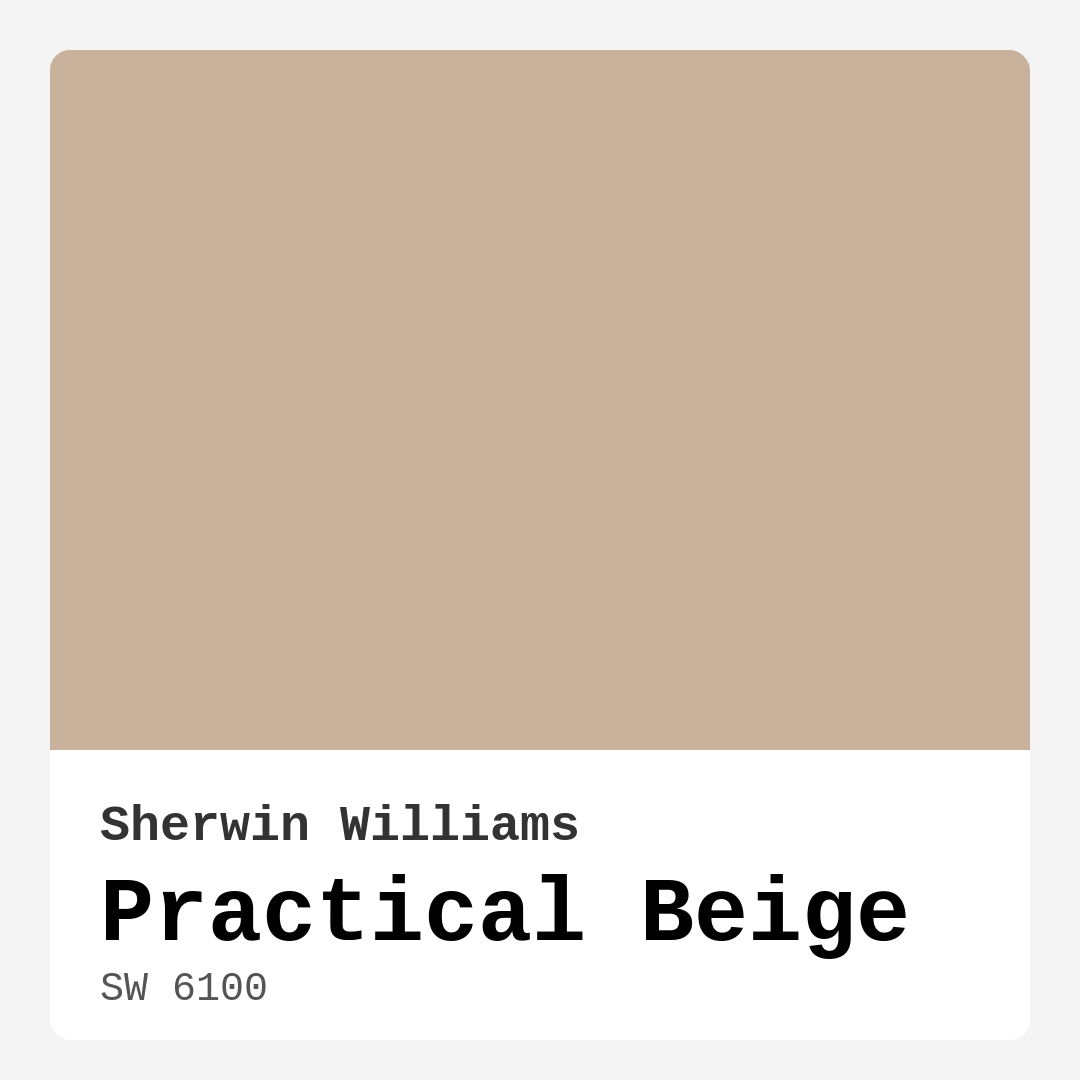
Color Preview & Key Details
| HEX Code | #C9B29C |
| RGB | 201, 178, 156 |
| LRV | 38% |
| Undertone | Red |
| Finish Options | Eggshell, Matte, Satin |
Imagine walking into a room that instantly wraps you in warmth, making you feel at home the moment you step inside. That’s the magic of Practical Beige, a Sherwin Williams color that transforms spaces into cozy retreats. Whether you’re contemplating a fresh coat of paint for your living room, bedroom, or even your home office, this delightful hue might just be the perfect choice to create that inviting atmosphere you desire.
Practical Beige (SW 6100) isn’t just another beige; it’s a soft, sophisticated neutral that embodies a beautiful balance of warmth without veering too far into yellow or orange territory. This makes it incredibly versatile, allowing you to pair it with a range of decor styles—from modern farmhouse to traditional and everything in between. When you choose Practical Beige, you’re opting for a backdrop that carries character, inviting you to experiment with various accent colors and furnishings.
Now, let’s talk about its undertones. With a subtle red hue, Practical Beige possesses depth, giving it a richness that can adapt beautifully to different lighting conditions. Under natural light, it has a way of brightening up a space, enhancing its warmth. However, in lower light settings, it can appear darker, which is something to consider if you’re working with a smaller room or a space that doesn’t receive much natural light. But don’t worry; by pairing it with lighter decor, you can maintain an open and airy feel.
One of the standout features of Practical Beige is its Light Reflectance Value (LRV) of 38%. This places it firmly in the medium category, reflecting a moderate amount of light. Understanding LRV is crucial when selecting paint colors because it affects how your space feels. Higher LRV colors can make a room feel larger and more open, while lower LRV shades tend to create a cozier atmosphere. Practical Beige strikes a nice balance, making it an ideal choice for spaces where comfort is key.
When it comes to application, Practical Beige scores high marks for being beginner-friendly. Whether you’re using a roller or a brush, the paint goes on smoothly, and the finish options—matte, eggshell, and satin—allow you to choose how much sheen you want. This flexibility ensures that no matter your style, Practical Beige can meet your needs. Plus, it’s washable and wipeable, making it easy to maintain, which is a definite plus in a busy household.
Let’s dive into some practical tips for using Practical Beige in your home. First, think about the rooms that would benefit most from its warm, inviting qualities. It works beautifully in living rooms, bedrooms, kitchens, dining rooms, and home offices. Imagine cozying up in a Practical Beige living room, with soft textiles and dim lighting creating a serene retreat after a long day. Or picture a Practical Beige kitchen, where the warmth complements the bustling activity of family gatherings.
If you’re worried about Practical Beige being too neutral, worry not! This color pairs exceptionally well with both warm and cool tones, allowing you to play with a range of complementary shades. For a striking contrast, consider pairing it with darker hues like SW 7625 or SW 9139. These colors will provide a bold statement against the softness of Practical Beige. If you prefer a more subdued look, you can incorporate lighter shades or natural wood tones to achieve a harmonious, earthy palette.
When styling your space, it’s essential to keep the undertones in mind. Practical Beige’s red undertone means it works wonderfully with colors that feature green hues, creating a beautiful contrast that adds depth to your design. Think of incorporating greenery through houseplants or artwork featuring greens to bring the space to life. Additionally, accessories in brass or warm metallics can elevate the entire look, complementing the warm undertones of Practical Beige.
You may wonder if this color is suitable for small spaces. Absolutely! Practical Beige is an excellent choice for smaller areas, as its warmth creates an inviting atmosphere. Just be mindful of the lighting; in poorly lit areas, it may appear darker. To keep the space feeling open, pair it with lighter furnishings and decor elements. This strategy helps maintain an airy vibe while still enjoying the richness of the color.
Another question that often arises is whether Practical Beige can fit into a modern decor setting. The answer is a resounding yes! Its versatility allows it to complement sleek lines and minimalist designs beautifully. You can pair it with bold accent colors or darker elements for a contemporary look, or keep it soft with muted tones for a more traditional aesthetic. This adaptability is one of the reasons why Practical Beige is such a beloved choice among homeowners and designers alike.
As an expert in home design, I can’t stress enough the importance of testing paint colors in your space. The way light interacts with a color can change throughout the day, so it’s vital to sample Practical Beige on your walls and observe it in different lighting conditions. This will give you a true sense of how the color feels in your home and how it interacts with your existing decor.
When considering Practical Beige, think about how it can serve as a classic favorite, especially if you’re preparing your home for sale. Its neutral yet warm character appeals to a wide range of buyers, making your space feel more inviting and livable.
To sum it all up, Practical Beige is more than just a neutral color; it’s a versatile and sophisticated choice that can transform your home into a warm and inviting sanctuary. With its ability to adapt to various decor styles, ease of application, and pleasing finish, it’s an option worth considering for any room. So, if you’re ready to create a space that feels cozy, welcoming, and stylish, Practical Beige might just be the perfect hue for your next project. Embrace the beauty of this color and watch your space come to life!
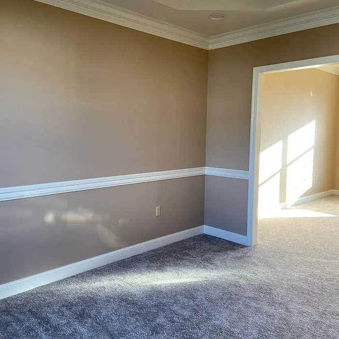
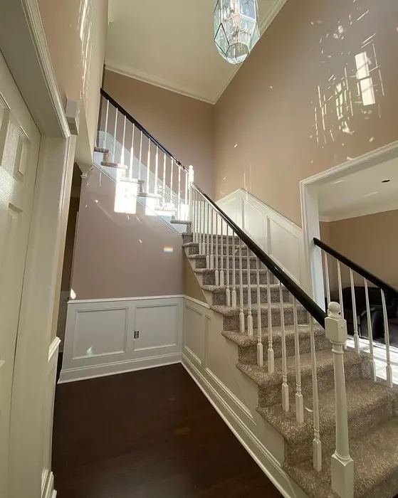
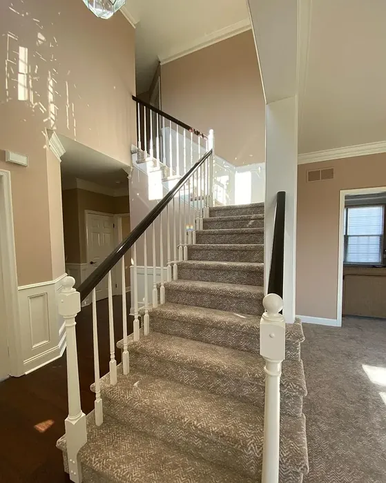
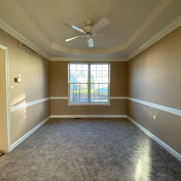
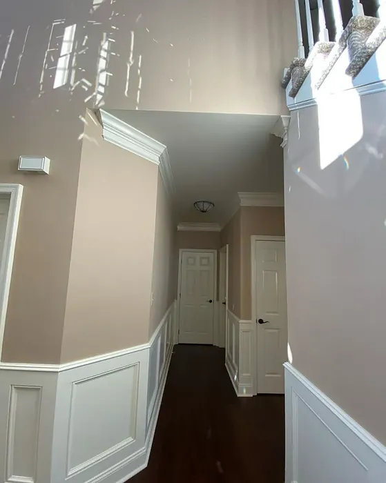
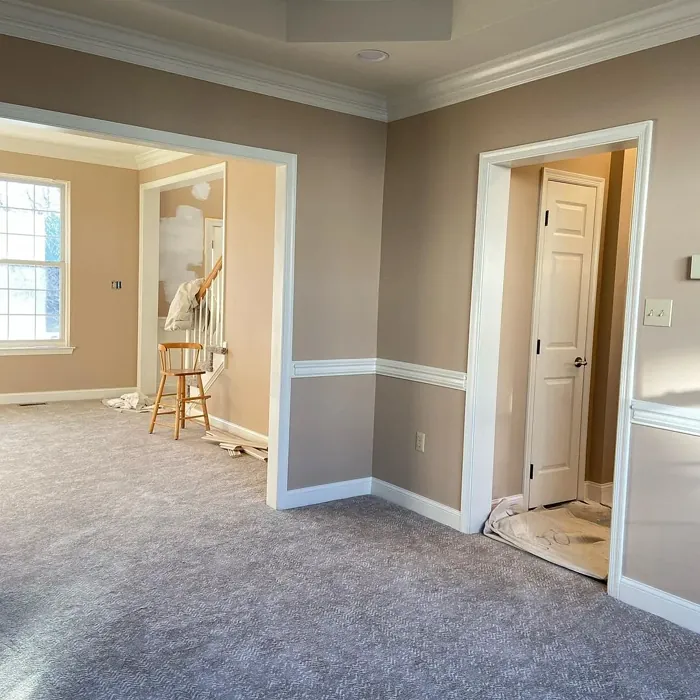
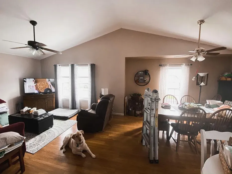
Real Room Photo of Practical Beige SW 6100
Undertones of Practical Beige ?
The undertones of Practical Beige are a key aspect of its character, leaning towards Red. These subtle underlying hues are what give the color its depth and complexity. For example, a gray with a blue undertone will feel cooler and more modern, while one with a brown undertone will feel warmer and more traditional. It’s essential to test this paint in your home and observe it next to your existing furniture, flooring, and decor to see how these undertones interact and reveal themselves throughout the day.
HEX value: #C9B29C
RGB code: 201, 178, 156
Is Practical Beige Cool or Warm?
This color leans towards the warm side of the spectrum, making it ideal for spaces where you want to foster a sense of comfort and relaxation.
Understanding Color Properties and Interior Design Tips
Hue refers to a specific position on the color wheel, measured in degrees from 0 to 360. Each degree represents a different pure color:
- 0° represents red
- 120° represents green
- 240° represents blue
Saturation describes the intensity or purity of a color and is expressed as a percentage:
- At 0%, the color appears completely desaturated—essentially a shade of gray
- At 100%, the color is at its most vivid and vibrant
Lightness indicates how light or dark a color is, also expressed as a percentage:
- 0% lightness results in black
- 100% lightness results in white
Using Warm Colors in Interior Design
Warm hues—such as reds, oranges, yellows, warm beiges, and greiges—are excellent choices for creating inviting and energetic spaces. These colors are particularly well-suited for:
- Kitchens, living rooms, and bathrooms, where warmth enhances comfort and sociability
- Large rooms, where warm tones can help reduce the sense of emptiness and make the space feel more intimate
For example:
- Warm beige shades provide a cozy, inviting atmosphere, ideal for living rooms, bedrooms, and hallways.
- Warm greige (a mix of beige and gray) offers the warmth of beige with the modern appeal of gray, making it a versatile backdrop for dining areas, bedrooms, and living spaces.
However, be mindful when using warm light tones in rooms with limited natural light. These shades may appear muted or even take on an unpleasant yellowish tint. To avoid a dull or flat appearance:
- Add depth by incorporating richer tones like deep greens, charcoal, or chocolate brown
- Use textured elements such as curtains, rugs, or cushions to bring dimension to the space
Pro Tip: Achieving Harmony with Warm and Cool Color Balance
To create a well-balanced and visually interesting interior, mix warm and cool tones strategically. This contrast adds depth and harmony to your design.
- If your walls feature warm hues, introduce cool-colored accents such as blue or green furniture, artwork, or accessories to create contrast.
- For a polished look, consider using a complementary color scheme, which pairs colors opposite each other on the color wheel (e.g., red with green, orange with blue).
This thoughtful mix not only enhances visual appeal but also creates a space that feels both dynamic and cohesive.
Light Temperature Affects on Practical Beige
Natural Light
Natural daylight changes in color temperature as the sun moves across the sky. At sunrise and sunset, the light tends to have a warm, golden tone with a color temperature around 2000 Kelvin (K). As the day progresses and the sun rises higher, the light becomes cooler and more neutral. Around midday, especially when the sky is clear, natural light typically reaches its peak brightness and shifts to a cooler tone, ranging from 5500 to 6500 Kelvin. This midday light is close to what we perceive as pure white or daylight-balanced light.
These shifts in natural light can significantly influence how colors appear in a space, which is why designers often consider both the time of day and the orientation of windows when planning interior color schemes.
Artificial Light
When choosing artificial lighting, pay close attention to the color temperature, measured in Kelvin (K). This determines how warm or cool the light will appear. Lower temperatures, around 2700K, give off a warm, yellow glow often used in living rooms or bedrooms. Higher temperatures, above 5000K, create a cool, bluish light similar to daylight, commonly used in kitchens, offices, or task areas.
Use the slider to see how lighting temperature can affect the appearance of a surface or color throughout a space.


4800K
LRV of Practical Beige
The Light Reflectance Value (LRV) of Practical Beige is 38%, which places it in the Medium category. This means it Reflects a moderate amount of light. Understanding a paint’s LRV is crucial for predicting how it will look in your space. A higher LRV indicates a lighter color that reflects more light, making rooms feel larger and brighter. A lower LRV signifies a darker color that absorbs more light, creating a cozier, more intimate atmosphere. Always consider the natural and artificial lighting in your room when selecting a paint color based on its LRV.
Detailed Review of Practical Beige
Additional Paint Characteristics
Ideal Rooms
Bedroom, Dining Room, Home Office, Kitchen, Living Room
Decor Styles
Contemporary, Modern Farmhouse, Rustic, Traditional, Transitional
Coverage
Good (1–2 Coats), Touch-Up Friendly
Ease of Application
Beginner Friendly, Brush Smooth, Roller-Ready
Washability
Washable, Wipeable
VOC Level
Low VOC
Best Use
Accent Wall, Interior Walls, Trim
Room Suitability
Bedroom, Dining Room, Home Office, Kitchen, Living Room
Tone Tag
Earthy, Neutral, Warm
Finish Type
Eggshell, Matte, Satin
Paint Performance
Easy Touch-Up, Fade Resistant, Low Odor
Use Cases
Best for Rentals, Best for Selling Your Home, Classic Favorite
Mood
Cozy, Grounding, Inviting
Trim Pairing
Complements Brass Fixtures, Pairs with White Dove, Works with Warm Trim
Practical Beige is more than just a neutral; it’s a color that invites you in. It has a beautiful balance of warmth without feeling overly yellow or orange, making it a perfect candidate for a range of spaces. Whether you’re painting an accent wall or an entire room, this color provides a lovely canvas for your decor. It pairs well with both warm and cool tones, giving you flexibility in your design choices. The application process is smooth, and the finish is pleasingly soft without being too flat. It’s particularly great for creating a cozy atmosphere, especially in living rooms or bedrooms. If you’re searching for a color that is practical yet stylish, Practical Beige is worth considering.
Pros & Cons of SW 6100 Practical Beige
Pros
Cons
Colors that go with Sherwin Williams Practical Beige
FAQ on SW 6100 Practical Beige
Is Practical Beige suitable for small spaces?
Absolutely! Practical Beige works wonderfully in small spaces. Its warm undertones help create an inviting atmosphere without overwhelming the area. Just be mindful of your lighting; it can appear darker in low-light conditions. Pair it with lighter decor and furnishings to keep the space feeling open and airy.
Can I use Practical Beige in a modern decor setting?
Definitely! Practical Beige’s versatility makes it an excellent choice for modern decor. It complements sleek lines and minimalist designs beautifully. You can pair it with bold colors or dark accents for a contemporary look, or with softer tones for a more subdued feel. Its adaptability allows it to fit seamlessly into various aesthetics.
Comparisons Practical Beige with other colors
Practical Beige SW 6100 vs Bungalow Beige SW 7511
| Attribute | Practical Beige SW 6100 | Bungalow Beige SW 7511 |
|---|---|---|
| Color Name | Practical Beige SW 6100 | Bungalow Beige SW 7511 |
| Color | ||
| Hue | Beige | Beige |
| Brightness | Medium | Medium |
| RGB | 201, 178, 156 | 205, 191, 176 |
| LRV | 38% | 45% |
| Finish Type | Eggshell, Matte, Satin | Eggshell, Satin |
| Finish Options | Eggshell, Matte, Satin | Eggshell, Matte, Satin |
| Ideal Rooms | Bedroom, Dining Room, Home Office, Kitchen, Living Room | Bedroom, Dining Room, Hallway, Home Office, Living Room |
| Decor Styles | Contemporary, Modern Farmhouse, Rustic, Traditional, Transitional | Bohemian, Coastal, Modern Farmhouse, Rustic, Transitional |
| Coverage | Good (1–2 Coats), Touch-Up Friendly | Good (1–2 Coats), Touch-Up Friendly |
| Ease of Application | Beginner Friendly, Brush Smooth, Roller-Ready | Beginner Friendly, Brush Smooth, Roller-Ready |
| Washability | Washable, Wipeable | Washable, Wipeable |
| Room Suitability | Bedroom, Dining Room, Home Office, Kitchen, Living Room | Bedroom, Dining Room, Hallway, Home Office, Living Room |
| Tone | Earthy, Neutral, Warm | Earthy, Neutral, Warm |
| Paint Performance | Easy Touch-Up, Fade Resistant, Low Odor | Easy Touch-Up, Fade Resistant, Low Odor |
Practical Beige SW 6100 vs Shiitake SW 9173
| Attribute | Practical Beige SW 6100 | Shiitake SW 9173 |
|---|---|---|
| Color Name | Practical Beige SW 6100 | Shiitake SW 9173 |
| Color | ||
| Hue | Beige | Beige |
| Brightness | Medium | Medium |
| RGB | 201, 178, 156 | 200, 188, 171 |
| LRV | 38% | 24% |
| Finish Type | Eggshell, Matte, Satin | Eggshell, Matte, Satin |
| Finish Options | Eggshell, Matte, Satin | Eggshell, Matte, Satin |
| Ideal Rooms | Bedroom, Dining Room, Home Office, Kitchen, Living Room | Bedroom, Dining Room, Home Office, Kitchen, Living Room |
| Decor Styles | Contemporary, Modern Farmhouse, Rustic, Traditional, Transitional | Contemporary, Eclectic, Modern Farmhouse, Rustic, Traditional |
| Coverage | Good (1–2 Coats), Touch-Up Friendly | Good (1–2 Coats), Touch-Up Friendly |
| Ease of Application | Beginner Friendly, Brush Smooth, Roller-Ready | Beginner Friendly, Brush Smooth, Roller-Ready |
| Washability | Washable, Wipeable | Highly Washable, Washable |
| Room Suitability | Bedroom, Dining Room, Home Office, Kitchen, Living Room | Bedroom, Dining Room, Home Office, Kitchen, Living Room |
| Tone | Earthy, Neutral, Warm | Earthy, Neutral, Warm |
| Paint Performance | Easy Touch-Up, Fade Resistant, Low Odor | Easy Touch-Up, High Coverage, Low Odor, Scuff Resistant |
Practical Beige SW 6100 vs Malabar SW 9110
| Attribute | Practical Beige SW 6100 | Malabar SW 9110 |
|---|---|---|
| Color Name | Practical Beige SW 6100 | Malabar SW 9110 |
| Color | ||
| Hue | Beige | Beige |
| Brightness | Medium | Medium |
| RGB | 201, 178, 156 | 207, 190, 169 |
| LRV | 38% | 12% |
| Finish Type | Eggshell, Matte, Satin | Eggshell, Matte, Satin |
| Finish Options | Eggshell, Matte, Satin | Eggshell, Matte, Satin |
| Ideal Rooms | Bedroom, Dining Room, Home Office, Kitchen, Living Room | Bedroom, Dining Room, Home Office, Living Room, Nursery |
| Decor Styles | Contemporary, Modern Farmhouse, Rustic, Traditional, Transitional | Coastal, Farmhouse, Modern, Rustic, Traditional |
| Coverage | Good (1–2 Coats), Touch-Up Friendly | Good (1–2 Coats), Touch-Up Friendly |
| Ease of Application | Beginner Friendly, Brush Smooth, Roller-Ready | Beginner Friendly, Brush Smooth, Fast-Drying, Roller-Ready |
| Washability | Washable, Wipeable | Washable, Wipeable |
| Room Suitability | Bedroom, Dining Room, Home Office, Kitchen, Living Room | Bedroom, Dining Room, Home Office, Living Room |
| Tone | Earthy, Neutral, Warm | Earthy, Neutral, Warm |
| Paint Performance | Easy Touch-Up, Fade Resistant, Low Odor | Easy Touch-Up, High Coverage, Low Odor, Quick Drying |
Practical Beige SW 6100 vs Stone Lion SW 7507
| Attribute | Practical Beige SW 6100 | Stone Lion SW 7507 |
|---|---|---|
| Color Name | Practical Beige SW 6100 | Stone Lion SW 7507 |
| Color | ||
| Hue | Beige | Beige |
| Brightness | Medium | Medium |
| RGB | 201, 178, 156 | 179, 164, 145 |
| LRV | 38% | 48% |
| Finish Type | Eggshell, Matte, Satin | Eggshell, Matte |
| Finish Options | Eggshell, Matte, Satin | Eggshell, Matte, Satin |
| Ideal Rooms | Bedroom, Dining Room, Home Office, Kitchen, Living Room | Bedroom, Dining Room, Home Office, Kitchen, Living Room |
| Decor Styles | Contemporary, Modern Farmhouse, Rustic, Traditional, Transitional | Bohemian, Classic, Minimalist, Modern Farmhouse, Transitional |
| Coverage | Good (1–2 Coats), Touch-Up Friendly | Good (1–2 Coats), Touch-Up Friendly |
| Ease of Application | Beginner Friendly, Brush Smooth, Roller-Ready | Beginner Friendly, Fast-Drying, Low Splatter, Roller-Ready |
| Washability | Washable, Wipeable | Washable, Wipeable |
| Room Suitability | Bedroom, Dining Room, Home Office, Kitchen, Living Room | Bedroom, Dining Room, Home Office, Kitchen, Living Room |
| Tone | Earthy, Neutral, Warm | Earthy, Muted, Neutral, Warm |
| Paint Performance | Easy Touch-Up, Fade Resistant, Low Odor | Easy Touch-Up, Long Lasting, Low Odor, Scuff Resistant |
Practical Beige SW 6100 vs Kilim Beige SW 6106
| Attribute | Practical Beige SW 6100 | Kilim Beige SW 6106 |
|---|---|---|
| Color Name | Practical Beige SW 6100 | Kilim Beige SW 6106 |
| Color | ||
| Hue | Beige | Beige |
| Brightness | Medium | Medium |
| RGB | 201, 178, 156 | 215, 197, 174 |
| LRV | 38% | 47% |
| Finish Type | Eggshell, Matte, Satin | Eggshell, Matte |
| Finish Options | Eggshell, Matte, Satin | Eggshell, Matte, Satin |
| Ideal Rooms | Bedroom, Dining Room, Home Office, Kitchen, Living Room | Bedroom, Dining Room, Entryway, Home Office, Kitchen, Living Room |
| Decor Styles | Contemporary, Modern Farmhouse, Rustic, Traditional, Transitional | Bohemian, Modern Farmhouse, Rustic, Transitional |
| Coverage | Good (1–2 Coats), Touch-Up Friendly | Good (1–2 Coats), Touch-Up Friendly |
| Ease of Application | Beginner Friendly, Brush Smooth, Roller-Ready | Beginner Friendly, Brush Smooth, Roller-Ready |
| Washability | Washable, Wipeable | Washable, Wipeable |
| Room Suitability | Bedroom, Dining Room, Home Office, Kitchen, Living Room | Bedroom, Dining Room, Home Office, Living Room |
| Tone | Earthy, Neutral, Warm | Earthy, Neutral, Warm |
| Paint Performance | Easy Touch-Up, Fade Resistant, Low Odor | Easy Touch-Up, Low Odor, Scuff Resistant |
Practical Beige SW 6100 vs Naturel SW 7542
| Attribute | Practical Beige SW 6100 | Naturel SW 7542 |
|---|---|---|
| Color Name | Practical Beige SW 6100 | Naturel SW 7542 |
| Color | ||
| Hue | Beige | Beige |
| Brightness | Medium | Medium |
| RGB | 201, 178, 156 | 203, 192, 173 |
| LRV | 38% | 62% |
| Finish Type | Eggshell, Matte, Satin | Eggshell, Matte |
| Finish Options | Eggshell, Matte, Satin | Eggshell, Matte, Satin |
| Ideal Rooms | Bedroom, Dining Room, Home Office, Kitchen, Living Room | Bathroom, Bedroom, Dining Room, Home Office, Kitchen, Living Room |
| Decor Styles | Contemporary, Modern Farmhouse, Rustic, Traditional, Transitional | Bohemian, Minimalist, Modern Farmhouse, Rustic, Scandinavian |
| Coverage | Good (1–2 Coats), Touch-Up Friendly | Good (1–2 Coats), Touch-Up Friendly |
| Ease of Application | Beginner Friendly, Brush Smooth, Roller-Ready | Beginner Friendly, Brush Smooth, Roller-Ready |
| Washability | Washable, Wipeable | Highly Washable, Washable |
| Room Suitability | Bedroom, Dining Room, Home Office, Kitchen, Living Room | Bathroom, Bedroom, Dining Room, Kitchen, Living Room |
| Tone | Earthy, Neutral, Warm | Earthy, Neutral, Warm |
| Paint Performance | Easy Touch-Up, Fade Resistant, Low Odor | Easy Touch-Up, Low Odor, Scuff Resistant |
Practical Beige SW 6100 vs Tony Taupe SW 7038
| Attribute | Practical Beige SW 6100 | Tony Taupe SW 7038 |
|---|---|---|
| Color Name | Practical Beige SW 6100 | Tony Taupe SW 7038 |
| Color | ||
| Hue | Beige | Beige |
| Brightness | Medium | Medium |
| RGB | 201, 178, 156 | 177, 162, 144 |
| LRV | 38% | 48% |
| Finish Type | Eggshell, Matte, Satin | Eggshell, Satin |
| Finish Options | Eggshell, Matte, Satin | Eggshell, Matte, Satin |
| Ideal Rooms | Bedroom, Dining Room, Home Office, Kitchen, Living Room | Bedroom, Dining Room, Entryway, Home Office, Living Room |
| Decor Styles | Contemporary, Modern Farmhouse, Rustic, Traditional, Transitional | Contemporary, Farmhouse, Modern, Rustic, Transitional |
| Coverage | Good (1–2 Coats), Touch-Up Friendly | Good (1–2 Coats), Touch-Up Friendly |
| Ease of Application | Beginner Friendly, Brush Smooth, Roller-Ready | Beginner Friendly, Brush Smooth, Roller-Ready |
| Washability | Washable, Wipeable | Washable, Wipeable |
| Room Suitability | Bedroom, Dining Room, Home Office, Kitchen, Living Room | Bedroom, Dining Room, Home Office, Kitchen, Living Room |
| Tone | Earthy, Neutral, Warm | Balanced, Earthy, Warm |
| Paint Performance | Easy Touch-Up, Fade Resistant, Low Odor | Easy Touch-Up, Low Odor, Scuff Resistant |
Practical Beige SW 6100 vs Loggia SW 7506
| Attribute | Practical Beige SW 6100 | Loggia SW 7506 |
|---|---|---|
| Color Name | Practical Beige SW 6100 | Loggia SW 7506 |
| Color | ||
| Hue | Beige | Beige |
| Brightness | Medium | Medium |
| RGB | 201, 178, 156 | 196, 183, 165 |
| LRV | 38% | 48% |
| Finish Type | Eggshell, Matte, Satin | Eggshell, Matte, Satin |
| Finish Options | Eggshell, Matte, Satin | Eggshell, Matte, Satin |
| Ideal Rooms | Bedroom, Dining Room, Home Office, Kitchen, Living Room | Bedroom, Dining Room, Home Office, Living Room |
| Decor Styles | Contemporary, Modern Farmhouse, Rustic, Traditional, Transitional | Contemporary, Modern, Rustic, Transitional |
| Coverage | Good (1–2 Coats), Touch-Up Friendly | Good (1–2 Coats) |
| Ease of Application | Beginner Friendly, Brush Smooth, Roller-Ready | Beginner Friendly, Brush Smooth, Roller-Ready |
| Washability | Washable, Wipeable | Washable, Wipeable |
| Room Suitability | Bedroom, Dining Room, Home Office, Kitchen, Living Room | Bedroom, Dining Room, Home Office, Living Room |
| Tone | Earthy, Neutral, Warm | Earthy, Neutral, Warm |
| Paint Performance | Easy Touch-Up, Fade Resistant, Low Odor | Easy Touch-Up, Low Odor, Scuff Resistant |
Practical Beige SW 6100 vs Urban Putty SW 7532
| Attribute | Practical Beige SW 6100 | Urban Putty SW 7532 |
|---|---|---|
| Color Name | Practical Beige SW 6100 | Urban Putty SW 7532 |
| Color | ||
| Hue | Beige | Beige |
| Brightness | Medium | Medium |
| RGB | 201, 178, 156 | 207, 192, 171 |
| LRV | 38% | 48% |
| Finish Type | Eggshell, Matte, Satin | Eggshell, Matte |
| Finish Options | Eggshell, Matte, Satin | Eggshell, Matte, Satin |
| Ideal Rooms | Bedroom, Dining Room, Home Office, Kitchen, Living Room | Bedroom, Hallway, Home Office, Living Room |
| Decor Styles | Contemporary, Modern Farmhouse, Rustic, Traditional, Transitional | Farmhouse, Minimalist, Modern, Transitional |
| Coverage | Good (1–2 Coats), Touch-Up Friendly | Good (1–2 Coats), Touch-Up Friendly |
| Ease of Application | Beginner Friendly, Brush Smooth, Roller-Ready | Beginner Friendly, Brush Smooth, Fast-Drying, Roller-Ready |
| Washability | Washable, Wipeable | Washable, Wipeable |
| Room Suitability | Bedroom, Dining Room, Home Office, Kitchen, Living Room | Bedroom, Dining Room, Home Office, Living Room |
| Tone | Earthy, Neutral, Warm | Earthy, Neutral, Warm |
| Paint Performance | Easy Touch-Up, Fade Resistant, Low Odor | Easy Touch-Up, Low Odor, Quick Drying |
Practical Beige SW 6100 vs Sandbar SW 7547
| Attribute | Practical Beige SW 6100 | Sandbar SW 7547 |
|---|---|---|
| Color Name | Practical Beige SW 6100 | Sandbar SW 7547 |
| Color | ||
| Hue | Beige | Beige |
| Brightness | Medium | Medium |
| RGB | 201, 178, 156 | 203, 191, 173 |
| LRV | 38% | 12% |
| Finish Type | Eggshell, Matte, Satin | Eggshell, Satin |
| Finish Options | Eggshell, Matte, Satin | Eggshell, Matte, Satin |
| Ideal Rooms | Bedroom, Dining Room, Home Office, Kitchen, Living Room | Bedroom, Dining Room, Hallway, Home Office, Kitchen, Living Room |
| Decor Styles | Contemporary, Modern Farmhouse, Rustic, Traditional, Transitional | Coastal, Modern Farmhouse, Rustic, Scandinavian, Transitional |
| Coverage | Good (1–2 Coats), Touch-Up Friendly | Good (1–2 Coats) |
| Ease of Application | Beginner Friendly, Brush Smooth, Roller-Ready | Beginner Friendly, Brush Smooth, Roller-Ready |
| Washability | Washable, Wipeable | Washable, Wipeable |
| Room Suitability | Bedroom, Dining Room, Home Office, Kitchen, Living Room | Bedroom, Dining Room, Hallway, Kitchen, Living Room |
| Tone | Earthy, Neutral, Warm | Earthy, Neutral, Warm |
| Paint Performance | Easy Touch-Up, Fade Resistant, Low Odor | Easy Touch-Up, High Coverage, Low Odor |
Official Page of Sherwin Williams Practical Beige SW 6100