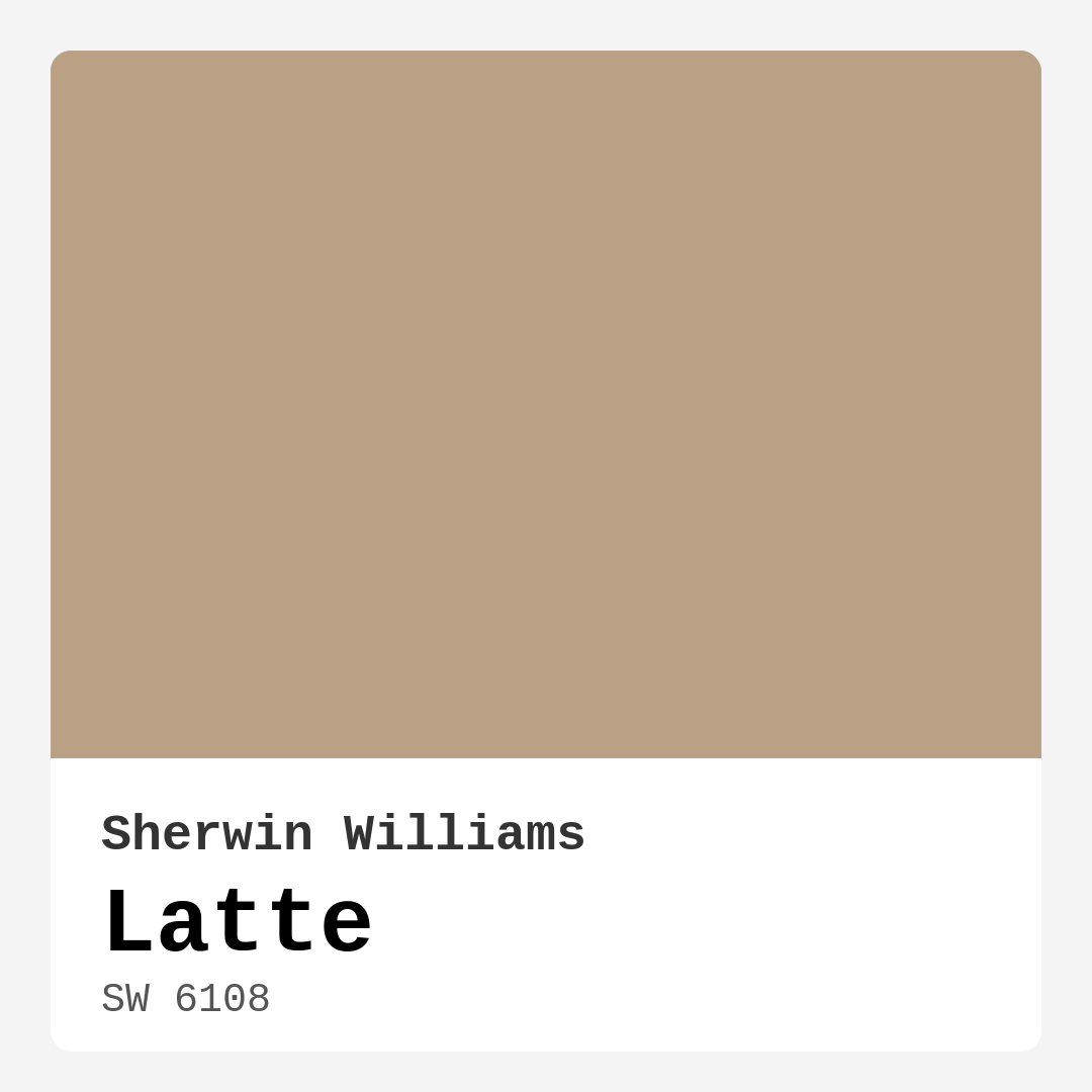
Color Preview & Key Details
| HEX Code | #BAA185 |
| RGB | 186, 161, 133 |
| LRV | 57% |
| Undertone | Red |
| Finish Options | Eggshell, Matte, Satin |
Imagine stepping into a cozy café on a chilly morning, the aroma of rich coffee wafting through the air, inviting you to sit down and unwind. That’s the feeling you get when you encounter Sherwin Williams’ Latte (SW 6108). This warm beige, with a hint of cream, captures the essence of comfort in its gentle embrace. It’s not just a color; it’s an experience.
Latte is the perfect choice for anyone looking to create a welcoming atmosphere in their home. Its subtle elegance effortlessly transforms any space into a sanctuary, radiating warmth and relaxation. Whether you’re redecorating a living room, refreshing a bedroom, or even sprucing up a hallway, Latte can adapt beautifully, making it a versatile color for various decor styles, from Modern Farmhouse to Contemporary and everything in between.
What makes Latte so appealing? For starters, it’s a medium shade with a Light Reflectance Value (LRV) of 57%. This means it reflects a moderate amount of light, creating a bright yet cozy environment. In a sunlit room, Latte appears soft and creamy, while in the glow of artificial lighting, it takes on richer, deeper tones. This dynamic quality allows it to change its mood based on the time of day, making your space feel alive.
When you’re considering a new paint color, understanding undertones is crucial. Latte has a slight red undertone that adds depth and complexity. This warmth evokes a sense of comfort and coziness, making it an inviting choice for family gatherings or quiet evenings at home. However, be cautious; it’s essential to test this color in your home. Place swatches next to your existing furniture, flooring, and decor to see how these undertones interact throughout the day. You might find that Latte enhances the beauty of your surroundings in ways you hadn’t anticipated.
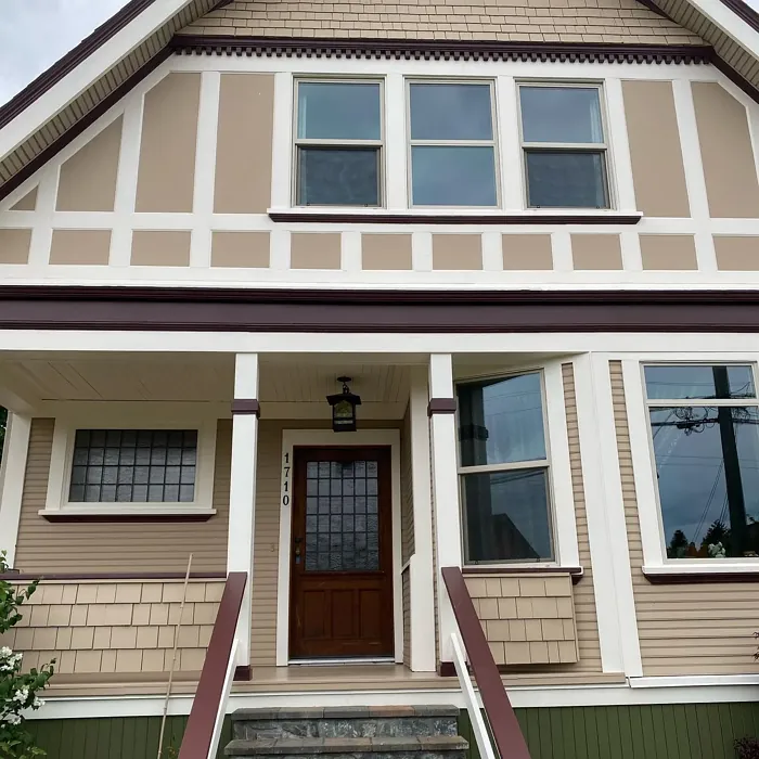
Now, let’s talk about where to use Latte. It shines in a variety of rooms. In the living room, it creates a relaxing backdrop for family gatherings and movie nights. In the bedroom, it sets a serene mood, perfect for unwinding after a long day. Even in kitchens and dining rooms, Latte encourages conversation and connection over shared meals. And don’t overlook hallways; this warm beige can make transitional spaces feel more inviting.
Choosing the right finish can also enhance Latte’s charm. You have options: matte, eggshell, or satin. For high-traffic areas like kitchens or hallways, satin or eggshell finishes are ideal. They’re more durable and easier to clean, ensuring that your beautiful beige stays looking fresh. If you prefer a softer, more understated look, matte offers a chic finish, but you’ll want to apply a quality top coat for added protection against stains and scuffs.
Latte is also beginner-friendly, making it accessible for those who may not have experience with paint projects. It applies smoothly with both rollers and brushes, typically requiring only one to two coats for excellent coverage. And if you need to touch up, you’ll find that it’s forgiving, blending in well with existing layers.
Pairing Latte with trim colors can elevate your design to the next level. It looks stunning alongside crisp whites like White Dove or Pure White, enhancing its warmth. Brass fixtures can also bring out Latte’s inviting nature, creating a cohesive and polished look. If you’re feeling adventurous, consider incorporating complementary colors from the Sherwin Williams palette, like SW 7625 or SW 9139, to add visual interest without overwhelming the space.
While Latte has many pros, it’s important to be aware of a few considerations. In poorly lit areas, Latte can appear darker than intended, so it’s wise to test a sample in your specific lighting conditions. Additionally, careful color matching is crucial to avoid clashing with existing elements in your home. And while it’s generally easy to maintain, be mindful that fingerprints can show on a matte finish, so opting for a more durable top coat is advisable if you have kids or pets.
One of the standout features of Latte is its low VOC content, contributing to healthier indoor air quality. For those who are environmentally conscious or have sensitivities, this is a key consideration. You can feel good about bringing this color into your home, knowing it’s a choice that supports your well-being.
If you’re still wondering if Latte is right for your space, consider this: it’s more than just a color; it’s a lifestyle choice. It invites you to pause, relax, and enjoy the moments that matter. Whether you’re hosting friends for coffee or curling up with a good book, this shade enhances every experience.
In conclusion, Latte is like that reliable friend who always knows how to make you feel at home. Warm, inviting, and versatile, it adapts beautifully to various decor styles and room types. With its rich undertones, excellent coverage, and ease of application, it’s no surprise that Latte is a favorite among designers and homeowners alike. So, grab your paintbrush, a sample pot of Latte, and let’s create a space that feels as comforting as your favorite café experience. You won’t regret it.
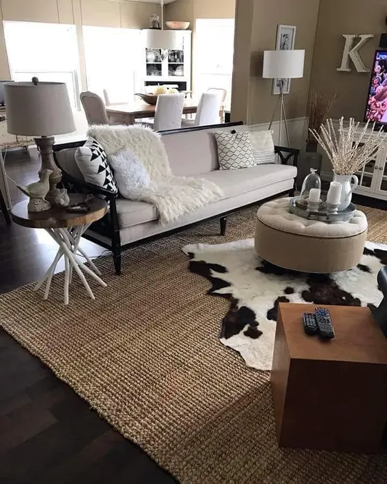
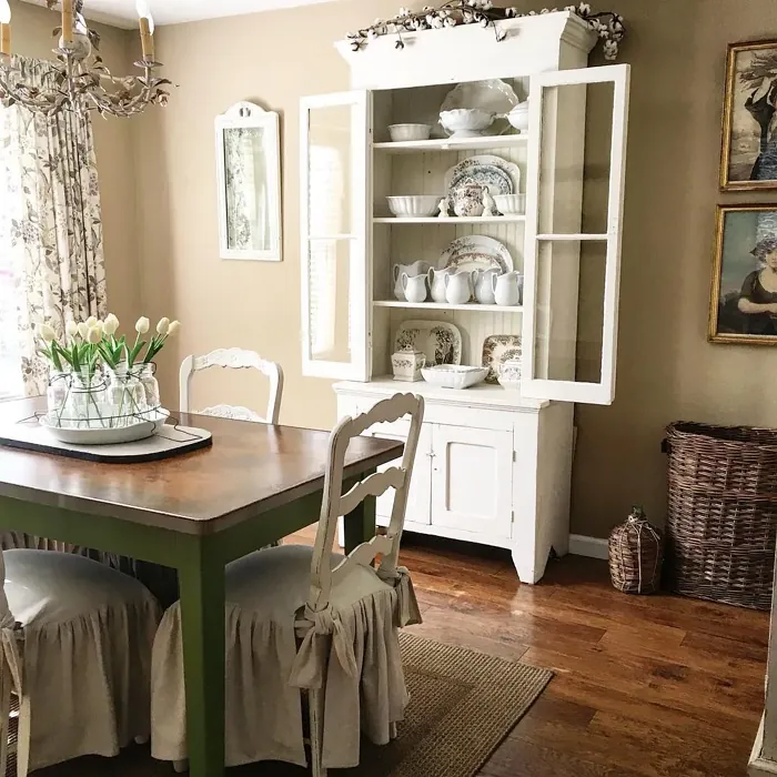
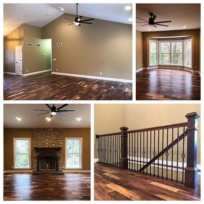
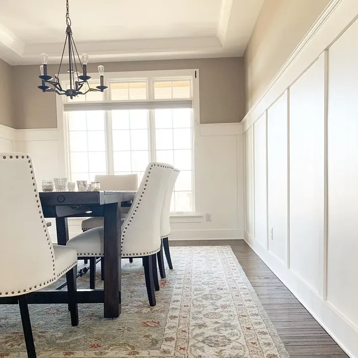
Real Room Photo of Latte SW 6108
Undertones of Latte ?
The undertones of Latte are a key aspect of its character, leaning towards Red. These subtle underlying hues are what give the color its depth and complexity. For example, a gray with a blue undertone will feel cooler and more modern, while one with a brown undertone will feel warmer and more traditional. It’s essential to test this paint in your home and observe it next to your existing furniture, flooring, and decor to see how these undertones interact and reveal themselves throughout the day.
HEX value: #BAA185
RGB code: 186, 161, 133
Is Latte Cool or Warm?
This shade is definitely warm, evoking a sense of comfort and coziness that makes any room feel more inviting.
Understanding Color Properties and Interior Design Tips
Hue refers to a specific position on the color wheel, measured in degrees from 0 to 360. Each degree represents a different pure color:
- 0° represents red
- 120° represents green
- 240° represents blue
Saturation describes the intensity or purity of a color and is expressed as a percentage:
- At 0%, the color appears completely desaturated—essentially a shade of gray
- At 100%, the color is at its most vivid and vibrant
Lightness indicates how light or dark a color is, also expressed as a percentage:
- 0% lightness results in black
- 100% lightness results in white
Using Warm Colors in Interior Design
Warm hues—such as reds, oranges, yellows, warm beiges, and greiges—are excellent choices for creating inviting and energetic spaces. These colors are particularly well-suited for:
- Kitchens, living rooms, and bathrooms, where warmth enhances comfort and sociability
- Large rooms, where warm tones can help reduce the sense of emptiness and make the space feel more intimate
For example:
- Warm beige shades provide a cozy, inviting atmosphere, ideal for living rooms, bedrooms, and hallways.
- Warm greige (a mix of beige and gray) offers the warmth of beige with the modern appeal of gray, making it a versatile backdrop for dining areas, bedrooms, and living spaces.
However, be mindful when using warm light tones in rooms with limited natural light. These shades may appear muted or even take on an unpleasant yellowish tint. To avoid a dull or flat appearance:
- Add depth by incorporating richer tones like deep greens, charcoal, or chocolate brown
- Use textured elements such as curtains, rugs, or cushions to bring dimension to the space
Pro Tip: Achieving Harmony with Warm and Cool Color Balance
To create a well-balanced and visually interesting interior, mix warm and cool tones strategically. This contrast adds depth and harmony to your design.
- If your walls feature warm hues, introduce cool-colored accents such as blue or green furniture, artwork, or accessories to create contrast.
- For a polished look, consider using a complementary color scheme, which pairs colors opposite each other on the color wheel (e.g., red with green, orange with blue).
This thoughtful mix not only enhances visual appeal but also creates a space that feels both dynamic and cohesive.
Light Temperature Affects on Latte
Natural Light
Natural daylight changes in color temperature as the sun moves across the sky. At sunrise and sunset, the light tends to have a warm, golden tone with a color temperature around 2000 Kelvin (K). As the day progresses and the sun rises higher, the light becomes cooler and more neutral. Around midday, especially when the sky is clear, natural light typically reaches its peak brightness and shifts to a cooler tone, ranging from 5500 to 6500 Kelvin. This midday light is close to what we perceive as pure white or daylight-balanced light.
These shifts in natural light can significantly influence how colors appear in a space, which is why designers often consider both the time of day and the orientation of windows when planning interior color schemes.
Artificial Light
When choosing artificial lighting, pay close attention to the color temperature, measured in Kelvin (K). This determines how warm or cool the light will appear. Lower temperatures, around 2700K, give off a warm, yellow glow often used in living rooms or bedrooms. Higher temperatures, above 5000K, create a cool, bluish light similar to daylight, commonly used in kitchens, offices, or task areas.
Use the slider to see how lighting temperature can affect the appearance of a surface or color throughout a space.


4800K
LRV of Latte
The Light Reflectance Value (LRV) of Latte is 57%, which places it in the Medium category. This means it Reflects a moderate amount of light. Understanding a paint’s LRV is crucial for predicting how it will look in your space. A higher LRV indicates a lighter color that reflects more light, making rooms feel larger and brighter. A lower LRV signifies a darker color that absorbs more light, creating a cozier, more intimate atmosphere. Always consider the natural and artificial lighting in your room when selecting a paint color based on its LRV.
Detailed Review of Latte
Additional Paint Characteristics
Ideal Rooms
Bedroom, Dining Room, Hallway, Kitchen, Living Room
Decor Styles
Bohemian, Contemporary, Modern Farmhouse, Rustic, Transitional
Coverage
Good (1–2 Coats), Touch-Up Friendly
Ease of Application
Beginner Friendly, Brush Smooth, Roller-Ready
Washability
Washable, Wipeable
VOC Level
Low VOC
Best Use
Accent Wall, Interior Walls, Trim
Room Suitability
Bedroom, Dining Room, Hallway, Kitchen, Living Room
Tone Tag
Earthy, Neutral, Warm
Finish Type
Eggshell, Matte, Satin
Paint Performance
Easy Touch-Up, High Coverage, Low Odor
Use Cases
Best for Rentals, Classic Favorite, Designer Favorite
Mood
Cozy, Inviting, Warm
Trim Pairing
Complements Brass Fixtures, Matches Pure White, Pairs with White Dove
Latte is more than just a color; it’s a lifestyle choice for those who appreciate warmth and relaxation in their spaces. When applied, it presents a soft, inviting hue that can transform any room into a sanctuary. Whether you’re looking to paint an accent wall or refresh the entire room, Latte adapts beautifully, making it a versatile option across various decor styles. The finish options of matte, eggshell, or satin allow for flexibility depending on your aesthetic and functional needs. Plus, its coverage is commendable, typically requiring just one to two coats for a flawless finish. If you’re in search of a color that doesn’t overpower yet makes a statement, Latte is an excellent choice.
Pros & Cons of SW 6108 Latte
Pros
Cons
Colors that go with Sherwin Williams Latte
FAQ on SW 6108 Latte
Can Latte be used in small spaces?
Absolutely! Latte’s warm, neutral tone can actually make small spaces feel more expansive and cozy at the same time. Just be mindful of the lighting; in darker areas, it may appear a bit deeper, so consider testing a sample before committing to the whole room.
How does Latte perform in high-traffic areas?
Latte holds up well in high-traffic areas, especially if you choose a satin or eggshell finish. These finishes are more durable and easier to clean, making them ideal for spaces like hallways, kitchens, or family rooms. Just ensure to apply a quality top coat for added protection against scuffs and stains.
Comparisons Latte with other colors
Latte SW 6108 vs Bungalow Beige SW 7511
| Attribute | Latte SW 6108 | Bungalow Beige SW 7511 |
|---|---|---|
| Color Name | Latte SW 6108 | Bungalow Beige SW 7511 |
| Color | ||
| Hue | Beige | Beige |
| Brightness | Medium | Medium |
| RGB | 186, 161, 133 | 205, 191, 176 |
| LRV | 57% | 45% |
| Finish Type | Eggshell, Matte, Satin | Eggshell, Satin |
| Finish Options | Eggshell, Matte, Satin | Eggshell, Matte, Satin |
| Ideal Rooms | Bedroom, Dining Room, Hallway, Kitchen, Living Room | Bedroom, Dining Room, Hallway, Home Office, Living Room |
| Decor Styles | Bohemian, Contemporary, Modern Farmhouse, Rustic, Transitional | Bohemian, Coastal, Modern Farmhouse, Rustic, Transitional |
| Coverage | Good (1–2 Coats), Touch-Up Friendly | Good (1–2 Coats), Touch-Up Friendly |
| Ease of Application | Beginner Friendly, Brush Smooth, Roller-Ready | Beginner Friendly, Brush Smooth, Roller-Ready |
| Washability | Washable, Wipeable | Washable, Wipeable |
| Room Suitability | Bedroom, Dining Room, Hallway, Kitchen, Living Room | Bedroom, Dining Room, Hallway, Home Office, Living Room |
| Tone | Earthy, Neutral, Warm | Earthy, Neutral, Warm |
| Paint Performance | Easy Touch-Up, High Coverage, Low Odor | Easy Touch-Up, Fade Resistant, Low Odor |
Latte SW 6108 vs Shiitake SW 9173
| Attribute | Latte SW 6108 | Shiitake SW 9173 |
|---|---|---|
| Color Name | Latte SW 6108 | Shiitake SW 9173 |
| Color | ||
| Hue | Beige | Beige |
| Brightness | Medium | Medium |
| RGB | 186, 161, 133 | 200, 188, 171 |
| LRV | 57% | 24% |
| Finish Type | Eggshell, Matte, Satin | Eggshell, Matte, Satin |
| Finish Options | Eggshell, Matte, Satin | Eggshell, Matte, Satin |
| Ideal Rooms | Bedroom, Dining Room, Hallway, Kitchen, Living Room | Bedroom, Dining Room, Home Office, Kitchen, Living Room |
| Decor Styles | Bohemian, Contemporary, Modern Farmhouse, Rustic, Transitional | Contemporary, Eclectic, Modern Farmhouse, Rustic, Traditional |
| Coverage | Good (1–2 Coats), Touch-Up Friendly | Good (1–2 Coats), Touch-Up Friendly |
| Ease of Application | Beginner Friendly, Brush Smooth, Roller-Ready | Beginner Friendly, Brush Smooth, Roller-Ready |
| Washability | Washable, Wipeable | Highly Washable, Washable |
| Room Suitability | Bedroom, Dining Room, Hallway, Kitchen, Living Room | Bedroom, Dining Room, Home Office, Kitchen, Living Room |
| Tone | Earthy, Neutral, Warm | Earthy, Neutral, Warm |
| Paint Performance | Easy Touch-Up, High Coverage, Low Odor | Easy Touch-Up, High Coverage, Low Odor, Scuff Resistant |
Latte SW 6108 vs Malabar SW 9110
| Attribute | Latte SW 6108 | Malabar SW 9110 |
|---|---|---|
| Color Name | Latte SW 6108 | Malabar SW 9110 |
| Color | ||
| Hue | Beige | Beige |
| Brightness | Medium | Medium |
| RGB | 186, 161, 133 | 207, 190, 169 |
| LRV | 57% | 12% |
| Finish Type | Eggshell, Matte, Satin | Eggshell, Matte, Satin |
| Finish Options | Eggshell, Matte, Satin | Eggshell, Matte, Satin |
| Ideal Rooms | Bedroom, Dining Room, Hallway, Kitchen, Living Room | Bedroom, Dining Room, Home Office, Living Room, Nursery |
| Decor Styles | Bohemian, Contemporary, Modern Farmhouse, Rustic, Transitional | Coastal, Farmhouse, Modern, Rustic, Traditional |
| Coverage | Good (1–2 Coats), Touch-Up Friendly | Good (1–2 Coats), Touch-Up Friendly |
| Ease of Application | Beginner Friendly, Brush Smooth, Roller-Ready | Beginner Friendly, Brush Smooth, Fast-Drying, Roller-Ready |
| Washability | Washable, Wipeable | Washable, Wipeable |
| Room Suitability | Bedroom, Dining Room, Hallway, Kitchen, Living Room | Bedroom, Dining Room, Home Office, Living Room |
| Tone | Earthy, Neutral, Warm | Earthy, Neutral, Warm |
| Paint Performance | Easy Touch-Up, High Coverage, Low Odor | Easy Touch-Up, High Coverage, Low Odor, Quick Drying |
Latte SW 6108 vs Stone Lion SW 7507
| Attribute | Latte SW 6108 | Stone Lion SW 7507 |
|---|---|---|
| Color Name | Latte SW 6108 | Stone Lion SW 7507 |
| Color | ||
| Hue | Beige | Beige |
| Brightness | Medium | Medium |
| RGB | 186, 161, 133 | 179, 164, 145 |
| LRV | 57% | 48% |
| Finish Type | Eggshell, Matte, Satin | Eggshell, Matte |
| Finish Options | Eggshell, Matte, Satin | Eggshell, Matte, Satin |
| Ideal Rooms | Bedroom, Dining Room, Hallway, Kitchen, Living Room | Bedroom, Dining Room, Home Office, Kitchen, Living Room |
| Decor Styles | Bohemian, Contemporary, Modern Farmhouse, Rustic, Transitional | Bohemian, Classic, Minimalist, Modern Farmhouse, Transitional |
| Coverage | Good (1–2 Coats), Touch-Up Friendly | Good (1–2 Coats), Touch-Up Friendly |
| Ease of Application | Beginner Friendly, Brush Smooth, Roller-Ready | Beginner Friendly, Fast-Drying, Low Splatter, Roller-Ready |
| Washability | Washable, Wipeable | Washable, Wipeable |
| Room Suitability | Bedroom, Dining Room, Hallway, Kitchen, Living Room | Bedroom, Dining Room, Home Office, Kitchen, Living Room |
| Tone | Earthy, Neutral, Warm | Earthy, Muted, Neutral, Warm |
| Paint Performance | Easy Touch-Up, High Coverage, Low Odor | Easy Touch-Up, Long Lasting, Low Odor, Scuff Resistant |
Latte SW 6108 vs Kilim Beige SW 6106
| Attribute | Latte SW 6108 | Kilim Beige SW 6106 |
|---|---|---|
| Color Name | Latte SW 6108 | Kilim Beige SW 6106 |
| Color | ||
| Hue | Beige | Beige |
| Brightness | Medium | Medium |
| RGB | 186, 161, 133 | 215, 197, 174 |
| LRV | 57% | 47% |
| Finish Type | Eggshell, Matte, Satin | Eggshell, Matte |
| Finish Options | Eggshell, Matte, Satin | Eggshell, Matte, Satin |
| Ideal Rooms | Bedroom, Dining Room, Hallway, Kitchen, Living Room | Bedroom, Dining Room, Entryway, Home Office, Kitchen, Living Room |
| Decor Styles | Bohemian, Contemporary, Modern Farmhouse, Rustic, Transitional | Bohemian, Modern Farmhouse, Rustic, Transitional |
| Coverage | Good (1–2 Coats), Touch-Up Friendly | Good (1–2 Coats), Touch-Up Friendly |
| Ease of Application | Beginner Friendly, Brush Smooth, Roller-Ready | Beginner Friendly, Brush Smooth, Roller-Ready |
| Washability | Washable, Wipeable | Washable, Wipeable |
| Room Suitability | Bedroom, Dining Room, Hallway, Kitchen, Living Room | Bedroom, Dining Room, Home Office, Living Room |
| Tone | Earthy, Neutral, Warm | Earthy, Neutral, Warm |
| Paint Performance | Easy Touch-Up, High Coverage, Low Odor | Easy Touch-Up, Low Odor, Scuff Resistant |
Latte SW 6108 vs Naturel SW 7542
| Attribute | Latte SW 6108 | Naturel SW 7542 |
|---|---|---|
| Color Name | Latte SW 6108 | Naturel SW 7542 |
| Color | ||
| Hue | Beige | Beige |
| Brightness | Medium | Medium |
| RGB | 186, 161, 133 | 203, 192, 173 |
| LRV | 57% | 62% |
| Finish Type | Eggshell, Matte, Satin | Eggshell, Matte |
| Finish Options | Eggshell, Matte, Satin | Eggshell, Matte, Satin |
| Ideal Rooms | Bedroom, Dining Room, Hallway, Kitchen, Living Room | Bathroom, Bedroom, Dining Room, Home Office, Kitchen, Living Room |
| Decor Styles | Bohemian, Contemporary, Modern Farmhouse, Rustic, Transitional | Bohemian, Minimalist, Modern Farmhouse, Rustic, Scandinavian |
| Coverage | Good (1–2 Coats), Touch-Up Friendly | Good (1–2 Coats), Touch-Up Friendly |
| Ease of Application | Beginner Friendly, Brush Smooth, Roller-Ready | Beginner Friendly, Brush Smooth, Roller-Ready |
| Washability | Washable, Wipeable | Highly Washable, Washable |
| Room Suitability | Bedroom, Dining Room, Hallway, Kitchen, Living Room | Bathroom, Bedroom, Dining Room, Kitchen, Living Room |
| Tone | Earthy, Neutral, Warm | Earthy, Neutral, Warm |
| Paint Performance | Easy Touch-Up, High Coverage, Low Odor | Easy Touch-Up, Low Odor, Scuff Resistant |
Latte SW 6108 vs Tony Taupe SW 7038
| Attribute | Latte SW 6108 | Tony Taupe SW 7038 |
|---|---|---|
| Color Name | Latte SW 6108 | Tony Taupe SW 7038 |
| Color | ||
| Hue | Beige | Beige |
| Brightness | Medium | Medium |
| RGB | 186, 161, 133 | 177, 162, 144 |
| LRV | 57% | 48% |
| Finish Type | Eggshell, Matte, Satin | Eggshell, Satin |
| Finish Options | Eggshell, Matte, Satin | Eggshell, Matte, Satin |
| Ideal Rooms | Bedroom, Dining Room, Hallway, Kitchen, Living Room | Bedroom, Dining Room, Entryway, Home Office, Living Room |
| Decor Styles | Bohemian, Contemporary, Modern Farmhouse, Rustic, Transitional | Contemporary, Farmhouse, Modern, Rustic, Transitional |
| Coverage | Good (1–2 Coats), Touch-Up Friendly | Good (1–2 Coats), Touch-Up Friendly |
| Ease of Application | Beginner Friendly, Brush Smooth, Roller-Ready | Beginner Friendly, Brush Smooth, Roller-Ready |
| Washability | Washable, Wipeable | Washable, Wipeable |
| Room Suitability | Bedroom, Dining Room, Hallway, Kitchen, Living Room | Bedroom, Dining Room, Home Office, Kitchen, Living Room |
| Tone | Earthy, Neutral, Warm | Balanced, Earthy, Warm |
| Paint Performance | Easy Touch-Up, High Coverage, Low Odor | Easy Touch-Up, Low Odor, Scuff Resistant |
Latte SW 6108 vs Loggia SW 7506
| Attribute | Latte SW 6108 | Loggia SW 7506 |
|---|---|---|
| Color Name | Latte SW 6108 | Loggia SW 7506 |
| Color | ||
| Hue | Beige | Beige |
| Brightness | Medium | Medium |
| RGB | 186, 161, 133 | 196, 183, 165 |
| LRV | 57% | 48% |
| Finish Type | Eggshell, Matte, Satin | Eggshell, Matte, Satin |
| Finish Options | Eggshell, Matte, Satin | Eggshell, Matte, Satin |
| Ideal Rooms | Bedroom, Dining Room, Hallway, Kitchen, Living Room | Bedroom, Dining Room, Home Office, Living Room |
| Decor Styles | Bohemian, Contemporary, Modern Farmhouse, Rustic, Transitional | Contemporary, Modern, Rustic, Transitional |
| Coverage | Good (1–2 Coats), Touch-Up Friendly | Good (1–2 Coats) |
| Ease of Application | Beginner Friendly, Brush Smooth, Roller-Ready | Beginner Friendly, Brush Smooth, Roller-Ready |
| Washability | Washable, Wipeable | Washable, Wipeable |
| Room Suitability | Bedroom, Dining Room, Hallway, Kitchen, Living Room | Bedroom, Dining Room, Home Office, Living Room |
| Tone | Earthy, Neutral, Warm | Earthy, Neutral, Warm |
| Paint Performance | Easy Touch-Up, High Coverage, Low Odor | Easy Touch-Up, Low Odor, Scuff Resistant |
Latte SW 6108 vs Urban Putty SW 7532
| Attribute | Latte SW 6108 | Urban Putty SW 7532 |
|---|---|---|
| Color Name | Latte SW 6108 | Urban Putty SW 7532 |
| Color | ||
| Hue | Beige | Beige |
| Brightness | Medium | Medium |
| RGB | 186, 161, 133 | 207, 192, 171 |
| LRV | 57% | 48% |
| Finish Type | Eggshell, Matte, Satin | Eggshell, Matte |
| Finish Options | Eggshell, Matte, Satin | Eggshell, Matte, Satin |
| Ideal Rooms | Bedroom, Dining Room, Hallway, Kitchen, Living Room | Bedroom, Hallway, Home Office, Living Room |
| Decor Styles | Bohemian, Contemporary, Modern Farmhouse, Rustic, Transitional | Farmhouse, Minimalist, Modern, Transitional |
| Coverage | Good (1–2 Coats), Touch-Up Friendly | Good (1–2 Coats), Touch-Up Friendly |
| Ease of Application | Beginner Friendly, Brush Smooth, Roller-Ready | Beginner Friendly, Brush Smooth, Fast-Drying, Roller-Ready |
| Washability | Washable, Wipeable | Washable, Wipeable |
| Room Suitability | Bedroom, Dining Room, Hallway, Kitchen, Living Room | Bedroom, Dining Room, Home Office, Living Room |
| Tone | Earthy, Neutral, Warm | Earthy, Neutral, Warm |
| Paint Performance | Easy Touch-Up, High Coverage, Low Odor | Easy Touch-Up, Low Odor, Quick Drying |
Latte SW 6108 vs Sandbar SW 7547
| Attribute | Latte SW 6108 | Sandbar SW 7547 |
|---|---|---|
| Color Name | Latte SW 6108 | Sandbar SW 7547 |
| Color | ||
| Hue | Beige | Beige |
| Brightness | Medium | Medium |
| RGB | 186, 161, 133 | 203, 191, 173 |
| LRV | 57% | 12% |
| Finish Type | Eggshell, Matte, Satin | Eggshell, Satin |
| Finish Options | Eggshell, Matte, Satin | Eggshell, Matte, Satin |
| Ideal Rooms | Bedroom, Dining Room, Hallway, Kitchen, Living Room | Bedroom, Dining Room, Hallway, Home Office, Kitchen, Living Room |
| Decor Styles | Bohemian, Contemporary, Modern Farmhouse, Rustic, Transitional | Coastal, Modern Farmhouse, Rustic, Scandinavian, Transitional |
| Coverage | Good (1–2 Coats), Touch-Up Friendly | Good (1–2 Coats) |
| Ease of Application | Beginner Friendly, Brush Smooth, Roller-Ready | Beginner Friendly, Brush Smooth, Roller-Ready |
| Washability | Washable, Wipeable | Washable, Wipeable |
| Room Suitability | Bedroom, Dining Room, Hallway, Kitchen, Living Room | Bedroom, Dining Room, Hallway, Kitchen, Living Room |
| Tone | Earthy, Neutral, Warm | Earthy, Neutral, Warm |
| Paint Performance | Easy Touch-Up, High Coverage, Low Odor | Easy Touch-Up, High Coverage, Low Odor |
Official Page of Sherwin Williams Latte SW 6108