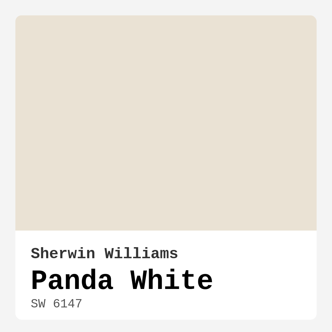
Color Preview & Key Details
| HEX Code | #EAE2D4 |
| RGB | 234, 226, 212 |
| LRV | 83% |
| Undertone | Red |
| Finish Options | Eggshell, Flat, Matte, Satin |
Imagine stepping into a room that feels both open and cozy at the same time. You see walls that reflect light effortlessly, creating an airy atmosphere while still wrapping you in a warm embrace. This is the magic of Panda White from Sherwin Williams. With its elegant and soft off-white hue, Panda White isn’t just a color; it’s a transformative experience for your space.
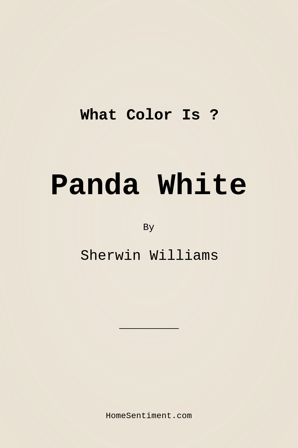
Panda White (SW 6147) is an excellent choice for anyone looking to refresh their home with a versatile and inviting shade. This warm, creamy beige paint has a remarkable ability to adapt to different styles, making it suitable for modern, farmhouse, minimalist, and Scandinavian interiors alike. It evokes a sense of tranquility and sophistication, perfect for transforming any room into a welcoming haven.
One of the standout features of Panda White is its impressive light reflectance value of 83%. This means it reflects a high amount of light, which can make even smaller spaces feel larger and brighter. So, whether you’re considering it for a cozy bedroom, a lively living room, or a productive home office, you can trust that Panda White will enhance the overall ambiance of your space. It’s particularly effective in open-concept areas, where it can seamlessly unify different zones without overwhelming them.
Let’s talk about its undertones, which are crucial in how the paint interacts with your existing decor. Panda White leans toward a subtle red undertone. This warmth is what sets it apart from a pure white, offering depth and inviting charm. The beauty of this color lies in that it doesn’t feel stark or cold, making it a more inviting choice for spaces where you want to foster connection and comfort. When you’re selecting a paint color, always remember to observe it next to your furniture and flooring. This interaction can reveal how the undertones play out throughout the day, shifting softly with the changing light.
Now, if you’re wondering how Panda White performs in various lighting conditions, you’re in for a treat. In bright, natural light, this shade appears crisp and clean, offering a fresh backdrop that can easily highlight your decor. As the light softens, however, it transforms, taking on a more subdued and cozy vibe. This adaptability makes it an excellent choice for rooms that experience varying light throughout the day.
The application of Panda White is a breeze, especially for those who might not be seasoned DIYers. It’s beginner-friendly, allowing for good coverage with just one to two coats, depending on your previous wall color. The finish options are another plus; whether you prefer a matte look or a satin sheen, Panda White’s versatility extends to its textures. It’s also wipeable and washable, ensuring that your walls remain pristine with minimal effort—perfect for busy households.
You might be wondering about the practical aspects of Panda White. Its low-VOC formula is a bonus for health-conscious homeowners, making it a safe choice for any room in the house. The low odor is particularly appealing for those who want to avoid the strong smell often associated with painting. Additionally, Panda White is a classic favorite for rentals, allowing tenants to create a cozy yet stylish environment without making permanent changes.
As you consider this lovely shade, think about how it pairs with other colors. Panda White works beautifully with a variety of complementary shades. For instance, pairing it with a warm white like White Dove can create a sophisticated trim that enhances its creamy quality. If you’re feeling adventurous, consider mixing in some brass fixtures or warm wood tones; these elements can elevate the overall aesthetic, adding character and warmth to your space.
What about its use in smaller rooms? Absolutely, Panda White is perfect for smaller spaces! Its light-reflective quality opens up the room, making it feel more spacious and inviting. Whether it’s a compact home office or a cozy corner in your living room, this color creates an intimate yet airy atmosphere, making it ideal for settings where you want to feel relaxed and centered.
Now, let’s address a common hesitation: how does Panda White compare to other whites? Unlike pure white, which can sometimes feel harsh or clinical, Panda White’s warm undertones lend it a softer, more livable quality. This makes it a versatile option for a wide range of decor styles, especially in areas where you want to foster a welcoming ambiance. So, if you’re leaning toward a lighter shade but want to avoid the coldness that can sometimes accompany stark whites, Panda White is your go-to.
For those who like to explore, you can always consider lighter or darker shades that create depth and contrast in your space. Lighter shades like SW 7551 or SW 7100 can complement Panda White beautifully, while darker shades such as SW 9508 or SW 7569 can provide a striking accent to create visual interest.
When selecting paint, it’s vital to consider the overall mood you wish to create. Panda White exudes a cozy, inviting, and restful feel—making it perfect for bedrooms, living spaces, and dining areas. Its adaptability means it can serve as a serene backdrop for vibrant artwork or a stylish display of personal touches, allowing your personality to shine through without competing with the color itself.
In conclusion, Panda White is more than just a paint color; it’s a pathway to creating a warm, inviting, and stylish home. Its ability to reflect light, adapt to various decor styles, and provide a cozy atmosphere makes it a timeless choice for any homeowner. Whether you’re aiming for a sleek modern look or a charming farmhouse vibe, Panda White can help you achieve that desired aesthetic with ease and grace. So, grab a sample and test it out in your space—you might just find that it’s the perfect color to breathe new life into your home.
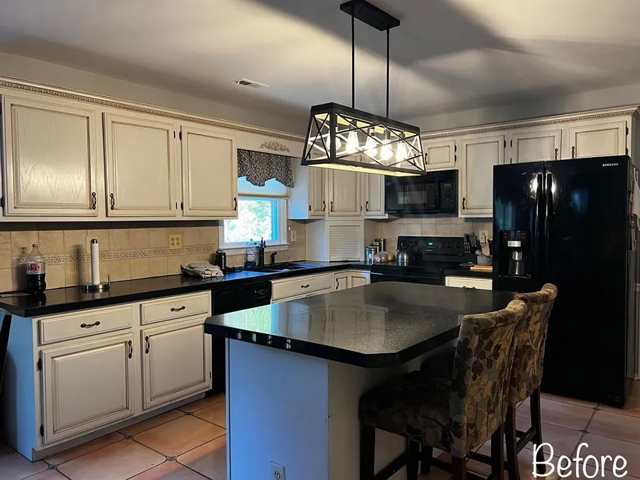
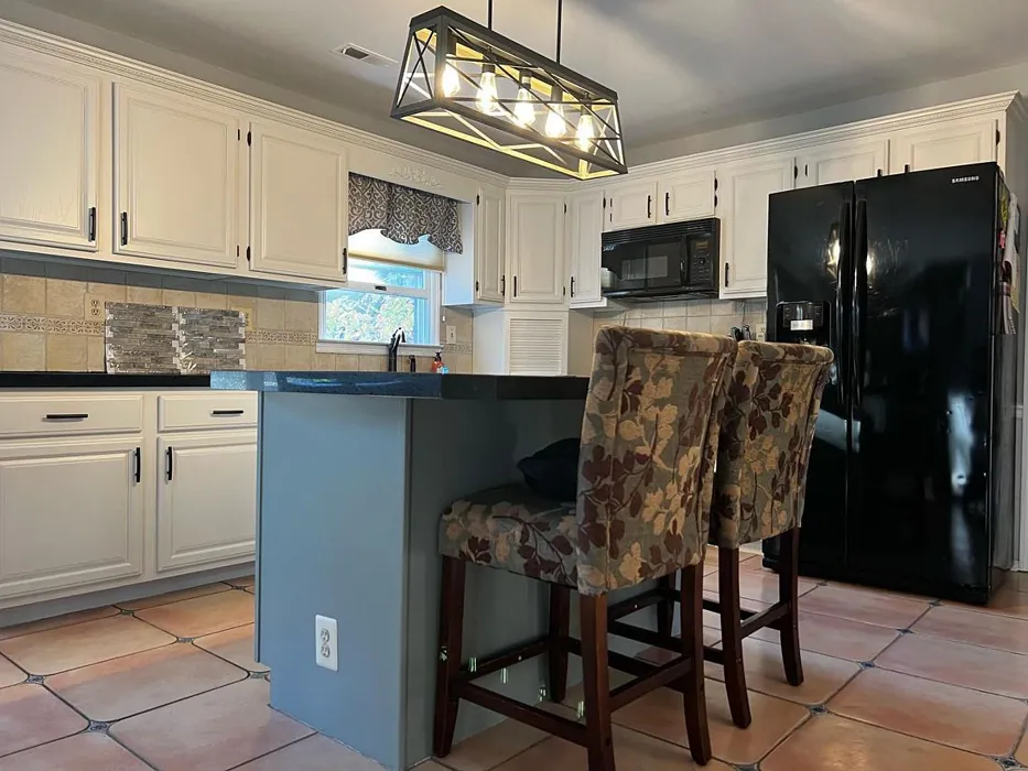
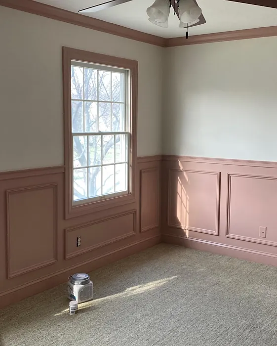
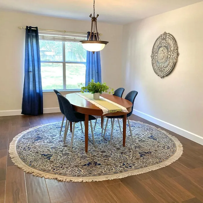
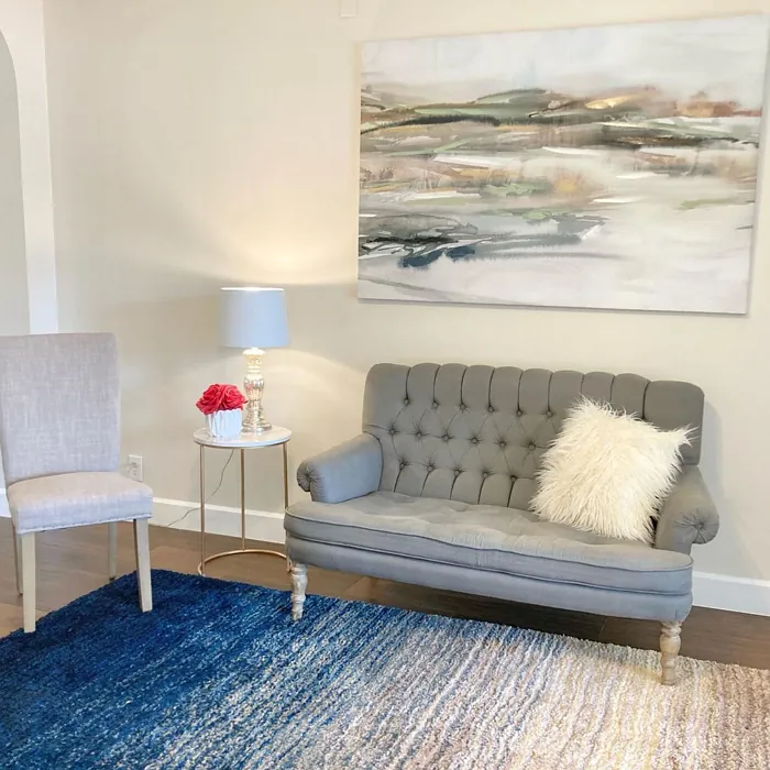
Real Room Photo of Panda White SW 6147
Undertones of Panda White ?
The undertones of Panda White are a key aspect of its character, leaning towards Red. These subtle underlying hues are what give the color its depth and complexity. For example, a gray with a blue undertone will feel cooler and more modern, while one with a brown undertone will feel warmer and more traditional. It’s essential to test this paint in your home and observe it next to your existing furniture, flooring, and decor to see how these undertones interact and reveal themselves throughout the day.
HEX value: #EAE2D4
RGB code: 234, 226, 212
Is Panda White Cool or Warm?
This paint leans warm, which helps to create an inviting feel in any room. The warm undertones can enhance natural light, making spaces feel brighter and more welcoming, especially during the colder months when a touch of warmth is most appreciated.
Understanding Color Properties and Interior Design Tips
Hue refers to a specific position on the color wheel, measured in degrees from 0 to 360. Each degree represents a different pure color:
- 0° represents red
- 120° represents green
- 240° represents blue
Saturation describes the intensity or purity of a color and is expressed as a percentage:
- At 0%, the color appears completely desaturated—essentially a shade of gray
- At 100%, the color is at its most vivid and vibrant
Lightness indicates how light or dark a color is, also expressed as a percentage:
- 0% lightness results in black
- 100% lightness results in white
Using Warm Colors in Interior Design
Warm hues—such as reds, oranges, yellows, warm beiges, and greiges—are excellent choices for creating inviting and energetic spaces. These colors are particularly well-suited for:
- Kitchens, living rooms, and bathrooms, where warmth enhances comfort and sociability
- Large rooms, where warm tones can help reduce the sense of emptiness and make the space feel more intimate
For example:
- Warm beige shades provide a cozy, inviting atmosphere, ideal for living rooms, bedrooms, and hallways.
- Warm greige (a mix of beige and gray) offers the warmth of beige with the modern appeal of gray, making it a versatile backdrop for dining areas, bedrooms, and living spaces.
However, be mindful when using warm light tones in rooms with limited natural light. These shades may appear muted or even take on an unpleasant yellowish tint. To avoid a dull or flat appearance:
- Add depth by incorporating richer tones like deep greens, charcoal, or chocolate brown
- Use textured elements such as curtains, rugs, or cushions to bring dimension to the space
Pro Tip: Achieving Harmony with Warm and Cool Color Balance
To create a well-balanced and visually interesting interior, mix warm and cool tones strategically. This contrast adds depth and harmony to your design.
- If your walls feature warm hues, introduce cool-colored accents such as blue or green furniture, artwork, or accessories to create contrast.
- For a polished look, consider using a complementary color scheme, which pairs colors opposite each other on the color wheel (e.g., red with green, orange with blue).
This thoughtful mix not only enhances visual appeal but also creates a space that feels both dynamic and cohesive.
Light Temperature Affects on Panda White
Natural Light
Natural daylight changes in color temperature as the sun moves across the sky. At sunrise and sunset, the light tends to have a warm, golden tone with a color temperature around 2000 Kelvin (K). As the day progresses and the sun rises higher, the light becomes cooler and more neutral. Around midday, especially when the sky is clear, natural light typically reaches its peak brightness and shifts to a cooler tone, ranging from 5500 to 6500 Kelvin. This midday light is close to what we perceive as pure white or daylight-balanced light.
These shifts in natural light can significantly influence how colors appear in a space, which is why designers often consider both the time of day and the orientation of windows when planning interior color schemes.
Artificial Light
When choosing artificial lighting, pay close attention to the color temperature, measured in Kelvin (K). This determines how warm or cool the light will appear. Lower temperatures, around 2700K, give off a warm, yellow glow often used in living rooms or bedrooms. Higher temperatures, above 5000K, create a cool, bluish light similar to daylight, commonly used in kitchens, offices, or task areas.
Use the slider to see how lighting temperature can affect the appearance of a surface or color throughout a space.


4800K
LRV of Panda White
The Light Reflectance Value (LRV) of Panda White is 83%, which places it in the Light category. This means it Reflects a high amount of light. Understanding a paint’s LRV is crucial for predicting how it will look in your space. A higher LRV indicates a lighter color that reflects more light, making rooms feel larger and brighter. A lower LRV signifies a darker color that absorbs more light, creating a cozier, more intimate atmosphere. Always consider the natural and artificial lighting in your room when selecting a paint color based on its LRV.
Detailed Review of Panda White
Additional Paint Characteristics
Ideal Rooms
Bedroom, Dining Room, Home Office, Kitchen, Living Room
Decor Styles
Farmhouse, Minimalist, Modern, Scandinavian
Coverage
Good (1–2 Coats)
Ease of Application
Beginner Friendly, Brush Smooth, Roller-Ready
Washability
Washable, Wipeable
VOC Level
Low VOC, Ultra Low VOC
Best Use
Accent Wall, Interior Walls, Trim
Room Suitability
Bedroom, Dining Room, Home Office, Living Room
Tone Tag
Creamy, Neutral, Warm
Finish Type
Eggshell, Satin
Paint Performance
Easy Touch-Up, High Coverage, Low Odor
Use Cases
Best for Open Concept, Best for Rentals, Best for Small Spaces, Classic Favorite
Mood
Cozy, Inviting, Restful
Trim Pairing
Complements Brass Fixtures, Pairs with White Dove, Works with Warm Trim
Panda White’s charm lies in its perfect balance between warmth and neutrality. This paint works wonders in both natural and artificial light, subtly shifting its character throughout the day. It’s especially effective in open concept spaces, where it can unify different areas without feeling overpowering. The finish options available allow for customization based on your needs, whether you’re looking for a sleek matte look or a soft sheen. One of the standout features of Panda White is its ability to enhance the visual space, making rooms feel larger and more inviting. So if you’re searching for a versatile and timeless color, Panda White might just be your go-to choice for a fresh and airy home.
Pros & Cons of SW 6147 Panda White
Pros
Cons
Colors that go with Sherwin Williams Panda White
FAQ on SW 6147 Panda White
Can Panda White be used in smaller spaces?
Absolutely! Panda White is perfect for smaller spaces as its high light reflectance helps to open up the room, making it feel larger and airier. Its warm undertones create a cozy atmosphere, making it ideal for intimate settings like bedrooms or home offices.
How does Panda White compare to pure white?
Panda White differs from pure white in that it has soft warm undertones, which can prevent it from feeling stark or cold. This makes it a more versatile option for various decor styles, especially in spaces where you want to create a welcoming ambiance while still keeping things light.
Comparisons Panda White with other colors
Panda White SW 6147 vs Natural Linen SW 9109
| Attribute | Panda White SW 6147 | Natural Linen SW 9109 |
|---|---|---|
| Color Name | Panda White SW 6147 | Natural Linen SW 9109 |
| Color | ||
| Hue | Beige | Beige |
| Brightness | Light | Light |
| RGB | 234, 226, 212 | 223, 211, 195 |
| LRV | 83% | 74% |
| Finish Type | Eggshell, Satin | Eggshell, Matte, Satin |
| Finish Options | Eggshell, Flat, Matte, Satin | Eggshell, Matte, Satin |
| Ideal Rooms | Bedroom, Dining Room, Home Office, Kitchen, Living Room | Bedroom, Dining Room, Hallway, Home Office, Kitchen, Living Room |
| Decor Styles | Farmhouse, Minimalist, Modern, Scandinavian | Bohemian, Modern Farmhouse, Scandinavian, Transitional |
| Coverage | Good (1–2 Coats) | Good (1–2 Coats), Touch-Up Friendly |
| Ease of Application | Beginner Friendly, Brush Smooth, Roller-Ready | Beginner Friendly, Brush Smooth, Fast-Drying, Roller-Ready |
| Washability | Washable, Wipeable | Highly Washable, Washable, Wipeable |
| Room Suitability | Bedroom, Dining Room, Home Office, Living Room | Bedroom, Dining Room, Home Office, Kitchen, Living Room |
| Tone | Creamy, Neutral, Warm | Earthy, Neutral, Warm |
| Paint Performance | Easy Touch-Up, High Coverage, Low Odor | Easy Touch-Up, Low Odor, Quick Drying, Scuff Resistant |
Panda White SW 6147 vs Alabaster SW 7008
| Attribute | Panda White SW 6147 | Alabaster SW 7008 |
|---|---|---|
| Color Name | Panda White SW 6147 | Alabaster SW 7008 |
| Color | ||
| Hue | Beige | Beige |
| Brightness | Light | Light |
| RGB | 234, 226, 212 | 237, 234, 224 |
| LRV | 83% | 82% |
| Finish Type | Eggshell, Satin | Eggshell, Matte, Satin |
| Finish Options | Eggshell, Flat, Matte, Satin | Eggshell, Matte, Satin |
| Ideal Rooms | Bedroom, Dining Room, Home Office, Kitchen, Living Room | Bathroom, Bedroom, Dining Room, Entryway, Home Office, Kitchen, Living Room, Nursery |
| Decor Styles | Farmhouse, Minimalist, Modern, Scandinavian | Coastal, Contemporary, Minimalist, Modern Farmhouse, Traditional, Transitional |
| Coverage | Good (1–2 Coats) | Good (1–2 Coats), Touch-Up Friendly |
| Ease of Application | Beginner Friendly, Brush Smooth, Roller-Ready | Beginner Friendly, Brush Smooth, Fast-Drying, Low Splatter, Roller-Ready |
| Washability | Washable, Wipeable | Washable, Wipeable |
| Room Suitability | Bedroom, Dining Room, Home Office, Living Room | Bathroom, Bedroom, Dining Room, Hallway, Home Office, Kitchen, Living Room, Nursery |
| Tone | Creamy, Neutral, Warm | Creamy, Neutral, Warm |
| Paint Performance | Easy Touch-Up, High Coverage, Low Odor | Easy Touch-Up, High Coverage, Low Odor, Quick Drying |
Panda White SW 6147 vs White Duck SW 7010
| Attribute | Panda White SW 6147 | White Duck SW 7010 |
|---|---|---|
| Color Name | Panda White SW 6147 | White Duck SW 7010 |
| Color | ||
| Hue | Beige | Beige |
| Brightness | Light | Light |
| RGB | 234, 226, 212 | 229, 223, 210 |
| LRV | 83% | 75% |
| Finish Type | Eggshell, Satin | Eggshell, Matte, Satin |
| Finish Options | Eggshell, Flat, Matte, Satin | Eggshell, Matte, Satin |
| Ideal Rooms | Bedroom, Dining Room, Home Office, Kitchen, Living Room | Bedroom, Dining Room, Home Office, Kitchen, Living Room, Nursery |
| Decor Styles | Farmhouse, Minimalist, Modern, Scandinavian | Farmhouse, Modern, Scandinavian, Traditional, Transitional |
| Coverage | Good (1–2 Coats) | Good (1–2 Coats), Touch-Up Friendly |
| Ease of Application | Beginner Friendly, Brush Smooth, Roller-Ready | Beginner Friendly, Brush Smooth, Fast-Drying, Roller-Ready |
| Washability | Washable, Wipeable | Highly Washable, Washable |
| Room Suitability | Bedroom, Dining Room, Home Office, Living Room | Bedroom, Dining Room, Home Office, Kitchen, Living Room |
| Tone | Creamy, Neutral, Warm | Creamy, Neutral, Warm |
| Paint Performance | Easy Touch-Up, High Coverage, Low Odor | Easy Touch-Up, Fade Resistant, Low Odor, Quick Drying |
Panda White SW 6147 vs Greek Villa SW 7551
| Attribute | Panda White SW 6147 | Greek Villa SW 7551 |
|---|---|---|
| Color Name | Panda White SW 6147 | Greek Villa SW 7551 |
| Color | ||
| Hue | Beige | Beige |
| Brightness | Light | Light |
| RGB | 234, 226, 212 | 240, 236, 226 |
| LRV | 83% | 82% |
| Finish Type | Eggshell, Satin | Eggshell, Satin |
| Finish Options | Eggshell, Flat, Matte, Satin | Eggshell, Flat, Satin |
| Ideal Rooms | Bedroom, Dining Room, Home Office, Kitchen, Living Room | Bedroom, Dining Room, Hallway, Home Office, Kitchen, Living Room |
| Decor Styles | Farmhouse, Minimalist, Modern, Scandinavian | Coastal, Minimalist, Modern Farmhouse, Traditional, Transitional |
| Coverage | Good (1–2 Coats) | Good (1–2 Coats), Touch-Up Friendly |
| Ease of Application | Beginner Friendly, Brush Smooth, Roller-Ready | Beginner Friendly, Brush Smooth, Roller-Ready |
| Washability | Washable, Wipeable | Washable, Wipeable |
| Room Suitability | Bedroom, Dining Room, Home Office, Living Room | Bedroom, Dining Room, Hallway, Kitchen, Living Room |
| Tone | Creamy, Neutral, Warm | Creamy, Neutral, Warm |
| Paint Performance | Easy Touch-Up, High Coverage, Low Odor | Easy Touch-Up, High Coverage, Low Odor, Quick Drying |
Panda White SW 6147 vs City Loft SW 7631
| Attribute | Panda White SW 6147 | City Loft SW 7631 |
|---|---|---|
| Color Name | Panda White SW 6147 | City Loft SW 7631 |
| Color | ||
| Hue | Beige | Beige |
| Brightness | Light | Light |
| RGB | 234, 226, 212 | 223, 218, 209 |
| LRV | 83% | 66% |
| Finish Type | Eggshell, Satin | Eggshell, Matte, Satin |
| Finish Options | Eggshell, Flat, Matte, Satin | Eggshell, Matte, Satin |
| Ideal Rooms | Bedroom, Dining Room, Home Office, Kitchen, Living Room | Bedroom, Hallway, Home Office, Kitchen, Living Room |
| Decor Styles | Farmhouse, Minimalist, Modern, Scandinavian | Minimalist, Modern, Scandinavian, Transitional |
| Coverage | Good (1–2 Coats) | Good (1–2 Coats), Touch-Up Friendly |
| Ease of Application | Beginner Friendly, Brush Smooth, Roller-Ready | Beginner Friendly, Brush Smooth, Fast-Drying, Low Splatter, Roller-Ready |
| Washability | Washable, Wipeable | Highly Washable, Washable |
| Room Suitability | Bedroom, Dining Room, Home Office, Living Room | Bedroom, Hallway, Home Office, Living Room |
| Tone | Creamy, Neutral, Warm | Balanced, Muted, Neutral, Warm |
| Paint Performance | Easy Touch-Up, High Coverage, Low Odor | Easy Touch-Up, High Coverage, Low Odor, Quick Drying, Scuff Resistant |
Panda White SW 6147 vs Shoji White SW 7042
| Attribute | Panda White SW 6147 | Shoji White SW 7042 |
|---|---|---|
| Color Name | Panda White SW 6147 | Shoji White SW 7042 |
| Color | ||
| Hue | Beige | Beige |
| Brightness | Light | Light |
| RGB | 234, 226, 212 | 230, 223, 211 |
| LRV | 83% | 74% |
| Finish Type | Eggshell, Satin | Eggshell, Matte, Satin |
| Finish Options | Eggshell, Flat, Matte, Satin | Eggshell, Matte, Satin |
| Ideal Rooms | Bedroom, Dining Room, Home Office, Kitchen, Living Room | Bedroom, Dining Room, Home Office, Living Room, Nursery |
| Decor Styles | Farmhouse, Minimalist, Modern, Scandinavian | Farmhouse, Japanese, Minimalist, Modern, Transitional |
| Coverage | Good (1–2 Coats) | Good (1–2 Coats), Touch-Up Friendly |
| Ease of Application | Beginner Friendly, Brush Smooth, Roller-Ready | Beginner Friendly, Brush Smooth, Roller-Ready |
| Washability | Washable, Wipeable | Washable, Wipeable |
| Room Suitability | Bedroom, Dining Room, Home Office, Living Room | Bedroom, Dining Room, Home Office, Living Room, Nursery |
| Tone | Creamy, Neutral, Warm | Creamy, Neutral, Warm |
| Paint Performance | Easy Touch-Up, High Coverage, Low Odor | Easy Touch-Up, High Coverage, Low Odor |
Panda White SW 6147 vs Neutral Ground SW 7568
| Attribute | Panda White SW 6147 | Neutral Ground SW 7568 |
|---|---|---|
| Color Name | Panda White SW 6147 | Neutral Ground SW 7568 |
| Color | ||
| Hue | Beige | Beige |
| Brightness | Light | Light |
| RGB | 234, 226, 212 | 226, 218, 202 |
| LRV | 83% | 40% |
| Finish Type | Eggshell, Satin | Eggshell, Matte, Satin |
| Finish Options | Eggshell, Flat, Matte, Satin | Eggshell, Matte, Satin |
| Ideal Rooms | Bedroom, Dining Room, Home Office, Kitchen, Living Room | Bedroom, Dining Room, Hallway, Home Office, Kitchen, Living Room |
| Decor Styles | Farmhouse, Minimalist, Modern, Scandinavian | Farmhouse, Modern, Scandinavian, Traditional, Transitional |
| Coverage | Good (1–2 Coats) | Good (1–2 Coats) |
| Ease of Application | Beginner Friendly, Brush Smooth, Roller-Ready | Beginner Friendly, Brush Smooth, Roller-Ready |
| Washability | Washable, Wipeable | Highly Washable, Washable |
| Room Suitability | Bedroom, Dining Room, Home Office, Living Room | Bedroom, Dining Room, Home Office, Kitchen, Living Room |
| Tone | Creamy, Neutral, Warm | Earthy, Neutral, Warm |
| Paint Performance | Easy Touch-Up, High Coverage, Low Odor | Easy Touch-Up, Low Odor, Quick Drying, Scuff Resistant |
Panda White SW 6147 vs Limewash SW 9589
| Attribute | Panda White SW 6147 | Limewash SW 9589 |
|---|---|---|
| Color Name | Panda White SW 6147 | Limewash SW 9589 |
| Color | ||
| Hue | Beige | Beige |
| Brightness | Light | Light |
| RGB | 234, 226, 212 | 219, 213, 203 |
| LRV | 83% | 75% |
| Finish Type | Eggshell, Satin | Flat, Matte |
| Finish Options | Eggshell, Flat, Matte, Satin | Flat, Matte |
| Ideal Rooms | Bedroom, Dining Room, Home Office, Kitchen, Living Room | Bedroom, Dining Room, Hallway, Kitchen, Living Room |
| Decor Styles | Farmhouse, Minimalist, Modern, Scandinavian | Bohemian, Contemporary, Modern Farmhouse, Rustic |
| Coverage | Good (1–2 Coats) | Good (1–2 Coats), Touch-Up Friendly |
| Ease of Application | Beginner Friendly, Brush Smooth, Roller-Ready | Beginner Friendly, Brush Smooth, Roller-Ready, Thin Formula |
| Washability | Washable, Wipeable | Washable, Wipeable |
| Room Suitability | Bedroom, Dining Room, Home Office, Living Room | Bathroom, Bedroom, Dining Room, Kitchen, Living Room |
| Tone | Creamy, Neutral, Warm | Earthy, Muted, Warm |
| Paint Performance | Easy Touch-Up, High Coverage, Low Odor | Easy Touch-Up, Long Lasting, Low Odor |
Panda White SW 6147 vs Creamy SW 7012
| Attribute | Panda White SW 6147 | Creamy SW 7012 |
|---|---|---|
| Color Name | Panda White SW 6147 | Creamy SW 7012 |
| Color | ||
| Hue | Beige | Beige |
| Brightness | Light | Light |
| RGB | 234, 226, 212 | 239, 232, 219 |
| LRV | 83% | 75% |
| Finish Type | Eggshell, Satin | Eggshell, Satin |
| Finish Options | Eggshell, Flat, Matte, Satin | Eggshell, Flat, Satin |
| Ideal Rooms | Bedroom, Dining Room, Home Office, Kitchen, Living Room | Bedroom, Dining Room, Hallway, Home Office, Kitchen, Living Room |
| Decor Styles | Farmhouse, Minimalist, Modern, Scandinavian | Contemporary, Minimalist, Modern Farmhouse, Rustic, Traditional |
| Coverage | Good (1–2 Coats) | Good (1–2 Coats), Touch-Up Friendly |
| Ease of Application | Beginner Friendly, Brush Smooth, Roller-Ready | Beginner Friendly, Fast-Drying, Low Splatter |
| Washability | Washable, Wipeable | Washable, Wipeable |
| Room Suitability | Bedroom, Dining Room, Home Office, Living Room | Bedroom, Dining Room, Hallway, Kitchen, Living Room |
| Tone | Creamy, Neutral, Warm | Creamy, Neutral, Warm |
| Paint Performance | Easy Touch-Up, High Coverage, Low Odor | High Coverage, Low Odor, Quick Drying |
Panda White SW 6147 vs White Sesame SW 9586
| Attribute | Panda White SW 6147 | White Sesame SW 9586 |
|---|---|---|
| Color Name | Panda White SW 6147 | White Sesame SW 9586 |
| Color | ||
| Hue | Beige | Beige |
| Brightness | Light | Light |
| RGB | 234, 226, 212 | 227, 219, 205 |
| LRV | 83% | 75% |
| Finish Type | Eggshell, Satin | Eggshell, Matte, Satin |
| Finish Options | Eggshell, Flat, Matte, Satin | Eggshell, Matte, Satin |
| Ideal Rooms | Bedroom, Dining Room, Home Office, Kitchen, Living Room | Bedroom, Home Office, Kitchen, Living Room, Nursery |
| Decor Styles | Farmhouse, Minimalist, Modern, Scandinavian | Minimalist, Modern Farmhouse, Rustic, Scandinavian, Transitional |
| Coverage | Good (1–2 Coats) | Good (1–2 Coats), Touch-Up Friendly |
| Ease of Application | Beginner Friendly, Brush Smooth, Roller-Ready | Beginner Friendly, Brush Smooth, Roller-Ready |
| Washability | Washable, Wipeable | Highly Washable, Washable |
| Room Suitability | Bedroom, Dining Room, Home Office, Living Room | Bedroom, Dining Room, Home Office, Living Room, Nursery |
| Tone | Creamy, Neutral, Warm | Creamy, Earthy, Neutral, Warm |
| Paint Performance | Easy Touch-Up, High Coverage, Low Odor | Easy Touch-Up, High Coverage, Low Odor, Quick Drying |
Official Page of Sherwin Williams Panda White SW 6147