Color Preview & Key Details
| HEX Code | #C8BBA3 |
| RGB | 200, 187, 163 |
| LRV | 40% |
| Undertone | Red |
| Finish Options | Eggshell, Matte, Satin |
Imagine walking into a space that feels instantly warm and inviting. That’s the magic of Relaxed Khaki by Sherwin-Williams—a color that effortlessly creates a cozy atmosphere while maintaining a sophisticated edge. You might be wondering if this soft, earthy hue is the right choice for your next home project. Let’s dive into what makes Relaxed Khaki so special and how it can transform your interior spaces.
Relaxed Khaki, with its color code SW 6149, is part of the greige family. This hue strikes a delightful balance between beige and gray, making it incredibly versatile. Whether you’re aiming for a modern farmhouse vibe, a rustic charm, or a more traditional look, Relaxed Khaki seamlessly adapts to your decor style. It’s like the perfect little black dress—timeless, stylish, and always in fashion.
One of the key features of Relaxed Khaki is its warm undertone, which leans slightly toward red. This subtle hint of warmth makes it an inviting choice, especially for spaces where you want to encourage relaxation and comfort, like your living room or bedroom. When you pair it with whites or soft greys, you can create striking contrasts that highlight the beauty of your furnishings and decor.
In terms of application, Relaxed Khaki is a dream for both DIY enthusiasts and seasoned pros. It’s beginner-friendly and rolls on smoothly without much fuss. Whether you’re painting an entire room or just doing touch-ups, this paint offers good coverage with just one or two coats. Plus, with its low VOC level, you can feel good about using it in your home, knowing it’s a healthier choice for you and your family.
One thing to keep in mind, though, is the lighting in your space. Relaxed Khaki reflects a moderate amount of light, with an LRV (Light Reflectance Value) of 40%. This means it can create a cozy, intimate atmosphere in well-lit rooms while appearing slightly darker in dimmer settings. If you’re working with a small room, pairing this color with lighter accents or trim can help keep the space feeling open and airy.
The color’s adaptability is one of its standout qualities. It works well in various lighting conditions, showcasing its warm characteristics in bright light and a more subdued, earthy tone in softer lighting. This versatility makes it a reliable choice for any room in your home, including your kitchen, dining room, or home office. Imagine a calm workspace painted in Relaxed Khaki, where the warm tones enhance your focus and creativity.
When it comes to decor, this color pairs beautifully with a range of complementary shades. Consider matching it with White Dove for a fresh, clean look or introducing richer colors like brass fixtures to add a touch of elegance. Relaxed Khaki can also work harmoniously with darker shades like SW 9122 or SW 7528, creating a striking contrast that adds depth to your interior.
As an expert home designer, I often advise clients to test paint colors in their spaces before committing. Grab a sample of Relaxed Khaki and apply it to a small section of your wall. Observe how it interacts with your existing decor, flooring, and lighting throughout the day. You’ll notice how the undertones come alive, adjusting beautifully with the changing light.
While Relaxed Khaki has many pros, it’s important to consider a few cons. In small spaces with limited natural light, it may appear darker than expected. However, this can be mitigated by ensuring ample lighting or using lighter decor to balance the depth of the color. Additionally, while it’s durable enough for high-traffic areas, opting for a satin finish can provide extra protection against scuffs and stains, making clean-up a breeze.
Let’s talk about versatility again. The muted yet warm quality of Relaxed Khaki allows it to complement both warm and cool palettes. This makes it an excellent choice for open-concept spaces where different areas might have varied styles. You can create a cohesive flow throughout your home, connecting rooms with a consistent color that feels inviting yet polished.
This color is also wipeable and washable, which is essential for busy households. Life happens—kids spill juice, pets leave their mark, and scuffs can occur. Relaxed Khaki stands up to the test, allowing you to maintain a fresh look without constant worry about wear and tear.
In conclusion, Relaxed Khaki is more than just a paint color; it’s an invitation to create a cozy, inviting home. Whether you’re looking to refresh a single room or transform your entire space, this color serves as the perfect canvas for your style. It’s adaptable, warm, and timeless—making it a favorite among designers and homeowners alike.
So, are you ready to embrace the warmth of Relaxed Khaki? Picture yourself walking into a room enveloped in this soothing hue, surrounded by decor that feels perfectly in sync. Let this color guide your next project, and watch as your space comes alive with comfort and elegance.
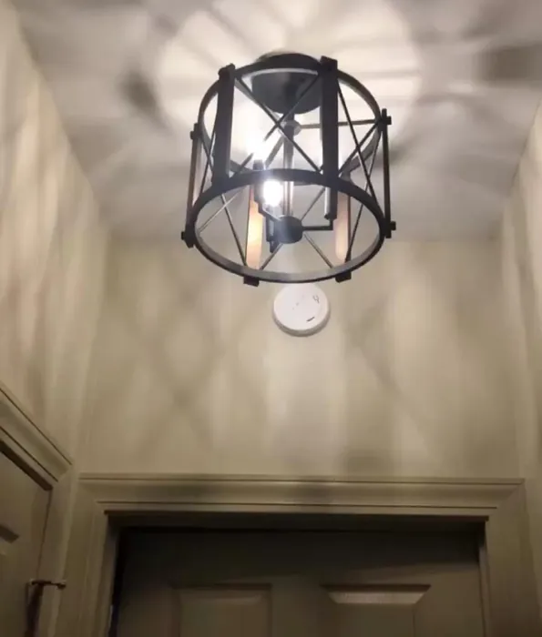
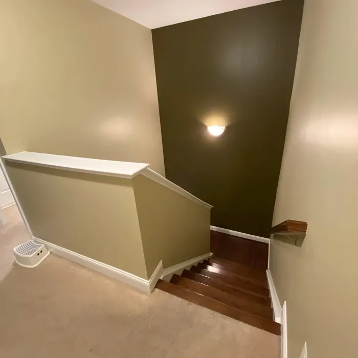
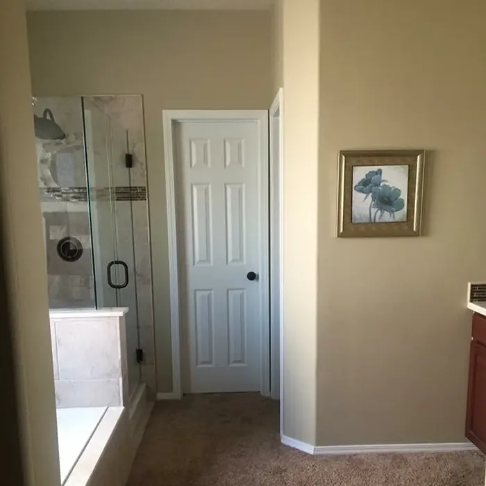
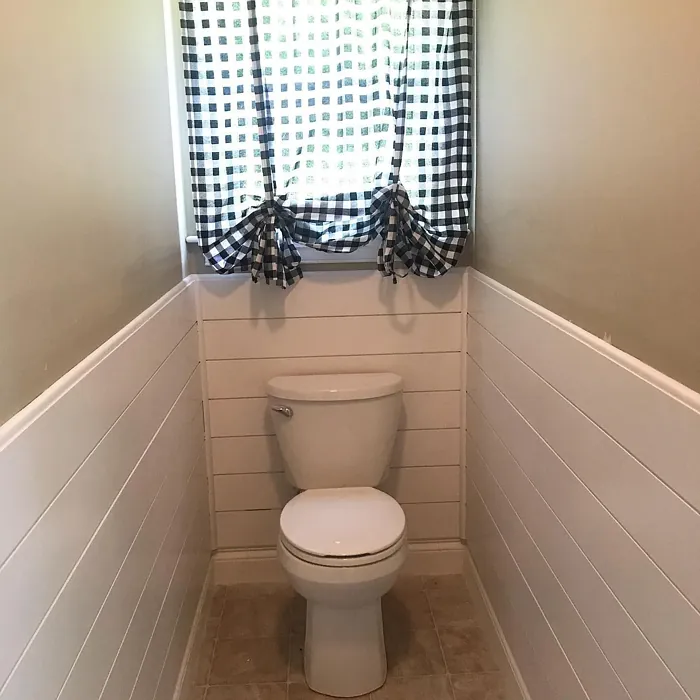
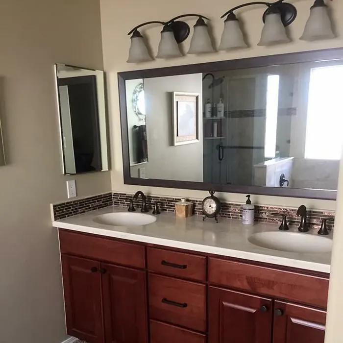
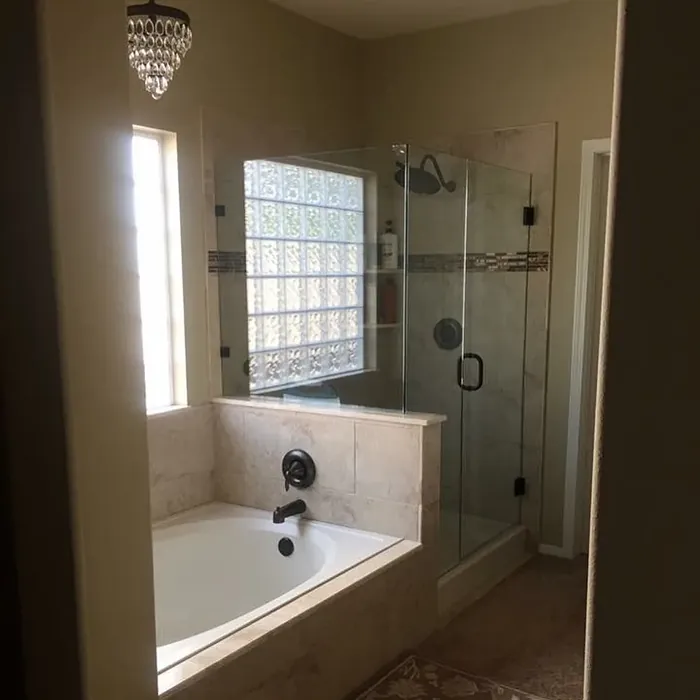
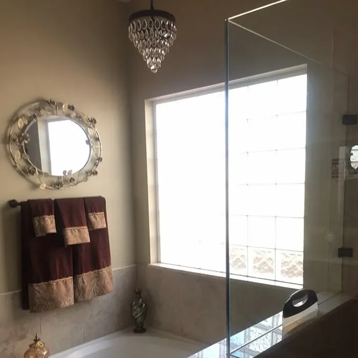
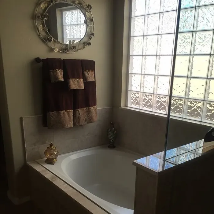
Real Room Photo of Relaxed Khaki SW 6149
Undertones of Relaxed Khaki ?
The undertones of Relaxed Khaki are a key aspect of its character, leaning towards Red. These subtle underlying hues are what give the color its depth and complexity. For example, a gray with a blue undertone will feel cooler and more modern, while one with a brown undertone will feel warmer and more traditional. It’s essential to test this paint in your home and observe it next to your existing furniture, flooring, and decor to see how these undertones interact and reveal themselves throughout the day.
HEX value: #C8BBA3
RGB code: 200, 187, 163
Is Relaxed Khaki Cool or Warm?
This color leans slightly warm due to its beige base, but its undertones give it a balanced quality that can adapt to both warm and cool palettes. It’s an excellent choice if you want to create a cozy atmosphere without overwhelming the senses.
Understanding Color Properties and Interior Design Tips
Hue refers to a specific position on the color wheel, measured in degrees from 0 to 360. Each degree represents a different pure color:
- 0° represents red
- 120° represents green
- 240° represents blue
Saturation describes the intensity or purity of a color and is expressed as a percentage:
- At 0%, the color appears completely desaturated—essentially a shade of gray
- At 100%, the color is at its most vivid and vibrant
Lightness indicates how light or dark a color is, also expressed as a percentage:
- 0% lightness results in black
- 100% lightness results in white
Using Warm Colors in Interior Design
Warm hues—such as reds, oranges, yellows, warm beiges, and greiges—are excellent choices for creating inviting and energetic spaces. These colors are particularly well-suited for:
- Kitchens, living rooms, and bathrooms, where warmth enhances comfort and sociability
- Large rooms, where warm tones can help reduce the sense of emptiness and make the space feel more intimate
For example:
- Warm beige shades provide a cozy, inviting atmosphere, ideal for living rooms, bedrooms, and hallways.
- Warm greige (a mix of beige and gray) offers the warmth of beige with the modern appeal of gray, making it a versatile backdrop for dining areas, bedrooms, and living spaces.
However, be mindful when using warm light tones in rooms with limited natural light. These shades may appear muted or even take on an unpleasant yellowish tint. To avoid a dull or flat appearance:
- Add depth by incorporating richer tones like deep greens, charcoal, or chocolate brown
- Use textured elements such as curtains, rugs, or cushions to bring dimension to the space
Pro Tip: Achieving Harmony with Warm and Cool Color Balance
To create a well-balanced and visually interesting interior, mix warm and cool tones strategically. This contrast adds depth and harmony to your design.
- If your walls feature warm hues, introduce cool-colored accents such as blue or green furniture, artwork, or accessories to create contrast.
- For a polished look, consider using a complementary color scheme, which pairs colors opposite each other on the color wheel (e.g., red with green, orange with blue).
This thoughtful mix not only enhances visual appeal but also creates a space that feels both dynamic and cohesive.
Light Temperature Affects on Relaxed Khaki
Natural Light
Natural daylight changes in color temperature as the sun moves across the sky. At sunrise and sunset, the light tends to have a warm, golden tone with a color temperature around 2000 Kelvin (K). As the day progresses and the sun rises higher, the light becomes cooler and more neutral. Around midday, especially when the sky is clear, natural light typically reaches its peak brightness and shifts to a cooler tone, ranging from 5500 to 6500 Kelvin. This midday light is close to what we perceive as pure white or daylight-balanced light.
These shifts in natural light can significantly influence how colors appear in a space, which is why designers often consider both the time of day and the orientation of windows when planning interior color schemes.
Artificial Light
When choosing artificial lighting, pay close attention to the color temperature, measured in Kelvin (K). This determines how warm or cool the light will appear. Lower temperatures, around 2700K, give off a warm, yellow glow often used in living rooms or bedrooms. Higher temperatures, above 5000K, create a cool, bluish light similar to daylight, commonly used in kitchens, offices, or task areas.
Use the slider to see how lighting temperature can affect the appearance of a surface or color throughout a space.


4800K
LRV of Relaxed Khaki
The Light Reflectance Value (LRV) of Relaxed Khaki is 40%, which places it in the Medium category. This means it Reflects a moderate amount of light. Understanding a paint’s LRV is crucial for predicting how it will look in your space. A higher LRV indicates a lighter color that reflects more light, making rooms feel larger and brighter. A lower LRV signifies a darker color that absorbs more light, creating a cozier, more intimate atmosphere. Always consider the natural and artificial lighting in your room when selecting a paint color based on its LRV.
Detailed Review of Relaxed Khaki
Additional Paint Characteristics
Ideal Rooms
Bedroom, Dining Room, Home Office, Kitchen, Living Room
Decor Styles
Contemporary, Modern Farmhouse, Rustic, Traditional
Coverage
Good (1–2 Coats), Touch-Up Friendly
Ease of Application
Beginner Friendly, Brush Smooth, Roller-Ready
Washability
Washable, Wipeable
VOC Level
Low VOC
Best Use
Accent Wall, Home Office, Interior Walls, Living Room
Room Suitability
Bedroom, Dining Room, Home Office, Living Room
Tone Tag
Earthy, Muted, Warm
Finish Type
Eggshell, Matte, Satin
Paint Performance
Easy Touch-Up, Low Odor, Scuff Resistant
Use Cases
Best for Open Concept, Best for Small Spaces, Designer Favorite
Mood
Calm, Cozy, Inviting
Trim Pairing
Complements Brass Fixtures, Good with Wood Trim, Pairs with White Dove
When it comes to Relaxed Khaki, you’re looking at more than just a paint color; you’re embracing a lifestyle. This hue offers a gentle balance between warmth and neutrality, making it a go-to choice for various rooms in your home. Whether you’re planning to create a calm reading nook or a sophisticated dining area, Relaxed Khaki sets the stage beautifully. Its muted tone pairs wonderfully with whites, greys, and even darker colors, providing flexibility in your decor choices. The application process is smooth, and it dries evenly, making it friendly for DIY enthusiasts and professionals alike. Plus, its versatility means it can transition seamlessly from room to room without feeling out of place.
Pros & Cons of SW 6149 Relaxed Khaki
Pros
Cons
Colors that go with Sherwin Williams Relaxed Khaki
FAQ on SW 6149 Relaxed Khaki
Can I use Relaxed Khaki in a small room?
Absolutely! Relaxed Khaki can work wonders in small spaces, making them feel cozy and inviting. Just be mindful that in dim lighting, it may appear a bit darker. Consider pairing it with ample white trim or lighter accents to keep the room feeling open and airy.
How does Relaxed Khaki perform in high-traffic areas?
This paint is quite durable and can handle moderate traffic. It’s wipeable and washable, which means you can easily clean it when necessary. If you’re concerned about scuffs or stains, consider adding a satin finish for added durability.
Comparisons Relaxed Khaki with other colors
Relaxed Khaki SW 6149 vs Accessible Beige SW 7036
| Attribute | Relaxed Khaki SW 6149 | Accessible Beige SW 7036 |
|---|---|---|
| Color Name | Relaxed Khaki SW 6149 | Accessible Beige SW 7036 |
| Color | ||
| Hue | Greige | Greige |
| Brightness | Medium | Medium |
| RGB | 200, 187, 163 | 209, 199, 184 |
| LRV | 40% | 58% |
| Finish Type | Eggshell, Matte, Satin | Eggshell, Matte, Satin |
| Finish Options | Eggshell, Matte, Satin | Eggshell, Matte, Satin |
| Ideal Rooms | Bedroom, Dining Room, Home Office, Kitchen, Living Room | Bedroom, Dining Room, Home Office, Kitchen, Living Room |
| Decor Styles | Contemporary, Modern Farmhouse, Rustic, Traditional | Bohemian, Contemporary, Modern Farmhouse, Traditional, Transitional |
| Coverage | Good (1–2 Coats), Touch-Up Friendly | Good (1–2 Coats), Touch-Up Friendly |
| Ease of Application | Beginner Friendly, Brush Smooth, Roller-Ready | Beginner Friendly, Brush Smooth, Roller-Ready |
| Washability | Washable, Wipeable | Highly Washable, Washable |
| Room Suitability | Bedroom, Dining Room, Home Office, Living Room | Bedroom, Dining Room, Home Office, Kitchen, Living Room |
| Tone | Earthy, Muted, Warm | Earthy, Neutral, Warm |
| Paint Performance | Easy Touch-Up, Low Odor, Scuff Resistant | Easy Touch-Up, Fade Resistant, High Coverage, Low Odor |
Relaxed Khaki SW 6149 vs Jogging Path SW 7638
| Attribute | Relaxed Khaki SW 6149 | Jogging Path SW 7638 |
|---|---|---|
| Color Name | Relaxed Khaki SW 6149 | Jogging Path SW 7638 |
| Color | ||
| Hue | Greige | Greige |
| Brightness | Medium | Medium |
| RGB | 200, 187, 163 | 192, 185, 169 |
| LRV | 40% | 15% |
| Finish Type | Eggshell, Matte, Satin | Eggshell, Matte |
| Finish Options | Eggshell, Matte, Satin | Eggshell, Matte, Satin |
| Ideal Rooms | Bedroom, Dining Room, Home Office, Kitchen, Living Room | Bedroom, Dining Room, Hallway, Home Office, Kitchen, Living Room |
| Decor Styles | Contemporary, Modern Farmhouse, Rustic, Traditional | Modern, Rustic, Scandinavian, Transitional |
| Coverage | Good (1–2 Coats), Touch-Up Friendly | Good (1–2 Coats), Touch-Up Friendly |
| Ease of Application | Beginner Friendly, Brush Smooth, Roller-Ready | Beginner Friendly, Brush Smooth, Fast-Drying, Roller-Ready |
| Washability | Washable, Wipeable | Washable, Wipeable |
| Room Suitability | Bedroom, Dining Room, Home Office, Living Room | Bedroom, Dining Room, Home Office, Living Room |
| Tone | Earthy, Muted, Warm | Balanced, Earthy, Muted, Warm |
| Paint Performance | Easy Touch-Up, Low Odor, Scuff Resistant | Easy Touch-Up, Fade Resistant, Low Odor |
Relaxed Khaki SW 6149 vs Antler Velvet SW 9111
| Attribute | Relaxed Khaki SW 6149 | Antler Velvet SW 9111 |
|---|---|---|
| Color Name | Relaxed Khaki SW 6149 | Antler Velvet SW 9111 |
| Color | ||
| Hue | Greige | Greige |
| Brightness | Medium | Medium |
| RGB | 200, 187, 163 | 192, 173, 150 |
| LRV | 40% | 6% |
| Finish Type | Eggshell, Matte, Satin | Eggshell, Matte |
| Finish Options | Eggshell, Matte, Satin | Eggshell, Matte, Satin |
| Ideal Rooms | Bedroom, Dining Room, Home Office, Kitchen, Living Room | Bedroom, Dining Room, Home Office, Living Room, Nursery |
| Decor Styles | Contemporary, Modern Farmhouse, Rustic, Traditional | Contemporary, Modern Farmhouse, Rustic, Transitional |
| Coverage | Good (1–2 Coats), Touch-Up Friendly | Good (1–2 Coats) |
| Ease of Application | Beginner Friendly, Brush Smooth, Roller-Ready | Beginner Friendly, Brush Smooth, Fast-Drying, Roller-Ready |
| Washability | Washable, Wipeable | Scrubbable, Washable, Wipeable |
| Room Suitability | Bedroom, Dining Room, Home Office, Living Room | Bedroom, Dining Room, Home Office, Living Room |
| Tone | Earthy, Muted, Warm | Earthy, Muted, Warm |
| Paint Performance | Easy Touch-Up, Low Odor, Scuff Resistant | Easy Touch-Up, High Coverage, Low Odor, Quick Drying |
Relaxed Khaki SW 6149 vs Perfect Greige SW 6073
| Attribute | Relaxed Khaki SW 6149 | Perfect Greige SW 6073 |
|---|---|---|
| Color Name | Relaxed Khaki SW 6149 | Perfect Greige SW 6073 |
| Color | ||
| Hue | Greige | Greige |
| Brightness | Medium | Medium |
| RGB | 200, 187, 163 | 183, 171, 159 |
| LRV | 40% | 38% |
| Finish Type | Eggshell, Matte, Satin | Eggshell, Matte, Satin |
| Finish Options | Eggshell, Matte, Satin | Eggshell, Matte, Satin |
| Ideal Rooms | Bedroom, Dining Room, Home Office, Kitchen, Living Room | Bathroom, Bedroom, Dining Room, Entryway, Home Office, Kitchen, Living Room |
| Decor Styles | Contemporary, Modern Farmhouse, Rustic, Traditional | Contemporary, Farmhouse, Modern, Traditional, Transitional |
| Coverage | Good (1–2 Coats), Touch-Up Friendly | Good (1–2 Coats), Touch-Up Friendly |
| Ease of Application | Beginner Friendly, Brush Smooth, Roller-Ready | Beginner Friendly, Brush Smooth, Roller-Ready |
| Washability | Washable, Wipeable | Highly Washable, Washable |
| Room Suitability | Bedroom, Dining Room, Home Office, Living Room | Bedroom, Dining Room, Home Office, Kitchen, Living Room |
| Tone | Earthy, Muted, Warm | Muted, Neutral, Warm |
| Paint Performance | Easy Touch-Up, Low Odor, Scuff Resistant | Easy Touch-Up, Low Odor, Scuff Resistant |
Relaxed Khaki SW 6149 vs Analytical Gray SW 7051
| Attribute | Relaxed Khaki SW 6149 | Analytical Gray SW 7051 |
|---|---|---|
| Color Name | Relaxed Khaki SW 6149 | Analytical Gray SW 7051 |
| Color | ||
| Hue | Greige | Greige |
| Brightness | Medium | Medium |
| RGB | 200, 187, 163 | 191, 182, 167 |
| LRV | 40% | 60% |
| Finish Type | Eggshell, Matte, Satin | Eggshell, Matte, Satin |
| Finish Options | Eggshell, Matte, Satin | Eggshell, Matte, Satin |
| Ideal Rooms | Bedroom, Dining Room, Home Office, Kitchen, Living Room | Bedroom, Dining Room, Hallway, Home Office, Living Room |
| Decor Styles | Contemporary, Modern Farmhouse, Rustic, Traditional | Farmhouse, Modern, Scandinavian, Transitional |
| Coverage | Good (1–2 Coats), Touch-Up Friendly | Good (1–2 Coats) |
| Ease of Application | Beginner Friendly, Brush Smooth, Roller-Ready | Beginner Friendly, Brush Smooth, Roller-Ready |
| Washability | Washable, Wipeable | Highly Washable, Washable |
| Room Suitability | Bedroom, Dining Room, Home Office, Living Room | Bedroom, Dining Room, Home Office, Living Room |
| Tone | Earthy, Muted, Warm | Balanced, Neutral, Warm |
| Paint Performance | Easy Touch-Up, Low Odor, Scuff Resistant | Easy Touch-Up, High Coverage, Low Odor |
Relaxed Khaki SW 6149 vs Sage SW 2860
| Attribute | Relaxed Khaki SW 6149 | Sage SW 2860 |
|---|---|---|
| Color Name | Relaxed Khaki SW 6149 | Sage SW 2860 |
| Color | ||
| Hue | Greige | Greige |
| Brightness | Medium | Medium |
| RGB | 200, 187, 163 | 179, 174, 149 |
| LRV | 40% | 24% |
| Finish Type | Eggshell, Matte, Satin | Eggshell, Matte, Satin |
| Finish Options | Eggshell, Matte, Satin | Eggshell, Matte, Satin |
| Ideal Rooms | Bedroom, Dining Room, Home Office, Kitchen, Living Room | Bathroom, Bedroom, Home Office, Kitchen, Living Room |
| Decor Styles | Contemporary, Modern Farmhouse, Rustic, Traditional | Bohemian, Farmhouse, Modern, Rustic, Traditional |
| Coverage | Good (1–2 Coats), Touch-Up Friendly | Good (1–2 Coats), Touch-Up Friendly |
| Ease of Application | Beginner Friendly, Brush Smooth, Roller-Ready | Beginner Friendly, Brush Smooth, Roller-Ready |
| Washability | Washable, Wipeable | Highly Washable, Washable |
| Room Suitability | Bedroom, Dining Room, Home Office, Living Room | Bathroom, Bedroom, Dining Room, Kitchen, Living Room |
| Tone | Earthy, Muted, Warm | Earthy, Muted, Warm |
| Paint Performance | Easy Touch-Up, Low Odor, Scuff Resistant | Easy Touch-Up, Fade Resistant, Low Odor |
Relaxed Khaki SW 6149 vs Worn Khaki SW 9527
| Attribute | Relaxed Khaki SW 6149 | Worn Khaki SW 9527 |
|---|---|---|
| Color Name | Relaxed Khaki SW 6149 | Worn Khaki SW 9527 |
| Color | ||
| Hue | Greige | Greige |
| Brightness | Medium | Medium |
| RGB | 200, 187, 163 | 166, 156, 129 |
| LRV | 40% | 38% |
| Finish Type | Eggshell, Matte, Satin | Eggshell, Matte, Satin |
| Finish Options | Eggshell, Matte, Satin | Eggshell, Matte, Satin |
| Ideal Rooms | Bedroom, Dining Room, Home Office, Kitchen, Living Room | Bedroom, Dining Room, Hallway, Home Office, Kitchen, Living Room |
| Decor Styles | Contemporary, Modern Farmhouse, Rustic, Traditional | Bohemian, Eclectic, Modern Farmhouse, Rustic, Transitional |
| Coverage | Good (1–2 Coats), Touch-Up Friendly | Good (1–2 Coats), Touch-Up Friendly |
| Ease of Application | Beginner Friendly, Brush Smooth, Roller-Ready | Beginner Friendly, Brush Smooth, Roller-Ready |
| Washability | Washable, Wipeable | Washable, Wipeable |
| Room Suitability | Bedroom, Dining Room, Home Office, Living Room | Bedroom, Dining Room, Home Office, Kitchen, Living Room |
| Tone | Earthy, Muted, Warm | Earthy, Neutral, Warm |
| Paint Performance | Easy Touch-Up, Low Odor, Scuff Resistant | Easy Touch-Up, High Coverage, Low Odor, Quick Drying |
Relaxed Khaki SW 6149 vs Smokey Taupe 983
| Attribute | Relaxed Khaki SW 6149 | Smokey Taupe 983 |
|---|---|---|
| Color Name | Relaxed Khaki SW 6149 | Smokey Taupe 983 |
| Color | ||
| Hue | Greige | Greige |
| Brightness | Medium | Medium |
| RGB | 200, 187, 163 | 205, 196, 181 |
| LRV | 40% | 54.53% |
| Finish Type | Eggshell, Matte, Satin | Eggshell, Matte, Satin |
| Finish Options | Eggshell, Matte, Satin | Eggshell, Matte, Satin |
| Ideal Rooms | Bedroom, Dining Room, Home Office, Kitchen, Living Room | Bedroom, Dining Room, Entryway, Home Office, Living Room |
| Decor Styles | Contemporary, Modern Farmhouse, Rustic, Traditional | Contemporary, Minimalist, Modern Farmhouse, Rustic, Transitional |
| Coverage | Good (1–2 Coats), Touch-Up Friendly | Good (1–2 Coats), High Hide, Touch-Up Friendly |
| Ease of Application | Beginner Friendly, Brush Smooth, Roller-Ready | Beginner Friendly, Brush Smooth, Fast-Drying, Roller-Ready |
| Washability | Washable, Wipeable | Highly Washable, Stain Resistant, Washable |
| Room Suitability | Bedroom, Dining Room, Home Office, Living Room | Bedroom, Dining Room, Entryway, Home Office, Living Room |
| Tone | Earthy, Muted, Warm | Balanced, Earthy, Muted, Warm |
| Paint Performance | Easy Touch-Up, Low Odor, Scuff Resistant | Easy Touch-Up, High Coverage, Low Odor, Quick Drying, Scuff Resistant |
Relaxed Khaki SW 6149 vs Pashmina AF-100
| Attribute | Relaxed Khaki SW 6149 | Pashmina AF-100 |
|---|---|---|
| Color Name | Relaxed Khaki SW 6149 | Pashmina AF-100 |
| Color | ||
| Hue | Greige | Greige |
| Brightness | Medium | Medium |
| RGB | 200, 187, 163 | 187, 178, 161 |
| LRV | 40% | 44.20% |
| Finish Type | Eggshell, Matte, Satin | Eggshell, Matte, Satin |
| Finish Options | Eggshell, Matte, Satin | Eggshell, Matte, Satin |
| Ideal Rooms | Bedroom, Dining Room, Home Office, Kitchen, Living Room | Bedroom, Hallway, Home Office, Living Room |
| Decor Styles | Contemporary, Modern Farmhouse, Rustic, Traditional | Bohemian, Modern, Rustic, Traditional |
| Coverage | Good (1–2 Coats), Touch-Up Friendly | Good (1–2 Coats), Touch-Up Friendly |
| Ease of Application | Beginner Friendly, Brush Smooth, Roller-Ready | Beginner Friendly, Brush Smooth, Roller-Ready |
| Washability | Washable, Wipeable | Scrubbable, Stain Resistant, Washable |
| Room Suitability | Bedroom, Dining Room, Home Office, Living Room | Bedroom, Dining Room, Home Office, Living Room |
| Tone | Earthy, Muted, Warm | Earthy, Neutral, Warm |
| Paint Performance | Easy Touch-Up, Low Odor, Scuff Resistant | Easy Touch-Up, High Coverage, Low Odor, Scuff Resistant |
Relaxed Khaki SW 6149 vs Spanish Olive 1509
| Attribute | Relaxed Khaki SW 6149 | Spanish Olive 1509 |
|---|---|---|
| Color Name | Relaxed Khaki SW 6149 | Spanish Olive 1509 |
| Color | ||
| Hue | Greige | Greige |
| Brightness | Medium | Medium |
| RGB | 200, 187, 163 | 197, 195, 174 |
| LRV | 40% | 52.54% |
| Finish Type | Eggshell, Matte, Satin | Eggshell, Matte, Satin |
| Finish Options | Eggshell, Matte, Satin | Eggshell, Matte, Satin |
| Ideal Rooms | Bedroom, Dining Room, Home Office, Kitchen, Living Room | Bedroom, Dining Room, Home Office, Kitchen, Living Room |
| Decor Styles | Contemporary, Modern Farmhouse, Rustic, Traditional | Bohemian, Contemporary, Modern Farmhouse, Rustic, Traditional |
| Coverage | Good (1–2 Coats), Touch-Up Friendly | Good (1–2 Coats), Touch-Up Friendly |
| Ease of Application | Beginner Friendly, Brush Smooth, Roller-Ready | Beginner Friendly, Brush Smooth, Roller-Ready |
| Washability | Washable, Wipeable | Highly Washable, Washable |
| Room Suitability | Bedroom, Dining Room, Home Office, Living Room | Bathroom, Bedroom, Dining Room, Kitchen, Living Room |
| Tone | Earthy, Muted, Warm | Earthy, Muted, Warm |
| Paint Performance | Easy Touch-Up, Low Odor, Scuff Resistant | Easy Touch-Up, Fade Resistant, Low Odor, Stain Resistant |
Official Page of Sherwin Williams Relaxed Khaki SW 6149