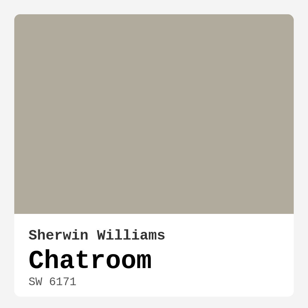
Color Preview & Key Details
| HEX Code | #B0AB9C |
| RGB | 176, 171, 156 |
| LRV | 45% |
| Undertone | Yellow |
| Finish Options | Eggshell, Matte, Satin |
Imagine walking into your home, and the first thing that greets you is a warm, inviting atmosphere that instantly puts you at ease. You look around, and your walls are painted in a soft hue that feels both calming and sophisticated. This is the magic of Chatroom, a beautiful paint color by Sherwin Williams that may just be the perfect choice for your next project.
Chatroom, with its color code SW 6171, is a serene gray that leans into warm undertones. You might be wondering how a gray can feel warm, but trust me on this one—Chatroom does it beautifully. Its subtle yellow undertones add depth and richness, allowing it to evoke a sense of tranquility without feeling cold or sterile. This makes it an ideal choice for various spaces, whether you’re looking to create a cozy living room, a serene bedroom, or a productive home office.
One of the standout features of Chatroom is its versatility. It fits seamlessly into modern, transitional, minimalist, and Scandinavian decor styles. You can easily envision it in a chic urban loft or a cozy suburban home. This adaptability means that no matter your aesthetic, Chatroom has the potential to elevate your space.
When it comes to application, you’ll be pleased to know that Chatroom is beginner-friendly. Whether you’re using a brush or a roller, the paint goes on smoothly and offers excellent coverage with just one or two coats. Plus, it’s touch-up friendly, making it easier to maintain a pristine look over time. And if you’ve got kids or pets, you’ll appreciate its washable and wipeable nature—perfect for high-traffic areas or any room where little hands might leave a mark.
Let’s talk about lighting, because this is where Chatroom really shines—or, should I say, adapts. With a Light Reflectance Value (LRV) of 45%, it reflects a moderate amount of light. In natural light, Chatroom can appear lighter and airier, creating a spacious feel. However, in dimmer settings, it retains its depth, ensuring the room feels cozy and intimate. This characteristic is particularly beneficial if your space doesn’t receive a lot of natural light. You get a warm hug of color without overwhelming your senses.
Now, I know some of you might be concerned about how Chatroom will pair with your existing decor. The good news is that its muted, earthy tone allows it to coordinate beautifully with a variety of colors. From bold jewel tones to soft pastels, you’re not limited in your choices. Imagine Chatroom against a backdrop of rich emerald greens or soft blush pinks—it’s a match made in decor heaven.
When considering complimentary shades, think about pairing Chatroom with colors like SW 9640, SW 6540, or even some classic whites like White Dove. These combinations can enhance the warmth of Chatroom while adding visual interest to your space. If you’re feeling adventurous, try integrating some brass fixtures or wooden trims, as they complement this color beautifully.
Of course, every paint color has its pros and cons. While Chatroom offers a warm and inviting hue that adapts well to various lighting conditions, it might appear darker in low-light situations. This is where careful consideration is essential. Always test the color in your space and observe how it interacts with your furniture and flooring. It’s not just about how pretty the color is; it’s about how it fits into your life.
For those of you living in smaller spaces, you might be wondering if Chatroom can work its magic in tight quarters. The answer is a resounding yes! Its warm undertones create an inviting atmosphere that can make a small room feel more expansive. Just be mindful of lighting; pairing it with lighter trim or decor can help keep the space feeling open.
What about high-traffic areas? Chatroom is a great option here, too. Its durability and washability make it suitable for hallways, kitchens, or family rooms. If you anticipate heavy wear, consider a satin or semi-gloss finish for added durability. You’ll enjoy the aesthetic appeal without sacrificing practicality.
As a designer, I often emphasize the importance of understanding undertones. Chatroom’s yellow undertones give it a unique character that differentiates it from cooler grays. This warmth can create a cozy environment, making it a fantastic choice for any room where you want to feel relaxed. Remember to take time to test how this undertone interacts with your existing decor; it can make all the difference.
Let’s not forget about the finishes available for Chatroom. You can choose from matte, eggshell, or satin, depending on the look and durability you desire. Matte finishes offer a soft, sophisticated look, while satin finishes give a slight sheen that’s easy to clean. Consider the mood you want to create and select a finish that complements that vision.
In conclusion, Chatroom is a standout choice for those looking to introduce a calming yet stylish hue into their home. Its balance of gray and warm undertones allows it to blend seamlessly with various decor styles, creating a tranquil atmosphere that encourages creativity and relaxation. Whether you’re painting an accent wall or transforming an entire room, Chatroom provides a chic backdrop that invites you to enjoy your space fully.
So, are you ready to embrace the warmth and versatility of Chatroom? With its beautiful color and practical application, it just might be the missing ingredient in your home decor project. Don’t forget to gather samples, test it in your space, and let your creativity flow. Happy painting!
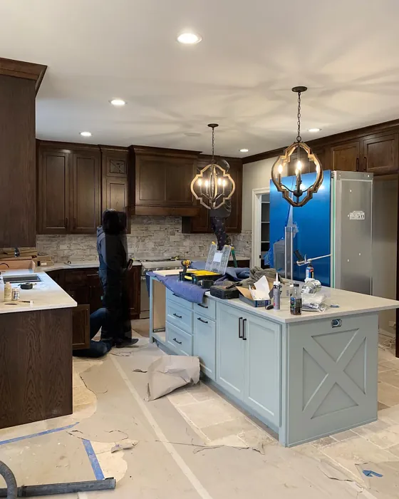
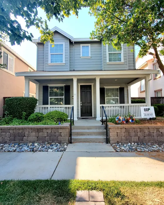
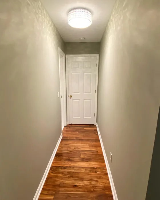
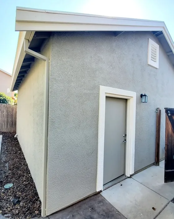
Real Room Photo of Chatroom SW 6171
Undertones of Chatroom ?
The undertones of Chatroom are a key aspect of its character, leaning towards Yellow. These subtle underlying hues are what give the color its depth and complexity. For example, a gray with a blue undertone will feel cooler and more modern, while one with a brown undertone will feel warmer and more traditional. It’s essential to test this paint in your home and observe it next to your existing furniture, flooring, and decor to see how these undertones interact and reveal themselves throughout the day.
HEX value: #B0AB9C
RGB code: 176, 171, 156
Is Chatroom Cool or Warm?
Chatroom is predominantly warm, thanks to its beige undertones. While it is a gray, it doesn’t lean too cool, ensuring that it can create a cozy atmosphere in any room.
Understanding Color Properties and Interior Design Tips
Hue refers to a specific position on the color wheel, measured in degrees from 0 to 360. Each degree represents a different pure color:
- 0° represents red
- 120° represents green
- 240° represents blue
Saturation describes the intensity or purity of a color and is expressed as a percentage:
- At 0%, the color appears completely desaturated—essentially a shade of gray
- At 100%, the color is at its most vivid and vibrant
Lightness indicates how light or dark a color is, also expressed as a percentage:
- 0% lightness results in black
- 100% lightness results in white
Using Warm Colors in Interior Design
Warm hues—such as reds, oranges, yellows, warm beiges, and greiges—are excellent choices for creating inviting and energetic spaces. These colors are particularly well-suited for:
- Kitchens, living rooms, and bathrooms, where warmth enhances comfort and sociability
- Large rooms, where warm tones can help reduce the sense of emptiness and make the space feel more intimate
For example:
- Warm beige shades provide a cozy, inviting atmosphere, ideal for living rooms, bedrooms, and hallways.
- Warm greige (a mix of beige and gray) offers the warmth of beige with the modern appeal of gray, making it a versatile backdrop for dining areas, bedrooms, and living spaces.
However, be mindful when using warm light tones in rooms with limited natural light. These shades may appear muted or even take on an unpleasant yellowish tint. To avoid a dull or flat appearance:
- Add depth by incorporating richer tones like deep greens, charcoal, or chocolate brown
- Use textured elements such as curtains, rugs, or cushions to bring dimension to the space
Pro Tip: Achieving Harmony with Warm and Cool Color Balance
To create a well-balanced and visually interesting interior, mix warm and cool tones strategically. This contrast adds depth and harmony to your design.
- If your walls feature warm hues, introduce cool-colored accents such as blue or green furniture, artwork, or accessories to create contrast.
- For a polished look, consider using a complementary color scheme, which pairs colors opposite each other on the color wheel (e.g., red with green, orange with blue).
This thoughtful mix not only enhances visual appeal but also creates a space that feels both dynamic and cohesive.
Light Temperature Affects on Chatroom
Natural Light
Natural daylight changes in color temperature as the sun moves across the sky. At sunrise and sunset, the light tends to have a warm, golden tone with a color temperature around 2000 Kelvin (K). As the day progresses and the sun rises higher, the light becomes cooler and more neutral. Around midday, especially when the sky is clear, natural light typically reaches its peak brightness and shifts to a cooler tone, ranging from 5500 to 6500 Kelvin. This midday light is close to what we perceive as pure white or daylight-balanced light.
These shifts in natural light can significantly influence how colors appear in a space, which is why designers often consider both the time of day and the orientation of windows when planning interior color schemes.
Artificial Light
When choosing artificial lighting, pay close attention to the color temperature, measured in Kelvin (K). This determines how warm or cool the light will appear. Lower temperatures, around 2700K, give off a warm, yellow glow often used in living rooms or bedrooms. Higher temperatures, above 5000K, create a cool, bluish light similar to daylight, commonly used in kitchens, offices, or task areas.
Use the slider to see how lighting temperature can affect the appearance of a surface or color throughout a space.


4800K
LRV of Chatroom
The Light Reflectance Value (LRV) of Chatroom is 45%, which places it in the Medium category. This means it Reflects a moderate amount of light. Understanding a paint’s LRV is crucial for predicting how it will look in your space. A higher LRV indicates a lighter color that reflects more light, making rooms feel larger and brighter. A lower LRV signifies a darker color that absorbs more light, creating a cozier, more intimate atmosphere. Always consider the natural and artificial lighting in your room when selecting a paint color based on its LRV.
Detailed Review of Chatroom
Additional Paint Characteristics
Ideal Rooms
Bedroom, Dining Room, Home Office, Living Room
Decor Styles
Minimalist, Modern, Scandinavian, Transitional
Coverage
Good (1–2 Coats), High Hide, Touch-Up Friendly
Ease of Application
Beginner Friendly, Brush Smooth, Roller-Ready
Washability
Washable, Wipeable
VOC Level
Eco-Certified, Low VOC
Best Use
Accent Wall, Interior Walls, Open Concept Spaces
Room Suitability
Bedroom, Dining Room, Home Office, Living Room
Tone Tag
Earthy, Muted, Warm
Finish Type
Eggshell, Matte, Satin
Paint Performance
Easy Touch-Up, High Coverage, Low Odor
Use Cases
Best for Rentals, Best for Selling Your Home, Designer Favorite
Mood
Calm, Cozy, Inviting
Trim Pairing
Complements Brass Fixtures, Good with Wood Trim, Pairs with White Dove
Chatroom is a standout choice for those wanting a calming yet stylish hue. Its balance of gray and warm undertones makes it incredibly adaptable, allowing it to blend seamlessly with various decor styles. The muted nature of this color means it can work effectively in both brightly lit areas and those with less natural light, ensuring it never overwhelms a space. Whether you’re painting an accent wall or transforming an entire room, Chatroom provides a chic backdrop that invites creativity and relaxation. Many users appreciate its versatility; it pairs well with a variety of colors, from bold jewel tones to soft pastels, allowing for easy coordination with furniture and accessories. Overall, if you’re looking for a paint color that brings tranquility without being dull, Chatroom is a fantastic option.
Pros & Cons of SW 6171 Chatroom
Pros
Cons
Colors that go with Sherwin Williams Chatroom
FAQ on SW 6171 Chatroom
Can Chatroom be used in small spaces?
Absolutely! Chatroom’s warm undertones help to create an inviting atmosphere, making it suitable for small spaces. It can give the illusion of depth without overwhelming the area, especially when paired with lighter trim or decor. Just be mindful of lighting, as it may appear darker in low-light conditions.
How does Chatroom perform in high-traffic areas?
Chatroom is a great option for high-traffic areas as it is both washable and durable. However, it’s important to note that in areas with very high wear, you might want to consider a satin or semi-gloss finish for added durability and ease of cleaning. This way, you can enjoy the aesthetic appeal without sacrificing practicality.
Comparisons Chatroom with other colors
Chatroom SW 6171 vs Repose Gray SW 7015
| Attribute | Chatroom SW 6171 | Repose Gray SW 7015 |
|---|---|---|
| Color Name | Chatroom SW 6171 | Repose Gray SW 7015 |
| Color | ||
| Hue | Grey | Grey |
| Brightness | Medium | Medium |
| RGB | 176, 171, 156 | 204, 201, 192 |
| LRV | 45% | 58% |
| Finish Type | Eggshell, Matte, Satin | Eggshell, Matte, Satin |
| Finish Options | Eggshell, Matte, Satin | Eggshell, Matte, Satin |
| Ideal Rooms | Bedroom, Dining Room, Home Office, Living Room | Bedroom, Dining Room, Hallway, Home Office, Living Room |
| Decor Styles | Minimalist, Modern, Scandinavian, Transitional | Contemporary, Farmhouse, Minimalist, Modern, Transitional |
| Coverage | Good (1–2 Coats), High Hide, Touch-Up Friendly | Good (1–2 Coats), Touch-Up Friendly |
| Ease of Application | Beginner Friendly, Brush Smooth, Roller-Ready | Beginner Friendly, Brush Smooth, Fast-Drying, Roller-Ready |
| Washability | Washable, Wipeable | Highly Washable, Washable |
| Room Suitability | Bedroom, Dining Room, Home Office, Living Room | Bedroom, Dining Room, Hallway, Home Office, Living Room |
| Tone | Earthy, Muted, Warm | Muted, Neutral, Warm |
| Paint Performance | Easy Touch-Up, High Coverage, Low Odor | Low Odor, Quick Drying, Scuff Resistant |
Chatroom SW 6171 vs Light French Gray SW 0055
| Attribute | Chatroom SW 6171 | Light French Gray SW 0055 |
|---|---|---|
| Color Name | Chatroom SW 6171 | Light French Gray SW 0055 |
| Color | ||
| Hue | Grey | Grey |
| Brightness | Medium | Medium |
| RGB | 176, 171, 156 | 194, 192, 187 |
| LRV | 45% | 53% |
| Finish Type | Eggshell, Matte, Satin | Eggshell, Matte, Satin |
| Finish Options | Eggshell, Matte, Satin | Eggshell, Matte, Satin |
| Ideal Rooms | Bedroom, Dining Room, Home Office, Living Room | Bedroom, Dining Room, Home Office, Kitchen, Living Room |
| Decor Styles | Minimalist, Modern, Scandinavian, Transitional | Contemporary, Farmhouse, Modern, Scandinavian, Transitional |
| Coverage | Good (1–2 Coats), High Hide, Touch-Up Friendly | Good (1–2 Coats), Touch-Up Friendly |
| Ease of Application | Beginner Friendly, Brush Smooth, Roller-Ready | Beginner Friendly, Brush Smooth, Roller-Ready |
| Washability | Washable, Wipeable | Highly Washable, Washable |
| Room Suitability | Bedroom, Dining Room, Home Office, Living Room | Bedroom, Dining Room, Home Office, Kitchen, Living Room |
| Tone | Earthy, Muted, Warm | Balanced, Muted, Neutral, Warm |
| Paint Performance | Easy Touch-Up, High Coverage, Low Odor | Easy Touch-Up, High Coverage, Low Odor |
Chatroom SW 6171 vs Wordly Gray SW 7043
| Attribute | Chatroom SW 6171 | Wordly Gray SW 7043 |
|---|---|---|
| Color Name | Chatroom SW 6171 | Wordly Gray SW 7043 |
| Color | ||
| Hue | Grey | Grey |
| Brightness | Medium | Medium |
| RGB | 176, 171, 156 | 206, 198, 187 |
| LRV | 45% | 58% |
| Finish Type | Eggshell, Matte, Satin | Eggshell, Satin |
| Finish Options | Eggshell, Matte, Satin | Eggshell, Flat, Satin |
| Ideal Rooms | Bedroom, Dining Room, Home Office, Living Room | Bedroom, Home Office, Kitchen, Living Room |
| Decor Styles | Minimalist, Modern, Scandinavian, Transitional | Minimalist, Modern, Scandi, Transitional |
| Coverage | Good (1–2 Coats), High Hide, Touch-Up Friendly | Good (1–2 Coats) |
| Ease of Application | Beginner Friendly, Brush Smooth, Roller-Ready | Beginner Friendly, Brush Smooth, Fast-Drying, Roller-Ready |
| Washability | Washable, Wipeable | Highly Washable, Washable |
| Room Suitability | Bedroom, Dining Room, Home Office, Living Room | Bedroom, Dining Room, Home Office, Living Room |
| Tone | Earthy, Muted, Warm | Muted, Neutral, Warm |
| Paint Performance | Easy Touch-Up, High Coverage, Low Odor | Easy Touch-Up, Low Odor, Scuff Resistant |
Chatroom SW 6171 vs Illusive Green SW 9164
| Attribute | Chatroom SW 6171 | Illusive Green SW 9164 |
|---|---|---|
| Color Name | Chatroom SW 6171 | Illusive Green SW 9164 |
| Color | ||
| Hue | Grey | Grey |
| Brightness | Medium | Medium |
| RGB | 176, 171, 156 | 146, 148, 141 |
| LRV | 45% | 24% |
| Finish Type | Eggshell, Matte, Satin | Eggshell, Matte, Satin |
| Finish Options | Eggshell, Matte, Satin | Eggshell, Matte, Satin |
| Ideal Rooms | Bedroom, Dining Room, Home Office, Living Room | Bedroom, Dining Room, Home Office, Living Room, Nursery |
| Decor Styles | Minimalist, Modern, Scandinavian, Transitional | Coastal, Minimalist, Modern, Rustic, Scandinavian |
| Coverage | Good (1–2 Coats), High Hide, Touch-Up Friendly | Good (1–2 Coats), Touch-Up Friendly |
| Ease of Application | Beginner Friendly, Brush Smooth, Roller-Ready | Beginner Friendly, Brush Smooth, Fast-Drying, Roller-Ready |
| Washability | Washable, Wipeable | Highly Washable, Washable, Wipeable |
| Room Suitability | Bedroom, Dining Room, Home Office, Living Room | Bedroom, Dining Room, Home Office, Living Room, Nursery |
| Tone | Earthy, Muted, Warm | Balanced, Earthy, Muted |
| Paint Performance | Easy Touch-Up, High Coverage, Low Odor | Easy Touch-Up, Low Odor, Quick Drying, Scuff Resistant |
Chatroom SW 6171 vs Fawn Brindle SW 7640
| Attribute | Chatroom SW 6171 | Fawn Brindle SW 7640 |
|---|---|---|
| Color Name | Chatroom SW 6171 | Fawn Brindle SW 7640 |
| Color | ||
| Hue | Grey | Grey |
| Brightness | Medium | Medium |
| RGB | 176, 171, 156 | 167, 160, 148 |
| LRV | 45% | 24% |
| Finish Type | Eggshell, Matte, Satin | Eggshell, Matte |
| Finish Options | Eggshell, Matte, Satin | Eggshell, Matte, Satin |
| Ideal Rooms | Bedroom, Dining Room, Home Office, Living Room | Bedroom, Dining Room, Hallway, Home Office, Living Room |
| Decor Styles | Minimalist, Modern, Scandinavian, Transitional | Bohemian, Minimalist, Modern Farmhouse, Transitional |
| Coverage | Good (1–2 Coats), High Hide, Touch-Up Friendly | Good (1–2 Coats) |
| Ease of Application | Beginner Friendly, Brush Smooth, Roller-Ready | Brush Smooth, Fast-Drying, Roller-Ready |
| Washability | Washable, Wipeable | Stain Resistant, Washable |
| Room Suitability | Bedroom, Dining Room, Home Office, Living Room | Bedroom, Dining Room, Home Office, Living Room |
| Tone | Earthy, Muted, Warm | Earthy, Neutral, Warm |
| Paint Performance | Easy Touch-Up, High Coverage, Low Odor | Easy Touch-Up, Fade Resistant, Low Odor |
Chatroom SW 6171 vs Balanced Beige SW 7037
| Attribute | Chatroom SW 6171 | Balanced Beige SW 7037 |
|---|---|---|
| Color Name | Chatroom SW 6171 | Balanced Beige SW 7037 |
| Color | ||
| Hue | Grey | Grey |
| Brightness | Medium | Medium |
| RGB | 176, 171, 156 | 192, 178, 162 |
| LRV | 45% | 44% |
| Finish Type | Eggshell, Matte, Satin | Eggshell, Matte, Satin |
| Finish Options | Eggshell, Matte, Satin | Eggshell, Matte, Satin |
| Ideal Rooms | Bedroom, Dining Room, Home Office, Living Room | Bedroom, Dining Room, Home Office, Kitchen, Living Room |
| Decor Styles | Minimalist, Modern, Scandinavian, Transitional | Contemporary, Minimalist, Modern Farmhouse, Rustic, Transitional |
| Coverage | Good (1–2 Coats), High Hide, Touch-Up Friendly | Good (1–2 Coats), Touch-Up Friendly |
| Ease of Application | Beginner Friendly, Brush Smooth, Roller-Ready | Beginner Friendly, Brush Smooth, Roller-Ready |
| Washability | Washable, Wipeable | Washable, Wipeable |
| Room Suitability | Bedroom, Dining Room, Home Office, Living Room | Bedroom, Dining Room, Hallway, Kitchen, Living Room |
| Tone | Earthy, Muted, Warm | Balanced, Earthy, Warm |
| Paint Performance | Easy Touch-Up, High Coverage, Low Odor | Easy Touch-Up, High Coverage, Low Odor |
Chatroom SW 6171 vs Mushroom SW 9587
| Attribute | Chatroom SW 6171 | Mushroom SW 9587 |
|---|---|---|
| Color Name | Chatroom SW 6171 | Mushroom SW 9587 |
| Color | ||
| Hue | Grey | Grey |
| Brightness | Medium | Medium |
| RGB | 176, 171, 156 | 208, 199, 183 |
| LRV | 45% | 24% |
| Finish Type | Eggshell, Matte, Satin | Eggshell, Satin |
| Finish Options | Eggshell, Matte, Satin | Eggshell, Flat, Matte, Satin |
| Ideal Rooms | Bedroom, Dining Room, Home Office, Living Room | Bedroom, Dining Room, Hallway, Home Office, Living Room |
| Decor Styles | Minimalist, Modern, Scandinavian, Transitional | Bohemian, Contemporary, Modern Farmhouse, Traditional |
| Coverage | Good (1–2 Coats), High Hide, Touch-Up Friendly | Good (1–2 Coats) |
| Ease of Application | Beginner Friendly, Brush Smooth, Roller-Ready | Beginner Friendly, Brush Smooth, Roller-Ready |
| Washability | Washable, Wipeable | Highly Washable, Washable |
| Room Suitability | Bedroom, Dining Room, Home Office, Living Room | Bedroom, Dining Room, Home Office, Living Room |
| Tone | Earthy, Muted, Warm | Earthy, Neutral, Warm |
| Paint Performance | Easy Touch-Up, High Coverage, Low Odor | Easy Touch-Up, Long Lasting, Low Odor, Scuff Resistant |
Chatroom SW 6171 vs Silver Strand SW 7057
| Attribute | Chatroom SW 6171 | Silver Strand SW 7057 |
|---|---|---|
| Color Name | Chatroom SW 6171 | Silver Strand SW 7057 |
| Color | ||
| Hue | Grey | Grey |
| Brightness | Medium | Medium |
| RGB | 176, 171, 156 | 200, 203, 196 |
| LRV | 45% | 66% |
| Finish Type | Eggshell, Matte, Satin | Eggshell, Satin |
| Finish Options | Eggshell, Matte, Satin | Eggshell, Matte, Satin |
| Ideal Rooms | Bedroom, Dining Room, Home Office, Living Room | Bedroom, Dining Room, Hallway, Home Office, Living Room |
| Decor Styles | Minimalist, Modern, Scandinavian, Transitional | Coastal, Minimalist, Modern, Traditional, Transitional |
| Coverage | Good (1–2 Coats), High Hide, Touch-Up Friendly | Good (1–2 Coats), Touch-Up Friendly |
| Ease of Application | Beginner Friendly, Brush Smooth, Roller-Ready | Beginner Friendly, Brush Smooth, Roller-Ready |
| Washability | Washable, Wipeable | Highly Washable, Washable |
| Room Suitability | Bedroom, Dining Room, Home Office, Living Room | Bathroom, Bedroom, Home Office, Kitchen, Living Room |
| Tone | Earthy, Muted, Warm | Balanced, Neutral, Warm |
| Paint Performance | Easy Touch-Up, High Coverage, Low Odor | Easy Touch-Up, High Coverage, Low Odor |
Chatroom SW 6171 vs Cadet SW 9143
| Attribute | Chatroom SW 6171 | Cadet SW 9143 |
|---|---|---|
| Color Name | Chatroom SW 6171 | Cadet SW 9143 |
| Color | ||
| Hue | Grey | Grey |
| Brightness | Medium | Medium |
| RGB | 176, 171, 156 | 145, 153, 156 |
| LRV | 45% | 12% |
| Finish Type | Eggshell, Matte, Satin | Eggshell, Matte, Satin |
| Finish Options | Eggshell, Matte, Satin | Eggshell, Matte, Satin |
| Ideal Rooms | Bedroom, Dining Room, Home Office, Living Room | Bathroom, Bedroom, Hallway, Home Office, Kitchen, Living Room |
| Decor Styles | Minimalist, Modern, Scandinavian, Transitional | Coastal, Industrial, Minimalist, Modern, Scandinavian |
| Coverage | Good (1–2 Coats), High Hide, Touch-Up Friendly | Good (1–2 Coats), Touch-Up Friendly |
| Ease of Application | Beginner Friendly, Brush Smooth, Roller-Ready | Beginner Friendly, Brush Smooth, Roller-Ready |
| Washability | Washable, Wipeable | Washable, Wipeable |
| Room Suitability | Bedroom, Dining Room, Home Office, Living Room | Bathroom, Bedroom, Hallway, Home Office, Living Room |
| Tone | Earthy, Muted, Warm | Balanced, Cool, Muted |
| Paint Performance | Easy Touch-Up, High Coverage, Low Odor | Easy Touch-Up, High Coverage, Low Odor |
Chatroom SW 6171 vs Dovetail SW 7018
| Attribute | Chatroom SW 6171 | Dovetail SW 7018 |
|---|---|---|
| Color Name | Chatroom SW 6171 | Dovetail SW 7018 |
| Color | ||
| Hue | Grey | Grey |
| Brightness | Medium | Medium |
| RGB | 176, 171, 156 | 144, 138, 131 |
| LRV | 45% | 24% |
| Finish Type | Eggshell, Matte, Satin | Eggshell, Matte, Satin |
| Finish Options | Eggshell, Matte, Satin | Eggshell, Matte, Satin |
| Ideal Rooms | Bedroom, Dining Room, Home Office, Living Room | Bedroom, Dining Room, Hallway, Home Office, Living Room |
| Decor Styles | Minimalist, Modern, Scandinavian, Transitional | Minimalist, Modern Farmhouse, Rustic, Transitional |
| Coverage | Good (1–2 Coats), High Hide, Touch-Up Friendly | Good (1–2 Coats), Touch-Up Friendly |
| Ease of Application | Beginner Friendly, Brush Smooth, Roller-Ready | Beginner Friendly, Brush Smooth, Roller-Ready |
| Washability | Washable, Wipeable | Washable, Wipeable |
| Room Suitability | Bedroom, Dining Room, Home Office, Living Room | Bedroom, Dining Room, Home Office, Living Room |
| Tone | Earthy, Muted, Warm | Earthy, Neutral, Warm |
| Paint Performance | Easy Touch-Up, High Coverage, Low Odor | Easy Touch-Up, Fade Resistant, Low Odor |
Official Page of Sherwin Williams Chatroom SW 6171