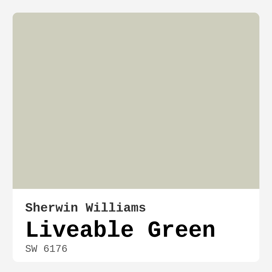
Color Preview & Key Details
| HEX Code | #CECEBD |
| RGB | 206, 206, 189 |
| LRV | 30% |
| Undertone | Yellow |
| Finish Options | Eggshell, Matte, Satin |
Imagine walking into a room where the walls embrace you with a gentle, inviting hue. That’s the magic of Liveable Green, a delightful paint color from Sherwin Williams that brings a touch of nature indoors. It’s more than just a color; it’s a mood, a feeling, and a beautifully versatile choice for any space in your home.
Liveable Green, with the color code SW 6176, is a soft, muted green that embodies a balance between warmth and coolness. This subtle shade creates a serene atmosphere, making it a perfect backdrop for your living room, bedroom, home office, or even a cozy nursery. Its earthy tone invites calmness, grounding the space while still offering a refreshing vibe that adapts to various decor styles.
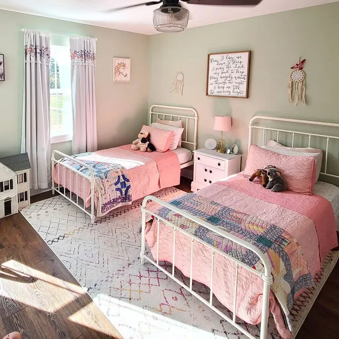
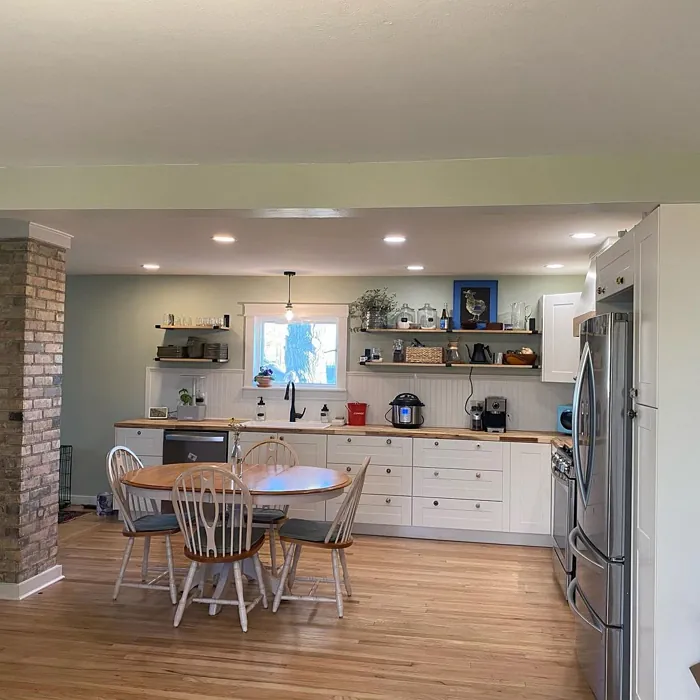
One of the standout features of Liveable Green is its versatility. Whether your home leans towards modern farmhouse, contemporary, rustic, or even Scandinavian aesthetics, this color fits right in. It works beautifully in spaces that crave a touch of nature, especially when paired with natural materials like wood and stone. Imagine wooden beams overhead or a reclaimed wood coffee table against those soft green walls—pure magic!
Now, let’s talk about the application process. If you’re a beginner or a DIY enthusiast, you’ll find that painting with Liveable Green is a breeze. The paint glides on smoothly, whether you’re using a roller or a brush, making it a pleasure to apply. Plus, it’s touch-up friendly, meaning you can easily address any wear and tear without having to repaint entire walls.
You might be wondering about how it looks in different lighting conditions. Liveable Green has a Light Reflectance Value (LRV) of 30%, which places it in the medium dark category. This means it reflects very little light, creating a cozy, intimate atmosphere. In bright spaces, it gently reflects light to maintain an airy feel, while in dimmer settings, it evokes a retreat-like vibe. Just be mindful that it may appear a bit dull in low light, so pairing it with brighter accents or decor can help elevate its charm.
Speaking of pairing, when selecting complementary colors, it’s essential to consider Liveable Green’s yellow undertones. These subtle hints of warmth add depth and complexity to the color, making it adaptable across various palettes. For a cohesive look, consider pairing it with soft whites or creams—White Dove is a fantastic choice here. For a bolder contrast, blues can elevate the space; think navy or teal accents to create a sophisticated aesthetic.
Now, let’s address some practical considerations. Liveable Green is highly washable, making it suitable for areas like kitchens and bathrooms where you might need to clean walls frequently. Its low VOC levels also make it an eco-friendly option, meaning you’re not just making your home beautiful; you’re also being kind to the environment.
A common question I hear is whether Liveable Green is suitable for small spaces. Absolutely! This muted tone can actually make a room feel larger while still maintaining a cozy atmosphere. Just balance it with lighter furniture or decor to keep the space feeling open and airy.
If you’re contemplating a project where you want to introduce this lovely shade, think about your current furnishings. Liveable Green has a way of enhancing the beauty of natural materials, so if you have elements like brass fixtures or warm wooden accents, they’ll shine even brighter against this backdrop.
For the more adventurous decorator, consider using Liveable Green for an accent wall. This can create a stunning focal point in your living room or bedroom, drawing the eye and creating a sense of depth. The color’s calming nature makes it perfect for spaces meant for relaxation, so go ahead and consider it for your bedroom or home office.
As you explore the possibilities with Liveable Green, keep in mind its lighter and darker companions. Lighter shades like SW 6182 and SW 6161 can be used to create a layered look, while darker shades such as SW 6177 and SW 0013 can add drama and depth. This flexibility allows you to craft a palette that feels uniquely yours.
In conclusion, Liveable Green isn’t just a color; it’s an invitation to step into a world of tranquility and style. Its muted, earthy tones create a calm and inviting environment, perfect for making your home feel like a sanctuary. Whether you’re refreshing a single room or transforming your entire space, this color brings a timeless quality that you’ll cherish for years to come.
So, if you’re ready to take that plunge into color, give Liveable Green a chance. Test it out in your home, and watch how it dances with your existing decor, lighting, and personal style. You might just find that this muted green becomes the heart of your home, a color that not only beautifies but also nurtures your soul. Happy decorating!

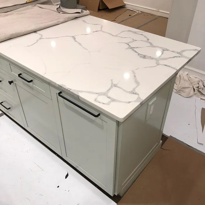
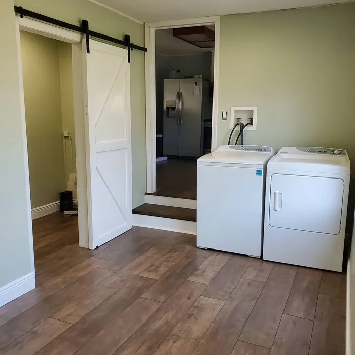
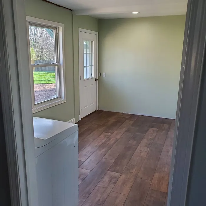
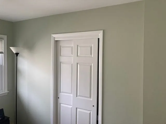
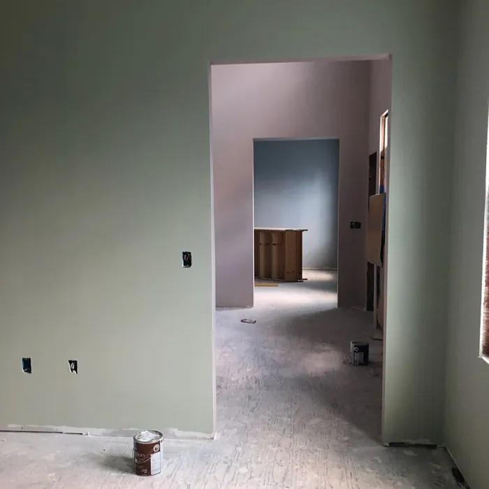
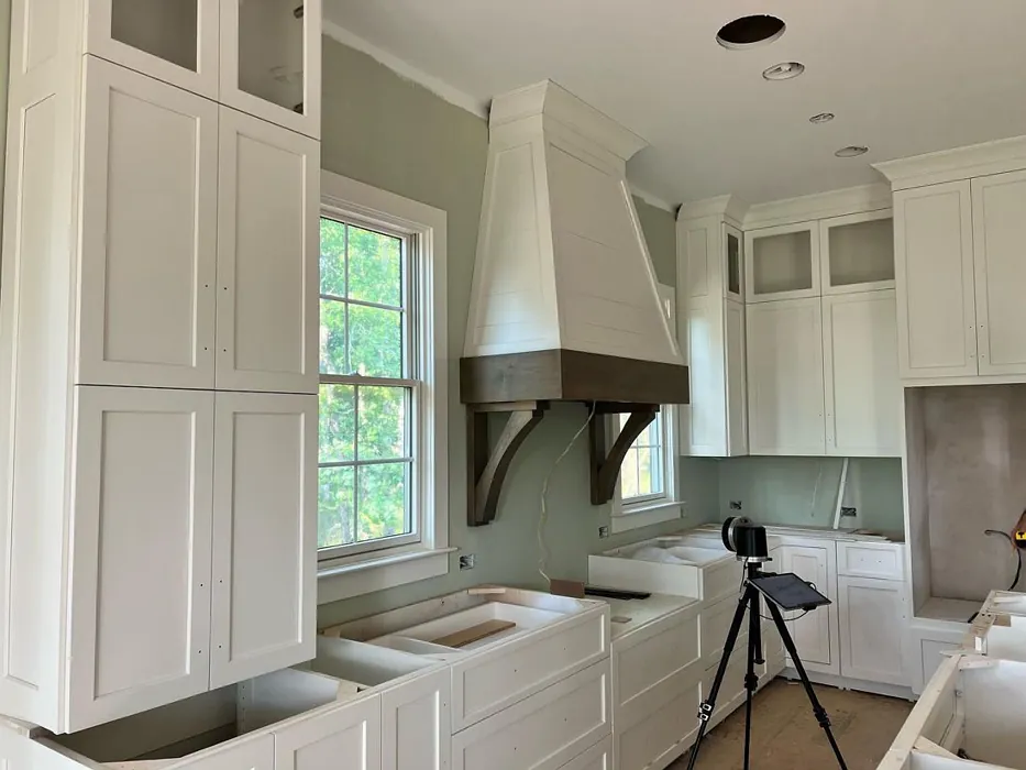
Real Room Photo of Liveable Green SW 6176
Undertones of Liveable Green ?
The undertones of Liveable Green are a key aspect of its character, leaning towards Yellow. These subtle underlying hues are what give the color its depth and complexity. For example, a gray with a blue undertone will feel cooler and more modern, while one with a brown undertone will feel warmer and more traditional. It’s essential to test this paint in your home and observe it next to your existing furniture, flooring, and decor to see how these undertones interact and reveal themselves throughout the day.
HEX value: #CECEBD
RGB code: 206, 206, 189
Is Liveable Green Cool or Warm?
This shade leans slightly cool but retains a warmth that keeps it from feeling chilly. Its balanced nature makes it suitable for diverse lighting conditions, adapting to both natural and artificial light beautifully.
Understanding Color Properties and Interior Design Tips
Hue refers to a specific position on the color wheel, measured in degrees from 0 to 360. Each degree represents a different pure color:
- 0° represents red
- 120° represents green
- 240° represents blue
Saturation describes the intensity or purity of a color and is expressed as a percentage:
- At 0%, the color appears completely desaturated—essentially a shade of gray
- At 100%, the color is at its most vivid and vibrant
Lightness indicates how light or dark a color is, also expressed as a percentage:
- 0% lightness results in black
- 100% lightness results in white
Using Warm Colors in Interior Design
Warm hues—such as reds, oranges, yellows, warm beiges, and greiges—are excellent choices for creating inviting and energetic spaces. These colors are particularly well-suited for:
- Kitchens, living rooms, and bathrooms, where warmth enhances comfort and sociability
- Large rooms, where warm tones can help reduce the sense of emptiness and make the space feel more intimate
For example:
- Warm beige shades provide a cozy, inviting atmosphere, ideal for living rooms, bedrooms, and hallways.
- Warm greige (a mix of beige and gray) offers the warmth of beige with the modern appeal of gray, making it a versatile backdrop for dining areas, bedrooms, and living spaces.
However, be mindful when using warm light tones in rooms with limited natural light. These shades may appear muted or even take on an unpleasant yellowish tint. To avoid a dull or flat appearance:
- Add depth by incorporating richer tones like deep greens, charcoal, or chocolate brown
- Use textured elements such as curtains, rugs, or cushions to bring dimension to the space
Pro Tip: Achieving Harmony with Warm and Cool Color Balance
To create a well-balanced and visually interesting interior, mix warm and cool tones strategically. This contrast adds depth and harmony to your design.
- If your walls feature warm hues, introduce cool-colored accents such as blue or green furniture, artwork, or accessories to create contrast.
- For a polished look, consider using a complementary color scheme, which pairs colors opposite each other on the color wheel (e.g., red with green, orange with blue).
This thoughtful mix not only enhances visual appeal but also creates a space that feels both dynamic and cohesive.
Light Temperature Affects on Liveable Green
Natural Light
Natural daylight changes in color temperature as the sun moves across the sky. At sunrise and sunset, the light tends to have a warm, golden tone with a color temperature around 2000 Kelvin (K). As the day progresses and the sun rises higher, the light becomes cooler and more neutral. Around midday, especially when the sky is clear, natural light typically reaches its peak brightness and shifts to a cooler tone, ranging from 5500 to 6500 Kelvin. This midday light is close to what we perceive as pure white or daylight-balanced light.
These shifts in natural light can significantly influence how colors appear in a space, which is why designers often consider both the time of day and the orientation of windows when planning interior color schemes.
Artificial Light
When choosing artificial lighting, pay close attention to the color temperature, measured in Kelvin (K). This determines how warm or cool the light will appear. Lower temperatures, around 2700K, give off a warm, yellow glow often used in living rooms or bedrooms. Higher temperatures, above 5000K, create a cool, bluish light similar to daylight, commonly used in kitchens, offices, or task areas.
Use the slider to see how lighting temperature can affect the appearance of a surface or color throughout a space.


4800K
LRV of Liveable Green
The Light Reflectance Value (LRV) of Liveable Green is 30%, which places it in the Medium Dark category. This means it reflects very little light. Understanding a paint’s LRV is crucial for predicting how it will look in your space. A higher LRV indicates a lighter color that reflects more light, making rooms feel larger and brighter. A lower LRV signifies a darker color that absorbs more light, creating a cozier, more intimate atmosphere. Always consider the natural and artificial lighting in your room when selecting a paint color based on its LRV.
Detailed Review of Liveable Green
Additional Paint Characteristics
Ideal Rooms
Bedroom, Home Office, Kitchen, Living Room, Nursery
Decor Styles
Contemporary, Modern Farmhouse, Rustic, Scandi
Coverage
Good (1–2 Coats), Touch-Up Friendly
Ease of Application
Beginner Friendly, Brush Smooth, Roller-Ready
Washability
Highly Washable, Washable
VOC Level
Eco-Certified, Low VOC
Best Use
Accent Wall, Interior Walls, Open Concept Spaces
Room Suitability
Bedroom, Home Office, Living Room, Nursery
Tone Tag
Balanced, Earthy, Muted
Finish Type
Eggshell, Matte, Satin
Paint Performance
Easy Touch-Up, High Coverage, Low Odor
Use Cases
Best for Low Light Rooms, Best for Rentals, Classic Favorite
Mood
Calm, Grounding, Inviting
Trim Pairing
Complements Brass Fixtures, Pairs with White Dove, Works with Warm Trim
Liveable Green is a versatile paint choice that strikes an ideal balance between calming and energizing. It works beautifully in both small and large spaces, offering a fresh, organic feel. When applied, it showcases a subtle depth that changes with the light throughout the day, creating a dynamic ambiance. The application process is straightforward, and the paint glides on smoothly, making it a pleasure to use.
This color pairs wonderfully with natural materials like wood and stone, enhancing the overall aesthetic of your home. Whether you’re looking to refresh a single room or your entire home, Liveable Green provides a foundation that feels both chic and comforting. Its muted tone works seamlessly across various decor styles, from modern to rustic, making it a fantastic choice for anyone looking to create a timeless space.
Pros & Cons of SW 6176 Liveable Green
Pros
Cons
Colors that go with Sherwin Williams Liveable Green
FAQ on SW 6176 Liveable Green
Is Liveable Green suitable for small spaces?
Absolutely! Liveable Green is a great choice for small spaces. Its muted tone can make a room feel larger and more open while maintaining a cozy atmosphere. Just ensure you balance it with lighter accents to keep the space feeling airy. Pairing it with light-colored furniture or decor can enhance its inviting qualities.
Can I use Liveable Green in a kitchen or bathroom?
Yes, Liveable Green can work beautifully in kitchens and bathrooms! Its washable finish makes it practical for areas that may require frequent cleaning. Just be mindful of the lighting in these spaces, as the color can appear different depending on natural light and artificial sources. Pair it with bright white trim to create a fresh look.
Comparisons Liveable Green with other colors
Liveable Green SW 6176 vs Sea Salt SW 6204
| Attribute | Liveable Green SW 6176 | Sea Salt SW 6204 |
|---|---|---|
| Color Name | Liveable Green SW 6176 | Sea Salt SW 6204 |
| Color | ||
| Hue | Green | Green |
| Brightness | Light | Light |
| RGB | 206, 206, 189 | 205, 210, 202 |
| LRV | 30% | 64% |
| Finish Type | Eggshell, Matte, Satin | Eggshell, Satin |
| Finish Options | Eggshell, Matte, Satin | Eggshell, Matte, Satin |
| Ideal Rooms | Bedroom, Home Office, Kitchen, Living Room, Nursery | Bathroom, Bedroom, Hallway, Kitchen, Living Room |
| Decor Styles | Contemporary, Modern Farmhouse, Rustic, Scandi | Coastal, Minimalist, Modern Farmhouse, Scandinavian, Traditional |
| Coverage | Good (1–2 Coats), Touch-Up Friendly | Good (1–2 Coats), Touch-Up Friendly |
| Ease of Application | Beginner Friendly, Brush Smooth, Roller-Ready | Beginner Friendly, Brush Smooth, Fast-Drying, Roller-Ready |
| Washability | Highly Washable, Washable | Highly Washable, Washable |
| Room Suitability | Bedroom, Home Office, Living Room, Nursery | Bathroom, Bedroom, Hallway, Kitchen, Living Room |
| Tone | Balanced, Earthy, Muted | Airy, Balanced, Cool, Muted |
| Paint Performance | Easy Touch-Up, High Coverage, Low Odor | Easy Touch-Up, High Coverage, Low Odor, Quick Drying |
Liveable Green SW 6176 vs Rainwashed SW 6211
| Attribute | Liveable Green SW 6176 | Rainwashed SW 6211 |
|---|---|---|
| Color Name | Liveable Green SW 6176 | Rainwashed SW 6211 |
| Color | ||
| Hue | Green | Green |
| Brightness | Light | Light |
| RGB | 206, 206, 189 | 194, 205, 197 |
| LRV | 30% | 60% |
| Finish Type | Eggshell, Matte, Satin | Eggshell, Matte, Satin |
| Finish Options | Eggshell, Matte, Satin | Eggshell, Matte, Satin |
| Ideal Rooms | Bedroom, Home Office, Kitchen, Living Room, Nursery | Bathroom, Bedroom, Home Office, Living Room, Nursery |
| Decor Styles | Contemporary, Modern Farmhouse, Rustic, Scandi | Coastal, Farmhouse, Minimalist, Modern, Transitional |
| Coverage | Good (1–2 Coats), Touch-Up Friendly | Good (1–2 Coats), Touch-Up Friendly |
| Ease of Application | Beginner Friendly, Brush Smooth, Roller-Ready | Beginner Friendly, Brush Smooth, Fast-Drying, Roller-Ready |
| Washability | Highly Washable, Washable | Washable, Wipeable |
| Room Suitability | Bedroom, Home Office, Living Room, Nursery | Bathroom, Bedroom, Home Office, Living Room, Nursery |
| Tone | Balanced, Earthy, Muted | Balanced, Cool, Muted |
| Paint Performance | Easy Touch-Up, High Coverage, Low Odor | Easy Touch-Up, High Coverage, Low Odor |
Liveable Green SW 6176 vs Filmy Green SW 6190
| Attribute | Liveable Green SW 6176 | Filmy Green SW 6190 |
|---|---|---|
| Color Name | Liveable Green SW 6176 | Filmy Green SW 6190 |
| Color | ||
| Hue | Green | Green |
| Brightness | Light | Light |
| RGB | 206, 206, 189 | 209, 211, 199 |
| LRV | 30% | 50% |
| Finish Type | Eggshell, Matte, Satin | Eggshell, Matte, Satin |
| Finish Options | Eggshell, Matte, Satin | Eggshell, Matte, Satin |
| Ideal Rooms | Bedroom, Home Office, Kitchen, Living Room, Nursery | Bedroom, Home Office, Living Room, Nursery |
| Decor Styles | Contemporary, Modern Farmhouse, Rustic, Scandi | Bohemian, Minimalist, Modern Farmhouse, Scandinavian |
| Coverage | Good (1–2 Coats), Touch-Up Friendly | Good (1–2 Coats) |
| Ease of Application | Beginner Friendly, Brush Smooth, Roller-Ready | Beginner Friendly, Brush Smooth, Roller-Ready |
| Washability | Highly Washable, Washable | Washable, Wipeable |
| Room Suitability | Bedroom, Home Office, Living Room, Nursery | Bedroom, Home Office, Living Room, Nursery |
| Tone | Balanced, Earthy, Muted | Calm, Earthy, Muted |
| Paint Performance | Easy Touch-Up, High Coverage, Low Odor | Easy Touch-Up, Low Odor, Quick Drying |
Liveable Green SW 6176 vs Slow Green SW 6456
| Attribute | Liveable Green SW 6176 | Slow Green SW 6456 |
|---|---|---|
| Color Name | Liveable Green SW 6176 | Slow Green SW 6456 |
| Color | ||
| Hue | Green | Green |
| Brightness | Light | Light |
| RGB | 206, 206, 189 | 198, 213, 201 |
| LRV | 30% | 48% |
| Finish Type | Eggshell, Matte, Satin | Eggshell, Matte, Satin |
| Finish Options | Eggshell, Matte, Satin | Eggshell, Matte, Satin |
| Ideal Rooms | Bedroom, Home Office, Kitchen, Living Room, Nursery | Bedroom, Dining Room, Home Office, Living Room, Nursery |
| Decor Styles | Contemporary, Modern Farmhouse, Rustic, Scandi | Coastal, Farmhouse, Modern, Rustic, Scandinavian |
| Coverage | Good (1–2 Coats), Touch-Up Friendly | Good (1–2 Coats), Touch-Up Friendly |
| Ease of Application | Beginner Friendly, Brush Smooth, Roller-Ready | Beginner Friendly, Brush Smooth, Roller-Ready |
| Washability | Highly Washable, Washable | Highly Washable, Washable |
| Room Suitability | Bedroom, Home Office, Living Room, Nursery | Bedroom, Dining Room, Entryway, Home Office, Living Room, Nursery |
| Tone | Balanced, Earthy, Muted | Balanced, Earthy, Muted |
| Paint Performance | Easy Touch-Up, High Coverage, Low Odor | Easy Touch-Up, Fade Resistant, Low Odor |
Liveable Green SW 6176 vs Acanthus SW 0029
| Attribute | Liveable Green SW 6176 | Acanthus SW 0029 |
|---|---|---|
| Color Name | Liveable Green SW 6176 | Acanthus SW 0029 |
| Color | ||
| Hue | Green | Green |
| Brightness | Light | Light |
| RGB | 206, 206, 189 | 205, 205, 180 |
| LRV | 30% | 10% |
| Finish Type | Eggshell, Matte, Satin | Eggshell, Matte, Satin |
| Finish Options | Eggshell, Matte, Satin | Eggshell, Matte, Satin |
| Ideal Rooms | Bedroom, Home Office, Kitchen, Living Room, Nursery | Bedroom, Dining Room, Home Office, Kitchen, Living Room |
| Decor Styles | Contemporary, Modern Farmhouse, Rustic, Scandi | Eclectic, Farmhouse, Modern, Traditional |
| Coverage | Good (1–2 Coats), Touch-Up Friendly | Good (1–2 Coats) |
| Ease of Application | Beginner Friendly, Brush Smooth, Roller-Ready | Beginner Friendly, Brush Smooth, Fast-Drying, Roller-Ready |
| Washability | Highly Washable, Washable | Highly Washable, Stain Resistant, Washable |
| Room Suitability | Bedroom, Home Office, Living Room, Nursery | Bedroom, Dining Room, Home Office, Living Room |
| Tone | Balanced, Earthy, Muted | Balanced, Earthy, Muted |
| Paint Performance | Easy Touch-Up, High Coverage, Low Odor | Easy Touch-Up, Low Odor, Quick Drying, Scuff Resistant |
Liveable Green SW 6176 vs Topiary Tint SW 6449
| Attribute | Liveable Green SW 6176 | Topiary Tint SW 6449 |
|---|---|---|
| Color Name | Liveable Green SW 6176 | Topiary Tint SW 6449 |
| Color | ||
| Hue | Green | Green |
| Brightness | Light | Light |
| RGB | 206, 206, 189 | 200, 216, 196 |
| LRV | 30% | 30% |
| Finish Type | Eggshell, Matte, Satin | Eggshell, Matte, Satin |
| Finish Options | Eggshell, Matte, Satin | Eggshell, Matte, Satin |
| Ideal Rooms | Bedroom, Home Office, Kitchen, Living Room, Nursery | Bathroom, Bedroom, Dining Room, Home Office, Kitchen, Living Room |
| Decor Styles | Contemporary, Modern Farmhouse, Rustic, Scandi | Bohemian, Coastal, Eclectic, Modern Farmhouse, Transitional |
| Coverage | Good (1–2 Coats), Touch-Up Friendly | Good (1–2 Coats), Touch-Up Friendly |
| Ease of Application | Beginner Friendly, Brush Smooth, Roller-Ready | Beginner Friendly, Brush Smooth, Fast-Drying, Roller-Ready |
| Washability | Highly Washable, Washable | Scuff Resistant, Washable |
| Room Suitability | Bedroom, Home Office, Living Room, Nursery | Bathroom, Bedroom, Dining Room, Kitchen, Living Room |
| Tone | Balanced, Earthy, Muted | Balanced, Calm, Earthy, Muted |
| Paint Performance | Easy Touch-Up, High Coverage, Low Odor | Easy Touch-Up, Low Odor, Quick Drying, Stain Resistant |
Liveable Green SW 6176 vs Waterscape SW 6470
| Attribute | Liveable Green SW 6176 | Waterscape SW 6470 |
|---|---|---|
| Color Name | Liveable Green SW 6176 | Waterscape SW 6470 |
| Color | ||
| Hue | Green | Green |
| Brightness | Light | Light |
| RGB | 206, 206, 189 | 191, 210, 201 |
| LRV | 30% | 50% |
| Finish Type | Eggshell, Matte, Satin | Eggshell, Matte |
| Finish Options | Eggshell, Matte, Satin | Eggshell, Matte, Satin |
| Ideal Rooms | Bedroom, Home Office, Kitchen, Living Room, Nursery | Bathroom, Bedroom, Home Office, Kitchen, Living Room |
| Decor Styles | Contemporary, Modern Farmhouse, Rustic, Scandi | Coastal, Minimalist, Modern, Scandinavian |
| Coverage | Good (1–2 Coats), Touch-Up Friendly | Good (1–2 Coats) |
| Ease of Application | Beginner Friendly, Brush Smooth, Roller-Ready | Beginner Friendly, Brush Smooth, Roller-Ready |
| Washability | Highly Washable, Washable | Highly Washable, Washable |
| Room Suitability | Bedroom, Home Office, Living Room, Nursery | Bathroom, Bedroom, Home Office, Living Room |
| Tone | Balanced, Earthy, Muted | Airy, Cool, Muted |
| Paint Performance | Easy Touch-Up, High Coverage, Low Odor | Easy Touch-Up, Low Odor, Quick Drying |
Liveable Green SW 6176 vs Bonsai Tint SW 6436
| Attribute | Liveable Green SW 6176 | Bonsai Tint SW 6436 |
|---|---|---|
| Color Name | Liveable Green SW 6176 | Bonsai Tint SW 6436 |
| Color | ||
| Hue | Green | Green |
| Brightness | Light | Light |
| RGB | 206, 206, 189 | 197, 209, 178 |
| LRV | 30% | 64% |
| Finish Type | Eggshell, Matte, Satin | Eggshell, Matte |
| Finish Options | Eggshell, Matte, Satin | Eggshell, Matte, Satin |
| Ideal Rooms | Bedroom, Home Office, Kitchen, Living Room, Nursery | Bedroom, Home Office, Living Room, Nursery |
| Decor Styles | Contemporary, Modern Farmhouse, Rustic, Scandi | Bohemian, Minimalist, Modern, Scandinavian |
| Coverage | Good (1–2 Coats), Touch-Up Friendly | Good (1–2 Coats) |
| Ease of Application | Beginner Friendly, Brush Smooth, Roller-Ready | Beginner Friendly, Brush Smooth, Roller-Ready |
| Washability | Highly Washable, Washable | Washable, Wipeable |
| Room Suitability | Bedroom, Home Office, Living Room, Nursery | Bedroom, Home Office, Living Room, Nursery |
| Tone | Balanced, Earthy, Muted | Calm, Earthy, Muted |
| Paint Performance | Easy Touch-Up, High Coverage, Low Odor | Easy Touch-Up, Fade Resistant, Low Odor |
Liveable Green SW 6176 vs Gratifying Green SW 6435
| Attribute | Liveable Green SW 6176 | Gratifying Green SW 6435 |
|---|---|---|
| Color Name | Liveable Green SW 6176 | Gratifying Green SW 6435 |
| Color | ||
| Hue | Green | Green |
| Brightness | Light | Light |
| RGB | 206, 206, 189 | 218, 226, 205 |
| LRV | 30% | 30% |
| Finish Type | Eggshell, Matte, Satin | Eggshell, Matte, Satin |
| Finish Options | Eggshell, Matte, Satin | Eggshell, Matte, Satin |
| Ideal Rooms | Bedroom, Home Office, Kitchen, Living Room, Nursery | Bedroom, Dining Room, Home Office, Living Room, Nursery |
| Decor Styles | Contemporary, Modern Farmhouse, Rustic, Scandi | Bohemian, Coastal, Minimalist, Modern Farmhouse |
| Coverage | Good (1–2 Coats), Touch-Up Friendly | Good (1–2 Coats), Touch-Up Friendly |
| Ease of Application | Beginner Friendly, Brush Smooth, Roller-Ready | Beginner Friendly, Brush Smooth, Roller-Ready |
| Washability | Highly Washable, Washable | Washable, Wipeable |
| Room Suitability | Bedroom, Home Office, Living Room, Nursery | Bedroom, Home Office, Living Room, Nursery |
| Tone | Balanced, Earthy, Muted | Earthy, Muted, Warm |
| Paint Performance | Easy Touch-Up, High Coverage, Low Odor | Easy Touch-Up, Low Odor, Quick Drying |
Liveable Green SW 6176 vs Fleeting Green SW 6455
| Attribute | Liveable Green SW 6176 | Fleeting Green SW 6455 |
|---|---|---|
| Color Name | Liveable Green SW 6176 | Fleeting Green SW 6455 |
| Color | ||
| Hue | Green | Green |
| Brightness | Light | Light |
| RGB | 206, 206, 189 | 216, 226, 216 |
| LRV | 30% | 64% |
| Finish Type | Eggshell, Matte, Satin | Eggshell, Matte |
| Finish Options | Eggshell, Matte, Satin | Eggshell, Matte, Satin |
| Ideal Rooms | Bedroom, Home Office, Kitchen, Living Room, Nursery | Bathroom, Bedroom, Home Office, Living Room, Nursery |
| Decor Styles | Contemporary, Modern Farmhouse, Rustic, Scandi | Coastal, Farmhouse, Minimalist, Modern, Scandinavian |
| Coverage | Good (1–2 Coats), Touch-Up Friendly | Good (1–2 Coats), Touch-Up Friendly |
| Ease of Application | Beginner Friendly, Brush Smooth, Roller-Ready | Beginner Friendly, Brush Smooth, Roller-Ready |
| Washability | Highly Washable, Washable | Washable, Wipeable |
| Room Suitability | Bedroom, Home Office, Living Room, Nursery | Bathroom, Bedroom, Home Office, Living Room, Nursery |
| Tone | Balanced, Earthy, Muted | Airy, Balanced, Cool, Muted |
| Paint Performance | Easy Touch-Up, High Coverage, Low Odor | Easy Touch-Up, Low Odor, Quick Drying |
Official Page of Sherwin Williams Liveable Green SW 6176