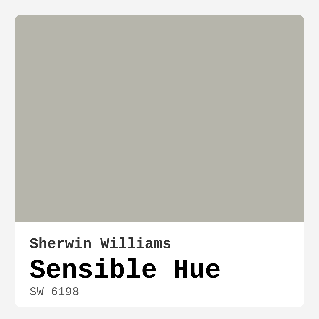
Color Preview & Key Details
| HEX Code | #B6B5AB |
| RGB | 182, 181, 171 |
| LRV | 30% |
| Undertone | Yellow |
| Finish Options | Eggshell, Matte, Satin |
Imagine stepping into a room that feels both inviting and sophisticated, where colors harmonize effortlessly and the atmosphere is warm without being overwhelming. This is the magic of paint, and one standout option that can achieve this effect is Sherwin Williams’ Sensible Hue (SW 6198). Let’s dive into what makes this gray such a remarkable choice for your home decor project.
Sensible Hue is a beautifully balanced gray with subtle warm undertones. The color leans toward the yellow side of the spectrum, offering a soft warmth that can make your living spaces feel cozy and welcoming. Its medium brightness ensures it’s not too stark, providing a refined backdrop that allows your furnishings and decor to shine.
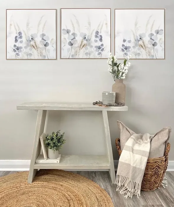
One of the first things you’ll notice about Sensible Hue is its versatility. This color effortlessly adapts to various decor styles, making it a fantastic choice whether your aesthetic is modern, transitional, Scandinavian, farmhouse, or minimalist. It creates an elegant finish in dining rooms, a relaxed vibe in bedrooms, and a productive atmosphere in home offices. The calm and grounding effect of this hue makes it ideal for spaces where you want to unwind or concentrate.
Now, let’s talk about practicality. Sensible Hue isn’t just a pretty face; it’s also beginner-friendly when it comes to application. Whether you’re a seasoned DIYer or a first-time painter, you’ll find that this paint goes on smoothly with both brushes and rollers. With good coverage in just one to two coats, you won’t spend your entire weekend painting, and the fast-drying formula means you can get back to enjoying your space sooner rather than later.
Care for the environment and your health? Sensible Hue has a low VOC (Volatile Organic Compounds) level, which means it emits fewer harmful chemicals into the air. This feature is particularly important for families with children or pets, ensuring you’re creating a safe and healthy environment. Plus, its washable nature makes it perfect for high-traffic areas. You can easily wipe away scuffs and dirt, keeping your walls looking fresh and clean over time.
One noteworthy aspect is how Sensible Hue interacts with light. With a Light Reflectance Value (LRV) of 30%, it sits comfortably in the medium dark range. This means it absorbs more light than it reflects, creating a cozy atmosphere, especially in spaces with abundant natural light. However, if you’re considering using it in a smaller room or one with limited light, keep in mind that it may appear darker. Pairing it with lighter trims, like White Dove or Pure White, can help balance this and brighten up the space.
While Sensible Hue can stand alone as a wall color, it also plays well with others. If you’re stumped about color pairings, consider using complementary shades like SW 6540 or SW 6812 for accents. These colors can add dimension and interest to your space. And if you want to explore variations in the same family, lighter shades such as SW 7651 or darker options like SW 7748 can help you create a cohesive look throughout your home.
When selecting paint, it’s crucial to consider how the undertones affect the overall ambiance. Sensible Hue’s warm yellow undertones lend it a unique character that can change throughout the day. In bright daylight, the warmth shines through, inviting you into a space that feels relaxed and serene. In lower light conditions, it maintains a cozy charm, perfect for creating restful environments.
Now, let’s address a common concern: Can you use Sensible Hue in a small room? Absolutely! This shade can make a small room feel more inviting and spacious, especially when paired with lighter accents. Just keep an eye on your room’s lighting. In darker areas, the paint may appear more muted, so consider testing a small patch before fully committing.
For a practical touch, Sensible Hue is also highly touch-up friendly. This is a great asset for homes with kids or pets, where walls may see more wear and tear. If you ever find yourself needing to refresh a section of the wall, you won’t have to dread the process; just grab your brush and get to it.
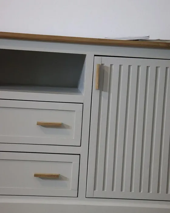
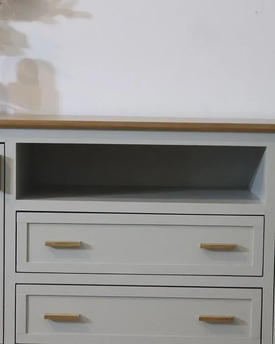
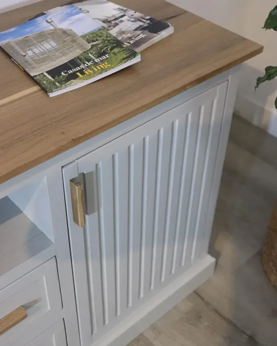
If you’re still unsure about how to incorporate Sensible Hue into your home, think about an accent wall. This approach allows you to enjoy the color without overwhelming the entire space. It could also be a fantastic choice for furniture, such as bookshelves or cabinets, adding a sophisticated touch to your decor.
As with any paint color, it’s important to test it out in your own space before making a final decision. Light affects colors differently in each environment, so grab some samples and try them out on your walls. Observe how the color interacts with your existing furnishings and decor. This step is essential to ensure that the undertones harmonize well with your overall design vision.
In summary, Sensible Hue by Sherwin Williams is more than just a paint color; it’s a versatile, warm gray that embodies sophistication while remaining approachable. Its easy application, low VOC levels, and washability make it a practical choice for any homeowner. The unique warm undertones provide depth and character, allowing it to adapt to various styles and lighting conditions. Whether you’re looking to revamp a cozy corner or create an elegant backdrop, this hue can help you achieve a look that feels curated and inviting.
So, are you ready to transform your space with Sensible Hue? With its calming presence and versatile nature, you might just find that this paint color is the perfect fit for your next home project.
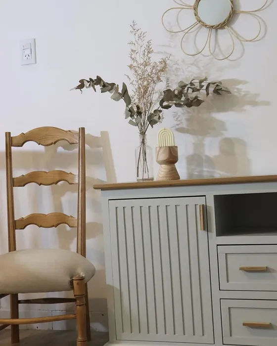
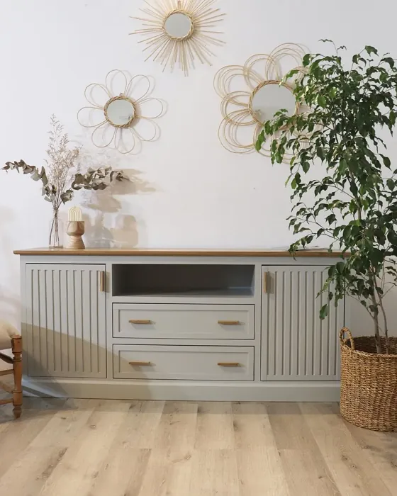
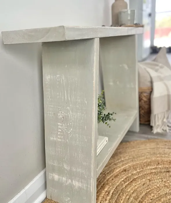
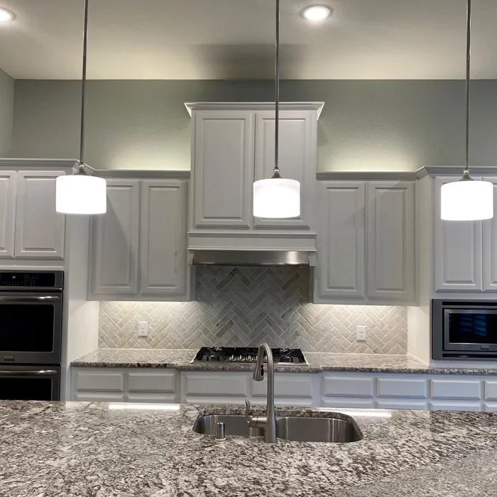
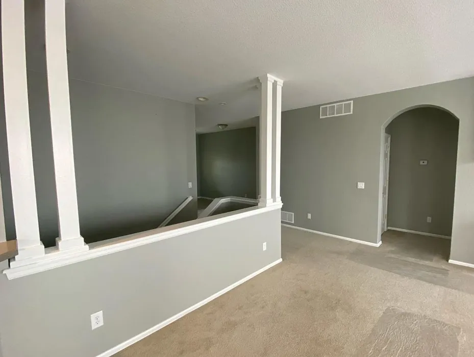
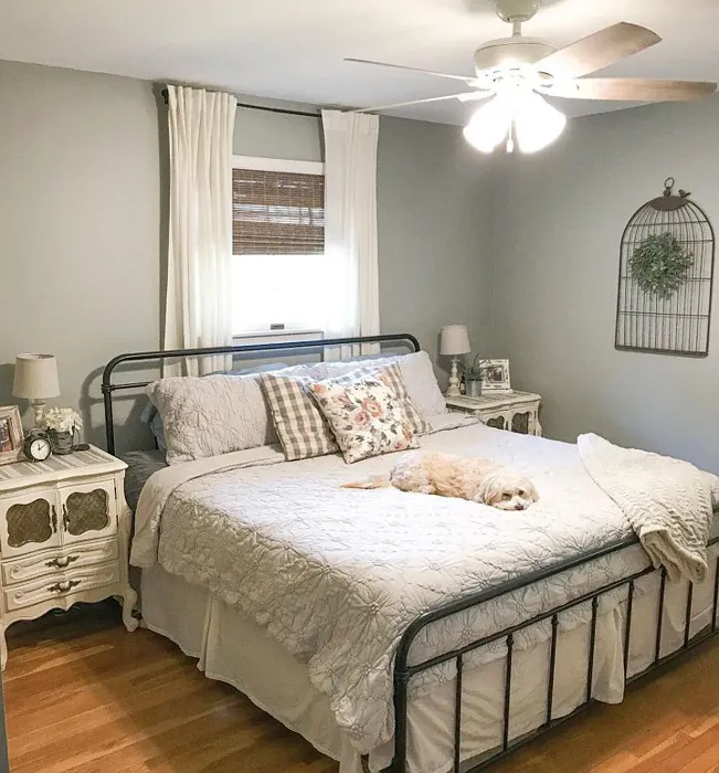
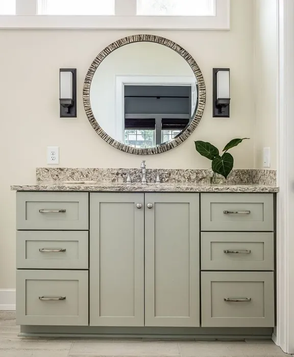
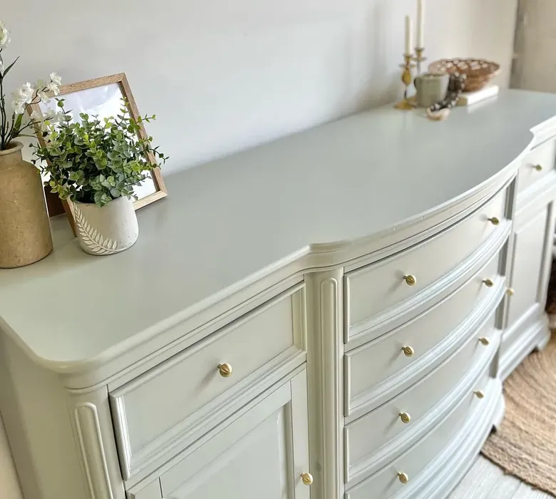
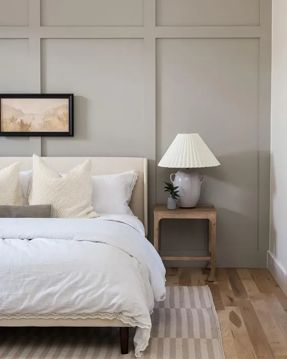
Real Room Photo of Sensible Hue SW 6198


Undertones of Sensible Hue ?
The undertones of Sensible Hue are a key aspect of its character, leaning towards Yellow. These subtle underlying hues are what give the color its depth and complexity. For example, a gray with a blue undertone will feel cooler and more modern, while one with a brown undertone will feel warmer and more traditional. It’s essential to test this paint in your home and observe it next to your existing furniture, flooring, and decor to see how these undertones interact and reveal themselves throughout the day.
HEX value: #B6B5AB
RGB code: 182, 181, 171
Is Sensible Hue Cool or Warm?
Sensible Hue leans towards the warm side of the spectrum, making it a great option for rooms that need a touch of warmth without being overpowering. Its balance ensures it doesn’t clash with cooler shades, making it versatile.
Understanding Color Properties and Interior Design Tips
Hue refers to a specific position on the color wheel, measured in degrees from 0 to 360. Each degree represents a different pure color:
- 0° represents red
- 120° represents green
- 240° represents blue
Saturation describes the intensity or purity of a color and is expressed as a percentage:
- At 0%, the color appears completely desaturated—essentially a shade of gray
- At 100%, the color is at its most vivid and vibrant
Lightness indicates how light or dark a color is, also expressed as a percentage:
- 0% lightness results in black
- 100% lightness results in white
Using Warm Colors in Interior Design
Warm hues—such as reds, oranges, yellows, warm beiges, and greiges—are excellent choices for creating inviting and energetic spaces. These colors are particularly well-suited for:
- Kitchens, living rooms, and bathrooms, where warmth enhances comfort and sociability
- Large rooms, where warm tones can help reduce the sense of emptiness and make the space feel more intimate
For example:
- Warm beige shades provide a cozy, inviting atmosphere, ideal for living rooms, bedrooms, and hallways.
- Warm greige (a mix of beige and gray) offers the warmth of beige with the modern appeal of gray, making it a versatile backdrop for dining areas, bedrooms, and living spaces.
However, be mindful when using warm light tones in rooms with limited natural light. These shades may appear muted or even take on an unpleasant yellowish tint. To avoid a dull or flat appearance:
- Add depth by incorporating richer tones like deep greens, charcoal, or chocolate brown
- Use textured elements such as curtains, rugs, or cushions to bring dimension to the space
Pro Tip: Achieving Harmony with Warm and Cool Color Balance
To create a well-balanced and visually interesting interior, mix warm and cool tones strategically. This contrast adds depth and harmony to your design.
- If your walls feature warm hues, introduce cool-colored accents such as blue or green furniture, artwork, or accessories to create contrast.
- For a polished look, consider using a complementary color scheme, which pairs colors opposite each other on the color wheel (e.g., red with green, orange with blue).
This thoughtful mix not only enhances visual appeal but also creates a space that feels both dynamic and cohesive.

Light Temperature Affects on Sensible Hue
Natural Light
Natural daylight changes in color temperature as the sun moves across the sky. At sunrise and sunset, the light tends to have a warm, golden tone with a color temperature around 2000 Kelvin (K). As the day progresses and the sun rises higher, the light becomes cooler and more neutral. Around midday, especially when the sky is clear, natural light typically reaches its peak brightness and shifts to a cooler tone, ranging from 5500 to 6500 Kelvin. This midday light is close to what we perceive as pure white or daylight-balanced light.
These shifts in natural light can significantly influence how colors appear in a space, which is why designers often consider both the time of day and the orientation of windows when planning interior color schemes.
Artificial Light
When choosing artificial lighting, pay close attention to the color temperature, measured in Kelvin (K). This determines how warm or cool the light will appear. Lower temperatures, around 2700K, give off a warm, yellow glow often used in living rooms or bedrooms. Higher temperatures, above 5000K, create a cool, bluish light similar to daylight, commonly used in kitchens, offices, or task areas.
Use the slider to see how lighting temperature can affect the appearance of a surface or color throughout a space.


4800K
LRV of Sensible Hue
The Light Reflectance Value (LRV) of Sensible Hue is 30%, which places it in the Medium Dark category. This means it reflects very little light. Understanding a paint’s LRV is crucial for predicting how it will look in your space. A higher LRV indicates a lighter color that reflects more light, making rooms feel larger and brighter. A lower LRV signifies a darker color that absorbs more light, creating a cozier, more intimate atmosphere. Always consider the natural and artificial lighting in your room when selecting a paint color based on its LRV.
Detailed Review of Sensible Hue
Additional Paint Characteristics
Ideal Rooms
Bedroom, Hallway, Home Office, Kitchen, Living Room
Decor Styles
Farmhouse, Minimalist, Modern, Scandinavian, Transitional
Coverage
Good (1–2 Coats), Touch-Up Friendly
Ease of Application
Beginner Friendly, Brush Smooth, Fast-Drying, Roller-Ready
Washability
Highly Washable, Washable
VOC Level
Low VOC
Best Use
Accent Wall, Furniture, Interior Walls
Room Suitability
Bedroom, Dining Room, Hallway, Home Office, Living Room
Tone Tag
Muted, Neutral, Warm
Finish Type
Eggshell, Matte
Paint Performance
Easy Touch-Up, High Coverage, Low Odor
Use Cases
Best for Low Light Rooms, Best for Rentals, Classic Favorite
Mood
Calm, Grounding, Inviting
Trim Pairing
Complements Cool Trim, Matches Pure White, Pairs with White Dove
When it comes to selecting the perfect paint, Sensible Hue stands out with its understated elegance. The soft gray tone invites a sense of calm while remaining versatile enough to complement various design aesthetics. You’ll find it works beautifully in spaces that need a touch of warmth without being too bold. It’s particularly stunning in natural light, where it reveals its warm undertones, creating an inviting atmosphere. Application is straightforward, making it suitable for both DIYers and professionals alike. Plus, its moderate coverage means you won’t be stuck applying coat after coat. Overall, Sensible Hue is a reliable choice for those seeking a refined yet approachable color.
Pros & Cons of SW 6198 Sensible Hue
Pros
Cons
Colors that go with Sherwin Williams Sensible Hue
FAQ on SW 6198 Sensible Hue
Can I use Sensible Hue in a small room?
Absolutely! Sensible Hue is a fantastic choice for small spaces. Its warm undertones can make a room feel more inviting and spacious, especially when paired with lighter trim or accents. Just be mindful of lighting; it might appear a tad darker in areas with less natural light.
How does Sensible Hue perform in high-traffic areas?
Sensible Hue is highly washable, which makes it suitable for high-traffic areas. You can easily wipe off marks and scuffs, ensuring your walls stay fresh and clean. Just remember to use a finish like eggshell or satin for added durability in these spaces.
Comparisons Sensible Hue with other colors
Sensible Hue SW 6198 vs Repose Gray SW 7015
| Attribute | Sensible Hue SW 6198 | Repose Gray SW 7015 |
|---|---|---|
| Color Name | Sensible Hue SW 6198 | Repose Gray SW 7015 |
| Color | ||
| Hue | Grey | Grey |
| Brightness | Medium | Medium |
| RGB | 182, 181, 171 | 204, 201, 192 |
| LRV | 30% | 58% |
| Finish Type | Eggshell, Matte | Eggshell, Matte, Satin |
| Finish Options | Eggshell, Matte, Satin | Eggshell, Matte, Satin |
| Ideal Rooms | Bedroom, Hallway, Home Office, Kitchen, Living Room | Bedroom, Dining Room, Hallway, Home Office, Living Room |
| Decor Styles | Farmhouse, Minimalist, Modern, Scandinavian, Transitional | Contemporary, Farmhouse, Minimalist, Modern, Transitional |
| Coverage | Good (1–2 Coats), Touch-Up Friendly | Good (1–2 Coats), Touch-Up Friendly |
| Ease of Application | Beginner Friendly, Brush Smooth, Fast-Drying, Roller-Ready | Beginner Friendly, Brush Smooth, Fast-Drying, Roller-Ready |
| Washability | Highly Washable, Washable | Highly Washable, Washable |
| Room Suitability | Bedroom, Dining Room, Hallway, Home Office, Living Room | Bedroom, Dining Room, Hallway, Home Office, Living Room |
| Tone | Muted, Neutral, Warm | Muted, Neutral, Warm |
| Paint Performance | Easy Touch-Up, High Coverage, Low Odor | Low Odor, Quick Drying, Scuff Resistant |
Sensible Hue SW 6198 vs Light French Gray SW 0055
| Attribute | Sensible Hue SW 6198 | Light French Gray SW 0055 |
|---|---|---|
| Color Name | Sensible Hue SW 6198 | Light French Gray SW 0055 |
| Color | ||
| Hue | Grey | Grey |
| Brightness | Medium | Medium |
| RGB | 182, 181, 171 | 194, 192, 187 |
| LRV | 30% | 53% |
| Finish Type | Eggshell, Matte | Eggshell, Matte, Satin |
| Finish Options | Eggshell, Matte, Satin | Eggshell, Matte, Satin |
| Ideal Rooms | Bedroom, Hallway, Home Office, Kitchen, Living Room | Bedroom, Dining Room, Home Office, Kitchen, Living Room |
| Decor Styles | Farmhouse, Minimalist, Modern, Scandinavian, Transitional | Contemporary, Farmhouse, Modern, Scandinavian, Transitional |
| Coverage | Good (1–2 Coats), Touch-Up Friendly | Good (1–2 Coats), Touch-Up Friendly |
| Ease of Application | Beginner Friendly, Brush Smooth, Fast-Drying, Roller-Ready | Beginner Friendly, Brush Smooth, Roller-Ready |
| Washability | Highly Washable, Washable | Highly Washable, Washable |
| Room Suitability | Bedroom, Dining Room, Hallway, Home Office, Living Room | Bedroom, Dining Room, Home Office, Kitchen, Living Room |
| Tone | Muted, Neutral, Warm | Balanced, Muted, Neutral, Warm |
| Paint Performance | Easy Touch-Up, High Coverage, Low Odor | Easy Touch-Up, High Coverage, Low Odor |
Sensible Hue SW 6198 vs Wordly Gray SW 7043
| Attribute | Sensible Hue SW 6198 | Wordly Gray SW 7043 |
|---|---|---|
| Color Name | Sensible Hue SW 6198 | Wordly Gray SW 7043 |
| Color | ||
| Hue | Grey | Grey |
| Brightness | Medium | Medium |
| RGB | 182, 181, 171 | 206, 198, 187 |
| LRV | 30% | 58% |
| Finish Type | Eggshell, Matte | Eggshell, Satin |
| Finish Options | Eggshell, Matte, Satin | Eggshell, Flat, Satin |
| Ideal Rooms | Bedroom, Hallway, Home Office, Kitchen, Living Room | Bedroom, Home Office, Kitchen, Living Room |
| Decor Styles | Farmhouse, Minimalist, Modern, Scandinavian, Transitional | Minimalist, Modern, Scandi, Transitional |
| Coverage | Good (1–2 Coats), Touch-Up Friendly | Good (1–2 Coats) |
| Ease of Application | Beginner Friendly, Brush Smooth, Fast-Drying, Roller-Ready | Beginner Friendly, Brush Smooth, Fast-Drying, Roller-Ready |
| Washability | Highly Washable, Washable | Highly Washable, Washable |
| Room Suitability | Bedroom, Dining Room, Hallway, Home Office, Living Room | Bedroom, Dining Room, Home Office, Living Room |
| Tone | Muted, Neutral, Warm | Muted, Neutral, Warm |
| Paint Performance | Easy Touch-Up, High Coverage, Low Odor | Easy Touch-Up, Low Odor, Scuff Resistant |
Sensible Hue SW 6198 vs Illusive Green SW 9164
| Attribute | Sensible Hue SW 6198 | Illusive Green SW 9164 |
|---|---|---|
| Color Name | Sensible Hue SW 6198 | Illusive Green SW 9164 |
| Color | ||
| Hue | Grey | Grey |
| Brightness | Medium | Medium |
| RGB | 182, 181, 171 | 146, 148, 141 |
| LRV | 30% | 24% |
| Finish Type | Eggshell, Matte | Eggshell, Matte, Satin |
| Finish Options | Eggshell, Matte, Satin | Eggshell, Matte, Satin |
| Ideal Rooms | Bedroom, Hallway, Home Office, Kitchen, Living Room | Bedroom, Dining Room, Home Office, Living Room, Nursery |
| Decor Styles | Farmhouse, Minimalist, Modern, Scandinavian, Transitional | Coastal, Minimalist, Modern, Rustic, Scandinavian |
| Coverage | Good (1–2 Coats), Touch-Up Friendly | Good (1–2 Coats), Touch-Up Friendly |
| Ease of Application | Beginner Friendly, Brush Smooth, Fast-Drying, Roller-Ready | Beginner Friendly, Brush Smooth, Fast-Drying, Roller-Ready |
| Washability | Highly Washable, Washable | Highly Washable, Washable, Wipeable |
| Room Suitability | Bedroom, Dining Room, Hallway, Home Office, Living Room | Bedroom, Dining Room, Home Office, Living Room, Nursery |
| Tone | Muted, Neutral, Warm | Balanced, Earthy, Muted |
| Paint Performance | Easy Touch-Up, High Coverage, Low Odor | Easy Touch-Up, Low Odor, Quick Drying, Scuff Resistant |
Sensible Hue SW 6198 vs Fawn Brindle SW 7640
| Attribute | Sensible Hue SW 6198 | Fawn Brindle SW 7640 |
|---|---|---|
| Color Name | Sensible Hue SW 6198 | Fawn Brindle SW 7640 |
| Color | ||
| Hue | Grey | Grey |
| Brightness | Medium | Medium |
| RGB | 182, 181, 171 | 167, 160, 148 |
| LRV | 30% | 24% |
| Finish Type | Eggshell, Matte | Eggshell, Matte |
| Finish Options | Eggshell, Matte, Satin | Eggshell, Matte, Satin |
| Ideal Rooms | Bedroom, Hallway, Home Office, Kitchen, Living Room | Bedroom, Dining Room, Hallway, Home Office, Living Room |
| Decor Styles | Farmhouse, Minimalist, Modern, Scandinavian, Transitional | Bohemian, Minimalist, Modern Farmhouse, Transitional |
| Coverage | Good (1–2 Coats), Touch-Up Friendly | Good (1–2 Coats) |
| Ease of Application | Beginner Friendly, Brush Smooth, Fast-Drying, Roller-Ready | Brush Smooth, Fast-Drying, Roller-Ready |
| Washability | Highly Washable, Washable | Stain Resistant, Washable |
| Room Suitability | Bedroom, Dining Room, Hallway, Home Office, Living Room | Bedroom, Dining Room, Home Office, Living Room |
| Tone | Muted, Neutral, Warm | Earthy, Neutral, Warm |
| Paint Performance | Easy Touch-Up, High Coverage, Low Odor | Easy Touch-Up, Fade Resistant, Low Odor |
Sensible Hue SW 6198 vs Balanced Beige SW 7037
| Attribute | Sensible Hue SW 6198 | Balanced Beige SW 7037 |
|---|---|---|
| Color Name | Sensible Hue SW 6198 | Balanced Beige SW 7037 |
| Color | ||
| Hue | Grey | Grey |
| Brightness | Medium | Medium |
| RGB | 182, 181, 171 | 192, 178, 162 |
| LRV | 30% | 44% |
| Finish Type | Eggshell, Matte | Eggshell, Matte, Satin |
| Finish Options | Eggshell, Matte, Satin | Eggshell, Matte, Satin |
| Ideal Rooms | Bedroom, Hallway, Home Office, Kitchen, Living Room | Bedroom, Dining Room, Home Office, Kitchen, Living Room |
| Decor Styles | Farmhouse, Minimalist, Modern, Scandinavian, Transitional | Contemporary, Minimalist, Modern Farmhouse, Rustic, Transitional |
| Coverage | Good (1–2 Coats), Touch-Up Friendly | Good (1–2 Coats), Touch-Up Friendly |
| Ease of Application | Beginner Friendly, Brush Smooth, Fast-Drying, Roller-Ready | Beginner Friendly, Brush Smooth, Roller-Ready |
| Washability | Highly Washable, Washable | Washable, Wipeable |
| Room Suitability | Bedroom, Dining Room, Hallway, Home Office, Living Room | Bedroom, Dining Room, Hallway, Kitchen, Living Room |
| Tone | Muted, Neutral, Warm | Balanced, Earthy, Warm |
| Paint Performance | Easy Touch-Up, High Coverage, Low Odor | Easy Touch-Up, High Coverage, Low Odor |
Sensible Hue SW 6198 vs Mushroom SW 9587
| Attribute | Sensible Hue SW 6198 | Mushroom SW 9587 |
|---|---|---|
| Color Name | Sensible Hue SW 6198 | Mushroom SW 9587 |
| Color | ||
| Hue | Grey | Grey |
| Brightness | Medium | Medium |
| RGB | 182, 181, 171 | 208, 199, 183 |
| LRV | 30% | 24% |
| Finish Type | Eggshell, Matte | Eggshell, Satin |
| Finish Options | Eggshell, Matte, Satin | Eggshell, Flat, Matte, Satin |
| Ideal Rooms | Bedroom, Hallway, Home Office, Kitchen, Living Room | Bedroom, Dining Room, Hallway, Home Office, Living Room |
| Decor Styles | Farmhouse, Minimalist, Modern, Scandinavian, Transitional | Bohemian, Contemporary, Modern Farmhouse, Traditional |
| Coverage | Good (1–2 Coats), Touch-Up Friendly | Good (1–2 Coats) |
| Ease of Application | Beginner Friendly, Brush Smooth, Fast-Drying, Roller-Ready | Beginner Friendly, Brush Smooth, Roller-Ready |
| Washability | Highly Washable, Washable | Highly Washable, Washable |
| Room Suitability | Bedroom, Dining Room, Hallway, Home Office, Living Room | Bedroom, Dining Room, Home Office, Living Room |
| Tone | Muted, Neutral, Warm | Earthy, Neutral, Warm |
| Paint Performance | Easy Touch-Up, High Coverage, Low Odor | Easy Touch-Up, Long Lasting, Low Odor, Scuff Resistant |
Sensible Hue SW 6198 vs Silver Strand SW 7057
| Attribute | Sensible Hue SW 6198 | Silver Strand SW 7057 |
|---|---|---|
| Color Name | Sensible Hue SW 6198 | Silver Strand SW 7057 |
| Color | ||
| Hue | Grey | Grey |
| Brightness | Medium | Medium |
| RGB | 182, 181, 171 | 200, 203, 196 |
| LRV | 30% | 66% |
| Finish Type | Eggshell, Matte | Eggshell, Satin |
| Finish Options | Eggshell, Matte, Satin | Eggshell, Matte, Satin |
| Ideal Rooms | Bedroom, Hallway, Home Office, Kitchen, Living Room | Bedroom, Dining Room, Hallway, Home Office, Living Room |
| Decor Styles | Farmhouse, Minimalist, Modern, Scandinavian, Transitional | Coastal, Minimalist, Modern, Traditional, Transitional |
| Coverage | Good (1–2 Coats), Touch-Up Friendly | Good (1–2 Coats), Touch-Up Friendly |
| Ease of Application | Beginner Friendly, Brush Smooth, Fast-Drying, Roller-Ready | Beginner Friendly, Brush Smooth, Roller-Ready |
| Washability | Highly Washable, Washable | Highly Washable, Washable |
| Room Suitability | Bedroom, Dining Room, Hallway, Home Office, Living Room | Bathroom, Bedroom, Home Office, Kitchen, Living Room |
| Tone | Muted, Neutral, Warm | Balanced, Neutral, Warm |
| Paint Performance | Easy Touch-Up, High Coverage, Low Odor | Easy Touch-Up, High Coverage, Low Odor |
Sensible Hue SW 6198 vs Cadet SW 9143
| Attribute | Sensible Hue SW 6198 | Cadet SW 9143 |
|---|---|---|
| Color Name | Sensible Hue SW 6198 | Cadet SW 9143 |
| Color | ||
| Hue | Grey | Grey |
| Brightness | Medium | Medium |
| RGB | 182, 181, 171 | 145, 153, 156 |
| LRV | 30% | 12% |
| Finish Type | Eggshell, Matte | Eggshell, Matte, Satin |
| Finish Options | Eggshell, Matte, Satin | Eggshell, Matte, Satin |
| Ideal Rooms | Bedroom, Hallway, Home Office, Kitchen, Living Room | Bathroom, Bedroom, Hallway, Home Office, Kitchen, Living Room |
| Decor Styles | Farmhouse, Minimalist, Modern, Scandinavian, Transitional | Coastal, Industrial, Minimalist, Modern, Scandinavian |
| Coverage | Good (1–2 Coats), Touch-Up Friendly | Good (1–2 Coats), Touch-Up Friendly |
| Ease of Application | Beginner Friendly, Brush Smooth, Fast-Drying, Roller-Ready | Beginner Friendly, Brush Smooth, Roller-Ready |
| Washability | Highly Washable, Washable | Washable, Wipeable |
| Room Suitability | Bedroom, Dining Room, Hallway, Home Office, Living Room | Bathroom, Bedroom, Hallway, Home Office, Living Room |
| Tone | Muted, Neutral, Warm | Balanced, Cool, Muted |
| Paint Performance | Easy Touch-Up, High Coverage, Low Odor | Easy Touch-Up, High Coverage, Low Odor |
Sensible Hue SW 6198 vs Dovetail SW 7018
| Attribute | Sensible Hue SW 6198 | Dovetail SW 7018 |
|---|---|---|
| Color Name | Sensible Hue SW 6198 | Dovetail SW 7018 |
| Color | ||
| Hue | Grey | Grey |
| Brightness | Medium | Medium |
| RGB | 182, 181, 171 | 144, 138, 131 |
| LRV | 30% | 24% |
| Finish Type | Eggshell, Matte | Eggshell, Matte, Satin |
| Finish Options | Eggshell, Matte, Satin | Eggshell, Matte, Satin |
| Ideal Rooms | Bedroom, Hallway, Home Office, Kitchen, Living Room | Bedroom, Dining Room, Hallway, Home Office, Living Room |
| Decor Styles | Farmhouse, Minimalist, Modern, Scandinavian, Transitional | Minimalist, Modern Farmhouse, Rustic, Transitional |
| Coverage | Good (1–2 Coats), Touch-Up Friendly | Good (1–2 Coats), Touch-Up Friendly |
| Ease of Application | Beginner Friendly, Brush Smooth, Fast-Drying, Roller-Ready | Beginner Friendly, Brush Smooth, Roller-Ready |
| Washability | Highly Washable, Washable | Washable, Wipeable |
| Room Suitability | Bedroom, Dining Room, Hallway, Home Office, Living Room | Bedroom, Dining Room, Home Office, Living Room |
| Tone | Muted, Neutral, Warm | Earthy, Neutral, Warm |
| Paint Performance | Easy Touch-Up, High Coverage, Low Odor | Easy Touch-Up, Fade Resistant, Low Odor |
Official Page of Sherwin Williams Sensible Hue SW 6198