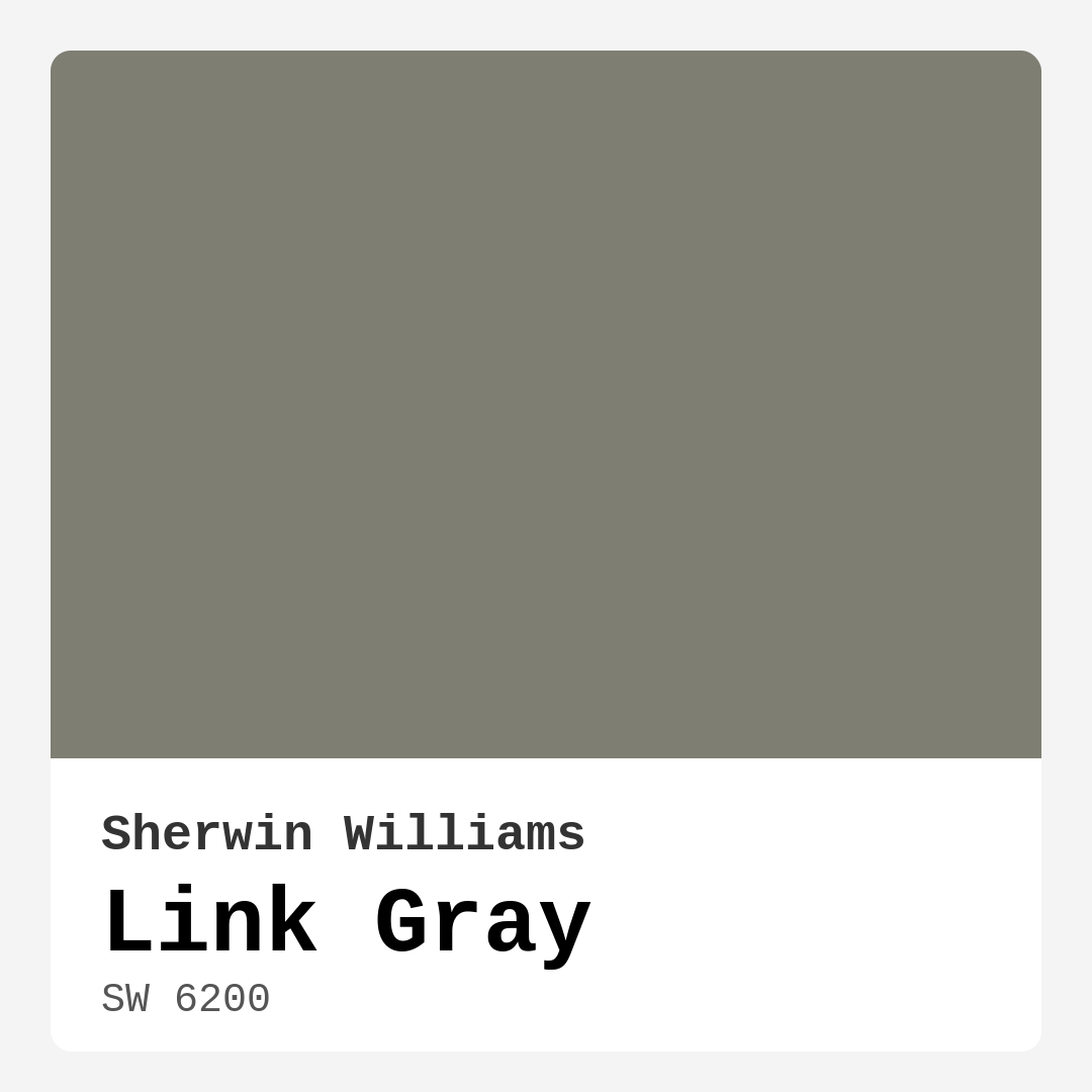
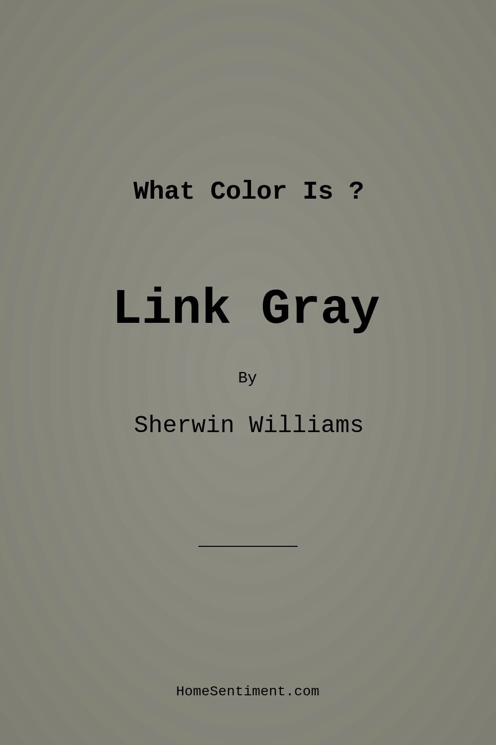
Color Preview & Key Details
| HEX Code | #7F7E72 |
| RGB | 127, 126, 114 |
| LRV | 48% |
| Undertone | Yellow |
| Finish Options | Eggshell, Matte, Satin |
Imagine walking into a room that feels instantly calming, yet sophisticated. You glance around and notice how the color wraps the space in a gentle embrace, creating a perfect backdrop for your decor. This is the magic of Link Gray by Sherwin Williams.
Link Gray, with its color code SW 6200, is a muted gray that leans softly towards warm undertones, making it a versatile choice for anyone looking to refresh their home. Whether you’re pondering a living room makeover or a serene bedroom retreat, this color might just be what you’ve been searching for.
One of the most appealing aspects of Link Gray is its adaptability. It plays well with a variety of decor styles, from modern and industrial to rustic and Scandinavian. This means you can confidently apply it to different areas of your home without worrying about clashing with your existing furnishings.
When applied, Link Gray offers excellent coverage with just one or two coats, making it a great option for DIY enthusiasts. Its performance is stellar, with a Light Reflectance Value (LRV) of 48%, which falls into the medium category. This means it reflects a moderate amount of light, helping to keep your spaces feeling open and airy. In bright light, Link Gray reveals its welcoming qualities, while in dimmer conditions, it maintains a cozy and sophisticated ambiance.
One thing to consider, though, is its subtler nature. Some might find that Link Gray appears darker in smaller spaces. However, don’t let that deter you! Its balanced tone can actually enhance the feeling of space when paired with light furnishings or decor items. Good lighting is key here, as it amplifies the welcoming feel.
Now, let’s talk about the undertones. Link Gray has a soft yellow undertone, adding warmth to its cool gray base. This combination creates a unique depth that shouldn’t be overlooked. Depending on your existing decor—be it furniture, flooring, or artwork—these undertones can shift and interact in beautiful ways throughout the day. Testing the color in your space before making a final decision is crucial.
When it comes to pairing colors, Link Gray truly shines. It complements whites and creams beautifully for an updated, fresh look, and it harmonizes perfectly with warm woods or brass accents for a cozier feel. If you’re looking to add a pop of drama, deep blues or rich greens can create a striking contrast, making your space feel both dynamic and inviting.
Link Gray isn’t just limited to one room, either. Its versatility makes it an excellent choice for various areas in your home, including the living room, bedroom, kitchen, dining room, and even a home office. Imagine wrapping your workspace in this calming hue, promoting focus and relaxation simultaneously.
Now, let’s address a few common concerns. Can Link Gray be used in a small room without making it feel cramped? Absolutely! Its soft undertones can help reflect light, keeping the room from feeling too dark. Just make sure to incorporate some good lighting to amplify its welcoming feel.
For those considering a bold statement, it’s essential to think about how Link Gray interacts with other elements in your space. While it can create a beautiful backdrop, be mindful of how it matches with your decor choices. Some might find it too muted for brighter styles, but that’s all about personal preference.
For those who appreciate a clean and polished look, Link Gray pairs exceptionally well with classic white trims, like White Dove, creating a timeless contrast that feels fresh and sophisticated. The color’s washability and high coverage make it particularly user-friendly, allowing for easy touch-ups whenever needed.
If you’re feeling adventurous and want to explore shades that complement Link Gray, look toward colors like SW 6540, SW 6543, or even SW 9073. These can add richness and variety without overshadowing the serene quality that Link Gray brings.
As a designer, I always emphasize the importance of how we feel in our spaces. Link Gray encapsulates a mood that is calm, inviting, and sophisticated. It creates an environment where you can unwind after a hectic day or enjoy a cozy gathering with friends and family. The soft, muted tone encourages a sense of tranquility, allowing you to create a space that resonates with your personal style.
So, are you ready to transform your home with Link Gray? This color not only offers a beautiful aesthetic but also brings a sense of peace and balance that can enhance your everyday life. With its beginner-friendly application, low VOC levels, and washability, it’s a choice that stands the test of time.
As you embark on your painting journey, remember to test the color in your space, observe it in different lighting conditions, and consider how it interacts with your existing decor. Trust your instincts and choose what feels right for you. With Link Gray, you’re not just selecting a paint color; you’re creating a beautiful, personalized environment that tells your unique story.
Let’s embrace the elegance of Link Gray and elevate your space into a realm of sophistication and comfort. Happy decorating!
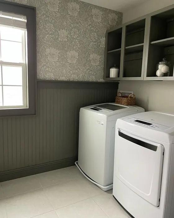
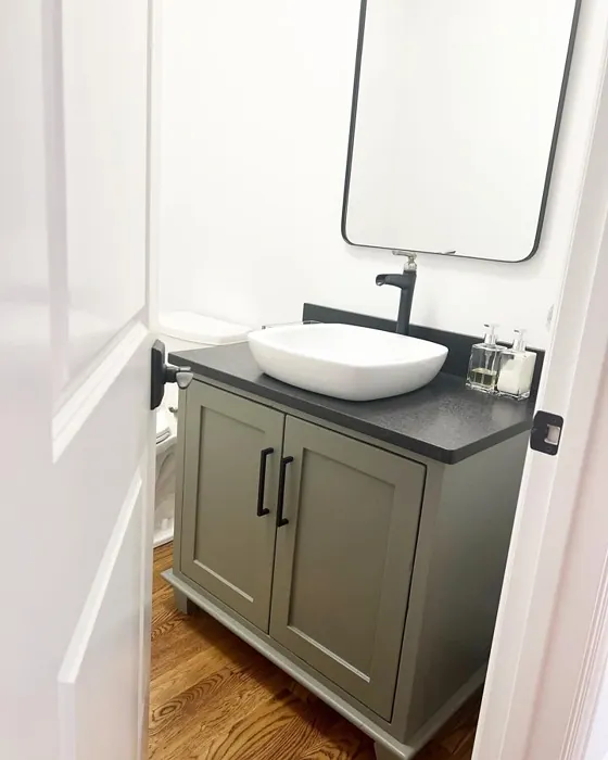
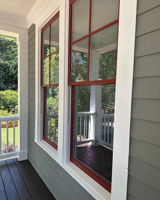
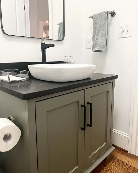
Real Room Photo of Link Gray SW 6200

Undertones of Link Gray ?
The undertones of Link Gray are a key aspect of its character, leaning towards Yellow. These subtle underlying hues are what give the color its depth and complexity. For example, a gray with a blue undertone will feel cooler and more modern, while one with a brown undertone will feel warmer and more traditional. It’s essential to test this paint in your home and observe it next to your existing furniture, flooring, and decor to see how these undertones interact and reveal themselves throughout the day.
HEX value: #7F7E72
RGB code: 127, 126, 114
Is Link Gray Cool or Warm?
Link Gray is predominantly a cool gray, but its soft undertones lend it a warmth that makes it approachable. This dual nature allows it to work beautifully across various lighting conditions, ensuring it doesn’t overpower a room but rather enhances the overall ambiance.
Understanding Color Properties and Interior Design Tips
Hue refers to a specific position on the color wheel, measured in degrees from 0 to 360. Each degree represents a different pure color:
- 0° represents red
- 120° represents green
- 240° represents blue
Saturation describes the intensity or purity of a color and is expressed as a percentage:
- At 0%, the color appears completely desaturated—essentially a shade of gray
- At 100%, the color is at its most vivid and vibrant
Lightness indicates how light or dark a color is, also expressed as a percentage:
- 0% lightness results in black
- 100% lightness results in white
Using Warm Colors in Interior Design
Warm hues—such as reds, oranges, yellows, warm beiges, and greiges—are excellent choices for creating inviting and energetic spaces. These colors are particularly well-suited for:
- Kitchens, living rooms, and bathrooms, where warmth enhances comfort and sociability
- Large rooms, where warm tones can help reduce the sense of emptiness and make the space feel more intimate
For example:
- Warm beige shades provide a cozy, inviting atmosphere, ideal for living rooms, bedrooms, and hallways.
- Warm greige (a mix of beige and gray) offers the warmth of beige with the modern appeal of gray, making it a versatile backdrop for dining areas, bedrooms, and living spaces.
However, be mindful when using warm light tones in rooms with limited natural light. These shades may appear muted or even take on an unpleasant yellowish tint. To avoid a dull or flat appearance:
- Add depth by incorporating richer tones like deep greens, charcoal, or chocolate brown
- Use textured elements such as curtains, rugs, or cushions to bring dimension to the space
Pro Tip: Achieving Harmony with Warm and Cool Color Balance
To create a well-balanced and visually interesting interior, mix warm and cool tones strategically. This contrast adds depth and harmony to your design.
- If your walls feature warm hues, introduce cool-colored accents such as blue or green furniture, artwork, or accessories to create contrast.
- For a polished look, consider using a complementary color scheme, which pairs colors opposite each other on the color wheel (e.g., red with green, orange with blue).
This thoughtful mix not only enhances visual appeal but also creates a space that feels both dynamic and cohesive.
Light Temperature Affects on Link Gray
Natural Light
Natural daylight changes in color temperature as the sun moves across the sky. At sunrise and sunset, the light tends to have a warm, golden tone with a color temperature around 2000 Kelvin (K). As the day progresses and the sun rises higher, the light becomes cooler and more neutral. Around midday, especially when the sky is clear, natural light typically reaches its peak brightness and shifts to a cooler tone, ranging from 5500 to 6500 Kelvin. This midday light is close to what we perceive as pure white or daylight-balanced light.
These shifts in natural light can significantly influence how colors appear in a space, which is why designers often consider both the time of day and the orientation of windows when planning interior color schemes.
Artificial Light
When choosing artificial lighting, pay close attention to the color temperature, measured in Kelvin (K). This determines how warm or cool the light will appear. Lower temperatures, around 2700K, give off a warm, yellow glow often used in living rooms or bedrooms. Higher temperatures, above 5000K, create a cool, bluish light similar to daylight, commonly used in kitchens, offices, or task areas.
Use the slider to see how lighting temperature can affect the appearance of a surface or color throughout a space.


4800K
LRV of Link Gray
The Light Reflectance Value (LRV) of Link Gray is 48%, which places it in the Medium category. This means it Reflects a moderate amount of light. Understanding a paint’s LRV is crucial for predicting how it will look in your space. A higher LRV indicates a lighter color that reflects more light, making rooms feel larger and brighter. A lower LRV signifies a darker color that absorbs more light, creating a cozier, more intimate atmosphere. Always consider the natural and artificial lighting in your room when selecting a paint color based on its LRV.
Detailed Review of Link Gray
Additional Paint Characteristics
Ideal Rooms
Bedroom, Dining Room, Home Office, Kitchen, Living Room
Decor Styles
Contemporary, Industrial, Modern, Rustic, Scandinavian
Coverage
Good (1–2 Coats), Touch-Up Friendly
Ease of Application
Beginner Friendly, Brush Smooth, Roller-Ready
Washability
Highly Washable, Washable
VOC Level
Low VOC, Ultra Low VOC
Best Use
Accent Wall, Interior Walls, Open Concept Spaces
Room Suitability
Bedroom, Dining Room, Home Office, Kitchen, Living Room
Tone Tag
Balanced, Cool, Muted
Finish Type
Eggshell, Matte, Satin
Paint Performance
Easy Touch-Up, High Coverage, Low Odor
Use Cases
Best for Modern Farmhouse, Best for Open Concept, Classic Favorite
Mood
Calm, Inviting, Sophisticated
Trim Pairing
Complements Brass Fixtures, Good with Wood Trim, Pairs with White Dove
Link Gray is a remarkable choice for anyone looking to create a serene and stylish environment. Its soft yet sophisticated tone makes it incredibly adaptable. When applied, it offers excellent coverage, often needing just one or two coats for a perfect finish. This paint performs beautifully in both natural and artificial light, enhancing its elegant and airy feel. Moreover, its muted quality allows it to pair effortlessly with various accent colors or decor elements, creating a cohesive look throughout your space. Whether you’re repainting your living room or refreshing your home office, Link Gray is sure to elevate any area with its understated charm.
Pros & Cons of SW 6200 Link Gray
Pros
Cons
Colors that go with Sherwin Williams Link Gray
FAQ on SW 6200 Link Gray
Can Link Gray be used in a small room without making it feel cramped?
Absolutely! Link Gray’s balanced tone can actually help a small room feel more spacious and airy. Its soft undertones can reflect enough light to keep the room from feeling too dark, especially when paired with light furnishings or accents. Just ensure you have some good lighting to amplify its welcoming feel.
What colors pair well with Link Gray?
Link Gray is incredibly versatile! It pairs beautifully with whites and creams for a fresh look, and works well with warm woods or brass accents for a cozy, inviting vibe. For a bolder contrast, consider pairing it with deep blues or rich greens. It’s all about how you want to express your personal style.
Comparisons Link Gray with other colors
Link Gray SW 6200 vs Night Owl SW 7061
| Attribute | Link Gray SW 6200 | Night Owl SW 7061 |
|---|---|---|
| Color Name | Link Gray SW 6200 | Night Owl SW 7061 |
| Color | ||
| Hue | Grey | Grey |
| Brightness | Dark | Dark |
| RGB | 127, 126, 114 | 99, 101, 95 |
| LRV | 48% | 24% |
| Finish Type | Eggshell, Matte, Satin | Eggshell, Matte, Satin |
| Finish Options | Eggshell, Matte, Satin | Eggshell, Matte, Satin |
| Ideal Rooms | Bedroom, Dining Room, Home Office, Kitchen, Living Room | Bedroom, Dining Room, Hallway, Home Office, Living Room |
| Decor Styles | Contemporary, Industrial, Modern, Rustic, Scandinavian | Industrial, Minimalist, Modern, Rustic, Scandinavian |
| Coverage | Good (1–2 Coats), Touch-Up Friendly | Good (1–2 Coats), Touch-Up Friendly |
| Ease of Application | Beginner Friendly, Brush Smooth, Roller-Ready | Beginner Friendly, Brush Smooth, Fast-Drying, Roller-Ready |
| Washability | Highly Washable, Washable | Scrubbable, Washable |
| Room Suitability | Bedroom, Dining Room, Home Office, Kitchen, Living Room | Bedroom, Dining Room, Home Office, Living Room |
| Tone | Balanced, Cool, Muted | Balanced, Deep, Earthy, Muted |
| Paint Performance | Easy Touch-Up, High Coverage, Low Odor | Easy Touch-Up, Fade Resistant, High Coverage, Low Odor |
Link Gray SW 6200 vs Urbane Bronze SW 7048
| Attribute | Link Gray SW 6200 | Urbane Bronze SW 7048 |
|---|---|---|
| Color Name | Link Gray SW 6200 | Urbane Bronze SW 7048 |
| Color | ||
| Hue | Grey | Grey |
| Brightness | Dark | Dark |
| RGB | 127, 126, 114 | 84, 80, 74 |
| LRV | 48% | 20% |
| Finish Type | Eggshell, Matte, Satin | Eggshell, Matte, Satin |
| Finish Options | Eggshell, Matte, Satin | Eggshell, Matte, Satin |
| Ideal Rooms | Bedroom, Dining Room, Home Office, Kitchen, Living Room | Bedroom, Dining Room, Home Office, Living Room |
| Decor Styles | Contemporary, Industrial, Modern, Rustic, Scandinavian | Contemporary, Industrial, Modern, Rustic, Transitional |
| Coverage | Good (1–2 Coats), Touch-Up Friendly | Good (1–2 Coats) |
| Ease of Application | Beginner Friendly, Brush Smooth, Roller-Ready | Beginner Friendly, Brush Smooth, Roller-Ready |
| Washability | Highly Washable, Washable | Highly Washable, Washable |
| Room Suitability | Bedroom, Dining Room, Home Office, Kitchen, Living Room | Bedroom, Dining Room, Home Office, Living Room |
| Tone | Balanced, Cool, Muted | Deep, Earthy, Warm |
| Paint Performance | Easy Touch-Up, High Coverage, Low Odor | Easy Touch-Up, Fade Resistant, High Coverage, Low Odor |
Link Gray SW 6200 vs Succulent SW 9650
| Attribute | Link Gray SW 6200 | Succulent SW 9650 |
|---|---|---|
| Color Name | Link Gray SW 6200 | Succulent SW 9650 |
| Color | ||
| Hue | Grey | Grey |
| Brightness | Dark | Dark |
| RGB | 127, 126, 114 | 97, 108, 100 |
| LRV | 48% | 30% |
| Finish Type | Eggshell, Matte, Satin | Eggshell, Matte, Satin |
| Finish Options | Eggshell, Matte, Satin | Eggshell, Matte, Satin |
| Ideal Rooms | Bedroom, Dining Room, Home Office, Kitchen, Living Room | Bathroom, Bedroom, Dining Room, Entryway, Kitchen, Living Room |
| Decor Styles | Contemporary, Industrial, Modern, Rustic, Scandinavian | Bohemian, Contemporary, Eclectic, Minimalist, Modern Farmhouse |
| Coverage | Good (1–2 Coats), Touch-Up Friendly | Good (1–2 Coats), Touch-Up Friendly |
| Ease of Application | Beginner Friendly, Brush Smooth, Roller-Ready | Beginner Friendly, Brush Smooth, Roller-Ready |
| Washability | Highly Washable, Washable | Highly Washable, Washable |
| Room Suitability | Bedroom, Dining Room, Home Office, Kitchen, Living Room | Bathroom, Bedroom, Dining Room, Kitchen, Living Room |
| Tone | Balanced, Cool, Muted | Cool, Earthy, Muted |
| Paint Performance | Easy Touch-Up, High Coverage, Low Odor | Easy Touch-Up, Low Odor, Quick Drying, Scuff Resistant |
Link Gray SW 6200 vs Grizzle Gray SW 7068
| Attribute | Link Gray SW 6200 | Grizzle Gray SW 7068 |
|---|---|---|
| Color Name | Link Gray SW 6200 | Grizzle Gray SW 7068 |
| Color | ||
| Hue | Grey | Grey |
| Brightness | Dark | Dark |
| RGB | 127, 126, 114 | 99, 101, 98 |
| LRV | 48% | 24% |
| Finish Type | Eggshell, Matte, Satin | Eggshell, Satin |
| Finish Options | Eggshell, Matte, Satin | Eggshell, Matte, Satin |
| Ideal Rooms | Bedroom, Dining Room, Home Office, Kitchen, Living Room | Bedroom, Dining Room, Home Office, Living Room |
| Decor Styles | Contemporary, Industrial, Modern, Rustic, Scandinavian | Industrial, Modern, Rustic, Scandinavian |
| Coverage | Good (1–2 Coats), Touch-Up Friendly | Good (1–2 Coats), Touch-Up Friendly |
| Ease of Application | Beginner Friendly, Brush Smooth, Roller-Ready | Beginner Friendly, Brush Smooth, Roller-Ready |
| Washability | Highly Washable, Washable | Washable, Wipeable |
| Room Suitability | Bedroom, Dining Room, Home Office, Kitchen, Living Room | Bedroom, Dining Room, Home Office, Living Room |
| Tone | Balanced, Cool, Muted | Balanced, Cool, Muted |
| Paint Performance | Easy Touch-Up, High Coverage, Low Odor | Easy Touch-Up, High Coverage, Low Odor |
Link Gray SW 6200 vs Iron Ore SW 7069
| Attribute | Link Gray SW 6200 | Iron Ore SW 7069 |
|---|---|---|
| Color Name | Link Gray SW 6200 | Iron Ore SW 7069 |
| Color | ||
| Hue | Grey | Grey |
| Brightness | Dark | Dark |
| RGB | 127, 126, 114 | 67, 67, 65 |
| LRV | 48% | 6% |
| Finish Type | Eggshell, Matte, Satin | Eggshell, Matte, Satin |
| Finish Options | Eggshell, Matte, Satin | Eggshell, Matte, Satin |
| Ideal Rooms | Bedroom, Dining Room, Home Office, Kitchen, Living Room | Bedroom, Dining Room, Entryway, Home Office, Living Room |
| Decor Styles | Contemporary, Industrial, Modern, Rustic, Scandinavian | Contemporary, Industrial, Minimalist, Modern, Rustic |
| Coverage | Good (1–2 Coats), Touch-Up Friendly | Good (1–2 Coats), High Hide |
| Ease of Application | Beginner Friendly, Brush Smooth, Roller-Ready | Brush Smooth, Fast-Drying, Roller-Ready |
| Washability | Highly Washable, Washable | Highly Washable, Washable |
| Room Suitability | Bedroom, Dining Room, Home Office, Kitchen, Living Room | Bedroom, Dining Room, Entryway, Home Office, Living Room |
| Tone | Balanced, Cool, Muted | Balanced, Deep, Muted, Warm |
| Paint Performance | Easy Touch-Up, High Coverage, Low Odor | Easy Touch-Up, High Coverage, Low Odor |
Link Gray SW 6200 vs Peppercorn SW 7674
| Attribute | Link Gray SW 6200 | Peppercorn SW 7674 |
|---|---|---|
| Color Name | Link Gray SW 6200 | Peppercorn SW 7674 |
| Color | ||
| Hue | Grey | Grey |
| Brightness | Dark | Dark |
| RGB | 127, 126, 114 | 88, 88, 88 |
| LRV | 48% | 10% |
| Finish Type | Eggshell, Matte, Satin | Eggshell, Matte, Satin |
| Finish Options | Eggshell, Matte, Satin | Eggshell, Matte, Satin |
| Ideal Rooms | Bedroom, Dining Room, Home Office, Kitchen, Living Room | Bedroom, Dining Room, Home Office, Living Room |
| Decor Styles | Contemporary, Industrial, Modern, Rustic, Scandinavian | Contemporary, Industrial, Minimalist, Modern |
| Coverage | Good (1–2 Coats), Touch-Up Friendly | Good (1–2 Coats), Touch-Up Friendly |
| Ease of Application | Beginner Friendly, Brush Smooth, Roller-Ready | Beginner Friendly, Brush Smooth, Roller-Ready |
| Washability | Highly Washable, Washable | Highly Washable, Washable |
| Room Suitability | Bedroom, Dining Room, Home Office, Kitchen, Living Room | Bedroom, Dining Room, Home Office, Living Room |
| Tone | Balanced, Cool, Muted | Balanced, Deep, Moody, Neutral |
| Paint Performance | Easy Touch-Up, High Coverage, Low Odor | Easy Touch-Up, Low Odor, Quick Drying, Scuff Resistant |
Link Gray SW 6200 vs Slate Tile SW 7624
| Attribute | Link Gray SW 6200 | Slate Tile SW 7624 |
|---|---|---|
| Color Name | Link Gray SW 6200 | Slate Tile SW 7624 |
| Color | ||
| Hue | Grey | Grey |
| Brightness | Dark | Dark |
| RGB | 127, 126, 114 | 96, 110, 116 |
| LRV | 48% | 15% |
| Finish Type | Eggshell, Matte, Satin | Eggshell, Matte, Satin |
| Finish Options | Eggshell, Matte, Satin | Eggshell, Matte, Satin |
| Ideal Rooms | Bedroom, Dining Room, Home Office, Kitchen, Living Room | Bathroom, Bedroom, Home Office, Kitchen, Living Room |
| Decor Styles | Contemporary, Industrial, Modern, Rustic, Scandinavian | Industrial, Minimalist, Modern, Rustic |
| Coverage | Good (1–2 Coats), Touch-Up Friendly | Good (1–2 Coats) |
| Ease of Application | Beginner Friendly, Brush Smooth, Roller-Ready | Beginner Friendly, Brush Smooth, Fast-Drying, Roller-Ready |
| Washability | Highly Washable, Washable | Scrubbable, Washable |
| Room Suitability | Bedroom, Dining Room, Home Office, Kitchen, Living Room | Bathroom, Bedroom, Kitchen, Living Room |
| Tone | Balanced, Cool, Muted | Balanced, Cool, Muted |
| Paint Performance | Easy Touch-Up, High Coverage, Low Odor | Easy Touch-Up, High Coverage, Low Odor, Quick Drying |
Link Gray SW 6200 vs Blustery Sky SW 9140
| Attribute | Link Gray SW 6200 | Blustery Sky SW 9140 |
|---|---|---|
| Color Name | Link Gray SW 6200 | Blustery Sky SW 9140 |
| Color | ||
| Hue | Grey | Grey |
| Brightness | Dark | Dark |
| RGB | 127, 126, 114 | 111, 132, 140 |
| LRV | 48% | 48% |
| Finish Type | Eggshell, Matte, Satin | Eggshell, Matte |
| Finish Options | Eggshell, Matte, Satin | Eggshell, Matte, Satin |
| Ideal Rooms | Bedroom, Dining Room, Home Office, Kitchen, Living Room | Bedroom, Dining Room, Home Office, Living Room, Nursery |
| Decor Styles | Contemporary, Industrial, Modern, Rustic, Scandinavian | Coastal, Modern Farmhouse, Scandinavian, Transitional |
| Coverage | Good (1–2 Coats), Touch-Up Friendly | Good (1–2 Coats), Touch-Up Friendly |
| Ease of Application | Beginner Friendly, Brush Smooth, Roller-Ready | Beginner Friendly, Fast-Drying, Low Splatter, Roller-Ready |
| Washability | Highly Washable, Washable | Washable, Wipeable |
| Room Suitability | Bedroom, Dining Room, Home Office, Kitchen, Living Room | Bedroom, Home Office, Living Room, Nursery |
| Tone | Balanced, Cool, Muted | Balanced, Cool, Muted |
| Paint Performance | Easy Touch-Up, High Coverage, Low Odor | Easy Touch-Up, Fade Resistant, Low Odor, Quick Drying |
Link Gray SW 6200 vs Gauntlet Gray SW 7019
| Attribute | Link Gray SW 6200 | Gauntlet Gray SW 7019 |
|---|---|---|
| Color Name | Link Gray SW 6200 | Gauntlet Gray SW 7019 |
| Color | ||
| Hue | Grey | Grey |
| Brightness | Dark | Dark |
| RGB | 127, 126, 114 | 120, 115, 110 |
| LRV | 48% | 24% |
| Finish Type | Eggshell, Matte, Satin | Eggshell, Matte, Satin |
| Finish Options | Eggshell, Matte, Satin | Eggshell, Matte, Satin |
| Ideal Rooms | Bedroom, Dining Room, Home Office, Kitchen, Living Room | Bedroom, Dining Room, Hallway, Home Office, Living Room |
| Decor Styles | Contemporary, Industrial, Modern, Rustic, Scandinavian | Industrial, Modern, Rustic, Transitional |
| Coverage | Good (1–2 Coats), Touch-Up Friendly | Good (1–2 Coats), Touch-Up Friendly |
| Ease of Application | Beginner Friendly, Brush Smooth, Roller-Ready | Beginner Friendly, Brush Smooth, Roller-Ready |
| Washability | Highly Washable, Washable | Scrubbable, Washable |
| Room Suitability | Bedroom, Dining Room, Home Office, Kitchen, Living Room | Bedroom, Dining Room, Home Office, Living Room |
| Tone | Balanced, Cool, Muted | Dusty, Earthy, Muted, Warm |
| Paint Performance | Easy Touch-Up, High Coverage, Low Odor | Easy Touch-Up, High Coverage, Low Odor |
Link Gray SW 6200 vs Cast Iron SW 6202
| Attribute | Link Gray SW 6200 | Cast Iron SW 6202 |
|---|---|---|
| Color Name | Link Gray SW 6200 | Cast Iron SW 6202 |
| Color | ||
| Hue | Grey | Grey |
| Brightness | Dark | Dark |
| RGB | 127, 126, 114 | 100, 100, 90 |
| LRV | 48% | 6% |
| Finish Type | Eggshell, Matte, Satin | Eggshell, Matte, Satin |
| Finish Options | Eggshell, Matte, Satin | Eggshell, Matte, Satin |
| Ideal Rooms | Bedroom, Dining Room, Home Office, Kitchen, Living Room | Bedroom, Dining Room, Hallway, Home Office, Kitchen, Living Room |
| Decor Styles | Contemporary, Industrial, Modern, Rustic, Scandinavian | Contemporary, Farmhouse, Industrial, Minimalist, Modern |
| Coverage | Good (1–2 Coats), Touch-Up Friendly | Good (1–2 Coats), High Hide, Touch-Up Friendly |
| Ease of Application | Beginner Friendly, Brush Smooth, Roller-Ready | Beginner Friendly, Brush Smooth, Fast-Drying, Roller-Ready |
| Washability | Highly Washable, Washable | Highly Washable, Washable, Wipeable |
| Room Suitability | Bedroom, Dining Room, Home Office, Kitchen, Living Room | Bedroom, Dining Room, Home Office, Kitchen, Living Room |
| Tone | Balanced, Cool, Muted | Balanced, Deep, Dusty, Earthy, Warm |
| Paint Performance | Easy Touch-Up, High Coverage, Low Odor | Easy Touch-Up, High Coverage, Low Odor, Stain Resistant |
Official Page of Sherwin Williams Link Gray SW 6200