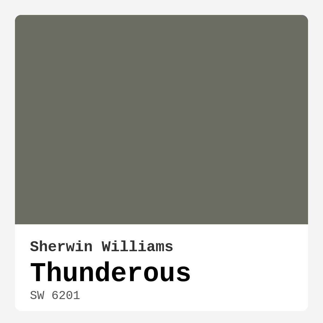
Color Preview & Key Details
| HEX Code | #6D6C62 |
| RGB | 109, 108, 98 |
| LRV | 12% |
| Undertone | Yellow |
| Finish Options | Eggshell, Matte, Satin |
Imagine stepping into a room that feels both sophisticated and inviting, a space that wraps you in warmth while still making a bold statement. That’s the magic of Thunderous, the striking gray paint color from Sherwin Williams. With its muted yet rich hue, Thunderous (SW 6201) offers a unique perspective on gray, making it a perfect choice for those looking to elevate their home decor.
Let’s dive into what makes Thunderous such a standout option. First off, it’s not just another gray. This color has earthy undertones of yellow that add depth and warmth, creating an atmosphere that feels both cozy and elegant. It’s the kind of color that invites you to sit back, relax, and stay awhile, whether you’re hosting friends in the living room or enjoying a quiet evening in your bedroom.
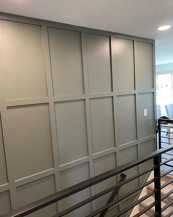
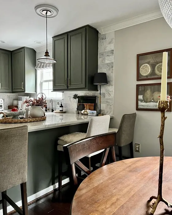
The beauty of Thunderous lies in its versatility. It seamlessly blends into various decor styles, from modern and industrial to rustic and Scandinavian. Picture a contemporary living room adorned with clean lines, where Thunderous serves as a striking backdrop for sleek furniture. Or imagine it in a rustic dining room, where the earthy tones enhance the warmth of wooden accents. This color adapts beautifully, allowing you to create a personalized space that reflects your style.
When selecting a paint color, practicality matters, and Thunderous shines in this area too. With an LRV (Light Reflectance Value) of 12%, it falls into the dark color category, meaning it doesn’t reflect a lot of light. This quality can make spaces feel more intimate, perfect for bedrooms or cozy corners. However, it’s essential to consider how your specific lighting will interact with this shade. In well-lit rooms, Thunderous can brighten the atmosphere, while in darker spaces, it might appear a bit more somber.
If you’re worried about the application process, rest easy. Thunderous is beginner-friendly, applying smoothly with minimal splatter, making it a great choice for DIY enthusiasts. Most projects will only require one or two coats for full coverage, which saves you time and effort. Plus, it’s touch-up friendly, so you don’t have to stress about those minor imperfections that can happen during painting.
Now, let’s talk about color pairings. Thunderous plays well with a variety of shades. For a classic look, consider pairing it with whites like White Dove or Simply White for trim. These crisp whites will provide a beautiful contrast, helping Thunderous to stand out while keeping the overall look fresh and clean. If you’re feeling a bit bolder, consider deep blues or muted greens. These colors can create a stunning contrast that still feels cohesive. Don’t forget about warm wood tones, which can enhance the earthy undertones of Thunderous, adding even more warmth to your space.
While Thunderous has many advantages, it’s also essential to be mindful of some potential downsides. In poorly lit areas, it may appear darker than intended, so it’s worth testing the color in your space before committing. Additionally, pairing it with trim colors requires some careful thought. You want to ensure that the undertones complement each other rather than clash.
Another consideration is the finish. Thunderous comes in several finishes—matte, eggshell, and satin. If you’re leaning towards a glossy finish, be cautious. Glossy finishes can sometimes show fingerprints more easily, which could detract from the overall look. A satin or eggshell finish may be ideal for balancing elegance with practicality.
As you think about where to use Thunderous, consider the rooms that could benefit from its cozy, calming vibe. It’s perfect for living rooms, bedrooms, and home offices, creating spaces that feel inviting yet sophisticated. Imagine a home office painted in Thunderous, where the muted tones help foster focus and creativity. Or picture a bedroom sanctuary, where the rich hue promotes relaxation at the end of a long day.
When you’re ready to explore Thunderous, testing it in your own space is key. Paint swatches on your walls and observe how the color changes throughout the day. Natural light can bring out the rich undertones, while artificial lighting may shift the hue slightly. This is your opportunity to see how Thunderous interacts with your existing furniture and decor.
In terms of performance, Thunderous holds up well against everyday wear. It’s washable, making it easy to clean, which is a definite plus for high-traffic areas or homes with kids and pets. Plus, with a low VOC level, you can feel good about your choice for both your home and the environment.
If you’re still unsure how Thunderous compares to other gray paints, it stands out for its warmth and earthy feel. Many other grays can feel cold or sterile, but Thunderous manages to maintain an inviting quality while still being sophisticated. It’s a gray that feels grounded, connected to nature, and that’s part of its charm.
To sum it up, if you’re looking for a paint color that offers both elegance and comfort, Thunderous is an excellent choice. Its unique undertones, versatility across decor styles, and practical application make it a top contender for your next home project. Whether you’re revamping a small space or transforming an entire room, this muted gray can add the perfect touch of sophistication without sacrificing warmth. So grab a sample, test it in your space, and see how Thunderous can bring your vision to life. You just might find that it’s the color your home has been waiting for.
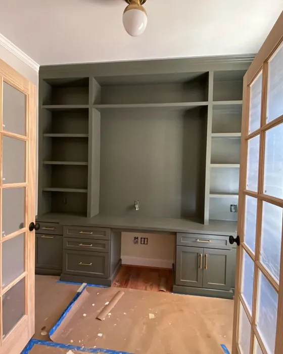
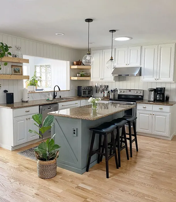
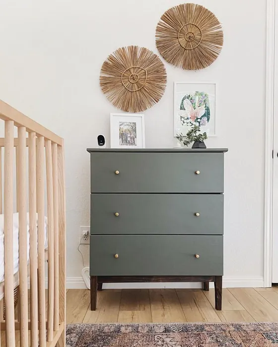
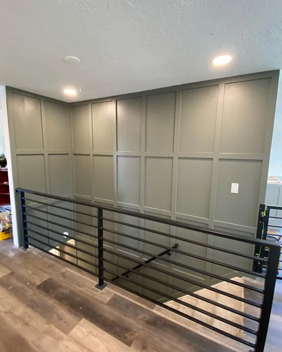
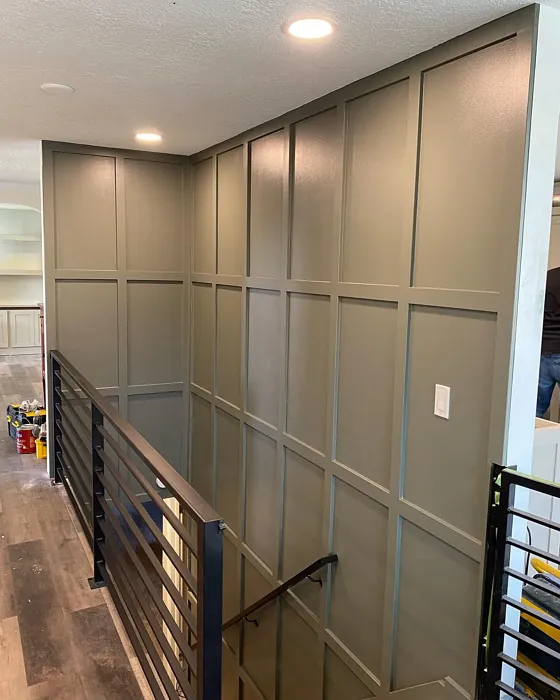
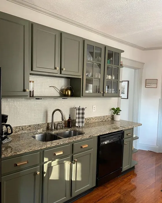
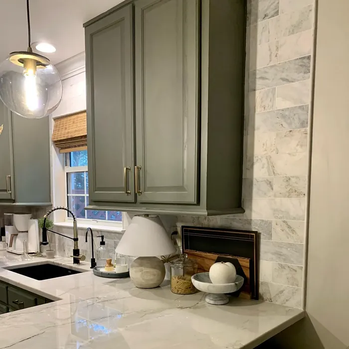
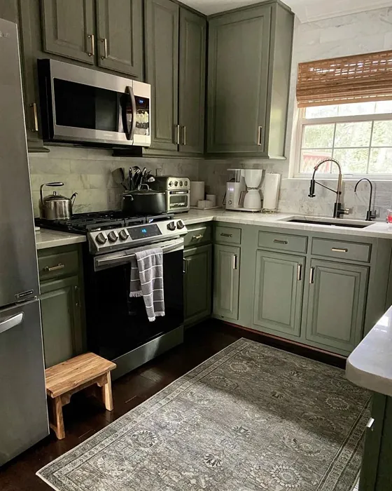
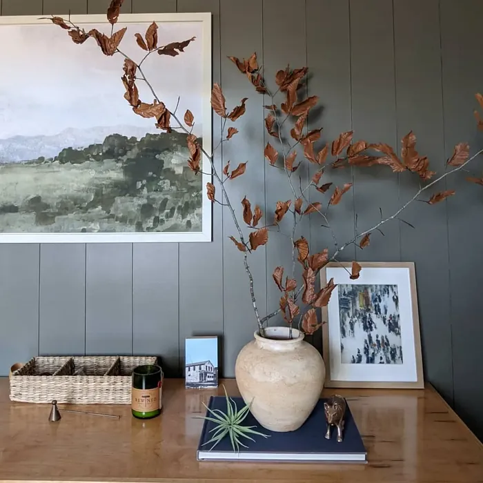
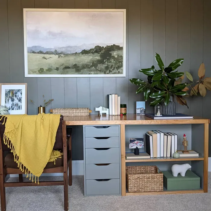
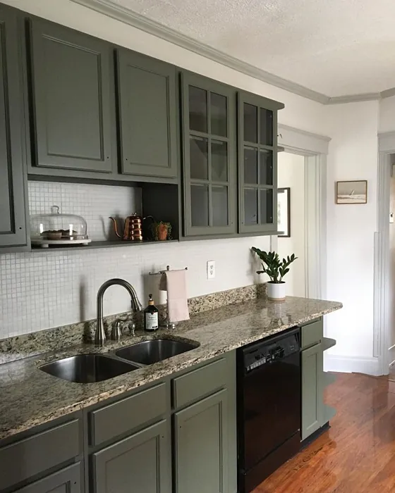
Real Room Photo of Thunderous SW 6201


Undertones of Thunderous ?
The undertones of Thunderous are a key aspect of its character, leaning towards Yellow. These subtle underlying hues are what give the color its depth and complexity. For example, a gray with a blue undertone will feel cooler and more modern, while one with a brown undertone will feel warmer and more traditional. It’s essential to test this paint in your home and observe it next to your existing furniture, flooring, and decor to see how these undertones interact and reveal themselves throughout the day.
HEX value: #6D6C62
RGB code: 109, 108, 98
Is Thunderous Cool or Warm?
Thunderous is primarily a warm gray, thanks to its earthy undertones. This warmth makes it more adaptable, allowing it to pair beautifully with both warm and cool decor elements, making it a fantastic choice for any room.
Understanding Color Properties and Interior Design Tips
Hue refers to a specific position on the color wheel, measured in degrees from 0 to 360. Each degree represents a different pure color:
- 0° represents red
- 120° represents green
- 240° represents blue
Saturation describes the intensity or purity of a color and is expressed as a percentage:
- At 0%, the color appears completely desaturated—essentially a shade of gray
- At 100%, the color is at its most vivid and vibrant
Lightness indicates how light or dark a color is, also expressed as a percentage:
- 0% lightness results in black
- 100% lightness results in white
Using Warm Colors in Interior Design
Warm hues—such as reds, oranges, yellows, warm beiges, and greiges—are excellent choices for creating inviting and energetic spaces. These colors are particularly well-suited for:
- Kitchens, living rooms, and bathrooms, where warmth enhances comfort and sociability
- Large rooms, where warm tones can help reduce the sense of emptiness and make the space feel more intimate
For example:
- Warm beige shades provide a cozy, inviting atmosphere, ideal for living rooms, bedrooms, and hallways.
- Warm greige (a mix of beige and gray) offers the warmth of beige with the modern appeal of gray, making it a versatile backdrop for dining areas, bedrooms, and living spaces.
However, be mindful when using warm light tones in rooms with limited natural light. These shades may appear muted or even take on an unpleasant yellowish tint. To avoid a dull or flat appearance:
- Add depth by incorporating richer tones like deep greens, charcoal, or chocolate brown
- Use textured elements such as curtains, rugs, or cushions to bring dimension to the space
Pro Tip: Achieving Harmony with Warm and Cool Color Balance
To create a well-balanced and visually interesting interior, mix warm and cool tones strategically. This contrast adds depth and harmony to your design.
- If your walls feature warm hues, introduce cool-colored accents such as blue or green furniture, artwork, or accessories to create contrast.
- For a polished look, consider using a complementary color scheme, which pairs colors opposite each other on the color wheel (e.g., red with green, orange with blue).
This thoughtful mix not only enhances visual appeal but also creates a space that feels both dynamic and cohesive.
Light Temperature Affects on Thunderous
Natural Light
Natural daylight changes in color temperature as the sun moves across the sky. At sunrise and sunset, the light tends to have a warm, golden tone with a color temperature around 2000 Kelvin (K). As the day progresses and the sun rises higher, the light becomes cooler and more neutral. Around midday, especially when the sky is clear, natural light typically reaches its peak brightness and shifts to a cooler tone, ranging from 5500 to 6500 Kelvin. This midday light is close to what we perceive as pure white or daylight-balanced light.
These shifts in natural light can significantly influence how colors appear in a space, which is why designers often consider both the time of day and the orientation of windows when planning interior color schemes.
Artificial Light
When choosing artificial lighting, pay close attention to the color temperature, measured in Kelvin (K). This determines how warm or cool the light will appear. Lower temperatures, around 2700K, give off a warm, yellow glow often used in living rooms or bedrooms. Higher temperatures, above 5000K, create a cool, bluish light similar to daylight, commonly used in kitchens, offices, or task areas.
Use the slider to see how lighting temperature can affect the appearance of a surface or color throughout a space.


4800K
LRV of Thunderous
The Light Reflectance Value (LRV) of Thunderous is 12%, which places it in the Dark colors category. This means it does not reflect light. Understanding a paint’s LRV is crucial for predicting how it will look in your space. A higher LRV indicates a lighter color that reflects more light, making rooms feel larger and brighter. A lower LRV signifies a darker color that absorbs more light, creating a cozier, more intimate atmosphere. Always consider the natural and artificial lighting in your room when selecting a paint color based on its LRV.
Detailed Review of Thunderous
Additional Paint Characteristics
Ideal Rooms
Bedroom, Dining Room, Home Office, Living Room
Decor Styles
Industrial, Modern, Rustic, Scandinavian
Coverage
Good (1–2 Coats), Touch-Up Friendly
Ease of Application
Beginner Friendly, Brush Smooth, Low Splatter, Roller-Ready
Washability
Washable, Wipeable
VOC Level
Low VOC
Best Use
Accent Wall, Furniture, Interior Walls
Room Suitability
Bedroom, Dining Room, Home Office, Living Room
Tone Tag
Deep, Earthy, Muted, Warm
Finish Type
Eggshell, Matte, Satin
Paint Performance
Easy Touch-Up, High Coverage, Low Odor
Use Cases
Best for Modern Farmhouse, Best for Open Concept, Best for Small Spaces
Mood
Calm, Cozy, Inviting
Trim Pairing
Complements Brass Fixtures, Matches Pure White, Pairs with White Dove
Thunderous is an exceptional paint choice that commands attention without overwhelming a room. Its unique blend of gray and earthy undertones makes it extremely versatile, allowing it to harmonize beautifully with various decor styles. Whether you’re going for a sleek modern look or a cozy rustic feel, this paint delivers. It applies smoothly and evenly, ensuring that you get a rich finish with minimal effort. Plus, the low splatter formula makes it perfect for DIY enthusiasts. Just one or two coats usually do the trick, making it both time-efficient and budget-friendly. If you’re looking to transform your space with a color that feels both grounded and sophisticated, Thunderous is definitely worth considering.
Pros & Cons of SW 6201 Thunderous
Pros
Cons
Colors that go with Sherwin Williams Thunderous
FAQ on SW 6201 Thunderous
How does Thunderous compare to other gray paints?
Thunderous stands out among gray paints due to its unique earthy undertones, which provide warmth and depth that many cooler grays lack. While other grays can feel cold or sterile, Thunderous manages to maintain a sophisticated vibe while still feeling inviting. It’s a great choice for those who want a gray that feels more grounded and connected to nature.
What colors pair well with Thunderous?
Thunderous pairs beautifully with a range of colors. For a classic look, consider whites like White Dove or Simply White for trim. If you’re aiming for a bolder contrast, deep blues or even muted greens can create a stunning effect. Warm woods also complement Thunderous well, enhancing its earthy undertones and adding warmth to the overall palette.
Comparisons Thunderous with other colors
Thunderous SW 6201 vs Night Owl SW 7061
| Attribute | Thunderous SW 6201 | Night Owl SW 7061 |
|---|---|---|
| Color Name | Thunderous SW 6201 | Night Owl SW 7061 |
| Color | ||
| Hue | Grey | Grey |
| Brightness | Dark | Dark |
| RGB | 109, 108, 98 | 99, 101, 95 |
| LRV | 12% | 24% |
| Finish Type | Eggshell, Matte, Satin | Eggshell, Matte, Satin |
| Finish Options | Eggshell, Matte, Satin | Eggshell, Matte, Satin |
| Ideal Rooms | Bedroom, Dining Room, Home Office, Living Room | Bedroom, Dining Room, Hallway, Home Office, Living Room |
| Decor Styles | Industrial, Modern, Rustic, Scandinavian | Industrial, Minimalist, Modern, Rustic, Scandinavian |
| Coverage | Good (1–2 Coats), Touch-Up Friendly | Good (1–2 Coats), Touch-Up Friendly |
| Ease of Application | Beginner Friendly, Brush Smooth, Low Splatter, Roller-Ready | Beginner Friendly, Brush Smooth, Fast-Drying, Roller-Ready |
| Washability | Washable, Wipeable | Scrubbable, Washable |
| Room Suitability | Bedroom, Dining Room, Home Office, Living Room | Bedroom, Dining Room, Home Office, Living Room |
| Tone | Deep, Earthy, Muted, Warm | Balanced, Deep, Earthy, Muted |
| Paint Performance | Easy Touch-Up, High Coverage, Low Odor | Easy Touch-Up, Fade Resistant, High Coverage, Low Odor |
Thunderous SW 6201 vs Urbane Bronze SW 7048
| Attribute | Thunderous SW 6201 | Urbane Bronze SW 7048 |
|---|---|---|
| Color Name | Thunderous SW 6201 | Urbane Bronze SW 7048 |
| Color | ||
| Hue | Grey | Grey |
| Brightness | Dark | Dark |
| RGB | 109, 108, 98 | 84, 80, 74 |
| LRV | 12% | 20% |
| Finish Type | Eggshell, Matte, Satin | Eggshell, Matte, Satin |
| Finish Options | Eggshell, Matte, Satin | Eggshell, Matte, Satin |
| Ideal Rooms | Bedroom, Dining Room, Home Office, Living Room | Bedroom, Dining Room, Home Office, Living Room |
| Decor Styles | Industrial, Modern, Rustic, Scandinavian | Contemporary, Industrial, Modern, Rustic, Transitional |
| Coverage | Good (1–2 Coats), Touch-Up Friendly | Good (1–2 Coats) |
| Ease of Application | Beginner Friendly, Brush Smooth, Low Splatter, Roller-Ready | Beginner Friendly, Brush Smooth, Roller-Ready |
| Washability | Washable, Wipeable | Highly Washable, Washable |
| Room Suitability | Bedroom, Dining Room, Home Office, Living Room | Bedroom, Dining Room, Home Office, Living Room |
| Tone | Deep, Earthy, Muted, Warm | Deep, Earthy, Warm |
| Paint Performance | Easy Touch-Up, High Coverage, Low Odor | Easy Touch-Up, Fade Resistant, High Coverage, Low Odor |
Thunderous SW 6201 vs Succulent SW 9650
| Attribute | Thunderous SW 6201 | Succulent SW 9650 |
|---|---|---|
| Color Name | Thunderous SW 6201 | Succulent SW 9650 |
| Color | ||
| Hue | Grey | Grey |
| Brightness | Dark | Dark |
| RGB | 109, 108, 98 | 97, 108, 100 |
| LRV | 12% | 30% |
| Finish Type | Eggshell, Matte, Satin | Eggshell, Matte, Satin |
| Finish Options | Eggshell, Matte, Satin | Eggshell, Matte, Satin |
| Ideal Rooms | Bedroom, Dining Room, Home Office, Living Room | Bathroom, Bedroom, Dining Room, Entryway, Kitchen, Living Room |
| Decor Styles | Industrial, Modern, Rustic, Scandinavian | Bohemian, Contemporary, Eclectic, Minimalist, Modern Farmhouse |
| Coverage | Good (1–2 Coats), Touch-Up Friendly | Good (1–2 Coats), Touch-Up Friendly |
| Ease of Application | Beginner Friendly, Brush Smooth, Low Splatter, Roller-Ready | Beginner Friendly, Brush Smooth, Roller-Ready |
| Washability | Washable, Wipeable | Highly Washable, Washable |
| Room Suitability | Bedroom, Dining Room, Home Office, Living Room | Bathroom, Bedroom, Dining Room, Kitchen, Living Room |
| Tone | Deep, Earthy, Muted, Warm | Cool, Earthy, Muted |
| Paint Performance | Easy Touch-Up, High Coverage, Low Odor | Easy Touch-Up, Low Odor, Quick Drying, Scuff Resistant |
Thunderous SW 6201 vs Grizzle Gray SW 7068
| Attribute | Thunderous SW 6201 | Grizzle Gray SW 7068 |
|---|---|---|
| Color Name | Thunderous SW 6201 | Grizzle Gray SW 7068 |
| Color | ||
| Hue | Grey | Grey |
| Brightness | Dark | Dark |
| RGB | 109, 108, 98 | 99, 101, 98 |
| LRV | 12% | 24% |
| Finish Type | Eggshell, Matte, Satin | Eggshell, Satin |
| Finish Options | Eggshell, Matte, Satin | Eggshell, Matte, Satin |
| Ideal Rooms | Bedroom, Dining Room, Home Office, Living Room | Bedroom, Dining Room, Home Office, Living Room |
| Decor Styles | Industrial, Modern, Rustic, Scandinavian | Industrial, Modern, Rustic, Scandinavian |
| Coverage | Good (1–2 Coats), Touch-Up Friendly | Good (1–2 Coats), Touch-Up Friendly |
| Ease of Application | Beginner Friendly, Brush Smooth, Low Splatter, Roller-Ready | Beginner Friendly, Brush Smooth, Roller-Ready |
| Washability | Washable, Wipeable | Washable, Wipeable |
| Room Suitability | Bedroom, Dining Room, Home Office, Living Room | Bedroom, Dining Room, Home Office, Living Room |
| Tone | Deep, Earthy, Muted, Warm | Balanced, Cool, Muted |
| Paint Performance | Easy Touch-Up, High Coverage, Low Odor | Easy Touch-Up, High Coverage, Low Odor |
Thunderous SW 6201 vs Iron Ore SW 7069
| Attribute | Thunderous SW 6201 | Iron Ore SW 7069 |
|---|---|---|
| Color Name | Thunderous SW 6201 | Iron Ore SW 7069 |
| Color | ||
| Hue | Grey | Grey |
| Brightness | Dark | Dark |
| RGB | 109, 108, 98 | 67, 67, 65 |
| LRV | 12% | 6% |
| Finish Type | Eggshell, Matte, Satin | Eggshell, Matte, Satin |
| Finish Options | Eggshell, Matte, Satin | Eggshell, Matte, Satin |
| Ideal Rooms | Bedroom, Dining Room, Home Office, Living Room | Bedroom, Dining Room, Entryway, Home Office, Living Room |
| Decor Styles | Industrial, Modern, Rustic, Scandinavian | Contemporary, Industrial, Minimalist, Modern, Rustic |
| Coverage | Good (1–2 Coats), Touch-Up Friendly | Good (1–2 Coats), High Hide |
| Ease of Application | Beginner Friendly, Brush Smooth, Low Splatter, Roller-Ready | Brush Smooth, Fast-Drying, Roller-Ready |
| Washability | Washable, Wipeable | Highly Washable, Washable |
| Room Suitability | Bedroom, Dining Room, Home Office, Living Room | Bedroom, Dining Room, Entryway, Home Office, Living Room |
| Tone | Deep, Earthy, Muted, Warm | Balanced, Deep, Muted, Warm |
| Paint Performance | Easy Touch-Up, High Coverage, Low Odor | Easy Touch-Up, High Coverage, Low Odor |
Thunderous SW 6201 vs Peppercorn SW 7674
| Attribute | Thunderous SW 6201 | Peppercorn SW 7674 |
|---|---|---|
| Color Name | Thunderous SW 6201 | Peppercorn SW 7674 |
| Color | ||
| Hue | Grey | Grey |
| Brightness | Dark | Dark |
| RGB | 109, 108, 98 | 88, 88, 88 |
| LRV | 12% | 10% |
| Finish Type | Eggshell, Matte, Satin | Eggshell, Matte, Satin |
| Finish Options | Eggshell, Matte, Satin | Eggshell, Matte, Satin |
| Ideal Rooms | Bedroom, Dining Room, Home Office, Living Room | Bedroom, Dining Room, Home Office, Living Room |
| Decor Styles | Industrial, Modern, Rustic, Scandinavian | Contemporary, Industrial, Minimalist, Modern |
| Coverage | Good (1–2 Coats), Touch-Up Friendly | Good (1–2 Coats), Touch-Up Friendly |
| Ease of Application | Beginner Friendly, Brush Smooth, Low Splatter, Roller-Ready | Beginner Friendly, Brush Smooth, Roller-Ready |
| Washability | Washable, Wipeable | Highly Washable, Washable |
| Room Suitability | Bedroom, Dining Room, Home Office, Living Room | Bedroom, Dining Room, Home Office, Living Room |
| Tone | Deep, Earthy, Muted, Warm | Balanced, Deep, Moody, Neutral |
| Paint Performance | Easy Touch-Up, High Coverage, Low Odor | Easy Touch-Up, Low Odor, Quick Drying, Scuff Resistant |
Thunderous SW 6201 vs Slate Tile SW 7624
| Attribute | Thunderous SW 6201 | Slate Tile SW 7624 |
|---|---|---|
| Color Name | Thunderous SW 6201 | Slate Tile SW 7624 |
| Color | ||
| Hue | Grey | Grey |
| Brightness | Dark | Dark |
| RGB | 109, 108, 98 | 96, 110, 116 |
| LRV | 12% | 15% |
| Finish Type | Eggshell, Matte, Satin | Eggshell, Matte, Satin |
| Finish Options | Eggshell, Matte, Satin | Eggshell, Matte, Satin |
| Ideal Rooms | Bedroom, Dining Room, Home Office, Living Room | Bathroom, Bedroom, Home Office, Kitchen, Living Room |
| Decor Styles | Industrial, Modern, Rustic, Scandinavian | Industrial, Minimalist, Modern, Rustic |
| Coverage | Good (1–2 Coats), Touch-Up Friendly | Good (1–2 Coats) |
| Ease of Application | Beginner Friendly, Brush Smooth, Low Splatter, Roller-Ready | Beginner Friendly, Brush Smooth, Fast-Drying, Roller-Ready |
| Washability | Washable, Wipeable | Scrubbable, Washable |
| Room Suitability | Bedroom, Dining Room, Home Office, Living Room | Bathroom, Bedroom, Kitchen, Living Room |
| Tone | Deep, Earthy, Muted, Warm | Balanced, Cool, Muted |
| Paint Performance | Easy Touch-Up, High Coverage, Low Odor | Easy Touch-Up, High Coverage, Low Odor, Quick Drying |
Thunderous SW 6201 vs Blustery Sky SW 9140
| Attribute | Thunderous SW 6201 | Blustery Sky SW 9140 |
|---|---|---|
| Color Name | Thunderous SW 6201 | Blustery Sky SW 9140 |
| Color | ||
| Hue | Grey | Grey |
| Brightness | Dark | Dark |
| RGB | 109, 108, 98 | 111, 132, 140 |
| LRV | 12% | 48% |
| Finish Type | Eggshell, Matte, Satin | Eggshell, Matte |
| Finish Options | Eggshell, Matte, Satin | Eggshell, Matte, Satin |
| Ideal Rooms | Bedroom, Dining Room, Home Office, Living Room | Bedroom, Dining Room, Home Office, Living Room, Nursery |
| Decor Styles | Industrial, Modern, Rustic, Scandinavian | Coastal, Modern Farmhouse, Scandinavian, Transitional |
| Coverage | Good (1–2 Coats), Touch-Up Friendly | Good (1–2 Coats), Touch-Up Friendly |
| Ease of Application | Beginner Friendly, Brush Smooth, Low Splatter, Roller-Ready | Beginner Friendly, Fast-Drying, Low Splatter, Roller-Ready |
| Washability | Washable, Wipeable | Washable, Wipeable |
| Room Suitability | Bedroom, Dining Room, Home Office, Living Room | Bedroom, Home Office, Living Room, Nursery |
| Tone | Deep, Earthy, Muted, Warm | Balanced, Cool, Muted |
| Paint Performance | Easy Touch-Up, High Coverage, Low Odor | Easy Touch-Up, Fade Resistant, Low Odor, Quick Drying |
Thunderous SW 6201 vs Gauntlet Gray SW 7019
| Attribute | Thunderous SW 6201 | Gauntlet Gray SW 7019 |
|---|---|---|
| Color Name | Thunderous SW 6201 | Gauntlet Gray SW 7019 |
| Color | ||
| Hue | Grey | Grey |
| Brightness | Dark | Dark |
| RGB | 109, 108, 98 | 120, 115, 110 |
| LRV | 12% | 24% |
| Finish Type | Eggshell, Matte, Satin | Eggshell, Matte, Satin |
| Finish Options | Eggshell, Matte, Satin | Eggshell, Matte, Satin |
| Ideal Rooms | Bedroom, Dining Room, Home Office, Living Room | Bedroom, Dining Room, Hallway, Home Office, Living Room |
| Decor Styles | Industrial, Modern, Rustic, Scandinavian | Industrial, Modern, Rustic, Transitional |
| Coverage | Good (1–2 Coats), Touch-Up Friendly | Good (1–2 Coats), Touch-Up Friendly |
| Ease of Application | Beginner Friendly, Brush Smooth, Low Splatter, Roller-Ready | Beginner Friendly, Brush Smooth, Roller-Ready |
| Washability | Washable, Wipeable | Scrubbable, Washable |
| Room Suitability | Bedroom, Dining Room, Home Office, Living Room | Bedroom, Dining Room, Home Office, Living Room |
| Tone | Deep, Earthy, Muted, Warm | Dusty, Earthy, Muted, Warm |
| Paint Performance | Easy Touch-Up, High Coverage, Low Odor | Easy Touch-Up, High Coverage, Low Odor |
Thunderous SW 6201 vs Cast Iron SW 6202
| Attribute | Thunderous SW 6201 | Cast Iron SW 6202 |
|---|---|---|
| Color Name | Thunderous SW 6201 | Cast Iron SW 6202 |
| Color | ||
| Hue | Grey | Grey |
| Brightness | Dark | Dark |
| RGB | 109, 108, 98 | 100, 100, 90 |
| LRV | 12% | 6% |
| Finish Type | Eggshell, Matte, Satin | Eggshell, Matte, Satin |
| Finish Options | Eggshell, Matte, Satin | Eggshell, Matte, Satin |
| Ideal Rooms | Bedroom, Dining Room, Home Office, Living Room | Bedroom, Dining Room, Hallway, Home Office, Kitchen, Living Room |
| Decor Styles | Industrial, Modern, Rustic, Scandinavian | Contemporary, Farmhouse, Industrial, Minimalist, Modern |
| Coverage | Good (1–2 Coats), Touch-Up Friendly | Good (1–2 Coats), High Hide, Touch-Up Friendly |
| Ease of Application | Beginner Friendly, Brush Smooth, Low Splatter, Roller-Ready | Beginner Friendly, Brush Smooth, Fast-Drying, Roller-Ready |
| Washability | Washable, Wipeable | Highly Washable, Washable, Wipeable |
| Room Suitability | Bedroom, Dining Room, Home Office, Living Room | Bedroom, Dining Room, Home Office, Kitchen, Living Room |
| Tone | Deep, Earthy, Muted, Warm | Balanced, Deep, Dusty, Earthy, Warm |
| Paint Performance | Easy Touch-Up, High Coverage, Low Odor | Easy Touch-Up, High Coverage, Low Odor, Stain Resistant |
Official Page of Sherwin Williams Thunderous SW 6201