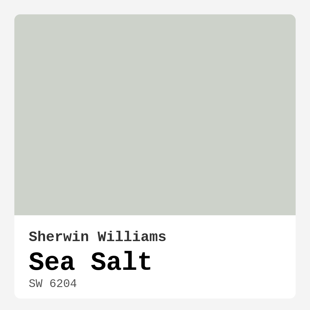
Color Preview & Key Details
| HEX Code | #CDD2CA |
| RGB | 205, 210, 202 |
| LRV | 64% |
| Undertone | Green |
| Finish Options | Eggshell, Matte, Satin |
Imagine walking into a room that instantly brings calmness to your mind and a smile to your face. You’re greeted by a soft, inviting hue reminiscent of the ocean’s gentle waves lapping against the shore. That color is Sea Salt by Sherwin Williams. It’s not just a paint color; it’s an experience, a feeling, a way to transform your space into a serene sanctuary.
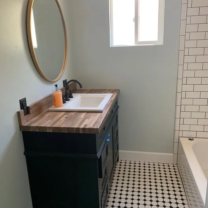
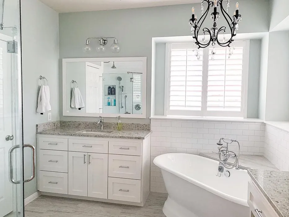
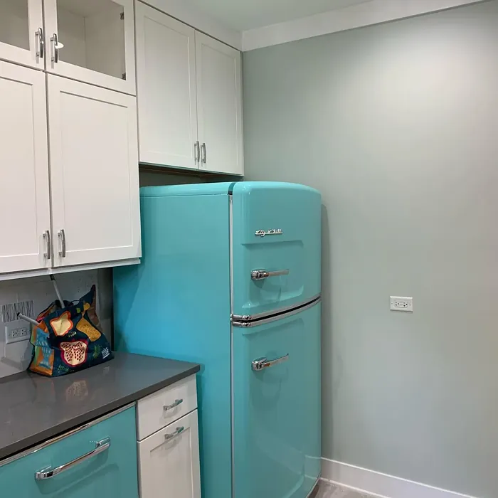
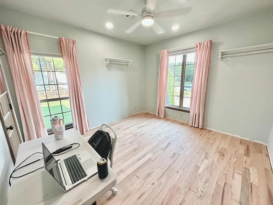
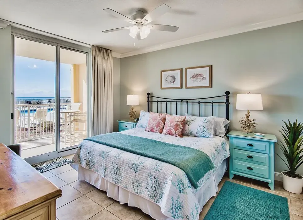
Sea Salt (SW 6204) is a stunning light green that embodies the essence of coastal tranquility. Its delicate hue can evoke memories of beach vacations and peaceful retreats, making it an ideal choice for anyone looking to create a relaxing atmosphere in their home. Whether you’re redesigning your living room, bedroom, bathroom, kitchen, or hallway, this versatile shade can bring a refreshing breeze into your space.
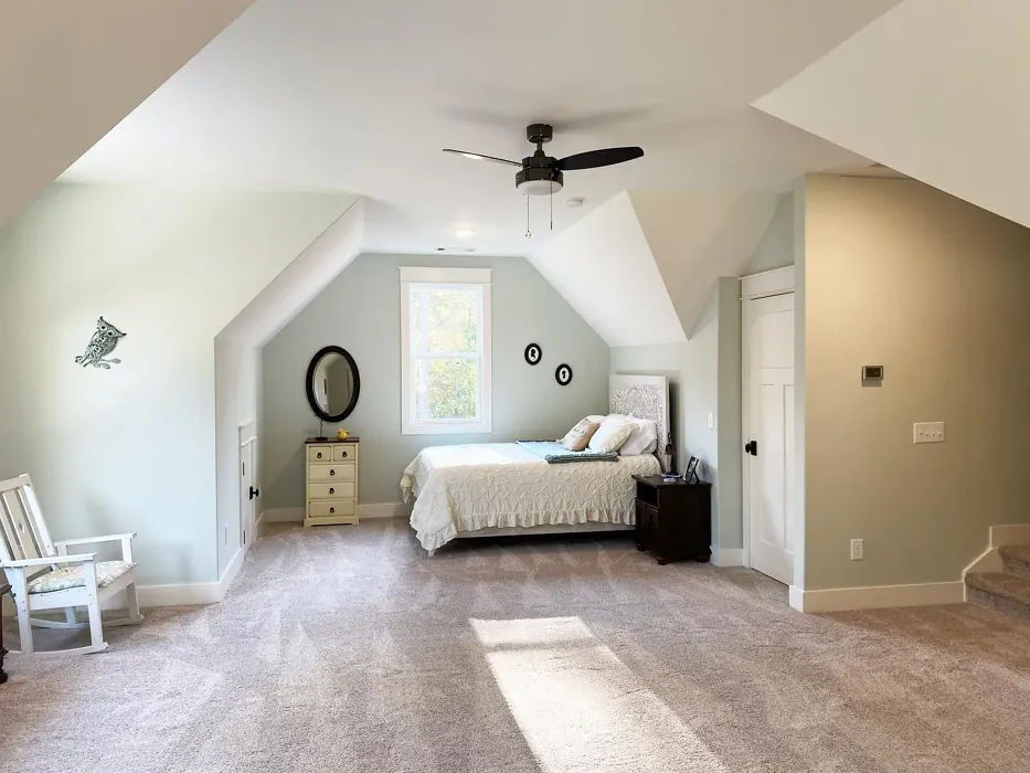
One of the most appealing aspects of Sea Salt is its adaptability. With a Light Reflectance Value (LRV) of 64%, it reflects a moderate amount of light, making it perfect for brightening up any room without feeling overwhelming. The color’s soft nature means it works well in various lighting conditions, allowing it to shift and change beautifully throughout the day. In natural light, Sea Salt appears fresh and airy, while under artificial lighting, it can take on a slightly warmer tone, making your space feel cozy and inviting.
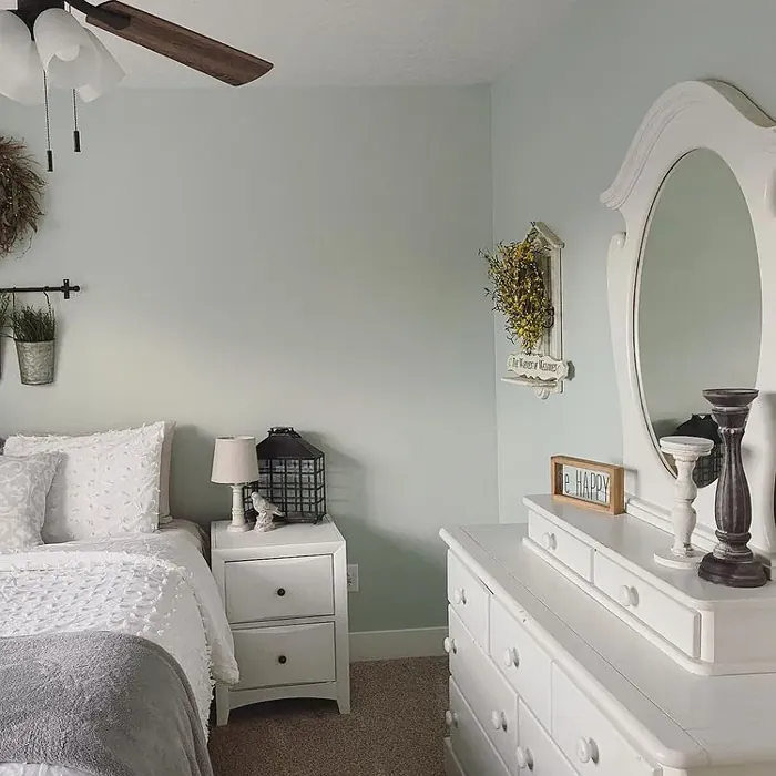
Now, let’s talk about the undertones. Sea Salt has a subtle green undertone that gives it depth and character. This is crucial when pairing it with other colors and materials in your home. For instance, if you’re considering using Sea Salt in a room with warm wooden tones or brass fixtures, you’ll find that it harmonizes beautifully, creating a balanced look. Conversely, placing it next to cooler shades can also yield stunning results. The key is to test the paint in your home, observing how it interacts with your existing furnishings and decor throughout different times of the day.
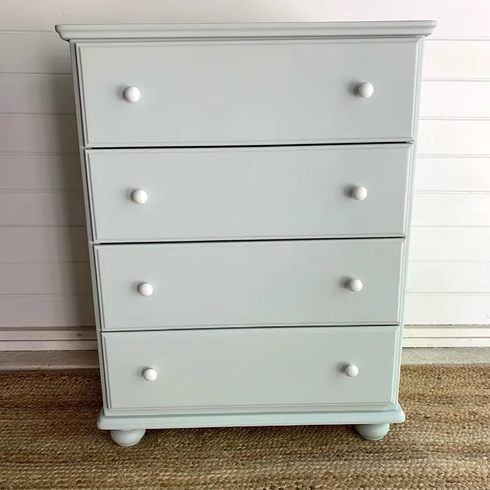
When it comes to application, Sea Salt is incredibly user-friendly. Its beginner-friendly formula means that even those new to DIY projects can achieve a professional-looking finish. The paint glides on smoothly with a roller and brushes out easily, ensuring a uniform application. With good coverage, usually requiring only one or two coats, you’ll find that it’s touch-up friendly as well. Plus, it’s highly washable, making it a practical choice for busy households or high-traffic areas like hallways and family rooms.
For those concerned about the environmental impact of their choices, you’ll be pleased to know that Sea Salt boasts a low VOC (volatile organic compounds) level. This means it’s safer for indoor air quality, making it an excellent option for families or anyone sensitive to strong odors. You can feel good about using it in your home, knowing you’re making a healthier choice.
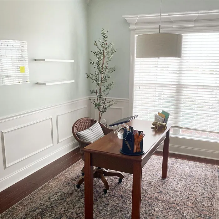
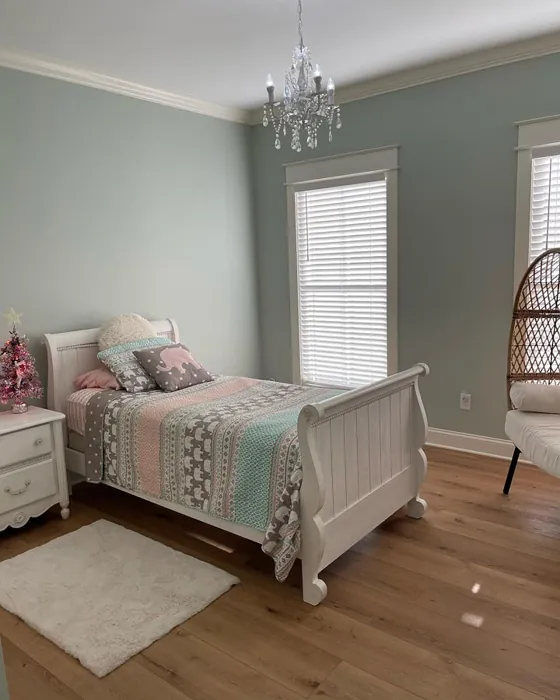
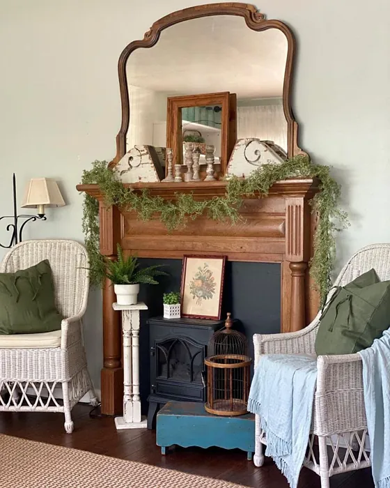
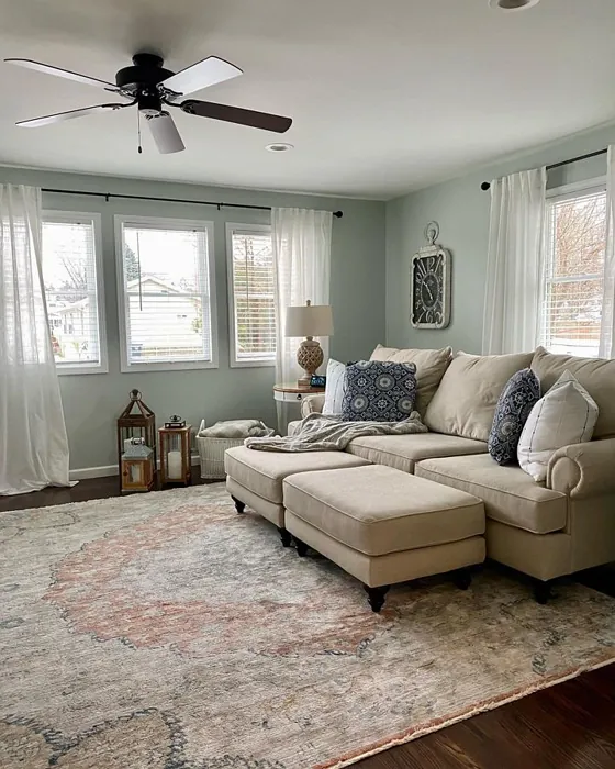
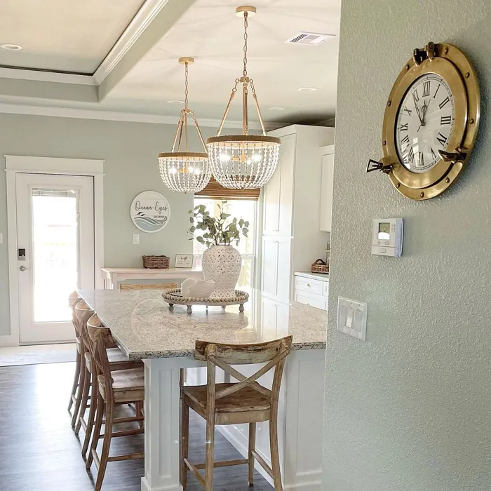
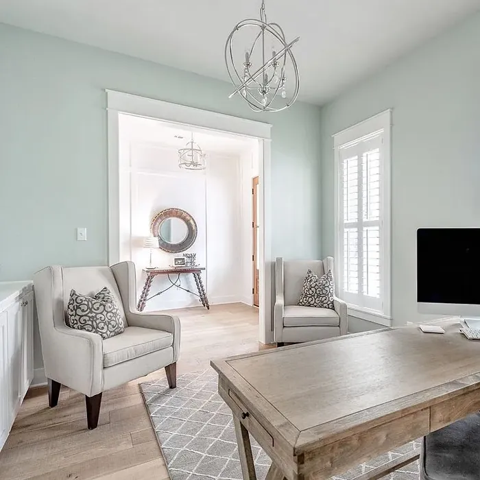
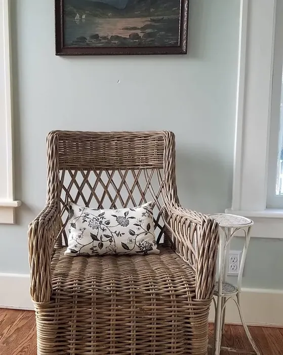
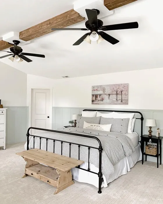
When thinking about decor styles, Sea Salt is incredibly versatile. It fits seamlessly into coastal, modern farmhouse, Scandinavian, traditional, and minimalist styles. This flexibility opens up a world of possibilities for your space. Imagine a cozy modern farmhouse kitchen accented with white cabinetry and brass fixtures, where Sea Salt creates a gentle backdrop, enhancing the rustic charm. Or picture a minimalist living room where the color adds a touch of warmth without overwhelming the simplicity of the design.
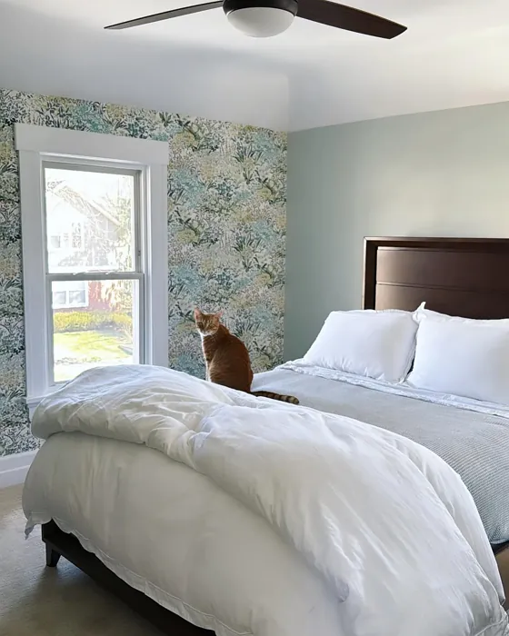
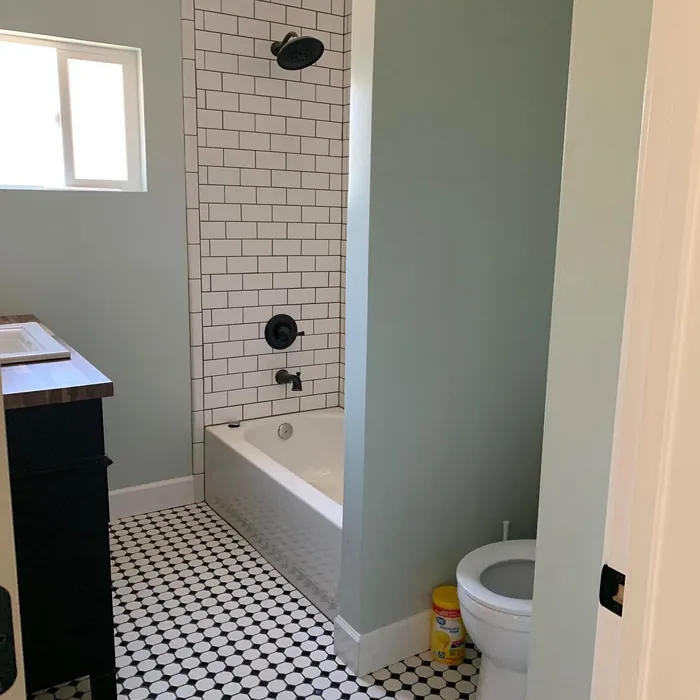
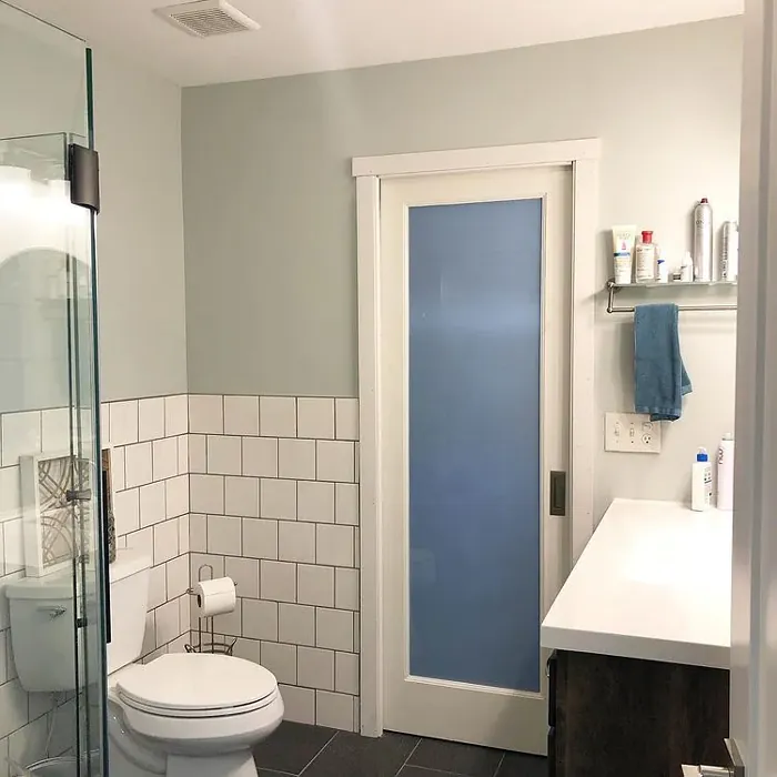
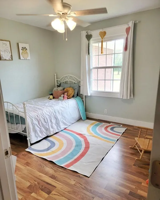
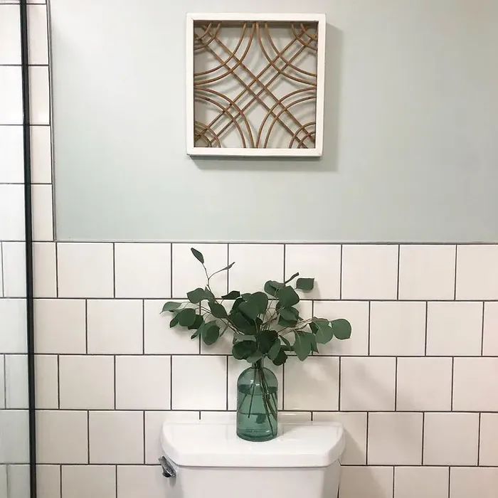
For room pairings, Sea Salt excels in spaces that benefit from a sense of calm. It can transform bedrooms into tranquil retreats, make bathrooms feel like personal spas, and bring freshness to kitchens and living areas. If you’re considering it for smaller rooms, it’s a fantastic choice. Its lighter hue can create an illusion of more space, making tight areas feel more open and inviting. Pair it with lighter furnishings or accents to enhance this effect even further.
While Sea Salt has many advantages, it’s essential to be mindful of its nuances. The color can appear differently in varied lighting, so it’s always a good idea to test it on your walls. Set up samples in the actual room where you plan to use it and observe how it changes throughout the day. This will help you understand how the color interacts with your specific lighting conditions and furnishings.
In terms of complementary colors, Sea Salt pairs beautifully with a range of shades. Consider using SW 6557 for a richer contrast, or SW 7141 for a soft, cohesive look. Whites like White Dove or Pure White can offer a crisp, clean transition that highlights Sea Salt’s soft green tones. For bolder looks, incorporating accents of purple can create a striking contrast that adds depth and dimension to your space.
If you’re looking to sell your home, Sea Salt is a classic favorite that appeals to a wide range of buyers. Its serene and inviting nature makes it a smart choice for staging. Potential buyers will appreciate the calm vibe it creates, making them feel instantly at home.
To summarize, Sea Salt by Sherwin Williams is a remarkable color option that blends serenity and versatility. From its beautiful, muted green hue to its low VOC composition, it checks all the boxes for a modern, stylish home. Whether you’re painting an entire room, creating an accent wall, or refreshing your furniture, this color has the ability to transform your space into a peaceful retreat.
So, are you ready to embrace the beauty of Sea Salt? Imagine stepping into a room that feels like a breath of fresh air, filled with tranquility and style. With a little creativity and thoughtful pairing, Sea Salt can be the perfect addition to your home, bringing a sense of calm and inviting beauty to your everyday life.
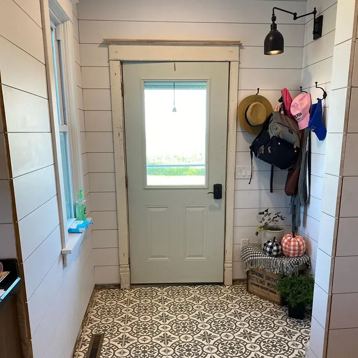
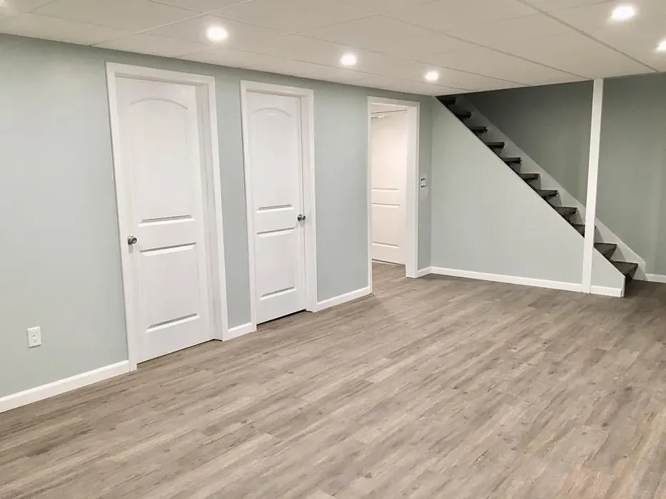
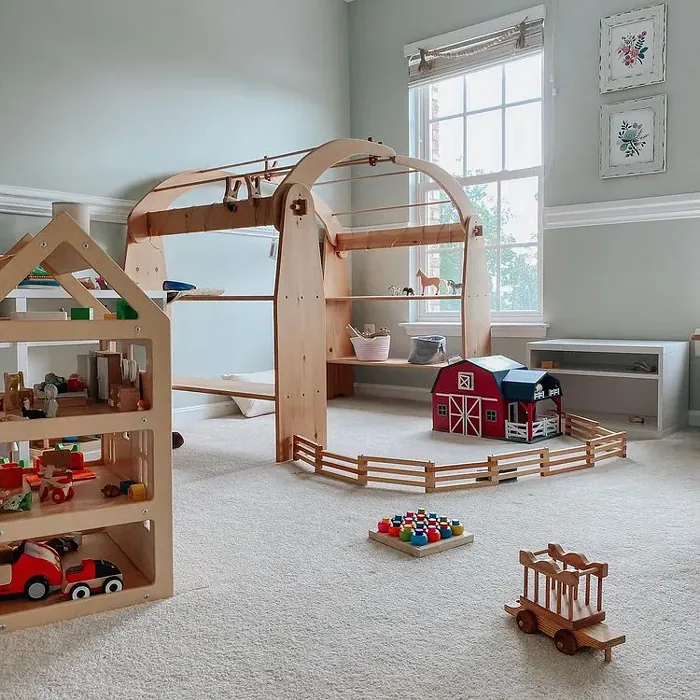
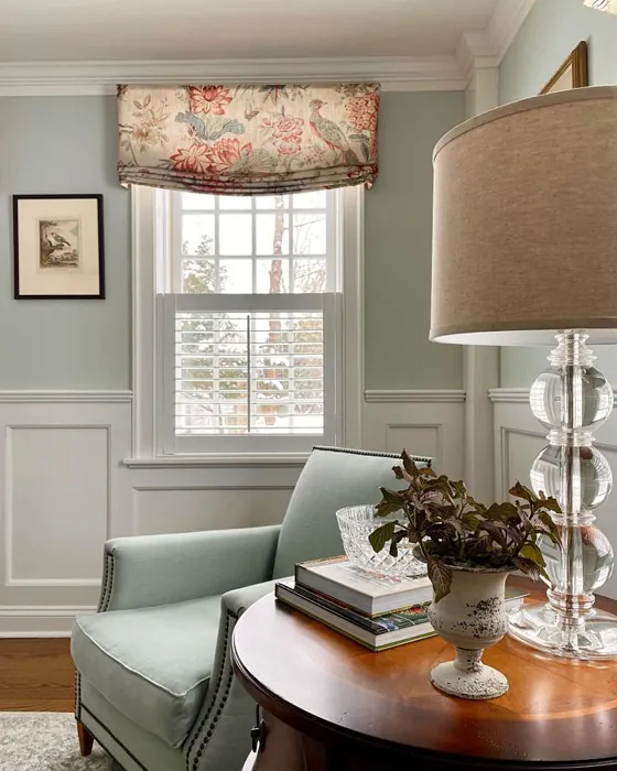
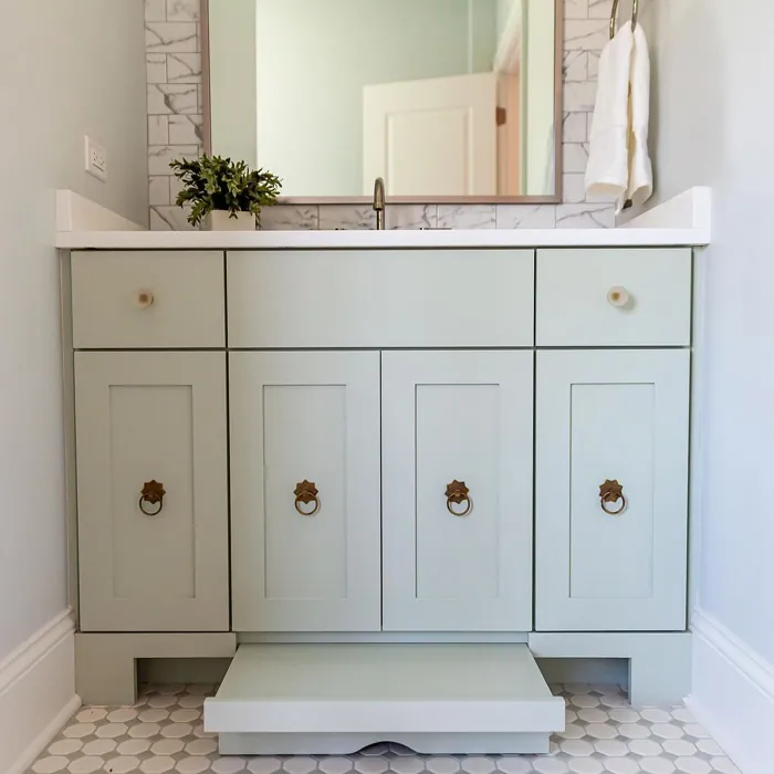
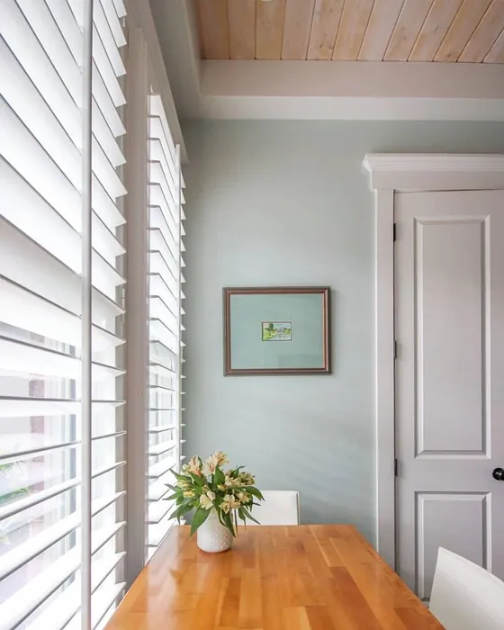
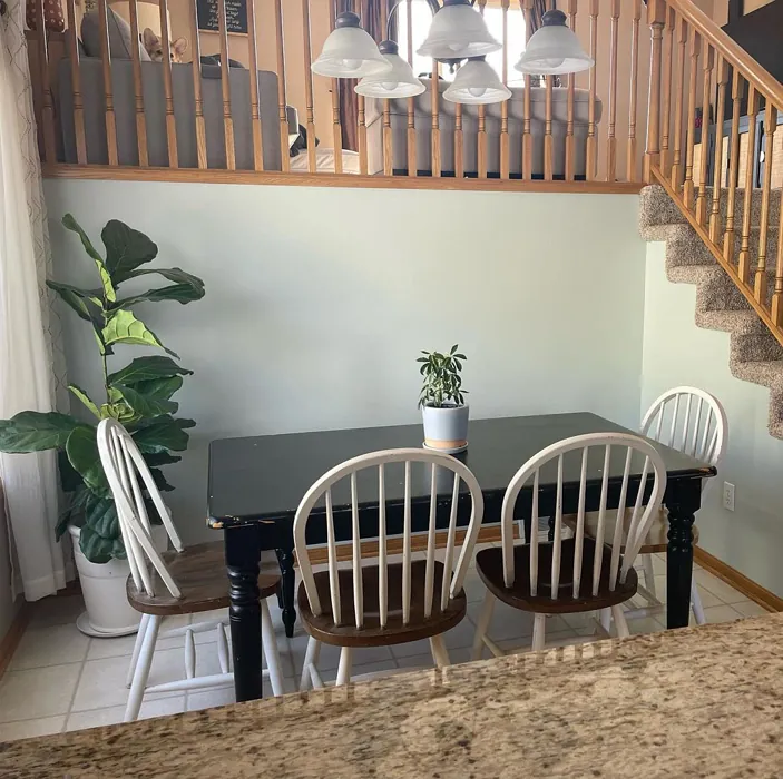
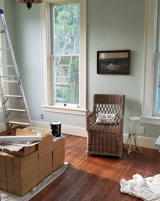
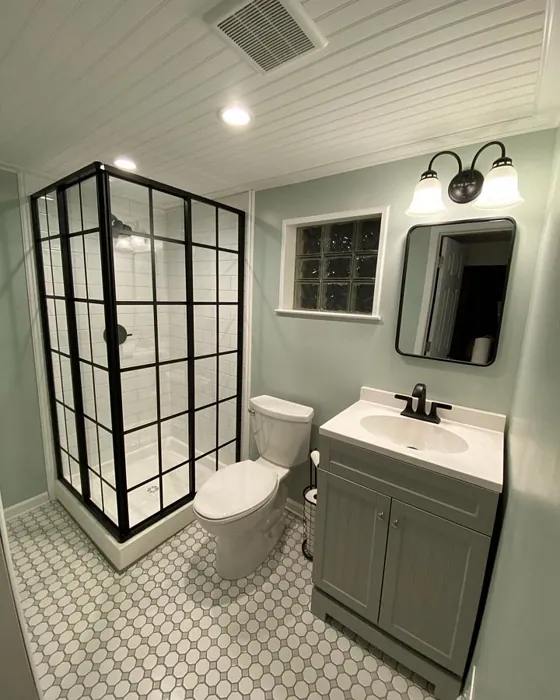
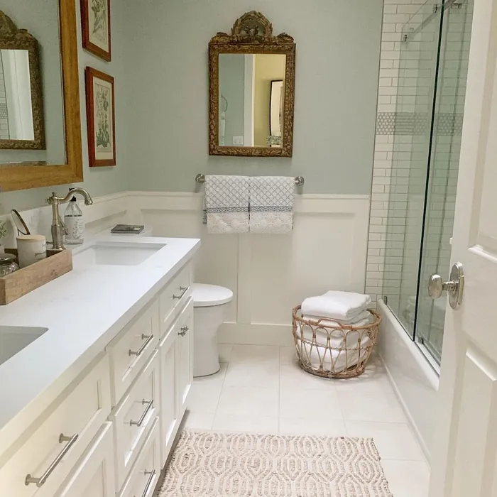
Real Room Photo of Sea Salt SW 6204


Undertones of Sea Salt ?
The undertones of Sea Salt are a key aspect of its character, leaning towards Green. These subtle underlying hues are what give the color its depth and complexity. For example, a gray with a blue undertone will feel cooler and more modern, while one with a brown undertone will feel warmer and more traditional. It’s essential to test this paint in your home and observe it next to your existing furniture, flooring, and decor to see how these undertones interact and reveal themselves throughout the day.
HEX value: #CDD2CA
RGB code: 205, 210, 202
Is Sea Salt Cool or Warm?
Sea Salt is predominantly a cool color, but its gentle undertones can make it feel more inviting than stark. This balance allows it to harmonize with a variety of other colors and materials, ensuring it feels at home in both modern and classic environments.
Understanding Color Properties and Interior Design Tips
Hue refers to a specific position on the color wheel, measured in degrees from 0 to 360. Each degree represents a different pure color:
- 0° represents red
- 120° represents green
- 240° represents blue
Saturation describes the intensity or purity of a color and is expressed as a percentage:
- At 0%, the color appears completely desaturated—essentially a shade of gray
- At 100%, the color is at its most vivid and vibrant
Lightness indicates how light or dark a color is, also expressed as a percentage:
- 0% lightness results in black
- 100% lightness results in white
Using Warm Colors in Interior Design
Warm hues—such as reds, oranges, yellows, warm beiges, and greiges—are excellent choices for creating inviting and energetic spaces. These colors are particularly well-suited for:
- Kitchens, living rooms, and bathrooms, where warmth enhances comfort and sociability
- Large rooms, where warm tones can help reduce the sense of emptiness and make the space feel more intimate
For example:
- Warm beige shades provide a cozy, inviting atmosphere, ideal for living rooms, bedrooms, and hallways.
- Warm greige (a mix of beige and gray) offers the warmth of beige with the modern appeal of gray, making it a versatile backdrop for dining areas, bedrooms, and living spaces.
However, be mindful when using warm light tones in rooms with limited natural light. These shades may appear muted or even take on an unpleasant yellowish tint. To avoid a dull or flat appearance:
- Add depth by incorporating richer tones like deep greens, charcoal, or chocolate brown
- Use textured elements such as curtains, rugs, or cushions to bring dimension to the space
Pro Tip: Achieving Harmony with Warm and Cool Color Balance
To create a well-balanced and visually interesting interior, mix warm and cool tones strategically. This contrast adds depth and harmony to your design.
- If your walls feature warm hues, introduce cool-colored accents such as blue or green furniture, artwork, or accessories to create contrast.
- For a polished look, consider using a complementary color scheme, which pairs colors opposite each other on the color wheel (e.g., red with green, orange with blue).
This thoughtful mix not only enhances visual appeal but also creates a space that feels both dynamic and cohesive.
Light Temperature Affects on Sea Salt
Natural Light
Natural daylight changes in color temperature as the sun moves across the sky. At sunrise and sunset, the light tends to have a warm, golden tone with a color temperature around 2000 Kelvin (K). As the day progresses and the sun rises higher, the light becomes cooler and more neutral. Around midday, especially when the sky is clear, natural light typically reaches its peak brightness and shifts to a cooler tone, ranging from 5500 to 6500 Kelvin. This midday light is close to what we perceive as pure white or daylight-balanced light.
These shifts in natural light can significantly influence how colors appear in a space, which is why designers often consider both the time of day and the orientation of windows when planning interior color schemes.
Artificial Light
When choosing artificial lighting, pay close attention to the color temperature, measured in Kelvin (K). This determines how warm or cool the light will appear. Lower temperatures, around 2700K, give off a warm, yellow glow often used in living rooms or bedrooms. Higher temperatures, above 5000K, create a cool, bluish light similar to daylight, commonly used in kitchens, offices, or task areas.
Use the slider to see how lighting temperature can affect the appearance of a surface or color throughout a space.


4800K
LRV of Sea Salt
The Light Reflectance Value (LRV) of Sea Salt is 64%, which places it in the Medium category. This means it Reflects a moderate amount of light. Understanding a paint’s LRV is crucial for predicting how it will look in your space. A higher LRV indicates a lighter color that reflects more light, making rooms feel larger and brighter. A lower LRV signifies a darker color that absorbs more light, creating a cozier, more intimate atmosphere. Always consider the natural and artificial lighting in your room when selecting a paint color based on its LRV.
Detailed Review of Sea Salt
Additional Paint Characteristics
Ideal Rooms
Bathroom, Bedroom, Hallway, Kitchen, Living Room
Decor Styles
Coastal, Minimalist, Modern Farmhouse, Scandinavian, Traditional
Coverage
Good (1–2 Coats), Touch-Up Friendly
Ease of Application
Beginner Friendly, Brush Smooth, Fast-Drying, Roller-Ready
Washability
Highly Washable, Washable
VOC Level
Low VOC, Ultra Low VOC
Best Use
Accent Wall, Furniture, Interior Walls, Trim
Room Suitability
Bathroom, Bedroom, Hallway, Kitchen, Living Room
Tone Tag
Airy, Balanced, Cool, Muted
Finish Type
Eggshell, Satin
Paint Performance
Easy Touch-Up, High Coverage, Low Odor, Quick Drying
Use Cases
Best for Modern Farmhouse, Best for Rentals, Best for Selling Your Home, Classic Favorite
Mood
Airy, Calm, Inviting, Restful
Trim Pairing
Complements Brass Fixtures, Matches Pure White, Pairs with White Dove
When it comes to versatility, Sea Salt stands out. Its muted green hue seamlessly blends with both warm and cool palettes, making it suitable for various decor styles from coastal to traditional. The color works remarkably well in spaces that require a touch of calmness, such as bedrooms and bathrooms, while also adding a fresh element to living rooms and kitchens. Notably, the paint’s performance is commendable; it offers good coverage, allowing for a smooth application with just one or two coats. Plus, its ability to adapt under different lighting makes it a reliable choice for those looking to refresh their interiors. This color can truly transform a space.
Pros & Cons of SW 6204 Sea Salt
Pros
Cons
Colors that go with Sherwin Williams Sea Salt
FAQ on SW 6204 Sea Salt
Can Sea Salt be used in small spaces?
Absolutely! Sea Salt is a fantastic choice for small spaces. Its light reflectance value helps to create an illusion of more space, making rooms feel airy and open. Pair it with lighter furnishings or accents to enhance this effect further.
How does Sea Salt perform in high-traffic areas?
Sea Salt holds up well in high-traffic areas due to its washable finish. It’s easy to clean, which makes it suitable for hallways or family rooms. However, for areas that require extra durability, consider adding a protective topcoat for added resilience.
Comparisons Sea Salt with other colors
Sea Salt SW 6204 vs Liveable Green SW 6176
| Attribute | Sea Salt SW 6204 | Liveable Green SW 6176 |
|---|---|---|
| Color Name | Sea Salt SW 6204 | Liveable Green SW 6176 |
| Color | ||
| Hue | Green | Green |
| Brightness | Light | Light |
| RGB | 205, 210, 202 | 206, 206, 189 |
| LRV | 64% | 30% |
| Finish Type | Eggshell, Satin | Eggshell, Matte, Satin |
| Finish Options | Eggshell, Matte, Satin | Eggshell, Matte, Satin |
| Ideal Rooms | Bathroom, Bedroom, Hallway, Kitchen, Living Room | Bedroom, Home Office, Kitchen, Living Room, Nursery |
| Decor Styles | Coastal, Minimalist, Modern Farmhouse, Scandinavian, Traditional | Contemporary, Modern Farmhouse, Rustic, Scandi |
| Coverage | Good (1–2 Coats), Touch-Up Friendly | Good (1–2 Coats), Touch-Up Friendly |
| Ease of Application | Beginner Friendly, Brush Smooth, Fast-Drying, Roller-Ready | Beginner Friendly, Brush Smooth, Roller-Ready |
| Washability | Highly Washable, Washable | Highly Washable, Washable |
| Room Suitability | Bathroom, Bedroom, Hallway, Kitchen, Living Room | Bedroom, Home Office, Living Room, Nursery |
| Tone | Airy, Balanced, Cool, Muted | Balanced, Earthy, Muted |
| Paint Performance | Easy Touch-Up, High Coverage, Low Odor, Quick Drying | Easy Touch-Up, High Coverage, Low Odor |
Sea Salt SW 6204 vs Rainwashed SW 6211
| Attribute | Sea Salt SW 6204 | Rainwashed SW 6211 |
|---|---|---|
| Color Name | Sea Salt SW 6204 | Rainwashed SW 6211 |
| Color | ||
| Hue | Green | Green |
| Brightness | Light | Light |
| RGB | 205, 210, 202 | 194, 205, 197 |
| LRV | 64% | 60% |
| Finish Type | Eggshell, Satin | Eggshell, Matte, Satin |
| Finish Options | Eggshell, Matte, Satin | Eggshell, Matte, Satin |
| Ideal Rooms | Bathroom, Bedroom, Hallway, Kitchen, Living Room | Bathroom, Bedroom, Home Office, Living Room, Nursery |
| Decor Styles | Coastal, Minimalist, Modern Farmhouse, Scandinavian, Traditional | Coastal, Farmhouse, Minimalist, Modern, Transitional |
| Coverage | Good (1–2 Coats), Touch-Up Friendly | Good (1–2 Coats), Touch-Up Friendly |
| Ease of Application | Beginner Friendly, Brush Smooth, Fast-Drying, Roller-Ready | Beginner Friendly, Brush Smooth, Fast-Drying, Roller-Ready |
| Washability | Highly Washable, Washable | Washable, Wipeable |
| Room Suitability | Bathroom, Bedroom, Hallway, Kitchen, Living Room | Bathroom, Bedroom, Home Office, Living Room, Nursery |
| Tone | Airy, Balanced, Cool, Muted | Balanced, Cool, Muted |
| Paint Performance | Easy Touch-Up, High Coverage, Low Odor, Quick Drying | Easy Touch-Up, High Coverage, Low Odor |
Sea Salt SW 6204 vs Filmy Green SW 6190
| Attribute | Sea Salt SW 6204 | Filmy Green SW 6190 |
|---|---|---|
| Color Name | Sea Salt SW 6204 | Filmy Green SW 6190 |
| Color | ||
| Hue | Green | Green |
| Brightness | Light | Light |
| RGB | 205, 210, 202 | 209, 211, 199 |
| LRV | 64% | 50% |
| Finish Type | Eggshell, Satin | Eggshell, Matte, Satin |
| Finish Options | Eggshell, Matte, Satin | Eggshell, Matte, Satin |
| Ideal Rooms | Bathroom, Bedroom, Hallway, Kitchen, Living Room | Bedroom, Home Office, Living Room, Nursery |
| Decor Styles | Coastal, Minimalist, Modern Farmhouse, Scandinavian, Traditional | Bohemian, Minimalist, Modern Farmhouse, Scandinavian |
| Coverage | Good (1–2 Coats), Touch-Up Friendly | Good (1–2 Coats) |
| Ease of Application | Beginner Friendly, Brush Smooth, Fast-Drying, Roller-Ready | Beginner Friendly, Brush Smooth, Roller-Ready |
| Washability | Highly Washable, Washable | Washable, Wipeable |
| Room Suitability | Bathroom, Bedroom, Hallway, Kitchen, Living Room | Bedroom, Home Office, Living Room, Nursery |
| Tone | Airy, Balanced, Cool, Muted | Calm, Earthy, Muted |
| Paint Performance | Easy Touch-Up, High Coverage, Low Odor, Quick Drying | Easy Touch-Up, Low Odor, Quick Drying |
Sea Salt SW 6204 vs Slow Green SW 6456
| Attribute | Sea Salt SW 6204 | Slow Green SW 6456 |
|---|---|---|
| Color Name | Sea Salt SW 6204 | Slow Green SW 6456 |
| Color | ||
| Hue | Green | Green |
| Brightness | Light | Light |
| RGB | 205, 210, 202 | 198, 213, 201 |
| LRV | 64% | 48% |
| Finish Type | Eggshell, Satin | Eggshell, Matte, Satin |
| Finish Options | Eggshell, Matte, Satin | Eggshell, Matte, Satin |
| Ideal Rooms | Bathroom, Bedroom, Hallway, Kitchen, Living Room | Bedroom, Dining Room, Home Office, Living Room, Nursery |
| Decor Styles | Coastal, Minimalist, Modern Farmhouse, Scandinavian, Traditional | Coastal, Farmhouse, Modern, Rustic, Scandinavian |
| Coverage | Good (1–2 Coats), Touch-Up Friendly | Good (1–2 Coats), Touch-Up Friendly |
| Ease of Application | Beginner Friendly, Brush Smooth, Fast-Drying, Roller-Ready | Beginner Friendly, Brush Smooth, Roller-Ready |
| Washability | Highly Washable, Washable | Highly Washable, Washable |
| Room Suitability | Bathroom, Bedroom, Hallway, Kitchen, Living Room | Bedroom, Dining Room, Entryway, Home Office, Living Room, Nursery |
| Tone | Airy, Balanced, Cool, Muted | Balanced, Earthy, Muted |
| Paint Performance | Easy Touch-Up, High Coverage, Low Odor, Quick Drying | Easy Touch-Up, Fade Resistant, Low Odor |
Sea Salt SW 6204 vs Acanthus SW 0029
| Attribute | Sea Salt SW 6204 | Acanthus SW 0029 |
|---|---|---|
| Color Name | Sea Salt SW 6204 | Acanthus SW 0029 |
| Color | ||
| Hue | Green | Green |
| Brightness | Light | Light |
| RGB | 205, 210, 202 | 205, 205, 180 |
| LRV | 64% | 10% |
| Finish Type | Eggshell, Satin | Eggshell, Matte, Satin |
| Finish Options | Eggshell, Matte, Satin | Eggshell, Matte, Satin |
| Ideal Rooms | Bathroom, Bedroom, Hallway, Kitchen, Living Room | Bedroom, Dining Room, Home Office, Kitchen, Living Room |
| Decor Styles | Coastal, Minimalist, Modern Farmhouse, Scandinavian, Traditional | Eclectic, Farmhouse, Modern, Traditional |
| Coverage | Good (1–2 Coats), Touch-Up Friendly | Good (1–2 Coats) |
| Ease of Application | Beginner Friendly, Brush Smooth, Fast-Drying, Roller-Ready | Beginner Friendly, Brush Smooth, Fast-Drying, Roller-Ready |
| Washability | Highly Washable, Washable | Highly Washable, Stain Resistant, Washable |
| Room Suitability | Bathroom, Bedroom, Hallway, Kitchen, Living Room | Bedroom, Dining Room, Home Office, Living Room |
| Tone | Airy, Balanced, Cool, Muted | Balanced, Earthy, Muted |
| Paint Performance | Easy Touch-Up, High Coverage, Low Odor, Quick Drying | Easy Touch-Up, Low Odor, Quick Drying, Scuff Resistant |
Sea Salt SW 6204 vs Topiary Tint SW 6449
| Attribute | Sea Salt SW 6204 | Topiary Tint SW 6449 |
|---|---|---|
| Color Name | Sea Salt SW 6204 | Topiary Tint SW 6449 |
| Color | ||
| Hue | Green | Green |
| Brightness | Light | Light |
| RGB | 205, 210, 202 | 200, 216, 196 |
| LRV | 64% | 30% |
| Finish Type | Eggshell, Satin | Eggshell, Matte, Satin |
| Finish Options | Eggshell, Matte, Satin | Eggshell, Matte, Satin |
| Ideal Rooms | Bathroom, Bedroom, Hallway, Kitchen, Living Room | Bathroom, Bedroom, Dining Room, Home Office, Kitchen, Living Room |
| Decor Styles | Coastal, Minimalist, Modern Farmhouse, Scandinavian, Traditional | Bohemian, Coastal, Eclectic, Modern Farmhouse, Transitional |
| Coverage | Good (1–2 Coats), Touch-Up Friendly | Good (1–2 Coats), Touch-Up Friendly |
| Ease of Application | Beginner Friendly, Brush Smooth, Fast-Drying, Roller-Ready | Beginner Friendly, Brush Smooth, Fast-Drying, Roller-Ready |
| Washability | Highly Washable, Washable | Scuff Resistant, Washable |
| Room Suitability | Bathroom, Bedroom, Hallway, Kitchen, Living Room | Bathroom, Bedroom, Dining Room, Kitchen, Living Room |
| Tone | Airy, Balanced, Cool, Muted | Balanced, Calm, Earthy, Muted |
| Paint Performance | Easy Touch-Up, High Coverage, Low Odor, Quick Drying | Easy Touch-Up, Low Odor, Quick Drying, Stain Resistant |
Sea Salt SW 6204 vs Waterscape SW 6470
| Attribute | Sea Salt SW 6204 | Waterscape SW 6470 |
|---|---|---|
| Color Name | Sea Salt SW 6204 | Waterscape SW 6470 |
| Color | ||
| Hue | Green | Green |
| Brightness | Light | Light |
| RGB | 205, 210, 202 | 191, 210, 201 |
| LRV | 64% | 50% |
| Finish Type | Eggshell, Satin | Eggshell, Matte |
| Finish Options | Eggshell, Matte, Satin | Eggshell, Matte, Satin |
| Ideal Rooms | Bathroom, Bedroom, Hallway, Kitchen, Living Room | Bathroom, Bedroom, Home Office, Kitchen, Living Room |
| Decor Styles | Coastal, Minimalist, Modern Farmhouse, Scandinavian, Traditional | Coastal, Minimalist, Modern, Scandinavian |
| Coverage | Good (1–2 Coats), Touch-Up Friendly | Good (1–2 Coats) |
| Ease of Application | Beginner Friendly, Brush Smooth, Fast-Drying, Roller-Ready | Beginner Friendly, Brush Smooth, Roller-Ready |
| Washability | Highly Washable, Washable | Highly Washable, Washable |
| Room Suitability | Bathroom, Bedroom, Hallway, Kitchen, Living Room | Bathroom, Bedroom, Home Office, Living Room |
| Tone | Airy, Balanced, Cool, Muted | Airy, Cool, Muted |
| Paint Performance | Easy Touch-Up, High Coverage, Low Odor, Quick Drying | Easy Touch-Up, Low Odor, Quick Drying |
Sea Salt SW 6204 vs Bonsai Tint SW 6436
| Attribute | Sea Salt SW 6204 | Bonsai Tint SW 6436 |
|---|---|---|
| Color Name | Sea Salt SW 6204 | Bonsai Tint SW 6436 |
| Color | ||
| Hue | Green | Green |
| Brightness | Light | Light |
| RGB | 205, 210, 202 | 197, 209, 178 |
| LRV | 64% | 64% |
| Finish Type | Eggshell, Satin | Eggshell, Matte |
| Finish Options | Eggshell, Matte, Satin | Eggshell, Matte, Satin |
| Ideal Rooms | Bathroom, Bedroom, Hallway, Kitchen, Living Room | Bedroom, Home Office, Living Room, Nursery |
| Decor Styles | Coastal, Minimalist, Modern Farmhouse, Scandinavian, Traditional | Bohemian, Minimalist, Modern, Scandinavian |
| Coverage | Good (1–2 Coats), Touch-Up Friendly | Good (1–2 Coats) |
| Ease of Application | Beginner Friendly, Brush Smooth, Fast-Drying, Roller-Ready | Beginner Friendly, Brush Smooth, Roller-Ready |
| Washability | Highly Washable, Washable | Washable, Wipeable |
| Room Suitability | Bathroom, Bedroom, Hallway, Kitchen, Living Room | Bedroom, Home Office, Living Room, Nursery |
| Tone | Airy, Balanced, Cool, Muted | Calm, Earthy, Muted |
| Paint Performance | Easy Touch-Up, High Coverage, Low Odor, Quick Drying | Easy Touch-Up, Fade Resistant, Low Odor |
Sea Salt SW 6204 vs Gratifying Green SW 6435
| Attribute | Sea Salt SW 6204 | Gratifying Green SW 6435 |
|---|---|---|
| Color Name | Sea Salt SW 6204 | Gratifying Green SW 6435 |
| Color | ||
| Hue | Green | Green |
| Brightness | Light | Light |
| RGB | 205, 210, 202 | 218, 226, 205 |
| LRV | 64% | 30% |
| Finish Type | Eggshell, Satin | Eggshell, Matte, Satin |
| Finish Options | Eggshell, Matte, Satin | Eggshell, Matte, Satin |
| Ideal Rooms | Bathroom, Bedroom, Hallway, Kitchen, Living Room | Bedroom, Dining Room, Home Office, Living Room, Nursery |
| Decor Styles | Coastal, Minimalist, Modern Farmhouse, Scandinavian, Traditional | Bohemian, Coastal, Minimalist, Modern Farmhouse |
| Coverage | Good (1–2 Coats), Touch-Up Friendly | Good (1–2 Coats), Touch-Up Friendly |
| Ease of Application | Beginner Friendly, Brush Smooth, Fast-Drying, Roller-Ready | Beginner Friendly, Brush Smooth, Roller-Ready |
| Washability | Highly Washable, Washable | Washable, Wipeable |
| Room Suitability | Bathroom, Bedroom, Hallway, Kitchen, Living Room | Bedroom, Home Office, Living Room, Nursery |
| Tone | Airy, Balanced, Cool, Muted | Earthy, Muted, Warm |
| Paint Performance | Easy Touch-Up, High Coverage, Low Odor, Quick Drying | Easy Touch-Up, Low Odor, Quick Drying |
Sea Salt SW 6204 vs Fleeting Green SW 6455
| Attribute | Sea Salt SW 6204 | Fleeting Green SW 6455 |
|---|---|---|
| Color Name | Sea Salt SW 6204 | Fleeting Green SW 6455 |
| Color | ||
| Hue | Green | Green |
| Brightness | Light | Light |
| RGB | 205, 210, 202 | 216, 226, 216 |
| LRV | 64% | 64% |
| Finish Type | Eggshell, Satin | Eggshell, Matte |
| Finish Options | Eggshell, Matte, Satin | Eggshell, Matte, Satin |
| Ideal Rooms | Bathroom, Bedroom, Hallway, Kitchen, Living Room | Bathroom, Bedroom, Home Office, Living Room, Nursery |
| Decor Styles | Coastal, Minimalist, Modern Farmhouse, Scandinavian, Traditional | Coastal, Farmhouse, Minimalist, Modern, Scandinavian |
| Coverage | Good (1–2 Coats), Touch-Up Friendly | Good (1–2 Coats), Touch-Up Friendly |
| Ease of Application | Beginner Friendly, Brush Smooth, Fast-Drying, Roller-Ready | Beginner Friendly, Brush Smooth, Roller-Ready |
| Washability | Highly Washable, Washable | Washable, Wipeable |
| Room Suitability | Bathroom, Bedroom, Hallway, Kitchen, Living Room | Bathroom, Bedroom, Home Office, Living Room, Nursery |
| Tone | Airy, Balanced, Cool, Muted | Airy, Balanced, Cool, Muted |
| Paint Performance | Easy Touch-Up, High Coverage, Low Odor, Quick Drying | Easy Touch-Up, Low Odor, Quick Drying |
Official Page of Sherwin Williams Sea Salt SW 6204