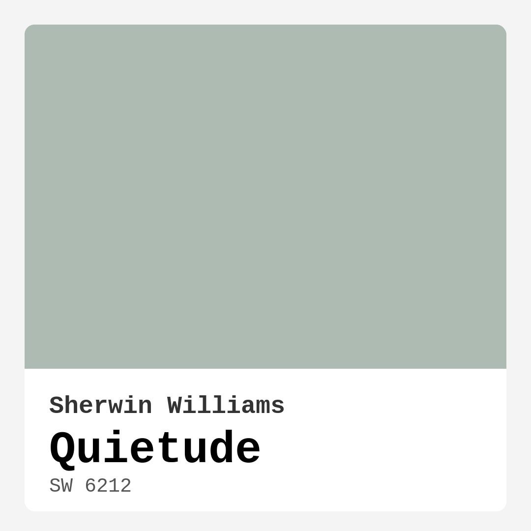
Color Preview & Key Details
| HEX Code | #ADBBB2 |
| RGB | 173, 187, 178 |
| LRV | 50% |
| Undertone | Green |
| Finish Options | Eggshell, Matte |
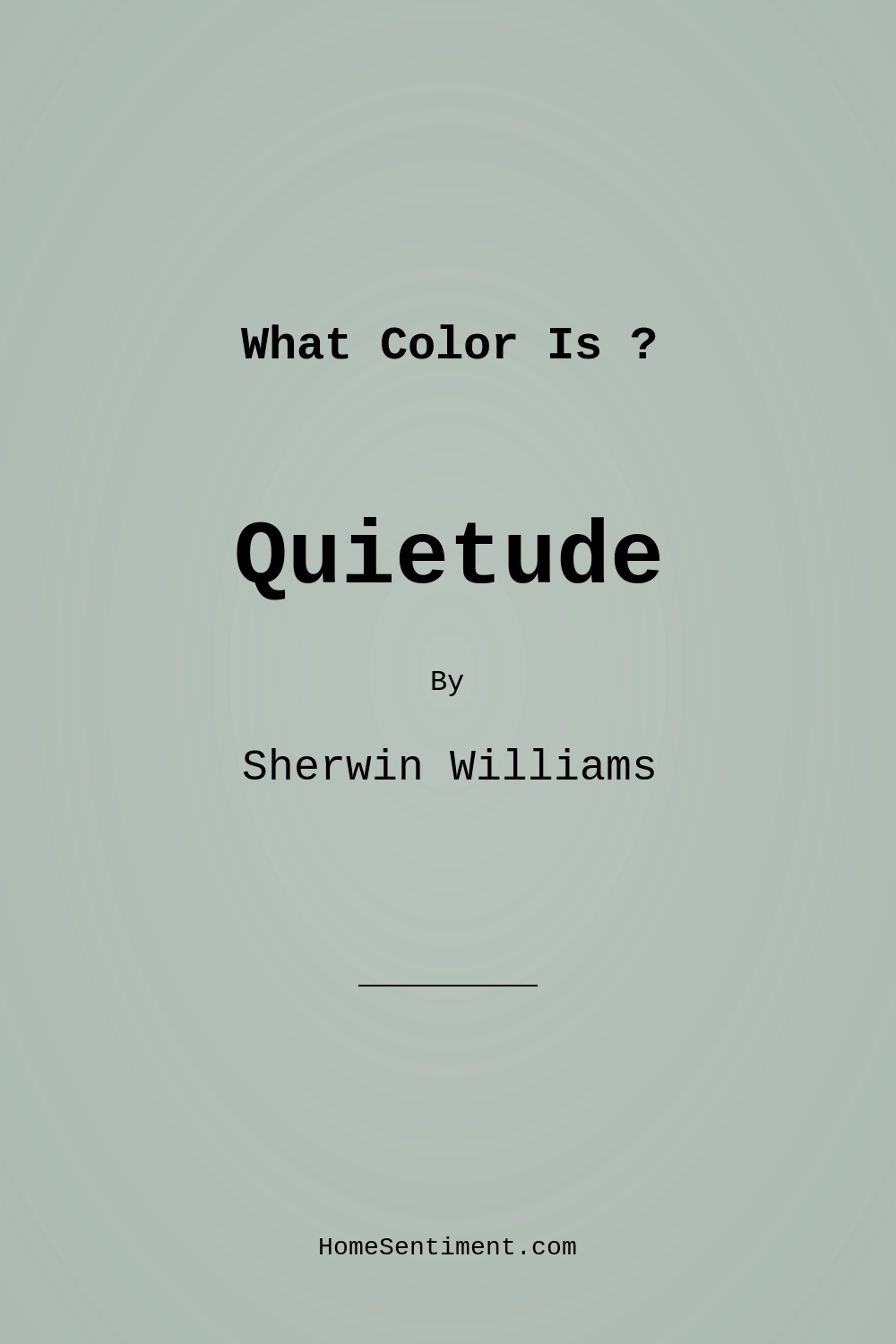
Imagine stepping into a space that instantly makes you feel at ease. Picture the walls wrapped in a soothing shade, enveloping you in a serene embrace. That’s the magic of Quietude by Sherwin Williams, a stunning paint color that invites tranquility into your home. It’s not just a color; it’s an experience, a mood, and a transformative element for your living space.
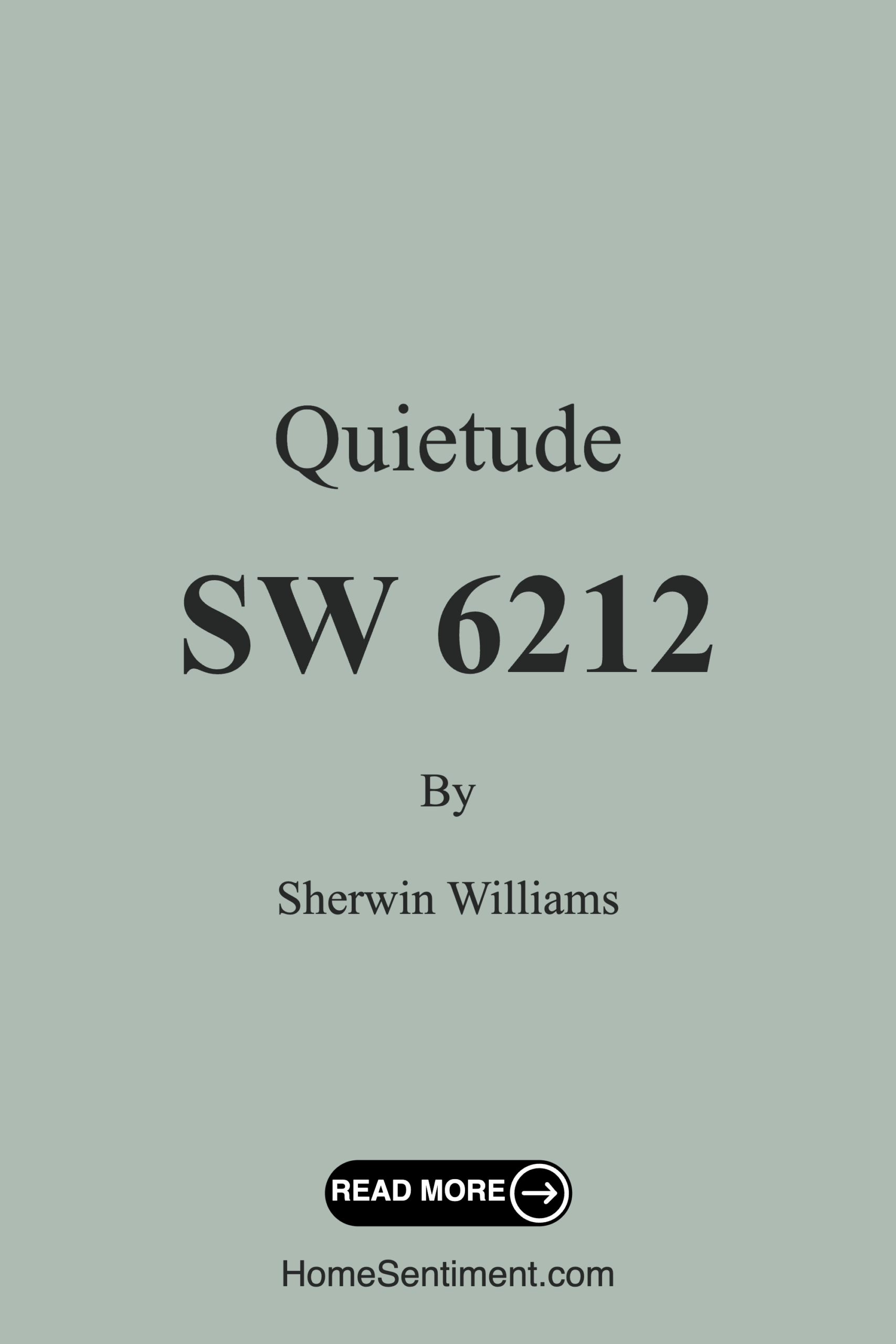
Quietude, with its soft, muted green-grey hue, is like a gentle sigh after a long day. Its official color code, SW 6212, reflects a beautiful balance of calm and sophistication. If you’re considering a fresh coat of paint or a complete room makeover, this color deserves a spot on your shortlist. Let’s dive deeper into what makes Quietude such an appealing choice for homeowners looking to create a peaceful sanctuary.
The first thing to understand about Quietude is its versatility. This muted green-grey can seamlessly blend with various decor styles, from modern and minimalist to coastal and farmhouse aesthetics. It’s a true chameleon, adapting to its surroundings while maintaining a sense of serenity. The gentle undertone of green adds warmth, while the grey infuses a contemporary edge. Together, they create an inviting backdrop, making it perfect for any room in your home.
Imagine walking into your living room, where Quietude covers the walls, instantly setting a calm tone. It’s not just about aesthetics; the color has a psychological effect too. With an LRV (Light Reflectance Value) of 50%, Quietude reflects a moderate amount of light, making spaces feel airy yet cozy. Whether it’s bright sunlight streaming through your windows or soft evening light, Quietude gracefully interacts with changing light conditions, subtly shifting from a soft green to a more pronounced grey.
Now, you might be wondering where this color shines the most. Quietude is ideally suited for spaces where relaxation is a priority. Think of it as a perfect backdrop in your bedroom, where peaceful sleep is essential. Picture it in your home office, creating a calm environment conducive to productivity. Even in a nursery, its soft hue can help foster a soothing atmosphere for your little one.
Application is another area where Quietude excels. It’s beginner-friendly, designed for ease of use whether you’re a DIY enthusiast or hiring a professional. The paint goes on smoothly, whether you’re using a roller or a brush, and it’s touch-up friendly. Plus, with a finish option of matte or eggshell, you can choose a look that aligns perfectly with your vision.
One of the perks of Quietude is its low VOC content. This means you’re not just beautifying your home but also ensuring healthier indoor air quality, a critical consideration for families. It’s a win-win situation when you can have a stunning space without compromising on health.
However, like any color, Quietude comes with its considerations. Depending on the lighting in your space, it may require multiple coats for full coverage. It’s wise to test a small area first, allowing you to see how the paint interacts with your existing furniture and decor. Colors can shift dramatically throughout the day, so observe it during different times to ensure it aligns with your expectations.
For those looking to complement Quietude, you’re in for a treat. It pairs beautifully with various shades, including soft whites and earthy tones. For a fresh and airy vibe, consider pairing it with White Dove, which accentuates the calmness of Quietude. If you’re feeling adventurous, contrasting it with deeper jewel tones can create a stunning focal point in your space. The possibilities are endless!
When it comes to smaller spaces, Quietude shines again. Its soft hue can make a room feel larger and more inviting, creating an illusion of space while still providing a cozy ambiance. Just be mindful of your lighting situation; its adaptability to natural light will play a significant role in how the color ultimately appears.
Now, let’s chat about practical usage. Quietude’s washability means you can wipe down surfaces without fear of damaging the finish. This quality makes it a wonderful choice for high-traffic areas, ensuring your walls can withstand everyday wear and tear. If you’re considering it for a busy hallway or a family room, choosing an eggshell finish will offer more durability while retaining that inviting look.
Feeling inspired yet? Quietude has that effect. It’s not merely a paint color; it’s a strategy for creating a restful, inviting home. Whether you’re looking to refresh a small nook or rethink an entire room, this color delivers a soft touch that beautifully complements both contemporary and traditional decor styles.
Ultimately, choosing Quietude means opting for a color that promotes relaxation and serenity. It’s about creating a space where you can unwind after a hectic day, a place that feels like your personal retreat. In a world filled with chaos, Quietude stands apart as a gentle reminder of calmness and tranquility.
So, when you’re ready to paint, take a step back and consider Quietude. It’s a hue that invites you to live a little slower and enjoy every moment. Whether you’re curling up with a book or gathering friends for a cozy evening, Quietude will be there, quietly enhancing every experience. After all, home is where the heart is, and with Quietude, your heart will feel right at home.
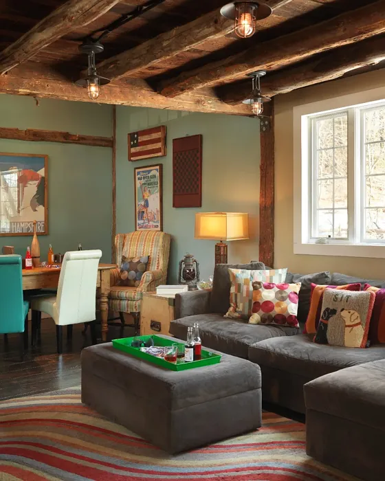
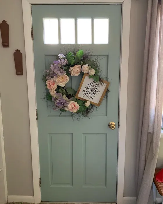
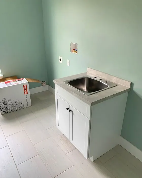
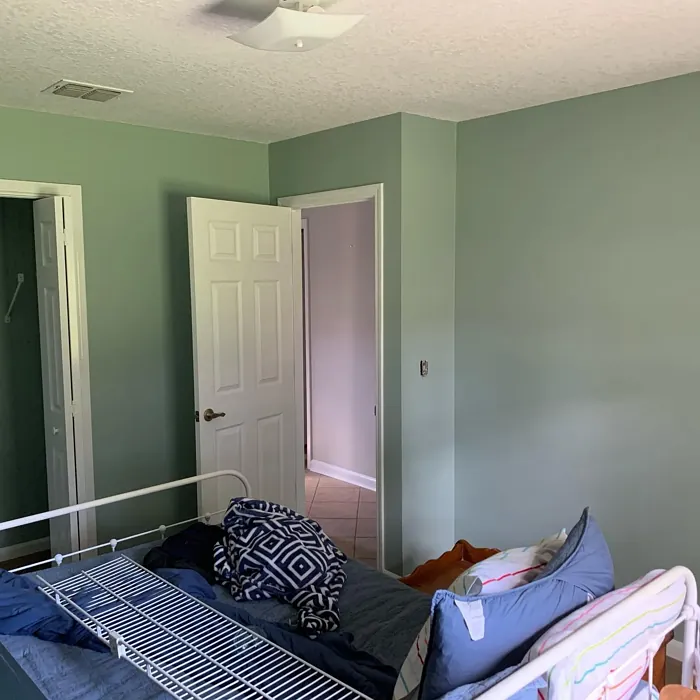
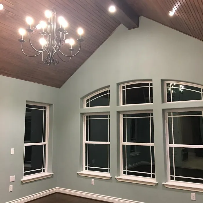
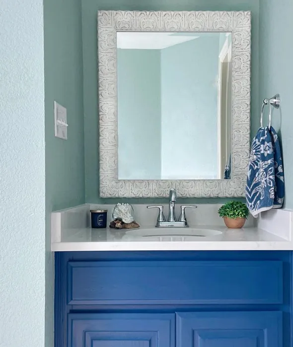
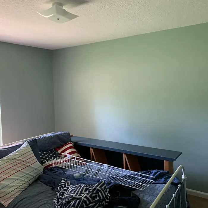
Real Room Photo of Quietude SW 6212
Undertones of Quietude ?
The undertones of Quietude are a key aspect of its character, leaning towards Green. These subtle underlying hues are what give the color its depth and complexity. For example, a gray with a blue undertone will feel cooler and more modern, while one with a brown undertone will feel warmer and more traditional. It’s essential to test this paint in your home and observe it next to your existing furniture, flooring, and decor to see how these undertones interact and reveal themselves throughout the day.
HEX value: #ADBBB2
RGB code: 173, 187, 178
Is Quietude Cool or Warm?
This color leans slightly cool with its grey-green base, giving it a refreshing quality that’s not too stark.
Understanding Color Properties and Interior Design Tips
Hue refers to a specific position on the color wheel, measured in degrees from 0 to 360. Each degree represents a different pure color:
- 0° represents red
- 120° represents green
- 240° represents blue
Saturation describes the intensity or purity of a color and is expressed as a percentage:
- At 0%, the color appears completely desaturated—essentially a shade of gray
- At 100%, the color is at its most vivid and vibrant
Lightness indicates how light or dark a color is, also expressed as a percentage:
- 0% lightness results in black
- 100% lightness results in white
Using Warm Colors in Interior Design
Warm hues—such as reds, oranges, yellows, warm beiges, and greiges—are excellent choices for creating inviting and energetic spaces. These colors are particularly well-suited for:
- Kitchens, living rooms, and bathrooms, where warmth enhances comfort and sociability
- Large rooms, where warm tones can help reduce the sense of emptiness and make the space feel more intimate
For example:
- Warm beige shades provide a cozy, inviting atmosphere, ideal for living rooms, bedrooms, and hallways.
- Warm greige (a mix of beige and gray) offers the warmth of beige with the modern appeal of gray, making it a versatile backdrop for dining areas, bedrooms, and living spaces.
However, be mindful when using warm light tones in rooms with limited natural light. These shades may appear muted or even take on an unpleasant yellowish tint. To avoid a dull or flat appearance:
- Add depth by incorporating richer tones like deep greens, charcoal, or chocolate brown
- Use textured elements such as curtains, rugs, or cushions to bring dimension to the space
Pro Tip: Achieving Harmony with Warm and Cool Color Balance
To create a well-balanced and visually interesting interior, mix warm and cool tones strategically. This contrast adds depth and harmony to your design.
- If your walls feature warm hues, introduce cool-colored accents such as blue or green furniture, artwork, or accessories to create contrast.
- For a polished look, consider using a complementary color scheme, which pairs colors opposite each other on the color wheel (e.g., red with green, orange with blue).
This thoughtful mix not only enhances visual appeal but also creates a space that feels both dynamic and cohesive.
Light Temperature Affects on Quietude
Natural Light
Natural daylight changes in color temperature as the sun moves across the sky. At sunrise and sunset, the light tends to have a warm, golden tone with a color temperature around 2000 Kelvin (K). As the day progresses and the sun rises higher, the light becomes cooler and more neutral. Around midday, especially when the sky is clear, natural light typically reaches its peak brightness and shifts to a cooler tone, ranging from 5500 to 6500 Kelvin. This midday light is close to what we perceive as pure white or daylight-balanced light.
These shifts in natural light can significantly influence how colors appear in a space, which is why designers often consider both the time of day and the orientation of windows when planning interior color schemes.
Artificial Light
When choosing artificial lighting, pay close attention to the color temperature, measured in Kelvin (K). This determines how warm or cool the light will appear. Lower temperatures, around 2700K, give off a warm, yellow glow often used in living rooms or bedrooms. Higher temperatures, above 5000K, create a cool, bluish light similar to daylight, commonly used in kitchens, offices, or task areas.
Use the slider to see how lighting temperature can affect the appearance of a surface or color throughout a space.


4800K
LRV of Quietude
The Light Reflectance Value (LRV) of Quietude is 50%, which places it in the Medium category. This means it Reflects a moderate amount of light. Understanding a paint’s LRV is crucial for predicting how it will look in your space. A higher LRV indicates a lighter color that reflects more light, making rooms feel larger and brighter. A lower LRV signifies a darker color that absorbs more light, creating a cozier, more intimate atmosphere. Always consider the natural and artificial lighting in your room when selecting a paint color based on its LRV.
Detailed Review of Quietude
Additional Paint Characteristics
Ideal Rooms
Bedroom, Entryway, Home Office, Living Room, Nursery
Decor Styles
Coastal, Farmhouse, Minimalist, Modern, Scandinavian
Coverage
Good (1–2 Coats), Touch-Up Friendly
Ease of Application
Beginner Friendly, Brush Smooth, Roller-Ready
Washability
Washable, Wipeable
VOC Level
Low VOC
Best Use
Accent Wall, Home Office, Interior Walls, Nursery
Room Suitability
Bedroom, Home Office, Living Room, Nursery
Tone Tag
Balanced, Calm, Earthy, Muted
Finish Type
Eggshell, Matte
Paint Performance
Easy Touch-Up, Fade Resistant, Low Odor
Use Cases
Best for Low Light Rooms, Best for Small Spaces, Designer Favorite
Mood
Calm, Inviting, Restful
Trim Pairing
Complements Cool Trim, Pairs with White Dove
Quietude stands out for its subtle sophistication. With a HEX code of #ADBBB2, it brings a unique blend of warmth and coolness, making it versatile for various settings. Whether you’re looking to refresh a small nook or an entire room, Quietude delivers a soft touch that complements both contemporary and traditional decor styles. The finish options of matte and eggshell allow for flexibility, depending on your desired look. It performs well in natural light, creating an airy atmosphere that feels both spacious and cozy. If you’re seeking a color that promotes relaxation, this paint is a fantastic choice.
Pros & Cons of SW 6212 Quietude
Pros
Cons
Colors that go with Sherwin Williams Quietude
FAQ on SW 6212 Quietude
Is Quietude suitable for small spaces?
Absolutely! Quietude’s soft hue can make small spaces feel larger and more inviting. Its calm color helps to open up areas while providing a cozy atmosphere. Just be mindful of lighting, as the color may shift slightly depending on the natural light available.
Can I use Quietude in a high-traffic area?
While Quietude is a beautiful choice for many rooms, for high-traffic areas, consider a finish that offers more durability, like eggshell. It can handle some wear and tear while still providing the soft, inviting look you want. Additionally, its washability makes it easier to maintain in busier spaces.
Comparisons Quietude with other colors
Quietude SW 6212 vs Acacia Haze SW 9132
| Attribute | Quietude SW 6212 | Acacia Haze SW 9132 |
|---|---|---|
| Color Name | Quietude SW 6212 | Acacia Haze SW 9132 |
| Color | ||
| Hue | Green | Green |
| Brightness | Medium | Medium |
| RGB | 173, 187, 178 | 150, 156, 146 |
| LRV | 50% | 30% |
| Finish Type | Eggshell, Matte | Eggshell, Satin |
| Finish Options | Eggshell, Matte | Eggshell, Matte, Satin |
| Ideal Rooms | Bedroom, Entryway, Home Office, Living Room, Nursery | Bedroom, Dining Room, Home Office, Living Room, Nursery |
| Decor Styles | Coastal, Farmhouse, Minimalist, Modern, Scandinavian | Bohemian, Coastal, Modern Farmhouse, Scandinavian |
| Coverage | Good (1–2 Coats), Touch-Up Friendly | Good (1–2 Coats), Touch-Up Friendly |
| Ease of Application | Beginner Friendly, Brush Smooth, Roller-Ready | Beginner Friendly, Brush Smooth, Roller-Ready |
| Washability | Washable, Wipeable | Washable, Wipeable |
| Room Suitability | Bedroom, Home Office, Living Room, Nursery | Bedroom, Home Office, Living Room, Nursery |
| Tone | Balanced, Calm, Earthy, Muted | Balanced, Earthy, Muted |
| Paint Performance | Easy Touch-Up, Fade Resistant, Low Odor | Easy Touch-Up, High Coverage, Low Odor |
Quietude SW 6212 vs Evergreen Fog SW 9130
| Attribute | Quietude SW 6212 | Evergreen Fog SW 9130 |
|---|---|---|
| Color Name | Quietude SW 6212 | Evergreen Fog SW 9130 |
| Color | ||
| Hue | Green | Green |
| Brightness | Medium | Medium |
| RGB | 173, 187, 178 | 149, 151, 138 |
| LRV | 50% | 30% |
| Finish Type | Eggshell, Matte | Eggshell, Matte, Satin |
| Finish Options | Eggshell, Matte | Eggshell, Matte, Satin |
| Ideal Rooms | Bedroom, Entryway, Home Office, Living Room, Nursery | Bedroom, Dining Room, Home Office, Living Room, Nursery |
| Decor Styles | Coastal, Farmhouse, Minimalist, Modern, Scandinavian | Coastal, Modern Farmhouse, Rustic, Scandinavian, Transitional |
| Coverage | Good (1–2 Coats), Touch-Up Friendly | Good (1–2 Coats), Touch-Up Friendly |
| Ease of Application | Beginner Friendly, Brush Smooth, Roller-Ready | Beginner Friendly, Brush Smooth, Roller-Ready |
| Washability | Washable, Wipeable | Scrubbable, Washable |
| Room Suitability | Bedroom, Home Office, Living Room, Nursery | Bedroom, Dining Room, Home Office, Living Room, Nursery |
| Tone | Balanced, Calm, Earthy, Muted | Balanced, Earthy, Muted |
| Paint Performance | Easy Touch-Up, Fade Resistant, Low Odor | Easy Touch-Up, Low Odor, Scuff Resistant |
Quietude SW 6212 vs Clary Sage SW 6178
| Attribute | Quietude SW 6212 | Clary Sage SW 6178 |
|---|---|---|
| Color Name | Quietude SW 6212 | Clary Sage SW 6178 |
| Color | ||
| Hue | Green | Green |
| Brightness | Medium | Medium |
| RGB | 173, 187, 178 | 172, 173, 151 |
| LRV | 50% | 24% |
| Finish Type | Eggshell, Matte | Eggshell, Matte |
| Finish Options | Eggshell, Matte | Eggshell, Matte, Satin |
| Ideal Rooms | Bedroom, Entryway, Home Office, Living Room, Nursery | Bathroom, Bedroom, Home Office, Kitchen, Living Room |
| Decor Styles | Coastal, Farmhouse, Minimalist, Modern, Scandinavian | Bohemian, Minimalist, Modern Farmhouse, Scandinavian, Traditional |
| Coverage | Good (1–2 Coats), Touch-Up Friendly | Good (1–2 Coats), Touch-Up Friendly |
| Ease of Application | Beginner Friendly, Brush Smooth, Roller-Ready | Beginner Friendly, Brush Smooth, Roller-Ready |
| Washability | Washable, Wipeable | Washable, Wipeable |
| Room Suitability | Bedroom, Home Office, Living Room, Nursery | Bathroom, Bedroom, Home Office, Kitchen, Living Room |
| Tone | Balanced, Calm, Earthy, Muted | Cool, Earthy, Muted |
| Paint Performance | Easy Touch-Up, Fade Resistant, Low Odor | Easy Touch-Up, High Coverage, Low Odor |
Quietude SW 6212 vs Softened Green SW 6177
| Attribute | Quietude SW 6212 | Softened Green SW 6177 |
|---|---|---|
| Color Name | Quietude SW 6212 | Softened Green SW 6177 |
| Color | ||
| Hue | Green | Green |
| Brightness | Medium | Medium |
| RGB | 173, 187, 178 | 187, 188, 167 |
| LRV | 50% | 48% |
| Finish Type | Eggshell, Matte | Eggshell, Matte, Satin |
| Finish Options | Eggshell, Matte | Eggshell, Matte, Satin |
| Ideal Rooms | Bedroom, Entryway, Home Office, Living Room, Nursery | Bathroom, Bedroom, Dining Room, Home Office, Kitchen, Living Room, Nursery |
| Decor Styles | Coastal, Farmhouse, Minimalist, Modern, Scandinavian | Coastal, Farmhouse, Minimalist, Modern, Scandinavian |
| Coverage | Good (1–2 Coats), Touch-Up Friendly | Good (1–2 Coats), Touch-Up Friendly |
| Ease of Application | Beginner Friendly, Brush Smooth, Roller-Ready | Beginner Friendly, Brush Smooth, Fast-Drying, Roller-Ready |
| Washability | Washable, Wipeable | Washable, Wipeable |
| Room Suitability | Bedroom, Home Office, Living Room, Nursery | Bathroom, Bedroom, Dining Room, Home Office, Kitchen, Living Room |
| Tone | Balanced, Calm, Earthy, Muted | Calm, Earthy, Muted |
| Paint Performance | Easy Touch-Up, Fade Resistant, Low Odor | Easy Touch-Up, Fade Resistant, Low Odor, Quick Drying |
Quietude SW 6212 vs Eventide SW 9643
| Attribute | Quietude SW 6212 | Eventide SW 9643 |
|---|---|---|
| Color Name | Quietude SW 6212 | Eventide SW 9643 |
| Color | ||
| Hue | Green | Green |
| Brightness | Medium | Medium |
| RGB | 173, 187, 178 | 163, 175, 172 |
| LRV | 50% | 24% |
| Finish Type | Eggshell, Matte | Eggshell, Matte, Satin |
| Finish Options | Eggshell, Matte | Eggshell, Matte, Satin |
| Ideal Rooms | Bedroom, Entryway, Home Office, Living Room, Nursery | Bedroom, Home Office, Kitchen, Living Room, Nursery |
| Decor Styles | Coastal, Farmhouse, Minimalist, Modern, Scandinavian | Coastal, Contemporary, Minimalist, Modern |
| Coverage | Good (1–2 Coats), Touch-Up Friendly | Good (1–2 Coats), Touch-Up Friendly |
| Ease of Application | Beginner Friendly, Brush Smooth, Roller-Ready | Beginner Friendly, Brush Smooth, Fast-Drying, Roller-Ready |
| Washability | Washable, Wipeable | Washable, Wipeable |
| Room Suitability | Bedroom, Home Office, Living Room, Nursery | Bedroom, Home Office, Living Room, Nursery |
| Tone | Balanced, Calm, Earthy, Muted | Airy, Balanced, Cool, Muted |
| Paint Performance | Easy Touch-Up, Fade Resistant, Low Odor | Easy Touch-Up, High Coverage, Low Odor, Quick Drying |
Quietude SW 6212 vs Escape Gray SW 6185
| Attribute | Quietude SW 6212 | Escape Gray SW 6185 |
|---|---|---|
| Color Name | Quietude SW 6212 | Escape Gray SW 6185 |
| Color | ||
| Hue | Green | Green |
| Brightness | Medium | Medium |
| RGB | 173, 187, 178 | 171, 172, 159 |
| LRV | 50% | 48% |
| Finish Type | Eggshell, Matte | Eggshell, Matte |
| Finish Options | Eggshell, Matte | Eggshell, Matte, Satin |
| Ideal Rooms | Bedroom, Entryway, Home Office, Living Room, Nursery | Bathroom, Bedroom, Entryway, Home Office, Living Room |
| Decor Styles | Coastal, Farmhouse, Minimalist, Modern, Scandinavian | Minimalist, Modern, Scandinavian, Transitional |
| Coverage | Good (1–2 Coats), Touch-Up Friendly | Good (1–2 Coats) |
| Ease of Application | Beginner Friendly, Brush Smooth, Roller-Ready | Beginner Friendly, Brush Smooth, Roller-Ready |
| Washability | Washable, Wipeable | Highly Washable, Washable |
| Room Suitability | Bedroom, Home Office, Living Room, Nursery | Bathroom, Bedroom, Home Office, Living Room |
| Tone | Balanced, Calm, Earthy, Muted | Cool, Muted, Neutral, Warm |
| Paint Performance | Easy Touch-Up, Fade Resistant, Low Odor | Easy Touch-Up, Low Odor, Scuff Resistant |
Quietude SW 6212 vs Coastal Plain SW 6192
| Attribute | Quietude SW 6212 | Coastal Plain SW 6192 |
|---|---|---|
| Color Name | Quietude SW 6212 | Coastal Plain SW 6192 |
| Color | ||
| Hue | Green | Green |
| Brightness | Medium | Medium |
| RGB | 173, 187, 178 | 159, 166, 148 |
| LRV | 50% | 66% |
| Finish Type | Eggshell, Matte | Eggshell, Satin |
| Finish Options | Eggshell, Matte | Eggshell, Satin, Semi-Gloss |
| Ideal Rooms | Bedroom, Entryway, Home Office, Living Room, Nursery | Bathroom, Bedroom, Home Office, Kitchen, Living Room |
| Decor Styles | Coastal, Farmhouse, Minimalist, Modern, Scandinavian | Bohemian, Coastal, Contemporary, Modern Farmhouse, Rustic |
| Coverage | Good (1–2 Coats), Touch-Up Friendly | Good (1–2 Coats) |
| Ease of Application | Beginner Friendly, Brush Smooth, Roller-Ready | Beginner Friendly, Brush Smooth, Fast-Drying, Roller-Ready |
| Washability | Washable, Wipeable | Scrubbable, Washable |
| Room Suitability | Bedroom, Home Office, Living Room, Nursery | Bathroom, Bedroom, Dining Room, Home Office, Kitchen, Living Room |
| Tone | Balanced, Calm, Earthy, Muted | Cool, Earthy, Muted |
| Paint Performance | Easy Touch-Up, Fade Resistant, Low Odor | High Coverage, Low Odor, Quick Drying |
Quietude SW 6212 vs Contented SW 6191
| Attribute | Quietude SW 6212 | Contented SW 6191 |
|---|---|---|
| Color Name | Quietude SW 6212 | Contented SW 6191 |
| Color | ||
| Hue | Green | Green |
| Brightness | Medium | Medium |
| RGB | 173, 187, 178 | 189, 192, 179 |
| LRV | 50% | 45% |
| Finish Type | Eggshell, Matte | Eggshell, Matte, Satin |
| Finish Options | Eggshell, Matte | Eggshell, Matte, Satin |
| Ideal Rooms | Bedroom, Entryway, Home Office, Living Room, Nursery | Bedroom, Dining Room, Home Office, Kitchen, Living Room |
| Decor Styles | Coastal, Farmhouse, Minimalist, Modern, Scandinavian | Contemporary, Minimalist, Modern, Scandinavian, Transitional |
| Coverage | Good (1–2 Coats), Touch-Up Friendly | Good (1–2 Coats), Touch-Up Friendly |
| Ease of Application | Beginner Friendly, Brush Smooth, Roller-Ready | Beginner Friendly, Brush Smooth, Roller-Ready |
| Washability | Washable, Wipeable | Stain Resistant, Washable |
| Room Suitability | Bedroom, Home Office, Living Room, Nursery | Bedroom, Dining Room, Home Office, Kitchen, Living Room |
| Tone | Balanced, Calm, Earthy, Muted | Muted, Neutral, Warm |
| Paint Performance | Easy Touch-Up, Fade Resistant, Low Odor | Easy Touch-Up, High Coverage, Low Odor |
Quietude SW 6212 vs Jade Dragon SW 9129
| Attribute | Quietude SW 6212 | Jade Dragon SW 9129 |
|---|---|---|
| Color Name | Quietude SW 6212 | Jade Dragon SW 9129 |
| Color | ||
| Hue | Green | Green |
| Brightness | Medium | Medium |
| RGB | 173, 187, 178 | 144, 152, 134 |
| LRV | 50% | 12% |
| Finish Type | Eggshell, Matte | Eggshell, Matte, Satin |
| Finish Options | Eggshell, Matte | Eggshell, Matte, Satin |
| Ideal Rooms | Bedroom, Entryway, Home Office, Living Room, Nursery | Bedroom, Dining Room, Home Office, Living Room, Nursery |
| Decor Styles | Coastal, Farmhouse, Minimalist, Modern, Scandinavian | Bohemian, Minimalist, Modern, Traditional, Transitional |
| Coverage | Good (1–2 Coats), Touch-Up Friendly | Good (1–2 Coats), Touch-Up Friendly |
| Ease of Application | Beginner Friendly, Brush Smooth, Roller-Ready | Beginner Friendly, Brush Smooth, Fast-Drying, Roller-Ready |
| Washability | Washable, Wipeable | Highly Washable, Stain Resistant, Washable |
| Room Suitability | Bedroom, Home Office, Living Room, Nursery | Bedroom, Dining Room, Home Office, Living Room, Nursery |
| Tone | Balanced, Calm, Earthy, Muted | Balanced, Cool, Earthy, Muted |
| Paint Performance | Easy Touch-Up, Fade Resistant, Low Odor | Easy Touch-Up, Fade Resistant, Low Odor, Stain Resistant |
Quietude SW 6212 vs Underseas SW 6214
| Attribute | Quietude SW 6212 | Underseas SW 6214 |
|---|---|---|
| Color Name | Quietude SW 6212 | Underseas SW 6214 |
| Color | ||
| Hue | Green | Green |
| Brightness | Medium | Medium |
| RGB | 173, 187, 178 | 124, 142, 135 |
| LRV | 50% | 24% |
| Finish Type | Eggshell, Matte | Eggshell, Matte, Satin |
| Finish Options | Eggshell, Matte | Eggshell, Matte, Satin |
| Ideal Rooms | Bedroom, Entryway, Home Office, Living Room, Nursery | Bathroom, Bedroom, Dining Room, Hallway, Home Office, Living Room |
| Decor Styles | Coastal, Farmhouse, Minimalist, Modern, Scandinavian | Coastal, Eclectic, Farmhouse, Modern, Scandinavian |
| Coverage | Good (1–2 Coats), Touch-Up Friendly | Good (1–2 Coats), Touch-Up Friendly |
| Ease of Application | Beginner Friendly, Brush Smooth, Roller-Ready | Beginner Friendly, Brush Smooth, Fast-Drying, Roller-Ready |
| Washability | Washable, Wipeable | Highly Washable, Washable, Wipeable |
| Room Suitability | Bedroom, Home Office, Living Room, Nursery | Bathroom, Bedroom, Dining Room, Home Office, Living Room |
| Tone | Balanced, Calm, Earthy, Muted | Balanced, Cool, Earthy, Muted |
| Paint Performance | Easy Touch-Up, Fade Resistant, Low Odor | Easy Touch-Up, Fade Resistant, High Coverage, Low Odor |
Official Page of Sherwin Williams Quietude SW 6212