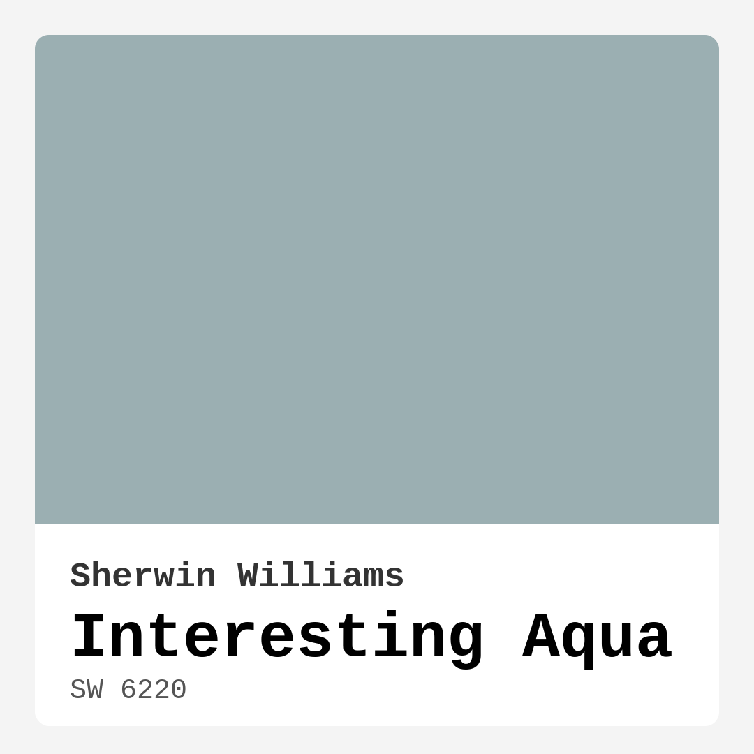
Color Preview & Key Details
| HEX Code | #9BAFB2 |
| RGB | 155, 175, 178 |
| LRV | 50% |
| Undertone | Blue |
| Finish Options | Eggshell, Matte, Satin |
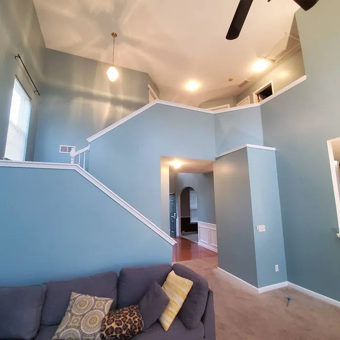
Picture this: you walk into a room and instantly feel a wave of calm wash over you. The walls are painted in a refreshing hue that speaks of tranquil waters and serene skies. That’s the magic of Interesting Aqua by Sherwin Williams. This paint color, with its captivating blue-green tone, has the power to transform your space into a peaceful retreat or a lively gathering area, depending on how you choose to use it.
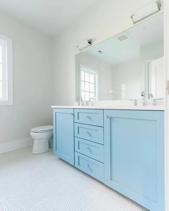
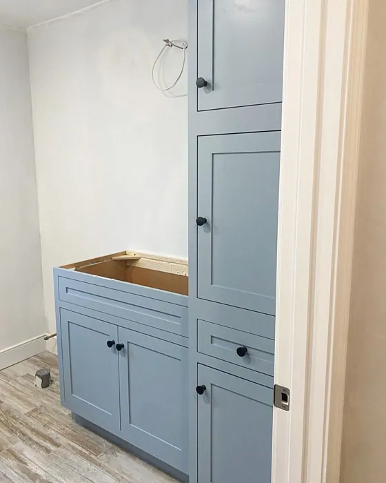
Interesting Aqua, with the color code SW 6220, is an exquisite choice if you’re looking to infuse your home with a sense of serenity. Its serene undertones lean towards blue, making it a perfect fit for various decor styles, from coastal and modern to traditional and Scandinavian. Whether you’re updating a cozy bedroom, a bright kitchen, or a tranquil bathroom, this medium-hued color can adapt beautifully, creating a calm and inviting atmosphere.
Let’s talk about what makes this color so special. The beauty of Interesting Aqua lies in its versatility. It reflects a moderate amount of light, with an LRV (Light Reflectance Value) of 50%. This means it won’t overpower a space, but instead, it’ll create an airy and open feel. If you’re concerned about how it might look in less-lit areas, keep in mind that good lighting is key to showcasing its true beauty. In rooms filled with natural light, this color will gleam vibrantly, but in dimmer conditions, it takes on a softer, more muted tone.
One of the standout features of Interesting Aqua is its washability and ease of application. Whether you’re a seasoned DIYer or just starting, this paint is beginner-friendly. It brushes on smoothly and is roller-ready, which means you’ll likely only need one or two coats for excellent coverage. Plus, it’s touch-up friendly, so any minor scuffs or marks can be quickly handled without the need for a complete repaint.
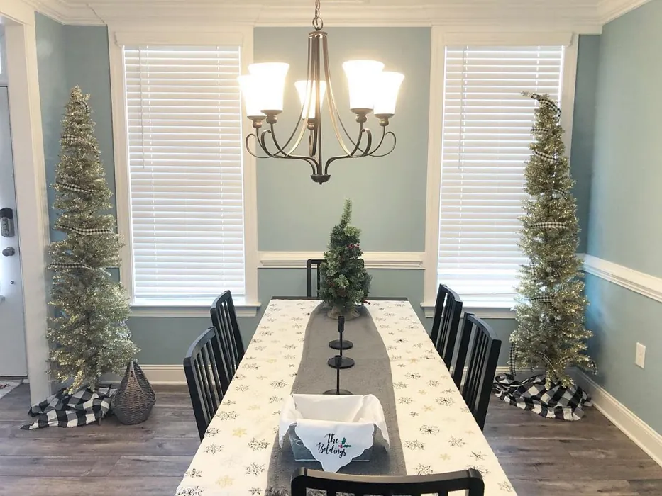
Now, let’s dive into the atmosphere this color creates. The calming and refreshing nature of Interesting Aqua makes it ideal for spaces where relaxation is key. Think about using it in a bedroom or bathroom where you want to unwind after a long day. It can also breathe life into an open-concept living area, making it feel cohesive and inviting as it flows into adjoining rooms. The color creates a soothing backdrop that allows other elements in your decor to shine.
When it comes to pairing, Interesting Aqua is incredibly adaptable. For a soft and fresh look, it works beautifully with whites and creams. Imagine crisp white trim against the gentle backdrop of Interesting Aqua; it creates a clean, airy vibe. If you want to add warmth, consider incorporating warm wood tones or earthy shades that complement this muted blue-green. For those who love bolder contrasts, try pairing it with navy or charcoal for a striking, contemporary edge.
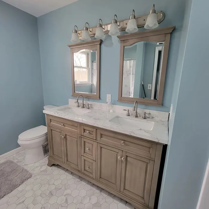
Now, you might be wondering where exactly this color would work best. The answer? Almost anywhere! Use it in a living room for a serene yet stylish gathering space. In a nursery, it fosters a calming environment perfect for little ones. A home office painted in Interesting Aqua can boost creativity while maintaining a tranquil atmosphere. Even in kitchens and bathrooms, it can evoke the freshness of coastal breezes, making your space feel like a retreat.
Of course, as with any color, there are a few things to keep in mind. While Interesting Aqua generally works well in various spaces, it can sometimes appear darker in poorly lit areas. To truly appreciate its beauty, ensure you have good lighting—natural or artificial—to enhance its qualities. Consider accent lighting or fixtures that can highlight its hue during the evening hours.
When testing colors, it’s essential to see how they interact with your existing decor. The undertones of Interesting Aqua play a significant role in its overall effect. Its subtle blue-green hue can appear cooler, lending a modern vibe to your space. If you’re pairing it with other colors or textures, pay attention to how those elements interact throughout the day, as lighting can shift and change the perception of color.
Let’s not forget about the eco-friendly aspect of Interesting Aqua. With low VOC levels, this paint is not only a beautiful choice but also a healthier one for your home environment. You can feel good about using it in spaces where air quality matters, such as bedrooms or nurseries.
For those looking to explore lighter shades, consider SW 9137, SW 9633, or SW 6219. If you’re interested in darker tones, SW 9634 and SW 7611 can create a beautiful contrast. As for complementary shades, SW 6280 and SW 6553 will add depth and interest to your palette.
So, can this color work in small spaces? Absolutely! Its light-reflective properties can make any room feel larger and more open. When you’re working with cozy nooks or compact areas, Interesting Aqua can create the illusion of space while maintaining an inviting atmosphere.
To wrap up, Interesting Aqua is more than just a color; it’s an experience waiting to unfold in your home. Its versatility, calming nature, and ability to adapt to different styles make it a fantastic choice for anyone looking to refresh their interiors. Whether you’re painting an accent wall, updating a room, or transforming your entire home, Interesting Aqua can help you create a space that feels serene, inviting, and distinctly yours.
So, what do you think? Are you ready to embrace the refreshing vibes of Interesting Aqua and transform your space into a tranquil retreat? Let the color inspire your next project, and enjoy the process of creating a beautiful, personalized home that truly reflects your style.
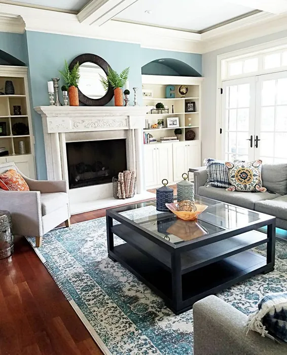
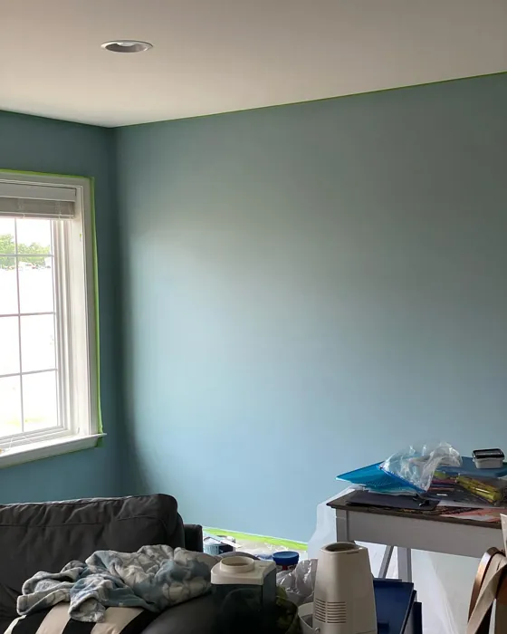
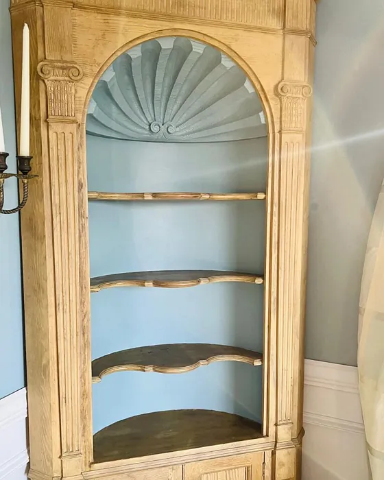
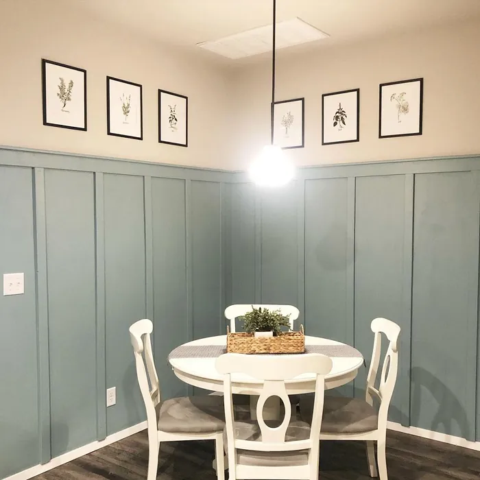
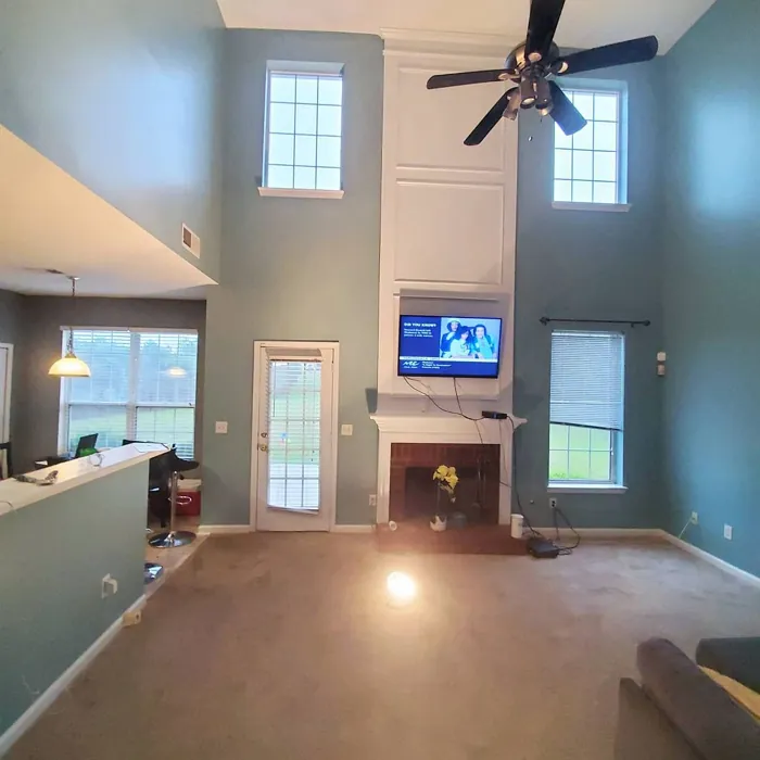
Real Room Photo of Interesting Aqua SW 6220
Undertones of Interesting Aqua ?
The undertones of Interesting Aqua are a key aspect of its character, leaning towards Blue. These subtle underlying hues are what give the color its depth and complexity. For example, a gray with a blue undertone will feel cooler and more modern, while one with a brown undertone will feel warmer and more traditional. It’s essential to test this paint in your home and observe it next to your existing furniture, flooring, and decor to see how these undertones interact and reveal themselves throughout the day.
HEX value: #9BAFB2
RGB code: 155, 175, 178
Is Interesting Aqua Cool or Warm?
Interesting Aqua is definitely on the cool side of the spectrum. Its blue-green hue can evoke feelings of calmness and tranquility, making it perfect for creating peaceful spaces.
Understanding Color Properties and Interior Design Tips
Hue refers to a specific position on the color wheel, measured in degrees from 0 to 360. Each degree represents a different pure color:
- 0° represents red
- 120° represents green
- 240° represents blue
Saturation describes the intensity or purity of a color and is expressed as a percentage:
- At 0%, the color appears completely desaturated—essentially a shade of gray
- At 100%, the color is at its most vivid and vibrant
Lightness indicates how light or dark a color is, also expressed as a percentage:
- 0% lightness results in black
- 100% lightness results in white
Using Warm Colors in Interior Design
Warm hues—such as reds, oranges, yellows, warm beiges, and greiges—are excellent choices for creating inviting and energetic spaces. These colors are particularly well-suited for:
- Kitchens, living rooms, and bathrooms, where warmth enhances comfort and sociability
- Large rooms, where warm tones can help reduce the sense of emptiness and make the space feel more intimate
For example:
- Warm beige shades provide a cozy, inviting atmosphere, ideal for living rooms, bedrooms, and hallways.
- Warm greige (a mix of beige and gray) offers the warmth of beige with the modern appeal of gray, making it a versatile backdrop for dining areas, bedrooms, and living spaces.
However, be mindful when using warm light tones in rooms with limited natural light. These shades may appear muted or even take on an unpleasant yellowish tint. To avoid a dull or flat appearance:
- Add depth by incorporating richer tones like deep greens, charcoal, or chocolate brown
- Use textured elements such as curtains, rugs, or cushions to bring dimension to the space
Pro Tip: Achieving Harmony with Warm and Cool Color Balance
To create a well-balanced and visually interesting interior, mix warm and cool tones strategically. This contrast adds depth and harmony to your design.
- If your walls feature warm hues, introduce cool-colored accents such as blue or green furniture, artwork, or accessories to create contrast.
- For a polished look, consider using a complementary color scheme, which pairs colors opposite each other on the color wheel (e.g., red with green, orange with blue).
This thoughtful mix not only enhances visual appeal but also creates a space that feels both dynamic and cohesive.
Light Temperature Affects on Interesting Aqua
Natural Light
Natural daylight changes in color temperature as the sun moves across the sky. At sunrise and sunset, the light tends to have a warm, golden tone with a color temperature around 2000 Kelvin (K). As the day progresses and the sun rises higher, the light becomes cooler and more neutral. Around midday, especially when the sky is clear, natural light typically reaches its peak brightness and shifts to a cooler tone, ranging from 5500 to 6500 Kelvin. This midday light is close to what we perceive as pure white or daylight-balanced light.
These shifts in natural light can significantly influence how colors appear in a space, which is why designers often consider both the time of day and the orientation of windows when planning interior color schemes.
Artificial Light
When choosing artificial lighting, pay close attention to the color temperature, measured in Kelvin (K). This determines how warm or cool the light will appear. Lower temperatures, around 2700K, give off a warm, yellow glow often used in living rooms or bedrooms. Higher temperatures, above 5000K, create a cool, bluish light similar to daylight, commonly used in kitchens, offices, or task areas.
Use the slider to see how lighting temperature can affect the appearance of a surface or color throughout a space.


4800K
LRV of Interesting Aqua
The Light Reflectance Value (LRV) of Interesting Aqua is 50%, which places it in the Medium category. This means it Reflects a moderate amount of light. Understanding a paint’s LRV is crucial for predicting how it will look in your space. A higher LRV indicates a lighter color that reflects more light, making rooms feel larger and brighter. A lower LRV signifies a darker color that absorbs more light, creating a cozier, more intimate atmosphere. Always consider the natural and artificial lighting in your room when selecting a paint color based on its LRV.
Detailed Review of Interesting Aqua
Additional Paint Characteristics
Ideal Rooms
Bathroom, Bedroom, Home Office, Kitchen, Living Room, Nursery
Decor Styles
Bohemian, Coastal, Modern, Scandinavian, Traditional
Coverage
Good (1–2 Coats), Touch-Up Friendly
Ease of Application
Beginner Friendly, Brush Smooth, Roller-Ready
Washability
Washable, Wipeable
VOC Level
Eco-Certified, Low VOC
Best Use
Accent Wall, Furniture, Interior Walls
Room Suitability
Bathroom, Bedroom, Home Office, Kitchen, Living Room, Nursery
Tone Tag
Airy, Cool, Muted
Finish Type
Eggshell, Matte, Satin
Paint Performance
Easy Touch-Up, High Coverage, Low Odor
Use Cases
Best for Rentals, Best for Selling Your Home, Designer Favorite
Mood
Calm, Inviting, Restful
Trim Pairing
Complements Cool Trim, Matches Pure White, Pairs with White Dove
Interesting Aqua is a delightful choice if you’re aiming for a refreshing yet soothing color palette. Its subtle blue-green hue creates a tranquil atmosphere, making it ideal for spaces where relaxation is key, like bedrooms or bathrooms. The paint applies smoothly, providing excellent coverage with just one or two coats, which is a significant advantage for DIY enthusiasts. Additionally, it pairs beautifully with a variety of decor styles, from coastal to modern, giving you the flexibility to design your space as you see fit. The color’s calming nature can help create an inviting ambiance, making it perfect for open concept spaces that flow into each other. Overall, it’s a well-rounded option for anyone looking to refresh their home.
Pros & Cons of SW 6220 Interesting Aqua
Pros
Cons
Colors that go with Sherwin Williams Interesting Aqua
FAQ on SW 6220 Interesting Aqua
Can Interesting Aqua be used in small spaces?
Absolutely! Interesting Aqua is a fantastic choice for small spaces. Its light-reflective properties help to make a room feel larger and more open. When paired with good lighting, it can create a bright and airy atmosphere, perfect for cozy nooks or compact rooms.
How does Interesting Aqua pair with other colors?
Interesting Aqua works beautifully with a variety of colors. It pairs well with whites and creams for a fresh, clean look, and it also complements warm wood tones and earthy shades. For a bolder statement, consider pairing it with deeper colors like navy or charcoal for a striking contrast.
Comparisons Interesting Aqua with other colors
Interesting Aqua SW 6220 vs Dutch Tile Blue SW 0031
| Attribute | Interesting Aqua SW 6220 | Dutch Tile Blue SW 0031 |
|---|---|---|
| Color Name | Interesting Aqua SW 6220 | Dutch Tile Blue SW 0031 |
| Color | ||
| Hue | Blue | Blue |
| Brightness | Medium | Medium |
| RGB | 155, 175, 178 | 154, 171, 171 |
| LRV | 50% | 24% |
| Finish Type | Eggshell, Matte, Satin | Eggshell, Matte, Satin |
| Finish Options | Eggshell, Matte, Satin | Eggshell, Flat, Matte, Satin |
| Ideal Rooms | Bathroom, Bedroom, Home Office, Kitchen, Living Room, Nursery | Bathroom, Bedroom, Dining Room, Hallway, Home Office, Kitchen, Living Room |
| Decor Styles | Bohemian, Coastal, Modern, Scandinavian, Traditional | Coastal, Modern Farmhouse, Scandinavian, Traditional, Transitional |
| Coverage | Good (1–2 Coats), Touch-Up Friendly | Good (1–2 Coats) |
| Ease of Application | Beginner Friendly, Brush Smooth, Roller-Ready | Beginner Friendly, Brush Smooth, Fast-Drying, Roller-Ready |
| Washability | Washable, Wipeable | Highly Washable, Washable |
| Room Suitability | Bathroom, Bedroom, Home Office, Kitchen, Living Room, Nursery | Bathroom, Bedroom, Dining Room, Kitchen, Living Room |
| Tone | Airy, Cool, Muted | Balanced, Cool, Muted |
| Paint Performance | Easy Touch-Up, High Coverage, Low Odor | Easy Touch-Up, High Coverage, Low Odor, Quick Drying |
Interesting Aqua SW 6220 vs Debonair SW 9139
| Attribute | Interesting Aqua SW 6220 | Debonair SW 9139 |
|---|---|---|
| Color Name | Interesting Aqua SW 6220 | Debonair SW 9139 |
| Color | ||
| Hue | Blue | Blue |
| Brightness | Medium | Medium |
| RGB | 155, 175, 178 | 144, 160, 166 |
| LRV | 50% | 30% |
| Finish Type | Eggshell, Matte, Satin | Eggshell, Matte, Satin |
| Finish Options | Eggshell, Matte, Satin | Eggshell, Matte, Satin |
| Ideal Rooms | Bathroom, Bedroom, Home Office, Kitchen, Living Room, Nursery | Bedroom, Dining Room, Home Office, Living Room |
| Decor Styles | Bohemian, Coastal, Modern, Scandinavian, Traditional | Coastal, Industrial, Modern, Transitional |
| Coverage | Good (1–2 Coats), Touch-Up Friendly | Good (1–2 Coats) |
| Ease of Application | Beginner Friendly, Brush Smooth, Roller-Ready | Beginner Friendly, Brush Smooth, Roller-Ready |
| Washability | Washable, Wipeable | Washable, Wipeable |
| Room Suitability | Bathroom, Bedroom, Home Office, Kitchen, Living Room, Nursery | Bedroom, Dining Room, Home Office, Living Room |
| Tone | Airy, Cool, Muted | Balanced, Cool, Muted |
| Paint Performance | Easy Touch-Up, High Coverage, Low Odor | Easy Touch-Up, Low Odor, Quick Drying |
Interesting Aqua SW 6220 vs Stardew SW 9138
| Attribute | Interesting Aqua SW 6220 | Stardew SW 9138 |
|---|---|---|
| Color Name | Interesting Aqua SW 6220 | Stardew SW 9138 |
| Color | ||
| Hue | Blue | Blue |
| Brightness | Medium | Medium |
| RGB | 155, 175, 178 | 166, 178, 181 |
| LRV | 50% | 30% |
| Finish Type | Eggshell, Matte, Satin | Eggshell, Satin |
| Finish Options | Eggshell, Matte, Satin | Eggshell, Matte, Satin |
| Ideal Rooms | Bathroom, Bedroom, Home Office, Kitchen, Living Room, Nursery | Bathroom, Bedroom, Home Office, Living Room, Nursery |
| Decor Styles | Bohemian, Coastal, Modern, Scandinavian, Traditional | Coastal, Farmhouse, Modern, Scandinavian |
| Coverage | Good (1–2 Coats), Touch-Up Friendly | Good (1–2 Coats) |
| Ease of Application | Beginner Friendly, Brush Smooth, Roller-Ready | Beginner Friendly, Brush Smooth, Roller-Ready |
| Washability | Washable, Wipeable | Highly Washable, Washable, Wipeable |
| Room Suitability | Bathroom, Bedroom, Home Office, Kitchen, Living Room, Nursery | Bathroom, Bedroom, Home Office, Living Room |
| Tone | Airy, Cool, Muted | Calm, Cool, Muted |
| Paint Performance | Easy Touch-Up, High Coverage, Low Odor | Easy Touch-Up, High Coverage, Low Odor |
Interesting Aqua SW 6220 vs Niebla Azul SW 9137
| Attribute | Interesting Aqua SW 6220 | Niebla Azul SW 9137 |
|---|---|---|
| Color Name | Interesting Aqua SW 6220 | Niebla Azul SW 9137 |
| Color | ||
| Hue | Blue | Blue |
| Brightness | Medium | Medium |
| RGB | 155, 175, 178 | 182, 195, 196 |
| LRV | 50% | 48% |
| Finish Type | Eggshell, Matte, Satin | Eggshell, Matte, Satin |
| Finish Options | Eggshell, Matte, Satin | Eggshell, Matte, Satin |
| Ideal Rooms | Bathroom, Bedroom, Home Office, Kitchen, Living Room, Nursery | Bedroom, Home Office, Living Room, Nursery |
| Decor Styles | Bohemian, Coastal, Modern, Scandinavian, Traditional | Coastal, Modern, Scandinavian, Transitional |
| Coverage | Good (1–2 Coats), Touch-Up Friendly | Good (1–2 Coats), Touch-Up Friendly |
| Ease of Application | Beginner Friendly, Brush Smooth, Roller-Ready | Beginner Friendly, Brush Smooth, Roller-Ready |
| Washability | Washable, Wipeable | Highly Washable, Washable |
| Room Suitability | Bathroom, Bedroom, Home Office, Kitchen, Living Room, Nursery | Bedroom, Home Office, Living Room, Nursery |
| Tone | Airy, Cool, Muted | Airy, Cool, Muted |
| Paint Performance | Easy Touch-Up, High Coverage, Low Odor | Easy Touch-Up, Fade Resistant, Low Odor, Scuff Resistant |
Interesting Aqua SW 6220 vs Rain SW 6219
| Attribute | Interesting Aqua SW 6220 | Rain SW 6219 |
|---|---|---|
| Color Name | Interesting Aqua SW 6220 | Rain SW 6219 |
| Color | ||
| Hue | Blue | Blue |
| Brightness | Medium | Medium |
| RGB | 155, 175, 178 | 171, 190, 191 |
| LRV | 50% | 50% |
| Finish Type | Eggshell, Matte, Satin | Eggshell, Matte, Satin |
| Finish Options | Eggshell, Matte, Satin | Eggshell, Matte, Satin |
| Ideal Rooms | Bathroom, Bedroom, Home Office, Kitchen, Living Room, Nursery | Bathroom, Bedroom, Home Office, Living Room, Nursery |
| Decor Styles | Bohemian, Coastal, Modern, Scandinavian, Traditional | Coastal, Minimalist, Modern, Scandinavian, Transitional |
| Coverage | Good (1–2 Coats), Touch-Up Friendly | Good (1–2 Coats), Touch-Up Friendly |
| Ease of Application | Beginner Friendly, Brush Smooth, Roller-Ready | Beginner Friendly, Brush Smooth, Fast-Drying, Roller-Ready |
| Washability | Washable, Wipeable | Scrubbable, Stain Resistant, Washable |
| Room Suitability | Bathroom, Bedroom, Home Office, Kitchen, Living Room, Nursery | Bathroom, Bedroom, Home Office, Living Room, Nursery |
| Tone | Airy, Cool, Muted | Balanced, Cool, Muted |
| Paint Performance | Easy Touch-Up, High Coverage, Low Odor | Easy Touch-Up, Low Odor, Quick Drying, Stain Resistant |
Interesting Aqua SW 6220 vs Morning at Sea SW 9634
| Attribute | Interesting Aqua SW 6220 | Morning at Sea SW 9634 |
|---|---|---|
| Color Name | Interesting Aqua SW 6220 | Morning at Sea SW 9634 |
| Color | ||
| Hue | Blue | Blue |
| Brightness | Medium | Medium |
| RGB | 155, 175, 178 | 130, 151, 155 |
| LRV | 50% | 50% |
| Finish Type | Eggshell, Matte, Satin | Eggshell, Matte |
| Finish Options | Eggshell, Matte, Satin | Eggshell, Matte, Satin |
| Ideal Rooms | Bathroom, Bedroom, Home Office, Kitchen, Living Room, Nursery | Bathroom, Bedroom, Home Office, Living Room |
| Decor Styles | Bohemian, Coastal, Modern, Scandinavian, Traditional | Coastal, Minimalist, Modern, Scandinavian |
| Coverage | Good (1–2 Coats), Touch-Up Friendly | Good (1–2 Coats), Touch-Up Friendly |
| Ease of Application | Beginner Friendly, Brush Smooth, Roller-Ready | Beginner Friendly, Brush Smooth, Roller-Ready |
| Washability | Washable, Wipeable | Washable, Wipeable |
| Room Suitability | Bathroom, Bedroom, Home Office, Kitchen, Living Room, Nursery | Bathroom, Bedroom, Home Office, Living Room |
| Tone | Airy, Cool, Muted | Airy, Cool, Muted |
| Paint Performance | Easy Touch-Up, High Coverage, Low Odor | Easy Touch-Up, Fade Resistant, Low Odor |
Interesting Aqua SW 6220 vs Sleepy Blue SW 6225
| Attribute | Interesting Aqua SW 6220 | Sleepy Blue SW 6225 |
|---|---|---|
| Color Name | Interesting Aqua SW 6220 | Sleepy Blue SW 6225 |
| Color | ||
| Hue | Blue | Blue |
| Brightness | Medium | Medium |
| RGB | 155, 175, 178 | 188, 203, 206 |
| LRV | 50% | 50% |
| Finish Type | Eggshell, Matte, Satin | Eggshell, Matte, Satin |
| Finish Options | Eggshell, Matte, Satin | Eggshell, Matte, Satin |
| Ideal Rooms | Bathroom, Bedroom, Home Office, Kitchen, Living Room, Nursery | Bedroom, Home Office, Living Room, Nursery |
| Decor Styles | Bohemian, Coastal, Modern, Scandinavian, Traditional | Coastal, Minimalist, Modern Farmhouse, Scandinavian |
| Coverage | Good (1–2 Coats), Touch-Up Friendly | Good (1–2 Coats) |
| Ease of Application | Beginner Friendly, Brush Smooth, Roller-Ready | Beginner Friendly, Brush Smooth, Fast-Drying, Roller-Ready |
| Washability | Washable, Wipeable | Highly Washable, Washable |
| Room Suitability | Bathroom, Bedroom, Home Office, Kitchen, Living Room, Nursery | Bedroom, Home Office, Living Room, Nursery |
| Tone | Airy, Cool, Muted | Airy, Cool, Muted |
| Paint Performance | Easy Touch-Up, High Coverage, Low Odor | Easy Touch-Up, Low Odor, Quick Drying, Scuff Resistant |
Interesting Aqua SW 6220 vs Lakeside SW 9683
| Attribute | Interesting Aqua SW 6220 | Lakeside SW 9683 |
|---|---|---|
| Color Name | Interesting Aqua SW 6220 | Lakeside SW 9683 |
| Color | ||
| Hue | Blue | Blue |
| Brightness | Medium | Medium |
| RGB | 155, 175, 178 | 173, 184, 192 |
| LRV | 50% | 24% |
| Finish Type | Eggshell, Matte, Satin | Eggshell, Matte, Satin |
| Finish Options | Eggshell, Matte, Satin | Eggshell, Matte, Satin |
| Ideal Rooms | Bathroom, Bedroom, Home Office, Kitchen, Living Room, Nursery | Bathroom, Bedroom, Home Office, Living Room |
| Decor Styles | Bohemian, Coastal, Modern, Scandinavian, Traditional | Coastal, Minimalist, Modern, Rustic |
| Coverage | Good (1–2 Coats), Touch-Up Friendly | Good (1–2 Coats) |
| Ease of Application | Beginner Friendly, Brush Smooth, Roller-Ready | Beginner Friendly, Brush Smooth, Roller-Ready |
| Washability | Washable, Wipeable | Scrubbable, Washable |
| Room Suitability | Bathroom, Bedroom, Home Office, Kitchen, Living Room, Nursery | Bathroom, Bedroom, Home Office, Living Room |
| Tone | Airy, Cool, Muted | Balanced, Cool, Muted |
| Paint Performance | Easy Touch-Up, High Coverage, Low Odor | Easy Touch-Up, Fade Resistant, High Coverage, Low Odor |
Interesting Aqua SW 6220 vs Upward SW 6239
| Attribute | Interesting Aqua SW 6220 | Upward SW 6239 |
|---|---|---|
| Color Name | Interesting Aqua SW 6220 | Upward SW 6239 |
| Color | ||
| Hue | Blue | Blue |
| Brightness | Medium | Medium |
| RGB | 155, 175, 178 | 191, 201, 208 |
| LRV | 50% | 75% |
| Finish Type | Eggshell, Matte, Satin | Eggshell, Satin |
| Finish Options | Eggshell, Matte, Satin | Eggshell, Flat, Satin |
| Ideal Rooms | Bathroom, Bedroom, Home Office, Kitchen, Living Room, Nursery | Bedroom, Dining Room, Home Office, Living Room, Nursery |
| Decor Styles | Bohemian, Coastal, Modern, Scandinavian, Traditional | Coastal, Minimalist, Modern, Scandinavian |
| Coverage | Good (1–2 Coats), Touch-Up Friendly | Good (1–2 Coats), Touch-Up Friendly |
| Ease of Application | Beginner Friendly, Brush Smooth, Roller-Ready | Beginner Friendly, Brush Smooth, Fast-Drying, Roller-Ready |
| Washability | Washable, Wipeable | Washable, Wipeable |
| Room Suitability | Bathroom, Bedroom, Home Office, Kitchen, Living Room, Nursery | Bedroom, Home Office, Living Room, Nursery |
| Tone | Airy, Cool, Muted | Cool, Crisp, Muted |
| Paint Performance | Easy Touch-Up, High Coverage, Low Odor | High Coverage, Low Odor, Quick Drying |
Interesting Aqua SW 6220 vs Aleutian SW 6241
| Attribute | Interesting Aqua SW 6220 | Aleutian SW 6241 |
|---|---|---|
| Color Name | Interesting Aqua SW 6220 | Aleutian SW 6241 |
| Color | ||
| Hue | Blue | Blue |
| Brightness | Medium | Medium |
| RGB | 155, 175, 178 | 152, 169, 183 |
| LRV | 50% | 24% |
| Finish Type | Eggshell, Matte, Satin | Eggshell, Matte, Satin |
| Finish Options | Eggshell, Matte, Satin | Eggshell, Matte, Satin |
| Ideal Rooms | Bathroom, Bedroom, Home Office, Kitchen, Living Room, Nursery | Bathroom, Bedroom, Home Office, Kitchen, Living Room, Nursery |
| Decor Styles | Bohemian, Coastal, Modern, Scandinavian, Traditional | Coastal, Minimalist, Modern, Scandinavian, Transitional |
| Coverage | Good (1–2 Coats), Touch-Up Friendly | Good (1–2 Coats), Touch-Up Friendly |
| Ease of Application | Beginner Friendly, Brush Smooth, Roller-Ready | Beginner Friendly, Brush Smooth, Fast-Drying, Roller-Ready |
| Washability | Washable, Wipeable | Scrubbable, Stain Resistant, Washable |
| Room Suitability | Bathroom, Bedroom, Home Office, Kitchen, Living Room, Nursery | Bathroom, Bedroom, Home Office, Living Room, Nursery |
| Tone | Airy, Cool, Muted | Airy, Balanced, Cool, Muted |
| Paint Performance | Easy Touch-Up, High Coverage, Low Odor | Easy Touch-Up, Fade Resistant, Low Odor, Quick Drying |
Official Page of Sherwin Williams Interesting Aqua SW 6220