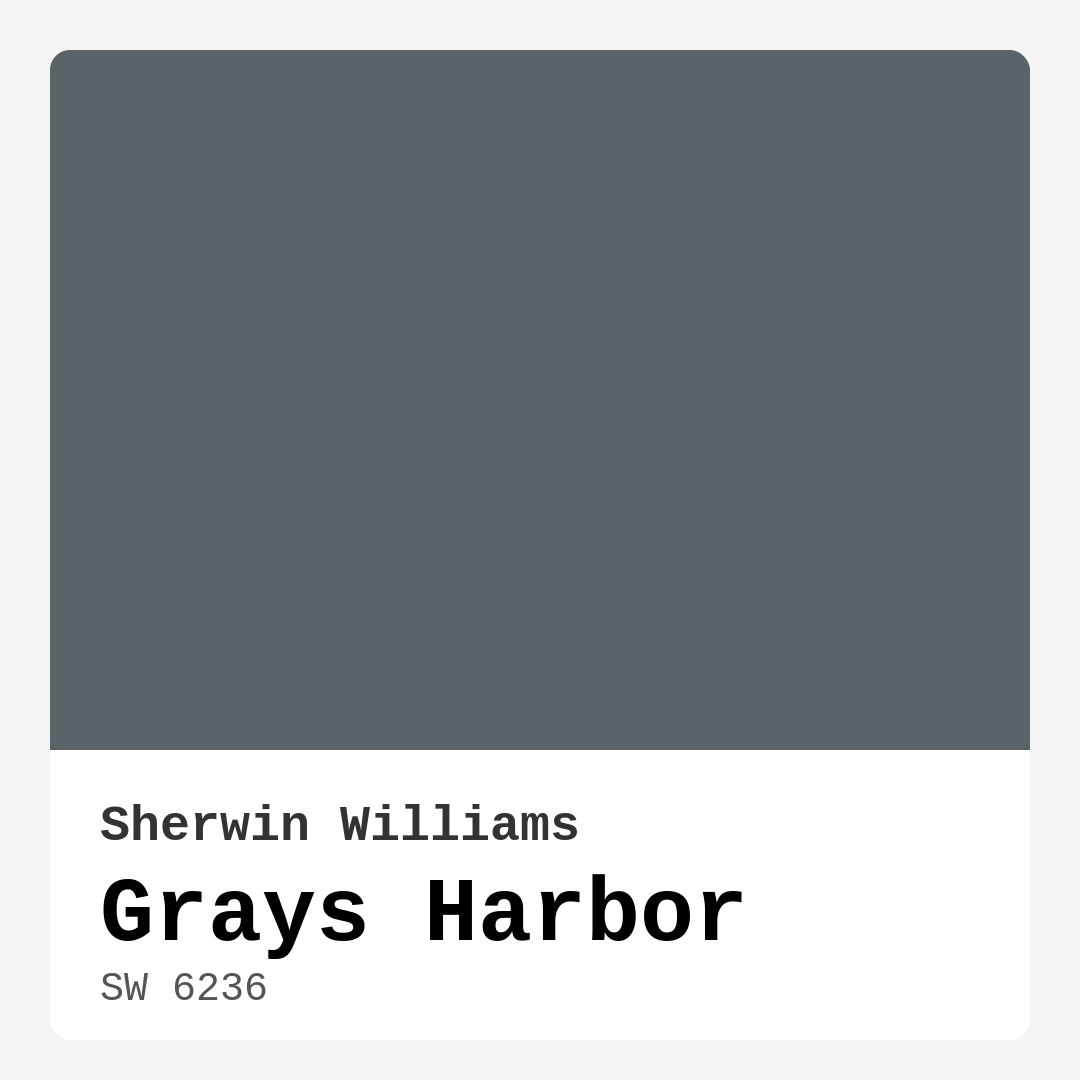
Color Preview & Key Details
| HEX Code | #596368 |
| RGB | 89, 99, 104 |
| LRV | 25% |
| Undertone | Blue |
| Finish Options | Eggshell, Matte, Satin |
Imagine stepping into a room that instantly wraps you in a gentle embrace, where the colors evoke a sense of calm, creativity, and comfort. That’s the magic of Grays Harbor—Sherwin Williams’ enchanting blend of muted green and gray. This captivating hue is perfect for those who envision transforming their home into a serene oasis.
Grays Harbor, with its cool undertones and muted tones, offers a sophisticated backdrop that can seamlessly adapt to various styles. Whether you’re striving for modern elegance or a rustic charm, this color is versatile enough to pull it off. It’s like that one outfit in your wardrobe that goes with everything.
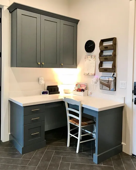
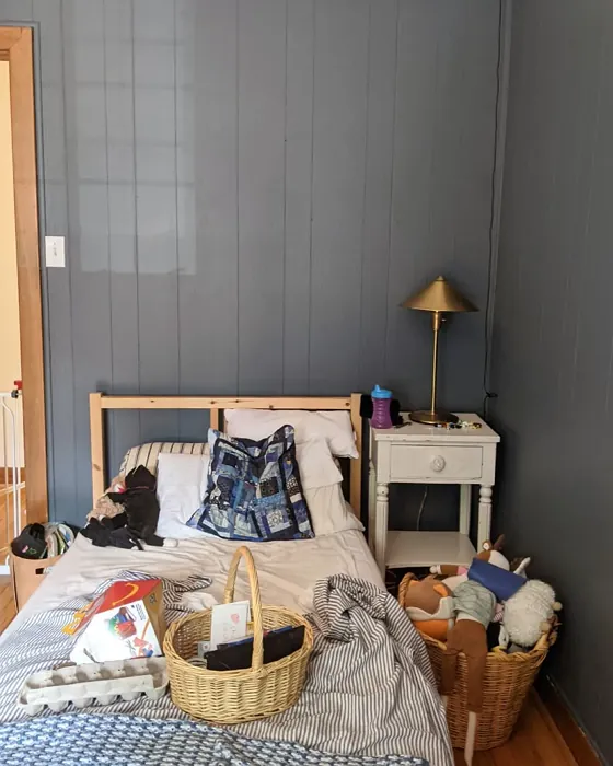
When you look at Grays Harbor, you might notice it has a unique depth that inspires tranquility. This color is particularly well-suited for spaces where you seek relaxation and focus, like the living room, bedroom, or home office. It’s a hue that encourages unwinding after a long day, allowing you to breathe and let go of the stresses that cling to you.
One of the fantastic features of Grays Harbor is its adaptability. Because it reflects very little light with a Light Reflectance Value (LRV) of 25%, it creates a cozy and intimate atmosphere. You might worry about how it will look in your space, especially in low light, but this color’s richness makes it suitable for various lighting conditions. In natural light, Grays Harbor takes on a vibrant freshness, while artificial light can deepen its tone, making it feel more inviting and snug.
Now, let’s talk about where this color shines. Grays Harbor is ideal for living rooms, bedrooms, and even dining areas. Imagine a cozy corner in your home office, where the soft gray-green backdrop fuels your creativity while still feeling calm and collected. Picture it in a dining room, where it complements a rustic table and elegant table settings, offering a serene backdrop for gatherings with family and friends.
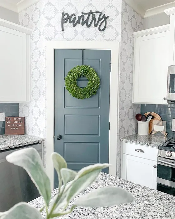
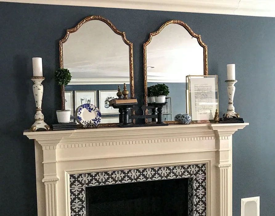
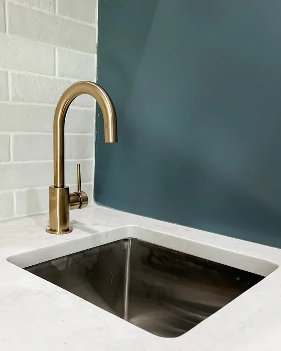
If you’re drawn to coastal decor, Grays Harbor perfectly embodies that serene vibe reminiscent of ocean views and sandy shores. When paired with crisp white trim, like Sherwin Williams’ White Dove, it creates a classic look that’s both refreshing and timeless. The subtle blue undertones of Grays Harbor enhance its coastal charm, making your space feel like a tranquil retreat.
Speaking of undertones, let’s dive a bit deeper into what makes Grays Harbor so special. Its blue undertones give it a cool, modern feel, setting it apart from warmer hues that can feel more traditional. This characteristic is crucial when it comes to pairing Grays Harbor with other colors. It can beautifully complement colors like soft whites, muted reds, and even deeper tones like navy or charcoal. Just remember, while it can be a show-stopper on its own, thoughtful pairings can elevate the entire look of your space.
If you’re considering Grays Harbor for a smaller room, you’re in luck. This color can enhance compact spaces by providing depth without feeling overwhelming. Its cool hue works to create a sense of openness, making it an excellent choice for cozy reading nooks or smaller bedrooms. Just be mindful of your lighting; a few bright accents can keep these spaces feeling airy and inviting.
When it comes to application, Grays Harbor is remarkable. It’s beginner-friendly and roller-ready, meaning you can take on the project without feeling overwhelmed. With good coverage needing just one to two coats, you’ll find that the transformation can happen quickly. Once applied, its washability and scrubbability ensure that it remains looking fresh over time, which is a significant plus in high-traffic areas.
The finishes available for Grays Harbor—matte, eggshell, and satin—each bring their unique touch to the color. For a softer appearance in a dining area or living room, a matte finish can add a sophisticated elegance, while eggshell or satin will provide a subtle sheen, making it practical for easy cleaning in more active spaces.
As with any paint color, there are a couple of things to keep in mind. While Grays Harbor can create a cozy atmosphere, be cautious in dimly lit areas, as it may appear darker than expected. Also, pairing it with the wrong colors could lead to a dull look, so it’s essential to test it in your space before fully committing.
When you think about Grays Harbor, envision a mood of calm, coziness, and inviting warmth. It’s perfect for creating personal expressions in your design choices, whether that be through your furniture, art, or textiles. The color’s versatility means it can work in a modern farmhouse setup or even a contemporary aesthetic, making it a classic favorite for various styles.
If you want to explore lighter shades for an accent or a complementary space, consider colors like SW 7665, SW 6251, or SW 7624. For a bolder statement, darker shades such as SW 9639 or SW 9660 can create striking contrasts. Each of these shades can harmonize with Grays Harbor to build a layered, inviting space that feels cohesive and well thought out.
In summary, Grays Harbor is more than just a color; it’s a canvas for your life. Its serene and soothing hue works across multiple decor styles, can adapt to different lighting conditions, and offers a calming presence that encourages relaxation and creativity. Whether you’re refreshing a single wall or transforming an entire room, Grays Harbor stands as a smart choice for those looking to create a tranquil yet stylish home. So, are you ready to embrace this beautiful hue and let it breathe new life into your space? I think you’ll find it’s a decision you won’t regret.

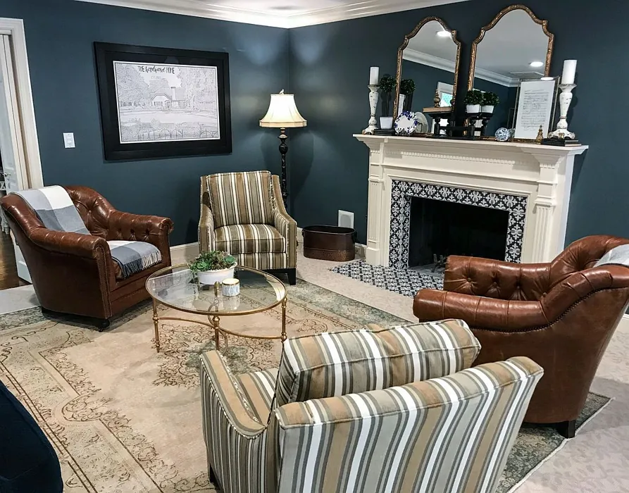
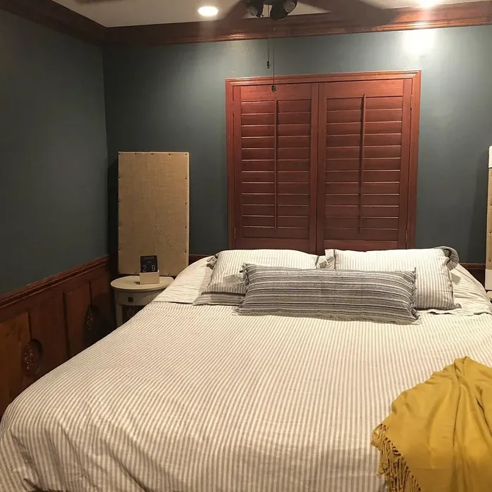
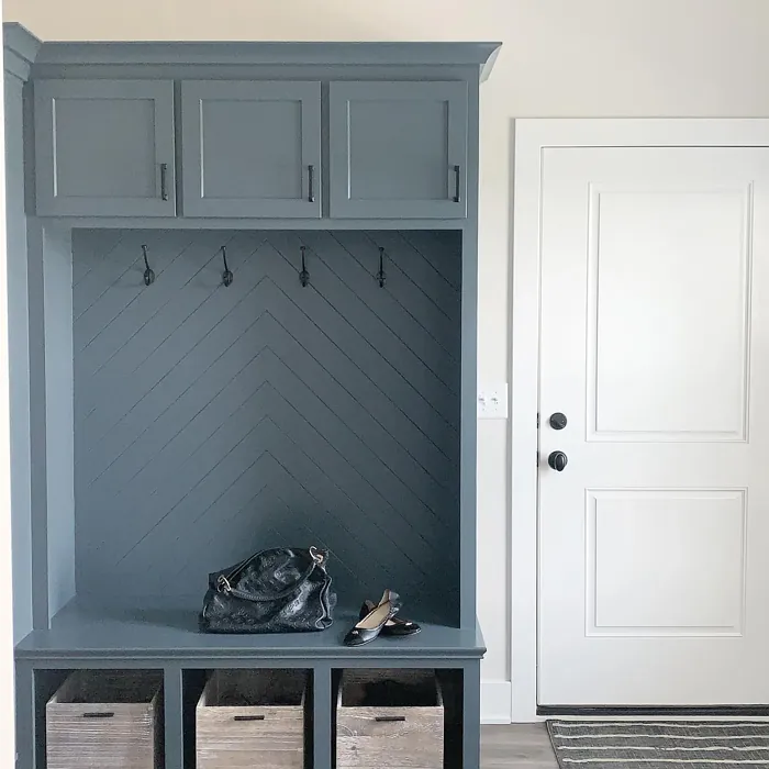
Real Room Photo of Grays Harbor SW 6236
Undertones of Grays Harbor ?
The undertones of Grays Harbor are a key aspect of its character, leaning towards Blue. These subtle underlying hues are what give the color its depth and complexity. For example, a gray with a blue undertone will feel cooler and more modern, while one with a brown undertone will feel warmer and more traditional. It’s essential to test this paint in your home and observe it next to your existing furniture, flooring, and decor to see how these undertones interact and reveal themselves throughout the day.
HEX value: #596368
RGB code: 89, 99, 104
Is Grays Harbor Cool or Warm?
Grays Harbor is considered a cool paint color. This characteristic plays a huge role in the overall feel of a room. Cool colors, like this one, tend to create a cozy, inviting, and energetic atmosphere, making them great for social spaces like living rooms and dining rooms. In contrast, warm colors often evoke a sense of calm and serenity, which is why they are popular in bedrooms and bathrooms. The coolth of Grays Harbor means it will pair beautifully with corresponding decor elements.
Understanding Color Properties and Interior Design Tips
Hue refers to a specific position on the color wheel, measured in degrees from 0 to 360. Each degree represents a different pure color:
- 0° represents red
- 120° represents green
- 240° represents blue
Saturation describes the intensity or purity of a color and is expressed as a percentage:
- At 0%, the color appears completely desaturated—essentially a shade of gray
- At 100%, the color is at its most vivid and vibrant
Lightness indicates how light or dark a color is, also expressed as a percentage:
- 0% lightness results in black
- 100% lightness results in white
Using Warm Colors in Interior Design
Warm hues—such as reds, oranges, yellows, warm beiges, and greiges—are excellent choices for creating inviting and energetic spaces. These colors are particularly well-suited for:
- Kitchens, living rooms, and bathrooms, where warmth enhances comfort and sociability
- Large rooms, where warm tones can help reduce the sense of emptiness and make the space feel more intimate
For example:
- Warm beige shades provide a cozy, inviting atmosphere, ideal for living rooms, bedrooms, and hallways.
- Warm greige (a mix of beige and gray) offers the warmth of beige with the modern appeal of gray, making it a versatile backdrop for dining areas, bedrooms, and living spaces.
However, be mindful when using warm light tones in rooms with limited natural light. These shades may appear muted or even take on an unpleasant yellowish tint. To avoid a dull or flat appearance:
- Add depth by incorporating richer tones like deep greens, charcoal, or chocolate brown
- Use textured elements such as curtains, rugs, or cushions to bring dimension to the space
Pro Tip: Achieving Harmony with Warm and Cool Color Balance
To create a well-balanced and visually interesting interior, mix warm and cool tones strategically. This contrast adds depth and harmony to your design.
- If your walls feature warm hues, introduce cool-colored accents such as blue or green furniture, artwork, or accessories to create contrast.
- For a polished look, consider using a complementary color scheme, which pairs colors opposite each other on the color wheel (e.g., red with green, orange with blue).
This thoughtful mix not only enhances visual appeal but also creates a space that feels both dynamic and cohesive.
Light Temperature Affects on Grays Harbor
Natural Light
Natural daylight changes in color temperature as the sun moves across the sky. At sunrise and sunset, the light tends to have a warm, golden tone with a color temperature around 2000 Kelvin (K). As the day progresses and the sun rises higher, the light becomes cooler and more neutral. Around midday, especially when the sky is clear, natural light typically reaches its peak brightness and shifts to a cooler tone, ranging from 5500 to 6500 Kelvin. This midday light is close to what we perceive as pure white or daylight-balanced light.
These shifts in natural light can significantly influence how colors appear in a space, which is why designers often consider both the time of day and the orientation of windows when planning interior color schemes.
Artificial Light
When choosing artificial lighting, pay close attention to the color temperature, measured in Kelvin (K). This determines how warm or cool the light will appear. Lower temperatures, around 2700K, give off a warm, yellow glow often used in living rooms or bedrooms. Higher temperatures, above 5000K, create a cool, bluish light similar to daylight, commonly used in kitchens, offices, or task areas.
Use the slider to see how lighting temperature can affect the appearance of a surface or color throughout a space.


4800K
LRV of Grays Harbor
The Light Reflectance Value (LRV) of Grays Harbor is 25%, which places it in the Medium Dark category. This means it reflects very little light. Understanding a paint’s LRV is crucial for predicting how it will look in your space. A higher LRV indicates a lighter color that reflects more light, making rooms feel larger and brighter. A lower LRV signifies a darker color that absorbs more light, creating a cozier, more intimate atmosphere. Always consider the natural and artificial lighting in your room when selecting a paint color based on its LRV.
Detailed Review of Grays Harbor
Additional Paint Characteristics
Ideal Rooms
Bedroom, Dining Room, Home Office, Living Room
Decor Styles
Coastal, Contemporary, Modern, Rustic
Coverage
Good (1–2 Coats), Touch-Up Friendly
Ease of Application
Beginner Friendly, Brush Smooth, Roller-Ready
Washability
Scrubbable, Washable
VOC Level
Eco-Certified, Low VOC
Best Use
Accent Wall, Bedroom, Interior Walls, Living Room
Room Suitability
Bedroom, Dining Room, Home Office, Living Room
Tone Tag
Balanced, Cool, Muted
Finish Type
Eggshell, Matte, Satin
Paint Performance
High Coverage, Low Odor, Quick Drying
Use Cases
Best for Modern Farmhouse, Best for Open Concept, Classic Favorite
Mood
Calm, Cozy, Inviting
Trim Pairing
Complements Cool Trim, Matches Pure White, Pairs with White Dove
Grays Harbor is a color that truly transforms a space with its calming presence. It’s perfect for those who want to create a peaceful oasis in their home. The color’s versatility shines through, working beautifully in both light and dark spaces. When applied, it brings depth without overwhelming the room, making it ideal for accent walls or entire rooms. Its muted tone complements a wide range of decor styles, from coastal chic to modern minimalism. Plus, its adaptability means you can pair it with various furnishings and accents, allowing for personal expression in your design choices. Overall, Grays Harbor is a smart choice for anyone looking to refresh their home with a tranquil yet stylish hue.
Pros & Cons of SW 6236 Grays Harbor
Pros
Cons
Colors that go with Sherwin Williams Grays Harbor
FAQ on SW 6236 Grays Harbor
Can Grays Harbor be used in small spaces?
Absolutely! Grays Harbor can actually enhance smaller spaces by providing depth without feeling overwhelming. Its cool undertones create a sense of openness, making it an excellent choice for compact rooms like bathrooms or cozy reading nooks. Just be mindful of your lighting; pairing it with bright accents can keep the space feeling airy.
What finish works best for Grays Harbor?
For Grays Harbor, finishes like eggshell or satin work beautifully. These finishes provide a subtle sheen that highlights the color’s depth while being practical for cleaning, especially in high-traffic areas. If you’re looking for a more sophisticated look in a living room or dining area, consider a matte finish for a softer appearance.
Comparisons Grays Harbor with other colors
Grays Harbor SW 6236 vs Night Owl SW 7061
| Attribute | Grays Harbor SW 6236 | Night Owl SW 7061 |
|---|---|---|
| Color Name | Grays Harbor SW 6236 | Night Owl SW 7061 |
| Color | ||
| Hue | Grey | Grey |
| Brightness | Dark | Dark |
| RGB | 89, 99, 104 | 99, 101, 95 |
| LRV | 25% | 24% |
| Finish Type | Eggshell, Matte, Satin | Eggshell, Matte, Satin |
| Finish Options | Eggshell, Matte, Satin | Eggshell, Matte, Satin |
| Ideal Rooms | Bedroom, Dining Room, Home Office, Living Room | Bedroom, Dining Room, Hallway, Home Office, Living Room |
| Decor Styles | Coastal, Contemporary, Modern, Rustic | Industrial, Minimalist, Modern, Rustic, Scandinavian |
| Coverage | Good (1–2 Coats), Touch-Up Friendly | Good (1–2 Coats), Touch-Up Friendly |
| Ease of Application | Beginner Friendly, Brush Smooth, Roller-Ready | Beginner Friendly, Brush Smooth, Fast-Drying, Roller-Ready |
| Washability | Scrubbable, Washable | Scrubbable, Washable |
| Room Suitability | Bedroom, Dining Room, Home Office, Living Room | Bedroom, Dining Room, Home Office, Living Room |
| Tone | Balanced, Cool, Muted | Balanced, Deep, Earthy, Muted |
| Paint Performance | High Coverage, Low Odor, Quick Drying | Easy Touch-Up, Fade Resistant, High Coverage, Low Odor |
Grays Harbor SW 6236 vs Urbane Bronze SW 7048
| Attribute | Grays Harbor SW 6236 | Urbane Bronze SW 7048 |
|---|---|---|
| Color Name | Grays Harbor SW 6236 | Urbane Bronze SW 7048 |
| Color | ||
| Hue | Grey | Grey |
| Brightness | Dark | Dark |
| RGB | 89, 99, 104 | 84, 80, 74 |
| LRV | 25% | 20% |
| Finish Type | Eggshell, Matte, Satin | Eggshell, Matte, Satin |
| Finish Options | Eggshell, Matte, Satin | Eggshell, Matte, Satin |
| Ideal Rooms | Bedroom, Dining Room, Home Office, Living Room | Bedroom, Dining Room, Home Office, Living Room |
| Decor Styles | Coastal, Contemporary, Modern, Rustic | Contemporary, Industrial, Modern, Rustic, Transitional |
| Coverage | Good (1–2 Coats), Touch-Up Friendly | Good (1–2 Coats) |
| Ease of Application | Beginner Friendly, Brush Smooth, Roller-Ready | Beginner Friendly, Brush Smooth, Roller-Ready |
| Washability | Scrubbable, Washable | Highly Washable, Washable |
| Room Suitability | Bedroom, Dining Room, Home Office, Living Room | Bedroom, Dining Room, Home Office, Living Room |
| Tone | Balanced, Cool, Muted | Deep, Earthy, Warm |
| Paint Performance | High Coverage, Low Odor, Quick Drying | Easy Touch-Up, Fade Resistant, High Coverage, Low Odor |
Grays Harbor SW 6236 vs Succulent SW 9650
| Attribute | Grays Harbor SW 6236 | Succulent SW 9650 |
|---|---|---|
| Color Name | Grays Harbor SW 6236 | Succulent SW 9650 |
| Color | ||
| Hue | Grey | Grey |
| Brightness | Dark | Dark |
| RGB | 89, 99, 104 | 97, 108, 100 |
| LRV | 25% | 30% |
| Finish Type | Eggshell, Matte, Satin | Eggshell, Matte, Satin |
| Finish Options | Eggshell, Matte, Satin | Eggshell, Matte, Satin |
| Ideal Rooms | Bedroom, Dining Room, Home Office, Living Room | Bathroom, Bedroom, Dining Room, Entryway, Kitchen, Living Room |
| Decor Styles | Coastal, Contemporary, Modern, Rustic | Bohemian, Contemporary, Eclectic, Minimalist, Modern Farmhouse |
| Coverage | Good (1–2 Coats), Touch-Up Friendly | Good (1–2 Coats), Touch-Up Friendly |
| Ease of Application | Beginner Friendly, Brush Smooth, Roller-Ready | Beginner Friendly, Brush Smooth, Roller-Ready |
| Washability | Scrubbable, Washable | Highly Washable, Washable |
| Room Suitability | Bedroom, Dining Room, Home Office, Living Room | Bathroom, Bedroom, Dining Room, Kitchen, Living Room |
| Tone | Balanced, Cool, Muted | Cool, Earthy, Muted |
| Paint Performance | High Coverage, Low Odor, Quick Drying | Easy Touch-Up, Low Odor, Quick Drying, Scuff Resistant |
Grays Harbor SW 6236 vs Grizzle Gray SW 7068
| Attribute | Grays Harbor SW 6236 | Grizzle Gray SW 7068 |
|---|---|---|
| Color Name | Grays Harbor SW 6236 | Grizzle Gray SW 7068 |
| Color | ||
| Hue | Grey | Grey |
| Brightness | Dark | Dark |
| RGB | 89, 99, 104 | 99, 101, 98 |
| LRV | 25% | 24% |
| Finish Type | Eggshell, Matte, Satin | Eggshell, Satin |
| Finish Options | Eggshell, Matte, Satin | Eggshell, Matte, Satin |
| Ideal Rooms | Bedroom, Dining Room, Home Office, Living Room | Bedroom, Dining Room, Home Office, Living Room |
| Decor Styles | Coastal, Contemporary, Modern, Rustic | Industrial, Modern, Rustic, Scandinavian |
| Coverage | Good (1–2 Coats), Touch-Up Friendly | Good (1–2 Coats), Touch-Up Friendly |
| Ease of Application | Beginner Friendly, Brush Smooth, Roller-Ready | Beginner Friendly, Brush Smooth, Roller-Ready |
| Washability | Scrubbable, Washable | Washable, Wipeable |
| Room Suitability | Bedroom, Dining Room, Home Office, Living Room | Bedroom, Dining Room, Home Office, Living Room |
| Tone | Balanced, Cool, Muted | Balanced, Cool, Muted |
| Paint Performance | High Coverage, Low Odor, Quick Drying | Easy Touch-Up, High Coverage, Low Odor |
Grays Harbor SW 6236 vs Iron Ore SW 7069
| Attribute | Grays Harbor SW 6236 | Iron Ore SW 7069 |
|---|---|---|
| Color Name | Grays Harbor SW 6236 | Iron Ore SW 7069 |
| Color | ||
| Hue | Grey | Grey |
| Brightness | Dark | Dark |
| RGB | 89, 99, 104 | 67, 67, 65 |
| LRV | 25% | 6% |
| Finish Type | Eggshell, Matte, Satin | Eggshell, Matte, Satin |
| Finish Options | Eggshell, Matte, Satin | Eggshell, Matte, Satin |
| Ideal Rooms | Bedroom, Dining Room, Home Office, Living Room | Bedroom, Dining Room, Entryway, Home Office, Living Room |
| Decor Styles | Coastal, Contemporary, Modern, Rustic | Contemporary, Industrial, Minimalist, Modern, Rustic |
| Coverage | Good (1–2 Coats), Touch-Up Friendly | Good (1–2 Coats), High Hide |
| Ease of Application | Beginner Friendly, Brush Smooth, Roller-Ready | Brush Smooth, Fast-Drying, Roller-Ready |
| Washability | Scrubbable, Washable | Highly Washable, Washable |
| Room Suitability | Bedroom, Dining Room, Home Office, Living Room | Bedroom, Dining Room, Entryway, Home Office, Living Room |
| Tone | Balanced, Cool, Muted | Balanced, Deep, Muted, Warm |
| Paint Performance | High Coverage, Low Odor, Quick Drying | Easy Touch-Up, High Coverage, Low Odor |
Grays Harbor SW 6236 vs Peppercorn SW 7674
| Attribute | Grays Harbor SW 6236 | Peppercorn SW 7674 |
|---|---|---|
| Color Name | Grays Harbor SW 6236 | Peppercorn SW 7674 |
| Color | ||
| Hue | Grey | Grey |
| Brightness | Dark | Dark |
| RGB | 89, 99, 104 | 88, 88, 88 |
| LRV | 25% | 10% |
| Finish Type | Eggshell, Matte, Satin | Eggshell, Matte, Satin |
| Finish Options | Eggshell, Matte, Satin | Eggshell, Matte, Satin |
| Ideal Rooms | Bedroom, Dining Room, Home Office, Living Room | Bedroom, Dining Room, Home Office, Living Room |
| Decor Styles | Coastal, Contemporary, Modern, Rustic | Contemporary, Industrial, Minimalist, Modern |
| Coverage | Good (1–2 Coats), Touch-Up Friendly | Good (1–2 Coats), Touch-Up Friendly |
| Ease of Application | Beginner Friendly, Brush Smooth, Roller-Ready | Beginner Friendly, Brush Smooth, Roller-Ready |
| Washability | Scrubbable, Washable | Highly Washable, Washable |
| Room Suitability | Bedroom, Dining Room, Home Office, Living Room | Bedroom, Dining Room, Home Office, Living Room |
| Tone | Balanced, Cool, Muted | Balanced, Deep, Moody, Neutral |
| Paint Performance | High Coverage, Low Odor, Quick Drying | Easy Touch-Up, Low Odor, Quick Drying, Scuff Resistant |
Grays Harbor SW 6236 vs Slate Tile SW 7624
| Attribute | Grays Harbor SW 6236 | Slate Tile SW 7624 |
|---|---|---|
| Color Name | Grays Harbor SW 6236 | Slate Tile SW 7624 |
| Color | ||
| Hue | Grey | Grey |
| Brightness | Dark | Dark |
| RGB | 89, 99, 104 | 96, 110, 116 |
| LRV | 25% | 15% |
| Finish Type | Eggshell, Matte, Satin | Eggshell, Matte, Satin |
| Finish Options | Eggshell, Matte, Satin | Eggshell, Matte, Satin |
| Ideal Rooms | Bedroom, Dining Room, Home Office, Living Room | Bathroom, Bedroom, Home Office, Kitchen, Living Room |
| Decor Styles | Coastal, Contemporary, Modern, Rustic | Industrial, Minimalist, Modern, Rustic |
| Coverage | Good (1–2 Coats), Touch-Up Friendly | Good (1–2 Coats) |
| Ease of Application | Beginner Friendly, Brush Smooth, Roller-Ready | Beginner Friendly, Brush Smooth, Fast-Drying, Roller-Ready |
| Washability | Scrubbable, Washable | Scrubbable, Washable |
| Room Suitability | Bedroom, Dining Room, Home Office, Living Room | Bathroom, Bedroom, Kitchen, Living Room |
| Tone | Balanced, Cool, Muted | Balanced, Cool, Muted |
| Paint Performance | High Coverage, Low Odor, Quick Drying | Easy Touch-Up, High Coverage, Low Odor, Quick Drying |
Grays Harbor SW 6236 vs Blustery Sky SW 9140
| Attribute | Grays Harbor SW 6236 | Blustery Sky SW 9140 |
|---|---|---|
| Color Name | Grays Harbor SW 6236 | Blustery Sky SW 9140 |
| Color | ||
| Hue | Grey | Grey |
| Brightness | Dark | Dark |
| RGB | 89, 99, 104 | 111, 132, 140 |
| LRV | 25% | 48% |
| Finish Type | Eggshell, Matte, Satin | Eggshell, Matte |
| Finish Options | Eggshell, Matte, Satin | Eggshell, Matte, Satin |
| Ideal Rooms | Bedroom, Dining Room, Home Office, Living Room | Bedroom, Dining Room, Home Office, Living Room, Nursery |
| Decor Styles | Coastal, Contemporary, Modern, Rustic | Coastal, Modern Farmhouse, Scandinavian, Transitional |
| Coverage | Good (1–2 Coats), Touch-Up Friendly | Good (1–2 Coats), Touch-Up Friendly |
| Ease of Application | Beginner Friendly, Brush Smooth, Roller-Ready | Beginner Friendly, Fast-Drying, Low Splatter, Roller-Ready |
| Washability | Scrubbable, Washable | Washable, Wipeable |
| Room Suitability | Bedroom, Dining Room, Home Office, Living Room | Bedroom, Home Office, Living Room, Nursery |
| Tone | Balanced, Cool, Muted | Balanced, Cool, Muted |
| Paint Performance | High Coverage, Low Odor, Quick Drying | Easy Touch-Up, Fade Resistant, Low Odor, Quick Drying |
Grays Harbor SW 6236 vs Gauntlet Gray SW 7019
| Attribute | Grays Harbor SW 6236 | Gauntlet Gray SW 7019 |
|---|---|---|
| Color Name | Grays Harbor SW 6236 | Gauntlet Gray SW 7019 |
| Color | ||
| Hue | Grey | Grey |
| Brightness | Dark | Dark |
| RGB | 89, 99, 104 | 120, 115, 110 |
| LRV | 25% | 24% |
| Finish Type | Eggshell, Matte, Satin | Eggshell, Matte, Satin |
| Finish Options | Eggshell, Matte, Satin | Eggshell, Matte, Satin |
| Ideal Rooms | Bedroom, Dining Room, Home Office, Living Room | Bedroom, Dining Room, Hallway, Home Office, Living Room |
| Decor Styles | Coastal, Contemporary, Modern, Rustic | Industrial, Modern, Rustic, Transitional |
| Coverage | Good (1–2 Coats), Touch-Up Friendly | Good (1–2 Coats), Touch-Up Friendly |
| Ease of Application | Beginner Friendly, Brush Smooth, Roller-Ready | Beginner Friendly, Brush Smooth, Roller-Ready |
| Washability | Scrubbable, Washable | Scrubbable, Washable |
| Room Suitability | Bedroom, Dining Room, Home Office, Living Room | Bedroom, Dining Room, Home Office, Living Room |
| Tone | Balanced, Cool, Muted | Dusty, Earthy, Muted, Warm |
| Paint Performance | High Coverage, Low Odor, Quick Drying | Easy Touch-Up, High Coverage, Low Odor |
Grays Harbor SW 6236 vs Cast Iron SW 6202
| Attribute | Grays Harbor SW 6236 | Cast Iron SW 6202 |
|---|---|---|
| Color Name | Grays Harbor SW 6236 | Cast Iron SW 6202 |
| Color | ||
| Hue | Grey | Grey |
| Brightness | Dark | Dark |
| RGB | 89, 99, 104 | 100, 100, 90 |
| LRV | 25% | 6% |
| Finish Type | Eggshell, Matte, Satin | Eggshell, Matte, Satin |
| Finish Options | Eggshell, Matte, Satin | Eggshell, Matte, Satin |
| Ideal Rooms | Bedroom, Dining Room, Home Office, Living Room | Bedroom, Dining Room, Hallway, Home Office, Kitchen, Living Room |
| Decor Styles | Coastal, Contemporary, Modern, Rustic | Contemporary, Farmhouse, Industrial, Minimalist, Modern |
| Coverage | Good (1–2 Coats), Touch-Up Friendly | Good (1–2 Coats), High Hide, Touch-Up Friendly |
| Ease of Application | Beginner Friendly, Brush Smooth, Roller-Ready | Beginner Friendly, Brush Smooth, Fast-Drying, Roller-Ready |
| Washability | Scrubbable, Washable | Highly Washable, Washable, Wipeable |
| Room Suitability | Bedroom, Dining Room, Home Office, Living Room | Bedroom, Dining Room, Home Office, Kitchen, Living Room |
| Tone | Balanced, Cool, Muted | Balanced, Deep, Dusty, Earthy, Warm |
| Paint Performance | High Coverage, Low Odor, Quick Drying | Easy Touch-Up, High Coverage, Low Odor, Stain Resistant |
Official Page of Sherwin Williams Grays Harbor SW 6236