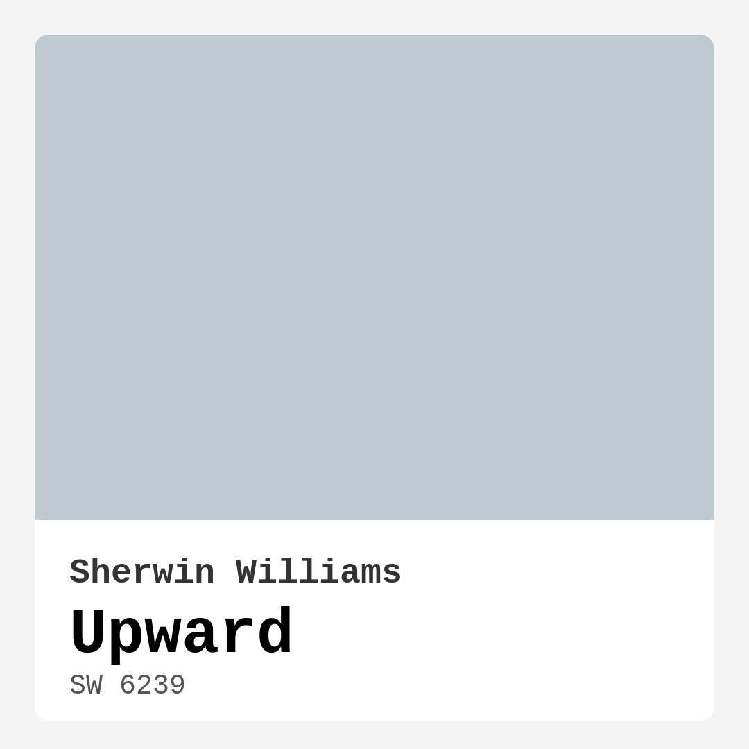
Color Preview & Key Details
| HEX Code | #BFC9D0 |
| RGB | 191, 201, 208 |
| LRV | 75% |
| Undertone | Blue |
| Finish Options | Eggshell, Flat, Satin |
Imagine stepping into your home after a long day, yearning for a space that wraps you in serenity. You want a color that not only looks beautiful but also feels inviting, calming, and refreshing. That’s where the enchanting hue of Upward by Sherwin Williams comes into play. With its delicate gray-blue tone, Upward creates an atmosphere that beckons you to unwind and breathe deeply. This paint color is more than just a visual option; it’s an invitation to transform your space into a personal oasis.
Upward, with the color code SW 6239, is a soft and serene shade that resonates with tranquility. Its medium brightness and high light reflectance value of 75% mean it illuminates any room beautifully, enhancing the natural light that flows through your windows. This is a crucial factor to consider when selecting a paint color; a higher LRV means your space will feel larger and more open, perfect for creating that airy, spacious vibe many homeowners crave.
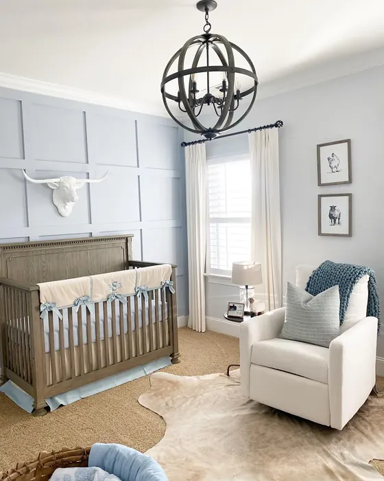
The undertones of Upward lean towards blue, infusing the color with depth and complexity. This blue undertone gives it a cool, modern feel while still remaining versatile enough to adapt to various decor styles. Whether you lean towards a minimalist aesthetic, a Scandinavian vibe, or beachy coastal themes, Upward fits seamlessly within these frameworks. The calming effect it brings makes it particularly suitable for spaces like bedrooms, living rooms, home offices, or nurseries where relaxation and tranquility are paramount.
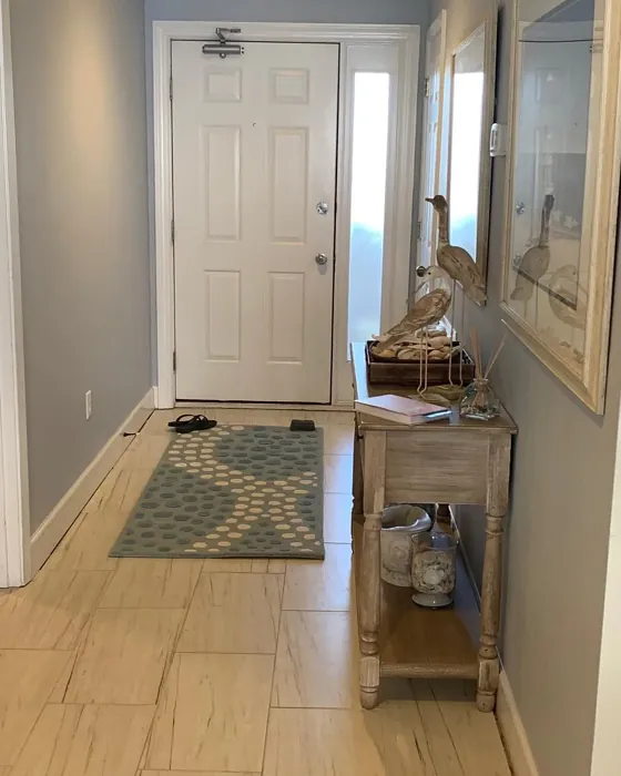
One of the standout features of Upward is its ability to reflect light, which is particularly effective in smaller spaces. If you’re considering a paint color for a compact room, Upward can help it feel more expansive. It’s ideal for entryways, small bedrooms, or even cozy bathrooms. The lightness of this hue invites natural light to bounce around, creating an open and inviting ambiance.
Now, let’s talk practicality. Upward offers excellent coverage, often requiring only one to two coats for a finished look that’s both polished and professional. This makes it a great choice for DIY enthusiasts and those who may not be professional painters. Its application is smooth and beginner-friendly, whether you’re using a brush or a roller. Plus, it dries quickly, allowing you to enjoy your newly painted space sooner rather than later.
When it comes to maintenance, Upward is a winner too. This paint is washable and wipeable, which means it can handle some wear and tear, especially in high-traffic areas. Just remember that while it may show dirt in busy spaces, regular touch-ups can keep your walls looking fresh and clean.
Choosing the right finish is also crucial, and you have options with Upward. It comes in Flat, Eggshell, and Satin finishes, each offering a different sheen level. Flat is perfect for ceilings or low-traffic areas, while Eggshell and Satin are more durable and work wonderfully for walls in living spaces or kitchens. This variety gives you the flexibility to choose what best suits the functionality and aesthetic of your room.
Of course, picking a paint color isn’t just about the color itself but how it interacts with other elements in your space. Upward pairs beautifully with various trim colors. For a crisp contrast, consider pairing it with white trim, like White Dove or Pure White. This combination highlights Upward’s soothing qualities without overwhelming the space. If you want to add warmth, consider warm wood tones or soft earth hues that balance the coolness of the blue undertone.
However, while Upward shines in many aspects, there are a couple of considerations to keep in mind. In low light settings, it may appear cooler than expected. This means that it’s essential to test samples on your walls in different lighting conditions before committing. The color can change throughout the day, so observe it at various times to see how it interacts with your space. Additionally, because it’s a light color, it might show dirt more easily in high-traffic areas. Regular cleaning and maintenance will help keep it looking its best.
If you’re looking for complementary colors to pair with Upward, consider shades like SW 6038, SW 6553, or SW 7077. These colors can create a beautiful palette that enhances your overall design without competing with the calming essence of Upward. Try these hues for accents, furniture, or decor pieces to maintain a cohesive look throughout your home.
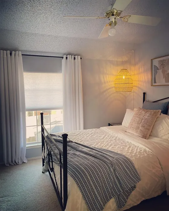
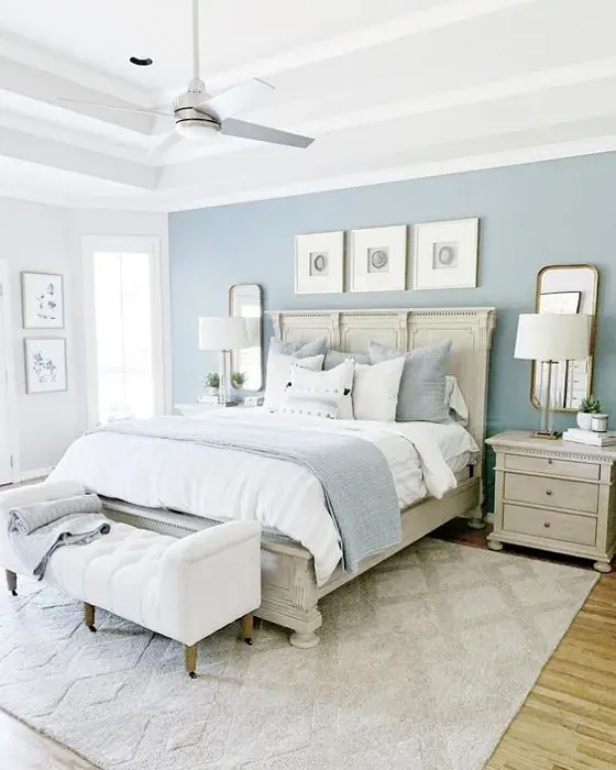
Imagine your living room adorned in Upward, where soft light dances off the walls, creating a peaceful retreat. Picture a nursery bathed in this gentle hue, fostering a nurturing environment for your little one. Or envision a cozy home office where creativity flows freely, inspired by the tranquil backdrop of Upward. The possibilities are endless with this versatile color!
In conclusion, if you’re searching for a paint color that promotes relaxation while remaining stylish, Upward is a fantastic choice. Its soothing gray-blue tone can transform any room into a personal sanctuary. With its excellent coverage, ease of application, and eco-friendly low VOC formulation, Upward checks all the boxes for a smart, beautiful choice in home decor. So, grab that paintbrush and get ready to elevate your space with a touch of tranquility and style. Your home deserves it!
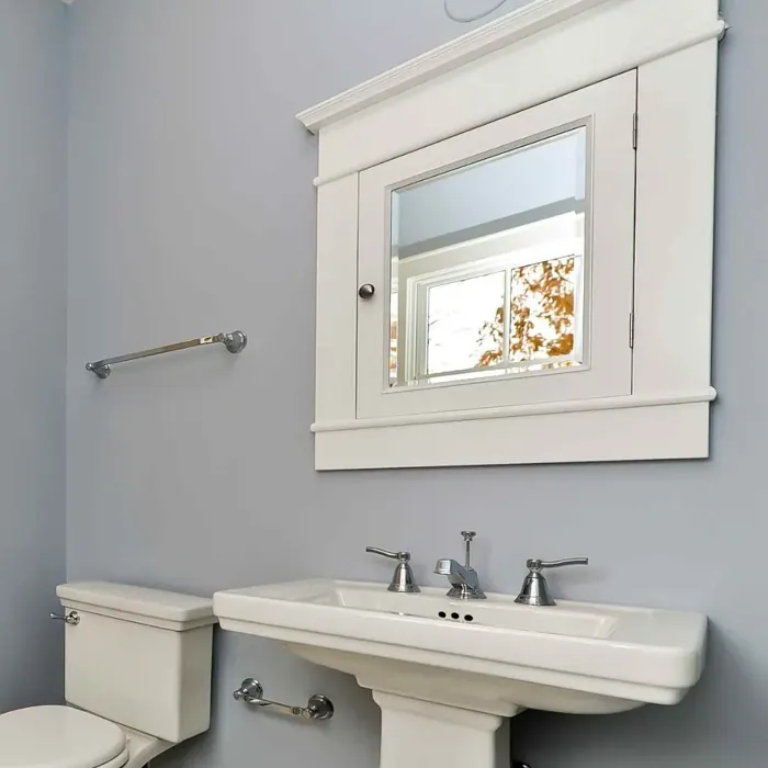
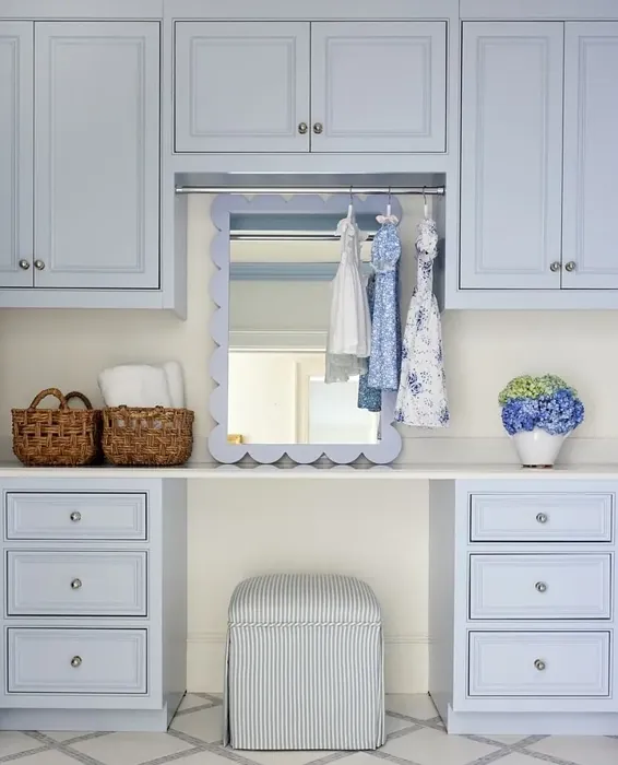
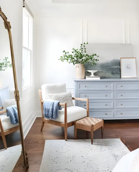
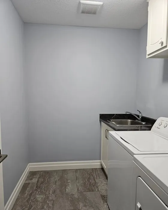
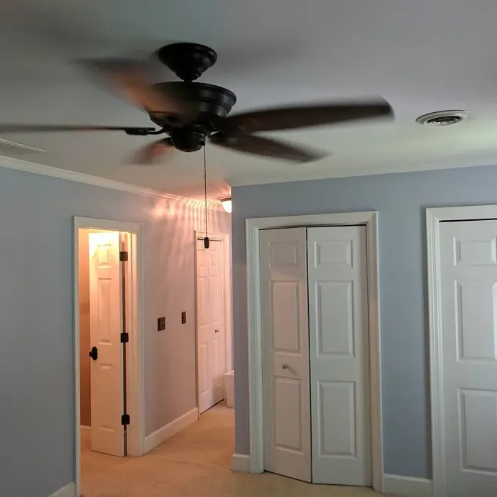
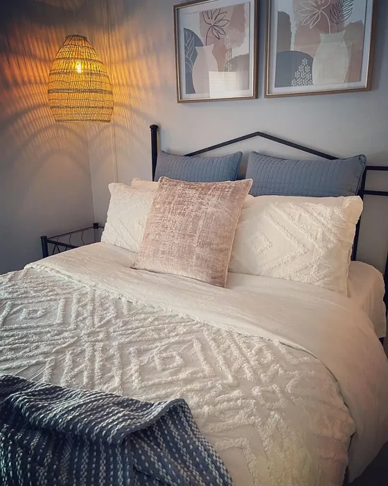
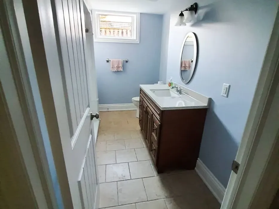
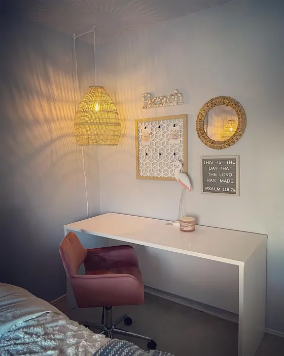
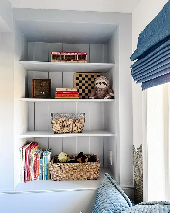
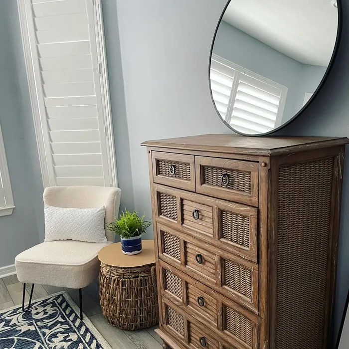
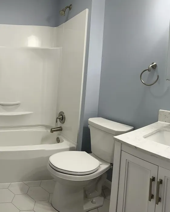
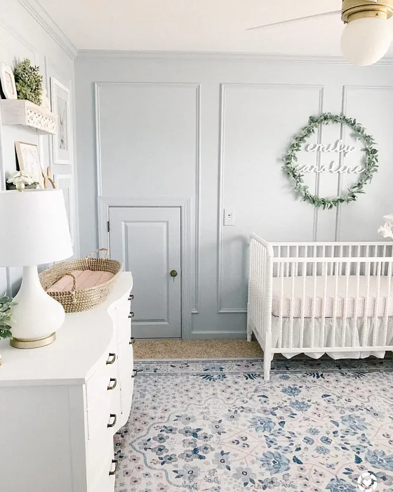
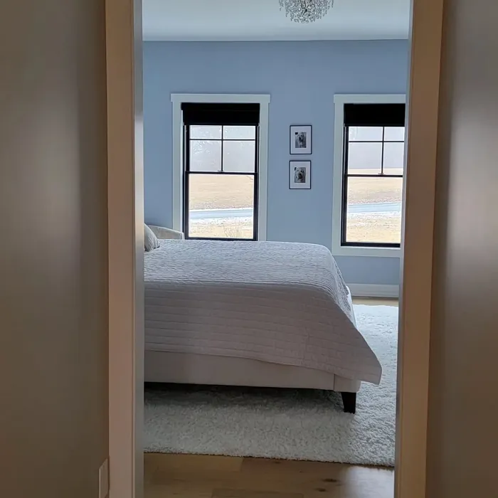
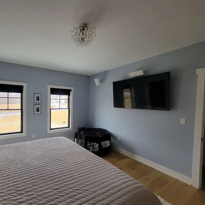
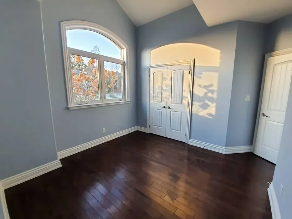
Real Room Photo of Upward SW 6239


Undertones of Upward ?
The undertones of Upward are a key aspect of its character, leaning towards Blue. These subtle underlying hues are what give the color its depth and complexity. For example, a gray with a blue undertone will feel cooler and more modern, while one with a brown undertone will feel warmer and more traditional. It’s essential to test this paint in your home and observe it next to your existing furniture, flooring, and decor to see how these undertones interact and reveal themselves throughout the day.
HEX value: #BFC9D0
RGB code: 191, 201, 208
Is Upward Cool or Warm?
This shade is decidedly cool, thanks to its blue undertones. It brings a sense of serenity to interiors, making it perfect for creating a soothing environment. When paired with warm accents, it can create a lovely contrast that balances the overall decor.
Understanding Color Properties and Interior Design Tips
Hue refers to a specific position on the color wheel, measured in degrees from 0 to 360. Each degree represents a different pure color:
- 0° represents red
- 120° represents green
- 240° represents blue
Saturation describes the intensity or purity of a color and is expressed as a percentage:
- At 0%, the color appears completely desaturated—essentially a shade of gray
- At 100%, the color is at its most vivid and vibrant
Lightness indicates how light or dark a color is, also expressed as a percentage:
- 0% lightness results in black
- 100% lightness results in white
Using Warm Colors in Interior Design
Warm hues—such as reds, oranges, yellows, warm beiges, and greiges—are excellent choices for creating inviting and energetic spaces. These colors are particularly well-suited for:
- Kitchens, living rooms, and bathrooms, where warmth enhances comfort and sociability
- Large rooms, where warm tones can help reduce the sense of emptiness and make the space feel more intimate
For example:
- Warm beige shades provide a cozy, inviting atmosphere, ideal for living rooms, bedrooms, and hallways.
- Warm greige (a mix of beige and gray) offers the warmth of beige with the modern appeal of gray, making it a versatile backdrop for dining areas, bedrooms, and living spaces.
However, be mindful when using warm light tones in rooms with limited natural light. These shades may appear muted or even take on an unpleasant yellowish tint. To avoid a dull or flat appearance:
- Add depth by incorporating richer tones like deep greens, charcoal, or chocolate brown
- Use textured elements such as curtains, rugs, or cushions to bring dimension to the space
Pro Tip: Achieving Harmony with Warm and Cool Color Balance
To create a well-balanced and visually interesting interior, mix warm and cool tones strategically. This contrast adds depth and harmony to your design.
- If your walls feature warm hues, introduce cool-colored accents such as blue or green furniture, artwork, or accessories to create contrast.
- For a polished look, consider using a complementary color scheme, which pairs colors opposite each other on the color wheel (e.g., red with green, orange with blue).
This thoughtful mix not only enhances visual appeal but also creates a space that feels both dynamic and cohesive.
Light Temperature Affects on Upward
Natural Light
Natural daylight changes in color temperature as the sun moves across the sky. At sunrise and sunset, the light tends to have a warm, golden tone with a color temperature around 2000 Kelvin (K). As the day progresses and the sun rises higher, the light becomes cooler and more neutral. Around midday, especially when the sky is clear, natural light typically reaches its peak brightness and shifts to a cooler tone, ranging from 5500 to 6500 Kelvin. This midday light is close to what we perceive as pure white or daylight-balanced light.
These shifts in natural light can significantly influence how colors appear in a space, which is why designers often consider both the time of day and the orientation of windows when planning interior color schemes.
Artificial Light
When choosing artificial lighting, pay close attention to the color temperature, measured in Kelvin (K). This determines how warm or cool the light will appear. Lower temperatures, around 2700K, give off a warm, yellow glow often used in living rooms or bedrooms. Higher temperatures, above 5000K, create a cool, bluish light similar to daylight, commonly used in kitchens, offices, or task areas.
Use the slider to see how lighting temperature can affect the appearance of a surface or color throughout a space.


4800K
LRV of Upward
The Light Reflectance Value (LRV) of Upward is 75%, which places it in the Light category. This means it Reflects a high amount of light. Understanding a paint’s LRV is crucial for predicting how it will look in your space. A higher LRV indicates a lighter color that reflects more light, making rooms feel larger and brighter. A lower LRV signifies a darker color that absorbs more light, creating a cozier, more intimate atmosphere. Always consider the natural and artificial lighting in your room when selecting a paint color based on its LRV.
Detailed Review of Upward
Additional Paint Characteristics
Ideal Rooms
Bedroom, Dining Room, Home Office, Living Room, Nursery
Decor Styles
Coastal, Minimalist, Modern, Scandinavian
Coverage
Good (1–2 Coats), Touch-Up Friendly
Ease of Application
Beginner Friendly, Brush Smooth, Fast-Drying, Roller-Ready
Washability
Washable, Wipeable
VOC Level
Eco-Certified, Low VOC
Best Use
Accent Wall, Bedroom, Interior Walls, Living Room
Room Suitability
Bedroom, Home Office, Living Room, Nursery
Tone Tag
Cool, Crisp, Muted
Finish Type
Eggshell, Satin
Paint Performance
High Coverage, Low Odor, Quick Drying
Use Cases
Best for Rentals, Best for Small Spaces, Designer Favorite
Mood
Calm, Inviting, Restful
Trim Pairing
Complements Cool Trim, Matches Pure White, Pairs with White Dove
Upward is a delightful paint color that exudes tranquility. The soft gray-blue tone makes it incredibly versatile, working well in both contemporary and traditional settings. When applied, it reflects light beautifully, enhancing the spacious feel of a room. This shade is particularly effective in areas where you want to unwind, like bedrooms or home offices. It pairs nicely with white or light wood trim, allowing it to shine without overwhelming the space. If you’re looking for a color that promotes relaxation while remaining stylish, Upward is a fantastic choice that won’t disappoint.
Pros & Cons of SW 6239 Upward
Pros
Cons
Colors that go with Sherwin Williams Upward
FAQ on SW 6239 Upward
What types of finishes are available for Upward?
Upward is available in several finishes including Flat, Eggshell, and Satin. Each finish offers a different sheen level, allowing you to choose the right one for your space. Flat is great for ceilings or low-traffic areas, while Eggshell and Satin are more durable and suitable for walls in living spaces or kitchens. This range gives you flexibility based on your design needs and the functionality of the room.
Is Upward suitable for small spaces?
Absolutely! Upward is an excellent choice for small spaces. Its light-reflective properties can help make compact rooms feel larger and more open. The calming hue also creates a sense of breathing room, which is particularly beneficial in tight areas like entryways, bathrooms, or small bedrooms. Plus, it pairs beautifully with various trim colors that can enhance the overall effect.
Comparisons Upward with other colors
Upward SW 6239 vs Dutch Tile Blue SW 0031
| Attribute | Upward SW 6239 | Dutch Tile Blue SW 0031 |
|---|---|---|
| Color Name | Upward SW 6239 | Dutch Tile Blue SW 0031 |
| Color | ||
| Hue | Blue | Blue |
| Brightness | Medium | Medium |
| RGB | 191, 201, 208 | 154, 171, 171 |
| LRV | 75% | 24% |
| Finish Type | Eggshell, Satin | Eggshell, Matte, Satin |
| Finish Options | Eggshell, Flat, Satin | Eggshell, Flat, Matte, Satin |
| Ideal Rooms | Bedroom, Dining Room, Home Office, Living Room, Nursery | Bathroom, Bedroom, Dining Room, Hallway, Home Office, Kitchen, Living Room |
| Decor Styles | Coastal, Minimalist, Modern, Scandinavian | Coastal, Modern Farmhouse, Scandinavian, Traditional, Transitional |
| Coverage | Good (1–2 Coats), Touch-Up Friendly | Good (1–2 Coats) |
| Ease of Application | Beginner Friendly, Brush Smooth, Fast-Drying, Roller-Ready | Beginner Friendly, Brush Smooth, Fast-Drying, Roller-Ready |
| Washability | Washable, Wipeable | Highly Washable, Washable |
| Room Suitability | Bedroom, Home Office, Living Room, Nursery | Bathroom, Bedroom, Dining Room, Kitchen, Living Room |
| Tone | Cool, Crisp, Muted | Balanced, Cool, Muted |
| Paint Performance | High Coverage, Low Odor, Quick Drying | Easy Touch-Up, High Coverage, Low Odor, Quick Drying |
Upward SW 6239 vs Debonair SW 9139
| Attribute | Upward SW 6239 | Debonair SW 9139 |
|---|---|---|
| Color Name | Upward SW 6239 | Debonair SW 9139 |
| Color | ||
| Hue | Blue | Blue |
| Brightness | Medium | Medium |
| RGB | 191, 201, 208 | 144, 160, 166 |
| LRV | 75% | 30% |
| Finish Type | Eggshell, Satin | Eggshell, Matte, Satin |
| Finish Options | Eggshell, Flat, Satin | Eggshell, Matte, Satin |
| Ideal Rooms | Bedroom, Dining Room, Home Office, Living Room, Nursery | Bedroom, Dining Room, Home Office, Living Room |
| Decor Styles | Coastal, Minimalist, Modern, Scandinavian | Coastal, Industrial, Modern, Transitional |
| Coverage | Good (1–2 Coats), Touch-Up Friendly | Good (1–2 Coats) |
| Ease of Application | Beginner Friendly, Brush Smooth, Fast-Drying, Roller-Ready | Beginner Friendly, Brush Smooth, Roller-Ready |
| Washability | Washable, Wipeable | Washable, Wipeable |
| Room Suitability | Bedroom, Home Office, Living Room, Nursery | Bedroom, Dining Room, Home Office, Living Room |
| Tone | Cool, Crisp, Muted | Balanced, Cool, Muted |
| Paint Performance | High Coverage, Low Odor, Quick Drying | Easy Touch-Up, Low Odor, Quick Drying |
Upward SW 6239 vs Stardew SW 9138
| Attribute | Upward SW 6239 | Stardew SW 9138 |
|---|---|---|
| Color Name | Upward SW 6239 | Stardew SW 9138 |
| Color | ||
| Hue | Blue | Blue |
| Brightness | Medium | Medium |
| RGB | 191, 201, 208 | 166, 178, 181 |
| LRV | 75% | 30% |
| Finish Type | Eggshell, Satin | Eggshell, Satin |
| Finish Options | Eggshell, Flat, Satin | Eggshell, Matte, Satin |
| Ideal Rooms | Bedroom, Dining Room, Home Office, Living Room, Nursery | Bathroom, Bedroom, Home Office, Living Room, Nursery |
| Decor Styles | Coastal, Minimalist, Modern, Scandinavian | Coastal, Farmhouse, Modern, Scandinavian |
| Coverage | Good (1–2 Coats), Touch-Up Friendly | Good (1–2 Coats) |
| Ease of Application | Beginner Friendly, Brush Smooth, Fast-Drying, Roller-Ready | Beginner Friendly, Brush Smooth, Roller-Ready |
| Washability | Washable, Wipeable | Highly Washable, Washable, Wipeable |
| Room Suitability | Bedroom, Home Office, Living Room, Nursery | Bathroom, Bedroom, Home Office, Living Room |
| Tone | Cool, Crisp, Muted | Calm, Cool, Muted |
| Paint Performance | High Coverage, Low Odor, Quick Drying | Easy Touch-Up, High Coverage, Low Odor |
Upward SW 6239 vs Niebla Azul SW 9137
| Attribute | Upward SW 6239 | Niebla Azul SW 9137 |
|---|---|---|
| Color Name | Upward SW 6239 | Niebla Azul SW 9137 |
| Color | ||
| Hue | Blue | Blue |
| Brightness | Medium | Medium |
| RGB | 191, 201, 208 | 182, 195, 196 |
| LRV | 75% | 48% |
| Finish Type | Eggshell, Satin | Eggshell, Matte, Satin |
| Finish Options | Eggshell, Flat, Satin | Eggshell, Matte, Satin |
| Ideal Rooms | Bedroom, Dining Room, Home Office, Living Room, Nursery | Bedroom, Home Office, Living Room, Nursery |
| Decor Styles | Coastal, Minimalist, Modern, Scandinavian | Coastal, Modern, Scandinavian, Transitional |
| Coverage | Good (1–2 Coats), Touch-Up Friendly | Good (1–2 Coats), Touch-Up Friendly |
| Ease of Application | Beginner Friendly, Brush Smooth, Fast-Drying, Roller-Ready | Beginner Friendly, Brush Smooth, Roller-Ready |
| Washability | Washable, Wipeable | Highly Washable, Washable |
| Room Suitability | Bedroom, Home Office, Living Room, Nursery | Bedroom, Home Office, Living Room, Nursery |
| Tone | Cool, Crisp, Muted | Airy, Cool, Muted |
| Paint Performance | High Coverage, Low Odor, Quick Drying | Easy Touch-Up, Fade Resistant, Low Odor, Scuff Resistant |
Upward SW 6239 vs Rain SW 6219
| Attribute | Upward SW 6239 | Rain SW 6219 |
|---|---|---|
| Color Name | Upward SW 6239 | Rain SW 6219 |
| Color | ||
| Hue | Blue | Blue |
| Brightness | Medium | Medium |
| RGB | 191, 201, 208 | 171, 190, 191 |
| LRV | 75% | 50% |
| Finish Type | Eggshell, Satin | Eggshell, Matte, Satin |
| Finish Options | Eggshell, Flat, Satin | Eggshell, Matte, Satin |
| Ideal Rooms | Bedroom, Dining Room, Home Office, Living Room, Nursery | Bathroom, Bedroom, Home Office, Living Room, Nursery |
| Decor Styles | Coastal, Minimalist, Modern, Scandinavian | Coastal, Minimalist, Modern, Scandinavian, Transitional |
| Coverage | Good (1–2 Coats), Touch-Up Friendly | Good (1–2 Coats), Touch-Up Friendly |
| Ease of Application | Beginner Friendly, Brush Smooth, Fast-Drying, Roller-Ready | Beginner Friendly, Brush Smooth, Fast-Drying, Roller-Ready |
| Washability | Washable, Wipeable | Scrubbable, Stain Resistant, Washable |
| Room Suitability | Bedroom, Home Office, Living Room, Nursery | Bathroom, Bedroom, Home Office, Living Room, Nursery |
| Tone | Cool, Crisp, Muted | Balanced, Cool, Muted |
| Paint Performance | High Coverage, Low Odor, Quick Drying | Easy Touch-Up, Low Odor, Quick Drying, Stain Resistant |
Upward SW 6239 vs Morning at Sea SW 9634
| Attribute | Upward SW 6239 | Morning at Sea SW 9634 |
|---|---|---|
| Color Name | Upward SW 6239 | Morning at Sea SW 9634 |
| Color | ||
| Hue | Blue | Blue |
| Brightness | Medium | Medium |
| RGB | 191, 201, 208 | 130, 151, 155 |
| LRV | 75% | 50% |
| Finish Type | Eggshell, Satin | Eggshell, Matte |
| Finish Options | Eggshell, Flat, Satin | Eggshell, Matte, Satin |
| Ideal Rooms | Bedroom, Dining Room, Home Office, Living Room, Nursery | Bathroom, Bedroom, Home Office, Living Room |
| Decor Styles | Coastal, Minimalist, Modern, Scandinavian | Coastal, Minimalist, Modern, Scandinavian |
| Coverage | Good (1–2 Coats), Touch-Up Friendly | Good (1–2 Coats), Touch-Up Friendly |
| Ease of Application | Beginner Friendly, Brush Smooth, Fast-Drying, Roller-Ready | Beginner Friendly, Brush Smooth, Roller-Ready |
| Washability | Washable, Wipeable | Washable, Wipeable |
| Room Suitability | Bedroom, Home Office, Living Room, Nursery | Bathroom, Bedroom, Home Office, Living Room |
| Tone | Cool, Crisp, Muted | Airy, Cool, Muted |
| Paint Performance | High Coverage, Low Odor, Quick Drying | Easy Touch-Up, Fade Resistant, Low Odor |
Upward SW 6239 vs Sleepy Blue SW 6225
| Attribute | Upward SW 6239 | Sleepy Blue SW 6225 |
|---|---|---|
| Color Name | Upward SW 6239 | Sleepy Blue SW 6225 |
| Color | ||
| Hue | Blue | Blue |
| Brightness | Medium | Medium |
| RGB | 191, 201, 208 | 188, 203, 206 |
| LRV | 75% | 50% |
| Finish Type | Eggshell, Satin | Eggshell, Matte, Satin |
| Finish Options | Eggshell, Flat, Satin | Eggshell, Matte, Satin |
| Ideal Rooms | Bedroom, Dining Room, Home Office, Living Room, Nursery | Bedroom, Home Office, Living Room, Nursery |
| Decor Styles | Coastal, Minimalist, Modern, Scandinavian | Coastal, Minimalist, Modern Farmhouse, Scandinavian |
| Coverage | Good (1–2 Coats), Touch-Up Friendly | Good (1–2 Coats) |
| Ease of Application | Beginner Friendly, Brush Smooth, Fast-Drying, Roller-Ready | Beginner Friendly, Brush Smooth, Fast-Drying, Roller-Ready |
| Washability | Washable, Wipeable | Highly Washable, Washable |
| Room Suitability | Bedroom, Home Office, Living Room, Nursery | Bedroom, Home Office, Living Room, Nursery |
| Tone | Cool, Crisp, Muted | Airy, Cool, Muted |
| Paint Performance | High Coverage, Low Odor, Quick Drying | Easy Touch-Up, Low Odor, Quick Drying, Scuff Resistant |
Upward SW 6239 vs Lakeside SW 9683
| Attribute | Upward SW 6239 | Lakeside SW 9683 |
|---|---|---|
| Color Name | Upward SW 6239 | Lakeside SW 9683 |
| Color | ||
| Hue | Blue | Blue |
| Brightness | Medium | Medium |
| RGB | 191, 201, 208 | 173, 184, 192 |
| LRV | 75% | 24% |
| Finish Type | Eggshell, Satin | Eggshell, Matte, Satin |
| Finish Options | Eggshell, Flat, Satin | Eggshell, Matte, Satin |
| Ideal Rooms | Bedroom, Dining Room, Home Office, Living Room, Nursery | Bathroom, Bedroom, Home Office, Living Room |
| Decor Styles | Coastal, Minimalist, Modern, Scandinavian | Coastal, Minimalist, Modern, Rustic |
| Coverage | Good (1–2 Coats), Touch-Up Friendly | Good (1–2 Coats) |
| Ease of Application | Beginner Friendly, Brush Smooth, Fast-Drying, Roller-Ready | Beginner Friendly, Brush Smooth, Roller-Ready |
| Washability | Washable, Wipeable | Scrubbable, Washable |
| Room Suitability | Bedroom, Home Office, Living Room, Nursery | Bathroom, Bedroom, Home Office, Living Room |
| Tone | Cool, Crisp, Muted | Balanced, Cool, Muted |
| Paint Performance | High Coverage, Low Odor, Quick Drying | Easy Touch-Up, Fade Resistant, High Coverage, Low Odor |
Upward SW 6239 vs Aleutian SW 6241
| Attribute | Upward SW 6239 | Aleutian SW 6241 |
|---|---|---|
| Color Name | Upward SW 6239 | Aleutian SW 6241 |
| Color | ||
| Hue | Blue | Blue |
| Brightness | Medium | Medium |
| RGB | 191, 201, 208 | 152, 169, 183 |
| LRV | 75% | 24% |
| Finish Type | Eggshell, Satin | Eggshell, Matte, Satin |
| Finish Options | Eggshell, Flat, Satin | Eggshell, Matte, Satin |
| Ideal Rooms | Bedroom, Dining Room, Home Office, Living Room, Nursery | Bathroom, Bedroom, Home Office, Kitchen, Living Room, Nursery |
| Decor Styles | Coastal, Minimalist, Modern, Scandinavian | Coastal, Minimalist, Modern, Scandinavian, Transitional |
| Coverage | Good (1–2 Coats), Touch-Up Friendly | Good (1–2 Coats), Touch-Up Friendly |
| Ease of Application | Beginner Friendly, Brush Smooth, Fast-Drying, Roller-Ready | Beginner Friendly, Brush Smooth, Fast-Drying, Roller-Ready |
| Washability | Washable, Wipeable | Scrubbable, Stain Resistant, Washable |
| Room Suitability | Bedroom, Home Office, Living Room, Nursery | Bathroom, Bedroom, Home Office, Living Room, Nursery |
| Tone | Cool, Crisp, Muted | Airy, Balanced, Cool, Muted |
| Paint Performance | High Coverage, Low Odor, Quick Drying | Easy Touch-Up, Fade Resistant, Low Odor, Quick Drying |
Upward SW 6239 vs Moody Blue SW 6221
| Attribute | Upward SW 6239 | Moody Blue SW 6221 |
|---|---|---|
| Color Name | Upward SW 6239 | Moody Blue SW 6221 |
| Color | ||
| Hue | Blue | Blue |
| Brightness | Medium | Medium |
| RGB | 191, 201, 208 | 122, 145, 146 |
| LRV | 75% | 10% |
| Finish Type | Eggshell, Satin | Eggshell, Matte, Satin |
| Finish Options | Eggshell, Flat, Satin | Eggshell, Matte, Satin |
| Ideal Rooms | Bedroom, Dining Room, Home Office, Living Room, Nursery | Bedroom, Dining Room, Hallway, Home Office, Living Room |
| Decor Styles | Coastal, Minimalist, Modern, Scandinavian | Coastal, Contemporary, Modern Farmhouse, Transitional |
| Coverage | Good (1–2 Coats), Touch-Up Friendly | Good (1–2 Coats) |
| Ease of Application | Beginner Friendly, Brush Smooth, Fast-Drying, Roller-Ready | Beginner Friendly, Brush Smooth, Roller-Ready |
| Washability | Washable, Wipeable | Highly Washable, Washable |
| Room Suitability | Bedroom, Home Office, Living Room, Nursery | Bedroom, Dining Room, Home Office, Living Room |
| Tone | Cool, Crisp, Muted | Cool, Deep, Moody, Muted |
| Paint Performance | High Coverage, Low Odor, Quick Drying | Easy Touch-Up, Fade Resistant, High Coverage, Low Odor |
Official Page of Sherwin Williams Upward SW 6239