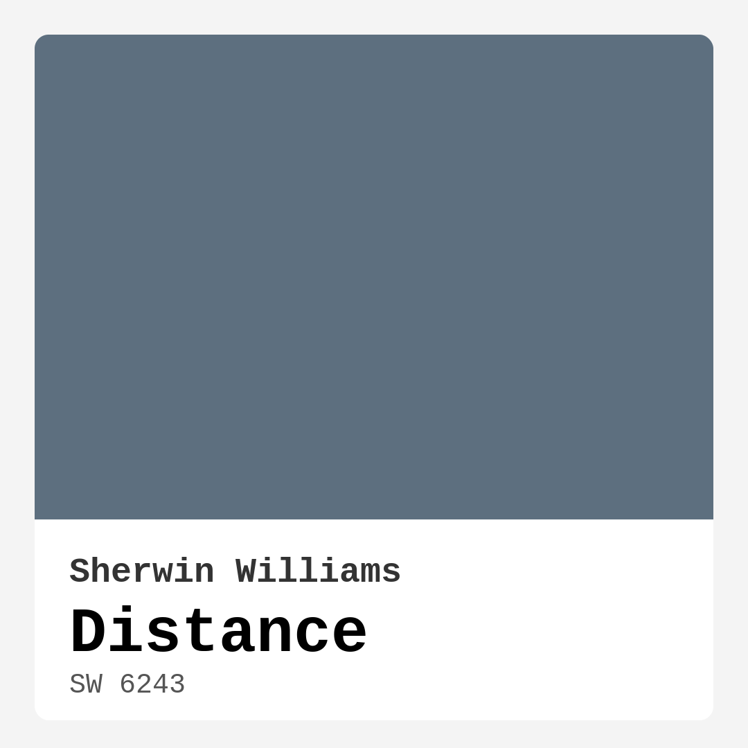
Color Preview & Key Details
| HEX Code | #5D6F7F |
| RGB | 93, 111, 127 |
| LRV | 58% |
| Undertone | Blue |
| Finish Options | Eggshell, Matte, Satin |
Imagine walking into a room that feels like a gentle embrace, where the colors wrap around you, creating a serene atmosphere that instantly calms your mind. That’s the magic of Sherwin Williams’ Distance (SW 6243). This sophisticated gray-blue is more than just a paint color; it’s a gateway to tranquility and style in your home.
Let’s dive into why Distance might just be the perfect choice for your next project. With its cool undertones and muted charm, this color sets a tone that whispers elegance while still maintaining a sense of warmth. Picture it as a distant horizon, offering a subtle backdrop that enhances your space without overwhelming it.
Distance has a unique ability to adapt to various lighting conditions. In bright natural light, you might notice the soft blue hints coming to life, while in dimmer settings, it transforms into a more subdued, cozy gray. This dynamic quality is particularly appealing for open-concept spaces where one color needs to harmonize with numerous elements. It provides a balanced, sophisticated palette that encourages comfort and relaxation.
When it comes to application, Distance is incredibly user-friendly. Whether you’re a seasoned DIYer or a beginner, you’ll appreciate how smoothly it rolls on and brushes out. It dries quickly, and the finish is consistent across surfaces — no blotchy patches here! With good coverage from just one to two coats, it gives you a solid return on your investment.
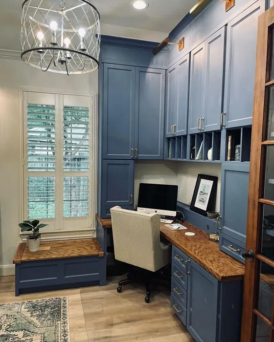
Let’s talk about where Distance shines best. It’s ideal for living rooms, bedrooms, and home offices, creating an environment that’s calm and conducive to focus. Imagine your home office painted in this soothing hue; it not only boosts productivity but also offers a sense of peace that many of us crave in our busy lives.
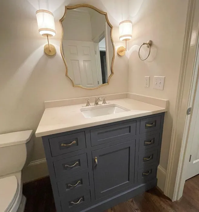
The versatility of Distance means it complements a wide range of decor styles. Whether your space is modern, coastal, transitional, or minimalist, this color can elevate your design. It pairs beautifully with white trim, allowing the soft blue to pop without being jarring. Consider accenting it with brass fixtures for a touch of glam or natural wood elements for warmth. The possibilities are endless!
When considering the mood you want to evoke in your space, Distance is a top contender. It creates a calm and restful atmosphere, making it perfect for spaces meant for relaxation. Imagine curling up in your bedroom, surrounded by this serene color, as you unwind after a long day. It can even work wonders in small spaces, reflecting light to give an illusion of openness, especially when paired with lighter furniture.
However, like any color, Distance isn’t without its challenges. In poorly lit areas, it may appear darker than intended, which can sometimes create a heavier feel. To counteract this, balance it out with lighter decor and strategic lighting choices. It’s essential to test how the color interacts with your existing furnishings and decor; paint a sample patch and watch it change throughout the day.
If you’re looking for a color that stays fresh and modern, Distance offers a low VOC formula, making it a healthier choice for your home. Its washability means you can easily wipe away marks, keeping your walls looking pristine. Plus, it’s touch-up friendly, which is a blessing for busy households.
For those who love to play with color combinations, Distance opens the door to many possibilities. Consider pairing it with complementary shades like SW 6038 or SW 6553; they bring out the best in each other, creating a cohesive look that feels intentional and curated. If you want a lighter option, SW 6242 is a lovely choice, while SW 7615 offers a deeper, more dramatic contrast for those bolder moments.
Nature lovers might find inspiration in the calming feel of Distance, reminiscent of a serene seascape or a peaceful sky. Its unique hue can serve as a beautiful backdrop for art pieces or family photos, allowing them to shine without competing for attention.
As you consider Distance for your project, think about the feeling you want to create. It embodies calmness and sophistication, making it perfect for any space that serves as your retreat.
If you’re wondering whether it can be used outdoors, while it’s predominantly an interior paint, it can work for exterior applications when properly sealed. Just keep in mind that for outdoor spaces exposed to the elements, a paint specifically designed for exterior use would be a more durable choice.
In the end, choosing a paint color is about more than aesthetics; it’s about how you want to feel in your space. Distance captures a sense of peace and elegance, allowing you to curate a home that tells your story.
So, are you ready to embrace the tranquility of Distance in your home? With its calming presence and adaptable nature, it could be just what you need to transform your space into a personal sanctuary. Grab that sample pot, and let your walls speak the language of serenity and style. After all, your home should be a reflection of who you are — and with Distance, you’re one step closer to achieving that perfect vibe.
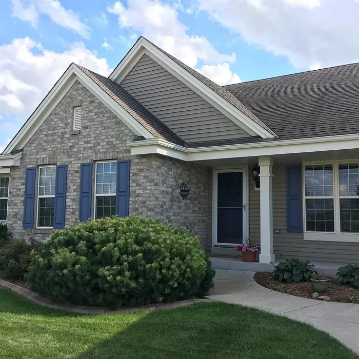
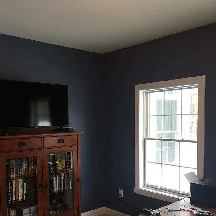
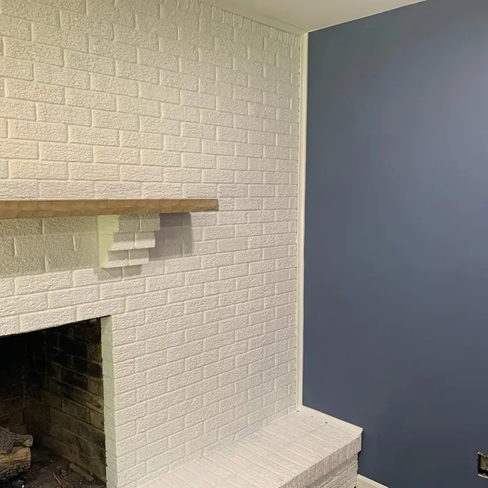
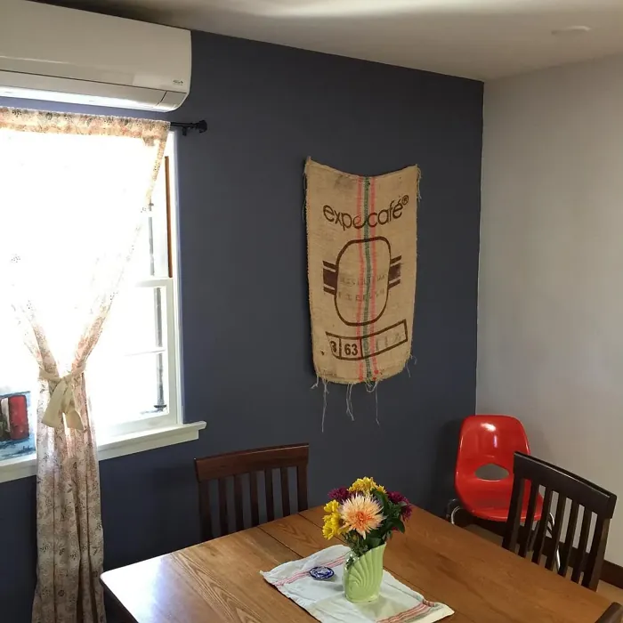
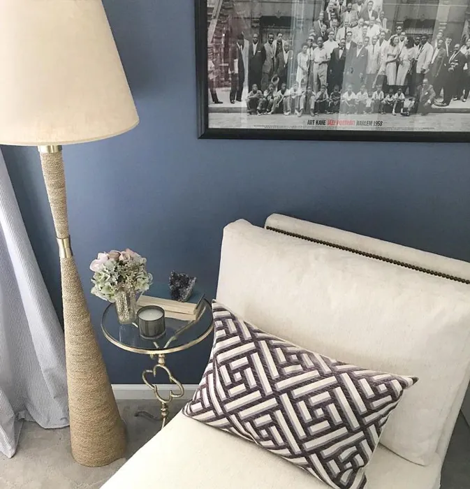
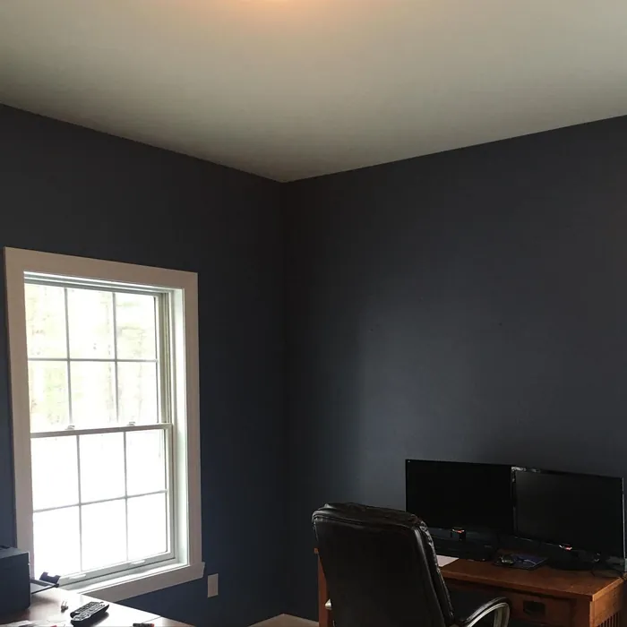
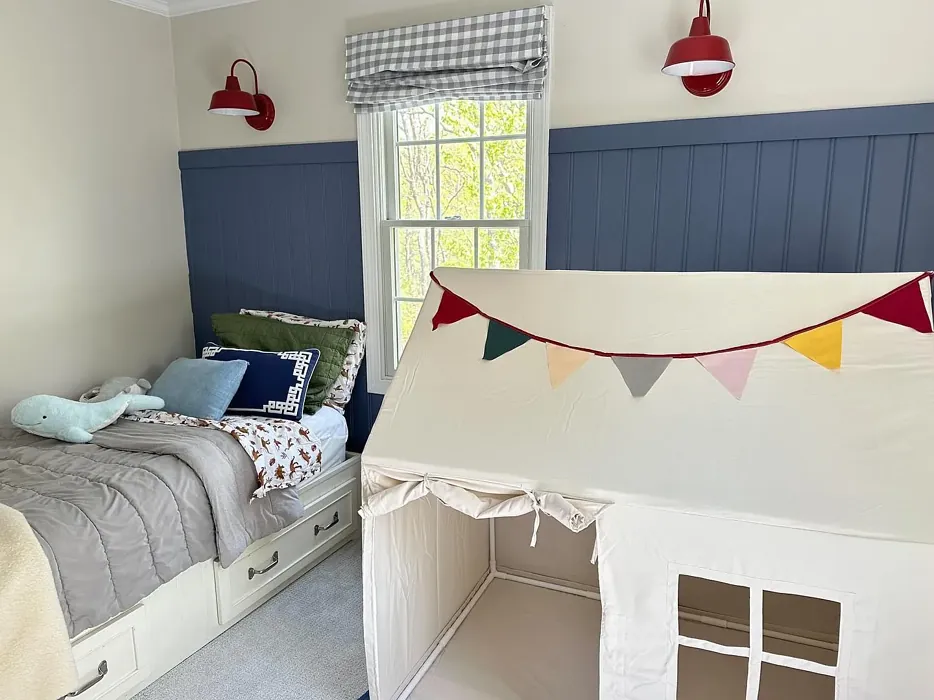
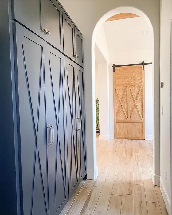
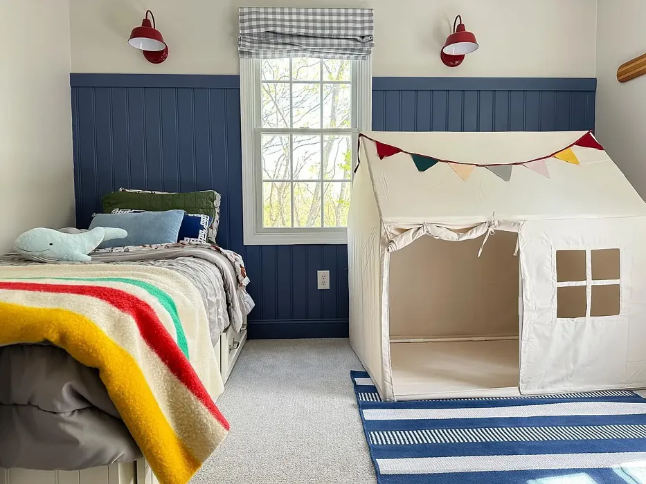
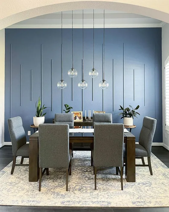
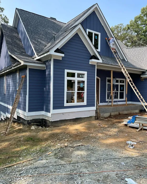
Real Room Photo of Distance SW 6243
Undertones of Distance ?
The undertones of Distance are a key aspect of its character, leaning towards Blue. These subtle underlying hues are what give the color its depth and complexity. For example, a gray with a blue undertone will feel cooler and more modern, while one with a brown undertone will feel warmer and more traditional. It’s essential to test this paint in your home and observe it next to your existing furniture, flooring, and decor to see how these undertones interact and reveal themselves throughout the day.
HEX value: #5D6F7F
RGB code: 93, 111, 127
Is Distance Cool or Warm?
This shade is distinctly cool, making it a great choice for spaces that benefit from a refreshing touch. Its blue-gray hue reflects light beautifully, enhancing the feeling of spaciousness while keeping the vibe tranquil.
Understanding Color Properties and Interior Design Tips
Hue refers to a specific position on the color wheel, measured in degrees from 0 to 360. Each degree represents a different pure color:
- 0° represents red
- 120° represents green
- 240° represents blue
Saturation describes the intensity or purity of a color and is expressed as a percentage:
- At 0%, the color appears completely desaturated—essentially a shade of gray
- At 100%, the color is at its most vivid and vibrant
Lightness indicates how light or dark a color is, also expressed as a percentage:
- 0% lightness results in black
- 100% lightness results in white
Using Warm Colors in Interior Design
Warm hues—such as reds, oranges, yellows, warm beiges, and greiges—are excellent choices for creating inviting and energetic spaces. These colors are particularly well-suited for:
- Kitchens, living rooms, and bathrooms, where warmth enhances comfort and sociability
- Large rooms, where warm tones can help reduce the sense of emptiness and make the space feel more intimate
For example:
- Warm beige shades provide a cozy, inviting atmosphere, ideal for living rooms, bedrooms, and hallways.
- Warm greige (a mix of beige and gray) offers the warmth of beige with the modern appeal of gray, making it a versatile backdrop for dining areas, bedrooms, and living spaces.
However, be mindful when using warm light tones in rooms with limited natural light. These shades may appear muted or even take on an unpleasant yellowish tint. To avoid a dull or flat appearance:
- Add depth by incorporating richer tones like deep greens, charcoal, or chocolate brown
- Use textured elements such as curtains, rugs, or cushions to bring dimension to the space
Pro Tip: Achieving Harmony with Warm and Cool Color Balance
To create a well-balanced and visually interesting interior, mix warm and cool tones strategically. This contrast adds depth and harmony to your design.
- If your walls feature warm hues, introduce cool-colored accents such as blue or green furniture, artwork, or accessories to create contrast.
- For a polished look, consider using a complementary color scheme, which pairs colors opposite each other on the color wheel (e.g., red with green, orange with blue).
This thoughtful mix not only enhances visual appeal but also creates a space that feels both dynamic and cohesive.
Light Temperature Affects on Distance
Natural Light
Natural daylight changes in color temperature as the sun moves across the sky. At sunrise and sunset, the light tends to have a warm, golden tone with a color temperature around 2000 Kelvin (K). As the day progresses and the sun rises higher, the light becomes cooler and more neutral. Around midday, especially when the sky is clear, natural light typically reaches its peak brightness and shifts to a cooler tone, ranging from 5500 to 6500 Kelvin. This midday light is close to what we perceive as pure white or daylight-balanced light.
These shifts in natural light can significantly influence how colors appear in a space, which is why designers often consider both the time of day and the orientation of windows when planning interior color schemes.
Artificial Light
When choosing artificial lighting, pay close attention to the color temperature, measured in Kelvin (K). This determines how warm or cool the light will appear. Lower temperatures, around 2700K, give off a warm, yellow glow often used in living rooms or bedrooms. Higher temperatures, above 5000K, create a cool, bluish light similar to daylight, commonly used in kitchens, offices, or task areas.
Use the slider to see how lighting temperature can affect the appearance of a surface or color throughout a space.


4800K
LRV of Distance
The Light Reflectance Value (LRV) of Distance is 58%, which places it in the Medium category. This means it Reflects a moderate amount of light. Understanding a paint’s LRV is crucial for predicting how it will look in your space. A higher LRV indicates a lighter color that reflects more light, making rooms feel larger and brighter. A lower LRV signifies a darker color that absorbs more light, creating a cozier, more intimate atmosphere. Always consider the natural and artificial lighting in your room when selecting a paint color based on its LRV.
Detailed Review of Distance
Additional Paint Characteristics
Ideal Rooms
Bedroom, Dining Room, Home Office, Living Room
Decor Styles
Coastal, Minimalist, Modern, Transitional
Coverage
Good (1–2 Coats), Touch-Up Friendly
Ease of Application
Beginner Friendly, Brush Smooth, Fast-Drying, Roller-Ready
Washability
Washable, Wipeable
VOC Level
Low VOC
Best Use
Accent Wall, Cabinets, Interior Walls
Room Suitability
Bedroom, Home Office, Living Room
Tone Tag
Balanced, Cool, Muted
Finish Type
Eggshell, Matte
Paint Performance
Easy Touch-Up, Fade Resistant, Low Odor, Quick Drying
Use Cases
Best for Low Light Rooms, Best for Small Spaces, Designer Favorite
Mood
Calm, Restful, Sophisticated
Trim Pairing
Complements Brass Fixtures, Pairs with White Dove
When you first apply Distance, you’ll notice its soothing quality. The gray undertones make it incredibly adaptable, working well in both bright and low-light settings. It has a unique ability to transform a space without overwhelming it, making it suitable for open-concept areas. The color appears deeper near darker furniture but lightens considerably in sunlight, creating an airy feel. The application process is smooth, whether you prefer a brush or roller, and the finish is even across the board. It’s a color that not only elevates your aesthetic but also provides a calming atmosphere, perfect for relaxation or focus.
Pros & Cons of SW 6243 Distance
Pros
Cons
Colors that go with Sherwin Williams Distance
FAQ on SW 6243 Distance
Can Distance be used in small spaces?
Absolutely! Distance works wonderfully in small spaces due to its ability to reflect light and create an illusion of openness. Just be sure to balance it with lighter furniture or accents to keep the area feeling airy.
Is Distance suitable for exterior use?
While Distance is primarily designed for indoor use, it can work for exterior applications if properly sealed and protected. However, for long-lasting results outdoors, consider a paint specifically formulated for exterior conditions.
Comparisons Distance with other colors
Distance SW 6243 vs Naval SW 6244
| Attribute | Distance SW 6243 | Naval SW 6244 |
|---|---|---|
| Color Name | Distance SW 6243 | Naval SW 6244 |
| Color | ||
| Hue | Blue | Blue |
| Brightness | Dark | Dark |
| RGB | 93, 111, 127 | 47, 61, 76 |
| LRV | 58% | 4% |
| Finish Type | Eggshell, Matte | Matte, Satin, Semi-Gloss |
| Finish Options | Eggshell, Matte, Satin | Matte, Satin, Semi-Gloss |
| Ideal Rooms | Bedroom, Dining Room, Home Office, Living Room | Bedroom, Dining Room, Hallway, Home Office, Living Room |
| Decor Styles | Coastal, Minimalist, Modern, Transitional | Coastal, Industrial, Minimalist, Modern, Traditional |
| Coverage | Good (1–2 Coats), Touch-Up Friendly | Good (1–2 Coats), Self-Priming |
| Ease of Application | Beginner Friendly, Brush Smooth, Fast-Drying, Roller-Ready | Beginner Friendly, Brush Smooth, Roller-Ready |
| Washability | Washable, Wipeable | Highly Washable, Washable |
| Room Suitability | Bedroom, Home Office, Living Room | Bedroom, Dining Room, Entryway, Home Office, Living Room |
| Tone | Balanced, Cool, Muted | Cool, Deep, Moody |
| Paint Performance | Easy Touch-Up, Fade Resistant, Low Odor, Quick Drying | Easy Touch-Up, High Coverage, Low Odor, Scuff Resistant |
Distance SW 6243 vs Sea Serpent SW 7615
| Attribute | Distance SW 6243 | Sea Serpent SW 7615 |
|---|---|---|
| Color Name | Distance SW 6243 | Sea Serpent SW 7615 |
| Color | ||
| Hue | Blue | Blue |
| Brightness | Dark | Dark |
| RGB | 93, 111, 127 | 62, 75, 84 |
| LRV | 58% | 12% |
| Finish Type | Eggshell, Matte | Eggshell, Matte, Satin |
| Finish Options | Eggshell, Matte, Satin | Eggshell, Matte, Satin |
| Ideal Rooms | Bedroom, Dining Room, Home Office, Living Room | Bathroom, Bedroom, Home Office, Living Room |
| Decor Styles | Coastal, Minimalist, Modern, Transitional | Coastal, Farmhouse, Industrial, Modern |
| Coverage | Good (1–2 Coats), Touch-Up Friendly | Good (1–2 Coats), Touch-Up Friendly |
| Ease of Application | Beginner Friendly, Brush Smooth, Fast-Drying, Roller-Ready | Beginner Friendly, Brush Smooth, Roller-Ready |
| Washability | Washable, Wipeable | Highly Washable, Washable |
| Room Suitability | Bedroom, Home Office, Living Room | Bathroom, Bedroom, Home Office, Living Room |
| Tone | Balanced, Cool, Muted | Cool, Deep, Moody |
| Paint Performance | Easy Touch-Up, Fade Resistant, Low Odor, Quick Drying | Easy Touch-Up, High Coverage, Low Odor |
Distance SW 6243 vs Rain Cloud SW 9639
| Attribute | Distance SW 6243 | Rain Cloud SW 9639 |
|---|---|---|
| Color Name | Distance SW 6243 | Rain Cloud SW 9639 |
| Color | ||
| Hue | Blue | Blue |
| Brightness | Dark | Dark |
| RGB | 93, 111, 127 | 83, 97, 104 |
| LRV | 58% | 30% |
| Finish Type | Eggshell, Matte | Eggshell, Matte, Satin |
| Finish Options | Eggshell, Matte, Satin | Eggshell, Matte, Satin |
| Ideal Rooms | Bedroom, Dining Room, Home Office, Living Room | Bedroom, Dining Room, Home Office, Living Room |
| Decor Styles | Coastal, Minimalist, Modern, Transitional | Coastal, Contemporary, Minimalist, Scandinavian |
| Coverage | Good (1–2 Coats), Touch-Up Friendly | Good (1–2 Coats), Touch-Up Friendly |
| Ease of Application | Beginner Friendly, Brush Smooth, Fast-Drying, Roller-Ready | Beginner Friendly, Brush Smooth, Roller-Ready |
| Washability | Washable, Wipeable | Highly Washable, Washable |
| Room Suitability | Bedroom, Home Office, Living Room | Bedroom, Home Office, Living Room |
| Tone | Balanced, Cool, Muted | Balanced, Cool, Muted |
| Paint Performance | Easy Touch-Up, Fade Resistant, Low Odor, Quick Drying | Easy Touch-Up, Fade Resistant, Low Odor |
Distance SW 6243 vs Indigo Batik SW 7602
| Attribute | Distance SW 6243 | Indigo Batik SW 7602 |
|---|---|---|
| Color Name | Distance SW 6243 | Indigo Batik SW 7602 |
| Color | ||
| Hue | Blue | Blue |
| Brightness | Dark | Dark |
| RGB | 93, 111, 127 | 62, 80, 99 |
| LRV | 58% | 10% |
| Finish Type | Eggshell, Matte | Matte, Satin |
| Finish Options | Eggshell, Matte, Satin | Eggshell, Flat, Matte, Satin |
| Ideal Rooms | Bedroom, Dining Room, Home Office, Living Room | Bedroom, Dining Room, Home Office, Living Room |
| Decor Styles | Coastal, Minimalist, Modern, Transitional | Bohemian, Coastal, Contemporary, Modern |
| Coverage | Good (1–2 Coats), Touch-Up Friendly | Good (1–2 Coats), Touch-Up Friendly |
| Ease of Application | Beginner Friendly, Brush Smooth, Fast-Drying, Roller-Ready | Brush Smooth, Fast-Drying, Roller-Ready |
| Washability | Washable, Wipeable | Scrubbable, Washable, Wipeable |
| Room Suitability | Bedroom, Home Office, Living Room | Bedroom, Dining Room, Home Office, Living Room |
| Tone | Balanced, Cool, Muted | Cool, Deep, Moody |
| Paint Performance | Easy Touch-Up, Fade Resistant, Low Odor, Quick Drying | Easy Touch-Up, High Coverage, Low Odor, Quick Drying |
Distance SW 6243 vs Sea Mariner SW 9640
| Attribute | Distance SW 6243 | Sea Mariner SW 9640 |
|---|---|---|
| Color Name | Distance SW 6243 | Sea Mariner SW 9640 |
| Color | ||
| Hue | Blue | Blue |
| Brightness | Dark | Dark |
| RGB | 93, 111, 127 | 67, 74, 84 |
| LRV | 58% | 6% |
| Finish Type | Eggshell, Matte | Eggshell, Matte, Satin |
| Finish Options | Eggshell, Matte, Satin | Eggshell, Matte, Satin |
| Ideal Rooms | Bedroom, Dining Room, Home Office, Living Room | Bedroom, Dining Room, Hallway, Home Office, Living Room |
| Decor Styles | Coastal, Minimalist, Modern, Transitional | Coastal, Industrial, Minimalist, Modern |
| Coverage | Good (1–2 Coats), Touch-Up Friendly | Good (1–2 Coats) |
| Ease of Application | Beginner Friendly, Brush Smooth, Fast-Drying, Roller-Ready | Beginner Friendly, Brush Smooth, Roller-Ready |
| Washability | Washable, Wipeable | Scrubbable, Washable |
| Room Suitability | Bedroom, Home Office, Living Room | Bedroom, Dining Room, Home Office, Living Room |
| Tone | Balanced, Cool, Muted | Cool, Deep, Moody |
| Paint Performance | Easy Touch-Up, Fade Resistant, Low Odor, Quick Drying | Easy Touch-Up, Low Odor, Quick Drying |
Distance SW 6243 vs Still Water SW 6223
| Attribute | Distance SW 6243 | Still Water SW 6223 |
|---|---|---|
| Color Name | Distance SW 6243 | Still Water SW 6223 |
| Color | ||
| Hue | Blue | Blue |
| Brightness | Dark | Dark |
| RGB | 93, 111, 127 | 74, 93, 95 |
| LRV | 58% | 48% |
| Finish Type | Eggshell, Matte | Eggshell, Matte, Satin |
| Finish Options | Eggshell, Matte, Satin | Eggshell, Matte, Satin |
| Ideal Rooms | Bedroom, Dining Room, Home Office, Living Room | Bedroom, Dining Room, Home Office, Living Room, Nursery |
| Decor Styles | Coastal, Minimalist, Modern, Transitional | Coastal, Contemporary, Farmhouse, Modern, Rustic |
| Coverage | Good (1–2 Coats), Touch-Up Friendly | Good (1–2 Coats), Touch-Up Friendly |
| Ease of Application | Beginner Friendly, Brush Smooth, Fast-Drying, Roller-Ready | Beginner Friendly, Brush Smooth, Roller-Ready |
| Washability | Washable, Wipeable | Highly Washable, Washable |
| Room Suitability | Bedroom, Home Office, Living Room | Bedroom, Dining Room, Home Office, Living Room |
| Tone | Balanced, Cool, Muted | Cool, Earthy, Muted |
| Paint Performance | Easy Touch-Up, Fade Resistant, Low Odor, Quick Drying | Easy Touch-Up, Fade Resistant, Low Odor |
Distance SW 6243 vs Waterloo SW 9141
| Attribute | Distance SW 6243 | Waterloo SW 9141 |
|---|---|---|
| Color Name | Distance SW 6243 | Waterloo SW 9141 |
| Color | ||
| Hue | Blue | Blue |
| Brightness | Dark | Dark |
| RGB | 93, 111, 127 | 83, 104, 114 |
| LRV | 58% | 12% |
| Finish Type | Eggshell, Matte | Matte, Satin |
| Finish Options | Eggshell, Matte, Satin | Matte, Satin, Semi-Gloss |
| Ideal Rooms | Bedroom, Dining Room, Home Office, Living Room | Bedroom, Dining Room, Hallway, Home Office, Living Room |
| Decor Styles | Coastal, Minimalist, Modern, Transitional | Coastal, Industrial, Modern, Rustic |
| Coverage | Good (1–2 Coats), Touch-Up Friendly | Good (1–2 Coats), Touch-Up Friendly |
| Ease of Application | Beginner Friendly, Brush Smooth, Fast-Drying, Roller-Ready | Brush Smooth, Fast-Drying, Roller-Ready |
| Washability | Washable, Wipeable | Scrubbable, Washable |
| Room Suitability | Bedroom, Home Office, Living Room | Bedroom, Dining Room, Home Office, Living Room |
| Tone | Balanced, Cool, Muted | Balanced, Cool, Muted |
| Paint Performance | Easy Touch-Up, Fade Resistant, Low Odor, Quick Drying | Easy Touch-Up, Fade Resistant, Low Odor, Quick Drying |
Distance SW 6243 vs Smoky Blue SW 7604
| Attribute | Distance SW 6243 | Smoky Blue SW 7604 |
|---|---|---|
| Color Name | Distance SW 6243 | Smoky Blue SW 7604 |
| Color | ||
| Hue | Blue | Blue |
| Brightness | Dark | Dark |
| RGB | 93, 111, 127 | 89, 110, 121 |
| LRV | 58% | 15% |
| Finish Type | Eggshell, Matte | Eggshell, Matte, Satin |
| Finish Options | Eggshell, Matte, Satin | Eggshell, Matte, Satin |
| Ideal Rooms | Bedroom, Dining Room, Home Office, Living Room | Bathroom, Bedroom, Home Office, Kitchen, Living Room |
| Decor Styles | Coastal, Minimalist, Modern, Transitional | Coastal, Modern, Scandinavian, Transitional |
| Coverage | Good (1–2 Coats), Touch-Up Friendly | Good (1–2 Coats), Touch-Up Friendly |
| Ease of Application | Beginner Friendly, Brush Smooth, Fast-Drying, Roller-Ready | Beginner Friendly, Brush Smooth, Roller-Ready |
| Washability | Washable, Wipeable | Highly Washable, Washable |
| Room Suitability | Bedroom, Home Office, Living Room | Bathroom, Bedroom, Home Office, Living Room |
| Tone | Balanced, Cool, Muted | Cool, Dusty, Muted |
| Paint Performance | Easy Touch-Up, Fade Resistant, Low Odor, Quick Drying | High Coverage, Low Odor, Quick Drying |
Distance SW 6243 vs Needlepoint Navy SW 0032
| Attribute | Distance SW 6243 | Needlepoint Navy SW 0032 |
|---|---|---|
| Color Name | Distance SW 6243 | Needlepoint Navy SW 0032 |
| Color | ||
| Hue | Blue | Blue |
| Brightness | Dark | Dark |
| RGB | 93, 111, 127 | 84, 102, 112 |
| LRV | 58% | 4% |
| Finish Type | Eggshell, Matte | Matte, Satin, Semi-Gloss |
| Finish Options | Eggshell, Matte, Satin | Matte, Satin, Semi-Gloss |
| Ideal Rooms | Bedroom, Dining Room, Home Office, Living Room | Bedroom, Dining Room, Entryway, Home Office, Living Room |
| Decor Styles | Coastal, Minimalist, Modern, Transitional | Coastal, Contemporary, Modern Farmhouse, Nautical, Traditional |
| Coverage | Good (1–2 Coats), Touch-Up Friendly | Good (1–2 Coats), Touch-Up Friendly |
| Ease of Application | Beginner Friendly, Brush Smooth, Fast-Drying, Roller-Ready | Beginner Friendly, Brush Smooth, Fast-Drying, Roller-Ready |
| Washability | Washable, Wipeable | Scrubbable, Washable |
| Room Suitability | Bedroom, Home Office, Living Room | Bedroom, Dining Room, Home Office, Living Room |
| Tone | Balanced, Cool, Muted | Cool, Deep, Muted |
| Paint Performance | Easy Touch-Up, Fade Resistant, Low Odor, Quick Drying | Easy Touch-Up, High Coverage, Low Odor, Quick Drying, Stain Resistant |
Distance SW 6243 vs Riverway SW 6222
| Attribute | Distance SW 6243 | Riverway SW 6222 |
|---|---|---|
| Color Name | Distance SW 6243 | Riverway SW 6222 |
| Color | ||
| Hue | Blue | Blue |
| Brightness | Dark | Dark |
| RGB | 93, 111, 127 | 93, 114, 116 |
| LRV | 58% | 24% |
| Finish Type | Eggshell, Matte | Eggshell, Satin |
| Finish Options | Eggshell, Matte, Satin | Eggshell, Matte, Satin |
| Ideal Rooms | Bedroom, Dining Room, Home Office, Living Room | Bathroom, Bedroom, Dining Room, Home Office, Living Room |
| Decor Styles | Coastal, Minimalist, Modern, Transitional | Coastal, Contemporary, Eclectic, Modern, Rustic |
| Coverage | Good (1–2 Coats), Touch-Up Friendly | Good (1–2 Coats), Touch-Up Friendly |
| Ease of Application | Beginner Friendly, Brush Smooth, Fast-Drying, Roller-Ready | Beginner Friendly, Brush Smooth, Fast-Drying, Low Splatter, Roller-Ready |
| Washability | Washable, Wipeable | Highly Washable, Washable |
| Room Suitability | Bedroom, Home Office, Living Room | Bathroom, Bedroom, Home Office, Living Room |
| Tone | Balanced, Cool, Muted | Balanced, Cool, Muted |
| Paint Performance | Easy Touch-Up, Fade Resistant, Low Odor, Quick Drying | Easy Touch-Up, High Coverage, Low Odor, Quick Drying |
Official Page of Sherwin Williams Distance SW 6243