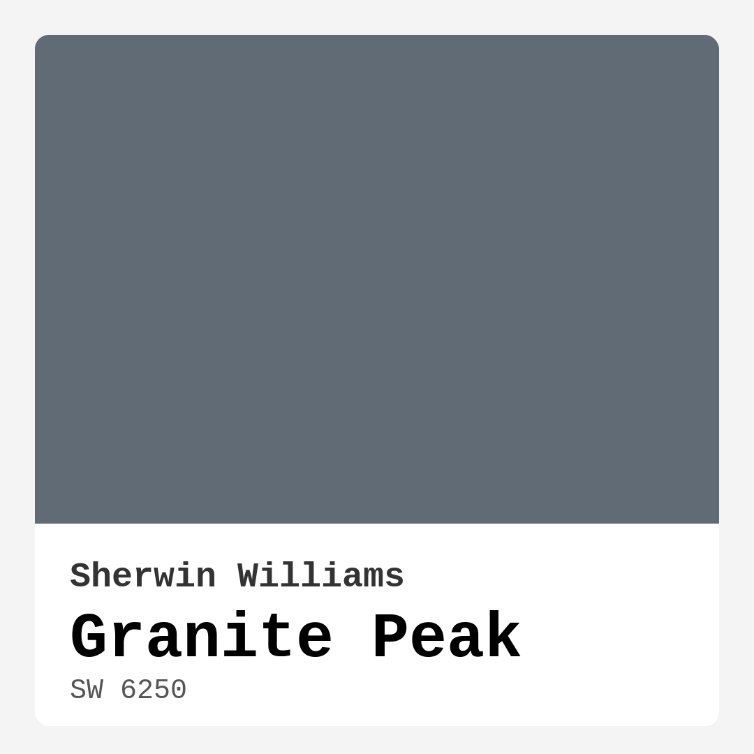
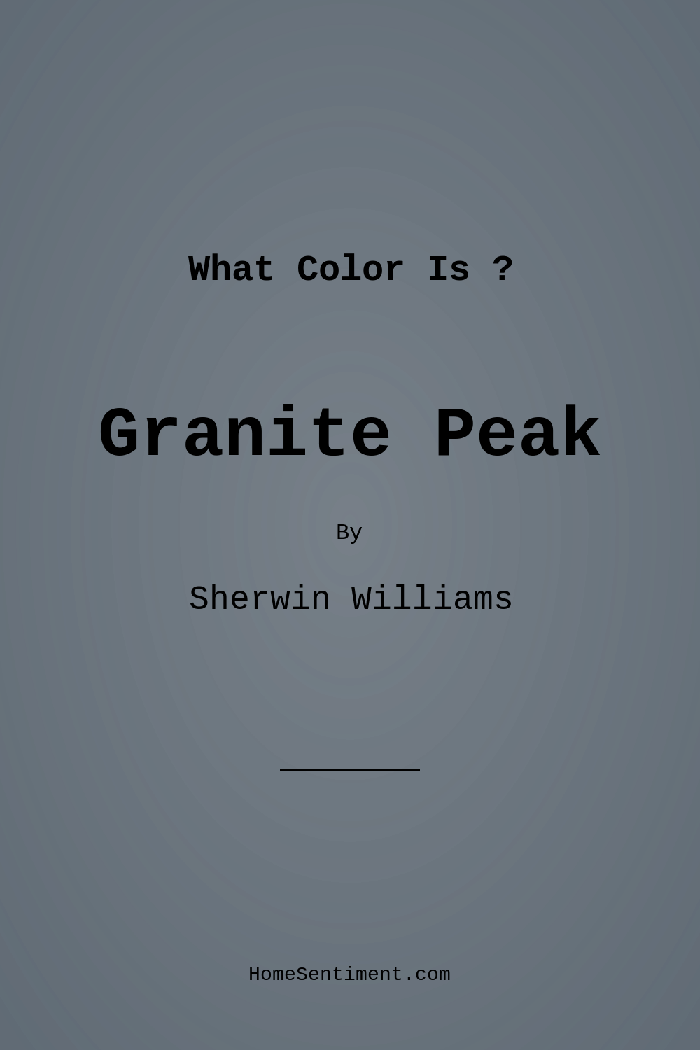
Color Preview & Key Details
| HEX Code | #606B75 |
| RGB | 96, 107, 117 |
| LRV | 25% |
| Undertone | Blue |
| Finish Options | Eggshell, Matte, Satin |
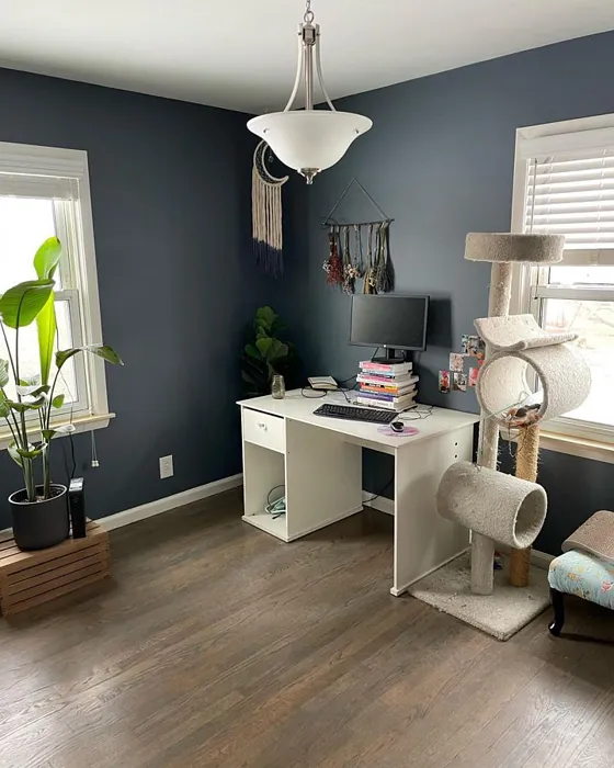
Imagine walking into a room that feels both modern and timeless, where the walls wrap you in a calming embrace. That’s the magic of Granite Peak from Sherwin Williams. This sophisticated shade of gray, with its subtle blue undertones, transforms spaces into serene retreats. Whether you’re updating a cozy bedroom or giving your home office a fresh look, Granite Peak could be the perfect companion for your walls.
Granite Peak—color code SW 6250—has an intriguing personality. It’s a cool, medium-dark gray with an LRV of 25%, which means it doesn’t reflect much light, creating a cozy atmosphere. Picture that soft, muted gray of natural stone, effortlessly blending into any decor style from modern and industrial to rustic and Scandinavian. The beauty of this hue lies in its versatility; it can be dressed up or down depending on your decor choices.
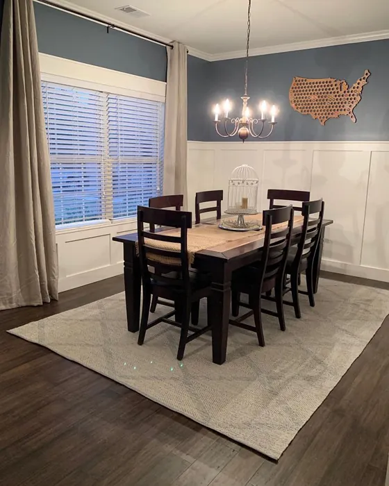
When you first lay eyes on Granite Peak, the blue undertones become apparent, giving it a unique character that sets it apart from other grays. This coolness can create a refreshing ambiance, making it an ideal option for spaces where you want to unwind. From the living room to the dining room, its calming presence is like a breath of fresh air. However, keep in mind that in low light, it may appear darker, so consider the natural light sources in your space before making it your go-to choice.
Using Granite Peak is not just about picking a color; it’s about creating an experience. This paint is beginner-friendly and rolls on smoothly, making it a dream for DIY enthusiasts. Whether you’re painting an accent wall or an entire room, you’ll appreciate how easily it applies. And if you happen to make a mistake? It’s touch-up friendly, allowing you to fix those tiny imperfections without any worry.
Now, let’s talk about finishes. Granite Peak is available in matte, eggshell, and satin. A matte finish provides a chic, contemporary look, while eggshell or satin can add a subtle sheen that enhances durability—perfect for high-traffic areas. Your choice of finish should depend on the function of the room and the aesthetic you’re aiming for. For example, a satin finish in a home office can offer both elegance and easy clean-up, while a matte finish in a bedroom can amplify the cozy vibe.
One of the standout features of Granite Peak is its adaptability. In daylight, the soft blue undertones come alive, offering a calm, inviting atmosphere. At night, it takes on a more subdued gray tone, maintaining its elegance without feeling heavy. This flexibility makes it a fantastic choice for open concept spaces where you want a cohesive look without overwhelming the senses.
Granite Peak pairs beautifully with a variety of colors. If you’re looking for complementary shades, consider colors like SW 6038 (a striking green) or SW 6553 (a lovely blush). These can create interesting contrasts and elevate the overall aesthetic of your space. For a more monochromatic look, shades like SW 7076 or SW 7635 can create a seamless transition that feels both modern and sophisticated.
Let’s not forget about the practical aspects of Granite Peak. It’s low VOC, which means it emits fewer harmful chemicals into your home environment. This is an important consideration for anyone looking to create a healthier living space. Plus, its washability ensures that your walls will stay looking fresh and clean, even in busy households.
If you’re still wondering whether Granite Peak is the right choice for small spaces, rest assured, it can work wonders. The medium LRV allows it to reflect light without overwhelming a room, making it feel open and airy. Pair it with lighter decor and accents to enhance this effect. Just be mindful of your lighting; spaces lacking natural light may see the color appear darker than intended.
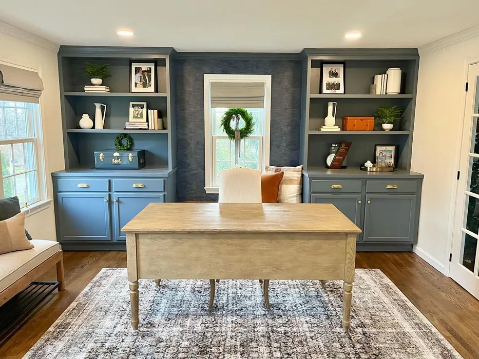
Granite Peak also excels in spaces where calm and focus are essential. It’s an excellent option for home offices, where you want to foster a productive yet serene atmosphere. The color’s grounding quality can help you stay centered and focused on your tasks.
In terms of decor styles, Granite Peak shines in modern farmhouse settings but is not limited to that aesthetic. It can meld beautifully with rustic finishes, adding a contemporary twist to traditional elements. In industrial spaces, its cool tone complements raw materials like metal and wood, creating a balanced look. The versatility of this color makes it a classic favorite for anyone looking to elevate their home’s aesthetic without overwhelming the senses.
As you contemplate your paint choices, remember that the undertones of Granite Peak add to its depth and complexity. A gray with a blue undertone feels cooler and more modern, while one with a brown undertone would lean towards warm and traditional. It’s crucial to test this color in your home environment, observing how it interacts with your existing furniture, flooring, and decor throughout the day.
Granite Peak indeed creates a mood that’s calm, restful, and grounding. It welcomes you into any space, making it feel more inviting. Whether you’re hosting friends or seeking solace after a long day, this color has the remarkable ability to enhance the experience of your home.
In conclusion, choosing Granite Peak means opting for a color that embodies sophistication and tranquility. It’s perfect for those who appreciate the subtle nuances of color and want to create a space that feels both modern and timeless. So grab a sample, paint a few swatches, and see how it transforms your home. You might just find that Granite Peak is the missing piece to your decor puzzle, turning your living space into a sanctuary of style and serenity.
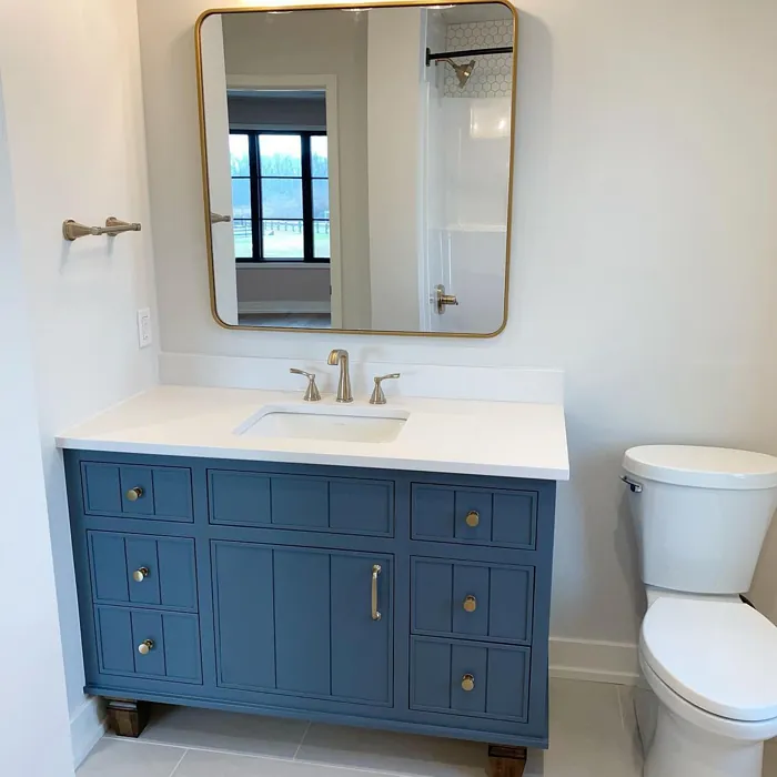
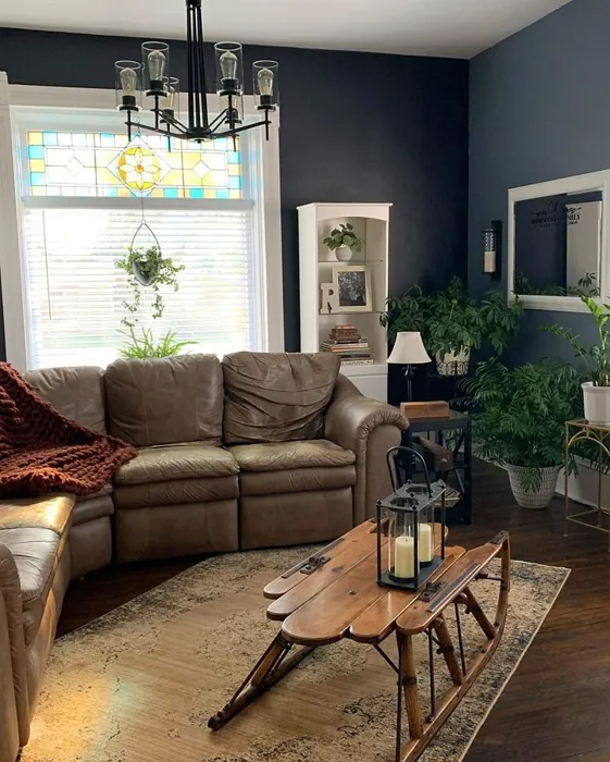
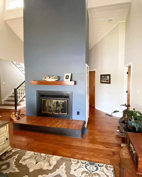
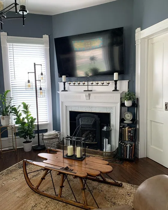
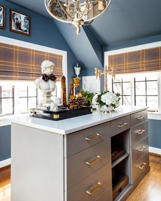
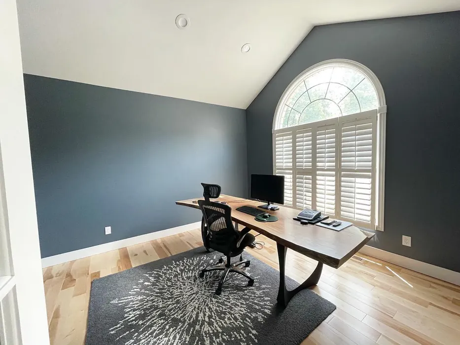
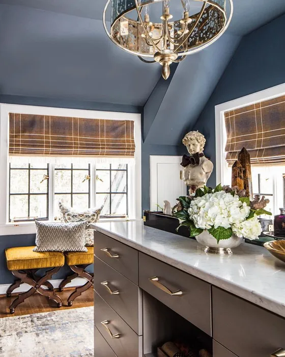
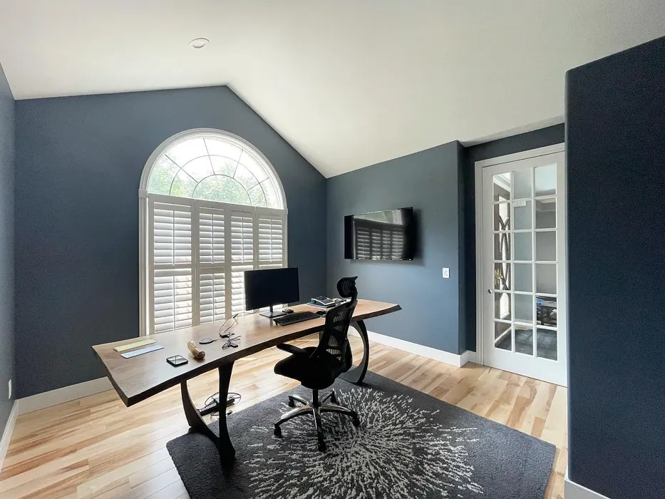
Real Room Photo of Granite Peak SW 6250
Undertones of Granite Peak ?
The undertones of Granite Peak are a key aspect of its character, leaning towards Blue. These subtle underlying hues are what give the color its depth and complexity. For example, a gray with a blue undertone will feel cooler and more modern, while one with a brown undertone will feel warmer and more traditional. It’s essential to test this paint in your home and observe it next to your existing furniture, flooring, and decor to see how these undertones interact and reveal themselves throughout the day.
HEX value: #606B75
RGB code: 96, 107, 117
Is Granite Peak Cool or Warm?
Granite Peak is considered a cool paint color. This characteristic plays a huge role in the overall feel of a room. Cool colors, like this one, tend to create a cozy, inviting, and energetic atmosphere, making them great for social spaces like living rooms and dining rooms. In contrast, warm colors often evoke a sense of calm and serenity, which is why they are popular in bedrooms and bathrooms. The coolth of Granite Peak means it will pair beautifully with corresponding decor elements.
Understanding Color Properties and Interior Design Tips
Hue refers to a specific position on the color wheel, measured in degrees from 0 to 360. Each degree represents a different pure color:
- 0° represents red
- 120° represents green
- 240° represents blue
Saturation describes the intensity or purity of a color and is expressed as a percentage:
- At 0%, the color appears completely desaturated—essentially a shade of gray
- At 100%, the color is at its most vivid and vibrant
Lightness indicates how light or dark a color is, also expressed as a percentage:
- 0% lightness results in black
- 100% lightness results in white
Using Warm Colors in Interior Design
Warm hues—such as reds, oranges, yellows, warm beiges, and greiges—are excellent choices for creating inviting and energetic spaces. These colors are particularly well-suited for:
- Kitchens, living rooms, and bathrooms, where warmth enhances comfort and sociability
- Large rooms, where warm tones can help reduce the sense of emptiness and make the space feel more intimate
For example:
- Warm beige shades provide a cozy, inviting atmosphere, ideal for living rooms, bedrooms, and hallways.
- Warm greige (a mix of beige and gray) offers the warmth of beige with the modern appeal of gray, making it a versatile backdrop for dining areas, bedrooms, and living spaces.
However, be mindful when using warm light tones in rooms with limited natural light. These shades may appear muted or even take on an unpleasant yellowish tint. To avoid a dull or flat appearance:
- Add depth by incorporating richer tones like deep greens, charcoal, or chocolate brown
- Use textured elements such as curtains, rugs, or cushions to bring dimension to the space
Pro Tip: Achieving Harmony with Warm and Cool Color Balance
To create a well-balanced and visually interesting interior, mix warm and cool tones strategically. This contrast adds depth and harmony to your design.
- If your walls feature warm hues, introduce cool-colored accents such as blue or green furniture, artwork, or accessories to create contrast.
- For a polished look, consider using a complementary color scheme, which pairs colors opposite each other on the color wheel (e.g., red with green, orange with blue).
This thoughtful mix not only enhances visual appeal but also creates a space that feels both dynamic and cohesive.
Light Temperature Affects on Granite Peak
Natural Light
Natural daylight changes in color temperature as the sun moves across the sky. At sunrise and sunset, the light tends to have a warm, golden tone with a color temperature around 2000 Kelvin (K). As the day progresses and the sun rises higher, the light becomes cooler and more neutral. Around midday, especially when the sky is clear, natural light typically reaches its peak brightness and shifts to a cooler tone, ranging from 5500 to 6500 Kelvin. This midday light is close to what we perceive as pure white or daylight-balanced light.
These shifts in natural light can significantly influence how colors appear in a space, which is why designers often consider both the time of day and the orientation of windows when planning interior color schemes.
Artificial Light
When choosing artificial lighting, pay close attention to the color temperature, measured in Kelvin (K). This determines how warm or cool the light will appear. Lower temperatures, around 2700K, give off a warm, yellow glow often used in living rooms or bedrooms. Higher temperatures, above 5000K, create a cool, bluish light similar to daylight, commonly used in kitchens, offices, or task areas.
Use the slider to see how lighting temperature can affect the appearance of a surface or color throughout a space.


4800K
LRV of Granite Peak
The Light Reflectance Value (LRV) of Granite Peak is 25%, which places it in the Medium Dark category. This means it reflects very little light. Understanding a paint’s LRV is crucial for predicting how it will look in your space. A higher LRV indicates a lighter color that reflects more light, making rooms feel larger and brighter. A lower LRV signifies a darker color that absorbs more light, creating a cozier, more intimate atmosphere. Always consider the natural and artificial lighting in your room when selecting a paint color based on its LRV.
Detailed Review of Granite Peak
Additional Paint Characteristics
Ideal Rooms
Bedroom, Dining Room, Home Office, Living Room
Decor Styles
Contemporary, Industrial, Modern, Rustic, Scandinavian
Coverage
Good (1–2 Coats), Touch-Up Friendly
Ease of Application
Beginner Friendly, Brush Smooth, Roller-Ready
Washability
Highly Washable, Washable
VOC Level
Low VOC
Best Use
Accent Wall, Interior Walls, Open Concept Spaces
Room Suitability
Bedroom, Dining Room, Home Office, Living Room
Tone Tag
Balanced, Cool, Muted
Finish Type
Eggshell, Matte, Satin
Paint Performance
Easy Touch-Up, Fade Resistant, Low Odor
Use Cases
Best for Modern Farmhouse, Best for Open Concept, Classic Favorite
Mood
Calm, Grounding, Restful
Trim Pairing
Complements Cool Trim, Pairs with White Dove
Granite Peak stands out as a captivating choice for those looking to add depth and elegance to their walls. Its unique blend of gray and blue undertones creates a calming effect, perfect for spaces where you want to unwind. When applied, it offers a smooth finish that enhances the room’s natural light, making it feel more spacious. This color pairs beautifully with both light and dark accents, allowing for flexibility in your decor choices.
In terms of application, Granite Peak is beginner-friendly, making it a fantastic option for DIY enthusiasts. Whether you’re painting a single accent wall or an entire room, you can expect a consistent, high-quality finish. Just remember to use good lighting to fully appreciate its nuances and how it shifts throughout the day. Overall, Granite Peak is a solid choice for anyone looking to elevate their home’s aesthetic without overwhelming the senses.
Pros & Cons of SW 6250 Granite Peak
Pros
Cons
Colors that go with Sherwin Williams Granite Peak
FAQ on SW 6250 Granite Peak
Can Granite Peak be used in small spaces?
Absolutely! Granite Peak can work wonders in small spaces. Its medium LRV allows it to reflect light without overwhelming the room, making it feel open and airy. Pair it with lighter decor and accents to enhance the effect further. Just be mindful of your lighting; it can look darker when the space lacks natural light.
What finishes are recommended for Granite Peak?
Granite Peak works well in various finishes, including matte, eggshell, and satin. A matte finish offers a chic, modern look, while eggshell or satin can add a subtle sheen that enhances durability, especially in high-traffic areas. Choose the finish based on the room’s function and the look you’re aiming for.
Comparisons Granite Peak with other colors
Granite Peak SW 6250 vs Night Owl SW 7061
| Attribute | Granite Peak SW 6250 | Night Owl SW 7061 |
|---|---|---|
| Color Name | Granite Peak SW 6250 | Night Owl SW 7061 |
| Color | ||
| Hue | Grey | Grey |
| Brightness | Dark | Dark |
| RGB | 96, 107, 117 | 99, 101, 95 |
| LRV | 25% | 24% |
| Finish Type | Eggshell, Matte, Satin | Eggshell, Matte, Satin |
| Finish Options | Eggshell, Matte, Satin | Eggshell, Matte, Satin |
| Ideal Rooms | Bedroom, Dining Room, Home Office, Living Room | Bedroom, Dining Room, Hallway, Home Office, Living Room |
| Decor Styles | Contemporary, Industrial, Modern, Rustic, Scandinavian | Industrial, Minimalist, Modern, Rustic, Scandinavian |
| Coverage | Good (1–2 Coats), Touch-Up Friendly | Good (1–2 Coats), Touch-Up Friendly |
| Ease of Application | Beginner Friendly, Brush Smooth, Roller-Ready | Beginner Friendly, Brush Smooth, Fast-Drying, Roller-Ready |
| Washability | Highly Washable, Washable | Scrubbable, Washable |
| Room Suitability | Bedroom, Dining Room, Home Office, Living Room | Bedroom, Dining Room, Home Office, Living Room |
| Tone | Balanced, Cool, Muted | Balanced, Deep, Earthy, Muted |
| Paint Performance | Easy Touch-Up, Fade Resistant, Low Odor | Easy Touch-Up, Fade Resistant, High Coverage, Low Odor |
Granite Peak SW 6250 vs Urbane Bronze SW 7048
| Attribute | Granite Peak SW 6250 | Urbane Bronze SW 7048 |
|---|---|---|
| Color Name | Granite Peak SW 6250 | Urbane Bronze SW 7048 |
| Color | ||
| Hue | Grey | Grey |
| Brightness | Dark | Dark |
| RGB | 96, 107, 117 | 84, 80, 74 |
| LRV | 25% | 20% |
| Finish Type | Eggshell, Matte, Satin | Eggshell, Matte, Satin |
| Finish Options | Eggshell, Matte, Satin | Eggshell, Matte, Satin |
| Ideal Rooms | Bedroom, Dining Room, Home Office, Living Room | Bedroom, Dining Room, Home Office, Living Room |
| Decor Styles | Contemporary, Industrial, Modern, Rustic, Scandinavian | Contemporary, Industrial, Modern, Rustic, Transitional |
| Coverage | Good (1–2 Coats), Touch-Up Friendly | Good (1–2 Coats) |
| Ease of Application | Beginner Friendly, Brush Smooth, Roller-Ready | Beginner Friendly, Brush Smooth, Roller-Ready |
| Washability | Highly Washable, Washable | Highly Washable, Washable |
| Room Suitability | Bedroom, Dining Room, Home Office, Living Room | Bedroom, Dining Room, Home Office, Living Room |
| Tone | Balanced, Cool, Muted | Deep, Earthy, Warm |
| Paint Performance | Easy Touch-Up, Fade Resistant, Low Odor | Easy Touch-Up, Fade Resistant, High Coverage, Low Odor |
Granite Peak SW 6250 vs Succulent SW 9650
| Attribute | Granite Peak SW 6250 | Succulent SW 9650 |
|---|---|---|
| Color Name | Granite Peak SW 6250 | Succulent SW 9650 |
| Color | ||
| Hue | Grey | Grey |
| Brightness | Dark | Dark |
| RGB | 96, 107, 117 | 97, 108, 100 |
| LRV | 25% | 30% |
| Finish Type | Eggshell, Matte, Satin | Eggshell, Matte, Satin |
| Finish Options | Eggshell, Matte, Satin | Eggshell, Matte, Satin |
| Ideal Rooms | Bedroom, Dining Room, Home Office, Living Room | Bathroom, Bedroom, Dining Room, Entryway, Kitchen, Living Room |
| Decor Styles | Contemporary, Industrial, Modern, Rustic, Scandinavian | Bohemian, Contemporary, Eclectic, Minimalist, Modern Farmhouse |
| Coverage | Good (1–2 Coats), Touch-Up Friendly | Good (1–2 Coats), Touch-Up Friendly |
| Ease of Application | Beginner Friendly, Brush Smooth, Roller-Ready | Beginner Friendly, Brush Smooth, Roller-Ready |
| Washability | Highly Washable, Washable | Highly Washable, Washable |
| Room Suitability | Bedroom, Dining Room, Home Office, Living Room | Bathroom, Bedroom, Dining Room, Kitchen, Living Room |
| Tone | Balanced, Cool, Muted | Cool, Earthy, Muted |
| Paint Performance | Easy Touch-Up, Fade Resistant, Low Odor | Easy Touch-Up, Low Odor, Quick Drying, Scuff Resistant |
Granite Peak SW 6250 vs Grizzle Gray SW 7068
| Attribute | Granite Peak SW 6250 | Grizzle Gray SW 7068 |
|---|---|---|
| Color Name | Granite Peak SW 6250 | Grizzle Gray SW 7068 |
| Color | ||
| Hue | Grey | Grey |
| Brightness | Dark | Dark |
| RGB | 96, 107, 117 | 99, 101, 98 |
| LRV | 25% | 24% |
| Finish Type | Eggshell, Matte, Satin | Eggshell, Satin |
| Finish Options | Eggshell, Matte, Satin | Eggshell, Matte, Satin |
| Ideal Rooms | Bedroom, Dining Room, Home Office, Living Room | Bedroom, Dining Room, Home Office, Living Room |
| Decor Styles | Contemporary, Industrial, Modern, Rustic, Scandinavian | Industrial, Modern, Rustic, Scandinavian |
| Coverage | Good (1–2 Coats), Touch-Up Friendly | Good (1–2 Coats), Touch-Up Friendly |
| Ease of Application | Beginner Friendly, Brush Smooth, Roller-Ready | Beginner Friendly, Brush Smooth, Roller-Ready |
| Washability | Highly Washable, Washable | Washable, Wipeable |
| Room Suitability | Bedroom, Dining Room, Home Office, Living Room | Bedroom, Dining Room, Home Office, Living Room |
| Tone | Balanced, Cool, Muted | Balanced, Cool, Muted |
| Paint Performance | Easy Touch-Up, Fade Resistant, Low Odor | Easy Touch-Up, High Coverage, Low Odor |
Granite Peak SW 6250 vs Iron Ore SW 7069
| Attribute | Granite Peak SW 6250 | Iron Ore SW 7069 |
|---|---|---|
| Color Name | Granite Peak SW 6250 | Iron Ore SW 7069 |
| Color | ||
| Hue | Grey | Grey |
| Brightness | Dark | Dark |
| RGB | 96, 107, 117 | 67, 67, 65 |
| LRV | 25% | 6% |
| Finish Type | Eggshell, Matte, Satin | Eggshell, Matte, Satin |
| Finish Options | Eggshell, Matte, Satin | Eggshell, Matte, Satin |
| Ideal Rooms | Bedroom, Dining Room, Home Office, Living Room | Bedroom, Dining Room, Entryway, Home Office, Living Room |
| Decor Styles | Contemporary, Industrial, Modern, Rustic, Scandinavian | Contemporary, Industrial, Minimalist, Modern, Rustic |
| Coverage | Good (1–2 Coats), Touch-Up Friendly | Good (1–2 Coats), High Hide |
| Ease of Application | Beginner Friendly, Brush Smooth, Roller-Ready | Brush Smooth, Fast-Drying, Roller-Ready |
| Washability | Highly Washable, Washable | Highly Washable, Washable |
| Room Suitability | Bedroom, Dining Room, Home Office, Living Room | Bedroom, Dining Room, Entryway, Home Office, Living Room |
| Tone | Balanced, Cool, Muted | Balanced, Deep, Muted, Warm |
| Paint Performance | Easy Touch-Up, Fade Resistant, Low Odor | Easy Touch-Up, High Coverage, Low Odor |
Granite Peak SW 6250 vs Peppercorn SW 7674
| Attribute | Granite Peak SW 6250 | Peppercorn SW 7674 |
|---|---|---|
| Color Name | Granite Peak SW 6250 | Peppercorn SW 7674 |
| Color | ||
| Hue | Grey | Grey |
| Brightness | Dark | Dark |
| RGB | 96, 107, 117 | 88, 88, 88 |
| LRV | 25% | 10% |
| Finish Type | Eggshell, Matte, Satin | Eggshell, Matte, Satin |
| Finish Options | Eggshell, Matte, Satin | Eggshell, Matte, Satin |
| Ideal Rooms | Bedroom, Dining Room, Home Office, Living Room | Bedroom, Dining Room, Home Office, Living Room |
| Decor Styles | Contemporary, Industrial, Modern, Rustic, Scandinavian | Contemporary, Industrial, Minimalist, Modern |
| Coverage | Good (1–2 Coats), Touch-Up Friendly | Good (1–2 Coats), Touch-Up Friendly |
| Ease of Application | Beginner Friendly, Brush Smooth, Roller-Ready | Beginner Friendly, Brush Smooth, Roller-Ready |
| Washability | Highly Washable, Washable | Highly Washable, Washable |
| Room Suitability | Bedroom, Dining Room, Home Office, Living Room | Bedroom, Dining Room, Home Office, Living Room |
| Tone | Balanced, Cool, Muted | Balanced, Deep, Moody, Neutral |
| Paint Performance | Easy Touch-Up, Fade Resistant, Low Odor | Easy Touch-Up, Low Odor, Quick Drying, Scuff Resistant |
Granite Peak SW 6250 vs Slate Tile SW 7624
| Attribute | Granite Peak SW 6250 | Slate Tile SW 7624 |
|---|---|---|
| Color Name | Granite Peak SW 6250 | Slate Tile SW 7624 |
| Color | ||
| Hue | Grey | Grey |
| Brightness | Dark | Dark |
| RGB | 96, 107, 117 | 96, 110, 116 |
| LRV | 25% | 15% |
| Finish Type | Eggshell, Matte, Satin | Eggshell, Matte, Satin |
| Finish Options | Eggshell, Matte, Satin | Eggshell, Matte, Satin |
| Ideal Rooms | Bedroom, Dining Room, Home Office, Living Room | Bathroom, Bedroom, Home Office, Kitchen, Living Room |
| Decor Styles | Contemporary, Industrial, Modern, Rustic, Scandinavian | Industrial, Minimalist, Modern, Rustic |
| Coverage | Good (1–2 Coats), Touch-Up Friendly | Good (1–2 Coats) |
| Ease of Application | Beginner Friendly, Brush Smooth, Roller-Ready | Beginner Friendly, Brush Smooth, Fast-Drying, Roller-Ready |
| Washability | Highly Washable, Washable | Scrubbable, Washable |
| Room Suitability | Bedroom, Dining Room, Home Office, Living Room | Bathroom, Bedroom, Kitchen, Living Room |
| Tone | Balanced, Cool, Muted | Balanced, Cool, Muted |
| Paint Performance | Easy Touch-Up, Fade Resistant, Low Odor | Easy Touch-Up, High Coverage, Low Odor, Quick Drying |
Granite Peak SW 6250 vs Blustery Sky SW 9140
| Attribute | Granite Peak SW 6250 | Blustery Sky SW 9140 |
|---|---|---|
| Color Name | Granite Peak SW 6250 | Blustery Sky SW 9140 |
| Color | ||
| Hue | Grey | Grey |
| Brightness | Dark | Dark |
| RGB | 96, 107, 117 | 111, 132, 140 |
| LRV | 25% | 48% |
| Finish Type | Eggshell, Matte, Satin | Eggshell, Matte |
| Finish Options | Eggshell, Matte, Satin | Eggshell, Matte, Satin |
| Ideal Rooms | Bedroom, Dining Room, Home Office, Living Room | Bedroom, Dining Room, Home Office, Living Room, Nursery |
| Decor Styles | Contemporary, Industrial, Modern, Rustic, Scandinavian | Coastal, Modern Farmhouse, Scandinavian, Transitional |
| Coverage | Good (1–2 Coats), Touch-Up Friendly | Good (1–2 Coats), Touch-Up Friendly |
| Ease of Application | Beginner Friendly, Brush Smooth, Roller-Ready | Beginner Friendly, Fast-Drying, Low Splatter, Roller-Ready |
| Washability | Highly Washable, Washable | Washable, Wipeable |
| Room Suitability | Bedroom, Dining Room, Home Office, Living Room | Bedroom, Home Office, Living Room, Nursery |
| Tone | Balanced, Cool, Muted | Balanced, Cool, Muted |
| Paint Performance | Easy Touch-Up, Fade Resistant, Low Odor | Easy Touch-Up, Fade Resistant, Low Odor, Quick Drying |
Granite Peak SW 6250 vs Gauntlet Gray SW 7019
| Attribute | Granite Peak SW 6250 | Gauntlet Gray SW 7019 |
|---|---|---|
| Color Name | Granite Peak SW 6250 | Gauntlet Gray SW 7019 |
| Color | ||
| Hue | Grey | Grey |
| Brightness | Dark | Dark |
| RGB | 96, 107, 117 | 120, 115, 110 |
| LRV | 25% | 24% |
| Finish Type | Eggshell, Matte, Satin | Eggshell, Matte, Satin |
| Finish Options | Eggshell, Matte, Satin | Eggshell, Matte, Satin |
| Ideal Rooms | Bedroom, Dining Room, Home Office, Living Room | Bedroom, Dining Room, Hallway, Home Office, Living Room |
| Decor Styles | Contemporary, Industrial, Modern, Rustic, Scandinavian | Industrial, Modern, Rustic, Transitional |
| Coverage | Good (1–2 Coats), Touch-Up Friendly | Good (1–2 Coats), Touch-Up Friendly |
| Ease of Application | Beginner Friendly, Brush Smooth, Roller-Ready | Beginner Friendly, Brush Smooth, Roller-Ready |
| Washability | Highly Washable, Washable | Scrubbable, Washable |
| Room Suitability | Bedroom, Dining Room, Home Office, Living Room | Bedroom, Dining Room, Home Office, Living Room |
| Tone | Balanced, Cool, Muted | Dusty, Earthy, Muted, Warm |
| Paint Performance | Easy Touch-Up, Fade Resistant, Low Odor | Easy Touch-Up, High Coverage, Low Odor |
Granite Peak SW 6250 vs Cast Iron SW 6202
| Attribute | Granite Peak SW 6250 | Cast Iron SW 6202 |
|---|---|---|
| Color Name | Granite Peak SW 6250 | Cast Iron SW 6202 |
| Color | ||
| Hue | Grey | Grey |
| Brightness | Dark | Dark |
| RGB | 96, 107, 117 | 100, 100, 90 |
| LRV | 25% | 6% |
| Finish Type | Eggshell, Matte, Satin | Eggshell, Matte, Satin |
| Finish Options | Eggshell, Matte, Satin | Eggshell, Matte, Satin |
| Ideal Rooms | Bedroom, Dining Room, Home Office, Living Room | Bedroom, Dining Room, Hallway, Home Office, Kitchen, Living Room |
| Decor Styles | Contemporary, Industrial, Modern, Rustic, Scandinavian | Contemporary, Farmhouse, Industrial, Minimalist, Modern |
| Coverage | Good (1–2 Coats), Touch-Up Friendly | Good (1–2 Coats), High Hide, Touch-Up Friendly |
| Ease of Application | Beginner Friendly, Brush Smooth, Roller-Ready | Beginner Friendly, Brush Smooth, Fast-Drying, Roller-Ready |
| Washability | Highly Washable, Washable | Highly Washable, Washable, Wipeable |
| Room Suitability | Bedroom, Dining Room, Home Office, Living Room | Bedroom, Dining Room, Home Office, Kitchen, Living Room |
| Tone | Balanced, Cool, Muted | Balanced, Deep, Dusty, Earthy, Warm |
| Paint Performance | Easy Touch-Up, Fade Resistant, Low Odor | Easy Touch-Up, High Coverage, Low Odor, Stain Resistant |
Official Page of Sherwin Williams Granite Peak SW 6250