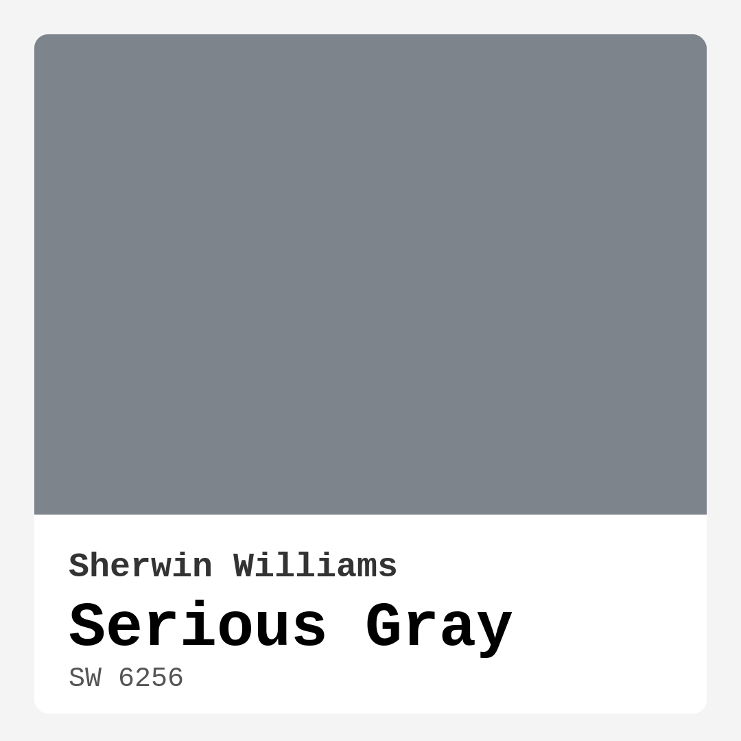
Color Preview & Key Details
| HEX Code | #7D848B |
| RGB | 125, 132, 139 |
| LRV | 24% |
| Undertone | Blue |
| Finish Options | Eggshell, Matte, Satin |
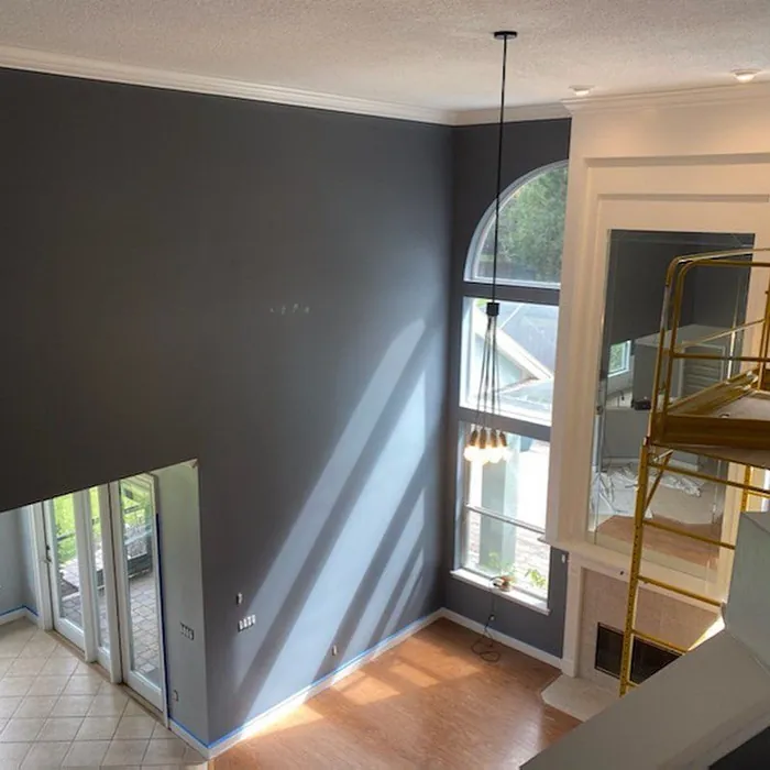
Imagine stepping into your living room, and instead of the chaos of bright colors, you’re enveloped in a soothing embrace of a sophisticated gray that feels both calming and sophisticated. Enter Serious Gray from Sherwin Williams, a color that embodies the perfect blend of warmth and coolness, creating an ambiance that’s as inviting as it is elegant. If you’re contemplating a fresh coat of paint that’s versatile yet impactful, Serious Gray might just be what you need.
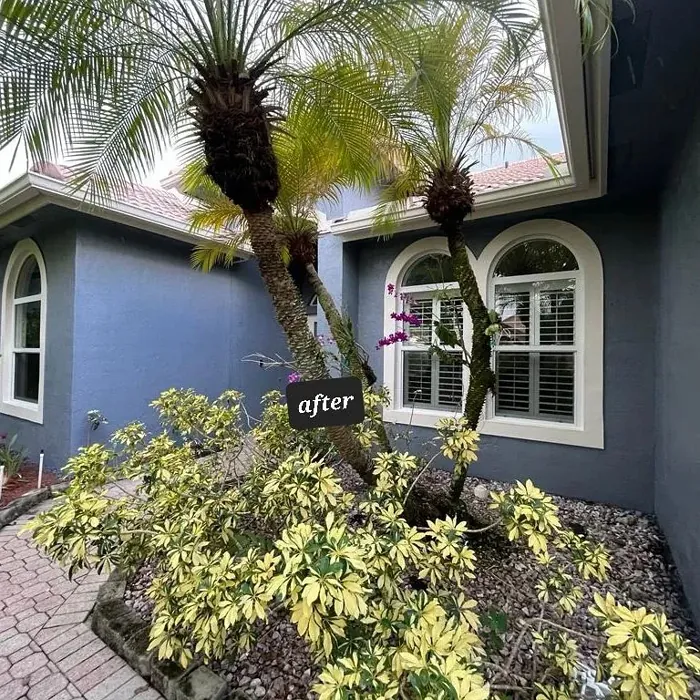
This color, with its gentle blue undertones, is one that can transform any space into a serene haven. Its muted elegance works across various settings, making it suitable for a living room, bedroom, home office, or even a dining room. Picture it on your walls, enhancing your decor while allowing your favorite pieces to shine. Whether your style leans toward modern, industrial, or transitional, Serious Gray has the potential to tie everything together beautifully.
What’s so striking about Serious Gray is its depth. With a Light Reflectance Value (LRV) of 24%, it reflects very little light, which means it can create a cozy, intimate atmosphere. This makes it perfect for spaces where you want to create a sense of calm and comfort. However, keep in mind that in rooms with limited natural light, it can appear slightly darker, so it’s essential to test it in your specific setting.
When considering paint colors, one often overlooks the importance of undertones. The blue undertone in Serious Gray adds character and sophistication, giving it a cooler edge that feels modern and fresh. This subtlety is what makes the color so adaptable; it can effortlessly complement various decor elements, from warm woods to sleek metals. Imagine pairing it with brass fixtures or white dove trim—what a stunning contrast!
As you’re thinking about where to use it, think of the mood you want to evoke. Serious Gray creates a calm, inviting atmosphere that’s perfect for social spaces like living rooms and dining areas. It enhances the overall aesthetic while still being a beautiful backdrop for artwork and furnishings. And if you’re worried about it feeling too dark, remember that adequate lighting can make all the difference. Sunlight can elevate its depth and reveal its true beauty, while artificial lights can create a cozy ambiance.
What about small spaces? You might be pleasantly surprised to learn that Serious Gray can actually make compact areas feel larger and more open. Its balanced undertones bring depth without overwhelming the room. Just ensure you have sufficient lighting to enhance its beauty further.
When it comes to application, Serious Gray is beginner-friendly, making it an excellent choice for DIY enthusiasts. It’s easy to apply with a roller, and you’ll find that touch-ups are seamless thanks to its forgiving nature. The finish options—matte, eggshell, and satin—allow you to customize the look to fit your style, whether you prefer a soft sheen or a more muted finish. Plus, its washability and scrubbable formula mean that maintaining its elegance is a breeze.
If you’re still on the fence about pairing colors, you’ll be delighted to know that Serious Gray is incredibly versatile. Mixing it with crisp whites can create a classic look, while warm woods and earthy tones lend a more organic feel. You can also consider pairing it with soft blues and greens for a serene palette that promotes relaxation.
Now, let’s talk about the practicality of this color. With low VOC levels, Serious Gray is a healthier choice for your home. It offers a low odor during application, and the quick-drying formula ensures that you won’t be living in a paint cloud for too long. Moreover, its scuff-resistant properties mean it will stand up to everyday wear and tear, making it a solid choice for high-traffic areas.
When selecting paint, it’s always wise to consider how it interacts with your existing decor. Take the time to test Serious Gray next to your furniture and flooring to see how the blue undertones play against your current palette. The goal is to create harmony in your space, and the right gray can serve as a perfect canvas to build upon.
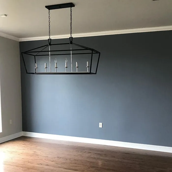
If you’re feeling adventurous, think about using Serious Gray as an accent wall. The depth it brings can create visual interest without overwhelming the space. Imagine a serene bedroom with one wall painted in Serious Gray, allowing the soft textures of your bedding and decor to take center stage. It’s a subtle yet striking choice that can refresh any room.
In terms of color synergy, don’t forget about its complementary hues. Whether it’s the freshness of SW 6038 or the warmth of SW 7635, incorporating these shades alongside Serious Gray can enhance the overall aesthetic.
To sum it up, Serious Gray is more than just a color; it’s a sophisticated choice that offers depth, versatility, and a calming ambiance. Whether you’re revamping a single room or your entire home, it provides a stylish backdrop that can adapt to your evolving decor needs. With its ease of application, beautiful undertones, and ability to create a tranquil atmosphere, Serious Gray is undoubtedly worth considering for your next painting project.
So, as you stand in your space, imagining what it could become, remember that Serious Gray could be the key to unlocking a new level of elegance and comfort. Are you ready to transform your home? Grab that paintbrush, and let’s get started on creating a beautiful, personalized space that reflects your style and warmth.
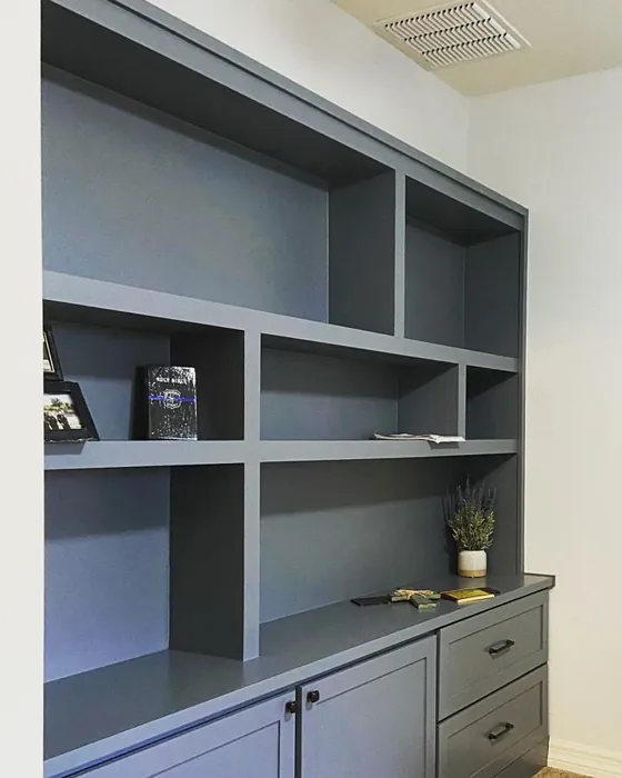
Real Room Photo of Serious Gray SW 6256


Undertones of Serious Gray ?
The undertones of Serious Gray are a key aspect of its character, leaning towards Blue. These subtle underlying hues are what give the color its depth and complexity. For example, a gray with a blue undertone will feel cooler and more modern, while one with a brown undertone will feel warmer and more traditional. It’s essential to test this paint in your home and observe it next to your existing furniture, flooring, and decor to see how these undertones interact and reveal themselves throughout the day.
HEX value: #7D848B
RGB code: 125, 132, 139
Is Serious Gray Cool or Warm?
Serious Gray is considered a warm paint color. This characteristic plays a huge role in the overall feel of a room. Warm colors, like this one, tend to create a cozy, inviting, and energetic atmosphere, making them great for social spaces like living rooms and dining rooms. In contrast, cool colors often evoke a sense of calm and serenity, which is why they are popular in bedrooms and bathrooms. The warmth of Serious Gray means it will pair beautifully with corresponding decor elements.
Understanding Color Properties and Interior Design Tips
Hue refers to a specific position on the color wheel, measured in degrees from 0 to 360. Each degree represents a different pure color:
- 0° represents red
- 120° represents green
- 240° represents blue
Saturation describes the intensity or purity of a color and is expressed as a percentage:
- At 0%, the color appears completely desaturated—essentially a shade of gray
- At 100%, the color is at its most vivid and vibrant
Lightness indicates how light or dark a color is, also expressed as a percentage:
- 0% lightness results in black
- 100% lightness results in white
Using Warm Colors in Interior Design
Warm hues—such as reds, oranges, yellows, warm beiges, and greiges—are excellent choices for creating inviting and energetic spaces. These colors are particularly well-suited for:
- Kitchens, living rooms, and bathrooms, where warmth enhances comfort and sociability
- Large rooms, where warm tones can help reduce the sense of emptiness and make the space feel more intimate
For example:
- Warm beige shades provide a cozy, inviting atmosphere, ideal for living rooms, bedrooms, and hallways.
- Warm greige (a mix of beige and gray) offers the warmth of beige with the modern appeal of gray, making it a versatile backdrop for dining areas, bedrooms, and living spaces.
However, be mindful when using warm light tones in rooms with limited natural light. These shades may appear muted or even take on an unpleasant yellowish tint. To avoid a dull or flat appearance:
- Add depth by incorporating richer tones like deep greens, charcoal, or chocolate brown
- Use textured elements such as curtains, rugs, or cushions to bring dimension to the space
Pro Tip: Achieving Harmony with Warm and Cool Color Balance
To create a well-balanced and visually interesting interior, mix warm and cool tones strategically. This contrast adds depth and harmony to your design.
- If your walls feature warm hues, introduce cool-colored accents such as blue or green furniture, artwork, or accessories to create contrast.
- For a polished look, consider using a complementary color scheme, which pairs colors opposite each other on the color wheel (e.g., red with green, orange with blue).
This thoughtful mix not only enhances visual appeal but also creates a space that feels both dynamic and cohesive.
Light Temperature Affects on Serious Gray
Natural Light
Natural daylight changes in color temperature as the sun moves across the sky. At sunrise and sunset, the light tends to have a warm, golden tone with a color temperature around 2000 Kelvin (K). As the day progresses and the sun rises higher, the light becomes cooler and more neutral. Around midday, especially when the sky is clear, natural light typically reaches its peak brightness and shifts to a cooler tone, ranging from 5500 to 6500 Kelvin. This midday light is close to what we perceive as pure white or daylight-balanced light.
These shifts in natural light can significantly influence how colors appear in a space, which is why designers often consider both the time of day and the orientation of windows when planning interior color schemes.
Artificial Light
When choosing artificial lighting, pay close attention to the color temperature, measured in Kelvin (K). This determines how warm or cool the light will appear. Lower temperatures, around 2700K, give off a warm, yellow glow often used in living rooms or bedrooms. Higher temperatures, above 5000K, create a cool, bluish light similar to daylight, commonly used in kitchens, offices, or task areas.
Use the slider to see how lighting temperature can affect the appearance of a surface or color throughout a space.


4800K
LRV of Serious Gray
The Light Reflectance Value (LRV) of Serious Gray is 24%, which places it in the Medium Dark category. This means it reflects very little light. Understanding a paint’s LRV is crucial for predicting how it will look in your space. A higher LRV indicates a lighter color that reflects more light, making rooms feel larger and brighter. A lower LRV signifies a darker color that absorbs more light, creating a cozier, more intimate atmosphere. Always consider the natural and artificial lighting in your room when selecting a paint color based on its LRV.
Detailed Review of Serious Gray
Additional Paint Characteristics
Ideal Rooms
Bedroom, Dining Room, Hallway, Home Office, Living Room
Decor Styles
Contemporary, Industrial, Modern, Transitional
Coverage
Good (1–2 Coats), Touch-Up Friendly
Ease of Application
Beginner Friendly, Brush Smooth, Roller-Ready
Washability
Scrubbable, Washable
VOC Level
Low VOC
Best Use
Accent Wall, Interior Walls, Trim
Room Suitability
Bedroom, Dining Room, Home Office, Living Room
Tone Tag
Balanced, Cool, Muted
Finish Type
Eggshell, Matte, Satin
Paint Performance
Long Lasting, Low Odor, Quick Drying, Scuff Resistant
Use Cases
Best for Rentals, Classic Favorite, Designer Favorite
Mood
Calm, Grounding, Inviting
Trim Pairing
Complements Brass Fixtures, Pairs with White Dove, Works with Warm Trim
When it comes to Serious Gray, you’ll find a color that exudes a quiet confidence. Its soft yet impactful presence works brilliantly in both bright and dimly lit spaces. The gray undertones are subtle enough to pair with a wide array of colors, making it an ideal backdrop for artwork or furnishings. It beautifully complements natural elements, especially wood and stone, enhancing the overall aesthetic of your home. This color is also forgiving, allowing for easy touch-ups and a seamless look. Whether you’re revamping a single room or an entire home, Serious Gray is a fabulous choice that offers both style and versatility.
Pros & Cons of SW 6256 Serious Gray
Pros
Cons
Colors that go with Sherwin Williams Serious Gray
FAQ on SW 6256 Serious Gray
Can Serious Gray be used in small spaces?
Absolutely! Serious Gray can actually help small spaces feel larger and more open. Its balanced undertones provide depth without overwhelming the room. Just ensure you have adequate lighting to enhance its beauty.
What colors pair well with Serious Gray?
Serious Gray is incredibly versatile. Pair it with crisp whites for a classic look, or try warm woods and earthy tones for a more organic feel. It also complements soft blues and greens beautifully, creating a serene palette.
Comparisons Serious Gray with other colors
Serious Gray SW 6256 vs Night Owl SW 7061
| Attribute | Serious Gray SW 6256 | Night Owl SW 7061 |
|---|---|---|
| Color Name | Serious Gray SW 6256 | Night Owl SW 7061 |
| Color | ||
| Hue | Grey | Grey |
| Brightness | Dark | Dark |
| RGB | 125, 132, 139 | 99, 101, 95 |
| LRV | 24% | 24% |
| Finish Type | Eggshell, Matte, Satin | Eggshell, Matte, Satin |
| Finish Options | Eggshell, Matte, Satin | Eggshell, Matte, Satin |
| Ideal Rooms | Bedroom, Dining Room, Hallway, Home Office, Living Room | Bedroom, Dining Room, Hallway, Home Office, Living Room |
| Decor Styles | Contemporary, Industrial, Modern, Transitional | Industrial, Minimalist, Modern, Rustic, Scandinavian |
| Coverage | Good (1–2 Coats), Touch-Up Friendly | Good (1–2 Coats), Touch-Up Friendly |
| Ease of Application | Beginner Friendly, Brush Smooth, Roller-Ready | Beginner Friendly, Brush Smooth, Fast-Drying, Roller-Ready |
| Washability | Scrubbable, Washable | Scrubbable, Washable |
| Room Suitability | Bedroom, Dining Room, Home Office, Living Room | Bedroom, Dining Room, Home Office, Living Room |
| Tone | Balanced, Cool, Muted | Balanced, Deep, Earthy, Muted |
| Paint Performance | Long Lasting, Low Odor, Quick Drying, Scuff Resistant | Easy Touch-Up, Fade Resistant, High Coverage, Low Odor |
Serious Gray SW 6256 vs Urbane Bronze SW 7048
| Attribute | Serious Gray SW 6256 | Urbane Bronze SW 7048 |
|---|---|---|
| Color Name | Serious Gray SW 6256 | Urbane Bronze SW 7048 |
| Color | ||
| Hue | Grey | Grey |
| Brightness | Dark | Dark |
| RGB | 125, 132, 139 | 84, 80, 74 |
| LRV | 24% | 20% |
| Finish Type | Eggshell, Matte, Satin | Eggshell, Matte, Satin |
| Finish Options | Eggshell, Matte, Satin | Eggshell, Matte, Satin |
| Ideal Rooms | Bedroom, Dining Room, Hallway, Home Office, Living Room | Bedroom, Dining Room, Home Office, Living Room |
| Decor Styles | Contemporary, Industrial, Modern, Transitional | Contemporary, Industrial, Modern, Rustic, Transitional |
| Coverage | Good (1–2 Coats), Touch-Up Friendly | Good (1–2 Coats) |
| Ease of Application | Beginner Friendly, Brush Smooth, Roller-Ready | Beginner Friendly, Brush Smooth, Roller-Ready |
| Washability | Scrubbable, Washable | Highly Washable, Washable |
| Room Suitability | Bedroom, Dining Room, Home Office, Living Room | Bedroom, Dining Room, Home Office, Living Room |
| Tone | Balanced, Cool, Muted | Deep, Earthy, Warm |
| Paint Performance | Long Lasting, Low Odor, Quick Drying, Scuff Resistant | Easy Touch-Up, Fade Resistant, High Coverage, Low Odor |
Serious Gray SW 6256 vs Succulent SW 9650
| Attribute | Serious Gray SW 6256 | Succulent SW 9650 |
|---|---|---|
| Color Name | Serious Gray SW 6256 | Succulent SW 9650 |
| Color | ||
| Hue | Grey | Grey |
| Brightness | Dark | Dark |
| RGB | 125, 132, 139 | 97, 108, 100 |
| LRV | 24% | 30% |
| Finish Type | Eggshell, Matte, Satin | Eggshell, Matte, Satin |
| Finish Options | Eggshell, Matte, Satin | Eggshell, Matte, Satin |
| Ideal Rooms | Bedroom, Dining Room, Hallway, Home Office, Living Room | Bathroom, Bedroom, Dining Room, Entryway, Kitchen, Living Room |
| Decor Styles | Contemporary, Industrial, Modern, Transitional | Bohemian, Contemporary, Eclectic, Minimalist, Modern Farmhouse |
| Coverage | Good (1–2 Coats), Touch-Up Friendly | Good (1–2 Coats), Touch-Up Friendly |
| Ease of Application | Beginner Friendly, Brush Smooth, Roller-Ready | Beginner Friendly, Brush Smooth, Roller-Ready |
| Washability | Scrubbable, Washable | Highly Washable, Washable |
| Room Suitability | Bedroom, Dining Room, Home Office, Living Room | Bathroom, Bedroom, Dining Room, Kitchen, Living Room |
| Tone | Balanced, Cool, Muted | Cool, Earthy, Muted |
| Paint Performance | Long Lasting, Low Odor, Quick Drying, Scuff Resistant | Easy Touch-Up, Low Odor, Quick Drying, Scuff Resistant |
Serious Gray SW 6256 vs Grizzle Gray SW 7068
| Attribute | Serious Gray SW 6256 | Grizzle Gray SW 7068 |
|---|---|---|
| Color Name | Serious Gray SW 6256 | Grizzle Gray SW 7068 |
| Color | ||
| Hue | Grey | Grey |
| Brightness | Dark | Dark |
| RGB | 125, 132, 139 | 99, 101, 98 |
| LRV | 24% | 24% |
| Finish Type | Eggshell, Matte, Satin | Eggshell, Satin |
| Finish Options | Eggshell, Matte, Satin | Eggshell, Matte, Satin |
| Ideal Rooms | Bedroom, Dining Room, Hallway, Home Office, Living Room | Bedroom, Dining Room, Home Office, Living Room |
| Decor Styles | Contemporary, Industrial, Modern, Transitional | Industrial, Modern, Rustic, Scandinavian |
| Coverage | Good (1–2 Coats), Touch-Up Friendly | Good (1–2 Coats), Touch-Up Friendly |
| Ease of Application | Beginner Friendly, Brush Smooth, Roller-Ready | Beginner Friendly, Brush Smooth, Roller-Ready |
| Washability | Scrubbable, Washable | Washable, Wipeable |
| Room Suitability | Bedroom, Dining Room, Home Office, Living Room | Bedroom, Dining Room, Home Office, Living Room |
| Tone | Balanced, Cool, Muted | Balanced, Cool, Muted |
| Paint Performance | Long Lasting, Low Odor, Quick Drying, Scuff Resistant | Easy Touch-Up, High Coverage, Low Odor |
Serious Gray SW 6256 vs Iron Ore SW 7069
| Attribute | Serious Gray SW 6256 | Iron Ore SW 7069 |
|---|---|---|
| Color Name | Serious Gray SW 6256 | Iron Ore SW 7069 |
| Color | ||
| Hue | Grey | Grey |
| Brightness | Dark | Dark |
| RGB | 125, 132, 139 | 67, 67, 65 |
| LRV | 24% | 6% |
| Finish Type | Eggshell, Matte, Satin | Eggshell, Matte, Satin |
| Finish Options | Eggshell, Matte, Satin | Eggshell, Matte, Satin |
| Ideal Rooms | Bedroom, Dining Room, Hallway, Home Office, Living Room | Bedroom, Dining Room, Entryway, Home Office, Living Room |
| Decor Styles | Contemporary, Industrial, Modern, Transitional | Contemporary, Industrial, Minimalist, Modern, Rustic |
| Coverage | Good (1–2 Coats), Touch-Up Friendly | Good (1–2 Coats), High Hide |
| Ease of Application | Beginner Friendly, Brush Smooth, Roller-Ready | Brush Smooth, Fast-Drying, Roller-Ready |
| Washability | Scrubbable, Washable | Highly Washable, Washable |
| Room Suitability | Bedroom, Dining Room, Home Office, Living Room | Bedroom, Dining Room, Entryway, Home Office, Living Room |
| Tone | Balanced, Cool, Muted | Balanced, Deep, Muted, Warm |
| Paint Performance | Long Lasting, Low Odor, Quick Drying, Scuff Resistant | Easy Touch-Up, High Coverage, Low Odor |
Serious Gray SW 6256 vs Peppercorn SW 7674
| Attribute | Serious Gray SW 6256 | Peppercorn SW 7674 |
|---|---|---|
| Color Name | Serious Gray SW 6256 | Peppercorn SW 7674 |
| Color | ||
| Hue | Grey | Grey |
| Brightness | Dark | Dark |
| RGB | 125, 132, 139 | 88, 88, 88 |
| LRV | 24% | 10% |
| Finish Type | Eggshell, Matte, Satin | Eggshell, Matte, Satin |
| Finish Options | Eggshell, Matte, Satin | Eggshell, Matte, Satin |
| Ideal Rooms | Bedroom, Dining Room, Hallway, Home Office, Living Room | Bedroom, Dining Room, Home Office, Living Room |
| Decor Styles | Contemporary, Industrial, Modern, Transitional | Contemporary, Industrial, Minimalist, Modern |
| Coverage | Good (1–2 Coats), Touch-Up Friendly | Good (1–2 Coats), Touch-Up Friendly |
| Ease of Application | Beginner Friendly, Brush Smooth, Roller-Ready | Beginner Friendly, Brush Smooth, Roller-Ready |
| Washability | Scrubbable, Washable | Highly Washable, Washable |
| Room Suitability | Bedroom, Dining Room, Home Office, Living Room | Bedroom, Dining Room, Home Office, Living Room |
| Tone | Balanced, Cool, Muted | Balanced, Deep, Moody, Neutral |
| Paint Performance | Long Lasting, Low Odor, Quick Drying, Scuff Resistant | Easy Touch-Up, Low Odor, Quick Drying, Scuff Resistant |
Serious Gray SW 6256 vs Slate Tile SW 7624
| Attribute | Serious Gray SW 6256 | Slate Tile SW 7624 |
|---|---|---|
| Color Name | Serious Gray SW 6256 | Slate Tile SW 7624 |
| Color | ||
| Hue | Grey | Grey |
| Brightness | Dark | Dark |
| RGB | 125, 132, 139 | 96, 110, 116 |
| LRV | 24% | 15% |
| Finish Type | Eggshell, Matte, Satin | Eggshell, Matte, Satin |
| Finish Options | Eggshell, Matte, Satin | Eggshell, Matte, Satin |
| Ideal Rooms | Bedroom, Dining Room, Hallway, Home Office, Living Room | Bathroom, Bedroom, Home Office, Kitchen, Living Room |
| Decor Styles | Contemporary, Industrial, Modern, Transitional | Industrial, Minimalist, Modern, Rustic |
| Coverage | Good (1–2 Coats), Touch-Up Friendly | Good (1–2 Coats) |
| Ease of Application | Beginner Friendly, Brush Smooth, Roller-Ready | Beginner Friendly, Brush Smooth, Fast-Drying, Roller-Ready |
| Washability | Scrubbable, Washable | Scrubbable, Washable |
| Room Suitability | Bedroom, Dining Room, Home Office, Living Room | Bathroom, Bedroom, Kitchen, Living Room |
| Tone | Balanced, Cool, Muted | Balanced, Cool, Muted |
| Paint Performance | Long Lasting, Low Odor, Quick Drying, Scuff Resistant | Easy Touch-Up, High Coverage, Low Odor, Quick Drying |
Serious Gray SW 6256 vs Blustery Sky SW 9140
| Attribute | Serious Gray SW 6256 | Blustery Sky SW 9140 |
|---|---|---|
| Color Name | Serious Gray SW 6256 | Blustery Sky SW 9140 |
| Color | ||
| Hue | Grey | Grey |
| Brightness | Dark | Dark |
| RGB | 125, 132, 139 | 111, 132, 140 |
| LRV | 24% | 48% |
| Finish Type | Eggshell, Matte, Satin | Eggshell, Matte |
| Finish Options | Eggshell, Matte, Satin | Eggshell, Matte, Satin |
| Ideal Rooms | Bedroom, Dining Room, Hallway, Home Office, Living Room | Bedroom, Dining Room, Home Office, Living Room, Nursery |
| Decor Styles | Contemporary, Industrial, Modern, Transitional | Coastal, Modern Farmhouse, Scandinavian, Transitional |
| Coverage | Good (1–2 Coats), Touch-Up Friendly | Good (1–2 Coats), Touch-Up Friendly |
| Ease of Application | Beginner Friendly, Brush Smooth, Roller-Ready | Beginner Friendly, Fast-Drying, Low Splatter, Roller-Ready |
| Washability | Scrubbable, Washable | Washable, Wipeable |
| Room Suitability | Bedroom, Dining Room, Home Office, Living Room | Bedroom, Home Office, Living Room, Nursery |
| Tone | Balanced, Cool, Muted | Balanced, Cool, Muted |
| Paint Performance | Long Lasting, Low Odor, Quick Drying, Scuff Resistant | Easy Touch-Up, Fade Resistant, Low Odor, Quick Drying |
Serious Gray SW 6256 vs Gauntlet Gray SW 7019
| Attribute | Serious Gray SW 6256 | Gauntlet Gray SW 7019 |
|---|---|---|
| Color Name | Serious Gray SW 6256 | Gauntlet Gray SW 7019 |
| Color | ||
| Hue | Grey | Grey |
| Brightness | Dark | Dark |
| RGB | 125, 132, 139 | 120, 115, 110 |
| LRV | 24% | 24% |
| Finish Type | Eggshell, Matte, Satin | Eggshell, Matte, Satin |
| Finish Options | Eggshell, Matte, Satin | Eggshell, Matte, Satin |
| Ideal Rooms | Bedroom, Dining Room, Hallway, Home Office, Living Room | Bedroom, Dining Room, Hallway, Home Office, Living Room |
| Decor Styles | Contemporary, Industrial, Modern, Transitional | Industrial, Modern, Rustic, Transitional |
| Coverage | Good (1–2 Coats), Touch-Up Friendly | Good (1–2 Coats), Touch-Up Friendly |
| Ease of Application | Beginner Friendly, Brush Smooth, Roller-Ready | Beginner Friendly, Brush Smooth, Roller-Ready |
| Washability | Scrubbable, Washable | Scrubbable, Washable |
| Room Suitability | Bedroom, Dining Room, Home Office, Living Room | Bedroom, Dining Room, Home Office, Living Room |
| Tone | Balanced, Cool, Muted | Dusty, Earthy, Muted, Warm |
| Paint Performance | Long Lasting, Low Odor, Quick Drying, Scuff Resistant | Easy Touch-Up, High Coverage, Low Odor |
Serious Gray SW 6256 vs Cast Iron SW 6202
| Attribute | Serious Gray SW 6256 | Cast Iron SW 6202 |
|---|---|---|
| Color Name | Serious Gray SW 6256 | Cast Iron SW 6202 |
| Color | ||
| Hue | Grey | Grey |
| Brightness | Dark | Dark |
| RGB | 125, 132, 139 | 100, 100, 90 |
| LRV | 24% | 6% |
| Finish Type | Eggshell, Matte, Satin | Eggshell, Matte, Satin |
| Finish Options | Eggshell, Matte, Satin | Eggshell, Matte, Satin |
| Ideal Rooms | Bedroom, Dining Room, Hallway, Home Office, Living Room | Bedroom, Dining Room, Hallway, Home Office, Kitchen, Living Room |
| Decor Styles | Contemporary, Industrial, Modern, Transitional | Contemporary, Farmhouse, Industrial, Minimalist, Modern |
| Coverage | Good (1–2 Coats), Touch-Up Friendly | Good (1–2 Coats), High Hide, Touch-Up Friendly |
| Ease of Application | Beginner Friendly, Brush Smooth, Roller-Ready | Beginner Friendly, Brush Smooth, Fast-Drying, Roller-Ready |
| Washability | Scrubbable, Washable | Highly Washable, Washable, Wipeable |
| Room Suitability | Bedroom, Dining Room, Home Office, Living Room | Bedroom, Dining Room, Home Office, Kitchen, Living Room |
| Tone | Balanced, Cool, Muted | Balanced, Deep, Dusty, Earthy, Warm |
| Paint Performance | Long Lasting, Low Odor, Quick Drying, Scuff Resistant | Easy Touch-Up, High Coverage, Low Odor, Stain Resistant |
Official Page of Sherwin Williams Serious Gray SW 6256