
Color Preview & Key Details
| HEX Code | #C79EA2 |
| RGB | 199, 158, 162 |
| LRV | 45% |
| Undertone | Red |
| Finish Options | Eggshell, Matte, Satin |
Imagine walking into a room that feels like a soft embrace, where the walls whisper warmth and charm. That’s the magic of Rose Embroidery, a delightful pink hue from Sherwin Williams that’s inspired by the delicate beauty of blooming roses. It’s not just a color; it’s an atmosphere, a feeling, and a way to transform your space into something truly special.
When you think about adding a touch of elegance to your home, Rose Embroidery may be just what you’re searching for. This medium pink shade, with its hex code #C79EA2, offers a cozy yet sophisticated vibe. Its slight red undertone adds depth, allowing it to stand out without overwhelming your decor. Imagine how it would look draping your walls, creating a serene backdrop for family gatherings or intimate evenings.
The beauty of Rose Embroidery lies in its versatility. This color can effortlessly adapt to various styles, whether you lean towards the shabby chic, modern farmhouse, romantic, or bohemian aesthetics. Picture this: a tranquil bedroom adorned in Rose Embroidery, where you can unwind after a long day, or a charming dining room filled with laughter and warmth. The options are endless!
One of the standout features of Rose Embroidery is its washability. Life can get messy, especially in homes with kids or pets, and having a paint that can be wiped clean is a blessing. You can gently clean the walls with a damp cloth without worrying about damaging the color. It’s a practical choice for high-traffic areas, ensuring your walls stay fresh and inviting.
For those concerned about the application process, rest easy. Rose Embroidery is beginner-friendly. With a smooth application that’s roller-ready and brush-smooth, you’ll find it easy to achieve beautiful results. Typically, one to two coats will do the trick, providing good coverage without the need for excessive layering. It’s a great project to tackle over a weekend, transforming your space with just a few strokes.
But let’s talk about light. This color reflects a moderate amount of light with a Light Reflectance Value (LRV) of 45%. In bright spaces, Rose Embroidery appears delicate and airy, enhancing the room’s overall feel. If your room has dimmer lighting, it deepens slightly, creating a more intimate, cozy atmosphere. This dynamic quality makes it an excellent choice for various rooms, including bedrooms, living rooms, nurseries, and dining rooms.
Now, you might be wondering how it pairs with your existing furniture and decor. That’s where the fun begins! Rose Embroidery beautifully complements white trim, allowing it to pop against the walls. Imagine crisp white crown molding or baseboards framing the gentle pink, elevating the overall aesthetic. You can also think about incorporating brass fixtures, which add a touch of glamour and warmth to the space, creating a striking contrast.
If you’re planning to use this color in a smaller room, don’t hesitate. Rose Embroidery can create the illusion of space while still maintaining a cozy feel. Pair it with lighter accents or white elements to enhance brightness and openness. It’s all about balance, and this color helps achieve that effortlessly.
As you consider how to maintain its beauty over time, remember that regular cleaning is key. Since it’s washable, a simple wipe down with a damp cloth can keep your walls looking fresh. Avoid harsh chemicals that may fade the color, and ensure proper ventilation to prevent moisture buildup, which can affect paint longevity.
Now, let’s talk about the mood Rose Embroidery sets. It’s cozy and inviting, making it the perfect backdrop for relaxation and connection. It’s a color that encourages you to unwind, whether you’re curling up with a good book in your living room or enjoying a meal in your dining area.
But let’s not overlook the importance of testing the color in your own space. Colors can behave differently depending on the lighting and surrounding decor. It’s essential to sample Rose Embroidery on your walls and see how it interacts with your existing furniture, flooring, and decoration throughout the day. Observe it in different lights—morning sunlight, afternoon glow, and evening coziness—to fully appreciate its depth and character.
If you’re feeling adventurous, consider pairing Rose Embroidery with darker shades like SW 6224 or SW 9137 for accents. This creates a beautiful contrast that adds visual interest and depth to your space. On the other hand, if you prefer a lighter touch, shades like SW 6296 can offer a subtle transition, maintaining that soft, inviting feel.
The pros of Rose Embroidery are clear—it’s a soft, inviting hue that’s versatile enough for various decor styles. With good coverage and easy application, it’s perfect for both beginners and seasoned DIYers. The low VOC level means you can feel good about using it in your home, contributing to a healthier indoor air quality.
However, like any color, it does come with considerations. In poorly lit spaces, it may appear darker than expected, so it’s crucial to evaluate the lighting in your room before committing. Additionally, careful color matching with furniture and decor is essential to ensure a harmonious look.
In summary, Rose Embroidery is more than just a pretty color—it’s a thoughtful choice for anyone looking to create a soothing and elegant atmosphere in their home. With its soft pink hue, versatility across decor styles, and practical benefits like washability and ease of application, it’s a fantastic option for various spaces. Whether you’re revamping a bedroom, refreshing a living room, or creating a dreamy nursery, Rose Embroidery could be the perfect touch to elevate your home.
So, are you ready to embrace the beauty of Rose Embroidery? Your walls are waiting for a little love, and this color might just be the perfect fit to make your space feel like home.
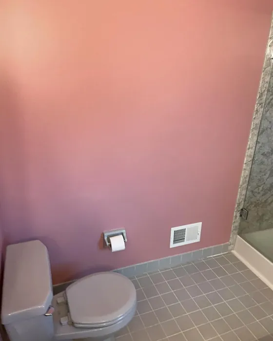
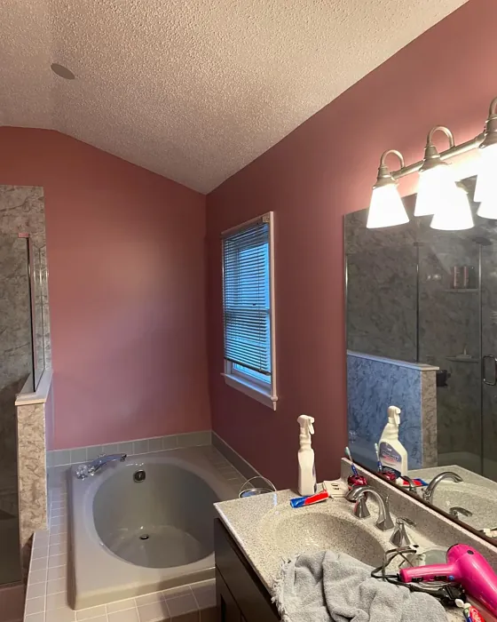
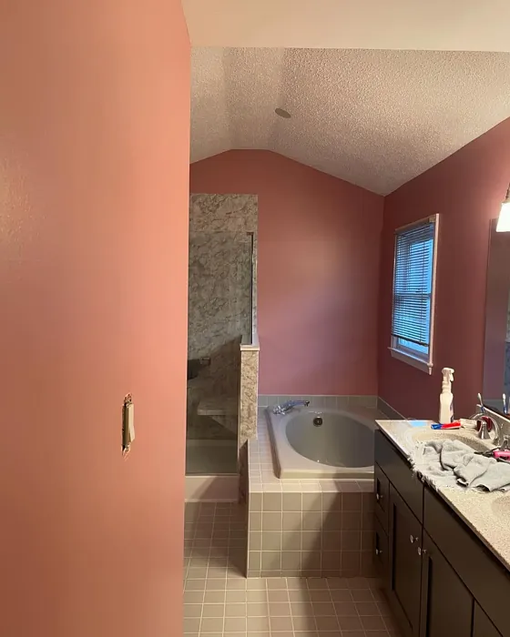
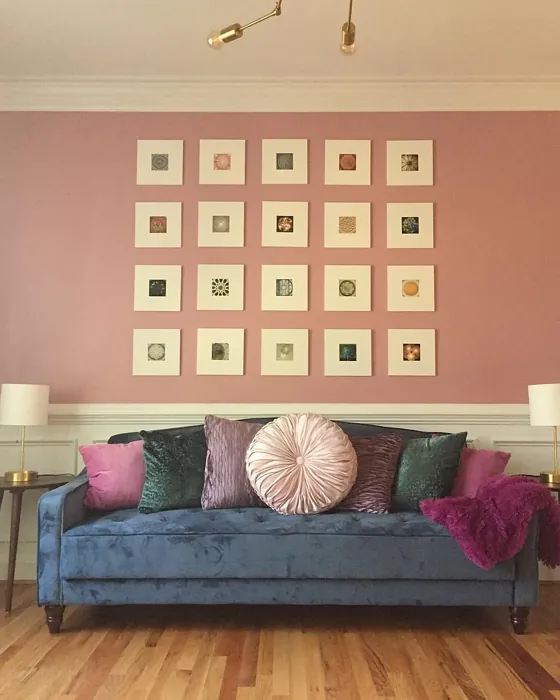
Real Room Photo of Rose Embroidery SW 6297
Undertones of Rose Embroidery ?
The undertones of Rose Embroidery are a key aspect of its character, leaning towards Red. These subtle underlying hues are what give the color its depth and complexity. For example, a gray with a blue undertone will feel cooler and more modern, while one with a brown undertone will feel warmer and more traditional. It’s essential to test this paint in your home and observe it next to your existing furniture, flooring, and decor to see how these undertones interact and reveal themselves throughout the day.
HEX value: #C79EA2
RGB code: 199, 158, 162
Is Rose Embroidery Cool or Warm?
This color leans towards the warm side of the spectrum, which enhances its inviting nature. It creates a soft glow in both natural and artificial light, making spaces feel more welcoming.
Understanding Color Properties and Interior Design Tips
Hue refers to a specific position on the color wheel, measured in degrees from 0 to 360. Each degree represents a different pure color:
- 0° represents red
- 120° represents green
- 240° represents blue
Saturation describes the intensity or purity of a color and is expressed as a percentage:
- At 0%, the color appears completely desaturated—essentially a shade of gray
- At 100%, the color is at its most vivid and vibrant
Lightness indicates how light or dark a color is, also expressed as a percentage:
- 0% lightness results in black
- 100% lightness results in white
Using Warm Colors in Interior Design
Warm hues—such as reds, oranges, yellows, warm beiges, and greiges—are excellent choices for creating inviting and energetic spaces. These colors are particularly well-suited for:
- Kitchens, living rooms, and bathrooms, where warmth enhances comfort and sociability
- Large rooms, where warm tones can help reduce the sense of emptiness and make the space feel more intimate
For example:
- Warm beige shades provide a cozy, inviting atmosphere, ideal for living rooms, bedrooms, and hallways.
- Warm greige (a mix of beige and gray) offers the warmth of beige with the modern appeal of gray, making it a versatile backdrop for dining areas, bedrooms, and living spaces.
However, be mindful when using warm light tones in rooms with limited natural light. These shades may appear muted or even take on an unpleasant yellowish tint. To avoid a dull or flat appearance:
- Add depth by incorporating richer tones like deep greens, charcoal, or chocolate brown
- Use textured elements such as curtains, rugs, or cushions to bring dimension to the space
Pro Tip: Achieving Harmony with Warm and Cool Color Balance
To create a well-balanced and visually interesting interior, mix warm and cool tones strategically. This contrast adds depth and harmony to your design.
- If your walls feature warm hues, introduce cool-colored accents such as blue or green furniture, artwork, or accessories to create contrast.
- For a polished look, consider using a complementary color scheme, which pairs colors opposite each other on the color wheel (e.g., red with green, orange with blue).
This thoughtful mix not only enhances visual appeal but also creates a space that feels both dynamic and cohesive.
Light Temperature Affects on Rose Embroidery
Natural Light
Natural daylight changes in color temperature as the sun moves across the sky. At sunrise and sunset, the light tends to have a warm, golden tone with a color temperature around 2000 Kelvin (K). As the day progresses and the sun rises higher, the light becomes cooler and more neutral. Around midday, especially when the sky is clear, natural light typically reaches its peak brightness and shifts to a cooler tone, ranging from 5500 to 6500 Kelvin. This midday light is close to what we perceive as pure white or daylight-balanced light.
These shifts in natural light can significantly influence how colors appear in a space, which is why designers often consider both the time of day and the orientation of windows when planning interior color schemes.
Artificial Light
When choosing artificial lighting, pay close attention to the color temperature, measured in Kelvin (K). This determines how warm or cool the light will appear. Lower temperatures, around 2700K, give off a warm, yellow glow often used in living rooms or bedrooms. Higher temperatures, above 5000K, create a cool, bluish light similar to daylight, commonly used in kitchens, offices, or task areas.
Use the slider to see how lighting temperature can affect the appearance of a surface or color throughout a space.


4800K
LRV of Rose Embroidery
The Light Reflectance Value (LRV) of Rose Embroidery is 45%, which places it in the Medium category. This means it Reflects a moderate amount of light. Understanding a paint’s LRV is crucial for predicting how it will look in your space. A higher LRV indicates a lighter color that reflects more light, making rooms feel larger and brighter. A lower LRV signifies a darker color that absorbs more light, creating a cozier, more intimate atmosphere. Always consider the natural and artificial lighting in your room when selecting a paint color based on its LRV.
Detailed Review of Rose Embroidery
Additional Paint Characteristics
Ideal Rooms
Bedroom, Dining Room, Living Room, Nursery
Decor Styles
Bohemian, Modern Farmhouse, Romantic, Shabby Chic
Coverage
Good (1–2 Coats), Touch-Up Friendly
Ease of Application
Beginner Friendly, Brush Smooth, Roller-Ready
Washability
Washable, Wipeable
VOC Level
Low VOC
Best Use
Accent Wall, Interior Walls, Nursery
Room Suitability
Bedroom, Dining Room, Living Room, Nursery
Tone Tag
Pastel, Soft, Warm
Finish Type
Eggshell, Matte
Paint Performance
Easy Touch-Up, Fade Resistant, Low Odor
Use Cases
Best for Low Light Rooms, Best for Rentals, Designer Favorite
Mood
Cozy, Inviting, Romantic
Trim Pairing
Complements Brass Fixtures, Pairs with White Dove
Rose Embroidery shines as a versatile choice for anyone looking to add a soft, romantic touch to their home. The gentle pink hue complements both traditional and contemporary decor effortlessly, making it a fantastic option for various rooms. The finish options, ranging from matte to satin, allow for a customizable look that can suit your preferences. Application is smooth, with good coverage typically achieved in one to two coats, making it beginner-friendly. Whether you’re painting a feature wall or an entire room, this paint brings a serene and inviting atmosphere that’s perfect for relaxation. Plus, it holds up well against daily wear, making it a smart choice for high-traffic areas too.
Pros & Cons of SW 6297 Rose Embroidery
Pros
Cons
Colors that go with Sherwin Williams Rose Embroidery
FAQ on SW 6297 Rose Embroidery
Can I use Rose Embroidery in a small room?
Absolutely! Rose Embroidery is a fantastic choice for small spaces. Its soft pink hue can create an illusion of space while maintaining a cozy atmosphere. Pair it with lighter accents or white trim to enhance the room’s brightness and openness.
How do I maintain the color over time?
To keep Rose Embroidery looking fresh, regular cleaning is essential. Since it’s washable, you can gently wipe the walls with a damp cloth to remove dirt or smudges. Avoid harsh chemicals, as they may fade the color. Additionally, ensure proper ventilation to prevent moisture buildup, which can affect paint longevity.
Comparisons Rose Embroidery with other colors
Rose Embroidery SW 6297 vs Realist Beige SW 6078
| Attribute | Rose Embroidery SW 6297 | Realist Beige SW 6078 |
|---|---|---|
| Color Name | Rose Embroidery SW 6297 | Realist Beige SW 6078 |
| Color | ||
| Hue | Pink | Pink |
| Brightness | Medium | Medium |
| RGB | 199, 158, 162 | 211, 200, 189 |
| LRV | 45% | 34% |
| Finish Type | Eggshell, Matte | Eggshell, Matte, Satin |
| Finish Options | Eggshell, Matte, Satin | Eggshell, Matte, Satin |
| Ideal Rooms | Bedroom, Dining Room, Living Room, Nursery | Bedroom, Dining Room, Entryway, Home Office, Kitchen, Living Room |
| Decor Styles | Bohemian, Modern Farmhouse, Romantic, Shabby Chic | Contemporary, Minimalist, Modern Farmhouse, Rustic, Traditional |
| Coverage | Good (1–2 Coats), Touch-Up Friendly | Good (1–2 Coats), Touch-Up Friendly |
| Ease of Application | Beginner Friendly, Brush Smooth, Roller-Ready | Beginner Friendly, Brush Smooth, Fast-Drying, Roller-Ready |
| Washability | Washable, Wipeable | Washable, Wipeable |
| Room Suitability | Bedroom, Dining Room, Living Room, Nursery | Bedroom, Dining Room, Home Office, Kitchen, Living Room |
| Tone | Pastel, Soft, Warm | Earthy, Neutral, Warm |
| Paint Performance | Easy Touch-Up, Fade Resistant, Low Odor | High Coverage, Low Odor, Quick Drying |
Rose Embroidery SW 6297 vs Rosaline Pearl SW 9077
| Attribute | Rose Embroidery SW 6297 | Rosaline Pearl SW 9077 |
|---|---|---|
| Color Name | Rose Embroidery SW 6297 | Rosaline Pearl SW 9077 |
| Color | ||
| Hue | Pink | Pink |
| Brightness | Medium | Medium |
| RGB | 199, 158, 162 | 163, 136, 135 |
| LRV | 45% | 69% |
| Finish Type | Eggshell, Matte | Eggshell, Matte |
| Finish Options | Eggshell, Matte, Satin | Eggshell, Matte, Satin |
| Ideal Rooms | Bedroom, Dining Room, Living Room, Nursery | Bedroom, Dining Room, Home Office, Living Room |
| Decor Styles | Bohemian, Modern Farmhouse, Romantic, Shabby Chic | Bohemian, Contemporary, Modern, Transitional |
| Coverage | Good (1–2 Coats), Touch-Up Friendly | Good (1–2 Coats) |
| Ease of Application | Beginner Friendly, Brush Smooth, Roller-Ready | Beginner Friendly, Brush Smooth, Fast-Drying, Roller-Ready |
| Washability | Washable, Wipeable | Washable, Wipeable |
| Room Suitability | Bedroom, Dining Room, Living Room, Nursery | Bedroom, Dining Room, Home Office, Living Room |
| Tone | Pastel, Soft, Warm | Dusty, Muted, Warm |
| Paint Performance | Easy Touch-Up, Fade Resistant, Low Odor | Easy Touch-Up, Fade Resistant, Low Odor |
Rose Embroidery SW 6297 vs Cabbage Rose SW 0003
| Attribute | Rose Embroidery SW 6297 | Cabbage Rose SW 0003 |
|---|---|---|
| Color Name | Rose Embroidery SW 6297 | Cabbage Rose SW 0003 |
| Color | ||
| Hue | Pink | Pink |
| Brightness | Medium | Medium |
| RGB | 199, 158, 162 | 197, 159, 145 |
| LRV | 45% | 15% |
| Finish Type | Eggshell, Matte | Eggshell, Matte, Satin |
| Finish Options | Eggshell, Matte, Satin | Eggshell, Matte, Satin |
| Ideal Rooms | Bedroom, Dining Room, Living Room, Nursery | Bedroom, Dining Room, Hallway, Living Room, Nursery |
| Decor Styles | Bohemian, Modern Farmhouse, Romantic, Shabby Chic | Cottage, Modern Farmhouse, Romantic, Shabby Chic, Vintage |
| Coverage | Good (1–2 Coats), Touch-Up Friendly | Good (1–2 Coats), Touch-Up Friendly |
| Ease of Application | Beginner Friendly, Brush Smooth, Roller-Ready | Beginner Friendly, Brush Smooth, Roller-Ready |
| Washability | Washable, Wipeable | Washable, Wipeable |
| Room Suitability | Bedroom, Dining Room, Living Room, Nursery | Bedroom, Dining Room, Hallway, Living Room, Nursery |
| Tone | Pastel, Soft, Warm | Earthy, Muted, Warm |
| Paint Performance | Easy Touch-Up, Fade Resistant, Low Odor | Easy Touch-Up, Low Odor |
Rose Embroidery SW 6297 vs Sashay Sand SW 6051
| Attribute | Rose Embroidery SW 6297 | Sashay Sand SW 6051 |
|---|---|---|
| Color Name | Rose Embroidery SW 6297 | Sashay Sand SW 6051 |
| Color | ||
| Hue | Pink | Pink |
| Brightness | Medium | Medium |
| RGB | 199, 158, 162 | 207, 180, 168 |
| LRV | 45% | 64% |
| Finish Type | Eggshell, Matte | Eggshell, Matte, Satin |
| Finish Options | Eggshell, Matte, Satin | Eggshell, Matte, Satin |
| Ideal Rooms | Bedroom, Dining Room, Living Room, Nursery | Bedroom, Dining Room, Home Office, Kitchen, Living Room |
| Decor Styles | Bohemian, Modern Farmhouse, Romantic, Shabby Chic | Bohemian, Contemporary, Modern Farmhouse, Scandinavian, Transitional |
| Coverage | Good (1–2 Coats), Touch-Up Friendly | Good (1–2 Coats), Touch-Up Friendly |
| Ease of Application | Beginner Friendly, Brush Smooth, Roller-Ready | Beginner Friendly, Fast-Drying, Roller-Ready |
| Washability | Washable, Wipeable | Highly Washable, Washable |
| Room Suitability | Bedroom, Dining Room, Living Room, Nursery | Bedroom, Dining Room, Home Office, Kitchen, Living Room |
| Tone | Pastel, Soft, Warm | Earthy, Muted, Warm |
| Paint Performance | Easy Touch-Up, Fade Resistant, Low Odor | Easy Touch-Up, Low Odor, Quick Drying, Scuff Resistant |
Rose Embroidery SW 6297 vs Touch of Sand SW 9085
| Attribute | Rose Embroidery SW 6297 | Touch of Sand SW 9085 |
|---|---|---|
| Color Name | Rose Embroidery SW 6297 | Touch of Sand SW 9085 |
| Color | ||
| Hue | Pink | Pink |
| Brightness | Medium | Medium |
| RGB | 199, 158, 162 | 213, 199, 186 |
| LRV | 45% | 66% |
| Finish Type | Eggshell, Matte | Eggshell, Matte, Satin |
| Finish Options | Eggshell, Matte, Satin | Eggshell, Matte, Satin |
| Ideal Rooms | Bedroom, Dining Room, Living Room, Nursery | Bathroom, Bedroom, Dining Room, Home Office, Kitchen, Living Room |
| Decor Styles | Bohemian, Modern Farmhouse, Romantic, Shabby Chic | Bohemian, Coastal, Contemporary, Modern Farmhouse, Rustic |
| Coverage | Good (1–2 Coats), Touch-Up Friendly | Good (1–2 Coats), Touch-Up Friendly |
| Ease of Application | Beginner Friendly, Brush Smooth, Roller-Ready | Beginner Friendly, Brush Smooth, Fast-Drying, Roller-Ready |
| Washability | Washable, Wipeable | Washable, Wipeable |
| Room Suitability | Bedroom, Dining Room, Living Room, Nursery | Bathroom, Bedroom, Dining Room, Home Office, Kitchen, Living Room |
| Tone | Pastel, Soft, Warm | Earthy, Muted, Neutral, Warm |
| Paint Performance | Easy Touch-Up, Fade Resistant, Low Odor | Easy Touch-Up, Low Odor, Quick Drying, Scuff Resistant |
Rose Embroidery SW 6297 vs Pink Shadow SW 0070
| Attribute | Rose Embroidery SW 6297 | Pink Shadow SW 0070 |
|---|---|---|
| Color Name | Rose Embroidery SW 6297 | Pink Shadow SW 0070 |
| Color | ||
| Hue | Pink | Pink |
| Brightness | Medium | Medium |
| RGB | 199, 158, 162 | 222, 195, 185 |
| LRV | 45% | 45% |
| Finish Type | Eggshell, Matte | Eggshell, Matte, Satin |
| Finish Options | Eggshell, Matte, Satin | Eggshell, Matte, Satin |
| Ideal Rooms | Bedroom, Dining Room, Living Room, Nursery | Bedroom, Dining Room, Home Office, Living Room, Nursery |
| Decor Styles | Bohemian, Modern Farmhouse, Romantic, Shabby Chic | Bohemian, Minimalist, Modern Farmhouse, Scandinavian, Traditional |
| Coverage | Good (1–2 Coats), Touch-Up Friendly | Good (1–2 Coats) |
| Ease of Application | Beginner Friendly, Brush Smooth, Roller-Ready | Beginner Friendly, Brush Smooth, Fast-Drying, Roller-Ready |
| Washability | Washable, Wipeable | Washable, Wipeable |
| Room Suitability | Bedroom, Dining Room, Living Room, Nursery | Bedroom, Dining Room, Living Room, Nursery |
| Tone | Pastel, Soft, Warm | Muted, Pastel, Warm |
| Paint Performance | Easy Touch-Up, Fade Resistant, Low Odor | Easy Touch-Up, High Coverage, Low Odor |
Rose Embroidery SW 6297 vs Hushed Auburn SW 9080
| Attribute | Rose Embroidery SW 6297 | Hushed Auburn SW 9080 |
|---|---|---|
| Color Name | Rose Embroidery SW 6297 | Hushed Auburn SW 9080 |
| Color | ||
| Hue | Pink | Pink |
| Brightness | Medium | Medium |
| RGB | 199, 158, 162 | 168, 133, 122 |
| LRV | 45% | 12% |
| Finish Type | Eggshell, Matte | Eggshell, Matte, Satin |
| Finish Options | Eggshell, Matte, Satin | Eggshell, Matte, Satin |
| Ideal Rooms | Bedroom, Dining Room, Living Room, Nursery | Bedroom, Dining Room, Home Office, Living Room |
| Decor Styles | Bohemian, Modern Farmhouse, Romantic, Shabby Chic | Contemporary, Modern Farmhouse, Rustic, Transitional |
| Coverage | Good (1–2 Coats), Touch-Up Friendly | Good (1–2 Coats), Touch-Up Friendly |
| Ease of Application | Beginner Friendly, Brush Smooth, Roller-Ready | Beginner Friendly, Brush Smooth, Fast-Drying, Roller-Ready |
| Washability | Washable, Wipeable | Washable, Wipeable |
| Room Suitability | Bedroom, Dining Room, Living Room, Nursery | Bedroom, Dining Room, Home Office, Living Room |
| Tone | Pastel, Soft, Warm | Earthy, Muted, Warm |
| Paint Performance | Easy Touch-Up, Fade Resistant, Low Odor | Easy Touch-Up, High Coverage, Low Odor |
Rose Embroidery SW 6297 vs Likeable Sand SW 6058
| Attribute | Rose Embroidery SW 6297 | Likeable Sand SW 6058 |
|---|---|---|
| Color Name | Rose Embroidery SW 6297 | Likeable Sand SW 6058 |
| Color | ||
| Hue | Pink | Pink |
| Brightness | Medium | Medium |
| RGB | 199, 158, 162 | 209, 183, 168 |
| LRV | 45% | 61% |
| Finish Type | Eggshell, Matte | Eggshell, Matte, Satin |
| Finish Options | Eggshell, Matte, Satin | Eggshell, Matte, Satin |
| Ideal Rooms | Bedroom, Dining Room, Living Room, Nursery | Bedroom, Dining Room, Home Office, Kitchen, Living Room |
| Decor Styles | Bohemian, Modern Farmhouse, Romantic, Shabby Chic | Bohemian, Coastal, Contemporary, Modern Farmhouse, Rustic |
| Coverage | Good (1–2 Coats), Touch-Up Friendly | Good (1–2 Coats), Touch-Up Friendly |
| Ease of Application | Beginner Friendly, Brush Smooth, Roller-Ready | Beginner Friendly, Brush Smooth, Fast-Drying, Roller-Ready |
| Washability | Washable, Wipeable | Washable, Wipeable |
| Room Suitability | Bedroom, Dining Room, Living Room, Nursery | Bedroom, Dining Room, Home Office, Kitchen, Living Room |
| Tone | Pastel, Soft, Warm | Earthy, Muted, Warm |
| Paint Performance | Easy Touch-Up, Fade Resistant, Low Odor | Easy Touch-Up, Low Odor, Quick Drying |
Rose Embroidery SW 6297 vs Glamour SW 6031
| Attribute | Rose Embroidery SW 6297 | Glamour SW 6031 |
|---|---|---|
| Color Name | Rose Embroidery SW 6297 | Glamour SW 6031 |
| Color | ||
| Hue | Pink | Pink |
| Brightness | Medium | Medium |
| RGB | 199, 158, 162 | 182, 160, 154 |
| LRV | 45% | 30% |
| Finish Type | Eggshell, Matte | Eggshell, Matte, Satin |
| Finish Options | Eggshell, Matte, Satin | Eggshell, Matte, Satin |
| Ideal Rooms | Bedroom, Dining Room, Living Room, Nursery | Bedroom, Dining Room, Home Office, Living Room |
| Decor Styles | Bohemian, Modern Farmhouse, Romantic, Shabby Chic | Bohemian, Classic, Modern, Transitional |
| Coverage | Good (1–2 Coats), Touch-Up Friendly | Good (1–2 Coats) |
| Ease of Application | Beginner Friendly, Brush Smooth, Roller-Ready | Beginner Friendly, Brush Smooth, Fast-Drying, Roller-Ready |
| Washability | Washable, Wipeable | Scrubbable, Washable |
| Room Suitability | Bedroom, Dining Room, Living Room, Nursery | Bedroom, Dining Room, Home Office, Living Room |
| Tone | Pastel, Soft, Warm | Balanced, Neutral, Warm |
| Paint Performance | Easy Touch-Up, Fade Resistant, Low Odor | Easy Touch-Up, Low Odor, Quick Drying |
Rose Embroidery SW 6297 vs Temperate Taupe SW 6037
| Attribute | Rose Embroidery SW 6297 | Temperate Taupe SW 6037 |
|---|---|---|
| Color Name | Rose Embroidery SW 6297 | Temperate Taupe SW 6037 |
| Color | ||
| Hue | Pink | Pink |
| Brightness | Medium | Medium |
| RGB | 199, 158, 162 | 191, 177, 170 |
| LRV | 45% | 34% |
| Finish Type | Eggshell, Matte | Eggshell, Matte, Satin |
| Finish Options | Eggshell, Matte, Satin | Eggshell, Matte, Satin |
| Ideal Rooms | Bedroom, Dining Room, Living Room, Nursery | Bedroom, Dining Room, Home Office, Kitchen, Living Room |
| Decor Styles | Bohemian, Modern Farmhouse, Romantic, Shabby Chic | Bohemian, Modern Farmhouse, Rustic, Transitional |
| Coverage | Good (1–2 Coats), Touch-Up Friendly | Good (1–2 Coats), Touch-Up Friendly |
| Ease of Application | Beginner Friendly, Brush Smooth, Roller-Ready | Beginner Friendly, Brush Smooth, Fast-Drying, Roller-Ready |
| Washability | Washable, Wipeable | Highly Washable, Washable |
| Room Suitability | Bedroom, Dining Room, Living Room, Nursery | Bedroom, Dining Room, Home Office, Living Room |
| Tone | Pastel, Soft, Warm | Earthy, Neutral, Warm |
| Paint Performance | Easy Touch-Up, Fade Resistant, Low Odor | Long Lasting, Low Odor, Quick Drying, Scuff Resistant |
Official Page of Sherwin Williams Rose Embroidery SW 6297