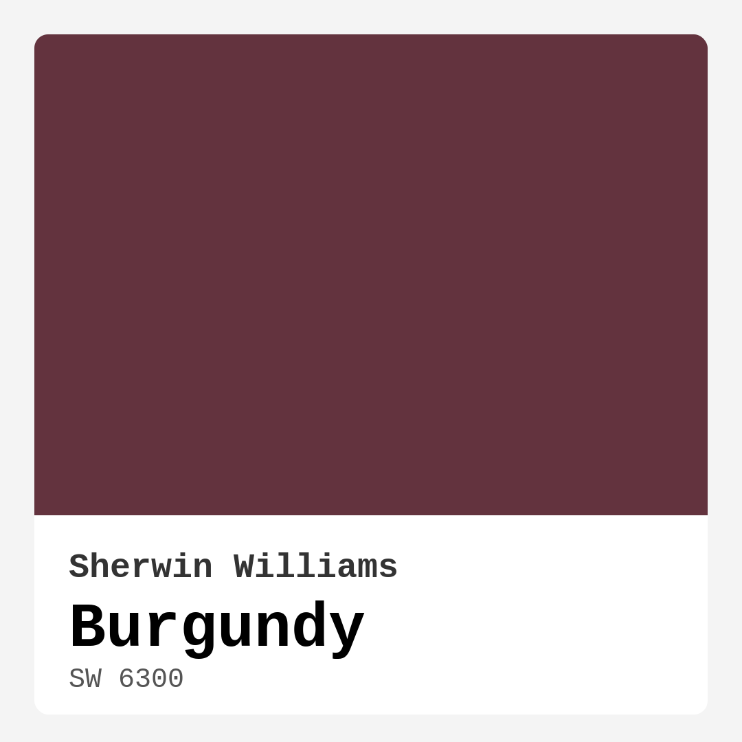
Color Preview & Key Details
| HEX Code | #63333E |
| RGB | 99, 51, 62 |
| LRV | 6% |
| Undertone | Red |
| Finish Options | Eggshell, Matte, Satin |
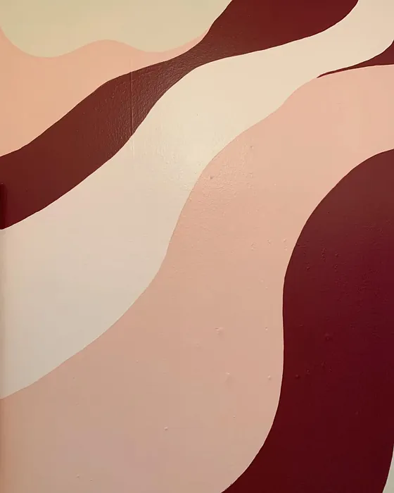
Imagine walking into a room that wraps around you like a warm hug. The walls are painted in a deep, rich hue, evoking a sense of coziness while also showcasing sophistication. That’s the magic of Burgundy (SW 6300) by Sherwin Williams. This color isn’t just another shade on the paint chip; it’s a statement, a feeling, and a transformative element for any space.
Burgundy, with its warm red undertones and dark brightness, can change the energy of a room completely. It’s versatile enough to fit various decor styles, whether you’re aiming for traditional elegance or a modern farmhouse vibe. Picture it in a dining room, creating an intimate atmosphere for family dinners, or in a home office, inspiring productivity while also providing a touch of comfort.
Let’s dive into why Burgundy might just be the perfect choice for your next project and how you can incorporate it into your home.
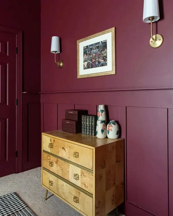
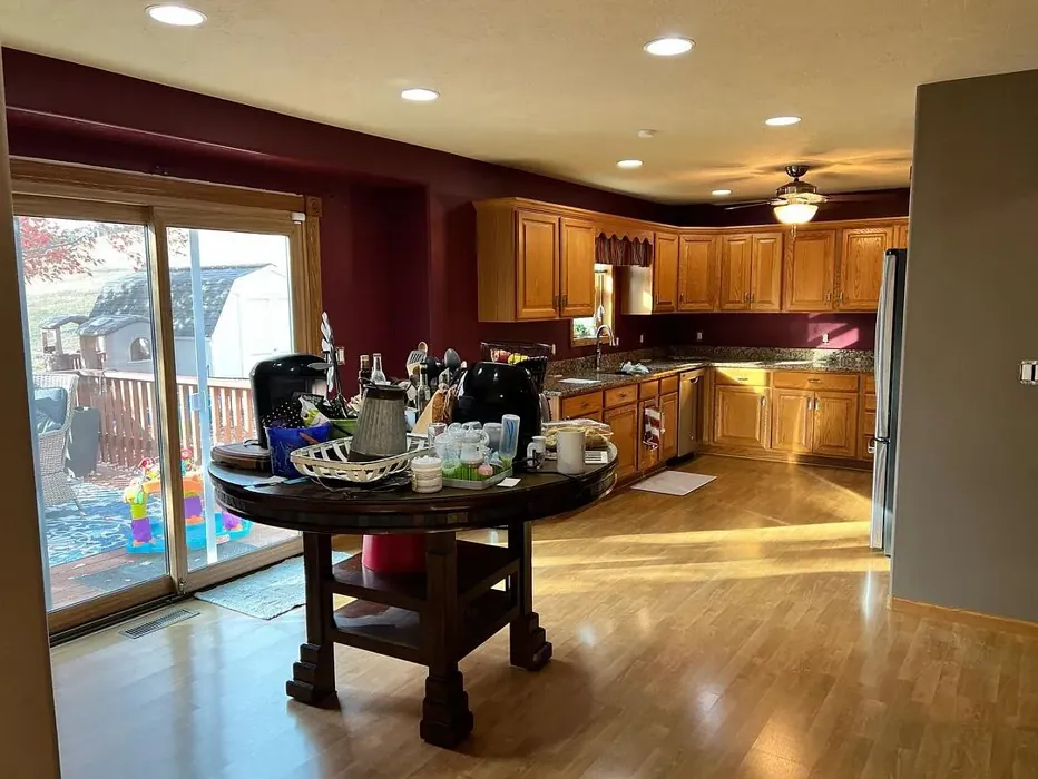
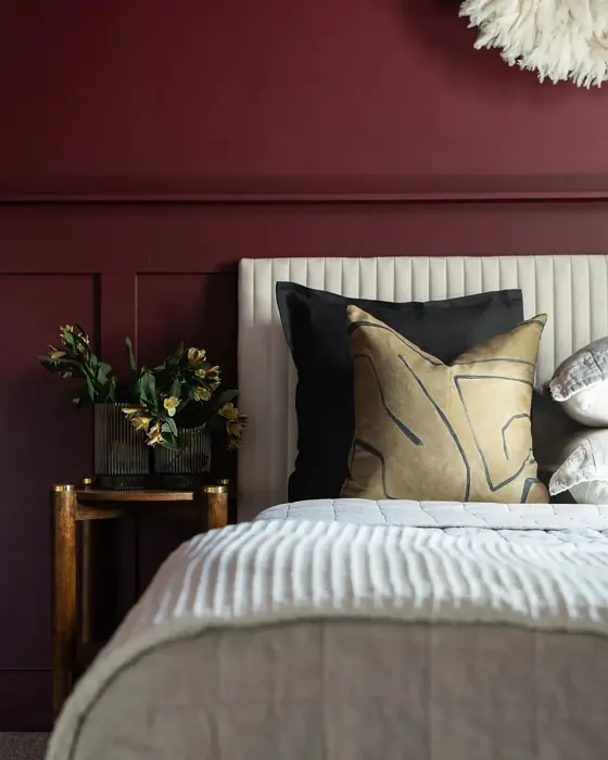
First things first, let’s talk about its characteristics. Burgundy is a bold, dark color, landing at a Light Reflectance Value (LRV) of just 6%. This means it doesn’t reflect light, creating a snug and inviting environment. It thrives in spaces where warmth and depth are desired. In bright lighting, Burgundy reveals its rich, luxurious qualities, while in dim lighting, it takes on a more moody, intimate vibe. This can be especially appealing in bedrooms or dining areas, where creating a cozy atmosphere is key.
Now, let’s consider the finish options. Burgundy is available in matte, eggshell, and satin finishes. Choosing the right finish can dramatically affect the overall look and feel of your space. A matte finish offers a soft, sophisticated appearance, perfect for bedrooms or more relaxed areas. If you’re looking for something a little easier to maintain, eggshell or satin finishes introduce a subtle sheen, making the color pop and adding a layer of durability, especially in high-traffic areas.
One of the best aspects of Burgundy is its adaptability. It pairs beautifully with many complementary shades, like the soft whites of White Dove or the warm brass fixtures that can enhance its richness. If you want to create contrast, consider lighter shades like SW 6307 or SW 6573. They can help balance the deep tones while adding dimension to your space.
You might be wondering about its application. Burgundy is beginner-friendly, making it great for DIY enthusiasts. It’s a roller-ready option, providing smooth coverage, and most importantly, it’s fast-drying, so you won’t have to wait long before you can admire your work. The coverage is also commendable, usually requiring only 1 to 2 coats for full saturation. However, keep in mind that its depth can sometimes absorb a bit of heat, making it feel warmer, which could be a benefit or a drawback depending on your climate.
Now, let’s address a common concern: can Burgundy work in smaller spaces? The answer is a resounding yes! While it’s a bold choice, when used thoughtfully, it can add depth and character without overwhelming a room. Consider using it as an accent wall paired with lighter furniture or decor to maintain an inviting atmosphere. This creates a focal point that draws the eye, while surrounding light colors help balance the richness of the Burgundy.
When thinking about where to use Burgundy, the ideal rooms include living rooms, dining rooms, bedrooms, and home offices. Each of these spaces can benefit from the warmth and sophistication that this color provides. In a living room, it can create a gathering place filled with conversation and laughter. In a dining room, it can set the stage for memorable meals. And in bedrooms, it creates a serene retreat where you can unwind after a long day.
Burgundy also shines in different decorating styles. Whether your aesthetic leans toward traditional, contemporary, rustic, or vintage, this color can enhance your vision. For instance, in a traditional setting, it can complement ornate furnishings, while in a contemporary space, it can add a bold touch that contrasts with sleek lines.
Visualizing the undertones of Burgundy is essential, too. The warm red undertones give it a complexity that can change based on your existing decor. Pair it with neutral tones or earthy hues to ground the space, or introduce contrasting colors to create an energizing effect. Testing the color in your own home is crucial; observe how it interacts with your furniture, flooring, and light throughout the day.
When it comes to upkeep, Burgundy is practical. It’s wipeable and washable, so you won’t have to stress about everyday wear and tear. The low VOC level means it’s a safer choice for your indoor air quality, making it a healthier option for your home.
There’s a certain sophistication that comes with using dark colors like Burgundy. It commands attention and evokes a sense of elegance, yet it’s warm enough to make any space feel inviting. It’s a color that tells a story, offering a backdrop for your life’s moments, whether it’s a quiet evening at home or a lively dinner party with friends.
As you consider Burgundy for your home, think about the mood you want to create and how this rich hue can enhance that feeling. Whether you opt for an entire room makeover or simply an accent wall, Burgundy is ready to elevate your space to new heights.
So, are you ready to embrace the warmth and sophistication of Burgundy? This color has the potential to transform your home into a cozy retreat that reflects your personality and style. Give it a try, and you might just find it’s the perfect fit for your next project.
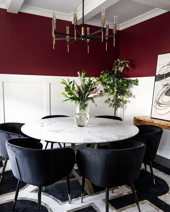
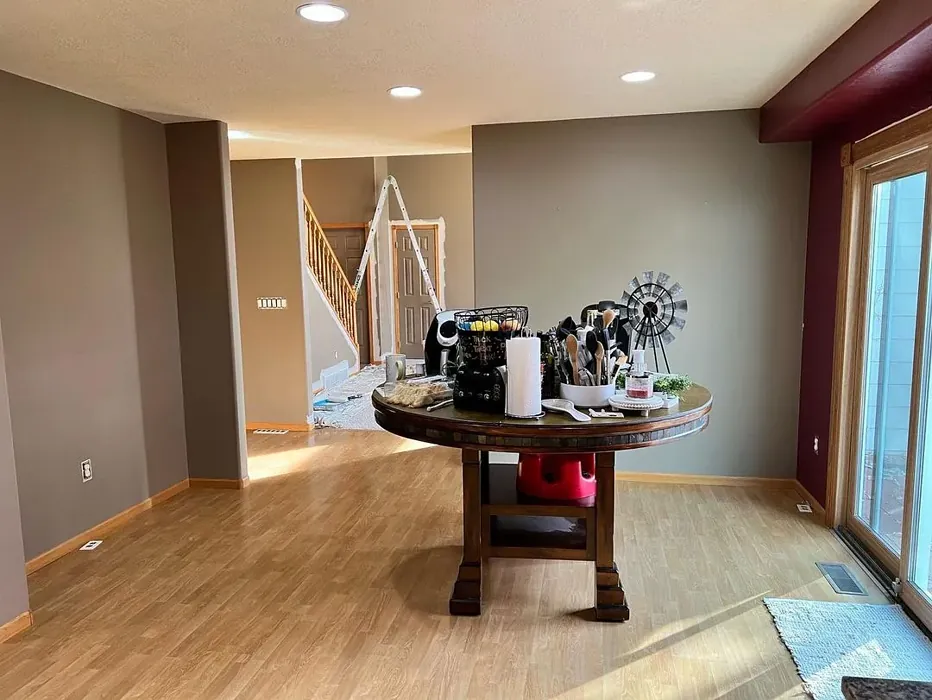
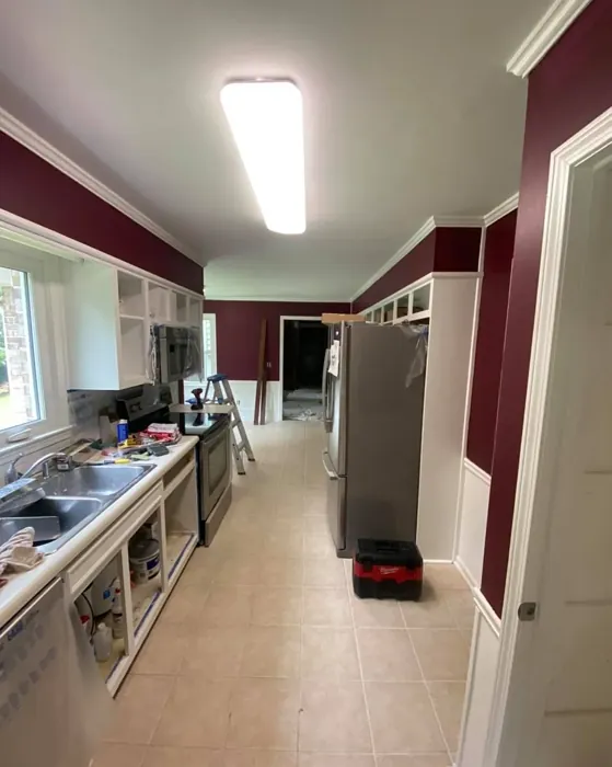
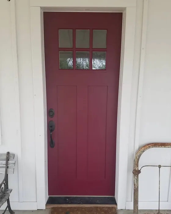
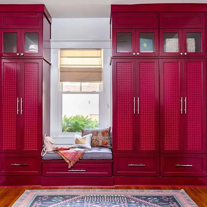
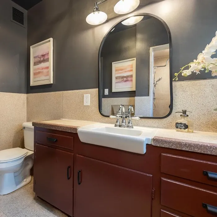
Real Room Photo of Burgundy SW 6300


Undertones of Burgundy ?
The undertones of Burgundy are a key aspect of its character, leaning towards Red. These subtle underlying hues are what give the color its depth and complexity. For example, a gray with a blue undertone will feel cooler and more modern, while one with a brown undertone will feel warmer and more traditional. It’s essential to test this paint in your home and observe it next to your existing furniture, flooring, and decor to see how these undertones interact and reveal themselves throughout the day.
HEX value: #63333E
RGB code: 99, 51, 62
Is Burgundy Cool or Warm?
Burgundy is considered a warm paint color. This characteristic plays a huge role in the overall feel of a room. Warm colors, like this one, tend to create a cozy, inviting, and energetic atmosphere, making them great for social spaces like living rooms and dining rooms. In contrast, cool colors often evoke a sense of calm and serenity, which is why they are popular in bedrooms and bathrooms. The warmth of Burgundy means it will pair beautifully with corresponding decor elements.
Understanding Color Properties and Interior Design Tips
Hue refers to a specific position on the color wheel, measured in degrees from 0 to 360. Each degree represents a different pure color:
- 0° represents red
- 120° represents green
- 240° represents blue
Saturation describes the intensity or purity of a color and is expressed as a percentage:
- At 0%, the color appears completely desaturated—essentially a shade of gray
- At 100%, the color is at its most vivid and vibrant
Lightness indicates how light or dark a color is, also expressed as a percentage:
- 0% lightness results in black
- 100% lightness results in white
Using Warm Colors in Interior Design
Warm hues—such as reds, oranges, yellows, warm beiges, and greiges—are excellent choices for creating inviting and energetic spaces. These colors are particularly well-suited for:
- Kitchens, living rooms, and bathrooms, where warmth enhances comfort and sociability
- Large rooms, where warm tones can help reduce the sense of emptiness and make the space feel more intimate
For example:
- Warm beige shades provide a cozy, inviting atmosphere, ideal for living rooms, bedrooms, and hallways.
- Warm greige (a mix of beige and gray) offers the warmth of beige with the modern appeal of gray, making it a versatile backdrop for dining areas, bedrooms, and living spaces.
However, be mindful when using warm light tones in rooms with limited natural light. These shades may appear muted or even take on an unpleasant yellowish tint. To avoid a dull or flat appearance:
- Add depth by incorporating richer tones like deep greens, charcoal, or chocolate brown
- Use textured elements such as curtains, rugs, or cushions to bring dimension to the space
Pro Tip: Achieving Harmony with Warm and Cool Color Balance
To create a well-balanced and visually interesting interior, mix warm and cool tones strategically. This contrast adds depth and harmony to your design.
- If your walls feature warm hues, introduce cool-colored accents such as blue or green furniture, artwork, or accessories to create contrast.
- For a polished look, consider using a complementary color scheme, which pairs colors opposite each other on the color wheel (e.g., red with green, orange with blue).
This thoughtful mix not only enhances visual appeal but also creates a space that feels both dynamic and cohesive.
Light Temperature Affects on Burgundy
Natural Light
Natural daylight changes in color temperature as the sun moves across the sky. At sunrise and sunset, the light tends to have a warm, golden tone with a color temperature around 2000 Kelvin (K). As the day progresses and the sun rises higher, the light becomes cooler and more neutral. Around midday, especially when the sky is clear, natural light typically reaches its peak brightness and shifts to a cooler tone, ranging from 5500 to 6500 Kelvin. This midday light is close to what we perceive as pure white or daylight-balanced light.
These shifts in natural light can significantly influence how colors appear in a space, which is why designers often consider both the time of day and the orientation of windows when planning interior color schemes.
Artificial Light
When choosing artificial lighting, pay close attention to the color temperature, measured in Kelvin (K). This determines how warm or cool the light will appear. Lower temperatures, around 2700K, give off a warm, yellow glow often used in living rooms or bedrooms. Higher temperatures, above 5000K, create a cool, bluish light similar to daylight, commonly used in kitchens, offices, or task areas.
Use the slider to see how lighting temperature can affect the appearance of a surface or color throughout a space.


4800K
LRV of Burgundy
The Light Reflectance Value (LRV) of Burgundy is 6%, which places it in the Dark colors category. This means it does not reflect light. Understanding a paint’s LRV is crucial for predicting how it will look in your space. A higher LRV indicates a lighter color that reflects more light, making rooms feel larger and brighter. A lower LRV signifies a darker color that absorbs more light, creating a cozier, more intimate atmosphere. Always consider the natural and artificial lighting in your room when selecting a paint color based on its LRV.
Detailed Review of Burgundy
Additional Paint Characteristics
Ideal Rooms
Bedroom, Dining Room, Home Office, Living Room
Decor Styles
Contemporary, Rustic, Traditional, Vintage
Coverage
Good (1–2 Coats), Touch-Up Friendly
Ease of Application
Beginner Friendly, Brush Smooth, Fast-Drying, Roller-Ready
Washability
Washable, Wipeable
VOC Level
Low VOC
Best Use
Accent Wall, Furniture, Interior Walls
Room Suitability
Bedroom, Dining Room, Home Office, Living Room
Tone Tag
Bold, Deep, Warm
Finish Type
Eggshell, Matte, Satin
Paint Performance
High Coverage, Low Odor, Quick Drying
Use Cases
Best for Modern Farmhouse, Best for Rentals, Classic Favorite
Mood
Cozy, Inviting, Sophisticated
Trim Pairing
Complements Brass Fixtures, Matches Pure White, Pairs with White Dove
Burgundy is a color that commands attention without overwhelming a space. Its luxurious depth makes it suitable for both accent walls and entire rooms. When applied, it has a velvety finish that enhances the texture of walls, making them feel more inviting. The color works beautifully with various materials, from wood to metal, providing a seamless blend in different decor styles. However, you might want to consider the lighting in your room, as natural light can bring out the best in Burgundy, while darker spaces may require additional illumination to showcase its full beauty. Overall, this color is a fantastic choice for anyone looking to add a touch of elegance and warmth to their home.
Pros & Cons of SW 6300 Burgundy
Pros
Cons
Colors that go with Sherwin Williams Burgundy
FAQ on SW 6300 Burgundy
Can I use Burgundy in small spaces?
Absolutely! While Burgundy is a bold color, it can work beautifully in small spaces if paired with appropriate lighting and decor. Use it as an accent wall to create depth without overwhelming the room. Light-colored furniture and trim can also help balance the richness of the color, making the space feel inviting rather than cramped.
What type of finish should I choose for Burgundy paint?
Choosing the right finish for Burgundy depends on the room and the look you want to achieve. A matte finish can give a sophisticated and soft look, while eggshell or satin finishes can add a bit of sheen, making it easier to clean. For high-traffic areas, a satin finish is recommended for durability, whereas a matte finish might be more suitable for bedrooms or dining areas to create a cozy vibe.
Comparisons Burgundy with other colors
Burgundy SW 6300 vs Cavern Clay SW 7701
| Attribute | Burgundy SW 6300 | Cavern Clay SW 7701 |
|---|---|---|
| Color Name | Burgundy SW 6300 | Cavern Clay SW 7701 |
| Color | ||
| Hue | Red | Red |
| Brightness | Dark | Dark |
| RGB | 99, 51, 62 | 172, 107, 83 |
| LRV | 6% | 30% |
| Finish Type | Eggshell, Matte, Satin | Eggshell, Matte, Satin |
| Finish Options | Eggshell, Matte, Satin | Eggshell, Matte, Satin |
| Ideal Rooms | Bedroom, Dining Room, Home Office, Living Room | Bedroom, Dining Room, Home Office, Kitchen, Living Room |
| Decor Styles | Contemporary, Rustic, Traditional, Vintage | Bohemian, Contemporary, Modern Farmhouse, Rustic, Transitional |
| Coverage | Good (1–2 Coats), Touch-Up Friendly | Good (1–2 Coats), Touch-Up Friendly |
| Ease of Application | Beginner Friendly, Brush Smooth, Fast-Drying, Roller-Ready | Beginner Friendly, Brush Smooth, Roller-Ready |
| Washability | Washable, Wipeable | Washable, Wipeable |
| Room Suitability | Bedroom, Dining Room, Home Office, Living Room | Bedroom, Dining Room, Home Office, Kitchen, Living Room |
| Tone | Bold, Deep, Warm | Earthy, Muted, Warm |
| Paint Performance | High Coverage, Low Odor, Quick Drying | Easy Touch-Up, Low Odor, Scuff Resistant |
Burgundy SW 6300 vs Rookwood Red SW 2802
| Attribute | Burgundy SW 6300 | Rookwood Red SW 2802 |
|---|---|---|
| Color Name | Burgundy SW 6300 | Rookwood Red SW 2802 |
| Color | ||
| Hue | Red | Red |
| Brightness | Dark | Dark |
| RGB | 99, 51, 62 | 98, 47, 45 |
| LRV | 6% | 6% |
| Finish Type | Eggshell, Matte, Satin | Eggshell, Matte, Satin |
| Finish Options | Eggshell, Matte, Satin | Eggshell, Matte, Satin |
| Ideal Rooms | Bedroom, Dining Room, Home Office, Living Room | Bedroom, Dining Room, Home Office, Living Room |
| Decor Styles | Contemporary, Rustic, Traditional, Vintage | Arts and Crafts, Modern Farmhouse, Rustic, Traditional |
| Coverage | Good (1–2 Coats), Touch-Up Friendly | Good (1–2 Coats), Touch-Up Friendly |
| Ease of Application | Beginner Friendly, Brush Smooth, Fast-Drying, Roller-Ready | Beginner Friendly, Brush Smooth, Fast-Drying, Roller-Ready |
| Washability | Washable, Wipeable | Washable, Wipeable |
| Room Suitability | Bedroom, Dining Room, Home Office, Living Room | Bedroom, Dining Room, Living Room |
| Tone | Bold, Deep, Warm | Deep, Earthy, Warm |
| Paint Performance | High Coverage, Low Odor, Quick Drying | Easy Touch-Up, High Coverage, Low Odor |
Burgundy SW 6300 vs Spiced Cider SW 7702
| Attribute | Burgundy SW 6300 | Spiced Cider SW 7702 |
|---|---|---|
| Color Name | Burgundy SW 6300 | Spiced Cider SW 7702 |
| Color | ||
| Hue | Red | Red |
| Brightness | Dark | Dark |
| RGB | 99, 51, 62 | 176, 120, 92 |
| LRV | 6% | 20% |
| Finish Type | Eggshell, Matte, Satin | Eggshell, Satin |
| Finish Options | Eggshell, Matte, Satin | Eggshell, Satin, Semi-Gloss |
| Ideal Rooms | Bedroom, Dining Room, Home Office, Living Room | Bedroom, Dining Room, Kitchen, Living Room |
| Decor Styles | Contemporary, Rustic, Traditional, Vintage | Modern Farmhouse, Rustic, Traditional, Transitional |
| Coverage | Good (1–2 Coats), Touch-Up Friendly | Good (1–2 Coats), Touch-Up Friendly |
| Ease of Application | Beginner Friendly, Brush Smooth, Fast-Drying, Roller-Ready | Beginner Friendly, Brush Smooth, Roller-Ready |
| Washability | Washable, Wipeable | Scrubbable, Washable |
| Room Suitability | Bedroom, Dining Room, Home Office, Living Room | Bedroom, Dining Room, Kitchen, Living Room |
| Tone | Bold, Deep, Warm | Earthy, Inviting, Warm |
| Paint Performance | High Coverage, Low Odor, Quick Drying | Easy Touch-Up, High Coverage, Low Odor |
Burgundy SW 6300 vs Carnelian SW 7580
| Attribute | Burgundy SW 6300 | Carnelian SW 7580 |
|---|---|---|
| Color Name | Burgundy SW 6300 | Carnelian SW 7580 |
| Color | ||
| Hue | Red | Red |
| Brightness | Dark | Dark |
| RGB | 99, 51, 62 | 87, 62, 62 |
| LRV | 6% | 20% |
| Finish Type | Eggshell, Matte, Satin | Eggshell, Satin |
| Finish Options | Eggshell, Matte, Satin | Eggshell, Matte, Satin |
| Ideal Rooms | Bedroom, Dining Room, Home Office, Living Room | Bedroom, Dining Room, Hallway, Home Office, Living Room |
| Decor Styles | Contemporary, Rustic, Traditional, Vintage | Bohemian, Modern Farmhouse, Rustic, Traditional |
| Coverage | Good (1–2 Coats), Touch-Up Friendly | Good (1–2 Coats), Touch-Up Friendly |
| Ease of Application | Beginner Friendly, Brush Smooth, Fast-Drying, Roller-Ready | Beginner Friendly, Brush Smooth, Fast-Drying, Roller-Ready |
| Washability | Washable, Wipeable | Washable, Wipeable |
| Room Suitability | Bedroom, Dining Room, Home Office, Living Room | Bedroom, Dining Room, Home Office, Living Room |
| Tone | Bold, Deep, Warm | Deep, Earthy, Warm |
| Paint Performance | High Coverage, Low Odor, Quick Drying | Easy Touch-Up, Low Odor, Quick Drying |
Burgundy SW 6300 vs Sommelier SW 7595
| Attribute | Burgundy SW 6300 | Sommelier SW 7595 |
|---|---|---|
| Color Name | Burgundy SW 6300 | Sommelier SW 7595 |
| Color | ||
| Hue | Red | Red |
| Brightness | Dark | Dark |
| RGB | 99, 51, 62 | 93, 55, 54 |
| LRV | 6% | 6% |
| Finish Type | Eggshell, Matte, Satin | Eggshell, Matte, Satin |
| Finish Options | Eggshell, Matte, Satin | Eggshell, Matte, Satin |
| Ideal Rooms | Bedroom, Dining Room, Home Office, Living Room | Bedroom, Dining Room, Home Office, Living Room |
| Decor Styles | Contemporary, Rustic, Traditional, Vintage | Modern, Rustic, Traditional, Transitional |
| Coverage | Good (1–2 Coats), Touch-Up Friendly | Good (1–2 Coats), Touch-Up Friendly |
| Ease of Application | Beginner Friendly, Brush Smooth, Fast-Drying, Roller-Ready | Brush Smooth, Fast-Drying, Low Splatter, Roller-Ready |
| Washability | Washable, Wipeable | Washable, Wipeable |
| Room Suitability | Bedroom, Dining Room, Home Office, Living Room | Bedroom, Dining Room, Home Office, Living Room |
| Tone | Bold, Deep, Warm | Deep, Earthy, Warm |
| Paint Performance | High Coverage, Low Odor, Quick Drying | Easy Touch-Up, High Coverage, Low Odor, Scuff Resistant |
Burgundy SW 6300 vs Sun Dried Tomato SW 7585
| Attribute | Burgundy SW 6300 | Sun Dried Tomato SW 7585 |
|---|---|---|
| Color Name | Burgundy SW 6300 | Sun Dried Tomato SW 7585 |
| Color | ||
| Hue | Red | Red |
| Brightness | Dark | Dark |
| RGB | 99, 51, 62 | 105, 43, 43 |
| LRV | 6% | 20% |
| Finish Type | Eggshell, Matte, Satin | Matte, Satin, Semi-Gloss |
| Finish Options | Eggshell, Matte, Satin | Matte, Satin, Semi-Gloss |
| Ideal Rooms | Bedroom, Dining Room, Home Office, Living Room | Dining Room, Home Office, Kitchen, Living Room |
| Decor Styles | Contemporary, Rustic, Traditional, Vintage | Industrial, Mediterranean, Modern Farmhouse, Rustic |
| Coverage | Good (1–2 Coats), Touch-Up Friendly | Good (1–2 Coats), Touch-Up Friendly |
| Ease of Application | Beginner Friendly, Brush Smooth, Fast-Drying, Roller-Ready | Beginner Friendly, Brush Smooth, Roller-Ready |
| Washability | Washable, Wipeable | Washable, Wipeable |
| Room Suitability | Bedroom, Dining Room, Home Office, Living Room | Dining Room, Home Office, Kitchen, Living Room |
| Tone | Bold, Deep, Warm | Bold, Earthy, Warm |
| Paint Performance | High Coverage, Low Odor, Quick Drying | Easy Touch-Up, High Coverage, Low Odor |
Burgundy SW 6300 vs Rustic Red SW 7593
| Attribute | Burgundy SW 6300 | Rustic Red SW 7593 |
|---|---|---|
| Color Name | Burgundy SW 6300 | Rustic Red SW 7593 |
| Color | ||
| Hue | Red | Red |
| Brightness | Dark | Dark |
| RGB | 99, 51, 62 | 112, 50, 41 |
| LRV | 6% | 12% |
| Finish Type | Eggshell, Matte, Satin | Matte, Satin |
| Finish Options | Eggshell, Matte, Satin | Matte, Satin, Semi-Gloss |
| Ideal Rooms | Bedroom, Dining Room, Home Office, Living Room | Bedroom, Dining Room, Hallway, Living Room |
| Decor Styles | Contemporary, Rustic, Traditional, Vintage | Country, Farmhouse, Rustic, Traditional |
| Coverage | Good (1–2 Coats), Touch-Up Friendly | Good (1–2 Coats) |
| Ease of Application | Beginner Friendly, Brush Smooth, Fast-Drying, Roller-Ready | Beginner Friendly, Brush Smooth, Fast-Drying, Roller-Ready |
| Washability | Washable, Wipeable | Washable, Wipeable |
| Room Suitability | Bedroom, Dining Room, Home Office, Living Room | Bedroom, Dining Room, Living Room |
| Tone | Bold, Deep, Warm | Deep, Earthy, Warm |
| Paint Performance | High Coverage, Low Odor, Quick Drying | Easy Touch-Up, Low Odor, Quick Drying |
Burgundy SW 6300 vs Roycroft Copper Red SW 2839
| Attribute | Burgundy SW 6300 | Roycroft Copper Red SW 2839 |
|---|---|---|
| Color Name | Burgundy SW 6300 | Roycroft Copper Red SW 2839 |
| Color | ||
| Hue | Red | Red |
| Brightness | Dark | Dark |
| RGB | 99, 51, 62 | 123, 55, 40 |
| LRV | 6% | 12% |
| Finish Type | Eggshell, Matte, Satin | Matte, Satin, Semi-Gloss |
| Finish Options | Eggshell, Matte, Satin | Matte, Satin, Semi-Gloss |
| Ideal Rooms | Bedroom, Dining Room, Home Office, Living Room | Bedroom, Dining Room, Entryway, Home Office, Living Room |
| Decor Styles | Contemporary, Rustic, Traditional, Vintage | Arts and Crafts, Eclectic, Farmhouse, Rustic, Traditional |
| Coverage | Good (1–2 Coats), Touch-Up Friendly | Good (1–2 Coats), Touch-Up Friendly |
| Ease of Application | Beginner Friendly, Brush Smooth, Fast-Drying, Roller-Ready | Beginner Friendly, Brush Smooth, Roller-Ready |
| Washability | Washable, Wipeable | Stain Resistant, Washable |
| Room Suitability | Bedroom, Dining Room, Home Office, Living Room | Bedroom, Dining Room, Entryway, Home Office, Living Room |
| Tone | Bold, Deep, Warm | Deep, Earthy, Warm |
| Paint Performance | High Coverage, Low Odor, Quick Drying | Easy Touch-Up, High Coverage, Low Odor |
Burgundy SW 6300 vs Rookwood Dark Red SW 2801
| Attribute | Burgundy SW 6300 | Rookwood Dark Red SW 2801 |
|---|---|---|
| Color Name | Burgundy SW 6300 | Rookwood Dark Red SW 2801 |
| Color | ||
| Hue | Red | Red |
| Brightness | Dark | Dark |
| RGB | 99, 51, 62 | 75, 41, 41 |
| LRV | 6% | 6% |
| Finish Type | Eggshell, Matte, Satin | Matte, Satin, Semi-Gloss |
| Finish Options | Eggshell, Matte, Satin | Matte, Satin, Semi-Gloss |
| Ideal Rooms | Bedroom, Dining Room, Home Office, Living Room | Bedroom, Dining Room, Home Office, Living Room |
| Decor Styles | Contemporary, Rustic, Traditional, Vintage | Farmhouse, Modern, Rustic, Traditional |
| Coverage | Good (1–2 Coats), Touch-Up Friendly | Good (1–2 Coats) |
| Ease of Application | Beginner Friendly, Brush Smooth, Fast-Drying, Roller-Ready | Beginner Friendly, Brush Smooth, Roller-Ready |
| Washability | Washable, Wipeable | Highly Washable, Washable |
| Room Suitability | Bedroom, Dining Room, Home Office, Living Room | Bedroom, Dining Room, Home Office, Living Room |
| Tone | Bold, Deep, Warm | Deep, Earthy, Warm |
| Paint Performance | High Coverage, Low Odor, Quick Drying | Easy Touch-Up, High Coverage, Low Odor |
Burgundy SW 6300 vs Red Barn SW 7591
| Attribute | Burgundy SW 6300 | Red Barn SW 7591 |
|---|---|---|
| Color Name | Burgundy SW 6300 | Red Barn SW 7591 |
| Color | ||
| Hue | Red | Red |
| Brightness | Dark | Dark |
| RGB | 99, 51, 62 | 124, 69, 61 |
| LRV | 6% | 6% |
| Finish Type | Eggshell, Matte, Satin | Eggshell, Matte, Satin |
| Finish Options | Eggshell, Matte, Satin | Eggshell, Flat, Matte, Satin |
| Ideal Rooms | Bedroom, Dining Room, Home Office, Living Room | Bedroom, Dining Room, Home Office, Living Room |
| Decor Styles | Contemporary, Rustic, Traditional, Vintage | Contemporary, Farmhouse, Rustic, Traditional |
| Coverage | Good (1–2 Coats), Touch-Up Friendly | Good (1–2 Coats), Self-Priming |
| Ease of Application | Beginner Friendly, Brush Smooth, Fast-Drying, Roller-Ready | Beginner Friendly, Brush Smooth, Roller-Ready |
| Washability | Washable, Wipeable | Washable, Wipeable |
| Room Suitability | Bedroom, Dining Room, Home Office, Living Room | Bedroom, Dining Room, Home Office, Living Room |
| Tone | Bold, Deep, Warm | Deep, Earthy, Warm |
| Paint Performance | High Coverage, Low Odor, Quick Drying | Easy Touch-Up, High Coverage, Low Odor |
Official Page of Sherwin Williams Burgundy SW 6300