
Color Preview & Key Details
| HEX Code | #EEDED5 |
| RGB | 238, 222, 213 |
| LRV | 66% |
| Undertone | Red |
| Finish Options | Eggshell, Matte, Satin |
Have you ever walked into a room and felt instantly at ease, as if the walls were hugging you? That’s the magic of color, and one shade that’s particularly good at creating that cozy vibe is Sherwin Williams’ Faint Coral (SW 6329). It’s a soft, delicate hue that can transform any space into an inviting retreat. So, let’s dive into what makes this color special and why it might be just what your home needs.
Faint Coral is like a warm embrace on a chilly day. This light pink shade radiates comfort and tranquility, with a warmth that makes it incredibly inviting. The color has a subtle red undertone, which enhances its soothing nature while keeping things sophisticated. Whether you’re going for a beachy coastal look or a vintage-inspired feel, Faint Coral is versatile enough to adapt to various decor styles.
One of the standout features of Faint Coral is its light reflectance value (LRV) of 66%. This means it reflects a good amount of light, making spaces feel larger and brighter. Imagine walking into your living room, which now feels airy and uplifting, thanks to the light bouncing off the soft walls. It’s especially effective in smaller rooms where you want to create an illusion of space without sacrificing warmth.
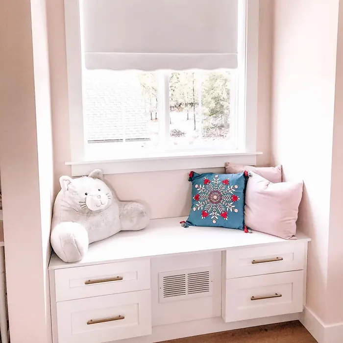
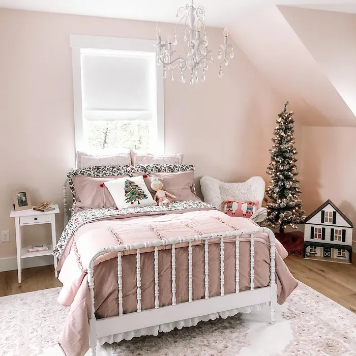
You might wonder how Faint Coral interacts with different lighting conditions. In natural light, this color appears light and buoyant, effortlessly brightening a room without being harsh or overwhelming. When the sun sets and artificial light takes over, the hue translates to a soft, inviting glow, creating an intimate atmosphere perfect for winding down after a long day. This adaptability is one of the reasons why Faint Coral shines in spaces like bedrooms or nurseries, where comfort is key.
And let’s talk about application. If you’re a DIY enthusiast or a beginner in the painting world, Faint Coral is your friend. It’s roller-ready and brush smooth, which means you can achieve a beautiful finish without fussing over complicated techniques. It’s fast-drying and has a low odor, making it a pleasant experience from start to finish. Plus, it’s touch-up friendly, so if you accidentally nick a corner, a quick brush-up is all it takes to restore that serene look.
In terms of finish, you have options. Whether you prefer a matte look for a soft, understated finish, an eggshell for a bit of sheen, or satin for a more polished appearance, Faint Coral can adapt to your personal style. Just think about how each finish might affect the look and feel of your space. For example, matte finishes can lend a modern touch, while satin adds a bit of sophistication.
Now, let’s talk about color pairings. Faint Coral looks fantastic alongside whites like White Dove or Pure White, which enhance its warmth and create a clean, fresh feel. If you’re looking to add more depth to your design, consider complementary shades like SW 9137 or SW 9633. They’ll harmonize beautifully, providing a cohesive palette that feels thoughtfully curated.
Are you concerned about how Faint Coral might hold up in a high-traffic area? While it’s a stunning choice for most rooms, keep in mind that it may require a bit of protection in bustling spaces. Given its delicate nature, you might want to consider additional protective coatings or fabrics in areas where wear and tear are more likely.
If you’re in a small room, you’re in luck! Faint Coral is a fabulous choice. Its light reflectance works wonders in open up spaces without feeling cold or sterile. Combining it with lighter trim can amplify that airy feel, making even the tiniest nook feel expansive and cozy.
For those of you considering this color for outdoor use, it’s worth noting that while Faint Coral excels indoors, it’s not recommended for exterior applications unless properly treated. Outdoor conditions can be harsh, and the color may fade over time. If you love the hue and want something similar outside, look for specially formulated exterior paints to maintain that delightful essence of Faint Coral.
As you embark on your painting journey, remember the importance of testing colors in your space. Faint Coral can shift slightly depending on your lighting and existing decor. Take the time to apply a sample on your walls and observe the color at different times of day. This simple step can save you from surprises later on and help you visualize how it’ll interact with your furnishings.
Faint Coral is not just a color; it’s a feeling—a mood of cozy calm that invites you to unwind and enjoy your surroundings. Whether you’re refreshing a single accent wall or engulfing an entire room in its warmth, this color adapts beautifully to your vision. Its understated elegance makes it a go-to option for anyone looking to create a personalized, beautiful interior.
As you explore your options, I encourage you to consider the overall vibe you want to achieve in your home. Faint Coral is a designer favorite for good reason. It’s warm and inviting, yet sophisticated enough to stand alongside more traditional styles. It plays well with both modern and vintage elements, making it a perfect choice for eclectic decorators.
So, are you ready to embrace the warmth and tranquility of Faint Coral? With its delightful charm and versatility, you might just find that it’s the perfect hue to breathe new life into your home. Whether you’re painting a nursery, a living room, or a hallway, this color brings a sense of peace and comfort that’s hard to resist. Trust me, once you experience the magic of Faint Coral, you may never want to leave your cozy sanctuary.
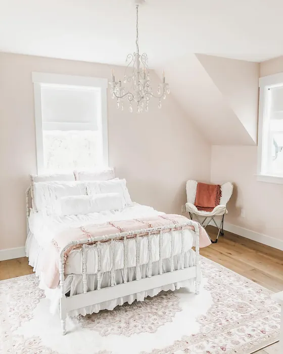
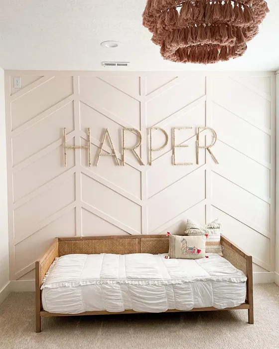
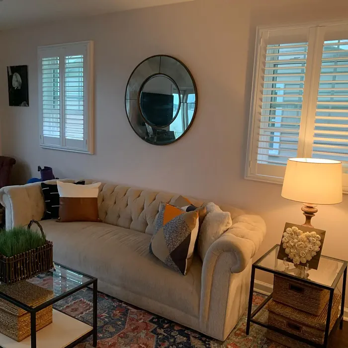
Real Room Photo of Faint Coral SW 6329
Undertones of Faint Coral ?
The undertones of Faint Coral are a key aspect of its character, leaning towards Red. These subtle underlying hues are what give the color its depth and complexity. For example, a gray with a blue undertone will feel cooler and more modern, while one with a brown undertone will feel warmer and more traditional. It’s essential to test this paint in your home and observe it next to your existing furniture, flooring, and decor to see how these undertones interact and reveal themselves throughout the day.
HEX value: #EEDED5
RGB code: 238, 222, 213
Is Faint Coral Cool or Warm?
Faint Coral is primarily a warm color, providing a cozy atmosphere that invites relaxation. Its soft undertones ensure it complements other warm hues effortlessly, making it a great choice for creating a unified and harmonious space.
Understanding Color Properties and Interior Design Tips
Hue refers to a specific position on the color wheel, measured in degrees from 0 to 360. Each degree represents a different pure color:
- 0° represents red
- 120° represents green
- 240° represents blue
Saturation describes the intensity or purity of a color and is expressed as a percentage:
- At 0%, the color appears completely desaturated—essentially a shade of gray
- At 100%, the color is at its most vivid and vibrant
Lightness indicates how light or dark a color is, also expressed as a percentage:
- 0% lightness results in black
- 100% lightness results in white
Using Warm Colors in Interior Design
Warm hues—such as reds, oranges, yellows, warm beiges, and greiges—are excellent choices for creating inviting and energetic spaces. These colors are particularly well-suited for:
- Kitchens, living rooms, and bathrooms, where warmth enhances comfort and sociability
- Large rooms, where warm tones can help reduce the sense of emptiness and make the space feel more intimate
For example:
- Warm beige shades provide a cozy, inviting atmosphere, ideal for living rooms, bedrooms, and hallways.
- Warm greige (a mix of beige and gray) offers the warmth of beige with the modern appeal of gray, making it a versatile backdrop for dining areas, bedrooms, and living spaces.
However, be mindful when using warm light tones in rooms with limited natural light. These shades may appear muted or even take on an unpleasant yellowish tint. To avoid a dull or flat appearance:
- Add depth by incorporating richer tones like deep greens, charcoal, or chocolate brown
- Use textured elements such as curtains, rugs, or cushions to bring dimension to the space
Pro Tip: Achieving Harmony with Warm and Cool Color Balance
To create a well-balanced and visually interesting interior, mix warm and cool tones strategically. This contrast adds depth and harmony to your design.
- If your walls feature warm hues, introduce cool-colored accents such as blue or green furniture, artwork, or accessories to create contrast.
- For a polished look, consider using a complementary color scheme, which pairs colors opposite each other on the color wheel (e.g., red with green, orange with blue).
This thoughtful mix not only enhances visual appeal but also creates a space that feels both dynamic and cohesive.

Light Temperature Affects on Faint Coral
Natural Light
Natural daylight changes in color temperature as the sun moves across the sky. At sunrise and sunset, the light tends to have a warm, golden tone with a color temperature around 2000 Kelvin (K). As the day progresses and the sun rises higher, the light becomes cooler and more neutral. Around midday, especially when the sky is clear, natural light typically reaches its peak brightness and shifts to a cooler tone, ranging from 5500 to 6500 Kelvin. This midday light is close to what we perceive as pure white or daylight-balanced light.
These shifts in natural light can significantly influence how colors appear in a space, which is why designers often consider both the time of day and the orientation of windows when planning interior color schemes.
Artificial Light
When choosing artificial lighting, pay close attention to the color temperature, measured in Kelvin (K). This determines how warm or cool the light will appear. Lower temperatures, around 2700K, give off a warm, yellow glow often used in living rooms or bedrooms. Higher temperatures, above 5000K, create a cool, bluish light similar to daylight, commonly used in kitchens, offices, or task areas.
Use the slider to see how lighting temperature can affect the appearance of a surface or color throughout a space.


4800K
LRV of Faint Coral
The Light Reflectance Value (LRV) of Faint Coral is 66%, which places it in the Light category. This means it Reflects a high amount of light. Understanding a paint’s LRV is crucial for predicting how it will look in your space. A higher LRV indicates a lighter color that reflects more light, making rooms feel larger and brighter. A lower LRV signifies a darker color that absorbs more light, creating a cozier, more intimate atmosphere. Always consider the natural and artificial lighting in your room when selecting a paint color based on its LRV.
Detailed Review of Faint Coral
Additional Paint Characteristics
Ideal Rooms
Bedroom, Dining Room, Hallway, Living Room, Nursery
Decor Styles
Bohemian, Coastal, Modern Farmhouse, Scandinavian, Vintage
Coverage
Good (1–2 Coats), Touch-Up Friendly
Ease of Application
Beginner Friendly, Brush Smooth, Fast-Drying, Roller-Ready
Washability
Washable, Wipeable
VOC Level
Eco-Certified, Low VOC
Best Use
Accent Wall, Interior Walls, Living Room, Nursery, Small Spaces
Room Suitability
Bedroom, Dining Room, Hallway, Living Room, Nursery
Tone Tag
Airy, Muted, Pastel, Warm
Finish Type
Eggshell, Matte, Satin
Paint Performance
Easy Touch-Up, Low Odor, Quick Drying
Use Cases
Best for Rentals, Best for Small Spaces, Classic Favorite, Designer Favorite
Mood
Calm, Cozy, Inviting, Restful
Trim Pairing
Complements Warm Trim, Matches Pure White, Pairs with White Dove
Faint Coral stands out as an exquisite choice for those looking to infuse their interiors with a warm, inviting glow. Its understated elegance makes it versatile for a wide range of decor styles, from coastal chic to vintage charm. The color’s soft pink undertones can shift with lighting, creating a dynamic visual experience throughout the day. Whether you’re painting an accent wall or refreshing a whole room, Faint Coral adapts beautifully, promoting a sense of calm and serenity. It’s particularly effective in spaces where relaxation is key, such as bedrooms and nurseries, and pairs wonderfully with natural wood accents or white trim. Overall, its charming demeanor makes it a fantastic option for home decorators seeking a touch of warmth without overwhelming the senses.
Pros & Cons of SW 6329 Faint Coral
Pros
Cons
Colors that go with Sherwin Williams Faint Coral
FAQ on SW 6329 Faint Coral
Can Faint Coral be used in small rooms?
Absolutely! Faint Coral is perfect for small rooms due to its light reflectance and warm undertones. It creates a sense of openness while also making the space feel cozy. Just be mindful of how it interacts with your lighting, and consider using it in conjunction with lighter trim to enhance the airy feel.
Is Faint Coral suitable for outdoor use?
While Faint Coral shines indoors, it’s generally not recommended for exterior applications without proper treatment. The color may fade when exposed to harsh weather conditions. If you’re looking for a similar hue outdoors, consider a specially formulated exterior paint that can withstand the elements while maintaining the essence of Faint Coral.
Comparisons Faint Coral with other colors
Faint Coral SW 6329 vs Malted Milk SW 6057
| Attribute | Faint Coral SW 6329 | Malted Milk SW 6057 |
|---|---|---|
| Color Name | Faint Coral SW 6329 | Malted Milk SW 6057 |
| Color | ||
| Hue | Pink | Pink |
| Brightness | Light | Light |
| RGB | 238, 222, 213 | 222, 202, 189 |
| LRV | 66% | 74% |
| Finish Type | Eggshell, Matte, Satin | Eggshell, Satin |
| Finish Options | Eggshell, Matte, Satin | Eggshell, Matte, Satin |
| Ideal Rooms | Bedroom, Dining Room, Hallway, Living Room, Nursery | Bedroom, Dining Room, Kitchen, Living Room, Nursery |
| Decor Styles | Bohemian, Coastal, Modern Farmhouse, Scandinavian, Vintage | Coastal, Farmhouse, Modern, Scandinavian, Transitional |
| Coverage | Good (1–2 Coats), Touch-Up Friendly | Good (1–2 Coats), Touch-Up Friendly |
| Ease of Application | Beginner Friendly, Brush Smooth, Fast-Drying, Roller-Ready | Beginner Friendly, Brush Smooth, Fast-Drying, Roller-Ready |
| Washability | Washable, Wipeable | Washable, Wipeable |
| Room Suitability | Bedroom, Dining Room, Hallway, Living Room, Nursery | Bedroom, Dining Room, Kitchen, Living Room, Nursery |
| Tone | Airy, Muted, Pastel, Warm | Creamy, Neutral, Warm |
| Paint Performance | Easy Touch-Up, Low Odor, Quick Drying | High Coverage, Low Odor, Quick Drying |
Faint Coral SW 6329 vs Intimate White SW 6322
| Attribute | Faint Coral SW 6329 | Intimate White SW 6322 |
|---|---|---|
| Color Name | Faint Coral SW 6329 | Intimate White SW 6322 |
| Color | ||
| Hue | Pink | Pink |
| Brightness | Light | Light |
| RGB | 238, 222, 213 | 240, 225, 216 |
| LRV | 66% | 75% |
| Finish Type | Eggshell, Matte, Satin | Eggshell, Matte, Satin |
| Finish Options | Eggshell, Matte, Satin | Eggshell, Matte, Satin |
| Ideal Rooms | Bedroom, Dining Room, Hallway, Living Room, Nursery | Bedroom, Hallway, Home Office, Living Room, Nursery |
| Decor Styles | Bohemian, Coastal, Modern Farmhouse, Scandinavian, Vintage | Farmhouse, Minimalist, Modern, Traditional |
| Coverage | Good (1–2 Coats), Touch-Up Friendly | Good (1–2 Coats) |
| Ease of Application | Beginner Friendly, Brush Smooth, Fast-Drying, Roller-Ready | Beginner Friendly, Brush Smooth, Roller-Ready |
| Washability | Washable, Wipeable | Highly Washable, Washable |
| Room Suitability | Bedroom, Dining Room, Hallway, Living Room, Nursery | Bedroom, Hallway, Living Room, Nursery |
| Tone | Airy, Muted, Pastel, Warm | Creamy, Muted, Warm |
| Paint Performance | Easy Touch-Up, Low Odor, Quick Drying | Easy Touch-Up, Fade Resistant, Low Odor |
Faint Coral SW 6329 vs Abalone Shell SW 6050
| Attribute | Faint Coral SW 6329 | Abalone Shell SW 6050 |
|---|---|---|
| Color Name | Faint Coral SW 6329 | Abalone Shell SW 6050 |
| Color | ||
| Hue | Pink | Pink |
| Brightness | Light | Light |
| RGB | 238, 222, 213 | 219, 199, 189 |
| LRV | 66% | 30% |
| Finish Type | Eggshell, Matte, Satin | Eggshell, Matte, Satin |
| Finish Options | Eggshell, Matte, Satin | Eggshell, Matte, Satin |
| Ideal Rooms | Bedroom, Dining Room, Hallway, Living Room, Nursery | Bedroom, Dining Room, Home Office, Living Room |
| Decor Styles | Bohemian, Coastal, Modern Farmhouse, Scandinavian, Vintage | Coastal, Farmhouse, Minimalist, Modern, Traditional |
| Coverage | Good (1–2 Coats), Touch-Up Friendly | Good (1–2 Coats), Touch-Up Friendly |
| Ease of Application | Beginner Friendly, Brush Smooth, Fast-Drying, Roller-Ready | Beginner Friendly, Brush Smooth, Fast-Drying, Roller-Ready |
| Washability | Washable, Wipeable | Washable, Wipeable |
| Room Suitability | Bedroom, Dining Room, Hallway, Living Room, Nursery | Bedroom, Dining Room, Home Office, Living Room |
| Tone | Airy, Muted, Pastel, Warm | Balanced, Muted, Warm |
| Paint Performance | Easy Touch-Up, Low Odor, Quick Drying | Easy Touch-Up, Fade Resistant, Low Odor, Quick Drying |
Faint Coral SW 6329 vs White Truffle SW 6029
| Attribute | Faint Coral SW 6329 | White Truffle SW 6029 |
|---|---|---|
| Color Name | Faint Coral SW 6329 | White Truffle SW 6029 |
| Color | ||
| Hue | Pink | Pink |
| Brightness | Light | Light |
| RGB | 238, 222, 213 | 215, 200, 194 |
| LRV | 66% | 48% |
| Finish Type | Eggshell, Matte, Satin | Eggshell, Satin |
| Finish Options | Eggshell, Matte, Satin | Eggshell, Flat, Matte, Satin |
| Ideal Rooms | Bedroom, Dining Room, Hallway, Living Room, Nursery | Bedroom, Dining Room, Hallway, Kitchen, Living Room |
| Decor Styles | Bohemian, Coastal, Modern Farmhouse, Scandinavian, Vintage | Eclectic, Farmhouse, Modern, Traditional |
| Coverage | Good (1–2 Coats), Touch-Up Friendly | Good (1–2 Coats), Touch-Up Friendly |
| Ease of Application | Beginner Friendly, Brush Smooth, Fast-Drying, Roller-Ready | Beginner Friendly, Brush Smooth, Roller-Ready |
| Washability | Washable, Wipeable | Washable, Wipeable |
| Room Suitability | Bedroom, Dining Room, Hallway, Living Room, Nursery | Bedroom, Dining Room, Hallway, Living Room |
| Tone | Airy, Muted, Pastel, Warm | Earthy, Neutral, Warm |
| Paint Performance | Easy Touch-Up, Low Odor, Quick Drying | Easy Touch-Up, Low Odor, Scuff Resistant |
Faint Coral SW 6329 vs Romance SW 6323
| Attribute | Faint Coral SW 6329 | Romance SW 6323 |
|---|---|---|
| Color Name | Faint Coral SW 6329 | Romance SW 6323 |
| Color | ||
| Hue | Pink | Pink |
| Brightness | Light | Light |
| RGB | 238, 222, 213 | 235, 207, 195 |
| LRV | 66% | 69% |
| Finish Type | Eggshell, Matte, Satin | Eggshell, Matte |
| Finish Options | Eggshell, Matte, Satin | Eggshell, Flat, Matte, Satin |
| Ideal Rooms | Bedroom, Dining Room, Hallway, Living Room, Nursery | Bedroom, Dining Room, Living Room, Nursery |
| Decor Styles | Bohemian, Coastal, Modern Farmhouse, Scandinavian, Vintage | Bohemian, Modern, Shabby Chic, Vintage |
| Coverage | Good (1–2 Coats), Touch-Up Friendly | Good (1–2 Coats), Touch-Up Friendly |
| Ease of Application | Beginner Friendly, Brush Smooth, Fast-Drying, Roller-Ready | Beginner Friendly, Brush Smooth, Fast-Drying, Roller-Ready |
| Washability | Washable, Wipeable | Washable, Wipeable |
| Room Suitability | Bedroom, Dining Room, Hallway, Living Room, Nursery | Bedroom, Dining Room, Living Room, Nursery |
| Tone | Airy, Muted, Pastel, Warm | Pastel, Soft, Warm |
| Paint Performance | Easy Touch-Up, Low Odor, Quick Drying | Easy Touch-Up, Low Odor, Quick Drying |
Faint Coral SW 6329 vs Innocence SW 6302
| Attribute | Faint Coral SW 6329 | Innocence SW 6302 |
|---|---|---|
| Color Name | Faint Coral SW 6329 | Innocence SW 6302 |
| Color | ||
| Hue | Pink | Pink |
| Brightness | Light | Light |
| RGB | 238, 222, 213 | 235, 209, 207 |
| LRV | 66% | 75% |
| Finish Type | Eggshell, Matte, Satin | Eggshell, Matte |
| Finish Options | Eggshell, Matte, Satin | Eggshell, Matte, Satin |
| Ideal Rooms | Bedroom, Dining Room, Hallway, Living Room, Nursery | Bedroom, Dining Room, Living Room, Nursery |
| Decor Styles | Bohemian, Coastal, Modern Farmhouse, Scandinavian, Vintage | Bohemian, Modern Farmhouse, Scandinavian, Shabby Chic |
| Coverage | Good (1–2 Coats), Touch-Up Friendly | Good (1–2 Coats), Touch-Up Friendly |
| Ease of Application | Beginner Friendly, Brush Smooth, Fast-Drying, Roller-Ready | Beginner Friendly, Brush Smooth, Roller-Ready |
| Washability | Washable, Wipeable | Washable, Wipeable |
| Room Suitability | Bedroom, Dining Room, Hallway, Living Room, Nursery | Bedroom, Dining Room, Living Room, Nursery |
| Tone | Airy, Muted, Pastel, Warm | Pastel, Soft, Warm |
| Paint Performance | Easy Touch-Up, Low Odor, Quick Drying | Easy Touch-Up, Fade Resistant, Low Odor |
Faint Coral SW 6329 vs Angelic SW 6602
| Attribute | Faint Coral SW 6329 | Angelic SW 6602 |
|---|---|---|
| Color Name | Faint Coral SW 6329 | Angelic SW 6602 |
| Color | ||
| Hue | Pink | Pink |
| Brightness | Light | Light |
| RGB | 238, 222, 213 | 242, 220, 215 |
| LRV | 66% | 75% |
| Finish Type | Eggshell, Matte, Satin | Eggshell, Satin |
| Finish Options | Eggshell, Matte, Satin | Eggshell, Flat, Matte, Satin |
| Ideal Rooms | Bedroom, Dining Room, Hallway, Living Room, Nursery | Bedroom, Dining Room, Home Office, Living Room, Nursery |
| Decor Styles | Bohemian, Coastal, Modern Farmhouse, Scandinavian, Vintage | Bohemian, Farmhouse, Modern, Transitional |
| Coverage | Good (1–2 Coats), Touch-Up Friendly | Good (1–2 Coats), Touch-Up Friendly |
| Ease of Application | Beginner Friendly, Brush Smooth, Fast-Drying, Roller-Ready | Beginner Friendly, Brush Smooth, Roller-Ready |
| Washability | Washable, Wipeable | Washable, Wipeable |
| Room Suitability | Bedroom, Dining Room, Hallway, Living Room, Nursery | Bedroom, Home Office, Living Room, Nursery |
| Tone | Airy, Muted, Pastel, Warm | Airy, Pastel, Warm |
| Paint Performance | Easy Touch-Up, Low Odor, Quick Drying | Easy Touch-Up, Fade Resistant, Low Odor |
Faint Coral SW 6329 vs Rosy Outlook SW 6316
| Attribute | Faint Coral SW 6329 | Rosy Outlook SW 6316 |
|---|---|---|
| Color Name | Faint Coral SW 6329 | Rosy Outlook SW 6316 |
| Color | ||
| Hue | Pink | Pink |
| Brightness | Light | Light |
| RGB | 238, 222, 213 | 235, 206, 203 |
| LRV | 66% | 45% |
| Finish Type | Eggshell, Matte, Satin | Eggshell, Matte, Satin |
| Finish Options | Eggshell, Matte, Satin | Eggshell, Matte, Satin |
| Ideal Rooms | Bedroom, Dining Room, Hallway, Living Room, Nursery | Bedroom, Home Office, Living Room, Nursery |
| Decor Styles | Bohemian, Coastal, Modern Farmhouse, Scandinavian, Vintage | Bohemian, Cottage, Modern, Traditional |
| Coverage | Good (1–2 Coats), Touch-Up Friendly | Good (1–2 Coats), Touch-Up Friendly |
| Ease of Application | Beginner Friendly, Brush Smooth, Fast-Drying, Roller-Ready | Beginner Friendly, Brush Smooth, Roller-Ready |
| Washability | Washable, Wipeable | Scuff Resistant, Washable, Wipeable |
| Room Suitability | Bedroom, Dining Room, Hallway, Living Room, Nursery | Bedroom, Home Office, Living Room, Nursery |
| Tone | Airy, Muted, Pastel, Warm | Muted, Pastel, Warm |
| Paint Performance | Easy Touch-Up, Low Odor, Quick Drying | High Coverage, Low Odor, Quick Drying |
Faint Coral SW 6329 vs Demure SW 6295
| Attribute | Faint Coral SW 6329 | Demure SW 6295 |
|---|---|---|
| Color Name | Faint Coral SW 6329 | Demure SW 6295 |
| Color | ||
| Hue | Pink | Pink |
| Brightness | Light | Light |
| RGB | 238, 222, 213 | 232, 212, 213 |
| LRV | 66% | 50% |
| Finish Type | Eggshell, Matte, Satin | Eggshell, Matte |
| Finish Options | Eggshell, Matte, Satin | Eggshell, Matte, Satin |
| Ideal Rooms | Bedroom, Dining Room, Hallway, Living Room, Nursery | Bedroom, Home Office, Living Room, Nursery |
| Decor Styles | Bohemian, Coastal, Modern Farmhouse, Scandinavian, Vintage | Minimalist, Modern, Shabby Chic, Transitional |
| Coverage | Good (1–2 Coats), Touch-Up Friendly | Good (1–2 Coats), Touch-Up Friendly |
| Ease of Application | Beginner Friendly, Brush Smooth, Fast-Drying, Roller-Ready | Beginner Friendly, Brush Smooth, Roller-Ready |
| Washability | Washable, Wipeable | Washable, Wipeable |
| Room Suitability | Bedroom, Dining Room, Hallway, Living Room, Nursery | Bedroom, Home Office, Living Room, Nursery |
| Tone | Airy, Muted, Pastel, Warm | Muted, Pastel, Warm |
| Paint Performance | Easy Touch-Up, Low Odor, Quick Drying | Easy Touch-Up, Low Odor, Quick Drying |
Faint Coral SW 6329 vs Charming Pink SW 6309
| Attribute | Faint Coral SW 6329 | Charming Pink SW 6309 |
|---|---|---|
| Color Name | Faint Coral SW 6329 | Charming Pink SW 6309 |
| Color | ||
| Hue | Pink | Pink |
| Brightness | Light | Light |
| RGB | 238, 222, 213 | 237, 211, 210 |
| LRV | 66% | 69% |
| Finish Type | Eggshell, Matte, Satin | Eggshell, Matte |
| Finish Options | Eggshell, Matte, Satin | Eggshell, Matte, Satin |
| Ideal Rooms | Bedroom, Dining Room, Hallway, Living Room, Nursery | Bedroom, Dining Room, Living Room, Nursery |
| Decor Styles | Bohemian, Coastal, Modern Farmhouse, Scandinavian, Vintage | Bohemian, Contemporary, Modern Farmhouse, Shabby Chic, Vintage |
| Coverage | Good (1–2 Coats), Touch-Up Friendly | Good (1–2 Coats), Touch-Up Friendly |
| Ease of Application | Beginner Friendly, Brush Smooth, Fast-Drying, Roller-Ready | Beginner Friendly, Brush Smooth, Fast-Drying, Roller-Ready |
| Washability | Washable, Wipeable | Washable, Wipeable |
| Room Suitability | Bedroom, Dining Room, Hallway, Living Room, Nursery | Bedroom, Dining Room, Living Room, Nursery |
| Tone | Airy, Muted, Pastel, Warm | Muted, Pastel, Warm |
| Paint Performance | Easy Touch-Up, Low Odor, Quick Drying | Easy Touch-Up, Low Odor, Quick Drying |
Official Page of Sherwin Williams Faint Coral SW 6329