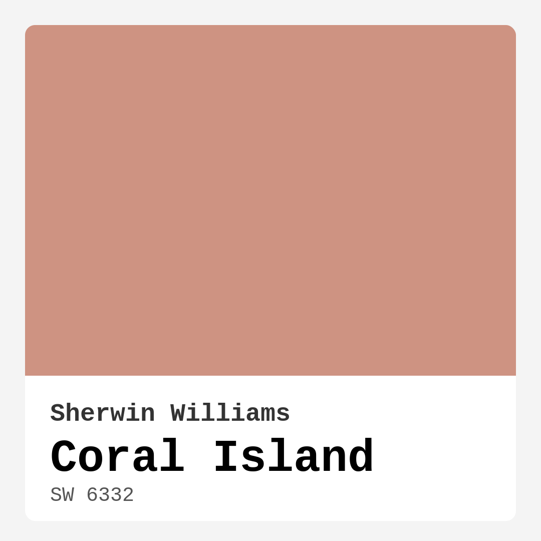
Color Preview & Key Details
| HEX Code | #CE9382 |
| RGB | 206, 147, 130 |
| LRV | 75% |
| Undertone | Red |
| Finish Options | Eggshell, Satin, Semi-Gloss |
Imagine stepping into a room that feels like a warm embrace, where the colors dance lightly around you, inviting you to stay awhile. This is the magic of Coral Island from Sherwin Williams. Its soft, warm hue, a delightful blend of coral and peach tones, brings a sense of tranquility and brightness to any space. As someone with a passion for creating beautiful interiors, I can confidently say that this paint color can transform your home into a serene escape.
Coral Island (SW 6332) is a color that embodies the essence of sunlit shores, making it a perfect choice for a variety of rooms. Whether you’re imagining it in your living room, bedroom, kitchen, dining room, or even a nursery, this inviting hue adapts beautifully to diverse design styles. It shines in coastal and bohemian spaces, while also complementing traditional, modern farmhouse, and eclectic decors. The versatility of this color makes it an excellent option for anyone looking to refresh their home.
One of the first things you’ll appreciate when working with Coral Island is its application. It’s beginner-friendly, gliding smoothly on with both rollers and brushes. You’ll find that it offers good coverage, often needing just one to two coats, depending on what you’re painting over. If you’re transitioning from a darker color, I recommend going for at least two coats to achieve that vibrant finish. But, if you’re covering a lighter shade, one coat might do the trick. Just remember, a second coat always enhances the richness and depth of the color.
The light reflectance value (LRV) of Coral Island is 75%, which means it reflects a significant amount of light. This feature is a game-changer for small spaces or rooms with limited natural light. It makes areas feel larger and more open, while still maintaining a cozy ambiance. In natural light, Coral Island radiates warmth and cheerfulness, whereas artificial light brings out its subtle peach tones. This adaptability ensures that this color remains pleasant throughout the day and into the evening, creating a welcoming atmosphere.
When considering how Coral Island pairs with other colors, the options are abundant. For a serene palette, it beautifully complements shades like White Dove or muted greens. The warm undertones of Coral Island lean towards red, adding depth to your decor. This characteristic is essential to keep in mind as you design your space. Colors can evolve throughout the day based on the lighting and the other elements in the room, so testing Coral Island next to your existing furnishings is key.
For those planning to decorate high-traffic areas, you’ll be glad to know that Coral Island is both washable and durable. Its smooth finish makes for easy cleaning, perfect for busy hallways, kitchens, or dining spaces. Opt for a satin or semi-gloss finish to enhance its durability while maintaining that lovely soft sheen. Plus, with a low VOC content, you can feel good about using it in your home, knowing it’s eco-certified and safe for your family.
Imagine Coral Island as an accent wall that draws the eye and invites conversation. You could use it to create a stunning focal point in your living room or a cozy nook in your bedroom. The color also works wonderfully for furniture pieces — think about painting a vintage dresser or a dining table. The possibilities are endless, and each application brings a touch of warmth and character to your space.
While Coral Island is a favorite among designers, it’s important to consider a few potential downsides. Depending on your lighting, the color perception can vary, and in smaller spaces, it might darken a bit. Therefore, always test a swatch in your home’s lighting before committing. It’s crucial to understand how it interacts with other colors in your environment.
In terms of complementary hues, Coral Island plays well with various shades. Pair it with greens for a fresh, natural look, or combine it with brass fixtures for an elegant touch. Wood trim can also enhance the warmth of the color, grounding the overall design. If you’re seeking lighter or darker shades to create contrast, consider incorporating shades like SW 0069 for a lighter counterpart or SW 6325 for a richer tone.
Creating a beautiful interior is all about balance and harmony, and Coral Island serves as an excellent foundation. It invites a sense of calm while maintaining a lively energy, making it ideal for social spaces where you want your guests to feel relaxed and welcomed. Whether you’re painting an entire room or simply refreshing an accent wall, Coral Island is sure to impress.
As you embark on your painting project, remember that the undertones of Coral Island are a key aspect of its character. Leaning towards red, these subtle hues give the color depth and complexity. By testing it against your current decor, you’ll be able to see how it interacts with your furniture and flooring throughout the day as different lights cast their glow. This exploration is part of the fun of designing your space.
So, if you’re ready to infuse your home with warmth and personality, Coral Island is undoubtedly a fantastic choice. This inviting hue not only brightens your rooms but also creates a cozy and grounding atmosphere. From its versatility to its ease of application, it stands out as a designer favorite. I can’t wait to see how you bring Coral Island into your home, creating a space that reflects your unique style and welcomes everyone who enters.
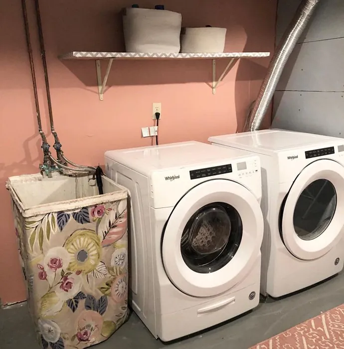
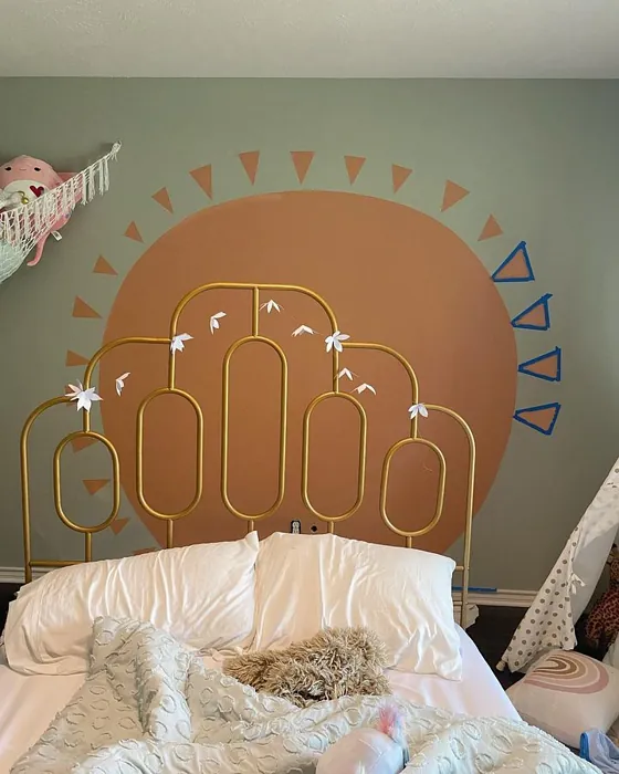
Real Room Photo of Coral Island SW 6332
Undertones of Coral Island ?
The undertones of Coral Island are a key aspect of its character, leaning towards Red. These subtle underlying hues are what give the color its depth and complexity. For example, a gray with a blue undertone will feel cooler and more modern, while one with a brown undertone will feel warmer and more traditional. It’s essential to test this paint in your home and observe it next to your existing furniture, flooring, and decor to see how these undertones interact and reveal themselves throughout the day.
HEX value: #CE9382
RGB code: 206, 147, 130
Is Coral Island Cool or Warm?
This paint leans warm, making it perfect for creating inviting spaces. Its coral base adds a touch of brightness without overwhelming the senses.
Understanding Color Properties and Interior Design Tips
Hue refers to a specific position on the color wheel, measured in degrees from 0 to 360. Each degree represents a different pure color:
- 0° represents red
- 120° represents green
- 240° represents blue
Saturation describes the intensity or purity of a color and is expressed as a percentage:
- At 0%, the color appears completely desaturated—essentially a shade of gray
- At 100%, the color is at its most vivid and vibrant
Lightness indicates how light or dark a color is, also expressed as a percentage:
- 0% lightness results in black
- 100% lightness results in white
Using Warm Colors in Interior Design
Warm hues—such as reds, oranges, yellows, warm beiges, and greiges—are excellent choices for creating inviting and energetic spaces. These colors are particularly well-suited for:
- Kitchens, living rooms, and bathrooms, where warmth enhances comfort and sociability
- Large rooms, where warm tones can help reduce the sense of emptiness and make the space feel more intimate
For example:
- Warm beige shades provide a cozy, inviting atmosphere, ideal for living rooms, bedrooms, and hallways.
- Warm greige (a mix of beige and gray) offers the warmth of beige with the modern appeal of gray, making it a versatile backdrop for dining areas, bedrooms, and living spaces.
However, be mindful when using warm light tones in rooms with limited natural light. These shades may appear muted or even take on an unpleasant yellowish tint. To avoid a dull or flat appearance:
- Add depth by incorporating richer tones like deep greens, charcoal, or chocolate brown
- Use textured elements such as curtains, rugs, or cushions to bring dimension to the space
Pro Tip: Achieving Harmony with Warm and Cool Color Balance
To create a well-balanced and visually interesting interior, mix warm and cool tones strategically. This contrast adds depth and harmony to your design.
- If your walls feature warm hues, introduce cool-colored accents such as blue or green furniture, artwork, or accessories to create contrast.
- For a polished look, consider using a complementary color scheme, which pairs colors opposite each other on the color wheel (e.g., red with green, orange with blue).
This thoughtful mix not only enhances visual appeal but also creates a space that feels both dynamic and cohesive.
Light Temperature Affects on Coral Island
Natural Light
Natural daylight changes in color temperature as the sun moves across the sky. At sunrise and sunset, the light tends to have a warm, golden tone with a color temperature around 2000 Kelvin (K). As the day progresses and the sun rises higher, the light becomes cooler and more neutral. Around midday, especially when the sky is clear, natural light typically reaches its peak brightness and shifts to a cooler tone, ranging from 5500 to 6500 Kelvin. This midday light is close to what we perceive as pure white or daylight-balanced light.
These shifts in natural light can significantly influence how colors appear in a space, which is why designers often consider both the time of day and the orientation of windows when planning interior color schemes.
Artificial Light
When choosing artificial lighting, pay close attention to the color temperature, measured in Kelvin (K). This determines how warm or cool the light will appear. Lower temperatures, around 2700K, give off a warm, yellow glow often used in living rooms or bedrooms. Higher temperatures, above 5000K, create a cool, bluish light similar to daylight, commonly used in kitchens, offices, or task areas.
Use the slider to see how lighting temperature can affect the appearance of a surface or color throughout a space.


4800K
LRV of Coral Island
The Light Reflectance Value (LRV) of Coral Island is 75%, which places it in the Light category. This means it Reflects a high amount of light. Understanding a paint’s LRV is crucial for predicting how it will look in your space. A higher LRV indicates a lighter color that reflects more light, making rooms feel larger and brighter. A lower LRV signifies a darker color that absorbs more light, creating a cozier, more intimate atmosphere. Always consider the natural and artificial lighting in your room when selecting a paint color based on its LRV.
Detailed Review of Coral Island
Additional Paint Characteristics
Ideal Rooms
Bedroom, Dining Room, Kitchen, Living Room, Nursery
Decor Styles
Bohemian, Coastal, Eclectic, Modern Farmhouse, Traditional
Coverage
Good (1–2 Coats), Touch-Up Friendly
Ease of Application
Beginner Friendly, Brush Smooth, Fast-Drying, Roller-Ready
Washability
Washable, Wipeable
VOC Level
Eco-Certified, Low VOC
Best Use
Accent Wall, Furniture, Interior Walls
Room Suitability
Bedroom, Dining Room, Kitchen, Living Room, Nursery
Tone Tag
Earthy, Inviting, Muted, Warm
Finish Type
Eggshell, Satin
Paint Performance
Easy Touch-Up, Low Odor, Quick Drying, Scuff Resistant
Use Cases
Best for Low Light Rooms, Best for Rentals, Best for Small Spaces, Designer Favorite
Mood
Cozy, Grounding, Inviting
Trim Pairing
Complements Brass Fixtures, Good with Wood Trim, Pairs with White Dove
Coral Island is a stunning choice for anyone looking to add warmth and brightness to their home. Its unique blend of coral and peach creates a soothing yet vibrant atmosphere, making it ideal for living areas and bedrooms alike. When applying this paint, you’ll find it glides on smoothly, offering good coverage in just one to two coats. Plus, the soft sheen reflects light beautifully, enhancing the room’s overall ambiance.
What truly sets Coral Island apart is its ability to pair well with a variety of styles, from coastal retreats to modern farmhouses. It invites a sense of calm while maintaining a lively energy, making it perfect for social spaces. Whether you’re painting an accent wall or redoing an entire room, Coral Island is sure to impress and uplift your home decor.
Pros & Cons of SW 6332 Coral Island
Pros
Cons
Colors that go with Sherwin Williams Coral Island
FAQ on SW 6332 Coral Island
How many coats of Coral Island should I apply?
For best results, it’s recommended to apply at least two coats of Coral Island, especially if you’re transitioning from a darker color. The first coat will serve as a base, while the second will enhance the vibrancy and depth of the color. If you’re painting over a similar light shade, you might achieve adequate coverage with just one coat, but a second coat will ensure a richer finish.
Is Coral Island suitable for high-traffic areas?
Yes, Coral Island is a great choice for high-traffic areas as it’s both washable and durable. Its smooth finish allows for easy cleaning, making it suitable for hallways, kitchens, and other busy spaces. Just ensure that you opt for a finish that can withstand wear and tear, like satin or semi-gloss, to maintain its beauty over time.
Comparisons Coral Island with other colors
Coral Island SW 6332 vs Realist Beige SW 6078
| Attribute | Coral Island SW 6332 | Realist Beige SW 6078 |
|---|---|---|
| Color Name | Coral Island SW 6332 | Realist Beige SW 6078 |
| Color | ||
| Hue | Pink | Pink |
| Brightness | Medium | Medium |
| RGB | 206, 147, 130 | 211, 200, 189 |
| LRV | 75% | 34% |
| Finish Type | Eggshell, Satin | Eggshell, Matte, Satin |
| Finish Options | Eggshell, Satin, Semi-Gloss | Eggshell, Matte, Satin |
| Ideal Rooms | Bedroom, Dining Room, Kitchen, Living Room, Nursery | Bedroom, Dining Room, Entryway, Home Office, Kitchen, Living Room |
| Decor Styles | Bohemian, Coastal, Eclectic, Modern Farmhouse, Traditional | Contemporary, Minimalist, Modern Farmhouse, Rustic, Traditional |
| Coverage | Good (1–2 Coats), Touch-Up Friendly | Good (1–2 Coats), Touch-Up Friendly |
| Ease of Application | Beginner Friendly, Brush Smooth, Fast-Drying, Roller-Ready | Beginner Friendly, Brush Smooth, Fast-Drying, Roller-Ready |
| Washability | Washable, Wipeable | Washable, Wipeable |
| Room Suitability | Bedroom, Dining Room, Kitchen, Living Room, Nursery | Bedroom, Dining Room, Home Office, Kitchen, Living Room |
| Tone | Earthy, Inviting, Muted, Warm | Earthy, Neutral, Warm |
| Paint Performance | Easy Touch-Up, Low Odor, Quick Drying, Scuff Resistant | High Coverage, Low Odor, Quick Drying |
Coral Island SW 6332 vs Rosaline Pearl SW 9077
| Attribute | Coral Island SW 6332 | Rosaline Pearl SW 9077 |
|---|---|---|
| Color Name | Coral Island SW 6332 | Rosaline Pearl SW 9077 |
| Color | ||
| Hue | Pink | Pink |
| Brightness | Medium | Medium |
| RGB | 206, 147, 130 | 163, 136, 135 |
| LRV | 75% | 69% |
| Finish Type | Eggshell, Satin | Eggshell, Matte |
| Finish Options | Eggshell, Satin, Semi-Gloss | Eggshell, Matte, Satin |
| Ideal Rooms | Bedroom, Dining Room, Kitchen, Living Room, Nursery | Bedroom, Dining Room, Home Office, Living Room |
| Decor Styles | Bohemian, Coastal, Eclectic, Modern Farmhouse, Traditional | Bohemian, Contemporary, Modern, Transitional |
| Coverage | Good (1–2 Coats), Touch-Up Friendly | Good (1–2 Coats) |
| Ease of Application | Beginner Friendly, Brush Smooth, Fast-Drying, Roller-Ready | Beginner Friendly, Brush Smooth, Fast-Drying, Roller-Ready |
| Washability | Washable, Wipeable | Washable, Wipeable |
| Room Suitability | Bedroom, Dining Room, Kitchen, Living Room, Nursery | Bedroom, Dining Room, Home Office, Living Room |
| Tone | Earthy, Inviting, Muted, Warm | Dusty, Muted, Warm |
| Paint Performance | Easy Touch-Up, Low Odor, Quick Drying, Scuff Resistant | Easy Touch-Up, Fade Resistant, Low Odor |
Coral Island SW 6332 vs Cabbage Rose SW 0003
| Attribute | Coral Island SW 6332 | Cabbage Rose SW 0003 |
|---|---|---|
| Color Name | Coral Island SW 6332 | Cabbage Rose SW 0003 |
| Color | ||
| Hue | Pink | Pink |
| Brightness | Medium | Medium |
| RGB | 206, 147, 130 | 197, 159, 145 |
| LRV | 75% | 15% |
| Finish Type | Eggshell, Satin | Eggshell, Matte, Satin |
| Finish Options | Eggshell, Satin, Semi-Gloss | Eggshell, Matte, Satin |
| Ideal Rooms | Bedroom, Dining Room, Kitchen, Living Room, Nursery | Bedroom, Dining Room, Hallway, Living Room, Nursery |
| Decor Styles | Bohemian, Coastal, Eclectic, Modern Farmhouse, Traditional | Cottage, Modern Farmhouse, Romantic, Shabby Chic, Vintage |
| Coverage | Good (1–2 Coats), Touch-Up Friendly | Good (1–2 Coats), Touch-Up Friendly |
| Ease of Application | Beginner Friendly, Brush Smooth, Fast-Drying, Roller-Ready | Beginner Friendly, Brush Smooth, Roller-Ready |
| Washability | Washable, Wipeable | Washable, Wipeable |
| Room Suitability | Bedroom, Dining Room, Kitchen, Living Room, Nursery | Bedroom, Dining Room, Hallway, Living Room, Nursery |
| Tone | Earthy, Inviting, Muted, Warm | Earthy, Muted, Warm |
| Paint Performance | Easy Touch-Up, Low Odor, Quick Drying, Scuff Resistant | Easy Touch-Up, Low Odor |
Coral Island SW 6332 vs Sashay Sand SW 6051
| Attribute | Coral Island SW 6332 | Sashay Sand SW 6051 |
|---|---|---|
| Color Name | Coral Island SW 6332 | Sashay Sand SW 6051 |
| Color | ||
| Hue | Pink | Pink |
| Brightness | Medium | Medium |
| RGB | 206, 147, 130 | 207, 180, 168 |
| LRV | 75% | 64% |
| Finish Type | Eggshell, Satin | Eggshell, Matte, Satin |
| Finish Options | Eggshell, Satin, Semi-Gloss | Eggshell, Matte, Satin |
| Ideal Rooms | Bedroom, Dining Room, Kitchen, Living Room, Nursery | Bedroom, Dining Room, Home Office, Kitchen, Living Room |
| Decor Styles | Bohemian, Coastal, Eclectic, Modern Farmhouse, Traditional | Bohemian, Contemporary, Modern Farmhouse, Scandinavian, Transitional |
| Coverage | Good (1–2 Coats), Touch-Up Friendly | Good (1–2 Coats), Touch-Up Friendly |
| Ease of Application | Beginner Friendly, Brush Smooth, Fast-Drying, Roller-Ready | Beginner Friendly, Fast-Drying, Roller-Ready |
| Washability | Washable, Wipeable | Highly Washable, Washable |
| Room Suitability | Bedroom, Dining Room, Kitchen, Living Room, Nursery | Bedroom, Dining Room, Home Office, Kitchen, Living Room |
| Tone | Earthy, Inviting, Muted, Warm | Earthy, Muted, Warm |
| Paint Performance | Easy Touch-Up, Low Odor, Quick Drying, Scuff Resistant | Easy Touch-Up, Low Odor, Quick Drying, Scuff Resistant |
Coral Island SW 6332 vs Touch of Sand SW 9085
| Attribute | Coral Island SW 6332 | Touch of Sand SW 9085 |
|---|---|---|
| Color Name | Coral Island SW 6332 | Touch of Sand SW 9085 |
| Color | ||
| Hue | Pink | Pink |
| Brightness | Medium | Medium |
| RGB | 206, 147, 130 | 213, 199, 186 |
| LRV | 75% | 66% |
| Finish Type | Eggshell, Satin | Eggshell, Matte, Satin |
| Finish Options | Eggshell, Satin, Semi-Gloss | Eggshell, Matte, Satin |
| Ideal Rooms | Bedroom, Dining Room, Kitchen, Living Room, Nursery | Bathroom, Bedroom, Dining Room, Home Office, Kitchen, Living Room |
| Decor Styles | Bohemian, Coastal, Eclectic, Modern Farmhouse, Traditional | Bohemian, Coastal, Contemporary, Modern Farmhouse, Rustic |
| Coverage | Good (1–2 Coats), Touch-Up Friendly | Good (1–2 Coats), Touch-Up Friendly |
| Ease of Application | Beginner Friendly, Brush Smooth, Fast-Drying, Roller-Ready | Beginner Friendly, Brush Smooth, Fast-Drying, Roller-Ready |
| Washability | Washable, Wipeable | Washable, Wipeable |
| Room Suitability | Bedroom, Dining Room, Kitchen, Living Room, Nursery | Bathroom, Bedroom, Dining Room, Home Office, Kitchen, Living Room |
| Tone | Earthy, Inviting, Muted, Warm | Earthy, Muted, Neutral, Warm |
| Paint Performance | Easy Touch-Up, Low Odor, Quick Drying, Scuff Resistant | Easy Touch-Up, Low Odor, Quick Drying, Scuff Resistant |
Coral Island SW 6332 vs Pink Shadow SW 0070
| Attribute | Coral Island SW 6332 | Pink Shadow SW 0070 |
|---|---|---|
| Color Name | Coral Island SW 6332 | Pink Shadow SW 0070 |
| Color | ||
| Hue | Pink | Pink |
| Brightness | Medium | Medium |
| RGB | 206, 147, 130 | 222, 195, 185 |
| LRV | 75% | 45% |
| Finish Type | Eggshell, Satin | Eggshell, Matte, Satin |
| Finish Options | Eggshell, Satin, Semi-Gloss | Eggshell, Matte, Satin |
| Ideal Rooms | Bedroom, Dining Room, Kitchen, Living Room, Nursery | Bedroom, Dining Room, Home Office, Living Room, Nursery |
| Decor Styles | Bohemian, Coastal, Eclectic, Modern Farmhouse, Traditional | Bohemian, Minimalist, Modern Farmhouse, Scandinavian, Traditional |
| Coverage | Good (1–2 Coats), Touch-Up Friendly | Good (1–2 Coats) |
| Ease of Application | Beginner Friendly, Brush Smooth, Fast-Drying, Roller-Ready | Beginner Friendly, Brush Smooth, Fast-Drying, Roller-Ready |
| Washability | Washable, Wipeable | Washable, Wipeable |
| Room Suitability | Bedroom, Dining Room, Kitchen, Living Room, Nursery | Bedroom, Dining Room, Living Room, Nursery |
| Tone | Earthy, Inviting, Muted, Warm | Muted, Pastel, Warm |
| Paint Performance | Easy Touch-Up, Low Odor, Quick Drying, Scuff Resistant | Easy Touch-Up, High Coverage, Low Odor |
Coral Island SW 6332 vs Hushed Auburn SW 9080
| Attribute | Coral Island SW 6332 | Hushed Auburn SW 9080 |
|---|---|---|
| Color Name | Coral Island SW 6332 | Hushed Auburn SW 9080 |
| Color | ||
| Hue | Pink | Pink |
| Brightness | Medium | Medium |
| RGB | 206, 147, 130 | 168, 133, 122 |
| LRV | 75% | 12% |
| Finish Type | Eggshell, Satin | Eggshell, Matte, Satin |
| Finish Options | Eggshell, Satin, Semi-Gloss | Eggshell, Matte, Satin |
| Ideal Rooms | Bedroom, Dining Room, Kitchen, Living Room, Nursery | Bedroom, Dining Room, Home Office, Living Room |
| Decor Styles | Bohemian, Coastal, Eclectic, Modern Farmhouse, Traditional | Contemporary, Modern Farmhouse, Rustic, Transitional |
| Coverage | Good (1–2 Coats), Touch-Up Friendly | Good (1–2 Coats), Touch-Up Friendly |
| Ease of Application | Beginner Friendly, Brush Smooth, Fast-Drying, Roller-Ready | Beginner Friendly, Brush Smooth, Fast-Drying, Roller-Ready |
| Washability | Washable, Wipeable | Washable, Wipeable |
| Room Suitability | Bedroom, Dining Room, Kitchen, Living Room, Nursery | Bedroom, Dining Room, Home Office, Living Room |
| Tone | Earthy, Inviting, Muted, Warm | Earthy, Muted, Warm |
| Paint Performance | Easy Touch-Up, Low Odor, Quick Drying, Scuff Resistant | Easy Touch-Up, High Coverage, Low Odor |
Coral Island SW 6332 vs Likeable Sand SW 6058
| Attribute | Coral Island SW 6332 | Likeable Sand SW 6058 |
|---|---|---|
| Color Name | Coral Island SW 6332 | Likeable Sand SW 6058 |
| Color | ||
| Hue | Pink | Pink |
| Brightness | Medium | Medium |
| RGB | 206, 147, 130 | 209, 183, 168 |
| LRV | 75% | 61% |
| Finish Type | Eggshell, Satin | Eggshell, Matte, Satin |
| Finish Options | Eggshell, Satin, Semi-Gloss | Eggshell, Matte, Satin |
| Ideal Rooms | Bedroom, Dining Room, Kitchen, Living Room, Nursery | Bedroom, Dining Room, Home Office, Kitchen, Living Room |
| Decor Styles | Bohemian, Coastal, Eclectic, Modern Farmhouse, Traditional | Bohemian, Coastal, Contemporary, Modern Farmhouse, Rustic |
| Coverage | Good (1–2 Coats), Touch-Up Friendly | Good (1–2 Coats), Touch-Up Friendly |
| Ease of Application | Beginner Friendly, Brush Smooth, Fast-Drying, Roller-Ready | Beginner Friendly, Brush Smooth, Fast-Drying, Roller-Ready |
| Washability | Washable, Wipeable | Washable, Wipeable |
| Room Suitability | Bedroom, Dining Room, Kitchen, Living Room, Nursery | Bedroom, Dining Room, Home Office, Kitchen, Living Room |
| Tone | Earthy, Inviting, Muted, Warm | Earthy, Muted, Warm |
| Paint Performance | Easy Touch-Up, Low Odor, Quick Drying, Scuff Resistant | Easy Touch-Up, Low Odor, Quick Drying |
Coral Island SW 6332 vs Glamour SW 6031
| Attribute | Coral Island SW 6332 | Glamour SW 6031 |
|---|---|---|
| Color Name | Coral Island SW 6332 | Glamour SW 6031 |
| Color | ||
| Hue | Pink | Pink |
| Brightness | Medium | Medium |
| RGB | 206, 147, 130 | 182, 160, 154 |
| LRV | 75% | 30% |
| Finish Type | Eggshell, Satin | Eggshell, Matte, Satin |
| Finish Options | Eggshell, Satin, Semi-Gloss | Eggshell, Matte, Satin |
| Ideal Rooms | Bedroom, Dining Room, Kitchen, Living Room, Nursery | Bedroom, Dining Room, Home Office, Living Room |
| Decor Styles | Bohemian, Coastal, Eclectic, Modern Farmhouse, Traditional | Bohemian, Classic, Modern, Transitional |
| Coverage | Good (1–2 Coats), Touch-Up Friendly | Good (1–2 Coats) |
| Ease of Application | Beginner Friendly, Brush Smooth, Fast-Drying, Roller-Ready | Beginner Friendly, Brush Smooth, Fast-Drying, Roller-Ready |
| Washability | Washable, Wipeable | Scrubbable, Washable |
| Room Suitability | Bedroom, Dining Room, Kitchen, Living Room, Nursery | Bedroom, Dining Room, Home Office, Living Room |
| Tone | Earthy, Inviting, Muted, Warm | Balanced, Neutral, Warm |
| Paint Performance | Easy Touch-Up, Low Odor, Quick Drying, Scuff Resistant | Easy Touch-Up, Low Odor, Quick Drying |
Coral Island SW 6332 vs Temperate Taupe SW 6037
| Attribute | Coral Island SW 6332 | Temperate Taupe SW 6037 |
|---|---|---|
| Color Name | Coral Island SW 6332 | Temperate Taupe SW 6037 |
| Color | ||
| Hue | Pink | Pink |
| Brightness | Medium | Medium |
| RGB | 206, 147, 130 | 191, 177, 170 |
| LRV | 75% | 34% |
| Finish Type | Eggshell, Satin | Eggshell, Matte, Satin |
| Finish Options | Eggshell, Satin, Semi-Gloss | Eggshell, Matte, Satin |
| Ideal Rooms | Bedroom, Dining Room, Kitchen, Living Room, Nursery | Bedroom, Dining Room, Home Office, Kitchen, Living Room |
| Decor Styles | Bohemian, Coastal, Eclectic, Modern Farmhouse, Traditional | Bohemian, Modern Farmhouse, Rustic, Transitional |
| Coverage | Good (1–2 Coats), Touch-Up Friendly | Good (1–2 Coats), Touch-Up Friendly |
| Ease of Application | Beginner Friendly, Brush Smooth, Fast-Drying, Roller-Ready | Beginner Friendly, Brush Smooth, Fast-Drying, Roller-Ready |
| Washability | Washable, Wipeable | Highly Washable, Washable |
| Room Suitability | Bedroom, Dining Room, Kitchen, Living Room, Nursery | Bedroom, Dining Room, Home Office, Living Room |
| Tone | Earthy, Inviting, Muted, Warm | Earthy, Neutral, Warm |
| Paint Performance | Easy Touch-Up, Low Odor, Quick Drying, Scuff Resistant | Long Lasting, Low Odor, Quick Drying, Scuff Resistant |
Official Page of Sherwin Williams Coral Island SW 6332