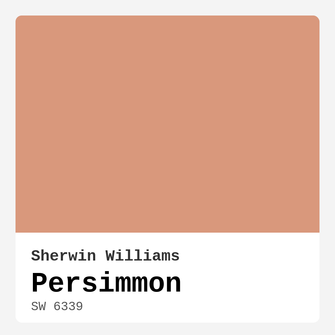
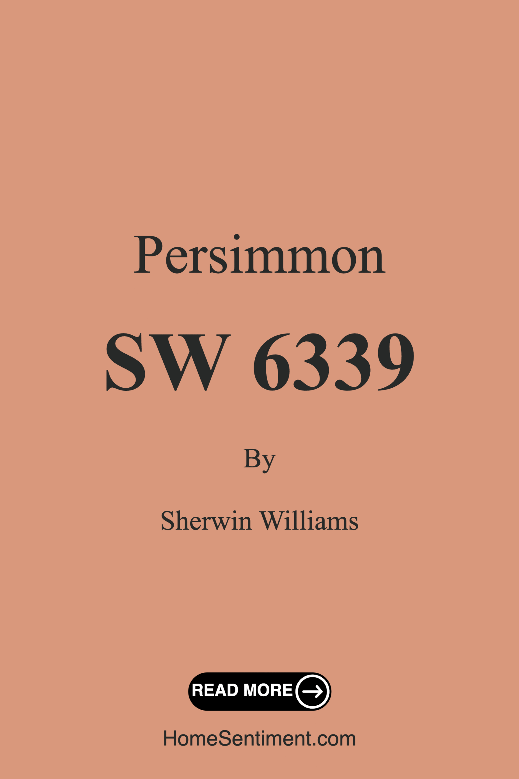
Color Preview & Key Details
| HEX Code | #D9987C |
| RGB | 217, 152, 124 |
| LRV | 30% |
| Undertone | Red |
| Finish Options | Matte, Satin, Semi-Gloss |
Imagine walking into a room that feels both warm and inviting, the kind of space that wraps you in comfort and cheer, almost like being hugged by autumn itself. That’s the magic of Persimmon, a stunning paint color from Sherwin Williams that transforms any area into a cozy retreat. This delightful hue, with its rich orange undertones and soft peachy highlights, captures the essence of fall and the warmth of home.
Let’s talk about why this color could be your next favorite choice for a home project. With a hue code of SW 6339, Persimmon is not just about aesthetics; it’s a versatile option that can complement various decor styles, from modern farmhouse to bohemian, traditional to eclectic. The beauty of Persimmon lies in its ability to enhance your space without overwhelming it.
One of the greatest strengths of Persimmon is its warm and inviting nature. It radiates a cozy atmosphere that makes it perfect for spaces where comfort is key, like a living room or a bedroom. When you paint a room with this shade, you’ll find that it reflects light beautifully, creating a vibrant yet soothing environment. This characteristic makes it ideal for areas where you gather with family or friends.
If you’re considering applying Persimmon in your home, the good news is that it offers excellent coverage, typically needing only one to two coats for a solid finish. Whether you’re a seasoned DIYer or just starting out, you’ll appreciate how easy it is to work with. The formulation is roller-ready and brush smooth, allowing for a quick and efficient application. Plus, it dries fast, so you won’t be left waiting around for hours.
Now, while Persimmon is certainly a showstopper, it does come with some considerations. With an LRV (Light Reflectance Value) of 30%, it falls into the medium dark category, which means it reflects very little light. This can create a cozy, intimate feel in a room, but in poorly lit spaces, it might appear darker than expected. If you’re working with a smaller room or a space that doesn’t get much natural light, you might consider pairing it with lighter accents or complementary colors to ensure the space doesn’t feel too enclosed.
Speaking of complementary colors, choosing the right shades to pair with Persimmon is crucial. This color leans heavily on its red undertones, which can sometimes be tricky if not matched correctly. Consider lighter, neutral shades or softer hues like white dove to create balance. Brass fixtures can also beautifully enhance this color, adding warmth and a touch of sophistication to your decor.
Persimmon works wonders across various finishes, allowing you to choose the look that best fits your style and the functionality of the room. A matte finish offers a soft, understated vibe, while satin gives a slight sheen that can elevate a space without being too flashy. For areas that require durability, like kitchens or bathrooms, a semi-gloss finish can be an excellent choice.
If you’re still on the fence about using Persimmon in a small room, let me reassure you: it can absolutely work! The vibrant hue can actually make smaller spaces feel more welcoming and cozy. Just remember to balance it out with lighter colors on trim, decor, or furniture to keep the area from feeling too confined.
Under different lighting conditions, Persimmon reveals its versatility. In natural light, it brightens up, reflecting warmth and energy, while in low light, it casts a gentle glow that’s perfect for creating a restful environment. It’s a fantastic choice for spaces that transition from day to night, like dining rooms or living areas that host gatherings.
Now, let’s talk about where to use Persimmon. It shines in living rooms, bedrooms, kitchens, and dining rooms. Whether you’re looking to create an accent wall that draws the eye or a full room makeover, this color brings a unique charm that can elevate any space. It also pairs beautifully with natural materials like wood and textiles, enhancing the overall aesthetic of your decor.
When considering the application of Persimmon, you’ll also appreciate its washability and low VOC levels. It’s wipeable and washable, making it practical for everyday living. This means you can enjoy the beauty of the color without the worry of it losing its charm over time.
In terms of mood, Persimmon creates a cozy, inviting atmosphere. It’s the kind of color that makes you want to curl up with a book or invite friends over for a casual dinner. The warmth it exudes can uplift your spirits and make your home feel more like a sanctuary.
If you’re looking for lighter shades to complement Persimmon, options like SW 6338, SW 9010, and SW 6346 work beautifully. For a bolder contrast, consider deeper tones like SW 6353 or SW 6642. These darker shades can create depth and dimension in your space.
Ultimately, the choice of color is deeply personal and should reflect your style and the ambiance you wish to create in your home. Testing Persimmon in your space is essential; observe how it interacts with your existing furniture, flooring, and decor throughout the day.
In conclusion, if you’re ready to infuse your home with warmth and character, Persimmon may just be the perfect color for you. Its inviting nature, versatility, and ease of application make it an excellent choice for various spaces. So, go ahead and embrace the beauty of Persimmon; your home deserves a touch of that cozy autumn charm.
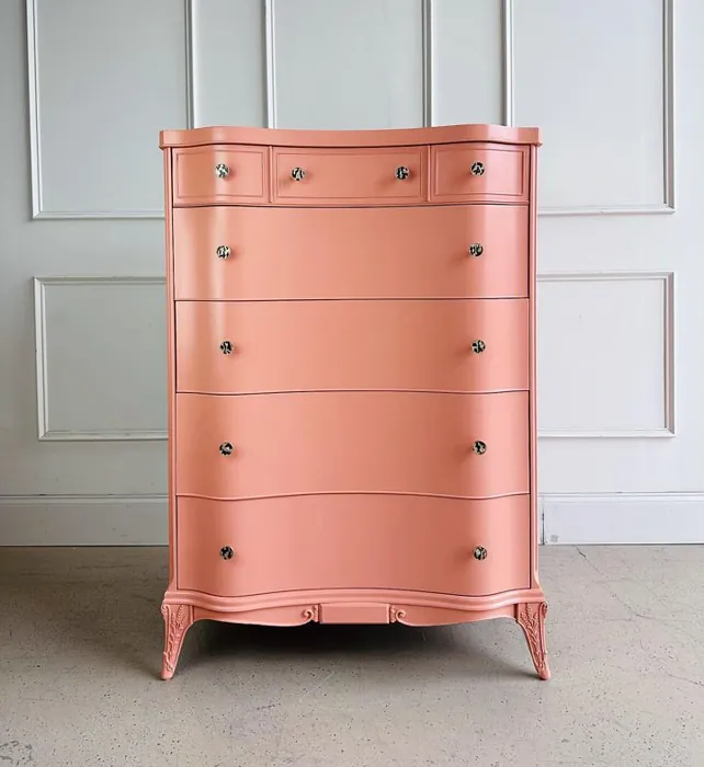
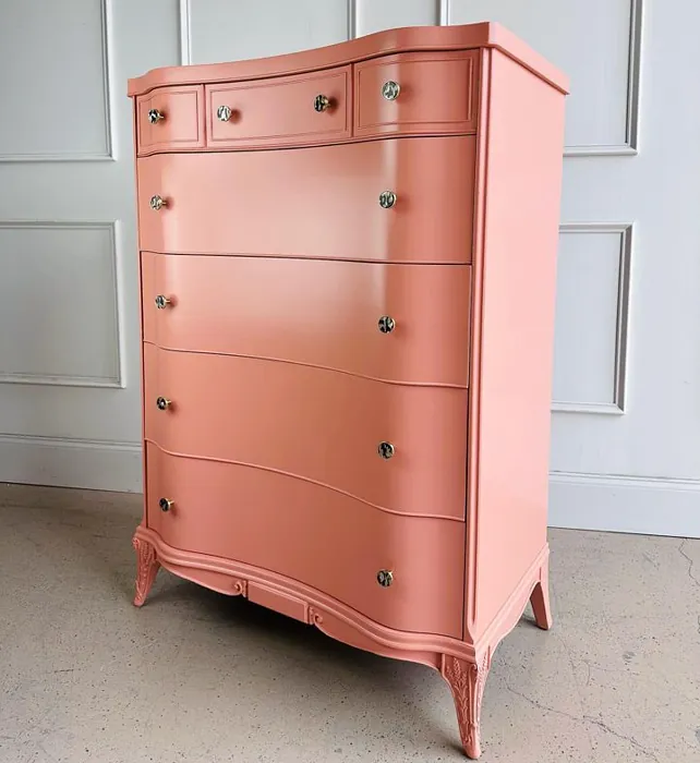
Real Room Photo of Persimmon SW 6339
Undertones of Persimmon ?
The undertones of Persimmon are a key aspect of its character, leaning towards Red. These subtle underlying hues are what give the color its depth and complexity. For example, a gray with a blue undertone will feel cooler and more modern, while one with a brown undertone will feel warmer and more traditional. It’s essential to test this paint in your home and observe it next to your existing furniture, flooring, and decor to see how these undertones interact and reveal themselves throughout the day.
HEX value: #D9987C
RGB code: 217, 152, 124
Is Persimmon Cool or Warm?
This color definitely falls on the warm side of the spectrum. Its rich orange and peach undertones create a cozy ambiance that can make any room feel inviting and cheerful.
Understanding Color Properties and Interior Design Tips
Hue refers to a specific position on the color wheel, measured in degrees from 0 to 360. Each degree represents a different pure color:
- 0° represents red
- 120° represents green
- 240° represents blue
Saturation describes the intensity or purity of a color and is expressed as a percentage:
- At 0%, the color appears completely desaturated—essentially a shade of gray
- At 100%, the color is at its most vivid and vibrant
Lightness indicates how light or dark a color is, also expressed as a percentage:
- 0% lightness results in black
- 100% lightness results in white
Using Warm Colors in Interior Design
Warm hues—such as reds, oranges, yellows, warm beiges, and greiges—are excellent choices for creating inviting and energetic spaces. These colors are particularly well-suited for:
- Kitchens, living rooms, and bathrooms, where warmth enhances comfort and sociability
- Large rooms, where warm tones can help reduce the sense of emptiness and make the space feel more intimate
For example:
- Warm beige shades provide a cozy, inviting atmosphere, ideal for living rooms, bedrooms, and hallways.
- Warm greige (a mix of beige and gray) offers the warmth of beige with the modern appeal of gray, making it a versatile backdrop for dining areas, bedrooms, and living spaces.
However, be mindful when using warm light tones in rooms with limited natural light. These shades may appear muted or even take on an unpleasant yellowish tint. To avoid a dull or flat appearance:
- Add depth by incorporating richer tones like deep greens, charcoal, or chocolate brown
- Use textured elements such as curtains, rugs, or cushions to bring dimension to the space
Pro Tip: Achieving Harmony with Warm and Cool Color Balance
To create a well-balanced and visually interesting interior, mix warm and cool tones strategically. This contrast adds depth and harmony to your design.
- If your walls feature warm hues, introduce cool-colored accents such as blue or green furniture, artwork, or accessories to create contrast.
- For a polished look, consider using a complementary color scheme, which pairs colors opposite each other on the color wheel (e.g., red with green, orange with blue).
This thoughtful mix not only enhances visual appeal but also creates a space that feels both dynamic and cohesive.
Light Temperature Affects on Persimmon
Natural Light
Natural daylight changes in color temperature as the sun moves across the sky. At sunrise and sunset, the light tends to have a warm, golden tone with a color temperature around 2000 Kelvin (K). As the day progresses and the sun rises higher, the light becomes cooler and more neutral. Around midday, especially when the sky is clear, natural light typically reaches its peak brightness and shifts to a cooler tone, ranging from 5500 to 6500 Kelvin. This midday light is close to what we perceive as pure white or daylight-balanced light.
These shifts in natural light can significantly influence how colors appear in a space, which is why designers often consider both the time of day and the orientation of windows when planning interior color schemes.
Artificial Light
When choosing artificial lighting, pay close attention to the color temperature, measured in Kelvin (K). This determines how warm or cool the light will appear. Lower temperatures, around 2700K, give off a warm, yellow glow often used in living rooms or bedrooms. Higher temperatures, above 5000K, create a cool, bluish light similar to daylight, commonly used in kitchens, offices, or task areas.
Use the slider to see how lighting temperature can affect the appearance of a surface or color throughout a space.


4800K
LRV of Persimmon
The Light Reflectance Value (LRV) of Persimmon is 30%, which places it in the Medium Dark category. This means it reflects very little light. Understanding a paint’s LRV is crucial for predicting how it will look in your space. A higher LRV indicates a lighter color that reflects more light, making rooms feel larger and brighter. A lower LRV signifies a darker color that absorbs more light, creating a cozier, more intimate atmosphere. Always consider the natural and artificial lighting in your room when selecting a paint color based on its LRV.
Detailed Review of Persimmon
Additional Paint Characteristics
Ideal Rooms
Bedroom, Dining Room, Entryway, Kitchen, Living Room
Decor Styles
Bohemian, Eclectic, Modern Farmhouse, Traditional
Coverage
Good (1–2 Coats)
Ease of Application
Beginner Friendly, Brush Smooth, Fast-Drying, Roller-Ready
Washability
Washable, Wipeable
VOC Level
Low VOC
Best Use
Accent Wall, Furniture, Interior Walls
Room Suitability
Bedroom, Dining Room, Kitchen, Living Room
Tone Tag
Earthy, Inviting, Warm
Finish Type
Matte, Satin
Paint Performance
High Coverage, Low Odor, Quick Drying
Use Cases
Best for Low Light Rooms, Best for Rentals, Best for Small Spaces, Classic Favorite
Mood
Cozy, Inviting, Warm
Trim Pairing
Complements Brass Fixtures, Pairs with White Dove, Works with Warm Trim
Persimmon is a delightfully warm paint color that evokes feelings of comfort and warmth. It’s particularly well-suited for spaces where you want to create a cozy atmosphere, such as a living room or bedroom. The color has a lovely ability to reflect light, making it feel vibrant yet soothing. When applied, it goes on smoothly and provides good coverage, typically requiring just one to two coats for a solid finish. One of the standout features is how it pairs beautifully with natural materials like wood and textiles, enhancing the overall aesthetic of your decor. Whether you’re looking to create an accent wall or a full room makeover, Persimmon offers versatility and charm, making it a fantastic choice for any homeowner.
Pros & Cons of SW 6339 Persimmon
Pros
Cons
Colors that go with Sherwin Williams Persimmon
FAQ on SW 6339 Persimmon
Can I use Persimmon in a small room?
Absolutely! While Persimmon is a warm color, its vibrant hue can actually make small rooms feel more inviting and cozy. To keep the space from feeling too enclosed, consider pairing it with lighter colors on trim or decor. It’s all about balance!
What finishes are best for Persimmon?
Persimmon works beautifully in various finishes including matte for a soft look, satin for a slight sheen, or semi-gloss for areas that need durability like kitchens and bathrooms. Choose the finish based on the look you want to achieve and the functionality of the room.
Comparisons Persimmon with other colors
Persimmon SW 6339 vs Realist Beige SW 6078
| Attribute | Persimmon SW 6339 | Realist Beige SW 6078 |
|---|---|---|
| Color Name | Persimmon SW 6339 | Realist Beige SW 6078 |
| Color | ||
| Hue | Pink | Pink |
| Brightness | Medium | Medium |
| RGB | 217, 152, 124 | 211, 200, 189 |
| LRV | 30% | 34% |
| Finish Type | Matte, Satin | Eggshell, Matte, Satin |
| Finish Options | Matte, Satin, Semi-Gloss | Eggshell, Matte, Satin |
| Ideal Rooms | Bedroom, Dining Room, Entryway, Kitchen, Living Room | Bedroom, Dining Room, Entryway, Home Office, Kitchen, Living Room |
| Decor Styles | Bohemian, Eclectic, Modern Farmhouse, Traditional | Contemporary, Minimalist, Modern Farmhouse, Rustic, Traditional |
| Coverage | Good (1–2 Coats) | Good (1–2 Coats), Touch-Up Friendly |
| Ease of Application | Beginner Friendly, Brush Smooth, Fast-Drying, Roller-Ready | Beginner Friendly, Brush Smooth, Fast-Drying, Roller-Ready |
| Washability | Washable, Wipeable | Washable, Wipeable |
| Room Suitability | Bedroom, Dining Room, Kitchen, Living Room | Bedroom, Dining Room, Home Office, Kitchen, Living Room |
| Tone | Earthy, Inviting, Warm | Earthy, Neutral, Warm |
| Paint Performance | High Coverage, Low Odor, Quick Drying | High Coverage, Low Odor, Quick Drying |
Persimmon SW 6339 vs Rosaline Pearl SW 9077
| Attribute | Persimmon SW 6339 | Rosaline Pearl SW 9077 |
|---|---|---|
| Color Name | Persimmon SW 6339 | Rosaline Pearl SW 9077 |
| Color | ||
| Hue | Pink | Pink |
| Brightness | Medium | Medium |
| RGB | 217, 152, 124 | 163, 136, 135 |
| LRV | 30% | 69% |
| Finish Type | Matte, Satin | Eggshell, Matte |
| Finish Options | Matte, Satin, Semi-Gloss | Eggshell, Matte, Satin |
| Ideal Rooms | Bedroom, Dining Room, Entryway, Kitchen, Living Room | Bedroom, Dining Room, Home Office, Living Room |
| Decor Styles | Bohemian, Eclectic, Modern Farmhouse, Traditional | Bohemian, Contemporary, Modern, Transitional |
| Coverage | Good (1–2 Coats) | Good (1–2 Coats) |
| Ease of Application | Beginner Friendly, Brush Smooth, Fast-Drying, Roller-Ready | Beginner Friendly, Brush Smooth, Fast-Drying, Roller-Ready |
| Washability | Washable, Wipeable | Washable, Wipeable |
| Room Suitability | Bedroom, Dining Room, Kitchen, Living Room | Bedroom, Dining Room, Home Office, Living Room |
| Tone | Earthy, Inviting, Warm | Dusty, Muted, Warm |
| Paint Performance | High Coverage, Low Odor, Quick Drying | Easy Touch-Up, Fade Resistant, Low Odor |
Persimmon SW 6339 vs Cabbage Rose SW 0003
| Attribute | Persimmon SW 6339 | Cabbage Rose SW 0003 |
|---|---|---|
| Color Name | Persimmon SW 6339 | Cabbage Rose SW 0003 |
| Color | ||
| Hue | Pink | Pink |
| Brightness | Medium | Medium |
| RGB | 217, 152, 124 | 197, 159, 145 |
| LRV | 30% | 15% |
| Finish Type | Matte, Satin | Eggshell, Matte, Satin |
| Finish Options | Matte, Satin, Semi-Gloss | Eggshell, Matte, Satin |
| Ideal Rooms | Bedroom, Dining Room, Entryway, Kitchen, Living Room | Bedroom, Dining Room, Hallway, Living Room, Nursery |
| Decor Styles | Bohemian, Eclectic, Modern Farmhouse, Traditional | Cottage, Modern Farmhouse, Romantic, Shabby Chic, Vintage |
| Coverage | Good (1–2 Coats) | Good (1–2 Coats), Touch-Up Friendly |
| Ease of Application | Beginner Friendly, Brush Smooth, Fast-Drying, Roller-Ready | Beginner Friendly, Brush Smooth, Roller-Ready |
| Washability | Washable, Wipeable | Washable, Wipeable |
| Room Suitability | Bedroom, Dining Room, Kitchen, Living Room | Bedroom, Dining Room, Hallway, Living Room, Nursery |
| Tone | Earthy, Inviting, Warm | Earthy, Muted, Warm |
| Paint Performance | High Coverage, Low Odor, Quick Drying | Easy Touch-Up, Low Odor |
Persimmon SW 6339 vs Sashay Sand SW 6051
| Attribute | Persimmon SW 6339 | Sashay Sand SW 6051 |
|---|---|---|
| Color Name | Persimmon SW 6339 | Sashay Sand SW 6051 |
| Color | ||
| Hue | Pink | Pink |
| Brightness | Medium | Medium |
| RGB | 217, 152, 124 | 207, 180, 168 |
| LRV | 30% | 64% |
| Finish Type | Matte, Satin | Eggshell, Matte, Satin |
| Finish Options | Matte, Satin, Semi-Gloss | Eggshell, Matte, Satin |
| Ideal Rooms | Bedroom, Dining Room, Entryway, Kitchen, Living Room | Bedroom, Dining Room, Home Office, Kitchen, Living Room |
| Decor Styles | Bohemian, Eclectic, Modern Farmhouse, Traditional | Bohemian, Contemporary, Modern Farmhouse, Scandinavian, Transitional |
| Coverage | Good (1–2 Coats) | Good (1–2 Coats), Touch-Up Friendly |
| Ease of Application | Beginner Friendly, Brush Smooth, Fast-Drying, Roller-Ready | Beginner Friendly, Fast-Drying, Roller-Ready |
| Washability | Washable, Wipeable | Highly Washable, Washable |
| Room Suitability | Bedroom, Dining Room, Kitchen, Living Room | Bedroom, Dining Room, Home Office, Kitchen, Living Room |
| Tone | Earthy, Inviting, Warm | Earthy, Muted, Warm |
| Paint Performance | High Coverage, Low Odor, Quick Drying | Easy Touch-Up, Low Odor, Quick Drying, Scuff Resistant |
Persimmon SW 6339 vs Touch of Sand SW 9085
| Attribute | Persimmon SW 6339 | Touch of Sand SW 9085 |
|---|---|---|
| Color Name | Persimmon SW 6339 | Touch of Sand SW 9085 |
| Color | ||
| Hue | Pink | Pink |
| Brightness | Medium | Medium |
| RGB | 217, 152, 124 | 213, 199, 186 |
| LRV | 30% | 66% |
| Finish Type | Matte, Satin | Eggshell, Matte, Satin |
| Finish Options | Matte, Satin, Semi-Gloss | Eggshell, Matte, Satin |
| Ideal Rooms | Bedroom, Dining Room, Entryway, Kitchen, Living Room | Bathroom, Bedroom, Dining Room, Home Office, Kitchen, Living Room |
| Decor Styles | Bohemian, Eclectic, Modern Farmhouse, Traditional | Bohemian, Coastal, Contemporary, Modern Farmhouse, Rustic |
| Coverage | Good (1–2 Coats) | Good (1–2 Coats), Touch-Up Friendly |
| Ease of Application | Beginner Friendly, Brush Smooth, Fast-Drying, Roller-Ready | Beginner Friendly, Brush Smooth, Fast-Drying, Roller-Ready |
| Washability | Washable, Wipeable | Washable, Wipeable |
| Room Suitability | Bedroom, Dining Room, Kitchen, Living Room | Bathroom, Bedroom, Dining Room, Home Office, Kitchen, Living Room |
| Tone | Earthy, Inviting, Warm | Earthy, Muted, Neutral, Warm |
| Paint Performance | High Coverage, Low Odor, Quick Drying | Easy Touch-Up, Low Odor, Quick Drying, Scuff Resistant |
Persimmon SW 6339 vs Pink Shadow SW 0070
| Attribute | Persimmon SW 6339 | Pink Shadow SW 0070 |
|---|---|---|
| Color Name | Persimmon SW 6339 | Pink Shadow SW 0070 |
| Color | ||
| Hue | Pink | Pink |
| Brightness | Medium | Medium |
| RGB | 217, 152, 124 | 222, 195, 185 |
| LRV | 30% | 45% |
| Finish Type | Matte, Satin | Eggshell, Matte, Satin |
| Finish Options | Matte, Satin, Semi-Gloss | Eggshell, Matte, Satin |
| Ideal Rooms | Bedroom, Dining Room, Entryway, Kitchen, Living Room | Bedroom, Dining Room, Home Office, Living Room, Nursery |
| Decor Styles | Bohemian, Eclectic, Modern Farmhouse, Traditional | Bohemian, Minimalist, Modern Farmhouse, Scandinavian, Traditional |
| Coverage | Good (1–2 Coats) | Good (1–2 Coats) |
| Ease of Application | Beginner Friendly, Brush Smooth, Fast-Drying, Roller-Ready | Beginner Friendly, Brush Smooth, Fast-Drying, Roller-Ready |
| Washability | Washable, Wipeable | Washable, Wipeable |
| Room Suitability | Bedroom, Dining Room, Kitchen, Living Room | Bedroom, Dining Room, Living Room, Nursery |
| Tone | Earthy, Inviting, Warm | Muted, Pastel, Warm |
| Paint Performance | High Coverage, Low Odor, Quick Drying | Easy Touch-Up, High Coverage, Low Odor |
Persimmon SW 6339 vs Hushed Auburn SW 9080
| Attribute | Persimmon SW 6339 | Hushed Auburn SW 9080 |
|---|---|---|
| Color Name | Persimmon SW 6339 | Hushed Auburn SW 9080 |
| Color | ||
| Hue | Pink | Pink |
| Brightness | Medium | Medium |
| RGB | 217, 152, 124 | 168, 133, 122 |
| LRV | 30% | 12% |
| Finish Type | Matte, Satin | Eggshell, Matte, Satin |
| Finish Options | Matte, Satin, Semi-Gloss | Eggshell, Matte, Satin |
| Ideal Rooms | Bedroom, Dining Room, Entryway, Kitchen, Living Room | Bedroom, Dining Room, Home Office, Living Room |
| Decor Styles | Bohemian, Eclectic, Modern Farmhouse, Traditional | Contemporary, Modern Farmhouse, Rustic, Transitional |
| Coverage | Good (1–2 Coats) | Good (1–2 Coats), Touch-Up Friendly |
| Ease of Application | Beginner Friendly, Brush Smooth, Fast-Drying, Roller-Ready | Beginner Friendly, Brush Smooth, Fast-Drying, Roller-Ready |
| Washability | Washable, Wipeable | Washable, Wipeable |
| Room Suitability | Bedroom, Dining Room, Kitchen, Living Room | Bedroom, Dining Room, Home Office, Living Room |
| Tone | Earthy, Inviting, Warm | Earthy, Muted, Warm |
| Paint Performance | High Coverage, Low Odor, Quick Drying | Easy Touch-Up, High Coverage, Low Odor |
Persimmon SW 6339 vs Likeable Sand SW 6058
| Attribute | Persimmon SW 6339 | Likeable Sand SW 6058 |
|---|---|---|
| Color Name | Persimmon SW 6339 | Likeable Sand SW 6058 |
| Color | ||
| Hue | Pink | Pink |
| Brightness | Medium | Medium |
| RGB | 217, 152, 124 | 209, 183, 168 |
| LRV | 30% | 61% |
| Finish Type | Matte, Satin | Eggshell, Matte, Satin |
| Finish Options | Matte, Satin, Semi-Gloss | Eggshell, Matte, Satin |
| Ideal Rooms | Bedroom, Dining Room, Entryway, Kitchen, Living Room | Bedroom, Dining Room, Home Office, Kitchen, Living Room |
| Decor Styles | Bohemian, Eclectic, Modern Farmhouse, Traditional | Bohemian, Coastal, Contemporary, Modern Farmhouse, Rustic |
| Coverage | Good (1–2 Coats) | Good (1–2 Coats), Touch-Up Friendly |
| Ease of Application | Beginner Friendly, Brush Smooth, Fast-Drying, Roller-Ready | Beginner Friendly, Brush Smooth, Fast-Drying, Roller-Ready |
| Washability | Washable, Wipeable | Washable, Wipeable |
| Room Suitability | Bedroom, Dining Room, Kitchen, Living Room | Bedroom, Dining Room, Home Office, Kitchen, Living Room |
| Tone | Earthy, Inviting, Warm | Earthy, Muted, Warm |
| Paint Performance | High Coverage, Low Odor, Quick Drying | Easy Touch-Up, Low Odor, Quick Drying |
Persimmon SW 6339 vs Glamour SW 6031
| Attribute | Persimmon SW 6339 | Glamour SW 6031 |
|---|---|---|
| Color Name | Persimmon SW 6339 | Glamour SW 6031 |
| Color | ||
| Hue | Pink | Pink |
| Brightness | Medium | Medium |
| RGB | 217, 152, 124 | 182, 160, 154 |
| LRV | 30% | 30% |
| Finish Type | Matte, Satin | Eggshell, Matte, Satin |
| Finish Options | Matte, Satin, Semi-Gloss | Eggshell, Matte, Satin |
| Ideal Rooms | Bedroom, Dining Room, Entryway, Kitchen, Living Room | Bedroom, Dining Room, Home Office, Living Room |
| Decor Styles | Bohemian, Eclectic, Modern Farmhouse, Traditional | Bohemian, Classic, Modern, Transitional |
| Coverage | Good (1–2 Coats) | Good (1–2 Coats) |
| Ease of Application | Beginner Friendly, Brush Smooth, Fast-Drying, Roller-Ready | Beginner Friendly, Brush Smooth, Fast-Drying, Roller-Ready |
| Washability | Washable, Wipeable | Scrubbable, Washable |
| Room Suitability | Bedroom, Dining Room, Kitchen, Living Room | Bedroom, Dining Room, Home Office, Living Room |
| Tone | Earthy, Inviting, Warm | Balanced, Neutral, Warm |
| Paint Performance | High Coverage, Low Odor, Quick Drying | Easy Touch-Up, Low Odor, Quick Drying |
Persimmon SW 6339 vs Temperate Taupe SW 6037
| Attribute | Persimmon SW 6339 | Temperate Taupe SW 6037 |
|---|---|---|
| Color Name | Persimmon SW 6339 | Temperate Taupe SW 6037 |
| Color | ||
| Hue | Pink | Pink |
| Brightness | Medium | Medium |
| RGB | 217, 152, 124 | 191, 177, 170 |
| LRV | 30% | 34% |
| Finish Type | Matte, Satin | Eggshell, Matte, Satin |
| Finish Options | Matte, Satin, Semi-Gloss | Eggshell, Matte, Satin |
| Ideal Rooms | Bedroom, Dining Room, Entryway, Kitchen, Living Room | Bedroom, Dining Room, Home Office, Kitchen, Living Room |
| Decor Styles | Bohemian, Eclectic, Modern Farmhouse, Traditional | Bohemian, Modern Farmhouse, Rustic, Transitional |
| Coverage | Good (1–2 Coats) | Good (1–2 Coats), Touch-Up Friendly |
| Ease of Application | Beginner Friendly, Brush Smooth, Fast-Drying, Roller-Ready | Beginner Friendly, Brush Smooth, Fast-Drying, Roller-Ready |
| Washability | Washable, Wipeable | Highly Washable, Washable |
| Room Suitability | Bedroom, Dining Room, Kitchen, Living Room | Bedroom, Dining Room, Home Office, Living Room |
| Tone | Earthy, Inviting, Warm | Earthy, Neutral, Warm |
| Paint Performance | High Coverage, Low Odor, Quick Drying | Long Lasting, Low Odor, Quick Drying, Scuff Resistant |
Official Page of Sherwin Williams Persimmon SW 6339