
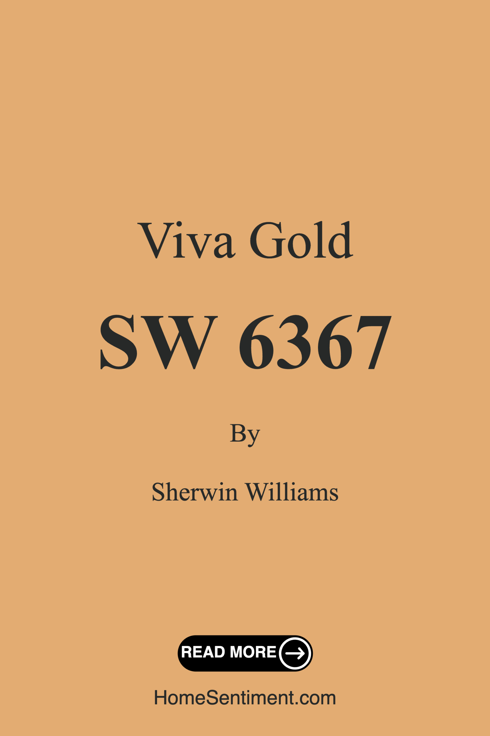
Color Preview & Key Details
| HEX Code | #E3AC72 |
| RGB | 227, 172, 114 |
| LRV | 45% |
| Undertone | Red |
| Finish Options | Eggshell, Flat, Matte, Satin |
Imagine stepping into a room that wraps you in warmth and cheer, where the ambiance feels inviting and stylish at the same time. That’s the magic of Viva Gold, a stunning paint color from Sherwin Williams that can transform any space into a cozy retreat. With its soft golden hue, this color captures the essence of sunlit afternoons, making it an excellent choice for homeowners looking to infuse their interiors with personality and comfort.
Viva Gold, with its color code SW 6367, stands out as a warm and inviting shade that brings a sense of joy to every corner. The hex code #E3AC72 showcases its rich golden tones perfectly, while the RGB values (227, 172, 114) highlight the warmth that envelops you as soon as you enter a room painted with this color. It’s not just a color; it’s a feeling.
One of the best features of Viva Gold is its versatility. Whether you’re implementing a modern design or leaning towards a more farmhouse or bohemian aesthetic, this color fits seamlessly into various decor styles. Its warm, earthy tone pairs beautifully with whites and earthy shades, creating a harmonious balance that can elevate any room. Imagine your living room adorned with Viva Gold walls, complemented by white trim and brass fixtures; it’s a stunning visual that exudes sophistication and comfort.
Now, let’s talk about practicality. The light reflectance value (LRV) of 45% means that Viva Gold reflects a moderate amount of light, which is essential for creating that inviting atmosphere. It’s bright enough to make a space feel open without overwhelming it. This balance is particularly crucial in areas with limited natural light. Spaces can feel cramped and dark, but Viva Gold has that golden touch that can help lift those shadows, making your room feel more expansive.
When considering a paint color, the undertones play a critical role in how it will look in your space. Viva Gold has a subtle red undertone, contributing to its warmth and depth. This complexity is what makes the color so dynamic and inviting. It’s essential to test this paint at home, as colors can shift based on your existing furniture, flooring, and the natural light that filters in. Observe how the undertones interact throughout the day; you might be pleasantly surprised by the transformation.
Viva Gold’s applications are endless. It’s perfect for living rooms, bedrooms, kitchens, dining rooms, and hallways. Whether you’re painting a single accent wall or transforming an entire room, it glides on smoothly, making the application process beginner-friendly. You don’t need to be a professional to achieve a beautiful finish. With the right tools, you’ll find it easy to work with, and since it’s quick-drying, you’ll have more time to enjoy your newly refreshed space.
Speaking of maintenance, one of the standout features of Viva Gold is its washability. High-traffic areas can be daunting for paint choices, but this color is designed to withstand the rigors of daily life. Whether you’re dealing with fingerprints, scuffs, or splatters, it’s highly washable, ensuring your walls maintain their beautiful appearance. Just be prepared for occasional touch-ups in busy areas, as even the most durable paints can show wear over time.
Let’s not forget about the ambiance that Viva Gold creates. This color radiates positivity and cheer, making it an exceptional choice for spaces where you want to foster warmth and relaxation. Whether you’re hosting friends and family or simply enjoying a quiet evening at home, the cozy, inviting mood this color establishes is unparalleled.
If you’re contemplating using Viva Gold in a small room, fear not. It can work wonders in these spaces by making them feel more inviting. Just ensure there’s enough natural light to prevent the color from feeling heavy. Pairing it with light-colored furniture and trim can enhance the overall brightness, creating a lovely, airy feel that defies the room’s size.
For the adventurous decorators, Viva Gold pairs beautifully with complementary colors. Consider using soft blues or cool grays to accentuate the warm tones of your walls. This contrast creates a refreshing balance, bringing out the best in both colors while ensuring your space feels dynamic and engaging.
Now, let’s talk about finishes. Viva Gold comes in flat, matte, eggshell, and satin options, giving you flexibility depending on your desired look and feel. For a cozy, rustic vibe, a matte or flat finish can work beautifully. If you’re after a bit of sheen that adds elegance to the space, satin is the way to go. The choice of finish can greatly influence the overall feel of the room, so consider how light reflects off the paint when making your decision.
As you finalize your choice, remember that colors can change under different lighting conditions. Viva Gold shines in natural light, reflecting warmth and making spaces feel larger. Under artificial lighting, it holds onto its inviting character while sprinkling a touch of elegance throughout your home.
Whether you’re a seasoned decorator or a newbie just starting on your home transformation journey, Viva Gold is a color worth considering. Its warm, inviting hue, versatility across various decor styles, and high washability for easy maintenance make it a designer favorite.
In conclusion, if you’re looking to create an atmosphere that feels both welcoming and stylish, Viva Gold is your go-to choice. It’s more than just a paint color; it’s an opportunity to express warmth, joy, and individuality in your home. Grab a sample, test it against your furnishings, and watch as your space transforms into a vibrant, inviting oasis. Your walls deserve this touch of golden sunshine, and so do you.
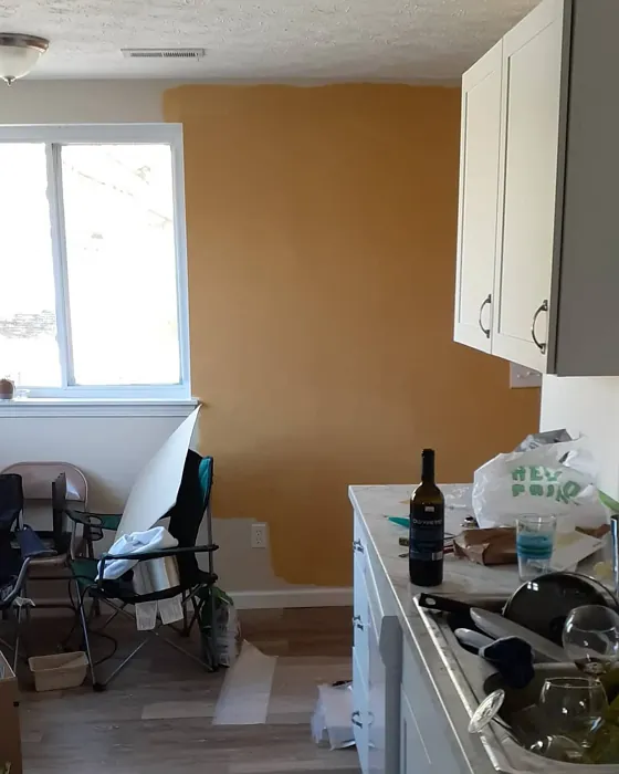
Real Room Photo of Viva Gold SW 6367
Undertones of Viva Gold ?
The undertones of Viva Gold are a key aspect of its character, leaning towards Red. These subtle underlying hues are what give the color its depth and complexity. For example, a gray with a blue undertone will feel cooler and more modern, while one with a brown undertone will feel warmer and more traditional. It’s essential to test this paint in your home and observe it next to your existing furniture, flooring, and decor to see how these undertones interact and reveal themselves throughout the day.
HEX value: #E3AC72
RGB code: 227, 172, 114
Is Viva Gold Cool or Warm?
Viva Gold is primarily a warm color, radiating positivity and cheer. Its golden hue brings a sunny disposition to any room, making it an excellent choice for spaces where you want to foster warmth and relaxation.
Understanding Color Properties and Interior Design Tips
Hue refers to a specific position on the color wheel, measured in degrees from 0 to 360. Each degree represents a different pure color:
- 0° represents red
- 120° represents green
- 240° represents blue
Saturation describes the intensity or purity of a color and is expressed as a percentage:
- At 0%, the color appears completely desaturated—essentially a shade of gray
- At 100%, the color is at its most vivid and vibrant
Lightness indicates how light or dark a color is, also expressed as a percentage:
- 0% lightness results in black
- 100% lightness results in white
Using Warm Colors in Interior Design
Warm hues—such as reds, oranges, yellows, warm beiges, and greiges—are excellent choices for creating inviting and energetic spaces. These colors are particularly well-suited for:
- Kitchens, living rooms, and bathrooms, where warmth enhances comfort and sociability
- Large rooms, where warm tones can help reduce the sense of emptiness and make the space feel more intimate
For example:
- Warm beige shades provide a cozy, inviting atmosphere, ideal for living rooms, bedrooms, and hallways.
- Warm greige (a mix of beige and gray) offers the warmth of beige with the modern appeal of gray, making it a versatile backdrop for dining areas, bedrooms, and living spaces.
However, be mindful when using warm light tones in rooms with limited natural light. These shades may appear muted or even take on an unpleasant yellowish tint. To avoid a dull or flat appearance:
- Add depth by incorporating richer tones like deep greens, charcoal, or chocolate brown
- Use textured elements such as curtains, rugs, or cushions to bring dimension to the space
Pro Tip: Achieving Harmony with Warm and Cool Color Balance
To create a well-balanced and visually interesting interior, mix warm and cool tones strategically. This contrast adds depth and harmony to your design.
- If your walls feature warm hues, introduce cool-colored accents such as blue or green furniture, artwork, or accessories to create contrast.
- For a polished look, consider using a complementary color scheme, which pairs colors opposite each other on the color wheel (e.g., red with green, orange with blue).
This thoughtful mix not only enhances visual appeal but also creates a space that feels both dynamic and cohesive.
Light Temperature Affects on Viva Gold
Natural Light
Natural daylight changes in color temperature as the sun moves across the sky. At sunrise and sunset, the light tends to have a warm, golden tone with a color temperature around 2000 Kelvin (K). As the day progresses and the sun rises higher, the light becomes cooler and more neutral. Around midday, especially when the sky is clear, natural light typically reaches its peak brightness and shifts to a cooler tone, ranging from 5500 to 6500 Kelvin. This midday light is close to what we perceive as pure white or daylight-balanced light.
These shifts in natural light can significantly influence how colors appear in a space, which is why designers often consider both the time of day and the orientation of windows when planning interior color schemes.
Artificial Light
When choosing artificial lighting, pay close attention to the color temperature, measured in Kelvin (K). This determines how warm or cool the light will appear. Lower temperatures, around 2700K, give off a warm, yellow glow often used in living rooms or bedrooms. Higher temperatures, above 5000K, create a cool, bluish light similar to daylight, commonly used in kitchens, offices, or task areas.
Use the slider to see how lighting temperature can affect the appearance of a surface or color throughout a space.


4800K
LRV of Viva Gold
The Light Reflectance Value (LRV) of Viva Gold is 45%, which places it in the Medium category. This means it Reflects a moderate amount of light. Understanding a paint’s LRV is crucial for predicting how it will look in your space. A higher LRV indicates a lighter color that reflects more light, making rooms feel larger and brighter. A lower LRV signifies a darker color that absorbs more light, creating a cozier, more intimate atmosphere. Always consider the natural and artificial lighting in your room when selecting a paint color based on its LRV.
Detailed Review of Viva Gold
Additional Paint Characteristics
Ideal Rooms
Bedroom, Dining Room, Hallway, Kitchen, Living Room
Decor Styles
Bohemian, Farmhouse, Modern, Scandinavian, Transitional
Coverage
Good (1–2 Coats), Touch-Up Friendly
Ease of Application
Beginner Friendly, Brush Smooth, Fast-Drying, Roller-Ready
Washability
Highly Washable, Washable
VOC Level
Eco-Certified, Low VOC
Best Use
Accent Wall, Furniture, Interior Walls, Trim
Room Suitability
Bedroom, Dining Room, Hallway, Kitchen, Living Room
Tone Tag
Earthy, Inviting, Warm
Finish Type
Eggshell, Satin
Paint Performance
Easy Touch-Up, Low Odor, Quick Drying, Scuff Resistant
Use Cases
Best for Open Concept, Best for Rentals, Best for Selling Your Home, Designer Favorite
Mood
Cozy, Inviting, Warm
Trim Pairing
Complements Brass Fixtures, Good with Wood Trim, Pairs with White Dove
Viva Gold is a stunning choice for anyone looking to inject warmth and personality into their home. Its unique blend of golden tones can transform a room, making it feel more expansive and inviting. When applied, the paint glides on smoothly, and it only takes a couple of coats to achieve a beautiful, even finish. Whether you’re painting an accent wall or an entire room, this color works wonders in creating a cozy atmosphere. Plus, it pairs beautifully with whites and earthy tones, making it versatile across different decor styles. If you’re after a refreshing yet warm color, Viva Gold is definitely worth considering.
Pros & Cons of SW 6367 Viva Gold
Pros
Cons
Colors that go with Sherwin Williams Viva Gold
FAQ on SW 6367 Viva Gold
Can I use Viva Gold in a small room?
Absolutely! Viva Gold can work wonders in small rooms by making them feel warmer and more inviting. Just ensure that you have enough natural light to prevent the color from feeling too heavy. Pairing it with light-colored furniture and trim can also help enhance the overall brightness of the space.
How does Viva Gold perform in high-traffic areas?
Viva Gold is a great choice for high-traffic areas due to its washability and durability. It’s designed to withstand the rigors of daily life while maintaining its beautiful appearance. Just keep in mind that it may require a touch-up every now and then, especially in areas that see a lot of wear and tear.
Comparisons Viva Gold with other colors
Viva Gold SW 6367 vs Hearts of Palm SW 6415
| Attribute | Viva Gold SW 6367 | Hearts of Palm SW 6415 |
|---|---|---|
| Color Name | Viva Gold SW 6367 | Hearts of Palm SW 6415 |
| Color | ||
| Hue | Yellow | Yellow |
| Brightness | Medium | Medium |
| RGB | 227, 172, 114 | 207, 194, 145 |
| LRV | 45% | 75% |
| Finish Type | Eggshell, Satin | Eggshell, Matte, Satin |
| Finish Options | Eggshell, Flat, Matte, Satin | Eggshell, Matte, Satin |
| Ideal Rooms | Bedroom, Dining Room, Hallway, Kitchen, Living Room | Bathroom, Bedroom, Dining Room, Home Office, Kitchen, Living Room |
| Decor Styles | Bohemian, Farmhouse, Modern, Scandinavian, Transitional | Bohemian, Coastal, Eclectic, Modern Farmhouse, Tropical |
| Coverage | Good (1–2 Coats), Touch-Up Friendly | Good (1–2 Coats), Touch-Up Friendly |
| Ease of Application | Beginner Friendly, Brush Smooth, Fast-Drying, Roller-Ready | Beginner Friendly, Brush Smooth, Roller-Ready |
| Washability | Highly Washable, Washable | Scrubbable, Washable |
| Room Suitability | Bedroom, Dining Room, Hallway, Kitchen, Living Room | Bathroom, Bedroom, Dining Room, Home Office, Kitchen, Living Room |
| Tone | Earthy, Inviting, Warm | Earthy, Muted, Warm |
| Paint Performance | Easy Touch-Up, Low Odor, Quick Drying, Scuff Resistant | Easy Touch-Up, Low Odor, Scuff Resistant |
Viva Gold SW 6367 vs Blonde SW 6128
| Attribute | Viva Gold SW 6367 | Blonde SW 6128 |
|---|---|---|
| Color Name | Viva Gold SW 6367 | Blonde SW 6128 |
| Color | ||
| Hue | Yellow | Yellow |
| Brightness | Medium | Medium |
| RGB | 227, 172, 114 | 220, 189, 146 |
| LRV | 45% | 64% |
| Finish Type | Eggshell, Satin | Eggshell, Satin |
| Finish Options | Eggshell, Flat, Matte, Satin | Eggshell, Matte, Satin |
| Ideal Rooms | Bedroom, Dining Room, Hallway, Kitchen, Living Room | Bedroom, Dining Room, Home Office, Kitchen, Living Room |
| Decor Styles | Bohemian, Farmhouse, Modern, Scandinavian, Transitional | Bohemian, Coastal, Modern Farmhouse, Scandinavian, Transitional |
| Coverage | Good (1–2 Coats), Touch-Up Friendly | Good (1–2 Coats), Touch-Up Friendly |
| Ease of Application | Beginner Friendly, Brush Smooth, Fast-Drying, Roller-Ready | Beginner Friendly, Fast-Drying, Roller-Ready |
| Washability | Highly Washable, Washable | Highly Washable, Washable |
| Room Suitability | Bedroom, Dining Room, Hallway, Kitchen, Living Room | Bedroom, Dining Room, Home Office, Kitchen, Living Room, Nursery |
| Tone | Earthy, Inviting, Warm | Earthy, Neutral, Warm |
| Paint Performance | Easy Touch-Up, Low Odor, Quick Drying, Scuff Resistant | Easy Touch-Up, Fade Resistant, Low Odor, Quick Drying |
Viva Gold SW 6367 vs Ruskin Room Green SW 0042
| Attribute | Viva Gold SW 6367 | Ruskin Room Green SW 0042 |
|---|---|---|
| Color Name | Viva Gold SW 6367 | Ruskin Room Green SW 0042 |
| Color | ||
| Hue | Yellow | Yellow |
| Brightness | Medium | Medium |
| RGB | 227, 172, 114 | 172, 161, 125 |
| LRV | 45% | 24% |
| Finish Type | Eggshell, Satin | Eggshell, Matte |
| Finish Options | Eggshell, Flat, Matte, Satin | Eggshell, Flat, Matte, Satin |
| Ideal Rooms | Bedroom, Dining Room, Hallway, Kitchen, Living Room | Bedroom, Dining Room, Home Office, Living Room |
| Decor Styles | Bohemian, Farmhouse, Modern, Scandinavian, Transitional | Farmhouse, Modern, Rustic, Traditional |
| Coverage | Good (1–2 Coats), Touch-Up Friendly | Good (1–2 Coats), Touch-Up Friendly |
| Ease of Application | Beginner Friendly, Brush Smooth, Fast-Drying, Roller-Ready | Beginner Friendly, Brush Smooth, Roller-Ready |
| Washability | Highly Washable, Washable | Scrubbable, Washable |
| Room Suitability | Bedroom, Dining Room, Hallway, Kitchen, Living Room | Bedroom, Dining Room, Home Office, Living Room |
| Tone | Earthy, Inviting, Warm | Earthy, Muted, Warm |
| Paint Performance | Easy Touch-Up, Low Odor, Quick Drying, Scuff Resistant | Easy Touch-Up, High Coverage, Low Odor |
Viva Gold SW 6367 vs Bosc Pear SW 6390
| Attribute | Viva Gold SW 6367 | Bosc Pear SW 6390 |
|---|---|---|
| Color Name | Viva Gold SW 6367 | Bosc Pear SW 6390 |
| Color | ||
| Hue | Yellow | Yellow |
| Brightness | Medium | Medium |
| RGB | 227, 172, 114 | 192, 144, 86 |
| LRV | 45% | 60% |
| Finish Type | Eggshell, Satin | Satin, Semi-Gloss |
| Finish Options | Eggshell, Flat, Matte, Satin | Flat, Satin, Semi-Gloss |
| Ideal Rooms | Bedroom, Dining Room, Hallway, Kitchen, Living Room | Bedroom, Dining Room, Home Office, Kitchen, Living Room |
| Decor Styles | Bohemian, Farmhouse, Modern, Scandinavian, Transitional | Modern Farmhouse, Rustic, Traditional, Transitional |
| Coverage | Good (1–2 Coats), Touch-Up Friendly | Good (1–2 Coats) |
| Ease of Application | Beginner Friendly, Brush Smooth, Fast-Drying, Roller-Ready | Beginner Friendly, Brush Smooth, Fast-Drying, Roller-Ready |
| Washability | Highly Washable, Washable | Highly Washable, Washable |
| Room Suitability | Bedroom, Dining Room, Hallway, Kitchen, Living Room | Bedroom, Dining Room, Home Office, Living Room |
| Tone | Earthy, Inviting, Warm | Balanced, Earthy, Warm |
| Paint Performance | Easy Touch-Up, Low Odor, Quick Drying, Scuff Resistant | Easy Touch-Up, High Coverage, Low Odor, Quick Drying |
Viva Gold SW 6367 vs Lemongrass SW 7732
| Attribute | Viva Gold SW 6367 | Lemongrass SW 7732 |
|---|---|---|
| Color Name | Viva Gold SW 6367 | Lemongrass SW 7732 |
| Color | ||
| Hue | Yellow | Yellow |
| Brightness | Medium | Medium |
| RGB | 227, 172, 114 | 200, 189, 152 |
| LRV | 45% | 48% |
| Finish Type | Eggshell, Satin | Eggshell, Matte, Satin |
| Finish Options | Eggshell, Flat, Matte, Satin | Eggshell, Matte, Satin |
| Ideal Rooms | Bedroom, Dining Room, Hallway, Kitchen, Living Room | Bathroom, Bedroom, Home Office, Kitchen, Living Room, Nursery |
| Decor Styles | Bohemian, Farmhouse, Modern, Scandinavian, Transitional | Bohemian, Modern Farmhouse, Scandinavian, Transitional |
| Coverage | Good (1–2 Coats), Touch-Up Friendly | Good (1–2 Coats) |
| Ease of Application | Beginner Friendly, Brush Smooth, Fast-Drying, Roller-Ready | Beginner Friendly, Brush Smooth, Roller-Ready |
| Washability | Highly Washable, Washable | Highly Washable, Washable |
| Room Suitability | Bedroom, Dining Room, Hallway, Kitchen, Living Room | Bedroom, Home Office, Kitchen, Living Room |
| Tone | Earthy, Inviting, Warm | Earthy, Muted, Warm |
| Paint Performance | Easy Touch-Up, Low Odor, Quick Drying, Scuff Resistant | Easy Touch-Up, Low Odor, Scuff Resistant |
Viva Gold SW 6367 vs Garden Sage SW 7736
| Attribute | Viva Gold SW 6367 | Garden Sage SW 7736 |
|---|---|---|
| Color Name | Viva Gold SW 6367 | Garden Sage SW 7736 |
| Color | ||
| Hue | Yellow | Yellow |
| Brightness | Medium | Medium |
| RGB | 227, 172, 114 | 177, 165, 132 |
| LRV | 45% | 24% |
| Finish Type | Eggshell, Satin | Eggshell, Matte, Satin |
| Finish Options | Eggshell, Flat, Matte, Satin | Eggshell, Matte, Satin |
| Ideal Rooms | Bedroom, Dining Room, Hallway, Kitchen, Living Room | Bedroom, Dining Room, Home Office, Kitchen, Living Room, Nursery |
| Decor Styles | Bohemian, Farmhouse, Modern, Scandinavian, Transitional | Bohemian, Cottage, Minimalist, Modern Farmhouse, Traditional |
| Coverage | Good (1–2 Coats), Touch-Up Friendly | Good (1–2 Coats), Touch-Up Friendly |
| Ease of Application | Beginner Friendly, Brush Smooth, Fast-Drying, Roller-Ready | Beginner Friendly, Brush Smooth, Roller-Ready |
| Washability | Highly Washable, Washable | Highly Washable, Washable |
| Room Suitability | Bedroom, Dining Room, Hallway, Kitchen, Living Room | Bedroom, Dining Room, Home Office, Kitchen, Living Room |
| Tone | Earthy, Inviting, Warm | Balanced, Earthy, Muted, Warm |
| Paint Performance | Easy Touch-Up, Low Odor, Quick Drying, Scuff Resistant | Easy Touch-Up, Fade Resistant, Low Odor |
Viva Gold SW 6367 vs Tassel SW 6369
| Attribute | Viva Gold SW 6367 | Tassel SW 6369 |
|---|---|---|
| Color Name | Viva Gold SW 6367 | Tassel SW 6369 |
| Color | ||
| Hue | Yellow | Yellow |
| Brightness | Medium | Medium |
| RGB | 227, 172, 114 | 198, 136, 74 |
| LRV | 45% | 45% |
| Finish Type | Eggshell, Satin | Matte, Satin |
| Finish Options | Eggshell, Flat, Matte, Satin | Matte, Satin, Semi-Gloss |
| Ideal Rooms | Bedroom, Dining Room, Hallway, Kitchen, Living Room | Bedroom, Dining Room, Home Office, Living Room |
| Decor Styles | Bohemian, Farmhouse, Modern, Scandinavian, Transitional | Bohemian, Modern Farmhouse, Rustic, Transitional |
| Coverage | Good (1–2 Coats), Touch-Up Friendly | Good (1–2 Coats) |
| Ease of Application | Beginner Friendly, Brush Smooth, Fast-Drying, Roller-Ready | Beginner Friendly, Brush Smooth, Fast-Drying, Roller-Ready |
| Washability | Highly Washable, Washable | Scrubbable, Washable |
| Room Suitability | Bedroom, Dining Room, Hallway, Kitchen, Living Room | Bedroom, Dining Room, Home Office, Living Room |
| Tone | Earthy, Inviting, Warm | Earthy, Inviting, Warm |
| Paint Performance | Easy Touch-Up, Low Odor, Quick Drying, Scuff Resistant | Easy Touch-Up, Low Odor, Quick Drying, Scuff Resistant |
Viva Gold SW 6367 vs Sunflower SW 6678
| Attribute | Viva Gold SW 6367 | Sunflower SW 6678 |
|---|---|---|
| Color Name | Viva Gold SW 6367 | Sunflower SW 6678 |
| Color | ||
| Hue | Yellow | Yellow |
| Brightness | Medium | Medium |
| RGB | 227, 172, 114 | 227, 154, 51 |
| LRV | 45% | 75% |
| Finish Type | Eggshell, Satin | Eggshell, Satin |
| Finish Options | Eggshell, Flat, Matte, Satin | Eggshell, Satin, Semi-Gloss |
| Ideal Rooms | Bedroom, Dining Room, Hallway, Kitchen, Living Room | Dining Room, Entryway, Home Office, Kitchen, Living Room |
| Decor Styles | Bohemian, Farmhouse, Modern, Scandinavian, Transitional | Bohemian, Eclectic, Modern Farmhouse, Traditional |
| Coverage | Good (1–2 Coats), Touch-Up Friendly | Good (1–2 Coats), Touch-Up Friendly |
| Ease of Application | Beginner Friendly, Brush Smooth, Fast-Drying, Roller-Ready | Beginner Friendly, Brush Smooth, Fast-Drying, Roller-Ready |
| Washability | Highly Washable, Washable | Highly Washable, Washable |
| Room Suitability | Bedroom, Dining Room, Hallway, Kitchen, Living Room | Dining Room, Entryway, Kitchen, Living Room |
| Tone | Earthy, Inviting, Warm | Bold, Earthy, Warm |
| Paint Performance | Easy Touch-Up, Low Odor, Quick Drying, Scuff Resistant | Fade Resistant, High Coverage, Quick Drying |
Viva Gold SW 6367 vs Bee's Wax SW 7682
| Attribute | Viva Gold SW 6367 | Bee's Wax SW 7682 |
|---|---|---|
| Color Name | Viva Gold SW 6367 | Bee's Wax SW 7682 |
| Color | ||
| Hue | Yellow | Yellow |
| Brightness | Medium | Medium |
| RGB | 227, 172, 114 | 234, 191, 134 |
| LRV | 45% | 50% |
| Finish Type | Eggshell, Satin | Eggshell, Matte, Satin |
| Finish Options | Eggshell, Flat, Matte, Satin | Eggshell, Matte, Satin |
| Ideal Rooms | Bedroom, Dining Room, Hallway, Kitchen, Living Room | Bedroom, Dining Room, Entryway, Kitchen, Living Room |
| Decor Styles | Bohemian, Farmhouse, Modern, Scandinavian, Transitional | Bohemian, Coastal, Modern Farmhouse, Traditional, Transitional |
| Coverage | Good (1–2 Coats), Touch-Up Friendly | Good (1–2 Coats), Touch-Up Friendly |
| Ease of Application | Beginner Friendly, Brush Smooth, Fast-Drying, Roller-Ready | Beginner Friendly, Brush Smooth, Roller-Ready |
| Washability | Highly Washable, Washable | Washable, Wipeable |
| Room Suitability | Bedroom, Dining Room, Hallway, Kitchen, Living Room | Bedroom, Dining Room, Entryway, Kitchen, Living Room |
| Tone | Earthy, Inviting, Warm | Creamy, Earthy, Warm |
| Paint Performance | Easy Touch-Up, Low Odor, Quick Drying, Scuff Resistant | Easy Touch-Up, High Coverage, Low Odor |
Viva Gold SW 6367 vs Downing Straw SW 2813
| Attribute | Viva Gold SW 6367 | Downing Straw SW 2813 |
|---|---|---|
| Color Name | Viva Gold SW 6367 | Downing Straw SW 2813 |
| Color | ||
| Hue | Yellow | Yellow |
| Brightness | Medium | Medium |
| RGB | 227, 172, 114 | 202, 171, 125 |
| LRV | 45% | 48% |
| Finish Type | Eggshell, Satin | Eggshell, Matte, Satin |
| Finish Options | Eggshell, Flat, Matte, Satin | Eggshell, Matte, Satin |
| Ideal Rooms | Bedroom, Dining Room, Hallway, Kitchen, Living Room | Bedroom, Dining Room, Home Office, Kitchen, Living Room |
| Decor Styles | Bohemian, Farmhouse, Modern, Scandinavian, Transitional | Contemporary, Eclectic, Modern Farmhouse, Rustic, Traditional |
| Coverage | Good (1–2 Coats), Touch-Up Friendly | Good (1–2 Coats), Touch-Up Friendly |
| Ease of Application | Beginner Friendly, Brush Smooth, Fast-Drying, Roller-Ready | Beginner Friendly, Brush Smooth, Roller-Ready |
| Washability | Highly Washable, Washable | Washable, Wipeable |
| Room Suitability | Bedroom, Dining Room, Hallway, Kitchen, Living Room | Bedroom, Dining Room, Home Office, Kitchen, Living Room |
| Tone | Earthy, Inviting, Warm | Earthy, Muted, Warm |
| Paint Performance | Easy Touch-Up, Low Odor, Quick Drying, Scuff Resistant | Easy Touch-Up, High Coverage, Low Odor |
Official Page of Sherwin Williams Viva Gold SW 6367