
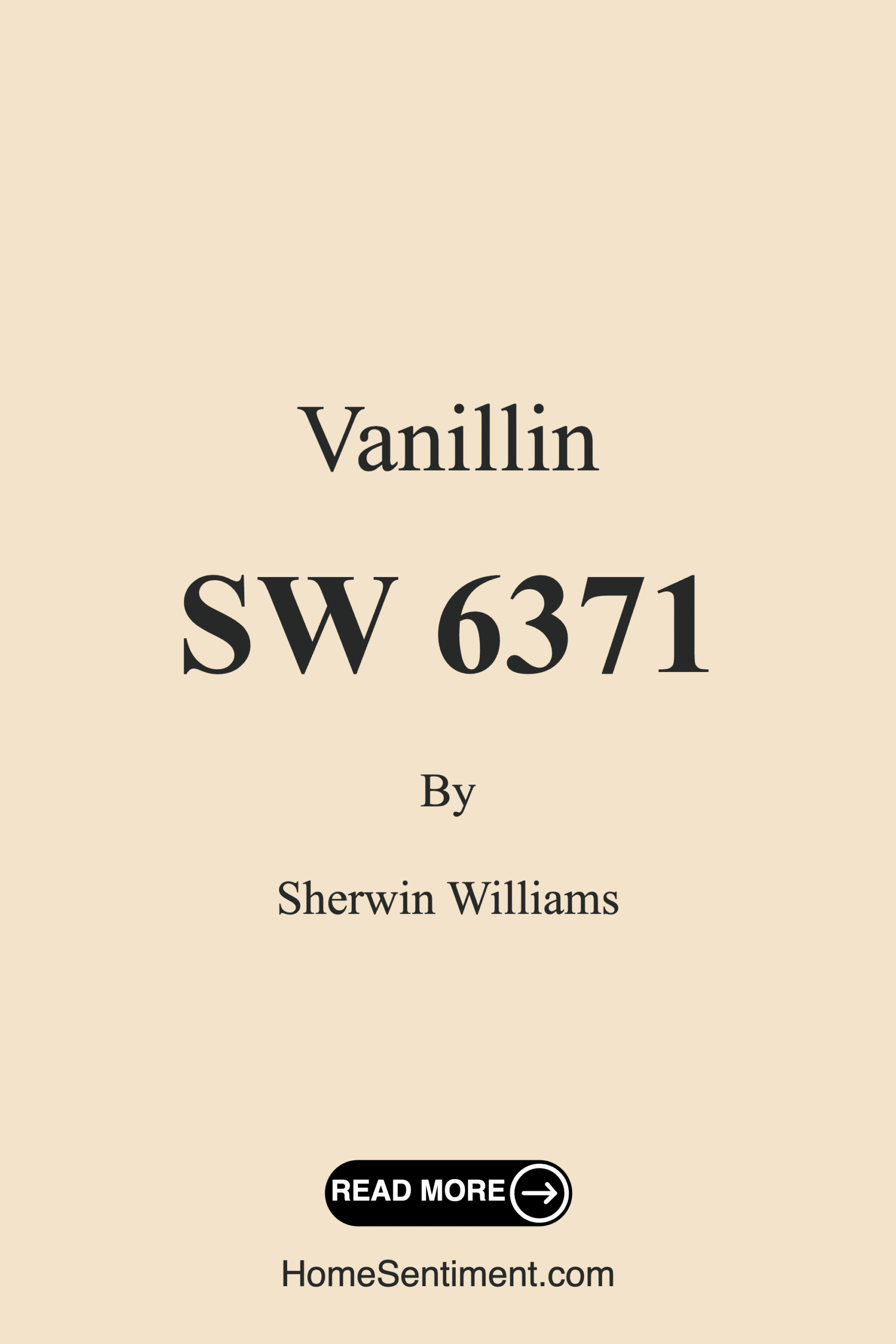
Color Preview & Key Details
| HEX Code | #F2E3CA |
| RGB | 242, 227, 202 |
| LRV | 83% |
| Undertone | Red |
| Finish Options | Eggshell, Matte, Satin |
Imagine stepping into a room that feels like a warm hug—a space that instantly makes you feel at home. That’s the magic of a well-chosen paint color, and today, I want to share with you one of my favorite hues: Sherwin Williams’ Vanillin (SW 6371). This soft, creamy beige is more than just a color; it’s an invitation to transform your home into a cozy sanctuary.
Vanillin is a delightful blend of warmth and lightness that can completely change the mood of your space. Its delicate balance creates an inviting atmosphere, perfect for those who want to feel comforted in their own homes. With an LRV (Light Reflectance Value) of 83%, this color reflects a significant amount of light, making rooms feel larger and more open. Whether you’re painting a living room, bedroom, kitchen, or even a bathroom, Vanillin can adapt beautifully, enriching the environment without overwhelming it.
Let’s talk about how it performs in different spaces. One of the standout features of Vanillin is its versatility. It pairs effortlessly with a variety of decor styles—from modern farmhouse to minimalist, and everything in between. Its warm undertone, which leans towards red, gives it a rich depth that can complement both warm and cool accents. Picture it with soft blues or crisp whites; the combination evokes a serene yet stylish vibe. This makes it an excellent choice if you love to mix styles or want to create an eclectic look.
The application of Vanillin is as smooth as its texture. It’s beginner-friendly, meaning even if you’ve never picked up a paintbrush before, you’ll feel confident tackling this project. Whether you’re using a roller or a brush, you’ll appreciate how effortlessly the paint glides on. Typically, you’ll get good coverage with just one or two coats, which is a definite plus when you’re in the thick of a home improvement project.
Have you ever painted a room and found the color looking different in the morning light versus the evening? That’s where Vanillin shines again. Its ability to adapt to changing light conditions means it provides a comforting ambiance throughout the day. In natural light, it takes on a soft, warm glow that feels welcoming. Under artificial lighting, it retains its creamy quality, but you might notice it shifting slightly to reveal more of its yellow undertones, which adds an extra layer of warmth to your space.
Now, let’s dive deeper into its undertones. The subtle red undertone is essential for understanding how Vanillin interacts with your existing decor. For instance, if you place it alongside furniture or flooring that has warm tones, the color will feel even cozier. Conversely, if you’re incorporating cooler hues, the warmth of Vanillin can create a beautiful balance, making your space feel well-rounded without becoming too “matchy-matchy.” Don’t forget to test the paint in your home to see how it reacts next to your furnishings throughout the day.
Of course, while Vanillin is highly durable and washable, it’s essential to remember that in high-traffic areas, you might need to do some touch-ups over time. To maintain its fresh look, consider opting for a satin finish in those spaces. This not only adds durability but also enhances its washability, making it a practical choice for families or active homes.
When it comes to pairing Vanillin with other colors, you have a plethora of options at your disposal. For a fresh and airy look, consider complementing it with whites, such as White Dove, or even a soft blue hue. These combinations can create a tranquil environment, perfect for relaxing afternoons. If you’re looking for something a bit richer, deeper shades like SW 0048 or SW 6813 can provide a stunning contrast that adds depth and interest to your interiors.
What about smaller spaces? Vanillin is a fantastic choice for these areas as well. Its light-reflective quality helps open them up, making them feel larger and airier. To amplify this effect, pair it with lighter furnishings and decor. You’ll be amazed at how such a soft color can make a cramped space feel inviting and expansive.
Let’s not overlook the finishes available for Vanillin. You can choose from a matte, eggshell, or satin finish based on your needs. Matte finishes lend a more traditional feel and can hide imperfections, while eggshell and satin offer a slight sheen that can enhance durability. Think about the mood you want to create and the functionality of the room when making your choice.
As you consider adding Vanillin to your home, think about the overall mood you want to evoke. It’s cozy, inviting, and calm—ideal for family gatherings or quiet evenings at home. With its warm, creamy essence, it can help turn any house into a home, where memories are made and shared.
In conclusion, Vanillin from Sherwin Williams is more than just a color; it’s a versatile, adaptable hue that can elevate your space in countless ways. Its warm undertones, excellent coverage, and ease of application make it a favorite among homeowners and designers alike. Whether you’re refreshing a single room or giving your entire home a makeover, consider bringing this delightful shade into your life. You might just find that it’s the perfect backdrop for all the beautiful moments that await you and your family. So grab that paintbrush, and let’s get started on creating a cozy, inviting space that feels just right for you.
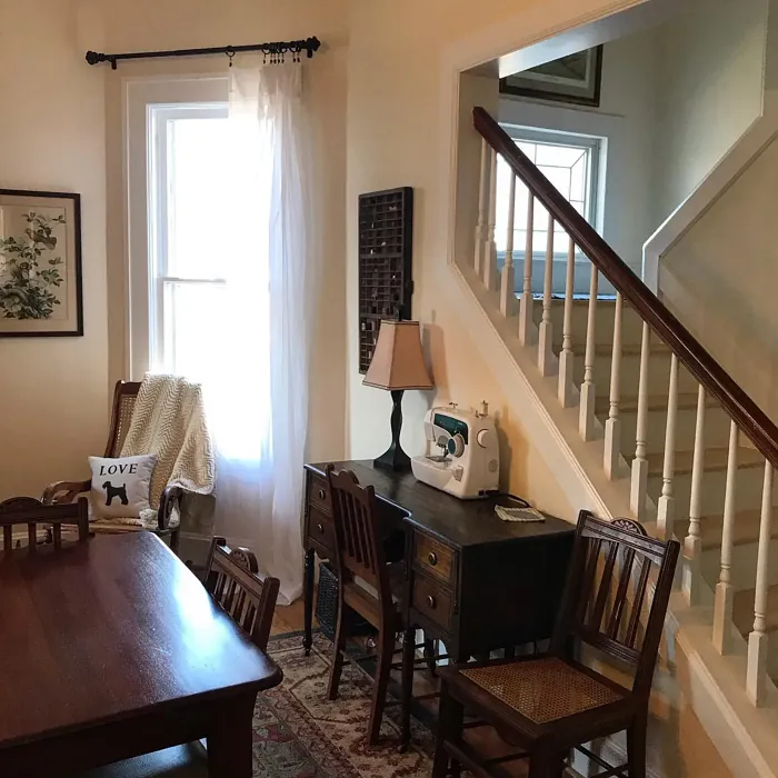
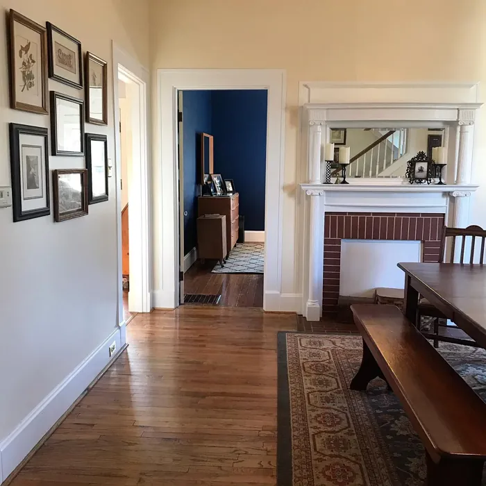
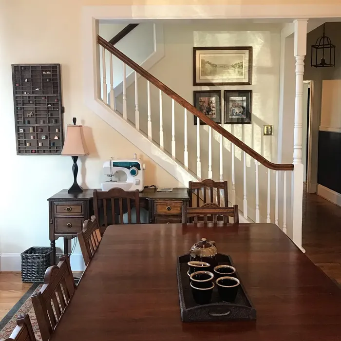
Real Room Photo of Vanillin SW 6371

Undertones of Vanillin ?
The undertones of Vanillin are a key aspect of its character, leaning towards Red. These subtle underlying hues are what give the color its depth and complexity. For example, a gray with a blue undertone will feel cooler and more modern, while one with a brown undertone will feel warmer and more traditional. It’s essential to test this paint in your home and observe it next to your existing furniture, flooring, and decor to see how these undertones interact and reveal themselves throughout the day.
HEX value: #F2E3CA
RGB code: 242, 227, 202
Is Vanillin Cool or Warm?
Vanillin leans towards the warm side of the color spectrum. Its soft, creamy essence radiates a sense of warmth, making spaces feel welcoming and snug, ideal for family gatherings or quiet evenings at home.
Understanding Color Properties and Interior Design Tips
Hue refers to a specific position on the color wheel, measured in degrees from 0 to 360. Each degree represents a different pure color:
- 0° represents red
- 120° represents green
- 240° represents blue
Saturation describes the intensity or purity of a color and is expressed as a percentage:
- At 0%, the color appears completely desaturated—essentially a shade of gray
- At 100%, the color is at its most vivid and vibrant
Lightness indicates how light or dark a color is, also expressed as a percentage:
- 0% lightness results in black
- 100% lightness results in white
Using Warm Colors in Interior Design
Warm hues—such as reds, oranges, yellows, warm beiges, and greiges—are excellent choices for creating inviting and energetic spaces. These colors are particularly well-suited for:
- Kitchens, living rooms, and bathrooms, where warmth enhances comfort and sociability
- Large rooms, where warm tones can help reduce the sense of emptiness and make the space feel more intimate
For example:
- Warm beige shades provide a cozy, inviting atmosphere, ideal for living rooms, bedrooms, and hallways.
- Warm greige (a mix of beige and gray) offers the warmth of beige with the modern appeal of gray, making it a versatile backdrop for dining areas, bedrooms, and living spaces.
However, be mindful when using warm light tones in rooms with limited natural light. These shades may appear muted or even take on an unpleasant yellowish tint. To avoid a dull or flat appearance:
- Add depth by incorporating richer tones like deep greens, charcoal, or chocolate brown
- Use textured elements such as curtains, rugs, or cushions to bring dimension to the space
Pro Tip: Achieving Harmony with Warm and Cool Color Balance
To create a well-balanced and visually interesting interior, mix warm and cool tones strategically. This contrast adds depth and harmony to your design.
- If your walls feature warm hues, introduce cool-colored accents such as blue or green furniture, artwork, or accessories to create contrast.
- For a polished look, consider using a complementary color scheme, which pairs colors opposite each other on the color wheel (e.g., red with green, orange with blue).
This thoughtful mix not only enhances visual appeal but also creates a space that feels both dynamic and cohesive.
Light Temperature Affects on Vanillin
Natural Light
Natural daylight changes in color temperature as the sun moves across the sky. At sunrise and sunset, the light tends to have a warm, golden tone with a color temperature around 2000 Kelvin (K). As the day progresses and the sun rises higher, the light becomes cooler and more neutral. Around midday, especially when the sky is clear, natural light typically reaches its peak brightness and shifts to a cooler tone, ranging from 5500 to 6500 Kelvin. This midday light is close to what we perceive as pure white or daylight-balanced light.
These shifts in natural light can significantly influence how colors appear in a space, which is why designers often consider both the time of day and the orientation of windows when planning interior color schemes.
Artificial Light
When choosing artificial lighting, pay close attention to the color temperature, measured in Kelvin (K). This determines how warm or cool the light will appear. Lower temperatures, around 2700K, give off a warm, yellow glow often used in living rooms or bedrooms. Higher temperatures, above 5000K, create a cool, bluish light similar to daylight, commonly used in kitchens, offices, or task areas.
Use the slider to see how lighting temperature can affect the appearance of a surface or color throughout a space.


4800K
LRV of Vanillin
The Light Reflectance Value (LRV) of Vanillin is 83%, which places it in the Light category. This means it Reflects a high amount of light. Understanding a paint’s LRV is crucial for predicting how it will look in your space. A higher LRV indicates a lighter color that reflects more light, making rooms feel larger and brighter. A lower LRV signifies a darker color that absorbs more light, creating a cozier, more intimate atmosphere. Always consider the natural and artificial lighting in your room when selecting a paint color based on its LRV.
Detailed Review of Vanillin
Additional Paint Characteristics
Ideal Rooms
Bathroom, Bedroom, Dining Room, Hallway, Kitchen, Living Room
Decor Styles
Coastal, Minimalist, Modern Farmhouse, Traditional, Transitional
Coverage
Good (1–2 Coats)
Ease of Application
Beginner Friendly, Brush Smooth, Roller-Ready
Washability
Highly Washable, Washable
VOC Level
Low VOC
Best Use
Accent Wall, Interior Walls, Trim
Room Suitability
Bathroom, Bedroom, Dining Room, Kitchen, Living Room
Tone Tag
Creamy, Neutral, Warm
Finish Type
Eggshell, Matte
Paint Performance
High Coverage, Low Odor, Quick Drying
Use Cases
Best for Rentals, Best for Small Spaces, Classic Favorite
Mood
Calm, Cozy, Inviting
Trim Pairing
Complements Cool Trim, Good with Wood Trim, Pairs with White Dove
Vanillin is a delightful paint color that truly shines in a variety of settings. Its warm tone is perfect for creating a homey feel, making it an excellent option for living rooms and bedrooms. When you apply it, you’ll notice how it effortlessly brightens up the space without being overwhelming. The texture feels smooth and buttery, whether you choose to use a roller or brush. In terms of its performance, it offers good coverage, typically requiring just one or two coats depending on the surface. Additionally, it pairs beautifully with both warm and cool accents, allowing for flexibility in your decor. One of the standout features of Vanillin is its ability to adapt to changing light conditions, providing a comforting ambiance that feels fresh yet grounded.
Pros & Cons of SW 6371 Vanillin
Pros
Cons
Colors that go with Sherwin Williams Vanillin
FAQ on SW 6371 Vanillin
How does Vanillin perform in high-traffic areas?
Vanillin is a great choice for high-traffic areas, but keep in mind that while it’s washable and highly durable, regular wear and tear might necessitate occasional touch-ups. To maintain its fresh look, consider applying a satin finish in these spaces for added durability.
Can I use Vanillin in a small room?
Absolutely! Vanillin is perfect for smaller rooms. Its light-reflective quality helps to open up the space, making it feel larger and airier. Pair it with lighter furnishings and decor to enhance the effect even more.
Comparisons Vanillin with other colors
Vanillin SW 6371 vs Natural Linen SW 9109
| Attribute | Vanillin SW 6371 | Natural Linen SW 9109 |
|---|---|---|
| Color Name | Vanillin SW 6371 | Natural Linen SW 9109 |
| Color | ||
| Hue | Beige | Beige |
| Brightness | Light | Light |
| RGB | 242, 227, 202 | 223, 211, 195 |
| LRV | 83% | 74% |
| Finish Type | Eggshell, Matte | Eggshell, Matte, Satin |
| Finish Options | Eggshell, Matte, Satin | Eggshell, Matte, Satin |
| Ideal Rooms | Bathroom, Bedroom, Dining Room, Hallway, Kitchen, Living Room | Bedroom, Dining Room, Hallway, Home Office, Kitchen, Living Room |
| Decor Styles | Coastal, Minimalist, Modern Farmhouse, Traditional, Transitional | Bohemian, Modern Farmhouse, Scandinavian, Transitional |
| Coverage | Good (1–2 Coats) | Good (1–2 Coats), Touch-Up Friendly |
| Ease of Application | Beginner Friendly, Brush Smooth, Roller-Ready | Beginner Friendly, Brush Smooth, Fast-Drying, Roller-Ready |
| Washability | Highly Washable, Washable | Highly Washable, Washable, Wipeable |
| Room Suitability | Bathroom, Bedroom, Dining Room, Kitchen, Living Room | Bedroom, Dining Room, Home Office, Kitchen, Living Room |
| Tone | Creamy, Neutral, Warm | Earthy, Neutral, Warm |
| Paint Performance | High Coverage, Low Odor, Quick Drying | Easy Touch-Up, Low Odor, Quick Drying, Scuff Resistant |
Vanillin SW 6371 vs Alabaster SW 7008
| Attribute | Vanillin SW 6371 | Alabaster SW 7008 |
|---|---|---|
| Color Name | Vanillin SW 6371 | Alabaster SW 7008 |
| Color | ||
| Hue | Beige | Beige |
| Brightness | Light | Light |
| RGB | 242, 227, 202 | 237, 234, 224 |
| LRV | 83% | 82% |
| Finish Type | Eggshell, Matte | Eggshell, Matte, Satin |
| Finish Options | Eggshell, Matte, Satin | Eggshell, Matte, Satin |
| Ideal Rooms | Bathroom, Bedroom, Dining Room, Hallway, Kitchen, Living Room | Bathroom, Bedroom, Dining Room, Entryway, Home Office, Kitchen, Living Room, Nursery |
| Decor Styles | Coastal, Minimalist, Modern Farmhouse, Traditional, Transitional | Coastal, Contemporary, Minimalist, Modern Farmhouse, Traditional, Transitional |
| Coverage | Good (1–2 Coats) | Good (1–2 Coats), Touch-Up Friendly |
| Ease of Application | Beginner Friendly, Brush Smooth, Roller-Ready | Beginner Friendly, Brush Smooth, Fast-Drying, Low Splatter, Roller-Ready |
| Washability | Highly Washable, Washable | Washable, Wipeable |
| Room Suitability | Bathroom, Bedroom, Dining Room, Kitchen, Living Room | Bathroom, Bedroom, Dining Room, Hallway, Home Office, Kitchen, Living Room, Nursery |
| Tone | Creamy, Neutral, Warm | Creamy, Neutral, Warm |
| Paint Performance | High Coverage, Low Odor, Quick Drying | Easy Touch-Up, High Coverage, Low Odor, Quick Drying |
Vanillin SW 6371 vs White Duck SW 7010
| Attribute | Vanillin SW 6371 | White Duck SW 7010 |
|---|---|---|
| Color Name | Vanillin SW 6371 | White Duck SW 7010 |
| Color | ||
| Hue | Beige | Beige |
| Brightness | Light | Light |
| RGB | 242, 227, 202 | 229, 223, 210 |
| LRV | 83% | 75% |
| Finish Type | Eggshell, Matte | Eggshell, Matte, Satin |
| Finish Options | Eggshell, Matte, Satin | Eggshell, Matte, Satin |
| Ideal Rooms | Bathroom, Bedroom, Dining Room, Hallway, Kitchen, Living Room | Bedroom, Dining Room, Home Office, Kitchen, Living Room, Nursery |
| Decor Styles | Coastal, Minimalist, Modern Farmhouse, Traditional, Transitional | Farmhouse, Modern, Scandinavian, Traditional, Transitional |
| Coverage | Good (1–2 Coats) | Good (1–2 Coats), Touch-Up Friendly |
| Ease of Application | Beginner Friendly, Brush Smooth, Roller-Ready | Beginner Friendly, Brush Smooth, Fast-Drying, Roller-Ready |
| Washability | Highly Washable, Washable | Highly Washable, Washable |
| Room Suitability | Bathroom, Bedroom, Dining Room, Kitchen, Living Room | Bedroom, Dining Room, Home Office, Kitchen, Living Room |
| Tone | Creamy, Neutral, Warm | Creamy, Neutral, Warm |
| Paint Performance | High Coverage, Low Odor, Quick Drying | Easy Touch-Up, Fade Resistant, Low Odor, Quick Drying |
Vanillin SW 6371 vs Greek Villa SW 7551
| Attribute | Vanillin SW 6371 | Greek Villa SW 7551 |
|---|---|---|
| Color Name | Vanillin SW 6371 | Greek Villa SW 7551 |
| Color | ||
| Hue | Beige | Beige |
| Brightness | Light | Light |
| RGB | 242, 227, 202 | 240, 236, 226 |
| LRV | 83% | 82% |
| Finish Type | Eggshell, Matte | Eggshell, Satin |
| Finish Options | Eggshell, Matte, Satin | Eggshell, Flat, Satin |
| Ideal Rooms | Bathroom, Bedroom, Dining Room, Hallway, Kitchen, Living Room | Bedroom, Dining Room, Hallway, Home Office, Kitchen, Living Room |
| Decor Styles | Coastal, Minimalist, Modern Farmhouse, Traditional, Transitional | Coastal, Minimalist, Modern Farmhouse, Traditional, Transitional |
| Coverage | Good (1–2 Coats) | Good (1–2 Coats), Touch-Up Friendly |
| Ease of Application | Beginner Friendly, Brush Smooth, Roller-Ready | Beginner Friendly, Brush Smooth, Roller-Ready |
| Washability | Highly Washable, Washable | Washable, Wipeable |
| Room Suitability | Bathroom, Bedroom, Dining Room, Kitchen, Living Room | Bedroom, Dining Room, Hallway, Kitchen, Living Room |
| Tone | Creamy, Neutral, Warm | Creamy, Neutral, Warm |
| Paint Performance | High Coverage, Low Odor, Quick Drying | Easy Touch-Up, High Coverage, Low Odor, Quick Drying |
Vanillin SW 6371 vs City Loft SW 7631
| Attribute | Vanillin SW 6371 | City Loft SW 7631 |
|---|---|---|
| Color Name | Vanillin SW 6371 | City Loft SW 7631 |
| Color | ||
| Hue | Beige | Beige |
| Brightness | Light | Light |
| RGB | 242, 227, 202 | 223, 218, 209 |
| LRV | 83% | 66% |
| Finish Type | Eggshell, Matte | Eggshell, Matte, Satin |
| Finish Options | Eggshell, Matte, Satin | Eggshell, Matte, Satin |
| Ideal Rooms | Bathroom, Bedroom, Dining Room, Hallway, Kitchen, Living Room | Bedroom, Hallway, Home Office, Kitchen, Living Room |
| Decor Styles | Coastal, Minimalist, Modern Farmhouse, Traditional, Transitional | Minimalist, Modern, Scandinavian, Transitional |
| Coverage | Good (1–2 Coats) | Good (1–2 Coats), Touch-Up Friendly |
| Ease of Application | Beginner Friendly, Brush Smooth, Roller-Ready | Beginner Friendly, Brush Smooth, Fast-Drying, Low Splatter, Roller-Ready |
| Washability | Highly Washable, Washable | Highly Washable, Washable |
| Room Suitability | Bathroom, Bedroom, Dining Room, Kitchen, Living Room | Bedroom, Hallway, Home Office, Living Room |
| Tone | Creamy, Neutral, Warm | Balanced, Muted, Neutral, Warm |
| Paint Performance | High Coverage, Low Odor, Quick Drying | Easy Touch-Up, High Coverage, Low Odor, Quick Drying, Scuff Resistant |
Vanillin SW 6371 vs Shoji White SW 7042
| Attribute | Vanillin SW 6371 | Shoji White SW 7042 |
|---|---|---|
| Color Name | Vanillin SW 6371 | Shoji White SW 7042 |
| Color | ||
| Hue | Beige | Beige |
| Brightness | Light | Light |
| RGB | 242, 227, 202 | 230, 223, 211 |
| LRV | 83% | 74% |
| Finish Type | Eggshell, Matte | Eggshell, Matte, Satin |
| Finish Options | Eggshell, Matte, Satin | Eggshell, Matte, Satin |
| Ideal Rooms | Bathroom, Bedroom, Dining Room, Hallway, Kitchen, Living Room | Bedroom, Dining Room, Home Office, Living Room, Nursery |
| Decor Styles | Coastal, Minimalist, Modern Farmhouse, Traditional, Transitional | Farmhouse, Japanese, Minimalist, Modern, Transitional |
| Coverage | Good (1–2 Coats) | Good (1–2 Coats), Touch-Up Friendly |
| Ease of Application | Beginner Friendly, Brush Smooth, Roller-Ready | Beginner Friendly, Brush Smooth, Roller-Ready |
| Washability | Highly Washable, Washable | Washable, Wipeable |
| Room Suitability | Bathroom, Bedroom, Dining Room, Kitchen, Living Room | Bedroom, Dining Room, Home Office, Living Room, Nursery |
| Tone | Creamy, Neutral, Warm | Creamy, Neutral, Warm |
| Paint Performance | High Coverage, Low Odor, Quick Drying | Easy Touch-Up, High Coverage, Low Odor |
Vanillin SW 6371 vs Neutral Ground SW 7568
| Attribute | Vanillin SW 6371 | Neutral Ground SW 7568 |
|---|---|---|
| Color Name | Vanillin SW 6371 | Neutral Ground SW 7568 |
| Color | ||
| Hue | Beige | Beige |
| Brightness | Light | Light |
| RGB | 242, 227, 202 | 226, 218, 202 |
| LRV | 83% | 40% |
| Finish Type | Eggshell, Matte | Eggshell, Matte, Satin |
| Finish Options | Eggshell, Matte, Satin | Eggshell, Matte, Satin |
| Ideal Rooms | Bathroom, Bedroom, Dining Room, Hallway, Kitchen, Living Room | Bedroom, Dining Room, Hallway, Home Office, Kitchen, Living Room |
| Decor Styles | Coastal, Minimalist, Modern Farmhouse, Traditional, Transitional | Farmhouse, Modern, Scandinavian, Traditional, Transitional |
| Coverage | Good (1–2 Coats) | Good (1–2 Coats) |
| Ease of Application | Beginner Friendly, Brush Smooth, Roller-Ready | Beginner Friendly, Brush Smooth, Roller-Ready |
| Washability | Highly Washable, Washable | Highly Washable, Washable |
| Room Suitability | Bathroom, Bedroom, Dining Room, Kitchen, Living Room | Bedroom, Dining Room, Home Office, Kitchen, Living Room |
| Tone | Creamy, Neutral, Warm | Earthy, Neutral, Warm |
| Paint Performance | High Coverage, Low Odor, Quick Drying | Easy Touch-Up, Low Odor, Quick Drying, Scuff Resistant |
Vanillin SW 6371 vs Limewash SW 9589
| Attribute | Vanillin SW 6371 | Limewash SW 9589 |
|---|---|---|
| Color Name | Vanillin SW 6371 | Limewash SW 9589 |
| Color | ||
| Hue | Beige | Beige |
| Brightness | Light | Light |
| RGB | 242, 227, 202 | 219, 213, 203 |
| LRV | 83% | 75% |
| Finish Type | Eggshell, Matte | Flat, Matte |
| Finish Options | Eggshell, Matte, Satin | Flat, Matte |
| Ideal Rooms | Bathroom, Bedroom, Dining Room, Hallway, Kitchen, Living Room | Bedroom, Dining Room, Hallway, Kitchen, Living Room |
| Decor Styles | Coastal, Minimalist, Modern Farmhouse, Traditional, Transitional | Bohemian, Contemporary, Modern Farmhouse, Rustic |
| Coverage | Good (1–2 Coats) | Good (1–2 Coats), Touch-Up Friendly |
| Ease of Application | Beginner Friendly, Brush Smooth, Roller-Ready | Beginner Friendly, Brush Smooth, Roller-Ready, Thin Formula |
| Washability | Highly Washable, Washable | Washable, Wipeable |
| Room Suitability | Bathroom, Bedroom, Dining Room, Kitchen, Living Room | Bathroom, Bedroom, Dining Room, Kitchen, Living Room |
| Tone | Creamy, Neutral, Warm | Earthy, Muted, Warm |
| Paint Performance | High Coverage, Low Odor, Quick Drying | Easy Touch-Up, Long Lasting, Low Odor |
Vanillin SW 6371 vs Creamy SW 7012
| Attribute | Vanillin SW 6371 | Creamy SW 7012 |
|---|---|---|
| Color Name | Vanillin SW 6371 | Creamy SW 7012 |
| Color | ||
| Hue | Beige | Beige |
| Brightness | Light | Light |
| RGB | 242, 227, 202 | 239, 232, 219 |
| LRV | 83% | 75% |
| Finish Type | Eggshell, Matte | Eggshell, Satin |
| Finish Options | Eggshell, Matte, Satin | Eggshell, Flat, Satin |
| Ideal Rooms | Bathroom, Bedroom, Dining Room, Hallway, Kitchen, Living Room | Bedroom, Dining Room, Hallway, Home Office, Kitchen, Living Room |
| Decor Styles | Coastal, Minimalist, Modern Farmhouse, Traditional, Transitional | Contemporary, Minimalist, Modern Farmhouse, Rustic, Traditional |
| Coverage | Good (1–2 Coats) | Good (1–2 Coats), Touch-Up Friendly |
| Ease of Application | Beginner Friendly, Brush Smooth, Roller-Ready | Beginner Friendly, Fast-Drying, Low Splatter |
| Washability | Highly Washable, Washable | Washable, Wipeable |
| Room Suitability | Bathroom, Bedroom, Dining Room, Kitchen, Living Room | Bedroom, Dining Room, Hallway, Kitchen, Living Room |
| Tone | Creamy, Neutral, Warm | Creamy, Neutral, Warm |
| Paint Performance | High Coverage, Low Odor, Quick Drying | High Coverage, Low Odor, Quick Drying |
Vanillin SW 6371 vs White Sesame SW 9586
| Attribute | Vanillin SW 6371 | White Sesame SW 9586 |
|---|---|---|
| Color Name | Vanillin SW 6371 | White Sesame SW 9586 |
| Color | ||
| Hue | Beige | Beige |
| Brightness | Light | Light |
| RGB | 242, 227, 202 | 227, 219, 205 |
| LRV | 83% | 75% |
| Finish Type | Eggshell, Matte | Eggshell, Matte, Satin |
| Finish Options | Eggshell, Matte, Satin | Eggshell, Matte, Satin |
| Ideal Rooms | Bathroom, Bedroom, Dining Room, Hallway, Kitchen, Living Room | Bedroom, Home Office, Kitchen, Living Room, Nursery |
| Decor Styles | Coastal, Minimalist, Modern Farmhouse, Traditional, Transitional | Minimalist, Modern Farmhouse, Rustic, Scandinavian, Transitional |
| Coverage | Good (1–2 Coats) | Good (1–2 Coats), Touch-Up Friendly |
| Ease of Application | Beginner Friendly, Brush Smooth, Roller-Ready | Beginner Friendly, Brush Smooth, Roller-Ready |
| Washability | Highly Washable, Washable | Highly Washable, Washable |
| Room Suitability | Bathroom, Bedroom, Dining Room, Kitchen, Living Room | Bedroom, Dining Room, Home Office, Living Room, Nursery |
| Tone | Creamy, Neutral, Warm | Creamy, Earthy, Neutral, Warm |
| Paint Performance | High Coverage, Low Odor, Quick Drying | Easy Touch-Up, High Coverage, Low Odor, Quick Drying |
Official Page of Sherwin Williams Vanillin SW 6371