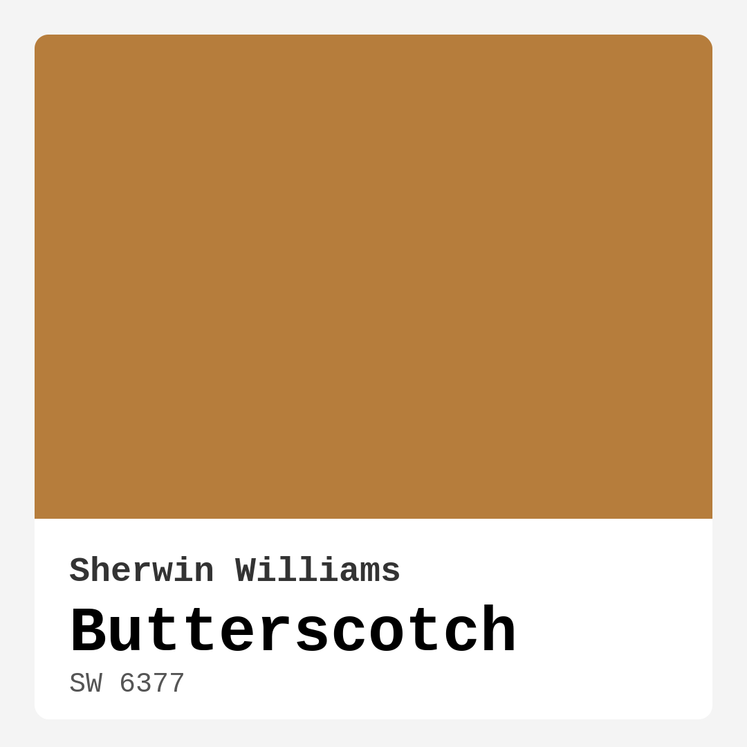
Color Preview & Key Details
| HEX Code | #B67D3C |
| RGB | 182, 125, 60 |
| LRV | 75% |
| Undertone | Red |
| Finish Options | Eggshell, Flat, Matte, Satin |
Imagine walking into a room that feels like a warm hug. You’re greeted by a golden hue that instantly lifts your spirits and wraps you in coziness. That’s the magic of Butterscotch, a paint color by Sherwin Williams that embodies warmth and friendliness. If you’ve been contemplating a fresh coat of paint but haven’t quite settled on a color, let’s delve into why Butterscotch might just be the perfect choice for your home.
Butterscotch, with its official color code SW 6377, is a stunning shade of beige that leans toward a warm, earthy tone. This paint color reflects 75% of light, making it bright enough to enliven any room while maintaining a cozy ambiance. Its hex code #B67D3C reveals a rich, inviting golden color that works wonders in transforming spaces. Whether you’re updating your living room, kitchen, or bedroom, Butterscotch brings a touch of nostalgia and comfort, reminiscent of sunny days spent enjoying sweet treats.
One of the best aspects of Butterscotch is its versatility. This color fits beautifully into various decor styles, from modern farmhouse to rustic and traditional settings. It’s not just a paint color; it’s an invitation to create a warm and welcoming environment. The rich undertones of red embedded in Butterscotch add depth, creating a sophisticated backdrop for your furnishings and decor. Pair it with white trim, and watch how it radiates a sense of elegance and comfort.
When considering where to use Butterscotch, think about the spaces that could benefit from its inviting presence. Living rooms are a prime candidate, as this shade can create a lively atmosphere perfect for gatherings. It’s also an excellent choice for kitchens and dining rooms, where warmth encourages conversation and camaraderie. Even in bedrooms, Butterscotch can evoke a sense of calm, making it easier to unwind after a long day.
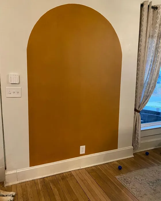
If you’re worried about Butterscotch overwhelming a small room, fear not! This color can actually make smaller spaces feel cozier and more inviting. Just keep an eye on the natural light. In rooms that receive limited sunlight, consider using Butterscotch as an accent color rather than covering all the walls to avoid creating a too-enclosed feeling. A feature wall painted in Butterscotch, perhaps behind a headboard or in a dining nook, can provide that warm embrace without making the room feel smaller.
The application of Butterscotch is a breeze, even for beginner DIYers. Its smooth formula makes it easy to brush or roll on, providing good coverage in just one to two coats. You’ll find that it adheres well to walls, creating a rich and even finish that enhances your decor effortlessly. Plus, with low VOC levels, you can breathe easy while you work. If you’re looking for a color that’s as easy to apply as it is to love, Butterscotch ticks all the boxes.
As you think about your decor style, consider the complementary colors that can enhance Butterscotch’s warmth. Pairing it with cooler hues can create a beautiful contrast, but be cautious with your choices. Colors like soft blues or greens can work well, but make sure to test them alongside Butterscotch to see how the undertones interact in your space. The interplay of warm and cool can create a stunning visual balance that draws the eye and adds depth to your design.
Light plays a crucial role in how Butterscotch will look in your home. In natural light, it reflects beautifully, enhancing its golden tones and creating a cheerful atmosphere. When the sun sets, you’ll notice that Butterscotch deepens slightly, giving your space an intimate glow that’s perfect for evening gatherings. This is why it’s essential to consider the lighting in your rooms when choosing Butterscotch. It’s all about how the color interacts with your space throughout the day.
In terms of finishes, Butterscotch truly shines with eggshell or satin. These finishes not only elevate the warmth of the color but also add a subtle sheen that feels sophisticated. Plus, they’re easy to clean, making them ideal for high-traffic areas or kitchens where spills can happen. If you’re considering Butterscotch for a space that sees a lot of action, opting for a satin finish can help maintain the beauty of the color while ensuring durability.
One thing to keep in mind is that while Butterscotch is a stunning choice, it may not be the best option for high-traffic areas without a protective finish. If you’re planning to paint a hallway or a room that gets a lot of wear, consider the durability factor and whether you might want to add a protective layer. This will help maintain the integrity of your beautiful new color.
The mood created by Butterscotch is undeniably cozy and grounding. It radiates a sense of comfort that invites you to relax and stay a while. Imagine gathering around a dining table with friends, the golden hue of Butterscotch surrounding you, enhancing the laughter and warmth of shared moments. It’s this kind of atmosphere that makes a house a home.
For those of you who love personal touches in your decor, Butterscotch can be a fantastic backdrop for showcasing your favorite pieces. Whether it’s artwork, family photos, or decorative accents, this warm shade provides a beautiful canvas that allows your personality to shine through. It can elevate everything from rustic wooden furniture to sleek modern decor, making it a truly adaptable choice for any interior.
If you’re still uncertain about committing to Butterscotch, grab a sample and paint a small swatch on your wall. Observe how it looks at different times of the day, and see how it interacts with your existing decor. You might be surprised at how much you love it once you see it in your own space.
In summary, Butterscotch is more than just a paint color; it’s an experience that transforms the feel of your home. Its warm, inviting nature makes it perfect for a variety of rooms, and its versatility allows it to coexist beautifully with many design styles. Whether you’re creating a cozy retreat or a vibrant entertaining space, Butterscotch promises to wrap your home in comfort and charm. So, why not give it a try? You just might find that Butterscotch is the perfect hue to embrace your home in warmth and style.
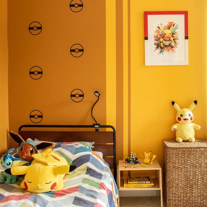
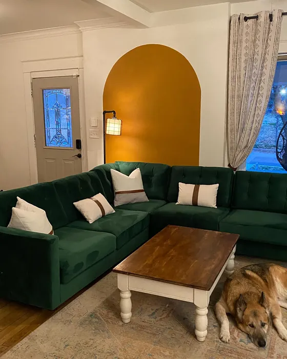
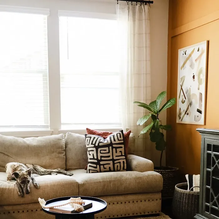
Real Room Photo of Butterscotch SW 6377


Undertones of Butterscotch ?
The undertones of Butterscotch are a key aspect of its character, leaning towards Red. These subtle underlying hues are what give the color its depth and complexity. For example, a gray with a blue undertone will feel cooler and more modern, while one with a brown undertone will feel warmer and more traditional. It’s essential to test this paint in your home and observe it next to your existing furniture, flooring, and decor to see how these undertones interact and reveal themselves throughout the day.
HEX value: #B67D3C
RGB code: 182, 125, 60
Is Butterscotch Cool or Warm?
Butterscotch is considered a warm paint color. This characteristic plays a huge role in the overall feel of a room. Warm colors, like this one, tend to create a cozy, inviting, and energetic atmosphere, making them great for social spaces like living rooms and dining rooms. In contrast, cool colors often evoke a sense of calm and serenity, which is why they are popular in bedrooms and bathrooms. The warmth of Butterscotch means it will pair beautifully with corresponding decor elements.
Understanding Color Properties and Interior Design Tips
Hue refers to a specific position on the color wheel, measured in degrees from 0 to 360. Each degree represents a different pure color:
- 0° represents red
- 120° represents green
- 240° represents blue
Saturation describes the intensity or purity of a color and is expressed as a percentage:
- At 0%, the color appears completely desaturated—essentially a shade of gray
- At 100%, the color is at its most vivid and vibrant
Lightness indicates how light or dark a color is, also expressed as a percentage:
- 0% lightness results in black
- 100% lightness results in white
Using Warm Colors in Interior Design
Warm hues—such as reds, oranges, yellows, warm beiges, and greiges—are excellent choices for creating inviting and energetic spaces. These colors are particularly well-suited for:
- Kitchens, living rooms, and bathrooms, where warmth enhances comfort and sociability
- Large rooms, where warm tones can help reduce the sense of emptiness and make the space feel more intimate
For example:
- Warm beige shades provide a cozy, inviting atmosphere, ideal for living rooms, bedrooms, and hallways.
- Warm greige (a mix of beige and gray) offers the warmth of beige with the modern appeal of gray, making it a versatile backdrop for dining areas, bedrooms, and living spaces.
However, be mindful when using warm light tones in rooms with limited natural light. These shades may appear muted or even take on an unpleasant yellowish tint. To avoid a dull or flat appearance:
- Add depth by incorporating richer tones like deep greens, charcoal, or chocolate brown
- Use textured elements such as curtains, rugs, or cushions to bring dimension to the space
Pro Tip: Achieving Harmony with Warm and Cool Color Balance
To create a well-balanced and visually interesting interior, mix warm and cool tones strategically. This contrast adds depth and harmony to your design.
- If your walls feature warm hues, introduce cool-colored accents such as blue or green furniture, artwork, or accessories to create contrast.
- For a polished look, consider using a complementary color scheme, which pairs colors opposite each other on the color wheel (e.g., red with green, orange with blue).
This thoughtful mix not only enhances visual appeal but also creates a space that feels both dynamic and cohesive.
Light Temperature Affects on Butterscotch
Natural Light
Natural daylight changes in color temperature as the sun moves across the sky. At sunrise and sunset, the light tends to have a warm, golden tone with a color temperature around 2000 Kelvin (K). As the day progresses and the sun rises higher, the light becomes cooler and more neutral. Around midday, especially when the sky is clear, natural light typically reaches its peak brightness and shifts to a cooler tone, ranging from 5500 to 6500 Kelvin. This midday light is close to what we perceive as pure white or daylight-balanced light.
These shifts in natural light can significantly influence how colors appear in a space, which is why designers often consider both the time of day and the orientation of windows when planning interior color schemes.
Artificial Light
When choosing artificial lighting, pay close attention to the color temperature, measured in Kelvin (K). This determines how warm or cool the light will appear. Lower temperatures, around 2700K, give off a warm, yellow glow often used in living rooms or bedrooms. Higher temperatures, above 5000K, create a cool, bluish light similar to daylight, commonly used in kitchens, offices, or task areas.
Use the slider to see how lighting temperature can affect the appearance of a surface or color throughout a space.


4800K
LRV of Butterscotch
The Light Reflectance Value (LRV) of Butterscotch is 75%, which places it in the Light category. This means it Reflects a high amount of light. Understanding a paint’s LRV is crucial for predicting how it will look in your space. A higher LRV indicates a lighter color that reflects more light, making rooms feel larger and brighter. A lower LRV signifies a darker color that absorbs more light, creating a cozier, more intimate atmosphere. Always consider the natural and artificial lighting in your room when selecting a paint color based on its LRV.
Detailed Review of Butterscotch
Additional Paint Characteristics
Ideal Rooms
Bedroom, Dining Room, Home Office, Kitchen, Living Room
Decor Styles
Bohemian, Modern Farmhouse, Rustic, Traditional
Coverage
Good (1–2 Coats)
Ease of Application
Beginner Friendly, Brush Smooth, Roller-Ready
Washability
Washable, Wipeable
VOC Level
Low VOC
Best Use
Accent Wall, Furniture, Interior Walls
Room Suitability
Bedroom, Dining Room, Kitchen, Living Room
Tone Tag
Cozy, Earthy, Warm
Finish Type
Eggshell, Satin
Paint Performance
Easy Touch-Up, High Coverage, Low Odor
Use Cases
Best for Modern Farmhouse, Best for Open Concept, Best for Small Spaces
Mood
Cozy, Grounding, Inviting
Trim Pairing
Complements Brass Fixtures, Good with Wood Trim, Pairs with White Dove
When it comes to paint colors, Butterscotch is a standout choice that balances warmth with versatility. It works beautifully in both bright and low-light spaces, allowing it to shine in various room settings. Whether you’re painting a cozy living room or a cheerful kitchen, this shade adds an inviting glow without overwhelming the senses. The application is smooth, and it adheres well to walls, providing a rich finish that can elevate your decor effortlessly. If you’re looking for a color that feels both timeless and trendy, Butterscotch is your go-to.
Pros & Cons of SW 6377 Butterscotch
Pros
Cons
Colors that go with Sherwin Williams Butterscotch
FAQ on SW 6377 Butterscotch
Can Butterscotch be used in small rooms?
Absolutely! Butterscotch can actually make small rooms feel warmer and more inviting. However, be mindful of natural light; if the room doesn’t get much sunlight, you might want to consider using it as an accent instead of the primary color to keep the space from feeling too enclosed.
What finishes work best with Butterscotch?
For Butterscotch, egg-shell and satin finishes are highly recommended. These finishes not only enhance the warmth of the color but also provide a slight sheen that can make the walls appear more sophisticated while still being easy to clean.
Comparisons Butterscotch with other colors
Butterscotch SW 6377 vs Griffin SW 7026
| Attribute | Butterscotch SW 6377 | Griffin SW 7026 |
|---|---|---|
| Color Name | Butterscotch SW 6377 | Griffin SW 7026 |
| Color | ||
| Hue | Beige | Beige |
| Brightness | Dark | Dark |
| RGB | 182, 125, 60 | 111, 100, 89 |
| LRV | 75% | 24% |
| Finish Type | Eggshell, Satin | Eggshell, Matte |
| Finish Options | Eggshell, Flat, Matte, Satin | Eggshell, Matte, Satin |
| Ideal Rooms | Bedroom, Dining Room, Home Office, Kitchen, Living Room | Bathroom, Bedroom, Dining Room, Home Office, Living Room |
| Decor Styles | Bohemian, Modern Farmhouse, Rustic, Traditional | Contemporary, Modern, Rustic, Transitional |
| Coverage | Good (1–2 Coats) | Good (1–2 Coats), Touch-Up Friendly |
| Ease of Application | Beginner Friendly, Brush Smooth, Roller-Ready | Beginner Friendly, Brush Smooth, Roller-Ready |
| Washability | Washable, Wipeable | Washable, Wipeable |
| Room Suitability | Bedroom, Dining Room, Kitchen, Living Room | Bedroom, Dining Room, Home Office, Living Room |
| Tone | Cozy, Earthy, Warm | Earthy, Muted, Warm |
| Paint Performance | Easy Touch-Up, High Coverage, Low Odor | Easy Touch-Up, Fade Resistant, Low Odor |
Butterscotch SW 6377 vs Warm Stone SW 7032
| Attribute | Butterscotch SW 6377 | Warm Stone SW 7032 |
|---|---|---|
| Color Name | Butterscotch SW 6377 | Warm Stone SW 7032 |
| Color | ||
| Hue | Beige | Beige |
| Brightness | Dark | Dark |
| RGB | 182, 125, 60 | 136, 123, 108 |
| LRV | 75% | 58% |
| Finish Type | Eggshell, Satin | Eggshell, Matte, Satin |
| Finish Options | Eggshell, Flat, Matte, Satin | Eggshell, Matte, Satin |
| Ideal Rooms | Bedroom, Dining Room, Home Office, Kitchen, Living Room | Bedroom, Dining Room, Home Office, Kitchen, Living Room |
| Decor Styles | Bohemian, Modern Farmhouse, Rustic, Traditional | Contemporary, Modern Farmhouse, Rustic, Transitional |
| Coverage | Good (1–2 Coats) | Good (1–2 Coats), Touch-Up Friendly |
| Ease of Application | Beginner Friendly, Brush Smooth, Roller-Ready | Beginner Friendly, Brush Smooth, Roller-Ready |
| Washability | Washable, Wipeable | Washable, Wipeable |
| Room Suitability | Bedroom, Dining Room, Kitchen, Living Room | Bedroom, Dining Room, Home Office, Living Room |
| Tone | Cozy, Earthy, Warm | Earthy, Muted, Warm |
| Paint Performance | Easy Touch-Up, High Coverage, Low Odor | Easy Touch-Up, High Coverage, Low Odor, Quick Drying, Scuff Resistant |
Butterscotch SW 6377 vs Black Fox SW 7020
| Attribute | Butterscotch SW 6377 | Black Fox SW 7020 |
|---|---|---|
| Color Name | Butterscotch SW 6377 | Black Fox SW 7020 |
| Color | ||
| Hue | Beige | Beige |
| Brightness | Dark | Dark |
| RGB | 182, 125, 60 | 79, 72, 66 |
| LRV | 75% | 5% |
| Finish Type | Eggshell, Satin | Eggshell, Matte, Satin |
| Finish Options | Eggshell, Flat, Matte, Satin | Eggshell, Matte, Satin |
| Ideal Rooms | Bedroom, Dining Room, Home Office, Kitchen, Living Room | Bedroom, Dining Room, Hallway, Home Office, Living Room |
| Decor Styles | Bohemian, Modern Farmhouse, Rustic, Traditional | Bohemian, Industrial, Modern, Rustic, Transitional |
| Coverage | Good (1–2 Coats) | Good (1–2 Coats), Touch-Up Friendly |
| Ease of Application | Beginner Friendly, Brush Smooth, Roller-Ready | Brush Smooth, Fast-Drying, Roller-Ready |
| Washability | Washable, Wipeable | Washable, Wipeable |
| Room Suitability | Bedroom, Dining Room, Kitchen, Living Room | Bedroom, Dining Room, Hallway, Home Office, Living Room |
| Tone | Cozy, Earthy, Warm | Deep, Earthy, Warm |
| Paint Performance | Easy Touch-Up, High Coverage, Low Odor | Easy Touch-Up, High Coverage, Low Odor |
Butterscotch SW 6377 vs Anonymous SW 7046
| Attribute | Butterscotch SW 6377 | Anonymous SW 7046 |
|---|---|---|
| Color Name | Butterscotch SW 6377 | Anonymous SW 7046 |
| Color | ||
| Hue | Beige | Beige |
| Brightness | Dark | Dark |
| RGB | 182, 125, 60 | 129, 122, 110 |
| LRV | 75% | 22% |
| Finish Type | Eggshell, Satin | Eggshell, Matte, Satin |
| Finish Options | Eggshell, Flat, Matte, Satin | Eggshell, Matte, Satin |
| Ideal Rooms | Bedroom, Dining Room, Home Office, Kitchen, Living Room | Bathroom, Bedroom, Dining Room, Home Office, Living Room |
| Decor Styles | Bohemian, Modern Farmhouse, Rustic, Traditional | Industrial, Modern, Rustic, Transitional |
| Coverage | Good (1–2 Coats) | Good (1–2 Coats), Touch-Up Friendly |
| Ease of Application | Beginner Friendly, Brush Smooth, Roller-Ready | Beginner Friendly, Brush Smooth, Roller-Ready |
| Washability | Washable, Wipeable | Highly Washable, Washable |
| Room Suitability | Bedroom, Dining Room, Kitchen, Living Room | Bedroom, Dining Room, Home Office, Living Room |
| Tone | Cozy, Earthy, Warm | Balanced, Earthy, Muted |
| Paint Performance | Easy Touch-Up, High Coverage, Low Odor | Easy Touch-Up, Low Odor, Quick Drying |
Butterscotch SW 6377 vs Porpoise SW 7047
| Attribute | Butterscotch SW 6377 | Porpoise SW 7047 |
|---|---|---|
| Color Name | Butterscotch SW 6377 | Porpoise SW 7047 |
| Color | ||
| Hue | Beige | Beige |
| Brightness | Dark | Dark |
| RGB | 182, 125, 60 | 107, 100, 91 |
| LRV | 75% | 30% |
| Finish Type | Eggshell, Satin | Eggshell, Satin |
| Finish Options | Eggshell, Flat, Matte, Satin | Eggshell, Satin, Semi-Gloss |
| Ideal Rooms | Bedroom, Dining Room, Home Office, Kitchen, Living Room | Bedroom, Dining Room, Hallway, Home Office, Living Room |
| Decor Styles | Bohemian, Modern Farmhouse, Rustic, Traditional | Industrial, Modern, Scandinavian, Transitional |
| Coverage | Good (1–2 Coats) | Good (1–2 Coats) |
| Ease of Application | Beginner Friendly, Brush Smooth, Roller-Ready | Beginner Friendly, Brush Smooth, Fast-Drying, Roller-Ready |
| Washability | Washable, Wipeable | Highly Washable, Washable |
| Room Suitability | Bedroom, Dining Room, Kitchen, Living Room | Bedroom, Dining Room, Home Office, Living Room |
| Tone | Cozy, Earthy, Warm | Earthy, Muted, Warm |
| Paint Performance | Easy Touch-Up, High Coverage, Low Odor | Easy Touch-Up, Fade Resistant, High Coverage, Low Odor |
Butterscotch SW 6377 vs Virtual Taupe SW 7039
| Attribute | Butterscotch SW 6377 | Virtual Taupe SW 7039 |
|---|---|---|
| Color Name | Butterscotch SW 6377 | Virtual Taupe SW 7039 |
| Color | ||
| Hue | Beige | Beige |
| Brightness | Dark | Dark |
| RGB | 182, 125, 60 | 138, 122, 106 |
| LRV | 75% | 24% |
| Finish Type | Eggshell, Satin | Eggshell, Satin |
| Finish Options | Eggshell, Flat, Matte, Satin | Eggshell, Flat, Matte, Satin, Semi-Gloss |
| Ideal Rooms | Bedroom, Dining Room, Home Office, Kitchen, Living Room | Bedroom, Dining Room, Home Office, Living Room |
| Decor Styles | Bohemian, Modern Farmhouse, Rustic, Traditional | Contemporary, Modern Farmhouse, Scandinavian, Transitional |
| Coverage | Good (1–2 Coats) | Good (1–2 Coats), Touch-Up Friendly |
| Ease of Application | Beginner Friendly, Brush Smooth, Roller-Ready | Brush Smooth, Fast-Drying, Roller-Ready |
| Washability | Washable, Wipeable | Scrubbable, Washable |
| Room Suitability | Bedroom, Dining Room, Kitchen, Living Room | Bedroom, Dining Room, Home Office, Living Room |
| Tone | Cozy, Earthy, Warm | Earthy, Muted, Warm |
| Paint Performance | Easy Touch-Up, High Coverage, Low Odor | Easy Touch-Up, High Coverage, Low Odor |
Butterscotch SW 6377 vs Polished Mahogany SW 2838
| Attribute | Butterscotch SW 6377 | Polished Mahogany SW 2838 |
|---|---|---|
| Color Name | Butterscotch SW 6377 | Polished Mahogany SW 2838 |
| Color | ||
| Hue | Beige | Beige |
| Brightness | Dark | Dark |
| RGB | 182, 125, 60 | 67, 39, 34 |
| LRV | 75% | 6% |
| Finish Type | Eggshell, Satin | Matte, Satin |
| Finish Options | Eggshell, Flat, Matte, Satin | Eggshell, Matte, Satin |
| Ideal Rooms | Bedroom, Dining Room, Home Office, Kitchen, Living Room | Bedroom, Dining Room, Home Office, Living Room |
| Decor Styles | Bohemian, Modern Farmhouse, Rustic, Traditional | Bohemian, Contemporary, Industrial, Rustic, Traditional |
| Coverage | Good (1–2 Coats) | Good (1–2 Coats) |
| Ease of Application | Beginner Friendly, Brush Smooth, Roller-Ready | Beginner Friendly, Brush Smooth, Fast-Drying, Roller-Ready |
| Washability | Washable, Wipeable | Washable, Wipeable |
| Room Suitability | Bedroom, Dining Room, Kitchen, Living Room | Bedroom, Dining Room, Hallway, Home Office, Living Room |
| Tone | Cozy, Earthy, Warm | Deep, Earthy, Warm |
| Paint Performance | Easy Touch-Up, High Coverage, Low Odor | High Coverage, Low Odor, Stain Resistant |
Butterscotch SW 6377 vs Sealskin SW 7675
| Attribute | Butterscotch SW 6377 | Sealskin SW 7675 |
|---|---|---|
| Color Name | Butterscotch SW 6377 | Sealskin SW 7675 |
| Color | ||
| Hue | Beige | Beige |
| Brightness | Dark | Dark |
| RGB | 182, 125, 60 | 72, 66, 60 |
| LRV | 75% | 4% |
| Finish Type | Eggshell, Satin | Eggshell, Matte, Satin |
| Finish Options | Eggshell, Flat, Matte, Satin | Eggshell, Matte, Satin |
| Ideal Rooms | Bedroom, Dining Room, Home Office, Kitchen, Living Room | Bedroom, Dining Room, Home Office, Living Room |
| Decor Styles | Bohemian, Modern Farmhouse, Rustic, Traditional | Bohemian, Contemporary, Industrial, Modern, Rustic |
| Coverage | Good (1–2 Coats) | Good (1–2 Coats), Touch-Up Friendly |
| Ease of Application | Beginner Friendly, Brush Smooth, Roller-Ready | Beginner Friendly, Brush Smooth, Roller-Ready |
| Washability | Washable, Wipeable | Washable, Wipeable |
| Room Suitability | Bedroom, Dining Room, Kitchen, Living Room | Bedroom, Dining Room, Home Office, Living Room |
| Tone | Cozy, Earthy, Warm | Deep, Earthy, Warm |
| Paint Performance | Easy Touch-Up, High Coverage, Low Odor | Easy Touch-Up, Fade Resistant, High Coverage, Low Odor |
Butterscotch SW 6377 vs Muddled Basil SW 7745
| Attribute | Butterscotch SW 6377 | Muddled Basil SW 7745 |
|---|---|---|
| Color Name | Butterscotch SW 6377 | Muddled Basil SW 7745 |
| Color | ||
| Hue | Beige | Beige |
| Brightness | Dark | Dark |
| RGB | 182, 125, 60 | 90, 82, 67 |
| LRV | 75% | 12% |
| Finish Type | Eggshell, Satin | Eggshell, Matte |
| Finish Options | Eggshell, Flat, Matte, Satin | Eggshell, Matte, Satin |
| Ideal Rooms | Bedroom, Dining Room, Home Office, Kitchen, Living Room | Bedroom, Dining Room, Home Office, Living Room |
| Decor Styles | Bohemian, Modern Farmhouse, Rustic, Traditional | Bohemian, Contemporary, Industrial, Modern Farmhouse, Rustic |
| Coverage | Good (1–2 Coats) | Good (1–2 Coats) |
| Ease of Application | Beginner Friendly, Brush Smooth, Roller-Ready | Beginner Friendly, Brush Smooth, Fast-Drying, Roller-Ready |
| Washability | Washable, Wipeable | Washable, Wipeable |
| Room Suitability | Bedroom, Dining Room, Kitchen, Living Room | Bedroom, Dining Room, Home Office, Living Room |
| Tone | Cozy, Earthy, Warm | Earthy, Muted, Warm |
| Paint Performance | Easy Touch-Up, High Coverage, Low Odor | High Coverage, Low Odor, Quick Drying, Scuff Resistant |
Butterscotch SW 6377 vs Backdrop SW 7025
| Attribute | Butterscotch SW 6377 | Backdrop SW 7025 |
|---|---|---|
| Color Name | Butterscotch SW 6377 | Backdrop SW 7025 |
| Color | ||
| Hue | Beige | Beige |
| Brightness | Dark | Dark |
| RGB | 182, 125, 60 | 134, 122, 111 |
| LRV | 75% | 48% |
| Finish Type | Eggshell, Satin | Eggshell, Matte, Satin |
| Finish Options | Eggshell, Flat, Matte, Satin | Eggshell, Matte, Satin |
| Ideal Rooms | Bedroom, Dining Room, Home Office, Kitchen, Living Room | Bedroom, Dining Room, Home Office, Living Room |
| Decor Styles | Bohemian, Modern Farmhouse, Rustic, Traditional | Bohemian, Modern Farmhouse, Scandinavian, Transitional |
| Coverage | Good (1–2 Coats) | Good (1–2 Coats), Touch-Up Friendly |
| Ease of Application | Beginner Friendly, Brush Smooth, Roller-Ready | Beginner Friendly, Brush Smooth, Fast-Drying, Roller-Ready |
| Washability | Washable, Wipeable | Scrubbable, Washable |
| Room Suitability | Bedroom, Dining Room, Kitchen, Living Room | Bedroom, Dining Room, Home Office, Living Room |
| Tone | Cozy, Earthy, Warm | Earthy, Muted, Warm |
| Paint Performance | Easy Touch-Up, High Coverage, Low Odor | Easy Touch-Up, High Coverage, Low Odor, Stain Resistant |
Official Page of Sherwin Williams Butterscotch SW 6377