
Color Preview & Key Details
| HEX Code | #F5DEBB |
| RGB | 245, 222, 187 |
| LRV | 82% |
| Undertone | Red |
| Finish Options | Eggshell, Satin, Semi-Gloss |
Imagine walking into your living room after a long day, the soft hues wrapping around you like a warm embrace. This feeling can be effortlessly captured with the right paint color, and today, I want to introduce you to a true gem in the Sherwin Williams palette: Jersey Cream (SW 6379). This delightful shade of soft, warm beige has a way of transforming spaces into inviting retreats, making it a fantastic choice for your home.
Jersey Cream is more than just a pretty color; it embodies a sense of comfort and sophistication. With its light brightness and a Light Reflectance Value (LRV) of 82%, it reflects a substantial amount of light. This quality can make rooms feel more spacious and airy, a crucial factor to consider, especially if you’re working with smaller areas. The color’s warm undertone, leaning toward red, adds depth and warmth that can enhance your decor without overpowering it.
One of the standout features of Jersey Cream is its versatility. It fits seamlessly into various decor styles, whether you’re drawn to the rustic charm of a modern farmhouse, the elegance of transitional design, or the soothing vibes of coastal aesthetics. This adaptability allows you to use Jersey Cream in different spaces throughout your home, creating a cohesive look that flows beautifully from room to room.
Imagine Jersey Cream in your living room: it can be the backdrop for lively gatherings or quiet evenings with a good book. In the kitchen, it brings a fresh, inviting atmosphere, making it the perfect spot for family meals and casual conversations. Its soft hue can also work wonders in a bedroom, creating a serene sanctuary that promotes relaxation and restful sleep.
When considering your application, you’ll find Jersey Cream to be remarkably user-friendly. It’s beginner-friendly and applies smoothly with both rollers and brushes, making it ideal for DIY enthusiasts. The paint dries quickly, minimizing waiting time, and its low splatter formula means you won’t spend hours cleaning up after. Plus, it’s wash-resistant and stain-resistant, so you can confidently use it in high-traffic areas like hallways and family rooms. Just be mindful that in spots experiencing a lot of activity, a few touch-ups may be necessary over time to keep it looking fresh.
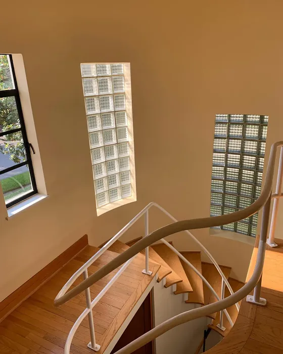
Lighting plays a significant role in how Jersey Cream appears in your space. It thrives in natural light, where its warm undertones come alive, creating a cozy and inviting ambiance. However, in poorly lit spaces, it may take on a slightly darker tone. To fully understand how Jersey Cream behaves in your home, I recommend sampling it on your walls at different times of the day. This will give you a sense of how it interacts with both natural and artificial lighting.
Complementary colors can elevate the beauty of Jersey Cream even further. Pairing it with crisp whites, like Benjamin Moore’s White Dove, creates a clean and striking contrast, especially in trim or cabinetry. For those who love metallic accents, brass fixtures beautifully complement this warm shade, adding a touch of elegance and sophistication to your space. When it comes to accent colors, consider shades of blues or greens that can provide a refreshing pop against the warm backdrop of Jersey Cream.
While it’s a fantastic choice for many spaces, it’s essential to consider a couple of its limitations. In rooms with very little natural light, Jersey Cream might appear darker than intended. So, if your space is on the dimmer side, you might want to explore lighter shades or ensure ample lighting is present. Additionally, while its warm, inviting tone is perfect for traditional and transitional designs, it may not align as well with very modern aesthetics that lean more toward cool-toned or stark palettes.
For those renting or looking for a classic color that won’t go out of style, Jersey Cream is an ideal choice. It’s a classic favorite that can adapt to changing trends without feeling dated. Its ability to create a warm and inviting atmosphere makes it perfect not only for personal spaces but also for welcoming guests.
As you dive deeper into the world of paint colors, you’ll discover that Jersey Cream has some lovely alternatives. If you’re curious about exploring lighter shades, consider looking at Sherwin Williams’ SW 7117, SW 7120, or SW 6679. For a bit more depth and contrast, shades like SW 6659 or SW 6366 could add character to your design while still maintaining that warm, cozy vibe.
In summary, Jersey Cream is a versatile, warm, and inviting color that has the potential to breathe life into your home. It’s perfect for creating a cozy atmosphere that feels welcoming and sophisticated at the same time. As you embark on your painting journey, remember to consider your space’s lighting, existing decor, and personal style. With Jersey Cream, you’re not just selecting a paint color; you’re choosing to create an environment that feels like home. Happy decorating!
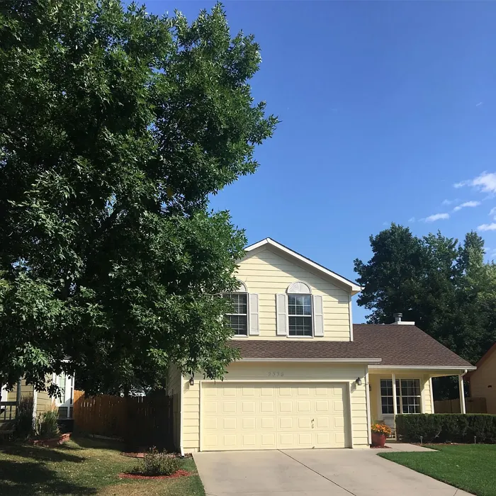
Real Room Photo of Jersey Cream SW 6379


Undertones of Jersey Cream ?
The undertones of Jersey Cream are a key aspect of its character, leaning towards Red. These subtle underlying hues are what give the color its depth and complexity. For example, a gray with a blue undertone will feel cooler and more modern, while one with a brown undertone will feel warmer and more traditional. It’s essential to test this paint in your home and observe it next to your existing furniture, flooring, and decor to see how these undertones interact and reveal themselves throughout the day.
HEX value: #F5DEBB
RGB code: 245, 222, 187
Is Jersey Cream Cool or Warm?
This paint leans warm, making it perfect for creating a cozy atmosphere. The warm undertones pair wonderfully with both vibrant and muted accents, allowing for a harmonious design.
Understanding Color Properties and Interior Design Tips
Hue refers to a specific position on the color wheel, measured in degrees from 0 to 360. Each degree represents a different pure color:
- 0° represents red
- 120° represents green
- 240° represents blue
Saturation describes the intensity or purity of a color and is expressed as a percentage:
- At 0%, the color appears completely desaturated—essentially a shade of gray
- At 100%, the color is at its most vivid and vibrant
Lightness indicates how light or dark a color is, also expressed as a percentage:
- 0% lightness results in black
- 100% lightness results in white
Using Warm Colors in Interior Design
Warm hues—such as reds, oranges, yellows, warm beiges, and greiges—are excellent choices for creating inviting and energetic spaces. These colors are particularly well-suited for:
- Kitchens, living rooms, and bathrooms, where warmth enhances comfort and sociability
- Large rooms, where warm tones can help reduce the sense of emptiness and make the space feel more intimate
For example:
- Warm beige shades provide a cozy, inviting atmosphere, ideal for living rooms, bedrooms, and hallways.
- Warm greige (a mix of beige and gray) offers the warmth of beige with the modern appeal of gray, making it a versatile backdrop for dining areas, bedrooms, and living spaces.
However, be mindful when using warm light tones in rooms with limited natural light. These shades may appear muted or even take on an unpleasant yellowish tint. To avoid a dull or flat appearance:
- Add depth by incorporating richer tones like deep greens, charcoal, or chocolate brown
- Use textured elements such as curtains, rugs, or cushions to bring dimension to the space
Pro Tip: Achieving Harmony with Warm and Cool Color Balance
To create a well-balanced and visually interesting interior, mix warm and cool tones strategically. This contrast adds depth and harmony to your design.
- If your walls feature warm hues, introduce cool-colored accents such as blue or green furniture, artwork, or accessories to create contrast.
- For a polished look, consider using a complementary color scheme, which pairs colors opposite each other on the color wheel (e.g., red with green, orange with blue).
This thoughtful mix not only enhances visual appeal but also creates a space that feels both dynamic and cohesive.
Light Temperature Affects on Jersey Cream
Natural Light
Natural daylight changes in color temperature as the sun moves across the sky. At sunrise and sunset, the light tends to have a warm, golden tone with a color temperature around 2000 Kelvin (K). As the day progresses and the sun rises higher, the light becomes cooler and more neutral. Around midday, especially when the sky is clear, natural light typically reaches its peak brightness and shifts to a cooler tone, ranging from 5500 to 6500 Kelvin. This midday light is close to what we perceive as pure white or daylight-balanced light.
These shifts in natural light can significantly influence how colors appear in a space, which is why designers often consider both the time of day and the orientation of windows when planning interior color schemes.
Artificial Light
When choosing artificial lighting, pay close attention to the color temperature, measured in Kelvin (K). This determines how warm or cool the light will appear. Lower temperatures, around 2700K, give off a warm, yellow glow often used in living rooms or bedrooms. Higher temperatures, above 5000K, create a cool, bluish light similar to daylight, commonly used in kitchens, offices, or task areas.
Use the slider to see how lighting temperature can affect the appearance of a surface or color throughout a space.


4800K
LRV of Jersey Cream
The Light Reflectance Value (LRV) of Jersey Cream is 82%, which places it in the Light category. This means it Reflects a high amount of light. Understanding a paint’s LRV is crucial for predicting how it will look in your space. A higher LRV indicates a lighter color that reflects more light, making rooms feel larger and brighter. A lower LRV signifies a darker color that absorbs more light, creating a cozier, more intimate atmosphere. Always consider the natural and artificial lighting in your room when selecting a paint color based on its LRV.
Detailed Review of Jersey Cream
Additional Paint Characteristics
Ideal Rooms
Bedroom, Dining Room, Entryway, Hallway, Home Office, Kitchen, Living Room
Decor Styles
Coastal, Modern Farmhouse, Rustic, Traditional, Transitional
Coverage
Good (1–2 Coats), Touch-Up Friendly
Ease of Application
Beginner Friendly, Brush Smooth, Fast-Drying, Low Splatter, Roller-Ready
Washability
Stain Resistant, Washable
VOC Level
Eco-Certified, Low VOC
Best Use
Accent Wall, Cabinets, Interior Walls, Trim
Room Suitability
Bedroom, Dining Room, Hallway, Kitchen, Living Room
Tone Tag
Creamy, Neutral, Warm
Finish Type
Eggshell, Satin
Paint Performance
Easy Touch-Up, High Coverage, Low Odor, Quick Drying, Stain Resistant
Use Cases
Best for Modern Farmhouse, Best for Open Concept, Best for Rentals, Classic Favorite
Mood
Cozy, Inviting, Warm
Trim Pairing
Complements Brass Fixtures, Good with Wood Trim, Pairs with White Dove
Jersey Cream offers a delightful hue that can transform your space effortlessly. Its warm undertones bring a sense of calm and relaxation, making it ideal for areas where you unwind. This paint works beautifully in open-concept layouts, creating a seamless flow from one room to another. The color is particularly flattering in natural light, enhancing the overall aesthetic without becoming too stark or bright. Whether you’re looking to create a cozy reading nook or a chic dining area, Jersey Cream adapts to your design intentions. Just remember, while it provides good coverage, two coats may be necessary for the best finish.
Pros & Cons of SW 6379 Jersey Cream
Pros
Cons
Colors that go with Sherwin Williams Jersey Cream
FAQ on SW 6379 Jersey Cream
What are the best lighting conditions for Jersey Cream?
Jersey Cream performs beautifully in natural light, where its warm undertones come to life. In spaces with limited light, it can appear slightly darker, so consider your room’s lighting when choosing this color. For the best effect, sample it on your walls at different times of the day to see how it interacts with your specific lighting.
Can Jersey Cream be used in high-traffic areas?
Yes, Jersey Cream is a durable choice for high-traffic areas. Its washability and stain resistance make it suitable for places like hallways or family rooms. Just keep in mind that touch-ups might be needed periodically, especially in spots that see a lot of wear and tear.
Comparisons Jersey Cream with other colors
Jersey Cream SW 6379 vs Napery SW 6386
| Attribute | Jersey Cream SW 6379 | Napery SW 6386 |
|---|---|---|
| Color Name | Jersey Cream SW 6379 | Napery SW 6386 |
| Color | ||
| Hue | Yellow | Yellow |
| Brightness | Light | Light |
| RGB | 245, 222, 187 | 239, 221, 193 |
| LRV | 82% | 75% |
| Finish Type | Eggshell, Satin | Eggshell, Matte, Satin |
| Finish Options | Eggshell, Satin, Semi-Gloss | Eggshell, Flat, Matte, Satin |
| Ideal Rooms | Bedroom, Dining Room, Entryway, Hallway, Home Office, Kitchen, Living Room | Bedroom, Dining Room, Kitchen, Living Room, Nursery |
| Decor Styles | Coastal, Modern Farmhouse, Rustic, Traditional, Transitional | Coastal, Modern Farmhouse, Scandinavian, Traditional, Transitional |
| Coverage | Good (1–2 Coats), Touch-Up Friendly | Good (1–2 Coats) |
| Ease of Application | Beginner Friendly, Brush Smooth, Fast-Drying, Low Splatter, Roller-Ready | Beginner Friendly, Brush Smooth, Fast-Drying, Roller-Ready |
| Washability | Stain Resistant, Washable | Scrubbable, Washable |
| Room Suitability | Bedroom, Dining Room, Hallway, Kitchen, Living Room | Bedroom, Dining Room, Home Office, Living Room, Nursery |
| Tone | Creamy, Neutral, Warm | Creamy, Earthy, Neutral, Warm |
| Paint Performance | Easy Touch-Up, High Coverage, Low Odor, Quick Drying, Stain Resistant | Easy Touch-Up, Low Odor, Quick Drying, Scuff Resistant |
Jersey Cream SW 6379 vs Friendly Yellow SW 6680
| Attribute | Jersey Cream SW 6379 | Friendly Yellow SW 6680 |
|---|---|---|
| Color Name | Jersey Cream SW 6379 | Friendly Yellow SW 6680 |
| Color | ||
| Hue | Yellow | Yellow |
| Brightness | Light | Light |
| RGB | 245, 222, 187 | 245, 224, 177 |
| LRV | 82% | 75% |
| Finish Type | Eggshell, Satin | Eggshell, Satin, Semi-Gloss |
| Finish Options | Eggshell, Satin, Semi-Gloss | Eggshell, Flat, Satin, Semi-Gloss |
| Ideal Rooms | Bedroom, Dining Room, Entryway, Hallway, Home Office, Kitchen, Living Room | Bedroom, Dining Room, Kitchen, Living Room, Nursery |
| Decor Styles | Coastal, Modern Farmhouse, Rustic, Traditional, Transitional | Bohemian, Coastal, Contemporary, Modern Farmhouse, Traditional |
| Coverage | Good (1–2 Coats), Touch-Up Friendly | Good (1–2 Coats), Touch-Up Friendly |
| Ease of Application | Beginner Friendly, Brush Smooth, Fast-Drying, Low Splatter, Roller-Ready | Beginner Friendly, Brush Smooth, Fast-Drying, Roller-Ready |
| Washability | Stain Resistant, Washable | Highly Washable, Washable, Wipeable |
| Room Suitability | Bedroom, Dining Room, Hallway, Kitchen, Living Room | Bedroom, Dining Room, Kitchen, Living Room, Nursery |
| Tone | Creamy, Neutral, Warm | Bright, Creamy, Warm |
| Paint Performance | Easy Touch-Up, High Coverage, Low Odor, Quick Drying, Stain Resistant | Easy Touch-Up, Low Odor, Quick Drying |
Jersey Cream SW 6379 vs Full Moon SW 6679
| Attribute | Jersey Cream SW 6379 | Full Moon SW 6679 |
|---|---|---|
| Color Name | Jersey Cream SW 6379 | Full Moon SW 6679 |
| Color | ||
| Hue | Yellow | Yellow |
| Brightness | Light | Light |
| RGB | 245, 222, 187 | 244, 227, 188 |
| LRV | 82% | 75% |
| Finish Type | Eggshell, Satin | Eggshell, Matte, Satin |
| Finish Options | Eggshell, Satin, Semi-Gloss | Eggshell, Matte, Satin |
| Ideal Rooms | Bedroom, Dining Room, Entryway, Hallway, Home Office, Kitchen, Living Room | Bedroom, Dining Room, Home Office, Kitchen, Living Room, Nursery |
| Decor Styles | Coastal, Modern Farmhouse, Rustic, Traditional, Transitional | Coastal, Modern Farmhouse, Scandinavian, Transitional |
| Coverage | Good (1–2 Coats), Touch-Up Friendly | Good (1–2 Coats), Touch-Up Friendly |
| Ease of Application | Beginner Friendly, Brush Smooth, Fast-Drying, Low Splatter, Roller-Ready | Beginner Friendly, Brush Smooth, Fast-Drying, Roller-Ready |
| Washability | Stain Resistant, Washable | Washable, Wipeable |
| Room Suitability | Bedroom, Dining Room, Hallway, Kitchen, Living Room | Bedroom, Dining Room, Living Room, Nursery |
| Tone | Creamy, Neutral, Warm | Creamy, Inviting, Warm |
| Paint Performance | Easy Touch-Up, High Coverage, Low Odor, Quick Drying, Stain Resistant | High Coverage, Low Odor, Quick Drying |
Jersey Cream SW 6379 vs Classical Yellow SW 2865
| Attribute | Jersey Cream SW 6379 | Classical Yellow SW 2865 |
|---|---|---|
| Color Name | Jersey Cream SW 6379 | Classical Yellow SW 2865 |
| Color | ||
| Hue | Yellow | Yellow |
| Brightness | Light | Light |
| RGB | 245, 222, 187 | 248, 212, 146 |
| LRV | 82% | 75% |
| Finish Type | Eggshell, Satin | Eggshell, Satin |
| Finish Options | Eggshell, Satin, Semi-Gloss | Eggshell, Satin, Semi-Gloss |
| Ideal Rooms | Bedroom, Dining Room, Entryway, Hallway, Home Office, Kitchen, Living Room | Bedroom, Dining Room, Home Office, Kitchen, Living Room, Nursery |
| Decor Styles | Coastal, Modern Farmhouse, Rustic, Traditional, Transitional | Coastal, Contemporary, Farmhouse, Rustic, Traditional |
| Coverage | Good (1–2 Coats), Touch-Up Friendly | Good (1–2 Coats), Touch-Up Friendly |
| Ease of Application | Beginner Friendly, Brush Smooth, Fast-Drying, Low Splatter, Roller-Ready | Beginner Friendly, Brush Smooth, Fast-Drying, Roller-Ready |
| Washability | Stain Resistant, Washable | Highly Washable, Washable, Wipeable |
| Room Suitability | Bedroom, Dining Room, Hallway, Kitchen, Living Room | Bedroom, Dining Room, Home Office, Kitchen, Living Room |
| Tone | Creamy, Neutral, Warm | Cozy, Creamy, Warm |
| Paint Performance | Easy Touch-Up, High Coverage, Low Odor, Quick Drying, Stain Resistant | Easy Touch-Up, High Coverage, Low Odor, Quick Drying |
Jersey Cream SW 6379 vs They call it Mellow SW 9015
| Attribute | Jersey Cream SW 6379 | They call it Mellow SW 9015 |
|---|---|---|
| Color Name | Jersey Cream SW 6379 | They call it Mellow SW 9015 |
| Color | ||
| Hue | Yellow | Yellow |
| Brightness | Light | Light |
| RGB | 245, 222, 187 | 251, 228, 179 |
| LRV | 82% | 10% |
| Finish Type | Eggshell, Satin | Eggshell, Satin |
| Finish Options | Eggshell, Satin, Semi-Gloss | Eggshell, Satin, Semi-Gloss |
| Ideal Rooms | Bedroom, Dining Room, Entryway, Hallway, Home Office, Kitchen, Living Room | Bedroom, Dining Room, Home Office, Living Room, Nursery |
| Decor Styles | Coastal, Modern Farmhouse, Rustic, Traditional, Transitional | Coastal, Farmhouse, Modern, Transitional |
| Coverage | Good (1–2 Coats), Touch-Up Friendly | Good (1–2 Coats), Touch-Up Friendly |
| Ease of Application | Beginner Friendly, Brush Smooth, Fast-Drying, Low Splatter, Roller-Ready | Beginner Friendly, Fast-Drying, Roller-Ready |
| Washability | Stain Resistant, Washable | Washable, Wipeable |
| Room Suitability | Bedroom, Dining Room, Hallway, Kitchen, Living Room | Bedroom, Home Office, Living Room, Nursery |
| Tone | Creamy, Neutral, Warm | Creamy, Soft, Warm |
| Paint Performance | Easy Touch-Up, High Coverage, Low Odor, Quick Drying, Stain Resistant | Easy Touch-Up, Low Odor, Quick Drying |
Jersey Cream SW 6379 vs Venetian Yellow SW 1666
| Attribute | Jersey Cream SW 6379 | Venetian Yellow SW 1666 |
|---|---|---|
| Color Name | Jersey Cream SW 6379 | Venetian Yellow SW 1666 |
| Color | ||
| Hue | Yellow | Yellow |
| Brightness | Light | Light |
| RGB | 245, 222, 187 | 246, 227, 161 |
| LRV | 82% | 50% |
| Finish Type | Eggshell, Satin | Eggshell, Satin |
| Finish Options | Eggshell, Satin, Semi-Gloss | Eggshell, Flat, Matte, Satin |
| Ideal Rooms | Bedroom, Dining Room, Entryway, Hallway, Home Office, Kitchen, Living Room | Bedroom, Dining Room, Hallway, Kitchen, Living Room |
| Decor Styles | Coastal, Modern Farmhouse, Rustic, Traditional, Transitional | Bohemian, Farmhouse, Mediterranean, Traditional |
| Coverage | Good (1–2 Coats), Touch-Up Friendly | Good (1–2 Coats), Touch-Up Friendly |
| Ease of Application | Beginner Friendly, Brush Smooth, Fast-Drying, Low Splatter, Roller-Ready | Beginner Friendly, Brush Smooth, Fast-Drying, Roller-Ready |
| Washability | Stain Resistant, Washable | Highly Washable, Washable |
| Room Suitability | Bedroom, Dining Room, Hallway, Kitchen, Living Room | Bedroom, Dining Room, Kitchen, Living Room |
| Tone | Creamy, Neutral, Warm | Creamy, Earthy, Warm |
| Paint Performance | Easy Touch-Up, High Coverage, Low Odor, Quick Drying, Stain Resistant | High Coverage, Low Odor, Quick Drying |
Jersey Cream SW 6379 vs Sunny Veranda SW 9017
| Attribute | Jersey Cream SW 6379 | Sunny Veranda SW 9017 |
|---|---|---|
| Color Name | Jersey Cream SW 6379 | Sunny Veranda SW 9017 |
| Color | ||
| Hue | Yellow | Yellow |
| Brightness | Light | Light |
| RGB | 245, 222, 187 | 254, 223, 148 |
| LRV | 82% | 9017% |
| Finish Type | Eggshell, Satin | Eggshell, Satin |
| Finish Options | Eggshell, Satin, Semi-Gloss | Eggshell, Satin, Semi-Gloss |
| Ideal Rooms | Bedroom, Dining Room, Entryway, Hallway, Home Office, Kitchen, Living Room | Dining Room, Hallway, Kitchen, Living Room, Nursery |
| Decor Styles | Coastal, Modern Farmhouse, Rustic, Traditional, Transitional | Bohemian, Coastal, Modern Farmhouse, Scandinavian, Traditional |
| Coverage | Good (1–2 Coats), Touch-Up Friendly | Good (1–2 Coats), Touch-Up Friendly |
| Ease of Application | Beginner Friendly, Brush Smooth, Fast-Drying, Low Splatter, Roller-Ready | Beginner Friendly, Brush Smooth, Fast-Drying, Roller-Ready |
| Washability | Stain Resistant, Washable | Highly Washable, Washable |
| Room Suitability | Bedroom, Dining Room, Hallway, Kitchen, Living Room | Dining Room, Hallway, Kitchen, Living Room, Nursery |
| Tone | Creamy, Neutral, Warm | Airy, Creamy, Warm |
| Paint Performance | Easy Touch-Up, High Coverage, Low Odor, Quick Drying, Stain Resistant | Easy Touch-Up, Low Odor, Quick Drying |
Jersey Cream SW 6379 vs Humble Gold SW 6380
| Attribute | Jersey Cream SW 6379 | Humble Gold SW 6380 |
|---|---|---|
| Color Name | Jersey Cream SW 6379 | Humble Gold SW 6380 |
| Color | ||
| Hue | Yellow | Yellow |
| Brightness | Light | Light |
| RGB | 245, 222, 187 | 237, 199, 150 |
| LRV | 82% | 38% |
| Finish Type | Eggshell, Satin | Eggshell, Satin |
| Finish Options | Eggshell, Satin, Semi-Gloss | Eggshell, Flat, Satin |
| Ideal Rooms | Bedroom, Dining Room, Entryway, Hallway, Home Office, Kitchen, Living Room | Bedroom, Dining Room, Hallway, Home Office, Living Room |
| Decor Styles | Coastal, Modern Farmhouse, Rustic, Traditional, Transitional | Bohemian, Modern Farmhouse, Traditional, Transitional |
| Coverage | Good (1–2 Coats), Touch-Up Friendly | Good (1–2 Coats), Touch-Up Friendly |
| Ease of Application | Beginner Friendly, Brush Smooth, Fast-Drying, Low Splatter, Roller-Ready | Beginner Friendly, Brush Smooth, Roller-Ready |
| Washability | Stain Resistant, Washable | Washable, Wipeable |
| Room Suitability | Bedroom, Dining Room, Hallway, Kitchen, Living Room | Bedroom, Dining Room, Hallway, Living Room |
| Tone | Creamy, Neutral, Warm | Balanced, Earthy, Warm |
| Paint Performance | Easy Touch-Up, High Coverage, Low Odor, Quick Drying, Stain Resistant | Easy Touch-Up, High Coverage, Low Odor |
Jersey Cream SW 6379 vs La Luna Amarilla SW 9016
| Attribute | Jersey Cream SW 6379 | La Luna Amarilla SW 9016 |
|---|---|---|
| Color Name | Jersey Cream SW 6379 | La Luna Amarilla SW 9016 |
| Color | ||
| Hue | Yellow | Yellow |
| Brightness | Light | Light |
| RGB | 245, 222, 187 | 253, 223, 160 |
| LRV | 82% | 83% |
| Finish Type | Eggshell, Satin | Eggshell, Satin |
| Finish Options | Eggshell, Satin, Semi-Gloss | Eggshell, Flat, Satin |
| Ideal Rooms | Bedroom, Dining Room, Entryway, Hallway, Home Office, Kitchen, Living Room | Bedroom, Dining Room, Kitchen, Living Room, Nursery |
| Decor Styles | Coastal, Modern Farmhouse, Rustic, Traditional, Transitional | Bohemian, Coastal, Contemporary, Modern Farmhouse, Traditional |
| Coverage | Good (1–2 Coats), Touch-Up Friendly | Good (1–2 Coats), Touch-Up Friendly |
| Ease of Application | Beginner Friendly, Brush Smooth, Fast-Drying, Low Splatter, Roller-Ready | Beginner Friendly, Fast-Drying, Low Splatter |
| Washability | Stain Resistant, Washable | Washable, Wipeable |
| Room Suitability | Bedroom, Dining Room, Hallway, Kitchen, Living Room | Bedroom, Dining Room, Kitchen, Living Room, Nursery |
| Tone | Creamy, Neutral, Warm | Airy, Creamy, Warm |
| Paint Performance | Easy Touch-Up, High Coverage, Low Odor, Quick Drying, Stain Resistant | Easy Touch-Up, Low Odor, Scuff Resistant |
Jersey Cream SW 6379 vs Sunbeam Yellow SW 0078
| Attribute | Jersey Cream SW 6379 | Sunbeam Yellow SW 0078 |
|---|---|---|
| Color Name | Jersey Cream SW 6379 | Sunbeam Yellow SW 0078 |
| Color | ||
| Hue | Yellow | Yellow |
| Brightness | Light | Light |
| RGB | 245, 222, 187 | 240, 211, 157 |
| LRV | 82% | 75% |
| Finish Type | Eggshell, Satin | Eggshell, Matte, Satin |
| Finish Options | Eggshell, Satin, Semi-Gloss | Eggshell, Matte, Satin |
| Ideal Rooms | Bedroom, Dining Room, Entryway, Hallway, Home Office, Kitchen, Living Room | Bedroom, Dining Room, Kitchen, Living Room, Nursery |
| Decor Styles | Coastal, Modern Farmhouse, Rustic, Traditional, Transitional | Bohemian, Coastal, Modern Farmhouse, Scandinavian, Traditional |
| Coverage | Good (1–2 Coats), Touch-Up Friendly | Good (1–2 Coats), Touch-Up Friendly |
| Ease of Application | Beginner Friendly, Brush Smooth, Fast-Drying, Low Splatter, Roller-Ready | Beginner Friendly, Brush Smooth, Fast-Drying, Roller-Ready |
| Washability | Stain Resistant, Washable | Highly Washable, Washable |
| Room Suitability | Bedroom, Dining Room, Hallway, Kitchen, Living Room | Bedroom, Dining Room, Kitchen, Living Room, Nursery |
| Tone | Creamy, Neutral, Warm | Airy, Brightening, Warm |
| Paint Performance | Easy Touch-Up, High Coverage, Low Odor, Quick Drying, Stain Resistant | Easy Touch-Up, Fade Resistant, Low Odor, Quick Drying |
Official Page of Sherwin Williams Jersey Cream SW 6379