
Color Preview & Key Details
| HEX Code | #CFC291 |
| RGB | 207, 194, 145 |
| LRV | 75% |
| Undertone | Yellow |
| Finish Options | Eggshell, Matte, Satin |
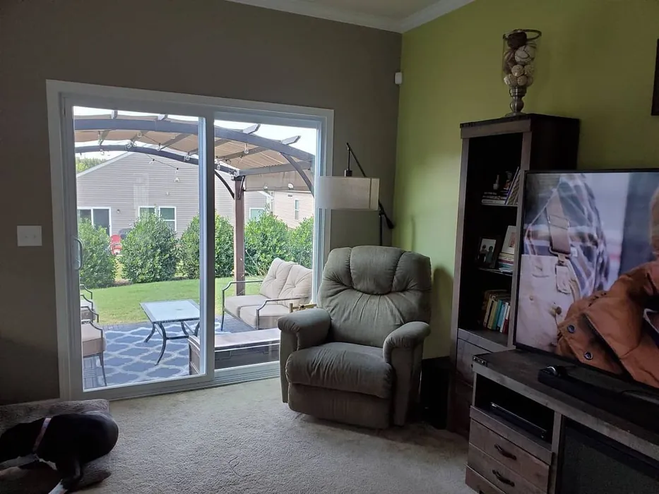
Imagine walking into your living room, and the first thing you notice is a soothing, soft green hue enveloping the space, making it feel like a serene escape. You’re greeted by a warm and inviting atmosphere that instantly puts you at ease. This is the magic of Hearts of Palm, a captivating paint color from Sherwin Williams that embodies tranquility and comfort.
Hearts of Palm, with the color code SW 6415, is a delightful choice for homeowners looking to create a calming environment. This soft, muted green, infused with warm yellow undertones, brings the essence of a tropical oasis right into your home. It’s perfect for those of you who appreciate the beauty of nature and want to incorporate that into your interior design.
One of the standout features of Hearts of Palm is its versatility. Whether you’re considering a fresh coat for your living room, bedroom, kitchen, or even your home office, this color works beautifully across various spaces. Its adaptability shines through in both bright and dim lighting, allowing it to radiate a soft, fresh quality during the day while transforming into a cozy, subdued hue in the evening.
Now, let’s talk about how to use this color. If you’re leaning toward a coastal or tropical theme, Hearts of Palm can be your perfect backdrop. Pair it with light woods, natural fibers, and nautical accents to create a refreshing coastal vibe. For a modern farmhouse look, combine it with rustic elements like reclaimed wood and vintage decor. If you’re going for an eclectic style, don’t shy away from mixing bold patterns and vibrant colors alongside this muted hue. It’s the kind of color that welcomes creativity and personal expression.
When it comes to application, Hearts of Palm is beginner-friendly. Its good coverage means you’ll likely only need one or two coats for a flawless finish. The paint goes on smoothly, whether you’re using a roller or a brush, making it a breeze for DIY enthusiasts. Plus, it’s touch-up friendly, so don’t worry if you accidentally scuff the wall; fixing it is simple.
One of the key aspects to consider is the Light Reflectance Value (LRV) of Hearts of Palm, which sits at 75%. This means it reflects a high amount of light, making spaces feel larger and airier. The color’s ability to bounce light around is particularly advantageous in smaller rooms or those without much natural light. However, be mindful that in low light settings, it can appear darker, so it’s wise to test it out in your specific space before committing.
What about maintenance? You’ll be pleased to know that Hearts of Palm is washable and scrubbable, making it a fantastic choice for areas like kitchens and bathrooms—just opt for a finish like Eggshell or Satin for added durability. The low VOC levels also mean it’s an eco-friendly choice, ensuring your home stays healthy while looking beautiful.
Now let’s discuss how lighting plays a significant role in how Hearts of Palm will appear in your space. In natural light, its fresh green undertones will shine, creating an uplifting and vibrant ambiance. As the sun sets, the warmth from the yellow undertones becomes more pronounced, providing a cozy glow that’s perfect for winding down after a long day. This dynamic quality makes Hearts of Palm not just a paint color but a living part of your home’s atmosphere.
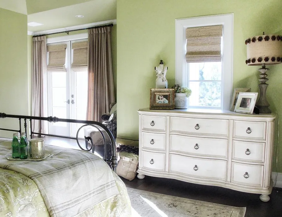
When thinking about complementary shades, Hearts of Palm pairs beautifully with whites, particularly a soft white like White Dove. It also works harmoniously with cooler tones, so if you’re considering an accent wall or trim, look at colors like Sherwin-Williams Sea Salt or Benjamin Moore Soft Fern for a cohesive and sophisticated look.
In terms of decor styles, Hearts of Palm is incredibly versatile. It fits beautifully in coastal and tropical designs, enhancing the natural elements of your space. Its warm, muted tone can also ground a modern farmhouse aesthetic, providing a perfect contrast to the rustic, airy qualities often found in such designs. If you’re an eclectic or bohemian decorator, this color can serve as a wonderful canvas for layering patterns and textures, inviting creativity and individuality into your home.
If you’re still uncertain whether Hearts of Palm is the right choice for your project, consider the mood you want to cultivate. This color exudes calmness and warmth, making it suitable for spaces where you relax, recharge, or gather with loved ones. Its inviting nature encourages connection and comfort, transforming your home into a sanctuary.
As you embark on your painting journey with Hearts of Palm, don’t forget to test the color in your space. Observe it at different times of the day and see how it interacts with your existing decor and lighting. This step is crucial to ensure that you’re making a choice that truly enhances your environment.
Ultimately, Hearts of Palm is more than just a color; it’s a way to bring a sense of peace and nature into your home. Whether you choose to use it as a soft backdrop or a more prominent feature, it carries a warmth that invites you to unwind and enjoy your surroundings. So go ahead, grab that paintbrush, and let this beautiful hue transform your space into a tranquil retreat. You won’t regret it.
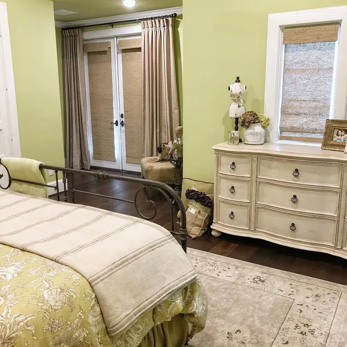
Real Room Photo of Hearts of Palm SW 6415
Undertones of Hearts of Palm ?
The undertones of Hearts of Palm are a key aspect of its character, leaning towards Yellow. These subtle underlying hues are what give the color its depth and complexity. For example, a gray with a blue undertone will feel cooler and more modern, while one with a brown undertone will feel warmer and more traditional. It’s essential to test this paint in your home and observe it next to your existing furniture, flooring, and decor to see how these undertones interact and reveal themselves throughout the day.
HEX value: #CFC291
RGB code: 207, 194, 145
Is Hearts of Palm Cool or Warm?
This color is warm, thanks to its yellow undertones, which add a cozy richness. While it does have green elements, the warmth makes it feel welcoming rather than stark or overly cool. It’s a perfect choice for creating a relaxed atmosphere in your home.
Understanding Color Properties and Interior Design Tips
Hue refers to a specific position on the color wheel, measured in degrees from 0 to 360. Each degree represents a different pure color:
- 0° represents red
- 120° represents green
- 240° represents blue
Saturation describes the intensity or purity of a color and is expressed as a percentage:
- At 0%, the color appears completely desaturated—essentially a shade of gray
- At 100%, the color is at its most vivid and vibrant
Lightness indicates how light or dark a color is, also expressed as a percentage:
- 0% lightness results in black
- 100% lightness results in white
Using Warm Colors in Interior Design
Warm hues—such as reds, oranges, yellows, warm beiges, and greiges—are excellent choices for creating inviting and energetic spaces. These colors are particularly well-suited for:
- Kitchens, living rooms, and bathrooms, where warmth enhances comfort and sociability
- Large rooms, where warm tones can help reduce the sense of emptiness and make the space feel more intimate
For example:
- Warm beige shades provide a cozy, inviting atmosphere, ideal for living rooms, bedrooms, and hallways.
- Warm greige (a mix of beige and gray) offers the warmth of beige with the modern appeal of gray, making it a versatile backdrop for dining areas, bedrooms, and living spaces.
However, be mindful when using warm light tones in rooms with limited natural light. These shades may appear muted or even take on an unpleasant yellowish tint. To avoid a dull or flat appearance:
- Add depth by incorporating richer tones like deep greens, charcoal, or chocolate brown
- Use textured elements such as curtains, rugs, or cushions to bring dimension to the space
Pro Tip: Achieving Harmony with Warm and Cool Color Balance
To create a well-balanced and visually interesting interior, mix warm and cool tones strategically. This contrast adds depth and harmony to your design.
- If your walls feature warm hues, introduce cool-colored accents such as blue or green furniture, artwork, or accessories to create contrast.
- For a polished look, consider using a complementary color scheme, which pairs colors opposite each other on the color wheel (e.g., red with green, orange with blue).
This thoughtful mix not only enhances visual appeal but also creates a space that feels both dynamic and cohesive.
Light Temperature Affects on Hearts of Palm
Natural Light
Natural daylight changes in color temperature as the sun moves across the sky. At sunrise and sunset, the light tends to have a warm, golden tone with a color temperature around 2000 Kelvin (K). As the day progresses and the sun rises higher, the light becomes cooler and more neutral. Around midday, especially when the sky is clear, natural light typically reaches its peak brightness and shifts to a cooler tone, ranging from 5500 to 6500 Kelvin. This midday light is close to what we perceive as pure white or daylight-balanced light.
These shifts in natural light can significantly influence how colors appear in a space, which is why designers often consider both the time of day and the orientation of windows when planning interior color schemes.
Artificial Light
When choosing artificial lighting, pay close attention to the color temperature, measured in Kelvin (K). This determines how warm or cool the light will appear. Lower temperatures, around 2700K, give off a warm, yellow glow often used in living rooms or bedrooms. Higher temperatures, above 5000K, create a cool, bluish light similar to daylight, commonly used in kitchens, offices, or task areas.
Use the slider to see how lighting temperature can affect the appearance of a surface or color throughout a space.


4800K
LRV of Hearts of Palm
The Light Reflectance Value (LRV) of Hearts of Palm is 75%, which places it in the Light category. This means it Reflects a high amount of light. Understanding a paint’s LRV is crucial for predicting how it will look in your space. A higher LRV indicates a lighter color that reflects more light, making rooms feel larger and brighter. A lower LRV signifies a darker color that absorbs more light, creating a cozier, more intimate atmosphere. Always consider the natural and artificial lighting in your room when selecting a paint color based on its LRV.
Detailed Review of Hearts of Palm
Additional Paint Characteristics
Ideal Rooms
Bathroom, Bedroom, Dining Room, Home Office, Kitchen, Living Room
Decor Styles
Bohemian, Coastal, Eclectic, Modern Farmhouse, Tropical
Coverage
Good (1–2 Coats), Touch-Up Friendly
Ease of Application
Beginner Friendly, Brush Smooth, Roller-Ready
Washability
Scrubbable, Washable
VOC Level
Eco-Certified, Low VOC
Best Use
Accent Wall, Interior Walls, Trim
Room Suitability
Bathroom, Bedroom, Dining Room, Home Office, Kitchen, Living Room
Tone Tag
Earthy, Muted, Warm
Finish Type
Eggshell, Matte, Satin
Paint Performance
Easy Touch-Up, Low Odor, Scuff Resistant
Use Cases
Best for Modern Farmhouse, Best for Rentals, Classic Favorite
Mood
Calm, Grounding, Inviting
Trim Pairing
Complements Cool Trim, Pairs with White Dove
Hearts of Palm is a versatile paint that strikes a beautiful balance between sophistication and warmth. It works wonderfully in both bright and dimly lit spaces, adapting its character to the amount of natural light available. In daylight, it radiates a soft greenish hue, creating an airy feel, while in the evening, it takes on a more subdued, cozy vibe. This adaptability makes it a fantastic choice for various rooms, from tranquil bedrooms to lively kitchens. Its application is smooth and flexible, allowing for easy touch-ups and ensuring a consistent finish. Overall, this color is a delightful option for anyone looking to enhance their home’s aesthetic with a serene touch.
Pros & Cons of SW 6415 Hearts of Palm
Pros
Cons
Colors that go with Sherwin Williams Hearts of Palm
FAQ on SW 6415 Hearts of Palm
What types of finishes are available for Hearts of Palm?
Hearts of Palm comes in several finishes, including Matte, Eggshell, and Satin. Each finish offers a different level of sheen, allowing you to choose one that best suits your space and personal aesthetic. Matte finishes provide a soft, non-reflective look, while Eggshell and Satin offer a bit more sheen, making them easier to clean, especially in high-traffic areas.
Is Hearts of Palm suitable for bathrooms and kitchens?
Yes, Hearts of Palm is a great choice for bathrooms and kitchens! Its scrubbable and washable properties make it perfect for areas that may encounter moisture and require regular cleaning. Just be sure to choose a finish like Eggshell or Satin for these spaces to ensure durability and ease of maintenance.
Comparisons Hearts of Palm with other colors
Hearts of Palm SW 6415 vs Blonde SW 6128
| Attribute | Hearts of Palm SW 6415 | Blonde SW 6128 |
|---|---|---|
| Color Name | Hearts of Palm SW 6415 | Blonde SW 6128 |
| Color | ||
| Hue | Yellow | Yellow |
| Brightness | Medium | Medium |
| RGB | 207, 194, 145 | 220, 189, 146 |
| LRV | 75% | 64% |
| Finish Type | Eggshell, Matte, Satin | Eggshell, Satin |
| Finish Options | Eggshell, Matte, Satin | Eggshell, Matte, Satin |
| Ideal Rooms | Bathroom, Bedroom, Dining Room, Home Office, Kitchen, Living Room | Bedroom, Dining Room, Home Office, Kitchen, Living Room |
| Decor Styles | Bohemian, Coastal, Eclectic, Modern Farmhouse, Tropical | Bohemian, Coastal, Modern Farmhouse, Scandinavian, Transitional |
| Coverage | Good (1–2 Coats), Touch-Up Friendly | Good (1–2 Coats), Touch-Up Friendly |
| Ease of Application | Beginner Friendly, Brush Smooth, Roller-Ready | Beginner Friendly, Fast-Drying, Roller-Ready |
| Washability | Scrubbable, Washable | Highly Washable, Washable |
| Room Suitability | Bathroom, Bedroom, Dining Room, Home Office, Kitchen, Living Room | Bedroom, Dining Room, Home Office, Kitchen, Living Room, Nursery |
| Tone | Earthy, Muted, Warm | Earthy, Neutral, Warm |
| Paint Performance | Easy Touch-Up, Low Odor, Scuff Resistant | Easy Touch-Up, Fade Resistant, Low Odor, Quick Drying |
Hearts of Palm SW 6415 vs Ruskin Room Green SW 0042
| Attribute | Hearts of Palm SW 6415 | Ruskin Room Green SW 0042 |
|---|---|---|
| Color Name | Hearts of Palm SW 6415 | Ruskin Room Green SW 0042 |
| Color | ||
| Hue | Yellow | Yellow |
| Brightness | Medium | Medium |
| RGB | 207, 194, 145 | 172, 161, 125 |
| LRV | 75% | 24% |
| Finish Type | Eggshell, Matte, Satin | Eggshell, Matte |
| Finish Options | Eggshell, Matte, Satin | Eggshell, Flat, Matte, Satin |
| Ideal Rooms | Bathroom, Bedroom, Dining Room, Home Office, Kitchen, Living Room | Bedroom, Dining Room, Home Office, Living Room |
| Decor Styles | Bohemian, Coastal, Eclectic, Modern Farmhouse, Tropical | Farmhouse, Modern, Rustic, Traditional |
| Coverage | Good (1–2 Coats), Touch-Up Friendly | Good (1–2 Coats), Touch-Up Friendly |
| Ease of Application | Beginner Friendly, Brush Smooth, Roller-Ready | Beginner Friendly, Brush Smooth, Roller-Ready |
| Washability | Scrubbable, Washable | Scrubbable, Washable |
| Room Suitability | Bathroom, Bedroom, Dining Room, Home Office, Kitchen, Living Room | Bedroom, Dining Room, Home Office, Living Room |
| Tone | Earthy, Muted, Warm | Earthy, Muted, Warm |
| Paint Performance | Easy Touch-Up, Low Odor, Scuff Resistant | Easy Touch-Up, High Coverage, Low Odor |
Hearts of Palm SW 6415 vs Bosc Pear SW 6390
| Attribute | Hearts of Palm SW 6415 | Bosc Pear SW 6390 |
|---|---|---|
| Color Name | Hearts of Palm SW 6415 | Bosc Pear SW 6390 |
| Color | ||
| Hue | Yellow | Yellow |
| Brightness | Medium | Medium |
| RGB | 207, 194, 145 | 192, 144, 86 |
| LRV | 75% | 60% |
| Finish Type | Eggshell, Matte, Satin | Satin, Semi-Gloss |
| Finish Options | Eggshell, Matte, Satin | Flat, Satin, Semi-Gloss |
| Ideal Rooms | Bathroom, Bedroom, Dining Room, Home Office, Kitchen, Living Room | Bedroom, Dining Room, Home Office, Kitchen, Living Room |
| Decor Styles | Bohemian, Coastal, Eclectic, Modern Farmhouse, Tropical | Modern Farmhouse, Rustic, Traditional, Transitional |
| Coverage | Good (1–2 Coats), Touch-Up Friendly | Good (1–2 Coats) |
| Ease of Application | Beginner Friendly, Brush Smooth, Roller-Ready | Beginner Friendly, Brush Smooth, Fast-Drying, Roller-Ready |
| Washability | Scrubbable, Washable | Highly Washable, Washable |
| Room Suitability | Bathroom, Bedroom, Dining Room, Home Office, Kitchen, Living Room | Bedroom, Dining Room, Home Office, Living Room |
| Tone | Earthy, Muted, Warm | Balanced, Earthy, Warm |
| Paint Performance | Easy Touch-Up, Low Odor, Scuff Resistant | Easy Touch-Up, High Coverage, Low Odor, Quick Drying |
Hearts of Palm SW 6415 vs Lemongrass SW 7732
| Attribute | Hearts of Palm SW 6415 | Lemongrass SW 7732 |
|---|---|---|
| Color Name | Hearts of Palm SW 6415 | Lemongrass SW 7732 |
| Color | ||
| Hue | Yellow | Yellow |
| Brightness | Medium | Medium |
| RGB | 207, 194, 145 | 200, 189, 152 |
| LRV | 75% | 48% |
| Finish Type | Eggshell, Matte, Satin | Eggshell, Matte, Satin |
| Finish Options | Eggshell, Matte, Satin | Eggshell, Matte, Satin |
| Ideal Rooms | Bathroom, Bedroom, Dining Room, Home Office, Kitchen, Living Room | Bathroom, Bedroom, Home Office, Kitchen, Living Room, Nursery |
| Decor Styles | Bohemian, Coastal, Eclectic, Modern Farmhouse, Tropical | Bohemian, Modern Farmhouse, Scandinavian, Transitional |
| Coverage | Good (1–2 Coats), Touch-Up Friendly | Good (1–2 Coats) |
| Ease of Application | Beginner Friendly, Brush Smooth, Roller-Ready | Beginner Friendly, Brush Smooth, Roller-Ready |
| Washability | Scrubbable, Washable | Highly Washable, Washable |
| Room Suitability | Bathroom, Bedroom, Dining Room, Home Office, Kitchen, Living Room | Bedroom, Home Office, Kitchen, Living Room |
| Tone | Earthy, Muted, Warm | Earthy, Muted, Warm |
| Paint Performance | Easy Touch-Up, Low Odor, Scuff Resistant | Easy Touch-Up, Low Odor, Scuff Resistant |
Hearts of Palm SW 6415 vs Garden Sage SW 7736
| Attribute | Hearts of Palm SW 6415 | Garden Sage SW 7736 |
|---|---|---|
| Color Name | Hearts of Palm SW 6415 | Garden Sage SW 7736 |
| Color | ||
| Hue | Yellow | Yellow |
| Brightness | Medium | Medium |
| RGB | 207, 194, 145 | 177, 165, 132 |
| LRV | 75% | 24% |
| Finish Type | Eggshell, Matte, Satin | Eggshell, Matte, Satin |
| Finish Options | Eggshell, Matte, Satin | Eggshell, Matte, Satin |
| Ideal Rooms | Bathroom, Bedroom, Dining Room, Home Office, Kitchen, Living Room | Bedroom, Dining Room, Home Office, Kitchen, Living Room, Nursery |
| Decor Styles | Bohemian, Coastal, Eclectic, Modern Farmhouse, Tropical | Bohemian, Cottage, Minimalist, Modern Farmhouse, Traditional |
| Coverage | Good (1–2 Coats), Touch-Up Friendly | Good (1–2 Coats), Touch-Up Friendly |
| Ease of Application | Beginner Friendly, Brush Smooth, Roller-Ready | Beginner Friendly, Brush Smooth, Roller-Ready |
| Washability | Scrubbable, Washable | Highly Washable, Washable |
| Room Suitability | Bathroom, Bedroom, Dining Room, Home Office, Kitchen, Living Room | Bedroom, Dining Room, Home Office, Kitchen, Living Room |
| Tone | Earthy, Muted, Warm | Balanced, Earthy, Muted, Warm |
| Paint Performance | Easy Touch-Up, Low Odor, Scuff Resistant | Easy Touch-Up, Fade Resistant, Low Odor |
Hearts of Palm SW 6415 vs Tassel SW 6369
| Attribute | Hearts of Palm SW 6415 | Tassel SW 6369 |
|---|---|---|
| Color Name | Hearts of Palm SW 6415 | Tassel SW 6369 |
| Color | ||
| Hue | Yellow | Yellow |
| Brightness | Medium | Medium |
| RGB | 207, 194, 145 | 198, 136, 74 |
| LRV | 75% | 45% |
| Finish Type | Eggshell, Matte, Satin | Matte, Satin |
| Finish Options | Eggshell, Matte, Satin | Matte, Satin, Semi-Gloss |
| Ideal Rooms | Bathroom, Bedroom, Dining Room, Home Office, Kitchen, Living Room | Bedroom, Dining Room, Home Office, Living Room |
| Decor Styles | Bohemian, Coastal, Eclectic, Modern Farmhouse, Tropical | Bohemian, Modern Farmhouse, Rustic, Transitional |
| Coverage | Good (1–2 Coats), Touch-Up Friendly | Good (1–2 Coats) |
| Ease of Application | Beginner Friendly, Brush Smooth, Roller-Ready | Beginner Friendly, Brush Smooth, Fast-Drying, Roller-Ready |
| Washability | Scrubbable, Washable | Scrubbable, Washable |
| Room Suitability | Bathroom, Bedroom, Dining Room, Home Office, Kitchen, Living Room | Bedroom, Dining Room, Home Office, Living Room |
| Tone | Earthy, Muted, Warm | Earthy, Inviting, Warm |
| Paint Performance | Easy Touch-Up, Low Odor, Scuff Resistant | Easy Touch-Up, Low Odor, Quick Drying, Scuff Resistant |
Hearts of Palm SW 6415 vs Sunflower SW 6678
| Attribute | Hearts of Palm SW 6415 | Sunflower SW 6678 |
|---|---|---|
| Color Name | Hearts of Palm SW 6415 | Sunflower SW 6678 |
| Color | ||
| Hue | Yellow | Yellow |
| Brightness | Medium | Medium |
| RGB | 207, 194, 145 | 227, 154, 51 |
| LRV | 75% | 75% |
| Finish Type | Eggshell, Matte, Satin | Eggshell, Satin |
| Finish Options | Eggshell, Matte, Satin | Eggshell, Satin, Semi-Gloss |
| Ideal Rooms | Bathroom, Bedroom, Dining Room, Home Office, Kitchen, Living Room | Dining Room, Entryway, Home Office, Kitchen, Living Room |
| Decor Styles | Bohemian, Coastal, Eclectic, Modern Farmhouse, Tropical | Bohemian, Eclectic, Modern Farmhouse, Traditional |
| Coverage | Good (1–2 Coats), Touch-Up Friendly | Good (1–2 Coats), Touch-Up Friendly |
| Ease of Application | Beginner Friendly, Brush Smooth, Roller-Ready | Beginner Friendly, Brush Smooth, Fast-Drying, Roller-Ready |
| Washability | Scrubbable, Washable | Highly Washable, Washable |
| Room Suitability | Bathroom, Bedroom, Dining Room, Home Office, Kitchen, Living Room | Dining Room, Entryway, Kitchen, Living Room |
| Tone | Earthy, Muted, Warm | Bold, Earthy, Warm |
| Paint Performance | Easy Touch-Up, Low Odor, Scuff Resistant | Fade Resistant, High Coverage, Quick Drying |
Hearts of Palm SW 6415 vs Bee's Wax SW 7682
| Attribute | Hearts of Palm SW 6415 | Bee's Wax SW 7682 |
|---|---|---|
| Color Name | Hearts of Palm SW 6415 | Bee's Wax SW 7682 |
| Color | ||
| Hue | Yellow | Yellow |
| Brightness | Medium | Medium |
| RGB | 207, 194, 145 | 234, 191, 134 |
| LRV | 75% | 50% |
| Finish Type | Eggshell, Matte, Satin | Eggshell, Matte, Satin |
| Finish Options | Eggshell, Matte, Satin | Eggshell, Matte, Satin |
| Ideal Rooms | Bathroom, Bedroom, Dining Room, Home Office, Kitchen, Living Room | Bedroom, Dining Room, Entryway, Kitchen, Living Room |
| Decor Styles | Bohemian, Coastal, Eclectic, Modern Farmhouse, Tropical | Bohemian, Coastal, Modern Farmhouse, Traditional, Transitional |
| Coverage | Good (1–2 Coats), Touch-Up Friendly | Good (1–2 Coats), Touch-Up Friendly |
| Ease of Application | Beginner Friendly, Brush Smooth, Roller-Ready | Beginner Friendly, Brush Smooth, Roller-Ready |
| Washability | Scrubbable, Washable | Washable, Wipeable |
| Room Suitability | Bathroom, Bedroom, Dining Room, Home Office, Kitchen, Living Room | Bedroom, Dining Room, Entryway, Kitchen, Living Room |
| Tone | Earthy, Muted, Warm | Creamy, Earthy, Warm |
| Paint Performance | Easy Touch-Up, Low Odor, Scuff Resistant | Easy Touch-Up, High Coverage, Low Odor |
Hearts of Palm SW 6415 vs Downing Straw SW 2813
| Attribute | Hearts of Palm SW 6415 | Downing Straw SW 2813 |
|---|---|---|
| Color Name | Hearts of Palm SW 6415 | Downing Straw SW 2813 |
| Color | ||
| Hue | Yellow | Yellow |
| Brightness | Medium | Medium |
| RGB | 207, 194, 145 | 202, 171, 125 |
| LRV | 75% | 48% |
| Finish Type | Eggshell, Matte, Satin | Eggshell, Matte, Satin |
| Finish Options | Eggshell, Matte, Satin | Eggshell, Matte, Satin |
| Ideal Rooms | Bathroom, Bedroom, Dining Room, Home Office, Kitchen, Living Room | Bedroom, Dining Room, Home Office, Kitchen, Living Room |
| Decor Styles | Bohemian, Coastal, Eclectic, Modern Farmhouse, Tropical | Contemporary, Eclectic, Modern Farmhouse, Rustic, Traditional |
| Coverage | Good (1–2 Coats), Touch-Up Friendly | Good (1–2 Coats), Touch-Up Friendly |
| Ease of Application | Beginner Friendly, Brush Smooth, Roller-Ready | Beginner Friendly, Brush Smooth, Roller-Ready |
| Washability | Scrubbable, Washable | Washable, Wipeable |
| Room Suitability | Bathroom, Bedroom, Dining Room, Home Office, Kitchen, Living Room | Bedroom, Dining Room, Home Office, Kitchen, Living Room |
| Tone | Earthy, Muted, Warm | Earthy, Muted, Warm |
| Paint Performance | Easy Touch-Up, Low Odor, Scuff Resistant | Easy Touch-Up, High Coverage, Low Odor |
Hearts of Palm SW 6415 vs Peristyle Brass SW 0043
| Attribute | Hearts of Palm SW 6415 | Peristyle Brass SW 0043 |
|---|---|---|
| Color Name | Hearts of Palm SW 6415 | Peristyle Brass SW 0043 |
| Color | ||
| Hue | Yellow | Yellow |
| Brightness | Medium | Medium |
| RGB | 207, 194, 145 | 174, 144, 94 |
| LRV | 75% | 50% |
| Finish Type | Eggshell, Matte, Satin | Matte, Satin, Semi-Gloss |
| Finish Options | Eggshell, Matte, Satin | Matte, Satin, Semi-Gloss |
| Ideal Rooms | Bathroom, Bedroom, Dining Room, Home Office, Kitchen, Living Room | Bedroom, Dining Room, Entryway, Home Office, Living Room |
| Decor Styles | Bohemian, Coastal, Eclectic, Modern Farmhouse, Tropical | Modern Farmhouse, Rustic, Traditional, Transitional |
| Coverage | Good (1–2 Coats), Touch-Up Friendly | Good (1–2 Coats), Touch-Up Friendly |
| Ease of Application | Beginner Friendly, Brush Smooth, Roller-Ready | Beginner Friendly, Brush Smooth, Fast-Drying, Roller-Ready |
| Washability | Scrubbable, Washable | Washable, Wipeable |
| Room Suitability | Bathroom, Bedroom, Dining Room, Home Office, Kitchen, Living Room | Bedroom, Dining Room, Hallway, Living Room |
| Tone | Earthy, Muted, Warm | Earthy, Muted, Warm |
| Paint Performance | Easy Touch-Up, Low Odor, Scuff Resistant | Easy Touch-Up, High Coverage, Low Odor, Quick Drying |
Official Page of Sherwin Williams Hearts of Palm SW 6415