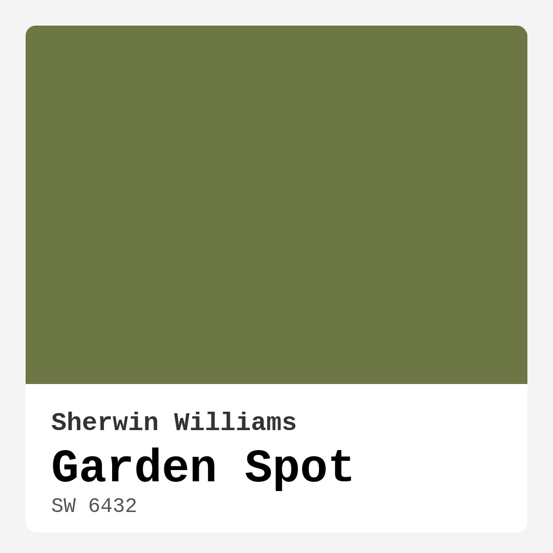
Color Preview & Key Details
| HEX Code | #6D7645 |
| RGB | 109, 118, 69 |
| LRV | 48% |
| Undertone | Yellow |
| Finish Options | Eggshell, Matte, Satin |
Imagine stepping into a space that instantly makes you feel at ease, where the stresses of the day seem to melt away, and a sense of calm washes over you. That’s the magic of color, and one shade that truly embodies this feeling is Sherwin Williams’ Garden Spot (SW 6432).
Garden Spot is a serene, earthy green that beautifully channels the tranquility of nature. Its muted tone is reminiscent of a lush garden, creating an inviting backdrop that can transform any room into a calming oasis. Picture this color gracing your living room walls or wrapping around your cozy bedroom; it’s all about bringing warmth and vitality into your home.
As an experienced home designer, I can tell you that choosing the right paint color is more than just picking a shade; it’s about creating an atmosphere. Garden Spot’s warm undertones—with a hint of yellow—make it incredibly versatile, allowing it to slip seamlessly into various decor styles, from modern farmhouse to bohemian chic. Imagine how it would look paired with natural wood accents or soft textiles; the possibilities are endless.
Now, let’s talk about the practicalities. Garden Spot has a Light Reflectance Value (LRV) of 48%, placing it in the medium range. This means it reflects a moderate amount of light, striking a perfect balance between feeling cozy and open. It’s essential to consider how light interacts with this color. In bright, natural light, Garden Spot appears vibrant and fresh, while under artificial lighting, it takes on a softer, more muted vibe. This adaptability makes it a smart choice for various spaces, whether you’re looking to breathe life into a home office or create a relaxing retreat in your bedroom.
When it comes to application, Garden Spot is incredibly user-friendly. You won’t need to be a seasoned pro to get a fantastic finish; it’s beginner-friendly, with a smooth application whether you’re using a brush or roller. Most projects will require just one or two coats for excellent coverage, and touch-ups are a breeze. Plus, it’s low VOC, which is a huge bonus for maintaining a healthier indoor environment. You can confidently refresh your space without worrying about strong odors or harmful emissions.
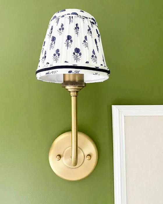
One of the standout features of Garden Spot is its versatility. Not only does it work well in various styles, but it also suits a variety of rooms. From living rooms and bedrooms to kitchens and dining areas, this color can harmonize with your home’s existing elements. Pair it with white trim like Benjamin Moore’s White Dove for a fresh and polished look, or go for brass fixtures to add a touch of warmth and sophistication.
However, every color has its quirks. Garden Spot can appear darker in smaller or enclosed spaces, so if you’re considering it for a cozy nook, make sure there’s adequate natural light. You might want to opt for brighter bulbs to help this shade pop. Additionally, while it pairs beautifully with numerous colors, it’s not ideal for very bold themes; if you’re looking to make a dramatic statement, this might not be your go-to.
So, how do you incorporate Garden Spot into your home? Start with an accent wall in your living room. It can create a focal point without overwhelming the space. You could also use it to refresh furniture pieces for a cohesive look throughout your home. Imagine a serene oasis where every element feels connected through this gorgeous hue.
If you’re leaning towards a lighter shade, consider SW 6433, which complements Garden Spot beautifully. For those wanting something darker, shades like SW 6551 or SW 6827 can add depth and drama. Remember, testing paint in your space is crucial. Observe how the undertones reveal themselves throughout the day—what feels warm in the morning light might shift into a more muted tone by evening.
The earthy, muted vibe of Garden Spot evokes a sense of calm and grounding. It’s perfect for spaces meant for relaxation, such as bedrooms or reading nooks. You can even use it in a nursery, creating a soothing environment for little ones. Visualize a cozy corner with soft furnishings, natural wood accents, and the gentle embrace of this lovely green on the walls. It’s a recipe for comfort and style.
While planning your decor, think about how Garden Spot interacts with your existing furniture and decor. Warm, earthy tones can enhance the richness of the color. For instance, pairing it with natural textures like jute or woven baskets can elevate the overall aesthetic, making your space feel inviting and grounded.
In conclusion, Garden Spot by Sherwin Williams is more than just a color; it’s a mood, a feeling, and a transformative element in your home. Its warm, inviting hue is perfect for various decor styles, making it an incredibly versatile choice. Whether you’re refreshing a single room or reimagining your entire home, this shade could be the secret ingredient you’ve been searching for.
Colors have the power to change how we feel in our spaces, and with Garden Spot, you’re investing in a beautiful, calming atmosphere that you’ll love coming home to every day. So, grab that paintbrush, dive into a little DIY, and let Garden Spot bring the tranquility of nature right into your living space. Happy decorating!

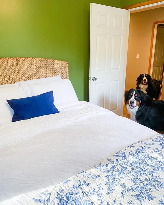
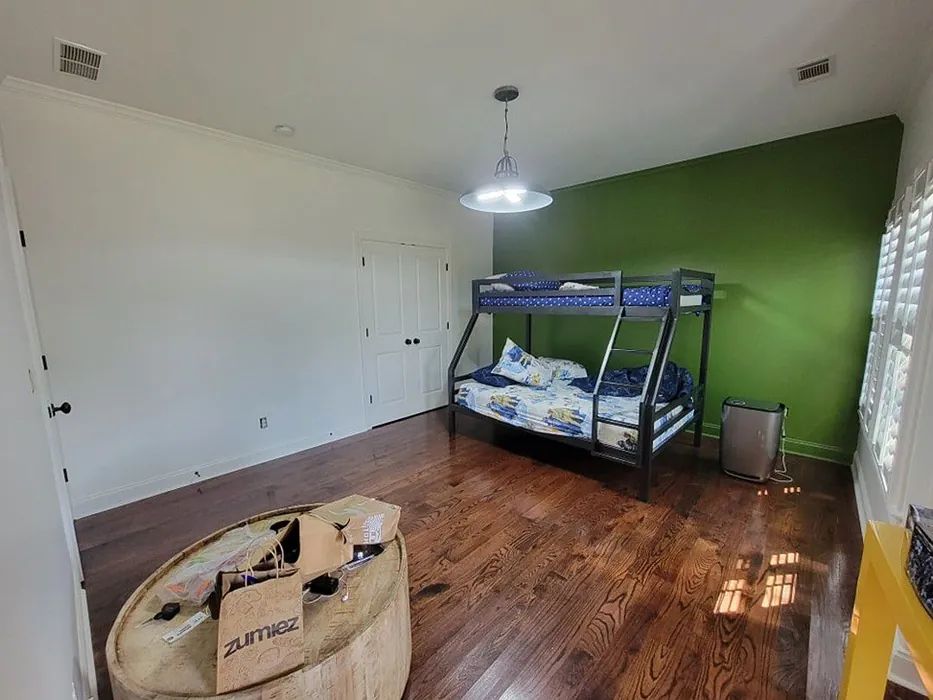
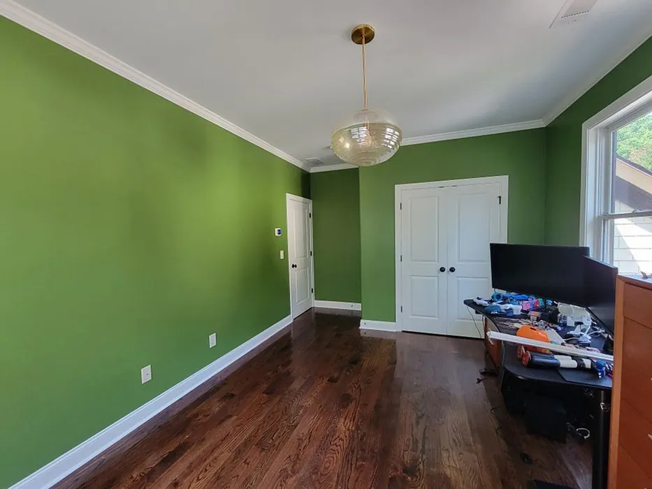
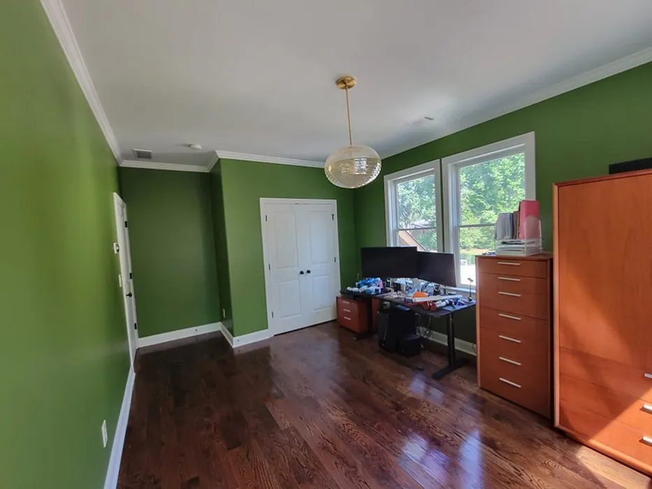
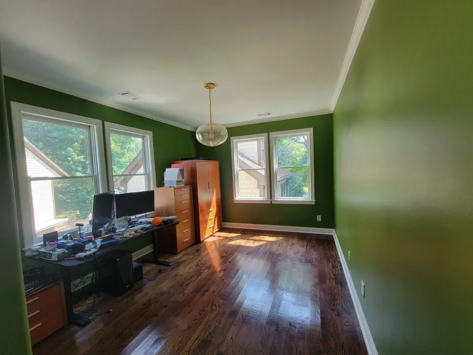
Real Room Photo of Garden Spot SW 6432

Undertones of Garden Spot ?
The undertones of Garden Spot are a key aspect of its character, leaning towards Yellow. These subtle underlying hues are what give the color its depth and complexity. For example, a gray with a blue undertone will feel cooler and more modern, while one with a brown undertone will feel warmer and more traditional. It’s essential to test this paint in your home and observe it next to your existing furniture, flooring, and decor to see how these undertones interact and reveal themselves throughout the day.
HEX value: #6D7645
RGB code: 109, 118, 69
Is Garden Spot Cool or Warm?
Garden Spot is considered a warm paint color. This characteristic plays a huge role in the overall feel of a room. Warm colors, like this one, tend to create a cozy, inviting, and energetic atmosphere, making them great for social spaces like living rooms and dining rooms. In contrast, cool colors often evoke a sense of calm and serenity, which is why they are popular in bedrooms and bathrooms. The warmth of Garden Spot means it will pair beautifully with corresponding decor elements.
Understanding Color Properties and Interior Design Tips
Hue refers to a specific position on the color wheel, measured in degrees from 0 to 360. Each degree represents a different pure color:
- 0° represents red
- 120° represents green
- 240° represents blue
Saturation describes the intensity or purity of a color and is expressed as a percentage:
- At 0%, the color appears completely desaturated—essentially a shade of gray
- At 100%, the color is at its most vivid and vibrant
Lightness indicates how light or dark a color is, also expressed as a percentage:
- 0% lightness results in black
- 100% lightness results in white
Using Warm Colors in Interior Design
Warm hues—such as reds, oranges, yellows, warm beiges, and greiges—are excellent choices for creating inviting and energetic spaces. These colors are particularly well-suited for:
- Kitchens, living rooms, and bathrooms, where warmth enhances comfort and sociability
- Large rooms, where warm tones can help reduce the sense of emptiness and make the space feel more intimate
For example:
- Warm beige shades provide a cozy, inviting atmosphere, ideal for living rooms, bedrooms, and hallways.
- Warm greige (a mix of beige and gray) offers the warmth of beige with the modern appeal of gray, making it a versatile backdrop for dining areas, bedrooms, and living spaces.
However, be mindful when using warm light tones in rooms with limited natural light. These shades may appear muted or even take on an unpleasant yellowish tint. To avoid a dull or flat appearance:
- Add depth by incorporating richer tones like deep greens, charcoal, or chocolate brown
- Use textured elements such as curtains, rugs, or cushions to bring dimension to the space
Pro Tip: Achieving Harmony with Warm and Cool Color Balance
To create a well-balanced and visually interesting interior, mix warm and cool tones strategically. This contrast adds depth and harmony to your design.
- If your walls feature warm hues, introduce cool-colored accents such as blue or green furniture, artwork, or accessories to create contrast.
- For a polished look, consider using a complementary color scheme, which pairs colors opposite each other on the color wheel (e.g., red with green, orange with blue).
This thoughtful mix not only enhances visual appeal but also creates a space that feels both dynamic and cohesive.
Light Temperature Affects on Garden Spot
Natural Light
Natural daylight changes in color temperature as the sun moves across the sky. At sunrise and sunset, the light tends to have a warm, golden tone with a color temperature around 2000 Kelvin (K). As the day progresses and the sun rises higher, the light becomes cooler and more neutral. Around midday, especially when the sky is clear, natural light typically reaches its peak brightness and shifts to a cooler tone, ranging from 5500 to 6500 Kelvin. This midday light is close to what we perceive as pure white or daylight-balanced light.
These shifts in natural light can significantly influence how colors appear in a space, which is why designers often consider both the time of day and the orientation of windows when planning interior color schemes.
Artificial Light
When choosing artificial lighting, pay close attention to the color temperature, measured in Kelvin (K). This determines how warm or cool the light will appear. Lower temperatures, around 2700K, give off a warm, yellow glow often used in living rooms or bedrooms. Higher temperatures, above 5000K, create a cool, bluish light similar to daylight, commonly used in kitchens, offices, or task areas.
Use the slider to see how lighting temperature can affect the appearance of a surface or color throughout a space.


4800K
LRV of Garden Spot
The Light Reflectance Value (LRV) of Garden Spot is 48%, which places it in the Medium category. This means it Reflects a moderate amount of light. Understanding a paint’s LRV is crucial for predicting how it will look in your space. A higher LRV indicates a lighter color that reflects more light, making rooms feel larger and brighter. A lower LRV signifies a darker color that absorbs more light, creating a cozier, more intimate atmosphere. Always consider the natural and artificial lighting in your room when selecting a paint color based on its LRV.
Detailed Review of Garden Spot
Additional Paint Characteristics
Ideal Rooms
Bedroom, Dining Room, Home Office, Kitchen, Living Room, Nursery
Decor Styles
Bohemian, Contemporary, Modern Farmhouse, Rustic, Traditional
Coverage
Good (1–2 Coats), Touch-Up Friendly
Ease of Application
Beginner Friendly, Brush Smooth, Fast-Drying, Roller-Ready
Washability
Washable, Wipeable
VOC Level
Low VOC
Best Use
Accent Wall, Furniture, Interior Walls
Room Suitability
Bedroom, Dining Room, Home Office, Kitchen, Living Room
Tone Tag
Balanced, Earthy, Muted
Finish Type
Eggshell, Satin
Paint Performance
Easy Touch-Up, Fade Resistant, Low Odor, Quick Drying, Scuff Resistant
Use Cases
Best for Low Light Rooms, Best for Modern Farmhouse, Best for Small Spaces
Mood
Calm, Grounding, Inviting
Trim Pairing
Complements Brass Fixtures, Pairs with White Dove
Garden Spot is truly a versatile color that effortlessly complements various decor styles. Its soft green base brings a sense of calm, making it perfect for spaces meant for relaxation, like bedrooms and living rooms. I found that this shade works particularly well in rooms with ample natural light, as it enhances the overall brightness while maintaining a grounded feel. The application process is straightforward, ensuring an even finish whether you’re using a brush or roller. Just remember, for the best results, you might want to apply two coats. Overall, Garden Spot is an excellent choice for anyone looking to infuse their space with a touch of nature while maintaining a stylish edge.
Pros & Cons of SW 6432 Garden Spot
Pros
Cons
Colors that go with Sherwin Williams Garden Spot
FAQ on SW 6432 Garden Spot
What type of finish is best for Garden Spot?
For Garden Spot, an eggshell or satin finish is highly recommended. These finishes not only enhance the color’s depth but also provide a subtle sheen that adds dimension to your walls. If you’re looking for a more matte look, that’s also an option, but keep in mind that it may require more maintenance over time, especially in high-traffic areas.
Can Garden Spot be used in small spaces?
Absolutely! Garden Spot can work well in small spaces, but it’s essential to pair it with good lighting. In smaller rooms, it may appear darker than intended, so ensure there’s adequate natural light or use brighter bulbs to help it pop. Additionally, consider using lighter decor accents to balance the space and keep it feeling airy.
Comparisons Garden Spot with other colors
Garden Spot SW 6432 vs Dried Thyme SW 6186
| Attribute | Garden Spot SW 6432 | Dried Thyme SW 6186 |
|---|---|---|
| Color Name | Garden Spot SW 6432 | Dried Thyme SW 6186 |
| Color | ||
| Hue | Green | Green |
| Brightness | Dark | Dark |
| RGB | 109, 118, 69 | 123, 128, 112 |
| LRV | 48% | 24% |
| Finish Type | Eggshell, Satin | Eggshell, Satin |
| Finish Options | Eggshell, Matte, Satin | Eggshell, Matte, Satin |
| Ideal Rooms | Bedroom, Dining Room, Home Office, Kitchen, Living Room, Nursery | Bathroom, Bedroom, Dining Room, Entryway, Home Office, Kitchen, Living Room |
| Decor Styles | Bohemian, Contemporary, Modern Farmhouse, Rustic, Traditional | Bohemian, Industrial, Minimalist, Modern Farmhouse, Rustic |
| Coverage | Good (1–2 Coats), Touch-Up Friendly | Good (1–2 Coats), Touch-Up Friendly |
| Ease of Application | Beginner Friendly, Brush Smooth, Fast-Drying, Roller-Ready | Beginner Friendly, Brush Smooth, Roller-Ready |
| Washability | Washable, Wipeable | Washable, Wipeable |
| Room Suitability | Bedroom, Dining Room, Home Office, Kitchen, Living Room | Bathroom, Bedroom, Dining Room, Home Office, Kitchen, Living Room |
| Tone | Balanced, Earthy, Muted | Cool, Earthy, Muted |
| Paint Performance | Easy Touch-Up, Fade Resistant, Low Odor, Quick Drying, Scuff Resistant | Easy Touch-Up, Low Odor, Scuff Resistant |
Garden Spot SW 6432 vs Retreat SW 6207
| Attribute | Garden Spot SW 6432 | Retreat SW 6207 |
|---|---|---|
| Color Name | Garden Spot SW 6432 | Retreat SW 6207 |
| Color | ||
| Hue | Green | Green |
| Brightness | Dark | Dark |
| RGB | 109, 118, 69 | 122, 128, 118 |
| LRV | 48% | 30% |
| Finish Type | Eggshell, Satin | Eggshell, Matte, Satin |
| Finish Options | Eggshell, Matte, Satin | Eggshell, Matte, Satin |
| Ideal Rooms | Bedroom, Dining Room, Home Office, Kitchen, Living Room, Nursery | Bathroom, Bedroom, Home Office, Kitchen, Living Room |
| Decor Styles | Bohemian, Contemporary, Modern Farmhouse, Rustic, Traditional | Minimalist, Modern, Rustic, Transitional |
| Coverage | Good (1–2 Coats), Touch-Up Friendly | Good (1–2 Coats), Touch-Up Friendly |
| Ease of Application | Beginner Friendly, Brush Smooth, Fast-Drying, Roller-Ready | Beginner Friendly, Brush Smooth, Roller-Ready |
| Washability | Washable, Wipeable | Washable, Wipeable |
| Room Suitability | Bedroom, Dining Room, Home Office, Kitchen, Living Room | Bathroom, Bedroom, Home Office, Living Room |
| Tone | Balanced, Earthy, Muted | Cool, Earthy, Muted |
| Paint Performance | Easy Touch-Up, Fade Resistant, Low Odor, Quick Drying, Scuff Resistant | Easy Touch-Up, Low Odor, Scuff Resistant |
Garden Spot SW 6432 vs Rosemary SW 6187
| Attribute | Garden Spot SW 6432 | Rosemary SW 6187 |
|---|---|---|
| Color Name | Garden Spot SW 6432 | Rosemary SW 6187 |
| Color | ||
| Hue | Green | Green |
| Brightness | Dark | Dark |
| RGB | 109, 118, 69 | 100, 105, 92 |
| LRV | 48% | 45% |
| Finish Type | Eggshell, Satin | Eggshell, Matte, Satin |
| Finish Options | Eggshell, Matte, Satin | Eggshell, Matte, Satin |
| Ideal Rooms | Bedroom, Dining Room, Home Office, Kitchen, Living Room, Nursery | Bedroom, Dining Room, Hallway, Home Office, Living Room |
| Decor Styles | Bohemian, Contemporary, Modern Farmhouse, Rustic, Traditional | Bohemian, Coastal, Modern Farmhouse, Rustic |
| Coverage | Good (1–2 Coats), Touch-Up Friendly | Good (1–2 Coats), Touch-Up Friendly |
| Ease of Application | Beginner Friendly, Brush Smooth, Fast-Drying, Roller-Ready | Beginner Friendly, Brush Smooth, Roller-Ready |
| Washability | Washable, Wipeable | Washable, Wipeable |
| Room Suitability | Bedroom, Dining Room, Home Office, Kitchen, Living Room | Bedroom, Dining Room, Home Office, Living Room |
| Tone | Balanced, Earthy, Muted | Earthy, Muted, Warm |
| Paint Performance | Easy Touch-Up, Fade Resistant, Low Odor, Quick Drying, Scuff Resistant | Fade Resistant, Low Odor, Quick Drying, Stain Resistant |
Garden Spot SW 6432 vs Basil SW 6194
| Attribute | Garden Spot SW 6432 | Basil SW 6194 |
|---|---|---|
| Color Name | Garden Spot SW 6432 | Basil SW 6194 |
| Color | ||
| Hue | Green | Green |
| Brightness | Dark | Dark |
| RGB | 109, 118, 69 | 98, 110, 96 |
| LRV | 48% | 12% |
| Finish Type | Eggshell, Satin | Eggshell, Matte, Satin |
| Finish Options | Eggshell, Matte, Satin | Eggshell, Matte, Satin |
| Ideal Rooms | Bedroom, Dining Room, Home Office, Kitchen, Living Room, Nursery | Bathroom, Bedroom, Dining Room, Home Office, Kitchen, Living Room |
| Decor Styles | Bohemian, Contemporary, Modern Farmhouse, Rustic, Traditional | Bohemian, Contemporary, Modern Farmhouse, Rustic, Transitional |
| Coverage | Good (1–2 Coats), Touch-Up Friendly | Good (1–2 Coats), Touch-Up Friendly |
| Ease of Application | Beginner Friendly, Brush Smooth, Fast-Drying, Roller-Ready | Beginner Friendly, Brush Smooth, Fast-Drying, Roller-Ready |
| Washability | Washable, Wipeable | Washable, Wipeable |
| Room Suitability | Bedroom, Dining Room, Home Office, Kitchen, Living Room | Bathroom, Bedroom, Dining Room, Kitchen, Living Room |
| Tone | Balanced, Earthy, Muted | Earthy, Muted, Warm |
| Paint Performance | Easy Touch-Up, Fade Resistant, Low Odor, Quick Drying, Scuff Resistant | Easy Touch-Up, Low Odor, Quick Drying |
Garden Spot SW 6432 vs Artichoke SW 6179
| Attribute | Garden Spot SW 6432 | Artichoke SW 6179 |
|---|---|---|
| Color Name | Garden Spot SW 6432 | Artichoke SW 6179 |
| Color | ||
| Hue | Green | Green |
| Brightness | Dark | Dark |
| RGB | 109, 118, 69 | 127, 130, 102 |
| LRV | 48% | 24% |
| Finish Type | Eggshell, Satin | Eggshell, Matte, Satin |
| Finish Options | Eggshell, Matte, Satin | Eggshell, Matte, Satin |
| Ideal Rooms | Bedroom, Dining Room, Home Office, Kitchen, Living Room, Nursery | Bedroom, Dining Room, Home Office, Living Room |
| Decor Styles | Bohemian, Contemporary, Modern Farmhouse, Rustic, Traditional | Eclectic, Modern Farmhouse, Rustic, Transitional |
| Coverage | Good (1–2 Coats), Touch-Up Friendly | Good (1–2 Coats), Touch-Up Friendly |
| Ease of Application | Beginner Friendly, Brush Smooth, Fast-Drying, Roller-Ready | Beginner Friendly, Brush Smooth, Fast-Drying, Roller-Ready |
| Washability | Washable, Wipeable | Washable, Wipeable |
| Room Suitability | Bedroom, Dining Room, Home Office, Kitchen, Living Room | Bedroom, Dining Room, Home Office, Living Room |
| Tone | Balanced, Earthy, Muted | Earthy, Muted, Warm |
| Paint Performance | Easy Touch-Up, Fade Resistant, Low Odor, Quick Drying, Scuff Resistant | Easy Touch-Up, High Coverage, Low Odor |
Garden Spot SW 6432 vs Shade-Grown SW 6188
| Attribute | Garden Spot SW 6432 | Shade-Grown SW 6188 |
|---|---|---|
| Color Name | Garden Spot SW 6432 | Shade-Grown SW 6188 |
| Color | ||
| Hue | Green | Green |
| Brightness | Dark | Dark |
| RGB | 109, 118, 69 | 78, 81, 71 |
| LRV | 48% | 24% |
| Finish Type | Eggshell, Satin | Eggshell, Satin |
| Finish Options | Eggshell, Matte, Satin | Eggshell, Flat, Satin |
| Ideal Rooms | Bedroom, Dining Room, Home Office, Kitchen, Living Room, Nursery | Bedroom, Dining Room, Home Office, Living Room |
| Decor Styles | Bohemian, Contemporary, Modern Farmhouse, Rustic, Traditional | Bohemian, Modern, Rustic, Scandinavian |
| Coverage | Good (1–2 Coats), Touch-Up Friendly | Good (1–2 Coats), Touch-Up Friendly |
| Ease of Application | Beginner Friendly, Brush Smooth, Fast-Drying, Roller-Ready | Beginner Friendly, Brush Smooth, Fast-Drying, Roller-Ready |
| Washability | Washable, Wipeable | Highly Washable, Washable |
| Room Suitability | Bedroom, Dining Room, Home Office, Kitchen, Living Room | Bedroom, Dining Room, Home Office, Living Room |
| Tone | Balanced, Earthy, Muted | Deep, Earthy, Muted |
| Paint Performance | Easy Touch-Up, Fade Resistant, Low Odor, Quick Drying, Scuff Resistant | Easy Touch-Up, High Coverage, Low Odor, Scuff Resistant |
Garden Spot SW 6432 vs Foxhall Green SW 9184
| Attribute | Garden Spot SW 6432 | Foxhall Green SW 9184 |
|---|---|---|
| Color Name | Garden Spot SW 6432 | Foxhall Green SW 9184 |
| Color | ||
| Hue | Green | Green |
| Brightness | Dark | Dark |
| RGB | 109, 118, 69 | 69, 75, 64 |
| LRV | 48% | 12% |
| Finish Type | Eggshell, Satin | Eggshell, Matte, Satin |
| Finish Options | Eggshell, Matte, Satin | Eggshell, Matte, Satin |
| Ideal Rooms | Bedroom, Dining Room, Home Office, Kitchen, Living Room, Nursery | Bedroom, Dining Room, Home Office, Living Room |
| Decor Styles | Bohemian, Contemporary, Modern Farmhouse, Rustic, Traditional | Contemporary, Modern Farmhouse, Rustic, Traditional |
| Coverage | Good (1–2 Coats), Touch-Up Friendly | Good (1–2 Coats), Touch-Up Friendly |
| Ease of Application | Beginner Friendly, Brush Smooth, Fast-Drying, Roller-Ready | Beginner Friendly, Brush Smooth, Fast-Drying, Roller-Ready |
| Washability | Washable, Wipeable | Washable, Wipeable |
| Room Suitability | Bedroom, Dining Room, Home Office, Kitchen, Living Room | Bedroom, Dining Room, Home Office, Living Room |
| Tone | Balanced, Earthy, Muted | Balanced, Deep, Earthy, Muted |
| Paint Performance | Easy Touch-Up, Fade Resistant, Low Odor, Quick Drying, Scuff Resistant | Easy Touch-Up, Fade Resistant, Low Odor, Quick Drying |
Garden Spot SW 6432 vs Pewter Green SW 6208
| Attribute | Garden Spot SW 6432 | Pewter Green SW 6208 |
|---|---|---|
| Color Name | Garden Spot SW 6432 | Pewter Green SW 6208 |
| Color | ||
| Hue | Green | Green |
| Brightness | Dark | Dark |
| RGB | 109, 118, 69 | 94, 98, 89 |
| LRV | 48% | 24% |
| Finish Type | Eggshell, Satin | Eggshell, Matte, Satin |
| Finish Options | Eggshell, Matte, Satin | Eggshell, Matte, Satin |
| Ideal Rooms | Bedroom, Dining Room, Home Office, Kitchen, Living Room, Nursery | Bedroom, Dining Room, Entryway, Home Office, Living Room |
| Decor Styles | Bohemian, Contemporary, Modern Farmhouse, Rustic, Traditional | Contemporary, Modern Farmhouse, Rustic, Scandinavian, Traditional |
| Coverage | Good (1–2 Coats), Touch-Up Friendly | Good (1–2 Coats), Touch-Up Friendly |
| Ease of Application | Beginner Friendly, Brush Smooth, Fast-Drying, Roller-Ready | Beginner Friendly, Brush Smooth, Fast-Drying, Roller-Ready |
| Washability | Washable, Wipeable | Highly Washable, Washable, Wipeable |
| Room Suitability | Bedroom, Dining Room, Home Office, Kitchen, Living Room | Bathroom, Bedroom, Dining Room, Kitchen, Living Room |
| Tone | Balanced, Earthy, Muted | Balanced, Cool, Earthy, Muted |
| Paint Performance | Easy Touch-Up, Fade Resistant, Low Odor, Quick Drying, Scuff Resistant | Easy Touch-Up, Fade Resistant, Low Odor, Quick Drying |
Garden Spot SW 6432 vs Rookwood Dark Green SW 2816
| Attribute | Garden Spot SW 6432 | Rookwood Dark Green SW 2816 |
|---|---|---|
| Color Name | Garden Spot SW 6432 | Rookwood Dark Green SW 2816 |
| Color | ||
| Hue | Green | Green |
| Brightness | Dark | Dark |
| RGB | 109, 118, 69 | 86, 92, 74 |
| LRV | 48% | 6% |
| Finish Type | Eggshell, Satin | Eggshell, Matte, Satin |
| Finish Options | Eggshell, Matte, Satin | Eggshell, Matte, Satin |
| Ideal Rooms | Bedroom, Dining Room, Home Office, Kitchen, Living Room, Nursery | Bedroom, Dining Room, Home Office, Kitchen, Living Room |
| Decor Styles | Bohemian, Contemporary, Modern Farmhouse, Rustic, Traditional | Contemporary, Modern Farmhouse, Rustic, Traditional |
| Coverage | Good (1–2 Coats), Touch-Up Friendly | Good (1–2 Coats), Touch-Up Friendly |
| Ease of Application | Beginner Friendly, Brush Smooth, Fast-Drying, Roller-Ready | Beginner Friendly, Brush Smooth, Roller-Ready |
| Washability | Washable, Wipeable | Washable, Wipeable |
| Room Suitability | Bedroom, Dining Room, Home Office, Kitchen, Living Room | Bedroom, Dining Room, Home Office, Living Room |
| Tone | Balanced, Earthy, Muted | Deep, Earthy, Warm |
| Paint Performance | Easy Touch-Up, Fade Resistant, Low Odor, Quick Drying, Scuff Resistant | Easy Touch-Up, High Coverage, Low Odor, Scuff Resistant |
Garden Spot SW 6432 vs Ripe Olive SW 6209
| Attribute | Garden Spot SW 6432 | Ripe Olive SW 6209 |
|---|---|---|
| Color Name | Garden Spot SW 6432 | Ripe Olive SW 6209 |
| Color | ||
| Hue | Green | Green |
| Brightness | Dark | Dark |
| RGB | 109, 118, 69 | 68, 72, 61 |
| LRV | 48% | 15% |
| Finish Type | Eggshell, Satin | Eggshell, Matte |
| Finish Options | Eggshell, Matte, Satin | Eggshell, Matte, Satin |
| Ideal Rooms | Bedroom, Dining Room, Home Office, Kitchen, Living Room, Nursery | Bedroom, Dining Room, Home Office, Living Room |
| Decor Styles | Bohemian, Contemporary, Modern Farmhouse, Rustic, Traditional | Bohemian, Industrial, Modern Farmhouse, Rustic |
| Coverage | Good (1–2 Coats), Touch-Up Friendly | Good (1–2 Coats) |
| Ease of Application | Beginner Friendly, Brush Smooth, Fast-Drying, Roller-Ready | Beginner Friendly, Brush Smooth, Roller-Ready |
| Washability | Washable, Wipeable | Highly Washable, Washable |
| Room Suitability | Bedroom, Dining Room, Home Office, Kitchen, Living Room | Bedroom, Dining Room, Home Office, Living Room |
| Tone | Balanced, Earthy, Muted | Deep, Earthy, Muted |
| Paint Performance | Easy Touch-Up, Fade Resistant, Low Odor, Quick Drying, Scuff Resistant | Easy Touch-Up, High Coverage, Low Odor |
Official Page of Sherwin Williams Garden Spot SW 6432