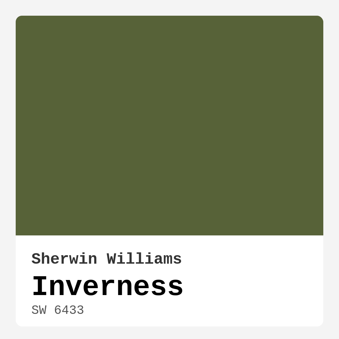
Color Preview & Key Details
| HEX Code | #576238 |
| RGB | 87, 98, 56 |
| LRV | 24% |
| Undertone | Green |
| Finish Options | Eggshell, Matte, Satin |
Imagine walking into a room that instantly envelops you in warmth and tranquility. That’s the magic of choosing the right paint color. Today, let’s chat about a captivating hue that brings the beauty of nature indoors: Sherwin Williams’ Inverness (SW 6433). This rich, earthy green is more than just a color; it’s an invitation to create a serene retreat within your home.
Inverness is steeped in the deep, lush tones you often find in a forest or a tranquil garden. With an LRV (Light Reflectance Value) of 24%, it falls into the Medium Dark category, meaning it reflects very little light. This quality makes it wonderfully cozy, but it also means you need to consider your lighting when using it. In rooms with ample natural light, Inverness can appear vibrant and inviting, while in dimmer spaces, it takes on a deeper, more sophisticated tone. This variability is part of what makes it so alluring.
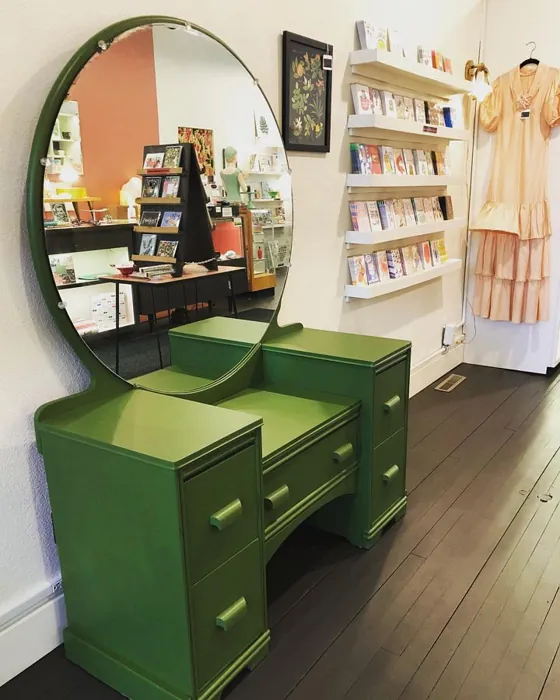
One of the most appealing aspects of Inverness is its versatility. Whether you’re looking to create a modern farmhouse aesthetic or want to incorporate rustic elements into your decor, this paint color fits seamlessly into various styles. Picture it adorning the walls of a cozy living room, or as a backdrop for a bohemian-inspired bedroom. It pairs beautifully with lighter trims, like White Dove, and complements warm wood tones that are popular in both traditional and contemporary settings.
Choosing the right paint finish can enhance the beauty of Inverness even further. Available in matte, eggshell, and satin, this hue allows you to customize the look to fit your personal style. A matte finish can create a soft, sophisticated atmosphere, while an eggshell or satin finish brings a bit of sheen that can help reflect light and make the color feel even more dynamic.
Now, you might be wondering about the practicalities of working with this stunning shade. The good news is that Inverness is beginner-friendly. Its smooth application makes it easy to achieve a beautiful finish, whether you’re using a brush or a roller. It offers good coverage with just 1-2 coats, meaning you won’t have to fuss over multiple applications to achieve the depth you desire. Plus, it’s touch-up friendly, which is a blessing for maintaining that fresh look over time.
Let’s talk about the mood this color can create. Inverness speaks to comfort and calm, making it ideal for bedrooms, home offices, and dining rooms where you want to foster connection and relaxation. Its warm undertones promote a cozy atmosphere, perfect for spaces where you unwind or gather with loved ones.
However, like any paint color, Inverness does come with a few considerations. While it can work in smaller rooms, it’s crucial to balance its richness with lighter accents. Think about incorporating lighter furniture or decor elements that can help reflect light and prevent the space from feeling too dark. Mirrors can also do wonders in creating an illusion of depth and brightness.
Another key point to keep in mind is the color’s compatibility with your existing decor. The undertones of Inverness lean toward green, which gives it depth and complexity. This means it can beautifully complement a variety of colors, from muted neutrals to brighter colors. Pairing it with shades like SW 6551 or SW 6558 can create a harmonious palette that feels cohesive and thoughtfully curated.
When it comes to durability, Inverness shines as well. Its washable finish means you can easily maintain its beauty, making it suitable for high-traffic areas like living rooms or dining spaces. Just a simple wipe down can keep it looking fresh and vibrant. Its low VOC level ensures that you can paint with peace of mind, knowing you’re choosing a healthier option for your home environment.
Lastly, as with any paint color, it’s always best to test it out in your space. The way colors react to light and surrounding elements can vary significantly from room to room. Grab a sample and paint a small area to see how it interacts with your furniture, flooring, and lighting throughout the day. This step can save you from potential regret down the line and ensure that you love the final result.
In summary, Sherwin Williams’ Inverness is a captivating, warm, and earthy green that can transform any space into a cozy haven. Its versatility across decor styles, ease of application, and durability make it a fantastic choice for a variety of rooms. By thoughtfully considering your lighting, decor elements, and finish options, you can create an inviting atmosphere that reflects your personal style. So, are you ready to embrace the serene beauty of Inverness in your home? Your next cozy retreat is just a paint can away!
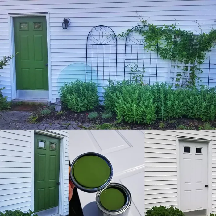
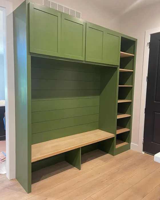
Real Room Photo of Inverness SW 6433

Undertones of Inverness ?
The undertones of Inverness are a key aspect of its character, leaning towards Green. These subtle underlying hues are what give the color its depth and complexity. For example, a gray with a blue undertone will feel cooler and more modern, while one with a brown undertone will feel warmer and more traditional. It’s essential to test this paint in your home and observe it next to your existing furniture, flooring, and decor to see how these undertones interact and reveal themselves throughout the day.
HEX value: #576238
RGB code: 87, 98, 56
Is Inverness Cool or Warm?
Inverness is considered a warm paint color. This characteristic plays a huge role in the overall feel of a room. Warm colors, like this one, tend to create a cozy, inviting, and energetic atmosphere, making them great for social spaces like living rooms and dining rooms. In contrast, cool colors often evoke a sense of calm and serenity, which is why they are popular in bedrooms and bathrooms. The warmth of Inverness means it will pair beautifully with corresponding decor elements.
Understanding Color Properties and Interior Design Tips
Hue refers to a specific position on the color wheel, measured in degrees from 0 to 360. Each degree represents a different pure color:
- 0° represents red
- 120° represents green
- 240° represents blue
Saturation describes the intensity or purity of a color and is expressed as a percentage:
- At 0%, the color appears completely desaturated—essentially a shade of gray
- At 100%, the color is at its most vivid and vibrant
Lightness indicates how light or dark a color is, also expressed as a percentage:
- 0% lightness results in black
- 100% lightness results in white
Using Warm Colors in Interior Design
Warm hues—such as reds, oranges, yellows, warm beiges, and greiges—are excellent choices for creating inviting and energetic spaces. These colors are particularly well-suited for:
- Kitchens, living rooms, and bathrooms, where warmth enhances comfort and sociability
- Large rooms, where warm tones can help reduce the sense of emptiness and make the space feel more intimate
For example:
- Warm beige shades provide a cozy, inviting atmosphere, ideal for living rooms, bedrooms, and hallways.
- Warm greige (a mix of beige and gray) offers the warmth of beige with the modern appeal of gray, making it a versatile backdrop for dining areas, bedrooms, and living spaces.
However, be mindful when using warm light tones in rooms with limited natural light. These shades may appear muted or even take on an unpleasant yellowish tint. To avoid a dull or flat appearance:
- Add depth by incorporating richer tones like deep greens, charcoal, or chocolate brown
- Use textured elements such as curtains, rugs, or cushions to bring dimension to the space
Pro Tip: Achieving Harmony with Warm and Cool Color Balance
To create a well-balanced and visually interesting interior, mix warm and cool tones strategically. This contrast adds depth and harmony to your design.
- If your walls feature warm hues, introduce cool-colored accents such as blue or green furniture, artwork, or accessories to create contrast.
- For a polished look, consider using a complementary color scheme, which pairs colors opposite each other on the color wheel (e.g., red with green, orange with blue).
This thoughtful mix not only enhances visual appeal but also creates a space that feels both dynamic and cohesive.
Light Temperature Affects on Inverness
Natural Light
Natural daylight changes in color temperature as the sun moves across the sky. At sunrise and sunset, the light tends to have a warm, golden tone with a color temperature around 2000 Kelvin (K). As the day progresses and the sun rises higher, the light becomes cooler and more neutral. Around midday, especially when the sky is clear, natural light typically reaches its peak brightness and shifts to a cooler tone, ranging from 5500 to 6500 Kelvin. This midday light is close to what we perceive as pure white or daylight-balanced light.
These shifts in natural light can significantly influence how colors appear in a space, which is why designers often consider both the time of day and the orientation of windows when planning interior color schemes.
Artificial Light
When choosing artificial lighting, pay close attention to the color temperature, measured in Kelvin (K). This determines how warm or cool the light will appear. Lower temperatures, around 2700K, give off a warm, yellow glow often used in living rooms or bedrooms. Higher temperatures, above 5000K, create a cool, bluish light similar to daylight, commonly used in kitchens, offices, or task areas.
Use the slider to see how lighting temperature can affect the appearance of a surface or color throughout a space.


4800K
LRV of Inverness
The Light Reflectance Value (LRV) of Inverness is 24%, which places it in the Medium Dark category. This means it reflects very little light. Understanding a paint’s LRV is crucial for predicting how it will look in your space. A higher LRV indicates a lighter color that reflects more light, making rooms feel larger and brighter. A lower LRV signifies a darker color that absorbs more light, creating a cozier, more intimate atmosphere. Always consider the natural and artificial lighting in your room when selecting a paint color based on its LRV.
Detailed Review of Inverness
Additional Paint Characteristics
Ideal Rooms
Bedroom, Dining Room, Home Office, Living Room
Decor Styles
Bohemian, Modern Farmhouse, Rustic, Traditional
Coverage
Good (1–2 Coats), Touch-Up Friendly
Ease of Application
Beginner Friendly, Brush Smooth, Roller-Ready
Washability
Highly Washable, Washable
VOC Level
Low VOC
Best Use
Accent Wall, Interior Walls, Trim
Room Suitability
Bedroom, Dining Room, Home Office, Living Room
Tone Tag
Deep, Earthy, Warm
Finish Type
Eggshell, Matte, Satin
Paint Performance
Easy Touch-Up, High Coverage, Low Odor, Scuff Resistant
Use Cases
Best for Modern Farmhouse, Best for Open Concept, Best for Small Spaces
Mood
Cozy, Inviting, Restful
Trim Pairing
Complements Warm Trim, Matches Pure White, Pairs with White Dove
Inverness stands out with its unique blend of rich green tones that can breathe life into any room. This paint not only provides a stunning aesthetic but also carries the warmth necessary for a welcoming atmosphere. Whether you’re looking to create an accent wall or paint an entire room, Inverness offers versatile application possibilities. The finish options—matte, eggshell, and satin—allow you to customize the look to fit your personal style. It’s particularly effective in spaces that benefit from a touch of nature, like living rooms and bedrooms, where the color can promote relaxation and comfort. The application process is smooth, and the coverage is commendable, ensuring that you get a beautiful finish with minimal fuss. Plus, it pairs beautifully with various trim colors, enhancing its versatility.
Pros & Cons of SW 6433 Inverness
Pros
Cons
Colors that go with Sherwin Williams Inverness
FAQ on SW 6433 Inverness
Can Inverness be used in small rooms?
Yes, while Inverness is a deeper shade, it can be effectively used in smaller rooms if paired with lighter accents or furnishings. Opting for lighter trim or larger mirrors can help reflect light and balance the richness of the color, making the space feel more open and inviting.
How does Inverness perform in terms of durability?
Inverness is designed with durability in mind, providing a finish that is both washable and resistant to everyday wear. This makes it suitable for high-traffic areas, ensuring that it maintains its beauty over time. Regular cleaning and touch-ups will keep the color looking fresh and vibrant.
Comparisons Inverness with other colors
Inverness SW 6433 vs Dried Thyme SW 6186
| Attribute | Inverness SW 6433 | Dried Thyme SW 6186 |
|---|---|---|
| Color Name | Inverness SW 6433 | Dried Thyme SW 6186 |
| Color | ||
| Hue | Green | Green |
| Brightness | Dark | Dark |
| RGB | 87, 98, 56 | 123, 128, 112 |
| LRV | 24% | 24% |
| Finish Type | Eggshell, Matte, Satin | Eggshell, Satin |
| Finish Options | Eggshell, Matte, Satin | Eggshell, Matte, Satin |
| Ideal Rooms | Bedroom, Dining Room, Home Office, Living Room | Bathroom, Bedroom, Dining Room, Entryway, Home Office, Kitchen, Living Room |
| Decor Styles | Bohemian, Modern Farmhouse, Rustic, Traditional | Bohemian, Industrial, Minimalist, Modern Farmhouse, Rustic |
| Coverage | Good (1–2 Coats), Touch-Up Friendly | Good (1–2 Coats), Touch-Up Friendly |
| Ease of Application | Beginner Friendly, Brush Smooth, Roller-Ready | Beginner Friendly, Brush Smooth, Roller-Ready |
| Washability | Highly Washable, Washable | Washable, Wipeable |
| Room Suitability | Bedroom, Dining Room, Home Office, Living Room | Bathroom, Bedroom, Dining Room, Home Office, Kitchen, Living Room |
| Tone | Deep, Earthy, Warm | Cool, Earthy, Muted |
| Paint Performance | Easy Touch-Up, High Coverage, Low Odor, Scuff Resistant | Easy Touch-Up, Low Odor, Scuff Resistant |
Inverness SW 6433 vs Retreat SW 6207
| Attribute | Inverness SW 6433 | Retreat SW 6207 |
|---|---|---|
| Color Name | Inverness SW 6433 | Retreat SW 6207 |
| Color | ||
| Hue | Green | Green |
| Brightness | Dark | Dark |
| RGB | 87, 98, 56 | 122, 128, 118 |
| LRV | 24% | 30% |
| Finish Type | Eggshell, Matte, Satin | Eggshell, Matte, Satin |
| Finish Options | Eggshell, Matte, Satin | Eggshell, Matte, Satin |
| Ideal Rooms | Bedroom, Dining Room, Home Office, Living Room | Bathroom, Bedroom, Home Office, Kitchen, Living Room |
| Decor Styles | Bohemian, Modern Farmhouse, Rustic, Traditional | Minimalist, Modern, Rustic, Transitional |
| Coverage | Good (1–2 Coats), Touch-Up Friendly | Good (1–2 Coats), Touch-Up Friendly |
| Ease of Application | Beginner Friendly, Brush Smooth, Roller-Ready | Beginner Friendly, Brush Smooth, Roller-Ready |
| Washability | Highly Washable, Washable | Washable, Wipeable |
| Room Suitability | Bedroom, Dining Room, Home Office, Living Room | Bathroom, Bedroom, Home Office, Living Room |
| Tone | Deep, Earthy, Warm | Cool, Earthy, Muted |
| Paint Performance | Easy Touch-Up, High Coverage, Low Odor, Scuff Resistant | Easy Touch-Up, Low Odor, Scuff Resistant |
Inverness SW 6433 vs Rosemary SW 6187
| Attribute | Inverness SW 6433 | Rosemary SW 6187 |
|---|---|---|
| Color Name | Inverness SW 6433 | Rosemary SW 6187 |
| Color | ||
| Hue | Green | Green |
| Brightness | Dark | Dark |
| RGB | 87, 98, 56 | 100, 105, 92 |
| LRV | 24% | 45% |
| Finish Type | Eggshell, Matte, Satin | Eggshell, Matte, Satin |
| Finish Options | Eggshell, Matte, Satin | Eggshell, Matte, Satin |
| Ideal Rooms | Bedroom, Dining Room, Home Office, Living Room | Bedroom, Dining Room, Hallway, Home Office, Living Room |
| Decor Styles | Bohemian, Modern Farmhouse, Rustic, Traditional | Bohemian, Coastal, Modern Farmhouse, Rustic |
| Coverage | Good (1–2 Coats), Touch-Up Friendly | Good (1–2 Coats), Touch-Up Friendly |
| Ease of Application | Beginner Friendly, Brush Smooth, Roller-Ready | Beginner Friendly, Brush Smooth, Roller-Ready |
| Washability | Highly Washable, Washable | Washable, Wipeable |
| Room Suitability | Bedroom, Dining Room, Home Office, Living Room | Bedroom, Dining Room, Home Office, Living Room |
| Tone | Deep, Earthy, Warm | Earthy, Muted, Warm |
| Paint Performance | Easy Touch-Up, High Coverage, Low Odor, Scuff Resistant | Fade Resistant, Low Odor, Quick Drying, Stain Resistant |
Inverness SW 6433 vs Basil SW 6194
| Attribute | Inverness SW 6433 | Basil SW 6194 |
|---|---|---|
| Color Name | Inverness SW 6433 | Basil SW 6194 |
| Color | ||
| Hue | Green | Green |
| Brightness | Dark | Dark |
| RGB | 87, 98, 56 | 98, 110, 96 |
| LRV | 24% | 12% |
| Finish Type | Eggshell, Matte, Satin | Eggshell, Matte, Satin |
| Finish Options | Eggshell, Matte, Satin | Eggshell, Matte, Satin |
| Ideal Rooms | Bedroom, Dining Room, Home Office, Living Room | Bathroom, Bedroom, Dining Room, Home Office, Kitchen, Living Room |
| Decor Styles | Bohemian, Modern Farmhouse, Rustic, Traditional | Bohemian, Contemporary, Modern Farmhouse, Rustic, Transitional |
| Coverage | Good (1–2 Coats), Touch-Up Friendly | Good (1–2 Coats), Touch-Up Friendly |
| Ease of Application | Beginner Friendly, Brush Smooth, Roller-Ready | Beginner Friendly, Brush Smooth, Fast-Drying, Roller-Ready |
| Washability | Highly Washable, Washable | Washable, Wipeable |
| Room Suitability | Bedroom, Dining Room, Home Office, Living Room | Bathroom, Bedroom, Dining Room, Kitchen, Living Room |
| Tone | Deep, Earthy, Warm | Earthy, Muted, Warm |
| Paint Performance | Easy Touch-Up, High Coverage, Low Odor, Scuff Resistant | Easy Touch-Up, Low Odor, Quick Drying |
Inverness SW 6433 vs Artichoke SW 6179
| Attribute | Inverness SW 6433 | Artichoke SW 6179 |
|---|---|---|
| Color Name | Inverness SW 6433 | Artichoke SW 6179 |
| Color | ||
| Hue | Green | Green |
| Brightness | Dark | Dark |
| RGB | 87, 98, 56 | 127, 130, 102 |
| LRV | 24% | 24% |
| Finish Type | Eggshell, Matte, Satin | Eggshell, Matte, Satin |
| Finish Options | Eggshell, Matte, Satin | Eggshell, Matte, Satin |
| Ideal Rooms | Bedroom, Dining Room, Home Office, Living Room | Bedroom, Dining Room, Home Office, Living Room |
| Decor Styles | Bohemian, Modern Farmhouse, Rustic, Traditional | Eclectic, Modern Farmhouse, Rustic, Transitional |
| Coverage | Good (1–2 Coats), Touch-Up Friendly | Good (1–2 Coats), Touch-Up Friendly |
| Ease of Application | Beginner Friendly, Brush Smooth, Roller-Ready | Beginner Friendly, Brush Smooth, Fast-Drying, Roller-Ready |
| Washability | Highly Washable, Washable | Washable, Wipeable |
| Room Suitability | Bedroom, Dining Room, Home Office, Living Room | Bedroom, Dining Room, Home Office, Living Room |
| Tone | Deep, Earthy, Warm | Earthy, Muted, Warm |
| Paint Performance | Easy Touch-Up, High Coverage, Low Odor, Scuff Resistant | Easy Touch-Up, High Coverage, Low Odor |
Inverness SW 6433 vs Shade-Grown SW 6188
| Attribute | Inverness SW 6433 | Shade-Grown SW 6188 |
|---|---|---|
| Color Name | Inverness SW 6433 | Shade-Grown SW 6188 |
| Color | ||
| Hue | Green | Green |
| Brightness | Dark | Dark |
| RGB | 87, 98, 56 | 78, 81, 71 |
| LRV | 24% | 24% |
| Finish Type | Eggshell, Matte, Satin | Eggshell, Satin |
| Finish Options | Eggshell, Matte, Satin | Eggshell, Flat, Satin |
| Ideal Rooms | Bedroom, Dining Room, Home Office, Living Room | Bedroom, Dining Room, Home Office, Living Room |
| Decor Styles | Bohemian, Modern Farmhouse, Rustic, Traditional | Bohemian, Modern, Rustic, Scandinavian |
| Coverage | Good (1–2 Coats), Touch-Up Friendly | Good (1–2 Coats), Touch-Up Friendly |
| Ease of Application | Beginner Friendly, Brush Smooth, Roller-Ready | Beginner Friendly, Brush Smooth, Fast-Drying, Roller-Ready |
| Washability | Highly Washable, Washable | Highly Washable, Washable |
| Room Suitability | Bedroom, Dining Room, Home Office, Living Room | Bedroom, Dining Room, Home Office, Living Room |
| Tone | Deep, Earthy, Warm | Deep, Earthy, Muted |
| Paint Performance | Easy Touch-Up, High Coverage, Low Odor, Scuff Resistant | Easy Touch-Up, High Coverage, Low Odor, Scuff Resistant |
Inverness SW 6433 vs Foxhall Green SW 9184
| Attribute | Inverness SW 6433 | Foxhall Green SW 9184 |
|---|---|---|
| Color Name | Inverness SW 6433 | Foxhall Green SW 9184 |
| Color | ||
| Hue | Green | Green |
| Brightness | Dark | Dark |
| RGB | 87, 98, 56 | 69, 75, 64 |
| LRV | 24% | 12% |
| Finish Type | Eggshell, Matte, Satin | Eggshell, Matte, Satin |
| Finish Options | Eggshell, Matte, Satin | Eggshell, Matte, Satin |
| Ideal Rooms | Bedroom, Dining Room, Home Office, Living Room | Bedroom, Dining Room, Home Office, Living Room |
| Decor Styles | Bohemian, Modern Farmhouse, Rustic, Traditional | Contemporary, Modern Farmhouse, Rustic, Traditional |
| Coverage | Good (1–2 Coats), Touch-Up Friendly | Good (1–2 Coats), Touch-Up Friendly |
| Ease of Application | Beginner Friendly, Brush Smooth, Roller-Ready | Beginner Friendly, Brush Smooth, Fast-Drying, Roller-Ready |
| Washability | Highly Washable, Washable | Washable, Wipeable |
| Room Suitability | Bedroom, Dining Room, Home Office, Living Room | Bedroom, Dining Room, Home Office, Living Room |
| Tone | Deep, Earthy, Warm | Balanced, Deep, Earthy, Muted |
| Paint Performance | Easy Touch-Up, High Coverage, Low Odor, Scuff Resistant | Easy Touch-Up, Fade Resistant, Low Odor, Quick Drying |
Inverness SW 6433 vs Pewter Green SW 6208
| Attribute | Inverness SW 6433 | Pewter Green SW 6208 |
|---|---|---|
| Color Name | Inverness SW 6433 | Pewter Green SW 6208 |
| Color | ||
| Hue | Green | Green |
| Brightness | Dark | Dark |
| RGB | 87, 98, 56 | 94, 98, 89 |
| LRV | 24% | 24% |
| Finish Type | Eggshell, Matte, Satin | Eggshell, Matte, Satin |
| Finish Options | Eggshell, Matte, Satin | Eggshell, Matte, Satin |
| Ideal Rooms | Bedroom, Dining Room, Home Office, Living Room | Bedroom, Dining Room, Entryway, Home Office, Living Room |
| Decor Styles | Bohemian, Modern Farmhouse, Rustic, Traditional | Contemporary, Modern Farmhouse, Rustic, Scandinavian, Traditional |
| Coverage | Good (1–2 Coats), Touch-Up Friendly | Good (1–2 Coats), Touch-Up Friendly |
| Ease of Application | Beginner Friendly, Brush Smooth, Roller-Ready | Beginner Friendly, Brush Smooth, Fast-Drying, Roller-Ready |
| Washability | Highly Washable, Washable | Highly Washable, Washable, Wipeable |
| Room Suitability | Bedroom, Dining Room, Home Office, Living Room | Bathroom, Bedroom, Dining Room, Kitchen, Living Room |
| Tone | Deep, Earthy, Warm | Balanced, Cool, Earthy, Muted |
| Paint Performance | Easy Touch-Up, High Coverage, Low Odor, Scuff Resistant | Easy Touch-Up, Fade Resistant, Low Odor, Quick Drying |
Inverness SW 6433 vs Rookwood Dark Green SW 2816
| Attribute | Inverness SW 6433 | Rookwood Dark Green SW 2816 |
|---|---|---|
| Color Name | Inverness SW 6433 | Rookwood Dark Green SW 2816 |
| Color | ||
| Hue | Green | Green |
| Brightness | Dark | Dark |
| RGB | 87, 98, 56 | 86, 92, 74 |
| LRV | 24% | 6% |
| Finish Type | Eggshell, Matte, Satin | Eggshell, Matte, Satin |
| Finish Options | Eggshell, Matte, Satin | Eggshell, Matte, Satin |
| Ideal Rooms | Bedroom, Dining Room, Home Office, Living Room | Bedroom, Dining Room, Home Office, Kitchen, Living Room |
| Decor Styles | Bohemian, Modern Farmhouse, Rustic, Traditional | Contemporary, Modern Farmhouse, Rustic, Traditional |
| Coverage | Good (1–2 Coats), Touch-Up Friendly | Good (1–2 Coats), Touch-Up Friendly |
| Ease of Application | Beginner Friendly, Brush Smooth, Roller-Ready | Beginner Friendly, Brush Smooth, Roller-Ready |
| Washability | Highly Washable, Washable | Washable, Wipeable |
| Room Suitability | Bedroom, Dining Room, Home Office, Living Room | Bedroom, Dining Room, Home Office, Living Room |
| Tone | Deep, Earthy, Warm | Deep, Earthy, Warm |
| Paint Performance | Easy Touch-Up, High Coverage, Low Odor, Scuff Resistant | Easy Touch-Up, High Coverage, Low Odor, Scuff Resistant |
Inverness SW 6433 vs Ripe Olive SW 6209
| Attribute | Inverness SW 6433 | Ripe Olive SW 6209 |
|---|---|---|
| Color Name | Inverness SW 6433 | Ripe Olive SW 6209 |
| Color | ||
| Hue | Green | Green |
| Brightness | Dark | Dark |
| RGB | 87, 98, 56 | 68, 72, 61 |
| LRV | 24% | 15% |
| Finish Type | Eggshell, Matte, Satin | Eggshell, Matte |
| Finish Options | Eggshell, Matte, Satin | Eggshell, Matte, Satin |
| Ideal Rooms | Bedroom, Dining Room, Home Office, Living Room | Bedroom, Dining Room, Home Office, Living Room |
| Decor Styles | Bohemian, Modern Farmhouse, Rustic, Traditional | Bohemian, Industrial, Modern Farmhouse, Rustic |
| Coverage | Good (1–2 Coats), Touch-Up Friendly | Good (1–2 Coats) |
| Ease of Application | Beginner Friendly, Brush Smooth, Roller-Ready | Beginner Friendly, Brush Smooth, Roller-Ready |
| Washability | Highly Washable, Washable | Highly Washable, Washable |
| Room Suitability | Bedroom, Dining Room, Home Office, Living Room | Bedroom, Dining Room, Home Office, Living Room |
| Tone | Deep, Earthy, Warm | Deep, Earthy, Muted |
| Paint Performance | Easy Touch-Up, High Coverage, Low Odor, Scuff Resistant | Easy Touch-Up, High Coverage, Low Odor |
Official Page of Sherwin Williams Inverness SW 6433