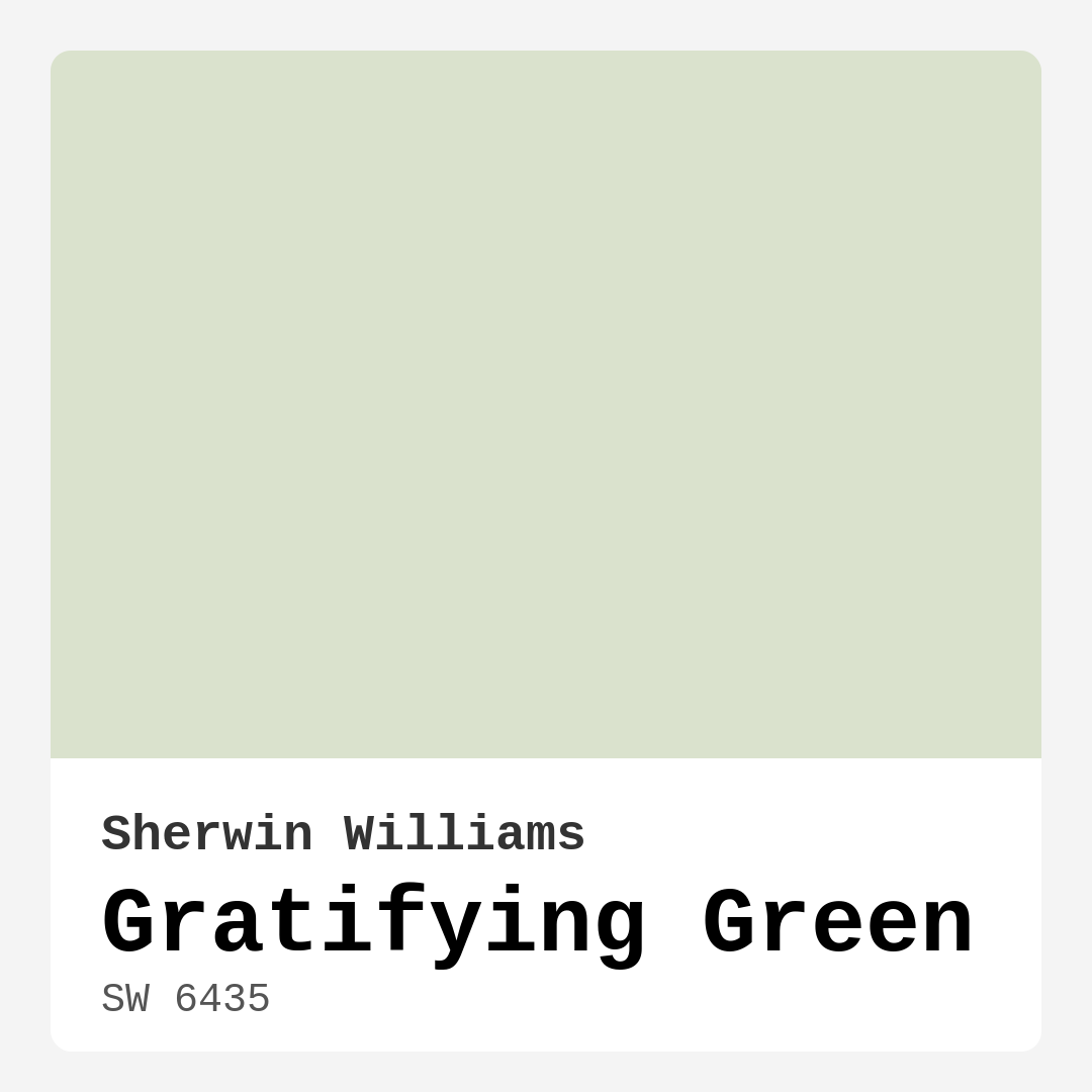
Color Preview & Key Details
| HEX Code | #DAE2CD |
| RGB | 218, 226, 205 |
| LRV | 30% |
| Undertone | Green |
| Finish Options | Eggshell, Matte, Satin |
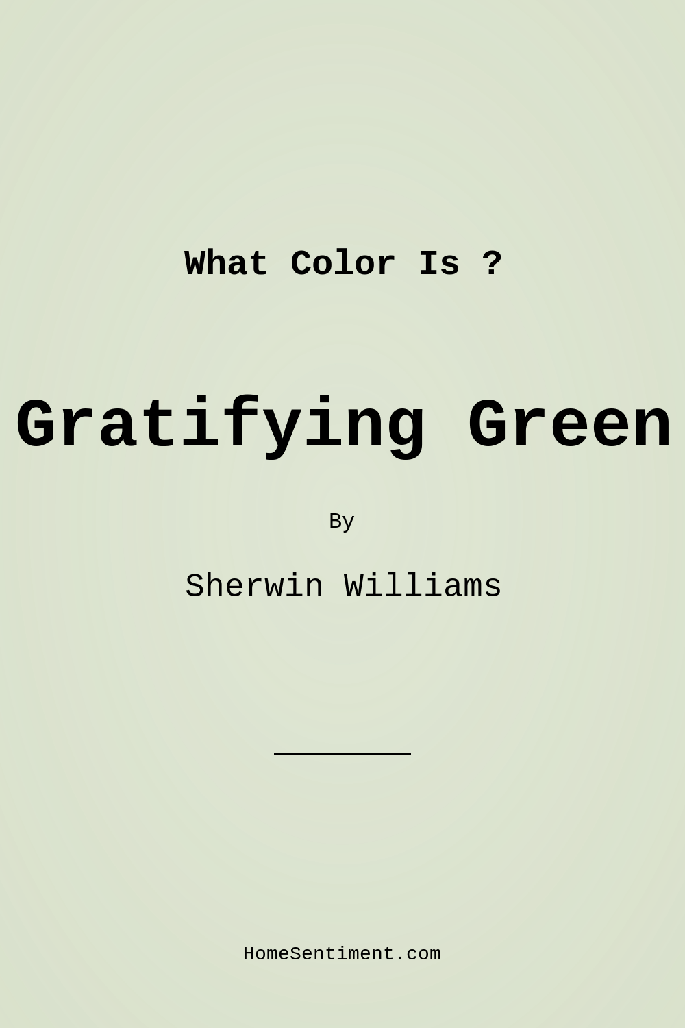
Have you ever walked into a room and felt an immediate sense of calm wash over you? That gentle embrace of tranquility can often be attributed to the color on the walls. Today, let’s explore a particular hue that can transform your space into a serene retreat: Sherwin Williams’ Gratifying Green (SW 6435). This soothing, soft green is a delightful choice that balances warmth and elegance, and I’m excited to help you decide if it’s the right fit for your home.
Gratifying Green is more than just a paint color; it’s an experience. Its muted quality evokes the tranquility of nature, making it an excellent backdrop for various decor styles. Whether you lean towards modern farmhouse, coastal, bohemian, or minimalist aesthetics, this gentle hue can adapt beautifully, enhancing the character of your space without overpowering it. Imagine it as a soft whisper in your living room, a gentle hug in your bedroom, or a calming presence in a home office.
When you look at Gratifying Green, you’ll notice its warm undertones, which give it a unique depth. It’s not a harsh or vibrant green; rather, it offers a sophisticated softness that many traditional greens lack. This makes it a stand-out option for those looking to infuse their home with a touch of nature while maintaining a polished look. Plus, its low VOC levels make it a responsible choice for eco-conscious homeowners concerned about indoor air quality.
The versatility of Gratifying Green shines through its application. It’s easy to work with, gliding on smoothly whether you use a roller or a brush. Most homeowners find that it provides good coverage with just one or two coats, though a second coat is often recommended to achieve full opacity. Its touch-up friendly nature means you won’t have to stress about maintaining that perfect finish. And if you’re like many of my clients who prefer a quick and straightforward painting process, you’ll appreciate how beginner-friendly this paint is.
Now, let’s talk about where Gratifying Green truly excels. Picture it in your living room, wrapping you in warmth as you unwind after a long day. It’s a perfect choice for bedrooms, creating a restful ambiance that invites relaxation. In a nursery, it fosters a calm environment for both parents and little ones. And don’t underestimate its potential in a home office; this color can inspire creativity and focus, making it easier to tackle your to-do list.
In terms of lighting, Gratifying Green has an LRV (Light Reflectance Value) of 30%, categorizing it as a medium dark hue. This means it reflects very little light, so it’s essential to consider the natural and artificial lighting in your space. In bright, natural light, it glows softly, while in dimmer settings, it maintains a soothing presence that sets the mood perfectly for relaxation.
One of the most satisfying aspects of using Gratifying Green is how well it pairs with other colors. For a cohesive look, consider accentuating it with whites or creams, such as White Dove, which can create a fresh contrast. If you’re feeling adventurous, brass fixtures can add a touch of elegance that complements the warm tones of the green. It also pairs beautifully with wooden trim, enhancing the earthy vibe that makes this color so inviting.
If you’re thinking about how to incorporate Gratifying Green into your home, consider creating an accent wall to make a bold statement. This can work particularly well in smaller spaces where you want to create a focal point without overwhelming the room. For larger areas, painting all the walls can envelop you in a serene atmosphere that feels inviting and warm.
Of course, like any color, Gratifying Green does come with its considerations. In poorly lit spaces, it may appear darker than intended, which is something to keep in mind if you’re working with a room that doesn’t receive much natural light. Additionally, while its muted elegance makes it a favorite, it may not be the best fit for high-traffic areas unless you’re willing to protect it with a durable finish.
Choosing the right finish can elevate your experience with this color. Eggshell and satin finishes are particularly popular for their ability to enhance the natural beauty of Gratifying Green while providing a subtle sheen that’s easy to clean. Matte finishes can also work well in low-traffic areas, offering a soft, velvety look that feels cozy and inviting.
As you consider paint colors, remember that it’s crucial to test any shade in your own space. Colors can look vastly different under various lighting conditions and next to your existing decor. Grab some samples of Gratifying Green and apply them on your walls to see how the light interacts with the color throughout the day. You’ll be surprised at how this gentle hue can change its character depending on the time of day and the light conditions.
When it comes to complementary colors, Gratifying Green opens up a palette of options. Lighter shades like SW 6436 or SW 6722 can create a harmonious look, while deeper greens can add depth and intrigue. Pairing it with tones like soft sage or misty green can create a serene, nature-inspired palette that feels fresh and relaxing.
To wrap it up, Gratifying Green by Sherwin Williams is a choice that brings warmth, tranquility, and versatility into your home. Its soft, muted quality makes it an inviting option for a variety of spaces, from living rooms to nurseries. As you embark on your painting journey, consider how this color can transform your environment into a soothing sanctuary. You’ll find that it not only beautifies your space but also fosters a sense of calm and peace that we all crave in our busy lives. So roll up your sleeves, grab that brush, and let Gratifying Green work its magic in your home.

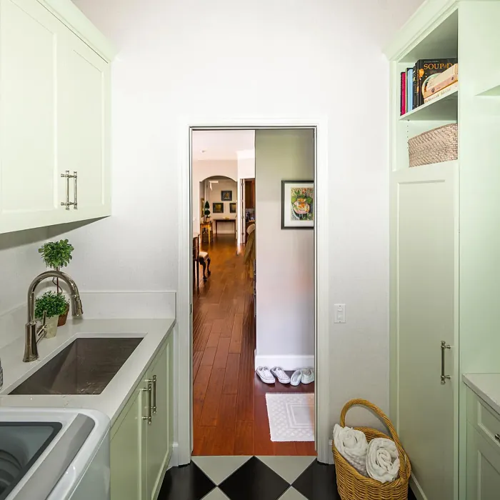
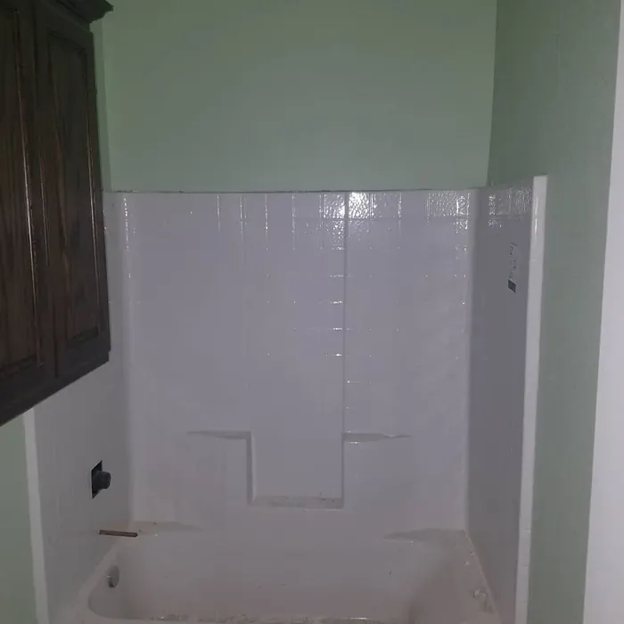
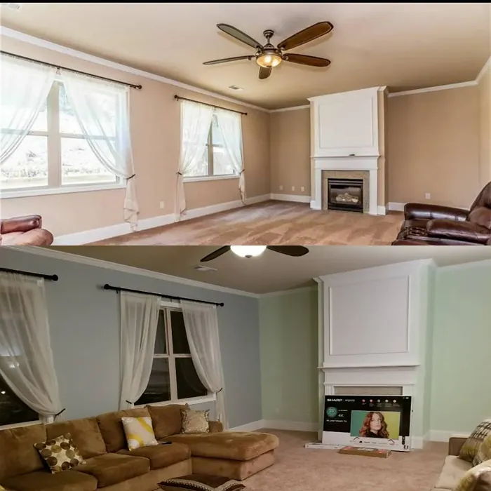
Real Room Photo of Gratifying Green SW 6435
Undertones of Gratifying Green ?
The undertones of Gratifying Green are a key aspect of its character, leaning towards Green. These subtle underlying hues are what give the color its depth and complexity. For example, a gray with a blue undertone will feel cooler and more modern, while one with a brown undertone will feel warmer and more traditional. It’s essential to test this paint in your home and observe it next to your existing furniture, flooring, and decor to see how these undertones interact and reveal themselves throughout the day.
HEX value: #DAE2CD
RGB code: 218, 226, 205
Is Gratifying Green Cool or Warm?
This color leans more towards warm, inviting tones, making it a great choice for creating a welcoming environment.
Understanding Color Properties and Interior Design Tips
Hue refers to a specific position on the color wheel, measured in degrees from 0 to 360. Each degree represents a different pure color:
- 0° represents red
- 120° represents green
- 240° represents blue
Saturation describes the intensity or purity of a color and is expressed as a percentage:
- At 0%, the color appears completely desaturated—essentially a shade of gray
- At 100%, the color is at its most vivid and vibrant
Lightness indicates how light or dark a color is, also expressed as a percentage:
- 0% lightness results in black
- 100% lightness results in white
Using Warm Colors in Interior Design
Warm hues—such as reds, oranges, yellows, warm beiges, and greiges—are excellent choices for creating inviting and energetic spaces. These colors are particularly well-suited for:
- Kitchens, living rooms, and bathrooms, where warmth enhances comfort and sociability
- Large rooms, where warm tones can help reduce the sense of emptiness and make the space feel more intimate
For example:
- Warm beige shades provide a cozy, inviting atmosphere, ideal for living rooms, bedrooms, and hallways.
- Warm greige (a mix of beige and gray) offers the warmth of beige with the modern appeal of gray, making it a versatile backdrop for dining areas, bedrooms, and living spaces.
However, be mindful when using warm light tones in rooms with limited natural light. These shades may appear muted or even take on an unpleasant yellowish tint. To avoid a dull or flat appearance:
- Add depth by incorporating richer tones like deep greens, charcoal, or chocolate brown
- Use textured elements such as curtains, rugs, or cushions to bring dimension to the space
Pro Tip: Achieving Harmony with Warm and Cool Color Balance
To create a well-balanced and visually interesting interior, mix warm and cool tones strategically. This contrast adds depth and harmony to your design.
- If your walls feature warm hues, introduce cool-colored accents such as blue or green furniture, artwork, or accessories to create contrast.
- For a polished look, consider using a complementary color scheme, which pairs colors opposite each other on the color wheel (e.g., red with green, orange with blue).
This thoughtful mix not only enhances visual appeal but also creates a space that feels both dynamic and cohesive.
Light Temperature Affects on Gratifying Green
Natural Light
Natural daylight changes in color temperature as the sun moves across the sky. At sunrise and sunset, the light tends to have a warm, golden tone with a color temperature around 2000 Kelvin (K). As the day progresses and the sun rises higher, the light becomes cooler and more neutral. Around midday, especially when the sky is clear, natural light typically reaches its peak brightness and shifts to a cooler tone, ranging from 5500 to 6500 Kelvin. This midday light is close to what we perceive as pure white or daylight-balanced light.
These shifts in natural light can significantly influence how colors appear in a space, which is why designers often consider both the time of day and the orientation of windows when planning interior color schemes.
Artificial Light
When choosing artificial lighting, pay close attention to the color temperature, measured in Kelvin (K). This determines how warm or cool the light will appear. Lower temperatures, around 2700K, give off a warm, yellow glow often used in living rooms or bedrooms. Higher temperatures, above 5000K, create a cool, bluish light similar to daylight, commonly used in kitchens, offices, or task areas.
Use the slider to see how lighting temperature can affect the appearance of a surface or color throughout a space.


4800K
LRV of Gratifying Green
The Light Reflectance Value (LRV) of Gratifying Green is 30%, which places it in the Medium Dark category. This means it reflects very little light. Understanding a paint’s LRV is crucial for predicting how it will look in your space. A higher LRV indicates a lighter color that reflects more light, making rooms feel larger and brighter. A lower LRV signifies a darker color that absorbs more light, creating a cozier, more intimate atmosphere. Always consider the natural and artificial lighting in your room when selecting a paint color based on its LRV.
Detailed Review of Gratifying Green
Additional Paint Characteristics
Ideal Rooms
Bedroom, Dining Room, Home Office, Living Room, Nursery
Decor Styles
Bohemian, Coastal, Minimalist, Modern Farmhouse
Coverage
Good (1–2 Coats), Touch-Up Friendly
Ease of Application
Beginner Friendly, Brush Smooth, Roller-Ready
Washability
Washable, Wipeable
VOC Level
Eco-Certified, Low VOC
Best Use
Accent Wall, Interior Walls, Small Spaces
Room Suitability
Bedroom, Home Office, Living Room, Nursery
Tone Tag
Earthy, Muted, Warm
Finish Type
Eggshell, Matte, Satin
Paint Performance
Easy Touch-Up, Low Odor, Quick Drying
Use Cases
Best for Small Spaces, Classic Favorite, Designer Favorite
Mood
Calm, Inviting, Restful
Trim Pairing
Complements Brass Fixtures, Good with Wood Trim, Pairs with White Dove
Gratifying Green is a refreshing take on traditional greens, combining a muted tone with a hint of warmth. This color works wonders in creating a serene atmosphere, perfect for spaces where relaxation is key, such as bedrooms and home offices. Its versatile nature means it pairs excellently with both warm and cool decor elements, making it a favorite among designers looking to create a balanced aesthetic. When applied, it glides on smoothly, providing even coverage and a beautiful finish that enhances the overall feel of your space. Whether you’re painting an accent wall or an entire room, Gratifying Green delivers a satisfying result that invites a sense of calm and comfort.
Pros & Cons of SW 6435 Gratifying Green
Pros
Cons
Colors that go with Sherwin Williams Gratifying Green
FAQ on SW 6435 Gratifying Green
How does Gratifying Green compare to other greens?
Gratifying Green stands out due to its balance of warmth and softness, making it less harsh than many traditional greens. Unlike brighter or more vibrant greens, it offers a muted elegance that complements a variety of decor styles. This color can be a beautiful alternative to more standard shades, providing a unique touch while still feeling familiar and comforting in your home.
What types of finishes work best with Gratifying Green?
For Gratifying Green, finishes like eggshell and satin are particularly popular. These finishes not only enhance the color’s natural beauty but also provide a subtle sheen that’s easy to clean and maintain. Matte finishes can also work well in low-traffic areas, as they create a soft, velvety look. Ultimately, the choice of finish will depend on the specific room and desired aesthetic, but you can’t go wrong with these options.
Comparisons Gratifying Green with other colors
Gratifying Green SW 6435 vs Sea Salt SW 6204
| Attribute | Gratifying Green SW 6435 | Sea Salt SW 6204 |
|---|---|---|
| Color Name | Gratifying Green SW 6435 | Sea Salt SW 6204 |
| Color | ||
| Hue | Green | Green |
| Brightness | Light | Light |
| RGB | 218, 226, 205 | 205, 210, 202 |
| LRV | 30% | 64% |
| Finish Type | Eggshell, Matte, Satin | Eggshell, Satin |
| Finish Options | Eggshell, Matte, Satin | Eggshell, Matte, Satin |
| Ideal Rooms | Bedroom, Dining Room, Home Office, Living Room, Nursery | Bathroom, Bedroom, Hallway, Kitchen, Living Room |
| Decor Styles | Bohemian, Coastal, Minimalist, Modern Farmhouse | Coastal, Minimalist, Modern Farmhouse, Scandinavian, Traditional |
| Coverage | Good (1–2 Coats), Touch-Up Friendly | Good (1–2 Coats), Touch-Up Friendly |
| Ease of Application | Beginner Friendly, Brush Smooth, Roller-Ready | Beginner Friendly, Brush Smooth, Fast-Drying, Roller-Ready |
| Washability | Washable, Wipeable | Highly Washable, Washable |
| Room Suitability | Bedroom, Home Office, Living Room, Nursery | Bathroom, Bedroom, Hallway, Kitchen, Living Room |
| Tone | Earthy, Muted, Warm | Airy, Balanced, Cool, Muted |
| Paint Performance | Easy Touch-Up, Low Odor, Quick Drying | Easy Touch-Up, High Coverage, Low Odor, Quick Drying |
Gratifying Green SW 6435 vs Liveable Green SW 6176
| Attribute | Gratifying Green SW 6435 | Liveable Green SW 6176 |
|---|---|---|
| Color Name | Gratifying Green SW 6435 | Liveable Green SW 6176 |
| Color | ||
| Hue | Green | Green |
| Brightness | Light | Light |
| RGB | 218, 226, 205 | 206, 206, 189 |
| LRV | 30% | 30% |
| Finish Type | Eggshell, Matte, Satin | Eggshell, Matte, Satin |
| Finish Options | Eggshell, Matte, Satin | Eggshell, Matte, Satin |
| Ideal Rooms | Bedroom, Dining Room, Home Office, Living Room, Nursery | Bedroom, Home Office, Kitchen, Living Room, Nursery |
| Decor Styles | Bohemian, Coastal, Minimalist, Modern Farmhouse | Contemporary, Modern Farmhouse, Rustic, Scandi |
| Coverage | Good (1–2 Coats), Touch-Up Friendly | Good (1–2 Coats), Touch-Up Friendly |
| Ease of Application | Beginner Friendly, Brush Smooth, Roller-Ready | Beginner Friendly, Brush Smooth, Roller-Ready |
| Washability | Washable, Wipeable | Highly Washable, Washable |
| Room Suitability | Bedroom, Home Office, Living Room, Nursery | Bedroom, Home Office, Living Room, Nursery |
| Tone | Earthy, Muted, Warm | Balanced, Earthy, Muted |
| Paint Performance | Easy Touch-Up, Low Odor, Quick Drying | Easy Touch-Up, High Coverage, Low Odor |
Gratifying Green SW 6435 vs Rainwashed SW 6211
| Attribute | Gratifying Green SW 6435 | Rainwashed SW 6211 |
|---|---|---|
| Color Name | Gratifying Green SW 6435 | Rainwashed SW 6211 |
| Color | ||
| Hue | Green | Green |
| Brightness | Light | Light |
| RGB | 218, 226, 205 | 194, 205, 197 |
| LRV | 30% | 60% |
| Finish Type | Eggshell, Matte, Satin | Eggshell, Matte, Satin |
| Finish Options | Eggshell, Matte, Satin | Eggshell, Matte, Satin |
| Ideal Rooms | Bedroom, Dining Room, Home Office, Living Room, Nursery | Bathroom, Bedroom, Home Office, Living Room, Nursery |
| Decor Styles | Bohemian, Coastal, Minimalist, Modern Farmhouse | Coastal, Farmhouse, Minimalist, Modern, Transitional |
| Coverage | Good (1–2 Coats), Touch-Up Friendly | Good (1–2 Coats), Touch-Up Friendly |
| Ease of Application | Beginner Friendly, Brush Smooth, Roller-Ready | Beginner Friendly, Brush Smooth, Fast-Drying, Roller-Ready |
| Washability | Washable, Wipeable | Washable, Wipeable |
| Room Suitability | Bedroom, Home Office, Living Room, Nursery | Bathroom, Bedroom, Home Office, Living Room, Nursery |
| Tone | Earthy, Muted, Warm | Balanced, Cool, Muted |
| Paint Performance | Easy Touch-Up, Low Odor, Quick Drying | Easy Touch-Up, High Coverage, Low Odor |
Gratifying Green SW 6435 vs Filmy Green SW 6190
| Attribute | Gratifying Green SW 6435 | Filmy Green SW 6190 |
|---|---|---|
| Color Name | Gratifying Green SW 6435 | Filmy Green SW 6190 |
| Color | ||
| Hue | Green | Green |
| Brightness | Light | Light |
| RGB | 218, 226, 205 | 209, 211, 199 |
| LRV | 30% | 50% |
| Finish Type | Eggshell, Matte, Satin | Eggshell, Matte, Satin |
| Finish Options | Eggshell, Matte, Satin | Eggshell, Matte, Satin |
| Ideal Rooms | Bedroom, Dining Room, Home Office, Living Room, Nursery | Bedroom, Home Office, Living Room, Nursery |
| Decor Styles | Bohemian, Coastal, Minimalist, Modern Farmhouse | Bohemian, Minimalist, Modern Farmhouse, Scandinavian |
| Coverage | Good (1–2 Coats), Touch-Up Friendly | Good (1–2 Coats) |
| Ease of Application | Beginner Friendly, Brush Smooth, Roller-Ready | Beginner Friendly, Brush Smooth, Roller-Ready |
| Washability | Washable, Wipeable | Washable, Wipeable |
| Room Suitability | Bedroom, Home Office, Living Room, Nursery | Bedroom, Home Office, Living Room, Nursery |
| Tone | Earthy, Muted, Warm | Calm, Earthy, Muted |
| Paint Performance | Easy Touch-Up, Low Odor, Quick Drying | Easy Touch-Up, Low Odor, Quick Drying |
Gratifying Green SW 6435 vs Slow Green SW 6456
| Attribute | Gratifying Green SW 6435 | Slow Green SW 6456 |
|---|---|---|
| Color Name | Gratifying Green SW 6435 | Slow Green SW 6456 |
| Color | ||
| Hue | Green | Green |
| Brightness | Light | Light |
| RGB | 218, 226, 205 | 198, 213, 201 |
| LRV | 30% | 48% |
| Finish Type | Eggshell, Matte, Satin | Eggshell, Matte, Satin |
| Finish Options | Eggshell, Matte, Satin | Eggshell, Matte, Satin |
| Ideal Rooms | Bedroom, Dining Room, Home Office, Living Room, Nursery | Bedroom, Dining Room, Home Office, Living Room, Nursery |
| Decor Styles | Bohemian, Coastal, Minimalist, Modern Farmhouse | Coastal, Farmhouse, Modern, Rustic, Scandinavian |
| Coverage | Good (1–2 Coats), Touch-Up Friendly | Good (1–2 Coats), Touch-Up Friendly |
| Ease of Application | Beginner Friendly, Brush Smooth, Roller-Ready | Beginner Friendly, Brush Smooth, Roller-Ready |
| Washability | Washable, Wipeable | Highly Washable, Washable |
| Room Suitability | Bedroom, Home Office, Living Room, Nursery | Bedroom, Dining Room, Entryway, Home Office, Living Room, Nursery |
| Tone | Earthy, Muted, Warm | Balanced, Earthy, Muted |
| Paint Performance | Easy Touch-Up, Low Odor, Quick Drying | Easy Touch-Up, Fade Resistant, Low Odor |
Gratifying Green SW 6435 vs Acanthus SW 0029
| Attribute | Gratifying Green SW 6435 | Acanthus SW 0029 |
|---|---|---|
| Color Name | Gratifying Green SW 6435 | Acanthus SW 0029 |
| Color | ||
| Hue | Green | Green |
| Brightness | Light | Light |
| RGB | 218, 226, 205 | 205, 205, 180 |
| LRV | 30% | 10% |
| Finish Type | Eggshell, Matte, Satin | Eggshell, Matte, Satin |
| Finish Options | Eggshell, Matte, Satin | Eggshell, Matte, Satin |
| Ideal Rooms | Bedroom, Dining Room, Home Office, Living Room, Nursery | Bedroom, Dining Room, Home Office, Kitchen, Living Room |
| Decor Styles | Bohemian, Coastal, Minimalist, Modern Farmhouse | Eclectic, Farmhouse, Modern, Traditional |
| Coverage | Good (1–2 Coats), Touch-Up Friendly | Good (1–2 Coats) |
| Ease of Application | Beginner Friendly, Brush Smooth, Roller-Ready | Beginner Friendly, Brush Smooth, Fast-Drying, Roller-Ready |
| Washability | Washable, Wipeable | Highly Washable, Stain Resistant, Washable |
| Room Suitability | Bedroom, Home Office, Living Room, Nursery | Bedroom, Dining Room, Home Office, Living Room |
| Tone | Earthy, Muted, Warm | Balanced, Earthy, Muted |
| Paint Performance | Easy Touch-Up, Low Odor, Quick Drying | Easy Touch-Up, Low Odor, Quick Drying, Scuff Resistant |
Gratifying Green SW 6435 vs Topiary Tint SW 6449
| Attribute | Gratifying Green SW 6435 | Topiary Tint SW 6449 |
|---|---|---|
| Color Name | Gratifying Green SW 6435 | Topiary Tint SW 6449 |
| Color | ||
| Hue | Green | Green |
| Brightness | Light | Light |
| RGB | 218, 226, 205 | 200, 216, 196 |
| LRV | 30% | 30% |
| Finish Type | Eggshell, Matte, Satin | Eggshell, Matte, Satin |
| Finish Options | Eggshell, Matte, Satin | Eggshell, Matte, Satin |
| Ideal Rooms | Bedroom, Dining Room, Home Office, Living Room, Nursery | Bathroom, Bedroom, Dining Room, Home Office, Kitchen, Living Room |
| Decor Styles | Bohemian, Coastal, Minimalist, Modern Farmhouse | Bohemian, Coastal, Eclectic, Modern Farmhouse, Transitional |
| Coverage | Good (1–2 Coats), Touch-Up Friendly | Good (1–2 Coats), Touch-Up Friendly |
| Ease of Application | Beginner Friendly, Brush Smooth, Roller-Ready | Beginner Friendly, Brush Smooth, Fast-Drying, Roller-Ready |
| Washability | Washable, Wipeable | Scuff Resistant, Washable |
| Room Suitability | Bedroom, Home Office, Living Room, Nursery | Bathroom, Bedroom, Dining Room, Kitchen, Living Room |
| Tone | Earthy, Muted, Warm | Balanced, Calm, Earthy, Muted |
| Paint Performance | Easy Touch-Up, Low Odor, Quick Drying | Easy Touch-Up, Low Odor, Quick Drying, Stain Resistant |
Gratifying Green SW 6435 vs Waterscape SW 6470
| Attribute | Gratifying Green SW 6435 | Waterscape SW 6470 |
|---|---|---|
| Color Name | Gratifying Green SW 6435 | Waterscape SW 6470 |
| Color | ||
| Hue | Green | Green |
| Brightness | Light | Light |
| RGB | 218, 226, 205 | 191, 210, 201 |
| LRV | 30% | 50% |
| Finish Type | Eggshell, Matte, Satin | Eggshell, Matte |
| Finish Options | Eggshell, Matte, Satin | Eggshell, Matte, Satin |
| Ideal Rooms | Bedroom, Dining Room, Home Office, Living Room, Nursery | Bathroom, Bedroom, Home Office, Kitchen, Living Room |
| Decor Styles | Bohemian, Coastal, Minimalist, Modern Farmhouse | Coastal, Minimalist, Modern, Scandinavian |
| Coverage | Good (1–2 Coats), Touch-Up Friendly | Good (1–2 Coats) |
| Ease of Application | Beginner Friendly, Brush Smooth, Roller-Ready | Beginner Friendly, Brush Smooth, Roller-Ready |
| Washability | Washable, Wipeable | Highly Washable, Washable |
| Room Suitability | Bedroom, Home Office, Living Room, Nursery | Bathroom, Bedroom, Home Office, Living Room |
| Tone | Earthy, Muted, Warm | Airy, Cool, Muted |
| Paint Performance | Easy Touch-Up, Low Odor, Quick Drying | Easy Touch-Up, Low Odor, Quick Drying |
Gratifying Green SW 6435 vs Bonsai Tint SW 6436
| Attribute | Gratifying Green SW 6435 | Bonsai Tint SW 6436 |
|---|---|---|
| Color Name | Gratifying Green SW 6435 | Bonsai Tint SW 6436 |
| Color | ||
| Hue | Green | Green |
| Brightness | Light | Light |
| RGB | 218, 226, 205 | 197, 209, 178 |
| LRV | 30% | 64% |
| Finish Type | Eggshell, Matte, Satin | Eggshell, Matte |
| Finish Options | Eggshell, Matte, Satin | Eggshell, Matte, Satin |
| Ideal Rooms | Bedroom, Dining Room, Home Office, Living Room, Nursery | Bedroom, Home Office, Living Room, Nursery |
| Decor Styles | Bohemian, Coastal, Minimalist, Modern Farmhouse | Bohemian, Minimalist, Modern, Scandinavian |
| Coverage | Good (1–2 Coats), Touch-Up Friendly | Good (1–2 Coats) |
| Ease of Application | Beginner Friendly, Brush Smooth, Roller-Ready | Beginner Friendly, Brush Smooth, Roller-Ready |
| Washability | Washable, Wipeable | Washable, Wipeable |
| Room Suitability | Bedroom, Home Office, Living Room, Nursery | Bedroom, Home Office, Living Room, Nursery |
| Tone | Earthy, Muted, Warm | Calm, Earthy, Muted |
| Paint Performance | Easy Touch-Up, Low Odor, Quick Drying | Easy Touch-Up, Fade Resistant, Low Odor |
Gratifying Green SW 6435 vs Fleeting Green SW 6455
| Attribute | Gratifying Green SW 6435 | Fleeting Green SW 6455 |
|---|---|---|
| Color Name | Gratifying Green SW 6435 | Fleeting Green SW 6455 |
| Color | ||
| Hue | Green | Green |
| Brightness | Light | Light |
| RGB | 218, 226, 205 | 216, 226, 216 |
| LRV | 30% | 64% |
| Finish Type | Eggshell, Matte, Satin | Eggshell, Matte |
| Finish Options | Eggshell, Matte, Satin | Eggshell, Matte, Satin |
| Ideal Rooms | Bedroom, Dining Room, Home Office, Living Room, Nursery | Bathroom, Bedroom, Home Office, Living Room, Nursery |
| Decor Styles | Bohemian, Coastal, Minimalist, Modern Farmhouse | Coastal, Farmhouse, Minimalist, Modern, Scandinavian |
| Coverage | Good (1–2 Coats), Touch-Up Friendly | Good (1–2 Coats), Touch-Up Friendly |
| Ease of Application | Beginner Friendly, Brush Smooth, Roller-Ready | Beginner Friendly, Brush Smooth, Roller-Ready |
| Washability | Washable, Wipeable | Washable, Wipeable |
| Room Suitability | Bedroom, Home Office, Living Room, Nursery | Bathroom, Bedroom, Home Office, Living Room, Nursery |
| Tone | Earthy, Muted, Warm | Airy, Balanced, Cool, Muted |
| Paint Performance | Easy Touch-Up, Low Odor, Quick Drying | Easy Touch-Up, Low Odor, Quick Drying |
Official Page of Sherwin Williams Gratifying Green SW 6435