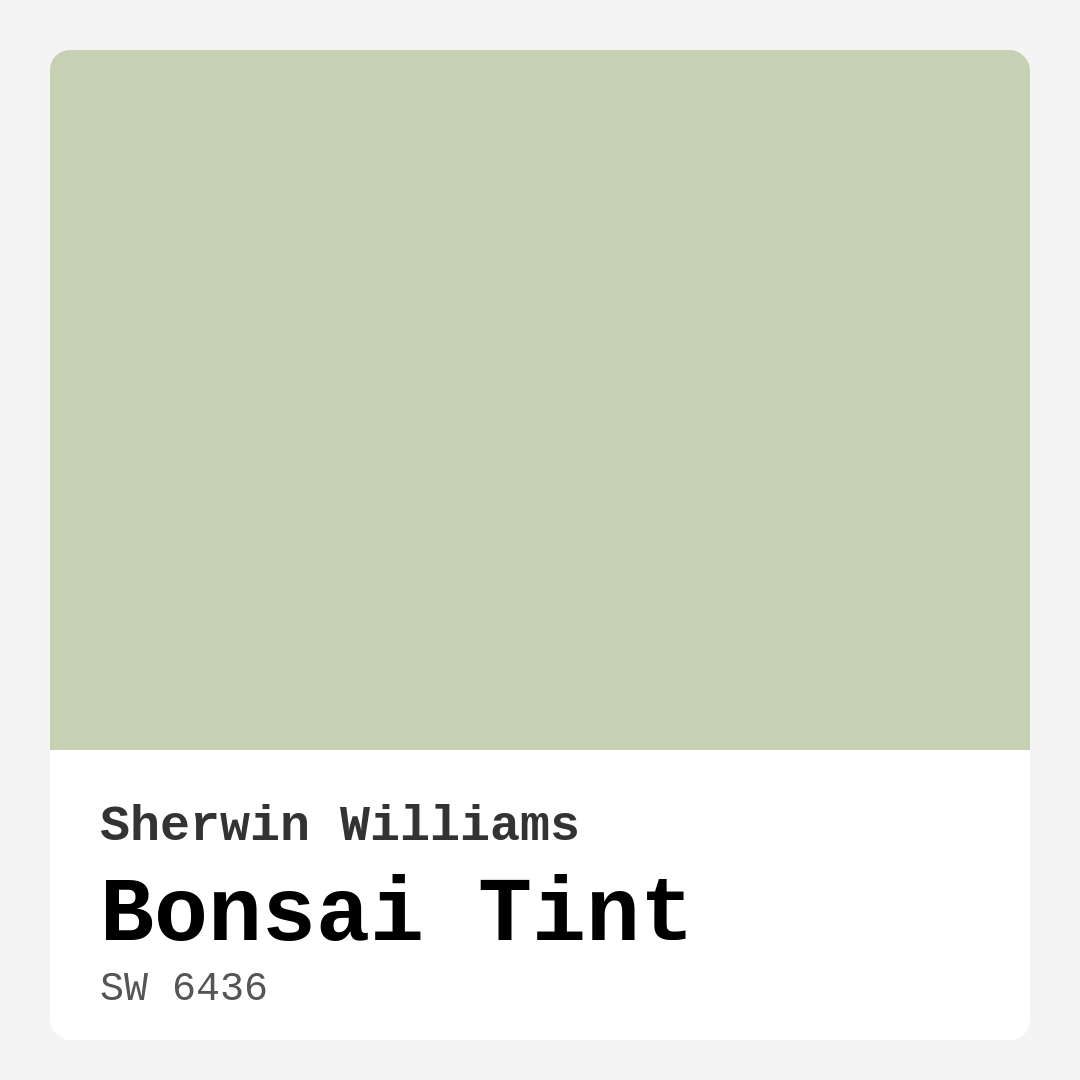
Color Preview & Key Details
| HEX Code | #C5D1B2 |
| RGB | 197, 209, 178 |
| LRV | 64% |
| Undertone | Green |
| Finish Options | Eggshell, Matte, Satin |
Picture this: you walk into a room, and immediately feel a wave of calm wash over you. The air feels lighter; the space, more inviting. This is the magic of color, and one hue in particular—Bonsai Tint by Sherwin Williams—has the power to transform any room into a serene oasis. Let’s dive deep into why this soft, gentle green could be the perfect choice for your next home decorating project.
Bonsai Tint (SW 6436) is a light green shade that strikes a lovely balance between earthy and muted. With its hex code #C5D1B2 and RGB values of 197, 209, and 178, it radiates a sense of tranquility reminiscent of lush foliage. This is more than just a paint color; it’s an experience. The color reflects a moderate amount of light, boasting a Light Reflectance Value (LRV) of 64%. This means it can brighten up your space without being overwhelming or harsh.
One of the best things about Bonsai Tint is its versatility. Whether your home leans towards modern minimalism, Scandinavian simplicity, or even a cozy bohemian vibe, this color can seamlessly fit in. It’s a fantastic backdrop for both bold accents and soft, muted furnishings. Imagine pairing it with warm woods and soft whites for a cohesive, grounded look. You could even introduce metallic elements, like brass fixtures, for a touch of elegance.
When it comes to application, Bonsai Tint is beginner-friendly. It glides on smoothly, allowing for minimal splatter, which makes your painting project a lot less daunting. Typically, it provides excellent coverage with just one to two coats, which means less time on the ladder and more time enjoying your newly revamped space. Plus, it has a low VOC content, making it an eco-conscious choice for homeowners who care about indoor air quality.
Now, you might be wondering about the best rooms for Bonsai Tint. This hue shines in spaces where you want to create a calming atmosphere. Think living rooms, bedrooms, home offices, or even a nursery. Its warm undertones invite a sense of peace and relaxation, making it an ideal choice for spaces where you unwind or focus.
However, there are some considerations to keep in mind. While Bonsai Tint is a beautiful choice, it can appear muted in poorly lit areas. If your room doesn’t get much natural light, consider pairing it with brighter accents, or lighter-colored furnishings to help it stand out. A well-placed mirror can also enhance the light in your space, making this gentle green feel a bit brighter and more vibrant.
The undertones of Bonsai Tint are key to its character. Leaning towards green, it carries subtle undertones that add depth and complexity. Depending on the time of day and the lighting, you might find it takes on different moods. During the day, it appears softer and more muted, while in the evening, it can take on a richer, more vibrant tone. This adaptability means that your space can feel fresh and different throughout the day, enhancing the overall mood of your home.
When selecting complementary shades, Bonsai Tint marries beautifully with colors like White Dove and Pure White. These lighter shades can make the color pop even more, creating a stunning contrast against trim or ceilings. If you’re thinking of accenting with bolder colors, consider hues like SW 6557, SW 9075, or SW 6827. These pairs can add a touch of vibrancy while still maintaining a serene ambiance.
Bonsai Tint can also be a fantastic choice for an accent wall, allowing you to create a focal point without overwhelming the entire room. Picture a soft, serene bedroom where one wall is painted with Bonsai Tint, and the rest are a crisp white. You can add earthy tones through your furniture and decor to maintain that grounding vibe.
If you’re still on the fence about this color, it might help to gather some paint samples and test them in your own space. Observe how Bonsai Tint interacts with different lighting conditions throughout the day. You might find that it brings a sense of calm that you never knew your room needed.
And let’s not forget about the practicality of this color choice. Bonsai Tint is not only visually appealing but also easy to maintain. It’s wipeable and washable, making it perfect for areas that might see a bit more wear and tear, like a nursery or a busy living room. With its low odor, you’ll hardly notice it’s there while you’re painting, and it’s easy to touch up if needed.
In conclusion, Bonsai Tint stands as a top contender for your next home project. Whether you’re aiming to create a peaceful retreat in your bedroom, a refreshing workspace in your home office, or an inviting atmosphere in your living room, this soft green hue has the versatility and charm to suit your needs. Its calming presence, ease of application, and compatibility with numerous decor styles make it a designer favorite.
So, the next time you ponder over paint colors, remember that Bonsai Tint isn’t just a color—it’s an invitation to create a tranquil space that reflects your personal style. Embrace the serene beauty of Bonsai Tint, and let it transform your home into a soothing sanctuary you can truly cherish.
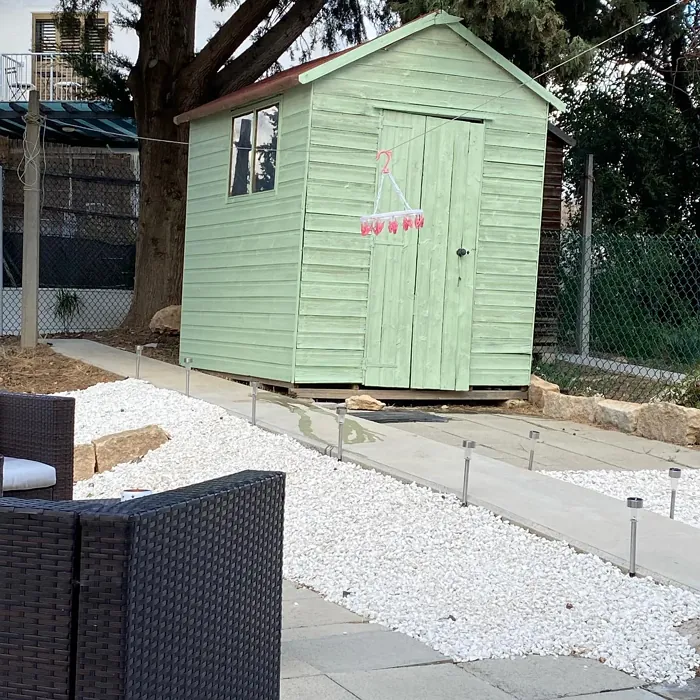
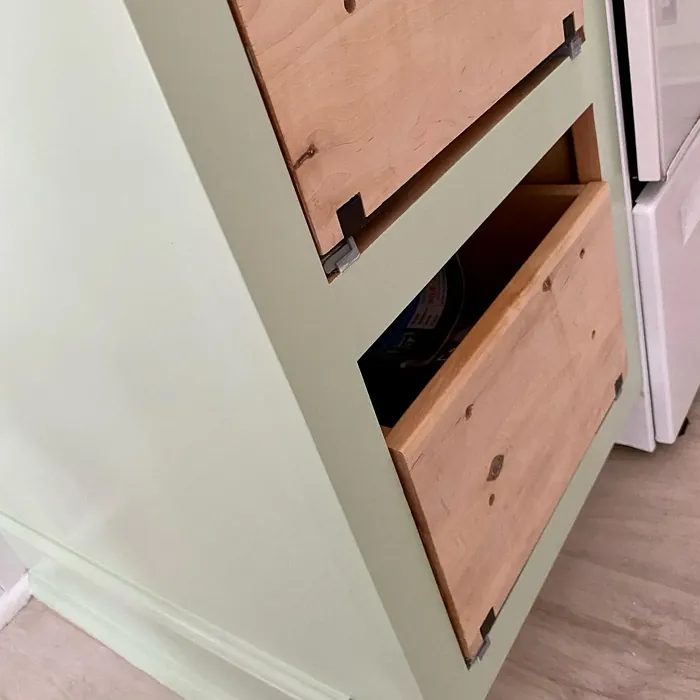
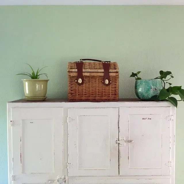
Real Room Photo of Bonsai Tint SW 6436


Undertones of Bonsai Tint ?
The undertones of Bonsai Tint are a key aspect of its character, leaning towards Green. These subtle underlying hues are what give the color its depth and complexity. For example, a gray with a blue undertone will feel cooler and more modern, while one with a brown undertone will feel warmer and more traditional. It’s essential to test this paint in your home and observe it next to your existing furniture, flooring, and decor to see how these undertones interact and reveal themselves throughout the day.
HEX value: #C5D1B2
RGB code: 197, 209, 178
Is Bonsai Tint Cool or Warm?
This color leans towards the cool side of the spectrum, making it ideal for spaces where you want to promote relaxation and tranquility. Its cooler hue can help balance warmer tones in a room, creating a well-rounded visual experience.
Understanding Color Properties and Interior Design Tips
Hue refers to a specific position on the color wheel, measured in degrees from 0 to 360. Each degree represents a different pure color:
- 0° represents red
- 120° represents green
- 240° represents blue
Saturation describes the intensity or purity of a color and is expressed as a percentage:
- At 0%, the color appears completely desaturated—essentially a shade of gray
- At 100%, the color is at its most vivid and vibrant
Lightness indicates how light or dark a color is, also expressed as a percentage:
- 0% lightness results in black
- 100% lightness results in white
Using Warm Colors in Interior Design
Warm hues—such as reds, oranges, yellows, warm beiges, and greiges—are excellent choices for creating inviting and energetic spaces. These colors are particularly well-suited for:
- Kitchens, living rooms, and bathrooms, where warmth enhances comfort and sociability
- Large rooms, where warm tones can help reduce the sense of emptiness and make the space feel more intimate
For example:
- Warm beige shades provide a cozy, inviting atmosphere, ideal for living rooms, bedrooms, and hallways.
- Warm greige (a mix of beige and gray) offers the warmth of beige with the modern appeal of gray, making it a versatile backdrop for dining areas, bedrooms, and living spaces.
However, be mindful when using warm light tones in rooms with limited natural light. These shades may appear muted or even take on an unpleasant yellowish tint. To avoid a dull or flat appearance:
- Add depth by incorporating richer tones like deep greens, charcoal, or chocolate brown
- Use textured elements such as curtains, rugs, or cushions to bring dimension to the space
Pro Tip: Achieving Harmony with Warm and Cool Color Balance
To create a well-balanced and visually interesting interior, mix warm and cool tones strategically. This contrast adds depth and harmony to your design.
- If your walls feature warm hues, introduce cool-colored accents such as blue or green furniture, artwork, or accessories to create contrast.
- For a polished look, consider using a complementary color scheme, which pairs colors opposite each other on the color wheel (e.g., red with green, orange with blue).
This thoughtful mix not only enhances visual appeal but also creates a space that feels both dynamic and cohesive.

Light Temperature Affects on Bonsai Tint
Natural Light
Natural daylight changes in color temperature as the sun moves across the sky. At sunrise and sunset, the light tends to have a warm, golden tone with a color temperature around 2000 Kelvin (K). As the day progresses and the sun rises higher, the light becomes cooler and more neutral. Around midday, especially when the sky is clear, natural light typically reaches its peak brightness and shifts to a cooler tone, ranging from 5500 to 6500 Kelvin. This midday light is close to what we perceive as pure white or daylight-balanced light.
These shifts in natural light can significantly influence how colors appear in a space, which is why designers often consider both the time of day and the orientation of windows when planning interior color schemes.
Artificial Light
When choosing artificial lighting, pay close attention to the color temperature, measured in Kelvin (K). This determines how warm or cool the light will appear. Lower temperatures, around 2700K, give off a warm, yellow glow often used in living rooms or bedrooms. Higher temperatures, above 5000K, create a cool, bluish light similar to daylight, commonly used in kitchens, offices, or task areas.
Use the slider to see how lighting temperature can affect the appearance of a surface or color throughout a space.


4800K
LRV of Bonsai Tint
The Light Reflectance Value (LRV) of Bonsai Tint is 64%, which places it in the Medium category. This means it Reflects a moderate amount of light. Understanding a paint’s LRV is crucial for predicting how it will look in your space. A higher LRV indicates a lighter color that reflects more light, making rooms feel larger and brighter. A lower LRV signifies a darker color that absorbs more light, creating a cozier, more intimate atmosphere. Always consider the natural and artificial lighting in your room when selecting a paint color based on its LRV.
Detailed Review of Bonsai Tint
Additional Paint Characteristics
Ideal Rooms
Bedroom, Home Office, Living Room, Nursery
Decor Styles
Bohemian, Minimalist, Modern, Scandinavian
Coverage
Good (1–2 Coats)
Ease of Application
Beginner Friendly, Brush Smooth, Roller-Ready
Washability
Washable, Wipeable
VOC Level
Eco-Certified, Low VOC
Best Use
Accent Wall, Home Office, Interior Walls
Room Suitability
Bedroom, Home Office, Living Room, Nursery
Tone Tag
Calm, Earthy, Muted
Finish Type
Eggshell, Matte
Paint Performance
Easy Touch-Up, Fade Resistant, Low Odor
Use Cases
Best for Low Light Rooms, Classic Favorite, Designer Favorite
Mood
Calm, Grounding, Inviting
Trim Pairing
Complements Brass Fixtures, Matches Pure White, Pairs with White Dove
Bonsai Tint has quickly become a favorite among homeowners looking for a tranquil touch to their interiors. The soft green is not only pleasing to the eye but also versatile enough to complement various decor styles, from modern minimalist to cozy bohemian. When applied, it provides a warm yet refreshing ambiance that can make any room feel more welcoming. In terms of application, it goes on smoothly and provides good coverage, typically requiring just one to two coats depending on the surface. Whether you’re aiming for a serene bedroom or a refreshing home office, Bonsai Tint delivers a subtle elegance that enhances your space beautifully.
Pros & Cons of SW 6436 Bonsai Tint
Pros
Cons
Colors that go with Sherwin Williams Bonsai Tint
FAQ on SW 6436 Bonsai Tint
Can Bonsai Tint be used in rooms with low natural light?
Yes, while Bonsai Tint may appear muted in low-light rooms, its gentle green undertones can create a serene environment. To enhance its appearance in these spaces, consider pairing it with brighter accents or light-colored furnishings to help it stand out.
Is Bonsai Tint suitable for exterior use?
Bonsai Tint is primarily designed for interior use, where it can showcase its calming qualities. If you’re looking for an exterior paint, it’s best to choose a product specifically formulated for outdoor conditions to ensure durability and weather resistance.
Comparisons Bonsai Tint with other colors
Bonsai Tint SW 6436 vs Sea Salt SW 6204
| Attribute | Bonsai Tint SW 6436 | Sea Salt SW 6204 |
|---|---|---|
| Color Name | Bonsai Tint SW 6436 | Sea Salt SW 6204 |
| Color | ||
| Hue | Green | Green |
| Brightness | Light | Light |
| RGB | 197, 209, 178 | 205, 210, 202 |
| LRV | 64% | 64% |
| Finish Type | Eggshell, Matte | Eggshell, Satin |
| Finish Options | Eggshell, Matte, Satin | Eggshell, Matte, Satin |
| Ideal Rooms | Bedroom, Home Office, Living Room, Nursery | Bathroom, Bedroom, Hallway, Kitchen, Living Room |
| Decor Styles | Bohemian, Minimalist, Modern, Scandinavian | Coastal, Minimalist, Modern Farmhouse, Scandinavian, Traditional |
| Coverage | Good (1–2 Coats) | Good (1–2 Coats), Touch-Up Friendly |
| Ease of Application | Beginner Friendly, Brush Smooth, Roller-Ready | Beginner Friendly, Brush Smooth, Fast-Drying, Roller-Ready |
| Washability | Washable, Wipeable | Highly Washable, Washable |
| Room Suitability | Bedroom, Home Office, Living Room, Nursery | Bathroom, Bedroom, Hallway, Kitchen, Living Room |
| Tone | Calm, Earthy, Muted | Airy, Balanced, Cool, Muted |
| Paint Performance | Easy Touch-Up, Fade Resistant, Low Odor | Easy Touch-Up, High Coverage, Low Odor, Quick Drying |
Bonsai Tint SW 6436 vs Liveable Green SW 6176
| Attribute | Bonsai Tint SW 6436 | Liveable Green SW 6176 |
|---|---|---|
| Color Name | Bonsai Tint SW 6436 | Liveable Green SW 6176 |
| Color | ||
| Hue | Green | Green |
| Brightness | Light | Light |
| RGB | 197, 209, 178 | 206, 206, 189 |
| LRV | 64% | 30% |
| Finish Type | Eggshell, Matte | Eggshell, Matte, Satin |
| Finish Options | Eggshell, Matte, Satin | Eggshell, Matte, Satin |
| Ideal Rooms | Bedroom, Home Office, Living Room, Nursery | Bedroom, Home Office, Kitchen, Living Room, Nursery |
| Decor Styles | Bohemian, Minimalist, Modern, Scandinavian | Contemporary, Modern Farmhouse, Rustic, Scandi |
| Coverage | Good (1–2 Coats) | Good (1–2 Coats), Touch-Up Friendly |
| Ease of Application | Beginner Friendly, Brush Smooth, Roller-Ready | Beginner Friendly, Brush Smooth, Roller-Ready |
| Washability | Washable, Wipeable | Highly Washable, Washable |
| Room Suitability | Bedroom, Home Office, Living Room, Nursery | Bedroom, Home Office, Living Room, Nursery |
| Tone | Calm, Earthy, Muted | Balanced, Earthy, Muted |
| Paint Performance | Easy Touch-Up, Fade Resistant, Low Odor | Easy Touch-Up, High Coverage, Low Odor |
Bonsai Tint SW 6436 vs Rainwashed SW 6211
| Attribute | Bonsai Tint SW 6436 | Rainwashed SW 6211 |
|---|---|---|
| Color Name | Bonsai Tint SW 6436 | Rainwashed SW 6211 |
| Color | ||
| Hue | Green | Green |
| Brightness | Light | Light |
| RGB | 197, 209, 178 | 194, 205, 197 |
| LRV | 64% | 60% |
| Finish Type | Eggshell, Matte | Eggshell, Matte, Satin |
| Finish Options | Eggshell, Matte, Satin | Eggshell, Matte, Satin |
| Ideal Rooms | Bedroom, Home Office, Living Room, Nursery | Bathroom, Bedroom, Home Office, Living Room, Nursery |
| Decor Styles | Bohemian, Minimalist, Modern, Scandinavian | Coastal, Farmhouse, Minimalist, Modern, Transitional |
| Coverage | Good (1–2 Coats) | Good (1–2 Coats), Touch-Up Friendly |
| Ease of Application | Beginner Friendly, Brush Smooth, Roller-Ready | Beginner Friendly, Brush Smooth, Fast-Drying, Roller-Ready |
| Washability | Washable, Wipeable | Washable, Wipeable |
| Room Suitability | Bedroom, Home Office, Living Room, Nursery | Bathroom, Bedroom, Home Office, Living Room, Nursery |
| Tone | Calm, Earthy, Muted | Balanced, Cool, Muted |
| Paint Performance | Easy Touch-Up, Fade Resistant, Low Odor | Easy Touch-Up, High Coverage, Low Odor |
Bonsai Tint SW 6436 vs Filmy Green SW 6190
| Attribute | Bonsai Tint SW 6436 | Filmy Green SW 6190 |
|---|---|---|
| Color Name | Bonsai Tint SW 6436 | Filmy Green SW 6190 |
| Color | ||
| Hue | Green | Green |
| Brightness | Light | Light |
| RGB | 197, 209, 178 | 209, 211, 199 |
| LRV | 64% | 50% |
| Finish Type | Eggshell, Matte | Eggshell, Matte, Satin |
| Finish Options | Eggshell, Matte, Satin | Eggshell, Matte, Satin |
| Ideal Rooms | Bedroom, Home Office, Living Room, Nursery | Bedroom, Home Office, Living Room, Nursery |
| Decor Styles | Bohemian, Minimalist, Modern, Scandinavian | Bohemian, Minimalist, Modern Farmhouse, Scandinavian |
| Coverage | Good (1–2 Coats) | Good (1–2 Coats) |
| Ease of Application | Beginner Friendly, Brush Smooth, Roller-Ready | Beginner Friendly, Brush Smooth, Roller-Ready |
| Washability | Washable, Wipeable | Washable, Wipeable |
| Room Suitability | Bedroom, Home Office, Living Room, Nursery | Bedroom, Home Office, Living Room, Nursery |
| Tone | Calm, Earthy, Muted | Calm, Earthy, Muted |
| Paint Performance | Easy Touch-Up, Fade Resistant, Low Odor | Easy Touch-Up, Low Odor, Quick Drying |
Bonsai Tint SW 6436 vs Slow Green SW 6456
| Attribute | Bonsai Tint SW 6436 | Slow Green SW 6456 |
|---|---|---|
| Color Name | Bonsai Tint SW 6436 | Slow Green SW 6456 |
| Color | ||
| Hue | Green | Green |
| Brightness | Light | Light |
| RGB | 197, 209, 178 | 198, 213, 201 |
| LRV | 64% | 48% |
| Finish Type | Eggshell, Matte | Eggshell, Matte, Satin |
| Finish Options | Eggshell, Matte, Satin | Eggshell, Matte, Satin |
| Ideal Rooms | Bedroom, Home Office, Living Room, Nursery | Bedroom, Dining Room, Home Office, Living Room, Nursery |
| Decor Styles | Bohemian, Minimalist, Modern, Scandinavian | Coastal, Farmhouse, Modern, Rustic, Scandinavian |
| Coverage | Good (1–2 Coats) | Good (1–2 Coats), Touch-Up Friendly |
| Ease of Application | Beginner Friendly, Brush Smooth, Roller-Ready | Beginner Friendly, Brush Smooth, Roller-Ready |
| Washability | Washable, Wipeable | Highly Washable, Washable |
| Room Suitability | Bedroom, Home Office, Living Room, Nursery | Bedroom, Dining Room, Entryway, Home Office, Living Room, Nursery |
| Tone | Calm, Earthy, Muted | Balanced, Earthy, Muted |
| Paint Performance | Easy Touch-Up, Fade Resistant, Low Odor | Easy Touch-Up, Fade Resistant, Low Odor |
Bonsai Tint SW 6436 vs Acanthus SW 0029
| Attribute | Bonsai Tint SW 6436 | Acanthus SW 0029 |
|---|---|---|
| Color Name | Bonsai Tint SW 6436 | Acanthus SW 0029 |
| Color | ||
| Hue | Green | Green |
| Brightness | Light | Light |
| RGB | 197, 209, 178 | 205, 205, 180 |
| LRV | 64% | 10% |
| Finish Type | Eggshell, Matte | Eggshell, Matte, Satin |
| Finish Options | Eggshell, Matte, Satin | Eggshell, Matte, Satin |
| Ideal Rooms | Bedroom, Home Office, Living Room, Nursery | Bedroom, Dining Room, Home Office, Kitchen, Living Room |
| Decor Styles | Bohemian, Minimalist, Modern, Scandinavian | Eclectic, Farmhouse, Modern, Traditional |
| Coverage | Good (1–2 Coats) | Good (1–2 Coats) |
| Ease of Application | Beginner Friendly, Brush Smooth, Roller-Ready | Beginner Friendly, Brush Smooth, Fast-Drying, Roller-Ready |
| Washability | Washable, Wipeable | Highly Washable, Stain Resistant, Washable |
| Room Suitability | Bedroom, Home Office, Living Room, Nursery | Bedroom, Dining Room, Home Office, Living Room |
| Tone | Calm, Earthy, Muted | Balanced, Earthy, Muted |
| Paint Performance | Easy Touch-Up, Fade Resistant, Low Odor | Easy Touch-Up, Low Odor, Quick Drying, Scuff Resistant |
Bonsai Tint SW 6436 vs Topiary Tint SW 6449
| Attribute | Bonsai Tint SW 6436 | Topiary Tint SW 6449 |
|---|---|---|
| Color Name | Bonsai Tint SW 6436 | Topiary Tint SW 6449 |
| Color | ||
| Hue | Green | Green |
| Brightness | Light | Light |
| RGB | 197, 209, 178 | 200, 216, 196 |
| LRV | 64% | 30% |
| Finish Type | Eggshell, Matte | Eggshell, Matte, Satin |
| Finish Options | Eggshell, Matte, Satin | Eggshell, Matte, Satin |
| Ideal Rooms | Bedroom, Home Office, Living Room, Nursery | Bathroom, Bedroom, Dining Room, Home Office, Kitchen, Living Room |
| Decor Styles | Bohemian, Minimalist, Modern, Scandinavian | Bohemian, Coastal, Eclectic, Modern Farmhouse, Transitional |
| Coverage | Good (1–2 Coats) | Good (1–2 Coats), Touch-Up Friendly |
| Ease of Application | Beginner Friendly, Brush Smooth, Roller-Ready | Beginner Friendly, Brush Smooth, Fast-Drying, Roller-Ready |
| Washability | Washable, Wipeable | Scuff Resistant, Washable |
| Room Suitability | Bedroom, Home Office, Living Room, Nursery | Bathroom, Bedroom, Dining Room, Kitchen, Living Room |
| Tone | Calm, Earthy, Muted | Balanced, Calm, Earthy, Muted |
| Paint Performance | Easy Touch-Up, Fade Resistant, Low Odor | Easy Touch-Up, Low Odor, Quick Drying, Stain Resistant |
Bonsai Tint SW 6436 vs Waterscape SW 6470
| Attribute | Bonsai Tint SW 6436 | Waterscape SW 6470 |
|---|---|---|
| Color Name | Bonsai Tint SW 6436 | Waterscape SW 6470 |
| Color | ||
| Hue | Green | Green |
| Brightness | Light | Light |
| RGB | 197, 209, 178 | 191, 210, 201 |
| LRV | 64% | 50% |
| Finish Type | Eggshell, Matte | Eggshell, Matte |
| Finish Options | Eggshell, Matte, Satin | Eggshell, Matte, Satin |
| Ideal Rooms | Bedroom, Home Office, Living Room, Nursery | Bathroom, Bedroom, Home Office, Kitchen, Living Room |
| Decor Styles | Bohemian, Minimalist, Modern, Scandinavian | Coastal, Minimalist, Modern, Scandinavian |
| Coverage | Good (1–2 Coats) | Good (1–2 Coats) |
| Ease of Application | Beginner Friendly, Brush Smooth, Roller-Ready | Beginner Friendly, Brush Smooth, Roller-Ready |
| Washability | Washable, Wipeable | Highly Washable, Washable |
| Room Suitability | Bedroom, Home Office, Living Room, Nursery | Bathroom, Bedroom, Home Office, Living Room |
| Tone | Calm, Earthy, Muted | Airy, Cool, Muted |
| Paint Performance | Easy Touch-Up, Fade Resistant, Low Odor | Easy Touch-Up, Low Odor, Quick Drying |
Bonsai Tint SW 6436 vs Gratifying Green SW 6435
| Attribute | Bonsai Tint SW 6436 | Gratifying Green SW 6435 |
|---|---|---|
| Color Name | Bonsai Tint SW 6436 | Gratifying Green SW 6435 |
| Color | ||
| Hue | Green | Green |
| Brightness | Light | Light |
| RGB | 197, 209, 178 | 218, 226, 205 |
| LRV | 64% | 30% |
| Finish Type | Eggshell, Matte | Eggshell, Matte, Satin |
| Finish Options | Eggshell, Matte, Satin | Eggshell, Matte, Satin |
| Ideal Rooms | Bedroom, Home Office, Living Room, Nursery | Bedroom, Dining Room, Home Office, Living Room, Nursery |
| Decor Styles | Bohemian, Minimalist, Modern, Scandinavian | Bohemian, Coastal, Minimalist, Modern Farmhouse |
| Coverage | Good (1–2 Coats) | Good (1–2 Coats), Touch-Up Friendly |
| Ease of Application | Beginner Friendly, Brush Smooth, Roller-Ready | Beginner Friendly, Brush Smooth, Roller-Ready |
| Washability | Washable, Wipeable | Washable, Wipeable |
| Room Suitability | Bedroom, Home Office, Living Room, Nursery | Bedroom, Home Office, Living Room, Nursery |
| Tone | Calm, Earthy, Muted | Earthy, Muted, Warm |
| Paint Performance | Easy Touch-Up, Fade Resistant, Low Odor | Easy Touch-Up, Low Odor, Quick Drying |
Bonsai Tint SW 6436 vs Fleeting Green SW 6455
| Attribute | Bonsai Tint SW 6436 | Fleeting Green SW 6455 |
|---|---|---|
| Color Name | Bonsai Tint SW 6436 | Fleeting Green SW 6455 |
| Color | ||
| Hue | Green | Green |
| Brightness | Light | Light |
| RGB | 197, 209, 178 | 216, 226, 216 |
| LRV | 64% | 64% |
| Finish Type | Eggshell, Matte | Eggshell, Matte |
| Finish Options | Eggshell, Matte, Satin | Eggshell, Matte, Satin |
| Ideal Rooms | Bedroom, Home Office, Living Room, Nursery | Bathroom, Bedroom, Home Office, Living Room, Nursery |
| Decor Styles | Bohemian, Minimalist, Modern, Scandinavian | Coastal, Farmhouse, Minimalist, Modern, Scandinavian |
| Coverage | Good (1–2 Coats) | Good (1–2 Coats), Touch-Up Friendly |
| Ease of Application | Beginner Friendly, Brush Smooth, Roller-Ready | Beginner Friendly, Brush Smooth, Roller-Ready |
| Washability | Washable, Wipeable | Washable, Wipeable |
| Room Suitability | Bedroom, Home Office, Living Room, Nursery | Bathroom, Bedroom, Home Office, Living Room, Nursery |
| Tone | Calm, Earthy, Muted | Airy, Balanced, Cool, Muted |
| Paint Performance | Easy Touch-Up, Fade Resistant, Low Odor | Easy Touch-Up, Low Odor, Quick Drying |
Official Page of Sherwin Williams Bonsai Tint SW 6436