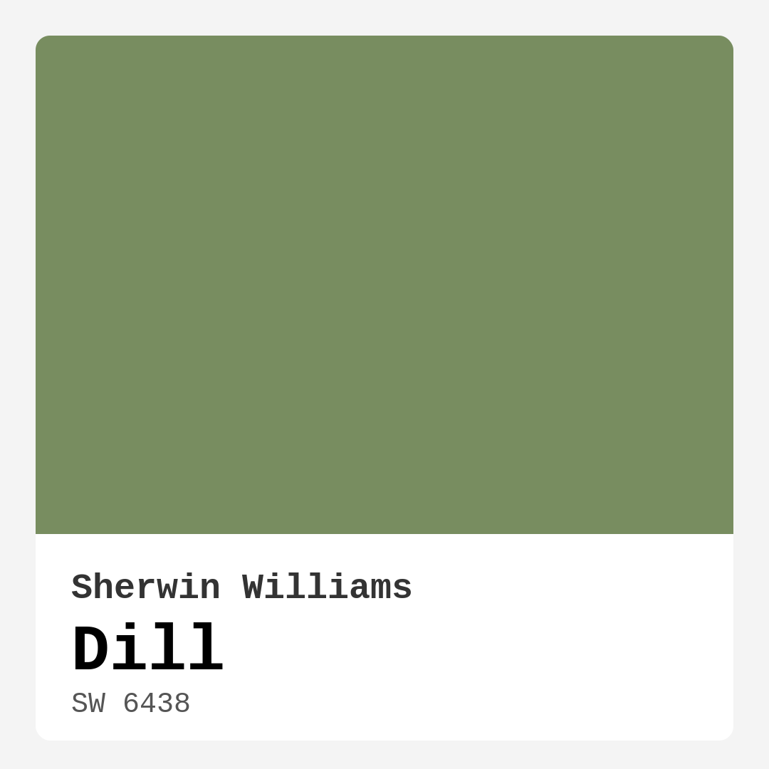
Color Preview & Key Details
| HEX Code | #788D60 |
| RGB | 120, 141, 96 |
| LRV | 30% |
| Undertone | Green |
| Finish Options | Eggshell, Matte, Satin |
Imagine stepping into a space that immediately calms your senses, wrapping you in a warm embrace of nature’s hues. That’s the magic of Dill, a sophisticated green from Sherwin Williams that evokes tranquility with its earthy charm. This color isn’t just paint; it’s the essence of serenity, perfect for anyone looking to create a personalized sanctuary at home.
Dill, with its color code SW 6438, is a muted green that integrates warmth and depth into any interior. At a Light Reflectance Value (LRV) of 30%, it doesn’t reflect much light, making it ideal for those cozy corners where you want to unwind after a long day. Its muted quality allows it to adapt beautifully to various lighting conditions, keeping your space vibrant in daylight while providing a sophisticated atmosphere in the evening.
What truly sets Dill apart is its versatility. It complements a range of decor styles from modern farmhouse to Scandinavian, Bohemian, coastal, and rustic aesthetics. Whether you’re reimagining your living room, bedroom, kitchen, or even a cozy home office, Dill offers a calming backdrop that enhances your decor without overwhelming it. Picture it on your walls, paired with natural wooden furnishings or soft textiles — it creates an inviting and grounding environment where creativity can flourish.
One of my favorite aspects of Dill is its ability to pair effortlessly with a variety of complementary shades. Colors like SW 6557 and SW 9075 provide a beautiful contrast, while softer hues can create a harmonious palette that feels cohesive. You can easily integrate Dill into your existing decor, allowing it to shine alongside your favorite pieces.
Applying Dill is also a breeze, thanks to its beginner-friendly nature. Whether you choose a matte, eggshell, or satin finish, you’ll find that it goes on smoothly and dries quickly. This means less waiting around and more time enjoying your freshly painted space. Plus, its washable and scrubbable features make it a durable choice for high-traffic areas like living rooms or hallways. Just remember, for best results, a little prep goes a long way. A well-prepared surface ensures that this lovely color adheres well and stands the test of time.
While Dill is perfect for interior walls, it also works wonderfully on accent walls, furniture, and even trim. Imagine a dining room with one wall painted in Dill, setting the perfect stage for family gatherings. Or think about how a piece of furniture in this lush hue can serve as a stunning focal point in your home. Its warm undertones invite conversation and connection, making it a fantastic choice for social spaces.
Now, let’s talk about lighting because it’s essential to understand how Dill interacts with your specific environment. In bright, natural light, Dill reveals its lively personality, brightening the room and evoking the freshness of nature. But in dimmer lighting, it takes on a more muted, sophisticated appearance, creating a cozy and intimate atmosphere. This duality enhances its appeal, making it suitable for various settings in your home.
However, it’s crucial to be mindful of Dill’s darker nature. While it’s warm and inviting, it may appear darker in low light, which can create a more intimate setting but might not be what you want in a space that needs to feel airy and open. Testing the color in your home before making a commitment is always a wise choice. Use samples and observe how it interacts with your furniture, flooring, and decor throughout different times of the day.
Dill’s earthy, muted tone provides a calming vibe that can ground even the busiest of spaces. It’s particularly apt for bedrooms and living rooms, where relaxation is key. The way it interacts with natural materials, like wood and stone, makes it an excellent choice for those who appreciate a rustic or organic feel.
As an eco-conscious choice, Dill is low in VOCs and eco-certified, which means you’re not only beautifying your space but also being kind to the environment. This quality, combined with its durability and ease of application, makes it suitable for various use cases, from rentals to small spaces or classic favorites that need a fresh update.
Let’s not forget about trim pairing. Dill looks stunning alongside crisp whites, such as White Dove, and it beautifully complements brass fixtures, which are so popular in today’s design schemes. Think about how those elements can come together in your space, creating a cohesive and polished look that feels curated yet comfortable.
In case you’re wondering about its washability, rest assured, Dill stands up to daily life with ease. High-traffic areas won’t pose a problem, as its scrubbable surface ensures that minor mishaps don’t ruin the beauty you’ve created.
To sum it all up, Dill is more than just a color; it’s a transformative element for your home. Its warm, inviting hue, versatility with various decor styles, and ease of application make it a top contender for your next project. Whether you’re looking to create a serene retreat in your bedroom or an inviting space for social gatherings, Dill brings nature indoors in a way that feels intentional and beautiful.
So, as you embark on your painting journey, consider Dill not just as a shade, but as a way to express your personal style and enhance the atmosphere of your home. With this delightful green, you’re sure to create a space that feels like a breath of fresh air and invites everyone who enters to linger a little longer.
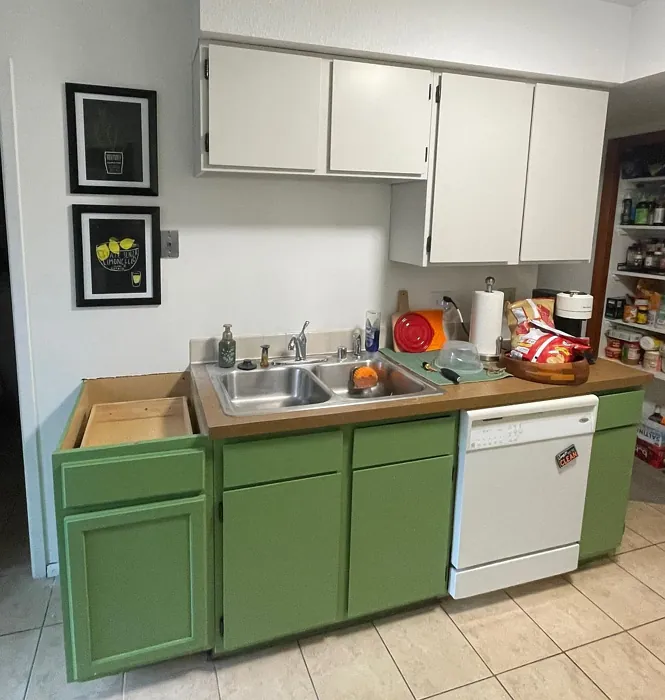
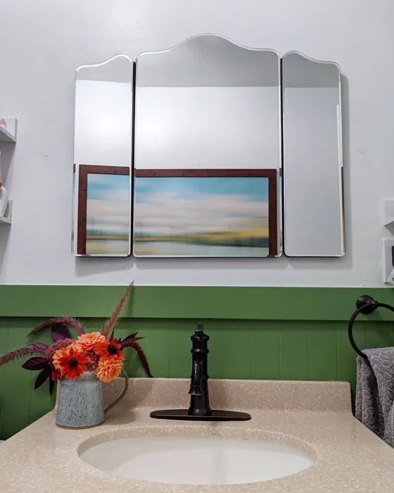
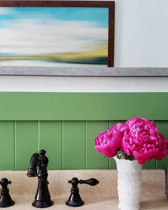
Real Room Photo of Dill SW 6438
Undertones of Dill ?
The undertones of Dill are a key aspect of its character, leaning towards Green. These subtle underlying hues are what give the color its depth and complexity. For example, a gray with a blue undertone will feel cooler and more modern, while one with a brown undertone will feel warmer and more traditional. It’s essential to test this paint in your home and observe it next to your existing furniture, flooring, and decor to see how these undertones interact and reveal themselves throughout the day.
HEX value: #788D60
RGB code: 120, 141, 96
Is Dill Cool or Warm?
Dill is considered a warm paint color. This characteristic plays a huge role in the overall feel of a room. Warm colors, like this one, tend to create a cozy, inviting, and energetic atmosphere, making them great for social spaces like living rooms and dining rooms. In contrast, cool colors often evoke a sense of calm and serenity, which is why they are popular in bedrooms and bathrooms. The warmth of Dill means it will pair beautifully with corresponding decor elements.
Understanding Color Properties and Interior Design Tips
Hue refers to a specific position on the color wheel, measured in degrees from 0 to 360. Each degree represents a different pure color:
- 0° represents red
- 120° represents green
- 240° represents blue
Saturation describes the intensity or purity of a color and is expressed as a percentage:
- At 0%, the color appears completely desaturated—essentially a shade of gray
- At 100%, the color is at its most vivid and vibrant
Lightness indicates how light or dark a color is, also expressed as a percentage:
- 0% lightness results in black
- 100% lightness results in white
Using Warm Colors in Interior Design
Warm hues—such as reds, oranges, yellows, warm beiges, and greiges—are excellent choices for creating inviting and energetic spaces. These colors are particularly well-suited for:
- Kitchens, living rooms, and bathrooms, where warmth enhances comfort and sociability
- Large rooms, where warm tones can help reduce the sense of emptiness and make the space feel more intimate
For example:
- Warm beige shades provide a cozy, inviting atmosphere, ideal for living rooms, bedrooms, and hallways.
- Warm greige (a mix of beige and gray) offers the warmth of beige with the modern appeal of gray, making it a versatile backdrop for dining areas, bedrooms, and living spaces.
However, be mindful when using warm light tones in rooms with limited natural light. These shades may appear muted or even take on an unpleasant yellowish tint. To avoid a dull or flat appearance:
- Add depth by incorporating richer tones like deep greens, charcoal, or chocolate brown
- Use textured elements such as curtains, rugs, or cushions to bring dimension to the space
Pro Tip: Achieving Harmony with Warm and Cool Color Balance
To create a well-balanced and visually interesting interior, mix warm and cool tones strategically. This contrast adds depth and harmony to your design.
- If your walls feature warm hues, introduce cool-colored accents such as blue or green furniture, artwork, or accessories to create contrast.
- For a polished look, consider using a complementary color scheme, which pairs colors opposite each other on the color wheel (e.g., red with green, orange with blue).
This thoughtful mix not only enhances visual appeal but also creates a space that feels both dynamic and cohesive.
Light Temperature Affects on Dill
Natural Light
Natural daylight changes in color temperature as the sun moves across the sky. At sunrise and sunset, the light tends to have a warm, golden tone with a color temperature around 2000 Kelvin (K). As the day progresses and the sun rises higher, the light becomes cooler and more neutral. Around midday, especially when the sky is clear, natural light typically reaches its peak brightness and shifts to a cooler tone, ranging from 5500 to 6500 Kelvin. This midday light is close to what we perceive as pure white or daylight-balanced light.
These shifts in natural light can significantly influence how colors appear in a space, which is why designers often consider both the time of day and the orientation of windows when planning interior color schemes.
Artificial Light
When choosing artificial lighting, pay close attention to the color temperature, measured in Kelvin (K). This determines how warm or cool the light will appear. Lower temperatures, around 2700K, give off a warm, yellow glow often used in living rooms or bedrooms. Higher temperatures, above 5000K, create a cool, bluish light similar to daylight, commonly used in kitchens, offices, or task areas.
Use the slider to see how lighting temperature can affect the appearance of a surface or color throughout a space.


4800K
LRV of Dill
The Light Reflectance Value (LRV) of Dill is 30%, which places it in the Medium Dark category. This means it reflects very little light. Understanding a paint’s LRV is crucial for predicting how it will look in your space. A higher LRV indicates a lighter color that reflects more light, making rooms feel larger and brighter. A lower LRV signifies a darker color that absorbs more light, creating a cozier, more intimate atmosphere. Always consider the natural and artificial lighting in your room when selecting a paint color based on its LRV.
Detailed Review of Dill
Additional Paint Characteristics
Ideal Rooms
Bedroom, Dining Room, Home Office, Kitchen, Living Room, Nursery
Decor Styles
Bohemian, Coastal, Modern Farmhouse, Rustic, Scandinavian
Coverage
Good (1–2 Coats), Touch-Up Friendly
Ease of Application
Beginner Friendly, Brush Smooth, Fast-Drying, Roller-Ready
Washability
Scrubbable, Washable
VOC Level
Eco-Certified, Low VOC
Best Use
Accent Wall, Furniture, Interior Walls, Trim
Room Suitability
Bedroom, Dining Room, Home Office, Kitchen, Living Room
Tone Tag
Balanced, Earthy, Muted
Finish Type
Eggshell, Matte, Satin
Paint Performance
Easy Touch-Up, High Coverage, Low Odor, Quick Drying
Use Cases
Best for Modern Farmhouse, Best for Rentals, Best for Small Spaces, Classic Favorite
Mood
Calm, Grounding, Inviting
Trim Pairing
Complements Brass Fixtures, Good with Wood Trim, Pairs with White Dove
Dill is a versatile paint color that beautifully balances earthy tones with a touch of elegance. When applied, it transforms spaces into calming retreats, making it ideal for areas where relaxation is key, like bedrooms and living rooms. The color adapts well to various lighting conditions — it maintains its character in both natural and artificial light, which is a significant plus for homeowners. Its muted quality allows it to pair effortlessly with other colors, making it easy to integrate into existing decor. Whether you’re going for a modern or rustic look, Dill fits in seamlessly, providing a refreshing yet grounded atmosphere. If you’re leaning towards an earthy palette, this color will complement natural materials like wood and stone beautifully.
Pros & Cons of SW 6438 Dill
Pros
Cons
Colors that go with Sherwin Williams Dill
FAQ on SW 6438 Dill
Can Dill be used in high-traffic areas?
Absolutely! Dill’s durable finish and scrubbable surface make it a great choice for high-traffic areas like hallways or living rooms. Just ensure proper surface prep before application to maximize its longevity and resistance to wear.
Is Dill suitable for exterior use?
While Dill is primarily designed for interior spaces, it can be used on exterior surfaces if properly sealed and protected. However, for exterior applications, consider a paint specifically formulated to withstand the elements for optimal performance.
Comparisons Dill with other colors
Dill SW 6438 vs Dried Thyme SW 6186
| Attribute | Dill SW 6438 | Dried Thyme SW 6186 |
|---|---|---|
| Color Name | Dill SW 6438 | Dried Thyme SW 6186 |
| Color | ||
| Hue | Green | Green |
| Brightness | Dark | Dark |
| RGB | 120, 141, 96 | 123, 128, 112 |
| LRV | 30% | 24% |
| Finish Type | Eggshell, Matte, Satin | Eggshell, Satin |
| Finish Options | Eggshell, Matte, Satin | Eggshell, Matte, Satin |
| Ideal Rooms | Bedroom, Dining Room, Home Office, Kitchen, Living Room, Nursery | Bathroom, Bedroom, Dining Room, Entryway, Home Office, Kitchen, Living Room |
| Decor Styles | Bohemian, Coastal, Modern Farmhouse, Rustic, Scandinavian | Bohemian, Industrial, Minimalist, Modern Farmhouse, Rustic |
| Coverage | Good (1–2 Coats), Touch-Up Friendly | Good (1–2 Coats), Touch-Up Friendly |
| Ease of Application | Beginner Friendly, Brush Smooth, Fast-Drying, Roller-Ready | Beginner Friendly, Brush Smooth, Roller-Ready |
| Washability | Scrubbable, Washable | Washable, Wipeable |
| Room Suitability | Bedroom, Dining Room, Home Office, Kitchen, Living Room | Bathroom, Bedroom, Dining Room, Home Office, Kitchen, Living Room |
| Tone | Balanced, Earthy, Muted | Cool, Earthy, Muted |
| Paint Performance | Easy Touch-Up, High Coverage, Low Odor, Quick Drying | Easy Touch-Up, Low Odor, Scuff Resistant |
Dill SW 6438 vs Retreat SW 6207
| Attribute | Dill SW 6438 | Retreat SW 6207 |
|---|---|---|
| Color Name | Dill SW 6438 | Retreat SW 6207 |
| Color | ||
| Hue | Green | Green |
| Brightness | Dark | Dark |
| RGB | 120, 141, 96 | 122, 128, 118 |
| LRV | 30% | 30% |
| Finish Type | Eggshell, Matte, Satin | Eggshell, Matte, Satin |
| Finish Options | Eggshell, Matte, Satin | Eggshell, Matte, Satin |
| Ideal Rooms | Bedroom, Dining Room, Home Office, Kitchen, Living Room, Nursery | Bathroom, Bedroom, Home Office, Kitchen, Living Room |
| Decor Styles | Bohemian, Coastal, Modern Farmhouse, Rustic, Scandinavian | Minimalist, Modern, Rustic, Transitional |
| Coverage | Good (1–2 Coats), Touch-Up Friendly | Good (1–2 Coats), Touch-Up Friendly |
| Ease of Application | Beginner Friendly, Brush Smooth, Fast-Drying, Roller-Ready | Beginner Friendly, Brush Smooth, Roller-Ready |
| Washability | Scrubbable, Washable | Washable, Wipeable |
| Room Suitability | Bedroom, Dining Room, Home Office, Kitchen, Living Room | Bathroom, Bedroom, Home Office, Living Room |
| Tone | Balanced, Earthy, Muted | Cool, Earthy, Muted |
| Paint Performance | Easy Touch-Up, High Coverage, Low Odor, Quick Drying | Easy Touch-Up, Low Odor, Scuff Resistant |
Dill SW 6438 vs Rosemary SW 6187
| Attribute | Dill SW 6438 | Rosemary SW 6187 |
|---|---|---|
| Color Name | Dill SW 6438 | Rosemary SW 6187 |
| Color | ||
| Hue | Green | Green |
| Brightness | Dark | Dark |
| RGB | 120, 141, 96 | 100, 105, 92 |
| LRV | 30% | 45% |
| Finish Type | Eggshell, Matte, Satin | Eggshell, Matte, Satin |
| Finish Options | Eggshell, Matte, Satin | Eggshell, Matte, Satin |
| Ideal Rooms | Bedroom, Dining Room, Home Office, Kitchen, Living Room, Nursery | Bedroom, Dining Room, Hallway, Home Office, Living Room |
| Decor Styles | Bohemian, Coastal, Modern Farmhouse, Rustic, Scandinavian | Bohemian, Coastal, Modern Farmhouse, Rustic |
| Coverage | Good (1–2 Coats), Touch-Up Friendly | Good (1–2 Coats), Touch-Up Friendly |
| Ease of Application | Beginner Friendly, Brush Smooth, Fast-Drying, Roller-Ready | Beginner Friendly, Brush Smooth, Roller-Ready |
| Washability | Scrubbable, Washable | Washable, Wipeable |
| Room Suitability | Bedroom, Dining Room, Home Office, Kitchen, Living Room | Bedroom, Dining Room, Home Office, Living Room |
| Tone | Balanced, Earthy, Muted | Earthy, Muted, Warm |
| Paint Performance | Easy Touch-Up, High Coverage, Low Odor, Quick Drying | Fade Resistant, Low Odor, Quick Drying, Stain Resistant |
Dill SW 6438 vs Basil SW 6194
| Attribute | Dill SW 6438 | Basil SW 6194 |
|---|---|---|
| Color Name | Dill SW 6438 | Basil SW 6194 |
| Color | ||
| Hue | Green | Green |
| Brightness | Dark | Dark |
| RGB | 120, 141, 96 | 98, 110, 96 |
| LRV | 30% | 12% |
| Finish Type | Eggshell, Matte, Satin | Eggshell, Matte, Satin |
| Finish Options | Eggshell, Matte, Satin | Eggshell, Matte, Satin |
| Ideal Rooms | Bedroom, Dining Room, Home Office, Kitchen, Living Room, Nursery | Bathroom, Bedroom, Dining Room, Home Office, Kitchen, Living Room |
| Decor Styles | Bohemian, Coastal, Modern Farmhouse, Rustic, Scandinavian | Bohemian, Contemporary, Modern Farmhouse, Rustic, Transitional |
| Coverage | Good (1–2 Coats), Touch-Up Friendly | Good (1–2 Coats), Touch-Up Friendly |
| Ease of Application | Beginner Friendly, Brush Smooth, Fast-Drying, Roller-Ready | Beginner Friendly, Brush Smooth, Fast-Drying, Roller-Ready |
| Washability | Scrubbable, Washable | Washable, Wipeable |
| Room Suitability | Bedroom, Dining Room, Home Office, Kitchen, Living Room | Bathroom, Bedroom, Dining Room, Kitchen, Living Room |
| Tone | Balanced, Earthy, Muted | Earthy, Muted, Warm |
| Paint Performance | Easy Touch-Up, High Coverage, Low Odor, Quick Drying | Easy Touch-Up, Low Odor, Quick Drying |
Dill SW 6438 vs Artichoke SW 6179
| Attribute | Dill SW 6438 | Artichoke SW 6179 |
|---|---|---|
| Color Name | Dill SW 6438 | Artichoke SW 6179 |
| Color | ||
| Hue | Green | Green |
| Brightness | Dark | Dark |
| RGB | 120, 141, 96 | 127, 130, 102 |
| LRV | 30% | 24% |
| Finish Type | Eggshell, Matte, Satin | Eggshell, Matte, Satin |
| Finish Options | Eggshell, Matte, Satin | Eggshell, Matte, Satin |
| Ideal Rooms | Bedroom, Dining Room, Home Office, Kitchen, Living Room, Nursery | Bedroom, Dining Room, Home Office, Living Room |
| Decor Styles | Bohemian, Coastal, Modern Farmhouse, Rustic, Scandinavian | Eclectic, Modern Farmhouse, Rustic, Transitional |
| Coverage | Good (1–2 Coats), Touch-Up Friendly | Good (1–2 Coats), Touch-Up Friendly |
| Ease of Application | Beginner Friendly, Brush Smooth, Fast-Drying, Roller-Ready | Beginner Friendly, Brush Smooth, Fast-Drying, Roller-Ready |
| Washability | Scrubbable, Washable | Washable, Wipeable |
| Room Suitability | Bedroom, Dining Room, Home Office, Kitchen, Living Room | Bedroom, Dining Room, Home Office, Living Room |
| Tone | Balanced, Earthy, Muted | Earthy, Muted, Warm |
| Paint Performance | Easy Touch-Up, High Coverage, Low Odor, Quick Drying | Easy Touch-Up, High Coverage, Low Odor |
Dill SW 6438 vs Shade-Grown SW 6188
| Attribute | Dill SW 6438 | Shade-Grown SW 6188 |
|---|---|---|
| Color Name | Dill SW 6438 | Shade-Grown SW 6188 |
| Color | ||
| Hue | Green | Green |
| Brightness | Dark | Dark |
| RGB | 120, 141, 96 | 78, 81, 71 |
| LRV | 30% | 24% |
| Finish Type | Eggshell, Matte, Satin | Eggshell, Satin |
| Finish Options | Eggshell, Matte, Satin | Eggshell, Flat, Satin |
| Ideal Rooms | Bedroom, Dining Room, Home Office, Kitchen, Living Room, Nursery | Bedroom, Dining Room, Home Office, Living Room |
| Decor Styles | Bohemian, Coastal, Modern Farmhouse, Rustic, Scandinavian | Bohemian, Modern, Rustic, Scandinavian |
| Coverage | Good (1–2 Coats), Touch-Up Friendly | Good (1–2 Coats), Touch-Up Friendly |
| Ease of Application | Beginner Friendly, Brush Smooth, Fast-Drying, Roller-Ready | Beginner Friendly, Brush Smooth, Fast-Drying, Roller-Ready |
| Washability | Scrubbable, Washable | Highly Washable, Washable |
| Room Suitability | Bedroom, Dining Room, Home Office, Kitchen, Living Room | Bedroom, Dining Room, Home Office, Living Room |
| Tone | Balanced, Earthy, Muted | Deep, Earthy, Muted |
| Paint Performance | Easy Touch-Up, High Coverage, Low Odor, Quick Drying | Easy Touch-Up, High Coverage, Low Odor, Scuff Resistant |
Dill SW 6438 vs Foxhall Green SW 9184
| Attribute | Dill SW 6438 | Foxhall Green SW 9184 |
|---|---|---|
| Color Name | Dill SW 6438 | Foxhall Green SW 9184 |
| Color | ||
| Hue | Green | Green |
| Brightness | Dark | Dark |
| RGB | 120, 141, 96 | 69, 75, 64 |
| LRV | 30% | 12% |
| Finish Type | Eggshell, Matte, Satin | Eggshell, Matte, Satin |
| Finish Options | Eggshell, Matte, Satin | Eggshell, Matte, Satin |
| Ideal Rooms | Bedroom, Dining Room, Home Office, Kitchen, Living Room, Nursery | Bedroom, Dining Room, Home Office, Living Room |
| Decor Styles | Bohemian, Coastal, Modern Farmhouse, Rustic, Scandinavian | Contemporary, Modern Farmhouse, Rustic, Traditional |
| Coverage | Good (1–2 Coats), Touch-Up Friendly | Good (1–2 Coats), Touch-Up Friendly |
| Ease of Application | Beginner Friendly, Brush Smooth, Fast-Drying, Roller-Ready | Beginner Friendly, Brush Smooth, Fast-Drying, Roller-Ready |
| Washability | Scrubbable, Washable | Washable, Wipeable |
| Room Suitability | Bedroom, Dining Room, Home Office, Kitchen, Living Room | Bedroom, Dining Room, Home Office, Living Room |
| Tone | Balanced, Earthy, Muted | Balanced, Deep, Earthy, Muted |
| Paint Performance | Easy Touch-Up, High Coverage, Low Odor, Quick Drying | Easy Touch-Up, Fade Resistant, Low Odor, Quick Drying |
Dill SW 6438 vs Pewter Green SW 6208
| Attribute | Dill SW 6438 | Pewter Green SW 6208 |
|---|---|---|
| Color Name | Dill SW 6438 | Pewter Green SW 6208 |
| Color | ||
| Hue | Green | Green |
| Brightness | Dark | Dark |
| RGB | 120, 141, 96 | 94, 98, 89 |
| LRV | 30% | 24% |
| Finish Type | Eggshell, Matte, Satin | Eggshell, Matte, Satin |
| Finish Options | Eggshell, Matte, Satin | Eggshell, Matte, Satin |
| Ideal Rooms | Bedroom, Dining Room, Home Office, Kitchen, Living Room, Nursery | Bedroom, Dining Room, Entryway, Home Office, Living Room |
| Decor Styles | Bohemian, Coastal, Modern Farmhouse, Rustic, Scandinavian | Contemporary, Modern Farmhouse, Rustic, Scandinavian, Traditional |
| Coverage | Good (1–2 Coats), Touch-Up Friendly | Good (1–2 Coats), Touch-Up Friendly |
| Ease of Application | Beginner Friendly, Brush Smooth, Fast-Drying, Roller-Ready | Beginner Friendly, Brush Smooth, Fast-Drying, Roller-Ready |
| Washability | Scrubbable, Washable | Highly Washable, Washable, Wipeable |
| Room Suitability | Bedroom, Dining Room, Home Office, Kitchen, Living Room | Bathroom, Bedroom, Dining Room, Kitchen, Living Room |
| Tone | Balanced, Earthy, Muted | Balanced, Cool, Earthy, Muted |
| Paint Performance | Easy Touch-Up, High Coverage, Low Odor, Quick Drying | Easy Touch-Up, Fade Resistant, Low Odor, Quick Drying |
Dill SW 6438 vs Rookwood Dark Green SW 2816
| Attribute | Dill SW 6438 | Rookwood Dark Green SW 2816 |
|---|---|---|
| Color Name | Dill SW 6438 | Rookwood Dark Green SW 2816 |
| Color | ||
| Hue | Green | Green |
| Brightness | Dark | Dark |
| RGB | 120, 141, 96 | 86, 92, 74 |
| LRV | 30% | 6% |
| Finish Type | Eggshell, Matte, Satin | Eggshell, Matte, Satin |
| Finish Options | Eggshell, Matte, Satin | Eggshell, Matte, Satin |
| Ideal Rooms | Bedroom, Dining Room, Home Office, Kitchen, Living Room, Nursery | Bedroom, Dining Room, Home Office, Kitchen, Living Room |
| Decor Styles | Bohemian, Coastal, Modern Farmhouse, Rustic, Scandinavian | Contemporary, Modern Farmhouse, Rustic, Traditional |
| Coverage | Good (1–2 Coats), Touch-Up Friendly | Good (1–2 Coats), Touch-Up Friendly |
| Ease of Application | Beginner Friendly, Brush Smooth, Fast-Drying, Roller-Ready | Beginner Friendly, Brush Smooth, Roller-Ready |
| Washability | Scrubbable, Washable | Washable, Wipeable |
| Room Suitability | Bedroom, Dining Room, Home Office, Kitchen, Living Room | Bedroom, Dining Room, Home Office, Living Room |
| Tone | Balanced, Earthy, Muted | Deep, Earthy, Warm |
| Paint Performance | Easy Touch-Up, High Coverage, Low Odor, Quick Drying | Easy Touch-Up, High Coverage, Low Odor, Scuff Resistant |
Dill SW 6438 vs Ripe Olive SW 6209
| Attribute | Dill SW 6438 | Ripe Olive SW 6209 |
|---|---|---|
| Color Name | Dill SW 6438 | Ripe Olive SW 6209 |
| Color | ||
| Hue | Green | Green |
| Brightness | Dark | Dark |
| RGB | 120, 141, 96 | 68, 72, 61 |
| LRV | 30% | 15% |
| Finish Type | Eggshell, Matte, Satin | Eggshell, Matte |
| Finish Options | Eggshell, Matte, Satin | Eggshell, Matte, Satin |
| Ideal Rooms | Bedroom, Dining Room, Home Office, Kitchen, Living Room, Nursery | Bedroom, Dining Room, Home Office, Living Room |
| Decor Styles | Bohemian, Coastal, Modern Farmhouse, Rustic, Scandinavian | Bohemian, Industrial, Modern Farmhouse, Rustic |
| Coverage | Good (1–2 Coats), Touch-Up Friendly | Good (1–2 Coats) |
| Ease of Application | Beginner Friendly, Brush Smooth, Fast-Drying, Roller-Ready | Beginner Friendly, Brush Smooth, Roller-Ready |
| Washability | Scrubbable, Washable | Highly Washable, Washable |
| Room Suitability | Bedroom, Dining Room, Home Office, Kitchen, Living Room | Bedroom, Dining Room, Home Office, Living Room |
| Tone | Balanced, Earthy, Muted | Deep, Earthy, Muted |
| Paint Performance | Easy Touch-Up, High Coverage, Low Odor, Quick Drying | Easy Touch-Up, High Coverage, Low Odor |
Official Page of Sherwin Williams Dill SW 6438