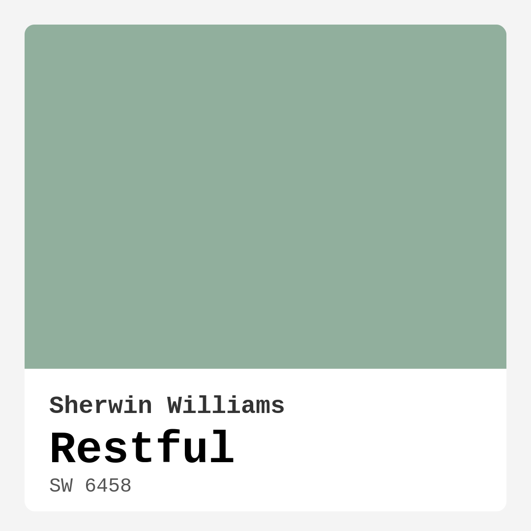
Color Preview & Key Details
| HEX Code | #91AF9D |
| RGB | 145, 175, 157 |
| LRV | 50% |
| Undertone | Green |
| Finish Options | Eggshell, Matte, Satin |
Imagine stepping into a space where the chaos of the outside world seems to melt away, replaced by a sense of calm and serenity. That’s the magic of Restful, a soft, soothing green from Sherwin Williams. With the color code SW 6458, Restful is not just a paint; it’s an invitation to experience tranquility in your home.
This color beautifully balances nature-inspired tones with a modern touch, making it a versatile choice for various decor styles. Whether you lean towards a sleek modern aesthetic, a cozy farmhouse vibe, or a minimalist design, Restful can seamlessly become a part of your home.
What makes Restful particularly special is its unique blend of green and grey, a combination that evokes feelings of freshness and timelessness. It’s a hue that can breathe life into your interiors while still maintaining a sense of elegance. Think about it: how often do we crave spaces that feel peaceful yet stylish? Restful delivers on that front and more.
Let’s talk about the practical aspects of this color. One of the standout features of Restful is its Light Reflectance Value (LRV) of 50%, placing it firmly in the medium category. This means it reflects a moderate amount of light, creating an inviting atmosphere without feeling too bright or overwhelming. In spaces flooded with natural light, Restful showcases its soft green essence beautifully, brightening the room and making it feel airy. In contrast, under artificial lighting, it holds onto its peaceful character, ensuring it remains a calming presence even when the sun goes down.
When considering a color for your home, it’s essential to think about how it interacts with the light in your space. Restful is particularly forgiving in this regard, managing to maintain its inviting quality across different lighting scenarios. Just keep in mind that in rooms with limited natural light, this color may appear a bit darker, which is something to consider if you’re aiming for a brighter feel.
If you’re wondering where to use Restful, the possibilities are endless. It works wonders in bedrooms, creating a soothing sanctuary where you can unwind after a long day. In living rooms, it invites guests to relax and feel at home. It’s also an excellent choice for home offices, fostering a tranquil environment that enhances productivity. Even in a nursery, Restful can make the space feel safe and nurturing, promoting a peaceful atmosphere for both parents and little ones.
One of the reasons I’m such a fan of Restful is its versatility. It pairs beautifully with various trim colors, particularly crisp whites like White Dove, which can enhance the fresh feel of the green. Imagine soft white trim against those restful walls—it’s a match made in design heaven.
If you’re leaning toward a more eclectic palette, Restful complements a range of other colors beautifully. Shades like SW 6826 and SW 0074 can add a pop of color and creativity, while deeper shades like SW 9041 can create a stunning contrast that adds depth and interest to your space.
One of the best parts about applying Restful is how user-friendly it is. It’s a paint that’s beginner-friendly, so even if you’re a DIY novice, you can achieve beautiful results. The application process is smooth, and it dries evenly, providing excellent coverage with just one or two coats. This makes it not just a beautiful choice, but a practical one as well.
For those of you concerned about maintenance, Restful is highly washable and durable, making it suitable for high-traffic areas. If you choose a finish like eggshell or satin, you’ll find it holds up exceptionally well, allowing you to keep your walls looking pristine. Plus, with its low VOC and eco-certified status, you can feel good about using this paint in your home.
Now, let’s touch on the undertones of Restful. It leans towards green, which is a key aspect of its character. Understanding these undertones is important—they can significantly influence how the color appears in your space. For instance, if you place it next to warm woods or earthy tones, it will convey a cozy, inviting vibe. Side by side with cooler hues, it can take on a more modern feel. Testing the color in your home is vital to see how it reacts with your existing decor.
While Restful is largely a muted, cool color, its balanced quality ensures it won’t feel cold or uninviting. It creates an environment that’s both restful and inviting, perfect for gatherings or quiet evenings in.
As you consider your next painting project, think about the mood you want to create. Restful embodies calm and serenity, making it an ideal choice for anyone looking to evoke relaxation in their home. Whether you’re updating a single room or embarking on a larger home refresh, incorporating Restful can transform your space into a peaceful haven.
If you’re still on the fence about whether this color is right for you, consider how it might work in various settings. For small spaces, Restful can create an illusion of openness and tranquility, making your area feel larger and more inviting. Just remember to be mindful of the lighting; it’s best suited for areas with ample natural light to showcase its full beauty.
When it comes to high-traffic areas, Restful holds its own. Just clean any scuffs or marks promptly to maintain its serene appearance.
In conclusion, Restful by Sherwin Williams is more than just a paint color; it’s an experience waiting to be had. Its ability to blend nature-inspired tones with a modern edge makes it a standout choice in the world of home decor. So, as you embark on your next project, consider this soft, soothing green. It just might be the perfect addition to create the tranquil space you’ve always dreamed of.
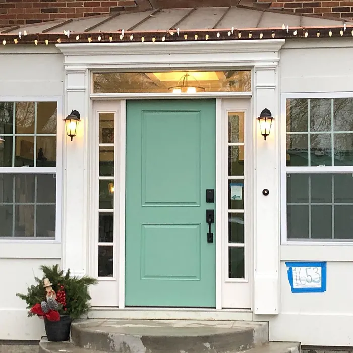
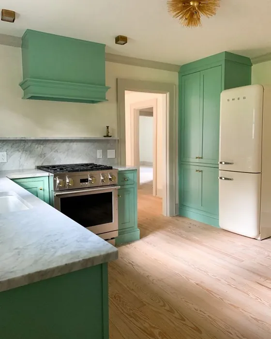
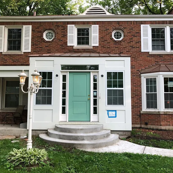
Real Room Photo of Restful SW 6458
Undertones of Restful ?
The undertones of Restful are a key aspect of its character, leaning towards Green. These subtle underlying hues are what give the color its depth and complexity. For example, a gray with a blue undertone will feel cooler and more modern, while one with a brown undertone will feel warmer and more traditional. It’s essential to test this paint in your home and observe it next to your existing furniture, flooring, and decor to see how these undertones interact and reveal themselves throughout the day.
HEX value: #91AF9D
RGB code: 145, 175, 157
Is Restful Cool or Warm?
While Restful leans towards the cool spectrum, its muted quality gives it a balanced feel that works harmoniously in various lighting conditions, ensuring it remains inviting without feeling cold.
Understanding Color Properties and Interior Design Tips
Hue refers to a specific position on the color wheel, measured in degrees from 0 to 360. Each degree represents a different pure color:
- 0° represents red
- 120° represents green
- 240° represents blue
Saturation describes the intensity or purity of a color and is expressed as a percentage:
- At 0%, the color appears completely desaturated—essentially a shade of gray
- At 100%, the color is at its most vivid and vibrant
Lightness indicates how light or dark a color is, also expressed as a percentage:
- 0% lightness results in black
- 100% lightness results in white
Using Warm Colors in Interior Design
Warm hues—such as reds, oranges, yellows, warm beiges, and greiges—are excellent choices for creating inviting and energetic spaces. These colors are particularly well-suited for:
- Kitchens, living rooms, and bathrooms, where warmth enhances comfort and sociability
- Large rooms, where warm tones can help reduce the sense of emptiness and make the space feel more intimate
For example:
- Warm beige shades provide a cozy, inviting atmosphere, ideal for living rooms, bedrooms, and hallways.
- Warm greige (a mix of beige and gray) offers the warmth of beige with the modern appeal of gray, making it a versatile backdrop for dining areas, bedrooms, and living spaces.
However, be mindful when using warm light tones in rooms with limited natural light. These shades may appear muted or even take on an unpleasant yellowish tint. To avoid a dull or flat appearance:
- Add depth by incorporating richer tones like deep greens, charcoal, or chocolate brown
- Use textured elements such as curtains, rugs, or cushions to bring dimension to the space
Pro Tip: Achieving Harmony with Warm and Cool Color Balance
To create a well-balanced and visually interesting interior, mix warm and cool tones strategically. This contrast adds depth and harmony to your design.
- If your walls feature warm hues, introduce cool-colored accents such as blue or green furniture, artwork, or accessories to create contrast.
- For a polished look, consider using a complementary color scheme, which pairs colors opposite each other on the color wheel (e.g., red with green, orange with blue).
This thoughtful mix not only enhances visual appeal but also creates a space that feels both dynamic and cohesive.
Light Temperature Affects on Restful
Natural Light
Natural daylight changes in color temperature as the sun moves across the sky. At sunrise and sunset, the light tends to have a warm, golden tone with a color temperature around 2000 Kelvin (K). As the day progresses and the sun rises higher, the light becomes cooler and more neutral. Around midday, especially when the sky is clear, natural light typically reaches its peak brightness and shifts to a cooler tone, ranging from 5500 to 6500 Kelvin. This midday light is close to what we perceive as pure white or daylight-balanced light.
These shifts in natural light can significantly influence how colors appear in a space, which is why designers often consider both the time of day and the orientation of windows when planning interior color schemes.
Artificial Light
When choosing artificial lighting, pay close attention to the color temperature, measured in Kelvin (K). This determines how warm or cool the light will appear. Lower temperatures, around 2700K, give off a warm, yellow glow often used in living rooms or bedrooms. Higher temperatures, above 5000K, create a cool, bluish light similar to daylight, commonly used in kitchens, offices, or task areas.
Use the slider to see how lighting temperature can affect the appearance of a surface or color throughout a space.


4800K
LRV of Restful
The Light Reflectance Value (LRV) of Restful is 50%, which places it in the Medium category. This means it Reflects a moderate amount of light. Understanding a paint’s LRV is crucial for predicting how it will look in your space. A higher LRV indicates a lighter color that reflects more light, making rooms feel larger and brighter. A lower LRV signifies a darker color that absorbs more light, creating a cozier, more intimate atmosphere. Always consider the natural and artificial lighting in your room when selecting a paint color based on its LRV.
Detailed Review of Restful
Additional Paint Characteristics
Ideal Rooms
Bedroom, Dining Room, Home Office, Living Room, Nursery
Decor Styles
Farmhouse, Minimalist, Modern, Scandinavian
Coverage
Good (1–2 Coats)
Ease of Application
Beginner Friendly, Brush Smooth, Roller-Ready
Washability
Highly Washable, Washable
VOC Level
Eco-Certified, Low VOC
Best Use
Accent Wall, Home Office, Interior Walls
Room Suitability
Bedroom, Home Office, Living Room, Nursery
Tone Tag
Balanced, Cool, Muted
Finish Type
Eggshell, Matte
Paint Performance
Easy Touch-Up, Low Odor, Scuff Resistant
Use Cases
Best for Rentals, Best for Selling Your Home, Designer Favorite
Mood
Calm, Inviting, Restful
Trim Pairing
Complements Cool Trim, Pairs with White Dove
Restful is more than just a paint color; it’s an experience. When you step into a room painted with this hue, you immediately feel a sense of calm wash over you. Its unique blend of green and grey creates a versatile backdrop that pairs well with both warm and cool tones. Whether you’re looking to refresh a bedroom or create a tranquil home office, Restful delivers a serene atmosphere. The application process is smooth, and the color dries evenly, providing excellent coverage in just one or two coats. It’s a go-to choice for anyone wanting to evoke relaxation in their home.
Pros & Cons of SW 6458 Restful
Pros
Cons
Colors that go with Sherwin Williams Restful
FAQ on SW 6458 Restful
Is Restful suitable for small spaces?
Absolutely! Restful is perfect for small spaces as it creates an illusion of openness and tranquility. Its soft hue helps to visually expand the area, making it feel larger and more inviting. Just be mindful of the lighting, as it may appear darker in rooms without ample natural light.
Can I use Restful in a high-traffic area?
Yes, Restful can be used in high-traffic areas, especially if you choose a more durable finish like eggshell or satin. These finishes are more resistant to wear and tear, ensuring that the calming beauty of this color remains intact even in bustling spaces. Just make sure to clean any scuffs or marks promptly to maintain its serene appearance.
Comparisons Restful with other colors
Restful SW 6458 vs Acacia Haze SW 9132
| Attribute | Restful SW 6458 | Acacia Haze SW 9132 |
|---|---|---|
| Color Name | Restful SW 6458 | Acacia Haze SW 9132 |
| Color | ||
| Hue | Green | Green |
| Brightness | Medium | Medium |
| RGB | 145, 175, 157 | 150, 156, 146 |
| LRV | 50% | 30% |
| Finish Type | Eggshell, Matte | Eggshell, Satin |
| Finish Options | Eggshell, Matte, Satin | Eggshell, Matte, Satin |
| Ideal Rooms | Bedroom, Dining Room, Home Office, Living Room, Nursery | Bedroom, Dining Room, Home Office, Living Room, Nursery |
| Decor Styles | Farmhouse, Minimalist, Modern, Scandinavian | Bohemian, Coastal, Modern Farmhouse, Scandinavian |
| Coverage | Good (1–2 Coats) | Good (1–2 Coats), Touch-Up Friendly |
| Ease of Application | Beginner Friendly, Brush Smooth, Roller-Ready | Beginner Friendly, Brush Smooth, Roller-Ready |
| Washability | Highly Washable, Washable | Washable, Wipeable |
| Room Suitability | Bedroom, Home Office, Living Room, Nursery | Bedroom, Home Office, Living Room, Nursery |
| Tone | Balanced, Cool, Muted | Balanced, Earthy, Muted |
| Paint Performance | Easy Touch-Up, Low Odor, Scuff Resistant | Easy Touch-Up, High Coverage, Low Odor |
Restful SW 6458 vs Evergreen Fog SW 9130
| Attribute | Restful SW 6458 | Evergreen Fog SW 9130 |
|---|---|---|
| Color Name | Restful SW 6458 | Evergreen Fog SW 9130 |
| Color | ||
| Hue | Green | Green |
| Brightness | Medium | Medium |
| RGB | 145, 175, 157 | 149, 151, 138 |
| LRV | 50% | 30% |
| Finish Type | Eggshell, Matte | Eggshell, Matte, Satin |
| Finish Options | Eggshell, Matte, Satin | Eggshell, Matte, Satin |
| Ideal Rooms | Bedroom, Dining Room, Home Office, Living Room, Nursery | Bedroom, Dining Room, Home Office, Living Room, Nursery |
| Decor Styles | Farmhouse, Minimalist, Modern, Scandinavian | Coastal, Modern Farmhouse, Rustic, Scandinavian, Transitional |
| Coverage | Good (1–2 Coats) | Good (1–2 Coats), Touch-Up Friendly |
| Ease of Application | Beginner Friendly, Brush Smooth, Roller-Ready | Beginner Friendly, Brush Smooth, Roller-Ready |
| Washability | Highly Washable, Washable | Scrubbable, Washable |
| Room Suitability | Bedroom, Home Office, Living Room, Nursery | Bedroom, Dining Room, Home Office, Living Room, Nursery |
| Tone | Balanced, Cool, Muted | Balanced, Earthy, Muted |
| Paint Performance | Easy Touch-Up, Low Odor, Scuff Resistant | Easy Touch-Up, Low Odor, Scuff Resistant |
Restful SW 6458 vs Clary Sage SW 6178
| Attribute | Restful SW 6458 | Clary Sage SW 6178 |
|---|---|---|
| Color Name | Restful SW 6458 | Clary Sage SW 6178 |
| Color | ||
| Hue | Green | Green |
| Brightness | Medium | Medium |
| RGB | 145, 175, 157 | 172, 173, 151 |
| LRV | 50% | 24% |
| Finish Type | Eggshell, Matte | Eggshell, Matte |
| Finish Options | Eggshell, Matte, Satin | Eggshell, Matte, Satin |
| Ideal Rooms | Bedroom, Dining Room, Home Office, Living Room, Nursery | Bathroom, Bedroom, Home Office, Kitchen, Living Room |
| Decor Styles | Farmhouse, Minimalist, Modern, Scandinavian | Bohemian, Minimalist, Modern Farmhouse, Scandinavian, Traditional |
| Coverage | Good (1–2 Coats) | Good (1–2 Coats), Touch-Up Friendly |
| Ease of Application | Beginner Friendly, Brush Smooth, Roller-Ready | Beginner Friendly, Brush Smooth, Roller-Ready |
| Washability | Highly Washable, Washable | Washable, Wipeable |
| Room Suitability | Bedroom, Home Office, Living Room, Nursery | Bathroom, Bedroom, Home Office, Kitchen, Living Room |
| Tone | Balanced, Cool, Muted | Cool, Earthy, Muted |
| Paint Performance | Easy Touch-Up, Low Odor, Scuff Resistant | Easy Touch-Up, High Coverage, Low Odor |
Restful SW 6458 vs Softened Green SW 6177
| Attribute | Restful SW 6458 | Softened Green SW 6177 |
|---|---|---|
| Color Name | Restful SW 6458 | Softened Green SW 6177 |
| Color | ||
| Hue | Green | Green |
| Brightness | Medium | Medium |
| RGB | 145, 175, 157 | 187, 188, 167 |
| LRV | 50% | 48% |
| Finish Type | Eggshell, Matte | Eggshell, Matte, Satin |
| Finish Options | Eggshell, Matte, Satin | Eggshell, Matte, Satin |
| Ideal Rooms | Bedroom, Dining Room, Home Office, Living Room, Nursery | Bathroom, Bedroom, Dining Room, Home Office, Kitchen, Living Room, Nursery |
| Decor Styles | Farmhouse, Minimalist, Modern, Scandinavian | Coastal, Farmhouse, Minimalist, Modern, Scandinavian |
| Coverage | Good (1–2 Coats) | Good (1–2 Coats), Touch-Up Friendly |
| Ease of Application | Beginner Friendly, Brush Smooth, Roller-Ready | Beginner Friendly, Brush Smooth, Fast-Drying, Roller-Ready |
| Washability | Highly Washable, Washable | Washable, Wipeable |
| Room Suitability | Bedroom, Home Office, Living Room, Nursery | Bathroom, Bedroom, Dining Room, Home Office, Kitchen, Living Room |
| Tone | Balanced, Cool, Muted | Calm, Earthy, Muted |
| Paint Performance | Easy Touch-Up, Low Odor, Scuff Resistant | Easy Touch-Up, Fade Resistant, Low Odor, Quick Drying |
Restful SW 6458 vs Eventide SW 9643
| Attribute | Restful SW 6458 | Eventide SW 9643 |
|---|---|---|
| Color Name | Restful SW 6458 | Eventide SW 9643 |
| Color | ||
| Hue | Green | Green |
| Brightness | Medium | Medium |
| RGB | 145, 175, 157 | 163, 175, 172 |
| LRV | 50% | 24% |
| Finish Type | Eggshell, Matte | Eggshell, Matte, Satin |
| Finish Options | Eggshell, Matte, Satin | Eggshell, Matte, Satin |
| Ideal Rooms | Bedroom, Dining Room, Home Office, Living Room, Nursery | Bedroom, Home Office, Kitchen, Living Room, Nursery |
| Decor Styles | Farmhouse, Minimalist, Modern, Scandinavian | Coastal, Contemporary, Minimalist, Modern |
| Coverage | Good (1–2 Coats) | Good (1–2 Coats), Touch-Up Friendly |
| Ease of Application | Beginner Friendly, Brush Smooth, Roller-Ready | Beginner Friendly, Brush Smooth, Fast-Drying, Roller-Ready |
| Washability | Highly Washable, Washable | Washable, Wipeable |
| Room Suitability | Bedroom, Home Office, Living Room, Nursery | Bedroom, Home Office, Living Room, Nursery |
| Tone | Balanced, Cool, Muted | Airy, Balanced, Cool, Muted |
| Paint Performance | Easy Touch-Up, Low Odor, Scuff Resistant | Easy Touch-Up, High Coverage, Low Odor, Quick Drying |
Restful SW 6458 vs Escape Gray SW 6185
| Attribute | Restful SW 6458 | Escape Gray SW 6185 |
|---|---|---|
| Color Name | Restful SW 6458 | Escape Gray SW 6185 |
| Color | ||
| Hue | Green | Green |
| Brightness | Medium | Medium |
| RGB | 145, 175, 157 | 171, 172, 159 |
| LRV | 50% | 48% |
| Finish Type | Eggshell, Matte | Eggshell, Matte |
| Finish Options | Eggshell, Matte, Satin | Eggshell, Matte, Satin |
| Ideal Rooms | Bedroom, Dining Room, Home Office, Living Room, Nursery | Bathroom, Bedroom, Entryway, Home Office, Living Room |
| Decor Styles | Farmhouse, Minimalist, Modern, Scandinavian | Minimalist, Modern, Scandinavian, Transitional |
| Coverage | Good (1–2 Coats) | Good (1–2 Coats) |
| Ease of Application | Beginner Friendly, Brush Smooth, Roller-Ready | Beginner Friendly, Brush Smooth, Roller-Ready |
| Washability | Highly Washable, Washable | Highly Washable, Washable |
| Room Suitability | Bedroom, Home Office, Living Room, Nursery | Bathroom, Bedroom, Home Office, Living Room |
| Tone | Balanced, Cool, Muted | Cool, Muted, Neutral, Warm |
| Paint Performance | Easy Touch-Up, Low Odor, Scuff Resistant | Easy Touch-Up, Low Odor, Scuff Resistant |
Restful SW 6458 vs Coastal Plain SW 6192
| Attribute | Restful SW 6458 | Coastal Plain SW 6192 |
|---|---|---|
| Color Name | Restful SW 6458 | Coastal Plain SW 6192 |
| Color | ||
| Hue | Green | Green |
| Brightness | Medium | Medium |
| RGB | 145, 175, 157 | 159, 166, 148 |
| LRV | 50% | 66% |
| Finish Type | Eggshell, Matte | Eggshell, Satin |
| Finish Options | Eggshell, Matte, Satin | Eggshell, Satin, Semi-Gloss |
| Ideal Rooms | Bedroom, Dining Room, Home Office, Living Room, Nursery | Bathroom, Bedroom, Home Office, Kitchen, Living Room |
| Decor Styles | Farmhouse, Minimalist, Modern, Scandinavian | Bohemian, Coastal, Contemporary, Modern Farmhouse, Rustic |
| Coverage | Good (1–2 Coats) | Good (1–2 Coats) |
| Ease of Application | Beginner Friendly, Brush Smooth, Roller-Ready | Beginner Friendly, Brush Smooth, Fast-Drying, Roller-Ready |
| Washability | Highly Washable, Washable | Scrubbable, Washable |
| Room Suitability | Bedroom, Home Office, Living Room, Nursery | Bathroom, Bedroom, Dining Room, Home Office, Kitchen, Living Room |
| Tone | Balanced, Cool, Muted | Cool, Earthy, Muted |
| Paint Performance | Easy Touch-Up, Low Odor, Scuff Resistant | High Coverage, Low Odor, Quick Drying |
Restful SW 6458 vs Contented SW 6191
| Attribute | Restful SW 6458 | Contented SW 6191 |
|---|---|---|
| Color Name | Restful SW 6458 | Contented SW 6191 |
| Color | ||
| Hue | Green | Green |
| Brightness | Medium | Medium |
| RGB | 145, 175, 157 | 189, 192, 179 |
| LRV | 50% | 45% |
| Finish Type | Eggshell, Matte | Eggshell, Matte, Satin |
| Finish Options | Eggshell, Matte, Satin | Eggshell, Matte, Satin |
| Ideal Rooms | Bedroom, Dining Room, Home Office, Living Room, Nursery | Bedroom, Dining Room, Home Office, Kitchen, Living Room |
| Decor Styles | Farmhouse, Minimalist, Modern, Scandinavian | Contemporary, Minimalist, Modern, Scandinavian, Transitional |
| Coverage | Good (1–2 Coats) | Good (1–2 Coats), Touch-Up Friendly |
| Ease of Application | Beginner Friendly, Brush Smooth, Roller-Ready | Beginner Friendly, Brush Smooth, Roller-Ready |
| Washability | Highly Washable, Washable | Stain Resistant, Washable |
| Room Suitability | Bedroom, Home Office, Living Room, Nursery | Bedroom, Dining Room, Home Office, Kitchen, Living Room |
| Tone | Balanced, Cool, Muted | Muted, Neutral, Warm |
| Paint Performance | Easy Touch-Up, Low Odor, Scuff Resistant | Easy Touch-Up, High Coverage, Low Odor |
Restful SW 6458 vs Jade Dragon SW 9129
| Attribute | Restful SW 6458 | Jade Dragon SW 9129 |
|---|---|---|
| Color Name | Restful SW 6458 | Jade Dragon SW 9129 |
| Color | ||
| Hue | Green | Green |
| Brightness | Medium | Medium |
| RGB | 145, 175, 157 | 144, 152, 134 |
| LRV | 50% | 12% |
| Finish Type | Eggshell, Matte | Eggshell, Matte, Satin |
| Finish Options | Eggshell, Matte, Satin | Eggshell, Matte, Satin |
| Ideal Rooms | Bedroom, Dining Room, Home Office, Living Room, Nursery | Bedroom, Dining Room, Home Office, Living Room, Nursery |
| Decor Styles | Farmhouse, Minimalist, Modern, Scandinavian | Bohemian, Minimalist, Modern, Traditional, Transitional |
| Coverage | Good (1–2 Coats) | Good (1–2 Coats), Touch-Up Friendly |
| Ease of Application | Beginner Friendly, Brush Smooth, Roller-Ready | Beginner Friendly, Brush Smooth, Fast-Drying, Roller-Ready |
| Washability | Highly Washable, Washable | Highly Washable, Stain Resistant, Washable |
| Room Suitability | Bedroom, Home Office, Living Room, Nursery | Bedroom, Dining Room, Home Office, Living Room, Nursery |
| Tone | Balanced, Cool, Muted | Balanced, Cool, Earthy, Muted |
| Paint Performance | Easy Touch-Up, Low Odor, Scuff Resistant | Easy Touch-Up, Fade Resistant, Low Odor, Stain Resistant |
Restful SW 6458 vs Underseas SW 6214
| Attribute | Restful SW 6458 | Underseas SW 6214 |
|---|---|---|
| Color Name | Restful SW 6458 | Underseas SW 6214 |
| Color | ||
| Hue | Green | Green |
| Brightness | Medium | Medium |
| RGB | 145, 175, 157 | 124, 142, 135 |
| LRV | 50% | 24% |
| Finish Type | Eggshell, Matte | Eggshell, Matte, Satin |
| Finish Options | Eggshell, Matte, Satin | Eggshell, Matte, Satin |
| Ideal Rooms | Bedroom, Dining Room, Home Office, Living Room, Nursery | Bathroom, Bedroom, Dining Room, Hallway, Home Office, Living Room |
| Decor Styles | Farmhouse, Minimalist, Modern, Scandinavian | Coastal, Eclectic, Farmhouse, Modern, Scandinavian |
| Coverage | Good (1–2 Coats) | Good (1–2 Coats), Touch-Up Friendly |
| Ease of Application | Beginner Friendly, Brush Smooth, Roller-Ready | Beginner Friendly, Brush Smooth, Fast-Drying, Roller-Ready |
| Washability | Highly Washable, Washable | Highly Washable, Washable, Wipeable |
| Room Suitability | Bedroom, Home Office, Living Room, Nursery | Bathroom, Bedroom, Dining Room, Home Office, Living Room |
| Tone | Balanced, Cool, Muted | Balanced, Cool, Earthy, Muted |
| Paint Performance | Easy Touch-Up, Low Odor, Scuff Resistant | Easy Touch-Up, Fade Resistant, High Coverage, Low Odor |
Official Page of Sherwin Williams Restful SW 6458