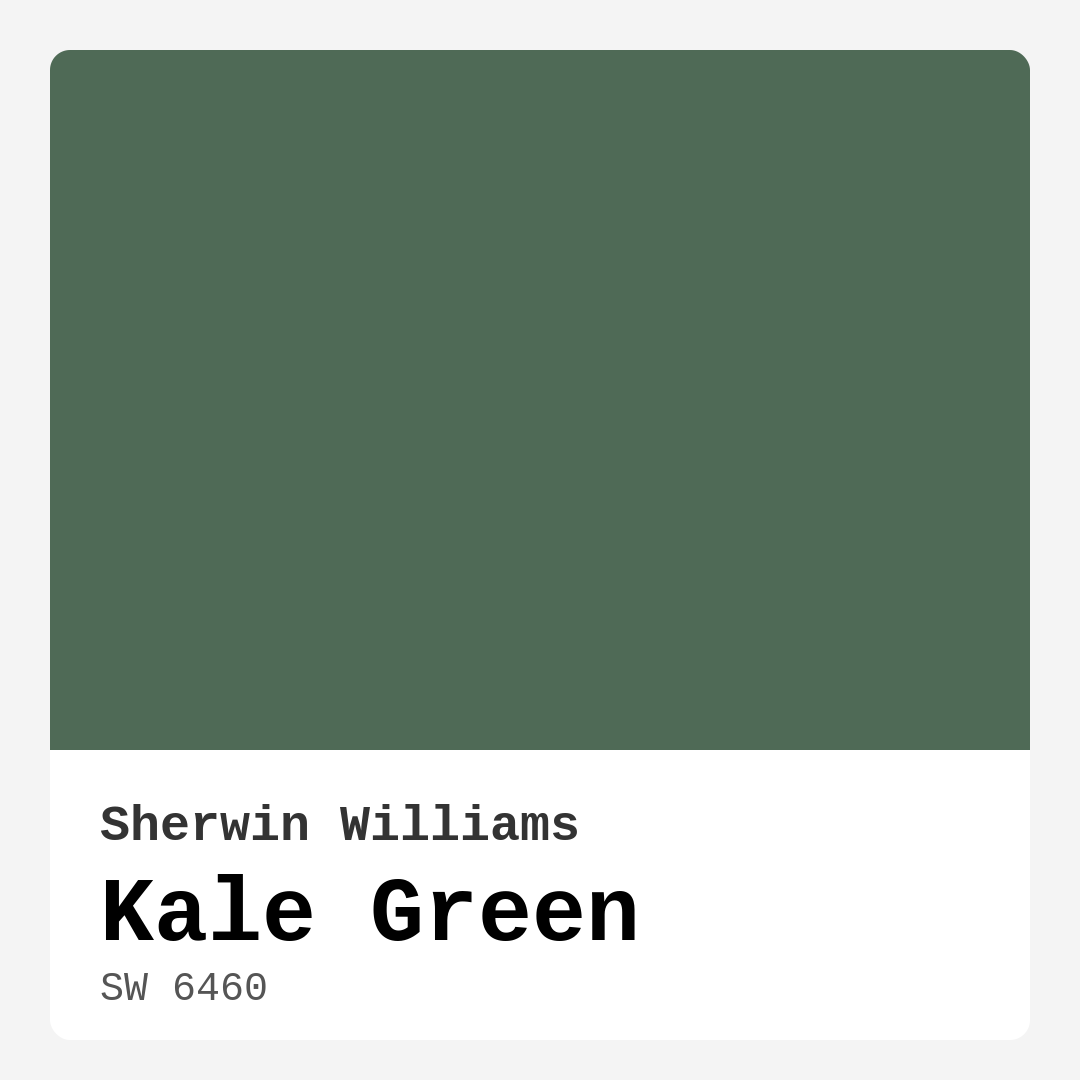
Color Preview & Key Details
| HEX Code | #4F6A56 |
| RGB | 79, 106, 86 |
| LRV | 12% |
| Undertone | Green |
| Finish Options | Eggshell, Matte, Satin |
Imagine walking into a room that feels like a gentle embrace, where the color on the walls effortlessly blends with nature and invites you to relax. That’s the magic of Kale Green, a color from Sherwin Williams that can transform your spaces into serene sanctuaries. This rich, muted green exudes warmth and tranquility, making it a favorite choice for so many homeowners looking to make their interiors feel more connected to the natural world.
Kale Green, with its color code SW 6460, is not your average green. It’s got depth and character, with an LRV of just 12%, placing it firmly in the category of dark colors. This means it doesn’t reflect light much, creating a cozy, intimate atmosphere that you’ll love coming home to. Picture a living room or bedroom enveloped in this earthy hue—it’s like being wrapped in a soft green blanket every time you step inside.
One of the first things you should know about Kale Green is its versatility. Whether your style leans toward modern farmhouse, bohemian, rustic, or traditional, this color fits right in. It’s not just for the trendy spaces, either—it can seamlessly enhance a contemporary home, offering a grounding element that balances sleek lines and crisp whites. The muted undertones of Kale Green bring a sense of warmth, making your home not just a place to live, but a haven to unwind.
When you think about using Kale Green in your home, consider where it would shine the most. Ideal candidates are the living room, bedroom, home office, or dining room. Imagine a dining room painted in this calming green, where family gatherings feel more intimate, and conversations flow effortlessly. In a home office, it can create an atmosphere of focus, helping you stay grounded while you tackle your to-do list.
Now, let’s talk about how to apply this beautiful color. Kale Green is beginner-friendly and easy to work with. Whether you’re using a roller or a brush, you’ll find that it goes on smoothly, drying evenly for a stunning finish. It’s also touch-up friendly, so you won’t have to worry about those pesky marks or scratches ruining the aesthetic. Plus, with its low VOC levels, you can feel good about using it in your home without worrying about harmful chemicals.
You might wonder how this color behaves under different lighting conditions. In bright sunlight, Kale Green appears vibrant and fresh, showcasing its lively character. As the day progresses and the sun sets, it takes on a deeper, cozier vibe, wrapping the room in warmth. This makes it an excellent choice for spaces that transition from day to night, creating a dynamic yet soothing environment.
While Kale Green is undeniably beautiful, it’s essential to consider how it interacts with the rest of your space. If you have smaller rooms or areas with limited natural light, it’s worth noting that darker shades can feel heavy. To combat this, think about using mirrors to reflect light or incorporating lighter accents to create balance. You might even choose to paint an accent wall, allowing the color to add depth without overwhelming the space.
Pairing Kale Green with complementary shades can also enhance its beauty. For a natural look, soft whites like White Dove will bring out the warmth in Kale Green. If you’re feeling bold, deep blues or rich earth tones create a stunning contrast that elevates the overall design. You can always experiment with various shades to find the perfect combination that resonates with your vision.
Another lovely aspect of Kale Green is its washability. This means it’s not just about looks; it’s also practical for everyday life. Whether you have kids, pets, or just enjoy a casual lifestyle, this color can withstand the test of time and wear. It’s scuff-resistant and fade-resistant, ensuring that your serene space remains beautiful for years to come.
As you consider adding Kale Green to your home, it’s helpful to think about the undertones. With a strong green base, this color leans toward the cooler side of the spectrum, which can evoke a sense of calm and grounding. This characteristic is particularly effective in social spaces, where you want to foster connection and comfort. Think about how it would pair with wood accents or natural materials to create a harmonious environment.
If you’re unsure about committing to Kale Green, start small. Maybe test it on a single accent wall or in a smaller space like a home office. This way, you can observe how it shifts with natural light throughout the day and see how it feels in your home’s unique environment. You might find it’s just the color you’ve been searching for to bring your vision to life.
In conclusion, Kale Green isn’t just a color; it’s an experience. It invites nature indoors, creating spaces that feel grounded and serene. With its versatility, ease of application, and ability to enhance various styles, it’s a choice that many homeowners will cherish for years to come. So, if you’re ready to embrace a warm, inviting hue that beautifully complements your decor, consider giving Kale Green a try. Transform your home into a sanctuary of calm and comfort—it’s time to let this beautiful shade work its magic.

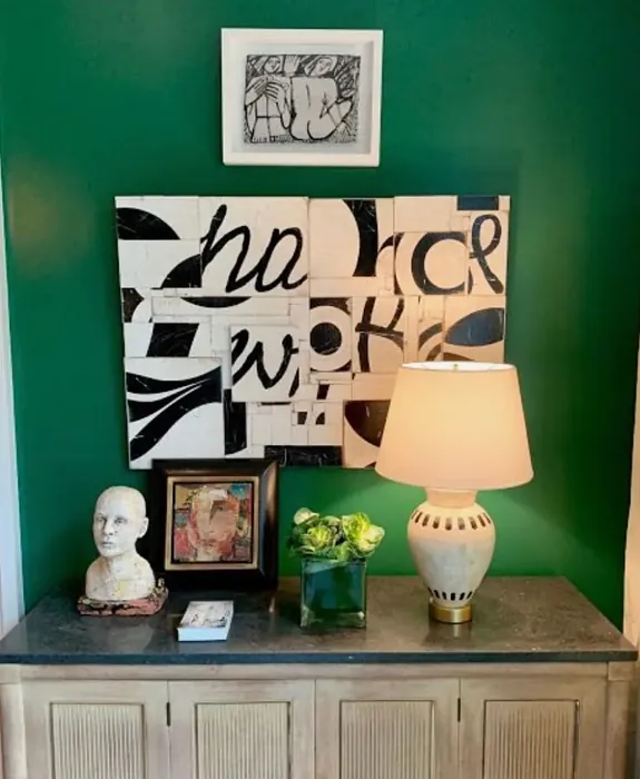
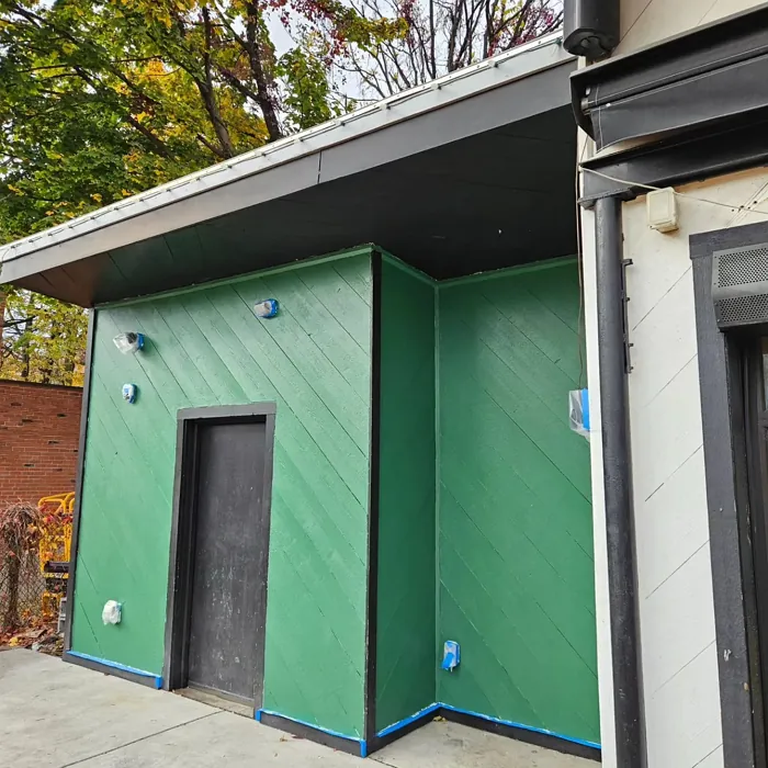
Real Room Photo of Kale Green SW 6460
Undertones of Kale Green ?
The undertones of Kale Green are a key aspect of its character, leaning towards Green. These subtle underlying hues are what give the color its depth and complexity. For example, a gray with a blue undertone will feel cooler and more modern, while one with a brown undertone will feel warmer and more traditional. It’s essential to test this paint in your home and observe it next to your existing furniture, flooring, and decor to see how these undertones interact and reveal themselves throughout the day.
HEX value: #4F6A56
RGB code: 79, 106, 86
Is Kale Green Cool or Warm?
Kale Green is considered a cool paint color. This characteristic plays a huge role in the overall feel of a room. Cool colors, like this one, tend to create a cozy, inviting, and energetic atmosphere, making them great for social spaces like living rooms and dining rooms. In contrast, warm colors often evoke a sense of calm and serenity, which is why they are popular in bedrooms and bathrooms. The coolth of Kale Green means it will pair beautifully with corresponding decor elements.
Understanding Color Properties and Interior Design Tips
Hue refers to a specific position on the color wheel, measured in degrees from 0 to 360. Each degree represents a different pure color:
- 0° represents red
- 120° represents green
- 240° represents blue
Saturation describes the intensity or purity of a color and is expressed as a percentage:
- At 0%, the color appears completely desaturated—essentially a shade of gray
- At 100%, the color is at its most vivid and vibrant
Lightness indicates how light or dark a color is, also expressed as a percentage:
- 0% lightness results in black
- 100% lightness results in white
Using Warm Colors in Interior Design
Warm hues—such as reds, oranges, yellows, warm beiges, and greiges—are excellent choices for creating inviting and energetic spaces. These colors are particularly well-suited for:
- Kitchens, living rooms, and bathrooms, where warmth enhances comfort and sociability
- Large rooms, where warm tones can help reduce the sense of emptiness and make the space feel more intimate
For example:
- Warm beige shades provide a cozy, inviting atmosphere, ideal for living rooms, bedrooms, and hallways.
- Warm greige (a mix of beige and gray) offers the warmth of beige with the modern appeal of gray, making it a versatile backdrop for dining areas, bedrooms, and living spaces.
However, be mindful when using warm light tones in rooms with limited natural light. These shades may appear muted or even take on an unpleasant yellowish tint. To avoid a dull or flat appearance:
- Add depth by incorporating richer tones like deep greens, charcoal, or chocolate brown
- Use textured elements such as curtains, rugs, or cushions to bring dimension to the space
Pro Tip: Achieving Harmony with Warm and Cool Color Balance
To create a well-balanced and visually interesting interior, mix warm and cool tones strategically. This contrast adds depth and harmony to your design.
- If your walls feature warm hues, introduce cool-colored accents such as blue or green furniture, artwork, or accessories to create contrast.
- For a polished look, consider using a complementary color scheme, which pairs colors opposite each other on the color wheel (e.g., red with green, orange with blue).
This thoughtful mix not only enhances visual appeal but also creates a space that feels both dynamic and cohesive.
Light Temperature Affects on Kale Green
Natural Light
Natural daylight changes in color temperature as the sun moves across the sky. At sunrise and sunset, the light tends to have a warm, golden tone with a color temperature around 2000 Kelvin (K). As the day progresses and the sun rises higher, the light becomes cooler and more neutral. Around midday, especially when the sky is clear, natural light typically reaches its peak brightness and shifts to a cooler tone, ranging from 5500 to 6500 Kelvin. This midday light is close to what we perceive as pure white or daylight-balanced light.
These shifts in natural light can significantly influence how colors appear in a space, which is why designers often consider both the time of day and the orientation of windows when planning interior color schemes.
Artificial Light
When choosing artificial lighting, pay close attention to the color temperature, measured in Kelvin (K). This determines how warm or cool the light will appear. Lower temperatures, around 2700K, give off a warm, yellow glow often used in living rooms or bedrooms. Higher temperatures, above 5000K, create a cool, bluish light similar to daylight, commonly used in kitchens, offices, or task areas.
Use the slider to see how lighting temperature can affect the appearance of a surface or color throughout a space.


4800K
LRV of Kale Green
The Light Reflectance Value (LRV) of Kale Green is 12%, which places it in the Dark colors category. This means it does not reflect light. Understanding a paint’s LRV is crucial for predicting how it will look in your space. A higher LRV indicates a lighter color that reflects more light, making rooms feel larger and brighter. A lower LRV signifies a darker color that absorbs more light, creating a cozier, more intimate atmosphere. Always consider the natural and artificial lighting in your room when selecting a paint color based on its LRV.
Detailed Review of Kale Green
Additional Paint Characteristics
Ideal Rooms
Bedroom, Dining Room, Home Office, Living Room, Nursery
Decor Styles
Bohemian, Contemporary, Modern Farmhouse, Rustic, Traditional
Coverage
Good (1–2 Coats), Touch-Up Friendly
Ease of Application
Beginner Friendly, Brush Smooth, Roller-Ready
Washability
Highly Washable, Washable
VOC Level
Eco-Certified, Low VOC
Best Use
Accent Wall, Furniture, Interior Walls
Room Suitability
Bedroom, Dining Room, Home Office, Living Room
Tone Tag
Earthy, Muted, Warm
Finish Type
Eggshell, Matte, Satin
Paint Performance
Fade Resistant, Low Odor, Quick Drying, Scuff Resistant
Use Cases
Best for Modern Farmhouse, Best for Open Concept, Best for Small Spaces
Mood
Calm, Grounding, Inviting
Trim Pairing
Good with Wood Trim, Pairs with White Dove
Kale Green is more than just a paint color; it’s a statement. With its perfect balance of muted tones, it’s versatile enough to adapt to various lighting conditions. In natural light, it shines with a fresh vibrancy, while under artificial lighting, it takes on a deeper, cozy vibe. This makes it a wonderful option for spaces where you want to create a feeling of calm and comfort. The application is smooth, and it dries evenly, providing a beautiful finish that enhances the overall look of your room. Whether you’re painting an accent wall or a full room, Kale Green delivers a sophisticated touch that can make your home feel more connected to the outdoors.
Pros & Cons of SW 6460 Kale Green
Pros
Cons
Colors that go with Sherwin Williams Kale Green
FAQ on SW 6460 Kale Green
Can Kale Green be used in small spaces?
Kale Green can indeed be used in small spaces, but it’s essential to pair it with adequate lighting to prevent the color from feeling too heavy. Use mirrors and light-colored accents to enhance the sense of space. Consider applying it on an accent wall to create depth without overwhelming the area.
How does Kale Green pair with other colors?
Kale Green beautifully complements a range of colors. For a natural look, pair it with soft whites like White Dove or warm woods. If you’re aiming for a bolder contrast, it works well with deep blues or rich earth tones. Experimenting with various color combinations can help you achieve the mood you desire.
Comparisons Kale Green with other colors
Kale Green SW 6460 vs Dried Thyme SW 6186
| Attribute | Kale Green SW 6460 | Dried Thyme SW 6186 |
|---|---|---|
| Color Name | Kale Green SW 6460 | Dried Thyme SW 6186 |
| Color | ||
| Hue | Green | Green |
| Brightness | Dark | Dark |
| RGB | 79, 106, 86 | 123, 128, 112 |
| LRV | 12% | 24% |
| Finish Type | Eggshell, Matte, Satin | Eggshell, Satin |
| Finish Options | Eggshell, Matte, Satin | Eggshell, Matte, Satin |
| Ideal Rooms | Bedroom, Dining Room, Home Office, Living Room, Nursery | Bathroom, Bedroom, Dining Room, Entryway, Home Office, Kitchen, Living Room |
| Decor Styles | Bohemian, Contemporary, Modern Farmhouse, Rustic, Traditional | Bohemian, Industrial, Minimalist, Modern Farmhouse, Rustic |
| Coverage | Good (1–2 Coats), Touch-Up Friendly | Good (1–2 Coats), Touch-Up Friendly |
| Ease of Application | Beginner Friendly, Brush Smooth, Roller-Ready | Beginner Friendly, Brush Smooth, Roller-Ready |
| Washability | Highly Washable, Washable | Washable, Wipeable |
| Room Suitability | Bedroom, Dining Room, Home Office, Living Room | Bathroom, Bedroom, Dining Room, Home Office, Kitchen, Living Room |
| Tone | Earthy, Muted, Warm | Cool, Earthy, Muted |
| Paint Performance | Fade Resistant, Low Odor, Quick Drying, Scuff Resistant | Easy Touch-Up, Low Odor, Scuff Resistant |
Kale Green SW 6460 vs Retreat SW 6207
| Attribute | Kale Green SW 6460 | Retreat SW 6207 |
|---|---|---|
| Color Name | Kale Green SW 6460 | Retreat SW 6207 |
| Color | ||
| Hue | Green | Green |
| Brightness | Dark | Dark |
| RGB | 79, 106, 86 | 122, 128, 118 |
| LRV | 12% | 30% |
| Finish Type | Eggshell, Matte, Satin | Eggshell, Matte, Satin |
| Finish Options | Eggshell, Matte, Satin | Eggshell, Matte, Satin |
| Ideal Rooms | Bedroom, Dining Room, Home Office, Living Room, Nursery | Bathroom, Bedroom, Home Office, Kitchen, Living Room |
| Decor Styles | Bohemian, Contemporary, Modern Farmhouse, Rustic, Traditional | Minimalist, Modern, Rustic, Transitional |
| Coverage | Good (1–2 Coats), Touch-Up Friendly | Good (1–2 Coats), Touch-Up Friendly |
| Ease of Application | Beginner Friendly, Brush Smooth, Roller-Ready | Beginner Friendly, Brush Smooth, Roller-Ready |
| Washability | Highly Washable, Washable | Washable, Wipeable |
| Room Suitability | Bedroom, Dining Room, Home Office, Living Room | Bathroom, Bedroom, Home Office, Living Room |
| Tone | Earthy, Muted, Warm | Cool, Earthy, Muted |
| Paint Performance | Fade Resistant, Low Odor, Quick Drying, Scuff Resistant | Easy Touch-Up, Low Odor, Scuff Resistant |
Kale Green SW 6460 vs Rosemary SW 6187
| Attribute | Kale Green SW 6460 | Rosemary SW 6187 |
|---|---|---|
| Color Name | Kale Green SW 6460 | Rosemary SW 6187 |
| Color | ||
| Hue | Green | Green |
| Brightness | Dark | Dark |
| RGB | 79, 106, 86 | 100, 105, 92 |
| LRV | 12% | 45% |
| Finish Type | Eggshell, Matte, Satin | Eggshell, Matte, Satin |
| Finish Options | Eggshell, Matte, Satin | Eggshell, Matte, Satin |
| Ideal Rooms | Bedroom, Dining Room, Home Office, Living Room, Nursery | Bedroom, Dining Room, Hallway, Home Office, Living Room |
| Decor Styles | Bohemian, Contemporary, Modern Farmhouse, Rustic, Traditional | Bohemian, Coastal, Modern Farmhouse, Rustic |
| Coverage | Good (1–2 Coats), Touch-Up Friendly | Good (1–2 Coats), Touch-Up Friendly |
| Ease of Application | Beginner Friendly, Brush Smooth, Roller-Ready | Beginner Friendly, Brush Smooth, Roller-Ready |
| Washability | Highly Washable, Washable | Washable, Wipeable |
| Room Suitability | Bedroom, Dining Room, Home Office, Living Room | Bedroom, Dining Room, Home Office, Living Room |
| Tone | Earthy, Muted, Warm | Earthy, Muted, Warm |
| Paint Performance | Fade Resistant, Low Odor, Quick Drying, Scuff Resistant | Fade Resistant, Low Odor, Quick Drying, Stain Resistant |
Kale Green SW 6460 vs Basil SW 6194
| Attribute | Kale Green SW 6460 | Basil SW 6194 |
|---|---|---|
| Color Name | Kale Green SW 6460 | Basil SW 6194 |
| Color | ||
| Hue | Green | Green |
| Brightness | Dark | Dark |
| RGB | 79, 106, 86 | 98, 110, 96 |
| LRV | 12% | 12% |
| Finish Type | Eggshell, Matte, Satin | Eggshell, Matte, Satin |
| Finish Options | Eggshell, Matte, Satin | Eggshell, Matte, Satin |
| Ideal Rooms | Bedroom, Dining Room, Home Office, Living Room, Nursery | Bathroom, Bedroom, Dining Room, Home Office, Kitchen, Living Room |
| Decor Styles | Bohemian, Contemporary, Modern Farmhouse, Rustic, Traditional | Bohemian, Contemporary, Modern Farmhouse, Rustic, Transitional |
| Coverage | Good (1–2 Coats), Touch-Up Friendly | Good (1–2 Coats), Touch-Up Friendly |
| Ease of Application | Beginner Friendly, Brush Smooth, Roller-Ready | Beginner Friendly, Brush Smooth, Fast-Drying, Roller-Ready |
| Washability | Highly Washable, Washable | Washable, Wipeable |
| Room Suitability | Bedroom, Dining Room, Home Office, Living Room | Bathroom, Bedroom, Dining Room, Kitchen, Living Room |
| Tone | Earthy, Muted, Warm | Earthy, Muted, Warm |
| Paint Performance | Fade Resistant, Low Odor, Quick Drying, Scuff Resistant | Easy Touch-Up, Low Odor, Quick Drying |
Kale Green SW 6460 vs Artichoke SW 6179
| Attribute | Kale Green SW 6460 | Artichoke SW 6179 |
|---|---|---|
| Color Name | Kale Green SW 6460 | Artichoke SW 6179 |
| Color | ||
| Hue | Green | Green |
| Brightness | Dark | Dark |
| RGB | 79, 106, 86 | 127, 130, 102 |
| LRV | 12% | 24% |
| Finish Type | Eggshell, Matte, Satin | Eggshell, Matte, Satin |
| Finish Options | Eggshell, Matte, Satin | Eggshell, Matte, Satin |
| Ideal Rooms | Bedroom, Dining Room, Home Office, Living Room, Nursery | Bedroom, Dining Room, Home Office, Living Room |
| Decor Styles | Bohemian, Contemporary, Modern Farmhouse, Rustic, Traditional | Eclectic, Modern Farmhouse, Rustic, Transitional |
| Coverage | Good (1–2 Coats), Touch-Up Friendly | Good (1–2 Coats), Touch-Up Friendly |
| Ease of Application | Beginner Friendly, Brush Smooth, Roller-Ready | Beginner Friendly, Brush Smooth, Fast-Drying, Roller-Ready |
| Washability | Highly Washable, Washable | Washable, Wipeable |
| Room Suitability | Bedroom, Dining Room, Home Office, Living Room | Bedroom, Dining Room, Home Office, Living Room |
| Tone | Earthy, Muted, Warm | Earthy, Muted, Warm |
| Paint Performance | Fade Resistant, Low Odor, Quick Drying, Scuff Resistant | Easy Touch-Up, High Coverage, Low Odor |
Kale Green SW 6460 vs Shade-Grown SW 6188
| Attribute | Kale Green SW 6460 | Shade-Grown SW 6188 |
|---|---|---|
| Color Name | Kale Green SW 6460 | Shade-Grown SW 6188 |
| Color | ||
| Hue | Green | Green |
| Brightness | Dark | Dark |
| RGB | 79, 106, 86 | 78, 81, 71 |
| LRV | 12% | 24% |
| Finish Type | Eggshell, Matte, Satin | Eggshell, Satin |
| Finish Options | Eggshell, Matte, Satin | Eggshell, Flat, Satin |
| Ideal Rooms | Bedroom, Dining Room, Home Office, Living Room, Nursery | Bedroom, Dining Room, Home Office, Living Room |
| Decor Styles | Bohemian, Contemporary, Modern Farmhouse, Rustic, Traditional | Bohemian, Modern, Rustic, Scandinavian |
| Coverage | Good (1–2 Coats), Touch-Up Friendly | Good (1–2 Coats), Touch-Up Friendly |
| Ease of Application | Beginner Friendly, Brush Smooth, Roller-Ready | Beginner Friendly, Brush Smooth, Fast-Drying, Roller-Ready |
| Washability | Highly Washable, Washable | Highly Washable, Washable |
| Room Suitability | Bedroom, Dining Room, Home Office, Living Room | Bedroom, Dining Room, Home Office, Living Room |
| Tone | Earthy, Muted, Warm | Deep, Earthy, Muted |
| Paint Performance | Fade Resistant, Low Odor, Quick Drying, Scuff Resistant | Easy Touch-Up, High Coverage, Low Odor, Scuff Resistant |
Kale Green SW 6460 vs Foxhall Green SW 9184
| Attribute | Kale Green SW 6460 | Foxhall Green SW 9184 |
|---|---|---|
| Color Name | Kale Green SW 6460 | Foxhall Green SW 9184 |
| Color | ||
| Hue | Green | Green |
| Brightness | Dark | Dark |
| RGB | 79, 106, 86 | 69, 75, 64 |
| LRV | 12% | 12% |
| Finish Type | Eggshell, Matte, Satin | Eggshell, Matte, Satin |
| Finish Options | Eggshell, Matte, Satin | Eggshell, Matte, Satin |
| Ideal Rooms | Bedroom, Dining Room, Home Office, Living Room, Nursery | Bedroom, Dining Room, Home Office, Living Room |
| Decor Styles | Bohemian, Contemporary, Modern Farmhouse, Rustic, Traditional | Contemporary, Modern Farmhouse, Rustic, Traditional |
| Coverage | Good (1–2 Coats), Touch-Up Friendly | Good (1–2 Coats), Touch-Up Friendly |
| Ease of Application | Beginner Friendly, Brush Smooth, Roller-Ready | Beginner Friendly, Brush Smooth, Fast-Drying, Roller-Ready |
| Washability | Highly Washable, Washable | Washable, Wipeable |
| Room Suitability | Bedroom, Dining Room, Home Office, Living Room | Bedroom, Dining Room, Home Office, Living Room |
| Tone | Earthy, Muted, Warm | Balanced, Deep, Earthy, Muted |
| Paint Performance | Fade Resistant, Low Odor, Quick Drying, Scuff Resistant | Easy Touch-Up, Fade Resistant, Low Odor, Quick Drying |
Kale Green SW 6460 vs Pewter Green SW 6208
| Attribute | Kale Green SW 6460 | Pewter Green SW 6208 |
|---|---|---|
| Color Name | Kale Green SW 6460 | Pewter Green SW 6208 |
| Color | ||
| Hue | Green | Green |
| Brightness | Dark | Dark |
| RGB | 79, 106, 86 | 94, 98, 89 |
| LRV | 12% | 24% |
| Finish Type | Eggshell, Matte, Satin | Eggshell, Matte, Satin |
| Finish Options | Eggshell, Matte, Satin | Eggshell, Matte, Satin |
| Ideal Rooms | Bedroom, Dining Room, Home Office, Living Room, Nursery | Bedroom, Dining Room, Entryway, Home Office, Living Room |
| Decor Styles | Bohemian, Contemporary, Modern Farmhouse, Rustic, Traditional | Contemporary, Modern Farmhouse, Rustic, Scandinavian, Traditional |
| Coverage | Good (1–2 Coats), Touch-Up Friendly | Good (1–2 Coats), Touch-Up Friendly |
| Ease of Application | Beginner Friendly, Brush Smooth, Roller-Ready | Beginner Friendly, Brush Smooth, Fast-Drying, Roller-Ready |
| Washability | Highly Washable, Washable | Highly Washable, Washable, Wipeable |
| Room Suitability | Bedroom, Dining Room, Home Office, Living Room | Bathroom, Bedroom, Dining Room, Kitchen, Living Room |
| Tone | Earthy, Muted, Warm | Balanced, Cool, Earthy, Muted |
| Paint Performance | Fade Resistant, Low Odor, Quick Drying, Scuff Resistant | Easy Touch-Up, Fade Resistant, Low Odor, Quick Drying |
Kale Green SW 6460 vs Rookwood Dark Green SW 2816
| Attribute | Kale Green SW 6460 | Rookwood Dark Green SW 2816 |
|---|---|---|
| Color Name | Kale Green SW 6460 | Rookwood Dark Green SW 2816 |
| Color | ||
| Hue | Green | Green |
| Brightness | Dark | Dark |
| RGB | 79, 106, 86 | 86, 92, 74 |
| LRV | 12% | 6% |
| Finish Type | Eggshell, Matte, Satin | Eggshell, Matte, Satin |
| Finish Options | Eggshell, Matte, Satin | Eggshell, Matte, Satin |
| Ideal Rooms | Bedroom, Dining Room, Home Office, Living Room, Nursery | Bedroom, Dining Room, Home Office, Kitchen, Living Room |
| Decor Styles | Bohemian, Contemporary, Modern Farmhouse, Rustic, Traditional | Contemporary, Modern Farmhouse, Rustic, Traditional |
| Coverage | Good (1–2 Coats), Touch-Up Friendly | Good (1–2 Coats), Touch-Up Friendly |
| Ease of Application | Beginner Friendly, Brush Smooth, Roller-Ready | Beginner Friendly, Brush Smooth, Roller-Ready |
| Washability | Highly Washable, Washable | Washable, Wipeable |
| Room Suitability | Bedroom, Dining Room, Home Office, Living Room | Bedroom, Dining Room, Home Office, Living Room |
| Tone | Earthy, Muted, Warm | Deep, Earthy, Warm |
| Paint Performance | Fade Resistant, Low Odor, Quick Drying, Scuff Resistant | Easy Touch-Up, High Coverage, Low Odor, Scuff Resistant |
Kale Green SW 6460 vs Ripe Olive SW 6209
| Attribute | Kale Green SW 6460 | Ripe Olive SW 6209 |
|---|---|---|
| Color Name | Kale Green SW 6460 | Ripe Olive SW 6209 |
| Color | ||
| Hue | Green | Green |
| Brightness | Dark | Dark |
| RGB | 79, 106, 86 | 68, 72, 61 |
| LRV | 12% | 15% |
| Finish Type | Eggshell, Matte, Satin | Eggshell, Matte |
| Finish Options | Eggshell, Matte, Satin | Eggshell, Matte, Satin |
| Ideal Rooms | Bedroom, Dining Room, Home Office, Living Room, Nursery | Bedroom, Dining Room, Home Office, Living Room |
| Decor Styles | Bohemian, Contemporary, Modern Farmhouse, Rustic, Traditional | Bohemian, Industrial, Modern Farmhouse, Rustic |
| Coverage | Good (1–2 Coats), Touch-Up Friendly | Good (1–2 Coats) |
| Ease of Application | Beginner Friendly, Brush Smooth, Roller-Ready | Beginner Friendly, Brush Smooth, Roller-Ready |
| Washability | Highly Washable, Washable | Highly Washable, Washable |
| Room Suitability | Bedroom, Dining Room, Home Office, Living Room | Bedroom, Dining Room, Home Office, Living Room |
| Tone | Earthy, Muted, Warm | Deep, Earthy, Muted |
| Paint Performance | Fade Resistant, Low Odor, Quick Drying, Scuff Resistant | Easy Touch-Up, High Coverage, Low Odor |
Official Page of Sherwin Williams Kale Green SW 6460