
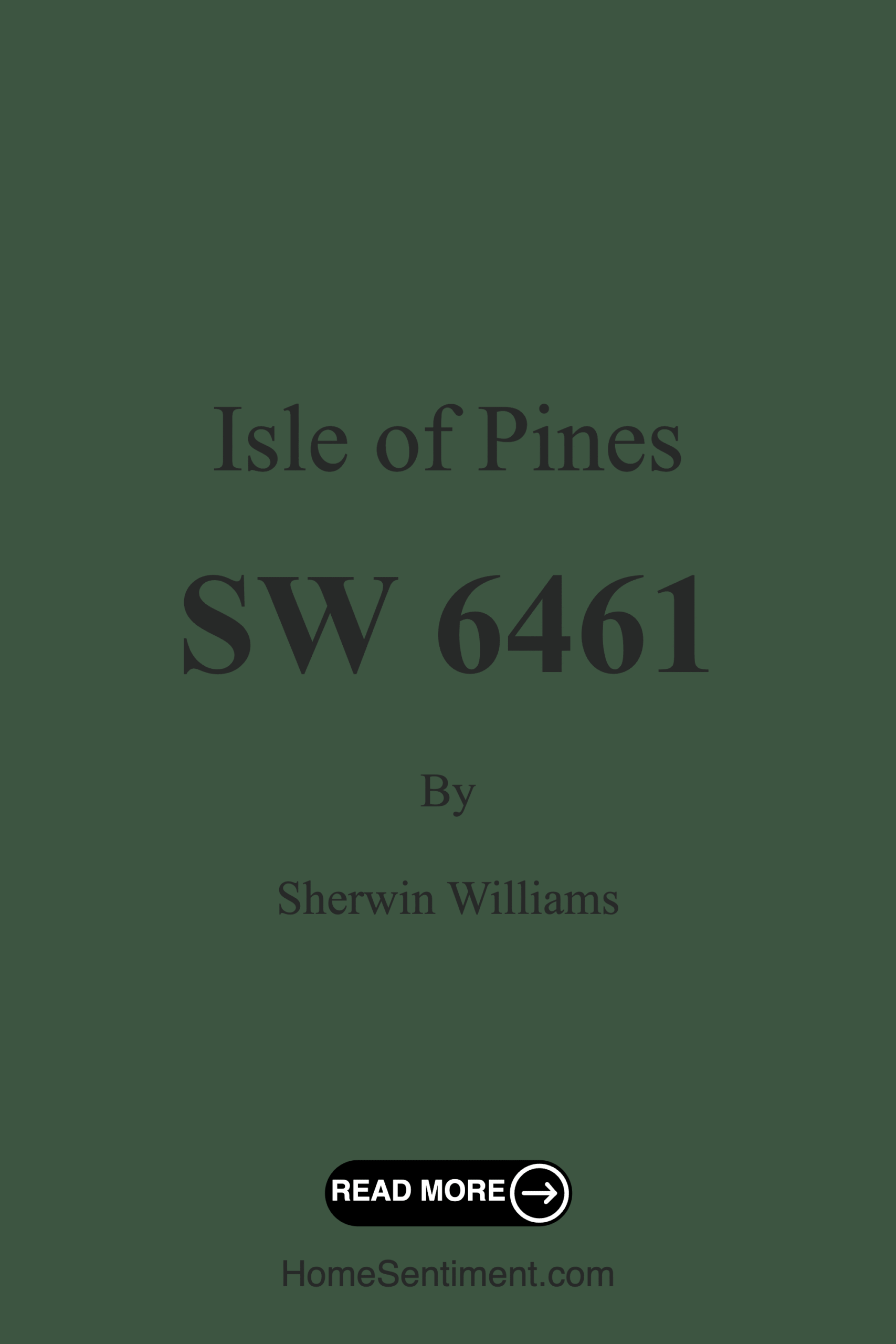
Color Preview & Key Details
| HEX Code | #3D5541 |
| RGB | 61, 85, 65 |
| LRV | 12% |
| Undertone | Green |
| Finish Options | Eggshell, Matte, Satin |
Imagine walking into a room that instantly wraps you in a warm, inviting embrace. The walls are painted in a deep, lush green that feels like a walk through a serene forest. This is the magic of Isle of Pines by Sherwin Williams. With its rich undertones and earthy vibe, this color has a unique ability to transform any space into a tranquil oasis. If you’ve been contemplating a change in your home, Isle of Pines may just be the perfect shade to consider.
Isle of Pines (SW 6461) is more than just a color; it’s an experience. The hue evokes images of tropical landscapes, lush greenery, and peaceful retreats. Its cool undertones provide a sense of calm, making it an ideal choice for spaces where relaxation and rejuvenation are key. Whether you’re refreshing your living room, creating a cozy bedroom, or designing a productive home office, this color can be a fantastic addition to your palette.
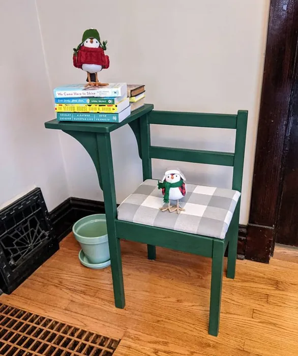
One of the standout features of Isle of Pines is its versatility. It fits beautifully into various decor styles, from coastal and bohemian to modern farmhouse and traditional. This means that regardless of your existing decor, Isle of Pines can seamlessly integrate without feeling out of place. If you have lighter furniture or accessories, they will pop against this dark hue, creating a stunning contrast that adds depth and interest to your space. Alternatively, pairing it with darker elements can create a sophisticated, moody ambiance that’s perfect for intimate gatherings.
In terms of application, Isle of Pines is remarkably beginner-friendly. It flows smoothly, allowing for easy application whether you’re using a roller or a brush. With good coverage, you’ll likely need only one or two coats, making your painting project quicker and more efficient. Plus, its fast-drying properties mean you won’t have to wait long to enjoy your newly transformed space.
Now, let’s talk about the practicalities. Isle of Pines is not just beautiful; it’s also functional. With an LRV (Light Reflectance Value) of 12%, it doesn’t reflect much light, which can create a cozy, intimate atmosphere. However, this characteristic also means that you should be mindful of lighting when using this color. In well-lit rooms, Isle of Pines radiates a serene ambiance that feels refreshing, while in softer, artificial light, it offers a cozy and inviting feel. Be sure to assess your space at different times of the day to see how the color interacts with your lighting.
You might wonder how this color works in smaller spaces. While it can feel a bit intense, Isle of Pines can also create a sense of intimacy when used thoughtfully. Consider using it as an accent wall to draw attention to a particular area without overwhelming the entire room. Pair it with lighter furniture and decor to balance the depth of the color. This way, you can enjoy the warmth and comfort it brings without feeling claustrophobic.
Cleaning is another aspect where Isle of Pines shines. Its washable properties make it easy to maintain, allowing you to wipe away any marks or stains with a damp cloth and mild soap. For tougher stains, a gentle scrubber will do the trick. Just remember to avoid harsh chemicals that might damage the finish.
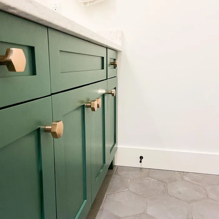
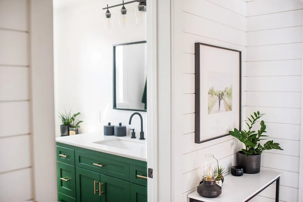
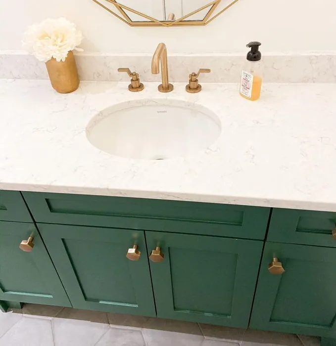
When it comes to pairing colors with Isle of Pines, you have plenty of options. Its earthy tone complements a variety of shades, especially lighter tones like white or cream. White Dove is a fantastic trim option, providing a fresh contrast that brightens the overall look. If you want to add a touch of elegance, consider incorporating brass fixtures, which work beautifully with the warmth of Isle of Pines.
As you consider this color for your home, take note of its undertones. Isle of Pines leans towards green, providing depth and character. The subtleties in undertones can dramatically influence how the color feels in your space. For instance, if you have a room filled with warm wood tones, Isle of Pines can enhance that warmth, creating a harmonious environment. Always test the color in your home’s lighting conditions to see how it interacts with your existing decor.
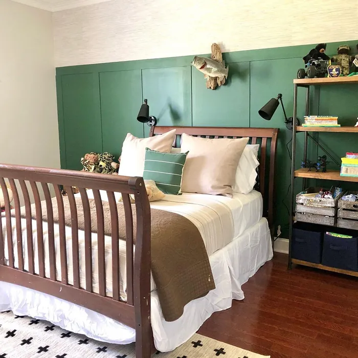
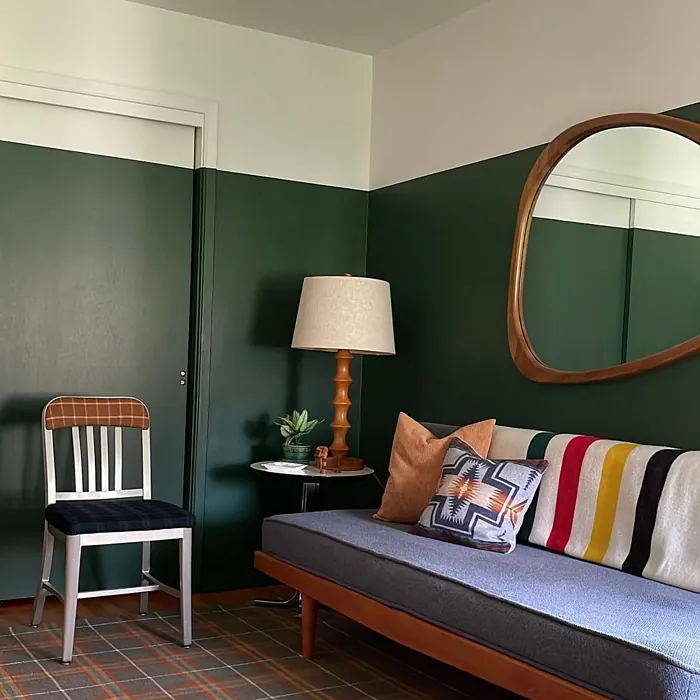
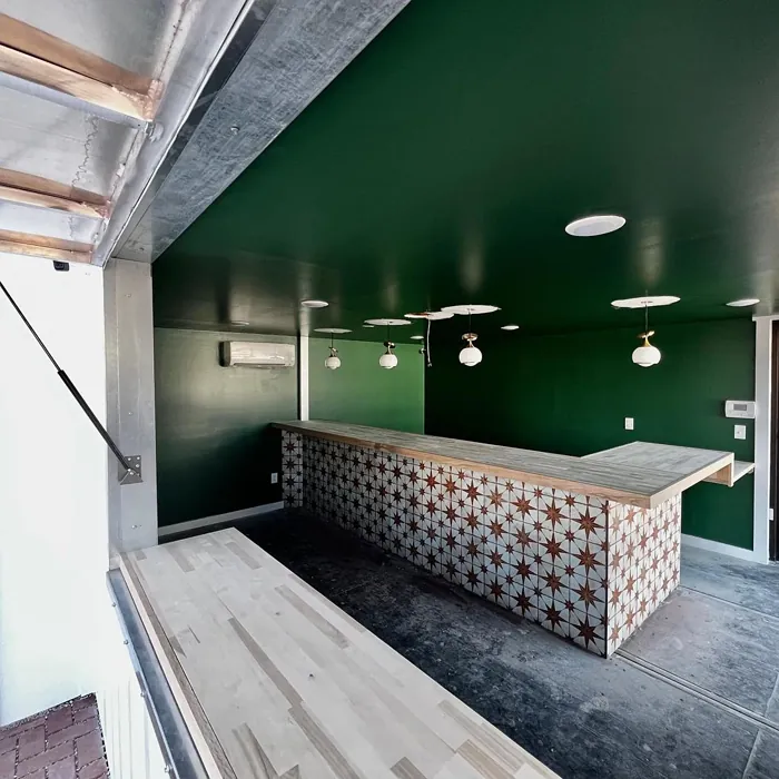
Isle of Pines is perfect for a variety of rooms. It can create a cozy vibe in a bedroom, making it a serene retreat at the end of a long day. In a living room or dining room, it adds a grounding element, making social gatherings feel more intimate and inviting. It’s also a great choice for a home office, fostering a calm environment that promotes focus and productivity.
In terms of mood, Isle of Pines evokes feelings of coziness, calm, and grounding. It invites you to take a deep breath and relax, making it an excellent choice for spaces designed for unwinding. Whether you’re curling up with a good book or entertaining friends, this color sets the tone for a delightful experience.
If you’re still on the fence, think of the impact Isle of Pines can have. Not only does it enhance the aesthetic appeal of your home, but it also connects you to nature, bringing a sense of tranquility indoors. This is particularly important in today’s fast-paced world, where creating a peaceful haven at home is more valuable than ever.
In summary, Isle of Pines by Sherwin Williams is an enchanting green hue that can elevate your home decor. Its versatility, ease of application, and calming presence make it an excellent choice for a variety of spaces and styles. Whether you’re looking to create a serene retreat or a cozy gathering space, this color can help you achieve your vision. So, grab a sample, test it in your home, and see how Isle of Pines can transform your space into an oasis of calm and beauty. You might just find that it’s the perfect fit for your next project.
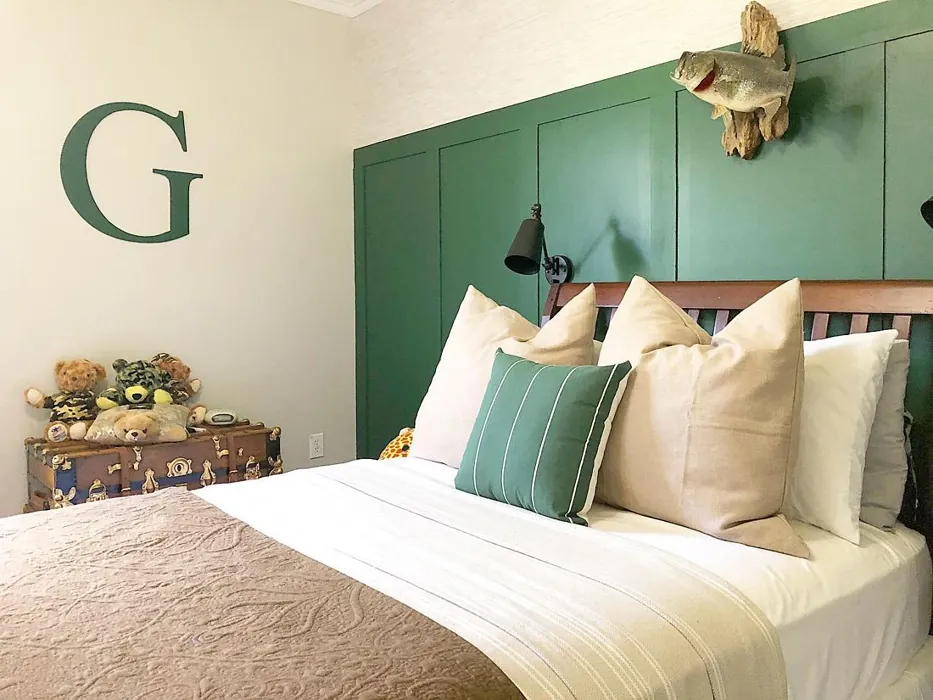
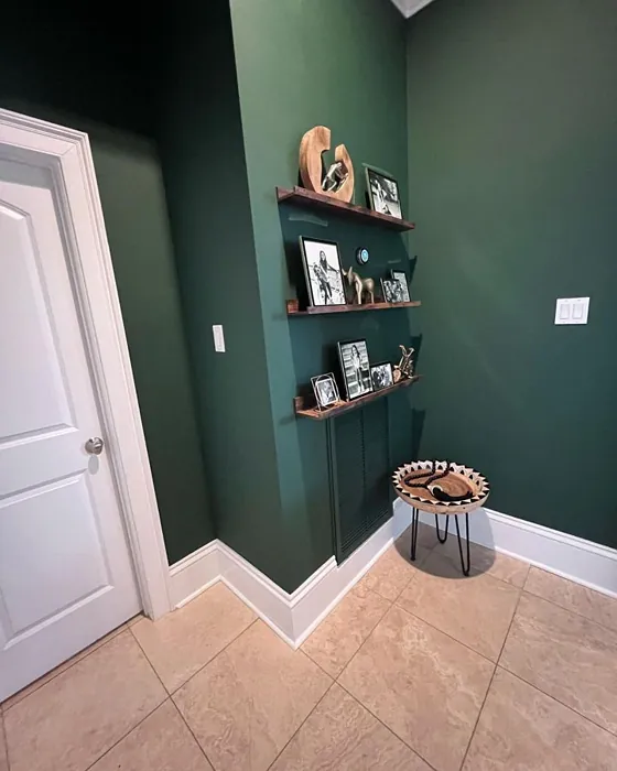
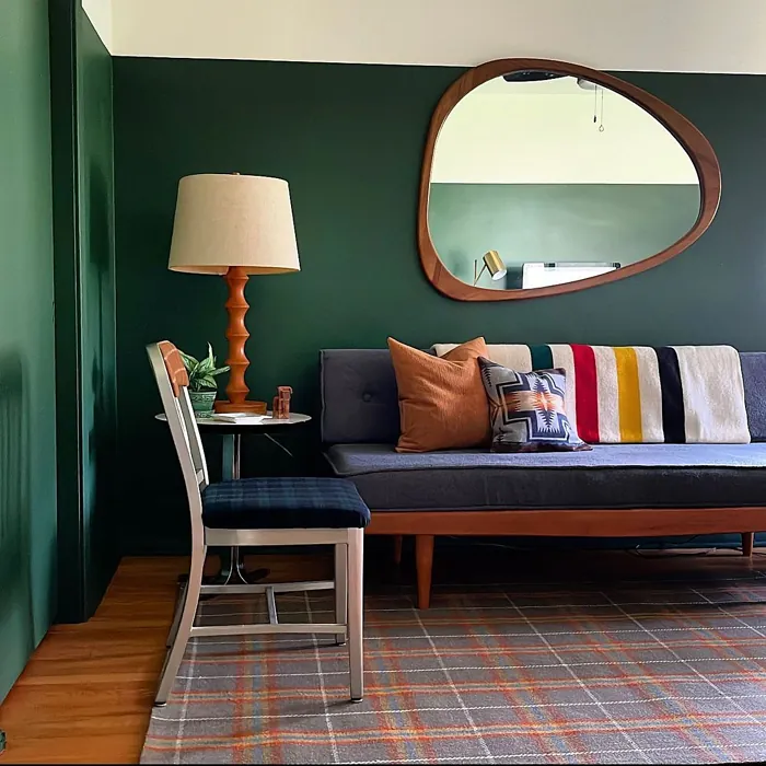
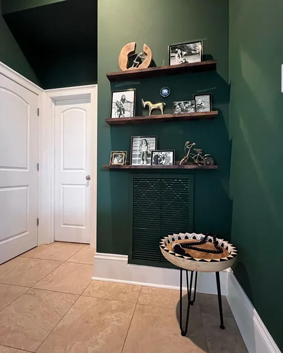
Real Room Photo of Isle of Pines SW 6461
Undertones of Isle of Pines ?
The undertones of Isle of Pines are a key aspect of its character, leaning towards Green. These subtle underlying hues are what give the color its depth and complexity. For example, a gray with a blue undertone will feel cooler and more modern, while one with a brown undertone will feel warmer and more traditional. It’s essential to test this paint in your home and observe it next to your existing furniture, flooring, and decor to see how these undertones interact and reveal themselves throughout the day.
HEX value: #3D5541
RGB code: 61, 85, 65
Is Isle of Pines Cool or Warm?
Isle of Pines is considered a cool paint color. This characteristic plays a huge role in the overall feel of a room. Cool colors, like this one, tend to create a cozy, inviting, and energetic atmosphere, making them great for social spaces like living rooms and dining rooms. In contrast, warm colors often evoke a sense of calm and serenity, which is why they are popular in bedrooms and bathrooms. The coolth of Isle of Pines means it will pair beautifully with corresponding decor elements.
Understanding Color Properties and Interior Design Tips
Hue refers to a specific position on the color wheel, measured in degrees from 0 to 360. Each degree represents a different pure color:
- 0° represents red
- 120° represents green
- 240° represents blue
Saturation describes the intensity or purity of a color and is expressed as a percentage:
- At 0%, the color appears completely desaturated—essentially a shade of gray
- At 100%, the color is at its most vivid and vibrant
Lightness indicates how light or dark a color is, also expressed as a percentage:
- 0% lightness results in black
- 100% lightness results in white
Using Warm Colors in Interior Design
Warm hues—such as reds, oranges, yellows, warm beiges, and greiges—are excellent choices for creating inviting and energetic spaces. These colors are particularly well-suited for:
- Kitchens, living rooms, and bathrooms, where warmth enhances comfort and sociability
- Large rooms, where warm tones can help reduce the sense of emptiness and make the space feel more intimate
For example:
- Warm beige shades provide a cozy, inviting atmosphere, ideal for living rooms, bedrooms, and hallways.
- Warm greige (a mix of beige and gray) offers the warmth of beige with the modern appeal of gray, making it a versatile backdrop for dining areas, bedrooms, and living spaces.
However, be mindful when using warm light tones in rooms with limited natural light. These shades may appear muted or even take on an unpleasant yellowish tint. To avoid a dull or flat appearance:
- Add depth by incorporating richer tones like deep greens, charcoal, or chocolate brown
- Use textured elements such as curtains, rugs, or cushions to bring dimension to the space
Pro Tip: Achieving Harmony with Warm and Cool Color Balance
To create a well-balanced and visually interesting interior, mix warm and cool tones strategically. This contrast adds depth and harmony to your design.
- If your walls feature warm hues, introduce cool-colored accents such as blue or green furniture, artwork, or accessories to create contrast.
- For a polished look, consider using a complementary color scheme, which pairs colors opposite each other on the color wheel (e.g., red with green, orange with blue).
This thoughtful mix not only enhances visual appeal but also creates a space that feels both dynamic and cohesive.
Light Temperature Affects on Isle of Pines
Natural Light
Natural daylight changes in color temperature as the sun moves across the sky. At sunrise and sunset, the light tends to have a warm, golden tone with a color temperature around 2000 Kelvin (K). As the day progresses and the sun rises higher, the light becomes cooler and more neutral. Around midday, especially when the sky is clear, natural light typically reaches its peak brightness and shifts to a cooler tone, ranging from 5500 to 6500 Kelvin. This midday light is close to what we perceive as pure white or daylight-balanced light.
These shifts in natural light can significantly influence how colors appear in a space, which is why designers often consider both the time of day and the orientation of windows when planning interior color schemes.
Artificial Light
When choosing artificial lighting, pay close attention to the color temperature, measured in Kelvin (K). This determines how warm or cool the light will appear. Lower temperatures, around 2700K, give off a warm, yellow glow often used in living rooms or bedrooms. Higher temperatures, above 5000K, create a cool, bluish light similar to daylight, commonly used in kitchens, offices, or task areas.
Use the slider to see how lighting temperature can affect the appearance of a surface or color throughout a space.


4800K
LRV of Isle of Pines
The Light Reflectance Value (LRV) of Isle of Pines is 12%, which places it in the Dark colors category. This means it does not reflect light. Understanding a paint’s LRV is crucial for predicting how it will look in your space. A higher LRV indicates a lighter color that reflects more light, making rooms feel larger and brighter. A lower LRV signifies a darker color that absorbs more light, creating a cozier, more intimate atmosphere. Always consider the natural and artificial lighting in your room when selecting a paint color based on its LRV.
Detailed Review of Isle of Pines
Additional Paint Characteristics
Ideal Rooms
Bedroom, Dining Room, Home Office, Living Room
Decor Styles
Bohemian, Coastal, Modern Farmhouse, Traditional
Coverage
Good (1–2 Coats), Touch-Up Friendly
Ease of Application
Beginner Friendly, Brush Smooth, Fast-Drying, Roller-Ready
Washability
Highly Washable, Washable, Wipeable
VOC Level
Low VOC, Ultra Low VOC
Best Use
Accent Wall, Cabinets, Interior Walls, Trim
Room Suitability
Bedroom, Dining Room, Home Office, Living Room
Tone Tag
Deep, Earthy, Moody, Warm
Finish Type
Eggshell, Matte, Satin
Paint Performance
Easy Touch-Up, High Coverage, Low Odor, Quick Drying
Use Cases
Best for Low Light Rooms, Best for Open Concept, Designer Favorite
Mood
Calm, Cozy, Grounding, Inviting
Trim Pairing
Complements Brass Fixtures, Pairs with White Dove, Works with Warm Trim
When it comes to paint, Isle of Pines stands out with its lush, earthy vibe. This color lends itself beautifully to various interior styles, especially those that embrace natural elements. Applying Isle of Pines is a breeze; it flows smoothly and offers great coverage, meaning you’ll likely need just one or two coats to achieve that striking finish. The color adapts well to both well-lit and dimly lit spaces, maintaining its charm without appearing flat. It creates a calming environment, making it perfect for a bedroom or home office. Plus, its versatility means it can be paired with lighter colors for a refreshed look or deeper shades for a more dramatic effect.
Pros & Cons of SW 6461 Isle of Pines
Pros
Cons
Colors that go with Sherwin Williams Isle of Pines
FAQ on SW 6461 Isle of Pines
Can Isle of Pines be used in small spaces?
Absolutely! While Isle of Pines can feel a bit intense in smaller areas, it can also offer a cozy, intimate feel when used thoughtfully. Pair it with lighter furniture and accessories to balance the depth of the color. Consider using it as an accent wall to create a focal point without overwhelming the space.
How do I clean surfaces painted with Isle of Pines?
Cleaning surfaces painted with Isle of Pines is straightforward, thanks to its washable properties. For routine cleaning, a damp cloth and mild soap should do the trick. For tougher stains, use a gentle scrubber. Just ensure not to use harsh chemicals that might damage the finish.
Comparisons Isle of Pines with other colors
Isle of Pines SW 6461 vs Dried Thyme SW 6186
| Attribute | Isle of Pines SW 6461 | Dried Thyme SW 6186 |
|---|---|---|
| Color Name | Isle of Pines SW 6461 | Dried Thyme SW 6186 |
| Color | ||
| Hue | Green | Green |
| Brightness | Dark | Dark |
| RGB | 61, 85, 65 | 123, 128, 112 |
| LRV | 12% | 24% |
| Finish Type | Eggshell, Matte, Satin | Eggshell, Satin |
| Finish Options | Eggshell, Matte, Satin | Eggshell, Matte, Satin |
| Ideal Rooms | Bedroom, Dining Room, Home Office, Living Room | Bathroom, Bedroom, Dining Room, Entryway, Home Office, Kitchen, Living Room |
| Decor Styles | Bohemian, Coastal, Modern Farmhouse, Traditional | Bohemian, Industrial, Minimalist, Modern Farmhouse, Rustic |
| Coverage | Good (1–2 Coats), Touch-Up Friendly | Good (1–2 Coats), Touch-Up Friendly |
| Ease of Application | Beginner Friendly, Brush Smooth, Fast-Drying, Roller-Ready | Beginner Friendly, Brush Smooth, Roller-Ready |
| Washability | Highly Washable, Washable, Wipeable | Washable, Wipeable |
| Room Suitability | Bedroom, Dining Room, Home Office, Living Room | Bathroom, Bedroom, Dining Room, Home Office, Kitchen, Living Room |
| Tone | Deep, Earthy, Moody, Warm | Cool, Earthy, Muted |
| Paint Performance | Easy Touch-Up, High Coverage, Low Odor, Quick Drying | Easy Touch-Up, Low Odor, Scuff Resistant |
Isle of Pines SW 6461 vs Retreat SW 6207
| Attribute | Isle of Pines SW 6461 | Retreat SW 6207 |
|---|---|---|
| Color Name | Isle of Pines SW 6461 | Retreat SW 6207 |
| Color | ||
| Hue | Green | Green |
| Brightness | Dark | Dark |
| RGB | 61, 85, 65 | 122, 128, 118 |
| LRV | 12% | 30% |
| Finish Type | Eggshell, Matte, Satin | Eggshell, Matte, Satin |
| Finish Options | Eggshell, Matte, Satin | Eggshell, Matte, Satin |
| Ideal Rooms | Bedroom, Dining Room, Home Office, Living Room | Bathroom, Bedroom, Home Office, Kitchen, Living Room |
| Decor Styles | Bohemian, Coastal, Modern Farmhouse, Traditional | Minimalist, Modern, Rustic, Transitional |
| Coverage | Good (1–2 Coats), Touch-Up Friendly | Good (1–2 Coats), Touch-Up Friendly |
| Ease of Application | Beginner Friendly, Brush Smooth, Fast-Drying, Roller-Ready | Beginner Friendly, Brush Smooth, Roller-Ready |
| Washability | Highly Washable, Washable, Wipeable | Washable, Wipeable |
| Room Suitability | Bedroom, Dining Room, Home Office, Living Room | Bathroom, Bedroom, Home Office, Living Room |
| Tone | Deep, Earthy, Moody, Warm | Cool, Earthy, Muted |
| Paint Performance | Easy Touch-Up, High Coverage, Low Odor, Quick Drying | Easy Touch-Up, Low Odor, Scuff Resistant |
Isle of Pines SW 6461 vs Rosemary SW 6187
| Attribute | Isle of Pines SW 6461 | Rosemary SW 6187 |
|---|---|---|
| Color Name | Isle of Pines SW 6461 | Rosemary SW 6187 |
| Color | ||
| Hue | Green | Green |
| Brightness | Dark | Dark |
| RGB | 61, 85, 65 | 100, 105, 92 |
| LRV | 12% | 45% |
| Finish Type | Eggshell, Matte, Satin | Eggshell, Matte, Satin |
| Finish Options | Eggshell, Matte, Satin | Eggshell, Matte, Satin |
| Ideal Rooms | Bedroom, Dining Room, Home Office, Living Room | Bedroom, Dining Room, Hallway, Home Office, Living Room |
| Decor Styles | Bohemian, Coastal, Modern Farmhouse, Traditional | Bohemian, Coastal, Modern Farmhouse, Rustic |
| Coverage | Good (1–2 Coats), Touch-Up Friendly | Good (1–2 Coats), Touch-Up Friendly |
| Ease of Application | Beginner Friendly, Brush Smooth, Fast-Drying, Roller-Ready | Beginner Friendly, Brush Smooth, Roller-Ready |
| Washability | Highly Washable, Washable, Wipeable | Washable, Wipeable |
| Room Suitability | Bedroom, Dining Room, Home Office, Living Room | Bedroom, Dining Room, Home Office, Living Room |
| Tone | Deep, Earthy, Moody, Warm | Earthy, Muted, Warm |
| Paint Performance | Easy Touch-Up, High Coverage, Low Odor, Quick Drying | Fade Resistant, Low Odor, Quick Drying, Stain Resistant |
Isle of Pines SW 6461 vs Basil SW 6194
| Attribute | Isle of Pines SW 6461 | Basil SW 6194 |
|---|---|---|
| Color Name | Isle of Pines SW 6461 | Basil SW 6194 |
| Color | ||
| Hue | Green | Green |
| Brightness | Dark | Dark |
| RGB | 61, 85, 65 | 98, 110, 96 |
| LRV | 12% | 12% |
| Finish Type | Eggshell, Matte, Satin | Eggshell, Matte, Satin |
| Finish Options | Eggshell, Matte, Satin | Eggshell, Matte, Satin |
| Ideal Rooms | Bedroom, Dining Room, Home Office, Living Room | Bathroom, Bedroom, Dining Room, Home Office, Kitchen, Living Room |
| Decor Styles | Bohemian, Coastal, Modern Farmhouse, Traditional | Bohemian, Contemporary, Modern Farmhouse, Rustic, Transitional |
| Coverage | Good (1–2 Coats), Touch-Up Friendly | Good (1–2 Coats), Touch-Up Friendly |
| Ease of Application | Beginner Friendly, Brush Smooth, Fast-Drying, Roller-Ready | Beginner Friendly, Brush Smooth, Fast-Drying, Roller-Ready |
| Washability | Highly Washable, Washable, Wipeable | Washable, Wipeable |
| Room Suitability | Bedroom, Dining Room, Home Office, Living Room | Bathroom, Bedroom, Dining Room, Kitchen, Living Room |
| Tone | Deep, Earthy, Moody, Warm | Earthy, Muted, Warm |
| Paint Performance | Easy Touch-Up, High Coverage, Low Odor, Quick Drying | Easy Touch-Up, Low Odor, Quick Drying |
Isle of Pines SW 6461 vs Artichoke SW 6179
| Attribute | Isle of Pines SW 6461 | Artichoke SW 6179 |
|---|---|---|
| Color Name | Isle of Pines SW 6461 | Artichoke SW 6179 |
| Color | ||
| Hue | Green | Green |
| Brightness | Dark | Dark |
| RGB | 61, 85, 65 | 127, 130, 102 |
| LRV | 12% | 24% |
| Finish Type | Eggshell, Matte, Satin | Eggshell, Matte, Satin |
| Finish Options | Eggshell, Matte, Satin | Eggshell, Matte, Satin |
| Ideal Rooms | Bedroom, Dining Room, Home Office, Living Room | Bedroom, Dining Room, Home Office, Living Room |
| Decor Styles | Bohemian, Coastal, Modern Farmhouse, Traditional | Eclectic, Modern Farmhouse, Rustic, Transitional |
| Coverage | Good (1–2 Coats), Touch-Up Friendly | Good (1–2 Coats), Touch-Up Friendly |
| Ease of Application | Beginner Friendly, Brush Smooth, Fast-Drying, Roller-Ready | Beginner Friendly, Brush Smooth, Fast-Drying, Roller-Ready |
| Washability | Highly Washable, Washable, Wipeable | Washable, Wipeable |
| Room Suitability | Bedroom, Dining Room, Home Office, Living Room | Bedroom, Dining Room, Home Office, Living Room |
| Tone | Deep, Earthy, Moody, Warm | Earthy, Muted, Warm |
| Paint Performance | Easy Touch-Up, High Coverage, Low Odor, Quick Drying | Easy Touch-Up, High Coverage, Low Odor |
Isle of Pines SW 6461 vs Shade-Grown SW 6188
| Attribute | Isle of Pines SW 6461 | Shade-Grown SW 6188 |
|---|---|---|
| Color Name | Isle of Pines SW 6461 | Shade-Grown SW 6188 |
| Color | ||
| Hue | Green | Green |
| Brightness | Dark | Dark |
| RGB | 61, 85, 65 | 78, 81, 71 |
| LRV | 12% | 24% |
| Finish Type | Eggshell, Matte, Satin | Eggshell, Satin |
| Finish Options | Eggshell, Matte, Satin | Eggshell, Flat, Satin |
| Ideal Rooms | Bedroom, Dining Room, Home Office, Living Room | Bedroom, Dining Room, Home Office, Living Room |
| Decor Styles | Bohemian, Coastal, Modern Farmhouse, Traditional | Bohemian, Modern, Rustic, Scandinavian |
| Coverage | Good (1–2 Coats), Touch-Up Friendly | Good (1–2 Coats), Touch-Up Friendly |
| Ease of Application | Beginner Friendly, Brush Smooth, Fast-Drying, Roller-Ready | Beginner Friendly, Brush Smooth, Fast-Drying, Roller-Ready |
| Washability | Highly Washable, Washable, Wipeable | Highly Washable, Washable |
| Room Suitability | Bedroom, Dining Room, Home Office, Living Room | Bedroom, Dining Room, Home Office, Living Room |
| Tone | Deep, Earthy, Moody, Warm | Deep, Earthy, Muted |
| Paint Performance | Easy Touch-Up, High Coverage, Low Odor, Quick Drying | Easy Touch-Up, High Coverage, Low Odor, Scuff Resistant |
Isle of Pines SW 6461 vs Foxhall Green SW 9184
| Attribute | Isle of Pines SW 6461 | Foxhall Green SW 9184 |
|---|---|---|
| Color Name | Isle of Pines SW 6461 | Foxhall Green SW 9184 |
| Color | ||
| Hue | Green | Green |
| Brightness | Dark | Dark |
| RGB | 61, 85, 65 | 69, 75, 64 |
| LRV | 12% | 12% |
| Finish Type | Eggshell, Matte, Satin | Eggshell, Matte, Satin |
| Finish Options | Eggshell, Matte, Satin | Eggshell, Matte, Satin |
| Ideal Rooms | Bedroom, Dining Room, Home Office, Living Room | Bedroom, Dining Room, Home Office, Living Room |
| Decor Styles | Bohemian, Coastal, Modern Farmhouse, Traditional | Contemporary, Modern Farmhouse, Rustic, Traditional |
| Coverage | Good (1–2 Coats), Touch-Up Friendly | Good (1–2 Coats), Touch-Up Friendly |
| Ease of Application | Beginner Friendly, Brush Smooth, Fast-Drying, Roller-Ready | Beginner Friendly, Brush Smooth, Fast-Drying, Roller-Ready |
| Washability | Highly Washable, Washable, Wipeable | Washable, Wipeable |
| Room Suitability | Bedroom, Dining Room, Home Office, Living Room | Bedroom, Dining Room, Home Office, Living Room |
| Tone | Deep, Earthy, Moody, Warm | Balanced, Deep, Earthy, Muted |
| Paint Performance | Easy Touch-Up, High Coverage, Low Odor, Quick Drying | Easy Touch-Up, Fade Resistant, Low Odor, Quick Drying |
Isle of Pines SW 6461 vs Pewter Green SW 6208
| Attribute | Isle of Pines SW 6461 | Pewter Green SW 6208 |
|---|---|---|
| Color Name | Isle of Pines SW 6461 | Pewter Green SW 6208 |
| Color | ||
| Hue | Green | Green |
| Brightness | Dark | Dark |
| RGB | 61, 85, 65 | 94, 98, 89 |
| LRV | 12% | 24% |
| Finish Type | Eggshell, Matte, Satin | Eggshell, Matte, Satin |
| Finish Options | Eggshell, Matte, Satin | Eggshell, Matte, Satin |
| Ideal Rooms | Bedroom, Dining Room, Home Office, Living Room | Bedroom, Dining Room, Entryway, Home Office, Living Room |
| Decor Styles | Bohemian, Coastal, Modern Farmhouse, Traditional | Contemporary, Modern Farmhouse, Rustic, Scandinavian, Traditional |
| Coverage | Good (1–2 Coats), Touch-Up Friendly | Good (1–2 Coats), Touch-Up Friendly |
| Ease of Application | Beginner Friendly, Brush Smooth, Fast-Drying, Roller-Ready | Beginner Friendly, Brush Smooth, Fast-Drying, Roller-Ready |
| Washability | Highly Washable, Washable, Wipeable | Highly Washable, Washable, Wipeable |
| Room Suitability | Bedroom, Dining Room, Home Office, Living Room | Bathroom, Bedroom, Dining Room, Kitchen, Living Room |
| Tone | Deep, Earthy, Moody, Warm | Balanced, Cool, Earthy, Muted |
| Paint Performance | Easy Touch-Up, High Coverage, Low Odor, Quick Drying | Easy Touch-Up, Fade Resistant, Low Odor, Quick Drying |
Isle of Pines SW 6461 vs Rookwood Dark Green SW 2816
| Attribute | Isle of Pines SW 6461 | Rookwood Dark Green SW 2816 |
|---|---|---|
| Color Name | Isle of Pines SW 6461 | Rookwood Dark Green SW 2816 |
| Color | ||
| Hue | Green | Green |
| Brightness | Dark | Dark |
| RGB | 61, 85, 65 | 86, 92, 74 |
| LRV | 12% | 6% |
| Finish Type | Eggshell, Matte, Satin | Eggshell, Matte, Satin |
| Finish Options | Eggshell, Matte, Satin | Eggshell, Matte, Satin |
| Ideal Rooms | Bedroom, Dining Room, Home Office, Living Room | Bedroom, Dining Room, Home Office, Kitchen, Living Room |
| Decor Styles | Bohemian, Coastal, Modern Farmhouse, Traditional | Contemporary, Modern Farmhouse, Rustic, Traditional |
| Coverage | Good (1–2 Coats), Touch-Up Friendly | Good (1–2 Coats), Touch-Up Friendly |
| Ease of Application | Beginner Friendly, Brush Smooth, Fast-Drying, Roller-Ready | Beginner Friendly, Brush Smooth, Roller-Ready |
| Washability | Highly Washable, Washable, Wipeable | Washable, Wipeable |
| Room Suitability | Bedroom, Dining Room, Home Office, Living Room | Bedroom, Dining Room, Home Office, Living Room |
| Tone | Deep, Earthy, Moody, Warm | Deep, Earthy, Warm |
| Paint Performance | Easy Touch-Up, High Coverage, Low Odor, Quick Drying | Easy Touch-Up, High Coverage, Low Odor, Scuff Resistant |
Isle of Pines SW 6461 vs Ripe Olive SW 6209
| Attribute | Isle of Pines SW 6461 | Ripe Olive SW 6209 |
|---|---|---|
| Color Name | Isle of Pines SW 6461 | Ripe Olive SW 6209 |
| Color | ||
| Hue | Green | Green |
| Brightness | Dark | Dark |
| RGB | 61, 85, 65 | 68, 72, 61 |
| LRV | 12% | 15% |
| Finish Type | Eggshell, Matte, Satin | Eggshell, Matte |
| Finish Options | Eggshell, Matte, Satin | Eggshell, Matte, Satin |
| Ideal Rooms | Bedroom, Dining Room, Home Office, Living Room | Bedroom, Dining Room, Home Office, Living Room |
| Decor Styles | Bohemian, Coastal, Modern Farmhouse, Traditional | Bohemian, Industrial, Modern Farmhouse, Rustic |
| Coverage | Good (1–2 Coats), Touch-Up Friendly | Good (1–2 Coats) |
| Ease of Application | Beginner Friendly, Brush Smooth, Fast-Drying, Roller-Ready | Beginner Friendly, Brush Smooth, Roller-Ready |
| Washability | Highly Washable, Washable, Wipeable | Highly Washable, Washable |
| Room Suitability | Bedroom, Dining Room, Home Office, Living Room | Bedroom, Dining Room, Home Office, Living Room |
| Tone | Deep, Earthy, Moody, Warm | Deep, Earthy, Muted |
| Paint Performance | Easy Touch-Up, High Coverage, Low Odor, Quick Drying | Easy Touch-Up, High Coverage, Low Odor |
Official Page of Sherwin Williams Isle of Pines SW 6461