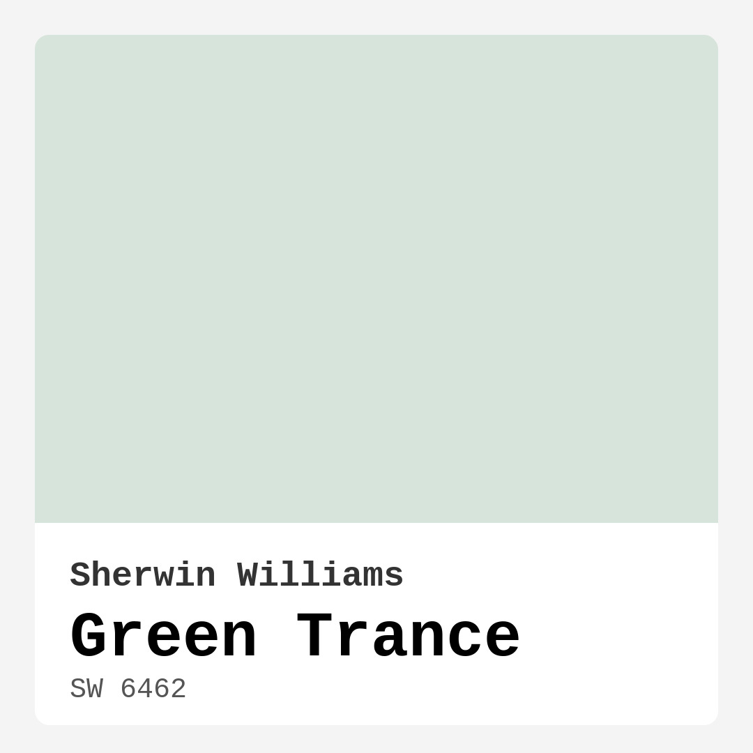
Color Preview & Key Details
| HEX Code | #D7E4DB |
| RGB | 215, 228, 219 |
| LRV | 30% |
| Undertone | Green |
| Finish Options | Eggshell, Matte, Satin |
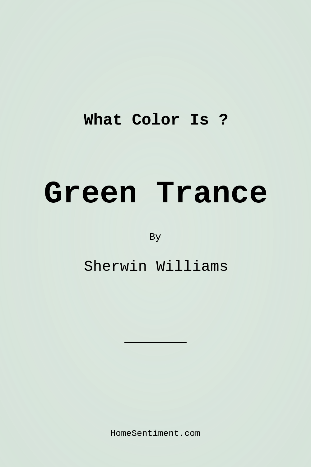
Have you ever walked into a room and felt an immediate sense of calm wash over you? That’s the magic of color, and one hue that can evoke such feelings is Green Trance by Sherwin Williams. Picture soft green meeting a whisper of gray; that’s the essence of this enchanting shade. It’s not just a color; it’s an invitation to transform your space into a serene retreat.
Imagine stepping into your living room, a space that should feel inviting and restful. Green Trance effortlessly sets that mood. It’s a versatile hue that plays well with various decor styles, whether your home leans towards modern minimalism or rustic charm. This gentle color can work wonders in any room, from bedrooms to nurseries, home offices to bathrooms. If you’re considering a refresh, let’s explore why Green Trance might just be the perfect choice for your project.
One of the standout features of Green Trance is its tranquil vibe. This color leans cool, offering a soothing environment that feels both calming and airy. It’s perfect for those moments when you want to unwind after a long day. Its subtle gray undertones add depth and complexity, ensuring that it never feels flat or monotonous. Instead, it adapts beautifully to its surroundings, inviting nature indoors.
As an expert home designer, I can’t stress enough how crucial it is to consider light when choosing a paint color. Green Trance has a Light Reflectance Value (LRV) of 30%, which places it in the medium dark category. This means it doesn’t reflect much light, creating a cozy atmosphere. In bright natural light, the hue reveals a vibrant, almost ethereal quality, while in dimmer conditions, it wraps the room in a soft, muted tone. This makes it particularly suitable for spaces where you want to cultivate a sense of calm, like bedrooms or reading nooks.
You might wonder how Green Trance performs in low-light settings. The good news is that it holds its own beautifully, though it does lean towards its cooler tones. So, if you’re working with a dimly lit room, consider pairing it with warm-toned furnishings or accents to balance that coolness. This approach can truly enhance the room’s inviting nature.
Now, let’s talk about versatility. Green Trance shines in various decor styles—from Scandinavian simplicity to transitional elegance. You can pair it with crisp whites for a clean, modern look, or enrich it with rich wood tones for a more rustic feel. The beauty of Green Trance is its adaptability; it can be the star of the show or a subtle backdrop that complements your decor. For those who love to mix and match, this color is a designer favorite for good reason.
When it comes to application, you’ll appreciate the ease of use that Green Trance offers. Its smooth application ensures a professional-looking finish, whether you’re using a brush or roller. It’s beginner-friendly, making it an ideal choice for DIY enthusiasts. Just keep in mind that you may need a couple of coats to achieve that perfect, even coverage, particularly if you’re transitioning from a darker color. But once it’s on the walls, the transformation is truly stunning.
Another practical aspect is its washability. Green Trance is designed to withstand the test of time, thanks to its wipeable surface. This feature is particularly beneficial in busy households where walls can quickly show signs of wear. Regular cleaning and touch-ups will keep it looking fresh, allowing you to enjoy the tranquility it brings without constant worry.
Now, let’s address a common concern: is Green Trance suitable for high-traffic areas? While it’s a lovely choice for many spaces, it may show wear more quickly than some bolder colors. However, opting for a satin finish can add durability, making it a more robust option for areas that see a lot of action.
One of the best parts about choosing a color like Green Trance is its ability to complement other shades beautifully. Picture it paired with soft whites, like White Dove, or against brass fixtures that bring a touch of warmth. This color also plays well with darker shades, such as SW 6826 or SW 0074, creating a layered look that adds depth and interest to your design scheme.
As you think about where to use Green Trance, consider its ideal rooms. It’s perfect for the living room, where relaxation is key, or in a bedroom, promoting restful sleep. A nursery adorned with this color can create a peaceful environment for little ones, while a home office can feel refreshing yet focused. The possibilities are endless, and the calming nature of this shade makes it a favorite for any space dedicated to relaxation and rejuvenation.
Let’s not overlook the importance of testing a paint color before making a final decision. It’s essential to observe how Green Trance interacts with your existing furniture and decor throughout the day. The undertones are what give the color its character, so you’ll want to ensure they harmonize with your overall design.
In conclusion, Green Trance by Sherwin Williams is more than just a paint color; it’s a pathway to creating a serene environment. Its calming hue, versatility, and ease of application make it an excellent choice for a variety of spaces. Whether you’re looking to refresh a single room or transform your entire home, consider this enchanting shade. Let it invite tranquility into your life and create a beautiful backdrop for cherished moments. Embrace the journey of color and let Green Trance guide you to a more peaceful home.
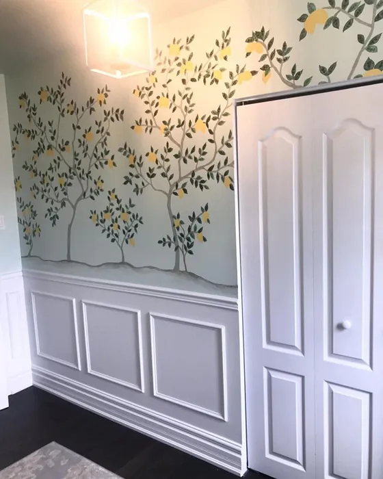
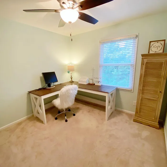
Real Room Photo of Green Trance SW 6462
Undertones of Green Trance ?
The undertones of Green Trance are a key aspect of its character, leaning towards Green. These subtle underlying hues are what give the color its depth and complexity. For example, a gray with a blue undertone will feel cooler and more modern, while one with a brown undertone will feel warmer and more traditional. It’s essential to test this paint in your home and observe it next to your existing furniture, flooring, and decor to see how these undertones interact and reveal themselves throughout the day.
HEX value: #D7E4DB
RGB code: 215, 228, 219
Is Green Trance Cool or Warm?
Green Trance leans towards the cool side of the color spectrum, bringing a refreshing feel to your space. Its calming nature makes it a perfect choice for creating a serene environment, especially in rooms dedicated to relaxation.
Understanding Color Properties and Interior Design Tips
Hue refers to a specific position on the color wheel, measured in degrees from 0 to 360. Each degree represents a different pure color:
- 0° represents red
- 120° represents green
- 240° represents blue
Saturation describes the intensity or purity of a color and is expressed as a percentage:
- At 0%, the color appears completely desaturated—essentially a shade of gray
- At 100%, the color is at its most vivid and vibrant
Lightness indicates how light or dark a color is, also expressed as a percentage:
- 0% lightness results in black
- 100% lightness results in white
Using Warm Colors in Interior Design
Warm hues—such as reds, oranges, yellows, warm beiges, and greiges—are excellent choices for creating inviting and energetic spaces. These colors are particularly well-suited for:
- Kitchens, living rooms, and bathrooms, where warmth enhances comfort and sociability
- Large rooms, where warm tones can help reduce the sense of emptiness and make the space feel more intimate
For example:
- Warm beige shades provide a cozy, inviting atmosphere, ideal for living rooms, bedrooms, and hallways.
- Warm greige (a mix of beige and gray) offers the warmth of beige with the modern appeal of gray, making it a versatile backdrop for dining areas, bedrooms, and living spaces.
However, be mindful when using warm light tones in rooms with limited natural light. These shades may appear muted or even take on an unpleasant yellowish tint. To avoid a dull or flat appearance:
- Add depth by incorporating richer tones like deep greens, charcoal, or chocolate brown
- Use textured elements such as curtains, rugs, or cushions to bring dimension to the space
Pro Tip: Achieving Harmony with Warm and Cool Color Balance
To create a well-balanced and visually interesting interior, mix warm and cool tones strategically. This contrast adds depth and harmony to your design.
- If your walls feature warm hues, introduce cool-colored accents such as blue or green furniture, artwork, or accessories to create contrast.
- For a polished look, consider using a complementary color scheme, which pairs colors opposite each other on the color wheel (e.g., red with green, orange with blue).
This thoughtful mix not only enhances visual appeal but also creates a space that feels both dynamic and cohesive.
Light Temperature Affects on Green Trance
Natural Light
Natural daylight changes in color temperature as the sun moves across the sky. At sunrise and sunset, the light tends to have a warm, golden tone with a color temperature around 2000 Kelvin (K). As the day progresses and the sun rises higher, the light becomes cooler and more neutral. Around midday, especially when the sky is clear, natural light typically reaches its peak brightness and shifts to a cooler tone, ranging from 5500 to 6500 Kelvin. This midday light is close to what we perceive as pure white or daylight-balanced light.
These shifts in natural light can significantly influence how colors appear in a space, which is why designers often consider both the time of day and the orientation of windows when planning interior color schemes.
Artificial Light
When choosing artificial lighting, pay close attention to the color temperature, measured in Kelvin (K). This determines how warm or cool the light will appear. Lower temperatures, around 2700K, give off a warm, yellow glow often used in living rooms or bedrooms. Higher temperatures, above 5000K, create a cool, bluish light similar to daylight, commonly used in kitchens, offices, or task areas.
Use the slider to see how lighting temperature can affect the appearance of a surface or color throughout a space.


4800K
LRV of Green Trance
The Light Reflectance Value (LRV) of Green Trance is 30%, which places it in the Medium Dark category. This means it reflects very little light. Understanding a paint’s LRV is crucial for predicting how it will look in your space. A higher LRV indicates a lighter color that reflects more light, making rooms feel larger and brighter. A lower LRV signifies a darker color that absorbs more light, creating a cozier, more intimate atmosphere. Always consider the natural and artificial lighting in your room when selecting a paint color based on its LRV.
Detailed Review of Green Trance
Additional Paint Characteristics
Ideal Rooms
Bathroom, Bedroom, Kitchen, Living Room, Nursery
Decor Styles
Minimalist, Modern, Rustic, Scandinavian, Transitional
Coverage
Good (1–2 Coats), Touch-Up Friendly
Ease of Application
Beginner Friendly, Brush Smooth, Roller-Ready
Washability
Washable, Wipeable
VOC Level
Low VOC
Best Use
Accent Wall, Interior Walls, Trim
Room Suitability
Bathroom, Bedroom, Home Office, Living Room, Nursery
Tone Tag
Airy, Balanced, Cool, Muted
Finish Type
Eggshell, Matte, Satin
Paint Performance
Easy Touch-Up, Low Odor, Quick Drying, Scuff Resistant
Use Cases
Best for Low Light Rooms, Best for Small Spaces, Designer Favorite
Mood
Calm, Inviting, Restful
Trim Pairing
Complements Brass Fixtures, Good with Wood Trim, Pairs with White Dove
Green Trance is a peaceful color that can transform any room into a calming retreat. Its subtle gray undertones add depth without overwhelming the space, making it ideal for both large and small areas. When applied, the paint glides on smoothly, providing a professional finish that enhances the beauty of your walls. The color looks stunning in natural light, where it comes alive, while also providing a cozy ambiance in dimmer settings. Whether you’re updating a nursery or refreshing your home office, this shade proves to be a delightful choice that balances freshness and elegance. Just be prepared for a couple of coats to achieve that perfect, even coverage, especially if you’re transitioning from darker colors.
Pros & Cons of SW 6462 Green Trance
Pros
Cons
Colors that go with Sherwin Williams Green Trance
FAQ on SW 6462 Green Trance
How does Green Trance perform in low light?
Green Trance performs admirably in low light, though it will lean more towards its cooler tones. It maintains an inviting ambiance, making it suitable for cozy spaces like bedrooms or reading nooks. To enhance its warmth, consider pairing it with warm-toned furnishings or accents.
Is Green Trance suitable for high-traffic areas?
While Green Trance is a lovely choice for many spaces, in high-traffic areas, it may show wear more quickly than some more robust colors. However, its washability helps maintain its look, so regular cleaning and touch-ups can keep it looking fresh. If you want a durable option, consider using a satin finish for added durability.
Comparisons Green Trance with other colors
Green Trance SW 6462 vs Sea Salt SW 6204
| Attribute | Green Trance SW 6462 | Sea Salt SW 6204 |
|---|---|---|
| Color Name | Green Trance SW 6462 | Sea Salt SW 6204 |
| Color | ||
| Hue | Green | Green |
| Brightness | Light | Light |
| RGB | 215, 228, 219 | 205, 210, 202 |
| LRV | 30% | 64% |
| Finish Type | Eggshell, Matte, Satin | Eggshell, Satin |
| Finish Options | Eggshell, Matte, Satin | Eggshell, Matte, Satin |
| Ideal Rooms | Bathroom, Bedroom, Kitchen, Living Room, Nursery | Bathroom, Bedroom, Hallway, Kitchen, Living Room |
| Decor Styles | Minimalist, Modern, Rustic, Scandinavian, Transitional | Coastal, Minimalist, Modern Farmhouse, Scandinavian, Traditional |
| Coverage | Good (1–2 Coats), Touch-Up Friendly | Good (1–2 Coats), Touch-Up Friendly |
| Ease of Application | Beginner Friendly, Brush Smooth, Roller-Ready | Beginner Friendly, Brush Smooth, Fast-Drying, Roller-Ready |
| Washability | Washable, Wipeable | Highly Washable, Washable |
| Room Suitability | Bathroom, Bedroom, Home Office, Living Room, Nursery | Bathroom, Bedroom, Hallway, Kitchen, Living Room |
| Tone | Airy, Balanced, Cool, Muted | Airy, Balanced, Cool, Muted |
| Paint Performance | Easy Touch-Up, Low Odor, Quick Drying, Scuff Resistant | Easy Touch-Up, High Coverage, Low Odor, Quick Drying |
Green Trance SW 6462 vs Liveable Green SW 6176
| Attribute | Green Trance SW 6462 | Liveable Green SW 6176 |
|---|---|---|
| Color Name | Green Trance SW 6462 | Liveable Green SW 6176 |
| Color | ||
| Hue | Green | Green |
| Brightness | Light | Light |
| RGB | 215, 228, 219 | 206, 206, 189 |
| LRV | 30% | 30% |
| Finish Type | Eggshell, Matte, Satin | Eggshell, Matte, Satin |
| Finish Options | Eggshell, Matte, Satin | Eggshell, Matte, Satin |
| Ideal Rooms | Bathroom, Bedroom, Kitchen, Living Room, Nursery | Bedroom, Home Office, Kitchen, Living Room, Nursery |
| Decor Styles | Minimalist, Modern, Rustic, Scandinavian, Transitional | Contemporary, Modern Farmhouse, Rustic, Scandi |
| Coverage | Good (1–2 Coats), Touch-Up Friendly | Good (1–2 Coats), Touch-Up Friendly |
| Ease of Application | Beginner Friendly, Brush Smooth, Roller-Ready | Beginner Friendly, Brush Smooth, Roller-Ready |
| Washability | Washable, Wipeable | Highly Washable, Washable |
| Room Suitability | Bathroom, Bedroom, Home Office, Living Room, Nursery | Bedroom, Home Office, Living Room, Nursery |
| Tone | Airy, Balanced, Cool, Muted | Balanced, Earthy, Muted |
| Paint Performance | Easy Touch-Up, Low Odor, Quick Drying, Scuff Resistant | Easy Touch-Up, High Coverage, Low Odor |
Green Trance SW 6462 vs Rainwashed SW 6211
| Attribute | Green Trance SW 6462 | Rainwashed SW 6211 |
|---|---|---|
| Color Name | Green Trance SW 6462 | Rainwashed SW 6211 |
| Color | ||
| Hue | Green | Green |
| Brightness | Light | Light |
| RGB | 215, 228, 219 | 194, 205, 197 |
| LRV | 30% | 60% |
| Finish Type | Eggshell, Matte, Satin | Eggshell, Matte, Satin |
| Finish Options | Eggshell, Matte, Satin | Eggshell, Matte, Satin |
| Ideal Rooms | Bathroom, Bedroom, Kitchen, Living Room, Nursery | Bathroom, Bedroom, Home Office, Living Room, Nursery |
| Decor Styles | Minimalist, Modern, Rustic, Scandinavian, Transitional | Coastal, Farmhouse, Minimalist, Modern, Transitional |
| Coverage | Good (1–2 Coats), Touch-Up Friendly | Good (1–2 Coats), Touch-Up Friendly |
| Ease of Application | Beginner Friendly, Brush Smooth, Roller-Ready | Beginner Friendly, Brush Smooth, Fast-Drying, Roller-Ready |
| Washability | Washable, Wipeable | Washable, Wipeable |
| Room Suitability | Bathroom, Bedroom, Home Office, Living Room, Nursery | Bathroom, Bedroom, Home Office, Living Room, Nursery |
| Tone | Airy, Balanced, Cool, Muted | Balanced, Cool, Muted |
| Paint Performance | Easy Touch-Up, Low Odor, Quick Drying, Scuff Resistant | Easy Touch-Up, High Coverage, Low Odor |
Green Trance SW 6462 vs Filmy Green SW 6190
| Attribute | Green Trance SW 6462 | Filmy Green SW 6190 |
|---|---|---|
| Color Name | Green Trance SW 6462 | Filmy Green SW 6190 |
| Color | ||
| Hue | Green | Green |
| Brightness | Light | Light |
| RGB | 215, 228, 219 | 209, 211, 199 |
| LRV | 30% | 50% |
| Finish Type | Eggshell, Matte, Satin | Eggshell, Matte, Satin |
| Finish Options | Eggshell, Matte, Satin | Eggshell, Matte, Satin |
| Ideal Rooms | Bathroom, Bedroom, Kitchen, Living Room, Nursery | Bedroom, Home Office, Living Room, Nursery |
| Decor Styles | Minimalist, Modern, Rustic, Scandinavian, Transitional | Bohemian, Minimalist, Modern Farmhouse, Scandinavian |
| Coverage | Good (1–2 Coats), Touch-Up Friendly | Good (1–2 Coats) |
| Ease of Application | Beginner Friendly, Brush Smooth, Roller-Ready | Beginner Friendly, Brush Smooth, Roller-Ready |
| Washability | Washable, Wipeable | Washable, Wipeable |
| Room Suitability | Bathroom, Bedroom, Home Office, Living Room, Nursery | Bedroom, Home Office, Living Room, Nursery |
| Tone | Airy, Balanced, Cool, Muted | Calm, Earthy, Muted |
| Paint Performance | Easy Touch-Up, Low Odor, Quick Drying, Scuff Resistant | Easy Touch-Up, Low Odor, Quick Drying |
Green Trance SW 6462 vs Slow Green SW 6456
| Attribute | Green Trance SW 6462 | Slow Green SW 6456 |
|---|---|---|
| Color Name | Green Trance SW 6462 | Slow Green SW 6456 |
| Color | ||
| Hue | Green | Green |
| Brightness | Light | Light |
| RGB | 215, 228, 219 | 198, 213, 201 |
| LRV | 30% | 48% |
| Finish Type | Eggshell, Matte, Satin | Eggshell, Matte, Satin |
| Finish Options | Eggshell, Matte, Satin | Eggshell, Matte, Satin |
| Ideal Rooms | Bathroom, Bedroom, Kitchen, Living Room, Nursery | Bedroom, Dining Room, Home Office, Living Room, Nursery |
| Decor Styles | Minimalist, Modern, Rustic, Scandinavian, Transitional | Coastal, Farmhouse, Modern, Rustic, Scandinavian |
| Coverage | Good (1–2 Coats), Touch-Up Friendly | Good (1–2 Coats), Touch-Up Friendly |
| Ease of Application | Beginner Friendly, Brush Smooth, Roller-Ready | Beginner Friendly, Brush Smooth, Roller-Ready |
| Washability | Washable, Wipeable | Highly Washable, Washable |
| Room Suitability | Bathroom, Bedroom, Home Office, Living Room, Nursery | Bedroom, Dining Room, Entryway, Home Office, Living Room, Nursery |
| Tone | Airy, Balanced, Cool, Muted | Balanced, Earthy, Muted |
| Paint Performance | Easy Touch-Up, Low Odor, Quick Drying, Scuff Resistant | Easy Touch-Up, Fade Resistant, Low Odor |
Green Trance SW 6462 vs Acanthus SW 0029
| Attribute | Green Trance SW 6462 | Acanthus SW 0029 |
|---|---|---|
| Color Name | Green Trance SW 6462 | Acanthus SW 0029 |
| Color | ||
| Hue | Green | Green |
| Brightness | Light | Light |
| RGB | 215, 228, 219 | 205, 205, 180 |
| LRV | 30% | 10% |
| Finish Type | Eggshell, Matte, Satin | Eggshell, Matte, Satin |
| Finish Options | Eggshell, Matte, Satin | Eggshell, Matte, Satin |
| Ideal Rooms | Bathroom, Bedroom, Kitchen, Living Room, Nursery | Bedroom, Dining Room, Home Office, Kitchen, Living Room |
| Decor Styles | Minimalist, Modern, Rustic, Scandinavian, Transitional | Eclectic, Farmhouse, Modern, Traditional |
| Coverage | Good (1–2 Coats), Touch-Up Friendly | Good (1–2 Coats) |
| Ease of Application | Beginner Friendly, Brush Smooth, Roller-Ready | Beginner Friendly, Brush Smooth, Fast-Drying, Roller-Ready |
| Washability | Washable, Wipeable | Highly Washable, Stain Resistant, Washable |
| Room Suitability | Bathroom, Bedroom, Home Office, Living Room, Nursery | Bedroom, Dining Room, Home Office, Living Room |
| Tone | Airy, Balanced, Cool, Muted | Balanced, Earthy, Muted |
| Paint Performance | Easy Touch-Up, Low Odor, Quick Drying, Scuff Resistant | Easy Touch-Up, Low Odor, Quick Drying, Scuff Resistant |
Green Trance SW 6462 vs Topiary Tint SW 6449
| Attribute | Green Trance SW 6462 | Topiary Tint SW 6449 |
|---|---|---|
| Color Name | Green Trance SW 6462 | Topiary Tint SW 6449 |
| Color | ||
| Hue | Green | Green |
| Brightness | Light | Light |
| RGB | 215, 228, 219 | 200, 216, 196 |
| LRV | 30% | 30% |
| Finish Type | Eggshell, Matte, Satin | Eggshell, Matte, Satin |
| Finish Options | Eggshell, Matte, Satin | Eggshell, Matte, Satin |
| Ideal Rooms | Bathroom, Bedroom, Kitchen, Living Room, Nursery | Bathroom, Bedroom, Dining Room, Home Office, Kitchen, Living Room |
| Decor Styles | Minimalist, Modern, Rustic, Scandinavian, Transitional | Bohemian, Coastal, Eclectic, Modern Farmhouse, Transitional |
| Coverage | Good (1–2 Coats), Touch-Up Friendly | Good (1–2 Coats), Touch-Up Friendly |
| Ease of Application | Beginner Friendly, Brush Smooth, Roller-Ready | Beginner Friendly, Brush Smooth, Fast-Drying, Roller-Ready |
| Washability | Washable, Wipeable | Scuff Resistant, Washable |
| Room Suitability | Bathroom, Bedroom, Home Office, Living Room, Nursery | Bathroom, Bedroom, Dining Room, Kitchen, Living Room |
| Tone | Airy, Balanced, Cool, Muted | Balanced, Calm, Earthy, Muted |
| Paint Performance | Easy Touch-Up, Low Odor, Quick Drying, Scuff Resistant | Easy Touch-Up, Low Odor, Quick Drying, Stain Resistant |
Green Trance SW 6462 vs Waterscape SW 6470
| Attribute | Green Trance SW 6462 | Waterscape SW 6470 |
|---|---|---|
| Color Name | Green Trance SW 6462 | Waterscape SW 6470 |
| Color | ||
| Hue | Green | Green |
| Brightness | Light | Light |
| RGB | 215, 228, 219 | 191, 210, 201 |
| LRV | 30% | 50% |
| Finish Type | Eggshell, Matte, Satin | Eggshell, Matte |
| Finish Options | Eggshell, Matte, Satin | Eggshell, Matte, Satin |
| Ideal Rooms | Bathroom, Bedroom, Kitchen, Living Room, Nursery | Bathroom, Bedroom, Home Office, Kitchen, Living Room |
| Decor Styles | Minimalist, Modern, Rustic, Scandinavian, Transitional | Coastal, Minimalist, Modern, Scandinavian |
| Coverage | Good (1–2 Coats), Touch-Up Friendly | Good (1–2 Coats) |
| Ease of Application | Beginner Friendly, Brush Smooth, Roller-Ready | Beginner Friendly, Brush Smooth, Roller-Ready |
| Washability | Washable, Wipeable | Highly Washable, Washable |
| Room Suitability | Bathroom, Bedroom, Home Office, Living Room, Nursery | Bathroom, Bedroom, Home Office, Living Room |
| Tone | Airy, Balanced, Cool, Muted | Airy, Cool, Muted |
| Paint Performance | Easy Touch-Up, Low Odor, Quick Drying, Scuff Resistant | Easy Touch-Up, Low Odor, Quick Drying |
Green Trance SW 6462 vs Bonsai Tint SW 6436
| Attribute | Green Trance SW 6462 | Bonsai Tint SW 6436 |
|---|---|---|
| Color Name | Green Trance SW 6462 | Bonsai Tint SW 6436 |
| Color | ||
| Hue | Green | Green |
| Brightness | Light | Light |
| RGB | 215, 228, 219 | 197, 209, 178 |
| LRV | 30% | 64% |
| Finish Type | Eggshell, Matte, Satin | Eggshell, Matte |
| Finish Options | Eggshell, Matte, Satin | Eggshell, Matte, Satin |
| Ideal Rooms | Bathroom, Bedroom, Kitchen, Living Room, Nursery | Bedroom, Home Office, Living Room, Nursery |
| Decor Styles | Minimalist, Modern, Rustic, Scandinavian, Transitional | Bohemian, Minimalist, Modern, Scandinavian |
| Coverage | Good (1–2 Coats), Touch-Up Friendly | Good (1–2 Coats) |
| Ease of Application | Beginner Friendly, Brush Smooth, Roller-Ready | Beginner Friendly, Brush Smooth, Roller-Ready |
| Washability | Washable, Wipeable | Washable, Wipeable |
| Room Suitability | Bathroom, Bedroom, Home Office, Living Room, Nursery | Bedroom, Home Office, Living Room, Nursery |
| Tone | Airy, Balanced, Cool, Muted | Calm, Earthy, Muted |
| Paint Performance | Easy Touch-Up, Low Odor, Quick Drying, Scuff Resistant | Easy Touch-Up, Fade Resistant, Low Odor |
Green Trance SW 6462 vs Gratifying Green SW 6435
| Attribute | Green Trance SW 6462 | Gratifying Green SW 6435 |
|---|---|---|
| Color Name | Green Trance SW 6462 | Gratifying Green SW 6435 |
| Color | ||
| Hue | Green | Green |
| Brightness | Light | Light |
| RGB | 215, 228, 219 | 218, 226, 205 |
| LRV | 30% | 30% |
| Finish Type | Eggshell, Matte, Satin | Eggshell, Matte, Satin |
| Finish Options | Eggshell, Matte, Satin | Eggshell, Matte, Satin |
| Ideal Rooms | Bathroom, Bedroom, Kitchen, Living Room, Nursery | Bedroom, Dining Room, Home Office, Living Room, Nursery |
| Decor Styles | Minimalist, Modern, Rustic, Scandinavian, Transitional | Bohemian, Coastal, Minimalist, Modern Farmhouse |
| Coverage | Good (1–2 Coats), Touch-Up Friendly | Good (1–2 Coats), Touch-Up Friendly |
| Ease of Application | Beginner Friendly, Brush Smooth, Roller-Ready | Beginner Friendly, Brush Smooth, Roller-Ready |
| Washability | Washable, Wipeable | Washable, Wipeable |
| Room Suitability | Bathroom, Bedroom, Home Office, Living Room, Nursery | Bedroom, Home Office, Living Room, Nursery |
| Tone | Airy, Balanced, Cool, Muted | Earthy, Muted, Warm |
| Paint Performance | Easy Touch-Up, Low Odor, Quick Drying, Scuff Resistant | Easy Touch-Up, Low Odor, Quick Drying |
Official Page of Sherwin Williams Green Trance SW 6462