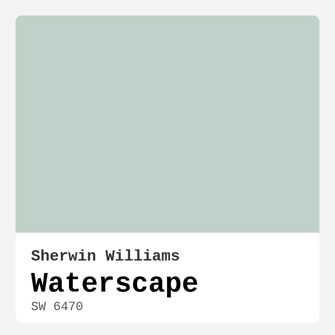
Color Preview & Key Details
| HEX Code | #BFD2C9 |
| RGB | 191, 210, 201 |
| LRV | 50% |
| Undertone | Green |
| Finish Options | Eggshell, Matte, Satin |
Imagine stepping into your home after a long day, ready to unwind in a space that feels like a serene retreat. What if that feeling could be captured with just a splash of paint? Let’s talk about Sherwin Williams’ Waterscape (SW 6470), a color that embodies tranquility and freshness, making it a perfect choice for those looking to create a peaceful atmosphere in their home.
Waterscape is a light, muted hue that seamlessly blends green and gray, reminiscent of the gentle ebb and flow of water. It’s that soft, soothing color that can instantly elevate your space, reflecting a moderate amount of light while maintaining a calming presence. With an LRV (Light Reflectance Value) of 50%, it’s versatile enough to enhance natural light without overwhelming the room.
One of the best things about Waterscape is its ability to fit into various decor styles. Whether your aesthetic leans coastal, modern, minimalist, or Scandinavian, this shade can adapt beautifully. If you’re going for a coastal vibe, imagine pairing Waterscape with sandy beiges and crisp whites, evoking the beachy feel of a seaside retreat. In a modern or minimalist setting, this color can serve as a subtle backdrop, allowing your furniture and decor to shine without competing for attention.
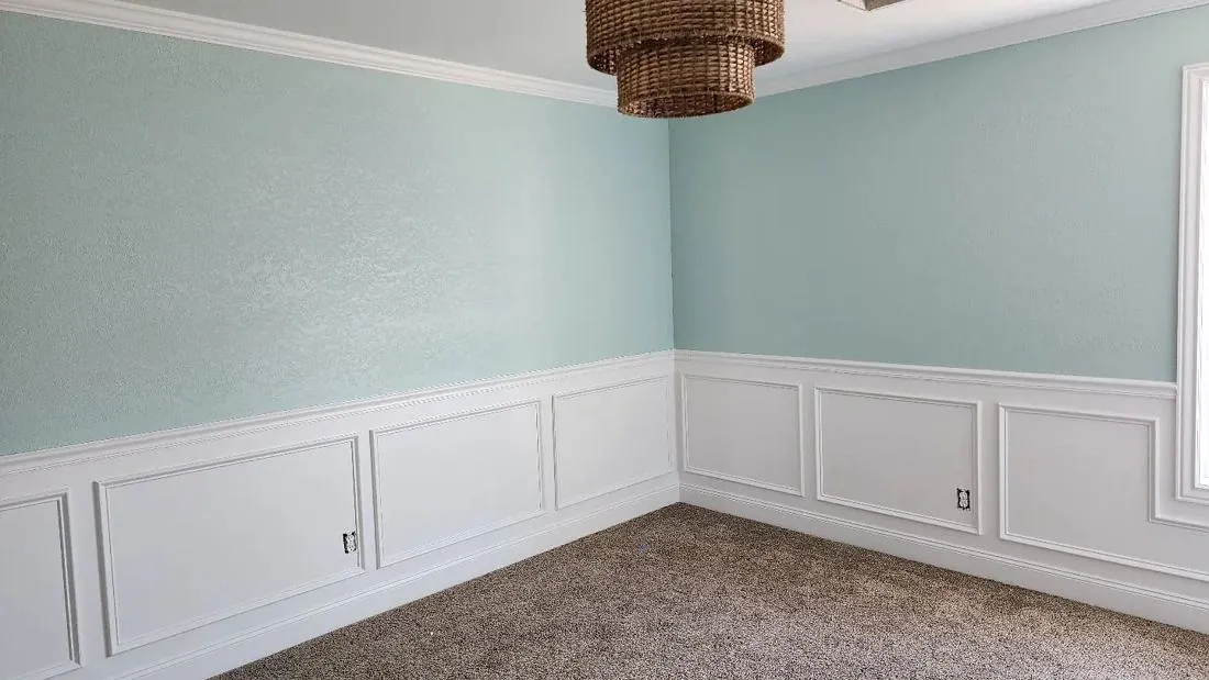
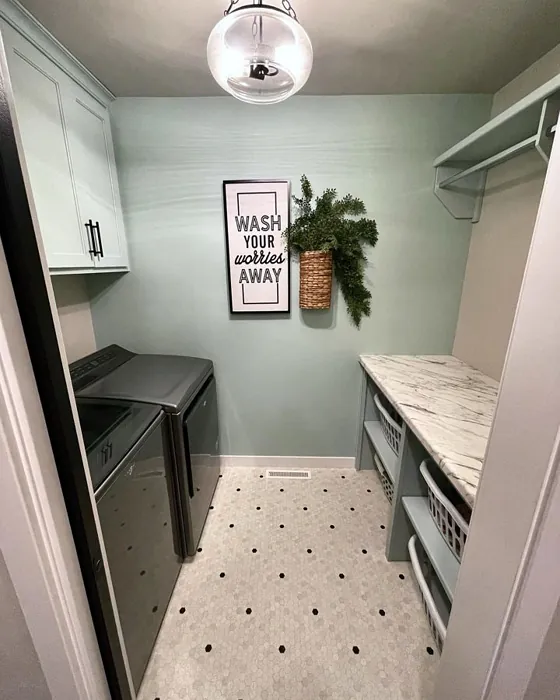
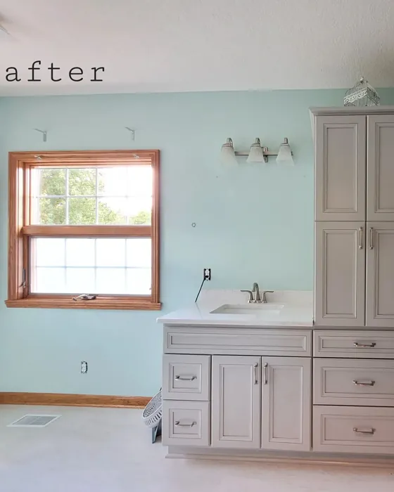
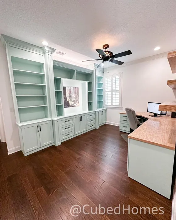
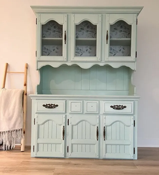
Let’s dive a bit deeper into how you can use Waterscape in different spaces. It’s ideal for living rooms, bedrooms, bathrooms, and even home offices. Picture this: your living room adorned in Waterscape, with white trim that accentuates the color’s soothing qualities. It creates a clean, polished look that feels both fresh and inviting, perfect for entertaining or simply relaxing with a good book.
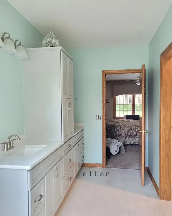
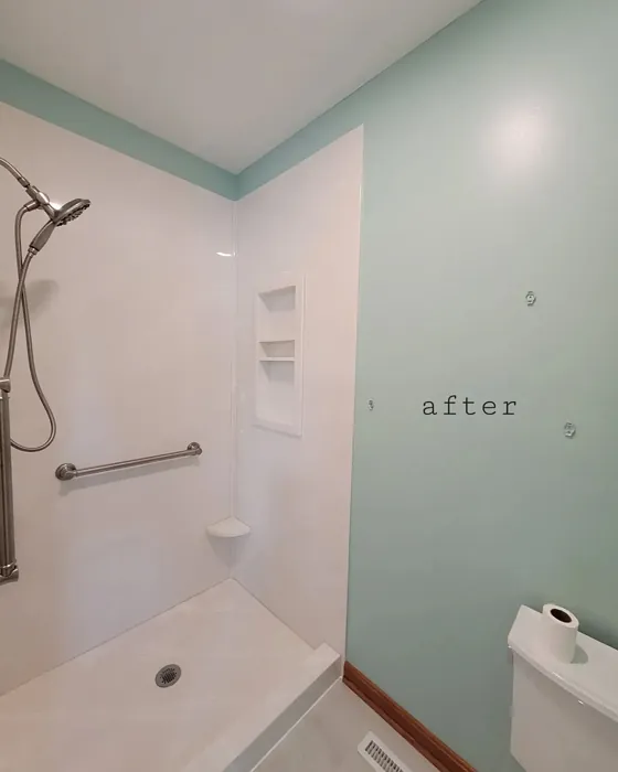
In the bedroom, Waterscape works wonders in promoting relaxation. It’s a perfect companion to soft textiles and natural wood accents, creating a serene sanctuary where you can retreat at the end of the day. And if you’re considering a bathroom refresh, this color can transform your space into a tranquil spa-like environment. Its washability is a bonus, as it can handle the humidity often found in bathrooms while still exuding a calming vibe.
For those thinking about using Waterscape in smaller spaces, you’re in luck! This color has a light and airy quality that can make compact areas feel more expansive. It invites light in while maintaining a cozy atmosphere, allowing small rooms to feel open and inviting.
Let’s not forget about the practical aspects of this paint. Waterscape is beginner-friendly, applying smoothly with both a brush and roller, making it an accessible choice for DIY projects. It boasts a low VOC level, ensuring that you can breathe easily while painting and living in your space. Plus, its quick-drying nature means you won’t be kept waiting long before you can enjoy your newly painted room.
Now, let’s chat about undertones. Waterscape leans towards green, which gives it a unique depth and complexity. This is crucial to consider when selecting your color, as the undertone can significantly affect the overall feel of your room. Whether you’re pairing it with existing furniture or new decor, take the time to test the paint in your home. Observe how it interacts with your lighting throughout the day and how it complements your flooring and furnishings.
For a more dynamic look, consider complementary shades. Waterscape pairs beautifully with colors like SW 6826 and SW 9076, which can enhance that tranquil, nature-inspired atmosphere. Think about using these shades for accent walls or decorative elements, allowing them to work in harmony with Waterscape’s calming presence.
A common question many homeowners ask is whether Waterscape might appear cooler in low light. Yes, it can take on a cooler tone in dimmer settings, which is something to keep in mind. However, under natural light, it shines brightly, revealing its full potential and maintaining a serene ambiance.
When it comes to finishes, you have options! Whether you choose matte, eggshell, or satin, each finish will bring out a different aspect of Waterscape. Matte finishes are great for a more sophisticated look, while eggshell and satin provide a subtle sheen that can enhance the color’s light-reflective qualities.
As you’re planning your project, remember that applying Waterscape generally requires one to two coats for the best results. While it’s easy to work with, a second coat can make a significant difference in achieving that perfect, consistent finish.
To sum it all up, Waterscape by Sherwin Williams is a remarkable paint color that brings a sense of calm and refreshment to any space. Its versatility makes it suitable for various decor styles and room types, while its soothing undertones create a welcoming atmosphere. Whether you’re looking to revamp a single wall or transform an entire room, Waterscape is a solid choice that won’t disappoint.
So, as you consider your next home decor project, think about the feeling you want to evoke. If tranquility, airiness, and a connection to nature resonate with you, then Waterscape might just be the perfect fit for your home. Embrace the calming allure of this color, and watch as it transforms your space into a beautiful sanctuary you’ll love coming home to.
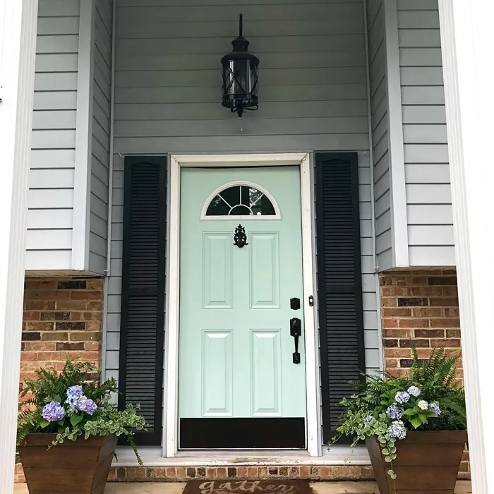
Real Room Photo of Waterscape SW 6470

Undertones of Waterscape ?
The undertones of Waterscape are a key aspect of its character, leaning towards Green. These subtle underlying hues are what give the color its depth and complexity. For example, a gray with a blue undertone will feel cooler and more modern, while one with a brown undertone will feel warmer and more traditional. It’s essential to test this paint in your home and observe it next to your existing furniture, flooring, and decor to see how these undertones interact and reveal themselves throughout the day.
HEX value: #BFD2C9
RGB code: 191, 210, 201
Is Waterscape Cool or Warm?
This paint leans cool but has enough warmth to create a welcoming ambiance. It strikes a great balance, making it suitable for both contemporary and traditional settings.
Understanding Color Properties and Interior Design Tips
Hue refers to a specific position on the color wheel, measured in degrees from 0 to 360. Each degree represents a different pure color:
- 0° represents red
- 120° represents green
- 240° represents blue
Saturation describes the intensity or purity of a color and is expressed as a percentage:
- At 0%, the color appears completely desaturated—essentially a shade of gray
- At 100%, the color is at its most vivid and vibrant
Lightness indicates how light or dark a color is, also expressed as a percentage:
- 0% lightness results in black
- 100% lightness results in white
Using Warm Colors in Interior Design
Warm hues—such as reds, oranges, yellows, warm beiges, and greiges—are excellent choices for creating inviting and energetic spaces. These colors are particularly well-suited for:
- Kitchens, living rooms, and bathrooms, where warmth enhances comfort and sociability
- Large rooms, where warm tones can help reduce the sense of emptiness and make the space feel more intimate
For example:
- Warm beige shades provide a cozy, inviting atmosphere, ideal for living rooms, bedrooms, and hallways.
- Warm greige (a mix of beige and gray) offers the warmth of beige with the modern appeal of gray, making it a versatile backdrop for dining areas, bedrooms, and living spaces.
However, be mindful when using warm light tones in rooms with limited natural light. These shades may appear muted or even take on an unpleasant yellowish tint. To avoid a dull or flat appearance:
- Add depth by incorporating richer tones like deep greens, charcoal, or chocolate brown
- Use textured elements such as curtains, rugs, or cushions to bring dimension to the space
Pro Tip: Achieving Harmony with Warm and Cool Color Balance
To create a well-balanced and visually interesting interior, mix warm and cool tones strategically. This contrast adds depth and harmony to your design.
- If your walls feature warm hues, introduce cool-colored accents such as blue or green furniture, artwork, or accessories to create contrast.
- For a polished look, consider using a complementary color scheme, which pairs colors opposite each other on the color wheel (e.g., red with green, orange with blue).
This thoughtful mix not only enhances visual appeal but also creates a space that feels both dynamic and cohesive.
Light Temperature Affects on Waterscape
Natural Light
Natural daylight changes in color temperature as the sun moves across the sky. At sunrise and sunset, the light tends to have a warm, golden tone with a color temperature around 2000 Kelvin (K). As the day progresses and the sun rises higher, the light becomes cooler and more neutral. Around midday, especially when the sky is clear, natural light typically reaches its peak brightness and shifts to a cooler tone, ranging from 5500 to 6500 Kelvin. This midday light is close to what we perceive as pure white or daylight-balanced light.
These shifts in natural light can significantly influence how colors appear in a space, which is why designers often consider both the time of day and the orientation of windows when planning interior color schemes.
Artificial Light
When choosing artificial lighting, pay close attention to the color temperature, measured in Kelvin (K). This determines how warm or cool the light will appear. Lower temperatures, around 2700K, give off a warm, yellow glow often used in living rooms or bedrooms. Higher temperatures, above 5000K, create a cool, bluish light similar to daylight, commonly used in kitchens, offices, or task areas.
Use the slider to see how lighting temperature can affect the appearance of a surface or color throughout a space.


4800K
LRV of Waterscape
The Light Reflectance Value (LRV) of Waterscape is 50%, which places it in the Medium category. This means it Reflects a moderate amount of light. Understanding a paint’s LRV is crucial for predicting how it will look in your space. A higher LRV indicates a lighter color that reflects more light, making rooms feel larger and brighter. A lower LRV signifies a darker color that absorbs more light, creating a cozier, more intimate atmosphere. Always consider the natural and artificial lighting in your room when selecting a paint color based on its LRV.
Detailed Review of Waterscape
Additional Paint Characteristics
Ideal Rooms
Bathroom, Bedroom, Home Office, Kitchen, Living Room
Decor Styles
Coastal, Minimalist, Modern, Scandinavian
Coverage
Good (1–2 Coats)
Ease of Application
Beginner Friendly, Brush Smooth, Roller-Ready
Washability
Highly Washable, Washable
VOC Level
Low VOC
Best Use
Accent Wall, Bathroom, Interior Walls
Room Suitability
Bathroom, Bedroom, Home Office, Living Room
Tone Tag
Airy, Cool, Muted
Finish Type
Eggshell, Matte
Paint Performance
Easy Touch-Up, Low Odor, Quick Drying
Use Cases
Best for Low Light Rooms, Best for Small Spaces, Designer Favorite
Mood
Calm, Inviting, Restful
Trim Pairing
Complements Cool Trim, Matches Pure White, Pairs with White Dove
Waterscape is a versatile paint that successfully balances warmth and coolness, making it an ideal choice for various decor styles. Its muted tone makes it particularly appealing for spaces designed to promote relaxation, such as bedrooms and bathrooms. The paint applies smoothly and adheres well to multiple surfaces, ensuring a consistent finish with minimal fuss. When choosing Waterscape, you can expect a subtle yet impactful color that enhances natural light, creating an airy feel. This color pairs beautifully with white or light wood trim, accentuating its tranquil vibe while maintaining a clean, polished look. Whether you’re looking to refresh a single wall or repaint an entire room, Waterscape delivers a satisfying and cohesive result.
Pros & Cons of SW 6470 Waterscape
Pros
Cons
Colors that go with Sherwin Williams Waterscape
FAQ on SW 6470 Waterscape
Is Waterscape suitable for small spaces?
Absolutely! Waterscape is a fantastic choice for small spaces. Its light and airy hue can make a room feel larger and more open. Plus, its soft undertones help create a cozy yet spacious vibe, perfect for compact areas.
Can I use Waterscape in a bathroom?
Yes, using Waterscape in a bathroom is a great idea! Its washability means it can handle the humidity typically found in bathrooms. This color adds a serene and spa-like feel, transforming your bathroom into a tranquil retreat.
Comparisons Waterscape with other colors
Waterscape SW 6470 vs Sea Salt SW 6204
| Attribute | Waterscape SW 6470 | Sea Salt SW 6204 |
|---|---|---|
| Color Name | Waterscape SW 6470 | Sea Salt SW 6204 |
| Color | ||
| Hue | Green | Green |
| Brightness | Light | Light |
| RGB | 191, 210, 201 | 205, 210, 202 |
| LRV | 50% | 64% |
| Finish Type | Eggshell, Matte | Eggshell, Satin |
| Finish Options | Eggshell, Matte, Satin | Eggshell, Matte, Satin |
| Ideal Rooms | Bathroom, Bedroom, Home Office, Kitchen, Living Room | Bathroom, Bedroom, Hallway, Kitchen, Living Room |
| Decor Styles | Coastal, Minimalist, Modern, Scandinavian | Coastal, Minimalist, Modern Farmhouse, Scandinavian, Traditional |
| Coverage | Good (1–2 Coats) | Good (1–2 Coats), Touch-Up Friendly |
| Ease of Application | Beginner Friendly, Brush Smooth, Roller-Ready | Beginner Friendly, Brush Smooth, Fast-Drying, Roller-Ready |
| Washability | Highly Washable, Washable | Highly Washable, Washable |
| Room Suitability | Bathroom, Bedroom, Home Office, Living Room | Bathroom, Bedroom, Hallway, Kitchen, Living Room |
| Tone | Airy, Cool, Muted | Airy, Balanced, Cool, Muted |
| Paint Performance | Easy Touch-Up, Low Odor, Quick Drying | Easy Touch-Up, High Coverage, Low Odor, Quick Drying |
Waterscape SW 6470 vs Liveable Green SW 6176
| Attribute | Waterscape SW 6470 | Liveable Green SW 6176 |
|---|---|---|
| Color Name | Waterscape SW 6470 | Liveable Green SW 6176 |
| Color | ||
| Hue | Green | Green |
| Brightness | Light | Light |
| RGB | 191, 210, 201 | 206, 206, 189 |
| LRV | 50% | 30% |
| Finish Type | Eggshell, Matte | Eggshell, Matte, Satin |
| Finish Options | Eggshell, Matte, Satin | Eggshell, Matte, Satin |
| Ideal Rooms | Bathroom, Bedroom, Home Office, Kitchen, Living Room | Bedroom, Home Office, Kitchen, Living Room, Nursery |
| Decor Styles | Coastal, Minimalist, Modern, Scandinavian | Contemporary, Modern Farmhouse, Rustic, Scandi |
| Coverage | Good (1–2 Coats) | Good (1–2 Coats), Touch-Up Friendly |
| Ease of Application | Beginner Friendly, Brush Smooth, Roller-Ready | Beginner Friendly, Brush Smooth, Roller-Ready |
| Washability | Highly Washable, Washable | Highly Washable, Washable |
| Room Suitability | Bathroom, Bedroom, Home Office, Living Room | Bedroom, Home Office, Living Room, Nursery |
| Tone | Airy, Cool, Muted | Balanced, Earthy, Muted |
| Paint Performance | Easy Touch-Up, Low Odor, Quick Drying | Easy Touch-Up, High Coverage, Low Odor |
Waterscape SW 6470 vs Rainwashed SW 6211
| Attribute | Waterscape SW 6470 | Rainwashed SW 6211 |
|---|---|---|
| Color Name | Waterscape SW 6470 | Rainwashed SW 6211 |
| Color | ||
| Hue | Green | Green |
| Brightness | Light | Light |
| RGB | 191, 210, 201 | 194, 205, 197 |
| LRV | 50% | 60% |
| Finish Type | Eggshell, Matte | Eggshell, Matte, Satin |
| Finish Options | Eggshell, Matte, Satin | Eggshell, Matte, Satin |
| Ideal Rooms | Bathroom, Bedroom, Home Office, Kitchen, Living Room | Bathroom, Bedroom, Home Office, Living Room, Nursery |
| Decor Styles | Coastal, Minimalist, Modern, Scandinavian | Coastal, Farmhouse, Minimalist, Modern, Transitional |
| Coverage | Good (1–2 Coats) | Good (1–2 Coats), Touch-Up Friendly |
| Ease of Application | Beginner Friendly, Brush Smooth, Roller-Ready | Beginner Friendly, Brush Smooth, Fast-Drying, Roller-Ready |
| Washability | Highly Washable, Washable | Washable, Wipeable |
| Room Suitability | Bathroom, Bedroom, Home Office, Living Room | Bathroom, Bedroom, Home Office, Living Room, Nursery |
| Tone | Airy, Cool, Muted | Balanced, Cool, Muted |
| Paint Performance | Easy Touch-Up, Low Odor, Quick Drying | Easy Touch-Up, High Coverage, Low Odor |
Waterscape SW 6470 vs Filmy Green SW 6190
| Attribute | Waterscape SW 6470 | Filmy Green SW 6190 |
|---|---|---|
| Color Name | Waterscape SW 6470 | Filmy Green SW 6190 |
| Color | ||
| Hue | Green | Green |
| Brightness | Light | Light |
| RGB | 191, 210, 201 | 209, 211, 199 |
| LRV | 50% | 50% |
| Finish Type | Eggshell, Matte | Eggshell, Matte, Satin |
| Finish Options | Eggshell, Matte, Satin | Eggshell, Matte, Satin |
| Ideal Rooms | Bathroom, Bedroom, Home Office, Kitchen, Living Room | Bedroom, Home Office, Living Room, Nursery |
| Decor Styles | Coastal, Minimalist, Modern, Scandinavian | Bohemian, Minimalist, Modern Farmhouse, Scandinavian |
| Coverage | Good (1–2 Coats) | Good (1–2 Coats) |
| Ease of Application | Beginner Friendly, Brush Smooth, Roller-Ready | Beginner Friendly, Brush Smooth, Roller-Ready |
| Washability | Highly Washable, Washable | Washable, Wipeable |
| Room Suitability | Bathroom, Bedroom, Home Office, Living Room | Bedroom, Home Office, Living Room, Nursery |
| Tone | Airy, Cool, Muted | Calm, Earthy, Muted |
| Paint Performance | Easy Touch-Up, Low Odor, Quick Drying | Easy Touch-Up, Low Odor, Quick Drying |
Waterscape SW 6470 vs Slow Green SW 6456
| Attribute | Waterscape SW 6470 | Slow Green SW 6456 |
|---|---|---|
| Color Name | Waterscape SW 6470 | Slow Green SW 6456 |
| Color | ||
| Hue | Green | Green |
| Brightness | Light | Light |
| RGB | 191, 210, 201 | 198, 213, 201 |
| LRV | 50% | 48% |
| Finish Type | Eggshell, Matte | Eggshell, Matte, Satin |
| Finish Options | Eggshell, Matte, Satin | Eggshell, Matte, Satin |
| Ideal Rooms | Bathroom, Bedroom, Home Office, Kitchen, Living Room | Bedroom, Dining Room, Home Office, Living Room, Nursery |
| Decor Styles | Coastal, Minimalist, Modern, Scandinavian | Coastal, Farmhouse, Modern, Rustic, Scandinavian |
| Coverage | Good (1–2 Coats) | Good (1–2 Coats), Touch-Up Friendly |
| Ease of Application | Beginner Friendly, Brush Smooth, Roller-Ready | Beginner Friendly, Brush Smooth, Roller-Ready |
| Washability | Highly Washable, Washable | Highly Washable, Washable |
| Room Suitability | Bathroom, Bedroom, Home Office, Living Room | Bedroom, Dining Room, Entryway, Home Office, Living Room, Nursery |
| Tone | Airy, Cool, Muted | Balanced, Earthy, Muted |
| Paint Performance | Easy Touch-Up, Low Odor, Quick Drying | Easy Touch-Up, Fade Resistant, Low Odor |
Waterscape SW 6470 vs Acanthus SW 0029
| Attribute | Waterscape SW 6470 | Acanthus SW 0029 |
|---|---|---|
| Color Name | Waterscape SW 6470 | Acanthus SW 0029 |
| Color | ||
| Hue | Green | Green |
| Brightness | Light | Light |
| RGB | 191, 210, 201 | 205, 205, 180 |
| LRV | 50% | 10% |
| Finish Type | Eggshell, Matte | Eggshell, Matte, Satin |
| Finish Options | Eggshell, Matte, Satin | Eggshell, Matte, Satin |
| Ideal Rooms | Bathroom, Bedroom, Home Office, Kitchen, Living Room | Bedroom, Dining Room, Home Office, Kitchen, Living Room |
| Decor Styles | Coastal, Minimalist, Modern, Scandinavian | Eclectic, Farmhouse, Modern, Traditional |
| Coverage | Good (1–2 Coats) | Good (1–2 Coats) |
| Ease of Application | Beginner Friendly, Brush Smooth, Roller-Ready | Beginner Friendly, Brush Smooth, Fast-Drying, Roller-Ready |
| Washability | Highly Washable, Washable | Highly Washable, Stain Resistant, Washable |
| Room Suitability | Bathroom, Bedroom, Home Office, Living Room | Bedroom, Dining Room, Home Office, Living Room |
| Tone | Airy, Cool, Muted | Balanced, Earthy, Muted |
| Paint Performance | Easy Touch-Up, Low Odor, Quick Drying | Easy Touch-Up, Low Odor, Quick Drying, Scuff Resistant |
Waterscape SW 6470 vs Topiary Tint SW 6449
| Attribute | Waterscape SW 6470 | Topiary Tint SW 6449 |
|---|---|---|
| Color Name | Waterscape SW 6470 | Topiary Tint SW 6449 |
| Color | ||
| Hue | Green | Green |
| Brightness | Light | Light |
| RGB | 191, 210, 201 | 200, 216, 196 |
| LRV | 50% | 30% |
| Finish Type | Eggshell, Matte | Eggshell, Matte, Satin |
| Finish Options | Eggshell, Matte, Satin | Eggshell, Matte, Satin |
| Ideal Rooms | Bathroom, Bedroom, Home Office, Kitchen, Living Room | Bathroom, Bedroom, Dining Room, Home Office, Kitchen, Living Room |
| Decor Styles | Coastal, Minimalist, Modern, Scandinavian | Bohemian, Coastal, Eclectic, Modern Farmhouse, Transitional |
| Coverage | Good (1–2 Coats) | Good (1–2 Coats), Touch-Up Friendly |
| Ease of Application | Beginner Friendly, Brush Smooth, Roller-Ready | Beginner Friendly, Brush Smooth, Fast-Drying, Roller-Ready |
| Washability | Highly Washable, Washable | Scuff Resistant, Washable |
| Room Suitability | Bathroom, Bedroom, Home Office, Living Room | Bathroom, Bedroom, Dining Room, Kitchen, Living Room |
| Tone | Airy, Cool, Muted | Balanced, Calm, Earthy, Muted |
| Paint Performance | Easy Touch-Up, Low Odor, Quick Drying | Easy Touch-Up, Low Odor, Quick Drying, Stain Resistant |
Waterscape SW 6470 vs Bonsai Tint SW 6436
| Attribute | Waterscape SW 6470 | Bonsai Tint SW 6436 |
|---|---|---|
| Color Name | Waterscape SW 6470 | Bonsai Tint SW 6436 |
| Color | ||
| Hue | Green | Green |
| Brightness | Light | Light |
| RGB | 191, 210, 201 | 197, 209, 178 |
| LRV | 50% | 64% |
| Finish Type | Eggshell, Matte | Eggshell, Matte |
| Finish Options | Eggshell, Matte, Satin | Eggshell, Matte, Satin |
| Ideal Rooms | Bathroom, Bedroom, Home Office, Kitchen, Living Room | Bedroom, Home Office, Living Room, Nursery |
| Decor Styles | Coastal, Minimalist, Modern, Scandinavian | Bohemian, Minimalist, Modern, Scandinavian |
| Coverage | Good (1–2 Coats) | Good (1–2 Coats) |
| Ease of Application | Beginner Friendly, Brush Smooth, Roller-Ready | Beginner Friendly, Brush Smooth, Roller-Ready |
| Washability | Highly Washable, Washable | Washable, Wipeable |
| Room Suitability | Bathroom, Bedroom, Home Office, Living Room | Bedroom, Home Office, Living Room, Nursery |
| Tone | Airy, Cool, Muted | Calm, Earthy, Muted |
| Paint Performance | Easy Touch-Up, Low Odor, Quick Drying | Easy Touch-Up, Fade Resistant, Low Odor |
Waterscape SW 6470 vs Gratifying Green SW 6435
| Attribute | Waterscape SW 6470 | Gratifying Green SW 6435 |
|---|---|---|
| Color Name | Waterscape SW 6470 | Gratifying Green SW 6435 |
| Color | ||
| Hue | Green | Green |
| Brightness | Light | Light |
| RGB | 191, 210, 201 | 218, 226, 205 |
| LRV | 50% | 30% |
| Finish Type | Eggshell, Matte | Eggshell, Matte, Satin |
| Finish Options | Eggshell, Matte, Satin | Eggshell, Matte, Satin |
| Ideal Rooms | Bathroom, Bedroom, Home Office, Kitchen, Living Room | Bedroom, Dining Room, Home Office, Living Room, Nursery |
| Decor Styles | Coastal, Minimalist, Modern, Scandinavian | Bohemian, Coastal, Minimalist, Modern Farmhouse |
| Coverage | Good (1–2 Coats) | Good (1–2 Coats), Touch-Up Friendly |
| Ease of Application | Beginner Friendly, Brush Smooth, Roller-Ready | Beginner Friendly, Brush Smooth, Roller-Ready |
| Washability | Highly Washable, Washable | Washable, Wipeable |
| Room Suitability | Bathroom, Bedroom, Home Office, Living Room | Bedroom, Home Office, Living Room, Nursery |
| Tone | Airy, Cool, Muted | Earthy, Muted, Warm |
| Paint Performance | Easy Touch-Up, Low Odor, Quick Drying | Easy Touch-Up, Low Odor, Quick Drying |
Waterscape SW 6470 vs Fleeting Green SW 6455
| Attribute | Waterscape SW 6470 | Fleeting Green SW 6455 |
|---|---|---|
| Color Name | Waterscape SW 6470 | Fleeting Green SW 6455 |
| Color | ||
| Hue | Green | Green |
| Brightness | Light | Light |
| RGB | 191, 210, 201 | 216, 226, 216 |
| LRV | 50% | 64% |
| Finish Type | Eggshell, Matte | Eggshell, Matte |
| Finish Options | Eggshell, Matte, Satin | Eggshell, Matte, Satin |
| Ideal Rooms | Bathroom, Bedroom, Home Office, Kitchen, Living Room | Bathroom, Bedroom, Home Office, Living Room, Nursery |
| Decor Styles | Coastal, Minimalist, Modern, Scandinavian | Coastal, Farmhouse, Minimalist, Modern, Scandinavian |
| Coverage | Good (1–2 Coats) | Good (1–2 Coats), Touch-Up Friendly |
| Ease of Application | Beginner Friendly, Brush Smooth, Roller-Ready | Beginner Friendly, Brush Smooth, Roller-Ready |
| Washability | Highly Washable, Washable | Washable, Wipeable |
| Room Suitability | Bathroom, Bedroom, Home Office, Living Room | Bathroom, Bedroom, Home Office, Living Room, Nursery |
| Tone | Airy, Cool, Muted | Airy, Balanced, Cool, Muted |
| Paint Performance | Easy Touch-Up, Low Odor, Quick Drying | Easy Touch-Up, Low Odor, Quick Drying |
Official Page of Sherwin Williams Waterscape SW 6470