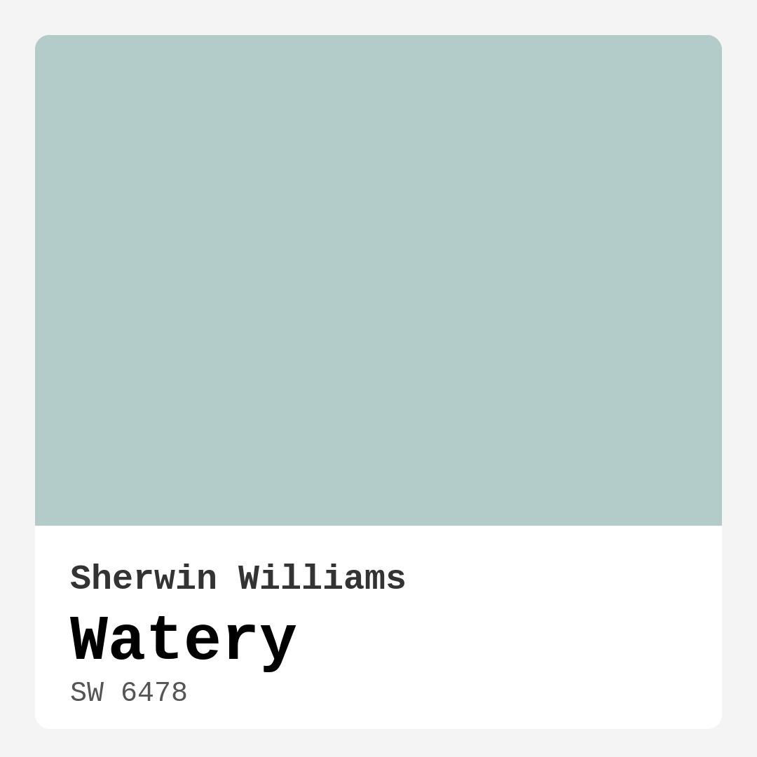
Color Preview & Key Details
| HEX Code | #B4CCC9 |
| RGB | 180, 204, 201 |
| LRV | 50% |
| Undertone | Green and Blue |
| Finish Options | Eggshell, Matte, Satin |
Imagine stepping into a room that instantly makes you feel at ease, where the color on the walls whispers calmness and serenity. That’s the magic of Sherwin Williams’ Watery (SW 6478). This delightful hue is more than just a color; it’s an experience, a feeling. With its gentle greenish-blue undertones, Watery captures the essence of tranquil waters, inviting you to relax and unwind every time you walk through the door.
Watery is a medium brightness color, boasting an LRV (Light Reflectance Value) of 50%. This means it reflects a moderate amount of light, which is perfect for creating an airy atmosphere without overwhelming the senses. Whether it’s a bathroom, bedroom, living room, or even a kitchen, this color can transform your space into a peaceful retreat. Picture it painted on your walls, softly reflecting natural light and making the room feel larger and more inviting.
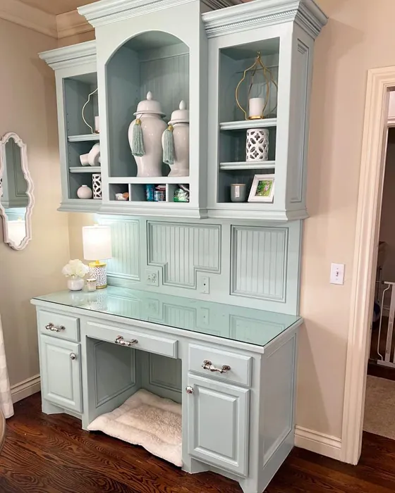
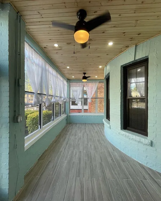
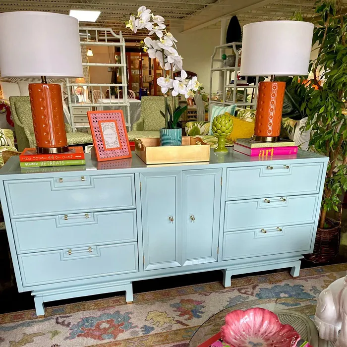
One of the best things about Watery is its versatility. It seamlessly fits into various decor styles—be it coastal, modern, Scandinavian, or farmhouse. Imagine pairing it with crisp white trim, like Benjamin Moore’s White Dove, to create a fresh and airy feel. For those of you who love nature-inspired decor, consider accenting Watery with earthy tones or natural textures. Think rattan baskets, wooden furniture, or woven rugs—all of these can beautifully complement this serene hue.
Now, let’s talk about how this color performs. Applying Watery is an absolute joy. It’s designed for both beginners and seasoned painters, gliding on smoothly whether you use a brush or roller. You’ll find it dries quickly, so you won’t be stuck waiting around for hours. With good coverage, you typically only need one to two coats, making the process efficient and satisfying. For the best results, especially if you’re painting over darker colors, a primer could be your best friend.
In terms of washability, Watery holds up well against the everyday wear and tear of life. It’s highly washable, which means you can easily wipe away fingerprints, smudges, or any marks that might accumulate. However, as with any light color, it might show dirt more easily, so regular maintenance will keep it looking fresh.
When it comes to lighting, Watery truly shines. In spaces filled with natural light, it can appear almost ethereal, bringing a sense of openness and airiness to the room. However, in lower light situations, it can take on a more muted quality, making it perfect for creating cozy corners where you might want to curl up with a good book. Just keep in mind that the right lighting is essential to fully appreciate its beauty.
The undertones of Watery are a key aspect of its charm. Leaning towards green and blue, these subtle shades add depth and complexity, allowing it to adapt beautifully to various settings. You might notice its greenish hue popping against warm wood tones or standing out in contrast to cooler furniture. This interplay of tones is why testing the paint in your space is crucial. Observe how it interacts with your furniture, flooring, and existing decor throughout the day.
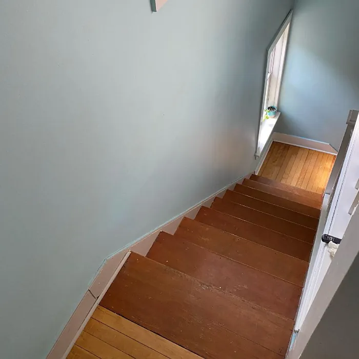
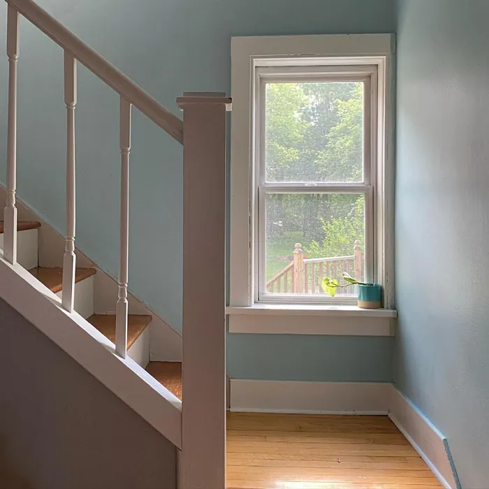
Watery can effortlessly enhance small spaces, making them feel larger and more inviting. Its light, airy quality can create an illusion of depth, turning a cramped bathroom or a cozy hallway into a refreshing oasis. It’s also an excellent choice for bedrooms, promoting a restful and calming atmosphere essential for relaxation and sleep.
It’s worth noting that while Watery is a stunning choice, it does have a few considerations. In low-light conditions, it may seem a bit dull, and its light color can show dirt more easily than darker shades. If you’re thinking of using it in high-traffic areas, you might want to consider additional protective measures, like a higher sheen finish for durability.
If you’re looking to create an impactful color scheme, Watery pairs beautifully with a range of complimentary colors. Consider using shades like SW 6826, SW 6016, or SW 6283 to enhance your decor and add visual interest. These colors can serve as accents in your furniture, artwork, or accessories, ensuring an overall harmonious look.
You might also explore lighter shades like SW 6477 or darker variations such as SW 9051 to create depth and contrast in your design. The key is to create a balanced palette that feels cohesive and inviting, with Watery serving as a soothing backdrop.
In addition to its aesthetic appeal, Watery has the added benefit of being low VOC, making it a safer choice for your home. This means you can enjoy your newly painted space without the worry of harmful fumes lingering in the air.
Ultimately, choosing Watery for your home is a decision you won’t regret. Its calm, inviting nature creates a restful environment that’s perfect for unwinding after a long day. Plus, its versatility ensures that it can adapt to your changing decor style over time. Whether you’re redesigning a single room or refreshing your entire home, this color can help you achieve a beautiful, personalized space that resonates with tranquility.
So, if you want to create a serene sanctuary in your home, consider giving Watery a try. Take the leap, embrace its soothing vibes, and watch as your space transforms into a relaxing retreat that you’ll love coming home to. It’s a color that not only beautifies your walls but also enriches your life, one serene moment at a time.

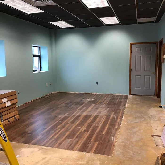
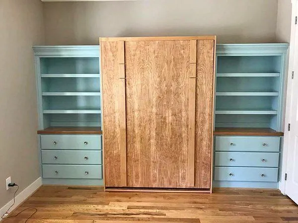
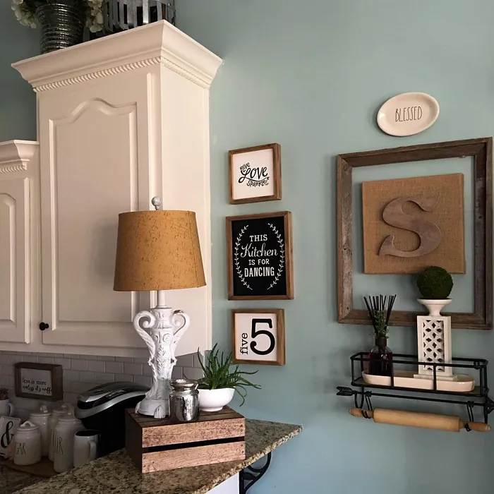
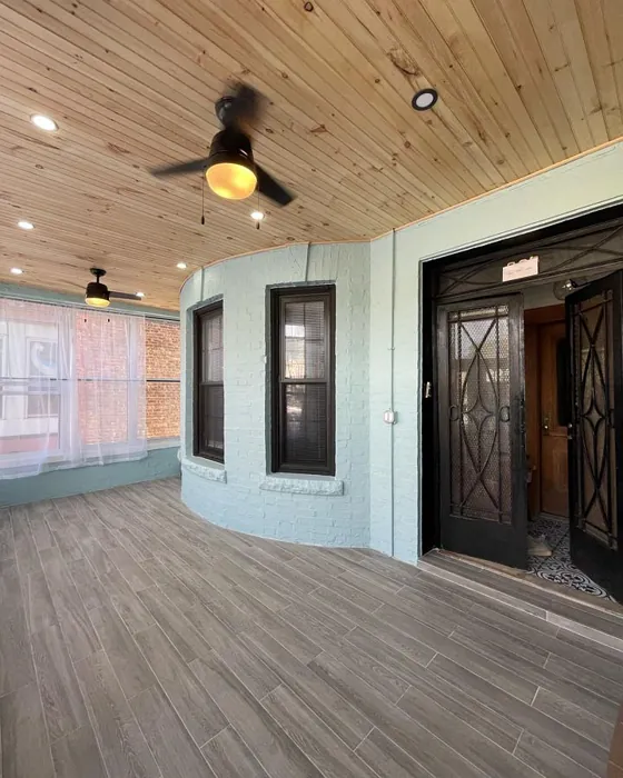
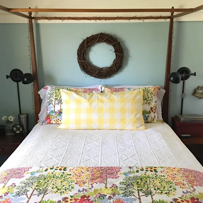
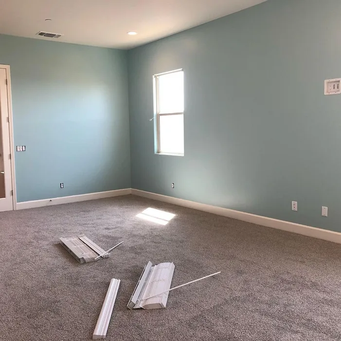
Real Room Photo of Watery SW 6478
Undertones of Watery ?
The undertones of Watery are a key aspect of its character, leaning towards Green and Blue. These subtle underlying hues are what give the color its depth and complexity. For example, a gray with a blue undertone will feel cooler and more modern, while one with a brown undertone will feel warmer and more traditional. It’s essential to test this paint in your home and observe it next to your existing furniture, flooring, and decor to see how these undertones interact and reveal themselves throughout the day.
HEX value: #B4CCC9
RGB code: 180, 204, 201
Is Watery Cool or Warm?
This color leans cool, with its calming blue-green shades promoting a soothing atmosphere. It’s ideal for spaces where you want to foster relaxation or focus, making it a great choice for bedrooms and home offices.
Understanding Color Properties and Interior Design Tips
Hue refers to a specific position on the color wheel, measured in degrees from 0 to 360. Each degree represents a different pure color:
- 0° represents red
- 120° represents green
- 240° represents blue
Saturation describes the intensity or purity of a color and is expressed as a percentage:
- At 0%, the color appears completely desaturated—essentially a shade of gray
- At 100%, the color is at its most vivid and vibrant
Lightness indicates how light or dark a color is, also expressed as a percentage:
- 0% lightness results in black
- 100% lightness results in white
Using Warm Colors in Interior Design
Warm hues—such as reds, oranges, yellows, warm beiges, and greiges—are excellent choices for creating inviting and energetic spaces. These colors are particularly well-suited for:
- Kitchens, living rooms, and bathrooms, where warmth enhances comfort and sociability
- Large rooms, where warm tones can help reduce the sense of emptiness and make the space feel more intimate
For example:
- Warm beige shades provide a cozy, inviting atmosphere, ideal for living rooms, bedrooms, and hallways.
- Warm greige (a mix of beige and gray) offers the warmth of beige with the modern appeal of gray, making it a versatile backdrop for dining areas, bedrooms, and living spaces.
However, be mindful when using warm light tones in rooms with limited natural light. These shades may appear muted or even take on an unpleasant yellowish tint. To avoid a dull or flat appearance:
- Add depth by incorporating richer tones like deep greens, charcoal, or chocolate brown
- Use textured elements such as curtains, rugs, or cushions to bring dimension to the space
Pro Tip: Achieving Harmony with Warm and Cool Color Balance
To create a well-balanced and visually interesting interior, mix warm and cool tones strategically. This contrast adds depth and harmony to your design.
- If your walls feature warm hues, introduce cool-colored accents such as blue or green furniture, artwork, or accessories to create contrast.
- For a polished look, consider using a complementary color scheme, which pairs colors opposite each other on the color wheel (e.g., red with green, orange with blue).
This thoughtful mix not only enhances visual appeal but also creates a space that feels both dynamic and cohesive.
Light Temperature Affects on Watery
Natural Light
Natural daylight changes in color temperature as the sun moves across the sky. At sunrise and sunset, the light tends to have a warm, golden tone with a color temperature around 2000 Kelvin (K). As the day progresses and the sun rises higher, the light becomes cooler and more neutral. Around midday, especially when the sky is clear, natural light typically reaches its peak brightness and shifts to a cooler tone, ranging from 5500 to 6500 Kelvin. This midday light is close to what we perceive as pure white or daylight-balanced light.
These shifts in natural light can significantly influence how colors appear in a space, which is why designers often consider both the time of day and the orientation of windows when planning interior color schemes.
Artificial Light
When choosing artificial lighting, pay close attention to the color temperature, measured in Kelvin (K). This determines how warm or cool the light will appear. Lower temperatures, around 2700K, give off a warm, yellow glow often used in living rooms or bedrooms. Higher temperatures, above 5000K, create a cool, bluish light similar to daylight, commonly used in kitchens, offices, or task areas.
Use the slider to see how lighting temperature can affect the appearance of a surface or color throughout a space.


4800K
LRV of Watery
The Light Reflectance Value (LRV) of Watery is 50%, which places it in the Medium category. This means it Reflects a moderate amount of light. Understanding a paint’s LRV is crucial for predicting how it will look in your space. A higher LRV indicates a lighter color that reflects more light, making rooms feel larger and brighter. A lower LRV signifies a darker color that absorbs more light, creating a cozier, more intimate atmosphere. Always consider the natural and artificial lighting in your room when selecting a paint color based on its LRV.
Detailed Review of Watery
Additional Paint Characteristics
Ideal Rooms
Bathroom, Bedroom, Hallway, Living Room
Decor Styles
Coastal, Farmhouse, Modern, Scandinavian
Coverage
Good (1–2 Coats)
Ease of Application
Beginner Friendly, Fast-Drying, Roller-Ready
Washability
Highly Washable, Washable
VOC Level
Low VOC
Best Use
Accent Wall, Interior Walls, Small Spaces
Room Suitability
Bathroom, Bedroom, Kitchen, Living Room
Tone Tag
Airy, Cool, Muted
Finish Type
Eggshell, Satin
Paint Performance
High Coverage, Low Odor, Quick Drying
Use Cases
Best for Low Light Rooms, Best for Small Spaces, Designer Favorite
Mood
Calm, Inviting, Restful
Trim Pairing
Complements Cool Trim, Pairs with White Dove
Applying Watery is a treat for any DIY enthusiast. The paint glides on smoothly, whether you’re using a brush or a roller, making it beginner-friendly. Its gentle hue reflects light beautifully, transforming spaces into airy retreats. You’ll find it’s not only easy to apply, but it also dries quickly, which means less waiting around and more time enjoying your refreshed room. The coverage is impressive, typically needing just one to two coats. However, for best results, especially on darker surfaces, consider a primer. Overall, Watery’s performance is stellar for both novice painters and seasoned pros alike, and it can elevate your home’s aesthetic with minimal effort.
Pros & Cons of SW 6478 Watery
Pros
Cons
Colors that go with Sherwin Williams Watery
FAQ on SW 6478 Watery
Is Watery suitable for high-traffic areas?
While Watery is designed for interior walls and can handle moderate wear, it may not be the best choice for high-traffic areas without additional protective measures. Consider using it in spaces where it won’t face heavy scuffing or wear, or opt for a higher sheen finish for better durability.
Can I use Watery in a small room?
Absolutely! Watery can be a fantastic choice for small spaces. Its light, airy quality helps to open up a room, making it feel larger and more inviting. Just ensure you have adequate lighting to fully appreciate its beauty.
Comparisons Watery with other colors
Watery SW 6478 vs Dutch Tile Blue SW 0031
| Attribute | Watery SW 6478 | Dutch Tile Blue SW 0031 |
|---|---|---|
| Color Name | Watery SW 6478 | Dutch Tile Blue SW 0031 |
| Color | ||
| Hue | Blue | Blue |
| Brightness | Medium | Medium |
| RGB | 180, 204, 201 | 154, 171, 171 |
| LRV | 50% | 24% |
| Finish Type | Eggshell, Satin | Eggshell, Matte, Satin |
| Finish Options | Eggshell, Matte, Satin | Eggshell, Flat, Matte, Satin |
| Ideal Rooms | Bathroom, Bedroom, Hallway, Living Room | Bathroom, Bedroom, Dining Room, Hallway, Home Office, Kitchen, Living Room |
| Decor Styles | Coastal, Farmhouse, Modern, Scandinavian | Coastal, Modern Farmhouse, Scandinavian, Traditional, Transitional |
| Coverage | Good (1–2 Coats) | Good (1–2 Coats) |
| Ease of Application | Beginner Friendly, Fast-Drying, Roller-Ready | Beginner Friendly, Brush Smooth, Fast-Drying, Roller-Ready |
| Washability | Highly Washable, Washable | Highly Washable, Washable |
| Room Suitability | Bathroom, Bedroom, Kitchen, Living Room | Bathroom, Bedroom, Dining Room, Kitchen, Living Room |
| Tone | Airy, Cool, Muted | Balanced, Cool, Muted |
| Paint Performance | High Coverage, Low Odor, Quick Drying | Easy Touch-Up, High Coverage, Low Odor, Quick Drying |
Watery SW 6478 vs Debonair SW 9139
| Attribute | Watery SW 6478 | Debonair SW 9139 |
|---|---|---|
| Color Name | Watery SW 6478 | Debonair SW 9139 |
| Color | ||
| Hue | Blue | Blue |
| Brightness | Medium | Medium |
| RGB | 180, 204, 201 | 144, 160, 166 |
| LRV | 50% | 30% |
| Finish Type | Eggshell, Satin | Eggshell, Matte, Satin |
| Finish Options | Eggshell, Matte, Satin | Eggshell, Matte, Satin |
| Ideal Rooms | Bathroom, Bedroom, Hallway, Living Room | Bedroom, Dining Room, Home Office, Living Room |
| Decor Styles | Coastal, Farmhouse, Modern, Scandinavian | Coastal, Industrial, Modern, Transitional |
| Coverage | Good (1–2 Coats) | Good (1–2 Coats) |
| Ease of Application | Beginner Friendly, Fast-Drying, Roller-Ready | Beginner Friendly, Brush Smooth, Roller-Ready |
| Washability | Highly Washable, Washable | Washable, Wipeable |
| Room Suitability | Bathroom, Bedroom, Kitchen, Living Room | Bedroom, Dining Room, Home Office, Living Room |
| Tone | Airy, Cool, Muted | Balanced, Cool, Muted |
| Paint Performance | High Coverage, Low Odor, Quick Drying | Easy Touch-Up, Low Odor, Quick Drying |
Watery SW 6478 vs Stardew SW 9138
| Attribute | Watery SW 6478 | Stardew SW 9138 |
|---|---|---|
| Color Name | Watery SW 6478 | Stardew SW 9138 |
| Color | ||
| Hue | Blue | Blue |
| Brightness | Medium | Medium |
| RGB | 180, 204, 201 | 166, 178, 181 |
| LRV | 50% | 30% |
| Finish Type | Eggshell, Satin | Eggshell, Satin |
| Finish Options | Eggshell, Matte, Satin | Eggshell, Matte, Satin |
| Ideal Rooms | Bathroom, Bedroom, Hallway, Living Room | Bathroom, Bedroom, Home Office, Living Room, Nursery |
| Decor Styles | Coastal, Farmhouse, Modern, Scandinavian | Coastal, Farmhouse, Modern, Scandinavian |
| Coverage | Good (1–2 Coats) | Good (1–2 Coats) |
| Ease of Application | Beginner Friendly, Fast-Drying, Roller-Ready | Beginner Friendly, Brush Smooth, Roller-Ready |
| Washability | Highly Washable, Washable | Highly Washable, Washable, Wipeable |
| Room Suitability | Bathroom, Bedroom, Kitchen, Living Room | Bathroom, Bedroom, Home Office, Living Room |
| Tone | Airy, Cool, Muted | Calm, Cool, Muted |
| Paint Performance | High Coverage, Low Odor, Quick Drying | Easy Touch-Up, High Coverage, Low Odor |
Watery SW 6478 vs Niebla Azul SW 9137
| Attribute | Watery SW 6478 | Niebla Azul SW 9137 |
|---|---|---|
| Color Name | Watery SW 6478 | Niebla Azul SW 9137 |
| Color | ||
| Hue | Blue | Blue |
| Brightness | Medium | Medium |
| RGB | 180, 204, 201 | 182, 195, 196 |
| LRV | 50% | 48% |
| Finish Type | Eggshell, Satin | Eggshell, Matte, Satin |
| Finish Options | Eggshell, Matte, Satin | Eggshell, Matte, Satin |
| Ideal Rooms | Bathroom, Bedroom, Hallway, Living Room | Bedroom, Home Office, Living Room, Nursery |
| Decor Styles | Coastal, Farmhouse, Modern, Scandinavian | Coastal, Modern, Scandinavian, Transitional |
| Coverage | Good (1–2 Coats) | Good (1–2 Coats), Touch-Up Friendly |
| Ease of Application | Beginner Friendly, Fast-Drying, Roller-Ready | Beginner Friendly, Brush Smooth, Roller-Ready |
| Washability | Highly Washable, Washable | Highly Washable, Washable |
| Room Suitability | Bathroom, Bedroom, Kitchen, Living Room | Bedroom, Home Office, Living Room, Nursery |
| Tone | Airy, Cool, Muted | Airy, Cool, Muted |
| Paint Performance | High Coverage, Low Odor, Quick Drying | Easy Touch-Up, Fade Resistant, Low Odor, Scuff Resistant |
Watery SW 6478 vs Rain SW 6219
| Attribute | Watery SW 6478 | Rain SW 6219 |
|---|---|---|
| Color Name | Watery SW 6478 | Rain SW 6219 |
| Color | ||
| Hue | Blue | Blue |
| Brightness | Medium | Medium |
| RGB | 180, 204, 201 | 171, 190, 191 |
| LRV | 50% | 50% |
| Finish Type | Eggshell, Satin | Eggshell, Matte, Satin |
| Finish Options | Eggshell, Matte, Satin | Eggshell, Matte, Satin |
| Ideal Rooms | Bathroom, Bedroom, Hallway, Living Room | Bathroom, Bedroom, Home Office, Living Room, Nursery |
| Decor Styles | Coastal, Farmhouse, Modern, Scandinavian | Coastal, Minimalist, Modern, Scandinavian, Transitional |
| Coverage | Good (1–2 Coats) | Good (1–2 Coats), Touch-Up Friendly |
| Ease of Application | Beginner Friendly, Fast-Drying, Roller-Ready | Beginner Friendly, Brush Smooth, Fast-Drying, Roller-Ready |
| Washability | Highly Washable, Washable | Scrubbable, Stain Resistant, Washable |
| Room Suitability | Bathroom, Bedroom, Kitchen, Living Room | Bathroom, Bedroom, Home Office, Living Room, Nursery |
| Tone | Airy, Cool, Muted | Balanced, Cool, Muted |
| Paint Performance | High Coverage, Low Odor, Quick Drying | Easy Touch-Up, Low Odor, Quick Drying, Stain Resistant |
Watery SW 6478 vs Morning at Sea SW 9634
| Attribute | Watery SW 6478 | Morning at Sea SW 9634 |
|---|---|---|
| Color Name | Watery SW 6478 | Morning at Sea SW 9634 |
| Color | ||
| Hue | Blue | Blue |
| Brightness | Medium | Medium |
| RGB | 180, 204, 201 | 130, 151, 155 |
| LRV | 50% | 50% |
| Finish Type | Eggshell, Satin | Eggshell, Matte |
| Finish Options | Eggshell, Matte, Satin | Eggshell, Matte, Satin |
| Ideal Rooms | Bathroom, Bedroom, Hallway, Living Room | Bathroom, Bedroom, Home Office, Living Room |
| Decor Styles | Coastal, Farmhouse, Modern, Scandinavian | Coastal, Minimalist, Modern, Scandinavian |
| Coverage | Good (1–2 Coats) | Good (1–2 Coats), Touch-Up Friendly |
| Ease of Application | Beginner Friendly, Fast-Drying, Roller-Ready | Beginner Friendly, Brush Smooth, Roller-Ready |
| Washability | Highly Washable, Washable | Washable, Wipeable |
| Room Suitability | Bathroom, Bedroom, Kitchen, Living Room | Bathroom, Bedroom, Home Office, Living Room |
| Tone | Airy, Cool, Muted | Airy, Cool, Muted |
| Paint Performance | High Coverage, Low Odor, Quick Drying | Easy Touch-Up, Fade Resistant, Low Odor |
Watery SW 6478 vs Sleepy Blue SW 6225
| Attribute | Watery SW 6478 | Sleepy Blue SW 6225 |
|---|---|---|
| Color Name | Watery SW 6478 | Sleepy Blue SW 6225 |
| Color | ||
| Hue | Blue | Blue |
| Brightness | Medium | Medium |
| RGB | 180, 204, 201 | 188, 203, 206 |
| LRV | 50% | 50% |
| Finish Type | Eggshell, Satin | Eggshell, Matte, Satin |
| Finish Options | Eggshell, Matte, Satin | Eggshell, Matte, Satin |
| Ideal Rooms | Bathroom, Bedroom, Hallway, Living Room | Bedroom, Home Office, Living Room, Nursery |
| Decor Styles | Coastal, Farmhouse, Modern, Scandinavian | Coastal, Minimalist, Modern Farmhouse, Scandinavian |
| Coverage | Good (1–2 Coats) | Good (1–2 Coats) |
| Ease of Application | Beginner Friendly, Fast-Drying, Roller-Ready | Beginner Friendly, Brush Smooth, Fast-Drying, Roller-Ready |
| Washability | Highly Washable, Washable | Highly Washable, Washable |
| Room Suitability | Bathroom, Bedroom, Kitchen, Living Room | Bedroom, Home Office, Living Room, Nursery |
| Tone | Airy, Cool, Muted | Airy, Cool, Muted |
| Paint Performance | High Coverage, Low Odor, Quick Drying | Easy Touch-Up, Low Odor, Quick Drying, Scuff Resistant |
Watery SW 6478 vs Lakeside SW 9683
| Attribute | Watery SW 6478 | Lakeside SW 9683 |
|---|---|---|
| Color Name | Watery SW 6478 | Lakeside SW 9683 |
| Color | ||
| Hue | Blue | Blue |
| Brightness | Medium | Medium |
| RGB | 180, 204, 201 | 173, 184, 192 |
| LRV | 50% | 24% |
| Finish Type | Eggshell, Satin | Eggshell, Matte, Satin |
| Finish Options | Eggshell, Matte, Satin | Eggshell, Matte, Satin |
| Ideal Rooms | Bathroom, Bedroom, Hallway, Living Room | Bathroom, Bedroom, Home Office, Living Room |
| Decor Styles | Coastal, Farmhouse, Modern, Scandinavian | Coastal, Minimalist, Modern, Rustic |
| Coverage | Good (1–2 Coats) | Good (1–2 Coats) |
| Ease of Application | Beginner Friendly, Fast-Drying, Roller-Ready | Beginner Friendly, Brush Smooth, Roller-Ready |
| Washability | Highly Washable, Washable | Scrubbable, Washable |
| Room Suitability | Bathroom, Bedroom, Kitchen, Living Room | Bathroom, Bedroom, Home Office, Living Room |
| Tone | Airy, Cool, Muted | Balanced, Cool, Muted |
| Paint Performance | High Coverage, Low Odor, Quick Drying | Easy Touch-Up, Fade Resistant, High Coverage, Low Odor |
Watery SW 6478 vs Upward SW 6239
| Attribute | Watery SW 6478 | Upward SW 6239 |
|---|---|---|
| Color Name | Watery SW 6478 | Upward SW 6239 |
| Color | ||
| Hue | Blue | Blue |
| Brightness | Medium | Medium |
| RGB | 180, 204, 201 | 191, 201, 208 |
| LRV | 50% | 75% |
| Finish Type | Eggshell, Satin | Eggshell, Satin |
| Finish Options | Eggshell, Matte, Satin | Eggshell, Flat, Satin |
| Ideal Rooms | Bathroom, Bedroom, Hallway, Living Room | Bedroom, Dining Room, Home Office, Living Room, Nursery |
| Decor Styles | Coastal, Farmhouse, Modern, Scandinavian | Coastal, Minimalist, Modern, Scandinavian |
| Coverage | Good (1–2 Coats) | Good (1–2 Coats), Touch-Up Friendly |
| Ease of Application | Beginner Friendly, Fast-Drying, Roller-Ready | Beginner Friendly, Brush Smooth, Fast-Drying, Roller-Ready |
| Washability | Highly Washable, Washable | Washable, Wipeable |
| Room Suitability | Bathroom, Bedroom, Kitchen, Living Room | Bedroom, Home Office, Living Room, Nursery |
| Tone | Airy, Cool, Muted | Cool, Crisp, Muted |
| Paint Performance | High Coverage, Low Odor, Quick Drying | High Coverage, Low Odor, Quick Drying |
Watery SW 6478 vs Aleutian SW 6241
| Attribute | Watery SW 6478 | Aleutian SW 6241 |
|---|---|---|
| Color Name | Watery SW 6478 | Aleutian SW 6241 |
| Color | ||
| Hue | Blue | Blue |
| Brightness | Medium | Medium |
| RGB | 180, 204, 201 | 152, 169, 183 |
| LRV | 50% | 24% |
| Finish Type | Eggshell, Satin | Eggshell, Matte, Satin |
| Finish Options | Eggshell, Matte, Satin | Eggshell, Matte, Satin |
| Ideal Rooms | Bathroom, Bedroom, Hallway, Living Room | Bathroom, Bedroom, Home Office, Kitchen, Living Room, Nursery |
| Decor Styles | Coastal, Farmhouse, Modern, Scandinavian | Coastal, Minimalist, Modern, Scandinavian, Transitional |
| Coverage | Good (1–2 Coats) | Good (1–2 Coats), Touch-Up Friendly |
| Ease of Application | Beginner Friendly, Fast-Drying, Roller-Ready | Beginner Friendly, Brush Smooth, Fast-Drying, Roller-Ready |
| Washability | Highly Washable, Washable | Scrubbable, Stain Resistant, Washable |
| Room Suitability | Bathroom, Bedroom, Kitchen, Living Room | Bathroom, Bedroom, Home Office, Living Room, Nursery |
| Tone | Airy, Cool, Muted | Airy, Balanced, Cool, Muted |
| Paint Performance | High Coverage, Low Odor, Quick Drying | Easy Touch-Up, Fade Resistant, Low Odor, Quick Drying |
Official Page of Sherwin Williams Watery SW 6478