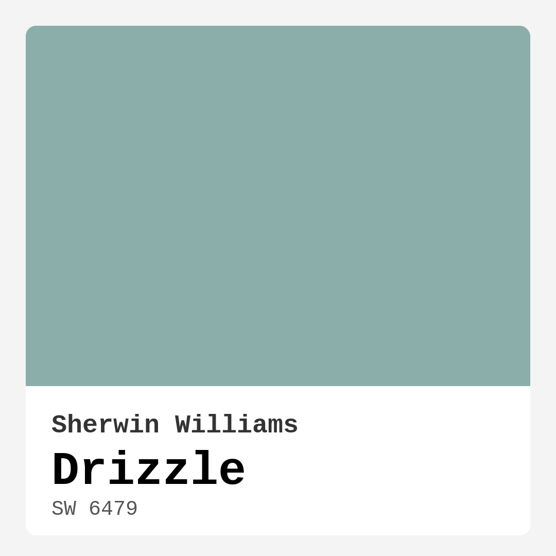
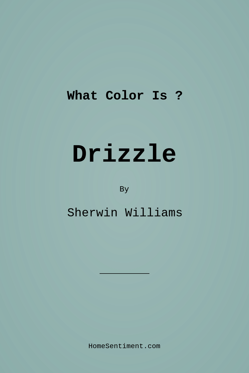
Color Preview & Key Details
| HEX Code | #8CAEAB |
| RGB | 140, 174, 171 |
| LRV | 50% |
| Undertone | Blue |
| Finish Options | Eggshell, Satin, Semi-Gloss |
Imagine walking into a room that feels like a gentle embrace, where the colors wrap around you like a soft, comforting blanket. That’s the magic of Drizzle, a serene hue from Sherwin Williams that captures the tranquil essence of a gentle rain shower. As an expert home designer, I can tell you that choosing the right paint color can transform a space, and Drizzle does just that.
This medium-toned blue, with its soft teal undertones, brings a refreshing calmness to any area it inhabits. Whether you’re looking to refresh your living room, create a peaceful bedroom, or even devise a serene home office, Drizzle stands out as an excellent choice. The color reflects a moderate amount of light, which allows it to breathe life into your rooms without overwhelming them.
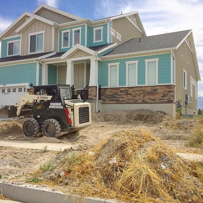
One of the first things you’ll notice about Drizzle is how effortlessly it adapts to various decor styles. Are you leaning towards a coastal vibe? Drizzle will evoke the soothing feel of the seaside, complementing natural textures like driftwood and soft linens. If modern aesthetics are more your style, this cool hue pairs beautifully with sleek lines and minimalist decor. Even in Scandinavian and minimalist designs, Drizzle acts as a subtle backdrop, allowing your furnishings and decor to shine.
You might be wondering, how does Drizzle perform in different lighting situations? That’s where its magic really comes to life. In natural light, it enhances that refreshing feel, appearing brighter and more vibrant. However, in dimly lit spaces, it may take on a slightly deeper shade, creating a cozy and inviting atmosphere. This quality makes it particularly appealing for bedrooms and bathrooms, where a calming retreat is essential.
In terms of application, Drizzle is beginner-friendly. It glides on smoothly with both a roller and a brush, which means you won’t have to struggle to get that desired finish. With good coverage, you’ll likely only need one to two coats to achieve that serene ambiance. Plus, it’s touch-up friendly, so any little mishaps along the way can be easily corrected.
Let’s talk about washability. Drizzle is highly washable, making it suitable for spaces that encounter more wear and tear, like kitchens and bathrooms. When it comes to finishes, you have options: Eggshell, Satin, or Semi-Gloss. Each finish offers a unique look and feel. Eggshell provides that soft sheen, perfect for living areas, while Satin works wonders in spaces that require a bit more durability, such as kitchens or bathrooms. Semi-Gloss is ideal for trim and cabinets, adding a touch of polish that complements the overall look.
Now, I’d be remiss if I didn’t mention its undertones. Drizzle leans towards a blue undertone, which is key to its serene character. This subtle hint of blue can play wonderfully with other colors in your home, but keep an eye on how it interacts with warmer tones. If you have overly warm hues in your existing decor, they might clash with Drizzle’s cool vibe.
If you’re exploring colors that pair well with Drizzle, consider complementary shades like SW 6016 or SW 7630. These will create a cohesive look while maintaining that refreshing feel. For a classic touch, mixing it with whites like White Dove or Pure White can elevate the space, bringing a timeless elegance that’s hard to beat.
The Light Reflectance Value (LRV) of Drizzle is 50%, placing it in the medium category. This means it reflects a moderate amount of light, making it versatile for various room sizes and lighting conditions. Understanding LRV is crucial; it gives you insight into how the color will behave under different lighting throughout the day. If you want a space that feels more expansive and airy, lighter colors might be the way to go. However, if you’re aiming for a cozy retreat, darker hues could work beautifully.
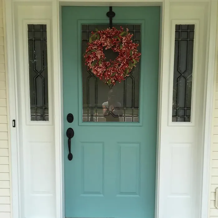
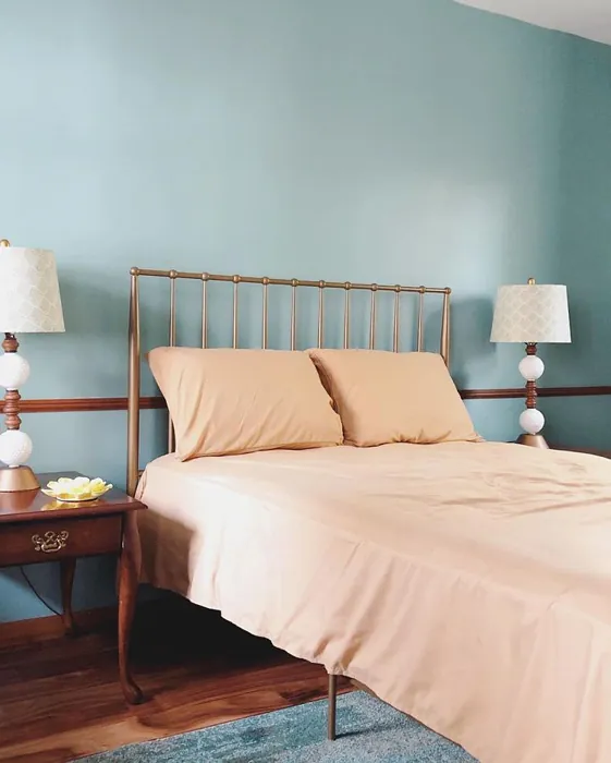
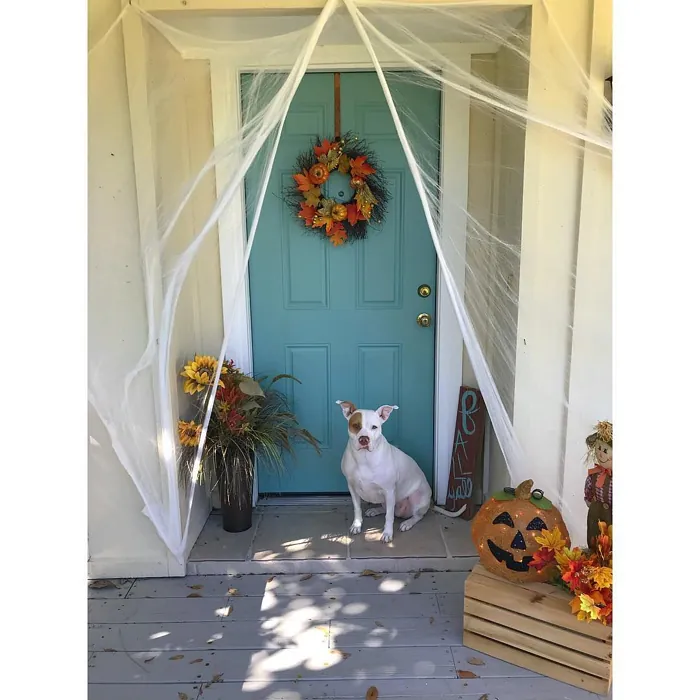
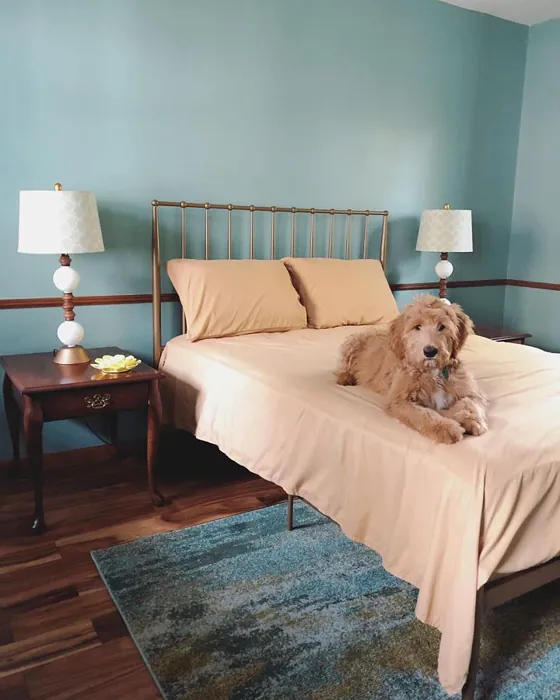
One of my favorite applications for Drizzle is as an accent wall. Imagine a cozy reading nook, where the calm, muted tone wraps around you, creating an inviting atmosphere perfect for escaping into a good book. It’s also a wonderful choice for a bedroom, where its restful qualities can help you unwind at the end of a long day.
As for bathrooms, Drizzle can turn a busy space into a tranquil oasis. It’s moisture-resistant, so choosing a satin or semi-gloss finish will ensure durability while still maintaining that calming vibe. You’ll love how it can transform a simple washroom into a serene retreat.
Another area where Drizzle shines is in home offices. With so many of us working from home these days, creating an inspiring yet calming workspace is essential. Drizzle encourages focus and creativity, making it a fantastic backdrop for productivity.
Before you commit, it’s always wise to test the color in your own home. Paint samples can look different depending on your existing furniture, flooring, and decor. Observe how Drizzle interacts with your space throughout the day; its character can shift with the light, revealing its various shades and undertones.
While Drizzle has many pros, it’s worth noting a few considerations. In lower light conditions, it might appear darker than expected, so think about the type of natural light your space receives. And while its versatility is a strength, be cautious around overly warm tones, as they may compete with Drizzle’s cool demeanor.
If you’re ready to take the plunge, I can confidently say Drizzle is an excellent choice for those looking to create a peaceful, inviting atmosphere in their home. It’s more than just a paint color; it’s a mood, a feeling, and a lifestyle enhancement. So go ahead, embrace this beautifully calming hue and let it transform your home into the serene retreat you’ve always dreamed of. Trust me, once you experience the tranquility of Drizzle, you’ll be glad you did.
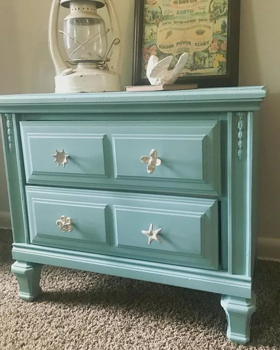
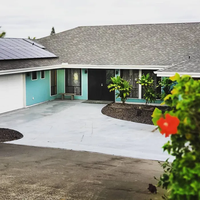
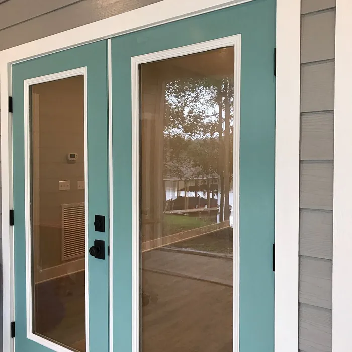
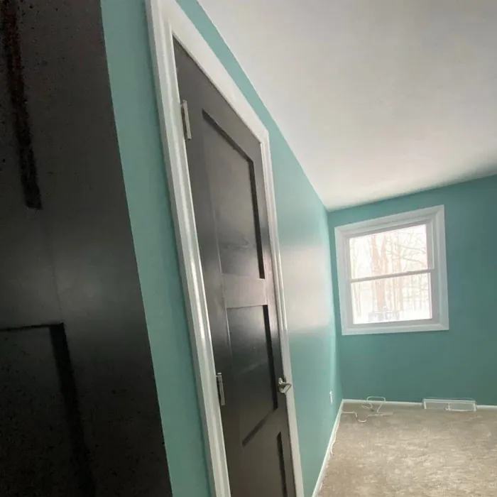
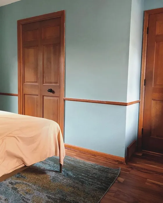
Real Room Photo of Drizzle SW 6479
Undertones of Drizzle ?
The undertones of Drizzle are a key aspect of its character, leaning towards Blue. These subtle underlying hues are what give the color its depth and complexity. For example, a gray with a blue undertone will feel cooler and more modern, while one with a brown undertone will feel warmer and more traditional. It’s essential to test this paint in your home and observe it next to your existing furniture, flooring, and decor to see how these undertones interact and reveal themselves throughout the day.
HEX value: #8CAEAB
RGB code: 140, 174, 171
Is Drizzle Cool or Warm?
This paint color is decidedly cool, with its blue-green undertones contributing to a tranquil atmosphere. Drizzle emanates a refreshing vibe that can brighten up spaces while maintaining a sense of calm. It’s an excellent choice for those who prefer cooler palettes that evoke feelings of serenity.
Understanding Color Properties and Interior Design Tips
Hue refers to a specific position on the color wheel, measured in degrees from 0 to 360. Each degree represents a different pure color:
- 0° represents red
- 120° represents green
- 240° represents blue
Saturation describes the intensity or purity of a color and is expressed as a percentage:
- At 0%, the color appears completely desaturated—essentially a shade of gray
- At 100%, the color is at its most vivid and vibrant
Lightness indicates how light or dark a color is, also expressed as a percentage:
- 0% lightness results in black
- 100% lightness results in white
Using Warm Colors in Interior Design
Warm hues—such as reds, oranges, yellows, warm beiges, and greiges—are excellent choices for creating inviting and energetic spaces. These colors are particularly well-suited for:
- Kitchens, living rooms, and bathrooms, where warmth enhances comfort and sociability
- Large rooms, where warm tones can help reduce the sense of emptiness and make the space feel more intimate
For example:
- Warm beige shades provide a cozy, inviting atmosphere, ideal for living rooms, bedrooms, and hallways.
- Warm greige (a mix of beige and gray) offers the warmth of beige with the modern appeal of gray, making it a versatile backdrop for dining areas, bedrooms, and living spaces.
However, be mindful when using warm light tones in rooms with limited natural light. These shades may appear muted or even take on an unpleasant yellowish tint. To avoid a dull or flat appearance:
- Add depth by incorporating richer tones like deep greens, charcoal, or chocolate brown
- Use textured elements such as curtains, rugs, or cushions to bring dimension to the space
Pro Tip: Achieving Harmony with Warm and Cool Color Balance
To create a well-balanced and visually interesting interior, mix warm and cool tones strategically. This contrast adds depth and harmony to your design.
- If your walls feature warm hues, introduce cool-colored accents such as blue or green furniture, artwork, or accessories to create contrast.
- For a polished look, consider using a complementary color scheme, which pairs colors opposite each other on the color wheel (e.g., red with green, orange with blue).
This thoughtful mix not only enhances visual appeal but also creates a space that feels both dynamic and cohesive.
Light Temperature Affects on Drizzle
Natural Light
Natural daylight changes in color temperature as the sun moves across the sky. At sunrise and sunset, the light tends to have a warm, golden tone with a color temperature around 2000 Kelvin (K). As the day progresses and the sun rises higher, the light becomes cooler and more neutral. Around midday, especially when the sky is clear, natural light typically reaches its peak brightness and shifts to a cooler tone, ranging from 5500 to 6500 Kelvin. This midday light is close to what we perceive as pure white or daylight-balanced light.
These shifts in natural light can significantly influence how colors appear in a space, which is why designers often consider both the time of day and the orientation of windows when planning interior color schemes.
Artificial Light
When choosing artificial lighting, pay close attention to the color temperature, measured in Kelvin (K). This determines how warm or cool the light will appear. Lower temperatures, around 2700K, give off a warm, yellow glow often used in living rooms or bedrooms. Higher temperatures, above 5000K, create a cool, bluish light similar to daylight, commonly used in kitchens, offices, or task areas.
Use the slider to see how lighting temperature can affect the appearance of a surface or color throughout a space.


4800K
LRV of Drizzle
The Light Reflectance Value (LRV) of Drizzle is 50%, which places it in the Medium category. This means it Reflects a moderate amount of light. Understanding a paint’s LRV is crucial for predicting how it will look in your space. A higher LRV indicates a lighter color that reflects more light, making rooms feel larger and brighter. A lower LRV signifies a darker color that absorbs more light, creating a cozier, more intimate atmosphere. Always consider the natural and artificial lighting in your room when selecting a paint color based on its LRV.
Detailed Review of Drizzle
Additional Paint Characteristics
Ideal Rooms
Bathroom, Bedroom, Home Office, Kitchen, Living Room
Decor Styles
Coastal, Minimalist, Modern, Scandinavian
Coverage
Good (1–2 Coats), Touch-Up Friendly
Ease of Application
Beginner Friendly, Brush Smooth, Roller-Ready
Washability
Highly Washable, Washable
VOC Level
Eco-Certified, Low VOC
Best Use
Accent Wall, Bathroom, Bedroom, Home Office, Interior Walls
Room Suitability
Bathroom, Bedroom, Home Office, Living Room
Tone Tag
Balanced, Cool, Muted
Finish Type
Eggshell, Satin, Semi-Gloss
Paint Performance
Easy Touch-Up, High Coverage, Low Odor, Quick Drying
Use Cases
Best for Low Light Rooms, Best for Modern Farmhouse, Classic Favorite, Designer Favorite
Mood
Airy, Calm, Inviting, Restful
Trim Pairing
Complements Cool Trim, Matches Pure White, Pairs with White Dove
Drizzle is a standout choice for anyone seeking a tranquil, yet stylish paint option. The color strikes a perfect balance between blue and green, making it versatile enough to pair with various decor styles. When applied, it dries evenly and provides a smooth, serene finish that works beautifully in both bright and dimly lit spaces. Whether you’re refreshing a small area or an entire room, Drizzle offers excellent coverage with just one to two coats. It’s a great option for those looking to create a calming environment, especially in places like bedrooms or bathrooms where serenity is key. Plus, it pairs beautifully with natural light, enhancing its fresh feel. Overall, if you’re aiming for a peaceful vibe in your home, Drizzle is a fantastic choice.
Pros & Cons of SW 6479 Drizzle
Pros
Cons
Colors that go with Sherwin Williams Drizzle
FAQ on SW 6479 Drizzle
What finishes are available for Drizzle paint?
Drizzle is available in several finishes, including Eggshell, Satin, and Semi-Gloss. Each finish offers a unique look and feel, with eggshell providing a soft sheen, satin delivering a subtle gloss, and semi-gloss giving a more reflective surface. Depending on your project needs, you can choose the one that best complements your space. For example, satin is great for living areas, while semi-gloss is perfect for trim and cabinets.
Can Drizzle be used in bathrooms or kitchens?
Absolutely! Drizzle is a fantastic choice for bathrooms and kitchens due to its washability and moisture-resistant properties. Its serene hue can create a calming atmosphere in these spaces, which are often bustling and busy. Just be sure to choose a finish that can handle the humidity, such as satin or semi-gloss, to ensure longevity and easy maintenance.
Comparisons Drizzle with other colors
Drizzle SW 6479 vs Dutch Tile Blue SW 0031
| Attribute | Drizzle SW 6479 | Dutch Tile Blue SW 0031 |
|---|---|---|
| Color Name | Drizzle SW 6479 | Dutch Tile Blue SW 0031 |
| Color | ||
| Hue | Blue | Blue |
| Brightness | Medium | Medium |
| RGB | 140, 174, 171 | 154, 171, 171 |
| LRV | 50% | 24% |
| Finish Type | Eggshell, Satin, Semi-Gloss | Eggshell, Matte, Satin |
| Finish Options | Eggshell, Satin, Semi-Gloss | Eggshell, Flat, Matte, Satin |
| Ideal Rooms | Bathroom, Bedroom, Home Office, Kitchen, Living Room | Bathroom, Bedroom, Dining Room, Hallway, Home Office, Kitchen, Living Room |
| Decor Styles | Coastal, Minimalist, Modern, Scandinavian | Coastal, Modern Farmhouse, Scandinavian, Traditional, Transitional |
| Coverage | Good (1–2 Coats), Touch-Up Friendly | Good (1–2 Coats) |
| Ease of Application | Beginner Friendly, Brush Smooth, Roller-Ready | Beginner Friendly, Brush Smooth, Fast-Drying, Roller-Ready |
| Washability | Highly Washable, Washable | Highly Washable, Washable |
| Room Suitability | Bathroom, Bedroom, Home Office, Living Room | Bathroom, Bedroom, Dining Room, Kitchen, Living Room |
| Tone | Balanced, Cool, Muted | Balanced, Cool, Muted |
| Paint Performance | Easy Touch-Up, High Coverage, Low Odor, Quick Drying | Easy Touch-Up, High Coverage, Low Odor, Quick Drying |
Drizzle SW 6479 vs Debonair SW 9139
| Attribute | Drizzle SW 6479 | Debonair SW 9139 |
|---|---|---|
| Color Name | Drizzle SW 6479 | Debonair SW 9139 |
| Color | ||
| Hue | Blue | Blue |
| Brightness | Medium | Medium |
| RGB | 140, 174, 171 | 144, 160, 166 |
| LRV | 50% | 30% |
| Finish Type | Eggshell, Satin, Semi-Gloss | Eggshell, Matte, Satin |
| Finish Options | Eggshell, Satin, Semi-Gloss | Eggshell, Matte, Satin |
| Ideal Rooms | Bathroom, Bedroom, Home Office, Kitchen, Living Room | Bedroom, Dining Room, Home Office, Living Room |
| Decor Styles | Coastal, Minimalist, Modern, Scandinavian | Coastal, Industrial, Modern, Transitional |
| Coverage | Good (1–2 Coats), Touch-Up Friendly | Good (1–2 Coats) |
| Ease of Application | Beginner Friendly, Brush Smooth, Roller-Ready | Beginner Friendly, Brush Smooth, Roller-Ready |
| Washability | Highly Washable, Washable | Washable, Wipeable |
| Room Suitability | Bathroom, Bedroom, Home Office, Living Room | Bedroom, Dining Room, Home Office, Living Room |
| Tone | Balanced, Cool, Muted | Balanced, Cool, Muted |
| Paint Performance | Easy Touch-Up, High Coverage, Low Odor, Quick Drying | Easy Touch-Up, Low Odor, Quick Drying |
Drizzle SW 6479 vs Stardew SW 9138
| Attribute | Drizzle SW 6479 | Stardew SW 9138 |
|---|---|---|
| Color Name | Drizzle SW 6479 | Stardew SW 9138 |
| Color | ||
| Hue | Blue | Blue |
| Brightness | Medium | Medium |
| RGB | 140, 174, 171 | 166, 178, 181 |
| LRV | 50% | 30% |
| Finish Type | Eggshell, Satin, Semi-Gloss | Eggshell, Satin |
| Finish Options | Eggshell, Satin, Semi-Gloss | Eggshell, Matte, Satin |
| Ideal Rooms | Bathroom, Bedroom, Home Office, Kitchen, Living Room | Bathroom, Bedroom, Home Office, Living Room, Nursery |
| Decor Styles | Coastal, Minimalist, Modern, Scandinavian | Coastal, Farmhouse, Modern, Scandinavian |
| Coverage | Good (1–2 Coats), Touch-Up Friendly | Good (1–2 Coats) |
| Ease of Application | Beginner Friendly, Brush Smooth, Roller-Ready | Beginner Friendly, Brush Smooth, Roller-Ready |
| Washability | Highly Washable, Washable | Highly Washable, Washable, Wipeable |
| Room Suitability | Bathroom, Bedroom, Home Office, Living Room | Bathroom, Bedroom, Home Office, Living Room |
| Tone | Balanced, Cool, Muted | Calm, Cool, Muted |
| Paint Performance | Easy Touch-Up, High Coverage, Low Odor, Quick Drying | Easy Touch-Up, High Coverage, Low Odor |
Drizzle SW 6479 vs Niebla Azul SW 9137
| Attribute | Drizzle SW 6479 | Niebla Azul SW 9137 |
|---|---|---|
| Color Name | Drizzle SW 6479 | Niebla Azul SW 9137 |
| Color | ||
| Hue | Blue | Blue |
| Brightness | Medium | Medium |
| RGB | 140, 174, 171 | 182, 195, 196 |
| LRV | 50% | 48% |
| Finish Type | Eggshell, Satin, Semi-Gloss | Eggshell, Matte, Satin |
| Finish Options | Eggshell, Satin, Semi-Gloss | Eggshell, Matte, Satin |
| Ideal Rooms | Bathroom, Bedroom, Home Office, Kitchen, Living Room | Bedroom, Home Office, Living Room, Nursery |
| Decor Styles | Coastal, Minimalist, Modern, Scandinavian | Coastal, Modern, Scandinavian, Transitional |
| Coverage | Good (1–2 Coats), Touch-Up Friendly | Good (1–2 Coats), Touch-Up Friendly |
| Ease of Application | Beginner Friendly, Brush Smooth, Roller-Ready | Beginner Friendly, Brush Smooth, Roller-Ready |
| Washability | Highly Washable, Washable | Highly Washable, Washable |
| Room Suitability | Bathroom, Bedroom, Home Office, Living Room | Bedroom, Home Office, Living Room, Nursery |
| Tone | Balanced, Cool, Muted | Airy, Cool, Muted |
| Paint Performance | Easy Touch-Up, High Coverage, Low Odor, Quick Drying | Easy Touch-Up, Fade Resistant, Low Odor, Scuff Resistant |
Drizzle SW 6479 vs Rain SW 6219
| Attribute | Drizzle SW 6479 | Rain SW 6219 |
|---|---|---|
| Color Name | Drizzle SW 6479 | Rain SW 6219 |
| Color | ||
| Hue | Blue | Blue |
| Brightness | Medium | Medium |
| RGB | 140, 174, 171 | 171, 190, 191 |
| LRV | 50% | 50% |
| Finish Type | Eggshell, Satin, Semi-Gloss | Eggshell, Matte, Satin |
| Finish Options | Eggshell, Satin, Semi-Gloss | Eggshell, Matte, Satin |
| Ideal Rooms | Bathroom, Bedroom, Home Office, Kitchen, Living Room | Bathroom, Bedroom, Home Office, Living Room, Nursery |
| Decor Styles | Coastal, Minimalist, Modern, Scandinavian | Coastal, Minimalist, Modern, Scandinavian, Transitional |
| Coverage | Good (1–2 Coats), Touch-Up Friendly | Good (1–2 Coats), Touch-Up Friendly |
| Ease of Application | Beginner Friendly, Brush Smooth, Roller-Ready | Beginner Friendly, Brush Smooth, Fast-Drying, Roller-Ready |
| Washability | Highly Washable, Washable | Scrubbable, Stain Resistant, Washable |
| Room Suitability | Bathroom, Bedroom, Home Office, Living Room | Bathroom, Bedroom, Home Office, Living Room, Nursery |
| Tone | Balanced, Cool, Muted | Balanced, Cool, Muted |
| Paint Performance | Easy Touch-Up, High Coverage, Low Odor, Quick Drying | Easy Touch-Up, Low Odor, Quick Drying, Stain Resistant |
Drizzle SW 6479 vs Morning at Sea SW 9634
| Attribute | Drizzle SW 6479 | Morning at Sea SW 9634 |
|---|---|---|
| Color Name | Drizzle SW 6479 | Morning at Sea SW 9634 |
| Color | ||
| Hue | Blue | Blue |
| Brightness | Medium | Medium |
| RGB | 140, 174, 171 | 130, 151, 155 |
| LRV | 50% | 50% |
| Finish Type | Eggshell, Satin, Semi-Gloss | Eggshell, Matte |
| Finish Options | Eggshell, Satin, Semi-Gloss | Eggshell, Matte, Satin |
| Ideal Rooms | Bathroom, Bedroom, Home Office, Kitchen, Living Room | Bathroom, Bedroom, Home Office, Living Room |
| Decor Styles | Coastal, Minimalist, Modern, Scandinavian | Coastal, Minimalist, Modern, Scandinavian |
| Coverage | Good (1–2 Coats), Touch-Up Friendly | Good (1–2 Coats), Touch-Up Friendly |
| Ease of Application | Beginner Friendly, Brush Smooth, Roller-Ready | Beginner Friendly, Brush Smooth, Roller-Ready |
| Washability | Highly Washable, Washable | Washable, Wipeable |
| Room Suitability | Bathroom, Bedroom, Home Office, Living Room | Bathroom, Bedroom, Home Office, Living Room |
| Tone | Balanced, Cool, Muted | Airy, Cool, Muted |
| Paint Performance | Easy Touch-Up, High Coverage, Low Odor, Quick Drying | Easy Touch-Up, Fade Resistant, Low Odor |
Drizzle SW 6479 vs Sleepy Blue SW 6225
| Attribute | Drizzle SW 6479 | Sleepy Blue SW 6225 |
|---|---|---|
| Color Name | Drizzle SW 6479 | Sleepy Blue SW 6225 |
| Color | ||
| Hue | Blue | Blue |
| Brightness | Medium | Medium |
| RGB | 140, 174, 171 | 188, 203, 206 |
| LRV | 50% | 50% |
| Finish Type | Eggshell, Satin, Semi-Gloss | Eggshell, Matte, Satin |
| Finish Options | Eggshell, Satin, Semi-Gloss | Eggshell, Matte, Satin |
| Ideal Rooms | Bathroom, Bedroom, Home Office, Kitchen, Living Room | Bedroom, Home Office, Living Room, Nursery |
| Decor Styles | Coastal, Minimalist, Modern, Scandinavian | Coastal, Minimalist, Modern Farmhouse, Scandinavian |
| Coverage | Good (1–2 Coats), Touch-Up Friendly | Good (1–2 Coats) |
| Ease of Application | Beginner Friendly, Brush Smooth, Roller-Ready | Beginner Friendly, Brush Smooth, Fast-Drying, Roller-Ready |
| Washability | Highly Washable, Washable | Highly Washable, Washable |
| Room Suitability | Bathroom, Bedroom, Home Office, Living Room | Bedroom, Home Office, Living Room, Nursery |
| Tone | Balanced, Cool, Muted | Airy, Cool, Muted |
| Paint Performance | Easy Touch-Up, High Coverage, Low Odor, Quick Drying | Easy Touch-Up, Low Odor, Quick Drying, Scuff Resistant |
Drizzle SW 6479 vs Lakeside SW 9683
| Attribute | Drizzle SW 6479 | Lakeside SW 9683 |
|---|---|---|
| Color Name | Drizzle SW 6479 | Lakeside SW 9683 |
| Color | ||
| Hue | Blue | Blue |
| Brightness | Medium | Medium |
| RGB | 140, 174, 171 | 173, 184, 192 |
| LRV | 50% | 24% |
| Finish Type | Eggshell, Satin, Semi-Gloss | Eggshell, Matte, Satin |
| Finish Options | Eggshell, Satin, Semi-Gloss | Eggshell, Matte, Satin |
| Ideal Rooms | Bathroom, Bedroom, Home Office, Kitchen, Living Room | Bathroom, Bedroom, Home Office, Living Room |
| Decor Styles | Coastal, Minimalist, Modern, Scandinavian | Coastal, Minimalist, Modern, Rustic |
| Coverage | Good (1–2 Coats), Touch-Up Friendly | Good (1–2 Coats) |
| Ease of Application | Beginner Friendly, Brush Smooth, Roller-Ready | Beginner Friendly, Brush Smooth, Roller-Ready |
| Washability | Highly Washable, Washable | Scrubbable, Washable |
| Room Suitability | Bathroom, Bedroom, Home Office, Living Room | Bathroom, Bedroom, Home Office, Living Room |
| Tone | Balanced, Cool, Muted | Balanced, Cool, Muted |
| Paint Performance | Easy Touch-Up, High Coverage, Low Odor, Quick Drying | Easy Touch-Up, Fade Resistant, High Coverage, Low Odor |
Drizzle SW 6479 vs Upward SW 6239
| Attribute | Drizzle SW 6479 | Upward SW 6239 |
|---|---|---|
| Color Name | Drizzle SW 6479 | Upward SW 6239 |
| Color | ||
| Hue | Blue | Blue |
| Brightness | Medium | Medium |
| RGB | 140, 174, 171 | 191, 201, 208 |
| LRV | 50% | 75% |
| Finish Type | Eggshell, Satin, Semi-Gloss | Eggshell, Satin |
| Finish Options | Eggshell, Satin, Semi-Gloss | Eggshell, Flat, Satin |
| Ideal Rooms | Bathroom, Bedroom, Home Office, Kitchen, Living Room | Bedroom, Dining Room, Home Office, Living Room, Nursery |
| Decor Styles | Coastal, Minimalist, Modern, Scandinavian | Coastal, Minimalist, Modern, Scandinavian |
| Coverage | Good (1–2 Coats), Touch-Up Friendly | Good (1–2 Coats), Touch-Up Friendly |
| Ease of Application | Beginner Friendly, Brush Smooth, Roller-Ready | Beginner Friendly, Brush Smooth, Fast-Drying, Roller-Ready |
| Washability | Highly Washable, Washable | Washable, Wipeable |
| Room Suitability | Bathroom, Bedroom, Home Office, Living Room | Bedroom, Home Office, Living Room, Nursery |
| Tone | Balanced, Cool, Muted | Cool, Crisp, Muted |
| Paint Performance | Easy Touch-Up, High Coverage, Low Odor, Quick Drying | High Coverage, Low Odor, Quick Drying |
Drizzle SW 6479 vs Aleutian SW 6241
| Attribute | Drizzle SW 6479 | Aleutian SW 6241 |
|---|---|---|
| Color Name | Drizzle SW 6479 | Aleutian SW 6241 |
| Color | ||
| Hue | Blue | Blue |
| Brightness | Medium | Medium |
| RGB | 140, 174, 171 | 152, 169, 183 |
| LRV | 50% | 24% |
| Finish Type | Eggshell, Satin, Semi-Gloss | Eggshell, Matte, Satin |
| Finish Options | Eggshell, Satin, Semi-Gloss | Eggshell, Matte, Satin |
| Ideal Rooms | Bathroom, Bedroom, Home Office, Kitchen, Living Room | Bathroom, Bedroom, Home Office, Kitchen, Living Room, Nursery |
| Decor Styles | Coastal, Minimalist, Modern, Scandinavian | Coastal, Minimalist, Modern, Scandinavian, Transitional |
| Coverage | Good (1–2 Coats), Touch-Up Friendly | Good (1–2 Coats), Touch-Up Friendly |
| Ease of Application | Beginner Friendly, Brush Smooth, Roller-Ready | Beginner Friendly, Brush Smooth, Fast-Drying, Roller-Ready |
| Washability | Highly Washable, Washable | Scrubbable, Stain Resistant, Washable |
| Room Suitability | Bathroom, Bedroom, Home Office, Living Room | Bathroom, Bedroom, Home Office, Living Room, Nursery |
| Tone | Balanced, Cool, Muted | Airy, Balanced, Cool, Muted |
| Paint Performance | Easy Touch-Up, High Coverage, Low Odor, Quick Drying | Easy Touch-Up, Fade Resistant, Low Odor, Quick Drying |
Official Page of Sherwin Williams Drizzle SW 6479