
Color Preview & Key Details
| HEX Code | #97B4C3 |
| RGB | 151, 180, 195 |
| LRV | 64% |
| Undertone | Blue |
| Finish Options | Eggshell, Matte, Satin |
Imagine walking into a room that instantly wraps you in a comforting embrace, a space where your worries seem to melt away. That’s the magic of color, and today, we’re diving into a hue that beautifully embodies tranquility — Sherwin Williams’ Respite (SW 6514). This gentle, serene blue is more than just a color; it’s a transformative experience that can redefine the atmosphere of your home.
Respite is like a breath of fresh air, bringing an inviting charm to any space. Its soft blue tones create a calming environment, making it an ideal choice for areas where relaxation is key. Whether it’s your bedroom, living room, nursery, or home office, Respite has a way of turning ordinary walls into soothing sanctuaries. Picture it softening the edges of a busy day, wrapping you in peaceful vibes every time you step inside.
One of the standout features of Respite is its versatility. It plays well with various decor styles, from coastal to modern farmhouse, Scandinavian, and even minimalist aesthetics. This hue isn’t just about looking good; it’s about feeling good too. Its balanced undertones ensure that it doesn’t lean too cool, preventing any sense of chilliness. Instead, it strikes the perfect note, offering a refreshing yet inviting backdrop for your personal style.
When considering Respite for your space, think about its performance characteristics. With a Light Reflectance Value (LRV) of 64%, it reflects a moderate amount of light, making it suitable for both bright and dimly lit rooms. In sunlight, it radiates an airy brightness, enhancing the feeling of openness. In lower light conditions, it maintains its charm, creating a cozy, intimate atmosphere. Just keep in mind that its appearance can shift with the light, which adds a dynamic quality to your walls.
Applying Respite is a breeze, especially if you’re new to DIY projects. It’s designed with the beginner in mind, offering a quick-drying, low-splatter formula that’s roller-ready. Most homeowners will find that one to two coats will do the trick, providing good coverage while being touch-up friendly. And if you’re concerned about the inevitable scuffs and stains that come with daily life, you’ll appreciate its washable surface, which allows for easy cleaning without losing that fresh look.
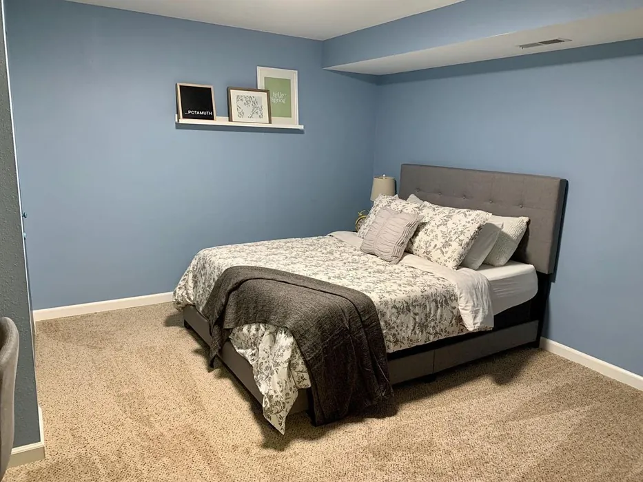
Let’s talk about the spaces where Respite truly shines. In a bedroom, it can create a peaceful retreat, promoting restful sleep. Imagine falling asleep to the soothing tones of blue, making your sanctuary feel like a serene getaway. For a nursery, it’s an excellent choice. The calming effect of Respite can help soothe your little one, making it a nurturing environment for rest and play. Plus, its washability is a bonus for parents dealing with messes.
In a living room, Respite can set a tranquil tone for gatherings, offering a refreshing backdrop for both lively conversations and quiet evenings. If you work from home, painting your home office in this soft hue can foster productivity while keeping you calm and focused. It’s a color that whispers relaxation without screaming for attention, allowing your decor to take center stage.
Now, let’s not forget about how Respite interacts with other colors. When pairing it with white trim, like Sherwin Williams’ White Dove, you can create a crisp, clean contrast that elevates the overall aesthetic. Brass fixtures add a touch of warmth and sophistication, while natural wood elements can enhance its coastal vibes, grounding the space in nature. When considering complimentary shades, colors like SW 0062, SW 6038, and SW 6553 work beautifully alongside Respite, creating a harmonious palette that invites warmth and coziness.
It’s essential to test Respite in your own home, though. The color can appear differently based on your specific lighting conditions, existing decor, and even the time of day. Observing how it interacts with your furniture and flooring will help you appreciate its nuances. The undertones become an essential aspect of its character, with the subtle blue lending depth and complexity to your space.
For those wondering about its suitability in darker rooms, it’s worth noting that while Respite can brighten up spaces, it may not be the best choice for very dark areas. However, in most settings, especially where natural light can filter in, it works wonders.
If you’re considering lighter shades, look to SW 6513 or SW 6520 for an even softer approach. On the other hand, if you’re drawn to deeper tones, shades like SW 7608 or SW 9070 can offer a richer variation while still harmonizing with Respite.
One of the most appealing aspects of Respite is its eco-friendly properties. With a low VOC level, it’s a paint that’s kinder to your home’s air quality, allowing you to create a beautiful space without compromising your health.
As you think about your project, remember that choosing a paint color is not just about aesthetics; it’s about creating a mood and a feeling. Respite is here to offer you calmness and serenity, transforming your home into a haven of relaxation.
So, whether you’re redoing a single room or refreshing your entire home, consider this gentle blue. It’s not just paint; it’s your new favorite backdrop for life’s moments. With Respite on your walls, you’ll find yourself in a space that feels inviting, soothing, and effortlessly beautiful.
Let’s embrace the power of color and make your home a tranquil retreat with Sherwin Williams’ Respite. It’s more than just a choice; it’s an investment in your peace of mind. You deserve a space that feels as good as it looks, and with Respite, that dream is just a brushstroke away.
Real Room Photo of Respite SW 6514
Undertones of Respite ?
The undertones of Respite are a key aspect of its character, leaning towards Blue. These subtle underlying hues are what give the color its depth and complexity. For example, a gray with a blue undertone will feel cooler and more modern, while one with a brown undertone will feel warmer and more traditional. It’s essential to test this paint in your home and observe it next to your existing furniture, flooring, and decor to see how these undertones interact and reveal themselves throughout the day.
HEX value: #97B4C3
RGB code: 151, 180, 195
Is Respite Cool or Warm?
Respite is primarily a cool color, which contributes to its calming effect. However, its balanced undertones keep it from feeling overly cold, making it suitable for a variety of settings.
Understanding Color Properties and Interior Design Tips
Hue refers to a specific position on the color wheel, measured in degrees from 0 to 360. Each degree represents a different pure color:
- 0° represents red
- 120° represents green
- 240° represents blue
Saturation describes the intensity or purity of a color and is expressed as a percentage:
- At 0%, the color appears completely desaturated—essentially a shade of gray
- At 100%, the color is at its most vivid and vibrant
Lightness indicates how light or dark a color is, also expressed as a percentage:
- 0% lightness results in black
- 100% lightness results in white
Using Warm Colors in Interior Design
Warm hues—such as reds, oranges, yellows, warm beiges, and greiges—are excellent choices for creating inviting and energetic spaces. These colors are particularly well-suited for:
- Kitchens, living rooms, and bathrooms, where warmth enhances comfort and sociability
- Large rooms, where warm tones can help reduce the sense of emptiness and make the space feel more intimate
For example:
- Warm beige shades provide a cozy, inviting atmosphere, ideal for living rooms, bedrooms, and hallways.
- Warm greige (a mix of beige and gray) offers the warmth of beige with the modern appeal of gray, making it a versatile backdrop for dining areas, bedrooms, and living spaces.
However, be mindful when using warm light tones in rooms with limited natural light. These shades may appear muted or even take on an unpleasant yellowish tint. To avoid a dull or flat appearance:
- Add depth by incorporating richer tones like deep greens, charcoal, or chocolate brown
- Use textured elements such as curtains, rugs, or cushions to bring dimension to the space
Pro Tip: Achieving Harmony with Warm and Cool Color Balance
To create a well-balanced and visually interesting interior, mix warm and cool tones strategically. This contrast adds depth and harmony to your design.
- If your walls feature warm hues, introduce cool-colored accents such as blue or green furniture, artwork, or accessories to create contrast.
- For a polished look, consider using a complementary color scheme, which pairs colors opposite each other on the color wheel (e.g., red with green, orange with blue).
This thoughtful mix not only enhances visual appeal but also creates a space that feels both dynamic and cohesive.
Light Temperature Affects on Respite
Natural Light
Natural daylight changes in color temperature as the sun moves across the sky. At sunrise and sunset, the light tends to have a warm, golden tone with a color temperature around 2000 Kelvin (K). As the day progresses and the sun rises higher, the light becomes cooler and more neutral. Around midday, especially when the sky is clear, natural light typically reaches its peak brightness and shifts to a cooler tone, ranging from 5500 to 6500 Kelvin. This midday light is close to what we perceive as pure white or daylight-balanced light.
These shifts in natural light can significantly influence how colors appear in a space, which is why designers often consider both the time of day and the orientation of windows when planning interior color schemes.
Artificial Light
When choosing artificial lighting, pay close attention to the color temperature, measured in Kelvin (K). This determines how warm or cool the light will appear. Lower temperatures, around 2700K, give off a warm, yellow glow often used in living rooms or bedrooms. Higher temperatures, above 5000K, create a cool, bluish light similar to daylight, commonly used in kitchens, offices, or task areas.
Use the slider to see how lighting temperature can affect the appearance of a surface or color throughout a space.


4800K
LRV of Respite
The Light Reflectance Value (LRV) of Respite is 64%, which places it in the Medium category. This means it Reflects a moderate amount of light. Understanding a paint’s LRV is crucial for predicting how it will look in your space. A higher LRV indicates a lighter color that reflects more light, making rooms feel larger and brighter. A lower LRV signifies a darker color that absorbs more light, creating a cozier, more intimate atmosphere. Always consider the natural and artificial lighting in your room when selecting a paint color based on its LRV.
Detailed Review of Respite
Additional Paint Characteristics
Ideal Rooms
Bedroom, Home Office, Living Room, Nursery
Decor Styles
Coastal, Minimalist, Modern Farmhouse, Scandinavian
Coverage
Good (1–2 Coats), Touch-Up Friendly
Ease of Application
Beginner Friendly, Fast-Drying, Low Splatter, Roller-Ready
Washability
Washable, Wipeable
VOC Level
Eco-Certified, Low VOC
Best Use
Accent Wall, Bedroom, Interior Walls, Nursery
Room Suitability
Bedroom, Home Office, Living Room, Nursery
Tone Tag
Airy, Balanced, Cool, Muted
Finish Type
Eggshell, Matte, Satin
Paint Performance
Easy Touch-Up, Low Odor, Quick Drying
Use Cases
Best for Low Light Rooms, Best for Rentals, Designer Favorite
Mood
Calm, Inviting, Restful
Trim Pairing
Complements Brass Fixtures, Good with Wood Trim, Pairs with White Dove
Respite stands out for its versatility and calming presence. When applied, it transforms any room into a peaceful haven. The finish options, including matte and satin, allow you to customize the look based on your preference and the room’s lighting. This color works beautifully in bedrooms and nurseries, promoting a restful environment. Additionally, it complements various decor styles, from coastal to modern farmhouse, making it a popular choice for many homeowners. Its ability to maintain a fresh look with just a couple of coats adds to its appeal. Overall, Respite is a remarkable choice for those seeking a tranquil yet stylish backdrop in their living spaces.
Pros & Cons of SW 6514 Respite
Pros
Cons
Colors that go with Sherwin Williams Respite
FAQ on SW 6514 Respite
Is Respite suitable for a nursery?
Absolutely! Respite is an excellent choice for a nursery due to its calming effect and soft hue. It creates a peaceful environment that can help soothe your little one, making it perfect for a space dedicated to rest and relaxation. Plus, its washability means you won’t have to worry too much about those little messes that come with parenting.
How does Respite work in different lighting?
Respite adapts beautifully to varying lighting conditions. In natural light, it appears bright and airy, enhancing the feeling of space. In the evening or in lower light, it retains its charm, becoming a cozy backdrop without losing its character. Just keep in mind that the color might shift slightly throughout the day, adding a dynamic element to your room.
Comparisons Respite with other colors
Respite SW 6514 vs Dutch Tile Blue SW 0031
| Attribute | Respite SW 6514 | Dutch Tile Blue SW 0031 |
|---|---|---|
| Color Name | Respite SW 6514 | Dutch Tile Blue SW 0031 |
| Color | ||
| Hue | Blue | Blue |
| Brightness | Medium | Medium |
| RGB | 151, 180, 195 | 154, 171, 171 |
| LRV | 64% | 24% |
| Finish Type | Eggshell, Matte, Satin | Eggshell, Matte, Satin |
| Finish Options | Eggshell, Matte, Satin | Eggshell, Flat, Matte, Satin |
| Ideal Rooms | Bedroom, Home Office, Living Room, Nursery | Bathroom, Bedroom, Dining Room, Hallway, Home Office, Kitchen, Living Room |
| Decor Styles | Coastal, Minimalist, Modern Farmhouse, Scandinavian | Coastal, Modern Farmhouse, Scandinavian, Traditional, Transitional |
| Coverage | Good (1–2 Coats), Touch-Up Friendly | Good (1–2 Coats) |
| Ease of Application | Beginner Friendly, Fast-Drying, Low Splatter, Roller-Ready | Beginner Friendly, Brush Smooth, Fast-Drying, Roller-Ready |
| Washability | Washable, Wipeable | Highly Washable, Washable |
| Room Suitability | Bedroom, Home Office, Living Room, Nursery | Bathroom, Bedroom, Dining Room, Kitchen, Living Room |
| Tone | Airy, Balanced, Cool, Muted | Balanced, Cool, Muted |
| Paint Performance | Easy Touch-Up, Low Odor, Quick Drying | Easy Touch-Up, High Coverage, Low Odor, Quick Drying |
Respite SW 6514 vs Debonair SW 9139
| Attribute | Respite SW 6514 | Debonair SW 9139 |
|---|---|---|
| Color Name | Respite SW 6514 | Debonair SW 9139 |
| Color | ||
| Hue | Blue | Blue |
| Brightness | Medium | Medium |
| RGB | 151, 180, 195 | 144, 160, 166 |
| LRV | 64% | 30% |
| Finish Type | Eggshell, Matte, Satin | Eggshell, Matte, Satin |
| Finish Options | Eggshell, Matte, Satin | Eggshell, Matte, Satin |
| Ideal Rooms | Bedroom, Home Office, Living Room, Nursery | Bedroom, Dining Room, Home Office, Living Room |
| Decor Styles | Coastal, Minimalist, Modern Farmhouse, Scandinavian | Coastal, Industrial, Modern, Transitional |
| Coverage | Good (1–2 Coats), Touch-Up Friendly | Good (1–2 Coats) |
| Ease of Application | Beginner Friendly, Fast-Drying, Low Splatter, Roller-Ready | Beginner Friendly, Brush Smooth, Roller-Ready |
| Washability | Washable, Wipeable | Washable, Wipeable |
| Room Suitability | Bedroom, Home Office, Living Room, Nursery | Bedroom, Dining Room, Home Office, Living Room |
| Tone | Airy, Balanced, Cool, Muted | Balanced, Cool, Muted |
| Paint Performance | Easy Touch-Up, Low Odor, Quick Drying | Easy Touch-Up, Low Odor, Quick Drying |
Respite SW 6514 vs Stardew SW 9138
| Attribute | Respite SW 6514 | Stardew SW 9138 |
|---|---|---|
| Color Name | Respite SW 6514 | Stardew SW 9138 |
| Color | ||
| Hue | Blue | Blue |
| Brightness | Medium | Medium |
| RGB | 151, 180, 195 | 166, 178, 181 |
| LRV | 64% | 30% |
| Finish Type | Eggshell, Matte, Satin | Eggshell, Satin |
| Finish Options | Eggshell, Matte, Satin | Eggshell, Matte, Satin |
| Ideal Rooms | Bedroom, Home Office, Living Room, Nursery | Bathroom, Bedroom, Home Office, Living Room, Nursery |
| Decor Styles | Coastal, Minimalist, Modern Farmhouse, Scandinavian | Coastal, Farmhouse, Modern, Scandinavian |
| Coverage | Good (1–2 Coats), Touch-Up Friendly | Good (1–2 Coats) |
| Ease of Application | Beginner Friendly, Fast-Drying, Low Splatter, Roller-Ready | Beginner Friendly, Brush Smooth, Roller-Ready |
| Washability | Washable, Wipeable | Highly Washable, Washable, Wipeable |
| Room Suitability | Bedroom, Home Office, Living Room, Nursery | Bathroom, Bedroom, Home Office, Living Room |
| Tone | Airy, Balanced, Cool, Muted | Calm, Cool, Muted |
| Paint Performance | Easy Touch-Up, Low Odor, Quick Drying | Easy Touch-Up, High Coverage, Low Odor |
Respite SW 6514 vs Niebla Azul SW 9137
| Attribute | Respite SW 6514 | Niebla Azul SW 9137 |
|---|---|---|
| Color Name | Respite SW 6514 | Niebla Azul SW 9137 |
| Color | ||
| Hue | Blue | Blue |
| Brightness | Medium | Medium |
| RGB | 151, 180, 195 | 182, 195, 196 |
| LRV | 64% | 48% |
| Finish Type | Eggshell, Matte, Satin | Eggshell, Matte, Satin |
| Finish Options | Eggshell, Matte, Satin | Eggshell, Matte, Satin |
| Ideal Rooms | Bedroom, Home Office, Living Room, Nursery | Bedroom, Home Office, Living Room, Nursery |
| Decor Styles | Coastal, Minimalist, Modern Farmhouse, Scandinavian | Coastal, Modern, Scandinavian, Transitional |
| Coverage | Good (1–2 Coats), Touch-Up Friendly | Good (1–2 Coats), Touch-Up Friendly |
| Ease of Application | Beginner Friendly, Fast-Drying, Low Splatter, Roller-Ready | Beginner Friendly, Brush Smooth, Roller-Ready |
| Washability | Washable, Wipeable | Highly Washable, Washable |
| Room Suitability | Bedroom, Home Office, Living Room, Nursery | Bedroom, Home Office, Living Room, Nursery |
| Tone | Airy, Balanced, Cool, Muted | Airy, Cool, Muted |
| Paint Performance | Easy Touch-Up, Low Odor, Quick Drying | Easy Touch-Up, Fade Resistant, Low Odor, Scuff Resistant |
Respite SW 6514 vs Rain SW 6219
| Attribute | Respite SW 6514 | Rain SW 6219 |
|---|---|---|
| Color Name | Respite SW 6514 | Rain SW 6219 |
| Color | ||
| Hue | Blue | Blue |
| Brightness | Medium | Medium |
| RGB | 151, 180, 195 | 171, 190, 191 |
| LRV | 64% | 50% |
| Finish Type | Eggshell, Matte, Satin | Eggshell, Matte, Satin |
| Finish Options | Eggshell, Matte, Satin | Eggshell, Matte, Satin |
| Ideal Rooms | Bedroom, Home Office, Living Room, Nursery | Bathroom, Bedroom, Home Office, Living Room, Nursery |
| Decor Styles | Coastal, Minimalist, Modern Farmhouse, Scandinavian | Coastal, Minimalist, Modern, Scandinavian, Transitional |
| Coverage | Good (1–2 Coats), Touch-Up Friendly | Good (1–2 Coats), Touch-Up Friendly |
| Ease of Application | Beginner Friendly, Fast-Drying, Low Splatter, Roller-Ready | Beginner Friendly, Brush Smooth, Fast-Drying, Roller-Ready |
| Washability | Washable, Wipeable | Scrubbable, Stain Resistant, Washable |
| Room Suitability | Bedroom, Home Office, Living Room, Nursery | Bathroom, Bedroom, Home Office, Living Room, Nursery |
| Tone | Airy, Balanced, Cool, Muted | Balanced, Cool, Muted |
| Paint Performance | Easy Touch-Up, Low Odor, Quick Drying | Easy Touch-Up, Low Odor, Quick Drying, Stain Resistant |
Respite SW 6514 vs Morning at Sea SW 9634
| Attribute | Respite SW 6514 | Morning at Sea SW 9634 |
|---|---|---|
| Color Name | Respite SW 6514 | Morning at Sea SW 9634 |
| Color | ||
| Hue | Blue | Blue |
| Brightness | Medium | Medium |
| RGB | 151, 180, 195 | 130, 151, 155 |
| LRV | 64% | 50% |
| Finish Type | Eggshell, Matte, Satin | Eggshell, Matte |
| Finish Options | Eggshell, Matte, Satin | Eggshell, Matte, Satin |
| Ideal Rooms | Bedroom, Home Office, Living Room, Nursery | Bathroom, Bedroom, Home Office, Living Room |
| Decor Styles | Coastal, Minimalist, Modern Farmhouse, Scandinavian | Coastal, Minimalist, Modern, Scandinavian |
| Coverage | Good (1–2 Coats), Touch-Up Friendly | Good (1–2 Coats), Touch-Up Friendly |
| Ease of Application | Beginner Friendly, Fast-Drying, Low Splatter, Roller-Ready | Beginner Friendly, Brush Smooth, Roller-Ready |
| Washability | Washable, Wipeable | Washable, Wipeable |
| Room Suitability | Bedroom, Home Office, Living Room, Nursery | Bathroom, Bedroom, Home Office, Living Room |
| Tone | Airy, Balanced, Cool, Muted | Airy, Cool, Muted |
| Paint Performance | Easy Touch-Up, Low Odor, Quick Drying | Easy Touch-Up, Fade Resistant, Low Odor |
Respite SW 6514 vs Sleepy Blue SW 6225
| Attribute | Respite SW 6514 | Sleepy Blue SW 6225 |
|---|---|---|
| Color Name | Respite SW 6514 | Sleepy Blue SW 6225 |
| Color | ||
| Hue | Blue | Blue |
| Brightness | Medium | Medium |
| RGB | 151, 180, 195 | 188, 203, 206 |
| LRV | 64% | 50% |
| Finish Type | Eggshell, Matte, Satin | Eggshell, Matte, Satin |
| Finish Options | Eggshell, Matte, Satin | Eggshell, Matte, Satin |
| Ideal Rooms | Bedroom, Home Office, Living Room, Nursery | Bedroom, Home Office, Living Room, Nursery |
| Decor Styles | Coastal, Minimalist, Modern Farmhouse, Scandinavian | Coastal, Minimalist, Modern Farmhouse, Scandinavian |
| Coverage | Good (1–2 Coats), Touch-Up Friendly | Good (1–2 Coats) |
| Ease of Application | Beginner Friendly, Fast-Drying, Low Splatter, Roller-Ready | Beginner Friendly, Brush Smooth, Fast-Drying, Roller-Ready |
| Washability | Washable, Wipeable | Highly Washable, Washable |
| Room Suitability | Bedroom, Home Office, Living Room, Nursery | Bedroom, Home Office, Living Room, Nursery |
| Tone | Airy, Balanced, Cool, Muted | Airy, Cool, Muted |
| Paint Performance | Easy Touch-Up, Low Odor, Quick Drying | Easy Touch-Up, Low Odor, Quick Drying, Scuff Resistant |
Respite SW 6514 vs Lakeside SW 9683
| Attribute | Respite SW 6514 | Lakeside SW 9683 |
|---|---|---|
| Color Name | Respite SW 6514 | Lakeside SW 9683 |
| Color | ||
| Hue | Blue | Blue |
| Brightness | Medium | Medium |
| RGB | 151, 180, 195 | 173, 184, 192 |
| LRV | 64% | 24% |
| Finish Type | Eggshell, Matte, Satin | Eggshell, Matte, Satin |
| Finish Options | Eggshell, Matte, Satin | Eggshell, Matte, Satin |
| Ideal Rooms | Bedroom, Home Office, Living Room, Nursery | Bathroom, Bedroom, Home Office, Living Room |
| Decor Styles | Coastal, Minimalist, Modern Farmhouse, Scandinavian | Coastal, Minimalist, Modern, Rustic |
| Coverage | Good (1–2 Coats), Touch-Up Friendly | Good (1–2 Coats) |
| Ease of Application | Beginner Friendly, Fast-Drying, Low Splatter, Roller-Ready | Beginner Friendly, Brush Smooth, Roller-Ready |
| Washability | Washable, Wipeable | Scrubbable, Washable |
| Room Suitability | Bedroom, Home Office, Living Room, Nursery | Bathroom, Bedroom, Home Office, Living Room |
| Tone | Airy, Balanced, Cool, Muted | Balanced, Cool, Muted |
| Paint Performance | Easy Touch-Up, Low Odor, Quick Drying | Easy Touch-Up, Fade Resistant, High Coverage, Low Odor |
Respite SW 6514 vs Upward SW 6239
| Attribute | Respite SW 6514 | Upward SW 6239 |
|---|---|---|
| Color Name | Respite SW 6514 | Upward SW 6239 |
| Color | ||
| Hue | Blue | Blue |
| Brightness | Medium | Medium |
| RGB | 151, 180, 195 | 191, 201, 208 |
| LRV | 64% | 75% |
| Finish Type | Eggshell, Matte, Satin | Eggshell, Satin |
| Finish Options | Eggshell, Matte, Satin | Eggshell, Flat, Satin |
| Ideal Rooms | Bedroom, Home Office, Living Room, Nursery | Bedroom, Dining Room, Home Office, Living Room, Nursery |
| Decor Styles | Coastal, Minimalist, Modern Farmhouse, Scandinavian | Coastal, Minimalist, Modern, Scandinavian |
| Coverage | Good (1–2 Coats), Touch-Up Friendly | Good (1–2 Coats), Touch-Up Friendly |
| Ease of Application | Beginner Friendly, Fast-Drying, Low Splatter, Roller-Ready | Beginner Friendly, Brush Smooth, Fast-Drying, Roller-Ready |
| Washability | Washable, Wipeable | Washable, Wipeable |
| Room Suitability | Bedroom, Home Office, Living Room, Nursery | Bedroom, Home Office, Living Room, Nursery |
| Tone | Airy, Balanced, Cool, Muted | Cool, Crisp, Muted |
| Paint Performance | Easy Touch-Up, Low Odor, Quick Drying | High Coverage, Low Odor, Quick Drying |
Respite SW 6514 vs Aleutian SW 6241
| Attribute | Respite SW 6514 | Aleutian SW 6241 |
|---|---|---|
| Color Name | Respite SW 6514 | Aleutian SW 6241 |
| Color | ||
| Hue | Blue | Blue |
| Brightness | Medium | Medium |
| RGB | 151, 180, 195 | 152, 169, 183 |
| LRV | 64% | 24% |
| Finish Type | Eggshell, Matte, Satin | Eggshell, Matte, Satin |
| Finish Options | Eggshell, Matte, Satin | Eggshell, Matte, Satin |
| Ideal Rooms | Bedroom, Home Office, Living Room, Nursery | Bathroom, Bedroom, Home Office, Kitchen, Living Room, Nursery |
| Decor Styles | Coastal, Minimalist, Modern Farmhouse, Scandinavian | Coastal, Minimalist, Modern, Scandinavian, Transitional |
| Coverage | Good (1–2 Coats), Touch-Up Friendly | Good (1–2 Coats), Touch-Up Friendly |
| Ease of Application | Beginner Friendly, Fast-Drying, Low Splatter, Roller-Ready | Beginner Friendly, Brush Smooth, Fast-Drying, Roller-Ready |
| Washability | Washable, Wipeable | Scrubbable, Stain Resistant, Washable |
| Room Suitability | Bedroom, Home Office, Living Room, Nursery | Bathroom, Bedroom, Home Office, Living Room, Nursery |
| Tone | Airy, Balanced, Cool, Muted | Airy, Balanced, Cool, Muted |
| Paint Performance | Easy Touch-Up, Low Odor, Quick Drying | Easy Touch-Up, Fade Resistant, Low Odor, Quick Drying |
Official Page of Sherwin Williams Respite SW 6514