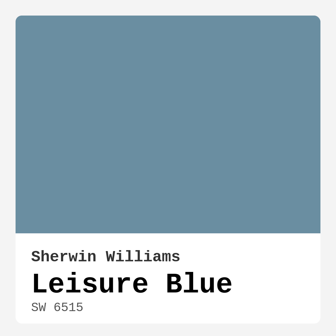
Color Preview & Key Details
| HEX Code | #6A8EA1 |
| RGB | 106, 142, 161 |
| LRV | 50% |
| Undertone | Blue |
| Finish Options | Eggshell, Flat, Matte, Satin |
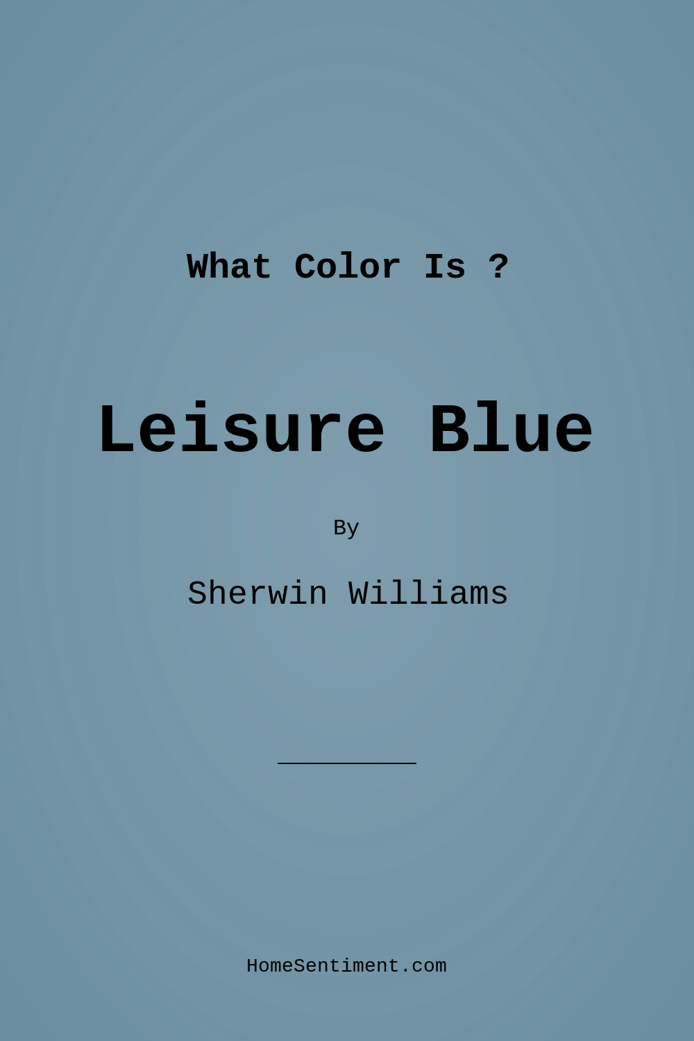
Imagine stepping into your home after a long day, greeted by a serene, tranquil hue that instantly melts away your stress. That welcoming feeling can be beautifully achieved with Leisure Blue from Sherwin Williams. This medium-toned blue—a delightful blend of blue and gray—evokes a sense of calm, inviting you to unwind and relax. Let’s dive deeper into why this color might just be the perfect choice for your next home project.
Leisure Blue, with the color code SW 6515, offers a unique blend of warmth and tranquility. It carries a subtle gray undertone that enhances its versatility, making it an exceptional match for various design aesthetics. Whether you’re leaning toward coastal charm, modern minimalism, or a cozy farmhouse vibe, this color can seamlessly adapt to your vision.
One of the most appealing aspects of Leisure Blue is its balanced warmth, which makes it an inviting choice for any room. Think about where you want to use this color. It’s ideal for living rooms, bedrooms, nurseries, and even home offices. Imagine a calming retreat in your bedroom or a peaceful, productive space in your home office—Leisure Blue delivers just that.
When it comes to finishes, you’re in luck. Leisure Blue is offered in several options, including Flat, Matte, Eggshell, and Satin. Each finish provides a unique look and feel. For a cozy, muted vibe, a flat finish might be your go-to. On the other hand, an eggshell or satin finish can lend a soft sheen, making it perfect for areas that see more traffic, as it’s easier to clean.
If you’re concerned about applying this color, don’t be. Leisure Blue is beginner-friendly, gliding on smoothly and drying quickly, making for a nearly effortless painting experience. Whether you’re using a roller or a brush, you’ll find it easy to achieve a professional-looking result. Plus, the washability factor is a significant bonus, allowing you to wipe away any marks or scuffs without a hassle.
Lighting plays a crucial role in how any paint color appears in your space, and Leisure Blue is no exception. With a Light Reflectance Value (LRV) of 50%, it reflects a moderate amount of light, striking a balance between bright and cozy. In natural light, this color can brighten up a room, creating an airy feel that’s perfect for open spaces. However, in low-light conditions, it may appear darker. This is why testing the color in your specific setting is so important. Observe how it interacts with both natural and artificial lighting throughout the day.
Now, let’s talk about the undertones. Leisure Blue has a cool undertone that radiates a refreshing atmosphere. This coolness can make a space feel more inviting and energetic, perfect for social areas like living rooms or dining rooms. For a harmonious design, consider pairing it with whites and natural woods, which will enhance its calming effect. Picture white trim or furniture against those serene walls, creating a crisp, clean look that elevates your decor.
For those of you with smaller spaces, Leisure Blue can work wonders. Its calming hue helps to open up a room, making it feel more expansive. When choosing decor and furnishings, opt for lighter pieces to maintain that airy feel. This way, you can keep the space inviting while avoiding any overwhelming darkness that can come from low light.
Of course, like any color, Leisure Blue does have its pros and cons. On the positive side, it’s warm and inviting, versatile across a range of decor styles, and offers smooth application with good washability. However, it may appear darker in rooms with limited natural light, and it’s essential to test the color in your space to see how it interacts with your existing decor.
If you’re looking for complementary shades, you’ll find that Leisure Blue pairs beautifully with a range of colors. Consider accents like SW 0062, SW 6038, or even deeper tones like SW 7077. These options can help create a cohesive color palette that brings your design to life. And for those who enjoy exploring different shades, you might want to check out some lighter alternatives like SW 6522 or darker options like SW 9149 to see how they can enhance your overall aesthetic.
Leisure Blue isn’t just a color; it’s a mood. It creates an atmosphere that is calm, inviting, and restful. Whether you’re painting an accent wall or refreshing an entire room, this hue brings a sense of serenity that can transform the feel of your home.
In terms of application, the color is touch-up friendly, which is a huge plus for anyone looking to maintain their space over time. With its low VOC and eco-certified status, you can feel good about using it in your home, knowing it’s a healthier choice for your indoor environment.
In summary, Leisure Blue is a fantastic choice for anyone wanting to infuse their space with tranquility. Its adaptability makes it perfect for a wide range of rooms and decor styles, while its soothing nature invites relaxation and peace. So, if you’re contemplating your next home project, consider this serene shade. It might just be the perfect touch to create the inviting, beautiful space you’ve always wanted.
Remember, the key to a successful paint job is testing colors in your own space. Observe how Leisure Blue interacts with your lighting and existing decor, and don’t hesitate to experiment with finishes to find your ideal look. With a little effort, Leisure Blue could be the hue that transforms your home into a calming retreat that you’ll love to come back to time and time again.
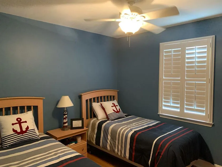
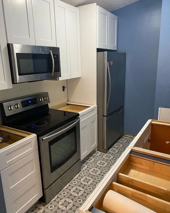
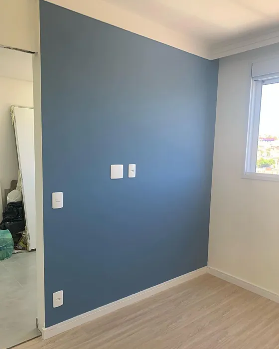
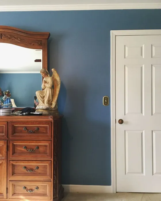
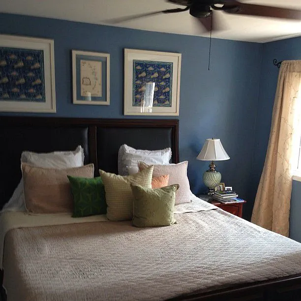
Real Room Photo of Leisure Blue SW 6515
Undertones of Leisure Blue ?
The undertones of Leisure Blue are a key aspect of its character, leaning towards Blue. These subtle underlying hues are what give the color its depth and complexity. For example, a gray with a blue undertone will feel cooler and more modern, while one with a brown undertone will feel warmer and more traditional. It’s essential to test this paint in your home and observe it next to your existing furniture, flooring, and decor to see how these undertones interact and reveal themselves throughout the day.
HEX value: #6A8EA1
RGB code: 106, 142, 161
Is Leisure Blue Cool or Warm?
Leisure Blue is considered a cool paint color. This characteristic plays a huge role in the overall feel of a room. Cool colors, like this one, tend to create a cozy, inviting, and energetic atmosphere, making them great for social spaces like living rooms and dining rooms. In contrast, warm colors often evoke a sense of calm and serenity, which is why they are popular in bedrooms and bathrooms. The coolth of Leisure Blue means it will pair beautifully with corresponding decor elements.
Understanding Color Properties and Interior Design Tips
Hue refers to a specific position on the color wheel, measured in degrees from 0 to 360. Each degree represents a different pure color:
- 0° represents red
- 120° represents green
- 240° represents blue
Saturation describes the intensity or purity of a color and is expressed as a percentage:
- At 0%, the color appears completely desaturated—essentially a shade of gray
- At 100%, the color is at its most vivid and vibrant
Lightness indicates how light or dark a color is, also expressed as a percentage:
- 0% lightness results in black
- 100% lightness results in white
Using Warm Colors in Interior Design
Warm hues—such as reds, oranges, yellows, warm beiges, and greiges—are excellent choices for creating inviting and energetic spaces. These colors are particularly well-suited for:
- Kitchens, living rooms, and bathrooms, where warmth enhances comfort and sociability
- Large rooms, where warm tones can help reduce the sense of emptiness and make the space feel more intimate
For example:
- Warm beige shades provide a cozy, inviting atmosphere, ideal for living rooms, bedrooms, and hallways.
- Warm greige (a mix of beige and gray) offers the warmth of beige with the modern appeal of gray, making it a versatile backdrop for dining areas, bedrooms, and living spaces.
However, be mindful when using warm light tones in rooms with limited natural light. These shades may appear muted or even take on an unpleasant yellowish tint. To avoid a dull or flat appearance:
- Add depth by incorporating richer tones like deep greens, charcoal, or chocolate brown
- Use textured elements such as curtains, rugs, or cushions to bring dimension to the space
Pro Tip: Achieving Harmony with Warm and Cool Color Balance
To create a well-balanced and visually interesting interior, mix warm and cool tones strategically. This contrast adds depth and harmony to your design.
- If your walls feature warm hues, introduce cool-colored accents such as blue or green furniture, artwork, or accessories to create contrast.
- For a polished look, consider using a complementary color scheme, which pairs colors opposite each other on the color wheel (e.g., red with green, orange with blue).
This thoughtful mix not only enhances visual appeal but also creates a space that feels both dynamic and cohesive.
Light Temperature Affects on Leisure Blue
Natural Light
Natural daylight changes in color temperature as the sun moves across the sky. At sunrise and sunset, the light tends to have a warm, golden tone with a color temperature around 2000 Kelvin (K). As the day progresses and the sun rises higher, the light becomes cooler and more neutral. Around midday, especially when the sky is clear, natural light typically reaches its peak brightness and shifts to a cooler tone, ranging from 5500 to 6500 Kelvin. This midday light is close to what we perceive as pure white or daylight-balanced light.
These shifts in natural light can significantly influence how colors appear in a space, which is why designers often consider both the time of day and the orientation of windows when planning interior color schemes.
Artificial Light
When choosing artificial lighting, pay close attention to the color temperature, measured in Kelvin (K). This determines how warm or cool the light will appear. Lower temperatures, around 2700K, give off a warm, yellow glow often used in living rooms or bedrooms. Higher temperatures, above 5000K, create a cool, bluish light similar to daylight, commonly used in kitchens, offices, or task areas.
Use the slider to see how lighting temperature can affect the appearance of a surface or color throughout a space.


4800K
LRV of Leisure Blue
The Light Reflectance Value (LRV) of Leisure Blue is 50%, which places it in the Medium category. This means it Reflects a moderate amount of light. Understanding a paint’s LRV is crucial for predicting how it will look in your space. A higher LRV indicates a lighter color that reflects more light, making rooms feel larger and brighter. A lower LRV signifies a darker color that absorbs more light, creating a cozier, more intimate atmosphere. Always consider the natural and artificial lighting in your room when selecting a paint color based on its LRV.
Detailed Review of Leisure Blue
Additional Paint Characteristics
Ideal Rooms
Bedroom, Dining Room, Home Office, Living Room, Nursery
Decor Styles
Coastal, Farmhouse, Modern, Scandinavian, Transitional
Coverage
Good (1–2 Coats), Touch-Up Friendly
Ease of Application
Beginner Friendly, Brush Smooth, Fast-Drying, Roller-Ready
Washability
Washable, Wipeable
VOC Level
Eco-Certified, Low VOC
Best Use
Accent Wall, Furniture, Interior Walls
Room Suitability
Bedroom, Dining Room, Home Office, Living Room, Nursery
Tone Tag
Airy, Balanced, Cool, Muted
Finish Type
Eggshell, Satin
Paint Performance
Easy Touch-Up, Low Odor, Quick Drying, Scuff Resistant
Use Cases
Best for Low Light Rooms, Best for Open Concept, Best for Rentals, Classic Favorite
Mood
Calm, Inviting, Restful
Trim Pairing
Complements Cool Trim, Matches Pure White, Pairs with White Dove
Leisure Blue stands out as a fantastic choice for those looking to infuse their space with tranquility. Its muted tone allows it to play nicely with both natural light and artificial lighting, making it adaptable for various rooms. When applied, the paint glides on smoothly and dries evenly, minimizing the appearance of brush strokes or roller marks. The color pairs beautifully with whites and natural wood, enhancing its calming effect. In larger spaces, it feels expansive, while in smaller rooms, it adds a touch of serenity without overwhelming the senses. Overall, Leisure Blue is perfect for creating a peaceful ambiance, whether it’s in a bedroom or a workspace, making it a versatile option for any home.
Pros & Cons of SW 6515 Leisure Blue
Pros
Cons
Colors that go with Sherwin Williams Leisure Blue
FAQ on SW 6515 Leisure Blue
What types of finishes are available for Leisure Blue?
Leisure Blue comes in several finishes to suit your needs, including Flat, Matte, Eggshell, and Satin. Each finish offers a different look and level of sheen, allowing you to choose based on the room and desired effect. For example, a satin finish can provide a bit of shine and is easier to clean, making it ideal for high-traffic areas, while a flat finish gives a more muted and cozy feel.
Is Leisure Blue suitable for small spaces?
Absolutely! Leisure Blue can work wonders in small spaces. Its calming hue helps to open up the room and create a sense of airiness. However, it’s essential to consider the lighting—if the space lacks natural light, the color might appear darker. To maximize its effect, pair it with lighter furnishings and decor to keep the space feeling bright and inviting.
Comparisons Leisure Blue with other colors
Leisure Blue SW 6515 vs Naval SW 6244
| Attribute | Leisure Blue SW 6515 | Naval SW 6244 |
|---|---|---|
| Color Name | Leisure Blue SW 6515 | Naval SW 6244 |
| Color | ||
| Hue | Blue | Blue |
| Brightness | Dark | Dark |
| RGB | 106, 142, 161 | 47, 61, 76 |
| LRV | 50% | 4% |
| Finish Type | Eggshell, Satin | Matte, Satin, Semi-Gloss |
| Finish Options | Eggshell, Flat, Matte, Satin | Matte, Satin, Semi-Gloss |
| Ideal Rooms | Bedroom, Dining Room, Home Office, Living Room, Nursery | Bedroom, Dining Room, Hallway, Home Office, Living Room |
| Decor Styles | Coastal, Farmhouse, Modern, Scandinavian, Transitional | Coastal, Industrial, Minimalist, Modern, Traditional |
| Coverage | Good (1–2 Coats), Touch-Up Friendly | Good (1–2 Coats), Self-Priming |
| Ease of Application | Beginner Friendly, Brush Smooth, Fast-Drying, Roller-Ready | Beginner Friendly, Brush Smooth, Roller-Ready |
| Washability | Washable, Wipeable | Highly Washable, Washable |
| Room Suitability | Bedroom, Dining Room, Home Office, Living Room, Nursery | Bedroom, Dining Room, Entryway, Home Office, Living Room |
| Tone | Airy, Balanced, Cool, Muted | Cool, Deep, Moody |
| Paint Performance | Easy Touch-Up, Low Odor, Quick Drying, Scuff Resistant | Easy Touch-Up, High Coverage, Low Odor, Scuff Resistant |
Leisure Blue SW 6515 vs Sea Serpent SW 7615
| Attribute | Leisure Blue SW 6515 | Sea Serpent SW 7615 |
|---|---|---|
| Color Name | Leisure Blue SW 6515 | Sea Serpent SW 7615 |
| Color | ||
| Hue | Blue | Blue |
| Brightness | Dark | Dark |
| RGB | 106, 142, 161 | 62, 75, 84 |
| LRV | 50% | 12% |
| Finish Type | Eggshell, Satin | Eggshell, Matte, Satin |
| Finish Options | Eggshell, Flat, Matte, Satin | Eggshell, Matte, Satin |
| Ideal Rooms | Bedroom, Dining Room, Home Office, Living Room, Nursery | Bathroom, Bedroom, Home Office, Living Room |
| Decor Styles | Coastal, Farmhouse, Modern, Scandinavian, Transitional | Coastal, Farmhouse, Industrial, Modern |
| Coverage | Good (1–2 Coats), Touch-Up Friendly | Good (1–2 Coats), Touch-Up Friendly |
| Ease of Application | Beginner Friendly, Brush Smooth, Fast-Drying, Roller-Ready | Beginner Friendly, Brush Smooth, Roller-Ready |
| Washability | Washable, Wipeable | Highly Washable, Washable |
| Room Suitability | Bedroom, Dining Room, Home Office, Living Room, Nursery | Bathroom, Bedroom, Home Office, Living Room |
| Tone | Airy, Balanced, Cool, Muted | Cool, Deep, Moody |
| Paint Performance | Easy Touch-Up, Low Odor, Quick Drying, Scuff Resistant | Easy Touch-Up, High Coverage, Low Odor |
Leisure Blue SW 6515 vs Rain Cloud SW 9639
| Attribute | Leisure Blue SW 6515 | Rain Cloud SW 9639 |
|---|---|---|
| Color Name | Leisure Blue SW 6515 | Rain Cloud SW 9639 |
| Color | ||
| Hue | Blue | Blue |
| Brightness | Dark | Dark |
| RGB | 106, 142, 161 | 83, 97, 104 |
| LRV | 50% | 30% |
| Finish Type | Eggshell, Satin | Eggshell, Matte, Satin |
| Finish Options | Eggshell, Flat, Matte, Satin | Eggshell, Matte, Satin |
| Ideal Rooms | Bedroom, Dining Room, Home Office, Living Room, Nursery | Bedroom, Dining Room, Home Office, Living Room |
| Decor Styles | Coastal, Farmhouse, Modern, Scandinavian, Transitional | Coastal, Contemporary, Minimalist, Scandinavian |
| Coverage | Good (1–2 Coats), Touch-Up Friendly | Good (1–2 Coats), Touch-Up Friendly |
| Ease of Application | Beginner Friendly, Brush Smooth, Fast-Drying, Roller-Ready | Beginner Friendly, Brush Smooth, Roller-Ready |
| Washability | Washable, Wipeable | Highly Washable, Washable |
| Room Suitability | Bedroom, Dining Room, Home Office, Living Room, Nursery | Bedroom, Home Office, Living Room |
| Tone | Airy, Balanced, Cool, Muted | Balanced, Cool, Muted |
| Paint Performance | Easy Touch-Up, Low Odor, Quick Drying, Scuff Resistant | Easy Touch-Up, Fade Resistant, Low Odor |
Leisure Blue SW 6515 vs Indigo Batik SW 7602
| Attribute | Leisure Blue SW 6515 | Indigo Batik SW 7602 |
|---|---|---|
| Color Name | Leisure Blue SW 6515 | Indigo Batik SW 7602 |
| Color | ||
| Hue | Blue | Blue |
| Brightness | Dark | Dark |
| RGB | 106, 142, 161 | 62, 80, 99 |
| LRV | 50% | 10% |
| Finish Type | Eggshell, Satin | Matte, Satin |
| Finish Options | Eggshell, Flat, Matte, Satin | Eggshell, Flat, Matte, Satin |
| Ideal Rooms | Bedroom, Dining Room, Home Office, Living Room, Nursery | Bedroom, Dining Room, Home Office, Living Room |
| Decor Styles | Coastal, Farmhouse, Modern, Scandinavian, Transitional | Bohemian, Coastal, Contemporary, Modern |
| Coverage | Good (1–2 Coats), Touch-Up Friendly | Good (1–2 Coats), Touch-Up Friendly |
| Ease of Application | Beginner Friendly, Brush Smooth, Fast-Drying, Roller-Ready | Brush Smooth, Fast-Drying, Roller-Ready |
| Washability | Washable, Wipeable | Scrubbable, Washable, Wipeable |
| Room Suitability | Bedroom, Dining Room, Home Office, Living Room, Nursery | Bedroom, Dining Room, Home Office, Living Room |
| Tone | Airy, Balanced, Cool, Muted | Cool, Deep, Moody |
| Paint Performance | Easy Touch-Up, Low Odor, Quick Drying, Scuff Resistant | Easy Touch-Up, High Coverage, Low Odor, Quick Drying |
Leisure Blue SW 6515 vs Sea Mariner SW 9640
| Attribute | Leisure Blue SW 6515 | Sea Mariner SW 9640 |
|---|---|---|
| Color Name | Leisure Blue SW 6515 | Sea Mariner SW 9640 |
| Color | ||
| Hue | Blue | Blue |
| Brightness | Dark | Dark |
| RGB | 106, 142, 161 | 67, 74, 84 |
| LRV | 50% | 6% |
| Finish Type | Eggshell, Satin | Eggshell, Matte, Satin |
| Finish Options | Eggshell, Flat, Matte, Satin | Eggshell, Matte, Satin |
| Ideal Rooms | Bedroom, Dining Room, Home Office, Living Room, Nursery | Bedroom, Dining Room, Hallway, Home Office, Living Room |
| Decor Styles | Coastal, Farmhouse, Modern, Scandinavian, Transitional | Coastal, Industrial, Minimalist, Modern |
| Coverage | Good (1–2 Coats), Touch-Up Friendly | Good (1–2 Coats) |
| Ease of Application | Beginner Friendly, Brush Smooth, Fast-Drying, Roller-Ready | Beginner Friendly, Brush Smooth, Roller-Ready |
| Washability | Washable, Wipeable | Scrubbable, Washable |
| Room Suitability | Bedroom, Dining Room, Home Office, Living Room, Nursery | Bedroom, Dining Room, Home Office, Living Room |
| Tone | Airy, Balanced, Cool, Muted | Cool, Deep, Moody |
| Paint Performance | Easy Touch-Up, Low Odor, Quick Drying, Scuff Resistant | Easy Touch-Up, Low Odor, Quick Drying |
Leisure Blue SW 6515 vs Still Water SW 6223
| Attribute | Leisure Blue SW 6515 | Still Water SW 6223 |
|---|---|---|
| Color Name | Leisure Blue SW 6515 | Still Water SW 6223 |
| Color | ||
| Hue | Blue | Blue |
| Brightness | Dark | Dark |
| RGB | 106, 142, 161 | 74, 93, 95 |
| LRV | 50% | 48% |
| Finish Type | Eggshell, Satin | Eggshell, Matte, Satin |
| Finish Options | Eggshell, Flat, Matte, Satin | Eggshell, Matte, Satin |
| Ideal Rooms | Bedroom, Dining Room, Home Office, Living Room, Nursery | Bedroom, Dining Room, Home Office, Living Room, Nursery |
| Decor Styles | Coastal, Farmhouse, Modern, Scandinavian, Transitional | Coastal, Contemporary, Farmhouse, Modern, Rustic |
| Coverage | Good (1–2 Coats), Touch-Up Friendly | Good (1–2 Coats), Touch-Up Friendly |
| Ease of Application | Beginner Friendly, Brush Smooth, Fast-Drying, Roller-Ready | Beginner Friendly, Brush Smooth, Roller-Ready |
| Washability | Washable, Wipeable | Highly Washable, Washable |
| Room Suitability | Bedroom, Dining Room, Home Office, Living Room, Nursery | Bedroom, Dining Room, Home Office, Living Room |
| Tone | Airy, Balanced, Cool, Muted | Cool, Earthy, Muted |
| Paint Performance | Easy Touch-Up, Low Odor, Quick Drying, Scuff Resistant | Easy Touch-Up, Fade Resistant, Low Odor |
Leisure Blue SW 6515 vs Waterloo SW 9141
| Attribute | Leisure Blue SW 6515 | Waterloo SW 9141 |
|---|---|---|
| Color Name | Leisure Blue SW 6515 | Waterloo SW 9141 |
| Color | ||
| Hue | Blue | Blue |
| Brightness | Dark | Dark |
| RGB | 106, 142, 161 | 83, 104, 114 |
| LRV | 50% | 12% |
| Finish Type | Eggshell, Satin | Matte, Satin |
| Finish Options | Eggshell, Flat, Matte, Satin | Matte, Satin, Semi-Gloss |
| Ideal Rooms | Bedroom, Dining Room, Home Office, Living Room, Nursery | Bedroom, Dining Room, Hallway, Home Office, Living Room |
| Decor Styles | Coastal, Farmhouse, Modern, Scandinavian, Transitional | Coastal, Industrial, Modern, Rustic |
| Coverage | Good (1–2 Coats), Touch-Up Friendly | Good (1–2 Coats), Touch-Up Friendly |
| Ease of Application | Beginner Friendly, Brush Smooth, Fast-Drying, Roller-Ready | Brush Smooth, Fast-Drying, Roller-Ready |
| Washability | Washable, Wipeable | Scrubbable, Washable |
| Room Suitability | Bedroom, Dining Room, Home Office, Living Room, Nursery | Bedroom, Dining Room, Home Office, Living Room |
| Tone | Airy, Balanced, Cool, Muted | Balanced, Cool, Muted |
| Paint Performance | Easy Touch-Up, Low Odor, Quick Drying, Scuff Resistant | Easy Touch-Up, Fade Resistant, Low Odor, Quick Drying |
Leisure Blue SW 6515 vs Smoky Blue SW 7604
| Attribute | Leisure Blue SW 6515 | Smoky Blue SW 7604 |
|---|---|---|
| Color Name | Leisure Blue SW 6515 | Smoky Blue SW 7604 |
| Color | ||
| Hue | Blue | Blue |
| Brightness | Dark | Dark |
| RGB | 106, 142, 161 | 89, 110, 121 |
| LRV | 50% | 15% |
| Finish Type | Eggshell, Satin | Eggshell, Matte, Satin |
| Finish Options | Eggshell, Flat, Matte, Satin | Eggshell, Matte, Satin |
| Ideal Rooms | Bedroom, Dining Room, Home Office, Living Room, Nursery | Bathroom, Bedroom, Home Office, Kitchen, Living Room |
| Decor Styles | Coastal, Farmhouse, Modern, Scandinavian, Transitional | Coastal, Modern, Scandinavian, Transitional |
| Coverage | Good (1–2 Coats), Touch-Up Friendly | Good (1–2 Coats), Touch-Up Friendly |
| Ease of Application | Beginner Friendly, Brush Smooth, Fast-Drying, Roller-Ready | Beginner Friendly, Brush Smooth, Roller-Ready |
| Washability | Washable, Wipeable | Highly Washable, Washable |
| Room Suitability | Bedroom, Dining Room, Home Office, Living Room, Nursery | Bathroom, Bedroom, Home Office, Living Room |
| Tone | Airy, Balanced, Cool, Muted | Cool, Dusty, Muted |
| Paint Performance | Easy Touch-Up, Low Odor, Quick Drying, Scuff Resistant | High Coverage, Low Odor, Quick Drying |
Leisure Blue SW 6515 vs Needlepoint Navy SW 0032
| Attribute | Leisure Blue SW 6515 | Needlepoint Navy SW 0032 |
|---|---|---|
| Color Name | Leisure Blue SW 6515 | Needlepoint Navy SW 0032 |
| Color | ||
| Hue | Blue | Blue |
| Brightness | Dark | Dark |
| RGB | 106, 142, 161 | 84, 102, 112 |
| LRV | 50% | 4% |
| Finish Type | Eggshell, Satin | Matte, Satin, Semi-Gloss |
| Finish Options | Eggshell, Flat, Matte, Satin | Matte, Satin, Semi-Gloss |
| Ideal Rooms | Bedroom, Dining Room, Home Office, Living Room, Nursery | Bedroom, Dining Room, Entryway, Home Office, Living Room |
| Decor Styles | Coastal, Farmhouse, Modern, Scandinavian, Transitional | Coastal, Contemporary, Modern Farmhouse, Nautical, Traditional |
| Coverage | Good (1–2 Coats), Touch-Up Friendly | Good (1–2 Coats), Touch-Up Friendly |
| Ease of Application | Beginner Friendly, Brush Smooth, Fast-Drying, Roller-Ready | Beginner Friendly, Brush Smooth, Fast-Drying, Roller-Ready |
| Washability | Washable, Wipeable | Scrubbable, Washable |
| Room Suitability | Bedroom, Dining Room, Home Office, Living Room, Nursery | Bedroom, Dining Room, Home Office, Living Room |
| Tone | Airy, Balanced, Cool, Muted | Cool, Deep, Muted |
| Paint Performance | Easy Touch-Up, Low Odor, Quick Drying, Scuff Resistant | Easy Touch-Up, High Coverage, Low Odor, Quick Drying, Stain Resistant |
Leisure Blue SW 6515 vs Riverway SW 6222
| Attribute | Leisure Blue SW 6515 | Riverway SW 6222 |
|---|---|---|
| Color Name | Leisure Blue SW 6515 | Riverway SW 6222 |
| Color | ||
| Hue | Blue | Blue |
| Brightness | Dark | Dark |
| RGB | 106, 142, 161 | 93, 114, 116 |
| LRV | 50% | 24% |
| Finish Type | Eggshell, Satin | Eggshell, Satin |
| Finish Options | Eggshell, Flat, Matte, Satin | Eggshell, Matte, Satin |
| Ideal Rooms | Bedroom, Dining Room, Home Office, Living Room, Nursery | Bathroom, Bedroom, Dining Room, Home Office, Living Room |
| Decor Styles | Coastal, Farmhouse, Modern, Scandinavian, Transitional | Coastal, Contemporary, Eclectic, Modern, Rustic |
| Coverage | Good (1–2 Coats), Touch-Up Friendly | Good (1–2 Coats), Touch-Up Friendly |
| Ease of Application | Beginner Friendly, Brush Smooth, Fast-Drying, Roller-Ready | Beginner Friendly, Brush Smooth, Fast-Drying, Low Splatter, Roller-Ready |
| Washability | Washable, Wipeable | Highly Washable, Washable |
| Room Suitability | Bedroom, Dining Room, Home Office, Living Room, Nursery | Bathroom, Bedroom, Home Office, Living Room |
| Tone | Airy, Balanced, Cool, Muted | Balanced, Cool, Muted |
| Paint Performance | Easy Touch-Up, Low Odor, Quick Drying, Scuff Resistant | Easy Touch-Up, High Coverage, Low Odor, Quick Drying |
Official Page of Sherwin Williams Leisure Blue SW 6515